
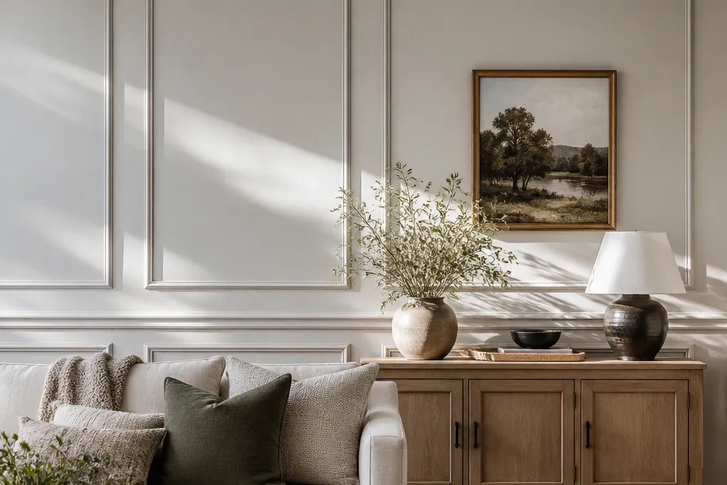
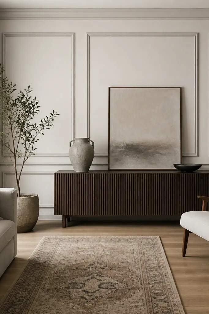
1. Rectangular picture-frame wall panels
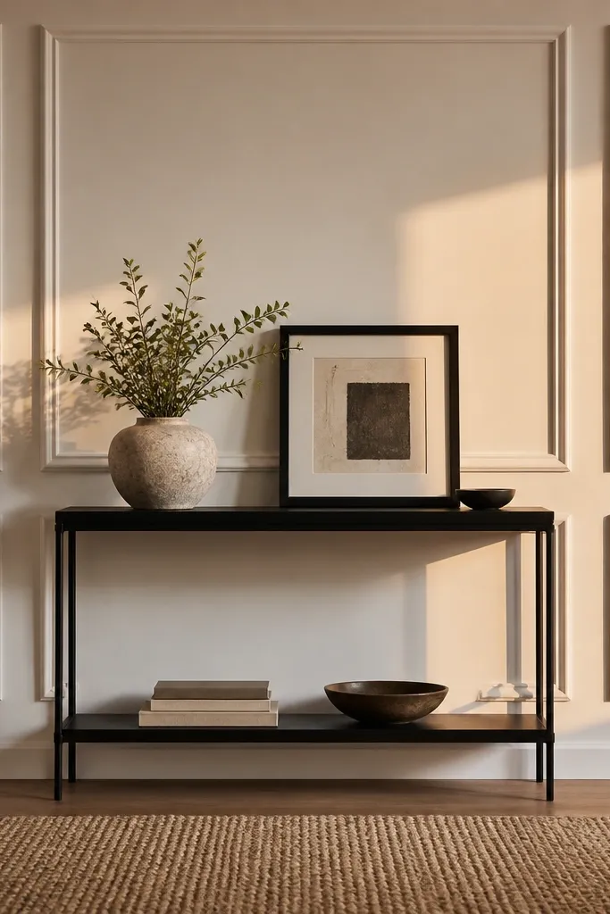
Start by marking the outer rectangle boundary using a level and a tape measure from one corner. Lay out inner rectangles with a consistent spacing of about 2-4 in. Between frames, then measure each run twice before cutting. Cut your moulding at 45-degree miters for the corners, dry-fit, and adjust until the frames sit flat. Install with a brad nailer and wood glue, then fill nail holes and miter gaps with paintable filler before caulking the perimeter seam.
This is the moulding look that makes a room feel “finished” without going full traditional. The rectangles create a gallery effect, and the shadows between each frame make the wall look deeper even when the wall is plain drywall. Use this on a living room feature wall or behind a console so the moulding frames the furniture visually. It’s also one of the most forgiving layouts because small measurement errors are less noticeable inside repeated rectangles.
Skip thisDon’t let the first outer frame go off-level; everything inside will look crooked.
Editor's notePaint the moulding before installation if you can — it’s faster and you’ll get cleaner corners.
2. Modern vertical slat moulding columns
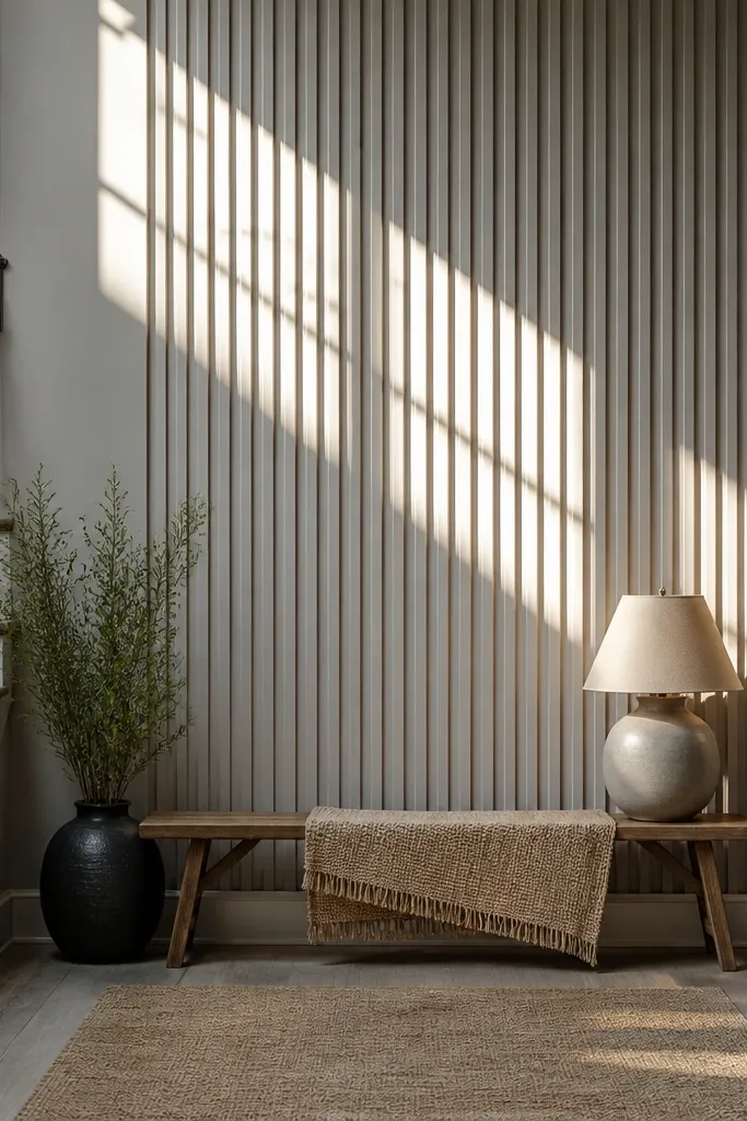
Vertical columns give you height and structure, and they look sharp in modern, Scandinavian, and farmhouse spaces. The beauty is in the rhythm: narrow strips with consistent spacing make the wall feel organized. This works especially well in entryways, stair landings, and behind a bench where you want a clean backdrop. Keep the moulding widths slim so the wall doesn’t feel heavy.
Choose a slim profile strip (about 1/2-3/4 in. Wide) and plan spacing so each column plus gap repeats evenly. Mark the first column line, then measure center-to-center for every strip so your spacing stays consistent. Cut strips to height, miter the top and bottom if you’re framing the ends, or use butt joints under a horizontal cap. Nail along the back edge, fill any tiny gaps with caulk, and paint with satin for visible shadow lines.
Use a laser level if you have one — vertical lines that look straight to the eye are still often slightly off by the time you reach the top.
Avoid mixed strip widths; it makes the wall look accidental.
3. Shadowbox grid with square panels
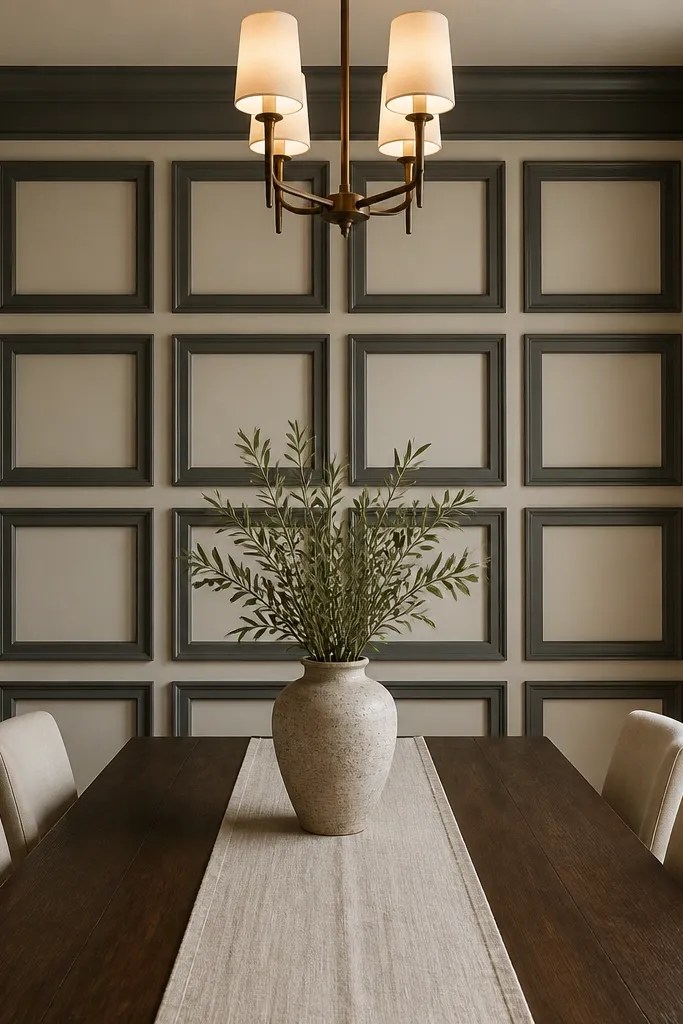
A square grid reads clean and architectural, and it turns a flat wall into something dimensional. The trick is creating a true shadowbox effect: the outer rails and inner dividers need consistent depth so the squares look crisp. This style looks gorgeous in dining rooms, home offices, and bedrooms because it frames the wall like built-in shelving. It also photographs well because the grid creates strong lines from any angle.
Pick your square size first — a common starting point is 12-16 in. Squares depending on wall width. Layout the perimeter, then mark the internal grid using a tape measure and level. Install horizontal and vertical rails first, using 45-degree miters at corners for a seamless look. Add inner dividers to form each square, then caulk all seams and nail holes, and finish with two coats of satin paint.
If your wall isn’t perfectly square, set the grid based on the widest span and let the last gap absorb the difference.
Don’t skip primer on MDF; raw spots can show through as dull patches after paint.
4. Classic chair-rail with stacked picture rails
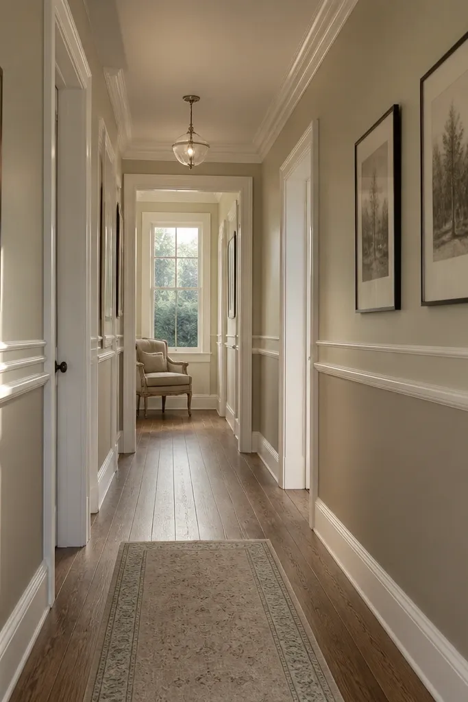
Decide your chair-rail height using the room layout: a common approach is placing the top of the chair rail around 32-36 in. From the floor, then adjusting for furniture height. Install the main chair rail with a level and brad nails, then add one or two thinner rails above it with consistent spacing. Use 45-degree miters at corners, and fill gaps with caulk plus a small amount of filler for nail holes. Paint the whole system satin so the layered shadows stand out.
Chair-rail moulding is timeless, but you can make it feel fresh by stacking thinner picture rails above the main line. This creates layered depth without covering the whole wall, so it’s perfect for rooms with lower ceilings or where you want a “structured” look. It also works great in hallways because it breaks up long stretches of wall at a comfortable height. Keep the proportions tight for a modern feel.
Skip thisDon’t install chair rail too low; it can make the room feel cramped.
Editor's noteDry-fit the stacked rails on the wall with painter’s tape before you cut anything — spacing errors show up fast.
5. Wainscoting-style panels with a top cap
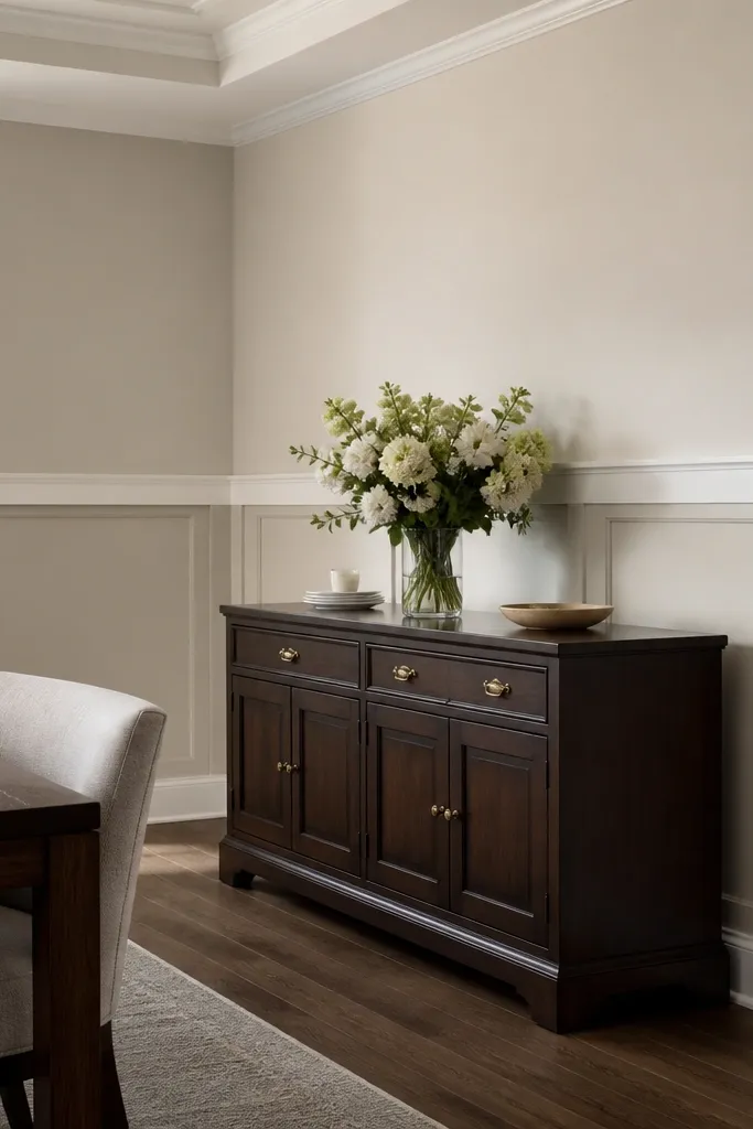
Wainscoting panels add classic charm, but the modern win is using clean, simple rectangles and a sharp top cap. The panels make walls feel more “designed” and they’re practical too — they hide scuffs better than flat paint in high-traffic areas. This looks great in dining rooms, entryways, and kids' spaces where you want style and durability. Keep the panel size consistent so it reads intentional.
Mark the wainscoting height and the panel grid spacing before you buy moulding. Install the top cap first so you lock the visual line, then build the panel rails and stiles underneath. Use pre-primed MDF for crisp edges, cut panels with mitered frames, and attach with glue plus nails. Caulk all perimeter edges, fill nail holes, sand lightly, then paint in satin for a crisp shadow effect.
Use painter’s tape to map the panel outlines; you’ll spot spacing mistakes before cutting.
Avoid wide, busy profiles if you want it to look clean — too much detail makes the wall feel cluttered.
6. Single large frame around a focal point
Choose a focal area width and set the frame outer edges with a level. Use a consistent margin from the artwork edges so the frame doesn’t crowd it, then cut the frame pieces with 45-degree miters at corners. Dry-fit to confirm the rectangle is square, then glue and nail the moulding to the wall. Fill miter joints, caulk the outer perimeter, and paint with satin so the shadow stays visible.
One big frame is the fastest way to get a high-end look without doing a full wall grid. It makes your mirror, art, or TV area feel built-in, and the frame’s shadow line adds depth even from across the room. This is ideal for renters who want impact without changing furniture — you can keep the moulding confined to one section. It also photographs beautifully because the frame creates a clear boundary.
Skip thisDon’t use a super thick frame on a small wall section; it overwhelms the focal point.
Editor's noteIf your artwork is slightly off-center, center the frame instead; it reads cleaner in photos.
7. Diagonal geometric moulding angles
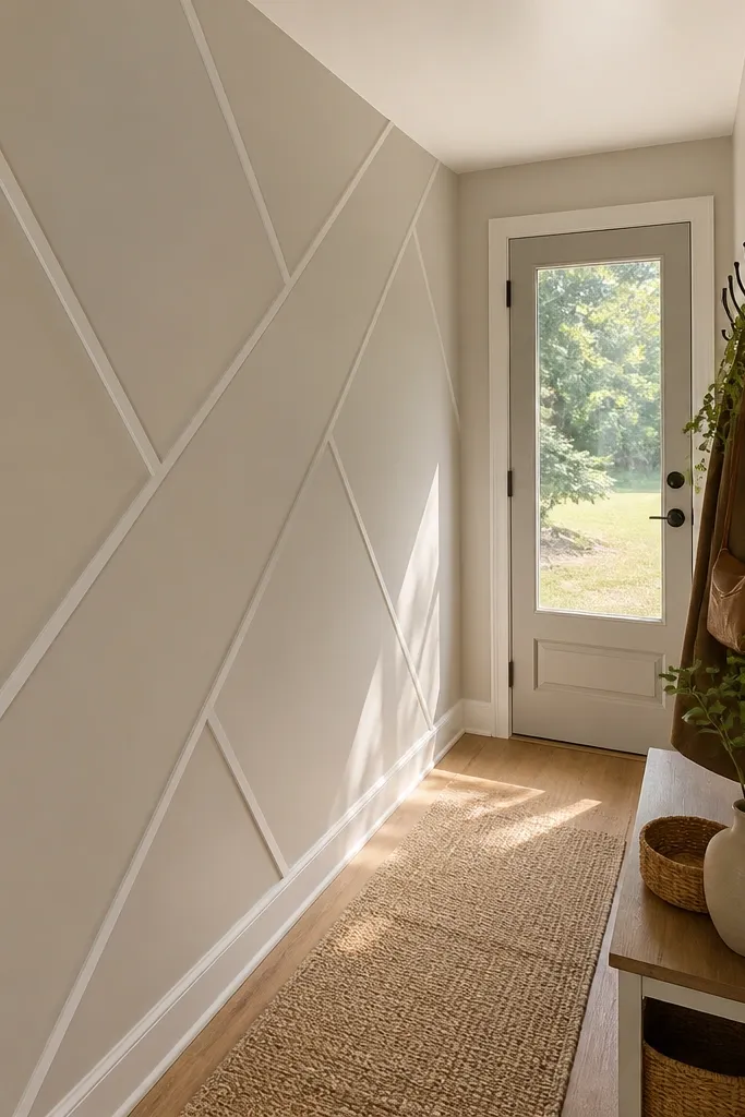
Pick a repeat pattern that fits your wall — for example, two long diagonals meeting in the center. Find the wall center point, then mark diagonal lines at the chosen angle and build your rails along those lines. Cut miters carefully for junctions where diagonals meet; dry-fit at least once before nailing. Seal seams with caulk, sand any rough spots, and paint satin to highlight the shadow lines.
Diagonal geometry brings energy and makes even a small hallway feel designed. The moulding lines create motion, and the shadows add contrast that flat paint can’t. This is a strong pick if you want a bold look but don’t want to cover the entire wall with many panels. Keep the pattern simple: a few long diagonals beat a complicated maze.
Skip thisAvoid rushing the center meeting point; tiny gaps there show the most.
Editor's noteUse a scrap “angle template” cut from cardboard so you can transfer the angle to each piece consistently.
8. Halo frame moulding around the room
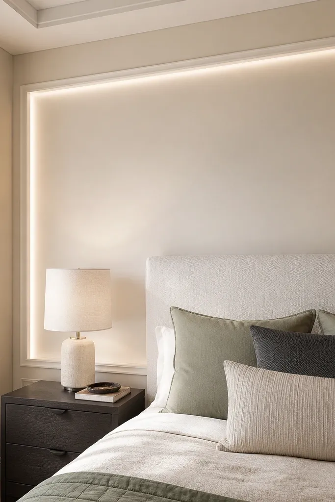
Measure the room perimeter and decide your border width, typically 1-2 in. Install the moulding along the wall top and around openings first so your lines stay consistent. Use 45-degree miters at corners and caulk the perimeter seam where the trim meets drywall. Fill nail holes, sand smooth, and paint the border in satin to catch light.
A halo border is one of the cleanest ways to make a room feel elevated without heavy panels. The moulding outlines the wall perimeter like a picture border, giving you a subtle architectural edge. It’s especially effective in bedrooms and living rooms where you want calm, not busy. The look also makes ceilings feel taller because it defines the wall boundary crisply.
Skip thisDon’t skip caulking at corners; hairline gaps are the first thing people notice.
Editor's noteIf your ceiling line isn’t perfect, keep the border a hair lower from the top edge so you don’t chase a wavy line all the way around.
9. Two-tone moulding with a crisp paint break
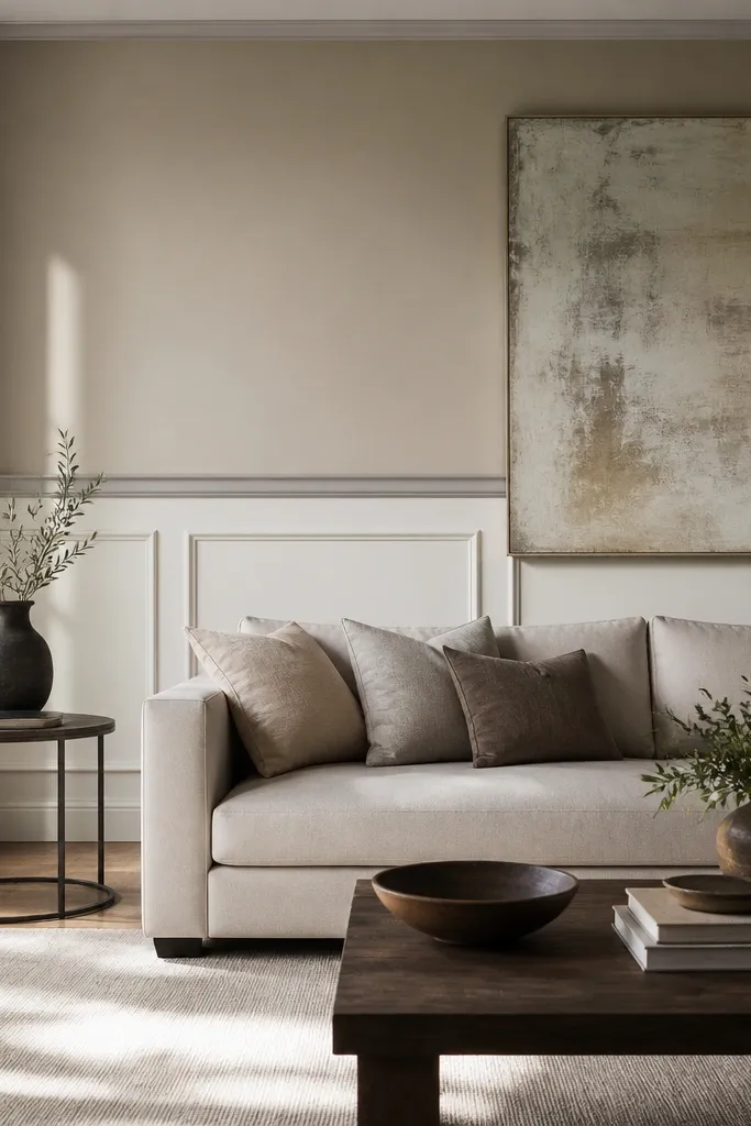
Choose your wall base color and moulding color, then tape off the moulding edges before painting. Install moulding first, then prime bare MDF and sand smooth. Paint the wall base color up to the moulding edges, let it cure, then paint the moulding satin. Remove tape carefully while paint is still slightly tacky for the cleanest line.
Two-tone walls make moulding look intentional because your eye reads the color break as part of the design. Use moulding to separate paint zones: keep the wall color matte or eggshell, then paint moulding satin in a lighter shade. This gives you a high-contrast shadow line and a clean, modern finish. It’s gorgeous in living rooms, bedrooms, and offices where you want a designer look without wallpaper.
Skip thisAvoid painting moulding matte; it kills the shadow definition.
Editor's noteUse a 1-1/2 in angled brush for tight moulding edges so you don’t flood paint into the shadow gaps.
10. Crown-below look with a mid-wall cap
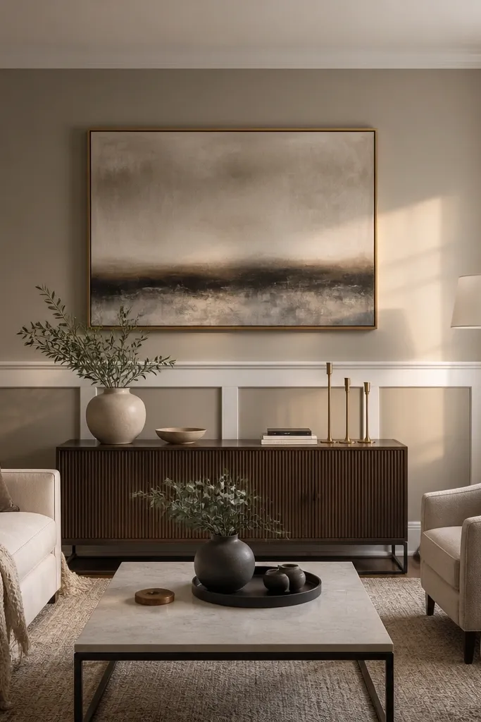
This is a twist on crown moulding: you place a thick horizontal cap mid-wall, then add simple vertical accents below. It makes tall walls feel structured and gives you a “built-in” vibe without doing full paneling. This works well behind beds, in living rooms with large blank walls, and in dining rooms where you want a focal zone. Keep the vertical pieces narrow so the cap remains the star.
Mark a straight horizontal line for the cap, usually around 45-54 in. From the floor depending on wall height. Install the cap with level marks, then add vertical strips below it with equal spacing. Use mitered corners where the verticals meet the cap for clean joins. Caulk seams, fill nail holes, sand, and paint satin to highlight the horizontal shadow line.
Pre-cut the vertical strips slightly long, then trim to final length after the cap is installed — it’s easier to fit.
Don’t install all verticals before confirming the cap is perfectly level.
11. French-inspired small rosettes with panels
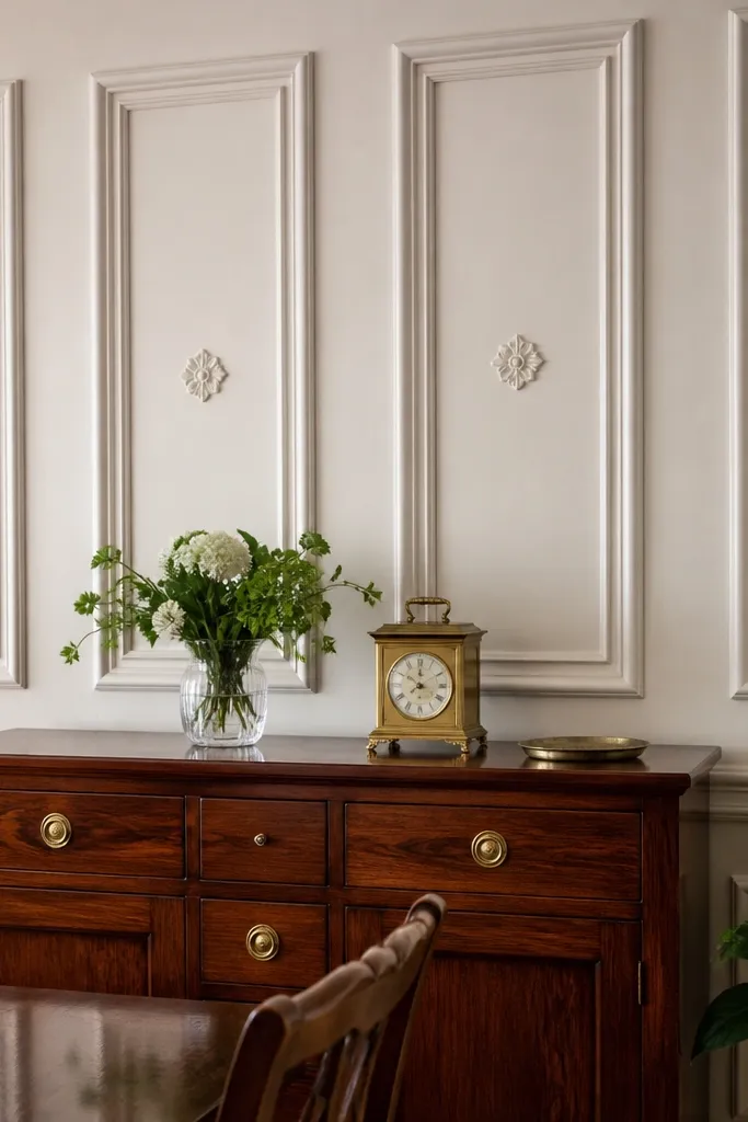
If you want romance without chaos, add small rosette medallions at the center of each panel. The circles catch light differently than straight moulding, so the wall feels more detailed while staying organized. This look is great for a dining room wall behind a sideboard or a bedroom behind a headboard. Use modest rosette sizes so it stays classy and not costume-y.
Build your panel grid first using simple rectangles, then mark the center point of each panel. Attach rosettes with wood glue and a couple of finishing nails if needed, keeping them aligned to the moulding edges. Caulk around the rosette perimeter so the join disappears. Paint everything after installation, and use satin on the moulding and rosettes so light glances off consistently.
Sand the rosette edge lightly before caulking so filler doesn’t create bumps under paint.
Avoid oversized rosettes on small walls; they dominate the whole pattern.
12. Raised beadboard with a modern top rail
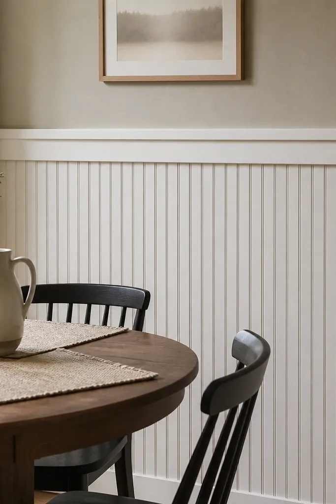
Install beadboard sheets or narrow bead strips on the wall, starting from a level reference line. Add a slim top rail across the top to finish the look and hide the top seams. Caulk the edges, fill nail holes, and sand any raised spots. Prime if needed, then paint satin for better shadow definition.
Beadboard gives you texture and a cozy feel, and pairing it with a modern top rail makes it look current instead of old-school. The vertical grooves create shadow texture even when paint is the same color. This works well in kitchens, breakfast nooks, and mudrooms where you want a practical, charming wall. Keep the beadboard spacing consistent so it reads as one continuous surface.
Skip thisDon’t leave gaps between beadboard pieces; they show as dark lines after paint.
Editor's noteUse a straightedge to check the first row before nailing the next — beadboard shows misalignment fast.
13. Large-scale vertical panels with a base rail
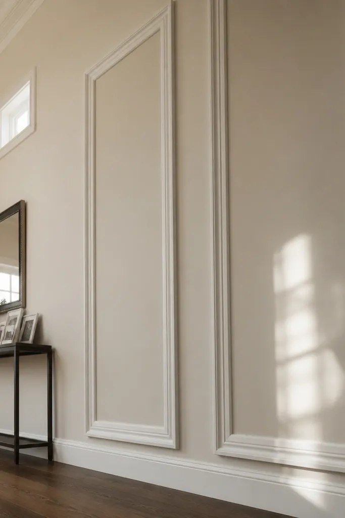
Decide how many tall panels you want across the wall width — start with 3-5 panels depending on width. Mark panel center lines and install vertical stiles first, then add top and bottom rails to form each frame. Use consistent widths for every rail so the pattern looks intentional. Caulk every seam, then paint satin with two coats for a crisp finish.
Tall framed panels read architectural and make a room feel taller, especially when you keep the number of panels low. Adding a base rail grounds the pattern so it doesn’t float. This is a strong choice for living rooms and hallways where you want structure without clutter. The look is clean because you’re not filling the entire wall with small boxes.
Skip thisAvoid random panel widths; it makes the wall look like patchwork.
Editor's notePick one panel width to anchor your layout, then adjust the side gaps so they stay equal.
14. Half-wall paneling with a clean border
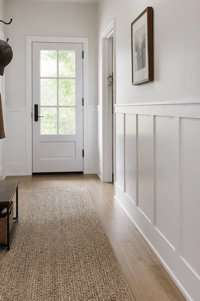
Measure the wall and set the panel height line, usually around 36-42 in. From the floor depending on chair height or door placement. Install the bottom rail and the top border line first, then build the rectangle panel frames between them. Nail and glue each frame, then caulk the perimeter and fill nail holes. Prime and paint with satin so the border and panel edges pop.
Half-wall paneling is practical and photogenic because it creates a clear visual boundary. It also hides scuffs on the lower portion while keeping the upper wall lighter and airy. This suits dining rooms, hallways, and entryways where you want a classic touch without doing full-wall moulding. Keep the panel design simple so the border looks crisp rather than busy.
Skip thisDon’t overcomplicate the panel shapes at half height; simple rectangles read best.
Editor's noteUse painter’s tape to mask the upper plain paint zone before you paint moulding so you don’t get messy edges.
15. Floating arch moulding frames
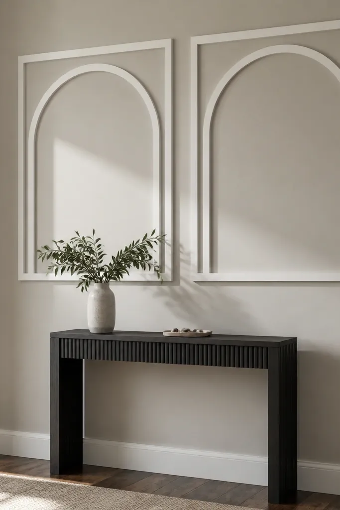
Plan your outer boundary rectangle, then decide the arch radius based on that width. Use a flexible strip or pre-made arch template to mark the curve on the wall. Install the outer rectangular frame, then attach arch moulding pieces using careful miters or small segmented cuts for smooth curves. Caulk seams, fill holes, sand, and paint satin for crisp shadow definition.
Arch frames soften a room instantly, and “floating” arches look modern because they sit inside a clean rectangular boundary. The moulding casts a curved shadow line that feels more decorative than straight panels. This looks gorgeous in foyers, breakfast nooks, and bedrooms. Keep the number of arches small — two or three is enough to make it feel intentional.
Skip thisDon’t force rigid arch segments into a curve; it creates visible gaps.
Editor's noteIf your arch moulding is straight pieces, cut them slightly long and sand the ends to fit the curve before nailing.
16. Bookcase-style vertical frames with empty shelves
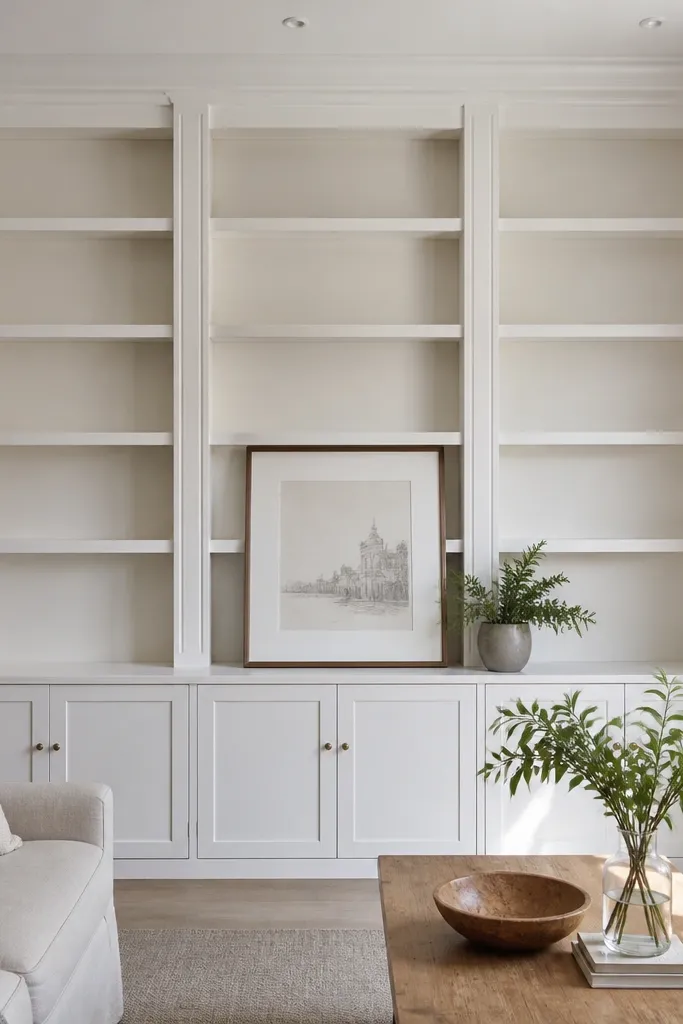
Mark the vertical rails across the wall width first, spacing them evenly. Add horizontal rails at your chosen shelf heights, then form each section as a rectangle outline. Use mitered corners for the cleanest look, and glue plus brads for stability. Caulk all joints, fill nail holes, sand, then paint satin so the shelf lines cast visible shadows.
This look gives you the visual of built-in storage without adding actual shelves. The vertical frames and horizontal “shelf” lines create depth and a custom architectural vibe. It’s perfect for living rooms where you want a backdrop behind a console, or for offices where you need structure. Keep the shelves empty in the design — the moulding alone is what makes it look built-in.
Skip thisAvoid irregular shelf heights; it makes the pattern feel random.
Editor's noteUse a consistent shelf thickness across every “level” so the wall reads like one built-in unit.
17. Geometric corner mirror frame
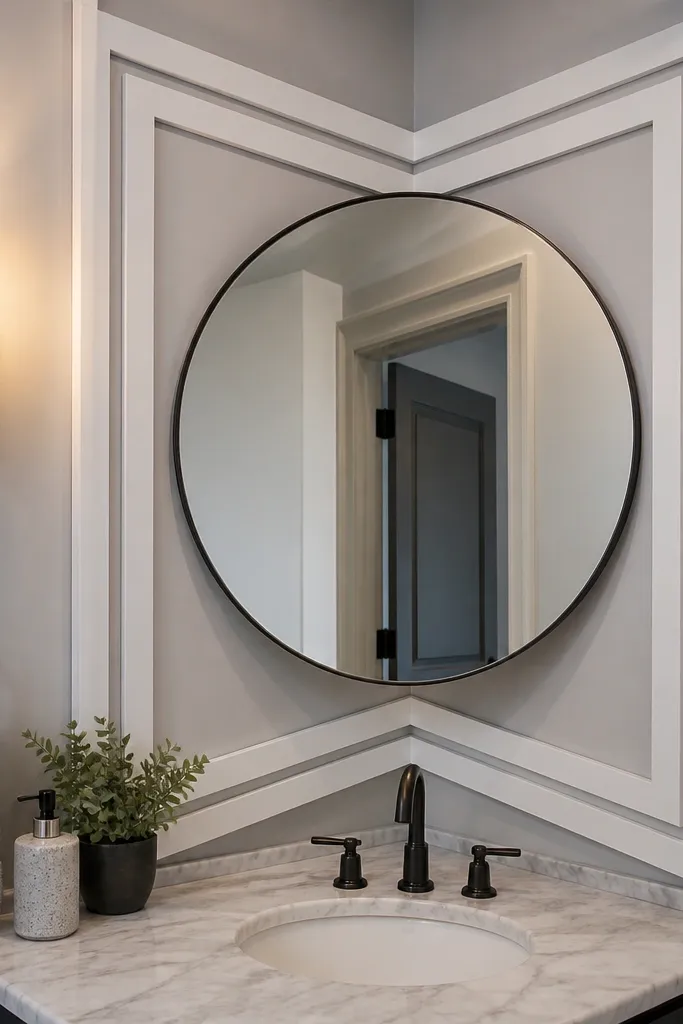
This is a small-scale moulding idea that still looks expensive because it frames a corner focal point. Angled trim pieces create a crisp geometry around a mirror, photo cluster, or sconce area. It works in powder rooms and entry corners where blank space looks awkward. The moulding is minimal, but the shadow edges make it pop in photos.
Choose a mirror or art placement, then mark the outer edges of the frame on the wall. Build a simple rectangle or square boundary, then add two angled trim pieces to form a geometric accent near the corner. Cut miters for the angled joints, dry-fit, then glue and nail the pieces in place. Caulk all seams and paint satin, matching the moulding finish to your hardware colors.
Keep your angles consistent by using one cardboard template for the angled pieces.
Don’t mount the mirror first; build the moulding frame around the final mirror position.
18. Lattice-style moulding squares for a feature wall
Lattice moulding makes a wall look like it has depth and structure, even with simple materials. The cross lines create lots of shadow “sparkle” when light moves across the room. This is best for a single feature wall — behind a sofa, in a hallway, or in a bedroom where you want the wall to steal the show. Keep the grid spacing consistent and don’t go too dense; photogenic lattice still needs breathing room.
Decide your square size, then mark a grid starting at one corner using a level. Install vertical strips first, then add horizontal strips to form the lattice squares. Use miters at intersections for a cleaner look, or use butt joints with caulk if you want faster building. Fill and caulk all gaps, sand, then paint satin so the lattice shadows stay visible.
Use a reference chalk line for the first row — lattice magnifies any early mistake.
Avoid mixing joint types on the same wall; it looks messy under paint.
19. Wedge moulding pattern with angled borders
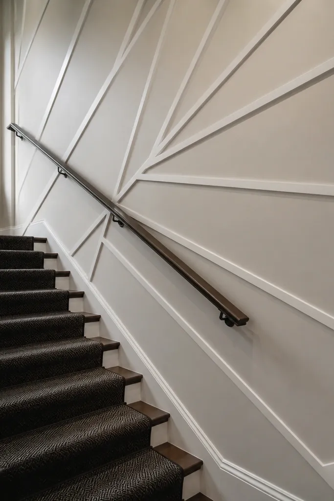
Wedge patterns are bold and modern, and they look great behind a console or in a stair landing where light hits from the side. Instead of full boxes, you get directional shapes that guide the eye. This works best when you keep the wedges large and the number of segments low. The result is dramatic without needing wallpaper.
Mark a center line on the wall, then decide the number of wedges and their width at the widest point. Use a straightedge to mark each wedge boundary line, then install moulding rails along those lines. Build the outer border first so wedges have a clean container, then fill wedge interiors with short horizontal accents if you want extra depth. Caulk joints, fill nail holes, sand, and paint satin for crisp edges.
Cut wedges from longer stock than you need so you can fine-tune the ends after dry-fit.
Don’t make wedges too small; tiny wedges disappear and look like mistakes instead of design.
20. Raised panel look with rope-cable trim accents
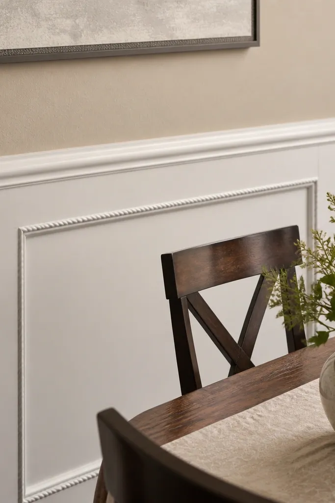
Build the main raised panel frames with flat moulding first, then mark where the rope trim will outline each panel. Cut and install rope trim around panel edges using careful miters at corners. Glue and nail, then caulk the rope-to-frame seam so it disappears under paint. Prime, then paint satin in two coats so the cable texture stays visible.
If you like texture but want it controlled, add cable or rope trim around plain raised panels. The cable detail adds a soft, decorative highlight that reads upscale on camera. This suits traditional rooms that still need a modern edge, like a dining room that’s not fully ornate. Keep the panels simple and let the cable trim do the work.
Skip thisAvoid rope trim on very tiny panels; the texture gets lost.
Editor's noteUse a thin bead of caulk — thick caulk softens the cable detail after paint.
21. Slim border moulding with centered vertical accents
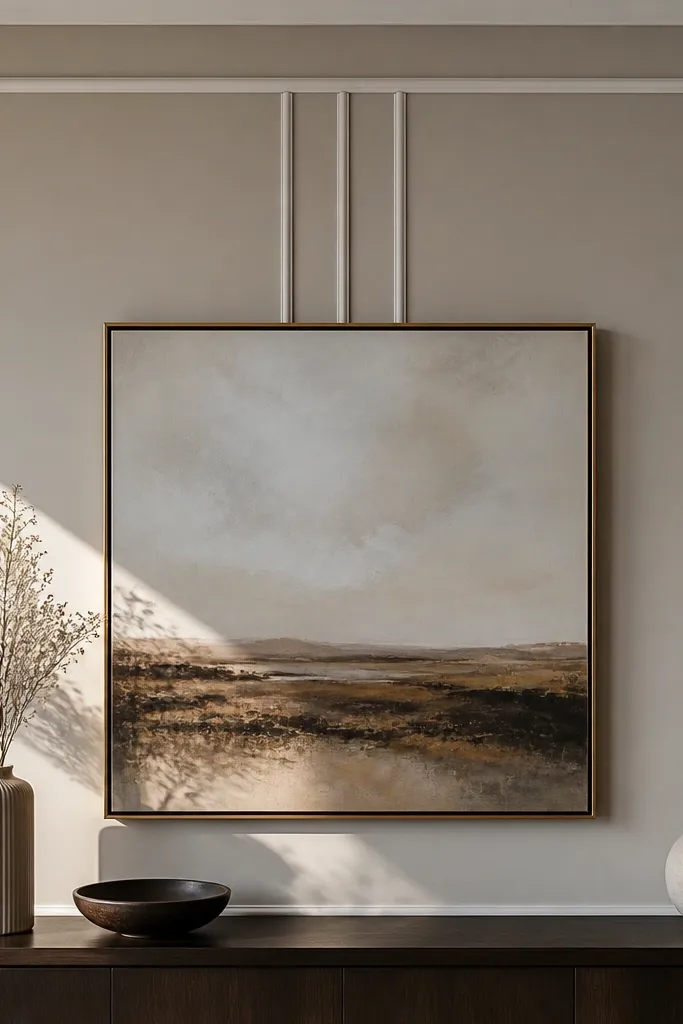
This is a clean, modern way to add moulding without turning the wall into a patchwork. A thin outer border gives you a defined shape, and a few centered vertical accents add interest. It’s perfect above a console, behind a bed, or around a large piece of art when you want a frame but not a full grid. The look is photogenic because it creates both a rectangle and a vertical focal point.
Mark the outer rectangle boundary first and install thin border moulding with 45-degree miters. Then measure the center of that rectangle and space three vertical accent strips evenly across the center zone. Cut the verticals to match the inner height, install with glue and brads, and caulk all joints. Fill nail holes, sand smooth, prime if needed, and paint satin.
Use the same moulding profile for both border and verticals so the wall reads cohesive.
Don’t leave the border too close to the ceiling or floor; it looks cramped.
22. Traditional paneling with a picture rail and corner blocks
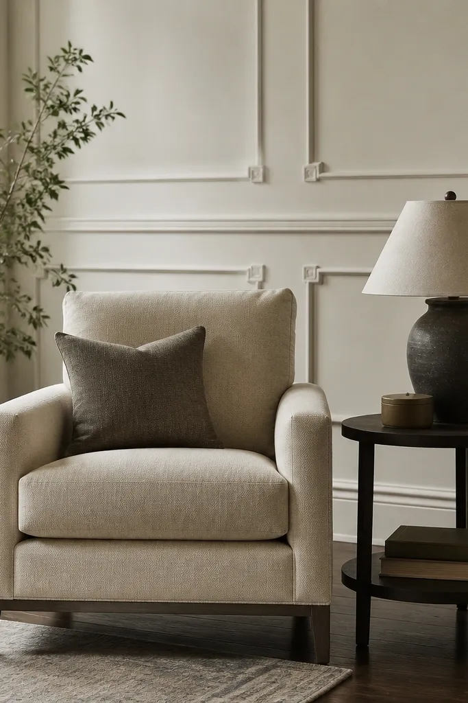
Corner blocks make panel walls look custom-built, even if the moulding layout is simple. Add a picture rail line and a few corner blocks to break up long runs and make the design feel intentional. This works in living rooms and bedrooms where you want traditional detail without heavy ornament. Keep blocks small and consistent so the wall stays crisp.
Install a picture rail at your chosen height and then build the rectangle panel grid beneath it. Add corner blocks at each panel corner where two frames meet — measure block size and align them so they sit centered. Glue blocks in place, then nail the surrounding moulding. Caulk around the blocks, fill nail holes, sand, and paint satin.
Dry-fit blocks without glue first; small alignment tweaks make the final wall look straight.
Avoid placing blocks randomly; they need a repeat pattern to look designed.
23. Vertical board-and-batten with a horizontal belt rail
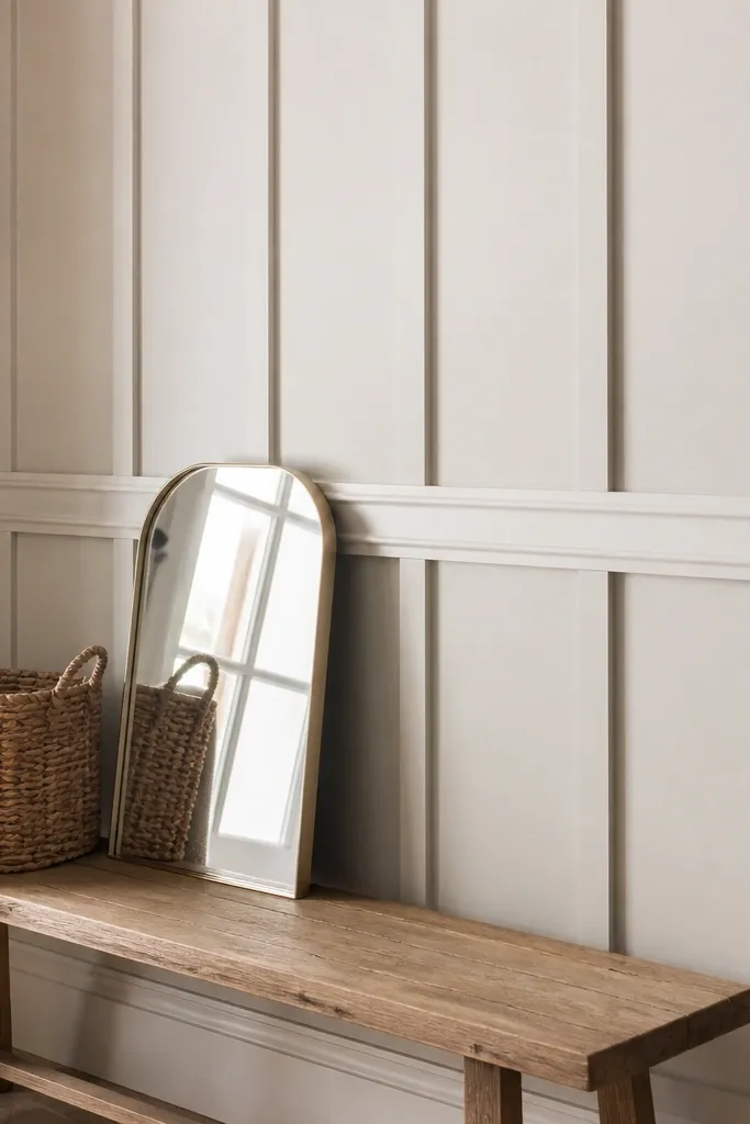
Board-and-batten looks farmhouse, but the horizontal belt rail makes it cleaner and more modern. The vertical battens create strong lines, while the belt rail adds a second layer of structure. This is gorgeous in entryways, bedrooms, and mudrooms where you want texture without complicated geometry. Keep the battens consistent width and spacing for a neat, professional look.
Install vertical battens over a smooth wall, starting from a level line at the top. Decide your batten spacing and mark center lines before you nail anything. Add the horizontal belt rail across the wall at the chosen height, then install corner trim to finish edges. Caulk seams between battens and the wall, fill nail holes, sand lightly, and paint satin.
If you’re using MDF battens, stagger joints slightly so seams don’t line up across the wall.
Avoid wide gaps between battens; they read as unfinished rather than intentional.
24. Modern stepped moulding with layered horizontal tiers
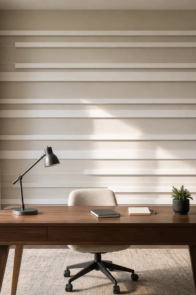
Pick the number of tiers and their heights, then mark a straight baseline for the first tier. Install the lowest tier first, then stack the next tier above it with a consistent gap (around 1-2 in.) so the shadows show. Use miters at corners for a crisp finish, and pre-cut your tier lengths to match the wall width. Caulk and fill, sand smooth, prime if needed, then paint satin.
Stepped tiers give you a graphic look that still feels warm when painted in soft neutral tones. The layers create multiple shadow depths, so the wall looks dimensional even on a flat color. This style is great for living rooms and home offices where you want a feature wall that doesn’t rely on wallpaper. The key is keeping the steps even and the spacing consistent.
Skip thisDon’t let tier edges wander; one uneven step makes the whole wall look off.
Editor's noteUse a spacer block for the gap between tiers so every step lands exactly the same.
25. Corner-to-corner frame with inset rectangles
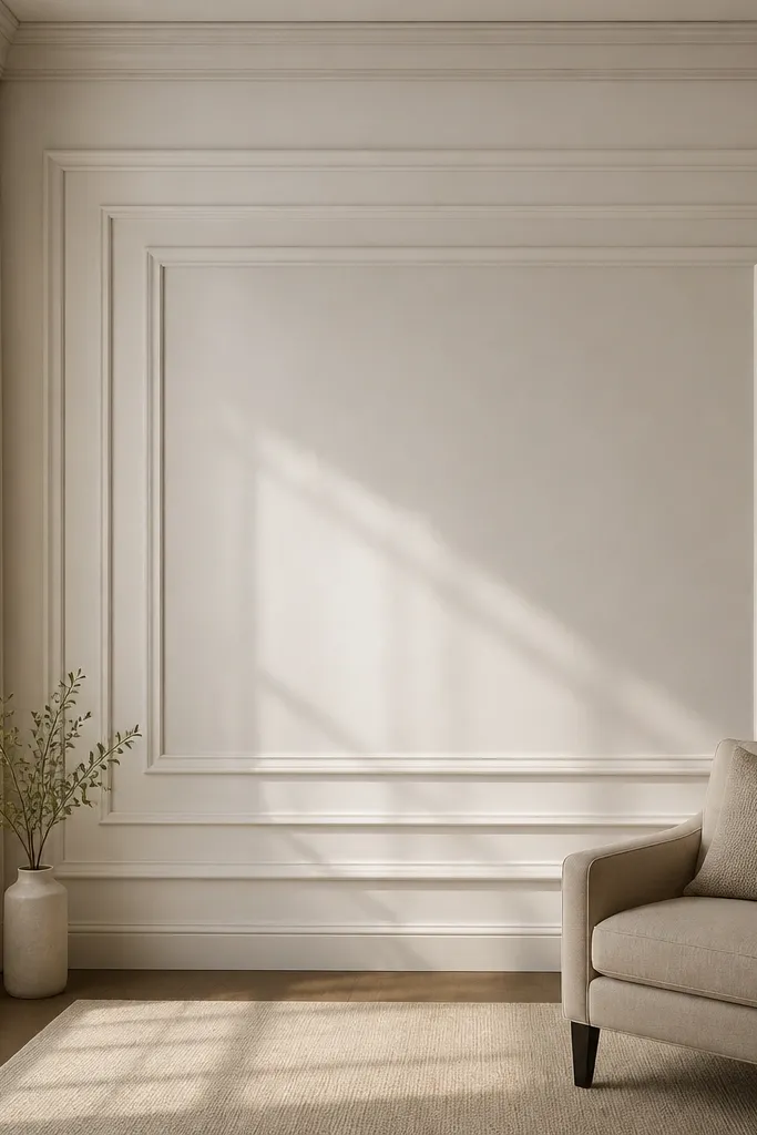
Mark a large outer frame that sits a few inches from each corner and spans most of the wall. Install the outer frame with mitered corners, then measure the inset rectangle sizes and spacing inside. Build inset rectangles by installing internal rails and stiles, keeping all gaps consistent. Caulk all seams, fill nail holes, sand, prime, then paint satin in a light color for maximum shadow contrast.
This idea uses the wall’s corners to create a big, architectural shape, then adds inset rectangles for extra depth. It works well in rooms with one large blank wall where you want it to feel custom-built. The inset rectangles catch light and make the wall look like you hired someone to do millwork. Keep the design symmetrical so it reads polished, not improvised.
Skip thisAvoid asymmetry unless you’re intentionally doing an uneven design; symmetry looks cleaner on camera.
Editor's noteStart with the longest runs — outer frame first — then build the inset rectangles from those fixed edges.
26. Slim vertical panels with a faux column center
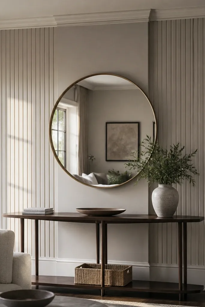
Mark a center line on the wall and decide the width of the faux column. Install narrow vertical moulding panels on both sides with equal spacing, then build a wider center frame around the column area. Use consistent moulding thickness for all vertical pieces, and miter the corners where the center frame meets the side panels. Caulk seams, fill holes, sand smooth, and paint satin.
This look gives you a focal column without building shelves or adding furniture. Slim vertical panels create texture, and a wider center column makes the wall feel balanced. It’s especially good for spaces with a focal point like a console or a large mirror. The center column draws the eye and makes the pattern look designed rather than decorative.
Skip thisDon’t make the center column too wide; it can overpower the rest of the wall.
Editor's noteMeasure spacing from center line, not from the left wall edge, so both sides stay perfectly balanced.
27. Micro panel grid with thick borders
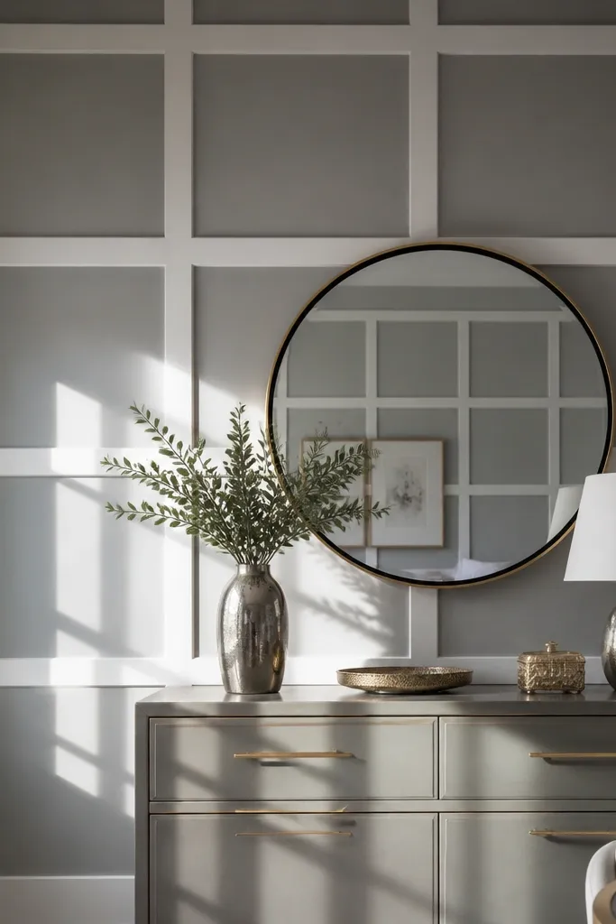
Install the thick border rails first, then lay out the micro squares inside. Mark each square with a grid technique using a tape measure and level, then cut internal dividers to the exact size. Use miters at corners for a crisp look, and glue plus brads for stability. Caulk all joints, fill nail holes, sand, prime, and paint satin.
Micro panels look luxe when you frame them with thicker borders. The thicker rails create a strong outline, while the small squares add detail that reads well in close photos. This is a great option for a powder room or dining nook where you want a high-end look in a smaller area. Don’t go too dense — keep squares around 8-12 in. So the pattern stays readable.
Skip thisAvoid thin borders with micro panels; the wall loses the clean, finished look.
Editor's noteLabel your pieces by row before cutting so you don’t mix up lengths mid-project.
28. Inset arch over rectangle panels
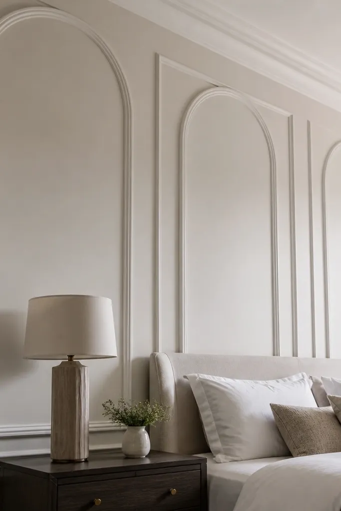
Plan your rectangle panel grid first, then decide where the arches sit above each rectangle. Install the rectangle frames, then cut arch moulding pieces using a template or flexible method for the curve. Glue and nail the arch pieces centered over each panel, then caulk the seam so the join disappears. Fill nail holes, sand smooth, prime, and paint satin.
This idea combines straight and curved shapes, which makes the wall feel playful but still structured. The inset arches add decoration without needing lots of extra pieces across the whole wall. It’s a great fit for bedrooms and foyers where you want a bit of softness. Keep the arches consistent and centered so the pattern looks intentional.
Skip thisDon’t vary arch height; it makes the wall look uneven.
Editor's noteUse the same arch radius across all panels — consistency is what makes it look professionally designed.
29. Modern half-rectangle framing for TV wall
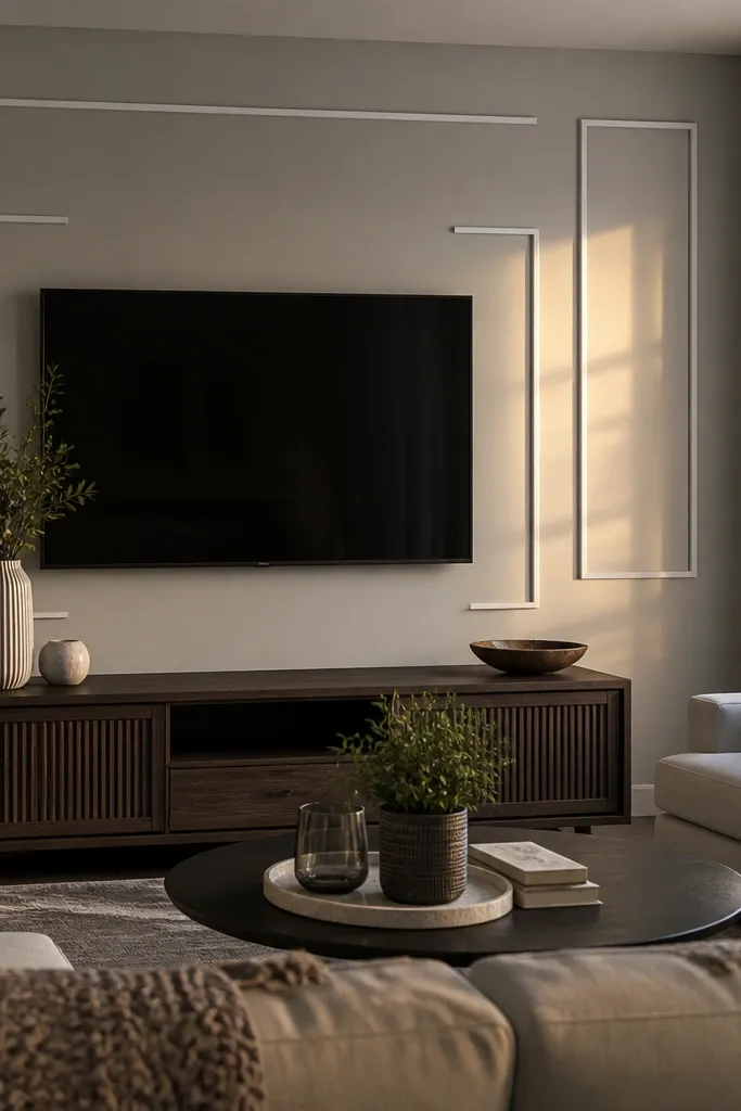
Measure the TV wall and pick an outer frame size that leaves breathing room around the screen. Install the top and side rails first to form a large “U” shape, then add inner vertical and horizontal pieces to complete the half-rectangle look. Use miters at corners for crisp joins and glue plus nails for strength. Caulk perimeter gaps, fill nail holes, sand, prime, and paint satin.
For a TV wall, full grids can feel busy. Half-rectangle framing focuses attention and creates a clean, modern box around the screen area without clutter. The shadows look great in evening lighting because the moulding edges catch light while the rest stays calm. This is ideal for living rooms where you want the room to feel designed but not too formal.
Skip thisAvoid placing the frame too tight to the TV; it makes the whole wall look cramped.
Editor's noteDry-fit rails around where cables run so you don’t end up with a frame that blocks access to outlets.
30. Layered frame corners with stepped reveals
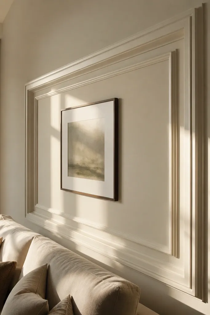
Layered corner reveals create a crisp, high-end look because your eye catches the steps in the shadow line. This design works when you want a central framed area but want the corners to look special. It’s photogenic from the side because the stepped moulding creates multiple depths. Use this on a feature wall behind art or a headboard where corners are visible.
Build the central rectangle frame first using straightforward miters. Then add corner layering pieces that step inward from the outer frame so you get a layered reveal at each corner. Cut each corner piece to match the step thickness and dry-fit before nailing. Caulk seams between layers, fill nail holes, sand, prime if needed, and paint satin for maximum shadow definition.
Make a small “corner test” on scrap boards to confirm the step depth before cutting your full wall pieces.
Don’t make steps random; keep the same number of steps and spacing at every corner.



