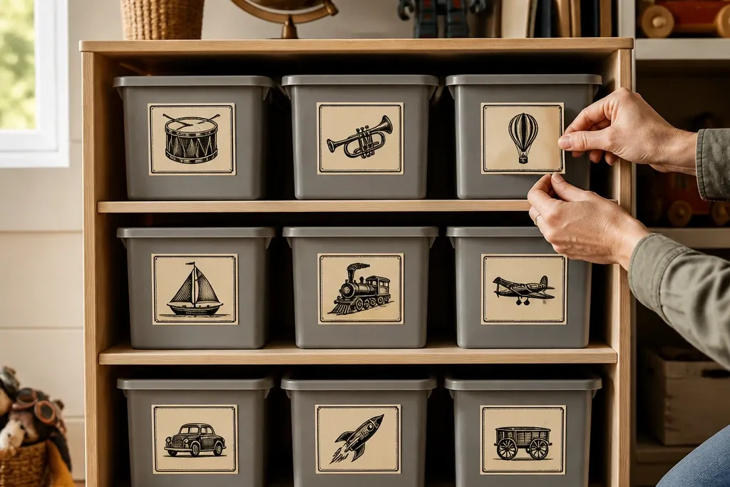
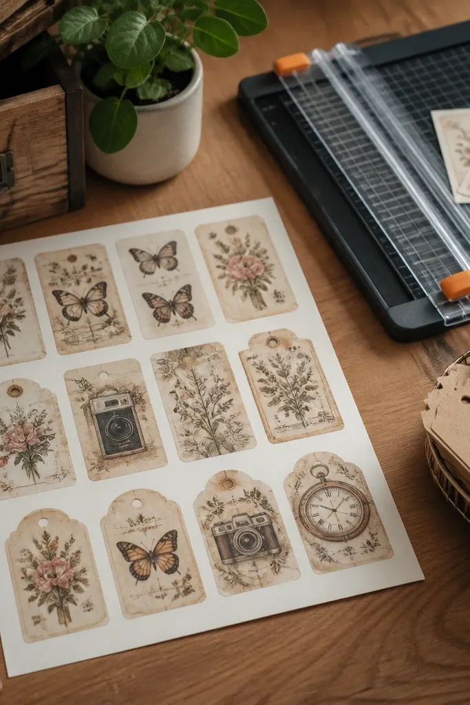
1. Faded Ticket Stub Collage Set
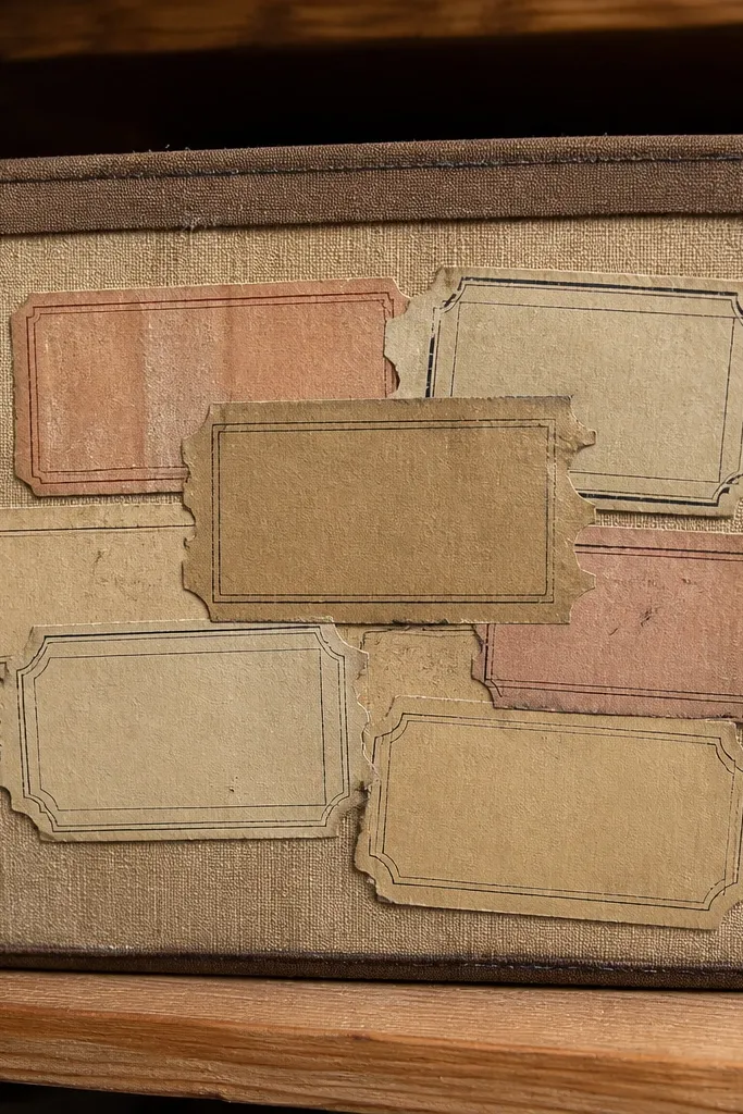
This set looks like you rescued it from an old theater envelope. The ticket shapes bring instant structure, so they don’t feel random on small storage bins. The vintage wear is built into the border, which means you get the aged look without trying to distress anything after printing. Use it to label “quiet time,” “crafts,” or “library” bins where kids can spot the text fast. It’s a strong choice for budget shelves because it makes plain plastic look designed.
Print the sheet at 100% scale on matte sticker paper. Trim each ticket using a metal ruler and a sharp craft knife, then round the outer corners slightly with scissors. Seal the edges with a thin brush-on matte laminate or a strip of clear packing tape that wraps past the border by 1-2 mm.
Editor's noteBefore trimming, do a quick test print on plain paper and check the size against one bin label spot.
Skip thisDon’t skip edge sealing — ticket corners lift first on glossy plastic.
2. Old Postcard Frame Labels
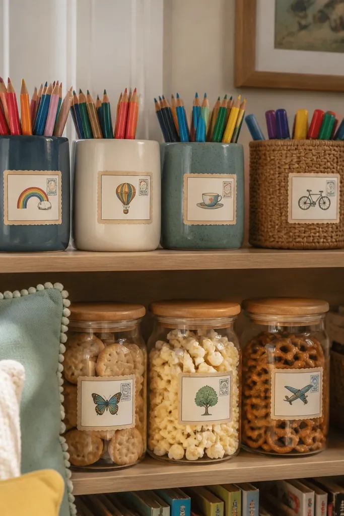
Postcard frames give you vintage charm without needing heavy graphics. The thin border style makes these stickers feel neat on small surfaces like pencil cups, snack containers, and narrow shelf fronts. The tiny stamp icons add realism and keep the look from becoming plain. Because the label area is framed, it’s easier to write or place over existing text on older bins. This style also photographs well for “aesthetic corners” where you want calm, not chaotic.
Print on sticker paper, then cut to the outer frame line. If the sheet includes blank label space, keep it centered so the border stays even. Add a clear top coat over the whole sticker if the surface will be wiped, using a thin brush or laminate sheet.
Match the sticker frame width to your bin front: aim for labels that are 2-3 inches wide on small cubes.
Avoid thin, hairline borders without sealing — they scuff fast on high-touch items.
3. Weathered Compass Corner Stickers
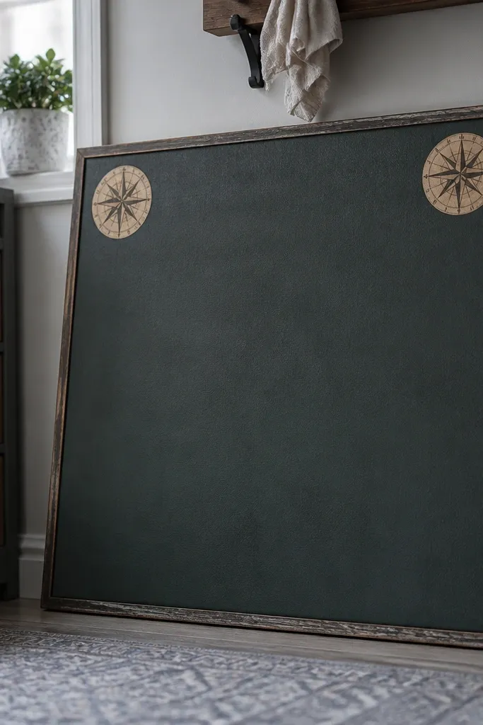
Corner-style compass stickers give a vintage map vibe that’s perfect for kids rooms without filling the whole bin. The small footprint keeps the space light, while the compass rose texture reads clearly even when printed from a budget printer. Place them like design accents on the corners of chalkboards, sticker books, or storage drawers. This is a great move if you want the room to look styled but you don’t want every label screaming for attention. It also works on laptops for a “travel notebook” aesthetic.
Print at 100% and use a craft knife to cut each compass close to the edge. Lightly round the corners so they sit flatter on curved plastic. Seal with matte tape or laminate, focusing on the corners where lifting starts.
Editor's noteUse 4 corner stickers per drawer front for symmetry — it looks intentional, not random.
Skip thisDon’t place compass stickers too big; oversized corners make small-space items feel cluttered.
4. Vintage Botanicals on Cream Paper
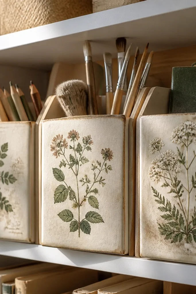
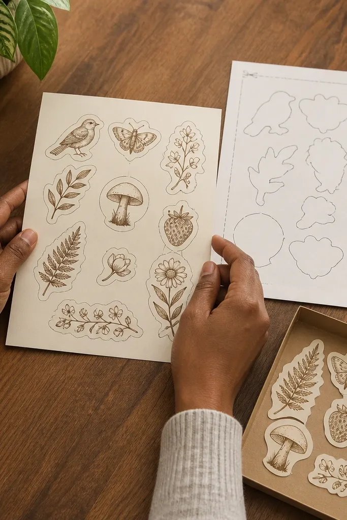
Botanical prints bring a soft, vintage calm. The muted greens and faded browns look great on white shelves, light wood, and off-white bins. This style is photogenic because the subject has texture and a natural focal point. Use it on organizers for art supplies or reading nooks where you want the room to feel cozy, not loud. It also helps hide minor scuffs on storage because the illustration draws the eye away from scratches.
Print on matte sticker paper for less glare. Trim around the illustration, leaving a 1-2 mm cream border so the distressed edge reads like paper. Seal with a clear matte laminate sheet to keep the ink from smearing if you wipe the area.
Editor's noteIf your printer runs slightly cool, warm up the look by choosing a cream-heavy background sticker sheet, not pure white.
Skip thisAvoid glossy sticker paper for botanicals — glare kills the vintage paper feel.
5. Rope Border Label Strips
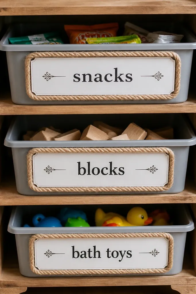
Rope borders make any label feel like it came from an old trunk. These work especially well on small bins because the border gives you a defined area without busy pictures. The tan rope color blends into wood tones and looks clean on gray plastic. Use them for “snacks,” “blocks,” or “bath toys” labels where you want a cohesive system across the room. The look is simple but strong — it turns basic labeling into an aesthetic design language.
Print on sticker paper and cut into strips that match the width of your bin fronts. Apply one strip centered on each container, then press along the edges with a soft cloth. Seal edges with a thin layer of clear tape or brush-on laminate so the rope texture doesn’t peel at the corners.
Keep strip height consistent across bins; matching heights makes the room look designed fast.
Don’t stretch the sticker when applying; rope borders show ripples immediately.
6. Antique Library Card Mini Labels
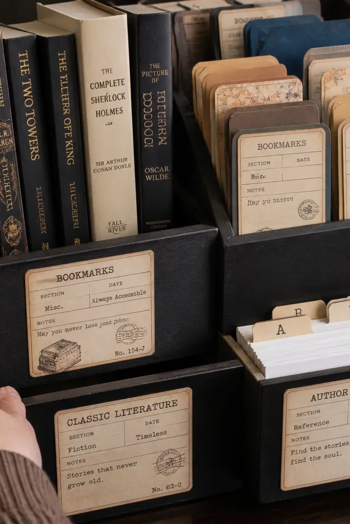
Library card designs are perfect for kids because they feel playful while still looking vintage. The mini card format is easy to place on book bins, bookmark holders, and reading charts. The stamp graphics and typed sections create a realistic paper look even when printed small. Use one card per bin and keep the rest of the surface clean so the labels stay readable. This style also makes a narrow shelf look intentional because the cards line up nicely.
Print at 100% and cut each card with a ruler for straight edges. If there are dotted lines, keep them — they add authenticity. Seal the top with matte laminate if the card will be handled a lot or wiped.
Apply library cards slightly above center on shelf fronts; it looks balanced in photos.
Avoid placing cards on textured surfaces — the edges lift and the distressed look breaks.
7. Vintage Numbers and Fractions Sheet
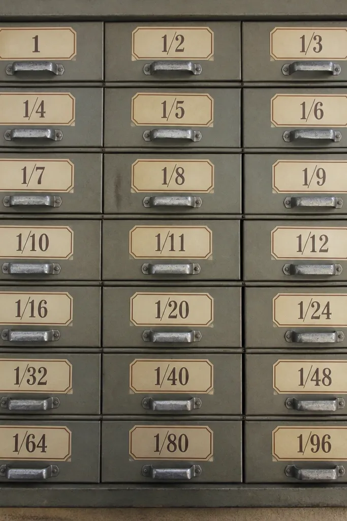
This is the sticker sheet you reach for when you want a system. Vintage numbers and fraction symbols make small-space Vintage Stickers feel organized without adding clutter. Use them to label drawers, cubbies, and storage drawers in a way that looks like a museum catalog. The typography style looks good even when you only use a few numbers, because the ink and spacing feel aged. It’s also a smart choice for kids because it turns “where does it go?” into “which drawer is number 3?”
Print on sticker paper and cut individual numerals. Wipe the surface with a dry cloth first so sticker adhesive bonds better. Seal edges with clear tape if the labels sit on plastic drawers that get cleaned.
Editor's noteUse a limited set of numbers on one shelf so the look stays cohesive and not busy.
Skip thisDon’t mix tiny numerals with large ones on the same bin; it makes the label hard to read.
8. Faded French Market Word Stickers
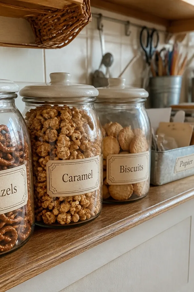
Word stickers add personality without taking up much space. The French-market vibe works because the script looks vintage, but the words are small enough to fit on narrow labels. Use them on snack jars, craft bins, and lunch prep containers where you want the room to look styled but practical. These stickers also photograph well because the ink has contrast against cream and tan backgrounds. Keep the placement tight: a word or two per object looks intentional.
Print at 100% on matte sticker paper. Cut each word close, keeping a narrow margin for the distressed edge. Press firmly and seal with clear laminate if the stickers will be wiped or handled by sticky hands.
Editor's notePick one language tone per shelf — mixing scripts and serif styles makes the look messy.
Skip thisAvoid placing word stickers on dark surfaces unless the sheet includes a high-contrast outline.
9. Sepia Camera Icons and Film Notes
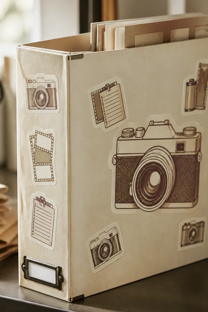
Camera and film-note graphics make a kid space feel like a mini studio. The sepia palette reads vintage, and the icons are simple enough to stay legible at small sizes. Put them on a “photo club” bin, a craft drawer for collage paper, or a shelf for art supplies. This set also makes a great accent on the spine of a photo album or a label on a small binder. It’s photogenic because the icons have clear shapes and a warm background tone.
Print on sticker paper and cut out each icon. Arrange 3-5 icons in a line on one label area so the surface doesn’t look empty. Seal with matte laminate or tape to stop ink from rubbing off when kids grab the bin.
Use a film strip sticker as a base label, then stack icons above it for a layered look.
Don’t put film-strip icons too close together; they merge into a gray blob when printed.
10. Vintage Seal Round Sticker Set
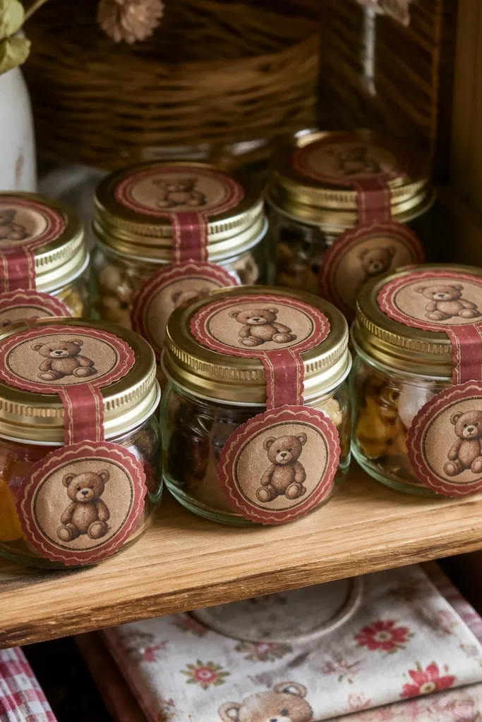
Round wax-seal stickers scream vintage in a clean, controlled way. The shapes look great on small-space Vintage Stickers because they don’t require large text blocks. Use them on gift bags, treat containers, or storage jars where you want a “finished” look. The muted reds and browns match wood and paper tones, and the seal texture adds depth on camera. This is a good option when you want fewer stickers but stronger visual impact.
Print on sticker paper and cut around the round edges using a craft knife or small circle cutter. Apply one seal per jar lid or per drawer front corner. Seal the edges with clear tape so the seal texture holds up to repeated touches.
Editor's noteIf your printer prints reds a little orange, choose sheets with brown-seal accents to keep the vintage tone.
Skip thisAvoid glossy surfaces with these seals; glare flattens the wax texture.
11. Old Map Grid Coordinate Stickers
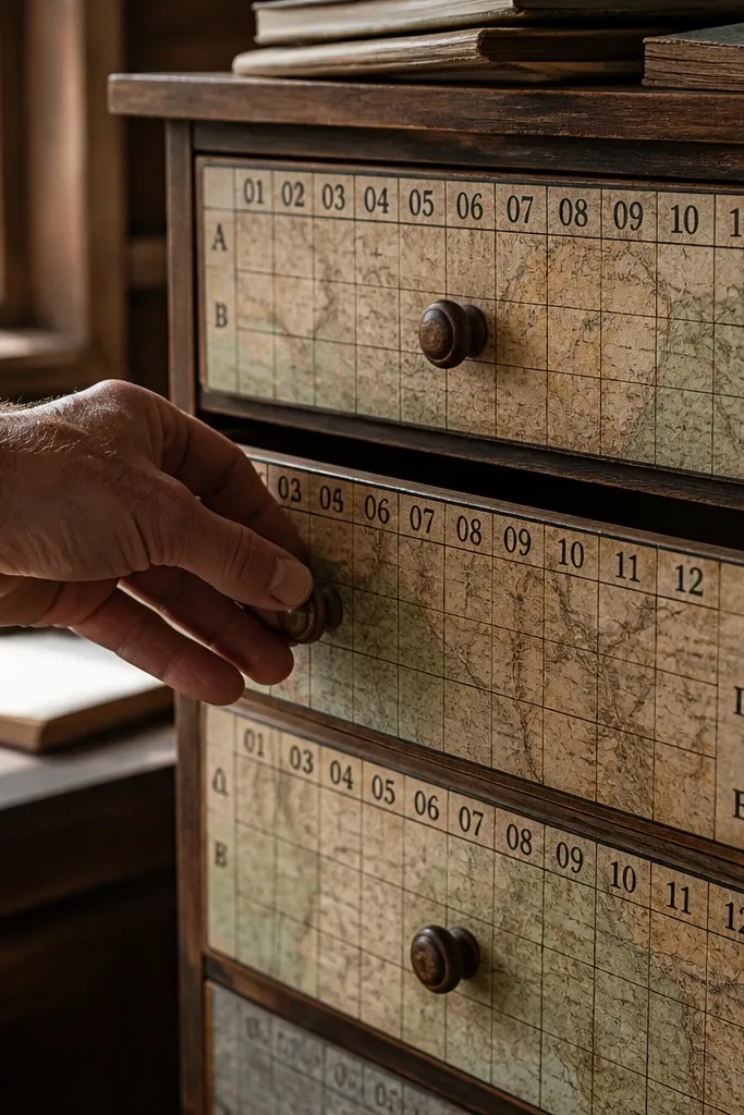
Coordinate stickers look like you labeled a treasure map — but they stay tidy. The map grid lines give structure, and the coordinates make the labels feel intentional. Use them on a scavenger-hunt drawer, a craft supply bin, or a small shelf for science kits. Because the design is mostly linework, it fits small spaces without covering everything. It’s also easy to repeat across objects, so the room starts to look like it has a system.
Print at 100% on matte sticker paper. Cut individual coordinate blocks with straight edges, then add a thin laminate top coat if labels will be wiped. Place each sticker with consistent spacing so the grid vibe stays clean.
Use only one coordinate style per shelf to avoid visual noise from multiple map themes.
Don’t enlarge these too much; fine grid lines blur fast if you scale up.
12. Vintage Sticker Border Strips for Trimming
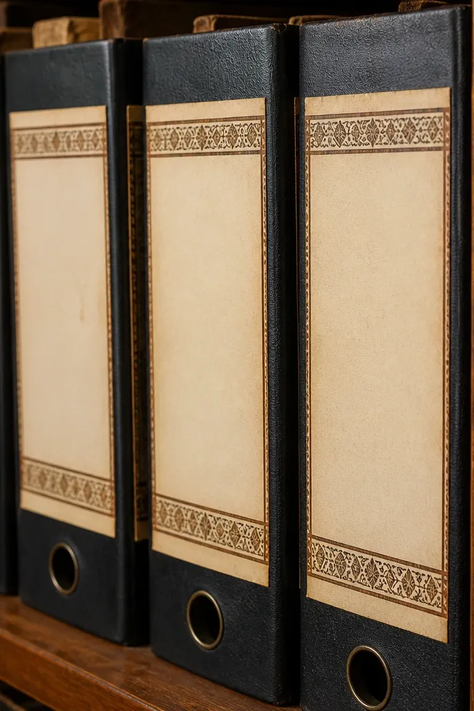
Border strips are the secret weapon for small spaces. Instead of covering a whole surface, you frame it — so you can keep bins, boxes, and folders readable. This style looks best when you use it like a trim: around the edge of a label card, along a folder spine, or as a single line on a drawer. Motifs repeat, which creates that vintage wallpaper feeling without the clutter. It’s also extremely fast to apply because you only need straight placement.
Print on sticker paper and cut borders into lengths matching your object width. Use a metal ruler so the strip stays straight. Press down firmly and seal the ends with a small piece of clear tape so the border doesn’t lift.
If your printer shifts slightly, measure one reference width and cut the strip to that exact width instead of guessing.
Skip stretchy placement — borders show crooked lines immediately in photos.
13. Antique Typewriter Key Label Set
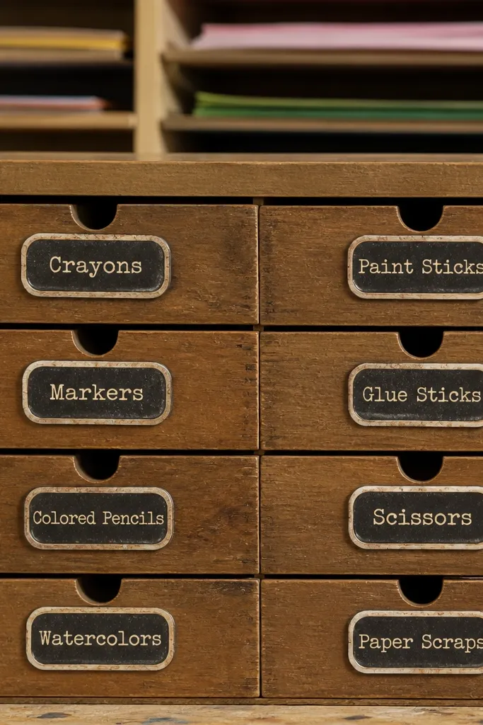
Typewriter-key stickers add a mechanical vintage feel that kids actually enjoy. The key rectangles are easy to place on small drawers because they look like functional buttons. Use them for “letters,” “markers,” “paper,” or “stickers” drawers so the label feels like part of the toy shelf system. The typography style stays readable even when the sticker is small. This set also looks great mixed with plain labels because the keys feel like accents, not full covers.
Print on matte sticker paper. Cut each key rectangle and apply one per drawer front, centered vertically. Seal with matte laminate if you expect frequent wiping or sticky hands.
Editor's noteKeep key labels at a consistent height across the unit — it makes the shelf look designed.
Skip thisDon’t put typewriter keys on curved lids unless the sticker paper is flexible; edges peel on curves.
14. Vintage Postmark Stamp Set
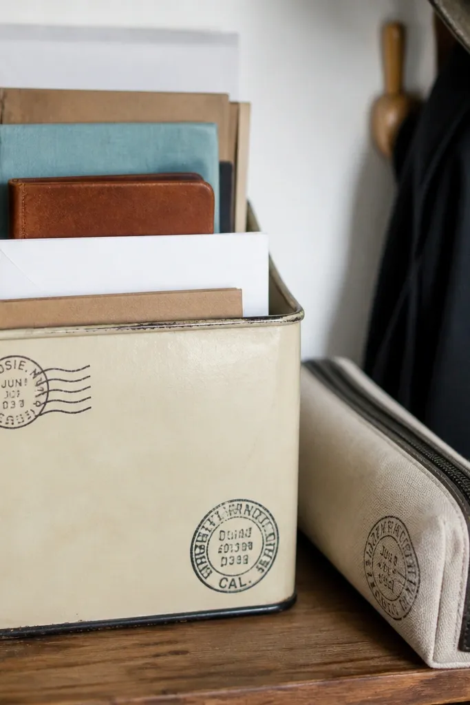
Postmarks give you a vintage stamp look without needing big artwork. They work on small objects because the stamps are compact and high-contrast against cream and tan backgrounds. Use them on mail organizers, craft supply tins, or pencil cases. The best part is that you can place them in odd corners and still make it look intentional. This set is great if you want a vintage aesthetic but your room already has lots of color.
Print on sticker paper, then cut each stamp close to its border. Test placement on a dry surface first so you don’t waste adhesive. Seal edges with clear tape or laminate, especially on the date text areas where ink rubs first.
Use a single stamp color family per shelf so the stamps look like one collection.
Avoid applying on dusty surfaces; postmarks peel faster when there’s residue.
15. Faded Advertisement Cutout Labels
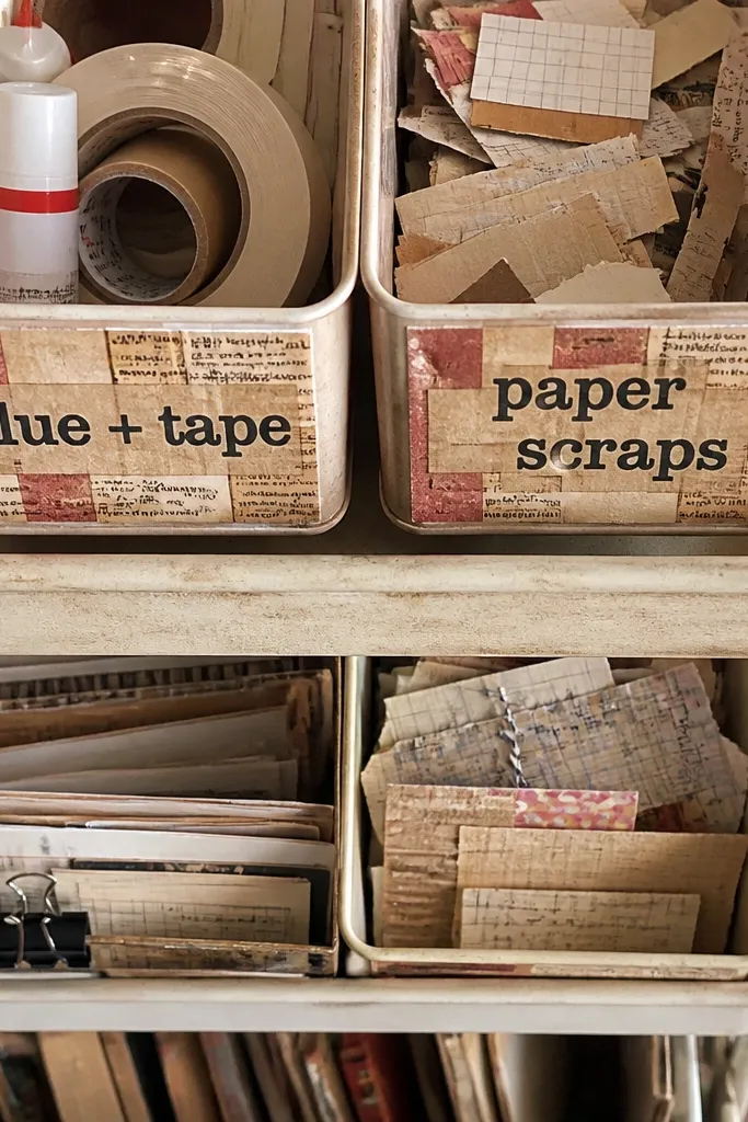
Advertisement-style stickers look like old newspaper clippings, and they’re perfect for making small objects feel collected. The graphic blocks and text strips create a layered look that reads as vintage, not random. Put these on scrap paper organizers, small bins for “glue + tape,” or a kids art cart. Because the design is busy but still boxed, it doesn’t turn into visual clutter. This is a good pick for readers who want the sticker to be the decoration.
Print at 100% and cut each ad block with clean rectangle edges. Apply one ad per object side, keeping margins even so it looks like a cutout. Seal the sticker with a matte laminate sheet to protect the ink from smudging.
If the design feels too busy, use only the biggest ad block per bin and leave the rest of the object plain.
Don’t stack multiple busy ad stickers on the same flat — it looks cluttered fast.
16. Vintage Label Tags with Twine Loop
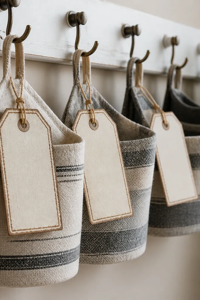
Tag stickers look like you tied them on, even when you stick them flat. The twine loop graphic adds charm without requiring actual string, which is perfect for small-space Vintage Stickers where you don’t want extra mess. Use these on bins, small hooks, or hanging organizers. The tag shape also hides small surface imperfections because it frames the area. They photograph well because the loop graphic creates a little depth even on flat objects.
Print on sticker paper and cut each tag close to the outline. Place tags near the top edge of the object so the loop graphic sits where you’d expect a tied tag. Seal edges with clear tape so the distressed border doesn’t fray from handling.
Choose tags with a blank center if you plan to add kids' names or weekly labels.
Avoid placing tags too low on bins; the loop graphic looks off when it’s near the bottom edge.
17. Sepia Botanical Frame Corners
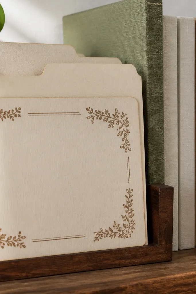
Corner frames give you a vintage picture-frame look without needing a full label. In small spaces, frames feel more intentional than full-coverage stickers because they leave breathing room. Use them to decorate the corners of paper folders, small notebooks, or label cards on shelves. The sepia leaf drawings read warm and vintage, and the corner placement makes the sticker look designed even when it’s small. This is a great option if you want the aesthetic but your objects have their own busy design.
Print and cut each corner frame separately. Apply corners to the four edges of one label card or notebook cover, aligning the inner edges. Seal with a clear matte laminate sheet if the paper item gets handled frequently.
Lay out corners on a scrap first using painter’s tape as guides to keep spacing even.
Don’t eyeball symmetry; slight corner misalignment shows in photos.
18. Vintage Recipe Card Sticker Sheet
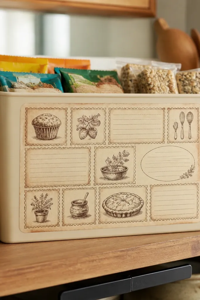
Recipe cards make a homey vintage look that works for kids too. Use them on snack bins, kid kitchen helpers organizers, or a “baking science” cart. The card layout gives you a clear place for names, dates, or simple rules like “wash hands first.” The vintage stamp and handwritten-style text blocks keep it charming even when you only use a few cards. It’s also photogenic because card edges and stamps create depth on camera.
Print on sticker paper and cut each recipe card. Apply one card per bin front, and press down starting in the center then working outward. Seal with matte laminate for wipe resistance on surfaces kids touch.
Use recipe cards for weekly rotation labels so the shelf stays fresh without redesigning everything.
Avoid placing recipe cards on glossy plastic without sealing; edges curl.
19. Vintage Train Ticket Destination Stickers
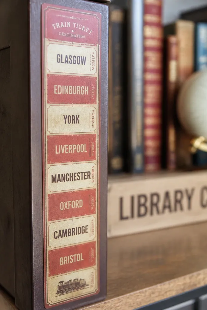
Destination tickets bring motion and story to a kid shelf. The strip format fits narrow surfaces like the side of a small bin or the edge of a shelf label. The faded stripe background looks vintage, and the destination text keeps it functional. Use these for “homework station,” “play area,” or “library corner” organization. The look is playful but still tidy, which matters in small rooms where clutter adds up fast.
Print at 100% and cut tickets into strips that match your object width. Apply vertically on narrow fronts so the text is readable. Seal with clear tape around the edges, especially where the stripes meet the cut line.
Editor's notePick one or two destinations per shelf and repeat them so the room feels like a theme.
Skip thisDon’t place tickets horizontally on narrow bins — text gets cramped and unreadable.
20. Antique Seal Monogram Stickers
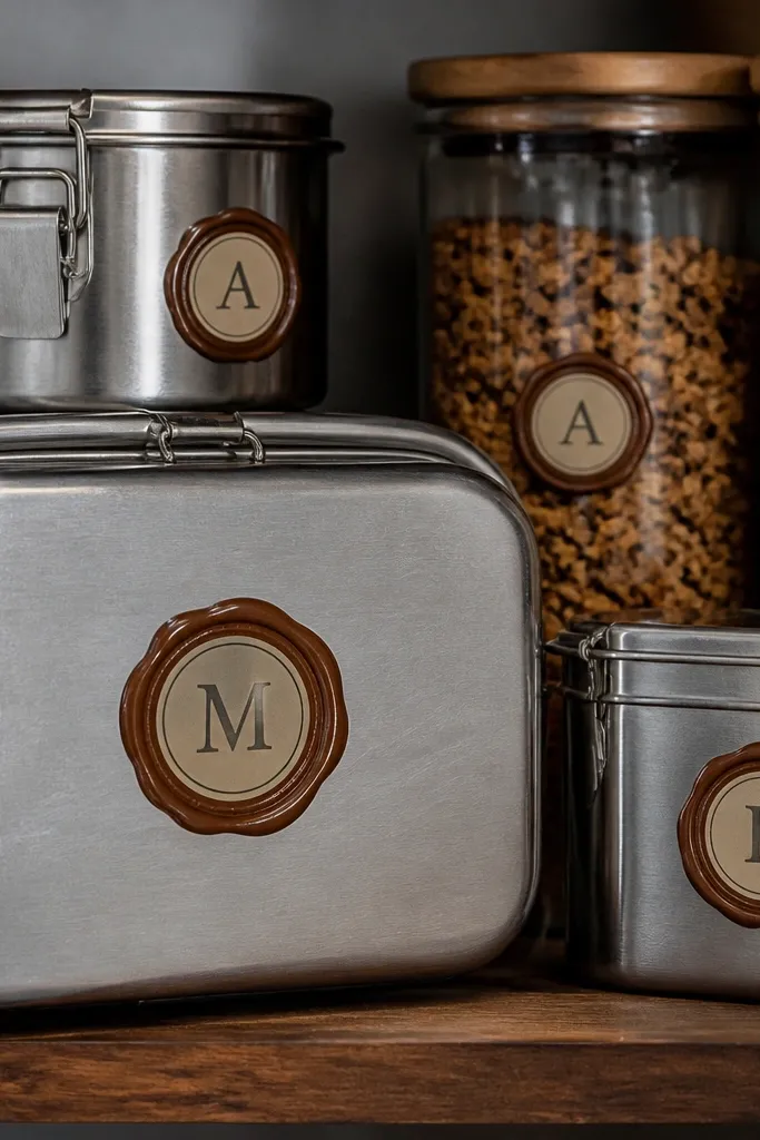
Monogram seals are the fastest way to make a small-space sticker setup look intentional. The design repeats cleanly, so you can label sets of items without the room turning into a sticker collage. Use them on lunch boxes, water bottles (on the dry storage area, not where liquids sit), or pencil cases. The letter center gives you a clear organizing system that kids can follow. The vintage seal texture adds depth so these look good even at small sizes.
Print on sticker paper and cut out each monogram seal. Clean the surface with a dry microfiber cloth so adhesive bonds well. Seal the edge with clear tape if the item gets frequent handling.
Editor's noteUse the same letter style across the room; mixing monogram fonts makes everything feel mismatched.
Skip thisAvoid placing seals on rough painted surfaces; they don’t lay flat and edges lift.
21. Vintage Weather Chart Mini Stickers
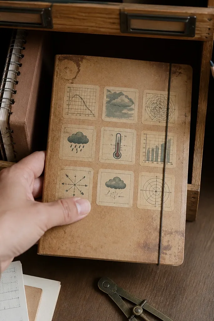
Weather charts are a fun vintage science vibe that still looks neat. The mini icons are easy to place on a small “weather journal” folder or a shelf organizer. Because the sheet is icon-based, you can use only a few stickers each day, keeping the look fresh without reprinting everything. The vintage palette makes it fit with older decor and neutral walls. It also photographs well because icons are bold and spaced clearly.
Print on matte sticker paper and cut each icon block. Apply one strip or chart to the front of a small notebook or folder pocket. Seal with a matte laminate if kids will flip pages and touch the stickers often.
Editor's notePut weather stickers on a folder spine so they show when the folder is in a bin.
Skip thisAvoid using glossy sticker paper — icons can reflect light and look washed out.
22. Faded Newspaper Strip Labels
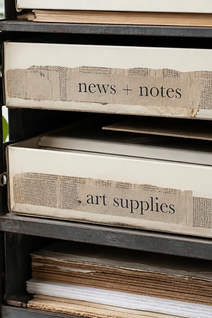
Newspaper strips give you vintage texture and a sense of history without needing big graphics. Use them on paper supply organizers, art drawers, or a “news + notes” board. The strips are long and narrow, so they work perfectly on small surfaces where a square sticker feels too bulky. The print blocks look authentic, and the distressed edges help it blend into modern objects. This is a strong choice for budget kids rooms because it turns plain storage into a styled shelf.
Print on sticker paper and cut strips to fit your object width. Apply strips straight using a metal ruler as a guide for alignment. Seal the edges with clear tape so the distressed border holds up to handling.
Use one consistent strip height across a set of bins so the shelf looks like it was designed, not decorated randomly.
Don’t place newspaper strips over curved plastic; they wrinkle at the edges.
23. Vintage Theater Playbill Stickers
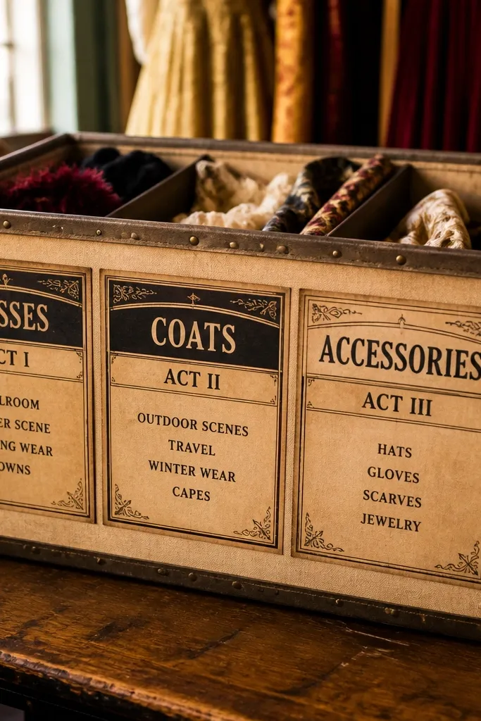
Playbill stickers feel like a vintage backstage pass. The design is structured, with clear sections that look good when printed small. Use them on a costume organizer bin, a craft drawer for masks, or a small “stage props” shelf. The warm sepia tones make the sticker pop on light backgrounds, and the typography style reads clearly. It’s photogenic because the playbill layout creates a natural focal point.
Print on sticker paper at 100% and cut each playbill rectangle. Apply one per bin front, centered, then press with firm pressure along the edges. Seal with matte laminate if the bin front gets wiped or cleaned.
Choose playbill stickers with one main title line — it keeps them readable at small sizes.
Avoid tiny multi-line text designs; they get fuzzy at typical home printer resolution.
24. Old Map Compass Rose Singletons
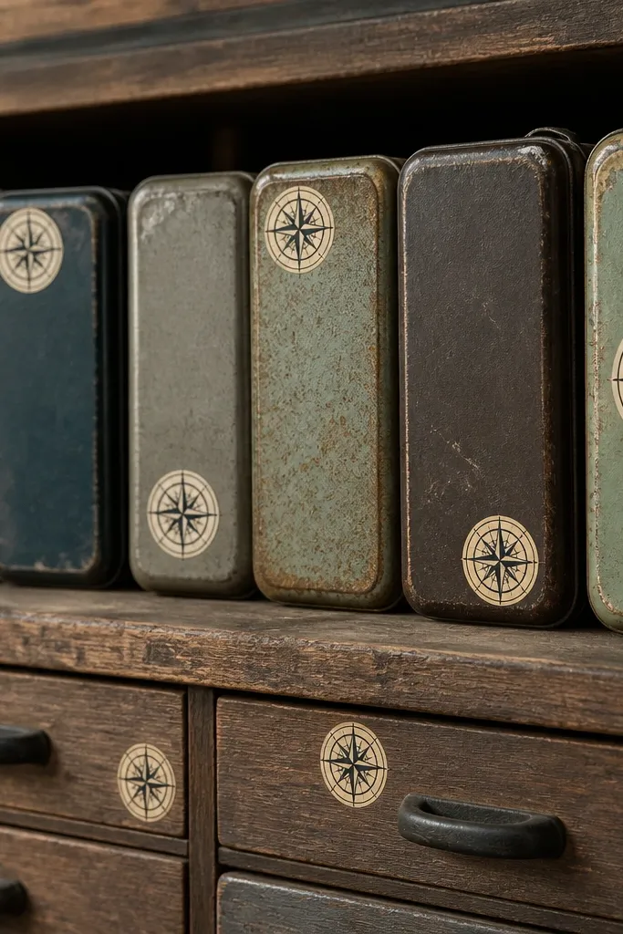
Singleton compass roses give you flexibility. You can sprinkle them across a few small objects without committing to a full theme sheet. The vintage linework stays crisp when the icon is bold, which is why these work for small-space Vintage Stickers. Place them on drawer fronts, pencil tins, or the corners of storage labels. Because they’re standalone, you can match color tone across items without repeating the same layout. This is a good option when you want variety but still want a cohesive vintage feel.
Print on matte sticker paper and cut each compass rose close to the border. Apply to clean, dry surfaces and press from center outward. Seal edges with clear tape if the stickers face friction from hands or frequent opening.
Editor's noteUse 2-3 compass rose sizes max; too many sizes makes the look scattershot.
Skip thisAvoid very pale compass designs; they disappear on cream objects when the printer ink is light.
25. Vintage School Blackboard Label Set
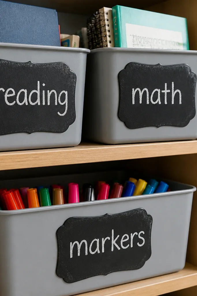
Blackboard-texture labels look great in kids spaces because they feel interactive. The chalk-style text reads like it can be rewritten, even though it’s printed. Use these on small bins for classroom-style organization: “reading,” “math,” or “markers.” The blackboard background gives high contrast, so labels stay readable even when the object is near other items. This is a smart pick for small rooms because dark labels anchor the shelf and reduce the “everything is the same color” problem.
Print on sticker paper, then cut each label rectangle. Apply to clean surfaces and press hard along the edges. Seal with a clear top coat if the label will be wiped; chalk-style prints can smear if left unprotected.
Editor's noteIf you want a handwritten feel, add a chalk marker over the sticker using a light touch so it doesn’t soak the ink.
Skip thisDon’t skip sealing — chalk-style areas scuff fast under fingers.
26. Vintage Frame Labels with Corner Flourish
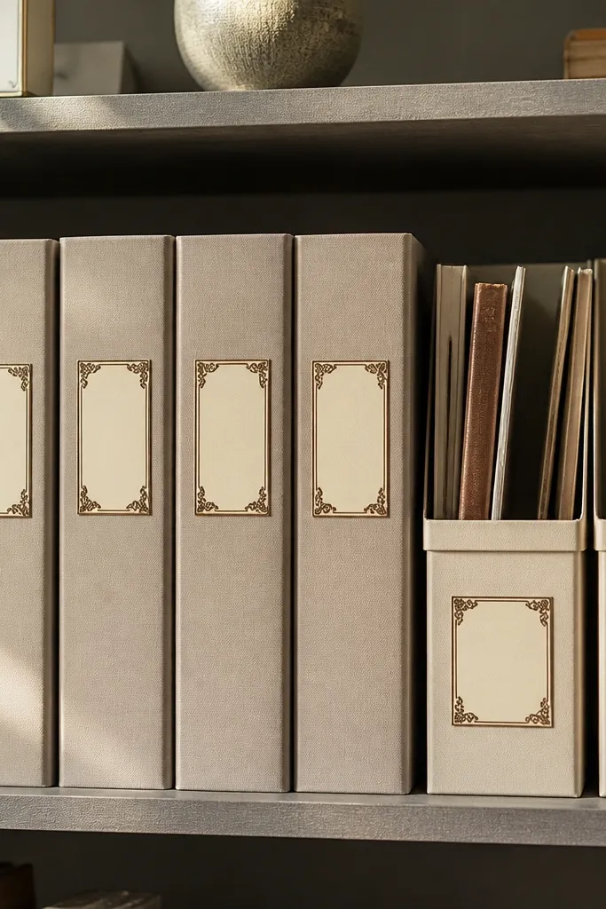
Framed labels with corner flourishes make small spaces look finished. The border gives structure, and the corner decorations keep it from looking like boring printer labels. This style works best on bins and folder covers because it creates a consistent visual system. If you use the same frame design across multiple objects, the room looks coordinated even when items are different colors. It’s also easy to keep photogenic because frames create natural lines for the eye.
Print on matte sticker paper and cut rectangles with straight edges. Center each label on the front face of the object, then smooth with a microfiber cloth. Seal edges with matte laminate for durability on frequently touched surfaces.
Use frames on only the “front-facing” side of bins so you don’t over-decorate every surface.
Avoid applying frames over glossy glare-heavy plastic without sealing; reflections make the vintage ink look flat.
27. Antique Shop Sign Word Strip Stickers
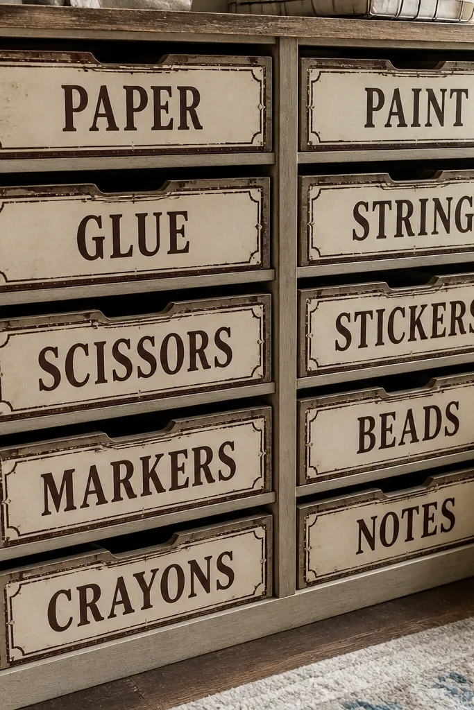
Old shop sign strips are a clean vintage aesthetic that doesn’t require illustrations. The distressed borders give age, while the word strip format stays readable on small shelves. Use them on storage drawers, cubbies, or a narrow wall ledge where you want labels to look like decor. This style also works well for kids because it feels friendly and familiar, not like a museum label. The strip shape makes it easy to align across multiple bins.
Print on sticker paper and cut strips to match your label area width. Apply one strip per bin front, keeping left edges aligned for a uniform look. Seal with clear tape if you need wipe resistance.
Pick a two-tone palette: tan strip with dark ink. It prints more consistently across budget printers.
Don’t mix multiple font styles on the same shelf; it breaks the sign-like look.
28. Vintage Doodle Icons for Craft Bins
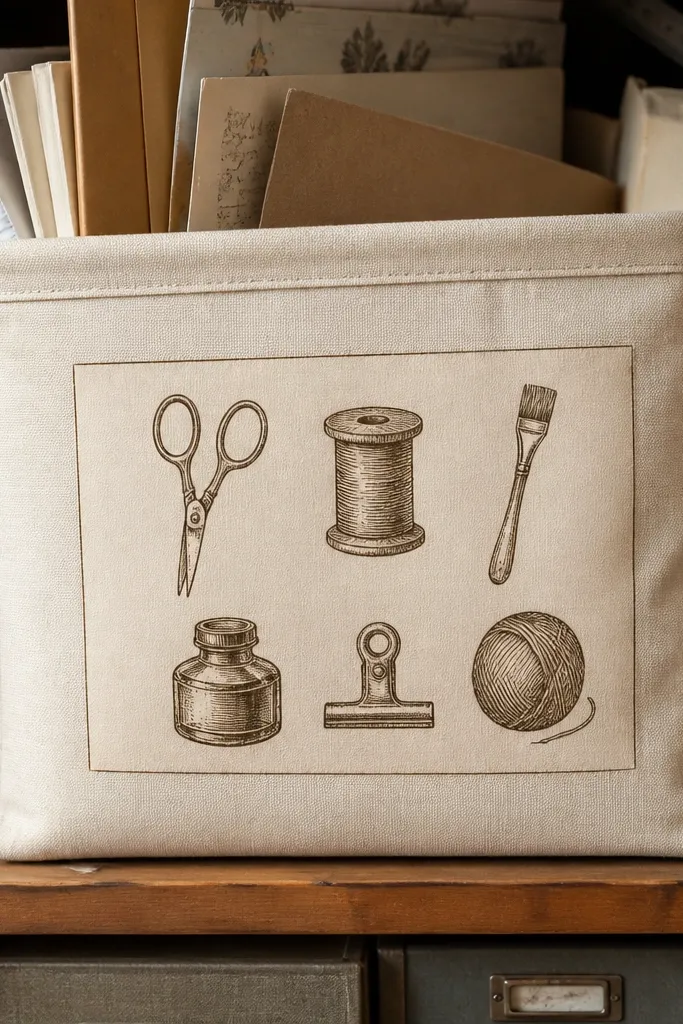
Doodle icons are the playful side of vintage sticker design. They work well on craft bins because the items connect to what kids use, and you don’t need long labels. The sepia linework keeps it vintage even though it’s cute. Use 4-6 icons on a single bin front instead of covering the whole surface. This gives you a clear “craft zone” look that still feels organized. It’s photogenic because icon clusters create a focal point without heavy background color.
Print on sticker paper and cut icon clusters as separate pieces. Arrange icons in a tight rectangle on the bin front, then press down starting from the center. Seal edges with matte laminate if the bin will be handled by kids with messy hands.
Editor's noteKeep icon cluster size consistent across the set so the shelf looks uniform.
Skip thisAvoid placing icons too close to the sticker edge; they lift first and the cluster looks unfinished.
29. Vintage Postcard Stamp and Corner Set
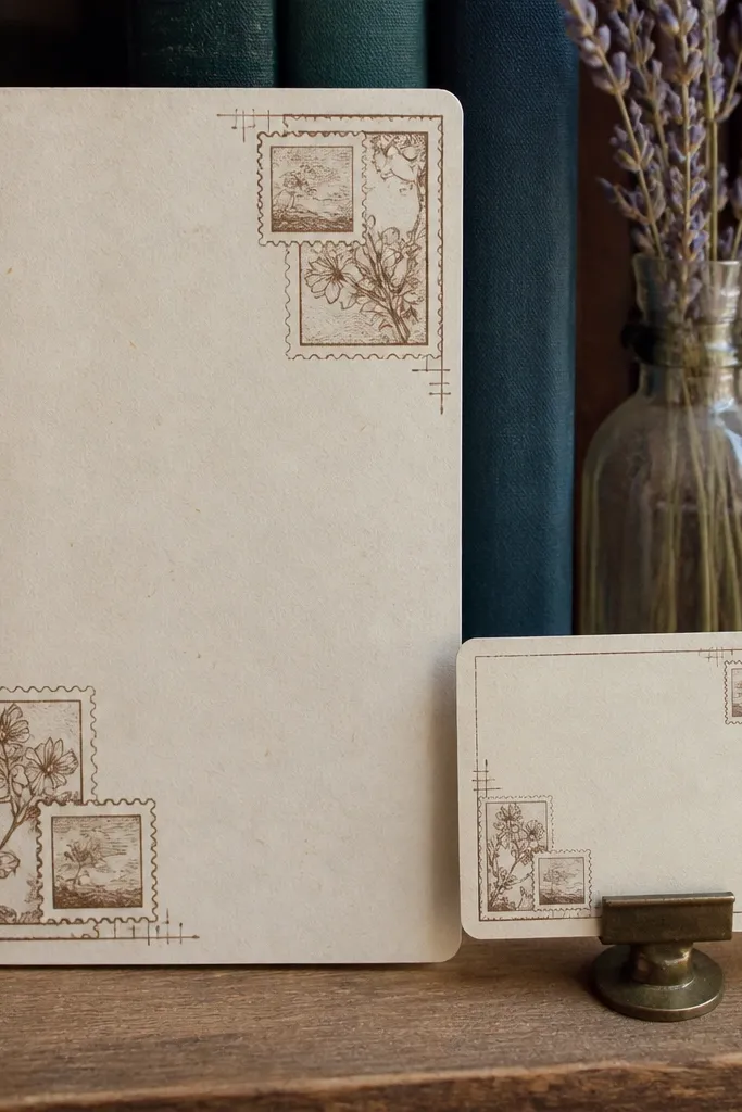
This set blends postcard corners with stamp marks for a layered vintage effect. Use it on small label cards or notebook covers where you want corners that frame the page. The stamp blocks add realism, while the corner frames keep things tidy. It’s ideal for small-space Vintage Stickers because you can place just four corners and one stamp and the object looks styled. The look stays photogenic because it creates a border without filling the whole surface.
Print and cut corner pieces separately. Apply corners first, aligning them to the label card edges, then add the stamp block near the top right. Seal with a clear laminate sheet over the whole sticker area if it will be handled often.
Editor's noteIf your printer cuts off tiny stamp text, print a second copy and use only the larger stamp blocks.
Skip thisDon’t center stamps on the exact middle; stamp style looks right when it sits near a corner.
30. Faded Badge Nameplate Stickers
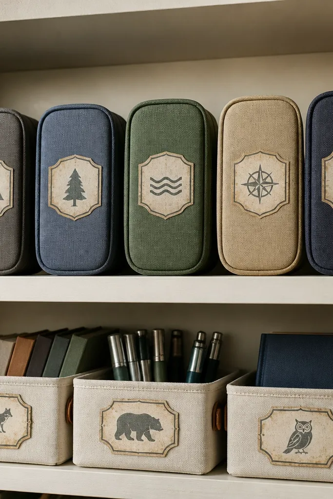
Badge nameplates make labeling feel like a club. The vintage border and worn texture look good on small bins, pencil cases, and classroom organizers. Because the badge shape is compact, it fits tight shelves without making them look overcrowded. Use them for kids' names, favorite activities, or “team” labels for group play. The badge layout gives a clear focal point so photos look clean even when the shelf has other items.
Print on sticker paper and cut each badge around the outer border. Apply to clean surfaces, then press firmly along the badge edges. Seal with clear tape if the badge will be rubbed by backpacks or frequently opened cases.
Editor's noteUse badges on the front-facing side only; keep the sides plain for a calmer look.
Skip thisAvoid tiny badges on big objects; they look lost and feel accidental.