1. Old Postage Stamp Sheet With Fake Cancel Marks
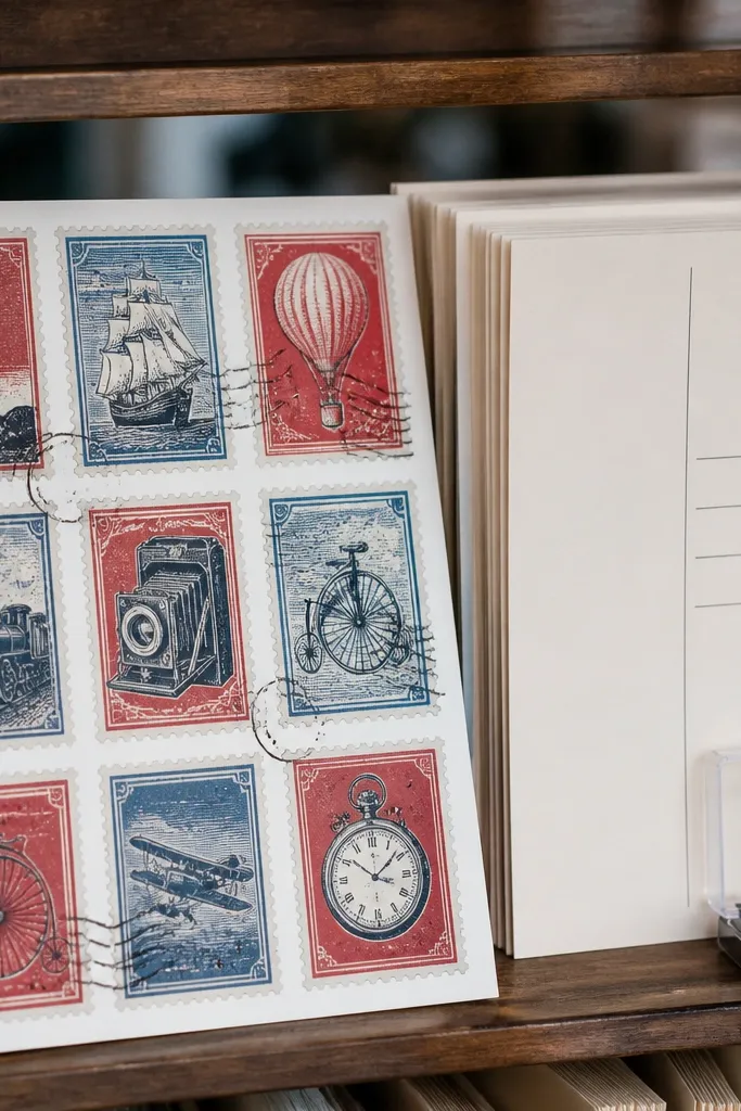
This sticker sheet looks like it came off a postcard from 1958, and it works because postage designs naturally have bold borders and a limited color palette. The cancel marks add texture even when printed at home, so small print imperfections don’t ruin the look. For renters, it’s safer than wall decals because you’re sticking to objects, not paint. Use it for kids' water bottles, lunch boxes, and journal covers where you want a “found label” vibe that still reads clearly from a few feet away.
Print the sheet at 100% scale on matte sticker paper, then set your printer to Photo or Best quality with matte paper selected. After printing, let the ink dry for 15 minutes, then use a metal ruler and hobby knife for full cuts or a kiss-cut mat for partial cuts. Place a thin sheet of clear contact film over the top side only if you want extra scuff resistance. Finally, round corners lightly with scissors if you see sharp edges catching on fabric.
If your cancel marks look too gray, increase print density by 10-15% in your printer’s manual color settings.
Don’t laminate the whole sheet before cutting — it makes the blade skate and leaves ragged edges.
2. Vintage Library Card Tabs and Due-Date Blocks
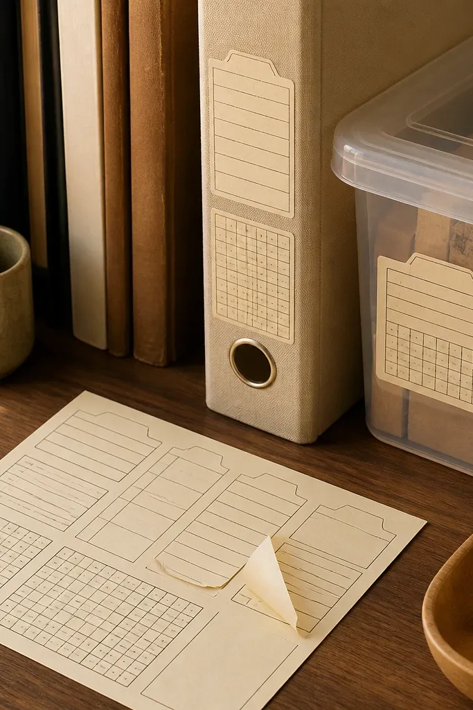
Print on matte sticker paper with the page set to borderless OFF so your text stays inside safe margins. After printing, cut each tab with a straight-edge blade, then cut the corners into small rectangles so the “card” shape stays crisp. If you want extra durability, apply a thin layer of removable laminate film on top, then press firmly with a brayer or the back of a spoon. Seal the edges by trimming any film overhang so it doesn’t peel.
Library-card stickers read instantly as “vintage” because of the layout: tabs, boxes, and the grid rhythm. They’re photogenic on binders and storage bins because the typography blocks catch light without needing heavy color. This is a great renter-friendly Vintage Stickers option for kids because it sticks well to smooth plastic and paper covers, and it looks intentional rather than random. The due-date blocks also let you label things quickly for school routines.
Skip thisAvoid tiny font sizes under 8 pt — kids' handling will make them look muddy.
Editor's noteUse a 2 mm margin around each tab so the blade has something clean to cut through.
3. Retro Botanical Labels in Muted Greens
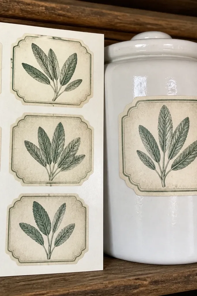
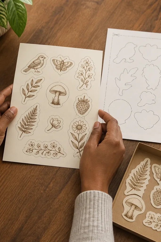
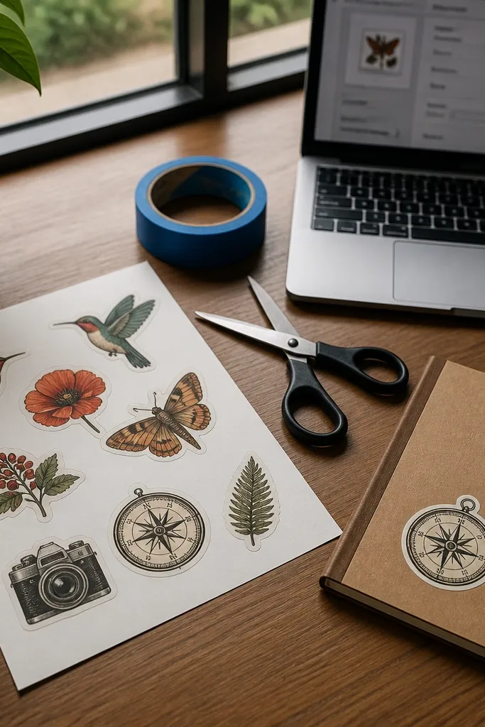
Botanical labels look classy without being flashy, and muted greens make them stand out on white and light-colored items. They’re also forgiving because leaf illustrations have natural variation — they still look vintage even if your printer slightly shifts a shade. This sheet is perfect for kids' science notebooks, plant pots, and craft supply jars where you want organization that looks cute. The vintage feel comes from using off-white backgrounds and thin, dark outlines rather than bright modern colors.
Print on matte sticker paper using “Plain Paper” or “Matte” mode depending on your printer, and choose the highest quality setting. Let the sheet dry fully, then cut with a sharp blade and a cutting mat to avoid tearing the paper fibers. Apply a removable clear film only if you plan to place stickers on items that get wiped down. If you’re sticking to glass jars, wipe the surface with alcohol and let it dry before applying.
If greens look too neon, reduce saturation in your print dialog by 5-10%.
Don’t use glossy paper for botanical designs — it makes the outlines look harsh and shiny.
4. Worn Paper Quote Tags With Cream Background
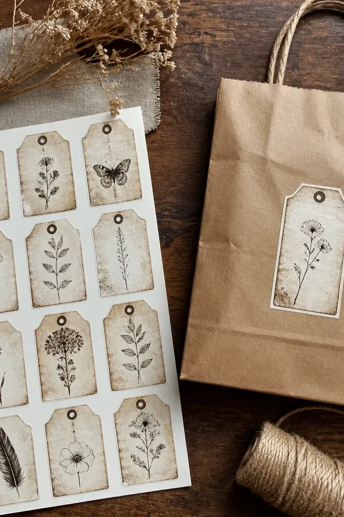
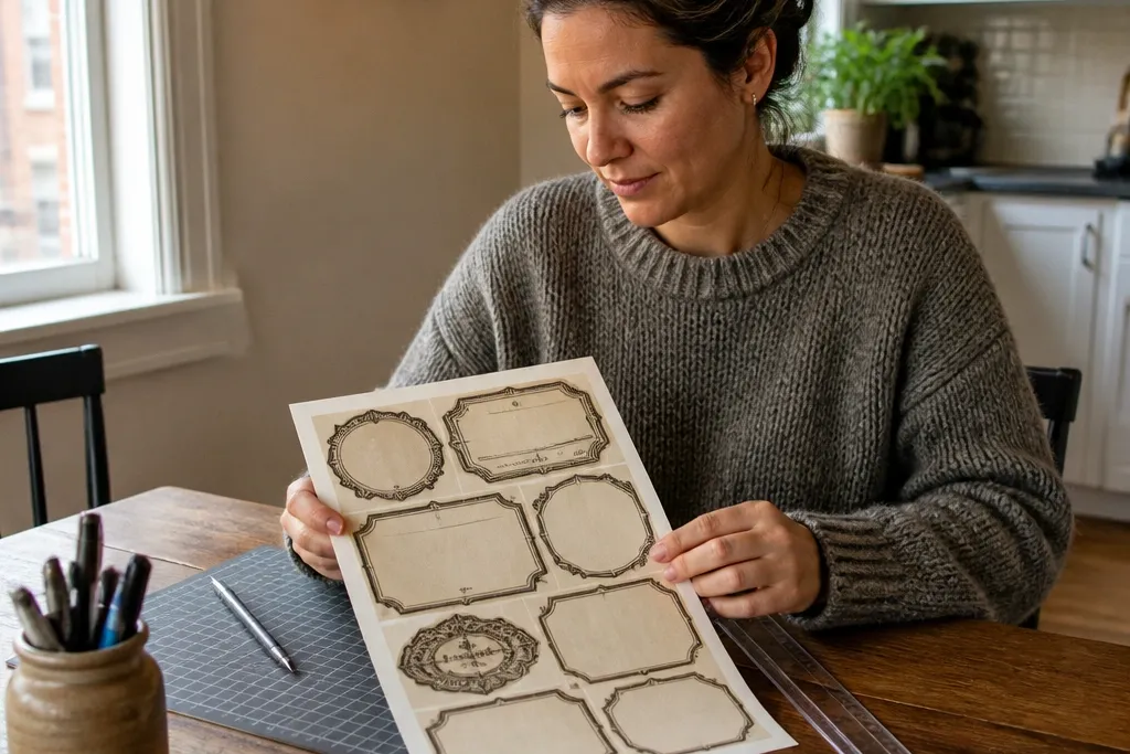
Print at 100% on matte sticker paper, then keep the page centered so the cream background doesn’t get clipped. Cut into tag shapes with rounded ends using scissors plus a blade for the final straight edge. If you want them to survive hand-sanitizer wipes, add a removable matte clear coat after drying, then wait 30 minutes before handling. Store finished stickers flat with parchment between sheets to prevent sticking.
These tags look like they were stamped on aged paper, which is what makes them photogenic. The cream background and worn edges hide minor edge-cut issues, so your final sheet still looks “designed,” not DIY. They work beautifully on kid planners, pencil cases, and small gift bags where you want a soft vintage tone. This is a renter-friendly Vintage Stickers pick because you can stick them to packaging and school supplies without worrying about wall residue.
Skip thisDon’t cut right after printing — wet ink can smear under the blade.
Editor's noteUse a bone folder to rub down the edges so the tag corners stay flat.
5. Vintage Travel Label Stickers With Compass Lines
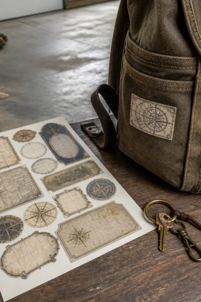
Print on matte sticker paper and set your printer to “High” quality, then turn off any “auto enhance” options that boost contrast too hard. Cut full pieces with a blade and ruler, or kiss-cut if you want a tidy sheet you can peel one at a time. If the borders look too light, print again with slightly higher brightness but keep saturation steady. Apply stickers to smooth plastic after cleaning with rubbing alcohol.
Travel labels look instantly nostalgic because they have borders, coordinates, and thin linework. The compass lines add a “map” texture that looks good even on small sticker sizes. For kids, this sheet turns boring items into themed gear — lunchboxes, backpacks, and water bottles look fun without being childish. It’s also a smart renter-friendly Vintage Stickers choice because you’re customizing your stuff, not altering your home.
Skip thisAvoid thick black outlines — they look modern and blocky next to faded travel art.
Editor's noteKeep coordinates bigger than you think — small numbers get lost once cut.
6. Old Apothecary Jar Labels and Ingredient Blocks

Print on matte sticker paper, then cut into rectangle labels with a small chamfer at the corners so they look like old tags. Use a label corner punch if you have one; it makes the sheet look consistent across all pieces. Let ink dry completely, then apply removable clear film if jars get handled daily. For best adhesion, press for 20-30 seconds and avoid sticking on textured or dusty plastic.
Apothecary labels have a built-in hierarchy: ingredient line, batch number, and symbol. That structure makes the sticker sheet look cohesive, and it photographs well because the blocks create strong shapes. It’s a great renter-friendly Vintage Stickers set for organizing craft supplies like beads, buttons, and glitter jars where you want the labels to feel collectible. Kids can also help read and sort ingredients for crafts, which makes the design useful, not just decorative.
Skip thisDon’t stick labels over existing dust or residue — they lift at the corners fast.
Editor's noteUse a slightly heavier outline on the label edges so the cut line doesn’t show through.
7. Vintage Botanical Frame Stickers for Kids' Notebooks
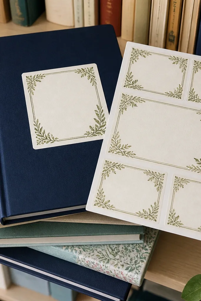
Print on matte sticker paper, then choose “No scaling” or 100% so borders don’t get squished. Cut using a blade with shallow passes — don’t force the knife, especially through thin border lines. If you’re applying to glossy notebook covers, rough them lightly with a fine scuff pad and wipe clean so the adhesive grabs. Add a removable clear film only on the edges if you want extra protection from finger rub.
Frame stickers make plain notebooks look designed because the border gives you a consistent “finished” edge. Botanical corners are especially photogenic because they add detail without overwhelming the page. This sheet is renter-friendly Vintage Stickers because it stays on paper covers and notebooks, not walls, and it’s easy to swap when a kid changes interests. The key is printing with enough contrast so the thin border lines stay visible.
Skip thisAvoid placing borders too close to the cut line — you’ll lose the corners.
Editor's noteIf your printer tends to smear thin lines, reduce ink density slightly and print one test label first.
8. Retro Ticket Stub Stickers With Perforated Edges
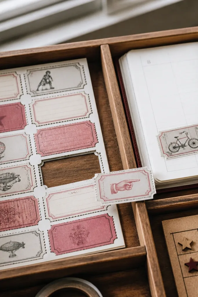
Print on matte sticker paper and keep the ticket shapes big enough for a clean cut line. Cut along the outer edge with a blade, then use a craft knife tip to lightly score a perforation line so it peels neatly. If your stickers curl after cutting, press them flat under a heavy book for 20 minutes. Apply to clean surfaces and rub edges with a firm cloth to set the adhesive.
Ticket stubs look fun and nostalgic because they have perforation marks and a “tear here” vibe. The perforated edge design also hides small cutting variations, which makes this one of the easiest renter-friendly Vintage Stickers to get right. Use them on planners, pencil cases, party goodie bags, and reward charts. They photograph well because the stub shapes create movement and a layered look when you place several on one item.
Skip thisDon’t use glossy paper — the perforation line glare makes the design look modern.
Editor's noteMake the perforation line slightly thicker than you think — it reads better and cuts cleaner.
9. Vintage Weather Map Labels With Coordinates
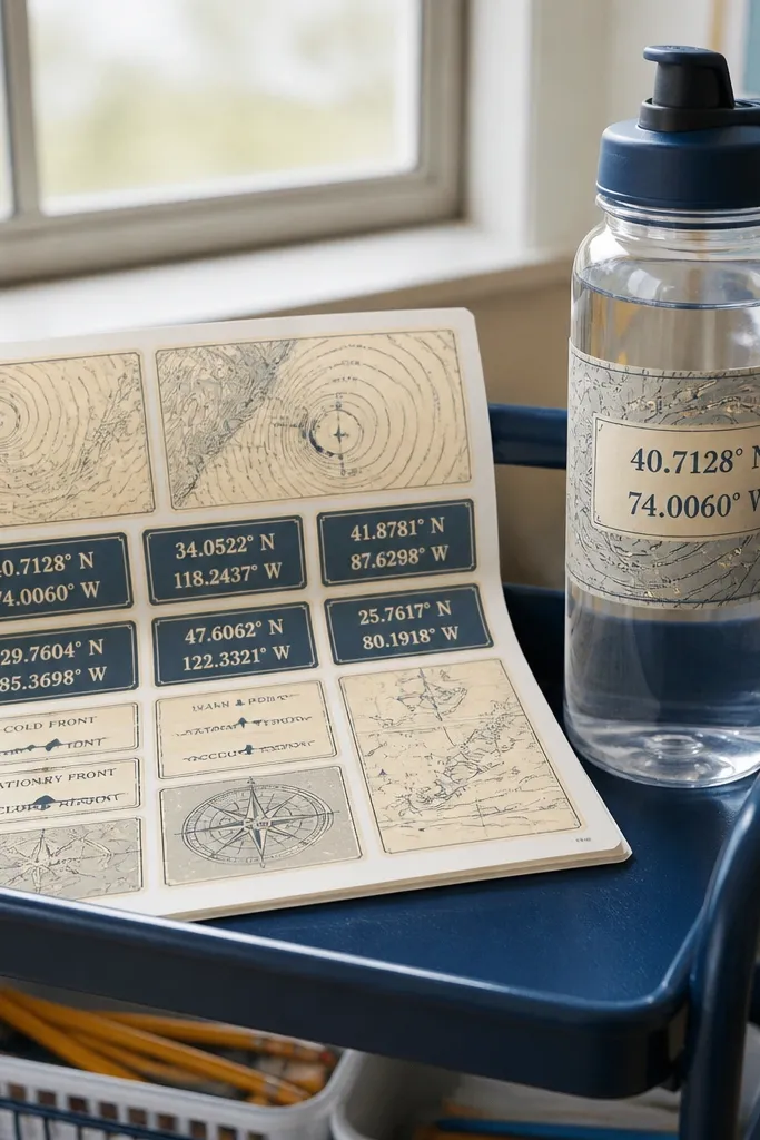
Print on matte sticker paper with the highest quality setting, then turn off “fit to page” so your lines don’t warp. Cut into small labels leaving a 1-2 mm border, then round corners for a softer vintage feel. If you’re using clear film, apply it after printing and trimming so it doesn’t trap bubbles near the edges. For placement, clean the surface with alcohol and let it dry fully before sticking.
Weather map labels feel vintage because they borrow the visual language of old charts: lines, symbols, and coordinate blocks. They’re especially good for kids' backpacks and water bottles because the design is busy enough to look cool, but structured enough to stay readable. This sheet works as renter-friendly Vintage Stickers because you can place them on gear that already gets scuffed — the stickers hide wear and keep the look consistent. Matte finishes also make the colors feel aged, not plastic.
Skip thisAvoid ultra-thin symbols — they vanish after cutting.
Editor's noteUse a slightly desaturated palette for blues and grays so the map lines read like print, not screen graphics.
10. Old School Schoolhouse Stickers With Chalkboard Frames
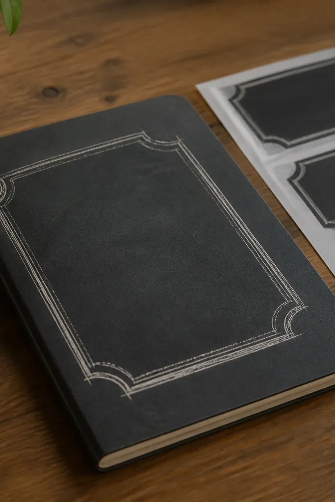
Print on matte sticker paper and choose a setting that reduces gloss. Let the sheet dry, then cut around the frame using a blade and mat so the border stays even. If your printer struggles with dark areas, print one test sheet and adjust contrast by a small step until the frame looks like dark gray, not black. Apply to smooth covers, press down firmly, and avoid stretching the sticker while placing it.
Chalkboard frames give you a vintage classroom vibe that looks great on kids' supplies. The trick is to keep the frame texture subtle — enough to read as chalk, not enough to look like a filter. This is renter-friendly Vintage Stickers because chalkboard-style labels stick to notebooks and organizers without needing any wall surface. It’s also practical: the icons act like visual reminders for schedules and routines.
Skip thisDon’t place chalk textures too close to the edge — they smear and look fuzzy.
Editor's noteMake the frame thickness consistent across the sheet so your cut line looks intentional.
11. Vintage Seed Packet Labels With Handwritten-Style Type
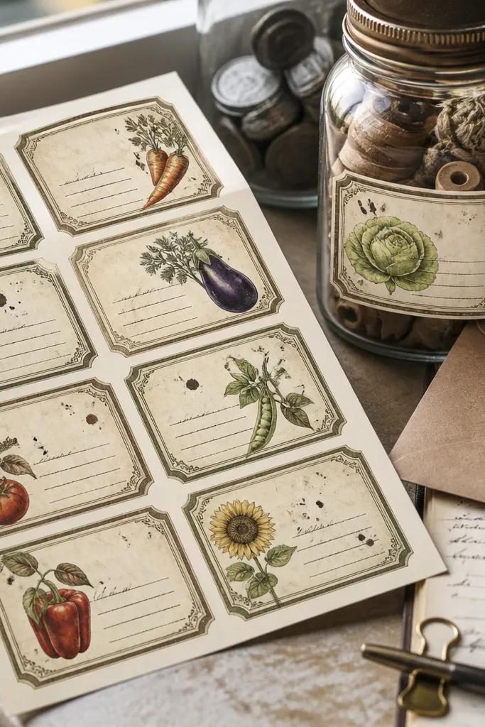
Seed packet labels are photogenic because they mix script-style text with simple graphic blocks. The faded ink blotches add age, and the label shape helps you place them quickly on jars, envelopes, and craft bags. For kids, this sheet is great for organizing art supplies and science kits, since it looks like they’re “growing” something. It’s renter-friendly Vintage Stickers because the labels are meant for containers and paper goods, not walls.
Print on matte sticker paper and set the printer to the highest print quality so the script doesn’t break up. Cut into rectangles with slightly rounded corners for that old packet feel. If you want them to last through spills, seal with a removable matte clear coat — spray lightly in two passes instead of one heavy pass. After sealing, wait at least 30 minutes before sticking so the finish doesn’t transfer.
Leave extra space between script and border so cutting doesn’t nick the letters.
Avoid super light gray text — it disappears once the sticker is on a colored surface.
12. Retro Music Notes and Vintage Cassette Micro-Labels
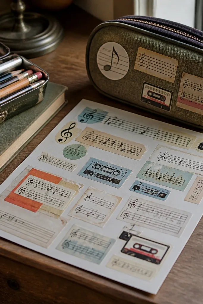
Print on matte sticker paper and use “Actual size” so the tiny icons don’t shrink. Cut carefully with a sharp blade; for micro labels, a kiss-cut sheet is easier so you can peel one at a time. If your cutter leaves ragged edges, switch to a fresh blade and use short, controlled cuts. Apply to clean surfaces and rub the edges for 10-15 seconds to lock them down.
Micro-label stickers look amazing because they pile up like a collage without taking over the whole item. Music notes and cassette icons feel vintage while still reading clearly at small sizes. This sheet is renter-friendly Vintage Stickers because you can decorate personal items — headphones case, pencil tin, homework binder — without dealing with wall adhesion. The aesthetic works best when you keep the colors muted and the outlines thin but crisp.
Skip thisDon’t try to cut tiny details with dull blades — you’ll end up with jagged edges that scream DIY.
Editor's noteUse a white border around each micro icon so the cut line stays invisible on darker items.
13. Vintage Frame Corner Stickers for Photo Walls and Binders
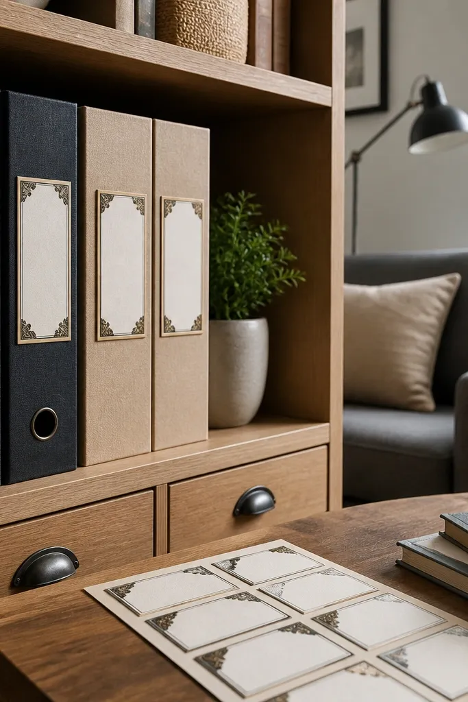
Corner frames are a smart renter-friendly Vintage Stickers style because you can build a “photo wall” look on binders and folders without covering the whole surface. They photograph well because corners create a clean composition and give you that vintage mat-board vibe. Kids can use them on project folders and art portfolios, and you can swap photos by replacing the center content instead of the whole design. Keep the frame lines thin and the background off-white to avoid a modern look.
Print on matte sticker paper and cut the corners as separate pieces. Use a blade plus ruler for straight edges, then round the outer tips slightly so corners don’t catch on sleeves. If you want a more durable finish, apply removable matte film only to the back of the sticker paper (if your film is adhesive-backed) or use a light top coat after cutting. Place on clean, dry surfaces and press down slowly to avoid trapping bubbles.
Plan your layout first with a ruler — corners look best when they line up like a grid.
Avoid over-ornate corners that crowd the sticker — the cut edges will look messy.
14. Vintage Map Compass Rose Full Sheet
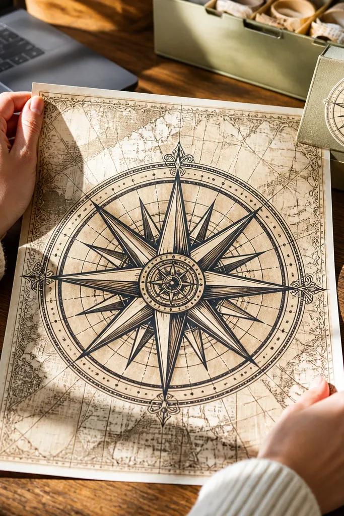
Print on matte sticker paper, then cut the sheet into either one large piece or a few large sections so the compass rose stays centered. Let the ink dry, then cut with a fresh blade and a steady hand, using a ruler to keep the symmetry. If you want it extra tough, seal with a removable matte clear coat after cutting, not before. Apply to smooth surfaces by aligning the center first, then pressing from the middle outward.
A compass rose sticker sheet is dramatic because it gives you one clear focal point — the kind of vintage map element that looks intentional on a laptop, supply box, or art journal cover. The design works because symmetrical shapes hide small miscuts better than scattered icons. It’s renter-friendly Vintage Stickers because you’re decorating removable surfaces like binders and cases, not committing to anything on walls. For kids, it also adds a fun geography theme that looks good year-round.
Skip thisDon’t fold the sheet while it’s curing — it creates a permanent crease line.
Editor's noteIf your printer leaves a slight border, trim it so the compass rose sits cleanly within the sticker edge.
15. Vintage Museum Label Stickers With Barcode Blocks
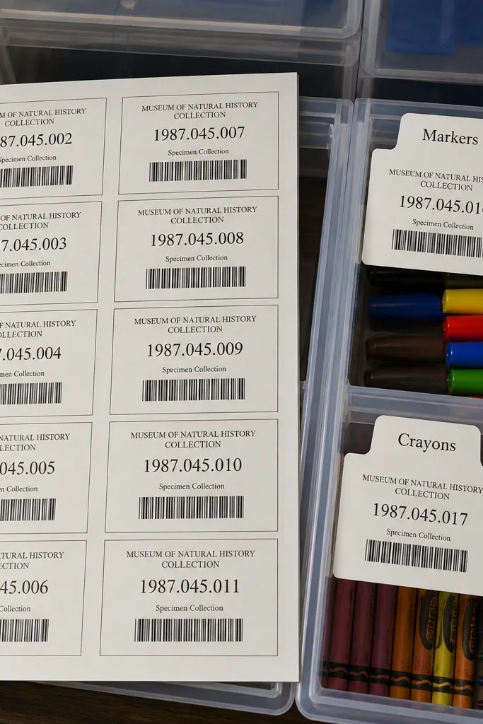
Museum labels look vintage because they combine typography, barcode blocks, and small accession-style numbers. They’re also incredibly practical for kids' organization: label a box for “Markers” or “Crayons” and it instantly looks like a collection. This is a renter-friendly Vintage Stickers idea that stays photogenic because the barcode stripes create texture and depth without needing color. The look is best when your black text is crisp and your background stays creamy, not bright white.
Print on matte sticker paper with the highest quality setting and ensure 100% scale so barcode widths stay believable. Cut into small rectangles with straight edges, then trim a 1 mm border so the sticker doesn’t show a thick paper rim. Seal with a removable matte clear coat if the stickers will be handled constantly. Apply to clean, dry containers and press for 20 seconds, especially along barcode edges.
Use a slightly thicker black line for the barcode so it stays readable after cutting.
Avoid bright white backgrounds — they make the sticker look like a modern print.