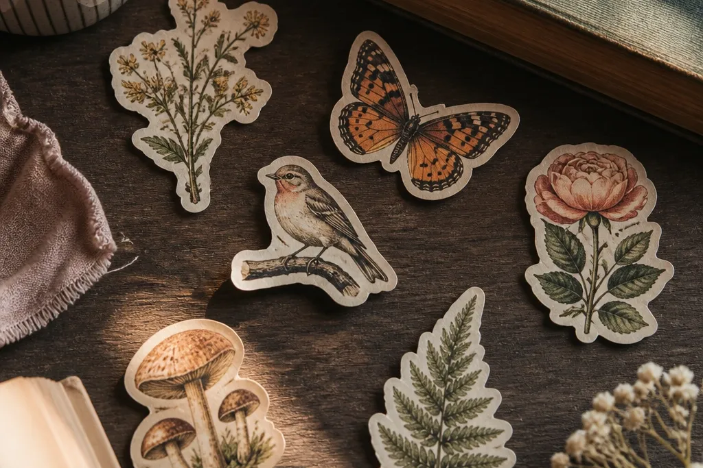
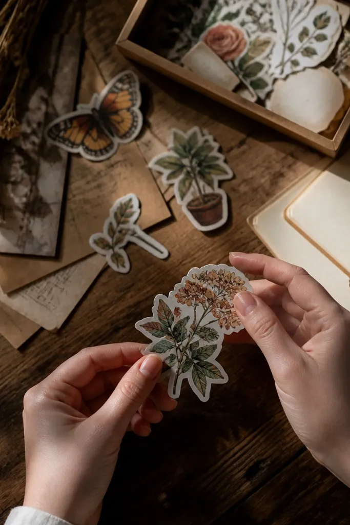
1. Tea-Tinted Botanical Label Stickers
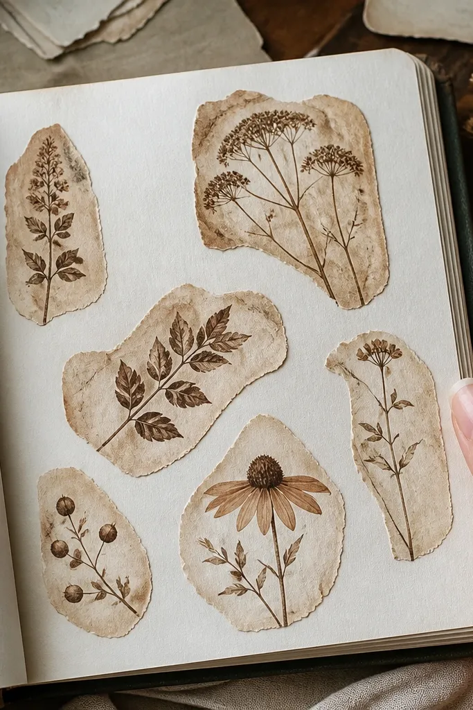
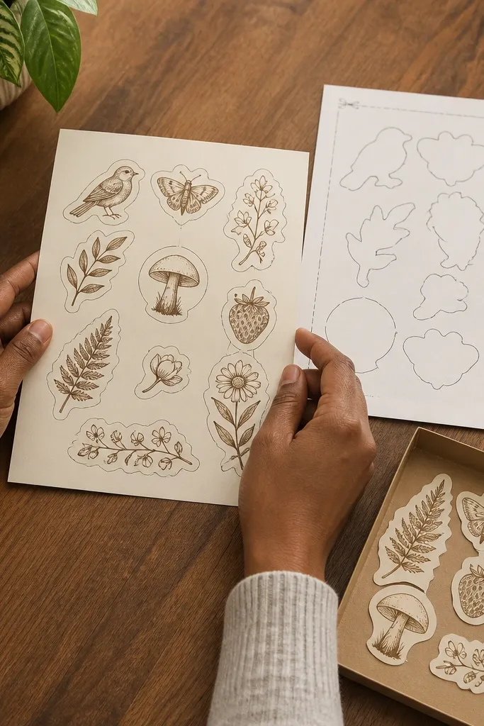
This is the fastest path to vintage because the warm tint mimics old paper without needing fancy printing. The botanical shapes look antique when the background shifts to light sepia and the edges look slightly frayed. You’ll get a label vibe that works on kid journals, lunchboxes, and storage bins. I like designs with dense leaves and simple stems because they stay readable after aging. Finish it matte so it doesn’t look like a brand-new decal.
Print your botanical art on printable sticker paper in a slightly darker ink than you think you need. Brew black tea or coffee, then dip a foam brush lightly and tap it across the sticker area — not soaking the whole sheet. After it dries, sand just the outer 1-2 mm of the sticker edges with a fine sanding sponge, then seal with 2 thin coats of matte clear spray. Let it cure fully before sticking.
Do the tint in one or two light passes so you don’t get tide marks.
Don’t soak the paper; saturated edges curl and peel faster.
2. Stamp-Style "Lost & Found" Round Stickers
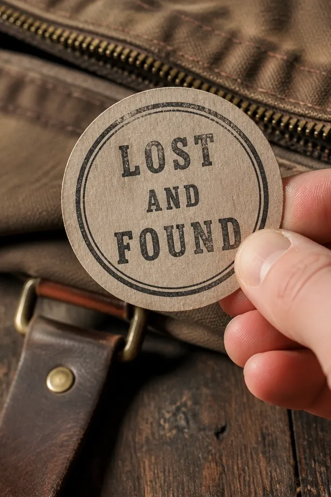
Stamp stickers look vintage because they have that imperfect, inky impression and a worn ring around the edges. A round “Lost & Found” design also has real use for school backpacks and kid cubbies. The trick is to fake the worn ink — clean vector text won’t feel old enough. Use a distressed border and a slightly uneven color so it reads like it’s been reapplied for years. Matte finish keeps the stamp effect believable.
Create a round design with thick outer text and a distressed inner text line. Print on sticker paper, then dab the printed surface with a small foam brush loaded with diluted black ink or watered-down acrylic paint. Use a cotton swab to wipe off the center so only the edges stay darker. Once dry, add matte clear coat in two light layers and let it dry flat under a book for 30 minutes.
Press a piece of scrap paper over the sticker while drying to keep it from warping.
Skip super-thin lettering; it vanishes after you wipe the ink.
3. Retro Postal Corner Stickers
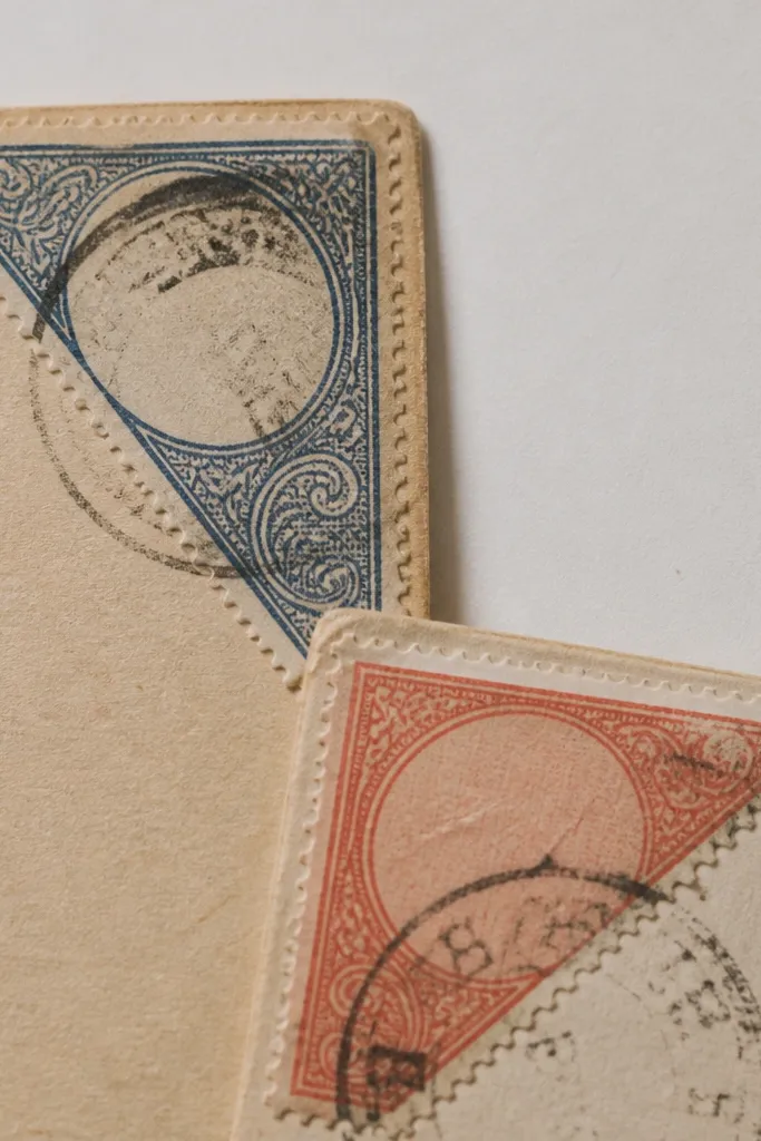
Postal ephemera looks vintage instantly, and corner stickers are great for organizing kids' projects without clutter. They also photograph well because the design sits at an angle and creates visual structure on the page. You’ll get that “mail label” vibe with cancellation marks and perforation cues. This idea works best on notebooks, craft folders, and paper planners where you want a tidy but aged look. Keep the colors muted and the contrast slightly low.
Design a corner label with a fake cancellation circle and a perforation border on two sides. Print on sticker paper, then cut with a craft knife so you have a clean corner shape. After cutting, lightly rub the perforation border with sanding sponge to roughen it. Seal with matte clear coat, then stick to the corner and press firmly for 20 seconds.
Editor's noteCut the corner shape with a fresh blade so the vintage effect stays only where you sand.
Skip thisDon’t use glossy topcoat; it makes postal designs look new.
4. Matchbook Recipe Strip Stickers
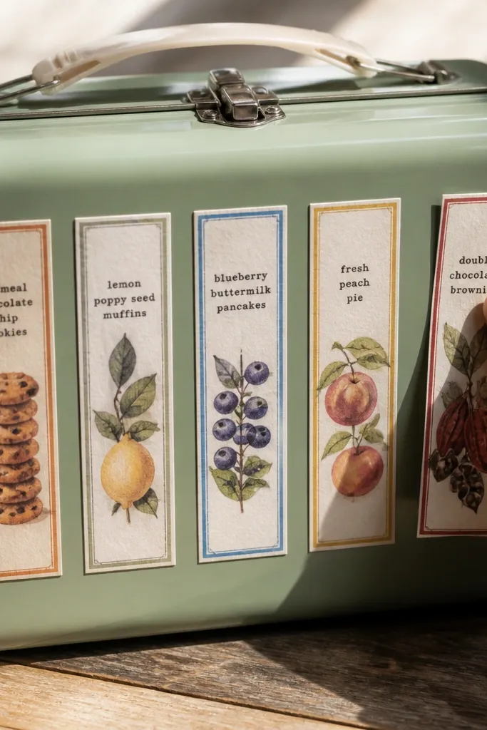
Long narrow strips look like old matchbook labels, and that format hides mistakes. If you’re working with kids' stuff, strips also hold up better because the sticker is less likely to lift at corners. The vintage look comes from muted typography and a slightly worn strip edge. These are great for labeling snack containers, craft drawers, and water bottles. They also layer well — one strip on top of another looks intentional.
Print a narrow strip design (about 1 inch wide by 3-4 inches long) with serif text and a faded border. Cut into strips and round the ends with scissors for a softer vintage edge. Dip only the strip ends in diluted coffee for a warm stain, then let it dry completely. Seal with matte clear coat, then apply to a clean, dry surface with strong pressure along the ends.
Editor's noteIf the sticker curls at the edges, flatten it under a heavy book before sealing.
Skip thisDon’t place strips on dusty surfaces; edges lift fast with kids' handling.
5. Ledger Page Number Stickers
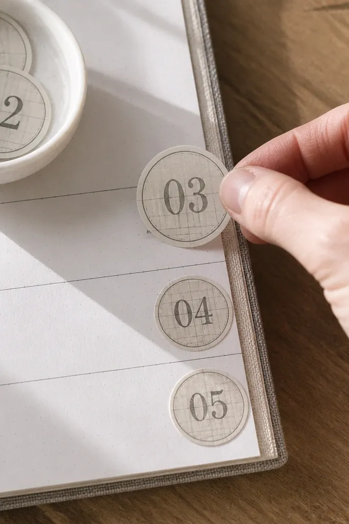
Ledger numbers feel vintage because they mimic archival printing and the “account book” vibe. This is a clean, modern-looking vintage option that still reads old thanks to gray ink and subtle paper texture. Use them for labeling bins, organizing art supplies, or numbering homework folders. The look is especially good on matte surfaces like kraft paper and light cardboard. Keep the numbers bold so they stay readable even after you age the edges.
Print your ledger-style numbers on sticker paper with a gray ink tone, not pure black. Add a light paper texture background in your design file or choose an image that already has grain. After printing, wipe the sticker edges with a pencil eraser to lighten them slightly. Seal with matte clear coat and let it cure, then apply to smooth paper or plastic after cleaning with a dry cloth.
Use a slightly off-white background in the design; pure white looks too new.
Don’t add heavy distressing all over; it turns into mud.
6. Faded Weather Icon Stickers
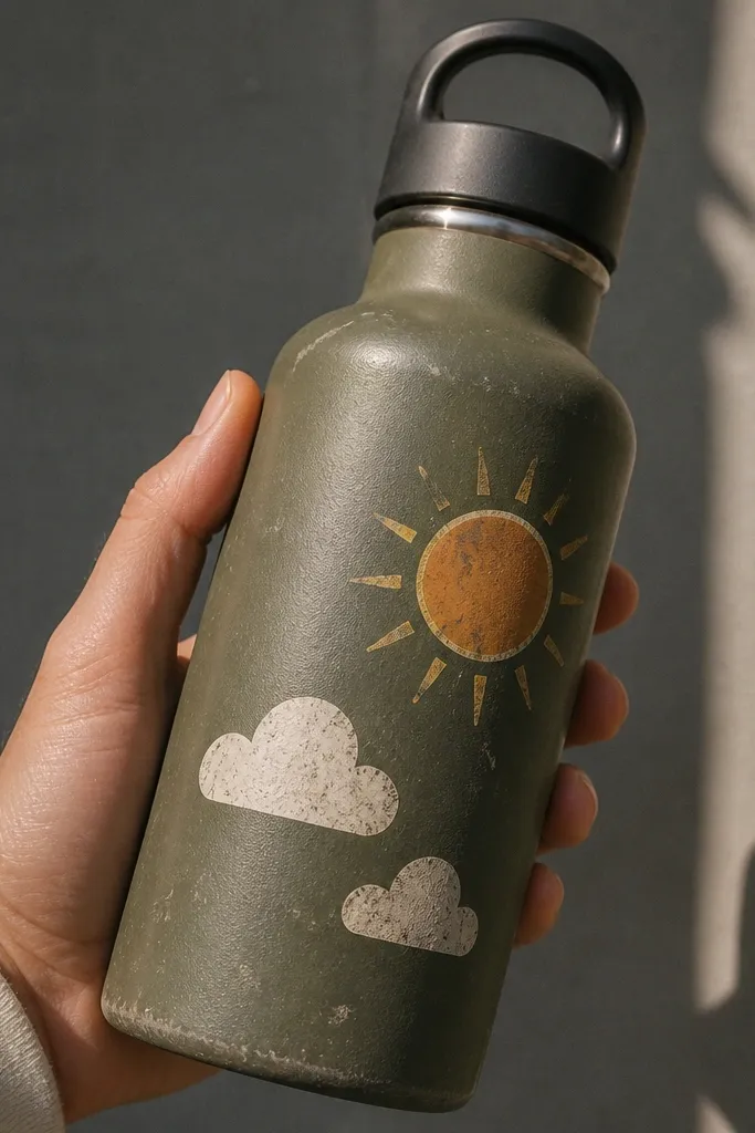
Weather icons make kids' items look fun and retro without needing detailed illustrations. The vintage effect comes from faded ink and soft edge wear, not from complicated artwork. Stick these on bottles, lunchboxes, or on the inside cover of a homework folder as a daily routine. You’ll get a consistent aesthetic because icons repeat well across a set. Matte finish makes the icons look printed, not laminated.
Pick a small set of icons: sun, cloud, rain, and lightning. Print with slightly muted colors and thick outlines so the aging doesn’t blur them. Dab the surface with a cloth lightly sprayed with water, then immediately blot — this creates a subtle ink bleed effect. Seal with matte topcoat in two thin coats, then let dry flat overnight before use.
Editor's noteIf you see smearing while sealing, stop and let the ink fully dry first.
Skip thisDon’t use ultra-thin line art; it disappears with aging.
7. Vintage Circus Ticket Tear Stickers
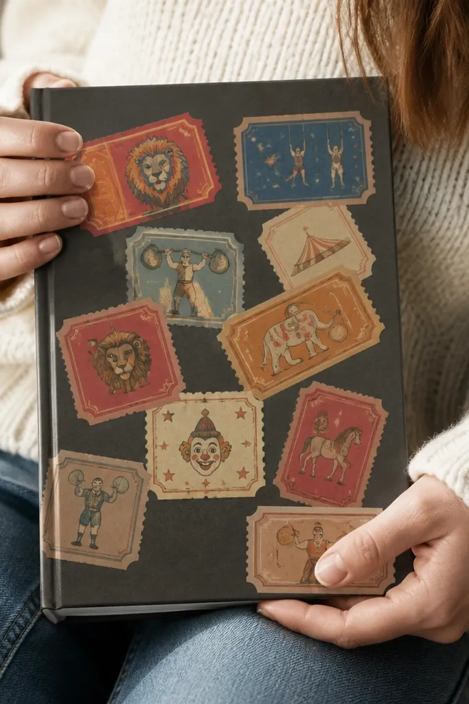
Ticket stubs look vintage because of the perforation and the slightly messy print marks. This idea is photogenic because the scalloped edge creates a natural frame for the label. It’s also great for kids because it feels like a collectible item rather than a label. Choose one ticket design and repeat it across a notebook set so everything looks coordinated. Matte finishing keeps the stub effect from looking like a modern sticker sheet.
Design a ticket stub with scalloped edges on both sides and a bold title line. Print on sticker paper and cut close to the design with scissors for unevenness. Use a craft knife to lightly score the perforation line, then gently tear along it to create a real tear texture. Seal with matte clear coat, then apply while the sticker is flat.
Editor's noteScore lightly first; deep scoring can split the sticker while you handle it.
Skip thisDon’t over-cut the scallops — leave a tiny margin so edges don’t lift.
8. Antique Map Compass Rose Stickers
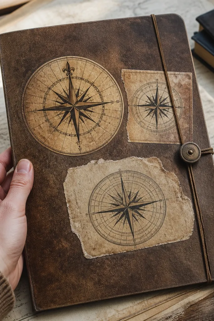
Compass roses have that old-world cartography look, and they photograph well even when kids slap them on slightly crooked. The vintage effect comes from sepia tint, light edge wear, and a restrained palette. Use these on folders, art bins, or the backs of sketchbooks as a “travel theme” without going full theme-party. These stickers handle well on smooth surfaces like plastic folders and binder covers. Keep the design chunky so it stays crisp after sealing.
Print the compass rose on sticker paper with a sepia palette and a slightly faded center. Stain the sticker background with diluted coffee using a sponge — tap from the center outward. After drying, rub the outer ring edges with sanding sponge for 30-60 seconds total. Seal with matte clear coat in two layers, then cure flat for a full hour before sticking to prevent edge curl.
Editor's noteUse a sponge, not a brush, so you get patchy vintage variation.
Skip thisDon’t tint over the compass lines heavily; it kills contrast.
9. Old Library Due-Date Rectangle Stickers
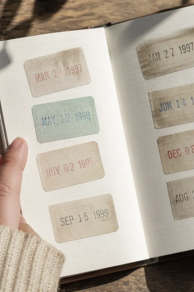
Library stickers read vintage because they’re built from rectangles, stamps, and boxy typography. They also have a job: tracking homework and reading. This design looks best with a slightly faded red and black stamp palette, plus worn edges. Place them on planners, reading logs, or the front of a kid’s binder. Matte finish is key so the sticker doesn’t look like a modern label.
Make a rectangle sticker design with a thick border and stamped text boxes. Print on sticker paper, then add red stamp effect with a watered-down red ink dabbed around the edges. Use a pencil eraser to lighten the border slightly so it looks handled. Seal with matte clear coat and apply to a dry surface, pressing down firmly on the corners.
Editor's noteCut rectangles with a steel ruler and craft knife for straight edges, then distress just the outer border.
Skip thisDon’t apply to glossy laminates without cleaning; the sealant can’t fix weak adhesion.
10. Vintage Crayon Label Stickers
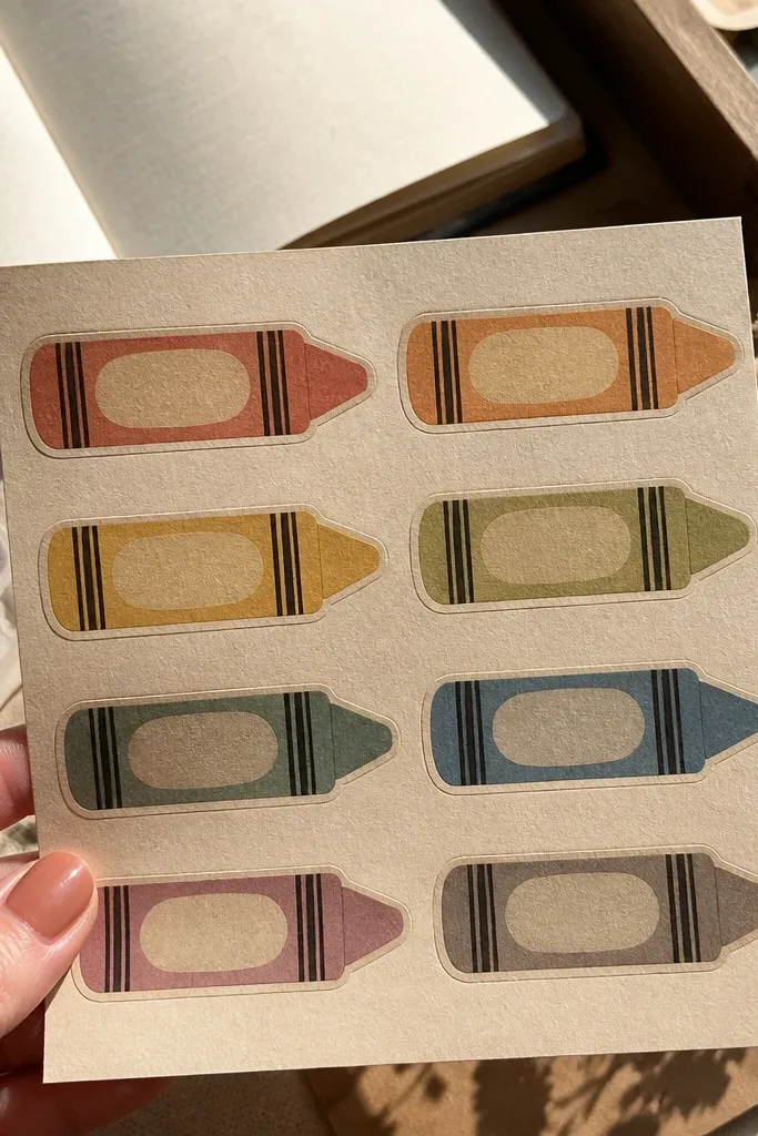
Crayon labels are a cute vintage idea that still works for kids' supplies. The trick is to make the label feel printed on paper, not printed on a glossy sheet. Muted color names, a slightly grainy background, and a lightly worn edge give you that old classroom feel. These are perfect for organizing art drawers and making “grab and go” supplies look tidy. Matte topcoat keeps the colors from looking too fresh.
Design each label with a color name, a small crayon icon, and a border like an old inventory label. Print on sticker paper, then lightly scuff the edges with a sanding sponge. Add a tiny bit of coffee tint to the background only, keeping the text darker for readability. Seal with matte clear coat and let cure. Stick to crayon boxes, pencil tins, or clear supply bins.
Use thicker borders and larger text so sanding won’t blur the name.
Don’t use bright neon colors; they fight the vintage aging effect.
11. Weathered Poster "Classified" Stickers
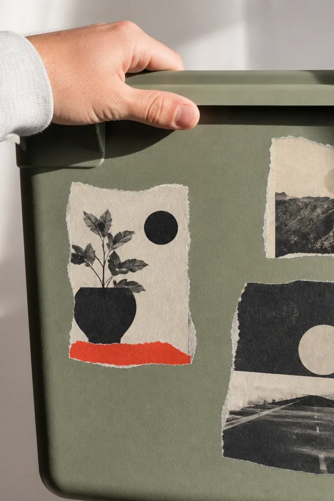
Classified poster stickers look like they came off a wall, which is exactly the vintage vibe you want. They’re also bold and readable from a distance, which matters on kids' storage bins and locker-style organizers. The look depends on torn edges and slightly uneven ink. This idea wins because it’s visually strong even if your cutting isn’t perfect. Use matte sealing so the torn paper effect stays believable.
Create a sticker design that looks like a torn poster: big title line, smaller text blocks, and a rough border. Print on sticker paper and cut with irregular edges using scissors. Tear the border gently by hand to create uneven fibers at the edge, then sand lightly to soften any sharp bits. Seal with matte clear coat in two layers, then apply by pressing from center outward to avoid bubbles.
If the tear looks too clean, add a tiny dot pattern with a sponge using diluted black paint.
Don’t seal with glossy spray; torn paper looks plastic when it shines.
12. Vintage Photo Frame Corner Stickers

Frame corners make any photo or label area look vintage without needing to print a whole scene. This is the cleanest way to get a “found in an old album” look on paper goods. Corner stickers also cover mistakes — if you have a messy label area, the frame corners make it look designed. They look best on journals, craft folders, and paper calendars. Matte finish keeps the frame from looking like a modern sticker border.
Design a set of four corner pieces that match in size and thickness, with a thin ornate border and a sepia tint. Print on sticker paper and cut the corners carefully. Lightly rub the edges with a sanding sponge to soften them, then apply a thin matte topcoat. Place corners first as a dry layout, then remove one at a time and press firmly so they align.
Measure the frame opening width before printing so the corners land where you want them.
Don’t put corners on textured surfaces; the adhesive can fail at raised spots.
13. Aged Label Border Stickers for Bins
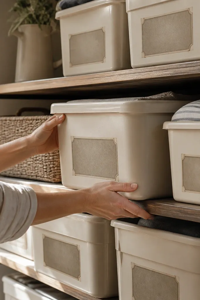
Border labels make your bins look like a real system, and the vintage part is in the aging, not the wording. You get a neat, repeatable look across multiple kid storage areas without making each sticker a different design. The vintage effect comes from muted ink and slightly worn edges that look consistent across the set. These are ideal for craft supplies, school folders, and pantry shelves in a kids' kitchen. Matte finish plus a clean border line makes it look intentional.
Design a label border with a blank text area and two small decorative icons, then print a sheet of identical borders. Cut labels and apply coffee tint around the border first, leaving the center lighter for readability. After drying, sand only the border edge so the center stays crisp. Seal with matte clear coat and apply to clean plastic bins, pressing the full perimeter and holding for 10 seconds.
Use the same paper tint recipe for every label so the set matches visually.
Don’t tint the center text area; it turns unreadable fast.
14. Vintage Soda Pop Bottle Cap Stickers
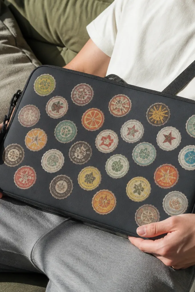
Bottle cap graphics are inherently photogenic because they’re round, bold, and graphic. Vintage works here by muting the colors and aging the edge like a sticker that’s been on metal for years. This idea is great for personalizing a kid’s laptop sleeve, water bottle, or craft organizer. The “cap” shape also hides small print imperfections. Keep the finish matte or satin so it doesn’t look like a fresh sticker slapped on metal.
Create a round design about 1.5-2 inches wide with a thick ring border and distressed brand text. Print on sticker paper and cut a perfect circle using a circle cutter or compass template. Lightly sand the outer ring edge with a sanding sponge, then wipe off dust. Seal with matte clear coat and let cure flat. Apply to a cleaned surface and press around the entire ring.
If you want stronger vintage wear, add a thin ring of diluted ink around the edge before sealing.
Avoid glossy clear coat; it makes the ring look brand-new.
15. Retro School Supply Icon Stickers
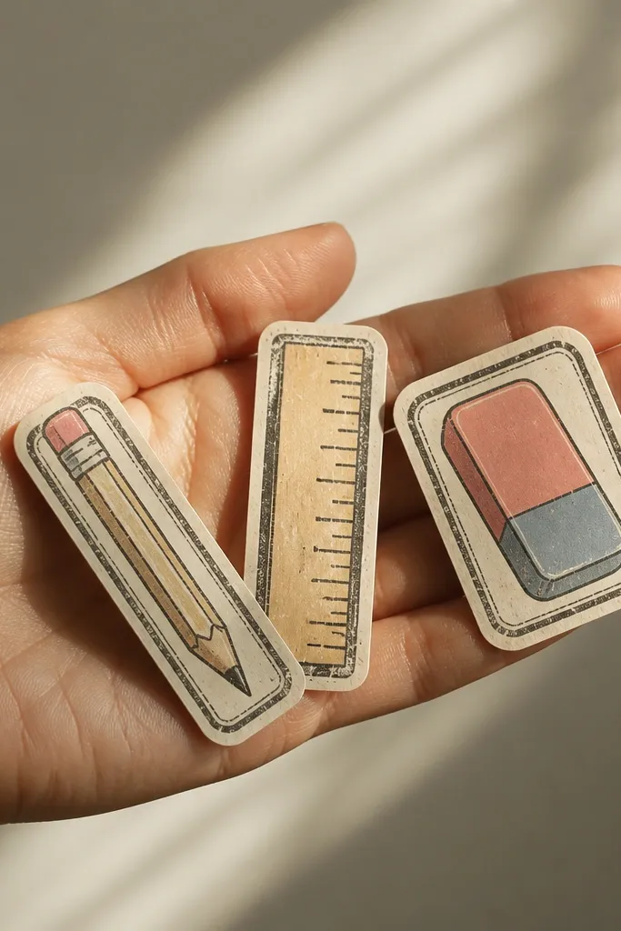
School supply icons look vintage when the icons are simple and the border looks stamped. This idea is perfect when you want a kid-friendly set that still looks “old paper” instead of modern clip-art. The visual payoff is in consistency — pencils, rulers, and erasers with the same border style and the same aging method. Use them on pencil cases, supply drawers, and art tote pockets. Matte sealing keeps the icons from looking like they’re printed on shiny label stock.
Pick 6 icons and keep them in one style with thick outlines. Print on sticker paper and add a distressed border in your design file. After printing, dab the border with diluted black ink using a sponge, then blot the center so ink stays near the edges. Seal with matte clear coat in two thin coats and apply after the sticker is fully dry.
Editor's noteKeep icon sizes big enough to read after sanding the edges lightly.
Skip thisDon’t mix icon styles; mismatched line weights ruin the vintage set look.