1. Postage Stamp Label Stack
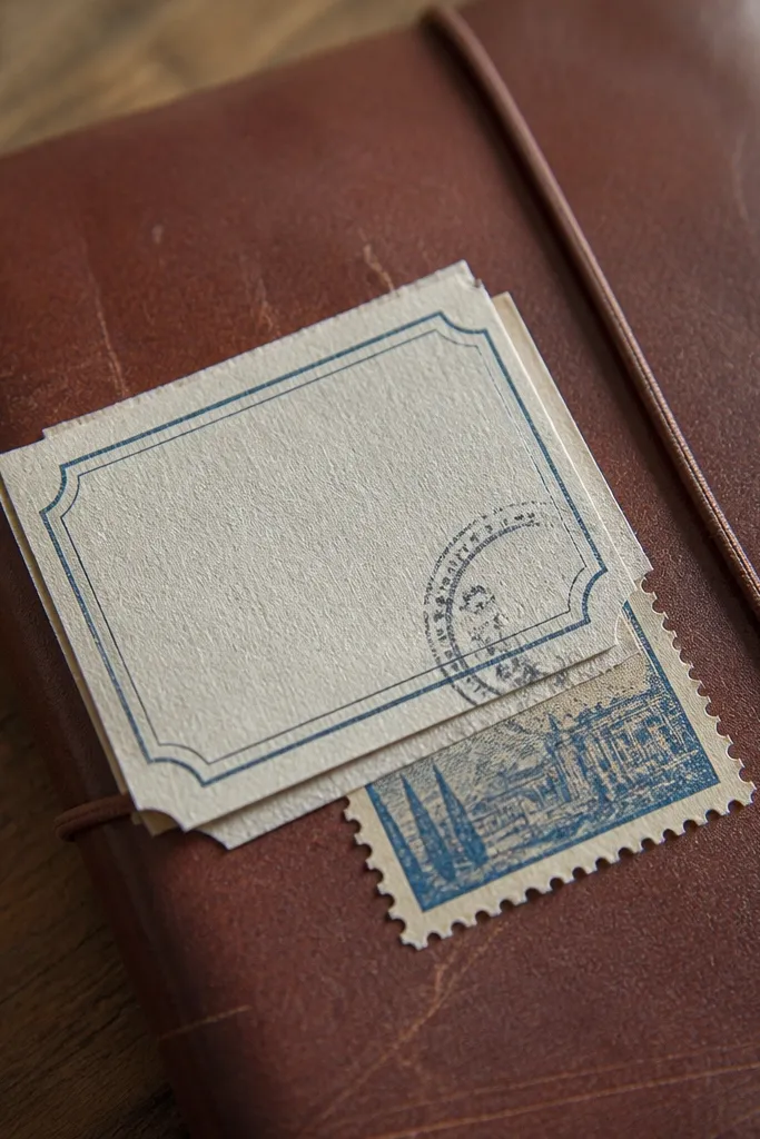
This look reads expensive because it mimics real mail artifacts: a stamp, a cancel mark, and a slightly misaligned overlap. Use a cream base with faded blue or slate ink so the cancel stamps don’t scream “graphic.” Add tiny perforation dots around the edges to sell the paper illusion. It fits school folders, planner covers, and any kids' surface that needs a clean focal point.
Start by designing three stamp rectangles: two medium (about 2.5 x 3.5 inches) and one smaller (about 1.8 x 2.7 inches). Add perforation edges using a dotted path or a perforation brush, then place a cancel mark over each stamp in a darker muted color. Print on sticker paper for journals or printable vinyl for backpacks, then seal with matte clear coat if you want less glare.
Editor's notePrint a test on plain paper first, then check edge alignment under daylight.
Skip thisDon’t use pure black cancellations; charcoal or deep navy reads vintage without looking harsh.
2. Botanical Specimen Cutout
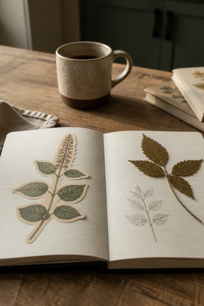
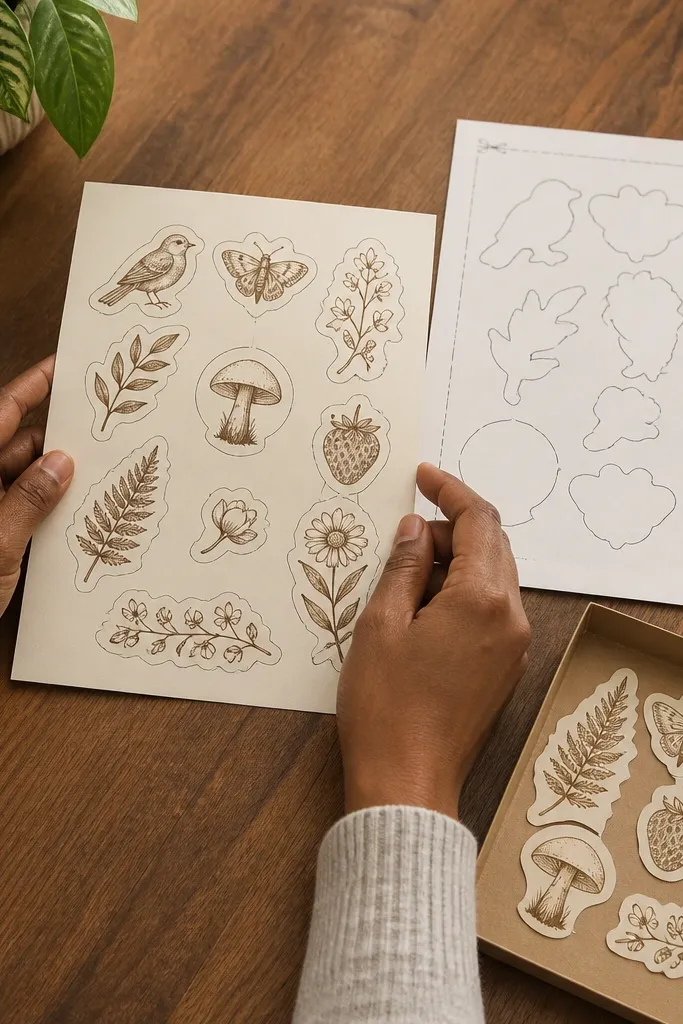
A botanical specimen label looks high-end because it has structure: a heading, a specimen sketch, and small metadata. The trick is to keep the illustration linework thin and slightly uneven, like old field notes. Choose muted greens and warm browns over bright neon. This sticker style is perfect for kids' science notebooks, lunchbox thermoses (with vinyl), and any page that needs a calm, tidy vibe.
Create a label shape in two parts: a top title strip and a larger body. Add a simple leaf illustration in desaturated sage and place tiny “collection notes” text underneath (dates, location, collector). Print on matte sticker paper, cut close to the label edges, and add a thin irregular border by lightly erasing the outer edge mask before printing.
Editor's noteUse matte paper + clear matte spray to stop the surface from looking plastic.
Skip thisDon’t center everything perfectly; slight skew in the cutout makes it look collected.
3. Vintage Library Due Date Strip
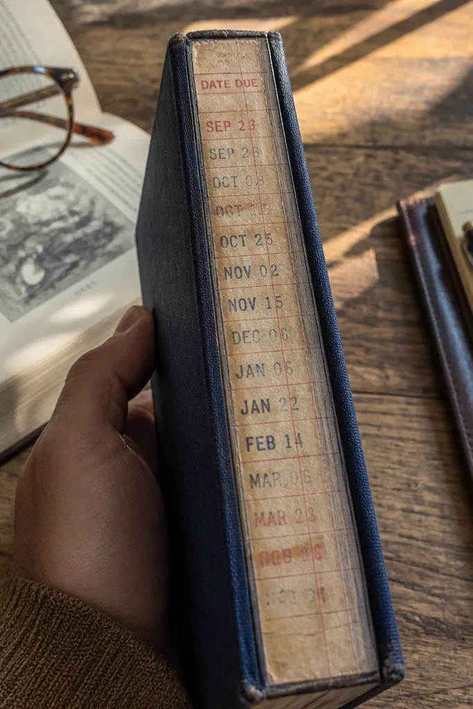
This is one of the best modern Vintage Stickers for a “real ephemera” look because it’s all about typography and stamps. Keep the strip narrow and long — it reads like something you’d find inside a book. Use faded ink colors (brick red, slate gray, or muted navy) instead of heavy black. Place it vertically on a notebook spine or horizontally across a journal cover.
Make a long rectangle about 1.5 x 4.5 inches. Add a library header line at the top and a due date block in the middle, then overlay a semi-transparent stamp circle. Print on printable vinyl for durability, then apply with a burnishing tool (a plastic card) to prevent bubbles at the edges.
Add one tiny misregistration effect by shifting the stamp layer by 1-2 pixels before printing.
Avoid thick borders; narrow edges and faded stamps do the heavy lifting.
4. Old Map Compass Rose Badge
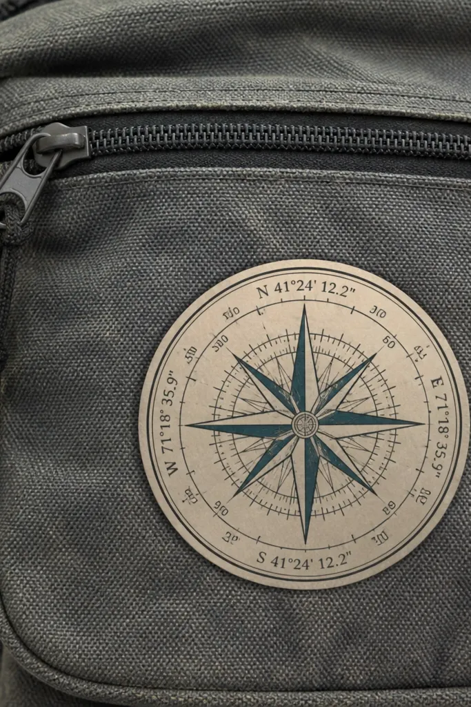
Compass roses look expensive because they’re graphic but still feel historical. The expensive part is the restrained palette: cream paper, faded teal lines, and charcoal labels. Add a thin ring border and a couple of tiny coordinate numbers so it feels like a real map fragment. This works great for kids' backpacks, pencil cases, and travel journals that need a bold centerpiece.
Draw a circle badge about 2.75 inches wide. Add a compass rose at the center, then put a thin ring around it and small “N / E / S / W” labels around the edge. Print on matte sticker paper, cut with a circle cutter or sharp craft knife, then lightly distress the outer rim with a sanding sponge.
Editor's noteDistress only the outer rim; leave the compass lines clean so it doesn’t look worn-out.
Skip thisDon’t use bright blue watermarks; keep map lines desaturated.
5. Aged Newspaper Cutline
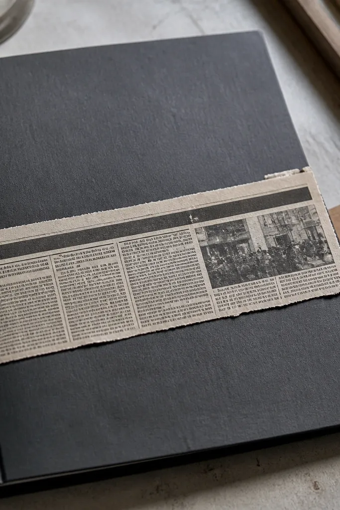
Newspaper strips look like real finds when the typography is dense and the paper is imperfect. Use grayscale headlines, a narrow torn edge, and small “article” blocks underneath. The subtle win is the torn texture: it catches light differently than clean vector edges. Put this on a plain notebook cover or a kid’s binder so it looks like a collage, not a sticker sheet.
Create a strip about 1.8 x 5.5 inches. Add faux headline text at the top and smaller columns below, then apply a torn-edge mask in your design software. Print on sticker paper, cut along the torn edge, and seal with matte clear coat to mute any shiny highlights.
Use a slightly off-white base (not bright white) for the paper so it matches aged ink.
Don’t leave the strip perfectly rectangular; the torn edge is the entire look.
6. Vintage Apothecary Vial Label
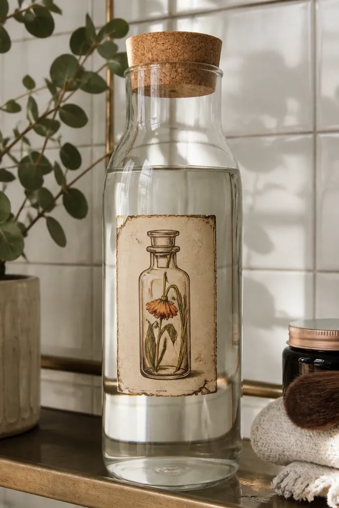
Apothecary labels feel luxe because they mix illustration and handwriting. The modern Vintage Stickers part is keeping it kid-friendly: simple vial icon, short ingredient list, and one warm accent color. Use sepia brown for the text and a pale cream background. This looks great on water bottles, school organizers, and craft jars.
Design a rounded rectangle label about 2.2 x 3.2 inches. Add a small vial icon on the left and “contents” lines on the right, then include one decorative rule line under the title. Print on printable vinyl if it’s going on a bottle, and seal with a clear laminate sheet for water resistance.
Pick one accent color for the title underline only; don’t color every line.
Avoid glossy vinyl on bottles without sealing; it can peel at the edges.
7. Railway Ticket Stub
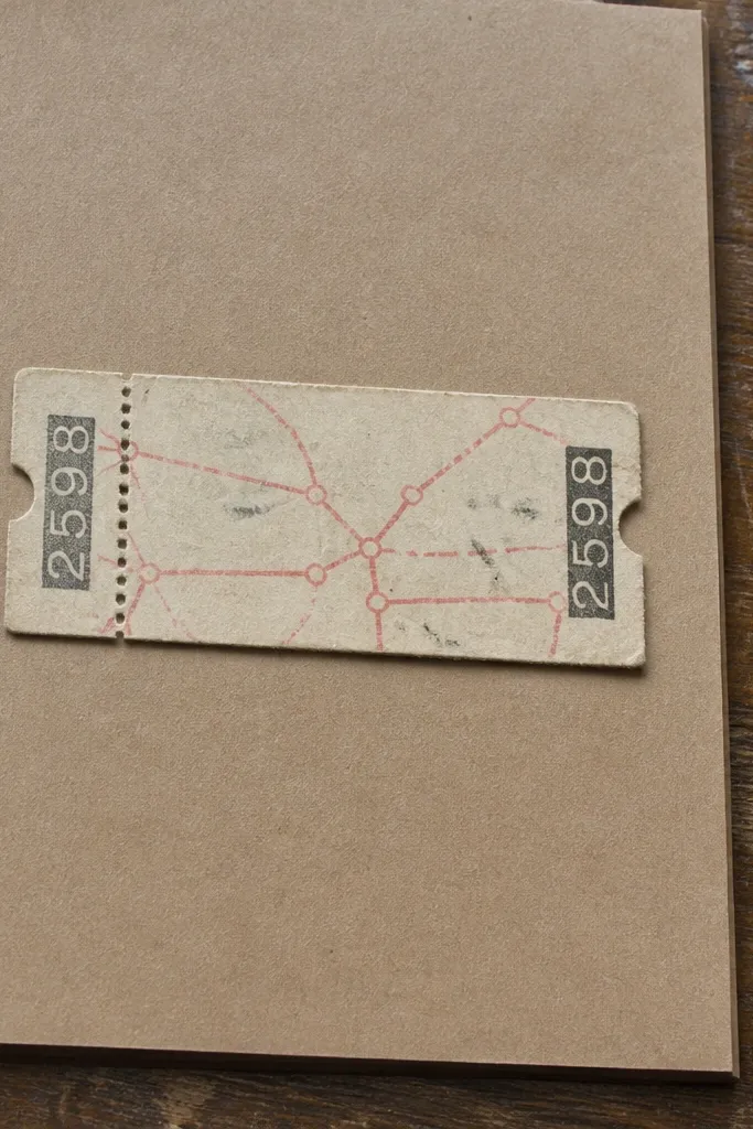
Ticket stubs look expensive because they have built-in “details” — perforations, serial numbers, and route lines. Keep the colors muted: oatmeal, faded red, and charcoal. A single ticket stub on a scrapbook page looks like a collectible. For kids' items, it’s visually interesting without being loud.
Make a ticket shape with a perforated center line and slightly rounded corners. Add a route line (two city names) and a serial number block at the bottom. Print on sticker paper for scrapbooks or printable vinyl for backpacks, then cut the ticket outline and the perforation line with a craft knife.
Editor's noteAdd a faint date stamp in the corner using low opacity so it looks like it was handled.
Skip thisDon’t use perfect uniform perforations; vary the dot spacing slightly.
8. Retro Airline Luggage Tag Frame
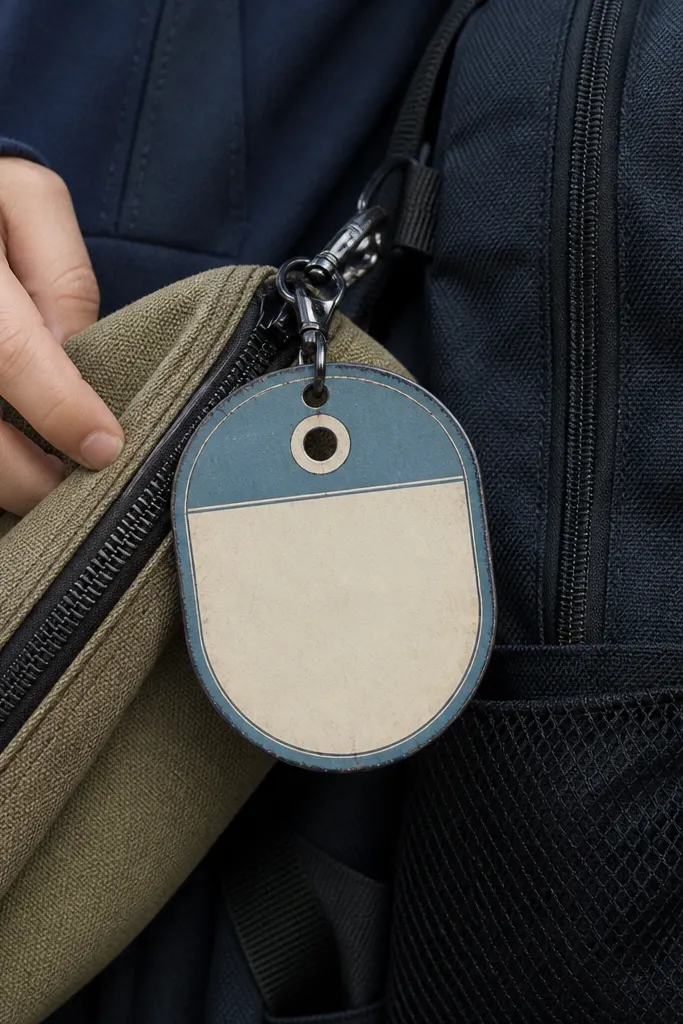
This sticker style looks rich because it’s framed and structured. The oval tag shape and thin border give it a “real product label” vibe even when the center is simple. Use muted blue-gray and warm cream so it doesn’t look like modern travel merch. Great for kids' backpacks and pencil pouches because it reads like a label, not decoration.
Create an oval frame about 3.1 inches wide. Add a thin outer border line and a double inner rule line, then leave a blank center area with two or three lines for text. Print on printable vinyl, cut with an oval cutter or a steady craft knife, and apply with a smoothing card to keep the edges flat.
Editor's noteIf you want extra realism, add a tiny corner fold crease using a subtle shadow layer.
Skip thisSkip thick borders; they make the tag look like a sticker sheet.
9. Monochrome Film Frame Sticker
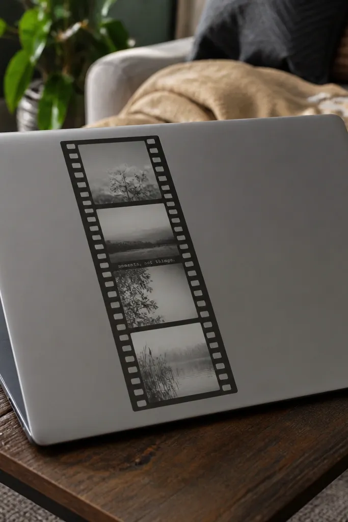
Film frames look expensive because they combine graphic geometry with aged tones. Keep it monochrome: charcoal, off-white, and a faint gray haze. Add sprocket holes along the sides and one tiny caption line so it feels like an actual film strip label. This works well in kid craft journals and on laptops when you use vinyl and seal properly.
Draw a film strip rectangle about 1.2 x 4 inches. Add three to four small frame windows and add sprocket holes as a repeating dot pattern along both edges. Print on matte sticker paper, then cut the strip cleanly and lightly sand the bottom edge so it blends into paper textures.
Editor's noteMatte finish is key; glossy makes film graphics look like decals.
Skip thisAvoid high-contrast pure white backgrounds; off-white reads older and calmer.
10. Vintage Postcard Corner Label
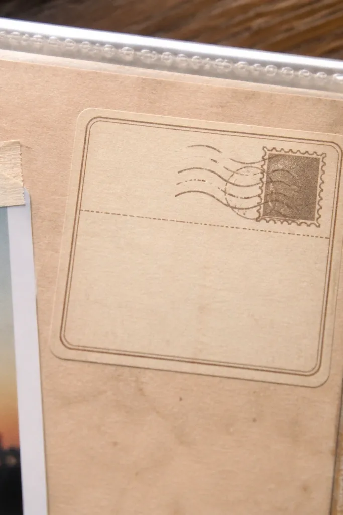
Corner labels look premium because they change the layout. It’s a design trick: place a small label in one corner and it makes the whole notebook page feel styled. Use a faded stamp icon and a blank message box so kids can write or draw on top. This style looks great on scrapbooks and classroom craft boards.
Design a quarter-card shape about 1.5 x 2 inches. Add a tiny stamp in the top corner and a small ruled box in the bottom area. Print on sticker paper, cut with a sharp knife, and apply to a flat surface. If applying to plastic, use printable vinyl and laminate or clear tape the edge.
Editor's noteLeave the message box slightly lighter so pencil marks show clearly.
Skip thisDon’t place it in the center; corner placement is what makes it look styled.
11. Antique Seal Wax Stamp Icon
Seal wax icons look expensive because they’re textured and centered. Use a warm muted red-brown, then add cracks and a slightly off-center stamp impression. A monogram letter or small symbol keeps it personal without needing big text. Put it on notebooks, water bottles, and craft storage labels for an instant “heirloom” vibe.
Create a circle about 2.2 inches wide with a wax texture overlay. Add a monogram in the center and a ring of small text around the edge, set in a condensed serif font. Print on printable vinyl, cut the circle, and apply over a clean, dry surface. Seal the edges with a thin clear laminate strip if the sticker will get handled a lot.
Editor's noteUse a slightly blurred edge ring to mimic hand-stamped pressure.
Skip thisAvoid glossy seal textures; matte vinyl or matte paper makes cracks believable.
12. Vintage Recipe Card with Grid
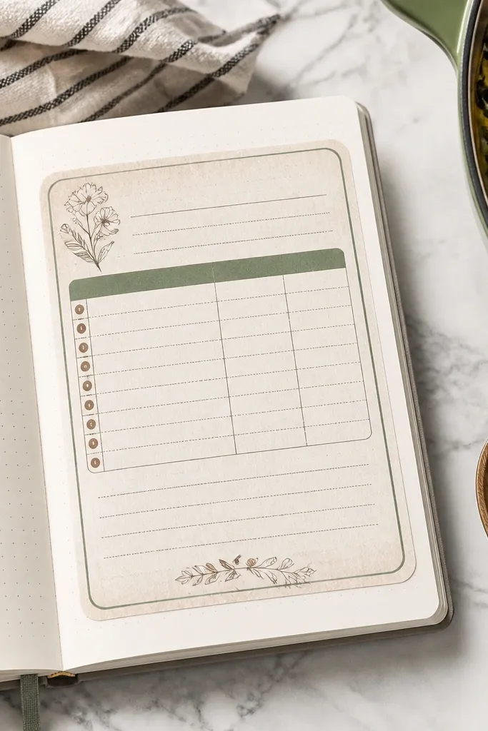
Recipe cards look good because they’re organized. The grid lines and short ingredient lists create a calm, intentional look that reads “designed,” not random. Stick to muted ink: brown, gray, and one light accent like dusty green. This sticker style is great for kids' lunch planners, snack trackers, and scrapbook pages.
Make a rectangle about 2 x 3.4 inches with a thin border. Add a title line at the top and a simple grid underneath for ingredients and steps. Print on matte sticker paper, cut with a paper trimmer, and add a light edge distress using a sanding sponge on the border only.
Editor's noteUse matte clear coat so the grid lines don’t reflect light.
Skip thisDon’t cram in tiny unreadable text; keep it short and legible.
13. Vintage Ticket Tear Off Panel
Wide tear-off panels look expensive because they have motion and function. They mimic carnival or concert stubs with notches and numbered sections. Use muted red and charcoal on cream so it reads like a real old ticket. This is a strong choice for kids' chore charts, reward trackers, and scrapbook layouts where you want a bold strip.
Design a panel about 3 x 5.5 inches with two tear-off sections. Add notch cuts along the top or bottom edge and place a small “seat/row” style block in the middle. Print on printable vinyl for durability, cut cleanly, and apply with firm pressure along edges using a burnishing tool.
Editor's noteMake the tear-off notches slightly smaller than you think; tiny ones cut better.
Skip thisAvoid thick outlines around the whole ticket; keep borders thin and faded.
14. Vintage Travel Label with Coordinates
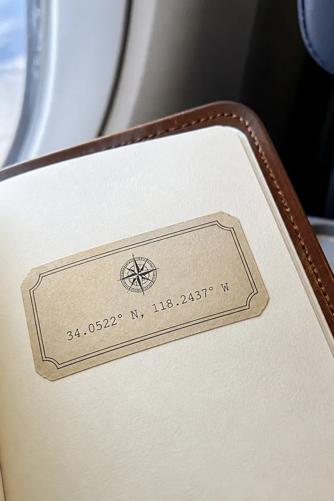
Coordinates feel premium because they add specificity. Use a label shape with a small compass icon and one line of coordinates, then keep the typography tight and evenly spaced. Modern Vintage Stickers look expensive when the text layout is clean and the ink is muted. Great on travel journals, pencil cases, and classroom “passport” folders.
Create a rounded rectangle label about 2.3 x 3.1 inches. Add a small compass icon at top left and coordinates at bottom right, then include a short location name in the center. Print on matte sticker paper, cut close, and add a faint “smudged stamp” overlay at 10-15% opacity to simulate handling.
Use one consistent font family for everything except the compass icon.
Don’t mix five font styles; it reads messy instead of collectible.
15. Retro Weather Station Sticker
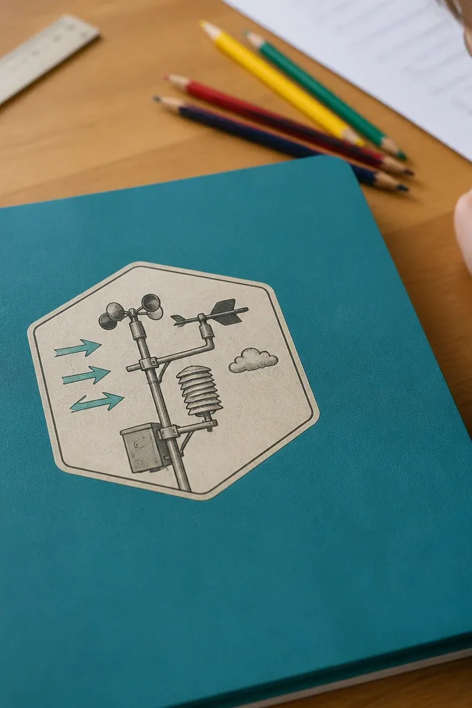
Weather station diagrams look good because they’re technical but still graphic. Use muted teal for arrows, gray for lines, and cream for the paper background. Add a small “station” title and one simple icon like a cloud or barometer needle. This style works on science notebooks and on kids' folders where you want a nerdy aesthetic without cartoon clutter.
Design a square about 2.5 x 2.5 inches. Draw a simple diagram grid, then add arrow lines pointing to a cloud icon or barometer needle. Print on matte sticker paper, cut with a square cutter, and seal with matte clear coat so it doesn’t shine.
Keep line thickness consistent; uneven lines make it feel amateur.
Skip bright colors; technical diagrams look vintage only when they’re muted.
16. Vintage Workshop Tools Badge
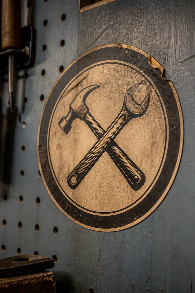
Tool badges look expensive because they’re emblem-like. The circular shape, crossed tools, and a ring of text make it feel like a real club patch. Keep the tools simple and line-drawn, not cartoonish. Muted browns and slate ink make it look like old workshop signage rather than toy stickers.
Make a circle about 2.6 inches wide. Add crossed tools in the center with thin lines, then place a ring of small uppercase text around the edge. Print on printable vinyl for durability, cut the circle, and apply. If you want extra depth, add a second layer of a slightly offset shadow cutout behind the tools.
Use a vinyl with matte finish so the emblem doesn’t look slick.
Don’t add thick drop shadows; vintage badges use flat ink with subtle aging.
17. Old Ledger Page Corner Piece
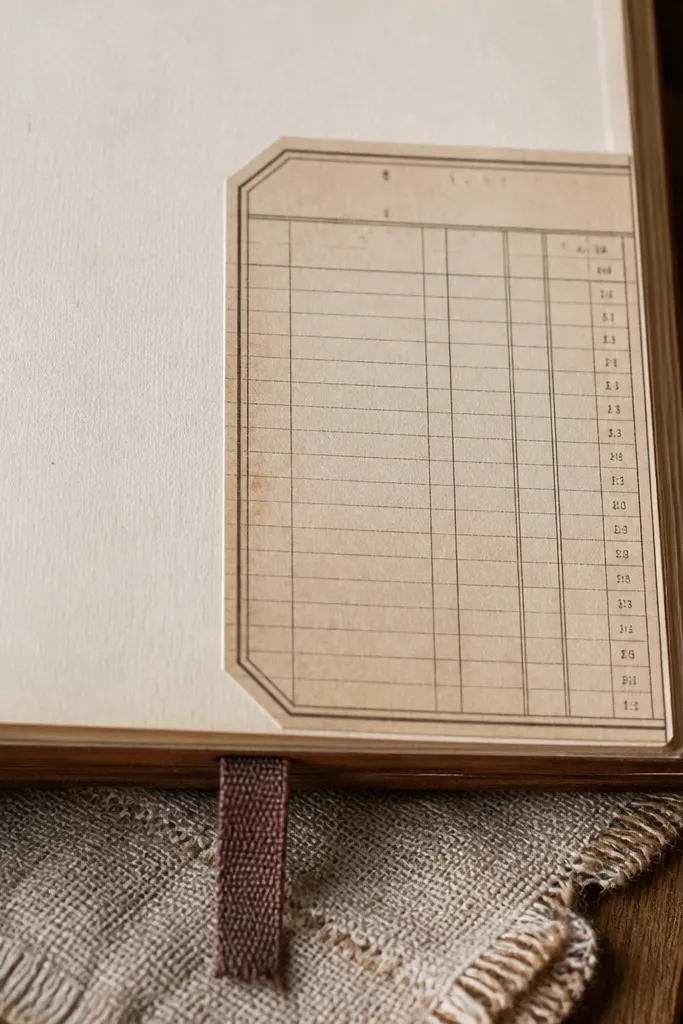
Ledger corners look premium because they trick the eye into thinking the page is already printed. Ruled lines, faint column headings, and tiny number blocks give instant “document” energy. Keep the palette to warm gray and cream so it doesn’t look like modern stationery. Put this on the corner of scrapbooks, kids' journals, and planner tabs.
Design a quarter-page corner piece about 2 x 2 inches. Add ruled lines across the diagonals and small number blocks in two columns. Print on sticker paper, cut the corner precisely, and apply to a flat page. Seal with matte clear coat if you’re using it on textured paper so it blends and doesn’t peel.
Match the line spacing to your paper’s texture; the closer the spacing, the more believable it looks.
Avoid pure white backgrounds; ledger pages should look slightly warm and gray.
18. Vintage Ingredient Pantry Tag
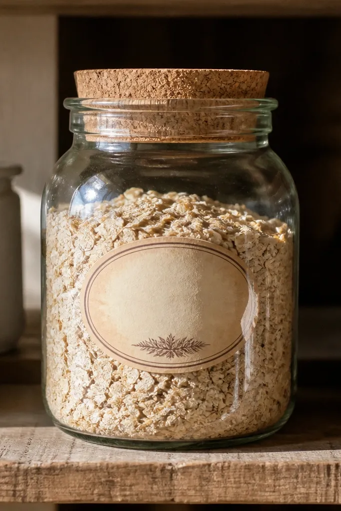
Pantry tags look expensive because they’re functional and slightly old-fashioned. The oval shape and stamp marks make it feel like it belongs on a glass jar, even if it’s on a notebook. Use short ingredient names and one stamp icon. This is a strong choice for kids' labeled bins and craft storage systems.
Create an oval about 2.7 x 1.8 inches with a thin border. Add an ingredient name in the center and a small stamp icon in one corner, then add one faded “batch” or “lot” line. Print on printable vinyl, cut, and apply to clean surfaces. For jars, wipe with rubbing alcohol first and press edges firmly.
Write over the label with a fine marker after applying a matte seal if you want kid-friendly updates.
Don’t use long paragraphs; tags look best with one clear line.
19. Vintage Map Scale Bar Strip
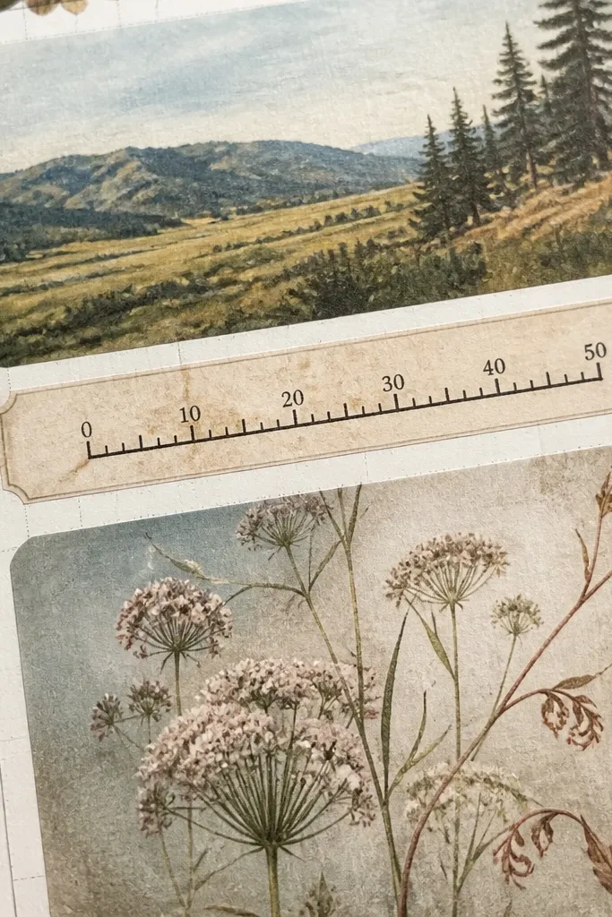
Scale bars look expensive because they’re small, technical, and visually clean. They also work as “glue” between bigger stickers in a cluster. Use a cream strip, charcoal tick marks, and one small label like “Miles” or “Leagues.” This is ideal for kids' planner pages where you want subtle detail without clutter.
Design a strip about 1 x 4 inches. Add a long baseline with tick marks every 1/4 inch and a small number label every few ticks. Print on sticker paper, cut close, and place it under a larger sticker. If you’re applying to plastic, use printable vinyl and laminate the strip edges.
Editor's noteUse it as a connector: put it between two larger pieces to make the cluster feel intentional.
Skip thisSkip thick borders; scale bars should look like printed information.
20. Retro Botanical Frame Border
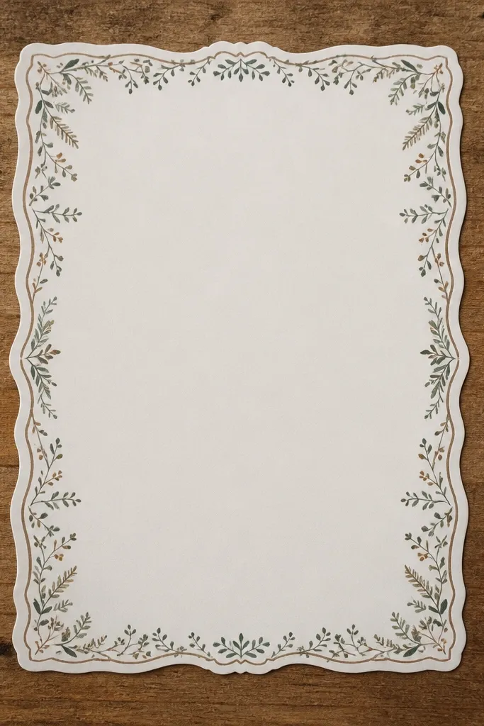
A frame border makes any center graphic look more expensive because it adds context. This one uses tiny leaf sprigs around the perimeter and a clean cream center that you can leave blank or fill with a small icon. Modern Vintage Stickers look best when the border is delicate and the center is simple. Great for labeling boxes, kids' art portfolios, and journal covers.
Design a rectangular frame about 3 x 4 inches with a 1/4-inch inner margin. Place small leaf icons along the edges, then keep the center as a blank panel or one tiny symbol. Print on matte sticker paper, cut the outer frame, and apply to a flat surface. Add matte clear coat if the surface is glossy so it grips.
If the frame peels, add a thin strip of clear laminate over the top edge only.
Don’t overload with leaves; too many icons makes it look busy.
21. Vintage Stamp Border Corner Set
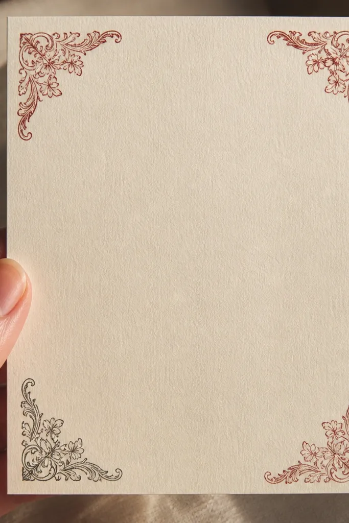
Corner sets look like you designed the whole page, even though you’re using small pieces. The trick is repetition: each corner has the same border logic, but the stamp ink is slightly different so it looks handled. Use muted reds and grays. This works for scrapbook pages, craft cards, and kids' art prints where you want a clean border without drawing one.
Create four small corner stickers about 1.2 x 1.2 inches each. Each should have a dotted border and a small stamp icon in the corner. Print on sticker paper, cut each corner, and apply with consistent spacing from the page edge (about 3-5 mm). Seal with matte spray if you want it to resist smudging from crayons or markers.
Editor's noteTest spacing with paper tape first so the corners line up before you commit.
Skip thisAvoid glossy prints for corners; glare makes the border look like a modern sticker sheet.
22. Vintage Handwritten Scroll Banner
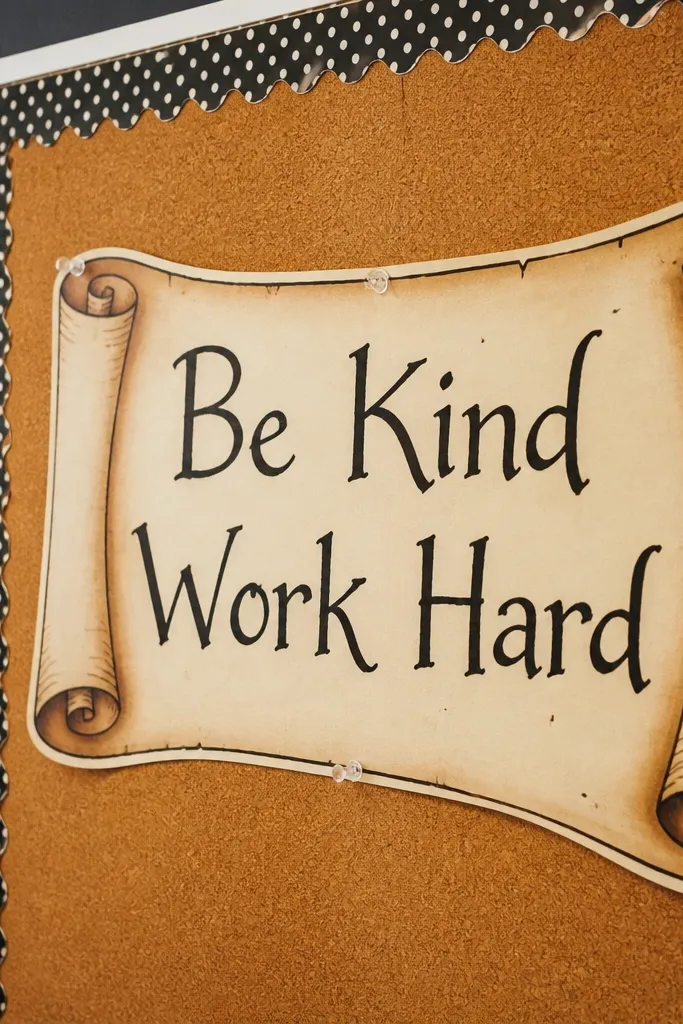
Handwritten scroll banners look expensive when the handwriting is short and slightly imperfect. Curl the ends, add a faint ink bleed effect, and keep the text to one or two words. This sticker style is perfect for kids' reward charts, classroom labels, and scrapbook captions. It reads vintage because it looks like something you’d write with a fountain pen on aged paper.
Design a banner shape about 1.6 x 4.2 inches with curled ends. Add a faux handwritten title line and a second smaller line beneath it. Print on matte sticker paper, cut close to the outline, and lightly distress the edges with a sanding sponge. Apply to paper first; for plastic, use printable vinyl and laminate.
Editor's noteUse low opacity shadow behind the letters so it looks like ink sat on paper.
Skip thisDon’t use cursive that’s too modern and smooth; add slight wobble to the letterforms.
23. Retro Museum Tag with Small Icon
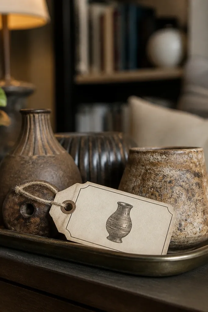
Museum tags look expensive because they’re official-looking. A thin border, short title, and a small artifact icon make it feel like a curated label. Keep the palette muted and the typography clean. This works well for kids' collections — rocks, shells, and craft pieces — because it turns a pile into a “display.”
Make a small tag about 1.6 x 2.6 inches with a thin rectangular border. Add a title line at the top and a tiny icon (leaf, shell, star) in the middle. Print on printable vinyl if it’s going on containers, cut with a craft knife, and punch a tiny hole if you want to tie it on with twine.
Punch holes after cutting, not before, so the border stays crisp.
Avoid thick borders; museum tags are delicate and lightly printed.
24. Vintage Catalog Number Sticker
Catalog numbers look expensive because they’re data. The combination of a number block, small labels, and a stamp mark makes it feel like a real item from inventory. Use gray ink and one muted accent color for the stamp. This is a great sticker for labeling craft supplies and for adding realism to scrapbook collage clusters.
Design a rectangle about 2 x 3 inches with a top header and a bold-ish catalog number block. Add two small stamp circles — one over the number, one in a corner. Print on matte sticker paper, cut close, and apply over a slightly textured surface for better “paper” realism.
Make the number block slightly darker than the rest so it becomes the focal point.
Don’t add too many icons; one number block and two stamps are enough.
25. Vintage Laundry Mark Label
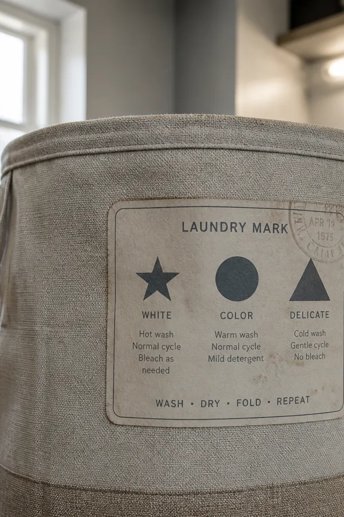
Laundry mark labels look surprisingly luxe because they’re based on repeated symbols and short instructions. The vintage effect comes from faded ink and simple icons like a star, circle, or triangle. Use warm gray and muted navy, keep text short, and add a faint stamp overlay. This works on kids' clothing bins, craft aprons, and storage folders.
Create a rounded rectangle about 2.1 x 3 inches. Place one symbol in the center and add two short lines of “mark” text above and below. Print on printable vinyl for durability, then round the corners with a corner punch to reduce peeling at edges.
Editor's noteRound corners always — it stops edge lift on frequently handled items.
Skip thisAvoid glossy finishes; laundry labels should look printed on paper or fabric.
26. Old Botanical Index Tabs
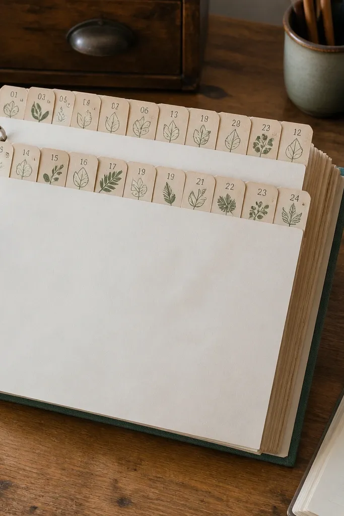
Index tabs look expensive because they imitate a real reference system. The tabs are small, but the layout feels intentional and orderly, which reads high-end in photos. Use muted green icons and gray numbers on cream. This is great for kids' books and binder systems where you want labels that look like vintage index cards.
Design 6-8 tiny tabs about 0.9 x 1.6 inches each. Give each tab a number and one small icon, then keep all tabs in the same color palette. Print on sticker paper, cut carefully along the tab shape, and apply to binder dividers or notebook pages. For durability, seal with matte clear coat.
Use a ruler and light pencil marks on your binder before placing tabs.
Don’t mix random colors across tabs; consistency is what makes it look designed.
27. Vintage Weatherproof Sticker Patch
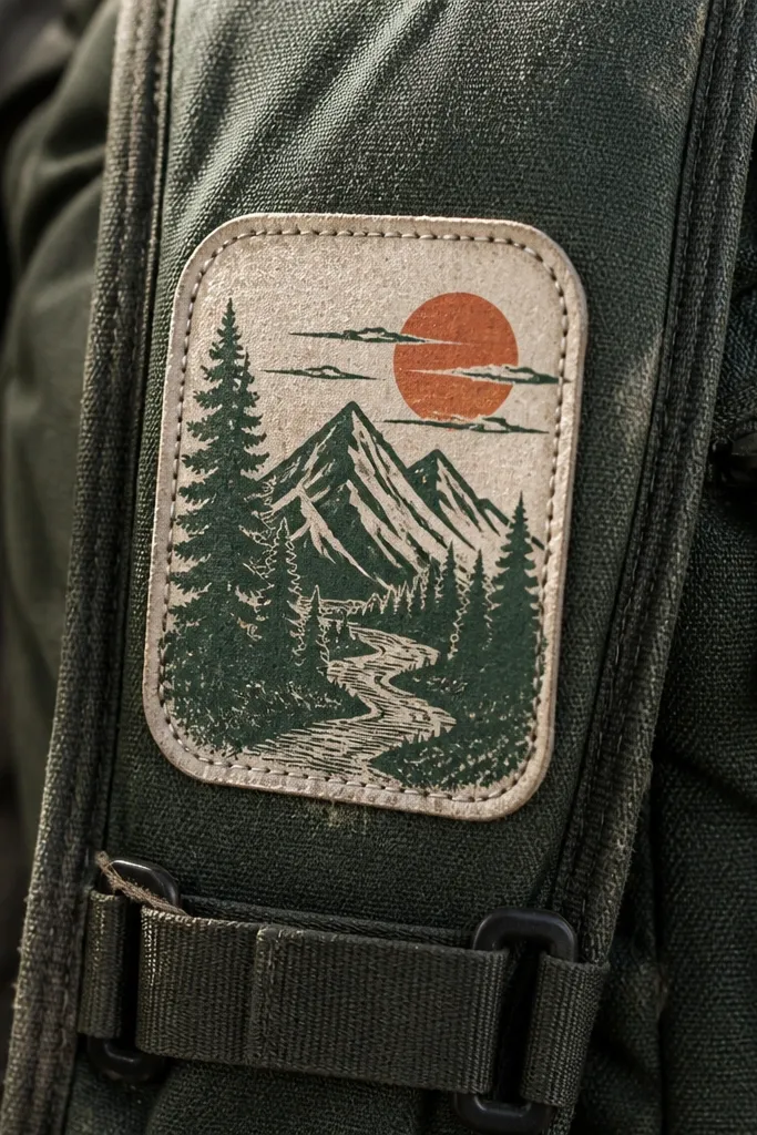
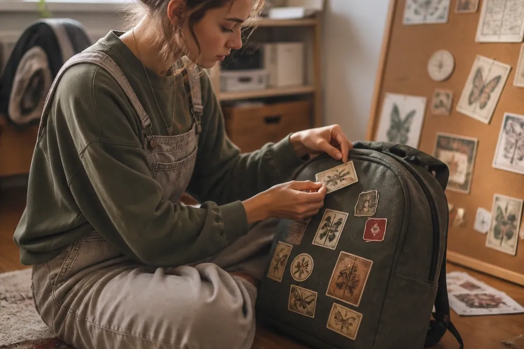
Patch-style stickers look expensive because they imitate fabric repair patches. The stitched border effect and muted stamp art create depth even in flat prints. Keep the patch palette to cream plus one muted accent color. This works on kids' backpacks and gear where you want a “lived-in” aesthetic without actual fabric work.
Design a patch shape with rounded corners about 2.6 x 3.2 inches. Add a stitched border effect using a dashed outline and a slightly darker shadow ring, then place a small stamp icon centered. Print on printable vinyl, cut the patch shape, and apply with a smoothing card. Finish by sealing edges with clear laminate tape to resist peeling.
Editor's noteUse matte vinyl for the patch look; gloss makes stitches look fake.
Skip thisAvoid neon stitch colors; use off-white or warm gray for the thread.
28. Vintage Watermark Pattern Sticker Sheet
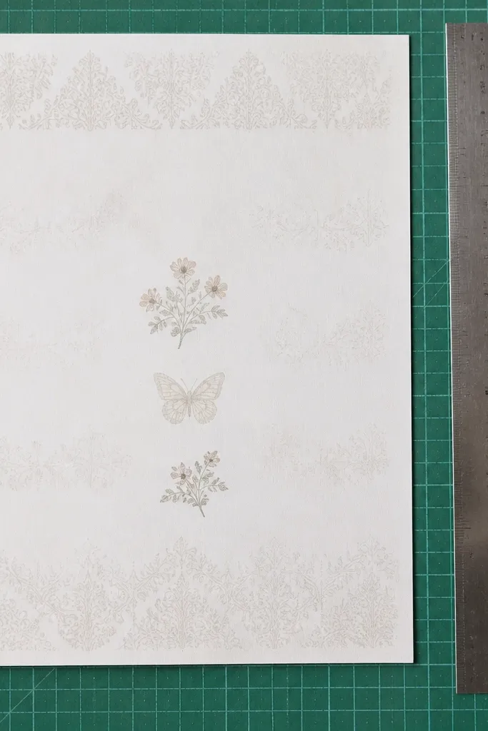
A small repeating pattern sheet looks expensive because it creates a consistent “world” across multiple stickers. The centerpieces might be simple, but the watermark texture makes everything look like it came from one set. Use very low opacity ink for the background band so it doesn’t overpower the main elements. This is great for kids' crafts because you can mix and match pieces without planning every cluster.
Design a sheet layout with 12-20 small stickers, each sized between 1 and 1.6 inches. Use one repeated watermark icon (like a tiny leaf or stamp circle) at 8-12% opacity behind the main sticker art. Print on sticker paper, cut each sticker, and apply as a cluster on notebooks or craft bins. Seal with matte clear coat if kids will scribble on top.
Editor's noteKeep the watermark icon the same size across the sheet for a calmer look.
Skip thisDon’t put strong background text behind main art; it competes visually.
29. Victorian Engraved Ornate Corner Label Set
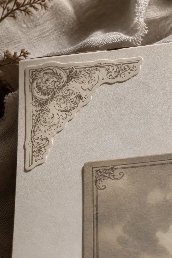
This set gives you that expensive, printed-on-paper look because the design lives in the corners where the eye expects decoration. It works like a frame without feeling bulky, so your stickers stay modern Vintage Stickers instead of looking like scrapbook filler. I’d print these on thick matte paper and add a light “engraving” texture using a simple emboss effect, then seal with a clear coat so the ink looks locked in. You can use the corners alone on plain labels, or mix them into bigger sticker layouts for packaging, jars, and planner pages. It takes a bit of patience the first time, but the build is straightforward and the result photographs beautifully on kraft paper, glass, and dark notebooks.
Step 1: Design or download one corner at a time with a tight outer border and thin inner linework. Target a finished corner size around 1.25 in x 1.25 in (3.2 cm x 3.2 cm) so it reads as “engraved” instead of cartoonish. Step 2: Print on 110-160 gsm matte cardstock (or matte sticker paper if you want peel-and-stick) using a color profile that keeps blacks neutral. Step 3: Add a subtle raised effect by running the sheet through an emboss folder (or using a craft embossing tool along the inner lines) after printing, then let it cool flat for 10 minutes before sealing. Step 4: Seal with a thin, even coat of matte clear spray, keeping the can 10-12 inches away so you don’t blur the fine lines.
Editor's noteDo a single test corner on scrap first and adjust your emboss pressure until the lines look raised but still crisp. Matte clear coat hides print dots and makes the whole set look like it came from a print shop.
Skip thisDon’t use glossy laminate or heavy glitter on the lines — it kills the engraved vibe.
30. Apothecary Vellum Window Sticker with Faux Backing
This is one of the cleanest ways to make stickers look expensive because you’re creating depth with a “window” that feels like layered vellum. The effect reads vintage without turning messy, since the text sits on a slightly translucent field while a darker backing gives it that old-store label contrast. It’s perfect for modern Vintage Stickers on glass jars, soap bars, candle tins, or any packaging where you want the label to look like it belongs behind the surface. You’ll also get a high-end look in photos because the light passes through the window and the edges stay sharp. Skill level is easy-to-medium, and the time is mostly drying and trimming, not complicated tools.
Step 1: Print your label text and ornament on matte paper at 100% scale, then cut a rectangle about 2.5 in x 1.5 in (6.4 cm x 3.8 cm). Step 2: Cut a second layer from translucent vellum-style film or clear sticker film using the same size, then trim an inner window opening so the printed label sits behind it. Step 3: Make the faux backing by printing a solid dark tone (deep sepia or charcoal) on paper, cutting it to the full rectangle, and gluing it behind the translucent window area only. Step 4: Assemble in this order: dark backing first, then printed paper, then translucent window film on top, and seal the edges with a thin layer of clear tape or clear gel medium to prevent peeling.
Editor's noteUse a metal ruler and a sharp craft knife for the window opening. A clean window edge is what makes this look like a real printed label instead of a DIY sandwich.
Skip thisDon’t glue the translucent film over wet ink — smearing ruins the “vellum” clarity.