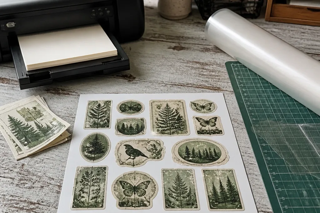
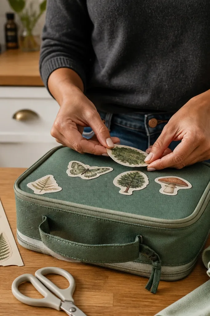
1. Mossy Label Frames With Tiny Corners
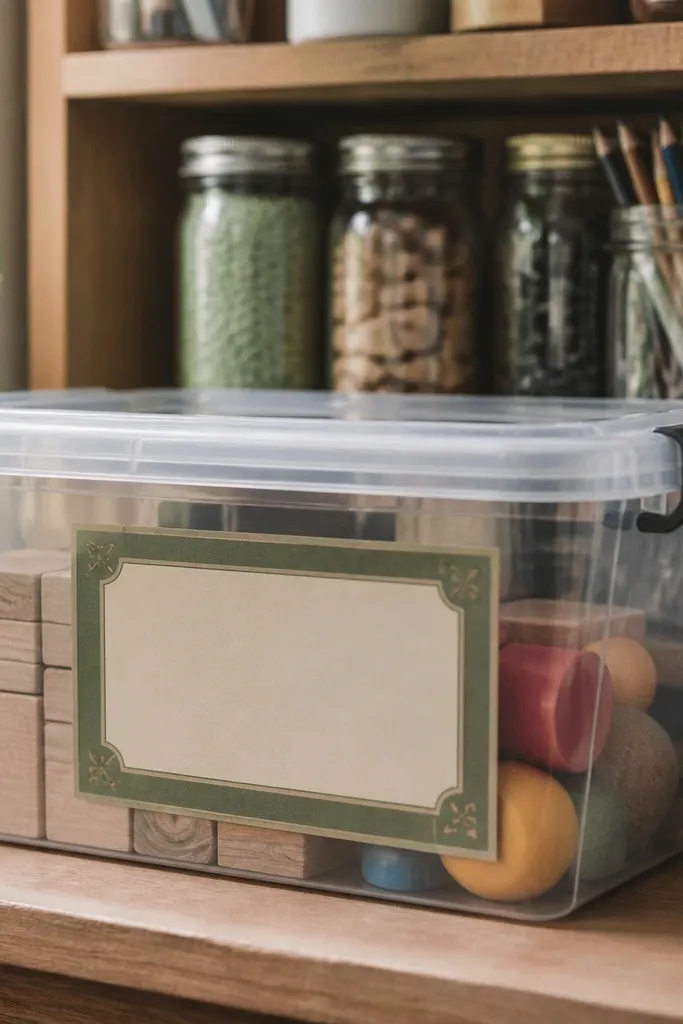
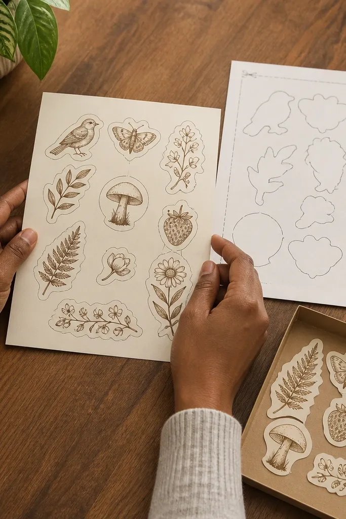
This is the sticker look that makes everything feel “put together” without covering the whole surface. The frame style gives you a clear border, so even when the print isn’t perfectly centered, the sticker still reads as intentional. Go for mossy greens with a slightly smoky background so it looks like old paper rather than a modern graphic. It works best on water bottles, lunch boxes, and the spine area of notebooks where you want structure.
Start by printing at 2.25 inches wide for bottles and 1.5 inches wide for notebooks. Use thick sticker paper and set your printer to its highest quality matte or photo setting. After printing, seal with a matte laminate sheet so the ink doesn’t scuff when kids toss backpacks. Finally, peel and stick only after you wipe the surface with a dry cloth so the frame edges stay crisp.
Editor's noteIf you’re seeing edge lift, press the sticker down with a credit card for 20 seconds, especially on corners.
Skip thisAvoid glossy finishes; green frames look streaky and plasticky under glare.
2. Old-Farm Market Sign Arrows
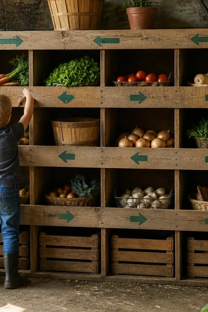
Arrow signs are a cheat code for good-looking vintage stickers because they add direction and rhythm. The design reads like something you’d find posted on a barn wall, but it’s still simple enough for a kid’s label. Choose arrows that are mostly solid shapes with a little distress — that makes them legible even at smaller sizes. This works great for arranging stickers on laptops, school folders, and binders where you want a “theme” without clutter.
Print the arrow set twice: 2.1 inches for the main arrow and 1.3 inches for the mini arrow accents. Cut cleanly around the outer arrow silhouette so the sticker edges don’t wobble. Seal with matte laminate or matte craft sealer applied in thin passes. Let it dry fully before sticking so the adhesive bonds through the finish.
Use a ruler and a sharp craft knife for cutting — arrow edges hide cutting errors much better when they’re straight.
Skip designs with tiny text; they blur when you seal with matte laminate.
3. Halftone Fern Corners
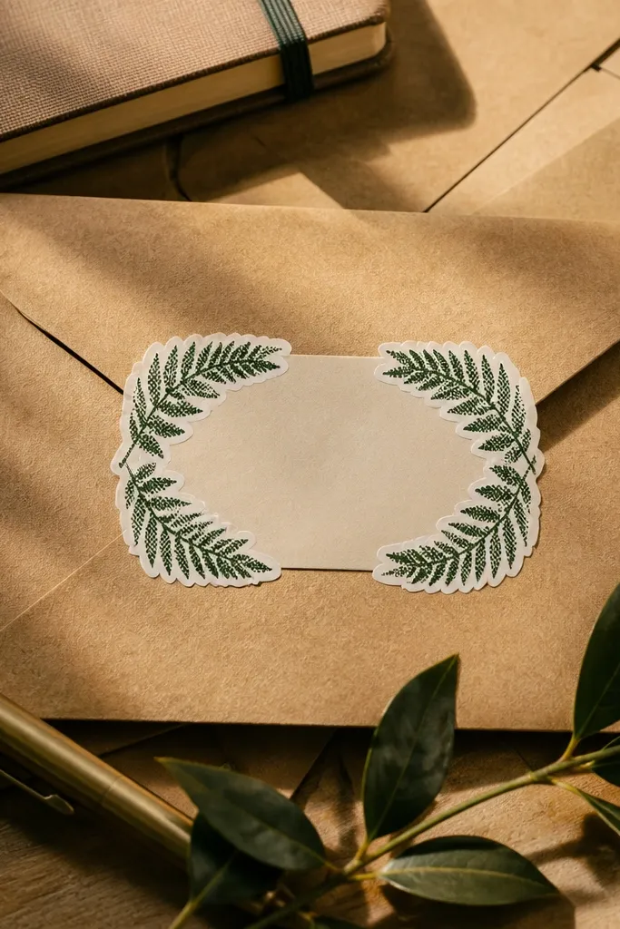
Corner accents look expensive because they frame the space without taking it over. Fern shapes also pair nicely with green — they look botanical instead of cartoonish. Halftone texture gives that vintage print feel, and the corners stay photogenic even if you place them slightly off-center. Use these to decorate the top-right or bottom-left corner of notebooks, pencil cases, and storage bins.
Print the corner set at 1.6 inches wide for most kids' notebooks. Cut with a small pair of scissors or a craft knife — corner details look better when you keep the outline tight. Seal with matte laminate, then trim any excess laminate around the sticker edge. Wipe the surface first, then place the corner and press along the longest edge, not just the center.
Editor's noteIf you want the corner to look more aged, add a light coat of matte sealer after sticking, not before cutting.
Skip thisDon’t over-saturate the green; dark green halftones look muddy if your printer is set too high.
4. Vintage Postage Stamp Squares
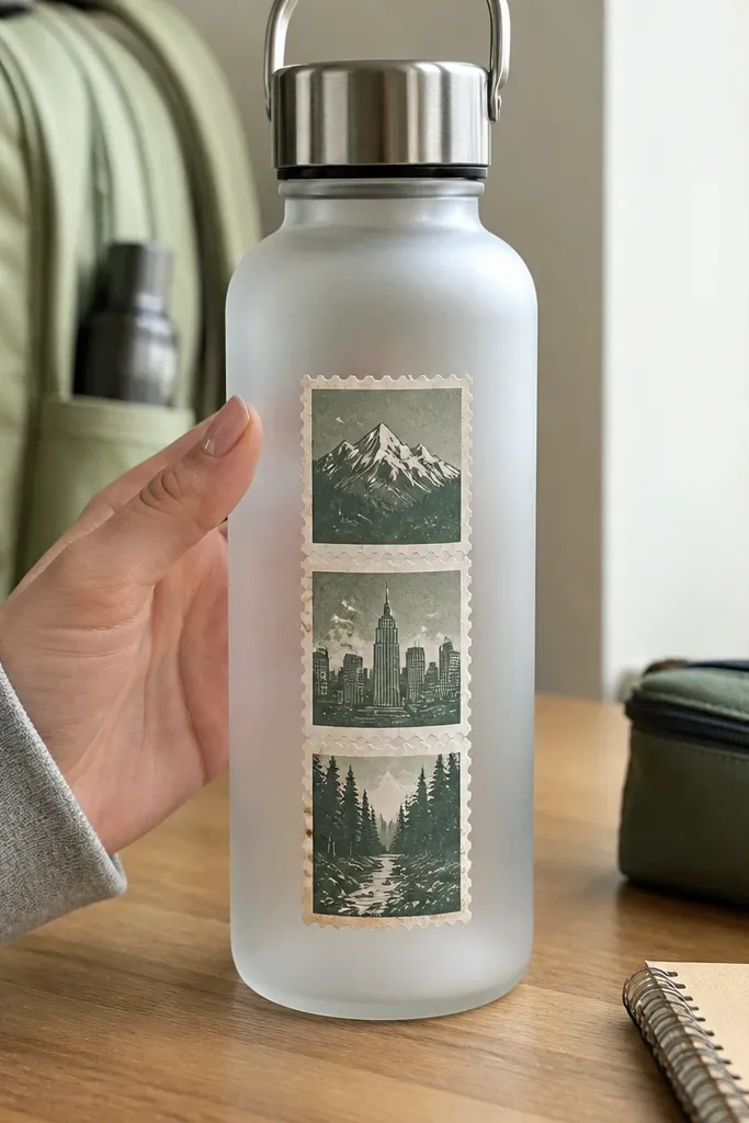
Postage stamps are instantly recognizable, and that makes them a low-maintenance design choice. You get a built-in border, plus the distressed perforation look hides minor edge imperfections. These are perfect for kids because you can mix a few stamps across a bottle without it looking random. Pick muted evergreen greens so the stamp doesn’t scream “new print” on day one.
Print at two widths: 2.4 inches for bottles and 1.4 inches for lunchboxes. Use thick sticker paper so the perforation border doesn’t warp when sealed. Seal with matte laminate and press the laminate firmly so it doesn’t create bubbles. Cut along the outer edge of the stamp, then apply one stamp at a time so placement stays neat.
Editor's noteTry placing stamps in a small cluster of 3: one large center and two smaller sides for a balanced look.
Skip thisAvoid transparent sticker paper; the stamp border needs opacity to look right.
5. Moss Ribbon Banner Text
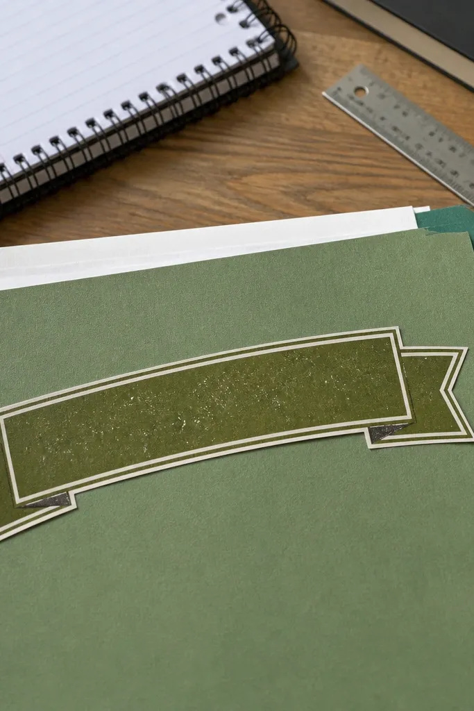
Ribbon banners are the cleanest way to add “name label energy” while still looking vintage. The shape gives you a flowing silhouette, and the distressed lettering makes it feel older than it is. This look is especially good for kids' storage drawers and school folders where you want a readable label without using plain tape. Keep the text short — 2 to 4 words — so it stays crisp after sealing.
Print the banner at 2 inches wide for folders and 1.35 inches wide for pencil cases. After printing, seal with matte laminate and cut close to the ribbon edges. If the banner has thin loops, round the corners slightly with scissors to reduce peeling points. Stick on a clean, dry surface and press the ribbon ends for 10 seconds each.
Use matte sealer on the sticker surface after placement to protect raised edges from scuffing.
Don’t pick super-thin fonts; they break up under matte laminate.
6. Garden Tool Silhouette Minis
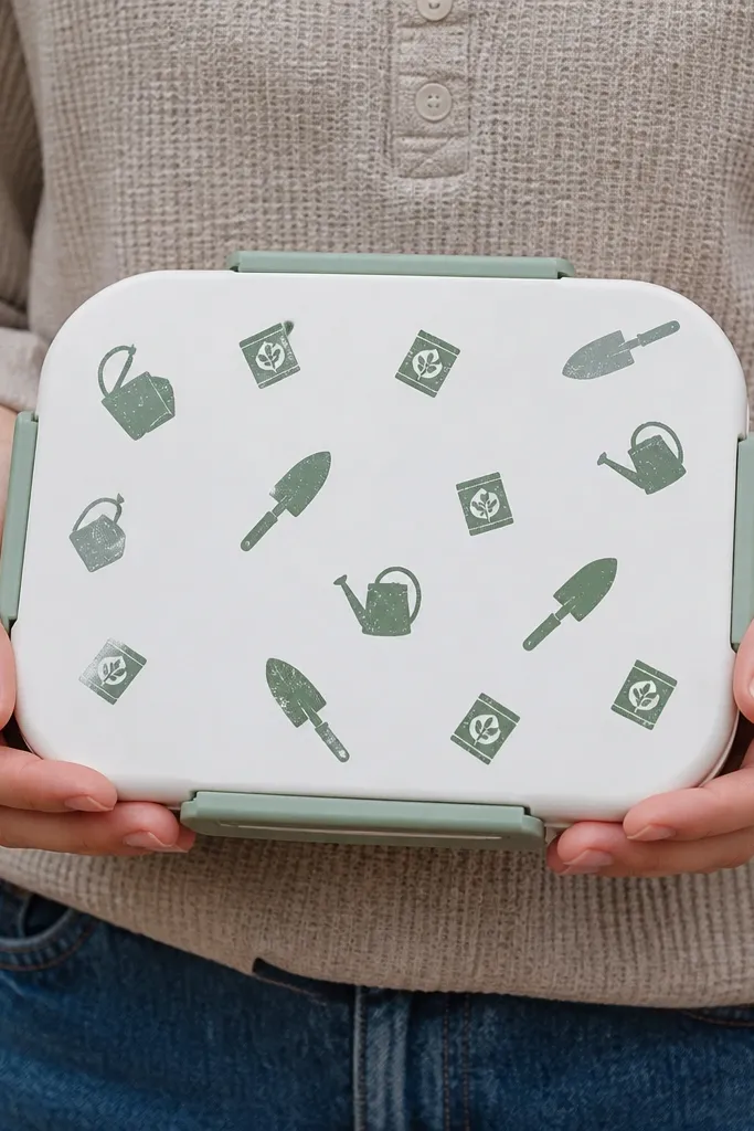
Silhouette minis look like a patterned scrapbook page, but they’re still low-maintenance because each sticker is simple. Choose tools like trowels, watering cans, and seed packets in one flat green shade with a slight distressed edge. These are great for filling blank space on lunchboxes and water bottles where one big sticker would look lonely. The best part is you can repeat the set — it stays cohesive.
Print at 1.2 to 1.5 inches wide and cut each silhouette separately. Seal with matte laminate, then trim away laminate corners so they don’t catch on backpacks. Place in a grid of 2 by 2 or a staggered diagonal so the pattern reads quickly. Press down firmly along the silhouette edges to prevent lifting.
If you’re using a matte laminate sheet, run the sheet through a laminator slowly to avoid wrinkles.
Skip multi-color tool silhouettes; they look messy once sealed and handled.
7. Weathered Botanical Roundels
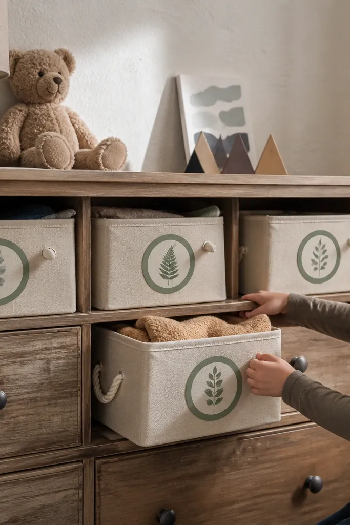
Roundels are the most forgiving shapes for kids' gear because they hide placement mistakes. The ring design makes the sticker look like a vintage label stamp, and the botanical element keeps it from feeling generic. Use muted green rings with subtle grain so the sticker looks aged rather than printed. This style looks best on flat surfaces like plastic water bottles, lunch trays, and storage bin lids.
Print at 2.25 inches wide for bottles and 1.5 inches wide for bins. Cut with a circle cutter if you have one, or use a craft knife and a printed circle guide for consistent edges. Seal with matte laminate and keep the laminate aligned with the sticker edge. Apply by lining up the ring first, then press around the outer ring, not just the center.
Editor's noteFor extra durability, seal again with a thin matte clear coat over the sticker after it’s stuck and fully dry.
Skip thisDon’t use glossy coating; roundels glare and look less “vintage.”
8. Old School Classroom Supply Icons
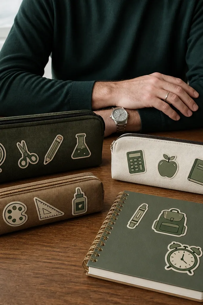
These stickers are practical and pretty at the same time. Classroom icons in vintage style make school supplies feel themed, and the muted green keeps it calm for kids. The icons also work as “spot labels” for pencil cases, folders, and notebook covers. If you pick icon designs with thick outlines, they stay readable after sealing.
Print at 1.4 inches wide for most school items. Use thick sticker paper and choose a high-quality matte print setting. Seal with matte laminate, then cut around the thick outline, leaving a tiny margin so the seal doesn’t peel at the edge. Place one icon near a corner seam or zipper so it doesn’t get scraped as much.
Editor's noteUse a small amount of rubbing alcohol on a cotton pad for glossy plastic — then let it dry fully.
Skip thisAvoid ultra-fine line icons; they break up when handled.
9. Distressed Green Recipe Cards
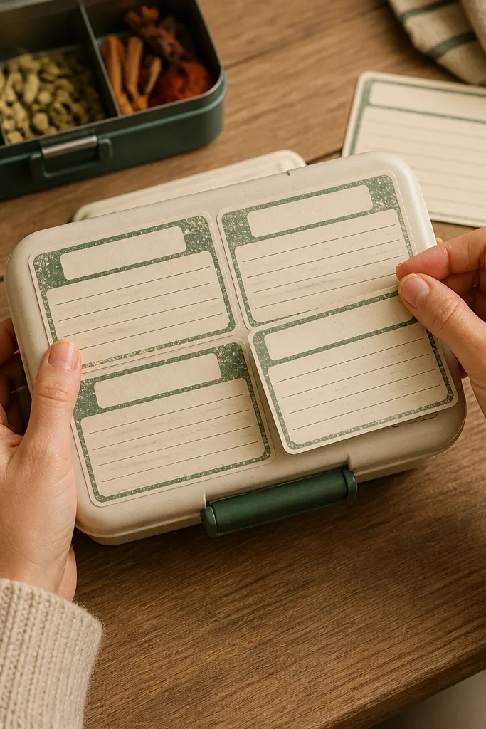
Recipe card stickers look like they belong on a pantry or a lunch kit, and they photograph beautifully because of the paper texture. The layout — lines, margins, and a small title block — gives a lot of visual interest without needing color variety. For low-maintenance results, pick cards that use one green ink and a simple distressed background. Put them on lunch boxes, thermoses, and storage jars to make the whole corner look styled.
Print at 2.2 inches wide for jars and 1.6 inches wide for lunch boxes. Seal with matte laminate so the paper texture doesn’t smear when it gets touched. Cut closely around the card rectangle, and trim any laminate that extends past the edge. Stick on clean, dry surfaces and smooth out from the center outward.
Editor's noteIf the card has thin border lines, press longer at the edges — they lift first on kids' items.
Skip thisDon’t choose cards with heavy shadows; matte laminate flattens shadows in a bad way.
10. Vintage Seed Packets
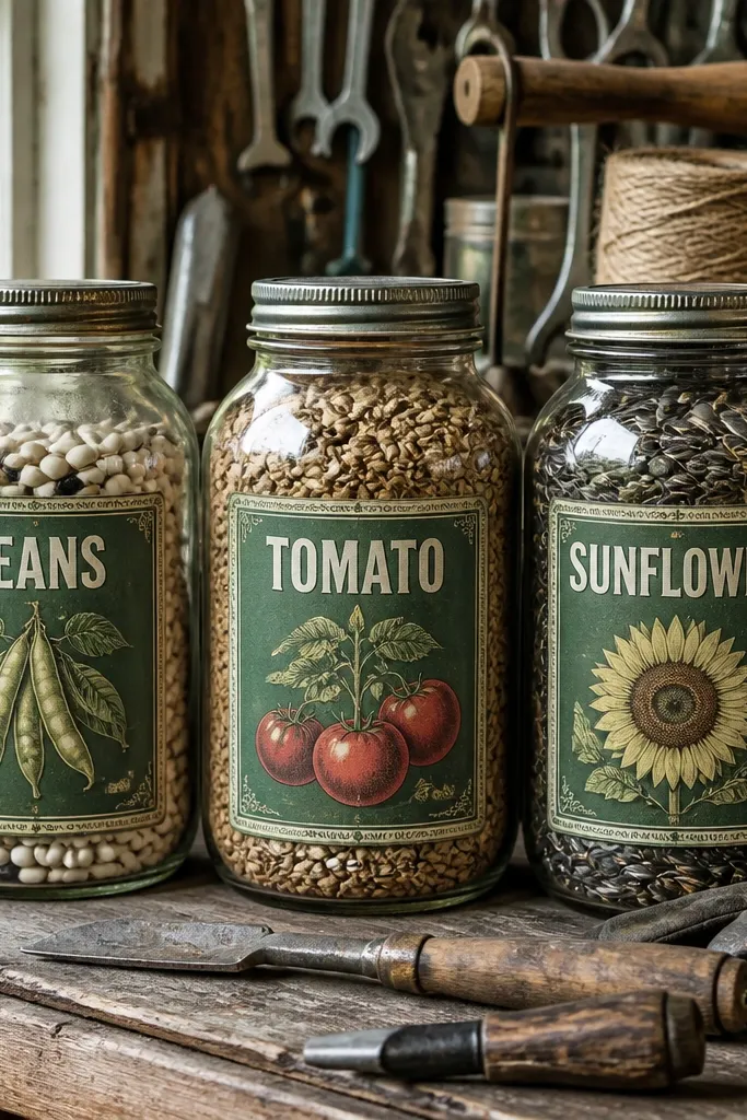
Seed packets look like real ephemera, and the shape gives you a natural “label” feel. They’re also great for kids because you can repeat the same packet design across a set of bins and bottles. Pick seed packet graphics with large block text and a border so it stays legible. The vintage green palette makes them look cohesive with craft supplies and school materials.
Print at 2 inches wide for bins and 1.25 inches wide for water bottles. Use thick sticker paper and a matte print setting to keep the background from looking shiny. Seal with matte laminate, then cut around the packet outline including the small corners. Apply to flat surfaces and press the corners down with your fingernail through a piece of scrap paper.
Use a craft knife for the packet corners — scissors snag the laminate edge.
Avoid seed packet designs with tiny seed names; they turn into blobs after sealing.
11. Garden Gate Frame Labels
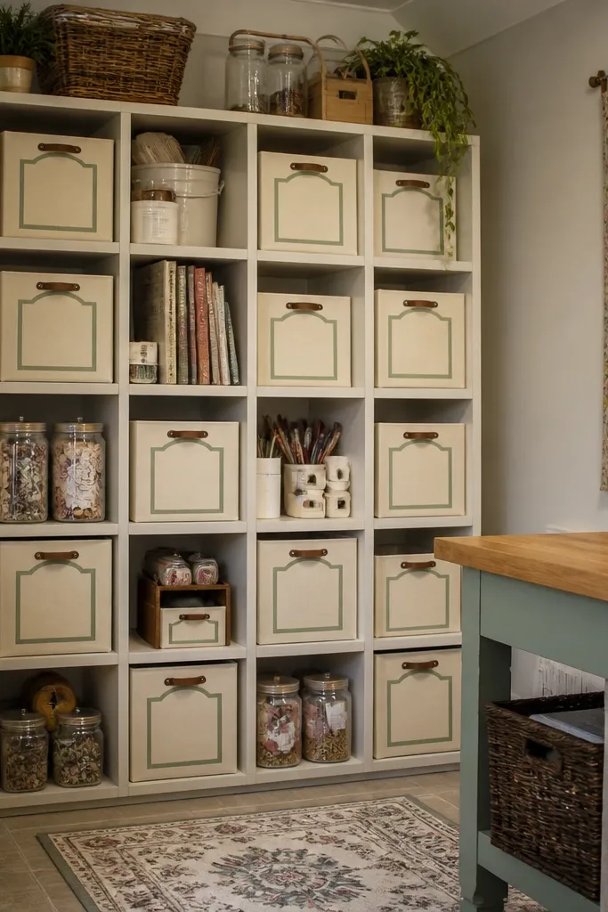
Gate frames give you a more decorative border than basic rectangles, but they’re still low-maintenance because the design is mostly outline. The aged border hides minor print shifts, and the gate shape makes placement on bins and shelves look intentional. Choose muted green with a slightly darker outline so the sticker reads from across the room. This is a strong pick for organizing kids' playroom containers.
Print at 2.3 inches wide for storage bins. Cut with a steady hand or a silhouette cutter if you have one, but keep the outline margin tight so it doesn’t curl. Seal with matte laminate and trim laminate flush with the sticker edge. Clean the bin surface, place the frame, and press around the outline first, then the center.
Editor's noteIf you’re sticking to textured plastic, warm the sticker with a hair dryer for 5-8 seconds before pressing.
Skip thisSkip high-contrast neon greens; gate frames look cheap under matte.
12. Halftone Weather Icons
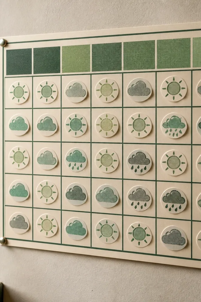
Weather icons are fun and still look vintage when you use halftone texture and limited colors. The sun, cloud, and small rain symbols create a sticker set that can repeat across multiple items without feeling random. This works especially well for kids because it reads quickly and adds personality without cluttering. Keep the icons in one green shade plus a slightly darker outline for consistency.
Print icons at 1.3 to 1.6 inches wide so they stay readable. Seal with matte laminate, then cut around each icon with a small margin. Place in pairs — one bigger icon and one smaller — so the set looks designed. Press firmly and let the adhesive settle for a full hour before rough handling.
Editor's noteUse matte laminate over glossy to prevent fingerprints from showing as shiny spots.
Skip thisDon’t use gradient-heavy icons; matte laminate kills the effect.
13. Old Map Compass Rose

A compass rose looks instantly vintage and it photographs well because it has a clear focal point. In green, it also stays kid-friendly compared to darker antique browns. The compass gives you a strong center design, which means you don’t need extra stickers to make it look complete. Use it on notebooks, skate decks, or storage lids where you want one statement sticker.
Print at 2.5 inches wide for the strongest impact. Seal with matte laminate and cut carefully around the outer ring so the edges look crisp. If the compass has fine tick marks, cut just outside the outer ring so you don’t nick thin lines. Apply to a clean, dry surface and press the outer ring for better adhesion.
Editor's noteIf you want it to look more “worn,” add a very light matte clear coat after sticking, then let it dry fully.
Skip thisAvoid glossy lamination; compass tick marks glare under light.
14. Vintage Library Callout Tags
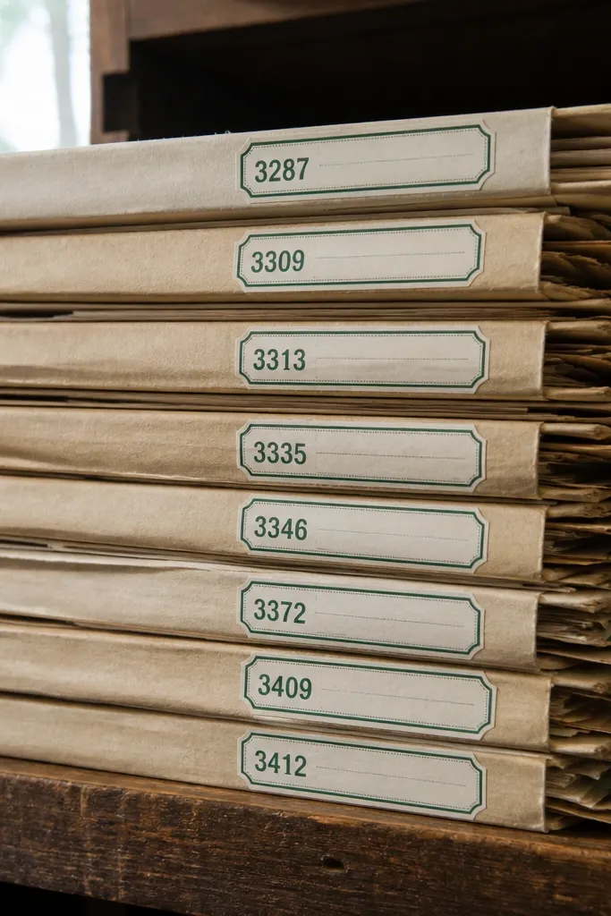
Library callouts are a great vintage look because they combine typography with a simple tag shape. The numbering and labels add visual texture without needing extra colors. This is a low-maintenance choice because tag shapes are easy to place in a group, and the border keeps the sticker edges looking clean. Use them on binders, book spines, and file folders.
Print tags at 1.6 inches wide and a second set at 1.2 inches for smaller folders. Seal with matte laminate so the print doesn’t smear when kids touch them. Cut around the tag outline and trim laminate flush. Stick one tag near the top corner and add a second tag below it for a layered look.
Editor's noteStick tags on the flattest area of a folder, not on the edge crease where they lift.
Skip thisSkip tags with ultra-small numbers; they get unreadable after sealing.
15. Mossy Corner Arrow Labels
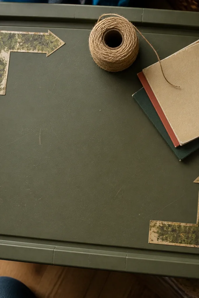
Corner arrow labels make a surface look organized without turning it into a wall of stickers. The arrow points give you a visual direction, so the sticker placement feels purposeful even if you’re just decorating. Choose mossy greens and distressed edges so it looks like an old label, not a modern sticker. Great for pencil cases, water bottles, and the front of lunch kits.
Print at 1.5 inches wide for most gear. Seal with matte laminate, then cut tightly around the arrow shape, especially the tip. Apply by placing the arrow tip first, then smoothing toward the tail. Press along the tip and edges for 10-15 seconds to prevent early lifting.
Use a fine-tip craft knife to cleanly cut the arrow tip point without tearing the laminate.
Avoid placing corner arrows on curved, high-scratch areas like bottle handles.
16. Vintage Garden Tool Brand Seals
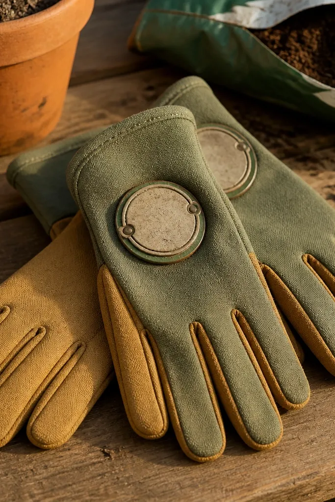
Brand seal circles look like old hardware labels, and they read well from far away. The seal format is perfect for low-maintenance repeating because you can place one large seal and then add smaller ones nearby. Keep the seal text bold and the green muted so it looks aged instead of printed. This style looks great on tool bins, lunch thermoses, and storage drawers.
Print the main seal at 2.4 inches wide and print the mini seals at 1.3 inches wide. Seal with matte laminate and cut around the outer circle edge. If the seal has small interior text, keep it inside the circle and don’t extend too close to the edge. Apply by pressing the outer ring first, then the center.
Editor's noteIf your printer tends to smear, let the sheet sit 10 minutes after printing before laminating.
Skip thisDon’t use bright kelly green; seal text loses its vintage feel under matte.
17. Old Orchard Banner Strips
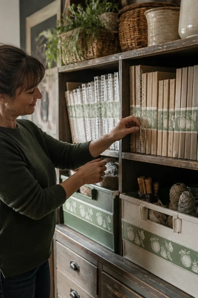
Banner strips are a good option when you want motion across a surface. They look like old signage clipped into sections, so you can place them horizontally on notebooks or vertically on bins. The vintage effect comes from the worn edges and limited green palette, not from extra colors. This is a strong aesthetic choice for organizing kids' craft shelves.
Print at 2 inches long for notebook covers and 2.25 inches long for storage bins. Seal with matte laminate, then cut each strip with straight edges so they line up cleanly. Apply in pairs — one near the top and one near the bottom — so it looks styled. Press down firmly and avoid stretching the sticker on curved plastic.
Use a straight edge ruler to align strips; even a 1/8 inch tilt shows on long banners.
Skip very long banners if your surface is curved; they wrinkle at the bend.
18. Weathered Green Botanicals in Frames
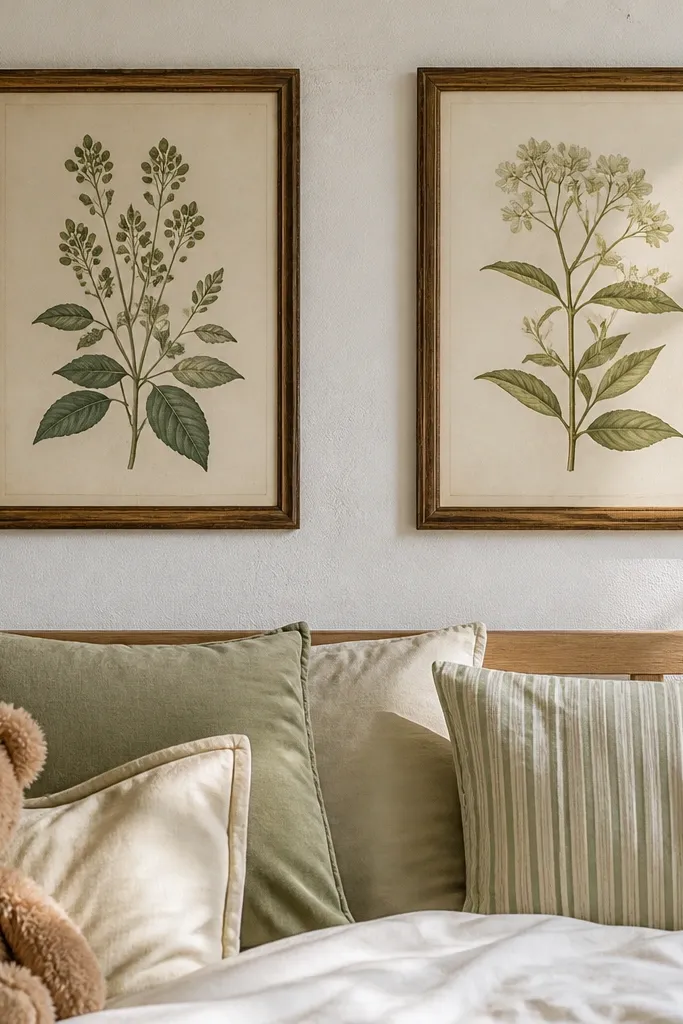
Framed botanicals make a simple sticker sheet feel like wall art. The frame gives you structure, while the botanical illustration adds that old print texture. Keep the palette to muted greens and one darker outline so the finish stays readable. This look is ideal for kids' rooms because it looks calm and intentional even when you use multiple stickers across a wall shelf or storage cart.
Print at 2.2 inches wide for visible surfaces and 1.5 inches wide for smaller bins. Seal with matte laminate and cut tight around the frame. If the botanical has fine leaf lines, leave a small border so the laminate holds the edges. Stick on clean, dry surfaces and press along the frame edges first.
Editor's noteFor best adhesion, wait until the surface is room temperature before sticking.
Skip thisAvoid heavy glossy backgrounds; they ruin the vintage paper vibe.
19. Distressed Green Corner Labels
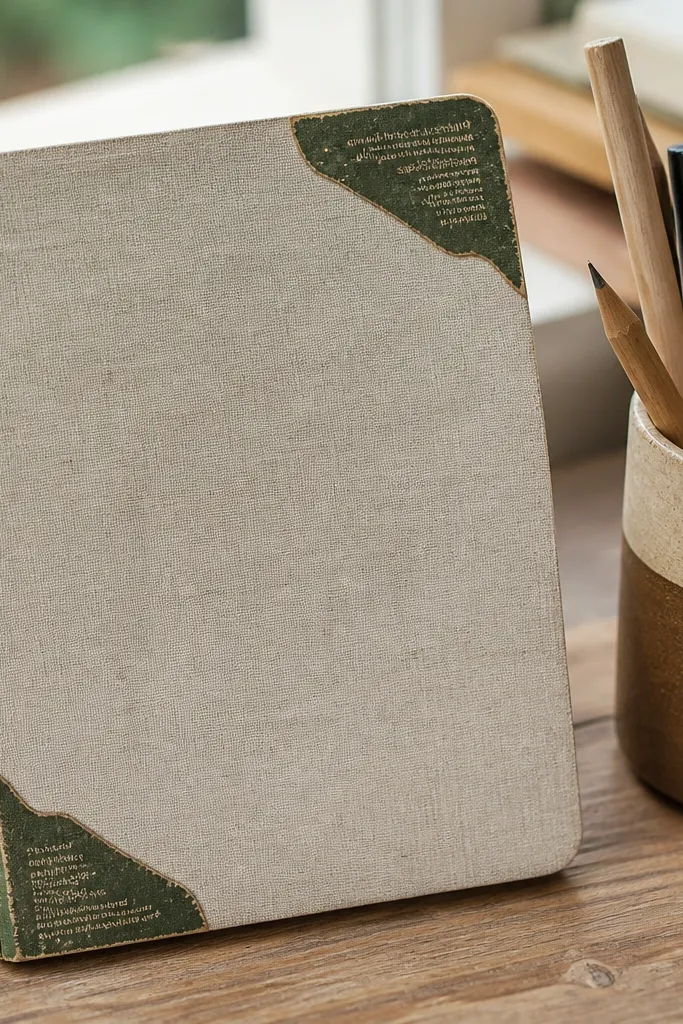
Corner labels are the easiest way to make a sticker set look curated without overthinking it. They sit neatly in corners, so you don’t need large empty space to make them look good. The distressing and small text blocks add age, and the corner placement keeps the look tidy on kids' items. Use them on notebooks, pencil cases, and storage bins where corners are flat and visible.
Print at 1.4 inches wide for corners. Seal with matte laminate and trim laminate flush with the sticker edge. Apply by lining up the corner first, then pressing the two edges that meet at the corner. Smooth from the corner outward so you don’t trap air bubbles under the distress texture.
Editor's noteIf bubbles show, poke a tiny pinhole at the bubble edge and press again through a cloth.
Skip thisAvoid placing corner labels over seams or zipper tracks where the sticker flexes.
20. Vintage Garden Sign Numbers
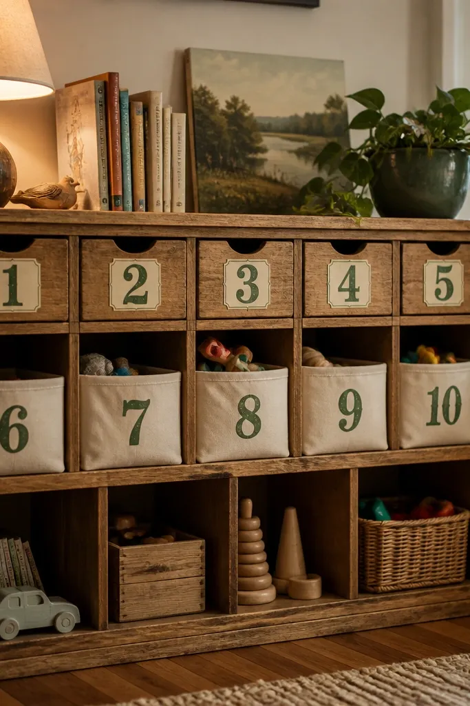
Numbers look great when you’re labeling kids' drawers, shelves, and toy bins — and they still feel vintage when the font is distressed and the palette stays green. This is low-maintenance because you repeat the same style across items, so everything matches even if you only add a few stickers. Choose designs that use thick digits with a worn border so they stay readable after sealing. Perfect for organizing without adding a ton of graphics.
Print numbers at 2 inches tall for bin labels and 1.2 inches tall for small containers. Seal with matte laminate, then cut around each number with tight margins. Apply to clean, dry surfaces and press firmly along the top and bottom edges of the digits. If you’re labeling curved containers, warm the sticker slightly before pressing.
Editor's noteUse a consistent placement rule: top-right for bins, bottom-left for drawers. It makes the set look intentional.
Skip thisSkip thin outlined numbers; they fade and chip at the edges.