1. Sepia Postage Pair With Cancel Marks
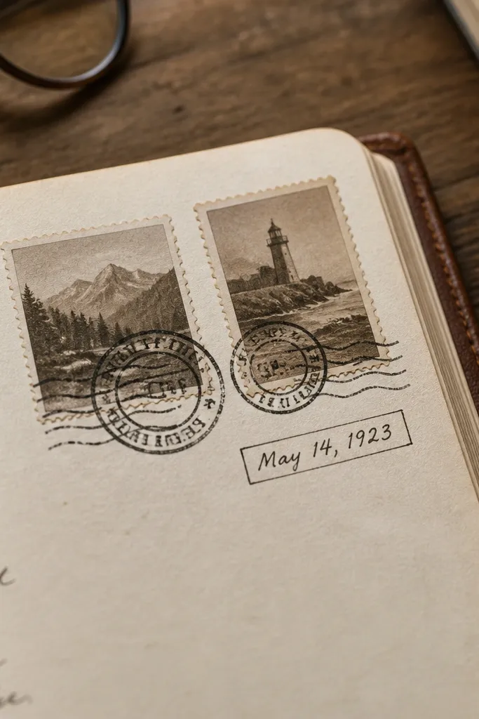
This is the fastest way to make a journal page look like it came from an old correspondence. The cancel marks give you instant texture, and the slightly uneven ink makes it look printed rather than pasted. Use the pair near a date box, on the corner of a pocket page, or as a subtle divider between entries. I like stamps that show a little ink bleed at the edges because they photograph soft instead of sharp.
Start by placing both stamps without pressing, using a ruler or a folded scrap paper to keep them aligned. Then stick the top stamp first, smooth with a burnishing tool or the side of a clean spoon, and finally press the second stamp while keeping a tiny gap for realism. Finish by adding a faint pencil shadow on the stamp edge facing the light source so the sticker doesn’t look like it’s floating.
If the sticker is glossy, wipe it lightly with a dry microfiber cloth before you apply edge ink or pencil shading.
Avoid stamps with bright modern colors or perfectly crisp borders — they scream “new sticker.”
2. Old Ledger Rows in Brown Ink
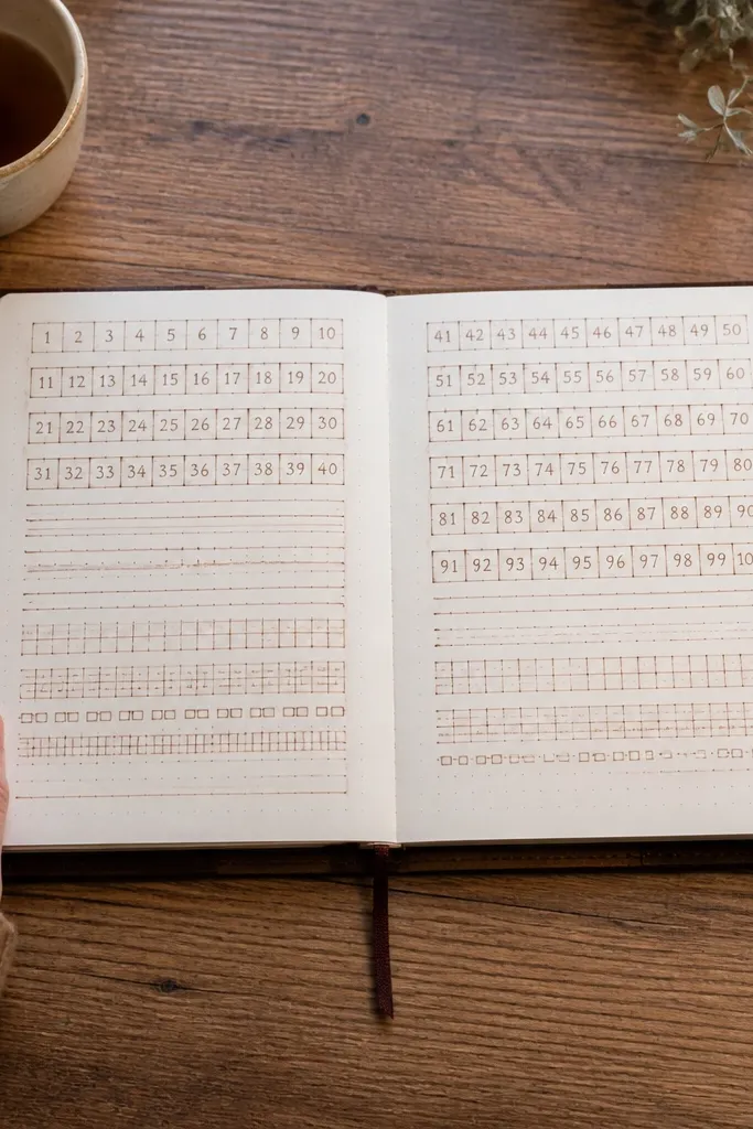
Choose a ledger sticker width that matches your page margins, usually about 1.5 to 2 inches for standard journals. Place it lightly first, then press from the center outward to avoid bubbles. If you want it to look like it belongs, add a small strip of matching brown ink along one edge with a foam brush, then let it dry completely before writing over it.
Ledger rows make your page feel organized even when the writing is messy. The thin rules and tiny number blocks create a grid that visually supports journaling, lists, and kids' daily tracking. Look for stickers where the lines vary slightly in darkness; that unevenness is what reads as authentic printing. This works especially well on plain notebook paper because the sticker supplies structure without covering everything.
Skip thisSkip ledger stickers with cartoon numbers or thick blocky fonts — they look like decoration, not ephemera.
Editor's notePair ledger rows with one short line of text in a contrasting pen color like dark gray so the sticker lines don’t compete.
3. Botanical Sprig in Faded Teal
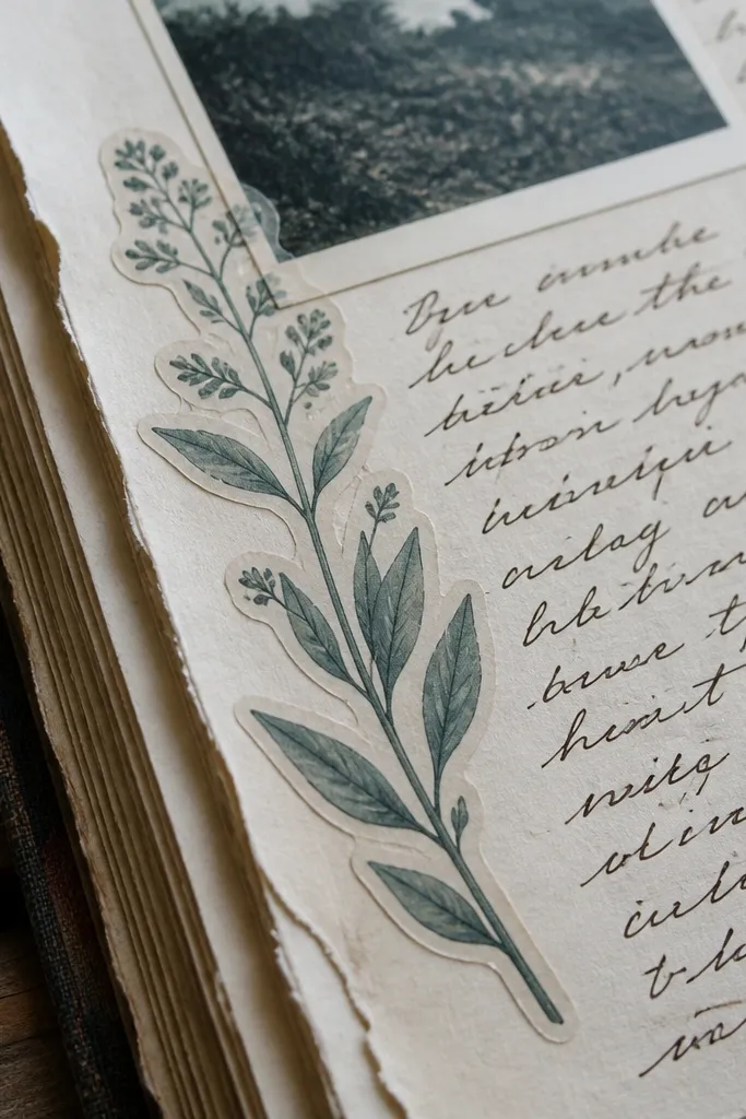
A botanical sprig gives you that “found paper” vibe without needing a whole collage. The faded teal is the sweet spot: it’s old-looking but still readable in photos. Use it as a side accent next to journaling, on the edge of a photo, or under a title line. I like sprigs that include tiny buds or seed shapes because they add detail even when you’re working quickly.
Place the sprig where you want a visual guide — left margin, top corner, or along a page fold. Press down the center first, then work outward so the delicate tips don’t lift. If the edges are too clean, blend them with a light dab of sepia ink using your fingertip or a makeup sponge, then wipe off excess on scrap paper.
Keep the sprig one per page for a high-end look; two sprigs start to look like a sticker sheet.
Avoid neon greens or solid teal that looks digital — vintage should feel muted.
4. Book Plate With Ornate Border
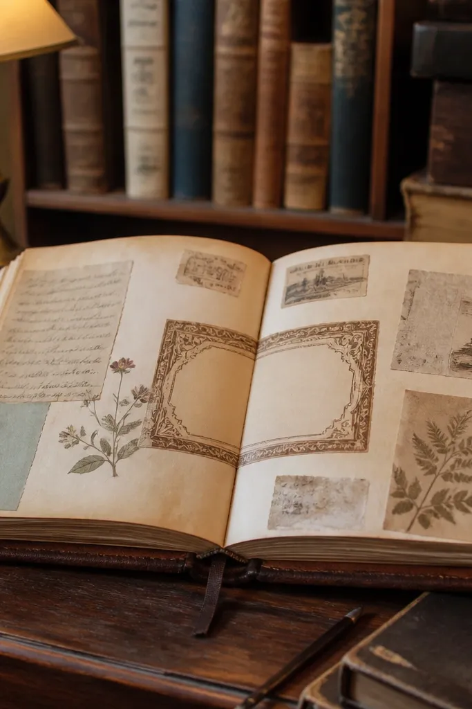
Book plate stickers make a journal page feel like a personal library page. The ornate border frames your content and makes the page look finished even with minimal writing. Choose book plates with faded lettering or a blank name area so you can add your own. This style looks especially good on thicker paper or mixed media pages because the border gives you something crisp to anchor the texture.
Center the book plate on the page or place it slightly above center for a calmer look. Press the border edges first, then smooth the center so the text area lays flat. If you want the border to look integrated, lightly age the sticker edge with a warm brown pencil and blend with a stump or tissue.
Write on top of the book plate only after the sticker is fully adhered and flat, so ink doesn’t smear on raised edges.
Don’t use book plates with super bold modern fonts — the mismatch makes the whole page feel new.
5. Vintage French Label Strip
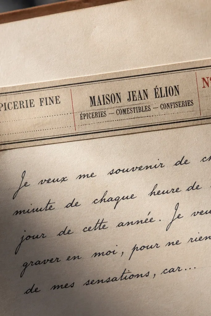
Cut or choose a strip that fits your page height, usually around 3 to 4 inches tall. Place it along the margin and align the text direction with your writing flow. Press, then add a thin shadow line under one side of the strip with a graphite pencil to make it look printed on top of the paper.
A French label strip adds instant sophistication because the typography looks like real print. It also solves a common journal problem: you need a heading that doesn’t look like a typed label. Look for strips with small accents — dots, tiny rules, or faded stamps — so it feels like part of an old document. This works well for kids' journals too because it creates clear sections for date, mood, or a single sentence.
Skip thisAvoid labels with high-contrast black text — vintage labels fade, they don’t look like a new sign.
Editor's noteIf your journal paper is thin, stick the label first, then write underneath so you don’t get show-through from heavy markers.
6. Aged Map Corner With Compass Rose
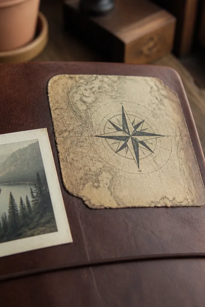
Trim the map corner sticker if the edges are too wide for your page — aim for a 2 to 3 inch footprint. Place it first, then lightly mark where the compass sits so you don’t skew the direction. Press firmly, especially around the compass rose details, then rub a little sepia ink around the outer edge to blend.
Map corners give you a subtle sense of place without turning your journal into a full map collage. The compass rose is a focal point that reads clearly in a photo, even when the rest of the page is simple writing. Use this in corners or around a small photo so the map edge frames the content. Choose versions with worn paper texture and muted ink so the border looks like it’s been handled.
Skip thisSkip map stickers with bright cartography blues — they look like modern printouts.
Editor's noteUse a ruler and pencil to keep the map corner straight; crooked maps look accidental, not artistic.
7. Vintage Ticket Stub in Rust Brown
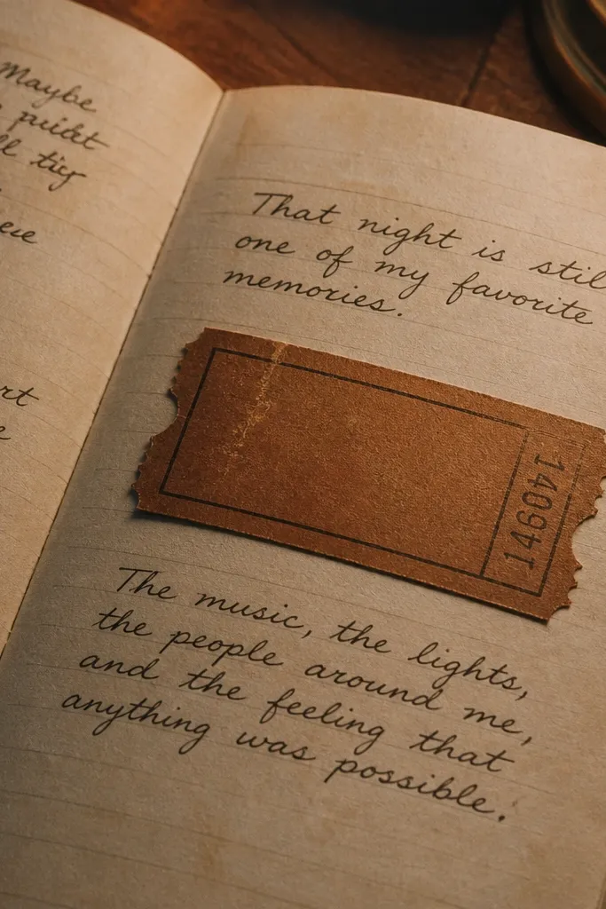
Choose a ticket stub size that matches your entry — small (about 1.5 inches wide) for side notes, larger for center accents. Stick it with the perforation aligned to your page fold if you have one, then burnish the center. If the stub edge is too clean, add a thin line of brown pencil along the outer border and blend outward.
Ticket stubs add motion and story to a page. The perforation lines give you built-in detail, and the rust brown feels warmer than standard sepia. Put one stub next to a short memory line, under a photo, or across a page crease for a fun vintage effect. This style is photogenic because the perforation reads like texture, not flat ink.
Skip thisDon’t pick ticket stubs with thick neon accents or metallic foil text — it ruins the aged look.
Editor's noteMatte finish looks best; gloss ticket stickers catch light and show the sticker layer.
8. Faded Recipe Card With Pin Holes
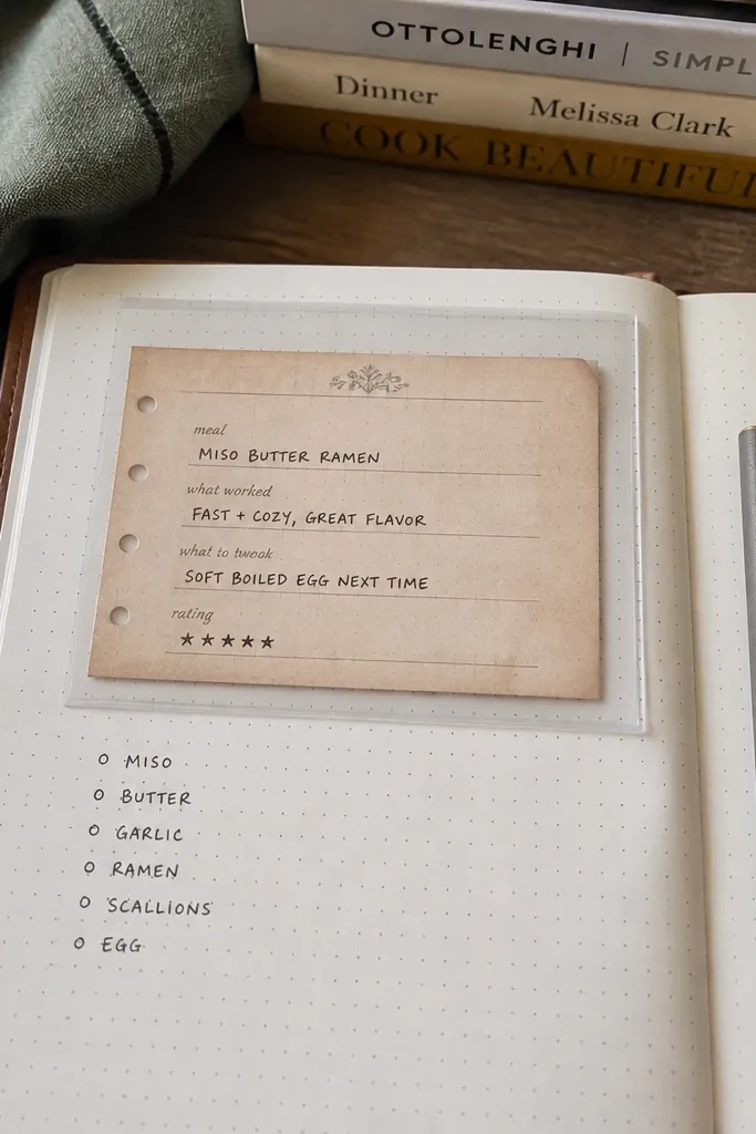
Place the recipe card where you want a writing box, usually slightly off-center. Press from the top pin hole outward so it stays flat. Then add a light wash of watered-down brown acrylic or ink around the edges with a small brush, and let it dry before writing inside.
Recipe cards are a cheat code for “high-end” journaling because they feel functional, not decorative. Pin holes add realism and make the sticker look like an actual card you’d keep. Use them for meal logs, kids' snack ideas, or any page where you want a clear block for one-liners. Pick cards that have slightly worn corners or faded text blocks so the sticker doesn’t look like a template.
Skip thisAvoid recipe cards with perfectly uniform crisp text — vintage cards have soft edges.
Editor's noteIf you plan to write on it, test your pen on scrap paper first; some ink pens smear on slick sticker stock.
9. Antique Key and Lock Mini

Use a pencil to mark placement — just a dot where you want the key tip to end. Apply the sticker, then press carefully around the thinnest lines so they don’t lift. Finish by adding a micro shadow with graphite on the side closest to the light source.
Mini keys and locks are great when you want a single “story object” without filling the whole page. They work in the margins, on bookmark pages, or as a tiny accent near a title. Look for linework that’s thin and slightly uneven; those imperfections make it feel like old engraving. This is also a good option for kids because it’s easy to place and doesn’t require a whole layout.
Skip thisSkip chunky, cartoon keys — they look like toys, not ephemera.
Editor's noteIf the sticker is die-cut and very clean, lightly sand the edge of the backing paper side before applying for better blending.
10. Vintage Flourish Frame for Titles
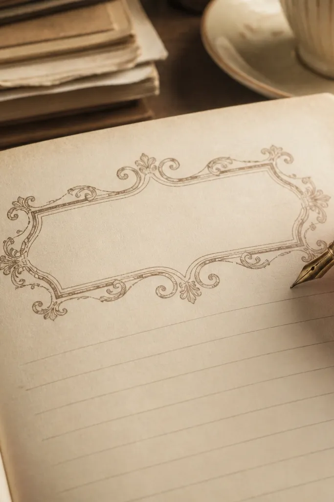
Stick the frame first, centered or aligned to your page heading line. Press corners down carefully, then smooth the inner area so the center stays flat. Add a thin pencil line under the frame if you want a grounding effect; then write inside the center with a pen that matches the sticker tone.
A flourish frame makes your title look intentional in a way plain text never will. It also gives you a consistent shape for repeated daily entries, which is exactly what makes a journal feel “daily” instead of random. Choose frames in muted brown, faded black, or deep charcoal so they match older paper tones. This is best for one-page spreads where you want the title to be the hero and everything else stays simple.
Skip thisAvoid frames with thick gold outlines or bright colors; they read modern.
Editor's noteUse a fine tip pen for the title so letter edges don’t look heavy against thin engraving lines.
11. Old Postcard With Border and Stamp Box
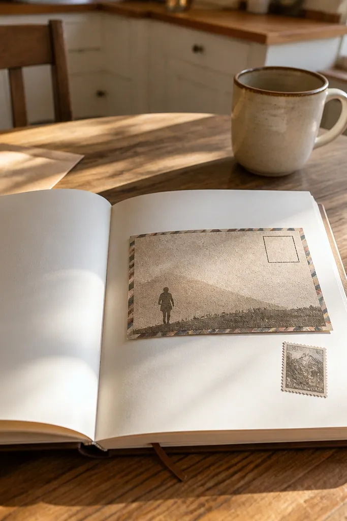
Place the postcard sticker so the stamp box sits where you’ll write a short date or mood label. Press down the border first, then the center message area. If the background is too clean, dab a tiny bit of sepia ink around the sticker edge with a sponge and let it dry before writing.
Postcards are a layout hack because they already have built-in zones: message area, address/stamp box, and border. That structure makes your journal pages look styled even when the content is just a few lines. Choose postcards with a slightly mottled background and a faint picture silhouette so it feels like a scanned artifact. Use one per page near the middle so the border frames your writing.
Skip thisSkip postcards with modern photo-style clarity; vintage should look soft and worn.
Editor's noteKeep your handwriting slightly larger inside the postcard zone; it looks more “published” against the printed border.
12. French Manuscript Marginal Notes
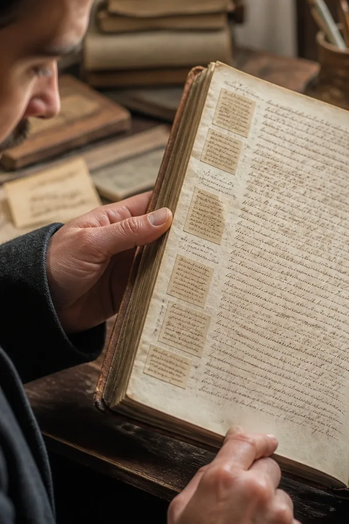
Start by arranging note blocks on scrap paper to decide spacing, aiming for 0.25 to 0.5 inches between clusters. Stick the first cluster, then place the second so the handwriting angles match. Finally, add a micro edge shadow with pencil around the densest ink blocks to prevent the sticker edge from showing.
These tiny marginal notes make a page feel alive without adding clutter. The trick is scale: the writing should be small enough that it reads as texture, not another full paragraph competing with your journal text. Place them along the side margin as a visual whisper. I like sets that include a few different note blocks so the margin doesn’t look like a single repeated stamp.
Skip thisAvoid marginal notes that are too legible; if you can read it from across the page, it will fight your text.
Editor's noteUse a slightly different pen for your own writing on the main line so it doesn’t blend into the sticker “fake handwriting.”
13. Vintage Botanical Diagram Labels
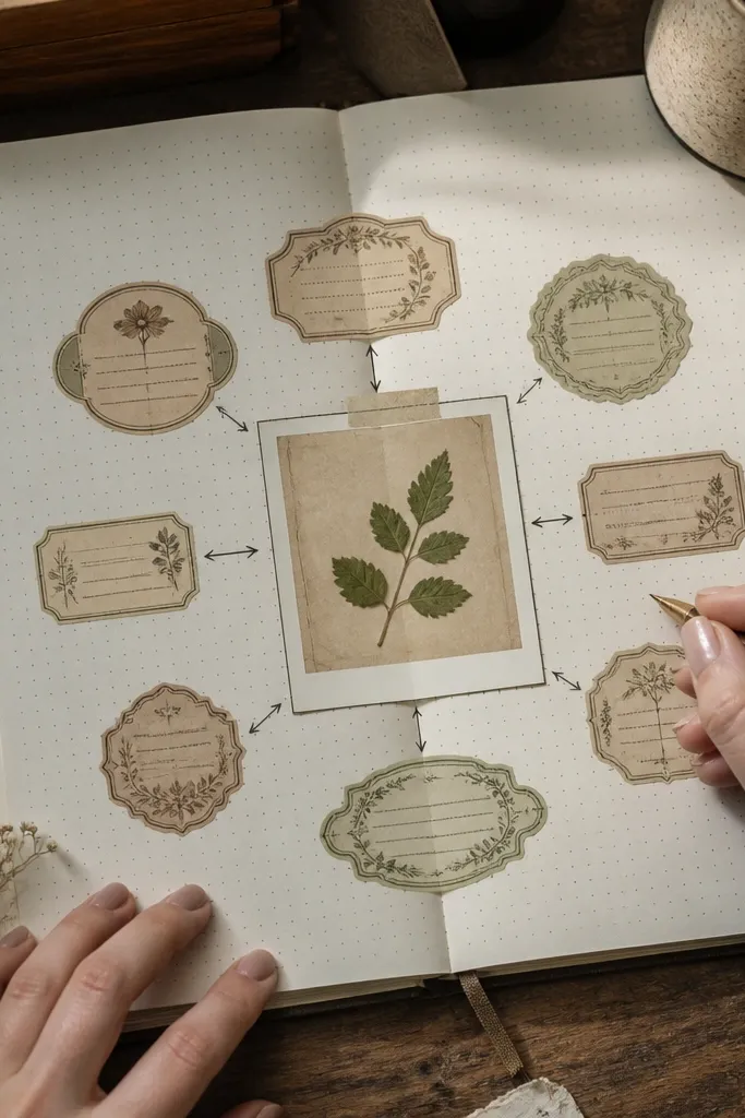
Diagram labels bring a scientific, old-book vibe that looks great on kids' journals and learning pages. The callouts and arrow lines create a natural guide for writing: you can place a short word or number near each label. Choose stickers with thin arrows and small serif text in muted brown or dusty green. This style photographs well because the lines hold shape and don’t blur like heavy florals.
Place the diagram sticker first, then write one short item next to one callout instead of trying to fill every label. Press the arrow lines down carefully along their length. If the sticker edge is too crisp, rub a little brown ink just around the outer border and blend with your fingertip.
Use colored pencils for the added notes; they match the muted print tone better than bright markers.
Skip diagrams with thick black outlines — they look like modern science clip-art.
14. Vintage Candle Label With Wax Drips
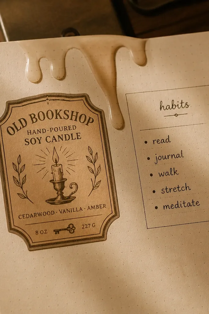
This sticker style adds texture even when it’s small. Wax drip shapes look dimensional on paper, and the label typography makes it feel like packaging from an old shop. Put it near a habit tracker, a kids' “today I did” list, or as a side accent beside a photo. Choose wax drips that fade into the paper tone, not hard black, so it looks like the ink has aged.
Stick the label so the wax drip points toward your page center for a balanced look. Press the label first, then go back and press the drip tips with a fingertip or soft tool. Add a light pencil shadow under the drip edge so it reads as a raised wax impression.
If you’re using glossy journal pages, scuff the sticker back lightly with your nail so it grips better.
Avoid candle labels with modern typography or bright red wax — it breaks the vintage mood.
15. Old Photo Corner Frames
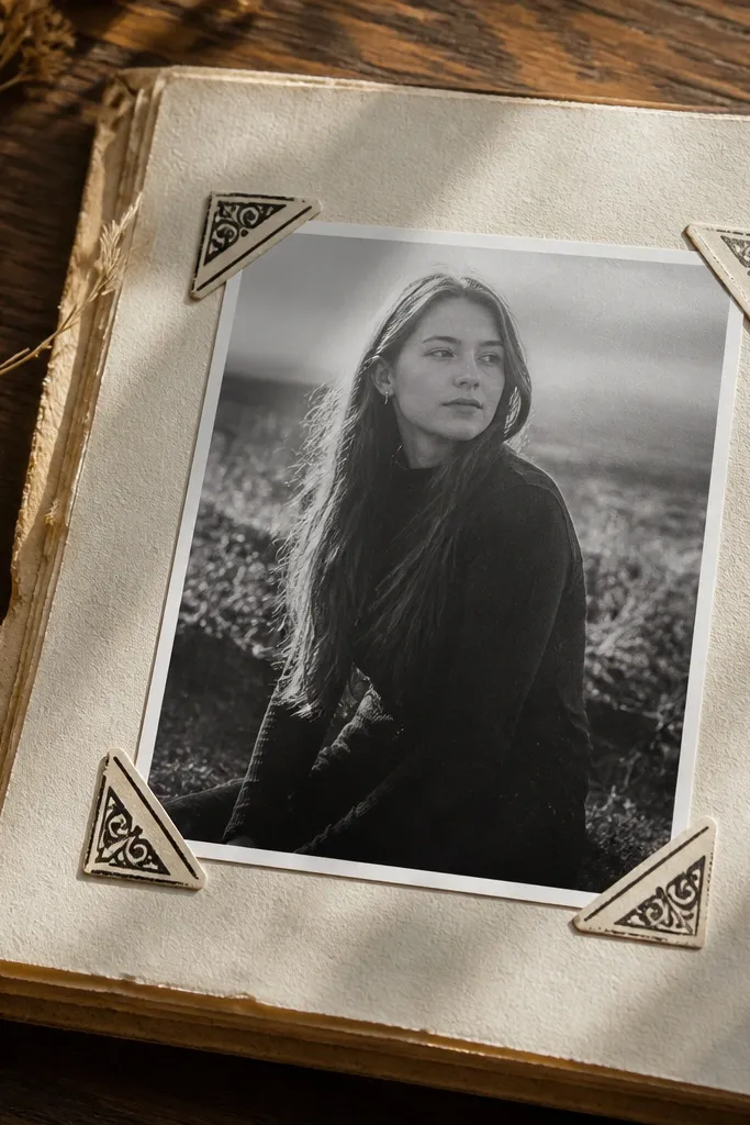
Trim or choose frames that match your photo size, leaving 0.25 to 0.5 inches of photo border. Place one corner at a time and check alignment before pressing fully. Once all corners are down, add a tiny brown ink wash behind the photo edge so the photo blends into the page.
Corner frames make photos and printed scraps look like they belong in an archive. You don’t have to cover the whole page, just anchor the edges with period-correct styling. Choose frames with worn ink, slightly uneven line weight, and small decorative corners. This style is especially good for kids' journals because it helps photos look tidy even when the page is busy.
Skip thisAvoid frames with thick uniform lines; they look like a modern border sticker.
Editor's noteUse a matte photo print; glossy photos will reflect light and make the corners look less vintage.
16. Vintage Label Tabs for Sections
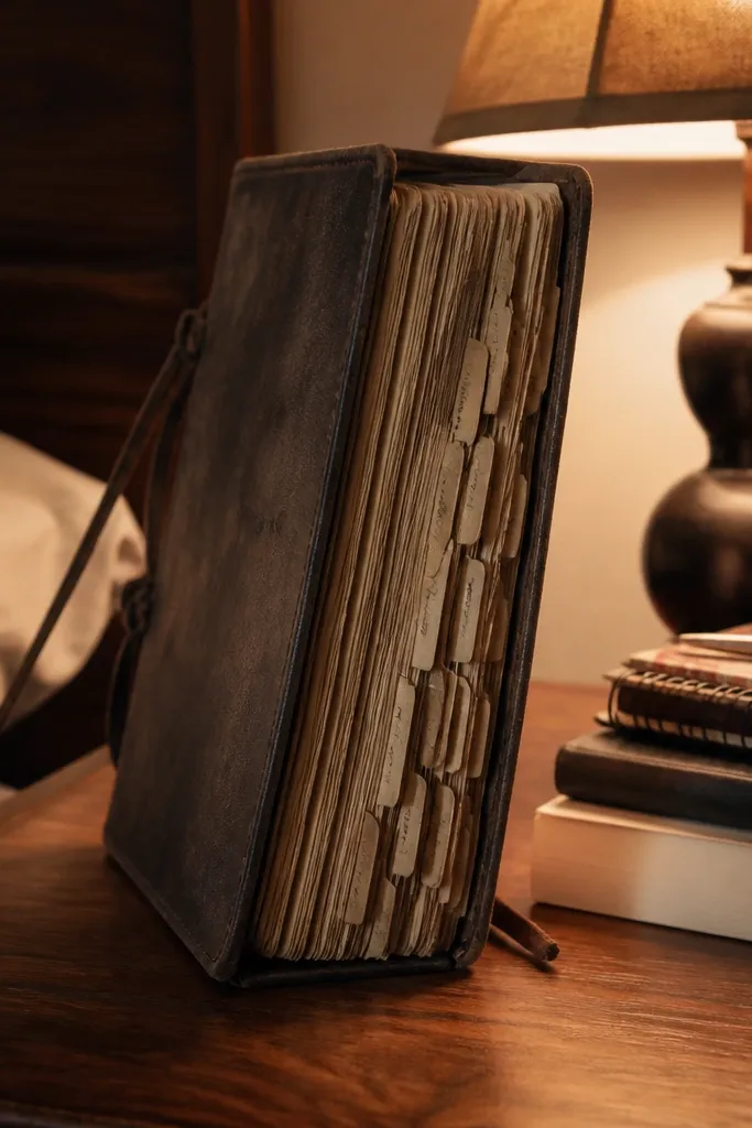
Label tabs are how you turn a journal into something that feels organized and collectible. They’re also the easiest way to keep a daily routine visually consistent. Use them to mark chapters, weeks, or kid-friendly categories like “School,” “Ideas,” and “Gratitude.” Choose tabs with slightly curved edges and faded text blocks so they look like real paper tabs, not straight labels.
Lay out your tabs first without sticking, spacing them so each tab has a clear gap for readability. Stick only one edge at a time, pressing down the tab tip last so the strip stays straight. If the tabs are very clean, rub a thin line of sepia ink along the outer edge for a worn look.
Write your own text with a pencil first, then go over with a pen once you like the spacing.
Skip tabs with perfect, glossy finish; they look like they were peeled from a sheet yesterday.
17. Antique Seal Round Sticker
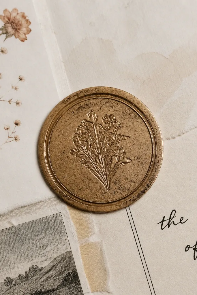
Place the seal where your eye should land first — top corner or near the center of a blank page area. Press firmly around the outer ring, then smooth the center. Add a light pencil shadow around the seal edge so it reads as a stamped mark sitting on paper.
Round seals look fancy because they create a clear focal point. They also solve a common design problem: you need something to tie scattered elements together. Use one seal to mark a page theme, label a gift note, or stamp a corner of a collage. The best seals look slightly worn and uneven, with faint ring marks that feel like real stamping ink.
Skip thisAvoid seals with crisp modern icons; vintage seals have softened, imperfect edges.
Editor's noteIf the seal has a transparent background, keep it away from busy photos so the ring stays readable.
18. Vintage Ornament Divider Dashes
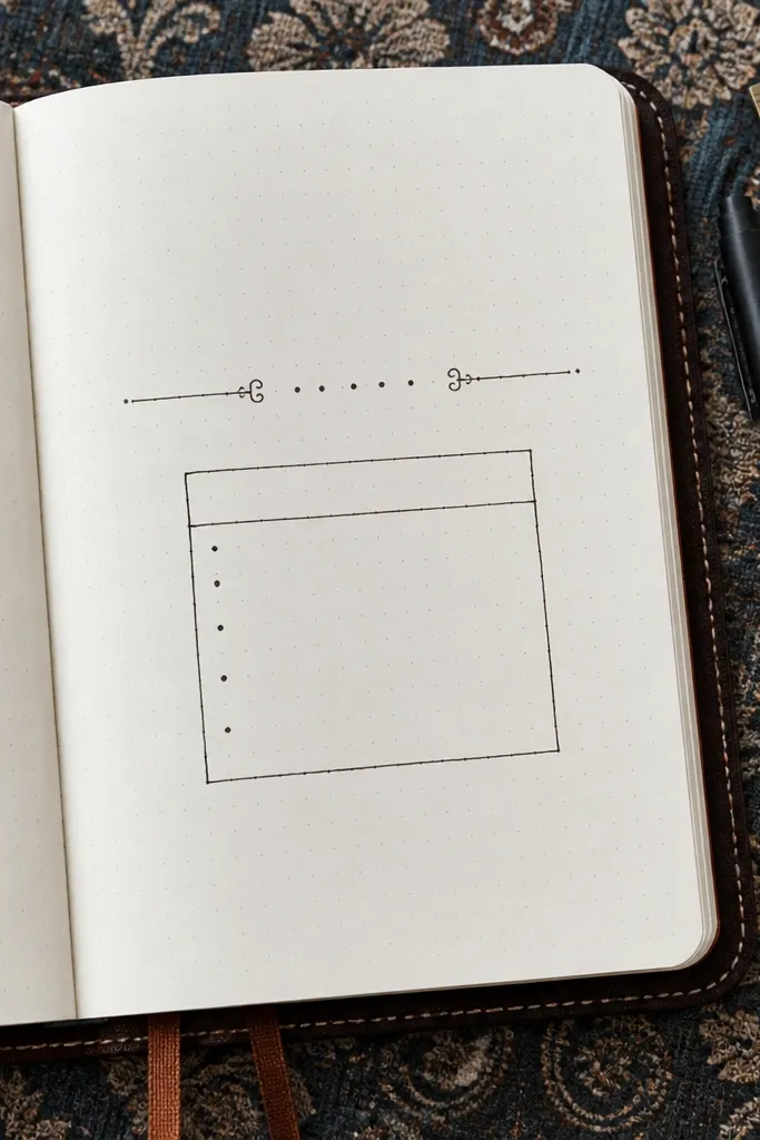
Divider dashes are small but they make a journal look designed. They separate sections without adding bulk, and they photograph cleanly because the linework is thin. Use them under a date, between a list and a paragraph, or to frame a kid’s “top 3 things” box. Pick dividers with tiny curls or dot clusters so the line doesn’t look like plain rules on a modern notebook page.
Choose a divider length that matches your text block width, then place it just below your writing baseline. Press along the line slowly, especially at curls or dot clusters. If the divider edge is too sharp, blend a warm brown pencil along the outside of the line so it looks like ink on paper rather than a cut sticker.
Use one divider per page for a clean, high-end look; two can start to feel busy.
Don’t use ultra-thin hairline dividers that fade into bright paper — you lose the vintage effect.
19. Faded Typography Word Sticker Set
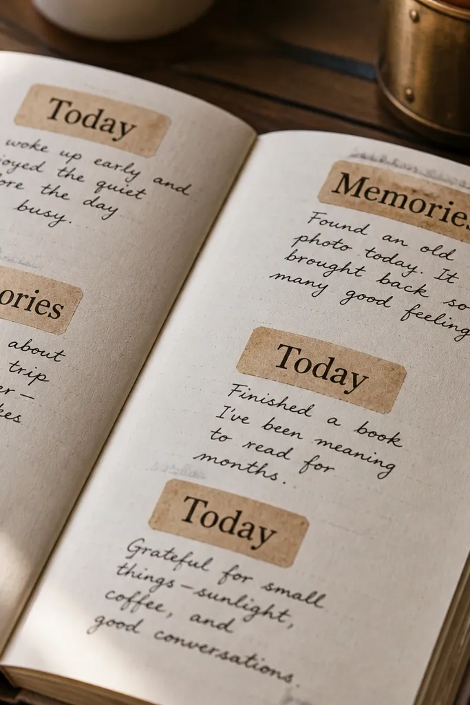
Pick two words that match your page mood and keep them in the same position every day. Place the first word as a title, then add the second word near a list or photo. Press down firmly, then add a light ink rub around the edges if the sticker looks too clean against your paper.
Word stickers are how you build consistent tone across days. Choose sets with faded serif words like “Journal,” “Notes,” “Memories,” or “Today,” printed in warm brown. They’re perfect for kids because they reduce decision fatigue: you can build a page layout in minutes using a few repeat phrases. For your own pages, use them as anchors — one word near the top, one near the bottom — so the page feels intentional.
Skip thisAvoid bright black word stickers; they look like labels, not aged print.
Editor's noteMatch your pen color to the sticker ink tone — warm brown + dark gray pens look best together.
20. Weathered Library Spine Strips With Faux Call Numbers
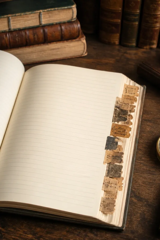
This is the sticker look I reach for when I want my journal pages to feel organized without looking modern. Library spine strips add a built-in structure — you get a long, narrow graphic that sits neatly along page edges, and the faux call numbers read like real cataloging. The weathering matters: it gives you that soft ink fade and scuffed paper texture that looks expensive in photos. You can make them in 10-20 minutes per sheet once your template is set, and they work for planners, travel journals, and recipe notebooks where you want headings that don’t scream “printout.” For high-end Vintage Stickers, the trick is keeping the typography imperfect — slightly misaligned, lightly smudged, and framed by paper wear.
Cut strips from vintage-style paper or cardstock, 1.2 inches wide by 3.5 to 4.5 inches long. Tear one long edge and lightly round the corners with scissors so the sticker looks handled, then sand the strip edges with fine sandpaper (220 grit) for that worn border. Print or hand-letter call numbers using a black or deep brown ink, then add a second line for letters and a tiny “VOL” or “NO” in a smaller size. Stipple the edges with a makeup sponge and diluted sepia ink, then dab a little watered-down gray-brown acrylic near the top like old shadowing. Seal with a light matte spray or brush-on matte medium, and let it dry fully before peeling off the backing and sticking.
Use a straightedge for the call number baseline, then add tiny intentional misregistration by shifting the second line 1-2 mm — it reads “printed long ago” in photos.
Don’t seal before the ink is fully dry — it can smear into a muddy blur instead of a faded print effect.