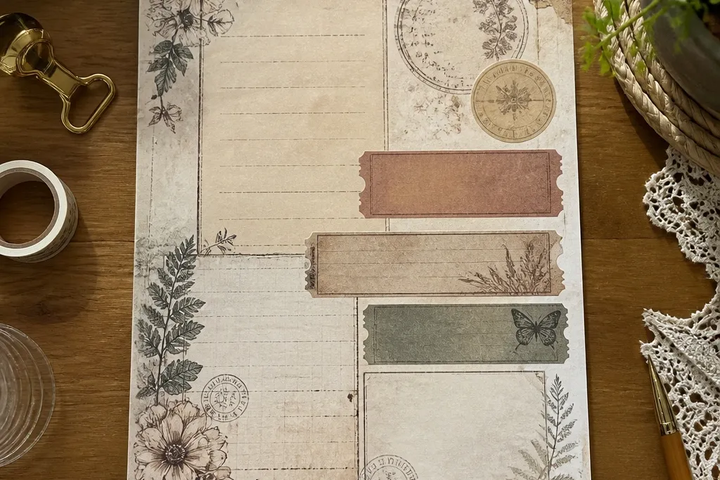
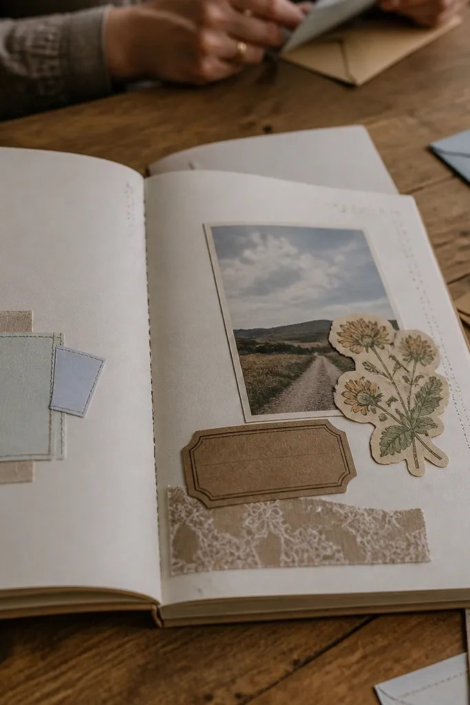
1. Aged Postal Seal Set
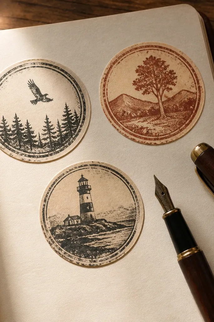
These are the easiest way to make a journal page look “received” instead of “made.” Round seals mimic old mail marks — they add instant structure and a bit of mystery, even when you’re writing about something simple. Print them on matte sticker paper so the ink looks flat and paper-like, not glossy. The best part is how they anchor a cluster: put one near a corner and let your handwriting fill the rest. This works great for travel journals, letter-style spreads, and any page where you want a date stamp feel.
Start by printing the seal set at 100% on matte sticker paper. Then cut each seal using micro scissors, staying close to the outer ring so the edge looks intentional. Finally, place one seal on the page and lightly dab a little brown ink along the outer edge with a cotton swab to deepen the vintage look.
If your printer runs warm and slightly smudges, let the sheet dry for 20 minutes before cutting.
Don’t ink the center — it turns readable text into a blur.
2. Library Card Labels
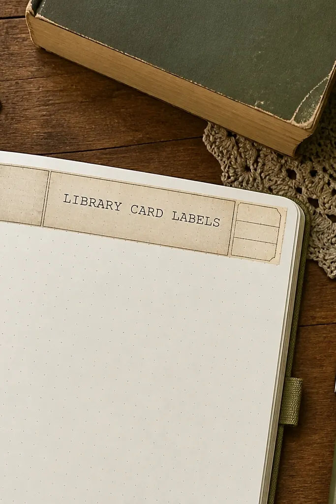
Library card labels are pure journal utility with a vintage skin. They look like something you’d find tucked into a book, so they instantly add credibility to a page layout without needing extra drawings. Use them as headers for entries, category tags for collections, or a “from the archive” section. They also layer well under washi tape because their borders catch the tape’s edges. Print them on off-white cardstock for the most authentic paper feel, then seal with a matte fixative if you’re using wet ink nearby.
Editor's noteUse a glue stick instead of liquid glue to keep the paper from warping.
Print the labels on off-white cardstock first. Cut along the outer border with a craft knife and ruler for straight edges. Then adhere with a thin glue stick or double-sided tape, and add a tiny brown ink dot in the label corner for a stamped feel.
Skip thisAvoid thick glue — it creates bubbles under the border.
3. Botanical Margin Corners
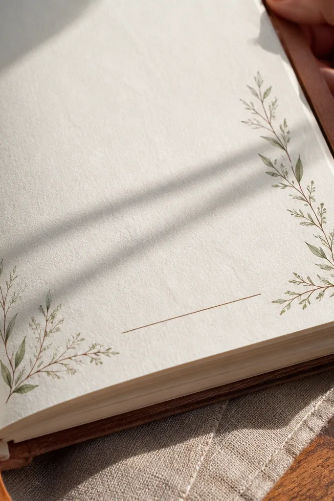
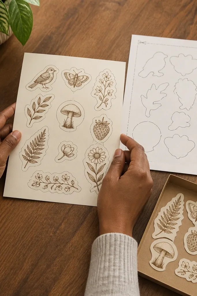
Corner stickers make your page look framed, even when you only have one sentence. Botanical linework adds softness without stealing attention from your writing. These are designed for margin placement, so they don’t overwhelm busy pages. When you place them in opposing corners, the page feels balanced, and the handwriting looks more “curated.” This is a strong choice for kids' journals too because corners are forgiving — even if cuts are a little off, the composition still reads as intentional.
Editor's noteLightly curl the sticker edge with your finger before sticking so it relaxes flat on textured paper.
Print the corner stickers on matte sticker paper for clean outlines. Cut each corner carefully and keep the outer border intact. Place one corner near the top-left and one near the bottom-right, then press for 10 seconds to lock it down.
Skip thisDon’t place corners too close to the text — keep at least 1/2 inch breathing room.
4. Vintage Ticket Stub Strips
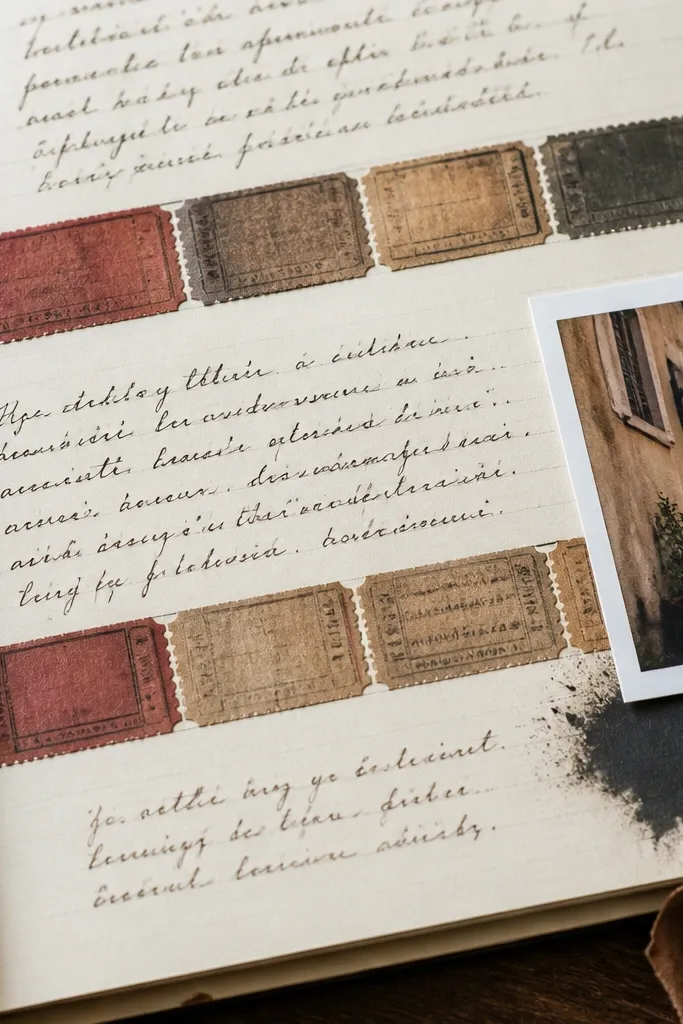
Ticket stubs turn a journal entry into a “memory artifact.” The perforation lines give you a built-in visual rhythm, and the faded blocks look like real paper ephemera. Use these strips as separators between paragraphs, as a background for a photo, or as a place to write a short headline. They also look great with kids' drawings because the stub shape keeps scribbles from floating. Print a few different sizes so you can match the width of your page layout.
Editor's noteIf you plan to write on top, use a gel pen with matte ink or a fine archival marker to avoid smearing.
Print the ticket strips at 100% on matte sticker paper or off-white cardstock. Cut straight along the edges, then lightly score the perforation line with a dull craft tool so it looks like it could tear. Adhere one strip across the page as a divider, then write directly on the sticker area with a fine-tip pen.
Skip thisSkip glossy sticker paper — it makes the ticket look new.
5. Script Quote Ribbon
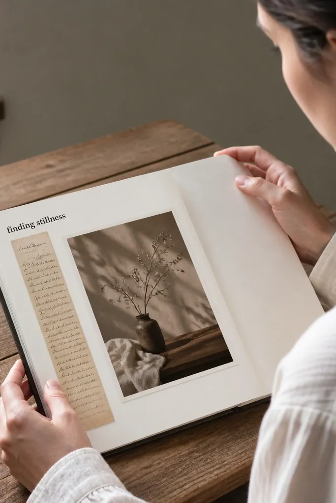
A script ribbon gives you instant “page design” without needing to draw flourishes yourself. The narrow shape makes it easy to place under a heading or along the side of a photo. These printables are built to read like handwritten quotes from old stationery, so they add atmosphere even on minimalist pages. If you’re doing a kids' budget journal, you can use them for “Today’s plan” or “Small wins” labels. Print on matte paper, then add a thin shadow with a gray pencil on one side for depth.
Editor's noteUse a ruler to align the ribbon; straight placement makes cursive look more authentic.
Print the ribbon on matte sticker paper. Cut around the border using micro scissors to keep the script sharp. Place it horizontally under your main text, then shade the ribbon’s outer edge with a soft gray colored pencil to create a subtle drop-shadow effect.
Skip thisDon’t stretch the ribbon by stretching the paper during cutting.
6. Antique Map Compass Rose

Compass rose stickers look great because they bring structure like a diagram, not just decoration. They work as a focal point on a travel journal page, a “direction” theme for kids' learning logs, or a centerpiece for a monthly recap. The vintage map palette makes them photograph well under natural light, and the bold outline keeps the details readable. This is the kind of sticker that makes your handwriting feel like part of a document.
Print the compass rose at 100% on off-white cardstock. Cut it with a craft knife along the thick outer border for a clean edge. If your page paper is bright, gently age the sticker edge by dabbing a light brown ink wash around the perimeter, then let it dry fully before sticking.
Place the compass slightly off-center and let one edge overlap a washi tape strip.
Don’t put it on a crowded background — it needs breathing space.
7. French Ephemera Frame
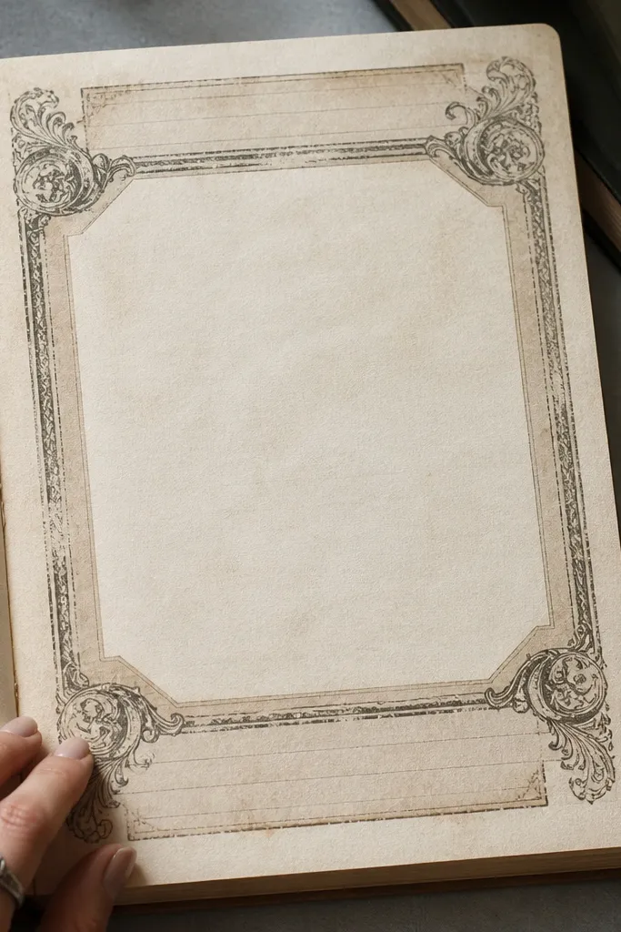
Frames make pages look finished because they create a boundary for your content. This French ephemera style gives you that old document feel with subtle text blocks and an ornate border. It’s ideal when you want a photo, a small drawing, or a journaling paragraph to look like it belongs in a scrapbook. Print on matte sticker paper for the cleanest edges, then lightly distress only the frame border so it doesn’t blur into your page. This is also great for kids because it turns a blank page into a ready-made “art window.”
Editor's noteIf the frame edges look too sharp, rub a tiny piece of sandpaper on the sticker edge after cutting.
Print the frame on matte sticker paper. Cut out the entire rectangle and remove the inner cut area only if the design includes a window. Stick the frame first, then layer your photo or text inside with tape so you can adjust alignment before pressing down.
Skip thisDon’t cover the frame with too much washi — it hides the border detail.
8. Vintage Botanicals Labels Pack
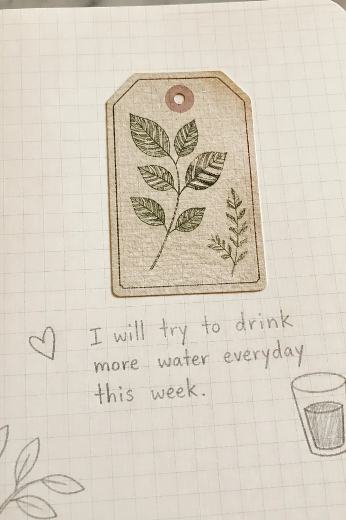
These are tiny but powerful because they look like plant specimen tags. They’re perfect for journaling about habits, reading notes, or science themes in a kids' notebook. Use them as mini headings for short entries — one label per paragraph — and your page instantly looks organized. They also layer well with doodled stems or simple leaf drawings. Print on matte paper and keep them small; this style looks best when it feels like it belongs on a specimen card.
Editor's noteUse a fine black pen to write directly under the printed label for a clean “specimen note” look.
Print the label pack on matte sticker paper. Cut each label individually and keep the border intact. Adhere one label at the start of each entry line, then add a thin green pencil line underneath to mimic a note tag.
Skip thisAvoid placing labels too far apart — the page should read as one cluster.
9. Old Ledger Number Stickers
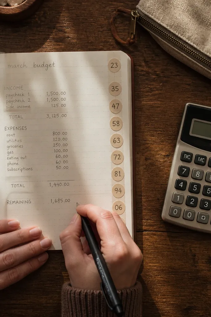
Ledger numbers make your journal feel like a record book. They’re especially good for budget pages, chore charts, and reading trackers because numbers look purposeful. The vintage printing gives you that slightly uneven ink feel, which is what makes them look real on paper. Use them as page counters, item markers, or to highlight a total. Print on matte sticker paper so the digits stay crisp, then place them next to handwritten amounts for an instant “accounting” vibe.
Editor's noteIf you’re doing a budget spread, keep all ledger numbers the same size so the page reads clean.
Print the number stickers on matte sticker paper at 100%. Cut them out with micro scissors to keep the digit edges sharp. Stick them next to the numbers you write by hand, then add a faint gray pencil underline to match the ledger tone.
Skip thisDon’t mix bright colors with ledger numbers — it breaks the vintage mood.
10. Seamless Script Swirl Corner
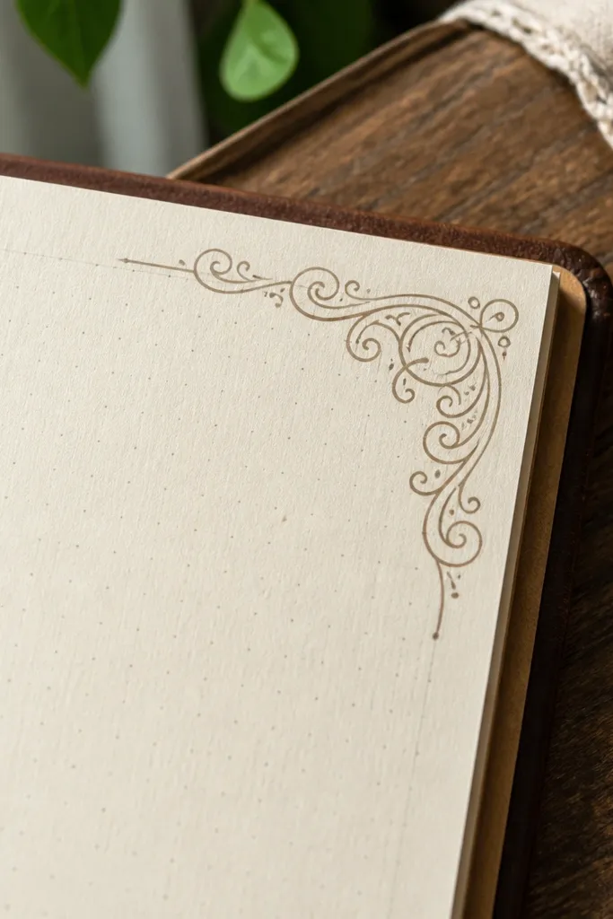
A script swirl corner is the quickest way to add movement to a page without adding clutter. The thin linework makes it look delicate and old, and it frames your handwriting naturally. Use it in the top corner of a page header, or repeat it along the side of a list so the page feels designed. This sticker style is great for kids because it works even if you have messy handwriting; the swirl gives the page a “finished” look. Pair it with a label sticker for best results.
Print the swirl corner on matte sticker paper. Cut along the outer edge and test-fit the placement with a pencil mark first. Stick it in the corner and press firmly for 10 seconds, then add one small dot of brown ink near the swirl tip for extra age.
Warm the sticker slightly with your hands before sticking to help it flatten on textured paper.
Don’t over-ink the swirl; thin lines lose definition fast.
11. Vintage Stationery Washi-Style Borders
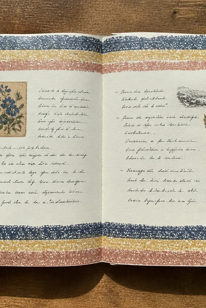
Border strips give you that “stationery sheet” feeling across an entire page. These are designed to look like patterned paper strips — not random doodles — so they photograph well and make your handwriting look more intentional. Use them as top and bottom bands, or as a frame around a single photo. Because they repeat, small misalignments still look deliberate. Print on matte paper, then trim cleanly so the strip edges match your page margins.
Editor's noteIf your page paper is thick, use tape runner instead of glue for a flatter finish.
Print the border strips on matte cardstock or matte sticker paper. Trim one strip to the width of your page using a ruler so it lands clean at the margin. Apply a thin line of glue stick or tape on the back and press from one end to the other to avoid bubbles.
Skip thisDon’t leave jagged strip edges — it kills the vintage border effect.
12. Antique Photo Frame Stickers
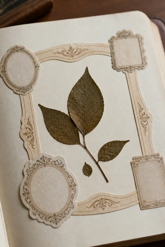
Photo frames turn a journal page into a scrapbook page instantly. These printables are sized like small archival frames, so they add a vintage “document” vibe even if you’re using a tiny image. They’re also useful when you don’t have a photo — you can place a pressed leaf, a kids' drawing, or a swatch of fabric inside the frame. Print on matte sticker paper for a clean edge, then add a light brown ink wash around the frame to blend it into the page.
Editor's noteUse double-sided tape on the photo corners so the center stays flat.
Print on matte sticker paper. Cut each frame out and remove the inside window only if the design requires it for your photo placement. Stick the frame first, then slide your photo or drawing under the window and secure it with a small piece of tape at the back corners.
Skip thisAvoid glossy frames — they look too new under daylight.
13. Vintage Postcard Corner Pieces
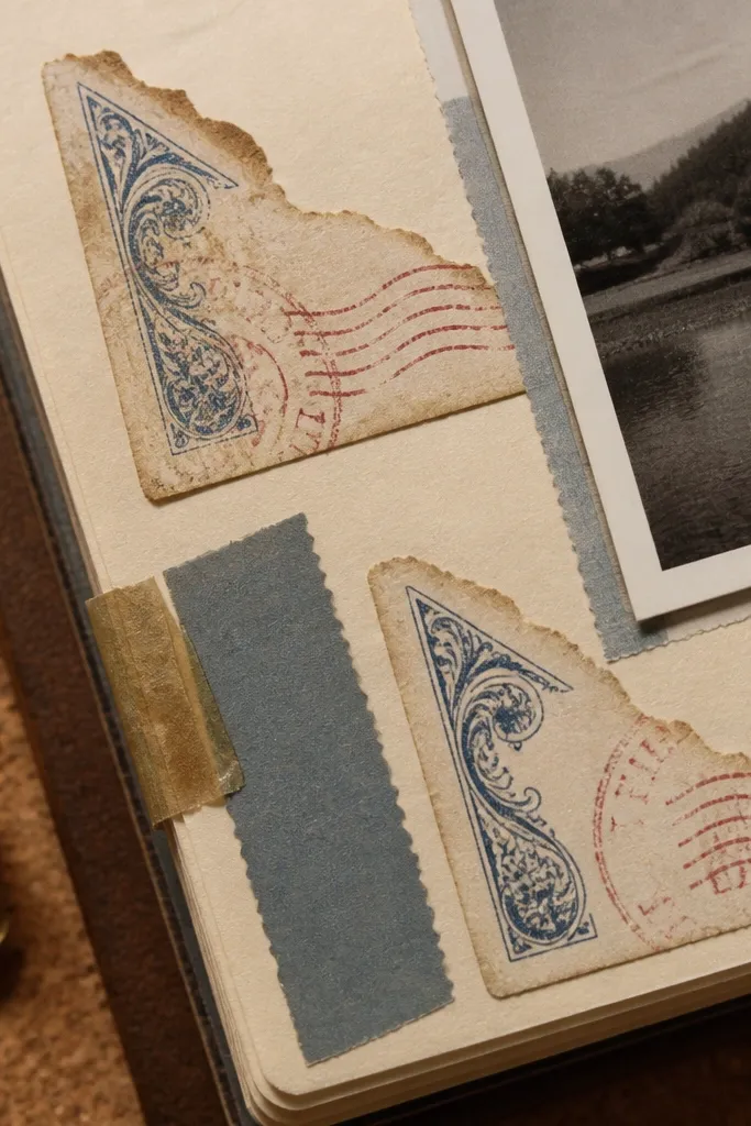
Corner pieces feel like you ripped them from a postcard stack. The torn-paper edge look adds texture, and the stamp-style elements give you a mini story. Put these corners near a photo, a list header, or even on a blank page to create instant visual interest. They’re also forgiving for kids because the tear effect hides uneven cutting. Print on matte sticker paper and keep the corners small so the page doesn’t feel heavy.
Editor's noteIf the torn edge looks too clean, add a tiny dab of brown ink with a cotton swab right along the perimeter.
Print the postcard corners on matte sticker paper. Cut right up to the torn edge so the effect reads as intentional. Adhere two corners diagonally opposite each other, then lightly scuff the outer edges with a pencil eraser to blend into the page.
Skip thisDon’t use thick glue — it makes the torn edge lift.
14. Botanical Stem Line Stickers
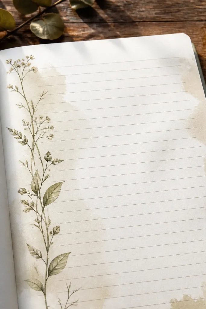
Line stem stickers are the best choice when you want vintage style without blocking your writing. They act like elegant structure that guides the eye along a list or paragraph. These are also great for kids because they’re easy to place — you can tuck a stem beside a drawing or let it run under a header. Print on matte paper and keep your ink pens consistent so the linework blends. This style looks best on dotted notebooks, craft paper, and pages with typed text.
Editor's noteUse a dark brown pen for headings so it matches the stem line tone.
Print the stems on matte sticker paper. Cut each stem along its outer line using micro scissors. Place one stem to start your entry and overlap it slightly with washi tape so the layers look like one paper piece.
Skip thisSkip placing stems over thick marker strokes — it creates glare and smears.
15. Antique Keys and Tag Set
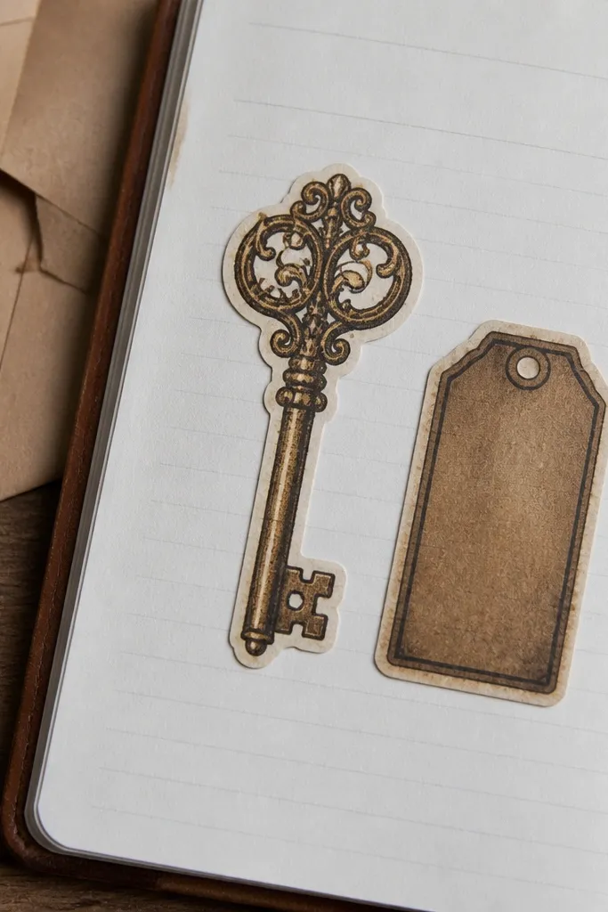
Keys and tags bring a “found object” feel that looks great on journals about goals, savings, or memory keeping. The key shape gives you a recognizable silhouette, while the tag adds space for short words like “open,” “keep,” or a date. This set is visually strong, so it works even with minimal writing. Print on matte sticker paper to keep the ink flat, then pair with a label or ledger number for a more layered look. It’s a great aesthetic choice for budget & kids journals because it makes chores and milestones feel like little treasures.
Editor's noteAdd a tiny highlight dot with white gel pen on the key edge for a subtle aged-metal look.
Print the key and tag set on matte sticker paper. Cut each piece separately and keep the small holes in the tag clean by using a craft knife tip. Stick the tag near where you write the date, then place the key diagonally so the tag doesn’t look alone.
Skip thisDon’t place the key straight on top of small text; it competes visually.
16. Vintage Label Arrows
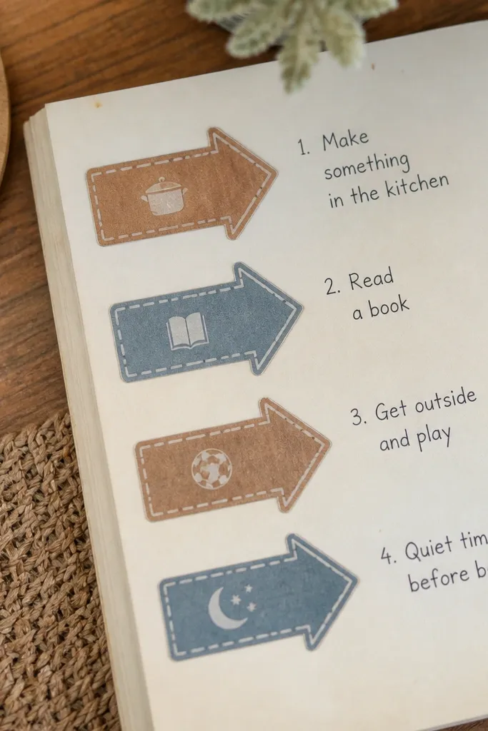
Arrow labels are for when you want direction on the page. They’re perfect for kids' “today’s tasks” spreads, reading response steps, or budget categories that point to where the numbers go. The vintage arrow shape looks like old instruction labels, which is why it reads well even when you keep the page simple. Print on matte paper so the edges look paper-cut, not plastic. Use a darker pen to write inside the arrow area for a crisp read.
Editor's noteKeep arrow text short — 2 to 5 words — so it stays legible.
Print arrow labels on matte sticker paper. Cut along the arrow outline with micro scissors, then test one placement on scrap paper to match your page angle. Stick the arrow so it points toward the content it labels, then write a short phrase in a single line using a fine-tip pen.
Skip thisAvoid long sentences inside arrows; they crowd the vintage border.
17. Ornate Divider Medallions
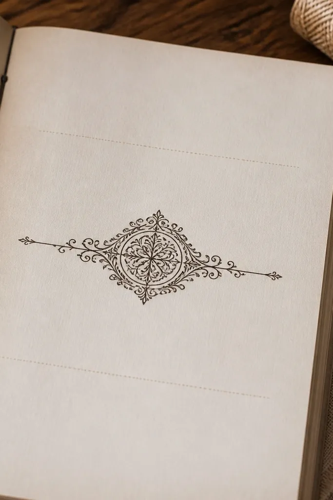
Medallions are page dividers that look like they belong in a vintage book. They make a spread feel split into sections without drawing extra lines. Use them between journal entries, between kids' activity lists, or to separate a photo from notes. The filigree details look good when you print at 100% and keep the surrounding page uncluttered. This is a strong aesthetic choice for people who think “I can’t decorate” — the sticker does the design work for you.
Editor's noteAdd a light pencil smudge behind the medallion to make it look embedded in the page.
Print the medallion stickers on off-white cardstock for a softer vintage tone. Cut out the medallion carefully around the outer border. Place one medallion in the center between two blocks of writing, then press with a bone folder or the back of a spoon to flatten the edges.
Skip thisDon’t put medallions near busy patterned backgrounds.
18. Vintage Calendar Date Tags
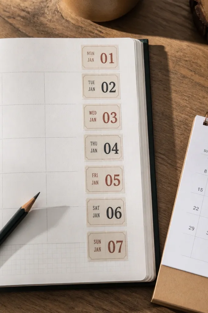
Date tags help your journal look organized even when you write messy. The calendar style gives a natural hierarchy: date tag first, then your entry text. These are also perfect for kids because they can add a drawing next to a date without needing to design a whole page. Print on matte sticker paper so the numbers stay sharp. Use them for daily logs, habit trackers, or “school week” pages. The vintage paper edges make the page feel like a historical record.
Editor's noteUse one consistent font color for handwritten dates so everything stays cohesive.
Print date tags at 100% on matte sticker paper. Cut each tag and keep the little border line intact. Stick the tag at the top of an entry and write directly beside it, then add a tiny brown ink corner dot to match the aged look.
Skip thisDon’t stack multiple date tags on the same spot.
19. Victorian Corner Flourish Labels
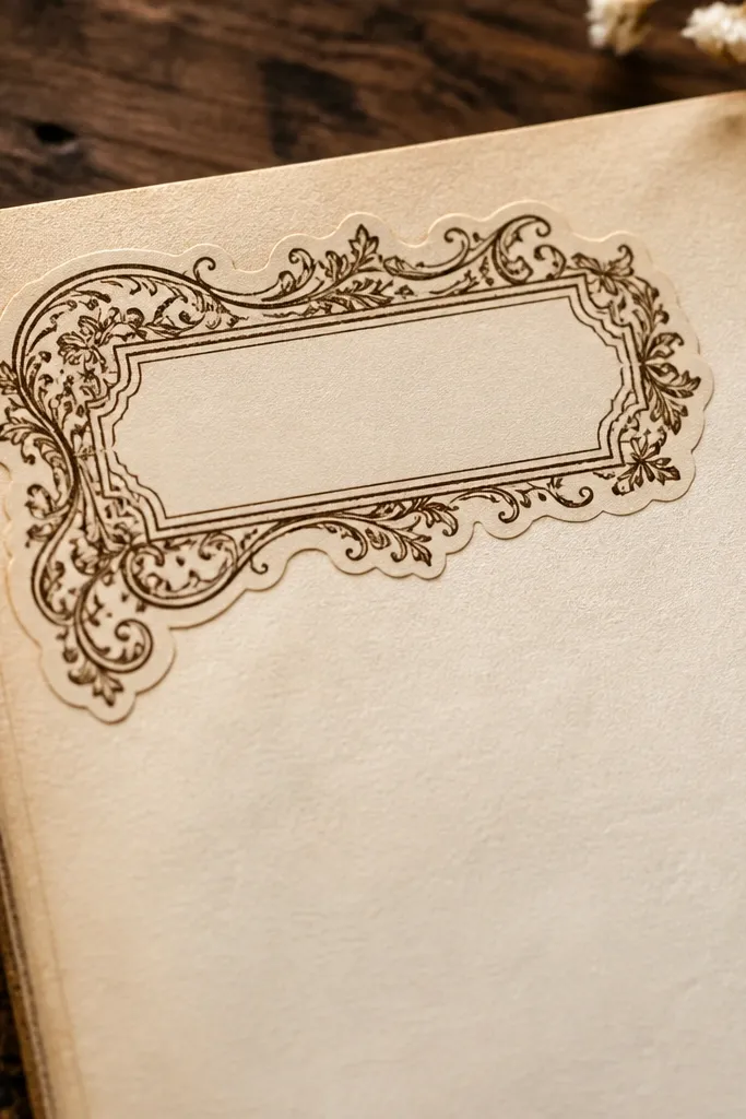
These corner flourish labels are decorative but still practical. The thin filigree looks delicate and vintage, while the label shape gives you a place to write a short heading. Use them to frame a page title, or put one in the margin next to a list item for a “chapter” feel. They photograph well because the linework creates contrast against plain paper. Print on matte sticker paper, then add a slight edge distress so the flourishes look less crisp.
Editor's noteChoose one corner per page so the flourishes don’t fight each other.
Print on matte sticker paper and cut along the outer border. Distress the edge by lightly rubbing with a pencil eraser so the border looks worn. Place the label in the corner and press down firmly, then write one short heading in the empty area with a fine pen.
Skip thisAvoid placing these over thick washi overlaps — the lines get lost.
20. Vintage Ledger Tape Strips
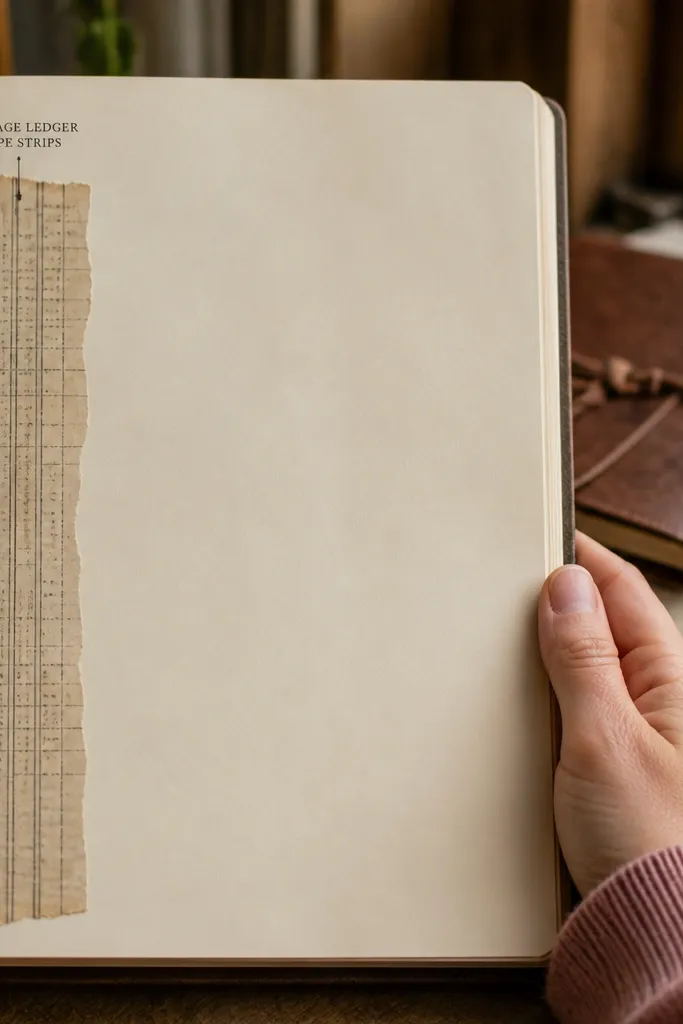
Ledger tape strips look like you ripped accounting tape from an old desk drawer. They’re great for creating structure along the side of a page or under a heading. The printed line columns add texture and make your handwriting look more intentional. Use them to separate sections, label a budget category, or underline a sentence without drawing your own lines. Print on matte sticker paper and trim to match your page width for a clean band.
Editor's notePress with a bone folder so the tape band edges stay crisp on textured paper.
Print the tape strips on matte sticker paper. Trim to the exact width you want using a ruler and craft knife. Stick one strip under your header, then write a category label directly above it or next to it using a fine black pen.
Skip thisDon’t use glossy paper — the printed lines look too modern.
21. Stamped Address Blocks
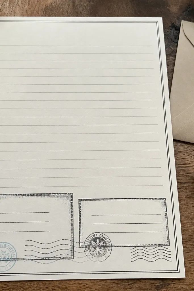
Address blocks are a smart way to fill space without adding clutter. They look like old mail — name lines, street lines, and postal marks — so they instantly create a vintage document feel. Use them on journal pages for “to/from” notes, gift logs, or letter-style journaling. If you’re doing a kids' journal, have them write their own “to” and “from” in the blank lines. Print on matte sticker paper and keep the background off-white so the stamped text stays readable.
Print address blocks at 100% on matte sticker paper. Cut out the rectangle and keep the border clean. Place the block on your page where you want a structured header, then write on the blank lines with a fine-tip pen after the sticker is fully adhered.
Write after sticking so you can align your pen lines with the printed guide lines.
Don’t smear with a broad marker; the stamped text lines are thin.
22. Vintage Envelope Flap Stickers
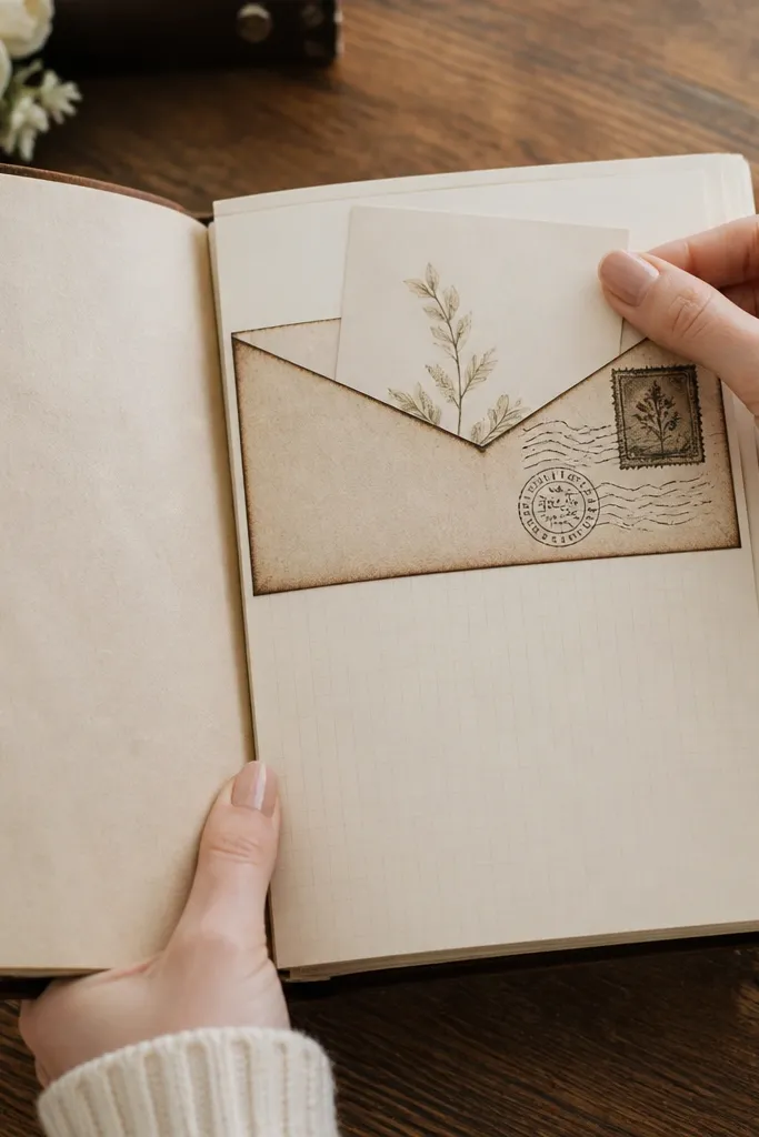
Envelope flap stickers add a tactile, keep-something-here feeling even on flat paper. They’re great for journaling about receipts, notes, and kids' school papers you want to remember. The flap shape gives you a natural place to tuck a tiny photo strip or a folded note behind the page. Print on matte sticker paper so the flap edge looks paper-thin, then lightly crease the flap line with a bone folder for a dimensional effect. This is a strong choice for scrapbook-style journal pages.
Editor's noteUse a very thin glue line so the tuck space stays open.
Print envelope flap stickers on matte sticker paper. Cut around the outer flap shape and score the flap line with a dull tool so it folds naturally. Stick the envelope body area first, leaving the flap edge slightly lifted, then tuck a small note behind it and press the flap down gently.
Skip thisAvoid thick paper inserts — they make the flap bulge.
23. Rag Paper Apothecary Vial Labels
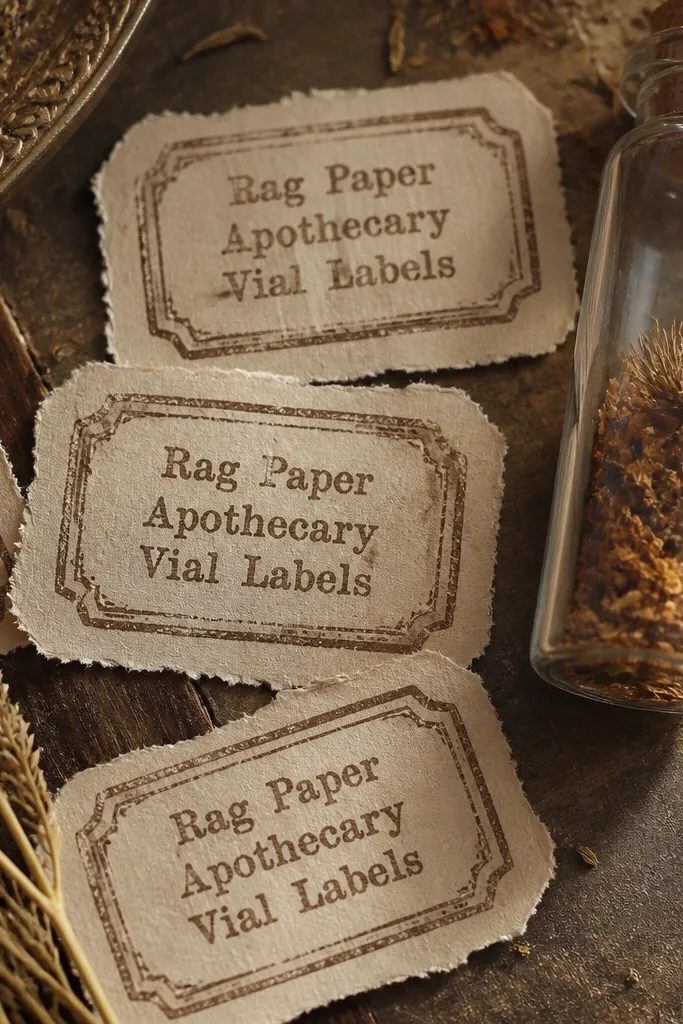
These labels make your journal look like it came out of a tiny apothecary — the kind with handwritten herb names and slightly uneven ink. The key is the print style: faded type, smudged edges, and a rag-paper texture so the stickers don’t look too crisp against real paper. You get a stack of small, high-impact stickers that fit bottle-shaped journal pockets, pen loops, and mini storage envelopes. They’re also forgiving: even if you cut a little off, the vintage edges hide it. This is a good project if you want good-looking Vintage Stickers that feel tactile and old without needing fancy tools.
Editor's noteUse matte spray, not gloss. Gloss makes the ink look plastic and kills the worn vibe.
Print the labels on 65-120 lb kraft paper or off-white cardstock. If your printer supports it, use “photo” or “high quality” so the ink looks dense; otherwise, print twice and layer the top sheet for a darker label. Cut each label with a 1/8 in border for a consistent frame, then round the corners with a small 3/8 in corner punch. Apply with a glue stick or adhesive roller so the paper fibers stay flat; for a stronger hold, seal the finished sticker with a thin coat of matte spray from 8-10 inches away. Let it dry flat for 30 minutes before sticking to a page so the rag texture doesn’t wrinkle.
Skip thisAvoid printing on bright white printer paper — it makes the labels look modern and flat.
24. Antique Library Pocket Cards
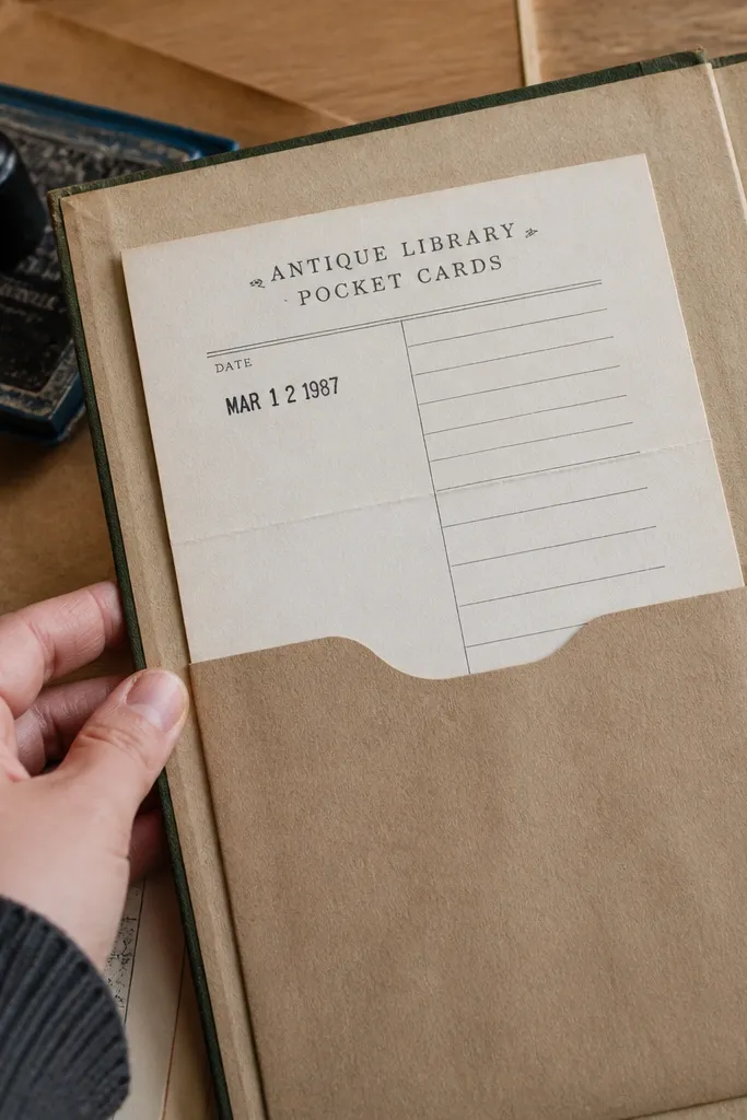
Pocket cards are one of the most satisfying vintage sticker formats because they add function, not just decoration. These pieces look like old library slips: a stamped date area, a thin ruled section, and a pocket-friendly fold line. You stick them into a journal sleeve or tuck them under a flap, then slide in a tiny note, receipt, or pressed leaf. The result is a journal spread that looks layered and lived-in without you having to hand-letter anything. Skill level is easy: the only “trick” is getting the fold and adhesive placement right so the pocket actually holds.
Editor's noteMark the opening side with a tiny pencil dot before you glue. It prevents the classic pocket-card face-up adhesive mishap.
Print the pocket card set on 80-100 lb cardstock for a crisp fold. Cut each card leaving about 1/16 in around the design, then use a bone folder along the printed fold line so the crease stays sharp. Apply adhesive only to the back tab area and the bottom edge of the card pocket — keep the top opening free. Press the pocket into place on your journal page or into a pre-made paper sleeve, then reinforce the bond with a strip of washi tape on the inside seam. After it’s dry, test it by sliding in a scrap of paper to confirm the opening isn’t glued shut.
Skip thisAvoid putting adhesive across the entire back — it seals the pocket and you lose the whole point.
25. Copperplate Margin Receipt Strips
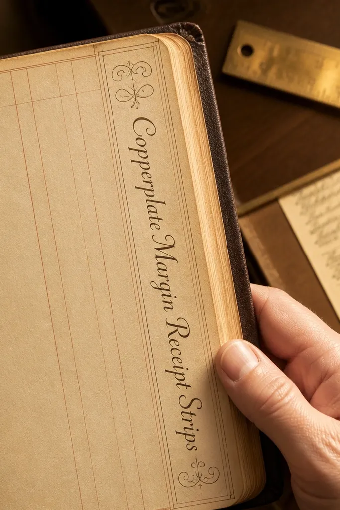
These margin strips make your journal pages look professionally formatted, like someone kept careful accounts for decades. They’re narrow, high-contrast, and built to sit along the edge of a page without covering the artwork. The best part is the copperplate-style typography plus faint ledger lines, which read as authentic print ephemera even when the rest of your page is plain. You can use them as separators between sections, to frame a photo, or to label a pocket. This is a great option if you want good-looking Vintage Stickers that improve layout instantly and don’t require measuring a whole border.
Editor's noteUse a ruler and a craft knife for the ends, even if the design is printed with guides. Clean ends make the whole strip look intentional.
Print the receipt strips on 70-90 lb cream paper so the ink looks slightly absorbed. Cut to the strip shape, then trim each end with a straight edge so the edges line up cleanly when you repeat them. For placement, measure 1/4 in from the page edge and mark a light pencil guide line — only on the back or beneath the page if you don’t want marks showing. Stick the strip using a thin adhesive roller, then burnish with a clean scrap of cardstock to prevent bubbles. Finish by lightly rubbing the edges with a dry sponge or sanding block to soften the cut line and blend it into the page.
Skip thisAvoid placing strips too close to the trim edge — they lift or peel when the journal gets handled.