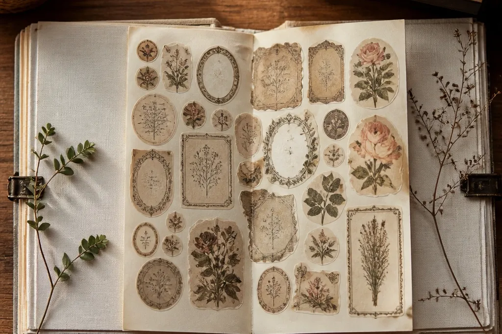
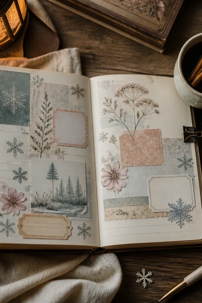
1. Aged Postage Corner Trio
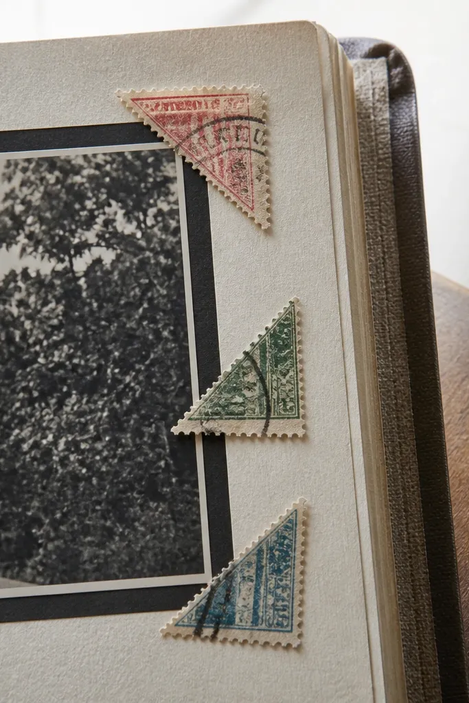
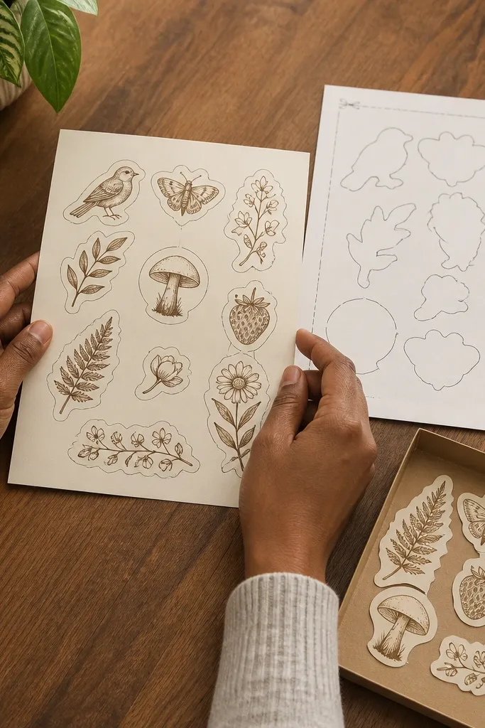
Postage corners give your journal page instant structure. They mimic old letters without covering the page like a big block, so the layout still breathes. Choose corners with faded stamps, tiny cancellation marks, and slightly rough edges — that texture is what reads cozy. Put them near the corners of a photo or a journaling box to frame the page like a vintage envelope. This is great for kids too because it creates a “finished” look with almost no planning.
Cut a page area you want to highlight, like a small photo or a rectangle of writing. Place one corner sticker on each of two adjacent corners, then dry-fit the third corner where it balances the text. Press firmly along the sticker edges with a ruler or your thumbnail so it adheres flat and doesn’t lift.
If your stickers curl at the edges, warm them under your palm for 10-15 seconds before placing.
Avoid bright modern stamps with crisp neon colors — they kill the vintage tone.
2. Brown Tea Stain Label Set
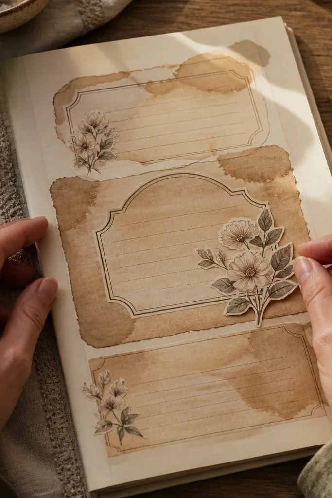
Tea stain labels look like they were saved from old pantry tags or recipe cards. The brown ink wash gives a soft background that pairs perfectly with cozy Vintage Stickers like florals or bookplates. Use these labels as anchors for titles — for example, “Cookies,” “Winter,” or “Monday Notes” — because the stain makes the words feel aged. They also hide the “blank spot” problem when your page needs a place for attention. Keep the set small so the journal doesn’t look like packaging.
Pick a label size that matches your page: for A5, use labels around 1.5-3 inches wide. Place one label as a title on the top third of the page, then add a second label under it or beside a photo. Layer smaller labels on top of plain paper only after you’ve decided where your journaling line will go.
Write your own short word on top of a blank label using a fine brown gel pen for a custom feel.
Skip labels with heavy black backgrounds — they look modern and overpower the page.
3. Vintage Book Spine Strips
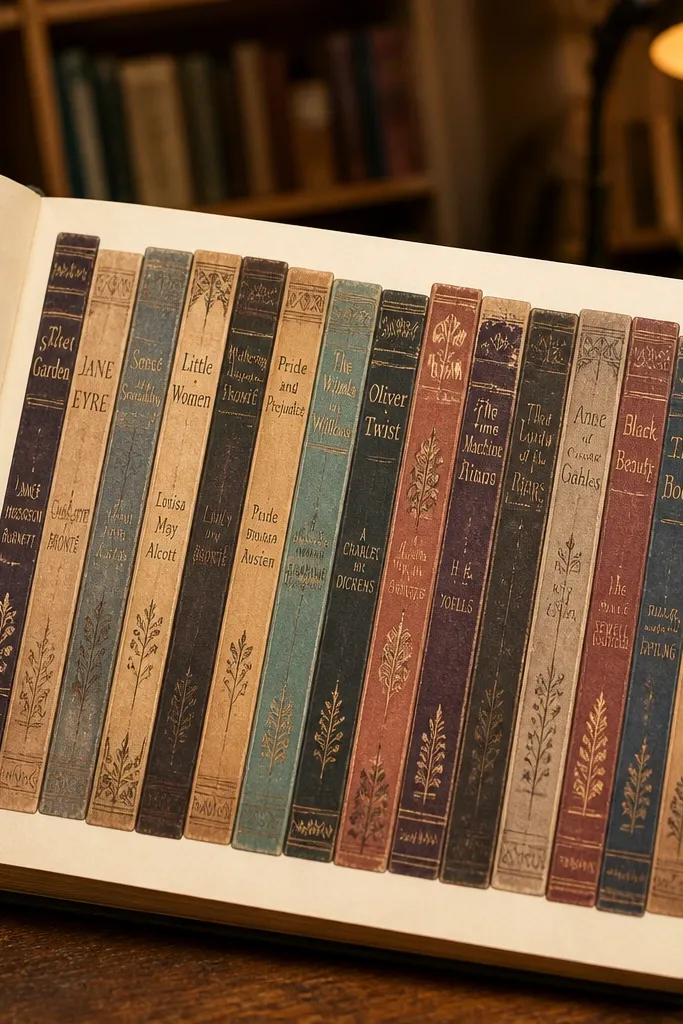
Book spine stickers make spreads look like a tiny library wall. Because they’re vertical and narrow, they add rhythm without taking over the page. The best ones have faded titles, worn edges, and thin decorative lines, so they blend into the vintage theme. Use them to separate sections: morning notes on one side, gratitude on the other. They also work well for kids because they’re easy to place in a row and look “organized” even when the rest of the page is playful.
Editor's noteUse a straightedge to place the first strip perfectly; the rest will look aligned if you match the first one.
Choose 3-5 spine strips that share the same ink style. Align them along a page margin or create a vertical strip down the left or right side. Keep the spacing consistent — press each strip down starting from one edge so it doesn’t skew.
Skip thisDon’t mix glossy book spines with matte florals — the shine will stand out.
4. Faded Botanical Sprig Corner
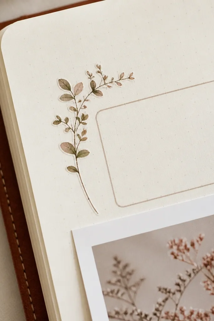
A single botanical sprig corner gives that soft cozy feeling without turning your page into a garden collage. Pick sprigs with small leaves, thin stems, and slightly uneven print so they resemble pressed plants. Place them near a photo edge or framing sticker so the page feels gently decorated. This style also makes handwriting look better because the sprig adds a natural visual margin. It’s a clean, photogenic choice for both journal covers and inside spreads.
Editor's noteIf the sprig is too big, trim only the outer leaf tips with small scissors for a tighter fit.
Choose one corner area where you already have content, like the top right near a title. Position the sprig so the tip points toward your focal text, then press the center first. Work outward from the center to the edges to avoid bubbles and keep the stem flat.
Skip thisAvoid dense bouquets — they look busy and compete with your journaling.
5. Antique Clock Face Mini
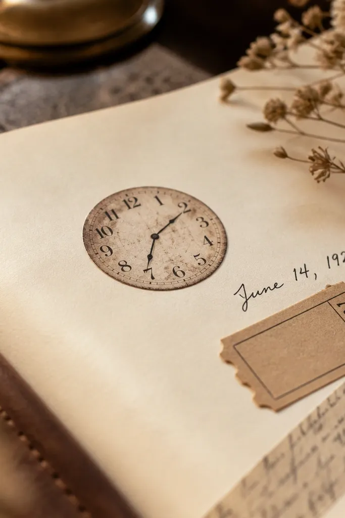
Clock face mini stickers add cozy time-and-memory vibes without needing a big theme. The best clock designs have thin hands, worn numerals, and a slightly off-center look like old prints. Use one clock as a punctuation mark — beside a date, under a title, or tucked near the corner of a photo. It makes your page feel like a snapshot from a slower era. For kids, clocks are also a friendly way to reinforce routines: “Tea time,” “Story time,” or “Bedtime.”
Editor's noteMatch clock ink to your pen color — brown ink with brown clock faces looks best.
Find a blank space near your date or title and place the clock there as a small focal. Keep it small enough that you can still read your main text; aim for about 1.25-2.5 inches wide. Press the clock flat, then add one tiny filler sticker nearby to complete the cluster.
Skip thisSkip neon gold clock stickers; they read like party decor, not vintage.
6. Script Word Strip in Sepia
Script word strips are the fastest way to make a cozy spread feel “made.” Choose sepia cursive that looks like it came from an old label maker or handwritten note. Use them as a divider between sections, or place them under a photo like a caption. The strip format helps you keep the page clean because it doesn’t cover large areas — it just adds mood. This is the sticker you reach for when you need something warm but you don’t want more images competing with your journaling.
Pick one phrase you want to repeat for the spread, like “soft days” or “little moments.” Place the strip horizontally under your main focal, then add one small accent sticker at each end if needed. Press down along the full strip and rub the edges with a thumbnail for a flat seal.
Use a ruler for straight placement; wobbly strips make the vintage vibe look sloppy.
Avoid loud blocky fonts — they break the cozy, handwritten feel.
7. Worn Floral Frame Sticker
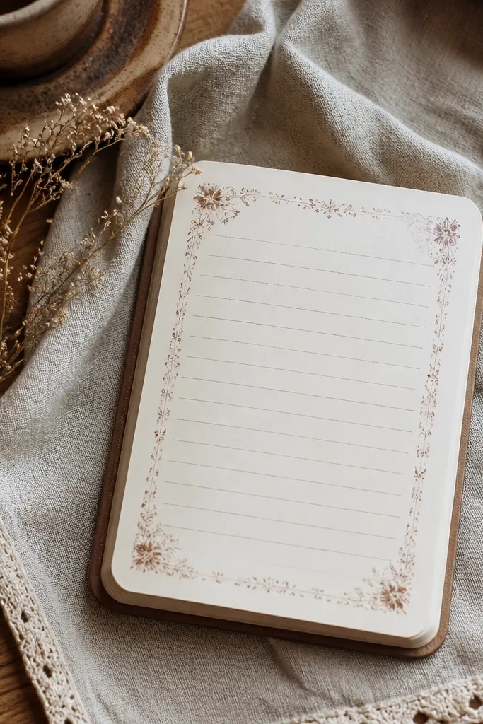
A worn floral frame sticker turns any page into a gallery. It’s especially helpful when you have a photo or a journaling box that needs boundaries. Choose frames with thin floral lines and faded color — the frame should look like it’s been used, not freshly printed. Place it around a small card, ticket, or writing block so everything inside looks cohesive. This one works well for kids because frames make the page feel “complete” even with minimal writing.
Editor's noteIf the frame has corners that lift, press for 20-30 seconds with firm pressure.
Decide what you’re framing — a photo, a journaling rectangle, or a sticker collage. Place the frame over the area first without removing backing if your stickers are peel-and-place; then commit once it’s centered. Press each side in order: top, bottom, then corners so the frame doesn’t shift.
Skip thisDon’t use frames with bright pink centers — they pull the whole spread toward modern scrapbooking.
8. Vintage Recipe Card Label
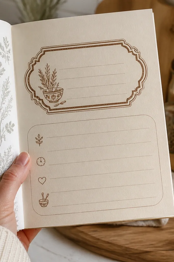
Recipe card stickers give you instant narrative. They look like something you’d pull from a kitchen drawer, and that makes your journal feel cozy instead of random. Choose cards with lined sections, tiny icons, or handwritten recipe-style headings. Use them as journaling prompts: “What we made,” “Favorite flavor,” or “Next time.” The best part is the visual structure — lines and boxes make your handwriting look tidy. This is also a great option for kids because it guides writing length.
Place the recipe card label where you want your writing block, usually mid-page. Add a short title on top or keep the printed heading if it fits your theme. Write into the card area with a fine pen, then press over any loose edges with a ruler to keep it flat.
Use a brown or black fine-tip pen so your handwriting matches the sticker ink tone.
Avoid recipe cards with huge glossy “lamination” shine; the vintage look breaks.
9. Old Photo Border Strip
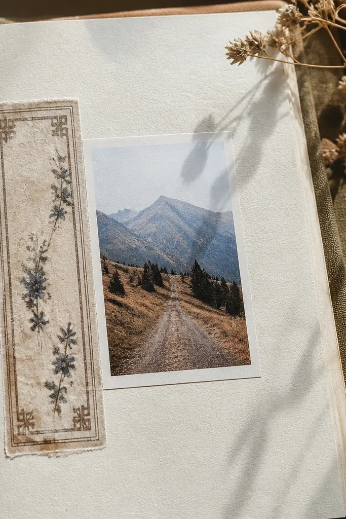
Photo border strips are a cheat code for making your pictures look like they belong in an album. They add a soft edge so the photo doesn’t float on plain paper. Choose borders with worn ink, tiny corner details, or faint frame lines. Place a strip along one side of the photo, or use two strips to form a partial border. It’s a cozy look because it imitates printed photo paper. Kids love it too because it hides messy edges when you cut printed photos.
Editor's noteIf the border is slightly longer, trim the extra with a craft knife on a cutting mat.
Measure your photo width and pick a border strip that matches the same length. Position one strip along the left edge with equal margins, then apply the top strip if you want a tighter frame. Press the border along its full length and smooth the corners with your fingertip.
Skip thisDon’t cover the photo corners completely; leave a small margin so it still feels like a photo.
10. Postcard Scene Mini
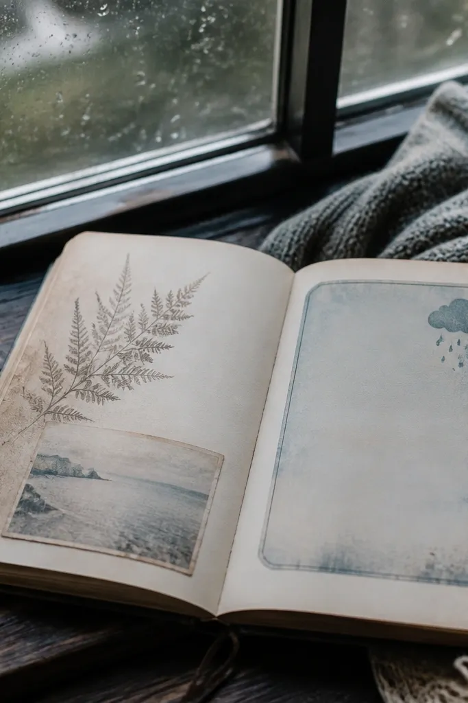
Postcard mini stickers add storytelling without making your spread too themed. The best ones look faded, like they’ve been handled — with soft skies and worn edges. Use them near travel memories, rainy-day notes, or even a simple “thinking of you” journal prompt. They look great when paired with script strips and small clocks because it feels like a letter came to you. Keep the scene small so your page stays readable and cozy.
Editor's noteChoose postcards with muted skies (dusty blue or gray) so they don’t overwhelm warm paper tones.
Place the postcard mini near a corner or under your title so it acts like a secondary focal. Add a small stamp corner or tea label nearby to tie it into the vintage theme. Press down firmly, then reinforce the edges with a quick rub using a thumbnail.
Skip thisSkip postcards with high-contrast modern buildings — they read too new.
11. Botanical Label Tags on Twine
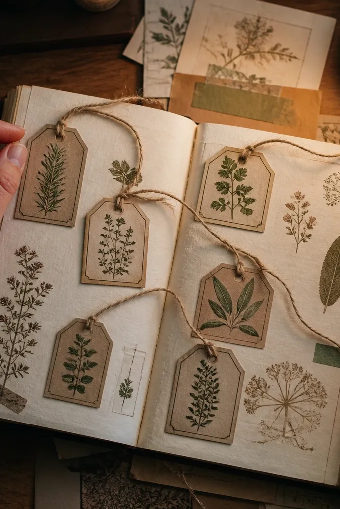
Tag stickers with twine lines look handmade, even when they’re store-bought. They add dimension and a “gift label” vibe that feels cozy and old-fashioned. Use them to label sections like “Herbs,” “Garden,” or “Notes from the yard.” The twine line is the visual trick — it gives movement and makes the page feel layered. These stickers are photogenic because they create little clusters that read well in close-ups.
Pick two to four tag stickers and cluster them around a journaling box or photo. Arrange them at slight angles so the twine lines don’t look perfectly uniform. Press the center of each tag first, then press the ends so the tiny twine lines stay flat.
If tags are too bright, place them over a slightly tinted paper scrap to soften the color match.
Avoid tags with thick plastic-looking borders; they don’t blend into paper spreads.
12. Vintage Envelope Seal Sticker
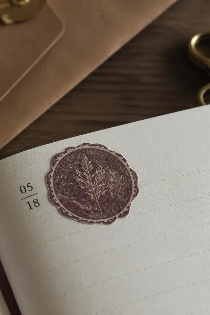
A vintage envelope seal sticker makes any page look sealed and saved. The round shape is simple, so it doesn’t clutter your spread, but it adds instant personality. Choose seals with wax-like texture, faded edges, and classic stamp style. Put one seal near the date or as a “this page is important” marker. It works for cozy Vintage Stickers spreads because it ties together paper, letters, and time. Kids also like it because seals look like treasure.
Editor's noteUse a seal as your only circular element; too many circles make the page feel busy.
Place the seal where you want a single focal dot, usually near the top or center-left. Keep it separated from text blocks so the seal doesn’t cover important words. Press firmly, then rub the edges to prevent lifting on paper corners.
Skip thisAvoid shiny metallic seals — the shine reads modern and sharp.
13. Worn Library Card Corner
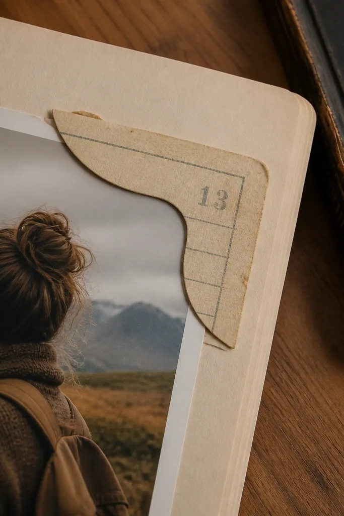
Library card stickers bring cozy calm. They look like something you’d slide into a pocket notebook, and the faded numbering gives you visual detail without loud color. Use a card corner to frame a small photo or to label a book-themed entry. The corners are especially useful because they create structure while keeping the page light. This is a strong choice for kids' journals because it guides where the photo or writing goes.
Editor's noteKeep the library card ink color consistent with your other ink-toned stickers.
Position the library card corner at a page corner with a small margin from the edge. Press the corner down first, then add a second smaller accent sticker opposite it for balance. If your card has a number block, write your own date or title inside the printed area using a fine pen.
Skip thisDon’t pair it with neon art stickers; the vintage card gets lost.
14. Faded Linen Texture Label
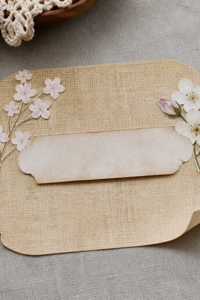
Texture labels are the secret to cozy Vintage Stickers spreads that look expensive. A linen-like label background makes flat paper feel layered and soft. Use these labels as “background plates” behind smaller words or tiny stickers. The trick is to pick beige or warm gray so it blends with creams and browns. This one is great when you’re using lots of small elements — the texture acts like a quiet backdrop.
Editor's noteUse one texture label per page; two can crowd the spread.
Cut or choose a label size that fits your layout: about 2.5-4 inches wide for a mid-page anchor. Place the linen label first, then layer smaller stickers on top after it’s centered. Rub edges firmly and smooth out any raised corners with your thumbnail.
Skip thisAvoid white, high-contrast textured labels — they look like modern print paper.
15. Vintage Lavender Packet Mini
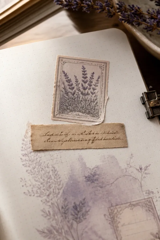
Lavender packet minis add cozy scent vibes without needing a real craft. The packet shape creates a natural pocket for a title or a short note. Choose stickers with muted lavender, worn edges, and tiny botanical lines. Place one packet near the top of your journaling area, then add a script strip under it so your page reads like a sweet letter. It’s photogenic because the packet edges look like paper folds.
Place the packet sticker where you want the page to start reading, usually near the top third. Add a small filler sticker next to it — a tiny clock or leaf sprig — so it doesn’t float alone. Press the packet edges carefully, especially the folded sides, so they lie flat.
Pair lavender with dusty blue or brown ink, not bright pinks or oranges.
Skip packets with glossy “foil” accents — they break the vintage paper feel.
16. Antique Botanical Illustration Squares
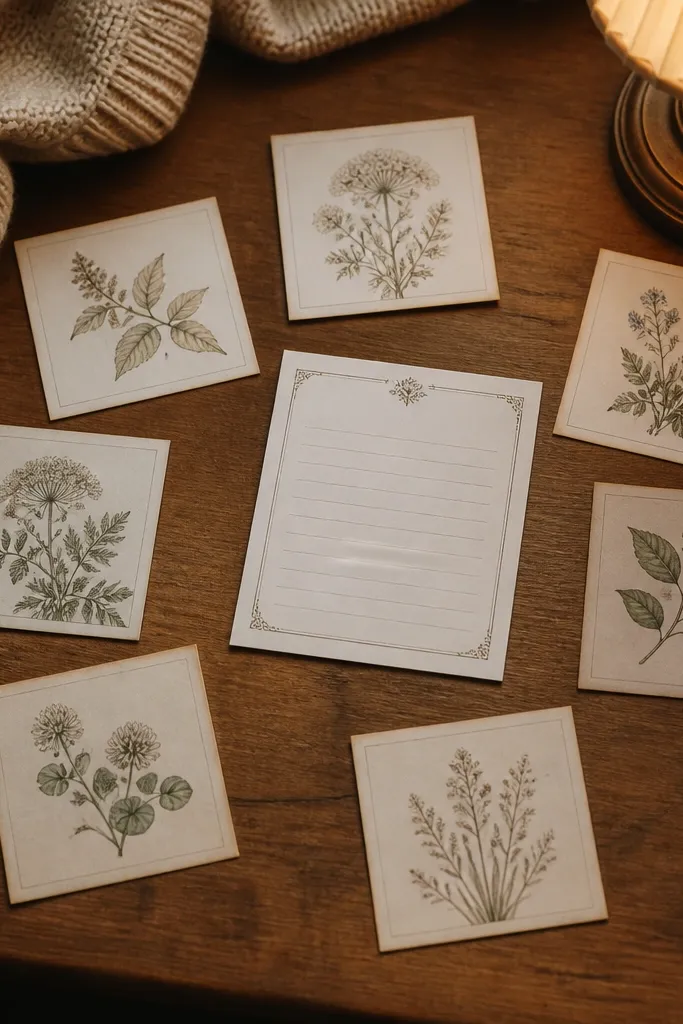
Illustration squares are a strong filler when you want detail but not clutter. They look like vintage prints, so they add sophistication while staying cozy. Pick squares with thin line drawings and muted greens or browns. Use them like a scatter pattern around a journaling block, keeping the spacing airy. Because they’re small and consistent, they unify the page even when you mix themes like recipes and letters.
Editor's noteStick to one botanical style set — same line weight across stickers looks intentional.
Choose 6-10 squares and decide the area they’ll cover, like around a photo. Place them in a loose grid or scattered cluster, leaving at least a half-inch gap between squares. Press each square after spacing is right; smoothing too early can shift small pieces.
Skip thisDon’t mix illustration squares with bold comic-style stickers — the tone clashes.
17. Vintage Sewing Notions Tag
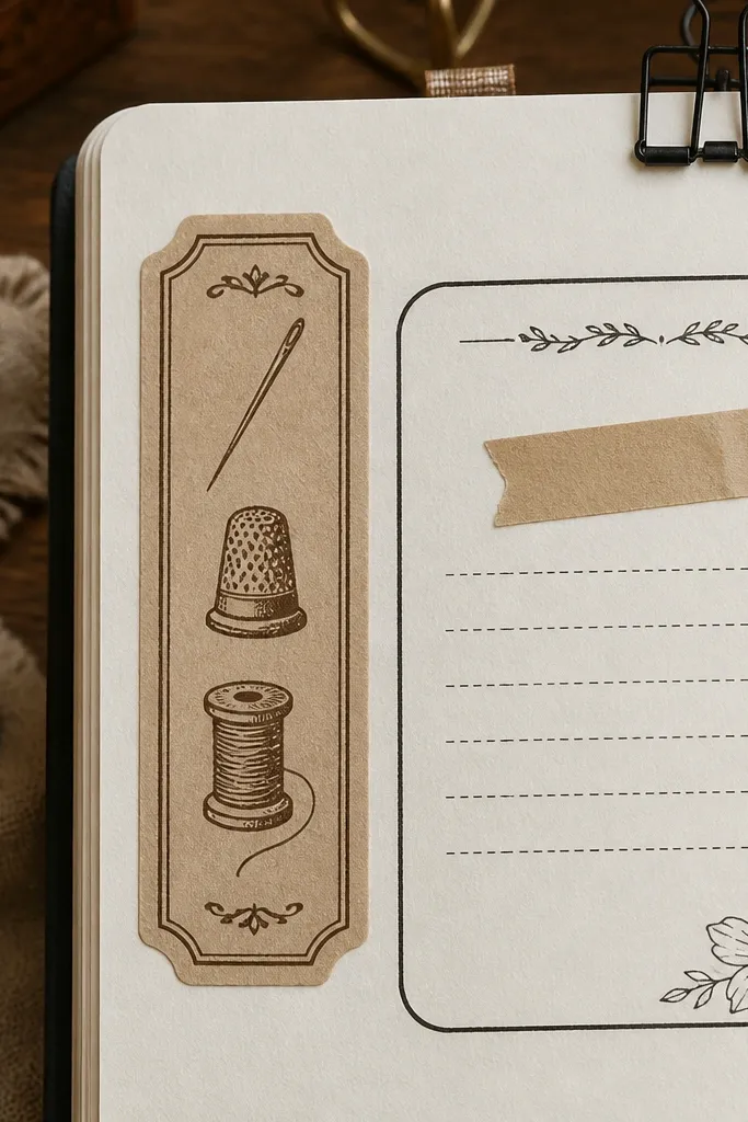
Sewing notions tags make a journal feel cozy in a very specific way: handmade, practical, and warm. The icons — needles, thimbles, spools — read like old craft supplies and fit perfectly with vintage sticker sets. Use one tag as a side label beside your journaling, like “Repair day” or “Handmade.” The best versions have worn line art and faded ink so they look like they came from a pattern book. This sticker also photographs well because the icons create tiny visual interest.
Place the sewing tag along the side of a journaling block so it acts like a border. Add one small filler sticker near the tag tip — a leaf sprig or script word — to connect it visually. Press down firmly and smooth the edges with a ruler for clean adhesion.
Use a brown pen to write near it so the ink tone matches the tag print.
Avoid tags with bright plastic-looking thread colors.
18. Vintage Label Borders for Journaling Boxes
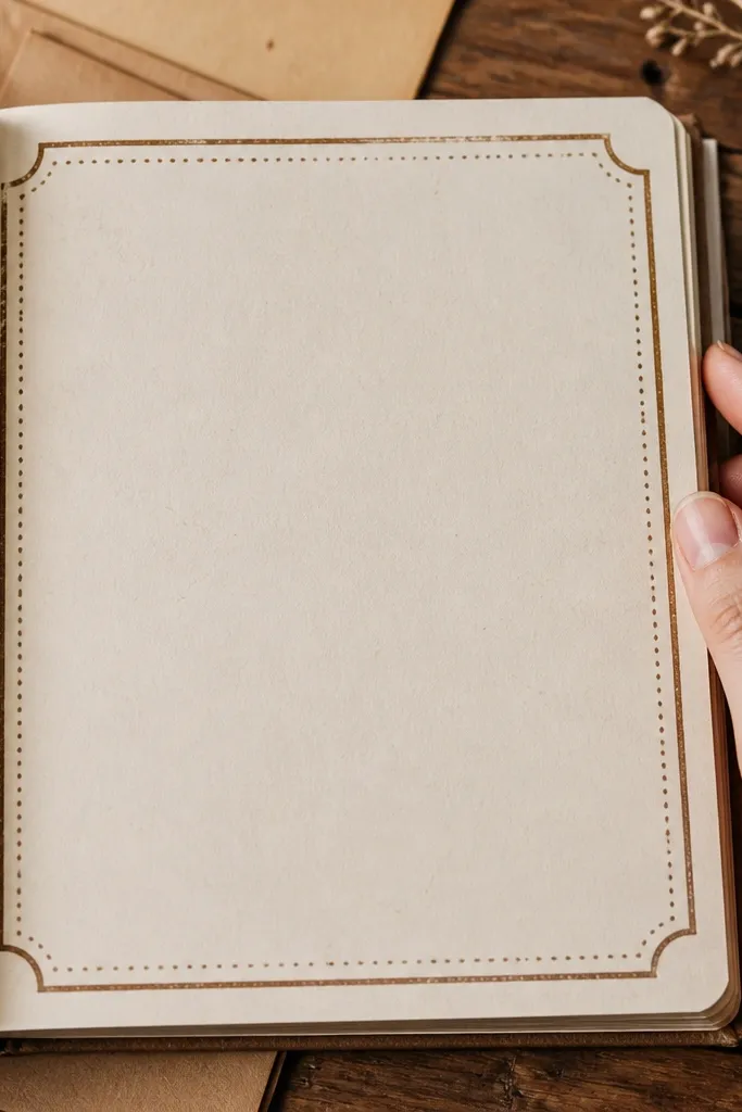
Label borders are the fastest way to make journaling boxes look finished. Instead of relying on your handwriting to carry the page, the border gives structure and makes your text sit inside a vintage frame. Choose borders with thin lines, small dots, and worn edges. Use them on pages where kids or beginners need guidance on where to write. The result looks neat, cozy, and intentional even with messy handwriting.
Editor's noteIf borders are slightly too long, trim only the straight edges with a craft knife on a cutting mat.
Decide your journaling box size first — for A5, a common size is about 4 by 3 inches. Place the bottom border strip, then align the left and right borders to match the box edges. Finally, add the top border and press all corners in order so the frame stays square.
Skip thisDon’t create a box that’s too small; tiny borders make text feel cramped.
19. Antique Leafy Corner Dividers
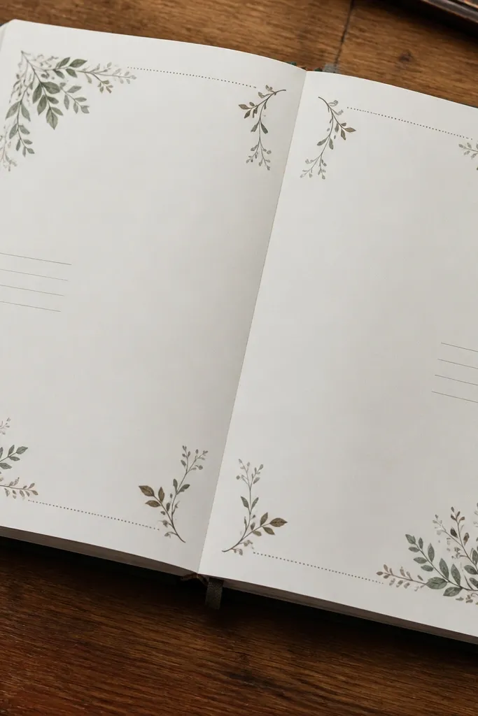
Leafy corner dividers help you split a page into sections while keeping the vibe soft. They work when you want separate areas for dates, gratitude, or kid drawings. The corner placement keeps the page from looking crowded, and the leaf lines add a natural feel that matches cozy Vintage Stickers. Choose dividers with thin leaves and faded ink rather than thick, colorful florals. This is a great option for spreads where you want structure but don’t want to draw straight lines.
Editor's noteMatch leaf color to your pen or marker color so the divider feels like part of the page, not a separate sticker.
Place one divider at the top left and one at the bottom right to create a diagonal visual flow. Leave space in the center for journaling or a photo. Press each divider starting at the corner point and working along the leaf line so it stays smooth.
Skip thisAvoid heavy full-bloom florals used as dividers; they cover too much.
20. Vintage Stamp Set with Different Cancellations
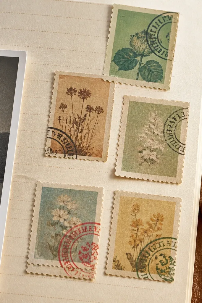
A stamp set gives you a repeating motif, which is what makes a spread look cohesive. The best stamps have different cancellation marks so the page doesn’t look like you copied the same icon everywhere. Use stamps as tiny accents near dates, corners, or the edges of photos. They also help you layer without adding bulk because stamps are small and flat. This is one of the easiest ways to make a cozy Vintage Stickers spread look like it came from a single vintage bundle.
Pick 8-12 stamps with the same ink tone range (brown/black/sepia). Place them in a scattered pattern around your focal area, keeping them under 1.5 inches wide. Press one at a time, then step back to check spacing before adding the rest.
Use stamps to cover tiny mistakes — a stamp over a smudge looks intentional.
Avoid using only one giant stamp; it makes the page feel heavy.
21. Old Book Page Script Micro Stickers
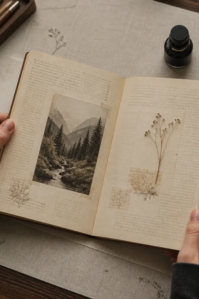
Micro script stickers are for the finishing touches. They make a blank area look filled without adding loud graphics. Choose stickers that look like aged book text — faint paragraphs, tiny headings, and light ink density. Use them as fillers around your main focal so the page looks textured and cozy. This works especially well for kids because it’s easy to place small pieces around drawings, and it hides uneven spacing. The page reads “layered,” not “empty.”
Pick a small cluster area — usually the bottom third near journaling. Place 3-6 micro script stickers around the space, leaving some paper visible so it doesn’t look like wallpaper. Press lightly at first to position, then press firmly once you like the spacing.
Keep your micro script stickers in one corner cluster to avoid a messy scatter look.
Don’t use micro script stickers as the main focal; they’re meant to support.
22. Vintage Botanical Checklist Sticker
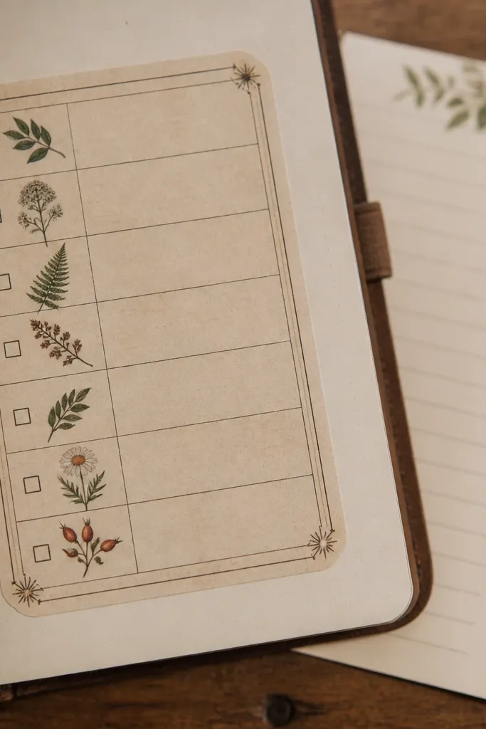
A checklist sticker makes your journal feel cozy and practical at the same time. The vintage lines and small botanical icons look like a page from a garden notebook, and the structure helps kids write or track a simple routine. Use it for “morning chores,” “library day,” or “things to notice.” This style is photogenic because the checkboxes and icons create clean visual order. It also stops spreads from feeling random when you’re mixing drawings, photos, and journaling.
Editor's noteUse a ruler to keep your handwriting inside the lines if you tend to drift.
Place the checklist sticker where you want a readable block of text, usually mid-page. Write short entries or dates in the checkbox areas with a fine pen. If the sticker includes a title line, follow it; if it doesn’t, add a title using a script word strip above it.
Skip thisSkip checklist stickers with tiny, unreadable boxes for kids' journals.
23. Faded Floral Ticket Stub Sticker
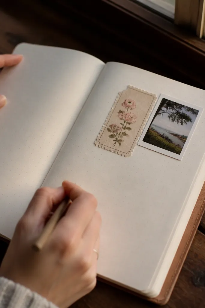
Ticket stubs look like keepsakes, and that’s why they make a spread feel cozy. The perforated edges and small printed details create a “saved moment” vibe. Choose ticket stubs with muted florals, faded ink, and a classic ticket layout. Place one stub next to a photo or under a journaling paragraph as a secondary focal. The shape also helps balance pages when you have a tall element like a book spine strip. It’s a photogenic sticker type that reads well in close-up.
Editor's noteLayer a small stamp corner above the ticket to make it look even more like a real keepsake.
Cut or select a ticket stub that matches your photo width, then place it slightly offset from the journaling block. If the stub has a blank area, write a date or a short memory there. Press the full stub down, then run your thumbnail along the perforation line so it stays flat.
Skip thisAvoid glossy ticket stubs with shiny borders — they look like modern labels.
24. Vintage Post-It Style Notes with Worn Edges
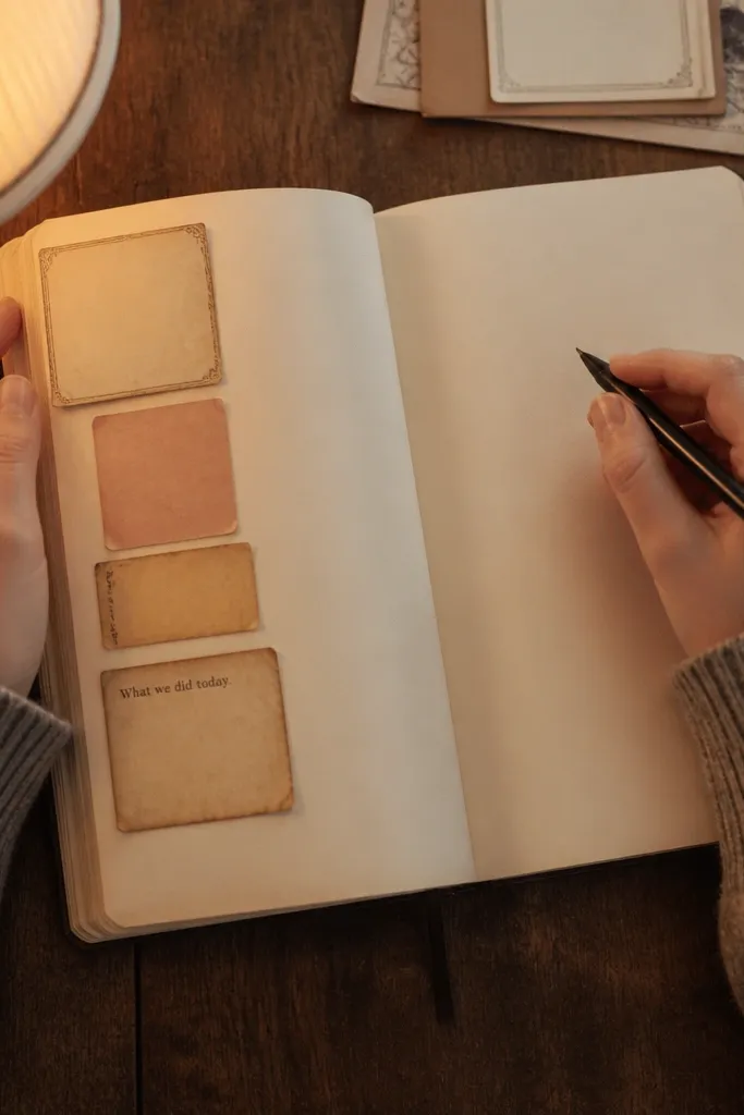
Vintage note stickers add a lived-in, cozy feel because they look like something you wrote quickly and saved. Look for notes with worn edges, faded ink, and simple lines for writing. Use them as reminders, gratitude prompts, or kid-friendly “what we did today” boxes. Because they’re small and rectangular, they work in lots of layouts without taking over the page. They also photograph well because the torn or worn edges catch light softly instead of reflecting like glossy stickers.
Editor's noteUse the same pen you use for journaling; matching ink makes the sticker cluster look intentional.
Place one note near your journaling lines so it feels connected to your writing. Add two smaller note stickers around it — one above and one to the side — to create a cluster. Write directly on the sticker area with a fine brown or black pen, then press edges for full contact.
Skip thisDon’t stack too many notes; three is enough before the page turns cluttered.
25. Antique Map Compass Rose Micro Sticker
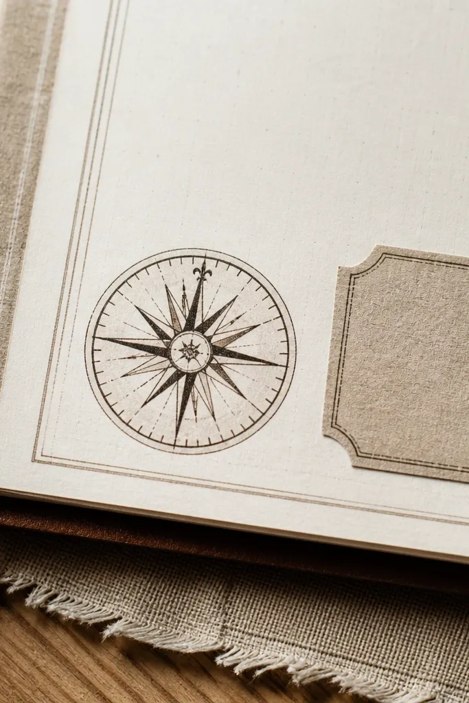
A compass rose micro sticker gives a cozy old-world vibe without adding a big theme. It’s small enough to act like a detail — perfect for corners, margins, or the side of a journaling box. Choose compass roses with thin lines and faded ink so they look like a printed map detail. Use one per page so it feels special, like a marker on a letter. This is a good choice when you want your journal to feel vintage and thoughtful even on days with no photos.
Editor's noteUse it next to a script title so the page reads like a letter with a destination.
Place the compass rose in a corner near a date or title, keeping at least a half-inch gap from text. Press it flat and then add a tiny filler next to it, like a leaf sprig or stamp corner. If you’re adding journaling over nearby space, test the pen flow first so you don’t smear ink on sticker ink.
Skip thisAvoid placing multiple compass roses; two looks like clutter fast.