1. Soft Blush Roses With Scalloped Frame
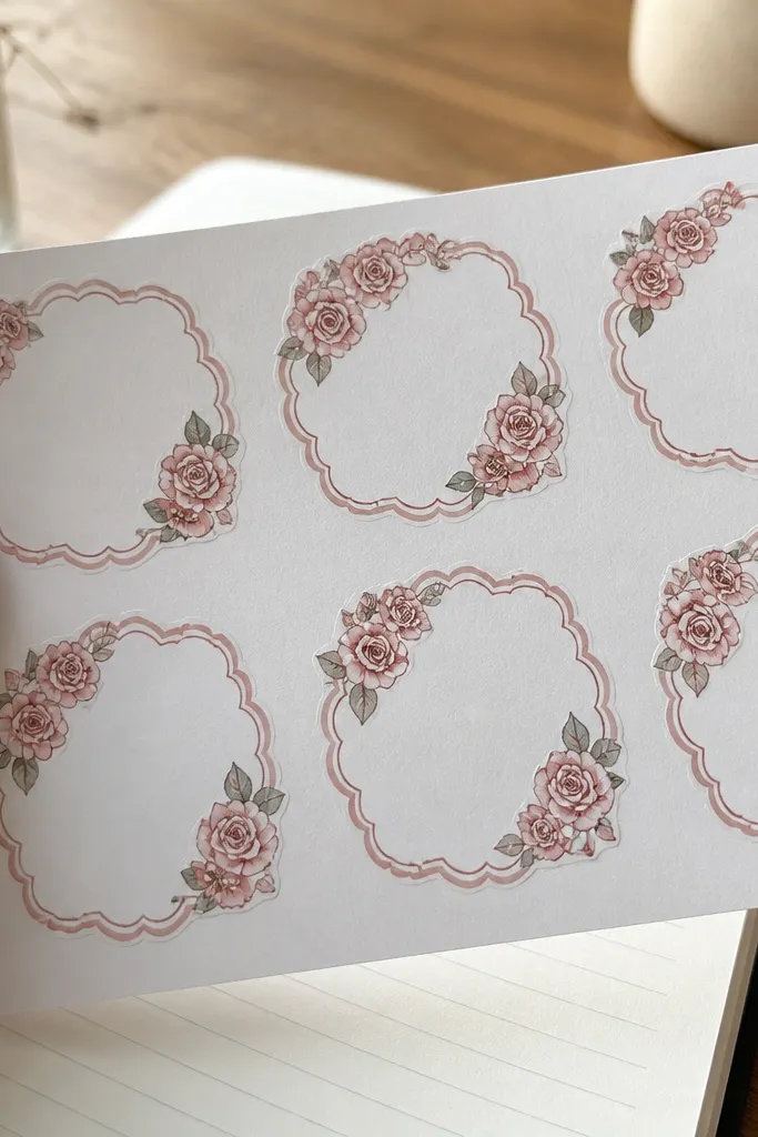
This one nails the vintage sticker look because the scalloped frame makes the whole design feel like it came from an old scrapbook. The roses stay readable even when printed smaller because the petals have clear separation. Pink stays gentle instead of screaming because the palette is blush with a slightly darker rose outline. It’s perfect for kids who love flowers but still want stickers that look “designed,” not random clip art. Print it on matte sticker paper and pair it with a thin white border so it feels like a collectible card.
First, set the sticker width to 2.0 inches so the petals keep their shape. Then print on matte sticker paper, and cut with a craft knife only if you have a cutting mat — otherwise use scissors with short snips to keep the scallops crisp. Finally, add a thin layer of clear packing tape over the top if you’re sticking it to water bottles or lunch containers.
If your pink looks too pale, bump print density by one notch rather than switching paper.
Don’t shrink this below 1.5 inches or the scallops turn into a fuzzy ring.
2. Antique Pink Tea Cup Label
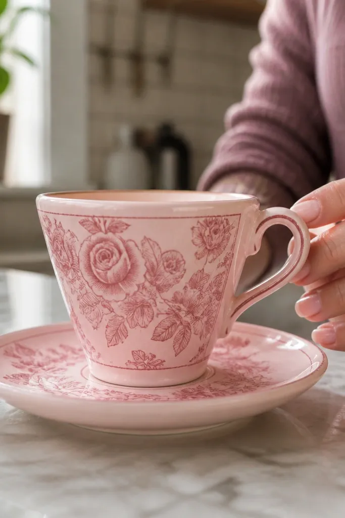
Tea cup labels look vintage fast because they read like old product packaging. This design works for a sticker sheet because it has a clear focal point: the cup handle and saucer edge. The soft pink background and darker pink linework give it that faded-ink vibe without turning gray. Kids also like it because it looks like something they’d “collect,” not just decorate. It fits notebooks, lunch bags, and reward charts without getting lost on the page.
First, print at 2.5 inches wide so the handle stays obvious. Then choose a semi-matte paper if you want slightly more contrast; matte is best if your printer tends to be too sharp. Cut around the label border using a ruler and craft knife for straight edges. Finish by sealing the sticker with clear tape if it will face daily handling.
Use a ruler guide for label borders so the straight sides stay clean.
Don’t place it next to other stickers too close — label edges snag when cutting.
3. Pink Meadow Wildflower Mini Burst
Mini burst stickers look adorable because they feel like a tiny bouquet popping out of the page. The design is intentionally simple: clustered flowers around a center point, which keeps it readable at smaller sizes. Pink works well here because the petals can be lighter and still show up against a pale background. This is a great option when you want variety on a sticker sheet without adding clutter. Print multiple sizes from the same design style and mix them across a notebook spread.
Editor's noteLightly warm the sticker under your fingers for 5-10 seconds before sticking for better adhesion.
First, print at 1.25 to 1.5 inches wide for a true “mini” look. Then cut using a circle cutter or trace a template if you want consistent burst shapes. If you’re using kiss-cut sticker paper, align the sheet grid so you don’t cut through the backing. Finally, stick onto paper with a clean surface — press from the center outward to avoid wrinkles.
Skip thisDon’t use glossy paper if your pink turns streaky — matte keeps it soft.
4. Vintage Heart Stamp In Bubble Pink
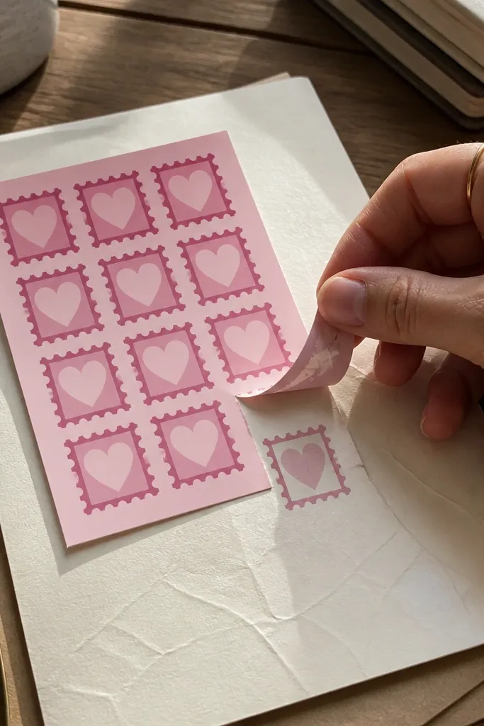
Stamp-style hearts are a cheat code for vintage without needing complicated artwork. The “inked” look gives texture, and that texture reads well even when the sticker is small. The bubble pink fill makes it playful for kids, but the darker stamp border keeps it vintage instead of cartoon. This is one of the best stickers for reward jars because it’s instantly recognizable and easy to place anywhere. It also pairs nicely with other frames and labels on the same sheet.
First, set width to 1.5 inches so the stamp rings stay legible. Then print on matte paper for the best texture match. Cut cleanly with scissors or a craft knife depending on whether your design has a border. Press firmly for 10 seconds, then wait a minute before handling to let the adhesive set.
For sharper stamp texture, print at the highest quality setting your printer supports.
Don’t over-ink the printer settings — stamp areas can turn blotchy.
5. Pink Lace Ribbon Banner
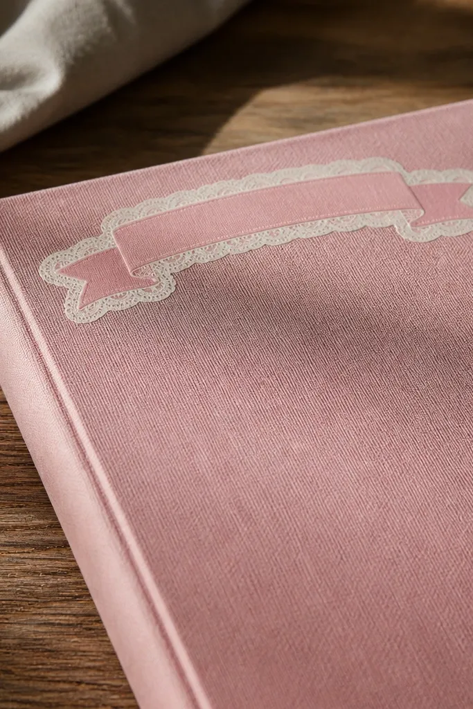
A lace ribbon banner looks like old stationery because it mixes soft shapes with decorative edges. It’s also practical: the banner has a strong horizontal line, so it looks good across the top corner of a page or on a notebook spine. Pink works here because lace details need gentle contrast to stay pretty, not harsh. Kids like it because it feels fancy without being hard to recognize. If you want one sticker that makes a sheet look styled, this is it.
First, print at 2.8 inches wide so the lace edges don’t collapse. Then use a straight-cut approach: cut the banner strip first, then trim the lace nubs with small snips. If you’re applying to fabric, do a quick tape test on scrap so you don’t waste your main sticker. Seal with clear tape for durability on backpacks.
Cut lace edges last — it keeps the sticker from shifting while you work.
Don’t place it on textured paper; the ribbon edges lift and curl.
6. Antique Pink Botanicals Bookplate
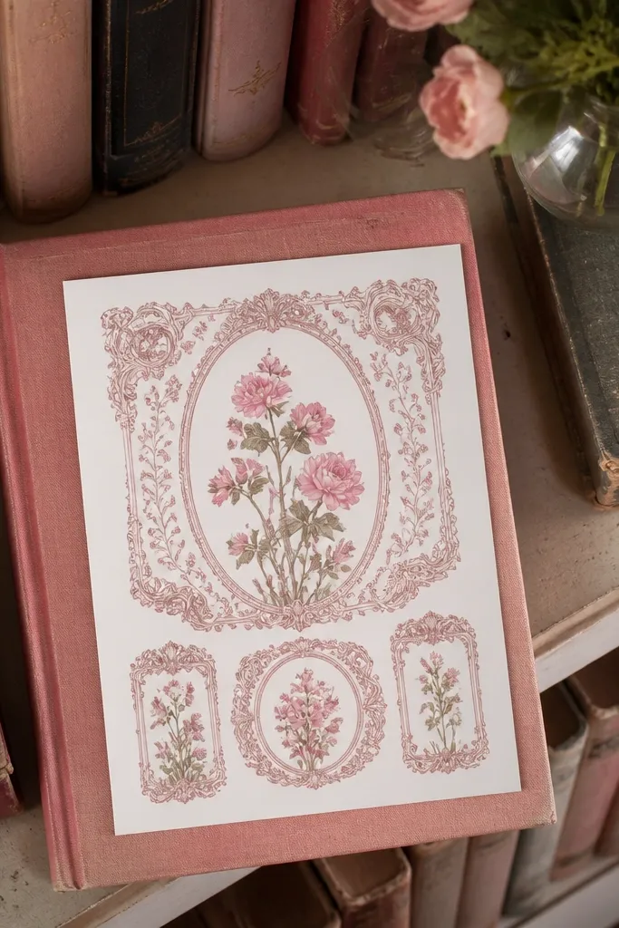
Bookplate designs look classy and vintage because they’re built like little ownership labels. The ornate frame gives you a “collection” vibe, and the botanical illustration keeps it from feeling too formal for kids. This sticker style works well when you want a calmer, more grown-up aesthetic on a pink sheet. It’s also great for organizing: label a notebook, a homework folder, or a craft bin with a matching set. Print it on matte so the frame looks like ink on aged paper.
Editor's noteSmooth with a hard edge slowly — quick rubbing can stretch thin sticker paper.
First, choose a 2.0 to 2.25 inch size so the frame details don’t blur. Then print and cut using a craft knife for the inner frame line if your design includes one. If your printer misaligns, reprint one test row until the frame centers correctly. Finally, apply to flat surfaces and smooth with a credit card to avoid bubbles.
Skip thisSkip glossy for this one if you want the bookplate to feel like ink, not plastic.
7. Pink Candy Cloud Wrapper Label
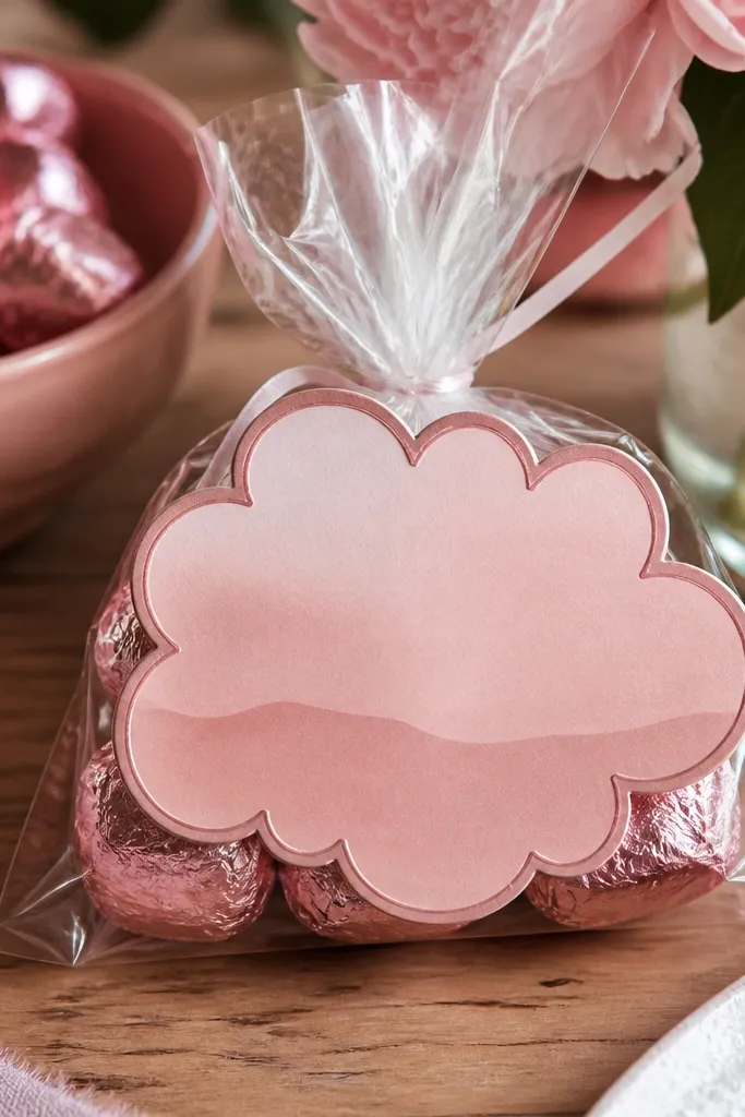
Candy wrapper stickers are fun because they look like something you’d find in a vintage treat bag. The cloud shape gives it a soft silhouette that kids instantly understand. Pink stays sweet instead of neon because the design uses muted blush gradients and darker outline lines. This is a strong “aesthetic variety” pick when you already have floral and hearts and want something whimsical. It also looks great in clusters on a journal page.
Editor's noteIf text looks faint, increase print darkness by one step and re-test on scrap.
First, print at 2 inches wide so the cloud edges stay rounded. Then cut carefully along the outer cloud outline; small snips keep the shape even. If you want extra durability, laminate with clear self-adhesive laminate sheet before peeling. Place on clean, dry surfaces and press from center outward to seal the edges.
Skip thisDon’t use tiny cloud stickers — they look lopsided after cutting.
8. Vintage Pink Bicycle Postcard
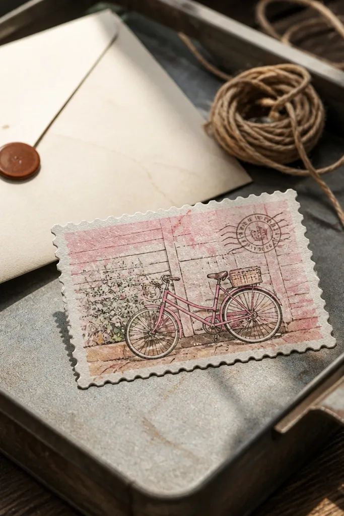
A bicycle postcard gives you a full scene in a small sticker, which makes it feel like a mini memory. The postcard border makes it look printed, not drawn, and the pink wash keeps it cohesive with the rest of your set. This sticker is a good choice for older kids too because it has a clear, recognizable object. It also works on laptops, water bottles, and pencil cases when sealed with tape. Print on matte so the postcard border looks like aged paper.
First, set width to 3 inches so the bike wheels read clearly. Then print and cut with a ruler-guided craft knife for a straight postcard edge. If you’re using sticker paper with kiss-cut lines, cut the sticker out after trimming the sheet. Seal with clear tape if it will be handled daily.
Use a heavier sticker paper weight if you want the postcard to feel sturdy on bottles.
Don’t go below 2.5 inches — the wheels blur into circles.
9. Pink Rosebud Frame Corner Set
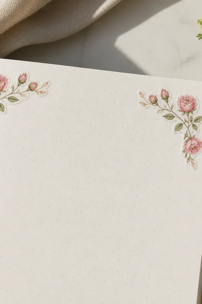
Corner sets are a sneaky way to make a notebook page look designed without covering everything. This design has rosebud corners, so you can place it like a picture frame around a title, drawing, or photo. Pink rosebuds keep it sweet for kids, while the corner layout keeps it clean. It also reduces cutting stress because you can align corners more easily than full rectangles. Print a sheet with multiple corner sizes so you can match different page layouts.
First, print corner stickers at 1.5 inches per corner so the petals stay crisp. Then cut each corner cleanly and test placement on scrap paper before peeling. Apply corners first, then press the middle area last so you can nudge alignment. Seal with tape only if it’s for bottles; paper notebooks don’t need it.
Use a light pencil guide on the page for alignment before you peel.
Don’t peel and stick one corner at a time without checking symmetry.
10. Pink Botanical Label With Dotted Border
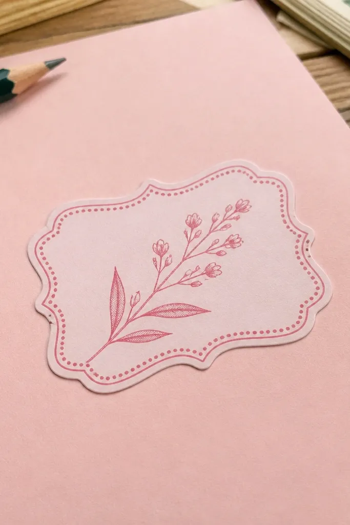
Dotted borders scream vintage because they mimic old label printing. This sticker is a clean, light look with a botanical sprig that stays readable at smaller sizes. Pink works well because the sprig can be pale and still pop with the dotted outline. This is a great pick for classroom craft days because it looks organized even when you mix it with other styles. It also makes a nice background sticker behind journaling titles.
First, print at 1.75 inches wide so the dotted border doesn’t turn into a solid line. Then cut using scissors and keep your cuts steady along the dot edge. If your dots look like smudges, lower print density slightly and re-test. Finally, stick on matte paper areas so the dotted border doesn’t reflect too much.
If your dots are too faint, switch to higher contrast settings instead of bigger size.
Don’t use glossy if you want the dotted look — reflections kill the vintage effect.
11. Pink Cameo Profile Medallion
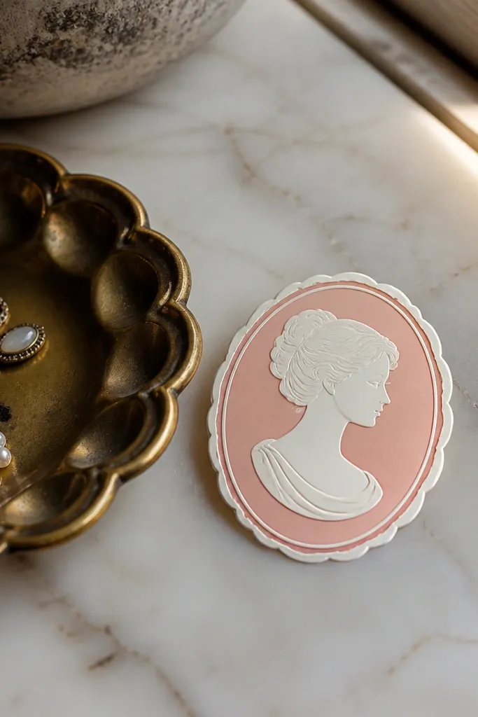
Cameo medallions feel vintage instantly because they’re built for portraits. This sticker keeps the look kid-friendly with a soft pink field and a simple profile silhouette. The medallion shape makes it look like a collectible badge rather than a random sticker. It’s also great for gift tags and treat bag seals because it reads like an emblem. Print it on matte so the medallion edges look like ink and not plastic.
First, print at 2.25 inches wide so the profile stays clear. Then cut using a circle template or a craft punch if you have one sized close to the design. If you need cleaner edges, use a craft knife around the outer ring, then snip the last millimeter with scissors. Press the sticker down firmly and smooth out any bubbles with your fingertip.
Use a craft punch only if your design border is perfectly circular.
Don’t cut too close to the silhouette — leave a thin border so it doesn’t peel.
12. Pink Vintage Flower Press Sheet
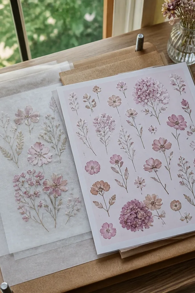
This one looks like a real pressed-flower sheet, which is why it feels instantly collectible. The design uses thin lines and pale pink botanicals placed like specimens, so it looks calm and artsy. Kids like it because it feels like a science craft but still matches the pink theme. It’s also perfect for scrapbooking since it gives you a background layer look. Print on matte so the fine lines don’t glare.
Editor's noteIf your printer smears thin lines, let the sheet dry for 10 minutes before cutting.
First, print at 3 inches wide because the specimen lines need space to stay sharp. Then cut around the outer rectangle with a ruler for straight edges. If you’re making a full sheet, place these away from super tiny stickers so cutting doesn’t bump them. Apply to a flat surface and press along the edges with a scraper or credit card.
Skip thisAvoid small sizes — thin lines blur quickly under 2 inches.
13. Pink Starburst With Vintage Swirl Border
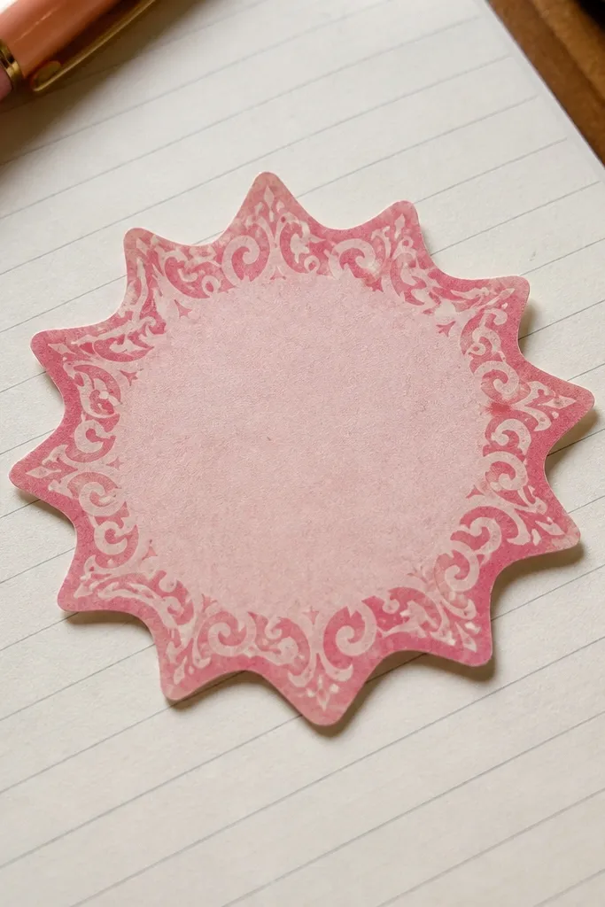
Starburst stickers are fun because they instantly read as “highlight” or “reward,” and the swirl border adds vintage charm. The shape makes it easy for kids to spot on a cluttered notebook page. Pink stays playful when the center is lighter and the border is a darker blush outline. This design is a strong choice when you want a sticker that looks great even if it’s placed alone. Print it matte so the swirl lines look like printed ink.
Editor's noteCut starburst points with scissors in short snips so they don’t tear.
First, print at 2.0 inches wide for a bold starburst without losing the swirl. Then cut carefully along the points; using a craft knife helps keep sharp edges. If your printer shifts, reprint one test copy and adjust scale until the points look symmetrical. Finally, press firmly and smooth from center to outer points.
Skip thisDon’t rotate the design too much on the sheet — points can get clipped when you cut.
14. Pink Envelope Seal Sticker
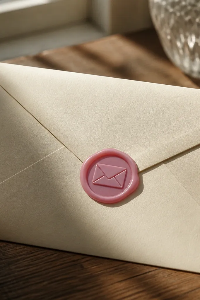
Envelope seal stickers look like old letters, which means instant vintage energy with minimal artwork. The wax-like pink gives you a soft texture effect, and the seal shape makes it feel intentional. This is a great sticker for kids because it’s recognizable and works on cards, gift bags, and homework folders. It also photographs beautifully because the seal has strong contrast edges. Print on matte for that paper-friendly look.
Editor's noteUse a thicker sticker paper for seals so they don’t curl at the edges.
First, print at 1.6 to 1.8 inches wide so the seal border stays crisp. Then cut around the outer seal edge, not the inner stamp, to keep it easy to peel. If you’re using sticker paper, keep the seal centered on the sheet so the border doesn’t get trimmed by accident. Seal with clear tape if it will be handled a lot.
Skip thisAvoid thin paper seals — they lift and look wrinkled fast.
15. Pink Vintage Script Banner
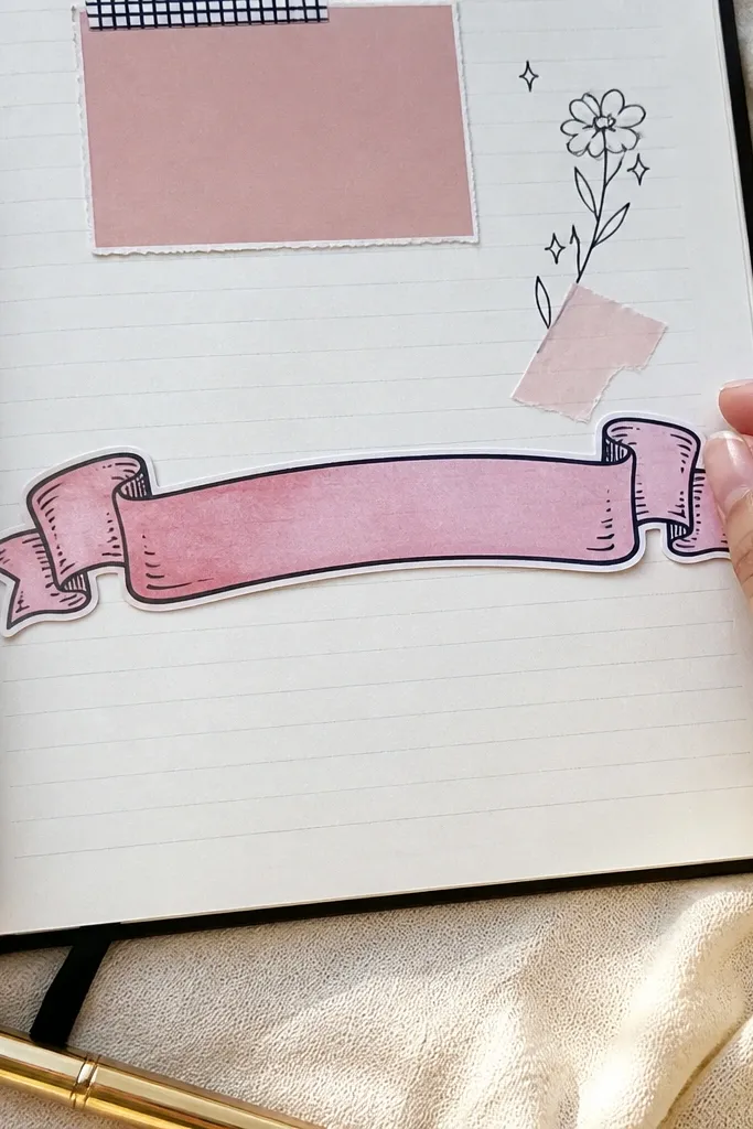
Script banners look dreamy because the handwriting style creates movement, even in a small sticker. This one works for kids because it’s still readable and doesn’t rely on tiny icons. The banner shape gives it a clean placement spot across notebook lines or near drawings. Pink keeps the mood soft, and the darker outline makes the letters print sharp. Print it on matte so the script looks like ink on paper.
First, print at 2.5 inches wide so letters aren’t too thin. Then cut the banner shape with scissors, keeping the top and bottom edges straight. Do a test print and check letter clarity before printing a full sheet. Finally, if you’re sticking to glossy surfaces, wipe the surface with a dry cloth first so adhesive grabs.
If your script is faint, increase print quality instead of scaling up too much.
Don’t choose a banner size under 2 inches; script turns into a blur.
16. Pink Polaroid Memory Frame
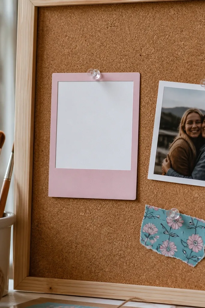
Polaroid frames look great because they create a photo-like moment even when the center is blank. The pink tint makes it feel vintage and sweet, and the thick border makes it easy to cut cleanly. This is a top pick for kids' crafts because it invites personalization: add a drawing, a tiny sticker, or a short note. It also looks good on sticker sheets because the frame shape is consistent and visually calming. Print on matte to reduce glare and keep the vintage mood.
Editor's noteScore fold lines lightly with a butter knife edge so they don’t tear the paper.
First, print at 2.75 inches wide so the border thickness stays visible. Then cut around the outer frame and score the small bottom flap area lightly if your design includes a fold line. Peel carefully and press the center first, then corners. Seal with a small strip of clear tape along the edges if it will live on a bottle.
Skip thisDon’t use glossy paper — polaroid borders reflect and look less vintage.
17. Pink Antique Key and Tag
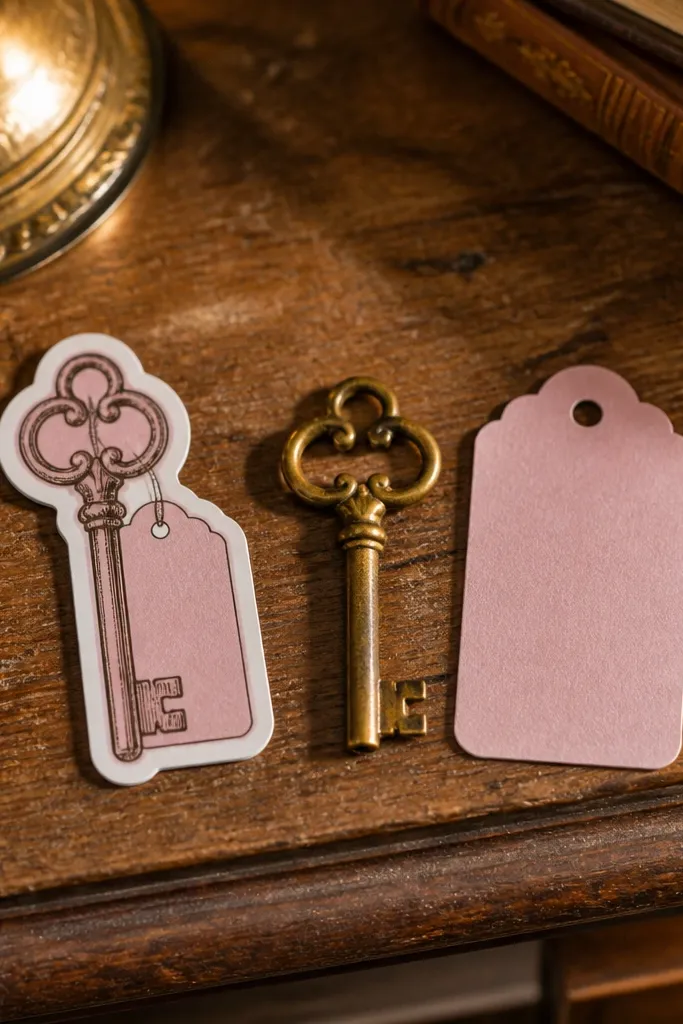
Keys and tags look vintage because they feel like old objects with a story. This sticker design has strong shapes: the key silhouette and the tag outline, both easy to recognize at a glance. Pink keeps it cute for kids while still giving it that “treasure hunt” vibe. It’s also one of the best sticker types for mixed sheets because it adds structure and contrast next to florals and hearts. Print on matte so the key lines look printed, not shiny.
Editor's noteUse a sharp blade and cut in short segments to avoid bending the key silhouette.
First, print at 2.25 inches wide to keep the key teeth readable. Then cut around the outer key and tag outline; go slow on the curves. If your printer tends to smear dark lines, let the sheet dry longer before cutting. Apply to smooth surfaces and press along edges so the tag corners don’t lift.
Skip thisAvoid tiny keys under 2 inches — the teeth vanish.
18. Pink Vintage Rose Label With Tear Strip
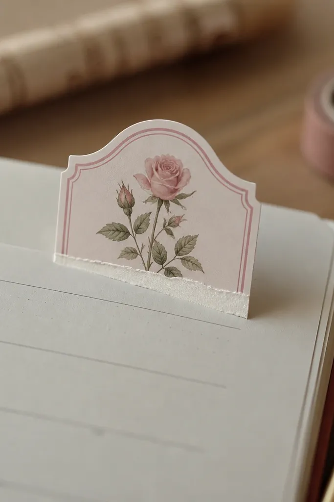
Tear strip labels look like old retail tags, and that’s why they feel vintage instantly. The rose keeps it romantic, while the torn strip shape adds texture and visual interest. Pink is kept soft so it doesn’t overpower a notebook page. This sticker is great when you want a “section divider” look for kids' planners. It also photographs well because the torn edge creates a natural shadow.
Editor's notePress the torn edge longer than the rest — 20-30 seconds helps it stick flat.
First, print at 2.2 inches wide so the tear strip edge stays defined. Then cut around the main label and trim the tear edge carefully with scissors. If your tear edge looks too straight, reduce printer scaling by a hair and re-test. Finally, place the sticker and press the torn edge down with a fingertip so it lies flat.
Skip thisDon’t cut the tear strip too thin; it lifts and looks ragged.
19. Pink Vintage Butterfly Notice
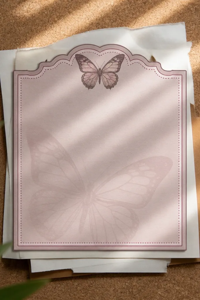
Butterfly notice stickers feel like vintage announcements, which makes them look designed instead of random. The butterfly silhouette gives you clear shape, and the notice border adds structure. Pink works because the butterfly can be pale and still show with darker outline lines. This is a good option for kids because it’s bright enough to stand out but still soft. Print it on matte so the border looks like printed paper, not glossy plastic.
First, print at 2.4 inches wide so the butterfly wings don’t blur. Then cut with scissors for the outer border, and use a craft knife for any inner border lines. Do one test sheet and check that the butterfly body isn’t too thin. Apply by smoothing from the center outward and hold the sticker in place for 5 seconds before releasing.
If borders look too faint, increase contrast settings by one step.
Avoid placing on textured fabric — notice borders curl.
20. Pink Vintage Ribbon Bow With Shadow Edge
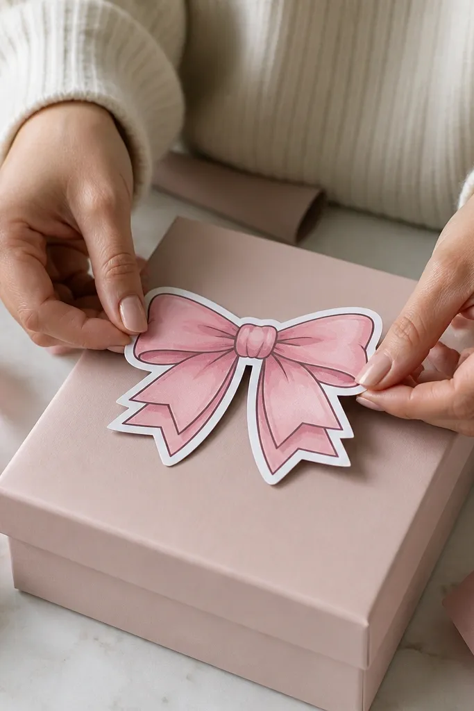
Ribbon bows read sweet and vintage because they have layered shapes and clear edges. This design includes a shadow-like outline so it looks dimensional without needing glitter. Pink stays cohesive across a sheet because bows use fewer colors than florals. This sticker is strong for decorating gift tags, pencil cases, and birthday cards for kids. It also helps your sticker sheet look “styled” because bows sit nicely next to labels and hearts.
First, print at 2.0 inches wide so the bow loops stay rounded. Then cut with scissors and keep the blade close to the outline to avoid thick white edges. If you want the shadow edge to look smoother, print at higher quality mode. Finally, seal with clear tape if it will be handled a lot, especially on pencil cases.
Cut bows after you’ve trimmed the sheet — it reduces shifting.
Don’t go bigger than 2.5 inches or the bow loops start looking chunky.
21. Pink Antique Frame With Tiny Daisies
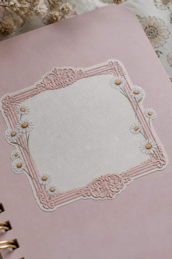
A thin frame with tiny daisies looks vintage because it’s delicate and spaced out. The frame keeps everything tidy, and the daisies add that soft “field flower” vibe. Pink is the right choice here because tiny flowers need gentle color to avoid looking like a kid drawing. This sticker is ideal for planners and sticker books where you want small decoration that doesn’t dominate. Print on matte to keep the frame from looking too shiny.
Editor's noteIf corners lift, press with a coin wrapped in paper for 10 seconds.
First, print at 1.75 inches wide so the daisies stay distinct. Then cut using a craft knife for the frame corners if your design includes corner details. Peel slowly from one corner so you don’t stretch the sticker paper. Place on smooth notebook pages and press along the frame edges to prevent lifting.
Skip thisAvoid rough paper for this one — the thin frame edges catch.
22. Pink Vintage Botanical Sprig Label
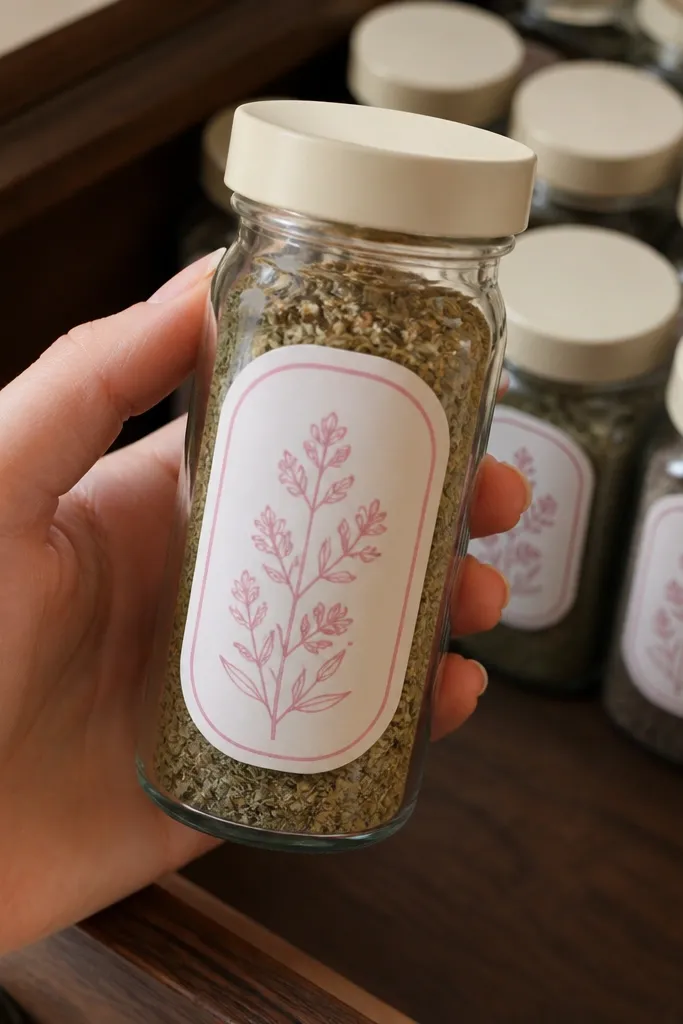
Simple sprig labels look expensive because the shape is clean and the pink palette is controlled. This sticker works when you want lots of designs on a sheet without them competing with each other. The sprig adds movement, and the label border makes it feel like a real item you’d find in a drawer. It’s a great filler sticker for kids because it’s easy to place and looks good in small clusters. Print on matte for that paper-printed softness.
First, set size to 1.5 to 1.75 inches wide for a tidy label sticker. Then print and cut along the label edge, keeping your cuts straight. If your sprig lines appear too light, do a test print with higher contrast. Finally, stick to flat surfaces and smooth with your fingertip from top to bottom.
Make sprigs your “background” stickers — place them behind bigger frames for depth.
Don’t choose super thin paper; sprigs curl and look unfinished.
23. Pink Vintage Balloon Tag Sticker
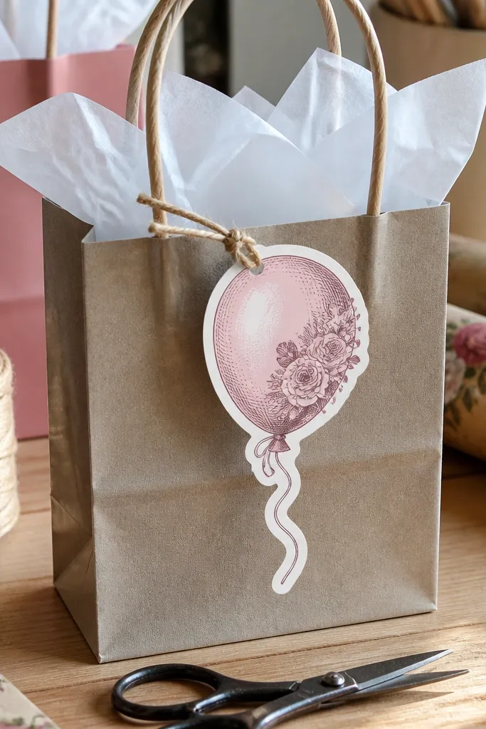
Balloon tags are fun and vintage because they mix a playful object with a packaged label look. The string and balloon silhouette create strong shape, which stays readable on printed sticker sheets. Pink keeps it soft and themed without turning into a neon party sticker. This works especially well on kids' birthday crafts, reward systems, and treat bag labels. Print on matte so the balloon shading looks like faded ink.
First, print at 2.3 inches wide so the balloon curves don’t flatten. Then cut around the balloon and tag edges carefully, leaving a thin margin. If your printer has trouble with gradients, choose slightly less saturated pink in your print settings. Apply to dry surfaces and press along the tag border for good adhesion.
Cut the tag edge first, then the balloon — it keeps the sticker from shifting.
Avoid shrinking too much — the balloon string turns into a thin line that breaks.
24. Pink Vintage Flower Shop Sign
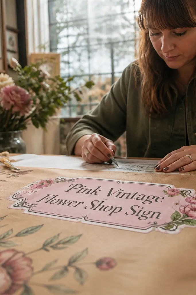
A shop sign sticker adds a bold focal point to your sheet because it’s framed like signage. The lettering and decorative border read clearly when the sign is big enough, and pink keeps the vibe sweet instead of old-school bleak. This is a great choice when you want one “hero” sticker per page to anchor the layout. Kids also like it because it feels like a tiny store they can place anywhere. Print on matte for a printed-paper look and better readability.
Editor's noteUse the highest print quality for text-heavy stickers — it matters more than paper type here.
First, print at 3.0 inches wide so the lettering stays crisp. Then cut with a ruler and craft knife for straight sign edges. After printing, let the sheet dry for 5-10 minutes before cutting so ink doesn’t smear. Apply to notebooks by pressing the center first, then edges, and smooth any bubbles with a card.
Skip thisDon’t crowd it with tiny stickers; cutting near the sign border risks nicking.
25. Pink Vintage Apothecary Bottle Labels With Faux Wax Seal
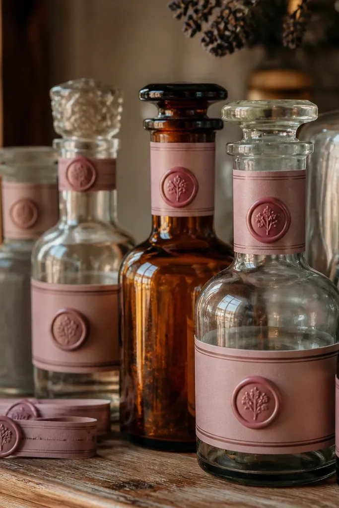
This is the kind of pink vintage sticker you print and immediately want to stick on everything — jars, bottles, and gift boxes. The label design has an old apothecary layout: stacked lines, tiny ornament rules, and a round faux wax seal that adds instant “real artifact” texture. It works because the composition gives you clear hierarchy (name at the top, contents in the middle, volume/date at the bottom) and the seal breaks up the flat label area. Print it on sticker paper, then pair it with a clear matte top coat so the ink doesn’t smear and the sticker looks less like office printing and more like paper ephemera. This suits planners, kitchen gifting, apothecary-style decor, and any space where you want small labels that look collected, not generic. Skill level is beginner — you’re mainly printing, trimming, and sealing.
Editor's noteIf you want the label to look more “printed on paper,” choose matte sticker paper and use matte varnish, not glossy. Gloss makes pink look plasticky and kills the vintage feel.
Print the label sheet on matte sticker paper sized to your printer (8.5x11 or A4). Use a file that includes two versions: one rectangular label sized about 2.2 in by 3.4 in and one smaller label around 1.8 in by 2.4 in so you have options for different bottles. After printing, let the ink dry 10 minutes, then cut with a metal ruler and a craft knife so the edges stay crisp — or use a circle punch for the wax seal area if your file separates it. Apply a thin coat of clear matte varnish spray from 8-10 inches away, two light passes, letting it dry between coats. For the seal look, use a small round seal sticker (or print-and-cut the seal) and press it down firmly for 30 seconds so it bonds smoothly.
Skip thisAvoid thick coats of clear varnish — they ripple and make the sticker edges look wavy.