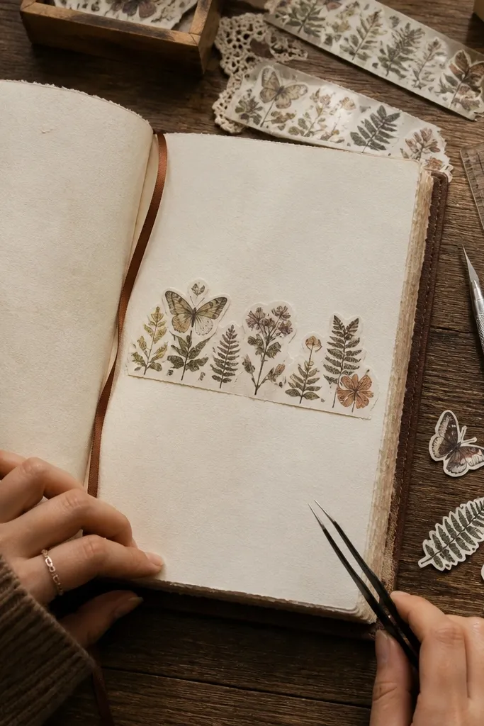
1. Distressed Postage Frame With No-White-Halo Cut
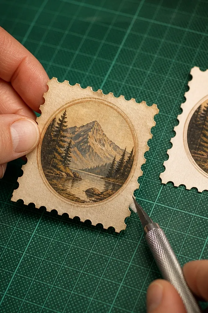
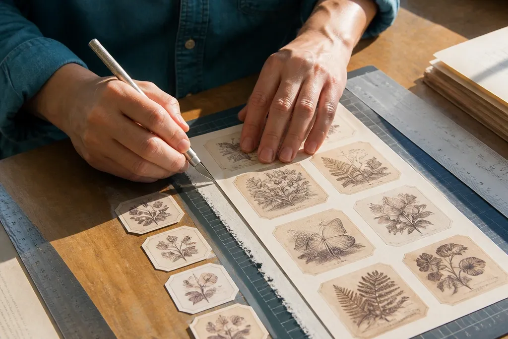
This one is all about the border problem. Vintage postage stickers often have faded ink that looks like it’s bleeding, but the printed edge is still there. If you cut too far out, you get a bright white ring that looks wrong next to your paper texture. If you cut too far in, you lose the stamp frame and the whole vintage illusion collapses.
Editor's noteUse a glassine or parchment tape tab on the back so the sticker doesn’t skate while you do the second pass.
First, find the exact printed border line and mark it lightly with a colored pencil dot at one corner so you don’t lose your reference. Next, do a rough silhouette cut about 1 mm outside the border, then switch to a second pass where you cut right up to the border line. Finally, test-fit the sticker on the page before peeling the backing, then press the corners flat with a bone folder for a crisp finish.
Skip thisDon’t cut the outer edge of the paper if the design is borderless.
2. Faded Botanical Label With Micro-Snip Lettering
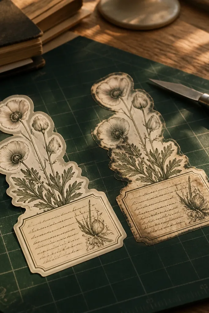
Script and tiny label text are where most cuts look messy. Vintage botanical stickers have letterforms with thin strokes, so heavy pressure makes the blade drag and distort the ink. The goal is to keep the letter edges crisp while still following the irregular, distressed print style. When you do it right, the sticker looks like it was printed that way, not cut by hand.
Editor's noteRotate the sticker 90 degrees and cut along the direction your blade naturally glides; don’t fight the blade angle.
Start by trimming the outside shape first so you can work closer to the text without fighting the whole sheet. Then swap to a micro-tip blade or a craft knife with a fine point and cut each script gap with short snips. Finally, use the blade tip to clean tiny bridges where the ink edge is faint, then wipe off any paper dust before placing.
Skip thisDon’t try to carve letters in one long motion.
3. Vintage Map Corner With Straightedge Accuracy
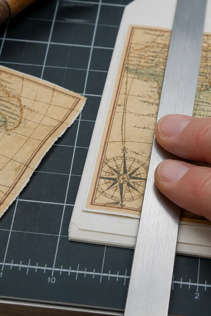
Map corners look best when the straight edges are actually straight. A lot of DIY cuts go wobbly because people cut freehand along the design edge, especially on angled corners. Vintage maps have compass lines and grid details that punish sloppy geometry. If you nail the angles, the sticker reads as “designed,” not “trimmed.”
Editor's noteUse the ruler for only the straight segments; freehand the distressed edge so it doesn’t look artificially perfect.
First, place the sticker on a cutting mat and align a metal ruler with the printed corner edge. Then make a single light pass to score along the ruler line, followed by a second slightly deeper pass. Finally, freehand only the curved or distressed edge portions, keeping your blade tip close to the ink and rotating the sticker instead of moving the ruler.
Skip thisDon’t press hard on the first pass — you’ll chew the paper and blur the ink edge.
4. Sepia Flower Cluster With Layered Edge Refinement
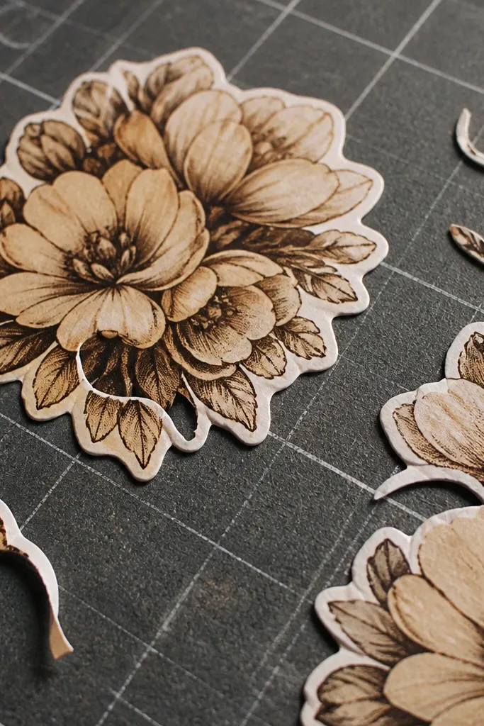
Flower clusters have overlapping petals, and that overlap creates a tricky silhouette. The common failure is cutting through one petal edge while trying to follow another, which makes the sticker look like it’s missing parts. A layered edge approach keeps every petal boundary intact. The result looks soft and natural, even with crisp cutting.
Editor's noteIf petals overlap heavily, cut the top silhouette first, then come back for the lower petals.
First, trim the outermost outline of the flower cluster so you can see each petal boundary clearly. Next, do a second pass where you cut each petal edge separately, stopping exactly where the ink fades or where petals overlap. Finally, gently lift any tiny cut tabs with the blade tip and press them back down after trimming so the sticker lies flat.
Skip thisDon’t treat overlapping petals as one shape.
5. Old Library Card With Hole-Accurate Punch Cuts
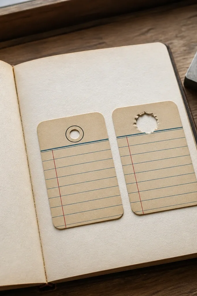
Library cards have punch holes or circular cutouts that make or break the look. If you just cut around them roughly, the holes turn into blobs. If you cut too tightly, you lose the printed ring detail and the card stops looking vintage. Clean holes make the sticker feel like a real printed card you pulled from a drawer.
Editor's noteFor circles, rotate the sticker and keep the blade tip moving; don’t drag the blade across the paper.
Start by trimming the rectangle outline first, leaving the holes untouched for now. Then use a craft knife tip to lightly score the inside of each hole outline, working around the circle in small arcs. Finally, remove the punched-out bits and refine the ring by shaving tiny slivers until the printed circle edge is continuous.
Skip thisDon’t cut the entire hole in one heavy stab.
6. Vintage Envelope Seal With Center-Exact Symmetry
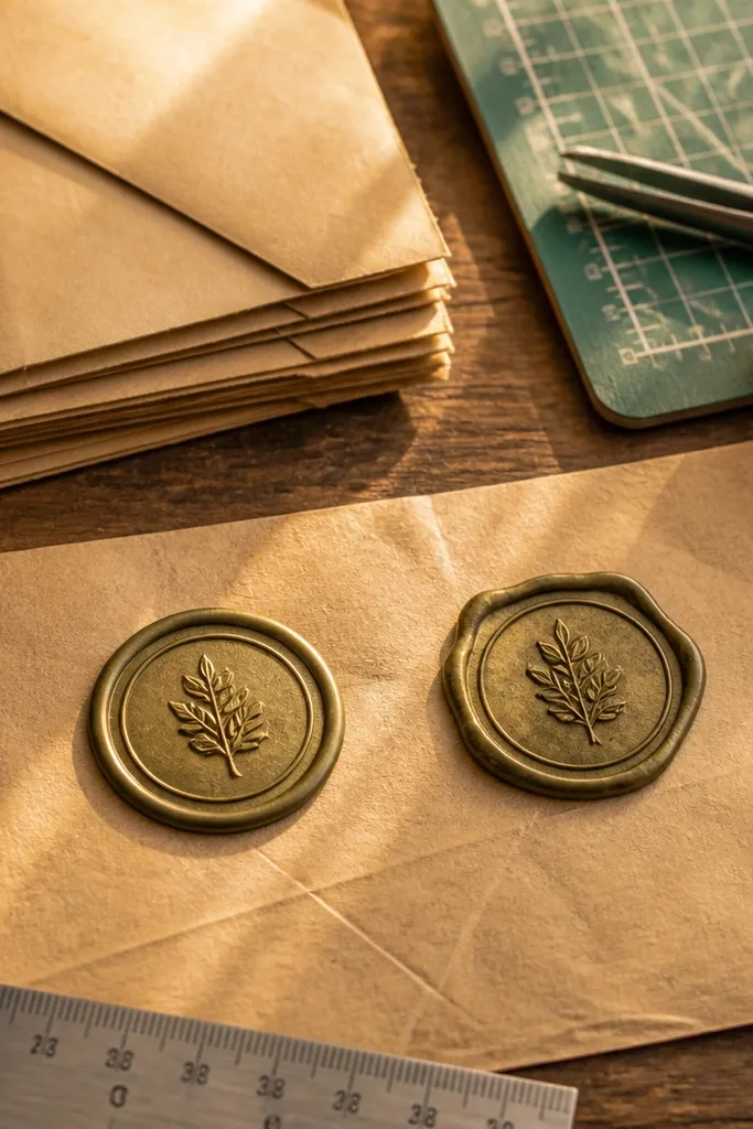
Seals look best when symmetry is real. Vintage envelope seal stickers often have a wax-like border and inner motifs, and uneven cuts distort the shape. The fix is to anchor your cutting line around the center motif and keep blade pressure even. When the outer ring is even, the distressed print reads as intentional.
First, fold the sticker sheet lightly along a center reference line so you can see which side needs trimming more. Next, cut the outer ring in a slow rotation, keeping your blade at a constant angle so the edge thickness stays consistent. Finally, clean the inner cut with a light score and then remove material gradually, not all at once.
Use a cutting mat with grid lines so you can check that the ring outline stays centered.
Don’t eyeball symmetry from one side only.
7. Botanical Border Strip With Straight-Edge Alignment
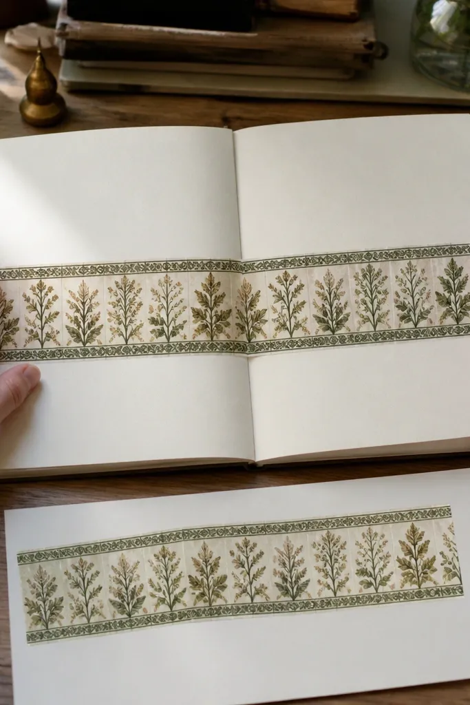
Border strips are unforgiving. If your top edge is wavy, the sticker looks like it was applied crooked even if you place it straight. Vintage borders also have repeating motifs, so a tiny drift early on makes the whole strip feel off. Clean alignment gives you that “decorative border” look that frames your journal page.
Editor's noteCut shorter sections and overlap them on your page if you need extra control on long strips.
First, cut the strip into manageable lengths so you can control the blade and keep the edge stable. Then use a metal ruler for the top and bottom straight edges, scoring lightly and repeating once more for a clean finish. Finally, trim the motif ends by following the printed fade so the strip doesn’t end in a hard, modern rectangle.
Skip thisDon’t cut the strip full-length while it’s still loose and shifting.
8. Typewriter Label With Tight Corners

Typewriter labels have sharp corners and thin lines. The most common mistake is rounding corners too much, which makes the sticker look handmade in a bad way. The goal is crisp corner points that still match the distressed printing. When corners stay sharp, the sticker looks like it belongs in an old office file.
Editor's noteIf corners tear, stop and replace the blade — dull blades stretch paper fibers.
First, score the corner outlines with the blade tip so you create a defined corner path. Next, make two shallow passes around the label perimeter instead of one deep cut. Finally, refine each corner by shaving slivers until the point meets cleanly without tearing the sticker edge.
Skip thisDon’t force corners by pushing the blade — it rounds the point.
9. Sepia Ticket Stub With Notch-Accurate Edges
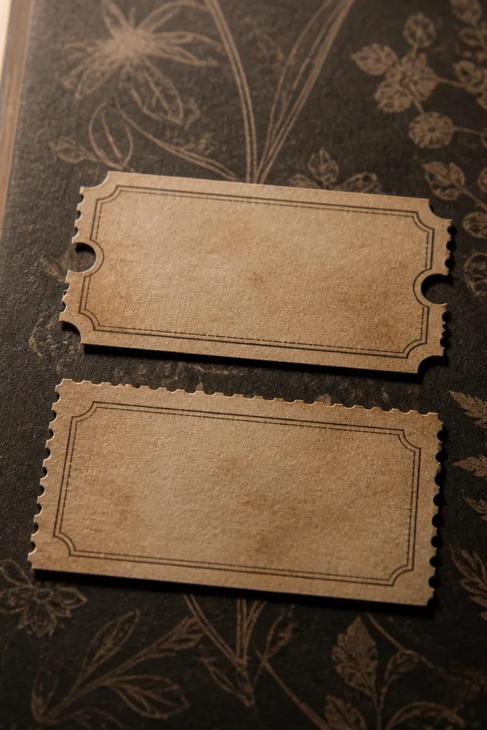
Ticket stubs have perforation-like notches, and those small cutouts are where the look gets authentic. If you skip them or cut them unevenly, the sticker reads as a generic label. Clean notches create that “torn-from-a-book” vibe without actually tearing your sticker. The visual payoff is immediate on dark or patterned journal pages.
First, cut the outer stub shape first, leaving extra margin around the notch line. Next, cut each notch individually using the printed notch edge as the guide, then remove the margin with a final perimeter pass. Finally, lightly press the perforation line with a bone folder so the sticker flexes without lifting.
Use a fresh blade for notch work — dull edges make the notches look jagged and uneven.
Don’t cut all notches as a single long curve.
10. Vintage Postcard Frame With Edge Feathering
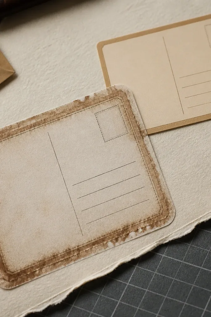
Postcards often have a distressed outer edge that looks feathered. The mistake is cutting a hard, perfect outline, which kills the worn look. You want feathering that matches the printed distress — a slightly irregular edge that still stays controlled. When the border feels naturally worn, it looks like it’s been in the journal for years.
Editor's noteIf the distressed edge is very light, hold the sticker at an angle to see the ink boundary before cutting.
First, identify the inner frame line and cut right on it so the main image stays crisp. Next, for the distressed outer edge, do a series of tiny “micro-cuts” following the faded ink pattern rather than one continuous sweep. Finally, place the sticker on scrap paper and adjust any spots where the edge looks too uniform.
Skip thisDon’t cut the outer edge too uniformly.
11. Old Letterhead With Thin Line Protection
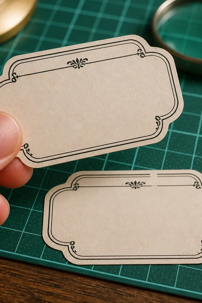
Letterhead designs have thin rules and borders that smear if your blade drags. Cutting too aggressively can create tiny tears along those lines, and once a rule line is broken, it looks like a printing error. A careful two-pass method keeps the thin lines intact and makes the sticker look professionally finished. This is the sticker to practice if you want cleaner typography edges.
Editor's noteKeep your cutting hand light and move faster — slow pressure increases ink drag.
First, do a perimeter pass at a shallow depth so you cut the sticker paper without crushing ink. Next, lift the edge with the blade tip and complete the cut from the underside with light pressure, keeping the blade moving continuously. Finally, check the thin line areas and clean any ragged fibers with the blade tip only, not by scraping.
Skip thisDon’t scrape the blade along printed lines.
12. Vintage Rose Corner With Curve Rotation Technique
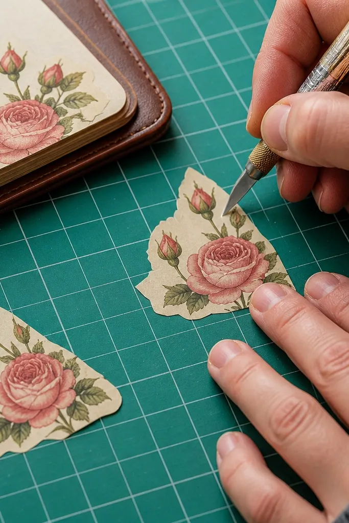
Corners with roses look best when the curve is smooth and consistent. The most common problem is zig-zagging on curves because people cut with their wrist instead of rotating the sticker. If your blade path changes direction mid-curve, the edge looks like a saw. Smooth curves make the rose corner look delicate and intentional.
Editor's noteStop every few centimeters and rotate the sticker to check that the cut follows the ink edge, not the paper edge.
First, trim the straight segments with a ruler, then switch to freehand for the curved rose edge. Next, use the rotation method: keep the blade tip in contact with the edge and rotate the sticker a few degrees at a time. Finally, refine any bumps by shaving tiny sections rather than re-cutting the whole curve.
Skip thisDon’t cut curves by moving your wrist back and forth.
13. Antique Key With Clean Outline Over Background Texture
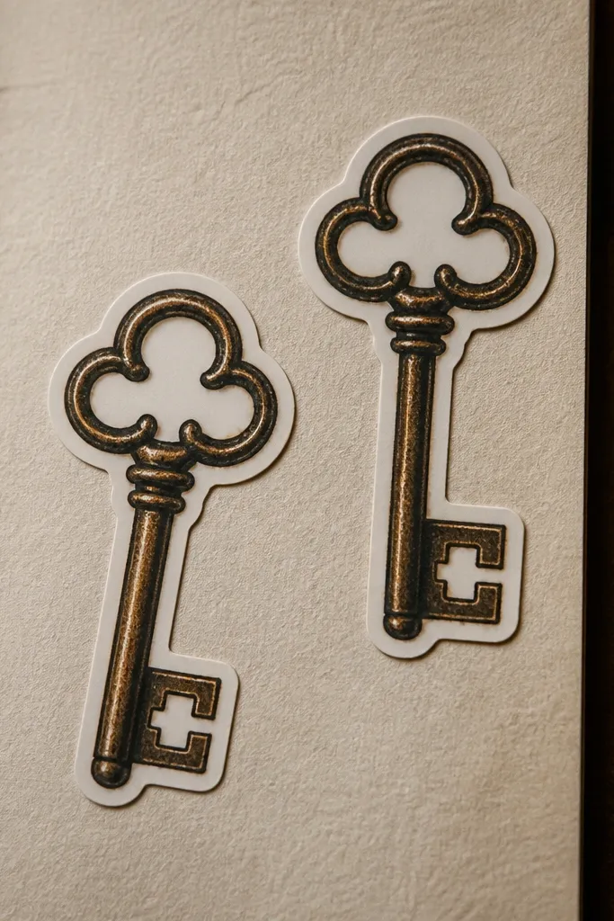
Keys have lots of small negative spaces and sharp teeth. When the background is textured, cutting on the wrong boundary makes the key look like it’s floating in the wrong place. You want the outline to hug the key silhouette and leave the background behind. Clean negative spaces also prevent the sticker from looking fuzzy once applied.
First, cut around the key silhouette tightly, following the darkest contour lines first. Next, remove the negative space by scoring the inner edges lightly, then cutting out the small bits with the blade tip. Finally, do a final outline pass to even out the thickness of the cut edge, then press the sticker flat before placing.
If the textured background peels up, tape the back with painter’s tape, then cut through it to stabilize.
Don’t leave background texture attached around the key edges.
14. Vintage Frame Label With Border Thickness Consistency
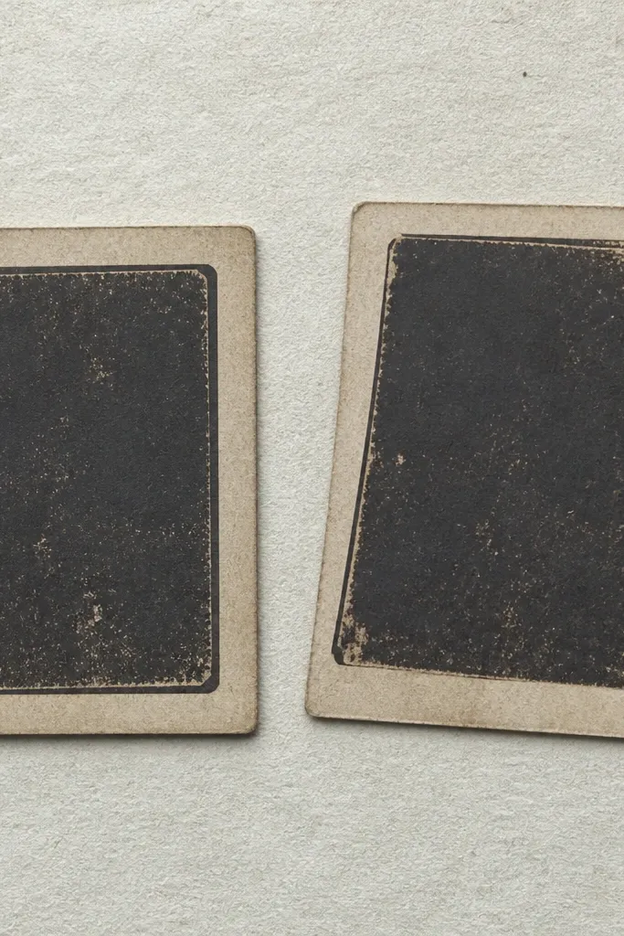
Frames look terrible when the border thickness varies. That happens when you cut too far out on one side and too close on the other, especially with distressed frames. Your goal is consistent distance from the inner image so the frame looks balanced. Once it’s even, the sticker looks like real printed ephemera.
First, choose a reference point on the frame — like a corner where the border is clearly defined — and keep that same distance for all sides. Next, do a perimeter cut leaving a small margin all around, then trim back to your reference distance in a second pass. Finally, press the border edge with a bone folder so it lies flat and doesn’t curl at the corners.
Mark your reference distance with a tiny pencil tick on the sticker backing side.
Don’t cut one side fully and then improvise the rest.
15. Worn Journal Quote Strip With Straight Cut for Readability
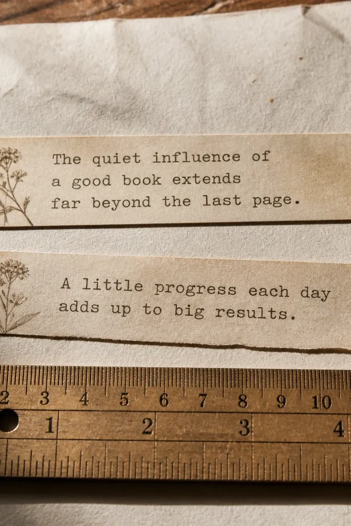
Quote strips need clean, straight top and bottom edges because the eye reads text alignment first. If those edges are uneven, the quote looks crooked even when you place it straight. Vintage quotes also have faded letters that can tear if you cut too deep. A controlled, shallow cut keeps the text crisp and keeps the strip from fraying.
First, cut the strip width using a ruler for the top and bottom edges with two light passes. Next, trim the ends by following the printed fade line so the ends match the worn style. Finally, place the strip on your journal page and press along the edges with a burnishing tool to stop lifting.
Use a ruler even for small strips — it makes the text look neatly framed.
Don’t cut quote strips freehand.
16. Antique Botanica Circle With Perfect Ring Separation
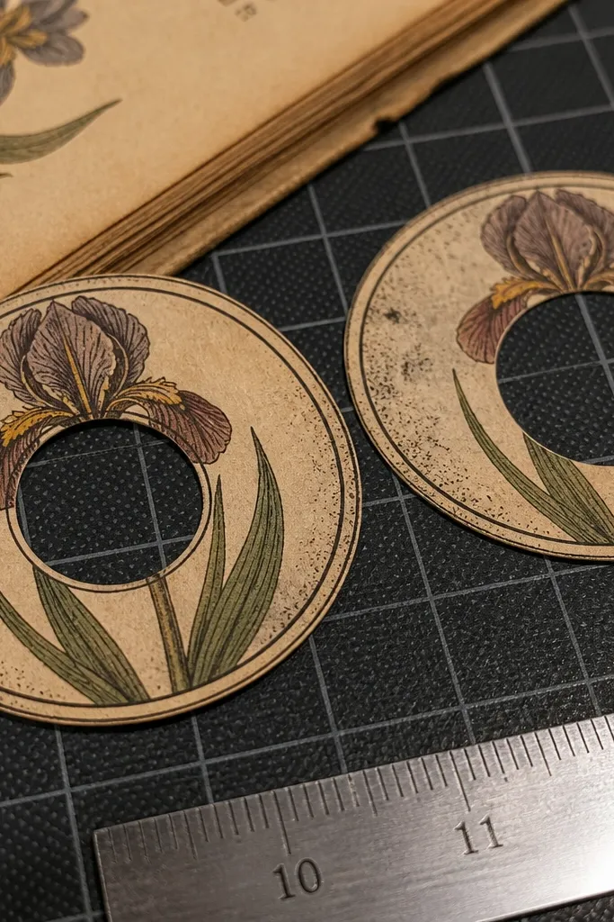
Circles look simple until you cut the inside ring. If the inner cut is off-center or the ring thickness varies, the sticker looks sloppy. Vintage botanica circles often have a ring border with delicate print, so you need steady pressure and clean separation. A neat ring makes the sticker look like a label from an old apothecary.
Editor's noteRotate the sticker slowly and keep the blade tip at the same angle the whole time.
First, cut the outer circle roughly, leaving a margin so you can correct the edge. Next, for the inner ring, use the blade tip to score the inner boundary all the way around with light pressure. Finally, connect the scored line with a second pass, then trim the outer edge down to match the printed circle line.
Skip thisDon’t press hard to cut circles — it widens the cut and distorts the ring.
17. Vintage Ticket Date Label With Edge Trimming for Layering
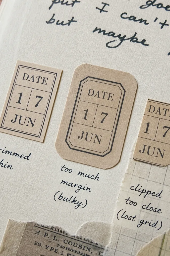
Date labels are made to stack with other stickers, so your cut edge needs to be thin and clean. If you leave too much margin, the label looks bulky and covers the layers underneath. If you cut too close, you clip the printed date box and lose the vintage grid look. Clean trimming gives you crisp layers without thick edges.
First, trim around the outer silhouette leaving about 0.5-1 mm margin. Next, do a second pass that removes the margin evenly, following the printed box edges around the date. Finally, press the sticker edge with a folder so it lays flat and stays thin when you stack it.
Use a cutting mat with a soft surface so the blade cuts cleanly without tearing the sticker backing.
Don’t leave a thick paper margin if you plan to layer.
18. Distressed Corner Label With Tear-Look Edge Control
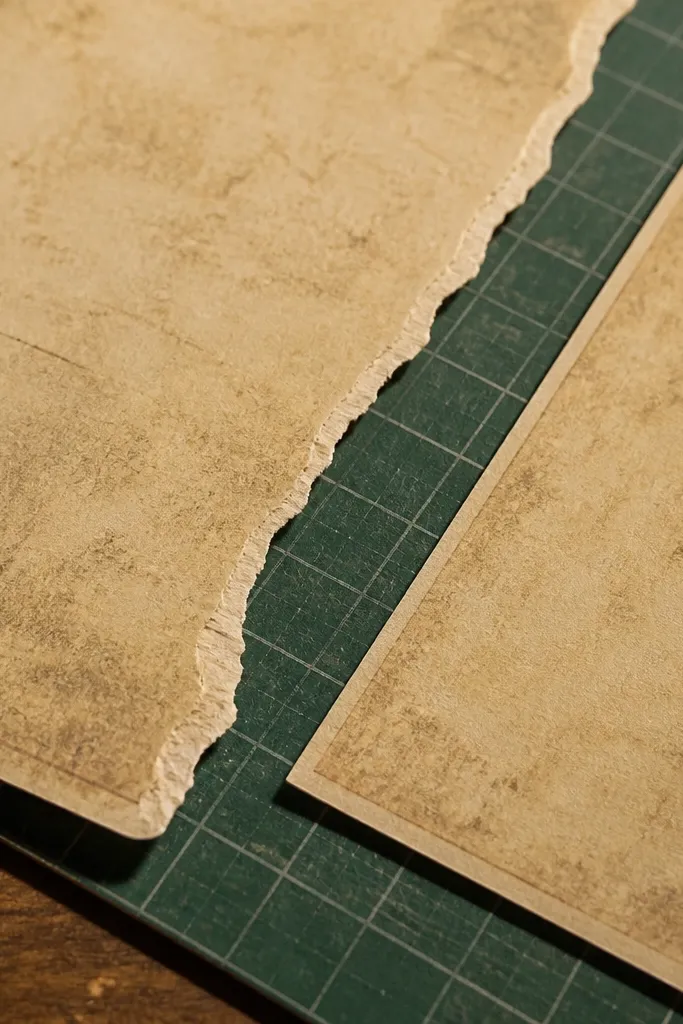
This style is about looking torn without actually tearing. Vintage corner labels often have distress that suggests a ripped edge, but if you cut it like a straight silhouette, it looks fake. The best version keeps the tear shape irregular while keeping the sticker intact. It should sit flat with a believable worn perimeter.
First, cut the main sticker shape leaving a small extra edge around the distress area. Next, follow the printed distress with tiny, angled cuts, removing small wedges so the edge looks uneven. Finally, test-press it on paper; if it lifts at the “tear” points, trim one more shave to reduce raised fibers.
Stop cutting when the edge matches the printed distress pattern — don’t over-distress it.
Don’t rip or force the sticker edge — cutting stays cleaner.
19. Vintage Typography Banner With Baseline Straightness
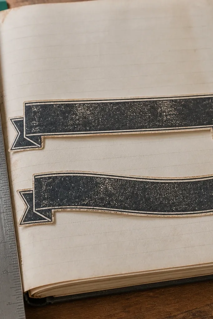
Typography banners are judged by baseline alignment. If the bottom edge dips, the words look crooked even if the font is printed straight. Vintage banners also have distressed ink that can crack if you cut too deep. Keeping the cut shallow and the bottom edge straight preserves the printed look and makes the banner feel intentional.
First, use a ruler to cut the bottom edge straight with two shallow passes. Next, trim the top edge following the banner’s distress pattern, using short snips so the edge doesn’t drift. Finally, clean the ends so the banner doesn’t look like it was cut from a rectangle — shave to the printed endpoint.
Cut the bottom edge first, then treat the top distress as decorative trimming.
Don’t cut the top and bottom freehand without a straight reference.
20. French Ledger Cut With Crisp Micro-Notches
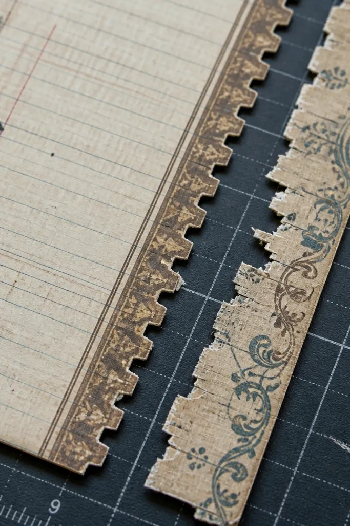
This sticker fixes a real problem with vintage journal pieces — the edges look “cut out” when the design has tiny corners or ticket-like tabs. French ledger layouts usually include those micro-notches along borders, and that’s where most people lose sharpness and end up with chunky tears. The method here gives you controlled breaks that still look handmade, not sloppy. You get a sticker that looks right next to real ephemera because the notch rhythm matches the printed age marks. It’s a moderate skill level project that takes about 25-35 minutes per sheet once your tools are set up, and it fits journals, planners, and mixed-media covers that need small, high-detail accents.
Print or trace a French ledger border that includes 6-10 micro-notches along one edge, spaced evenly (start with 3 mm between notch points). Cut the sticker with a sharp craft knife against a metal ruler, leaving the notch area for last so you don’t distort the border. Use a 0.5 mm mechanical pencil to mark each notch tip, then score each notch with the knife tip first — don’t try to slice through in one pass. Finish by shaving each notch wall with 2-3 light strokes until the paper edge is clean and flat, then lightly burnish the edge with a bone folder to remove fuzz. Age the ink by lightly dabbing the outer edge with a brown ink pad or watered-down acrylic wash, and seal with a matte spray in thin coats so the notches don’t fill in.
Do one “test notch” on scrap paper first — adjust your knife angle until the notch walls look smooth under direct light. Use a cutting mat with a fresh surface so the blade doesn’t drag and round the notch corners.
Avoid trying to cut every notch in one heavy stroke — it crushes paper fibers and makes the notches look rounded instead of crisp.