1. Aged Library Card Sticker Set
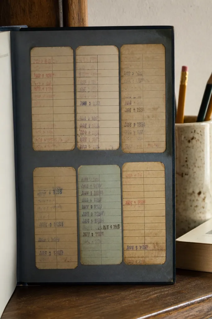
This look mimics real library ephemera, which is why it reads vintage fast. You get a long, vertical card shape with a slightly imperfect border and a date stamp vibe, so it looks “collected,” not “printed.” It’s great for kids' notebooks because the card format gives you a natural place for a name, school year, or a tiny theme label. Use muted ink colors like dusty blue, sepia brown, and faded black to keep it from looking like a modern form. The best part is that the design stays interesting even when stickers are small.
Start by designing one card template sized about 2.25 x 3.25 inches with an off-white background and a thin distressed border. Add a faux date stamp in the top corner using a circular stamp font, then place 3-5 text blocks across the middle. Print on matte sticker paper, cut with a straight-edge craft knife or heavy-duty scissors, then apply a thin matte clear coat if the stickers will touch backpacks.
Add a tiny “due back” line in light gray — it sells the library feel without cluttering the sticker.
Avoid super-crisp borders and bright black text; they kill the vintage effect.
2. Brown Kraft Label Stickers with Tiny Serif Text
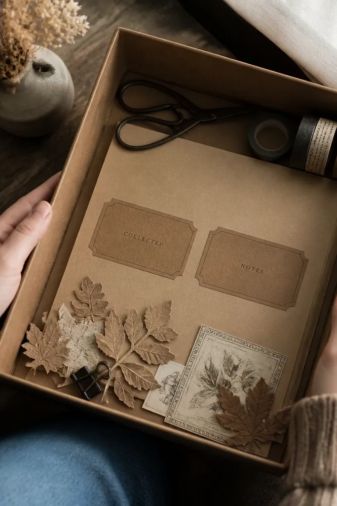
Kraft labels look expensive even when they’re cheap because the texture does half the work. The visual trick is contrast: a brown paper background, a lighter inner panel, and short serif wording like “COLLECTED” or “NOTES.” Kids love using them because they feel like real product labels, not craft stickers. They’re also easy to place neatly on journals, storage bins, and handmade gift tags. Keep the text minimal and bold so it stays readable after printing and sealing.
Cut label shapes from kraft-colored printable label paper (or print the design onto matte sticker paper and keep the background brown). Create a cream inner rectangle about 80% of the label width, then add 1-2 lines of tiny serif text centered. Print, cut, and optionally edge-rub with a brown ink pad or watered-down sepia paint to roughen the edges. Finish with matte laminate tape over the top if the stickers will be peeled repeatedly.
Use one consistent label size across your set so kids' projects look coordinated.
Don’t pack the label with long sentences; the tiny text turns into a blur.
3. Postage Stamp Frames with Misaligned Colors
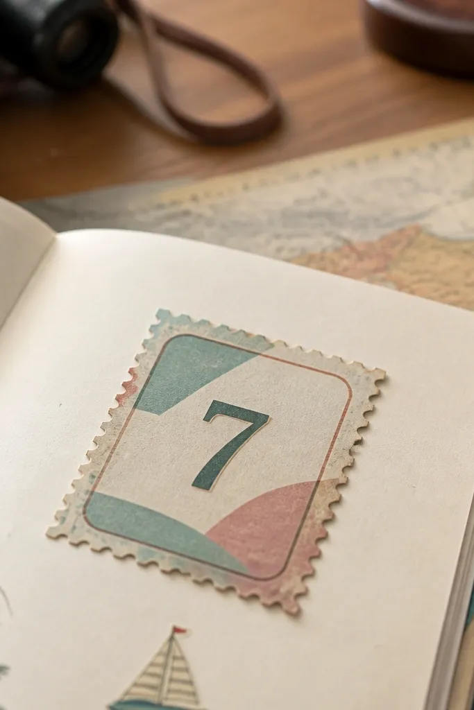
Postage stamps are the fastest way to get that vintage travel look without needing complicated scenes. The key is “imperfect alignment” — slightly off registration colors make it feel like a real stamp that’s been handled. Use perforated edges, a simple frame, and one large number or letter so kids can recognize it instantly. Place these on letters, craft folders, and paper envelopes for instant character. They also photograph well because the border gives structure.
Design a stamp sticker around 1.75 x 2.25 inches with a faux perforation edge and a thick outer border. Add 2-3 color blocks that intentionally shift by a few pixels (or hand-ink one layer) so the colors don’t line up perfectly. Print on matte sticker paper, then lightly distress the edges with sandpaper or a nail buffer. If the sticker will get handled, seal with matte clear coat.
Editor's notePick two close colors (like faded teal and seafoam) instead of high-contrast neon so it still reads vintage.
Skip thisAvoid tiny logos and dense microtext; kids' stickers get rubbed and those details disappear.
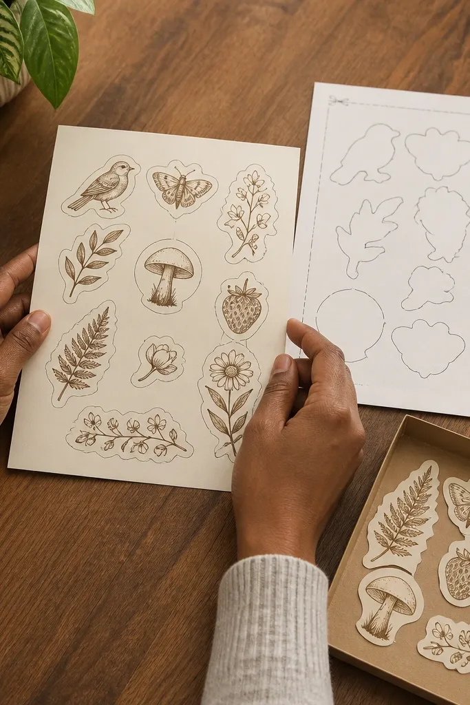
4. Botanical Sprig Stickers on Off-White Paper
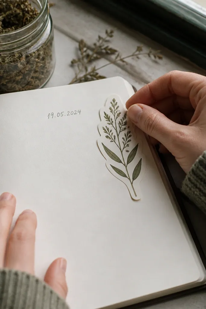
Single sprigs look vintage because old botanical art is usually simple and spaced out. You get a clean silhouette, muted greens, and negative space that makes the sticker feel like it belongs in a field guide. These work well for kids because they’re not “busy,” so the sticker still looks good when placed on a small notebook corner. Use them to label jars, decorate craft boxes, or mark page themes. Keep the leaves slightly varied in color so it doesn’t look like clipart.
Create or download a botanical sprig drawing, then isolate it with a transparent background. Place it on an off-white rectangle sized about 2 x 2.5 inches, with a thin border line in light sepia. Print on matte sticker paper, then cut around the rectangle or use a kiss-cut sheet if you have a cutting machine. Seal with matte clear coat if it’s going on glossy surfaces.
Editor's noteUse one sprig per sticker, not a full bouquet. It looks older and reads better from a distance.
Skip thisDon’t use bright lime greens; they turn it into modern craft art.
5. Vintage Recipe Card Stickers for Kids' Journals
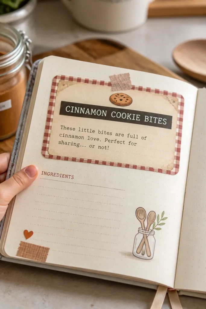
Recipe cards have that cozy, practical vintage vibe, and the layout helps the sticker look “real.” This one is perfect for budget Vintage Stickers because you can reuse the same card format across dozens of themes: cookies, lemonade, art prompts, science notes. The best designs keep the title bold and the body text short, like “Ingredients” and 3 bullet lines. Kids can write on the sticker too, which turns it into a functional decor piece. It’s also great for photo albums because it adds a consistent graphic block.
Design a card template about 3 x 4 inches with a thin border and a bold title strip at the top. Add two labeled sections: “Ingredients” and “Steps,” but keep the sample text short so it won’t blur when printed. Print on matte sticker paper, cut to size, and lightly distress the bottom edge with sepia chalk. Seal with matte tape if you want it to survive frequent writing and erasing.
Editor's noteUse a slightly uneven border thickness — it mimics hand-printed cards.
Skip thisAvoid long paragraphs of text; they make sticker edges look messy.
6. Vintage Ticket Stub Stickers in Muted Reds
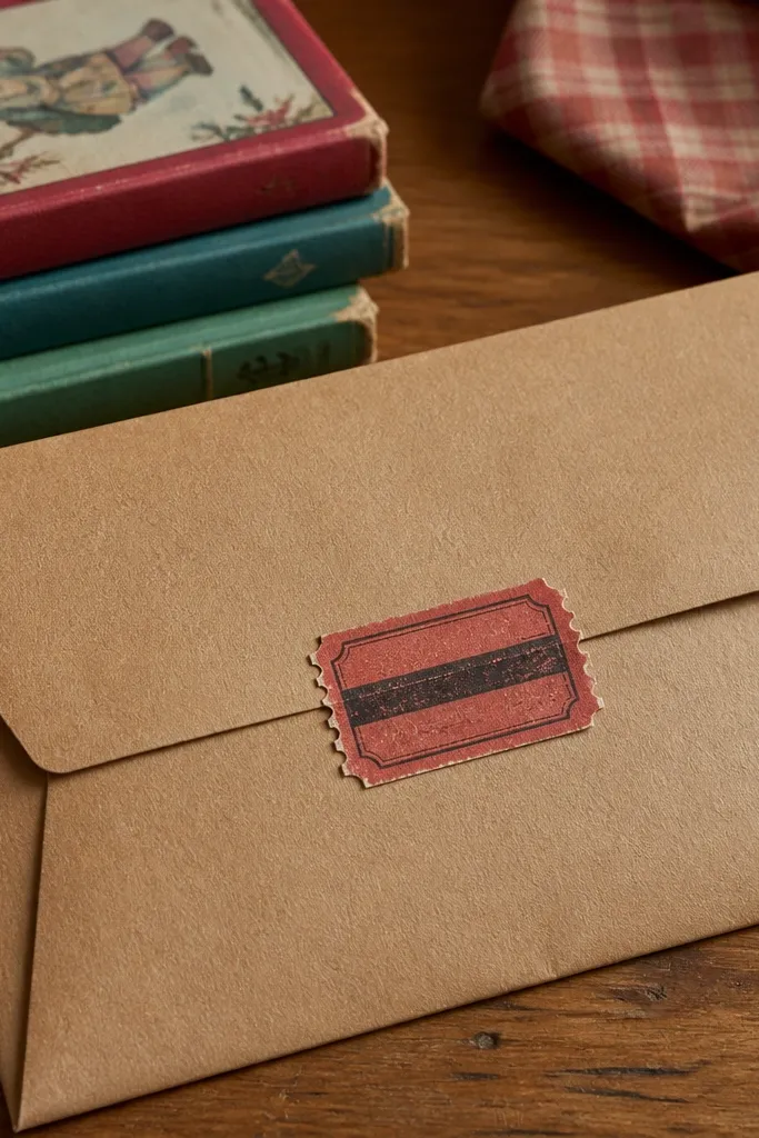
Ticket stubs look great because they’re already a design pattern: perforation, numbering, and a narrow strip layout. For kids, they’re fun because they feel like secret “admission passes” to games, crafts, or story time. The vintage look comes from muted reds, faded blacks, and a slightly worn center. These stickers also work as labels on handmade envelopes and reward charts. Keep the design to one stub per sticker so it stays crisp.
Make a sticker about 1.5 x 3.25 inches with a perforation line across the middle (or near the bottom). Add a simple header like “ADMIT ONE” and a faux serial number in the corner. Print on matte sticker paper, then distress with a dry-brush technique: lightly rub a tan-brown pigment around the edges. Apply matte clear coat for durability.
Use a slightly off-center serial number. Perfect symmetry reads modern.
Don’t use bright candy-red; it looks like party supplies, not vintage paper.
7. Old Map Compass Stickers with Thin Lines
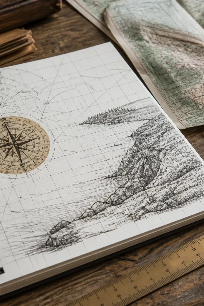
Map compasses have a clean, graphic vintage look that still feels kid-friendly. The thin lines and circular layout create a strong focal point even at small sizes. Put these on travel journals, science notebooks, or craft supply labels. Use muted ink colors like faded black with a hint of sepia so it doesn’t look like a modern vector icon. This sticker style is also easy to scale into a set: different compass sizes or coordinates all match.
Design a compass rose in a circle around 1.5-2 inches wide with thin linework and a tiny direction label. Set the background to off-white and add a faint printed texture using a subtle noise overlay. Print on matte sticker paper, then cut into circles with a circle cutter or scissors. Seal with matte clear coat if used on frequently handled items.
Editor's noteKeep the lines thin but not hairline. If they’re too fine, they clog when printed.
Skip thisAvoid thick outlines around the compass. It makes the sticker look like a logo.
8. Vintage Weather Sticker Set with Cloud Icons
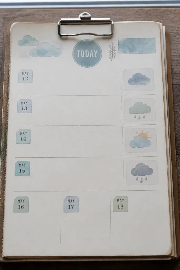
Weather stickers are surprisingly photogenic because they’re simple shapes with a clear color palette. Add a dated stamp style like “TODAY” or “FORECAST” and you get that vintage poster feel. Kids love them for calendar pages, reward charts, and “weather journal” sheets. The vintage look comes from faded blues, dusty grays, and a slightly rough border. Make the set consistent by using the same stamp frame around each icon.
Create a sticker frame around 2 inches wide with a rounded rectangle stamp look. Inside, place one icon (sun, cloud, rain) with muted colors and slightly textured edges. Print on matte sticker paper, cut with a straight edge, and distress the border lightly with gray pigment. Seal with matte laminate tape if it’s going onto paper that gets rubbed.
Editor's noteUse one border color across the set so the stickers look like a coordinated pack.
Skip thisDon’t use super-saturated sky blue; it reads like kids' cartoons.
9. Handwritten-Style Address Label Stickers
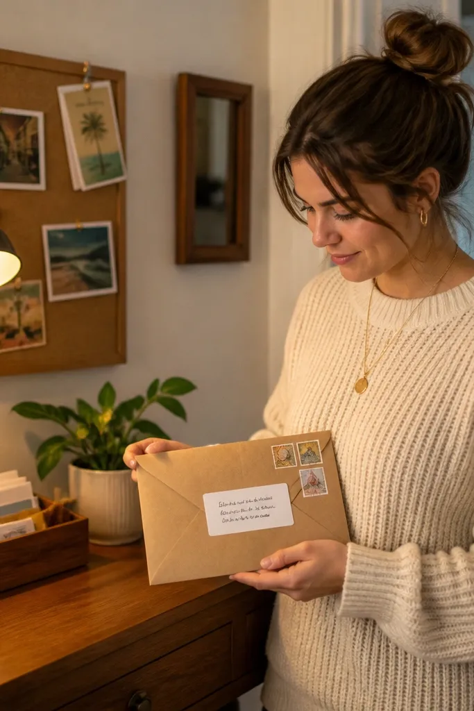
Address labels bring a believable “found in an old drawer” vibe. The look is mostly typography: a script line for the “address,” plus tiny stamp icons and short location text. This sticker style is great for kids' mail games and craft envelopes because it looks like real correspondence. Keep the script readable and the rest of the text short. The vintage feel comes from faded ink, slightly uneven letter thickness, and an off-white background.
Design a label about 2.25 x 1 inch with an off-white background and a cream inner panel. Add a scripted line in sepia brown and a small stamp icon in the corner. Print on matte label paper, then cut and lightly distress the edges with a dark brown ink pad. If you want extra durability, apply a strip of clear matte tape over the top.
Editor's noteUse fewer characters than you think so the script stays crisp at small sizes.
Skip thisAvoid dark black ink; it looks modern and too sharp.
10. Vintage Frame Corner Stickers (Instant Polaroid Look)
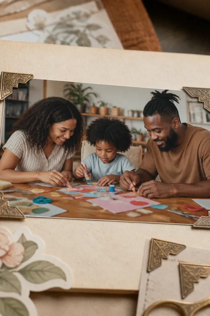
Corner frames make any photo or drawing look “archival,” and the sticker itself is the aesthetic. These are budget Vintage Stickers that work even when you don’t have a full image printed — kids can place their drawing in the center and it instantly looks like a vintage print. The frame corners should be thin and slightly worn, with a muted border color. This is also a smart choice for classroom crafts because it turns blank pages into finished-looking keepsakes.
Design a sticker sheet of corner frames sized around 3 x 3 inches overall with the center left blank or lightly tinted. Print on matte sticker paper, then cut out each corner set as a single sticker piece. If your printer supports it, add subtle edge noise so the frame looks worn. Seal with matte clear coat to keep the corners from peeling at the edges.
Editor's noteTint the center a pale gray instead of pure white. It makes the frame look older.
Skip thisDon’t add a full rectangle frame. Corners look more vintage and less “sticker-y.”
11. Retro Animal Silhouette Stickers with Sepia Wash
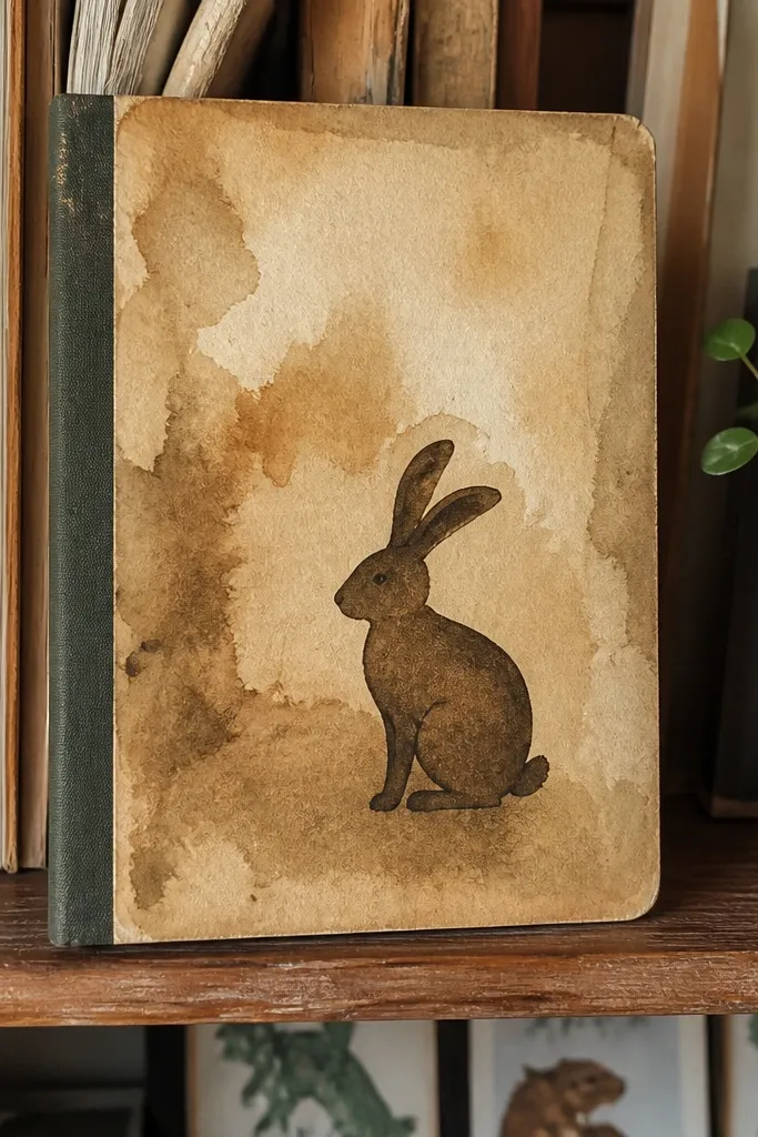
Animal silhouettes look vintage when you pair them with a watercolor wash behind the shape. The silhouette gives clarity, and the wash gives age. Use simple animals like birds, rabbits, or small cats so the sticker stays readable on notebooks. These are great for kids because they look charming without needing tiny details. Pick one color family — sepia brown and faded olive — and keep everything consistent across the set.
Create silhouettes with clean edges, then place a semi-transparent watercolor texture behind them (light enough that it doesn’t muddy the shape). Set the sticker size around 2 x 2.75 inches. Print on matte sticker paper and cut around the silhouette. Distress the border with a light sepia ink wash on a sponge for a worn-paper look.
Editor's noteAdd a tiny “specimen” label strip near the bottom edge for extra vintage credibility.
Skip thisAvoid busy backgrounds with multiple colors; it stops reading as vintage paper.
12. Vintage Botanical Nameplate Stickers
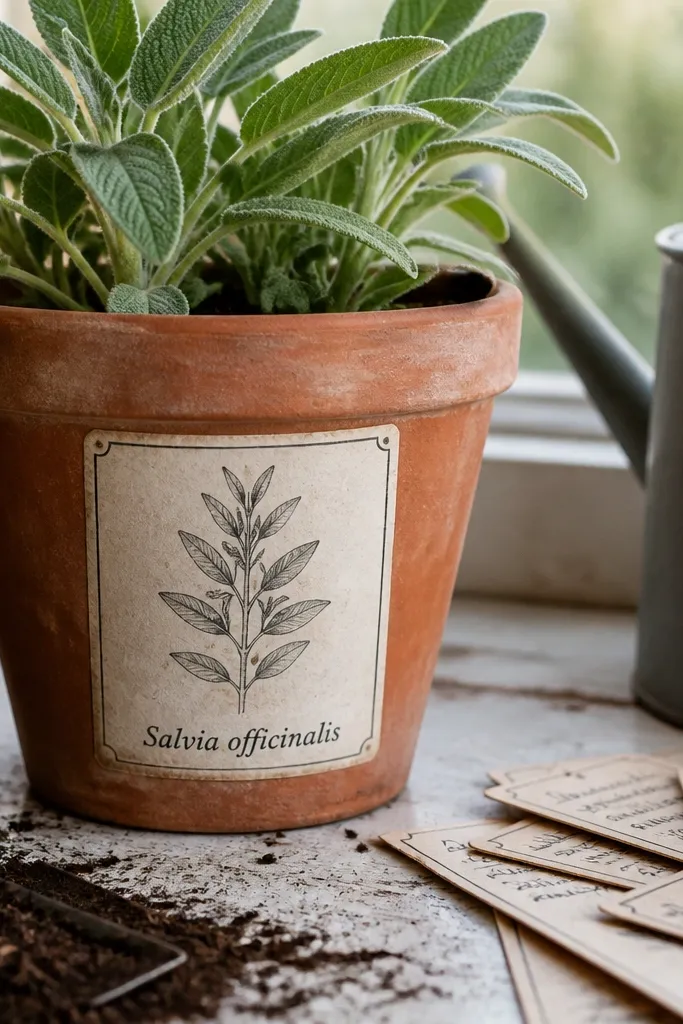
Nameplates feel like old herbarium labels, which is exactly the vintage look you want. They’re also practical: the sticker can label a plant, a craft box, or a page theme. Keep the botanical drawing simple and place one nameplate strip underneath with short italic text. This style looks great even when printed small because the label strip creates a clear reading area. It’s one of the best budget Vintage Stickers for kids' science corners.
Design a leaf illustration in muted green and place it above a cream nameplate strip. Add short italic text on the strip, but keep it to 2-3 words so it doesn’t blur. Print on matte sticker paper, cut neatly around the leaf outline, and then trim the nameplate edges with a craft knife for crisp corners. Seal with matte laminate tape if kids will stick them onto textured surfaces.
Use one consistent strip color across your whole sticker pack for cohesion.
Don’t use long Latin-style strings; tiny letters won’t survive printing.
13. Vintage Soda Bottle Label Stickers
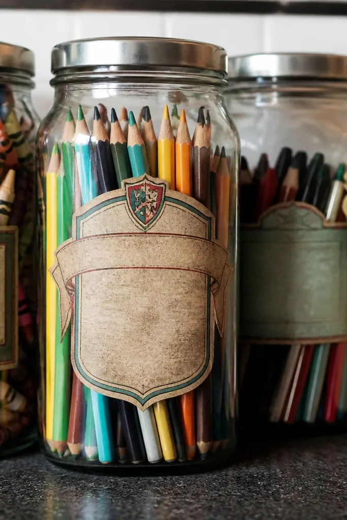
Bottle labels are fun because they feel like mini collectibles. The vintage look comes from a faded banner, a small crest, and a limited color palette. Kids love these on lunch containers, water bottles, and craft supply jars. The silhouette matters too: a bottle-shaped label reads instantly, even if the sticker is small. Keep the design to one bottle per sticker and avoid tiny ingredient lists.
Create a bottle-shaped label template around 1.75 x 3 inches. Add a banner at the top with a single word like “GINGER” or “COLA” and include a faded crest or dot pattern. Print on matte sticker paper, cut to the bottle outline, and apply a thin matte clear coat. For extra scuff resistance, top it with a small square of matte laminate tape.
Editor's noteUse muted reds or dusty blues, not bright primary colors.
Skip thisAvoid glossy sticker paper for these; it can make the label look modern and plasticky.
14. Old School Blackboard Style Stickers
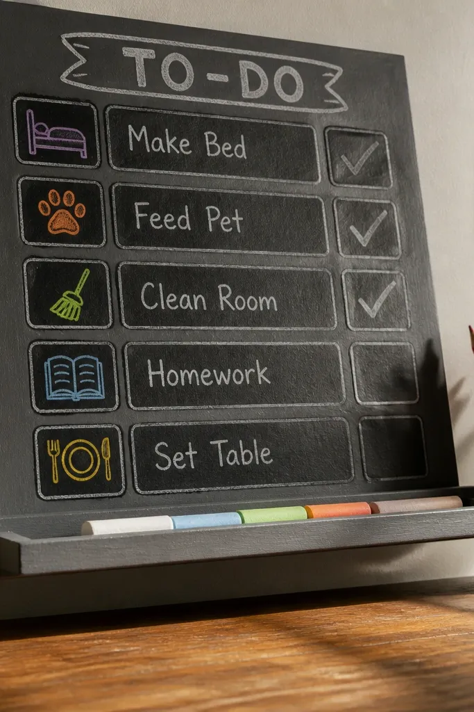
Chalkboard stickers are visually striking because the texture reads like a real surface, even when it’s printed. You get that vintage classroom vibe without needing actual chalkboard material. These are perfect for kids' craft labels, “to-do” lists, and reward notes. The trick is to keep chalk lines thick enough to show up after printing and sealing. Use off-white chalk lines and muted border colors to keep it vintage, not neon.
Design a rounded rectangle around 2 x 2.5 inches with a dark gray-green background. Add 1-2 chalk icons or short words in off-white, then add a subtle chalk smudge effect around the text. Print on matte sticker paper, cut with a rounded-edge scissors, and seal with matte clear coat to stop smearing. If you’re placing on glossy surfaces, press firmly for 30 seconds.
Make the chalk strokes intentionally uneven. Perfect lines look fake.
Avoid thin chalk fonts. They disappear when sealed.
15. Vintage Sea Weather Icons with Waves
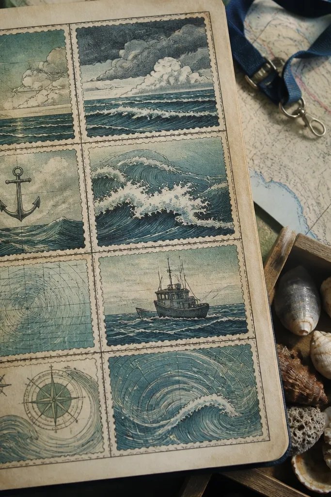
Sea-themed icons bring instant story to kids' projects: boats, anchors, waves, and compass dots. The vintage look comes from a stamp border and faded blue-green ink. This sticker style works well on craft maps, “treasure hunt” envelopes, and science journals. It’s also easy to keep consistent because you’re repeating the same stamp frame around different icons. Choose one anchor icon and a few wave variations for a cohesive set.
Design a small stamp frame around 2 inches wide and place a wave motif inside using muted blue-green. Add a tiny anchor or navigation dot icon in a corner. Print on matte sticker paper, cut out each stamp, and distress edges with a light sandpaper pass. Seal with matte clear coat so the ink holds up on frequently handled paper.
Editor's noteUse a slightly irregular stamp border. It makes the sticker feel hand-printed.
Skip thisDon’t add lots of tiny waves; keep the shapes bold.
16. Vintage Envelope Seal Stickers
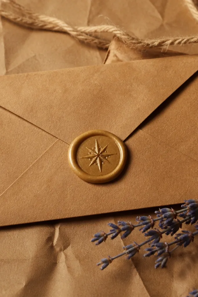
Envelope seals make any envelope or craft packet look official. They’re also gorgeous on finished projects because they sit flat and still feel like an event. The vintage look comes from a wax-like texture and a simple symbol like a star, leaf, or small monogram. Kids can use them for birthday cards, science packet folders, and “secret note” envelopes. Keep the seal design to one symbol so it doesn’t turn into clutter when printed small.
Create a circular sticker around 1.5 inches wide with a slightly textured wax background in deep red-brown. Add a single symbol in faded cream or muted gold and keep it centered. Print on matte sticker paper, then cut circles with a punch or circle cutter for clean edges. Seal with matte laminate tape if the seal will be handled a lot.
Editor's noteMake the symbol slightly off-center by a hair. It looks like real wax stamped unevenly.
Skip thisAvoid metallic gold effects that print too bright. They look modern and uneven.
17. Vintage Train Ticket Stickers with Date Lines
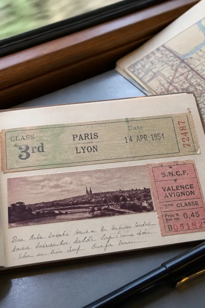
Train tickets are a stronger vintage signal than you’d expect because of the layout. The long strip format, the date line, and the “class” label make it instantly recognizable. These stickers are perfect for kids' travel journals and for labeling craft drawers. They also look good in clusters on paper because the strips form a pattern. Keep the color palette muted and the text short so everything stays readable.
Design a 1.25 x 3.5 inch ticket strip with a perforation line and 2-3 labeled fields like DATE, CLASS, and DEST. Use muted ink colors: sepia for text and faded blue for a border line. Print on matte sticker paper, cut strips, and distress edges with a tan pigment. Finish with a matte clear coat for durability.
Use one consistent perforation angle across the set to keep it cohesive.
Avoid full-color landscapes on the ticket. The print cost shows up in quality.
18. Vintage Map Coordinates Stickers in Small Dots
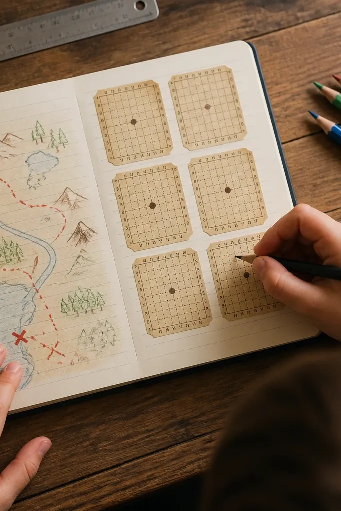
Coordinates stickers look vintage because they mimic chart markings. The style is subtle but photogenic: tiny numbers, a small dot marker, and a faint grid. Kids use them to label “map treasures,” decorate science notebooks, or mark where a drawing “is from.” Keep the layout clean so it reads as cartography, not random text. This is one of the best budget Vintage Stickers for creating a set that feels uniform across different projects.
Create a small sticker about 1.75 x 2 inches with a faint grid background. Add one coordinate line like “N 41.0 W 72.0” and a tiny dot marker icon. Print on matte sticker paper, cut into rectangles with a slight rounded corner, and lightly distress the edges with a gray-brown pigment. Seal with matte clear coat if kids will stick and peel repeatedly.
Editor's noteUse a monospaced number font for that chart look.
Skip thisAvoid handwriting fonts for coordinates; they look like modern labels.
19. Vintage Bird Migration Sticker Set
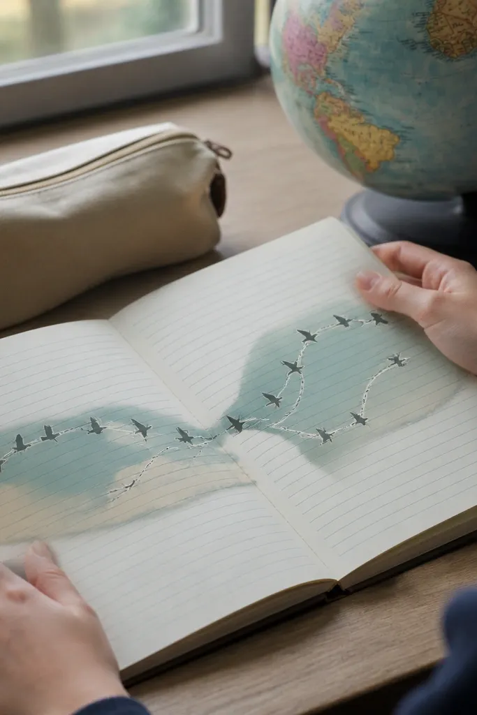
Migration arrows turn a simple bird into a story, which is why these stickers look good on kids' journals. The vintage effect comes from the combination of muted illustration and diagram-like arrows. You get a clear silhouette plus directional lines, so even small stickers look intentional. Use them to label “autumn,” “spring,” or “habitats” in a kid-friendly science corner. Keep the number of elements low so the sticker doesn’t turn into a busy graphic.
Design each sticker around 2.25 x 2.75 inches with one bird silhouette in muted brown or olive. Add a curved arrow path behind or beside the bird and a short label like “MIGRATION” or “SPRING ROUTE.” Print on matte sticker paper, cut around the shape, and distress the edges lightly with sepia ink. Seal with matte clear coat for scuff resistance.
Editor's noteMake the arrow line slightly faded compared to the bird. It adds age depth.
Skip thisDon’t add multiple birds in one sticker; it kills the clean vintage look.
20. Vintage Fruit Crate Label Stickers
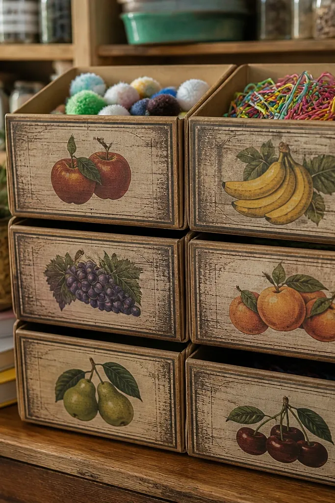
Crate labels have a nostalgic farm feel and they look great in a set. This sticker style works especially well on cardboard bins, craft storage boxes, and kids' pantry-themed crafts. The visual formula is simple: one fruit illustration, a short variety name, and a border that feels like stamped wood. Use muted colors so the label looks like it’s been on crates for years. Kids can also use them to label pretend “snack shops” for craft play.
Create a label about 2 x 3 inches with a cream background and a border that looks stamped or wood-grain. Add one fruit illustration in muted orange or green and add a short variety name like “CIDER” or “PEACH.” Print on matte sticker paper, cut, and edge-distress with a dark brown ink pad. Apply a matte laminate tape top layer if the labels will be on cardboard frequently handled by kids.
Editor's noteUse the same border type on every label so your storage looks coordinated.
Skip thisAvoid glossy fruit highlights; they look like modern packaging.
21. Vintage Music Notes and Staff Line Stickers
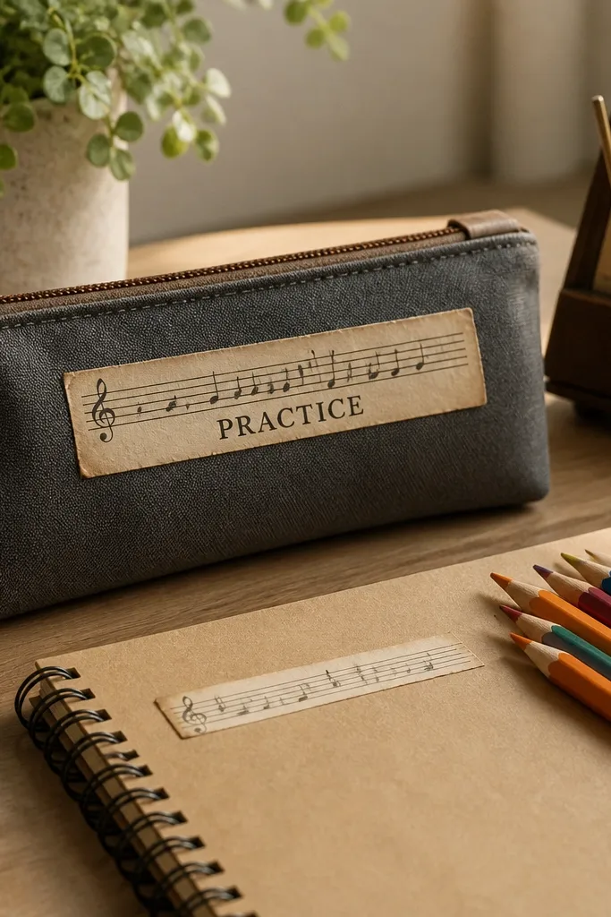
Music-themed stickers are a clean way to make kids' school stuff look styled. The vintage look is in the staff line spacing and the aged ink color, not in fancy graphics. Use a few notes and a small title strip like “SONG” or “PRACTICE” so it reads quickly. These stickers look good on notebooks, pencil cases, and craft booklets. Keep the design airy, with lots of off-white space, so it feels like printed paper.
Design a sticker around 2 x 2.5 inches with one horizontal staff line and 4-6 simple notes. Add a small muted title strip at the bottom in sepia. Print on matte sticker paper, then cut with rounded corners for a softer vintage feel. Seal with matte clear coat if you’re sticking to pencil cases or plastic folders.
Use a slightly curved staff line. Straight perfect lines feel too digital.
Don’t add too many notes; it becomes unreadable when kids handle it.
22. Vintage Monogram Initial Stickers with Worn Borders
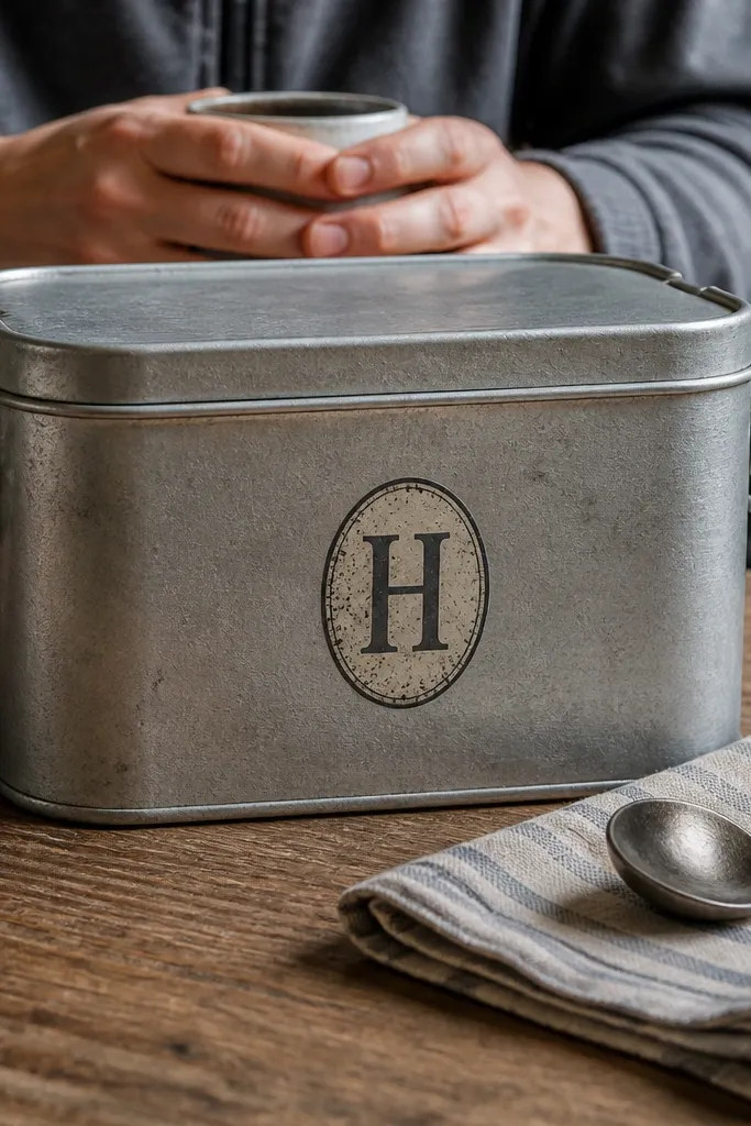
Monograms look vintage because they’re personal and structured. You get a clear initial, an oval shape, and a worn border that feels like engraved metal or stamped paper. For budget Vintage Stickers, this is a money-saver because you can reuse the same border template for every kid’s initial. These are great on lunch boxes, water bottles, and handmade gift tags. Pick serif initials and keep the color muted so it doesn’t look like modern vinyl lettering.
Create an oval sticker template about 1.75 x 2.25 inches with an off-white background. Add the initial in a serif font, then add a worn border effect using a distressed brush texture. Print on matte sticker paper, cut with an oval cutter if you have one, and edge-distress with a light ink pad. Seal with matte clear coat for durability on glossy items.
Use one border color across the whole set, then vary the initial color slightly for personality.
Avoid thin script monograms; they look delicate until they get rubbed.
23. Vintage Science Diagram Stickers with Labels
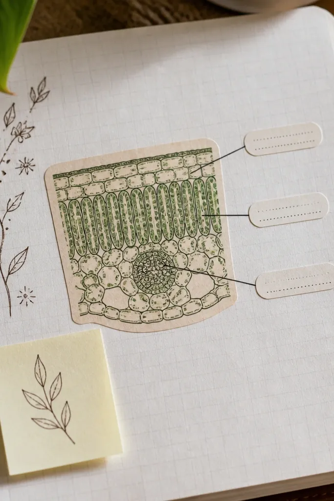
Science diagrams look vintage when they’re simplified and labeled like old textbooks. This sticker style has that “diagram + callout lines” look, which is instantly aesthetic on notebooks. Keep the diagram to one shape: a cell-like circle, a leaf cross-section, or a simple gear. Add 2-3 callout labels maximum so kids can read it. It’s perfect for science journals, maker folders, and craft labeling.
Design a sticker about 2.5 x 2.5 inches with an off-white background and a faint grid texture. Draw one simple diagram shape in muted black or sepia, then add 2-3 callout lines with short labels. Print on matte sticker paper and cut into a square with slight rounding. Seal with matte clear coat to prevent label text from scuffing.
Editor's noteUse arrow callouts instead of tiny boxes. They read better at small sizes.
Skip thisDon’t add more than 3 labels; it turns into clutter after printing.
24. Vintage Gallery Tag Stickers for Craft Supplies
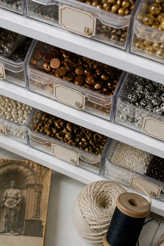
Gallery tag stickers look like they came from a museum display, but the layout is simple enough for budget Vintage Stickers. They’re great for craft supply bins because the tag shape gives a natural “this item belongs here” feeling. Use a cream label with a thin border and a small stamp icon in the corner. Kids can also use them for art “titles” on their drawings. Keep the tag short and readable so it looks good when stuck on bins and folders.
Create a tag-shaped sticker around 1.75 x 2.75 inches with a small top notch. Add a cream label area and a short title like “SKETCHES” or “PAINTS,” plus a tiny stamp icon. Print on matte sticker paper, cut with a craft knife for the notch, and edge-distress with sepia chalk. Seal with matte tape if it needs to survive being handled.
Editor's noteMake the top notch clean and symmetrical; it’s the part that shows up most in photos.
Skip thisAvoid long titles. The tag shape makes text look cramped.
25. Vintage Postcard Border Stickers with Corner Flourish
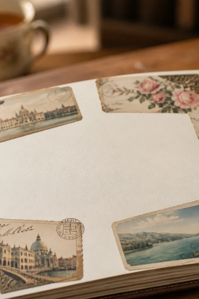
Postcard borders are a classic vintage look because they already frame information like a real card. Use a thin border, worn edges, and small corner flourishes instead of a full picture. This makes the sticker flexible: kids can add their own drawings in the center or leave it blank for journaling. The vintage effect comes from off-white paper tone and slightly rough edge distress. These stickers look great on scrapbook pages and craft envelopes.
Design a postcard border sticker around 3 x 4 inches with an off-white background and a thin outer border. Add corner flourishes in a muted sepia color and keep the center mostly empty or lightly tinted. Print on matte sticker paper, then cut to the postcard rectangle. Distress edges by lightly rubbing with a tan-brown pigment and seal with matte clear coat.
Editor's noteTint the border slightly darker than the background so it reads like printed paper.
Skip thisDon’t add a busy scene in the center; it makes printing look cheap.