1. Sheer Whitewash
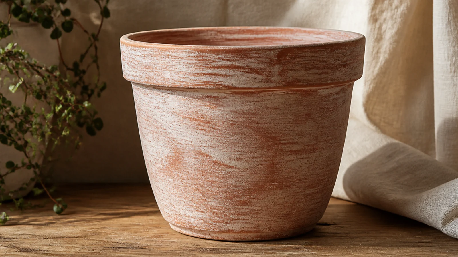
Skip primer — you want the clay to drink the wash. Thin white chalky acrylic with water to a milky consistency, about one part paint to one part water. Brush it on in long vertical strokes, letting some areas stay lighter so the clay glows through unevenly. Wipe the raised texture back with a damp cloth right away for a worn look, let it dry fully, then seal with a matte clear.
This is the easiest design here and the one that most obviously celebrates the clay. A watered-down white wash tones the terracotta down a shade without hiding it, so you keep all the warmth and texture but get a soft, weathered, expensive look. It suits any plant and any room, and there’s no pattern to get wrong.
Skip thisDon’t prime first or use full-strength paint; either one seals the clay off and you lose the whole soaked-in, natural effect.
Editor's noteKeep a damp rag in your other hand and wipe back the high spots as you go — the uneven, sun-faded result is what makes it look aged rather than painted.
2. Raw-Clay Dip-Dye
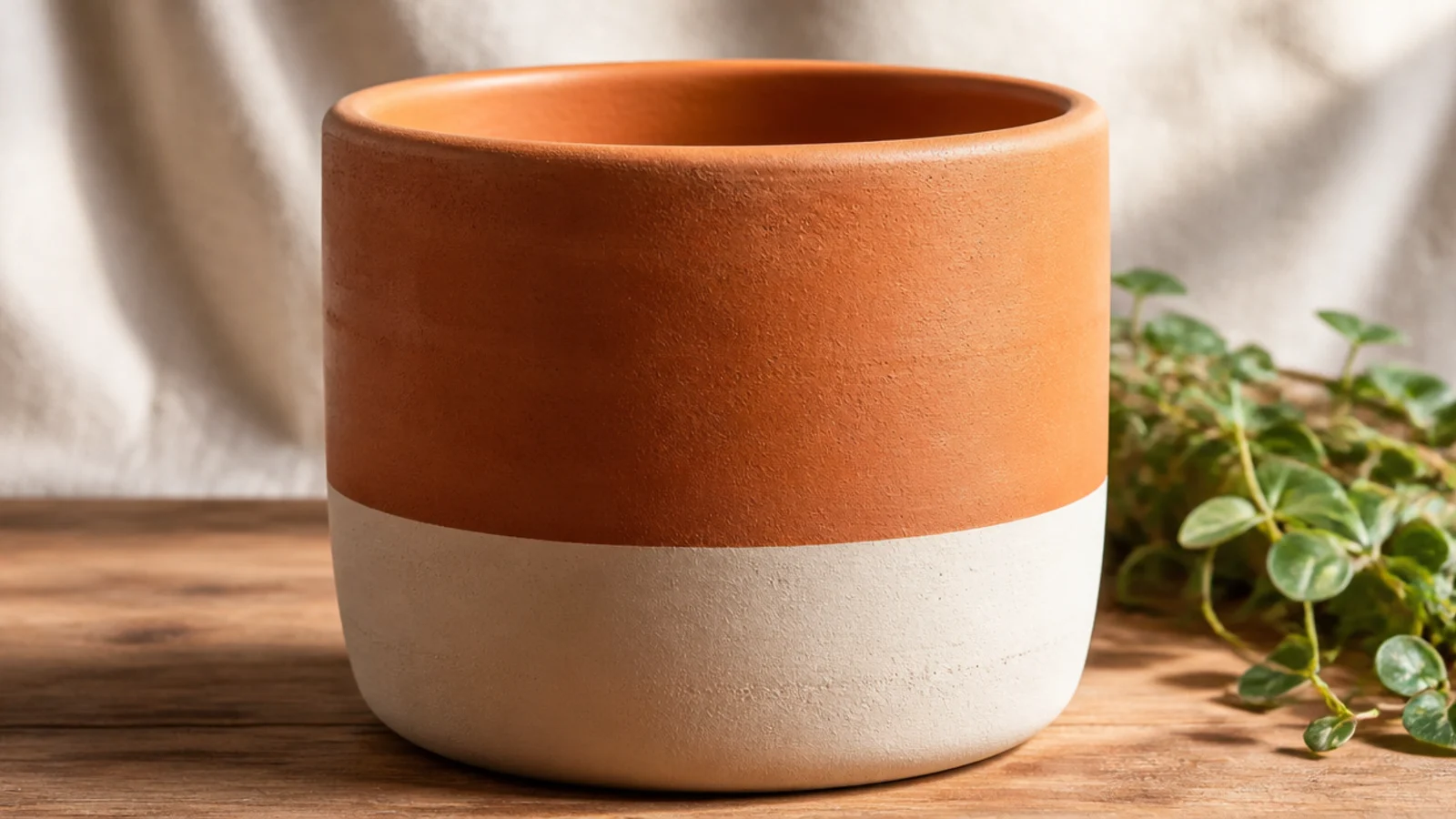
Leave the top bare and prime only the bottom third you’ll paint. Wrap a strip of painter’s tape level around the pot a third of the way up, using the pot’s height as a guide. Paint below the line with two thin coats of matte acrylic, letting the first dry before the second. Peel the tape while the second coat is slightly wet, then seal the whole pot — clay included — with a matte clear.
Painting only the bottom third one matte color and leaving the top as raw terracotta is the cleanest way to modernize a pot while keeping the clay front and center. The contrast between bare warm clay and one calm color reads boutique. Cream, sage, or soft charcoal all let the terracotta stay the hero.
Skip thisDon’t let the tape line wander — a crooked divide is the one thing that makes a dip-dye look sloppy against the clean bare clay above it.
Editor's noteSet the pot on a lazy Susan or jar lid and spin it as you wrap the tape so the line stays perfectly level all the way around.
3. Matte Charcoal Rim Band
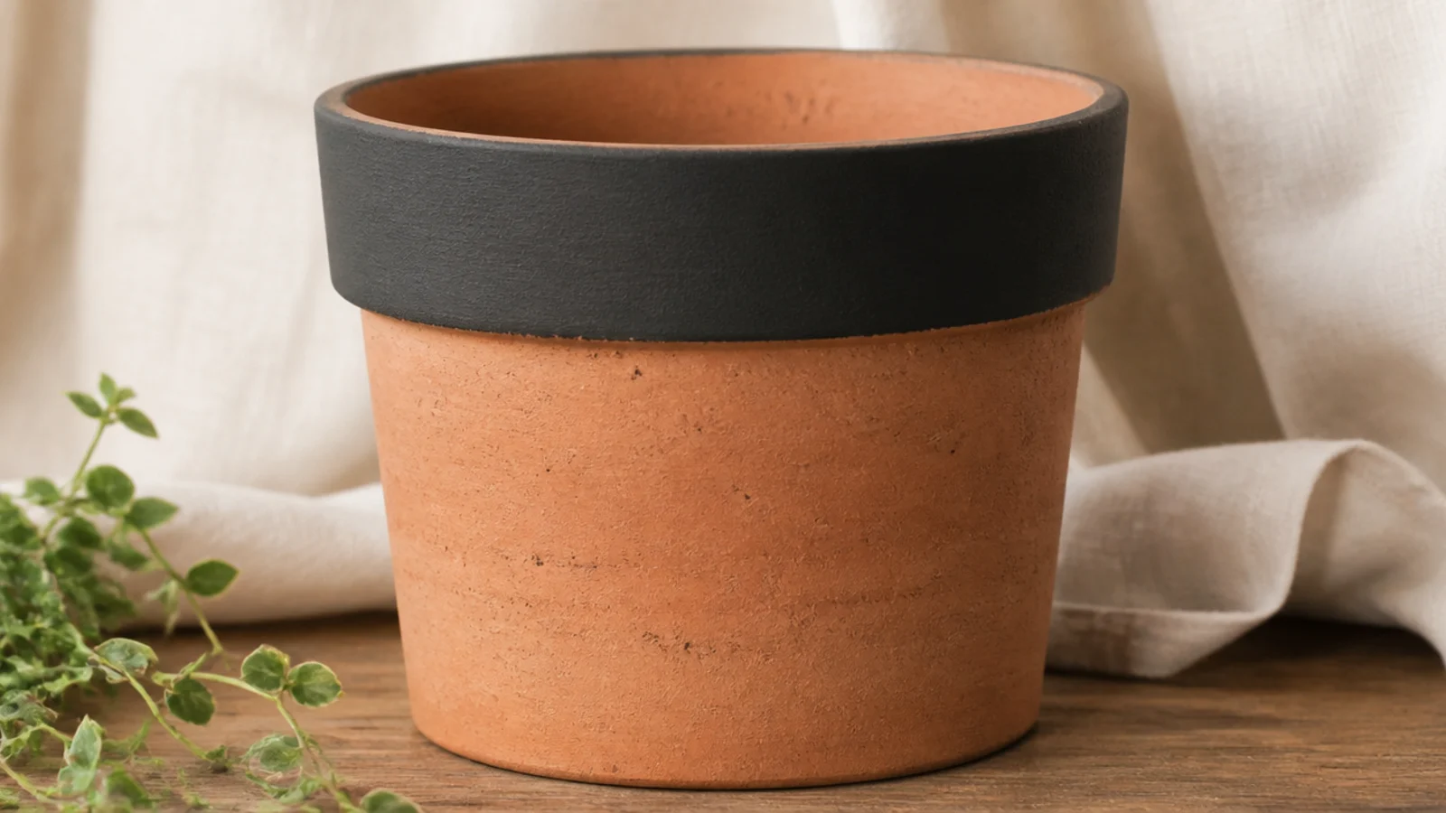
Prime only the rim area. Tape a level line about an inch below the rim, then paint the rim and everything above it, including a little way down the inside lip, in two thin coats of matte charcoal. Peel the tape before it fully cures. Seal the painted band and the bare body together with a matte clear so both surfaces match in sheen.
Painting just the rim and top inch in a matte dark color gives raw terracotta a strong modern frame with almost no work. Charcoal or black against warm clay looks especially sharp and gallery-like. It’s the fastest way to make a plain pot look deliberately designed while keeping most of the clay showing.
Skip thisDon’t use a glossy black here; a shiny rim reads plasticky next to matte clay, while a flat charcoal looks intentional and calm.
Editor's noteCarry the paint an inch down the inside lip so that looking into the pot from above you see finished color, not a raw ring.
4. Earthy Tonal Ombre
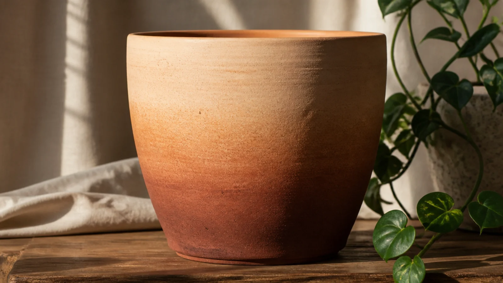
Leave the top third bare clay. Base the bottom in a warm rust chalky acrylic. While it’s tacky, dab a slightly lighter ochre above it with a damp makeup sponge, then pounce the seam where the ochre meets bare clay so it blurs into the terracotta. Build the fade gradually with light pressure, let it dry, then seal the whole pot with a matte clear.
An ombre that stays inside the clay’s own family — rust, ochre, warm sand — looks like the terracotta itself is deepening in color. Because you fade a darker earth tone up into the bare clay, the transition is forgiving and the pot still reads as natural. It suits anyone who wants dimension without an obvious painted look.
Skip thisDon’t jump to a color outside the earth family; a cool or bright shade breaks the illusion that the clay is simply getting richer toward the base.
Editor's noteLightly mist the sponge with water before pouncing the seam — a barely damp sponge melts the paint into the bare clay far more smoothly than a dry one.
5. Speckled Stoneware Finish
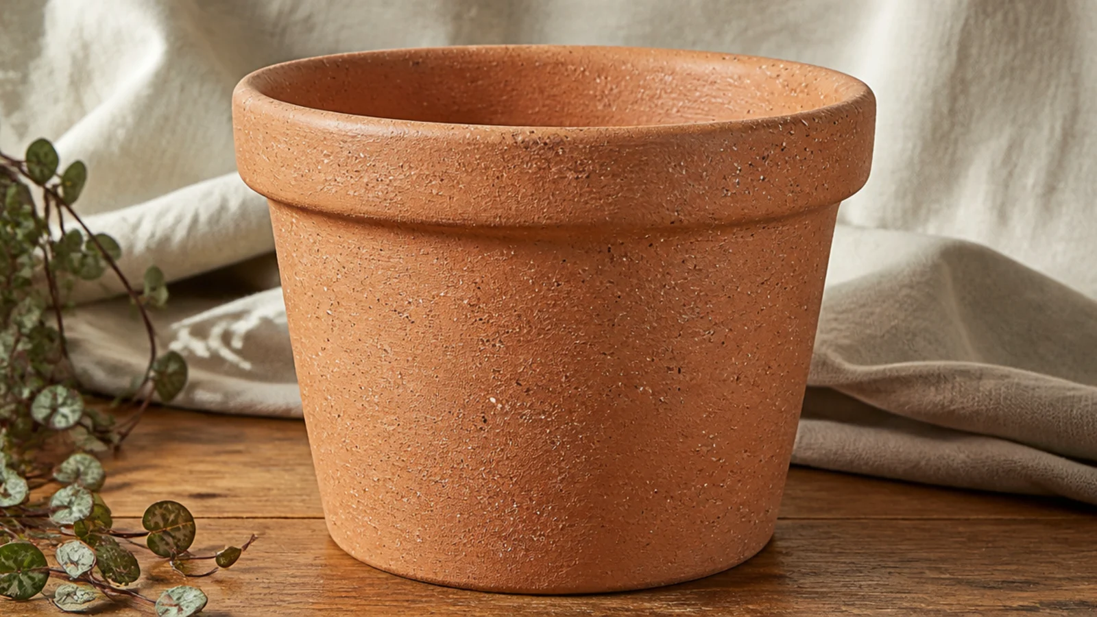
Leave the pot bare and unprimed. Thin a little cream acrylic with water to a milky consistency, dip a stiff old toothbrush, and run your thumb across the bristles to flick fine speckles over the clay. Repeat with a small amount of dark brown for depth, rotating the pot for even coverage. Let it dry, then seal with a matte clear to lock the flecks down.
Fine speckles flicked straight onto raw clay turn a plain pot into something that looks like a studio stoneware piece. You keep the terracotta base entirely and just add scattered flecks. It’s messy but genuinely hard to get wrong, and it hides any surface marks in the clay.
Skip thisDon’t hold the brush too close or over-thin the paint; big wet splatters look like accidents, while fine, dry-ish flecks look like real stoneware.
Editor's noteDo a few practice flicks on scrap paper to dial in the paint thickness — too thick makes blobs, too thin makes runs down the clay.
6. Minimal Line Drawing
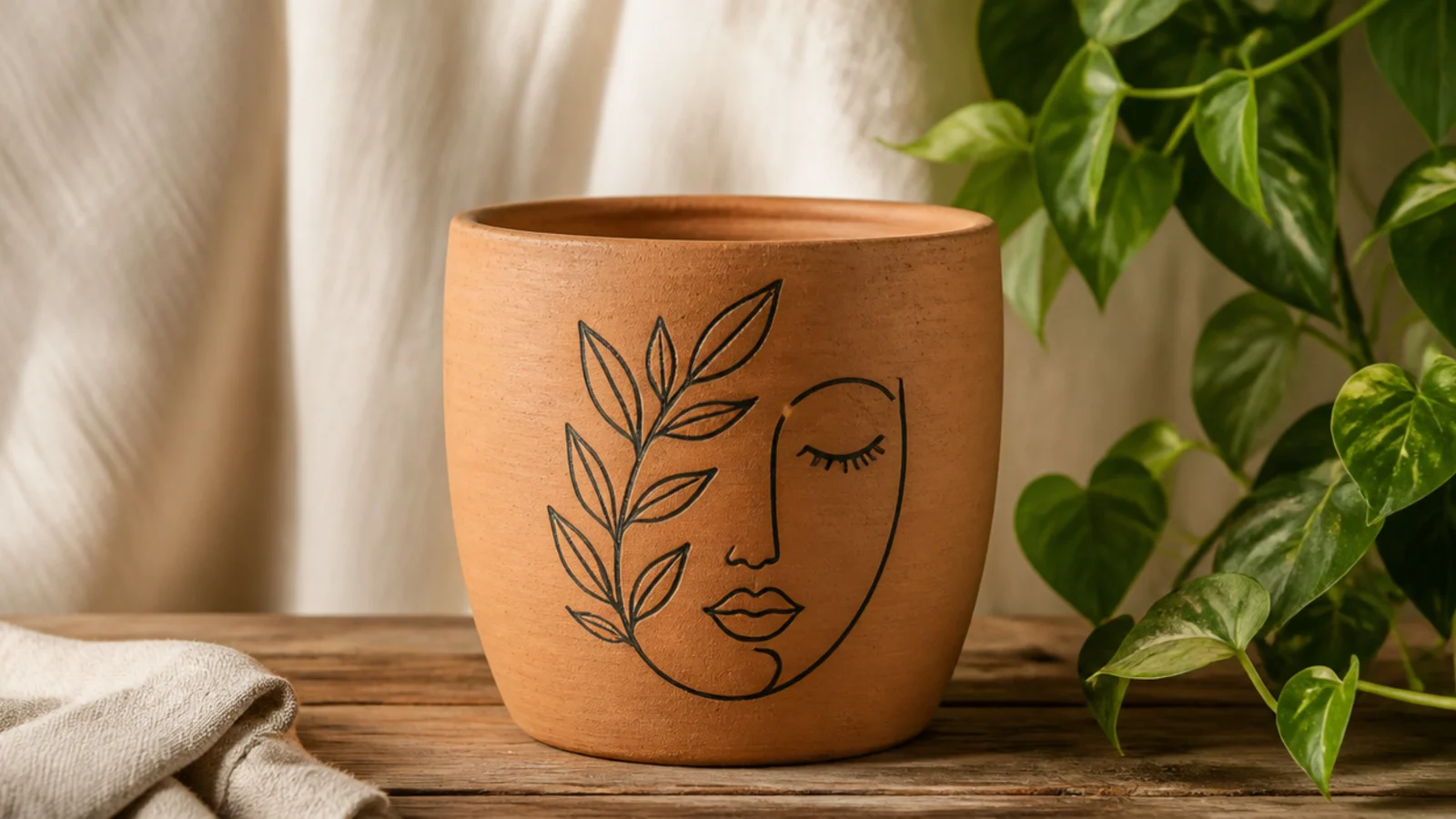
Leave the pot bare and unprimed. Lightly pencil your simple line design on the front. Go over it once with a fine round brush or a matte black paint pen in a single confident line, keeping it thin and even. Don’t fill anything in — the line is the design. Erase stray pencil, then seal the whole pot with a matte clear.
One simple continuous-line drawing — an abstract face, a leaf, a curve — in matte black on bare clay looks like a modern ceramics piece. The empty terracotta around the drawing is the whole point, so restraint does the work. It suits anyone who can trace a shape lightly in pencil first.
Skip thisDon’t thicken or fill the drawing to 'improve' it; the charm is in the single thin line and the bare clay around it, and adding weight kills it.
Editor's notePractice the line two or three times on paper first so you can draw it on the pot in one smooth pass rather than a shaky, retraced wobble.
7. Half-Moon Negative Space
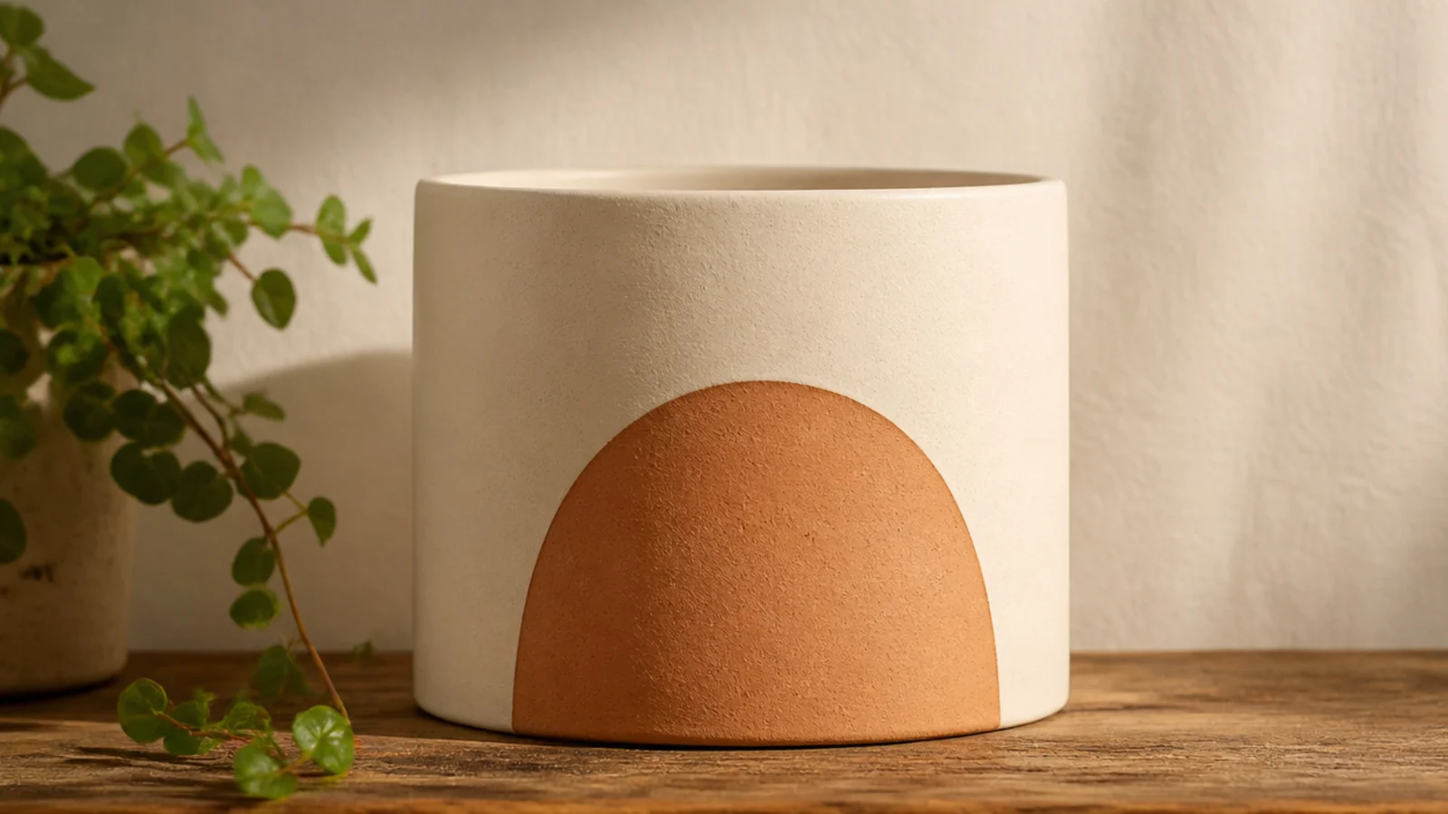
Instead of painting a shape on, you paint around one and leave bare clay as the design. A cream pot with a half-moon or arch of raw terracotta showing through looks graphic and intentional. It’s a favorite because the negative space does something most painted pots don’t — it makes the clay the feature.
Prime the pot except the shape you want to keep bare. Cut a half-moon or arch from painter’s tape or a sticker and press it firmly onto the front, sealing the edges. Base-coat the whole pot matte cream in two thin coats. Peel the mask while the last coat is slightly wet to reveal a crisp bare-clay shape, then seal the whole pot with a matte clear.
Burnish the mask edge hard with a fingernail before painting so cream can’t seep under and blur the clean clay shape underneath.
Don’t use a flimsy paper cutout that lifts at the edges; if paint creeps under, the bare-clay shape loses the sharp edge that makes it read as designed.
8. Two-Tone Matte Color Block
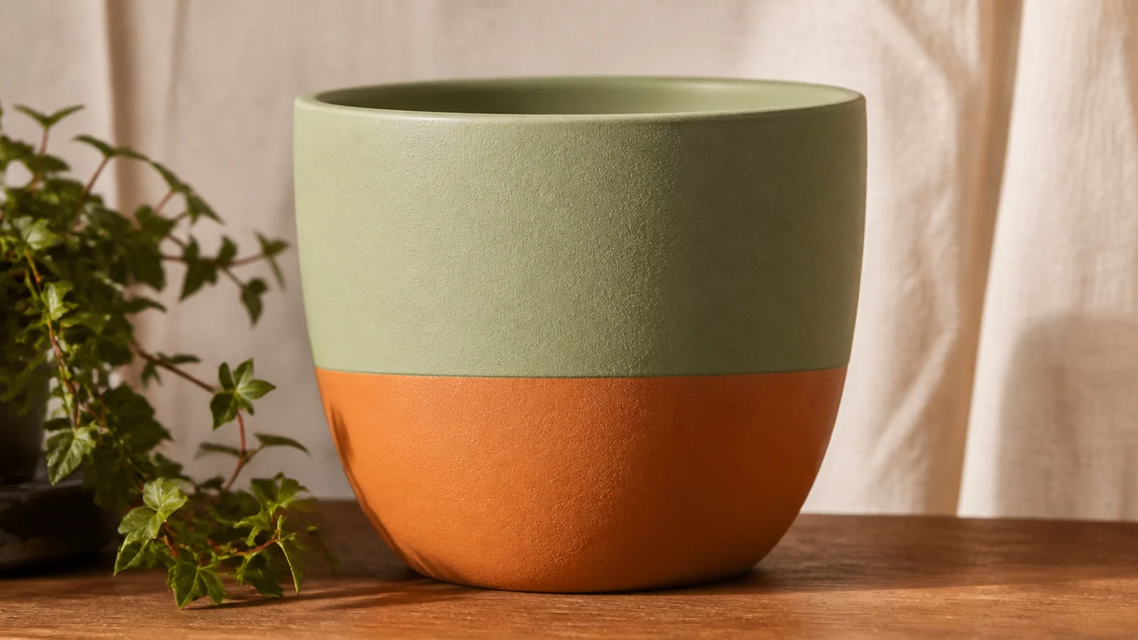
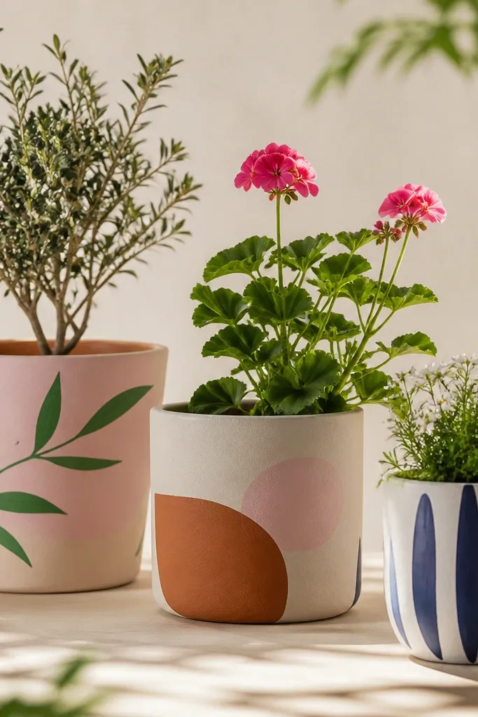
A color block is just two matte colors meeting at one clean line, and in earthy tones it feels grounded rather than loud. Sage over ochre, or ecru over rust, keeps it in the terracotta world even when the clay is fully covered. Beginners love it because the tape does all the precision work.
Prime the whole pot, then base-coat it in your lighter color and let it dry. Tape a level line around the middle, run a fingernail along the edge to seal it, and paint the bottom half in your second matte color with two thin coats. Peel the tape before it fully cures, touch up any bleed with a small brush, then seal with a matte clear.
Base-coat the entire pot in the lighter color first so the seam sits over an even surface and the top color reads clean where the two meet.
Don’t pick two high-contrast or cool colors; muted earth tones keep the block feeling like it belongs on clay instead of shouting over it.
9. Earthy Geometric Triangles
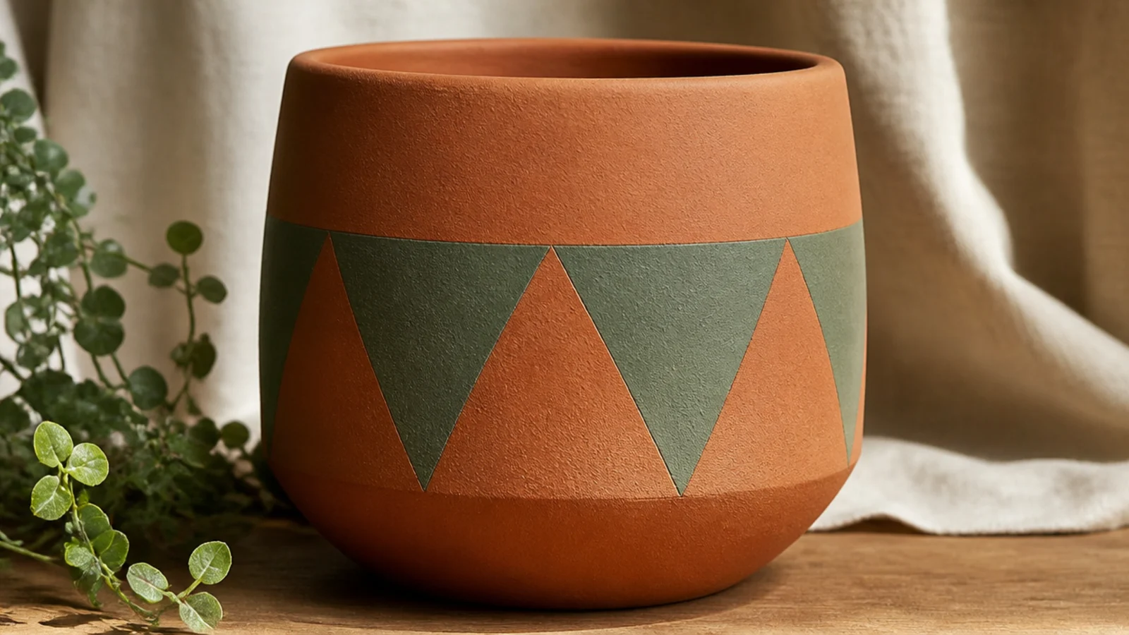
Leave the clay bare or lightly prime a base band. Lay strips of painter’s tape in a zigzag to mask a row of triangles around the middle, pressing every edge firmly. Paint the exposed triangles in matte ochre, then fill alternating ones with sage, leaving some as bare clay. Peel the tape while slightly wet for sharp points, then seal the whole pot.
A row of crisp triangles looks graphic and current, and alternating a painted triangle with a bare-clay one keeps the terracotta in the pattern. Tape gives you the sharp points, so it looks harder than it is. Two earthy colors plus the raw clay is an easy, on-trend palette.
Skip thisDon’t reuse tape that has lost its stick; loose tape lets paint bleed and rounds off the points that make the pattern look intentional.
Editor's noteBurnish every taped edge with a fingernail before painting — crisp triangle points only happen when the tape is fully sealed against the clay grain.
10. Whitewashed Botanical Print
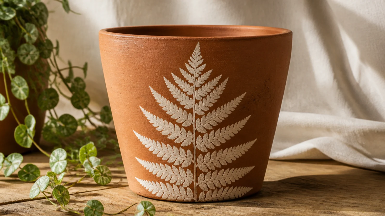
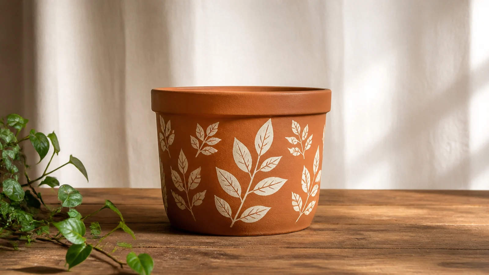
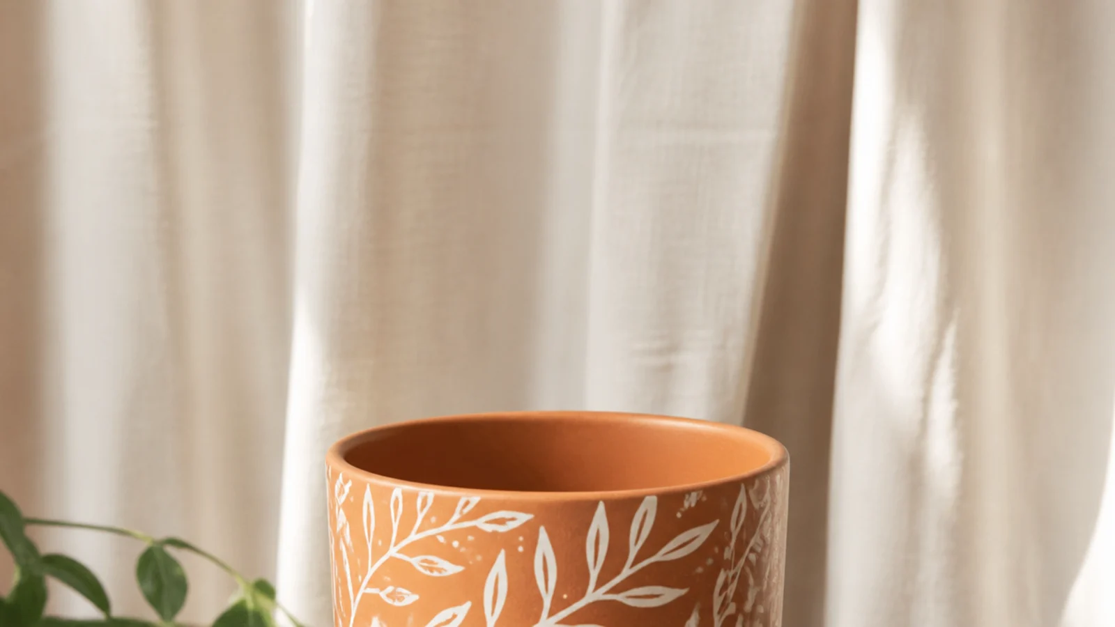
Leave the pot bare and unprimed. Sponge a thin, even coat of cream acrylic onto one side of a flat leaf, press it paint-side down onto the front, and hold it flat with a dry paper towel for a few seconds so the veins make contact. Peel it off to reveal the print, let it dry, then seal the whole pot with a matte clear.
You can use a real leaf as a stamp to print a crisp botanical silhouette on bare clay — no drawing needed. A cream fern print on warm terracotta looks organic and calm, perfect for a plant pot. Ferns and flat leaves with clean edges print best because they lie against the curve.
Skip thisDon’t overload the leaf with paint; a thin coat prints fine veins, while a heavy coat floods into a shapeless blob on the clay.
Editor's notePress the leaf down through a dry paper towel so the whole shape, veins included, touches the clay and prints crisply instead of smearing.
11. Sheer Color-Wash Arch
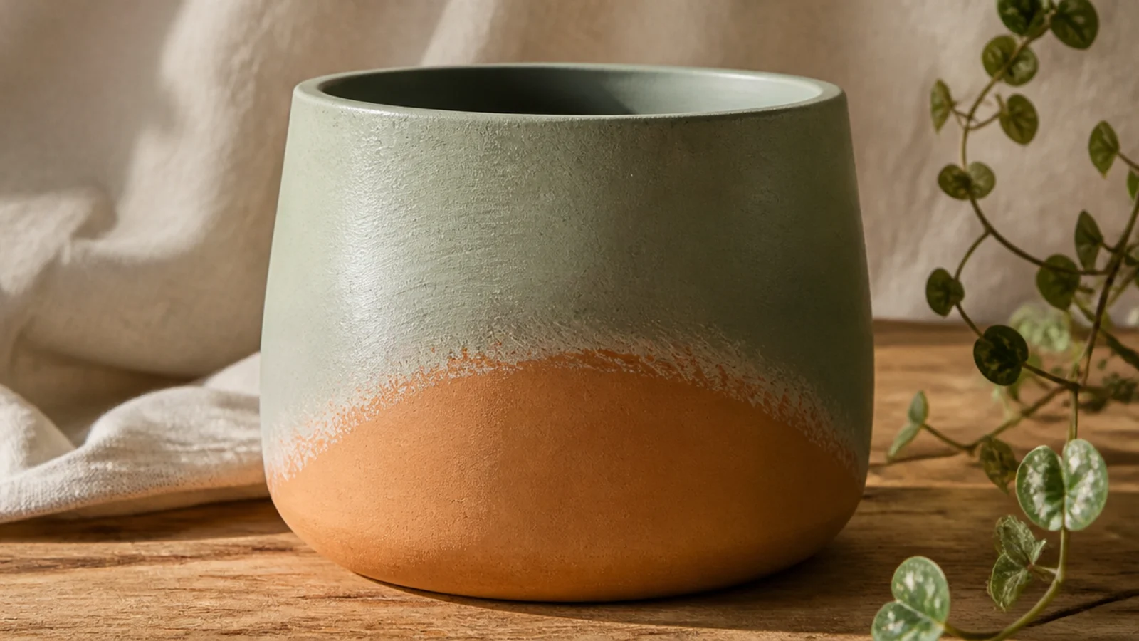
Leave the pot unprimed. Lightly pencil an arch line across the front. Thin sage acrylic with water to a milky wash and brush it over the top area down to the arch line, feathering the bottom edge so it dissolves into the clay rather than stopping hard. Build a second sheer pass at the very top for depth, let it dry, then seal with a matte clear.
This combines a wash with negative space — you brush a sheer color only over the top portion in an arch, letting it fade into bare clay lower down. The see-through wash keeps the clay texture visible even where it’s tinted, so the whole pot still reads natural. It suits anyone who wants a hint of color without a hard painted edge.
Skip thisDon’t use full-strength paint; an opaque arch gives you a hard painted edge and loses the soft, clay-through-color effect that makes this work.
Editor's noteFeather the bottom edge with a barely-damp clean brush while the wash is wet so it melts into the bare clay instead of leaving a tide line.
12. Earthy Checkerboard Band
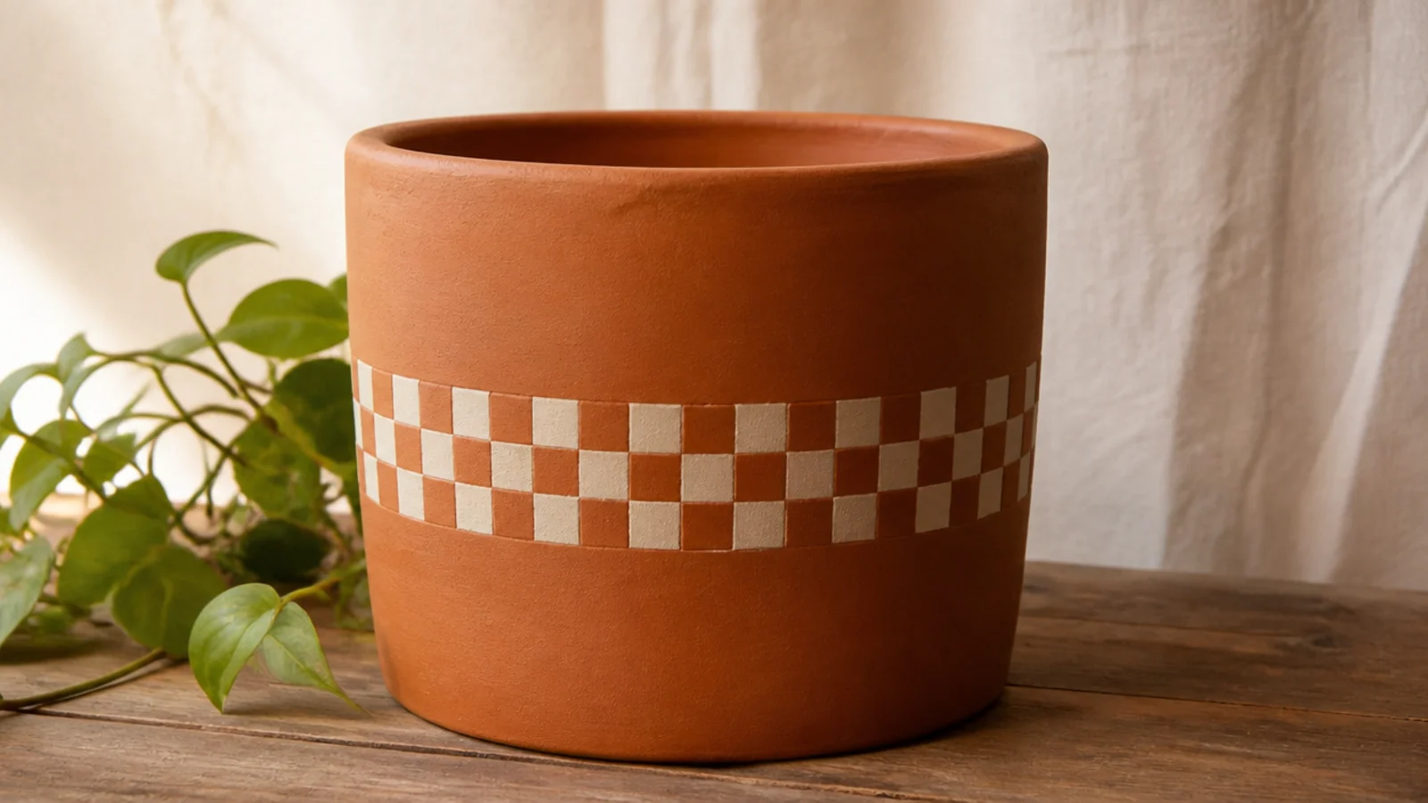
A checkerboard band looks playful and current, and using bare clay as every other square keeps it earthy instead of graphic-loud. The grid structure hides small wobbles, so it’s more forgiving than it looks. Keeping it to one band around the middle lets the terracotta above and below stay the frame.
Leave the clay bare. Lightly pencil a grid for one horizontal band around the middle. Paint alternating squares in matte cream with a small flat brush, leaving the other squares as raw clay so the checker is cream-on-terracotta. Use two thin coats for solid squares, erase visible pencil, then seal the whole pot with a matte clear.
Use a small flat brush, not a round one — its square edge fills each check with fewer, cleaner strokes that match the grid lines.
Don’t checker the whole pot; a single band keeps plenty of bare clay showing and is far easier to keep even than a full grid.
13. Sgraffito Scratch Design
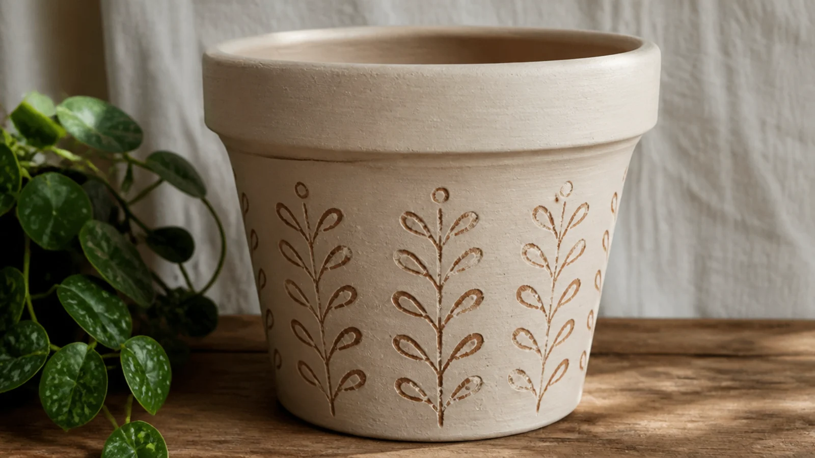
Base a panel or the whole pot in one thin coat of matte cream acrylic. While the paint is still slightly tacky, drag a wooden skewer or the wrong end of a brush through it to scratch your design down to the clay, wiping the tool between strokes. Let it dry fully — the scratched lines stay bare terracotta — then seal with a matte clear.
Sgraffito means scratching a design back through paint to reveal the clay underneath, and terracotta is perfect for it because the exposed lines glow warm against the color. You paint a panel, then scratch simple stripes, dots, or a plant motif while it’s tacky. Every scratched line is bare clay, so the terracotta is literally the drawing.
Skip thisDon’t use a thick base coat; scratching through heavy paint tears ragged edges instead of revealing a clean warm-clay line.
Editor's noteWork while the paint is tacky, not wet or dry — wet paint flows back into the line and dry paint chips instead of scratching cleanly.
14. Limewash Aged Finish
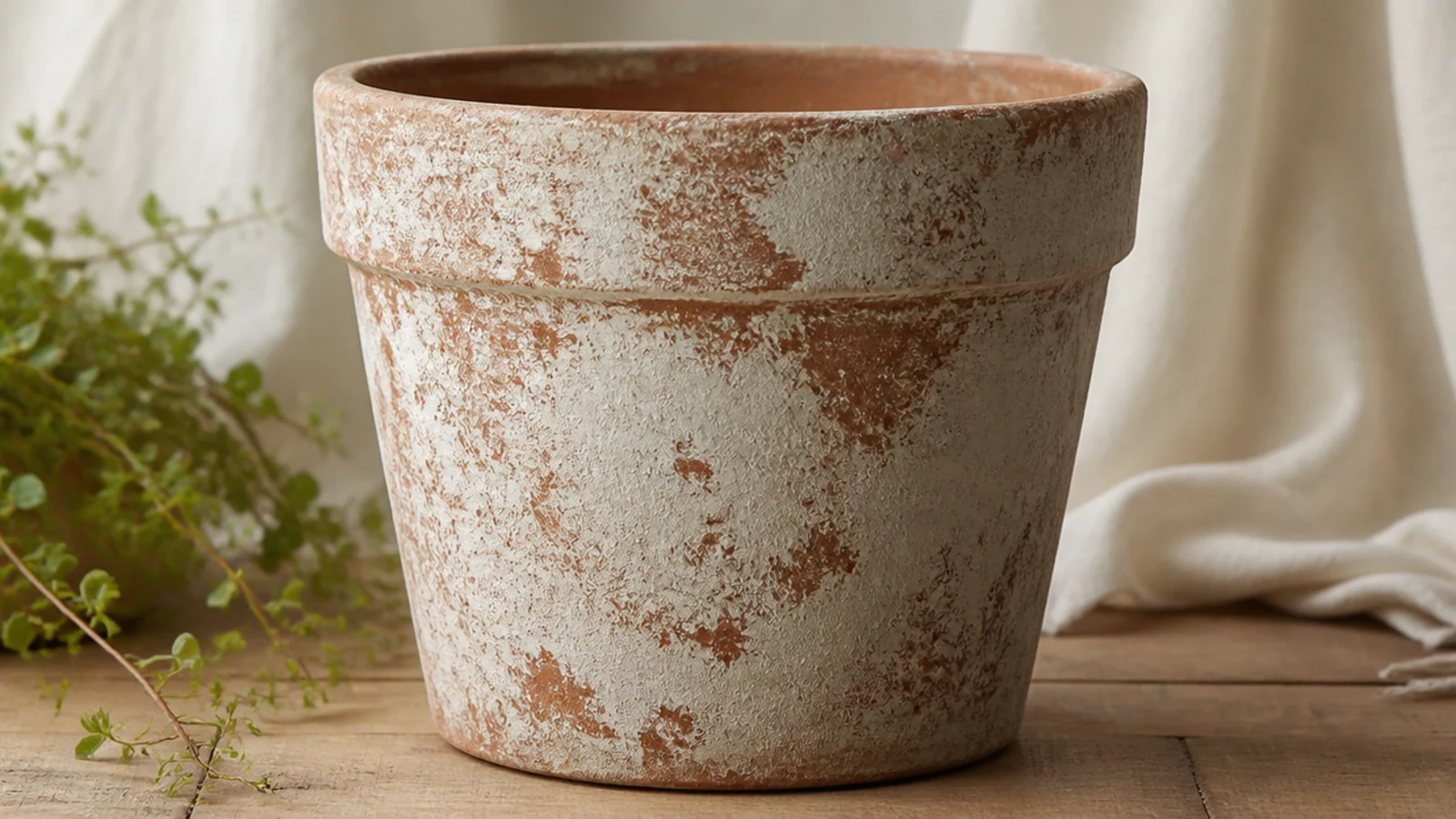
Leave the pot unprimed. Thin white or pale grey chalky acrylic with water to a loose, cloudy wash. Dab and swirl it on unevenly with a rag or a chunky brush, leaving some clay bare and pooling more in the recesses. Let it dry, then dry-brush a little more white over raised areas for depth. Seal with a matte clear once fully dry.
A limewash-style finish gives terracotta that cloudy, old-world, just-dug-from-a-villa-garden look. Unlike an even wash, you deliberately leave it patchy and mottled so the clay breaks through in soft blotches. It’s the finish that makes a brand-new $3 pot look like an antique, and it suits farmhouse and Mediterranean styling.
Skip thisDon’t aim for even coverage; a smooth, uniform coat looks like flat paint, while deliberate patchiness is exactly what sells the aged look.
Editor's noteDab most of the wash off with a dry rag right after applying — limewash looks most authentic when it’s thin, cloudy, and clearly worn in patches.
15. Gilded Edge Accent
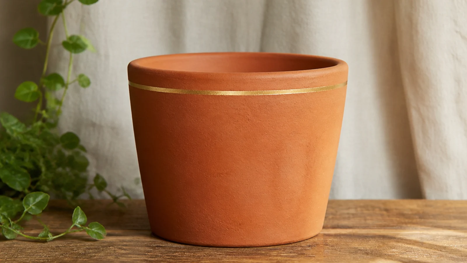
A single thin gold line around the rim edge is the most restrained way to dress up raw terracotta, and it makes bare clay look intentional and a little luxe. A metallic paint pen gives you a clean line with zero brush skill. It works because it’s the only addition — everything else stays natural clay.
Leave the pot completely bare and clean. Shake a metallic gold paint pen well and prime it on scrap paper. Rest the tip on the rim edge and slowly rotate the pot with your other hand so the pen draws the line for you. Add a second thin line lower down only if you want. Let it dry, then seal with a light matte spray clear that won’t drag the metallic ink.
Move the pot, not the pen — spinning the pot against a steady pen hand gives a far smoother line than trying to draw around the rim freehand.
Don’t brush a heavy varnish over the metallic line; it drags the ink into streaks, so use a light spray clear or the gentlest touch.