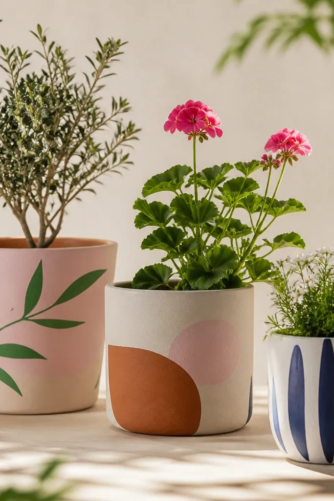
1. Sunrise Terracotta with Ombre Sky
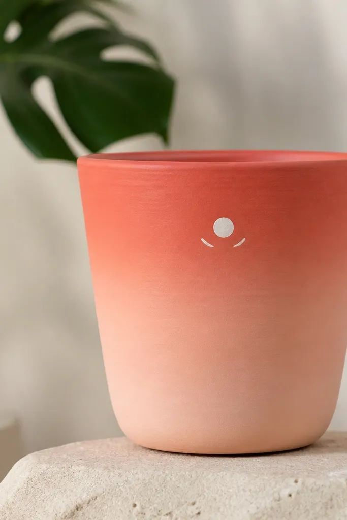
Start with a coral-red base blended into peach so the pot looks like a warm morning sky. Add a simple white sun dot and two curved rays to keep it cute, not cartoonish. This works because gradients hide minor brush strokes and terracotta texture adds natural depth. The limited colors (coral, peach, white) make it look expensive even when it's just craft paint.
Use an outdoor acrylic in coral and peach. Paint the top 1/3 coral, the middle 1/3 blend, and the bottom 1/3 peach. When dry, dab a small white circle with the end of a bobby pin or a foam sponge tip for the sun. Add rays with a liner brush using white paint thinned slightly with water.
Pro tipBlend ombre with a dry, nearly clean brush - use gentle upward strokes to soften the join.
AvoidDon't paint ombre with thick, wet layers or you'll get streaks that look like roller marks.
2. French Stripe Pot with Tape-Wrapped Bands
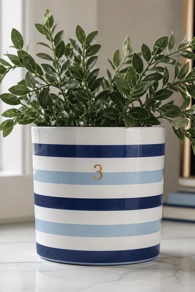
Horizontal stripes make pots look neat instantly. Tape gives you straight lines without freehand wobble, and navy + light blue reads classic outdoors. The gold numeral adds a tiny seasonal accent without needing a full graphic. This style works with almost any flowers because white is a neutral base.
Prime first, then paint the whole pot white. Apply painter's tape bands around the pot at even spacing (I do 1/2 inch bands for a 10-12 inch pot). Paint navy between tapes, let dry, then remove tape while paint is still slightly tacky. Finish with a small gold number using a stencil or label maker decal and acrylic craft paint.
Pro tipPress tape edges firmly with a plastic card so paint doesn't creep under.
AvoidDon't remove tape after the paint is fully hard - it can tear the edges and leave jagged lines.
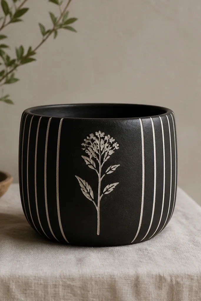
3. Botanical Line Art with Black Ink Look
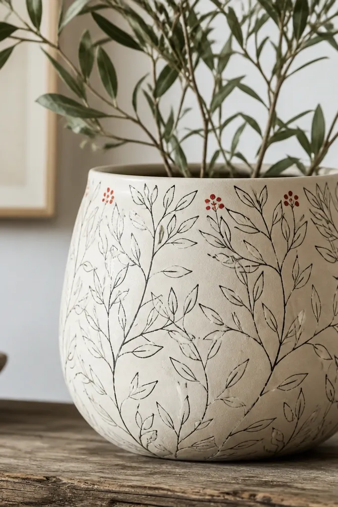
Fine line drawings look clean and modern, even on a cheap pot. Use a black paint that flows like ink so your lines stay crisp. The cream base makes the black pop, and the tiny red berries keep it from feeling flat. This works well for spring and everyday planters because it doesn't fight with busy flowers.
Base coat in matte cream. Lightly sketch leaf shapes with a pencil so you don't overthink spacing. Use a small liner brush or acrylic paint pen in black to draw stems and leaves. Add 3-5 small red dots for berries, then seal with matte outdoor clear coat.
Pro tipThin your black paint with a drop of water and test on scrap cardboard first so the line thickness matches your sketch.
AvoidSkip thick paint markers; they look bold and smear in sun.
4. Terracotta Polka Dot Picnic Pot
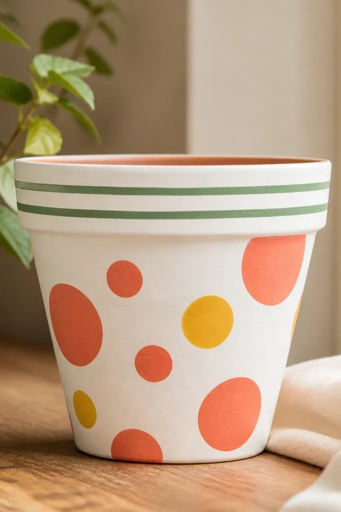
Polka dots hide uneven coverage and make a pot instantly playful. I like warm white because it keeps the dots looking bright instead of dusty. Mixed dot sizes feel handpicked, not stamped, and the green rim stripes tie it to plant life. It's a great "weekend project" look that doesn't require artistic skill.
Paint the pot with warm white acrylic (satin looks too shiny outside). Use a foam sponge cut into a circle for consistent dots, or a dotting tool if you have one. Place coral dots first, then add yellow dots in a few gaps. Finish with two green stripes using painter's tape around the top edge.
Pro tipKeep the dot grid loose - leave small gaps so the pot still looks airy.
AvoidDon't pack dots edge-to-edge; that's when it starts looking like craft-store stickers.
5. Pastel Speckle with Sponge Marble
Speckle looks like painted stone, and it hides brush texture. The mint base keeps it fresh, while pink and lavender make it feel springy without cartoon vibes. A darker ring around the top gives structure so the speckles don't look random. This is one of the easiest cheap pot painting ideas that still looks intentional.
Base coat mint. For speckles, load a small sponge with watered-down white, then dab off on paper until it's faint. Dab across the pot in small clusters. Add a second color (pink or lavender) the same way after the first layer dries. Make a top ring by painting a 1 inch band of darker mint and blending the edge with a dry brush.
Pro tipSprinkle speckles in "bands" rather than full coverage so the pot has breathing room.
AvoidDon't overdo layers - too many specks create a gritty, messy look.
6. Chalkboard Pot with Tiny Garden Labels
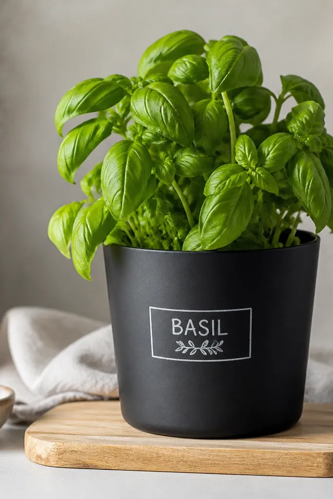
A chalkboard pot makes your planter look like a mini garden board. Matte black absorbs light and makes white paint lettering look crisp. The tiny labels add function - you can swap them seasonally. It works especially well for herb pots on a kitchen patio.
Use an outdoor chalkboard paint or matte black acrylic designed for exteriors. Paint the pot and let it cure the full time on the can. Letter with white paint using a label stencil or printed vinyl as a guide. Seal with a matte clear coat made for chalkboard surfaces so lettering doesn't smear.
Pro tipWrite your label slightly curved to match the pot - straight text looks off on round surfaces.
AvoidAvoid glossy clear coat; it makes the black look plastic and the lettering harder to read.
7. Navy Anchor Coastal Pot
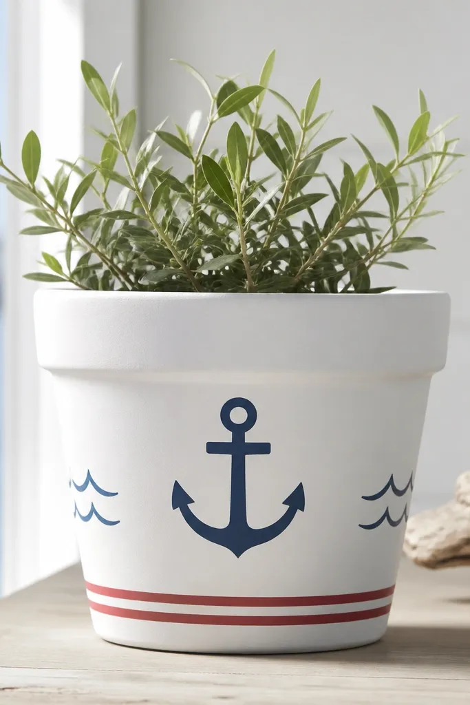
Coastal icons look clean when you keep the design to one main element. White base makes the navy anchor pop, and the red stripe adds just enough color for summer. Wave lines are simple but give the whole pot a theme. This works with blue flowers or anything green and airy.
Prime and paint white. Add a wave pattern on both sides using a stencil or freehand with a liner brush. Center an anchor using a stencil, then fill with navy paint. Add a thin stripe at the bottom edge with tape and paint it red.
Pro tipLet the anchor dry fully before painting waves so you don't smear edges.
AvoidDon't add multiple icons (anchors, boats, shells) - it turns into a cluttered sticker look.
8. Gold Leaf Corner Accent
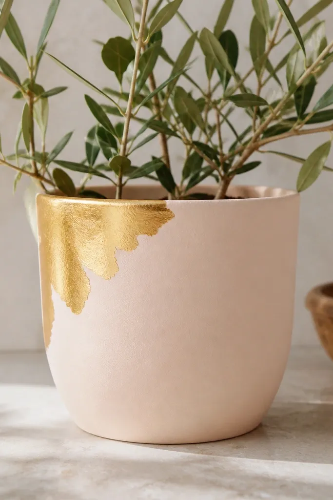
Gold leaf accents look expensive because your eye focuses on texture, not perfection. Blush keeps it soft and works for spring blooms and even holiday poinsettias. Keeping gold to one corner keeps it from looking like random glitter. This is a great way to upgrade cheap pots without covering them fully.
Base coat in blush pink. For the gold, use metallic gold craft acrylic and stipple with a sponge brush in an irregular corner shape. If you have real gold leaf, apply it with adhesive medium, then seal lightly. Keep the gold area about 3-4 inches wide on a standard 10-12 inch pot.
Pro tipAdd a tiny dot trail from the gold corner to connect it visually to the rest of the pot.
AvoidAvoid full-pot glitter - it sheds and looks messy fast outdoors.
9. Rainbow Rim with Solid Center
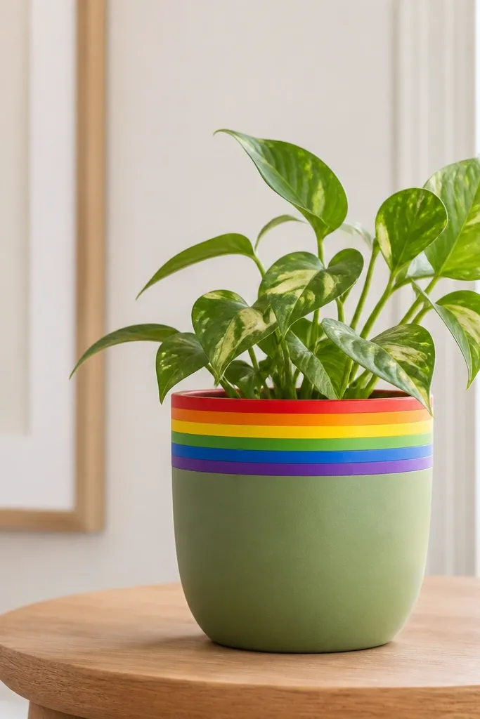
A rainbow rim looks cheerful without turning the whole pot into a busy painting. Keeping the center solid makes the rim read as a deliberate design element. Sage green is a calm background that makes bright colors look clean. This is a fun option for spring and Pride season, but it's still plant-friendly.
Paint the pot sage green first. Tape off a 1-inch high band around the rim. Paint each stripe in order with outdoor acrylic: red, orange, yellow, green, blue, purple. Remove tape after each stripe dries for sharp edges, or do all stripes at once carefully if you're fast.
Pro tipUse a small angled brush for stripe edges so you don't get paint under the tape.
AvoidDon't let the rainbow band go down too far - wide bands can make the pot feel top-heavy.
10. Monochrome Dots with One Color Pop
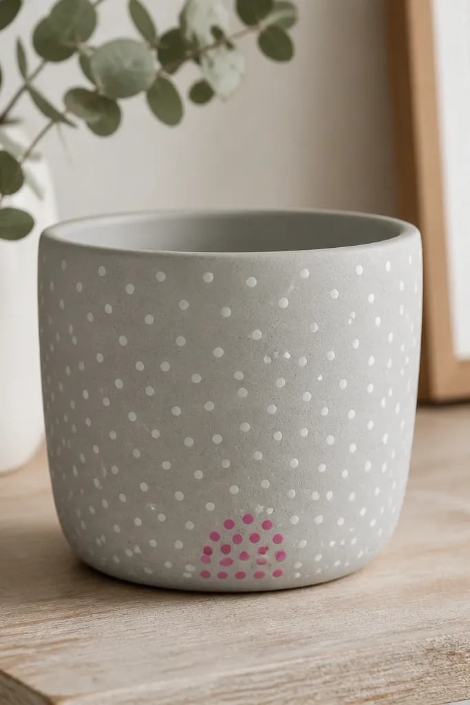
Monochrome designs look high-end because there's no color chaos. The hot pink cluster acts like a focal point, similar to how a bouquet has one standout bloom. Small dots keep the pattern subtle from a distance. This is one of those cheap pot painting ideas that looks like you planned it.
Base coat light gray matte. Use a dotting tool or the end of a paintbrush handle for white dots. Leave one area near the bottom for hot pink dots; make them bigger than the white ones so they pop. Seal with matte outdoor clear coat to keep the dots from looking shiny.
Pro tipKeep your dot spacing consistent - even a rough grid looks cleaner than random clusters everywhere.
AvoidAvoid mixing too many pop colors; two colors total is the sweet spot.
11. Geometric Half-and-Half Blocks
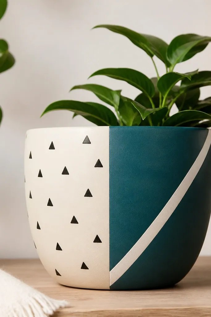
Half-and-half blocks create instant modern style and are easy because you're working with big shapes. The triangles on the cream side add pattern without clutter. Teal + cream gives strong contrast that holds up outside in daylight. It looks great with grasses, succulents, and any plant with structure.
Tape a vertical line down the pot and paint one side cream, the other teal. After both dry, remove tape to reveal a crisp split. Add the diagonal stripe with tape on the teal side. For triangles, use a small stencil or draw them with a ruler and triangle template, then fill in black.
Pro tipUse painter's tape that's labeled for delicate surfaces if your pot paint is already smooth - it peels clean.
AvoidDon't freehand triangles; they end up uneven and read cheap.
12. Fall Pumpkin Vines and Leaves
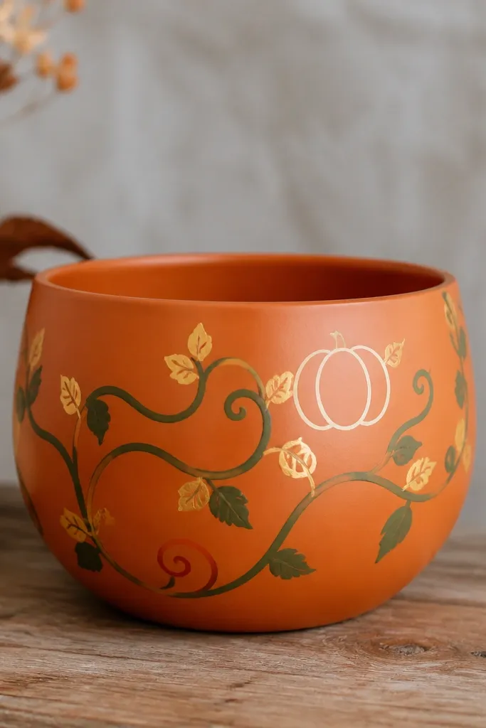
Vines wrap naturally around a round pot, so your design looks like it grew with the plant. The pumpkin outline keeps it seasonal without making the pot look like a Halloween costume. Orange-brown base ties to autumn leaves and looks great with mums. This design is detailed but still doable with a stencil for the pumpkin.
Prime and paint an orange-brown base. Use a vine stencil or draw curved lines with a liner brush in deep green. Add small leaf shapes using a leaf stencil or freehand with a flat brush. Outline a simple pumpkin in white near the upper third, then add 3-4 vertical ribs.
Pro tipPaint the vines first, then add leaves one at a time - that prevents leaf clusters from looking like blobs.
AvoidDon't use bright neon greens; autumn leaves look more muted than that.
13. Winter Snow Dots with Pine Bough
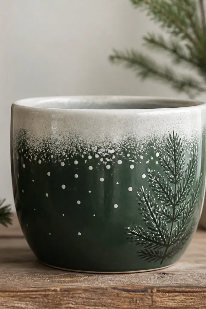
A snow fade looks cozy and reads as winter from across the patio. The forest-green base keeps it grounded, while the off-white snow band adds contrast. White dots create the illusion of falling snow without drawing actual snowflakes. A pine bough silhouette makes it feel holiday-ready without extra characters.
Paint the pot forest green matte. For snow, paint an off-white band around the top and blend downward with a dry brush. Add scattered snow dots using a stiff brush loaded with white paint. Apply a pine bough stencil on one side, then fill it with off-white or light gray.
Pro tipKeep dots larger near the top band and smaller as they descend for a natural look.
AvoidAvoid glossy paint for the snow; it looks like plastic in winter light.
14. Terracotta Hearts for Valentine Season
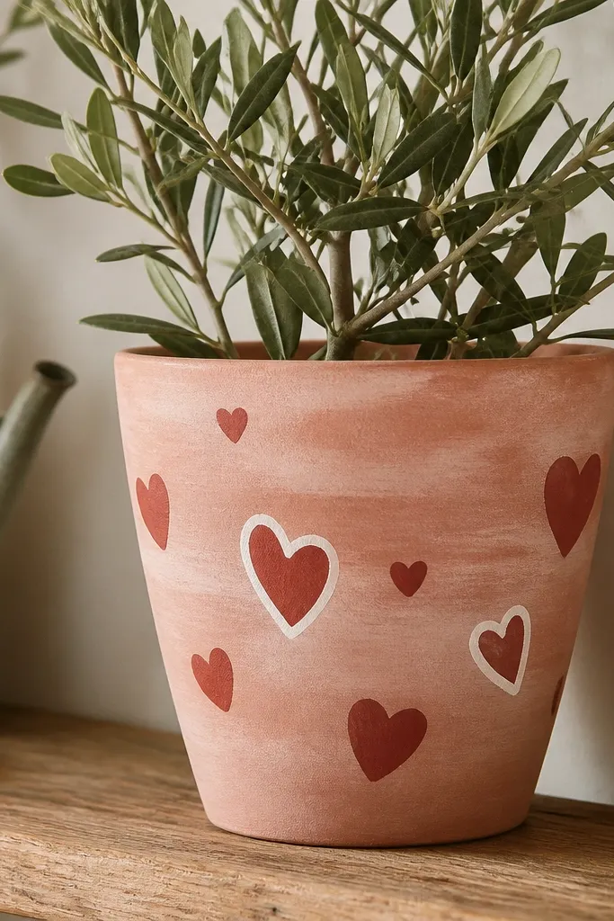
Hearts work because they're simple shapes that still feel special. A blush wash makes the pot look softened, not harsh, and the red hearts add clear contrast. Outlined hearts keep the design from becoming too flat. This style looks adorable with small flowering plants or herbs in a sunny window box.
Thin blush paint with a bit of water so it looks like a wash. Let it dry fully. Paint hearts with a small round brush or use a heart stencil. Add white outline hearts last, using a liner brush so the outline stays thin.
Pro tipVary heart angles slightly - straight upright hearts look stamped.
AvoidDon't make every heart the same size and spacing or it looks like a repeating sticker sheet.
15. Turquoise Moroccan Tile Border
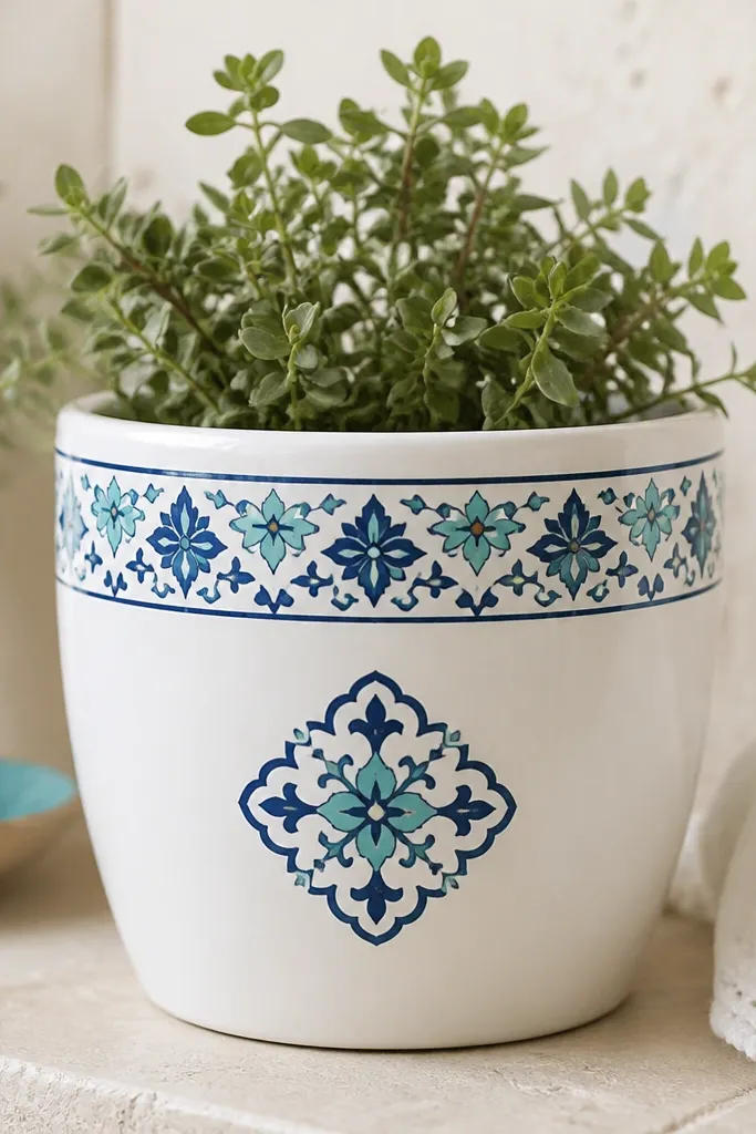
A tile border gives you a Moroccan look without painting a full pattern all over. The white base keeps it crisp, and the turquoise + navy combo reads like outdoor ceramic. Repeating shapes make the pot look styled even if you're not a confident painter. It also pairs well with blue-green foliage plants.
Paint the pot white first. Use a small square stencil for tiles. Tape off a 2-inch band at the top and stencil alternating turquoise and navy tile patterns. On the front, stencil one larger tile square and outline it with a thin gold line if you want extra polish.
Pro tipStencil with a dry sponge so the paint deposits evenly and doesn't smear under the edges.
AvoidDon't flood the stencil holes with paint - it bleeds and ruins the tile edges.
16. Pink Lemonade with Citrus Slices
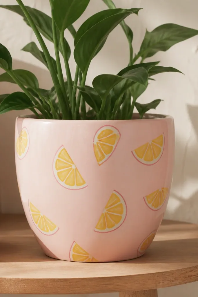
Citrus slices look bright and summery, and half-moons wrap around a pot naturally. The thin outline makes the slices readable even from a distance. Pale pink keeps it playful without clashing with greenery. This design works great for herbs like mint or basil because it feels fresh, not themed like a cartoon.
Base coat in pale pink satin or matte. Paint yellow half-moon slices with a round brush; add a thin darker pink outline using a liner brush. Add a few small green leaf sprigs near the center. Seal with clear coat once everything cures.
Pro tipMake the slices slightly uneven - perfect circles look printed, not painted.
AvoidAvoid thick outlines; they look like sticker edges.
17. Black-and-White Stripe with Botanical Stamp
Vertical stripes elongate the pot visually and make it look taller. Black + white is bold and reads well next to bright flowers. A botanical stamp keeps the pot from feeling too graphic. This is a strong option for outdoor tables because it looks crisp in sunlight.
Prime and paint the pot matte black. Tape vertical stripes and paint them off-white. For the stamp, use a leaf stamp or stencil image; dab paint through the stencil for a stamped look. Add a small date or simple word under the stamp if you want, but keep it one line.
Pro tipIf you use a stamp, press firmly and lift straight up to prevent smudging.
AvoidDon't mix glossy black with matte clear coat - you'll get uneven sheen.
18. Soft Sage with Watercolor Flowers
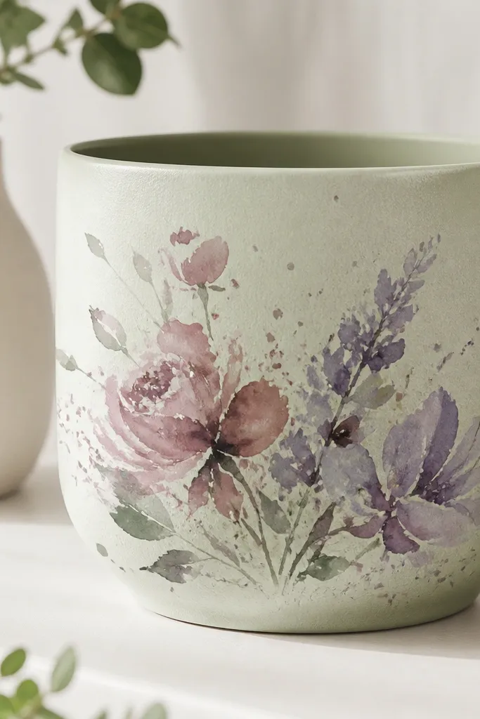
Watercolor-style flowers look airy and forgiving. The sage base gives you a calm background, and dusty rose + lavender feel natural in daylight. Splatter adds a handmade texture that hides small mistakes. This style works best when you let some edges fade instead of trying to fully color every petal.
Base coat sage. For watercolor flowers, use a small brush and dilute paint with water so edges feather. Paint 2-3 main blooms and let the colors bleed a little on the pot surface. Add tiny splatters with a toothbrush (tap lightly) using white paint. Seal with matte outdoor clear coat so the feathering stays soft.
Pro tipDo blooms first, then splatter last - splatter covers small gaps around the petals.
AvoidAvoid painting every petal solid; that kills the watercolor effect.
19. Candy Cane Bands for Holiday Pots
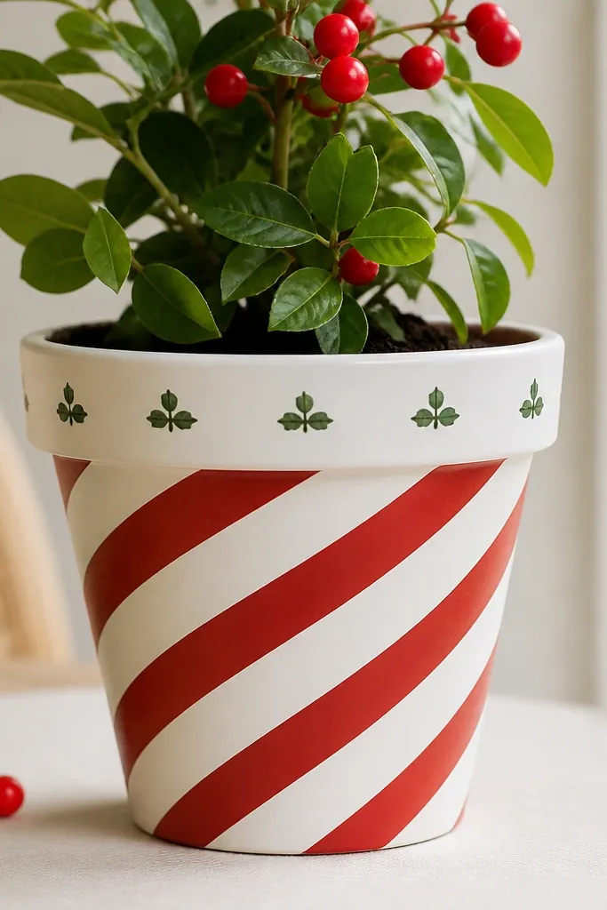
Diagonal candy-cane bands read instantly as holiday. You don't need a whole scene - the spiral stripes do the work. Red and white look crisp and photo-friendly, while tiny green dots keep it from feeling flat. This is one of the fastest holiday looks because you're mostly painting tape-controlled bands.
Wrap painter's tape around the pot diagonally at a steady angle, leaving narrow gaps. Paint red over the taped sections, then remove tape for clean stripes. Add a few small green dots for holly berries using a dotting tool. Finish with a thin matte clear coat to reduce glare.
Pro tipUse the same tape angle on every band so the spiral looks intentional.
AvoidDon't eyeball the angle; one off-tilted band makes the whole pot look crooked.
20. Mossy Ombre with Dry Brush Texture
Dry-brush texture makes paint look like a natural surface. The ombre from dark to light gives depth, and the speckles hide uneven coverage. It's a great look for succulent pots because it matches earthy tones. This also works for fall because the colors read like leaves and bark.
Paint the pot dark green matte as the base. Blend toward light moss green near the top using a dry brush - barely load the brush with paint. Then tap a lighter green and a tiny bit of yellow-green over the surface for moss speckles. Seal with matte clear coat.
Pro tipUse a stiff bristle brush and keep your wrist loose so texture stays random.
AvoidDon't over-wet the dry-brush layer; it turns into muddy streaks.
21. Sea Glass Pastel Blocks
Sea glass blocks look like beach finds because they're irregular and layered. Outlining with thin gray makes each chunk feel separate instead of blending into paint blobs. The pastel palette stays soft and calm, so it pairs with almost any plant. It's a cheap pot painting idea that looks like you bought ceramic pots.
Base coat off-white. Use a thin gray outline first by drawing irregular block shapes with a pencil and then tracing. Fill blocks with aqua, seafoam, and pale yellow acrylic. Keep the edges slightly uneven so they look like tumbled glass. Seal with satin outdoor clear coat for a glassy hint without mirror shine.
Pro tipPaint the outlines first, then fill one color at a time to avoid color smearing.
AvoidAvoid thick outlines; they look like coloring-book lines.
22. Botanical Stencil Repeat All Around
A repeat stencil pattern makes a pot look like wallpaper. Fern fronds are forgiving because they're mostly curves, and dark green on beige looks natural outdoors. Repetition hides small spacing issues because your eye reads it as intentional pattern. This is a go-to when you want something pretty without hand-drawing.
Base coat beige matte. Place a fern stencil and dab paint with a sponge brush. Rotate the stencil around the pot so the pattern lines wrap evenly. Do two layers if needed for solid coverage, letting it dry between passes. Seal with matte outdoor clear coat to lock it in.
Pro tipMark one stencil starting point with a piece of tape so your repeats stay aligned as you rotate.
AvoidDon't use a brush for stenciling; it drags paint under the stencil edges.
23. Terracotta with Painted Nameplate and Border
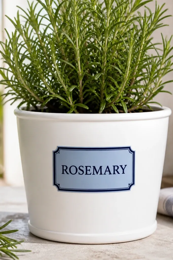
A nameplate panel makes the pot look like a labeled garden sign. The border frames the text so it reads cleanly, and the light blue panel adds color without taking over. I've used this for herbs and seedlings because it's practical and pretty. It's also a great way to use a stencil and avoid letter mistakes.
Paint the pot white. Tape a rectangle in the center for the nameplate and paint it light blue. Add a navy border by painting a thin band around the rectangle after it dries. Use a stencil for the word, then add small decorative dots in the corners. Seal with outdoor clear coat.
Pro tipUse all caps for painted labels; thin script fonts look shaky on curved pots.
AvoidAvoid using black text on dark bases; it disappears in shadow.
24. Metallic Copper Drip Accent
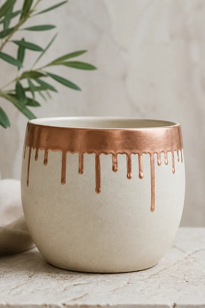
Copper drips give you that modern "ceramic glaze" vibe. The cream base keeps it soft, and the drips create movement without needing a full pattern. Metallic paint catches light and makes the pot look more expensive on a table or patio. This design works for fall and winter because copper reads like leaves and candlelight.
Base coat cream. Paint a copper band across the top about 1.5 inches wide. Then drag the brush tip downward to create short drips, stopping at different lengths. Add a second copper line around the bottom edge if you want balance. Seal with an outdoor clear coat that's compatible with metallics.
Pro tipPractice drip lengths on cardboard first - you want most drips under 2 inches.
AvoidDon't seal until paint is fully cured; metallics smear if the clear coat goes on too soon.
25. Pastel Checkered Pot with Tiny Daisy Centers
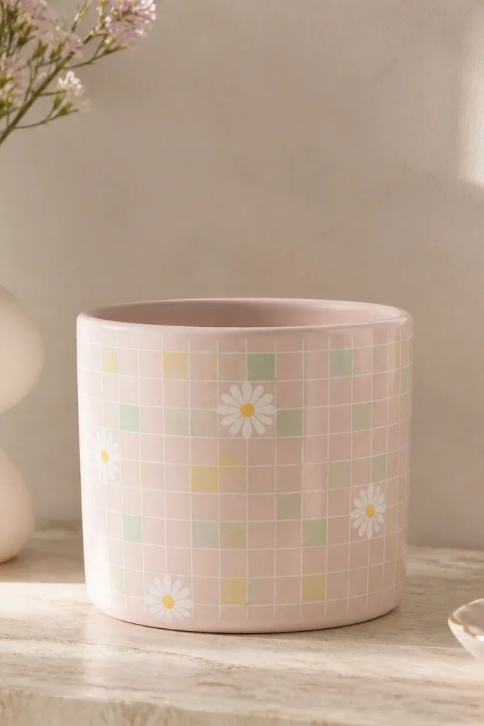
Checkered patterns look cute and tidy because squares give structure. Pastels keep it gentle, and daisy centers add a flower theme without painting big blooms. I like placing daisies only in one area so the grid stays the main design. This looks great in spring and pairs well with small flowers.
Base coat in light pink. Tape a grid with even spacing, paint alternating squares in white and mint, then add pale yellow squares. Remove tape carefully. For daisies, use a tiny flower stencil and paint white petals with a yellow dot center. Seal matte to keep colors soft.
Pro tipUse a ruler to measure tape spacing once, then repeat - consistent grid spacing makes it look store-bought.
AvoidAvoid wide square sizes; large checks can look childish on a real pot.
26. Holly and Berries One-Side Branch
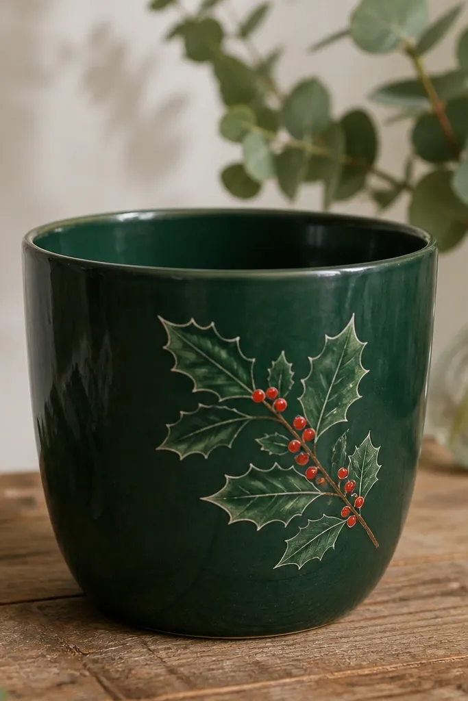
A single branch composition looks classy because it follows the pot's curve. Red berries give holiday punch, and a thin white highlight makes leaves look dimensional. Deep green base makes everything read clearly in low winter light. This is a clean alternative to full-on Christmas scenes.
Paint the whole pot deep green matte. Use a holly leaf stencil or draw leaves with a small flat brush. Add red berry dots along the branch. Use off-white paint to add a thin highlight line on each leaf edge. Seal with matte outdoor clear coat.
Pro tipPlace the branch so it runs from upper left to lower right across the front for a natural diagonal flow.
AvoidDon't paint berries as big blobs; make them small and round.
27. Lemon Slice Border Around the Bottom
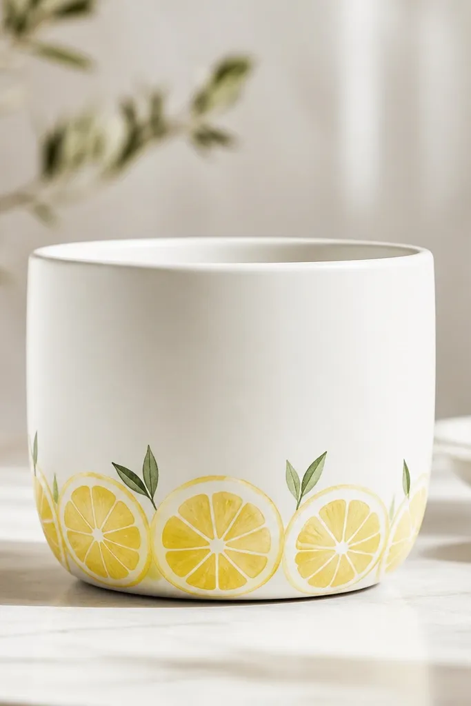
A bottom border is a cheat code for looking detailed without covering the whole pot. Lemon slices add summer energy, and the border placement keeps the pot looking balanced. White base makes the yellow pop and keeps the design crisp. This works well with herbs, especially thyme and basil.
Paint the pot white matte. Tape a narrow band around the bottom, about 1 inch tall. Paint lemon slices inside the band using a stencil or round brush circles with white rind lines. Add tiny green leaf tips between slices. Seal after dry.
Pro tipStagger the lemon slices - don't line them up perfectly or it looks printed.
AvoidAvoid painting the border too high; it can cover the plant base visually.
28. Galaxy Night Sky with Star Splatter
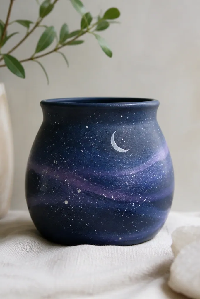
Galaxy pots look great because splatter creates stars faster than any brushwork. A dark navy base makes purple swirls look deep, and a silver crescent gives a clear focal point. You don't need to paint planets - the sky effect does the work. This style is a fun seasonal choice for winter and also looks good with low light plants.
Base coat navy. For swirls, paint a light purple curve and blend outward with a sponge. Flick white paint with a toothbrush for stars - cover the rim area with cardboard so dots don't land where you'll handle the pot. Paint a small crescent moon with a stencil or freehand curved shape. Seal with matte clear coat to avoid glare.
Pro tipUse a thicker paint for stars so they look like dots, not smears.
AvoidDon't use too much water in the base coats or the swirls will run.
29. Spring Bunny Ears Minimal Pot
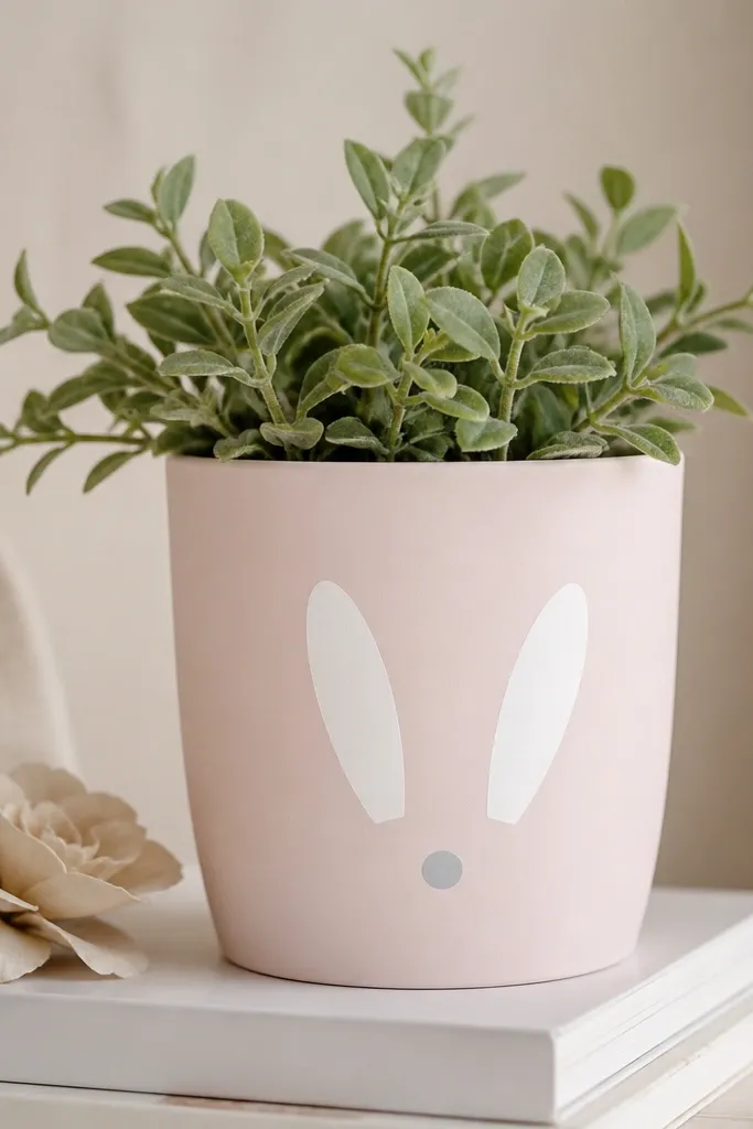
Minimal bunny ears look cute without turning the pot into a cartoon. The white ears on pale pink read clearly and stay adorable even when the flowers grow tall. Small gray nose dot adds a focal point without clutter. This is ideal for early spring when you want decor that's not too holiday-heavy.
Base coat pale pink matte. Paint two white ear shapes using a stencil or cut paper template. Add a tiny gray circle for the nose and two small dot eyes if you want. Seal with matte clear coat so paint stays soft-looking outdoors.
Pro tipKeep ears slightly tilted - it makes the design feel playful, not stiff.
AvoidAvoid big faces or long whiskers; they look messy once plants cover them.
30. Geometric Dot Constellation Pot
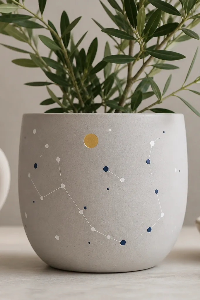
Constellation-style dots look modern and don't require artistic drawing talent. Thin lines connect dots and create a sense of order, even if the dot placement is random. A gold dot adds a highlight that catches sunlight. This works for winter and also makes a great gift for plant people.
Base coat light gray matte. Place dots with a dotting tool in navy and white, then add thin connecting lines with a liner brush. Add one larger gold dot near the top and one tiny gold dot elsewhere for balance. Seal with clear coat, then let cure fully before outdoor use.
Pro tipUse a ruler for line spacing only at the start - after that, trust the curve of the pot.
AvoidAvoid thick lines; they make the design look like a child's craft project.