1. Five-Dot Daisies
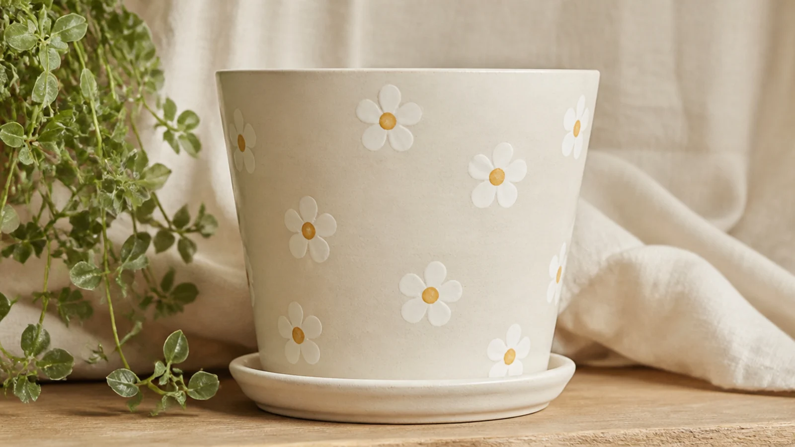
This is the easiest real flower to paint and the one I start every beginner on. Each daisy is just five petal dots in a circle with one contrasting center dot, so there’s no drawing at all. Scatter six or seven across a cream pot for a fresh, cottage look that suits any plant. White petals with mustard centers read cleanest, but blush or dusty blue petals work too.
Prime and base-coat the pot cream, then let it cure. Dip a cotton swab or the flat end of a pencil eraser in white paint and press five dots in a loose ring, re-dipping for each so they stay even. Add a mustard center dot with a size 2 round brush, then a few tiny green leaf dashes between blooms. Let it dry fully and seal with a matte clear.
Editor's notePaint the center dot last and slightly overlapping the petals — it pulls the five dots together so they read instantly as a flower.
Skip thisDon’t crowd the daisies edge to edge; a few well-spaced blooms look intentional, a full cluster looks messy.
2. Lavender Sprigs
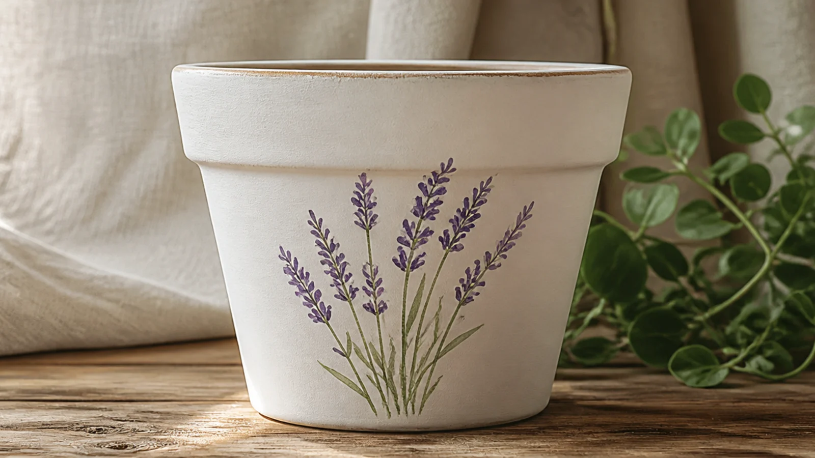
Lavender looks delicate but it’s just a green stem line topped with small purple dabs. A little bundle of three or four sprigs on the front of a white pot feels calm and Provencal. It’s the perfect second project after daisies because it introduces a stem without needing a real petal shape.
Base-coat the pot white and dry it. With a size 0 liner brush, paint three or four slightly curved green stems rising from one point. Load a size 2 round with soft purple and dab small buds in a tapering column up each stem, biggest at the bottom, smallest at the tip. Add a couple of thin leaf dashes low on the stems, then seal once dry.
Dab the buds in a loose zigzag up each stem rather than a straight line — real lavender is a little irregular, and that reads more natural.
Don’t make the buds a solid purple block; leaving small gaps between dabs is what makes it look like individual flowers.
3. Poppy Field
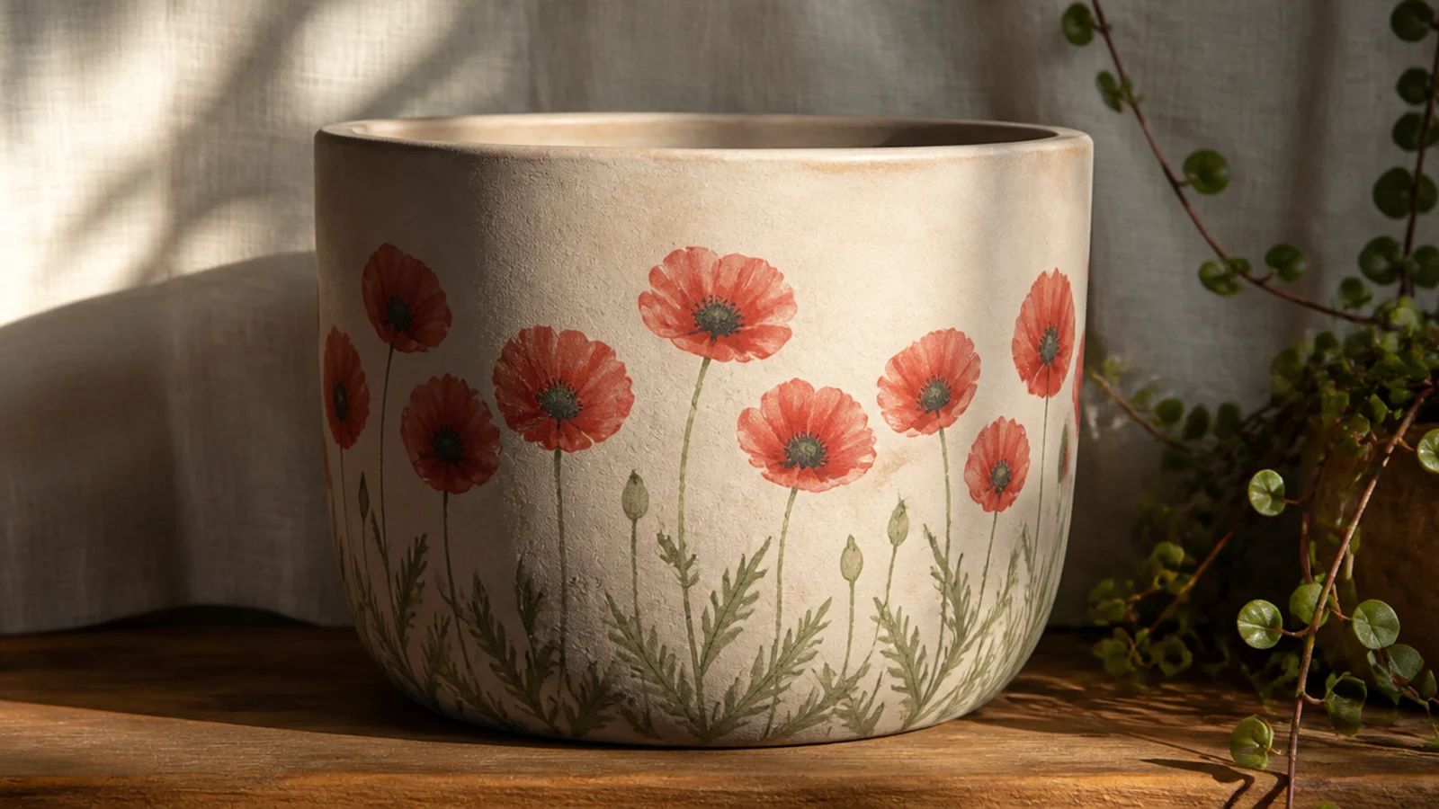
Poppies are bold, simple, and very forgiving — three or four rounded petals and a dark middle. A short row of them along the bottom of a cream pot looks like a summer field. The strong red-orange against cream is cheerful without being fussy, and the loose shape means small imperfections just look natural.
Base-coat cream and let dry. Paint a few thin green stems with a liner brush, then load a size 4 round with red-orange and press three or four overlapping rounded petals at the top of each stem. While slightly wet, tap a small dark charcoal or deep purple center into each. Add tiny black dots around the centers, then seal with a clear topcoat.
Editor's noteWobble the outer edge of each petal slightly instead of making a smooth curve — poppy petals are crinkled, so imperfect edges look right.
Skip thisDon’t paint the centers before the petals dry; a wet-on-wet dark center will bleed out and muddy the red.
4. Wildflower Meadow Band
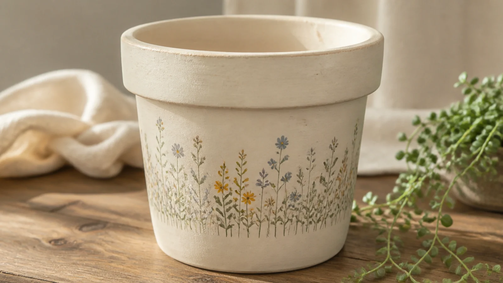
A loose wildflower band wrapping the pot mixes several simple shapes — dots, dashes, and tiny daisies — so it never has to be precise. It’s my go-to when I want something that looks hand-painted and abundant. Keeping it to one band around the middle stops it from overwhelming a small pot.
Base-coat a pale neutral and dry. Pencil two faint guidelines to keep the band level. With a liner brush, paint a row of thin green stems of varying heights, then top them with a mix: eraser-dot flowers, small dash buds, and tiny three-dot blooms in sage, mustard, and dusty blue. Fill gaps with single leaf dashes, then seal.
Editor's noteVary the stem heights and lean a few slightly left or right — uniform, upright stems look stiff, while varied ones look like a real meadow.
Skip thisDon’t use more than three or four colors in the band; too many shades turns it busy instead of charming.
5. Single Statement Bloom
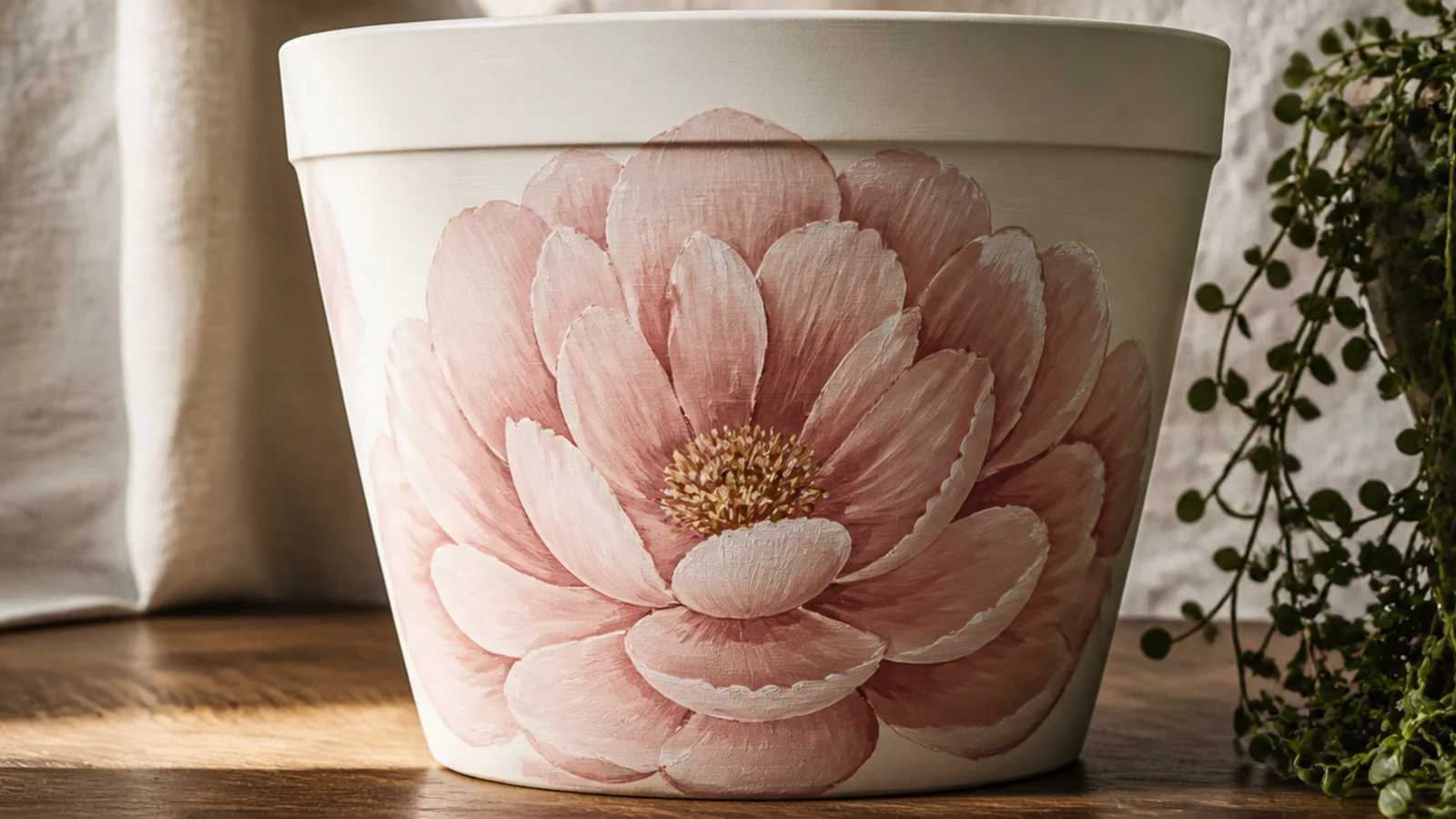
One large flower filling the front of the pot is modern and graphic, and it’s easier than lots of small blooms because you only have one shape to get right. A big blush or coral bloom on white feels like a boutique piece. It suits a plain 6-inch pot that needs one strong focal point.
Base-coat white and dry. Lightly pencil a large circle for the flower’s outer edge. Working from the outside in, paint overlapping rounded petals with a size 6 round brush in blush, adding a second slightly darker layer of petals inside. Tap a soft yellow center with small dots, let it dry, erase stray pencil, and seal.
Editor's notePaint the outer petals first and let each ring guide the next — building inward keeps the bloom balanced instead of lopsided.
Skip thisDon’t outline the whole flower in a dark line; hand-painted petals look softer and more expensive without a hard border.
6. Eucalyptus Ring
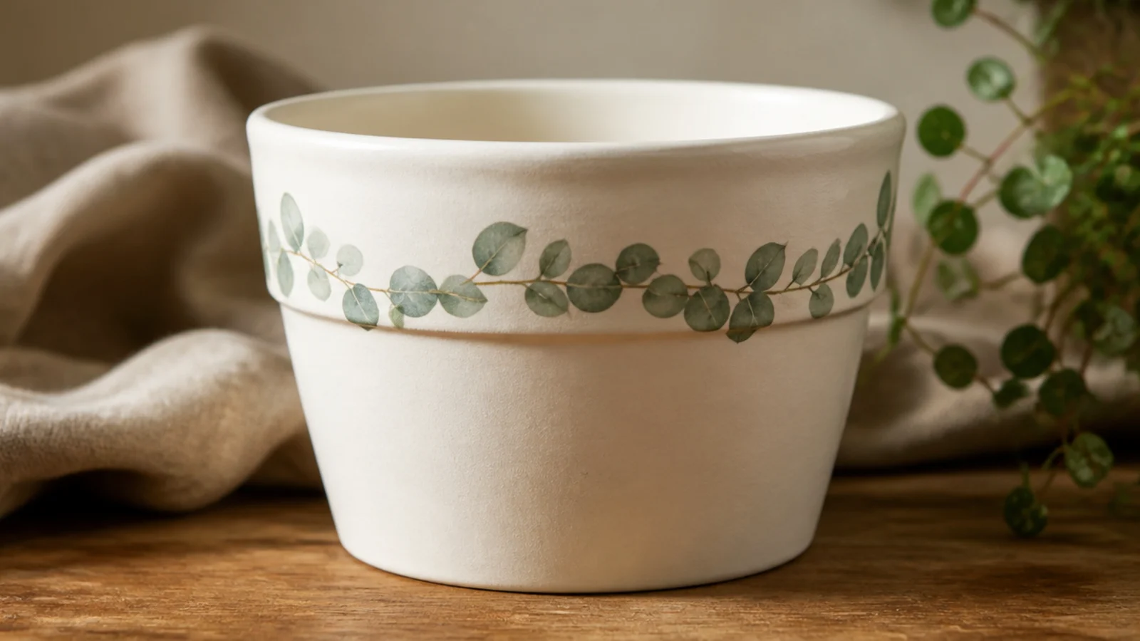
A ring of eucalyptus leaves gives you a wreath effect without a single flower, and the muted sage suits almost any decor. It’s calming and grown-up, perfect if bright florals feel too much for your space. The repeated leaf shape makes it meditative to paint once you find the rhythm.
Base-coat cream and dry. Pencil a faint circle around the upper third to guide the ring. With a size 2 round and sage green, paint a gently curving stem all the way around, then add pairs of small oval leaves along both sides, alternating. Add a few lighter sage leaves for depth, let dry, erase the guideline, and seal with a matte clear.
Editor's notePaint the leaves in pairs facing outward from the stem and let some overlap — it reads far more like a real sprig than evenly spaced leaves.
Skip thisDon’t make every leaf identical in size; slight variation is what stops it looking like a printed pattern.
7. Real Leaf Print
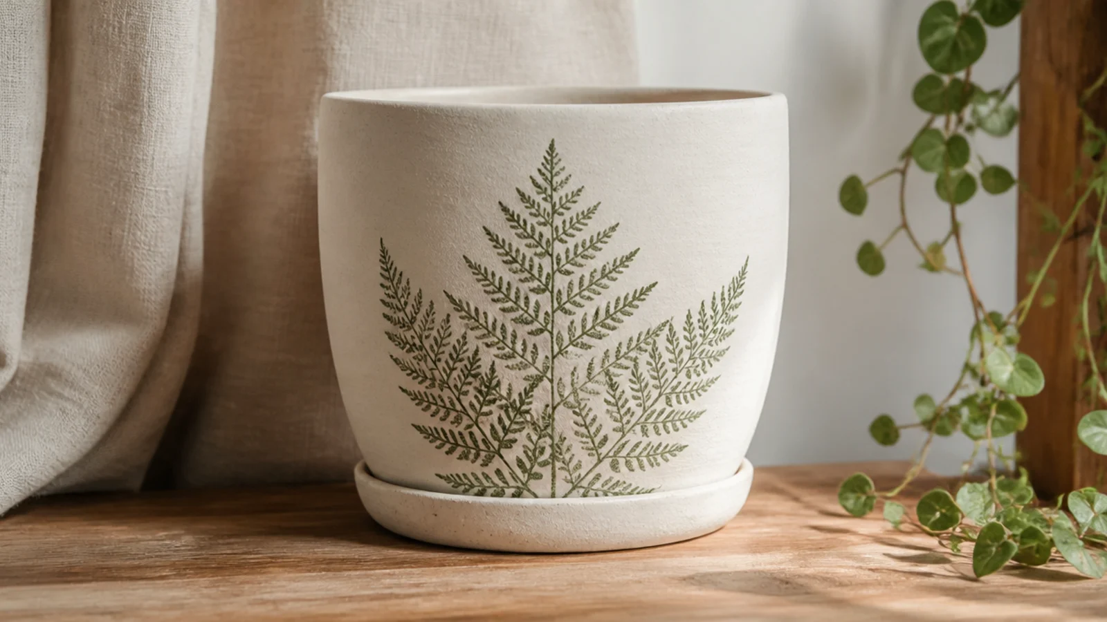
You can use an actual leaf as a stamp to print a perfect botanical silhouette, veins and all — no drawing skill required. Ferns and flat, clean-edged leaves work best. It looks organic and expensive, and it’s genuinely one of the most satisfying techniques on this list.
Base-coat cream and dry. Brush or sponge a thin, even coat of sage paint onto the back (veiny side) of a flat leaf. Press it paint-side down on the pot, lay a dry paper towel over it, and press evenly for a few seconds. Peel the leaf straight off to reveal the print. Repeat with a second leaf if you like, then seal when dry.
Use the underside of the leaf where the veins are raised — it makes contact better and prints far more detail than the smooth top.
Don’t overload the leaf with paint; a thick coat smears into a blob, while a thin coat prints crisp veins.
8. Simple Tulip Row
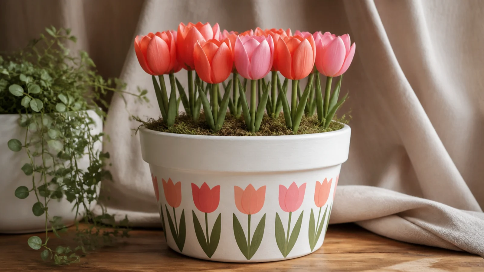
Tulips are a clean, graphic flower that beginners can nail because each one is just a little three-petal cup. A neat row along the front of a white pot feels fresh and springlike. Alternating two soft colors keeps the row lively without needing any shading.
Base-coat white and dry. With a liner brush, paint a row of straight green stems of equal height, evenly spaced. For each flower, use a size 4 round to paint a rounded cup shape, then two small side petals in coral or pink. Add a pair of long pointed leaves at the base of each stem, let dry, and seal.
Space the stems by making light pencil ticks first so the row stays even — uneven spacing is the main thing that makes a tidy row look off.
Don’t overwork the tulip cups; three simple shapes per flower reads cleaner than trying to add realistic curves.
9. Cherry Blossom Branch
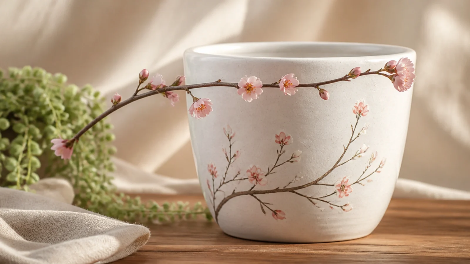
A cherry blossom branch arcing across the pot is elegant and asymmetrical, which makes it feel designed. The branch is one confident line and the blossoms are small five-dot flowers, so it’s more approachable than it looks. Pale pink on white is soft and gallery-like.
Base-coat white and dry. With a liner brush and brown paint, sweep one arcing branch across the front with a couple of small offshoots. Using a size 2 round or cotton swab, cluster pale-pink five-petal blossoms along the branch, adding a tiny darker center dot to each. Dot a few unopened buds at the branch tips, let dry, and seal.
Paint the branch in one confident stroke rather than slowly — a smooth, tapering line looks far more natural than a shaky redrawn one.
Don’t space the blossoms evenly like beads; clustering them with gaps between is what makes it look like a real branch.
10. Hydrangea Sponge Cluster
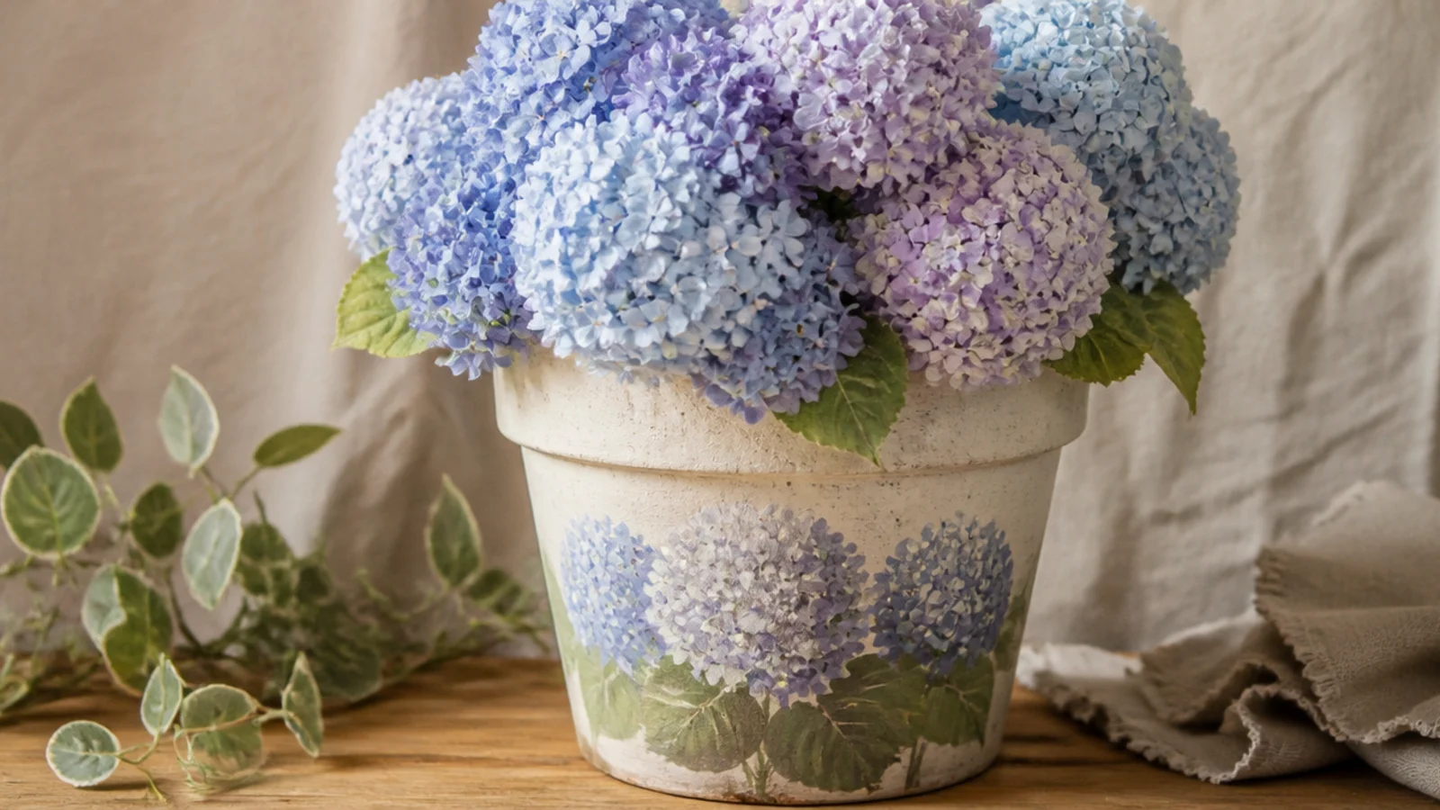
Hydrangeas are perfect for sponging because the flower is a mass of tiny blooms — a dabbed sponge does all the texture for you. A single rounded cluster in dusty blue and lavender looks lush with almost no skill. It’s a great way to get a full, romantic flower without painting individual petals.
Base-coat cream and dry. Pencil a soft round shape for the cluster. Dip a small piece of sponge in dusty blue, dab off the excess, and pounce it inside the shape, then layer lavender and a touch of white while wet so the tones blend. Add a few green leaves below with a round brush, let dry, and seal.
Dab a few tiny darker four-dot florets over the sponged mass with a liner brush — that hint of detail sells it as a hydrangea.
Don’t press the sponge into a solid patch; leaving a slightly uneven, mottled edge is what makes it look like clustered blooms.
11. Trailing Vine
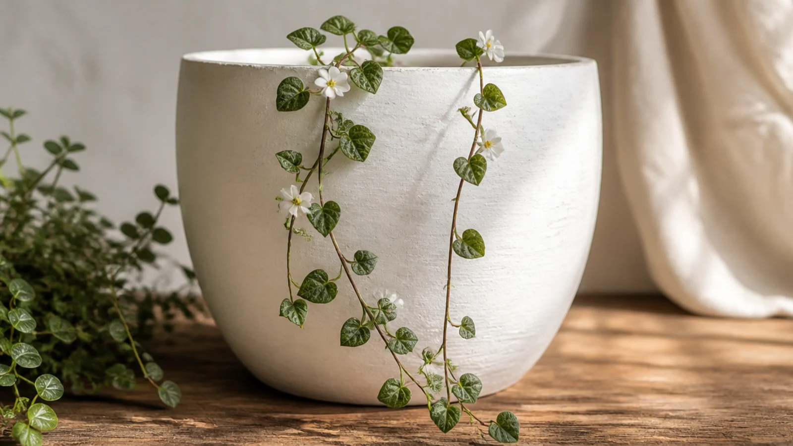
A vine spilling down from the rim mirrors a trailing plant and makes the pot feel connected to what’s in it. It’s a single flowing line with small leaves, so it’s forgiving and quick. This looks especially good on a pot holding a pothos or ivy.
Base-coat white and dry. Starting just under the rim, use a liner brush to draw two or three thin green vines curving down the pot. Add small heart-shaped or oval leaves alternating along each vine with a size 2 round. Dot a few tiny white flowers among the leaves, let dry, and seal with a clear topcoat.
Let the vines cross and drape unevenly rather than running parallel — real trailing plants tangle, and that looseness looks intentional.
Don’t make the leaves all point the same way; alternating their direction keeps the vine from looking like a stencil.
12. Folk-Art Floral Band
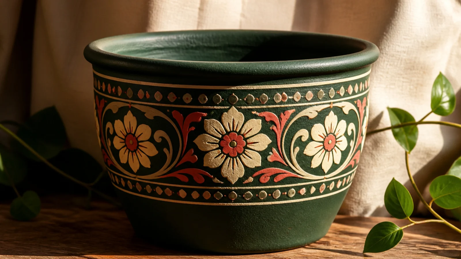
A folk-art band, inspired by rosemaling and painted pottery, feels rich and heirloom-like. The flowers are stylized and symmetrical, so there’s a clear pattern to follow rather than realistic shapes to guess at. A cream-and-coral design on a deep green pot looks especially striking.
Base-coat the pot deep green and dry. Pencil two guidelines for the band. With a size 2 round, paint a repeating unit — a central cream flower, a comma-stroke leaf on each side, and small coral dots — then repeat it around the band. Add fine white detail lines and dots on top once dry, then seal with a satin clear.
Paint one full repeat unit first and use it as your template for spacing so the pattern meets cleanly where it wraps around.
Don’t improvise each flower differently; folk art relies on repeating the same motif, and consistency is what makes it look skilled.
13. Watercolor-Style Peony
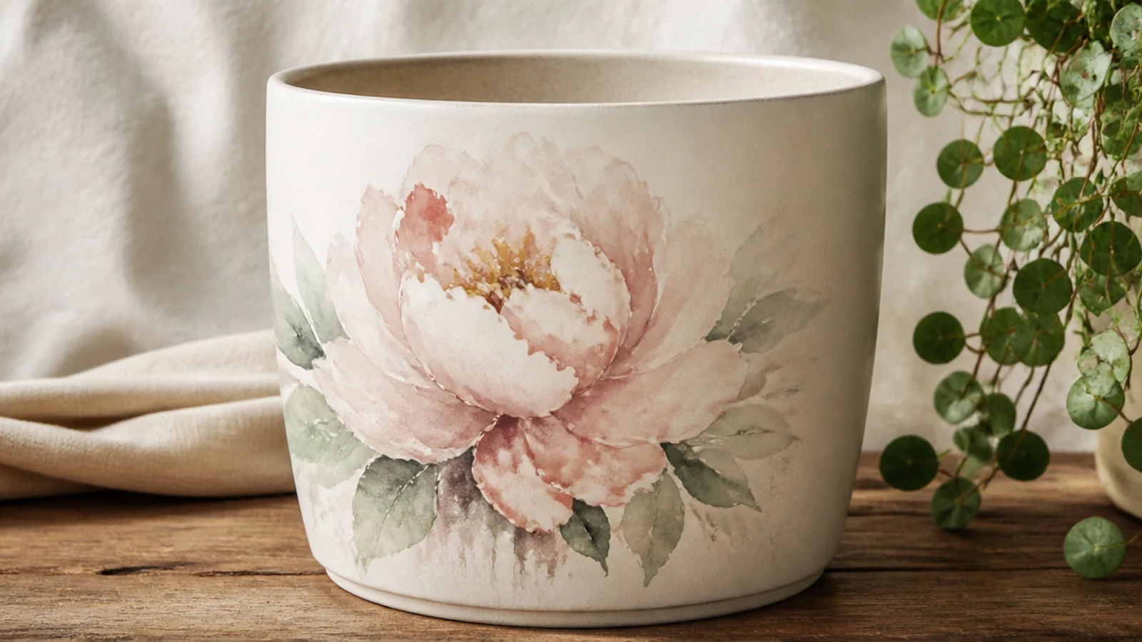
A loose, blended peony looks like a watercolor painting and feels artistic and soft. Thinning your acrylic with water lets colors bleed into each other for that dreamy effect. It’s more advanced because it’s about control of water, but the soft edges actually hide mistakes.
Base-coat white and dry. Thin blush acrylic with water to a milky wash. Paint loose, rounded petal shapes with a size 6 round, dropping in slightly stronger blush at the petal bases while wet so it blooms outward. Layer a few deeper petals in the center, let it dry, add fine liner details, and seal with a matte clear.
Editor's noteKeep a clean damp brush handy to soften any hard edge immediately — blending while wet is what gives the watercolor look.
Skip thisDon’t use thick, opaque paint for this one; watercolor style depends on translucent, watery layers, not solid coverage.
14. Ditsy Floral All-Over
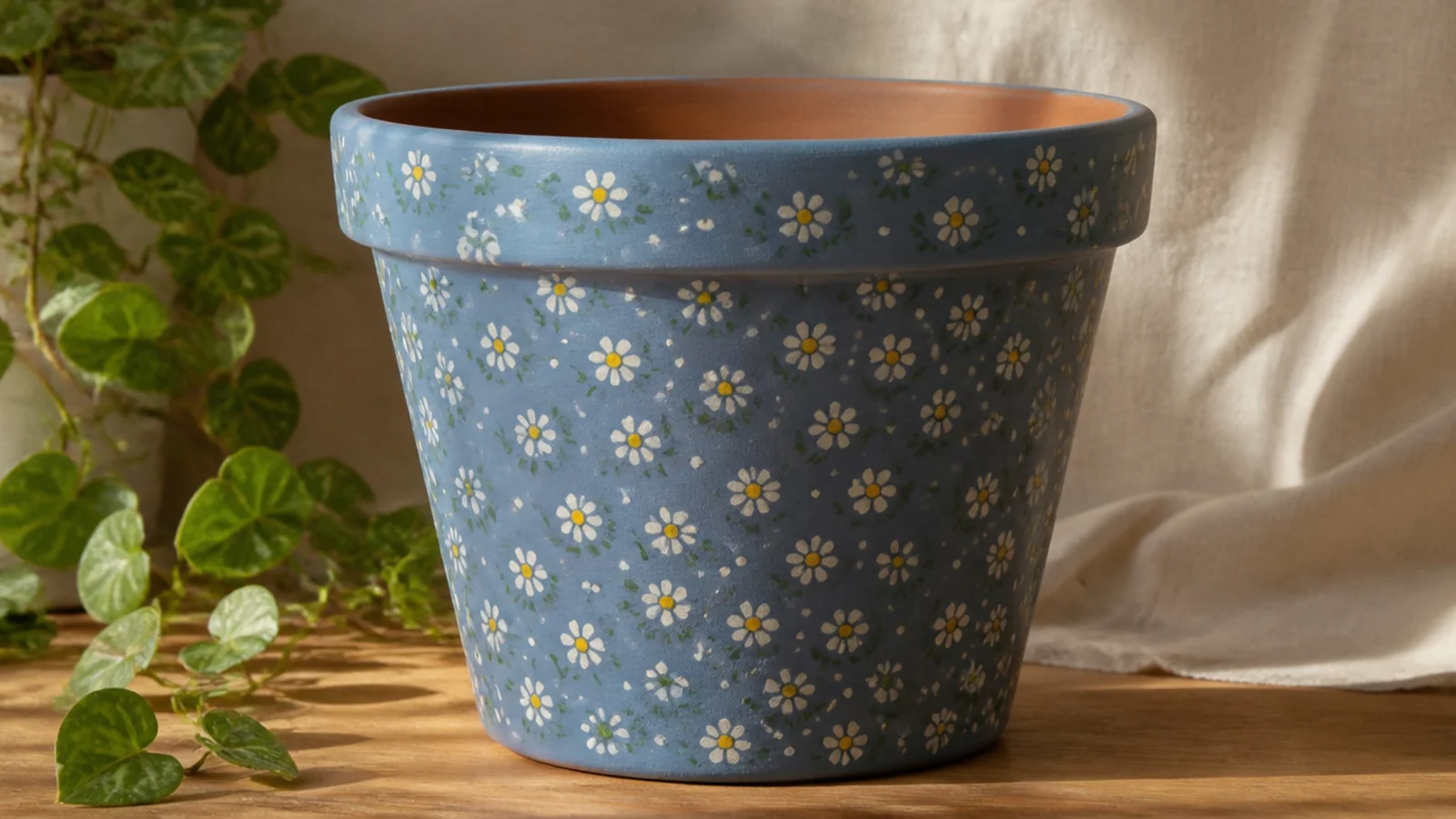
A ditsy print is the small, all-over floral you see on cottage fabric — tiny flowers scattered evenly across the whole pot. It looks charming and detailed but every flower is just a few dots. It suits a pot you want to feel soft and busy in a good way, like a piece of vintage china.
Base-coat the pot dusty blue and dry. Using a cotton swab and a liner brush, scatter tiny white four-dot and five-dot flowers evenly across the whole surface, adding a yellow center to each. Fill the gaps with small green dot-leaves and single dots, keeping the spacing loose but consistent, then seal.
Editor's noteWork in a loose grid, placing a flower, then a gap, then a flower, so the scatter stays even without looking rigidly lined up.
Skip thisDon’t cluster the flowers in patches; a true ditsy print is evenly distributed, and clumps make it look unfinished.
15. Sunflower Face
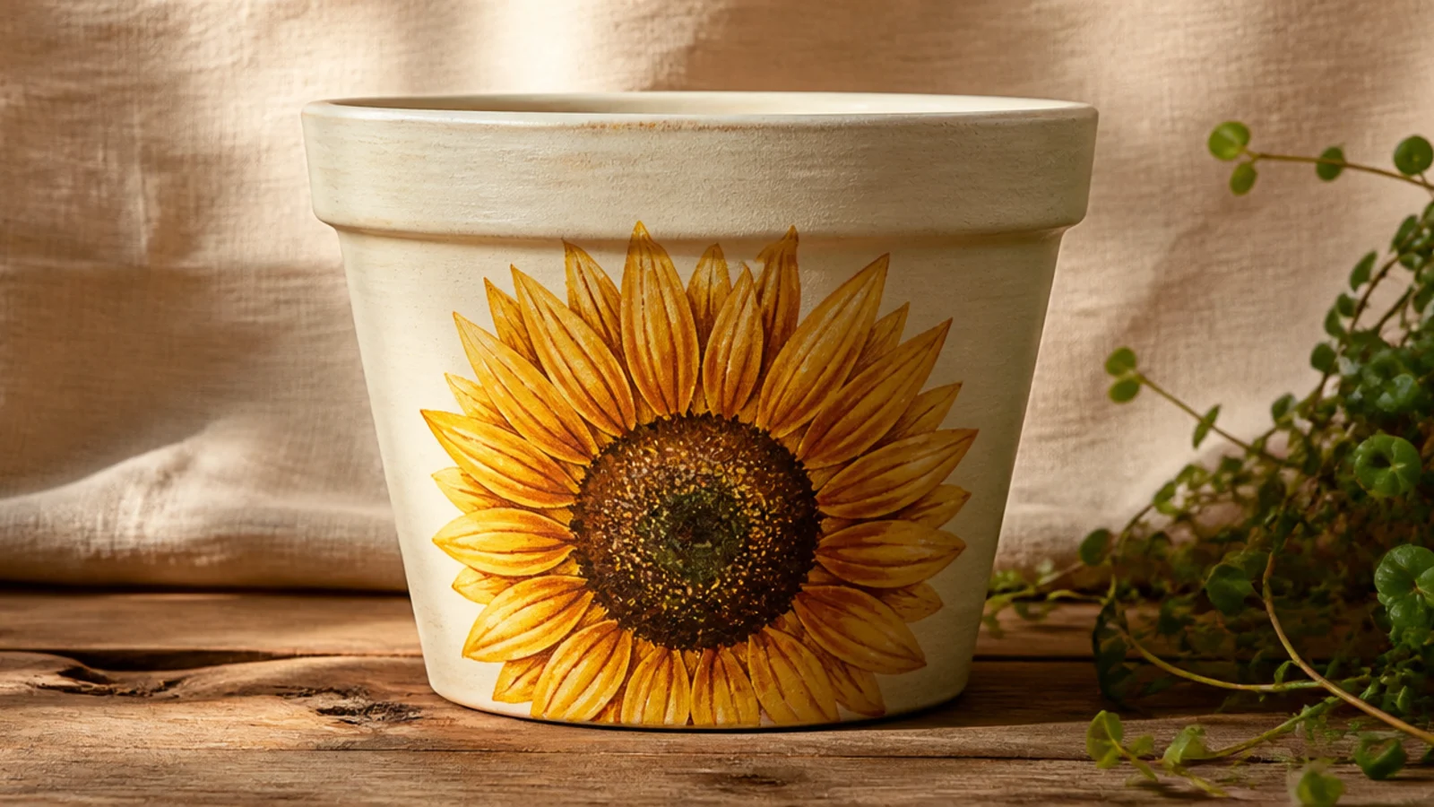
A single sunflower is cheerful and instantly recognizable, and the pointed petals are more forgiving than rounded ones. One big bloom on a cream pot brings warmth to a kitchen windowsill. The textured brown center is where it comes alive, and it’s just layered dots.
Base-coat cream and dry. Pencil a circle for the center. With a size 4 round and golden yellow, paint a ring of pointed petals around it, then a second offset ring behind the first for fullness. Fill the center with brown, then stipple darker brown and a few tiny yellow dots on top for seed texture. Add a green leaf, let dry, and seal.
Add a second layer of petals slightly offset behind the first row — that overlap gives the sunflower depth instead of a flat pinwheel look.
Don’t leave the center flat brown; stippling darker dots and yellow flecks is what makes it read as seeds, not a circle.
16. Rosebud Cluster
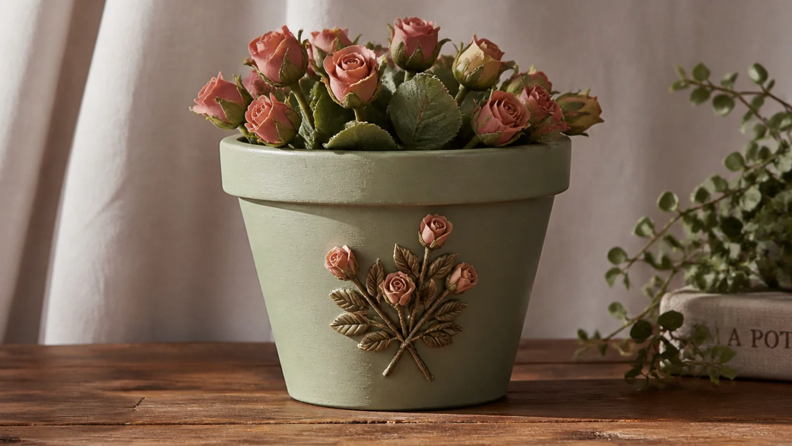
Rosebuds are easier than open roses because they’re small and tight, just a spiral of a few strokes. A little gathered cluster in dusty rose on a sage pot feels romantic and vintage. It’s a lovely gift pot and a good step up once you’re comfortable with a round brush.
Base-coat sage and dry. For each bud, use a size 2 round to paint a small C-stroke, then wrap two or three more curved strokes around it in dusty rose to suggest a spiral. Group three to five buds together, tuck small green leaves between and around them, and add a couple of tiny buds on stems. Let dry and seal.
Start each rosebud from the center out with a tight comma stroke — the little swirl in the middle is what makes a bud read as a rose.
Don’t try to paint fully open, detailed roses as a beginner; tight buds look intentional and are far more forgiving.
17. Chrysanthemum Dot Mandala
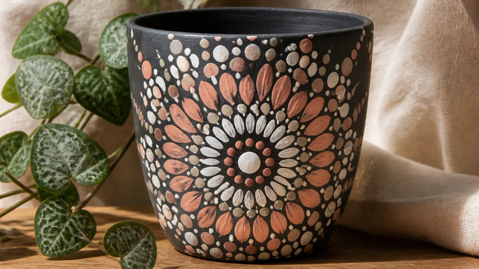
A dot-mandala flower turns simple dots into a hypnotic, symmetrical chrysanthemum. You build it in rings from the center out, each ring a slightly different dot size. It looks intricate and skilled but relies entirely on patience and even dots, not drawing.
Base-coat the pot charcoal and dry. Mark a center point. Using dotting tools or the ends of different-sized brushes, place a center dot, then a ring of evenly spaced dots around it, then another larger ring, alternating white and blush. Keep each ring’s dots aligned with the last, working outward until the flower fills the space. Let dry and seal.
Editor's noteRotate the pot as you place each ring instead of leaning over it, so the dots stay evenly spaced around the circle.
Skip thisDon’t rush the outer rings; uneven dot spacing at the edges is where a mandala falls apart, so re-dip and place each one deliberately.
18. Forget-Me-Nots
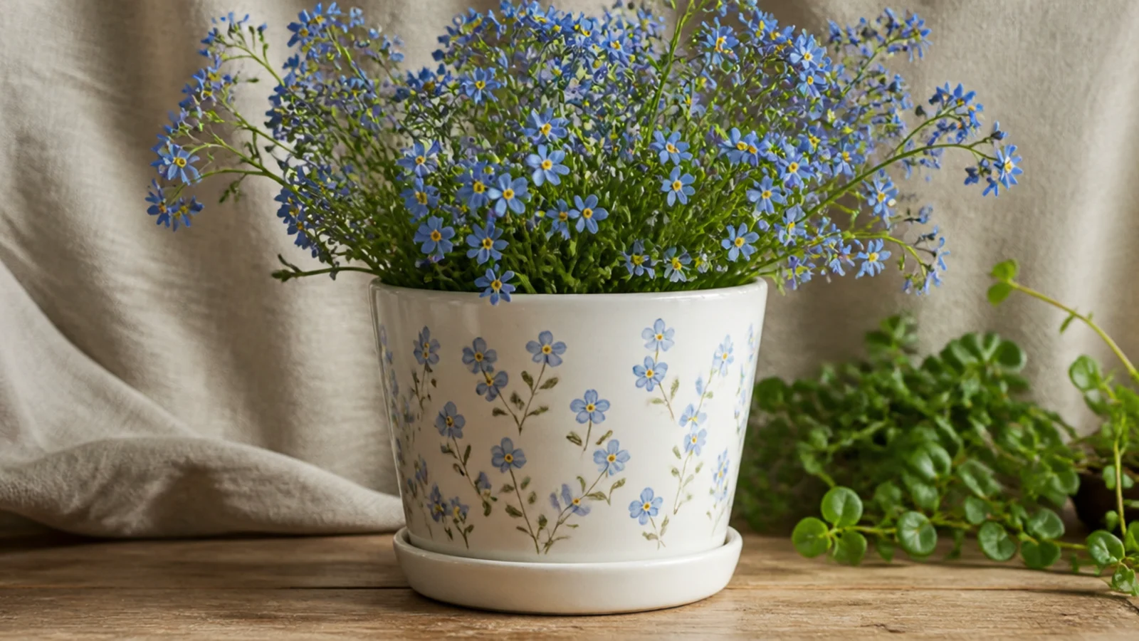
Forget-me-nots are tiny, sweet, and almost impossible to mess up — five small blue dots and a yellow center. Painted in loose little sprigs across a white pot, they feel delicate and nostalgic. This is a great project for a very small pot where big flowers would overwhelm it.
Base-coat white and dry. With a liner brush, paint a few short, curving green stems in small groups. Using a fine round brush or a toothpick, place five small blue petal dots in a ring at the stem tips, then a single yellow center dot in each. Add tiny leaf dashes, let dry, and seal with a clear topcoat.
Use a toothpick for the yellow centers so they stay tiny and crisp — a brush tip often leaves them too big for such a small flower.
Don’t make the blue petals large; forget-me-nots only look right when the flowers stay small and delicate.
19. Dried Palm Boho Spray
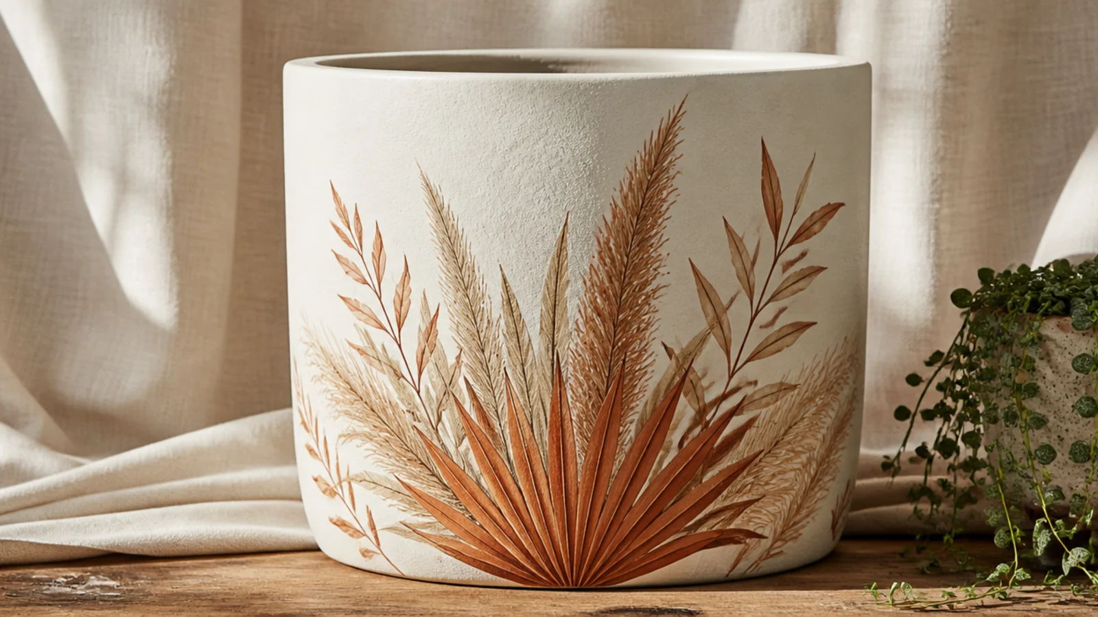
A boho spray of dried palm and pampas fronds skips flowers entirely for a warm, neutral, on-trend look. The fronds are feathery lines fanning up from the base, painted in tan and rust. It suits a modern, earthy space and pairs beautifully with a real dried arrangement.
Base-coat cream and dry. With a liner brush, paint a few tall stems fanning up from one point on the front. For pampas, add soft feathery strokes along the top of each stem in tan; for palm, paint a fan of thin lines. Layer rust and cream fronds for depth, keeping strokes light and dry-brushed, then let dry and seal.
Use a nearly dry brush with light pressure for the feathery pampas tops — too much paint turns the wispy fronds into solid blobs.
Don’t paint the fronds as solid shapes; their charm is in the fine, separate strokes that let the background show through.
20. Monochrome Line Florals
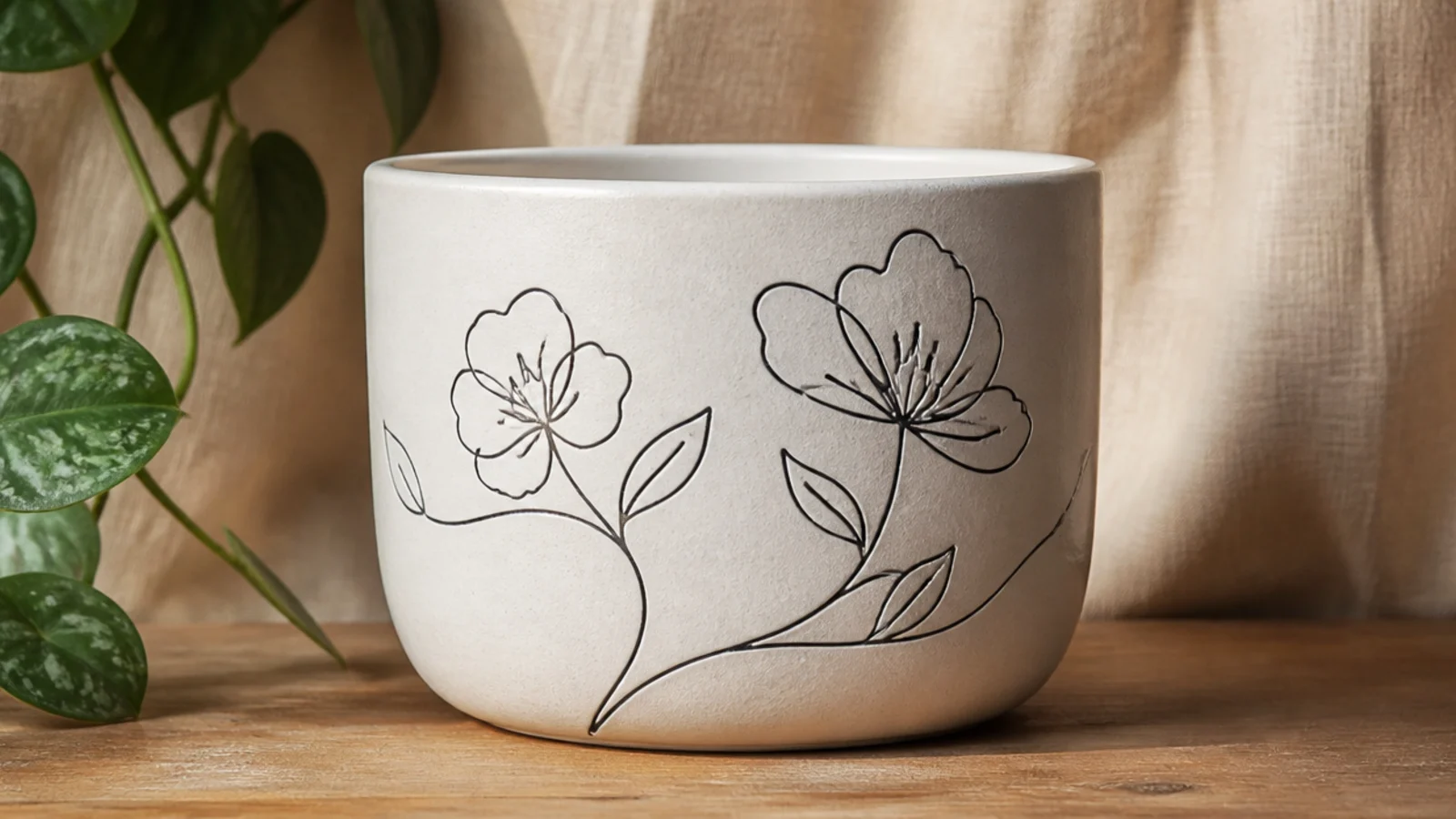
Single-line florals are minimalist flower outlines drawn in one continuous stroke, like modern line art. They’re graphic and current, and they work in any single color against white. It looks effortlessly stylish and is faster than any filled design once you loosen up.
Base-coat white and dry. Practice a few continuous-line flowers on paper first — a loose loop for petals without lifting the brush. Using a size 0 liner brush or a fine black paint pen, draw two or three simple line flowers and stems on the front of the pot. Keep the line thin and even, let it dry, and seal with a light spray clear so the ink doesn’t smear.
Editor's noteDraw the whole flower in one flowing motion without lifting — the unbroken line is the entire point of this modern look.
Skip thisDon’t go back to thicken or fix lines; the beauty is in the confident single stroke, and touch-ups make it look labored.
21. Poinsettia Winter Bloom
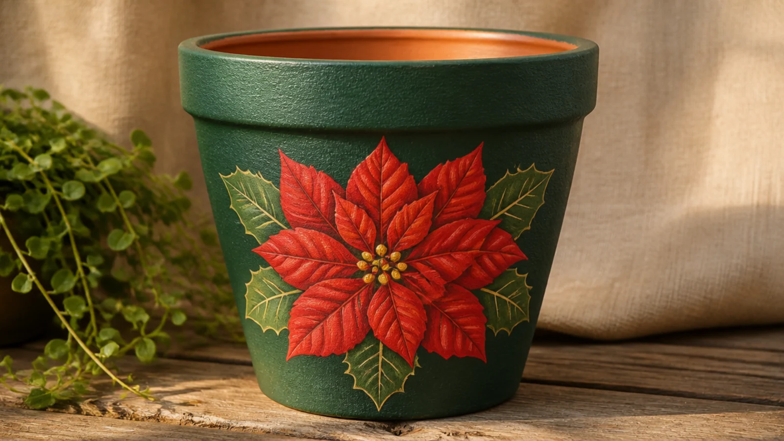
A poinsettia gives you a festive flower for winter and holiday plants, and its pointed bracts are easier than rounded petals. One bold red bloom on a deep-green pot suits an amaryllis or a Christmas cactus. It’s seasonal without being kitschy if you keep the red muted rather than bright.
Base-coat the pot deep green and dry. With a size 4 round and a muted red, paint a star of pointed bracts, then a second smaller layer of bracts inside and offset. Add a cluster of small yellow-green dots in the very center. Tuck a few darker green leaves behind the red bracts, let dry, and seal with a satin clear.
Editor's noteLayer a slightly darker red on the inner bracts to add depth so the flower doesn’t look like one flat red star.
Skip thisDon’t use a bright fire-engine red if you want it to look elegant; a slightly muted, deeper red reads far more sophisticated.
22. Cottage Hollyhocks
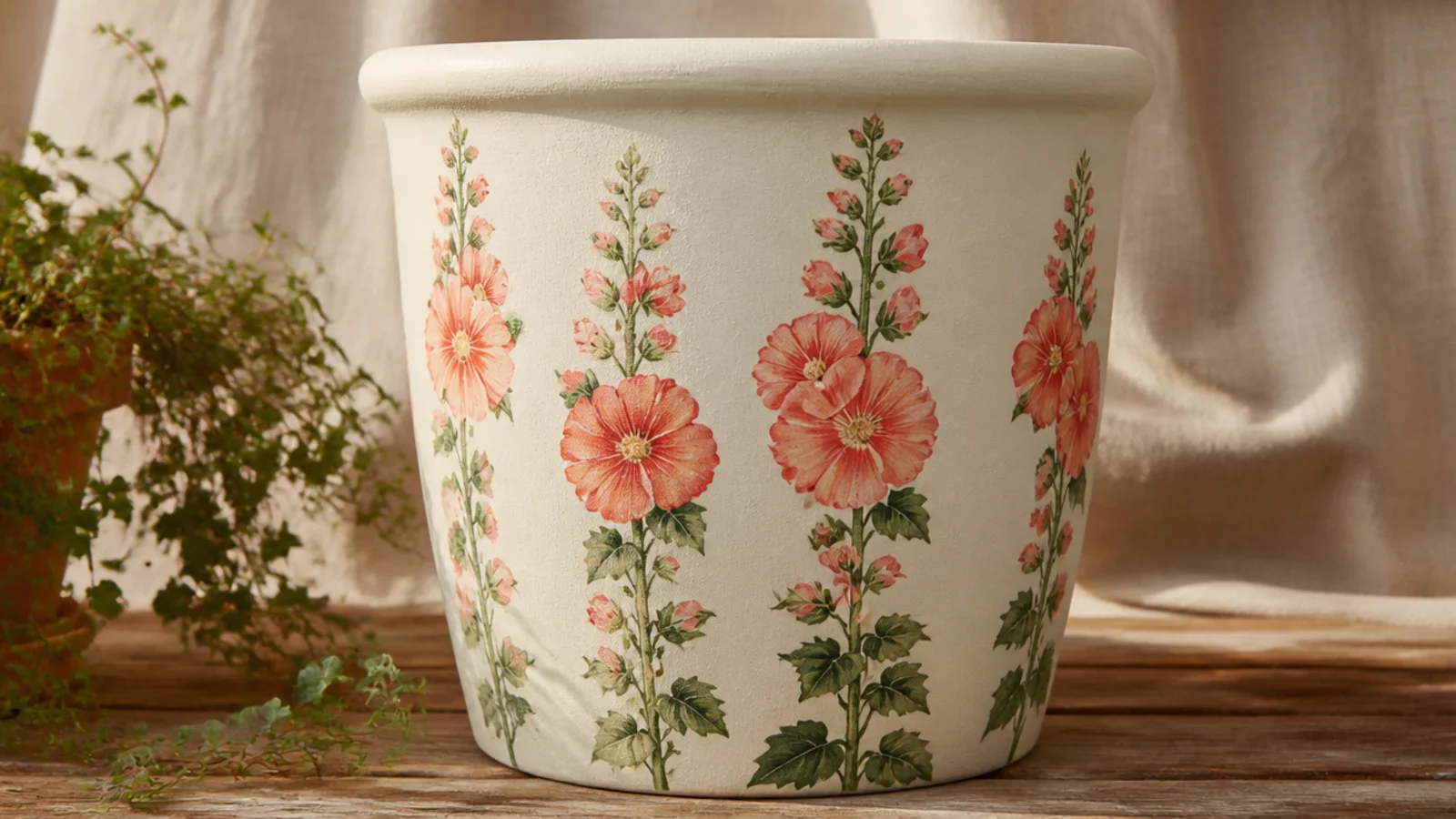
Hollyhocks are tall cottage-garden spires, perfect for using the full height of a taller pot. Each is a stem with open flowers stacked up it, largest at the base. Two or three spires in blush and coral give a pot real garden charm and draw the eye upward.
Base-coat cream and dry. With a liner brush, paint two or three tall green stems rising most of the pot’s height. Using a size 4 round, paint open five-petal flowers along each stem, largest at the bottom fading to buds at the top, in blush and coral. Add small green leaves at the base, let dry, and seal.
Editor's noteMake the flowers gradually smaller toward the top and finish with a few unopened buds — that gradient is what makes a hollyhock spire believable.
Skip thisDon’t keep the flowers the same size up the whole stem; equal-sized blooms flatten the tall, tapering look.
23. Abstract Floral Brushstrokes
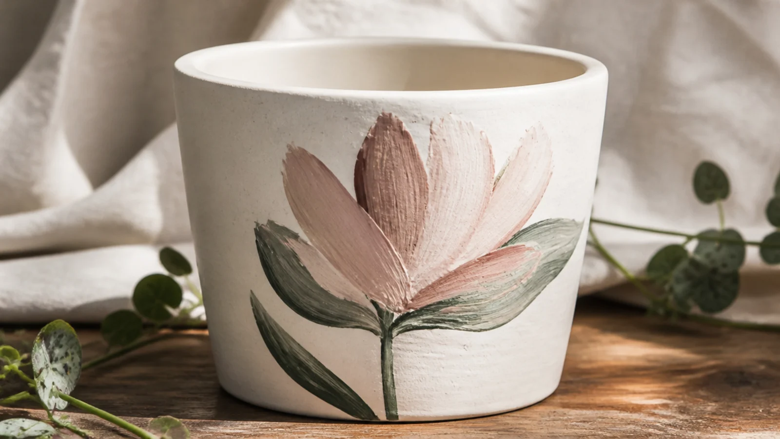
Abstract florals are a handful of confident brushstrokes that suggest a flower without detailing it. The look is modern and gallery-like, and it’s the most forgiving design here because there’s no correct shape. Three or four petal strokes and a couple of leaf marks are all it takes.
Base-coat white and dry. Load a size 6 round fully with blush and press-and-lift a few petal-shaped strokes radiating from one point, letting the paint vary in thickness. Add two or three sage leaf strokes below with the same technique. Tap a small mustard center, step back, resist adding more, and seal once dry.
Make each petal in a single press-and-lift motion so it has a natural tapered shape — dragging the brush slowly kills the effect.
Don’t keep adding strokes to make it look more like a flower; abstract designs die from overworking, so stop while it feels sparse.
24. Botanical Jar Label
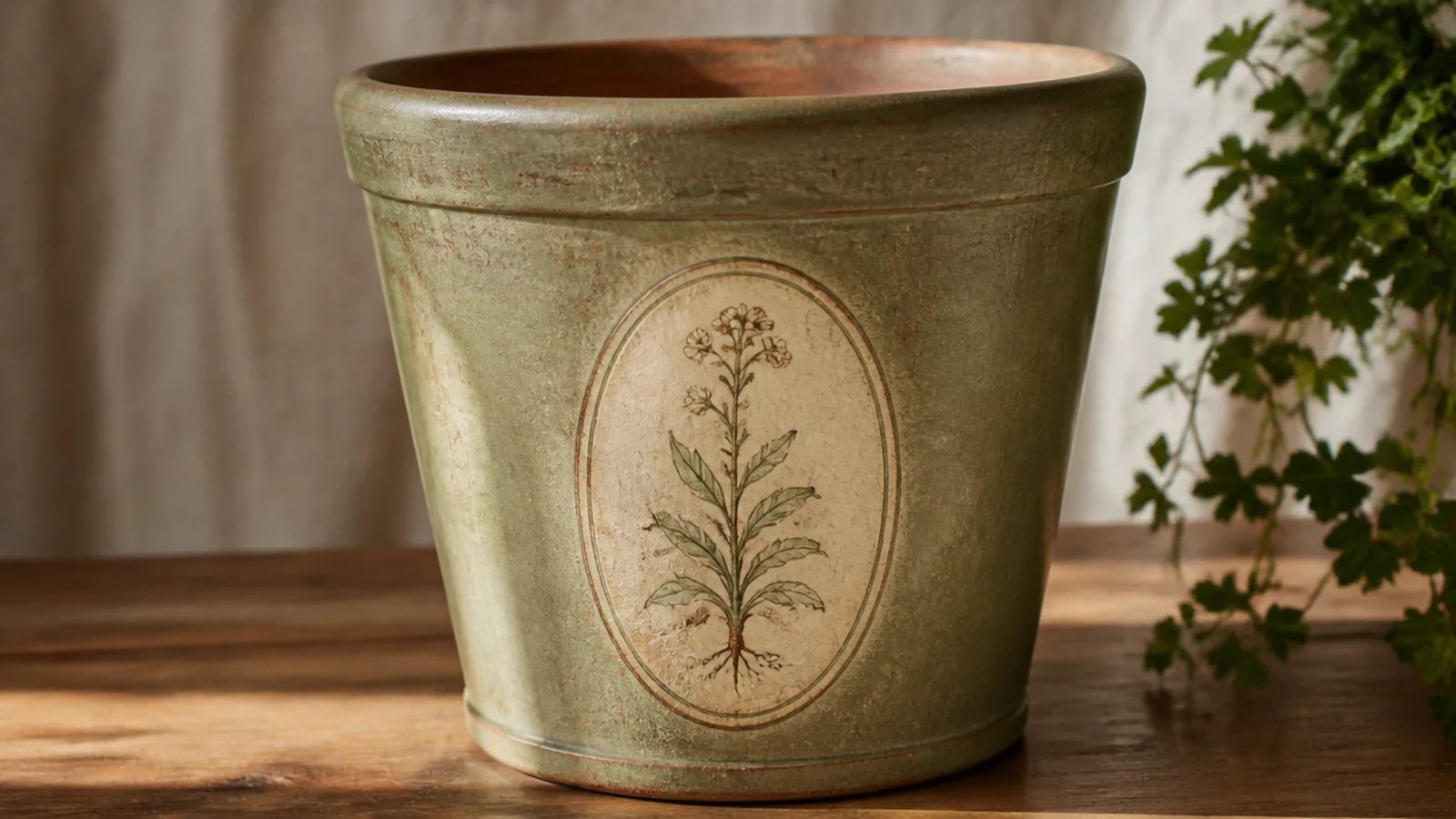
A framed botanical label looks like an antique seed packet or apothecary jar, which suits a herb pot beautifully. You paint a simple oval or rectangle frame and a small sprig inside. It’s tidy, vintage, and doubles as a way to mark what’s planted.
Base-coat sage and dry. Pencil a centered oval or rounded rectangle on the front and paint its outline in cream with a liner brush, adding a thin second inner line for a framed look. Inside, paint a small botanical sprig — a few leaves and buds — in muted tones. Add a hand-lettered name if you like, let dry, and seal with a satin clear.
Keep the sprig inside the frame small with clear space around it, like a real label — a crowded frame loses the vintage, printed feel.
Don’t freehand the frame if you want it crisp; use a light pencil oval traced from a stencil or lid so the shape stays even.
25. Full Meadow Scene
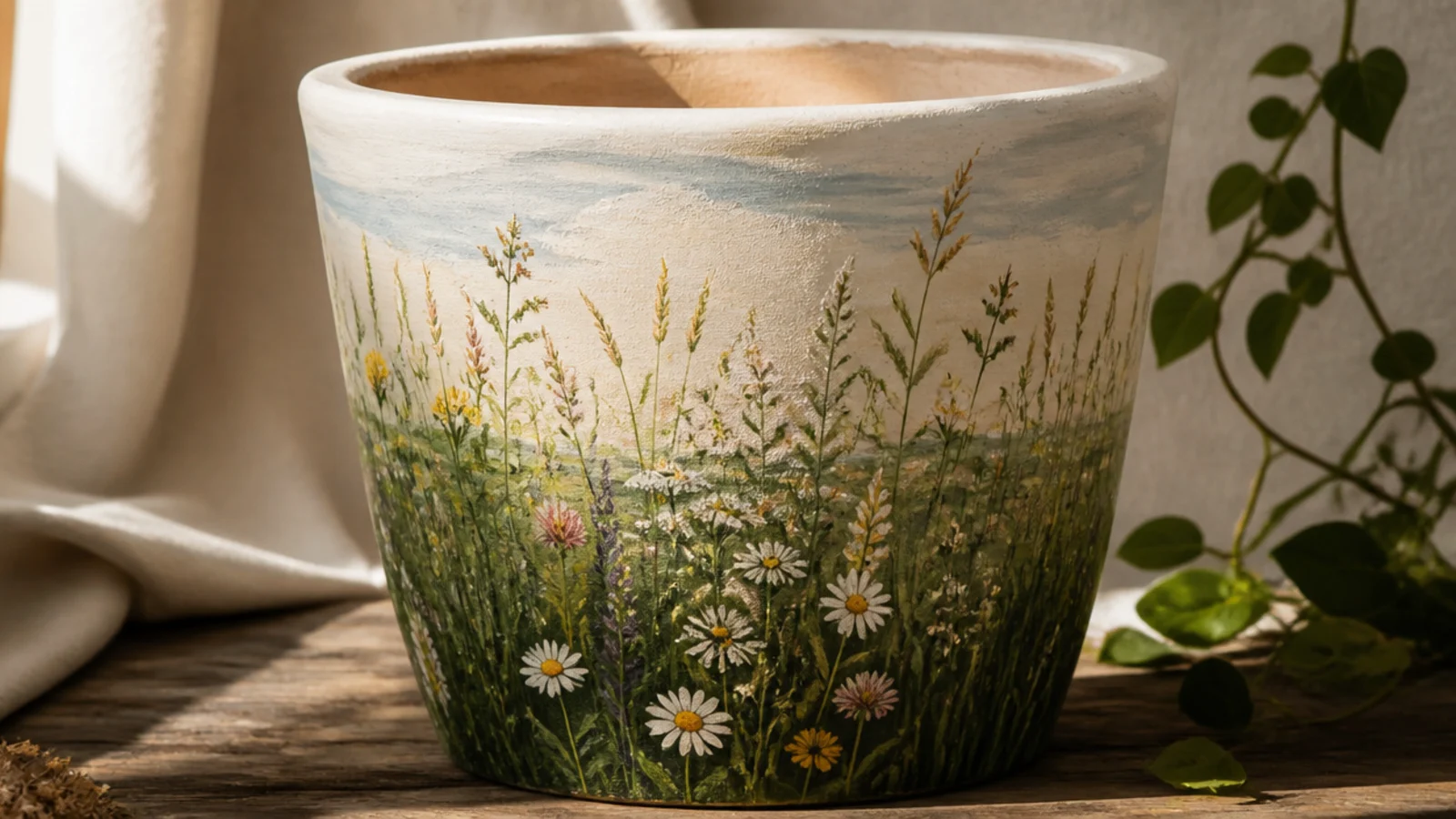
A full wraparound meadow turns the whole pot into a little landscape, with a sky band, a grassy field, and wildflowers throughout. It’s the most ambitious design here but it builds on everything else — stripes for the sky, dashes for grass, dots for flowers. On a 6-8 inch pot it’s a showstopper.
Base-coat the pot cream and dry. Paint a pale sky band around the top third and blend its lower edge with a dry brush. Below it, dry-brush layered greens for a grassy field, then add tall grass strokes with a liner. Scatter wildflowers throughout using dots and dashes in mixed colors, keeping smaller flowers toward the top for depth. Let dry and seal thoroughly.
Editor's notePaint smaller, paler flowers near the top and larger, brighter ones near the base — that scale shift creates a sense of distance across the field.
Skip thisDon’t paint every flower the same size across the whole pot; without that scale change the meadow looks flat, not deep.