1. Sunburst Tape Stripes on a Terracotta Base
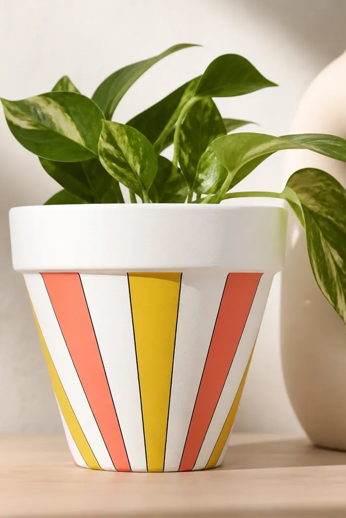
This one looks like a summer sign because the rays create motion even from a distance. I paint a solid light base, then lay tape in evenly spaced lines so each stripe stays sharp. The coral and yellow pop against white and make the pot look clean and bright on cloudy days.
Start with a 10-12 inch terracotta pot: prime if needed, then base coat matte white. Apply painter's tape from near the center outward in 10-15 degree gaps, paint two ray colors (alternate coral and yellow), and remove tape while paint is still slightly tacky. Finish with a thin line in a deep navy or charcoal to separate rays.
Pro tipUse a tiny foam roller for the base and stripe areas so the finish stays smooth instead of brush-streaky.
AvoidDon't let the tape sit too long - dried paint can tear edges when you peel it.
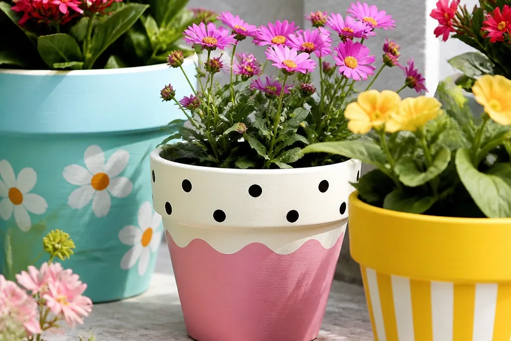
2. Mint and Gold Polka Dot Party Pot
Polka dots are the fastest way to make a pot look festive without complicated drawing. Mint gives a fresh seasonal feel, and gold makes it look "decorated" instead of childlike. The dot cluster near the rim draws the eye upward.
Base coat: mint acrylic in a matte finish. Use a dotting tool or the end of a capped paintbrush to tap gold dots. Keep spacing consistent by starting with a grid: lightly mark 1-inch intervals with a pencil and erase later.
Pro tipDip the brush lightly and tap straight down - angled taps make oval dots.
AvoidAvoid uneven spacing - random dots look messy on a curved surface.
3. Chalkboard Herb Labels with White Doodles
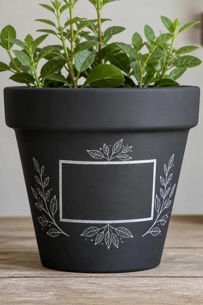
This design is practical and pretty: you get a labeled pot that still looks stylish. The chalkboard surface hides minor scuffs and looks great for herbs, bulbs, or seasonal flowers. White doodles and a simple label rectangle keep it readable and crisp.
Paint the pot charcoal using chalkboard paint or a matte acrylic mix you test first. Add a label rectangle with painter's tape, then paint it white. Finish by freehanding leaf doodles in white and a small border line in thin gray.
Pro tipWrite the plant name with chalk or a chalk marker only after the paint cures, so the label doesn't smear.
AvoidDon't seal a chalkboard finish with glossy sealer - it kills the chalk texture.
4. Ombre Fade from Navy to Sky Blue
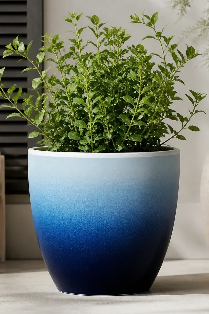
Ombre looks fancy because it covers the pot in a gradient that reads well from across the yard. Navy anchors the base, and sky blue makes the top feel airy. A crisp white rim line gives the pot a finished frame.
Base coat the bottom half navy. Then sponge-paint sky blue starting above it, blending upward with a dry brush edge. Work in small sections so you don't overwork the paint and create muddy bands. Add a 1/4 inch white rim line around the top edge.
Pro tipUse a sea sponge - it creates soft texture that helps the gradient blend.
AvoidDon't paint the gradient wet-on-wet with a big brush - it streaks on curved pots.
5. Lemon Wreath Ring Around the Midline
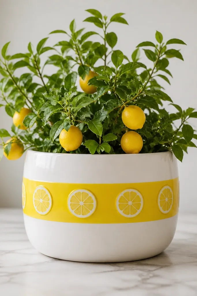
This gives "seasonal summer" without full-on holiday characters. The thick ring reads first, then the lemon slices add charm. White background keeps it bright even if your garden is green-heavy.
Base coat white. Paint a 2-3 inch wide yellow band around the pot midline using painter's tape for straightness. Add lemon slices: draw small ovals, paint a lighter yellow fill, then add darker yellow rind lines and tiny seed dots.
Pro tipMake one lemon slice template by drawing it on paper and tracing it lightly with pencil before painting.
AvoidAvoid tiny seed dots that are too big - they look like bubbles instead of seeds.
6. Holiday Plaid with Two Tape Grids
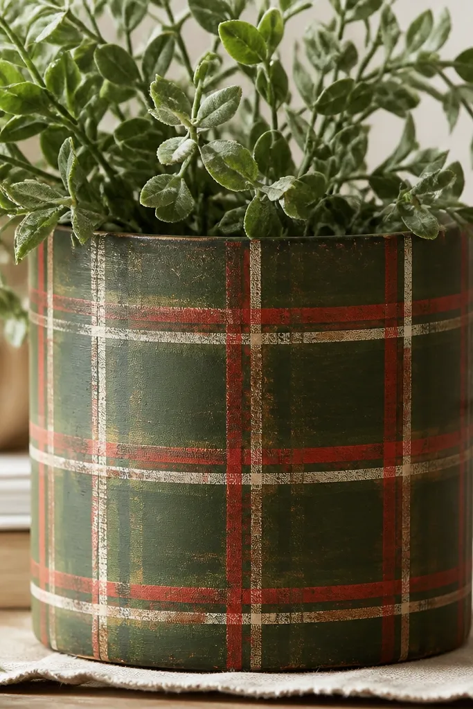
Plaid looks like winter décor because it's structured. You don't need freehand skill; tape gives you the grid and keeps the pattern even around the curve. Cream lines soften the contrast so it doesn't look harsh.
Start with a matte forest green base. Tape horizontal stripes first, paint red, let dry, then remove tape. Re-tape vertical stripes over the remaining surface and paint cream. Optional: lightly sand corners after sealer for a rustic look.
Pro tipUse two tape widths: one for thick lines and one for thin lines, so the plaid looks layered.
AvoidDon't overbuild too many colors - two reds and one cream is enough.
7. Galaxy Speckles with a White Star Halo
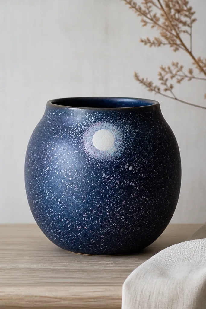
This one looks like expensive outdoor décor because the speckles catch light. Speckle work hides small imperfections, and the halo gives it a focal point. Purple and blue make it feel seasonal for fall and winter.
Paint the pot dark navy as the base. Load a toothbrush with watered-down light gray or white and flick speckles with your thumb. Add a second round of speckles in light periwinkle for depth. Paint a soft white circle halo near the top using a sponge, then seal.
Pro tipPractice flicking on cardboard first so you control dot size.
AvoidAvoid heavy splatter - big blobs look like paint drips.
8. Terracotta "Rope" Wrap Lines in Sand and Clay
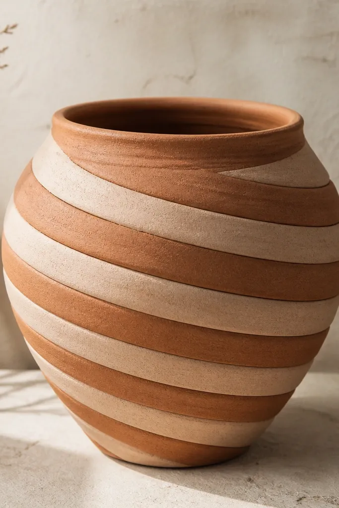
Rope lines make plain terracotta look hand-crafted. The spiral pattern breaks the monotony of a cylinder and gives a sense of movement. Sand and clay tones stay warm and don't clash with garden greens.
Prime and paint a thin base coat in light sand. Then paint a clay-orange rope band: use a 1/4 inch angled brush to create two parallel lines, then fill the center. Repeat the spiral spacing evenly around the pot, keeping the rope width consistent.
Pro tipUse a piece of painter's tape as a guide by wrapping it around the pot at a slight angle.
AvoidDon't make the rope bands too close - the pattern turns into a muddy stripe.
9. Bees and Blossoms on a Yellow Base
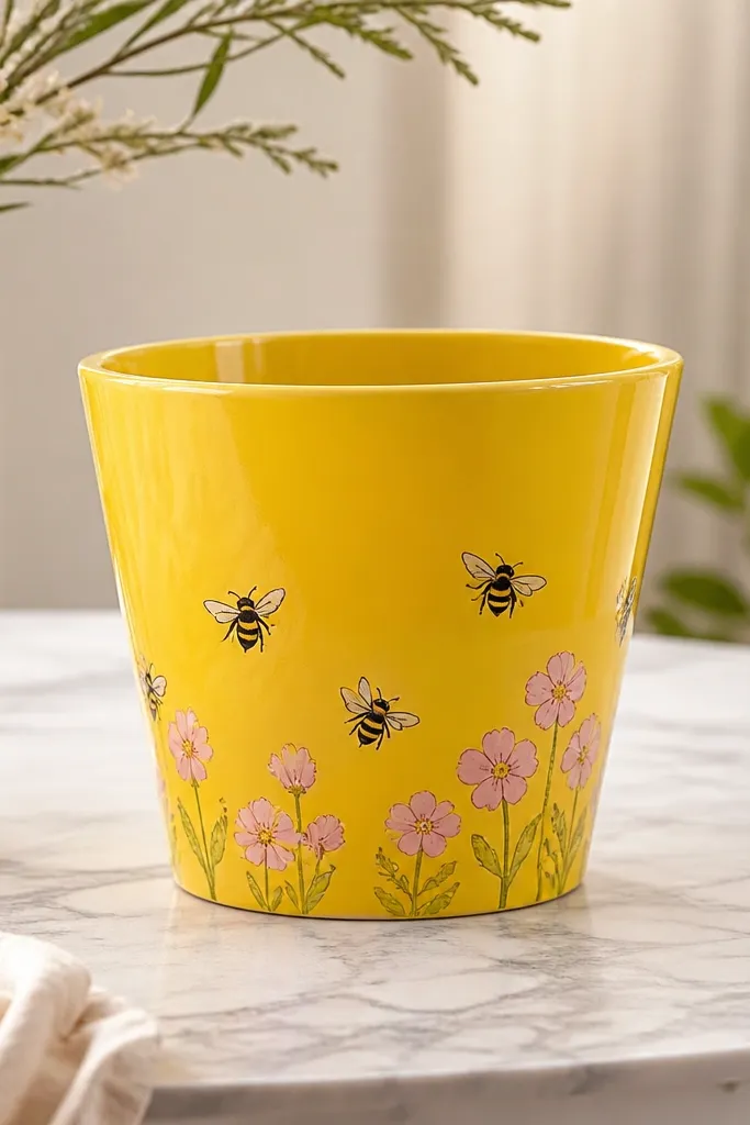
Bees bring spring energy, and blossoms stop it from looking like a child's craft. The yellow base makes the black details pop, and the pink flowers add softness. It reads clearly from a patio chair.
Paint the pot buttery yellow. Add bees: draw tiny ovals, stripe them with black, add a small gold highlight wing, and dot the face. For blossoms, paint five-petal circles in pink with a tiny yellow center dot.
Pro tipOutline bee bodies with a fine liner brush so stripes don't bleed.
AvoidDon't skip a matte sealer - gloss makes bees look like stickers.
10. Blue and White Coastal Waves with a Foam Brush
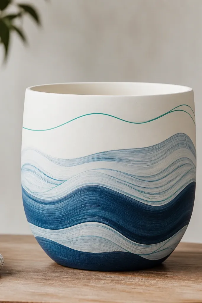
Waves are forgiving because the shape repeats. White background keeps it crisp, and layered blues look like depth. A foam brush gives you the right texture for wave crests.
Base coat white. Dip a foam brush in medium ocean blue and tap to create wave crests. Add thin teal lines with a liner brush on top after the first layer dries. Keep the waves angled slightly upward toward the right or left for a natural flow.
Pro tipUse a paper strip as a "wave guide" to keep the wave rhythm consistent around the curve.
AvoidAvoid straight horizontal lines - they look like a tiled pattern, not water.
11. Terracotta "Sun-Kissed" Dry Brush Highlights
Dry brushing looks expensive because it mimics light hitting texture. It's also the most forgiving method for beginners - small mistakes blend in. Peach highlights warm up terracotta without turning it into a neon pot.
Use a dry brush with minimal paint: mix a peachy color like apricot with a touch of white. Lightly skim the brush over the pot surface in vertical strokes. Add a thin dark brown band around the top for structure.
Pro tipWipe your brush on paper until only a faint color transfers.
AvoidDon't load the brush - heavy dry brushing looks streaky and patchy.
12. Rainbow Steps on a Black Background
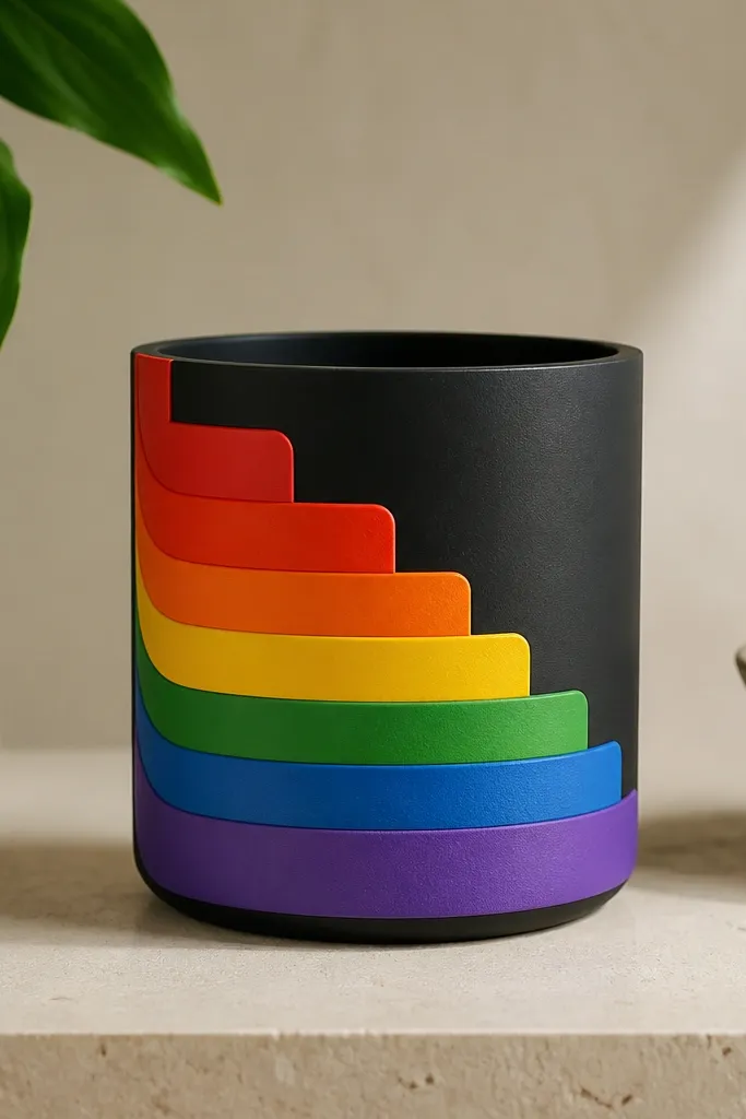
A black base makes rainbow colors look electric. The step shape is geometric, so it looks intentional even if you keep the drawing simple. This one works great for spring parties, outdoor tables, and kids' gardens.
Paint the pot matte black first. Tape horizontal lines to create consistent step layers, then paint each layer in one rainbow color. Remove tape carefully and let paint dry before adding a thin white outline line around the steps.
Pro tipUse a ruler against the tape edge so each step has the same height.
AvoidAvoid using metallic paint for every color - it can look flat and chalky outdoors.
13. Pumpkin Carving Look with Orange and Black Tape
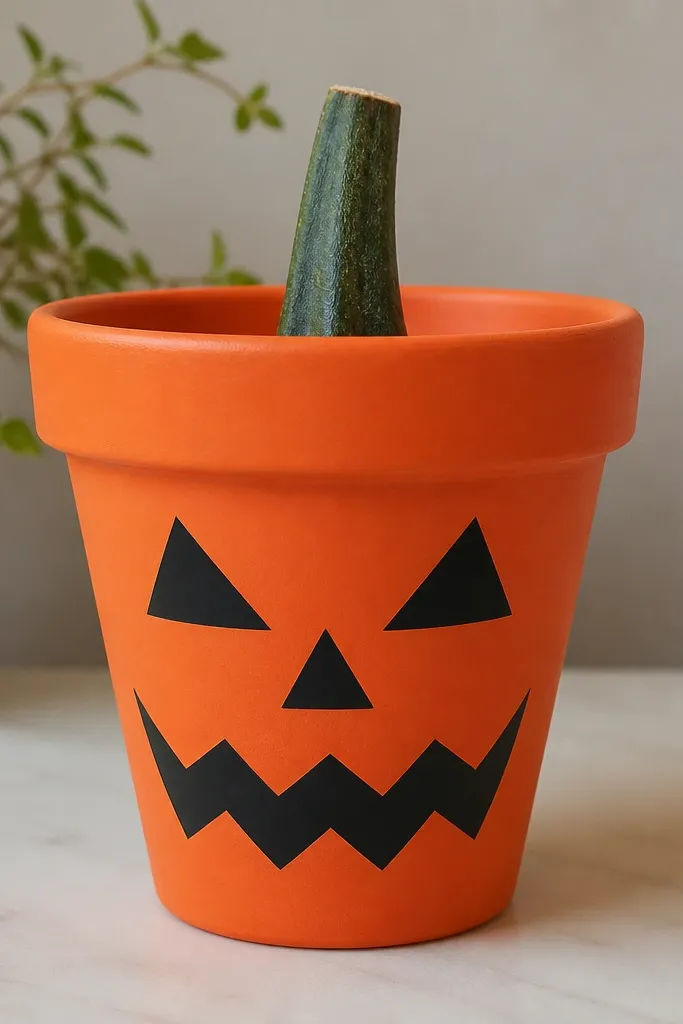
This gives the Halloween vibe without dealing with real carving mess. The black shapes look bold and readable from across the porch. Orange base plus green stem makes it look like a mini pumpkin.
Base coat orange acrylic. Use painter's tape to mask the eye and mouth shapes, then paint black. Add a small green stem with two leaf lines. If you want "cutout" depth, paint a thin darker orange shadow around the black edges.
Pro tipPeel the tape slowly at a 45-degree angle for clean pumpkin edges.
AvoidDon't freehand the eyes - wobbly shapes make it look accidental.
14. Gingham Check in Red and Cream
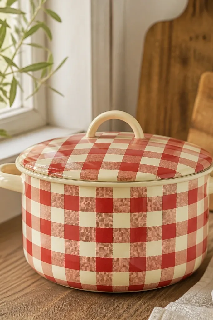
Gingham looks like summer picnic décor. When the grid stays even, the pot looks "done" even before plants fill it in. Red and cream pair well with green leaves and colorful flowers.
Base coat cream. Mark a grid lightly with pencil: choose a square size like 1 inch for a 10-12 inch pot. Paint red squares by tape-masking alternate rows, then fill the remaining cream areas. Seal with a matte outdoor clear coat.
Pro tipUse a small foam roller for flat color blocks so the grid stays smooth.
AvoidAvoid squares that get wider toward the top - keep your grid measurements consistent.
15. Rose Gold Dots and a Single Line Border
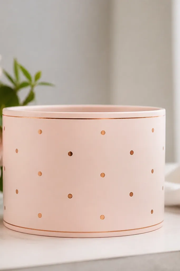
This is the "soft glam" look that still reads outdoors. Blush keeps it light, and rose gold dots add sparkle without needing glitter. The single line border makes it look designed instead of random.
Base coat blush pink matte. Paint a thin line border with a fine brush using rose gold paint mixed with a little glaze medium for flow. Add dots with a dotting tool spaced about 1.5 inches apart.
Pro tipSeal over metallic paint with two thin coats; thick coats can dull the shine.
AvoidAvoid glitter paint - it flakes and catches on fingers during watering.
16. Watercolor Leaves with a Wet-on-Wet Sponge
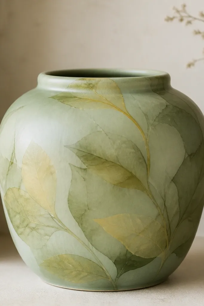
Watercolor leaf shapes look airy and natural. The semi-transparent layers mimic real leaf veining and make the pot blend with garden colors instead of fighting them. It's especially pretty for herb planters and plants with delicate foliage.
Base coat sage green. For leaves, sponge on light olive first, then add light yellow highlights while the paint is still slightly damp. Use a sponge corner to shape leaf tips, and a damp fine brush to pull a few vein lines.
Pro tipKeep layers thin - watercolor effects look best when the base shows through.
AvoidDon't over-darken the leaf edges - it turns into a cartoon silhouette.
17. Winter Snowcap with Blue Drip Edge
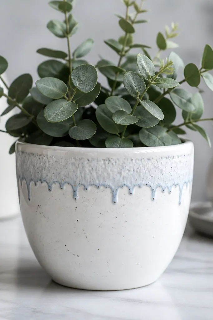
Snowcap designs look good on cold-weather pots because they read instantly. The white top band gives a clean "snow" look, and blue drips suggest iciness. Silver speckles add sparkle without needing glitter.
Paint the pot white. Tape a band across the upper third and paint a slightly cool gray shadow beneath it. For drips, use a liner brush with pale blue and pull short vertical lines downward. Finish with tiny silver speckles using a toothbrush.
Pro tipMake drips shorter than you think - long drips look like paint runs.
AvoidAvoid thick paint for drips; it won't dry smoothly on a curve.
18. Mandala Dot Rings for Eye-Level Pots
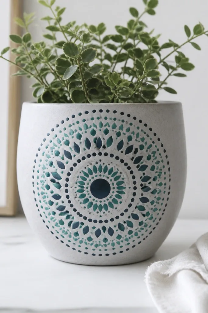
Mandala dot work looks like it took hours, but it's mostly repeating circles. Concentric rings make the pot feel balanced, and teal/navy adds depth without overwhelming the garden. It's best for pots placed where you'll see them up close.
Base coat light gray or off-white. Draw a center circle guideline and add dot rings using a dotting tool. Between rings, add tiny leaf petal shapes with a small round brush. Keep everything around the center band rather than covering the whole pot.
Pro tipUse a stencil circle for the first ring, then freehand the rest for a natural hand-made feel.
AvoidDon't spread the pattern too wide - a scattered mandala looks unfinished.
19. Spring Confetti with Stiff Brush Flicks
Confetti is the fastest way to make a pot look festive and playful. It hides small surface imperfections because the pattern fills gaps. The rim outline makes the color flecks look intentional instead of random splatter.
Base coat white. Use a stiff toothbrush or stiff stencil brush loaded with thick-ish paint and flick in short bursts. Add a thin rim outline in a dark color like charcoal or navy. Use 4-5 colors max so it stays cheerful, not chaotic.
Pro tipDo flicking in a mask - cover the surrounding area and work in one direction.
AvoidAvoid watery paint - it makes long streaks that dry dull.
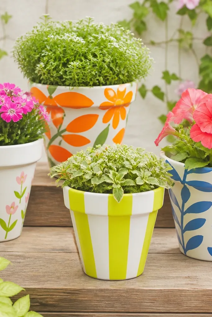
20. Monochrome Stripe Wrap with Black + White
Monochrome stripes look modern and clean, even when your garden is messy. Vertical stripes visually stretch the pot, which makes it feel taller and more "architectural." It's a great choice if you want something that doesn't clash with flower colors.
Prime and paint white first. Tape vertical stripes with painter's tape: alternate widths like 1/4 inch and 1/2 inch. Paint black between tape lines, let dry, peel tape, then add a thin black band around the top edge.
Pro tipPress tape firmly at the seam - curved pots leave gaps if you rush.
AvoidDon't use glossy black - it shows brush marks and looks smeared after rain.
21. Botanical Silhouette Cutout Look
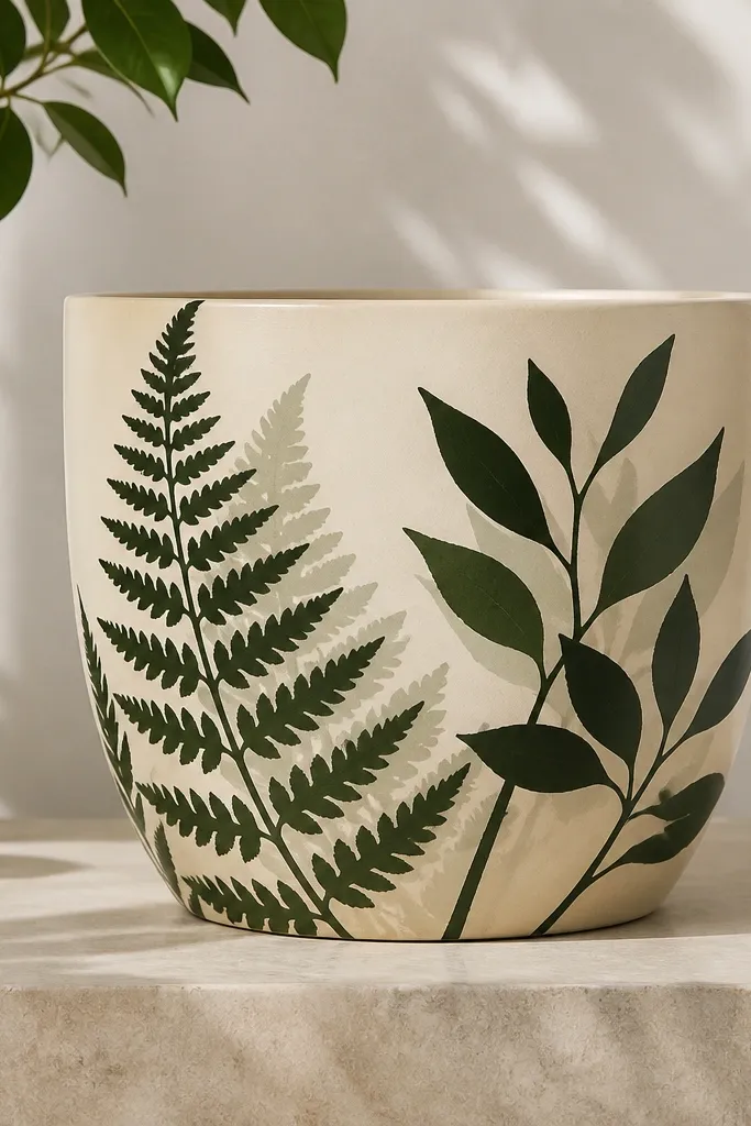
Silhouettes look sharp because they're about shape, not detail. The fern-like forms make it feel seasonal while staying classy. A soft shadow behind each shape adds depth without extra drawing.
Base coat cream. Print or draw a fern silhouette on paper, cut it out, and use it as a stencil. Trace lightly, then paint dark green silhouettes. For shadow, paint a slightly lighter green around the edges with a sponge while the silhouette is still fresh.
Pro tipUse a sponge stencil technique - dab the paint instead of brushing to avoid fuzzy edges.
AvoidAvoid tiny leaf veins; silhouettes look best when the shape is bold.
22. Lime Base with Navy Sailboat Symbols
This is a clean nautical look that doesn't need a whole mural. Lime is unexpected, so it pops against typical garden greens. Navy icons stay crisp, and the tiny wave line makes each boat feel like it's floating.
Paint the pot lime green matte. Add sailboats using a stencil or print-and-trace icons: triangle sails, a small mast line, and a curved hull. Paint a thin white wave line under each boat. Seal with outdoor clear coat so the navy stays dark.
Pro tipKeep the icons the same size and spacing - it makes the pot look professionally planned.
AvoidDon't crowd the icons; leave breathing space so they read clearly.
23. Fall Leaves with Burnt Umber Veins
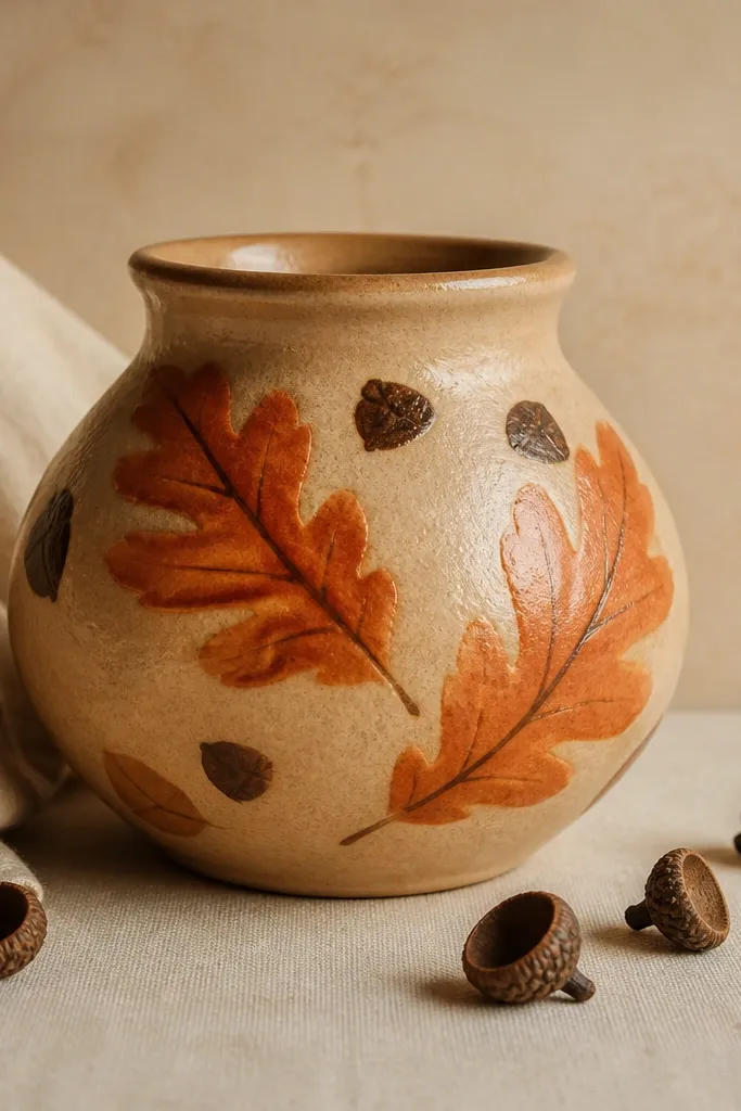
Fall leaf motifs look warm and grounded, especially when you use earthy browns for veins. Orange leaves bring seasonal color, and burnt umber veins make them look real. A beige base keeps it soft and prevents the design from getting too loud.
Base coat warm beige. Paint leaf shapes in burnt orange, then add veins in burnt umber with a fine liner brush. Add a few acorn caps: small dark brown ovals with a textured dot pattern. Finish with a clear matte sealer to keep colors muted like fall.
Pro tipUse a leaf shape template cut from cardboard for consistent outlines.
AvoidAvoid bright neon orange; it looks out of place in fall gardens.
24. Easter Egg Blocks with Stencil Edges
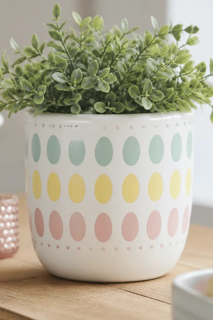
Easter egg blocks look cheerful and tidy, which matters because holiday pots sit on porches where people notice instantly. Pastels keep it light, and block layout makes the pattern feel organized. A dotted border adds a finished edge.
Base coat white. Use an egg stencil or trace egg shapes lightly with pencil, then paint each block in one pastel color. Leave small gaps between eggs for definition, and add a dotted border around the midline or near the bottom. Seal with outdoor clear coat once fully dry.
Pro tipPaint eggs from the same direction each time so the brush texture lines up.
AvoidDon't blend pastel colors together; clean separation keeps it looking crisp.