1. Solid Color Base Coat
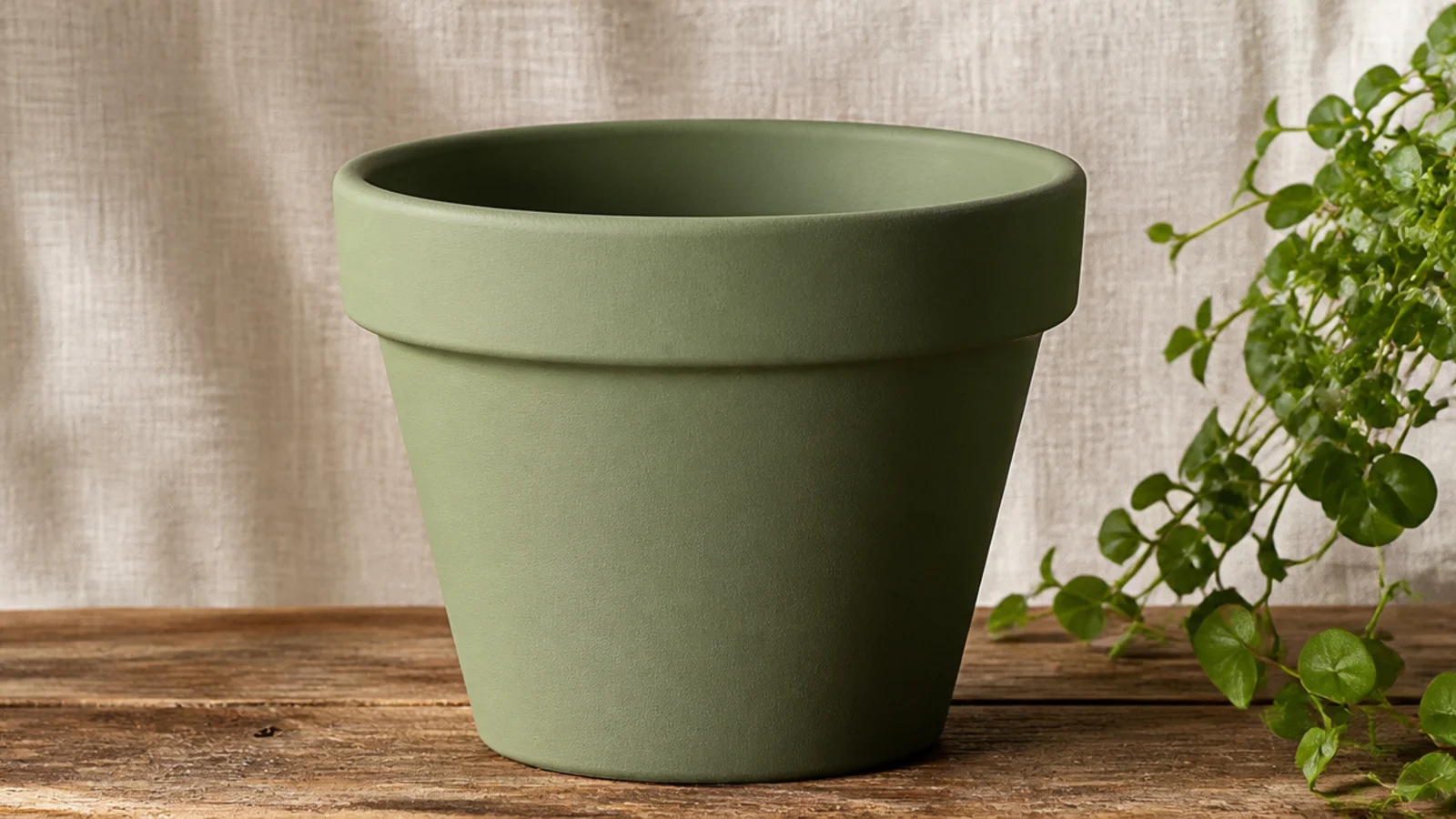
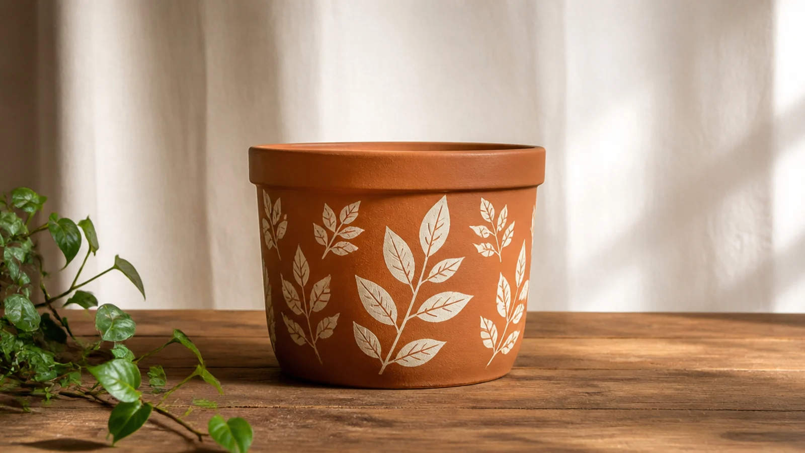
Wash and dry the pot, then prime it and let the primer cure. Load a flat 1-inch brush and paint in long vertical strokes from rim to base, working around the pot in sections. Let the first coat dry fully, then add a second thin coat to even out the color — two thin coats always beat one thick one. Once dry, brush or spray on a clear matte sealer to lock it in.
This is the most beginner-friendly design on the list and the one I’d start anyone on. You paint the whole pot one calm, solid color, so there’s no pattern to line up and nothing to get wrong. One grounded shade — sage, cream, or dusty blue — instantly reads as intentional and works with any plant. Nailing a smooth solid coat also teaches the prep habits every other design depends on.
Skip thisDon’t try to cover the clay in one heavy coat; thick paint dries streaky and shows every brush drag.
Editor's noteSet the pot upside down on a jar or can while you paint the sides, then flip it to do the rim — you’ll avoid touching wet paint.
2. Dip-Dye Bottom
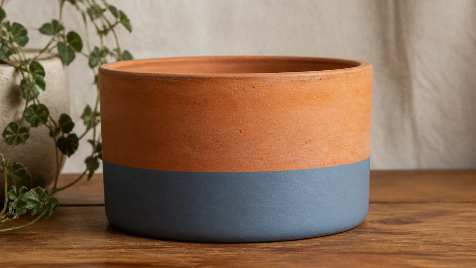
Painting only the bottom third one solid color, leaving the raw clay on top, looks modern and boutique with almost no effort. The contrast between natural terracotta and one clean color does all the work, and there’s no pattern to mess up. Pick one soft color so it plays nicely with whatever you plant.
Prime the whole pot and let it dry. Wrap a strip of painter’s tape level around the pot about a third of the way up, using the pot’s own height as your guide. Paint everything below the tape in two thin coats of acrylic, letting the first dry before the second. Peel the tape while the second coat is still slightly wet for a crisp edge, then seal once fully dry.
Spin the pot on a lazy Susan or an upturned jar lid as you wrap the tape so the line stays perfectly level.
Don’t eyeball the tape line by hand — a crooked line is the one thing that makes a dip-dye look sloppy.
3. Two-Tone Horizontal Split
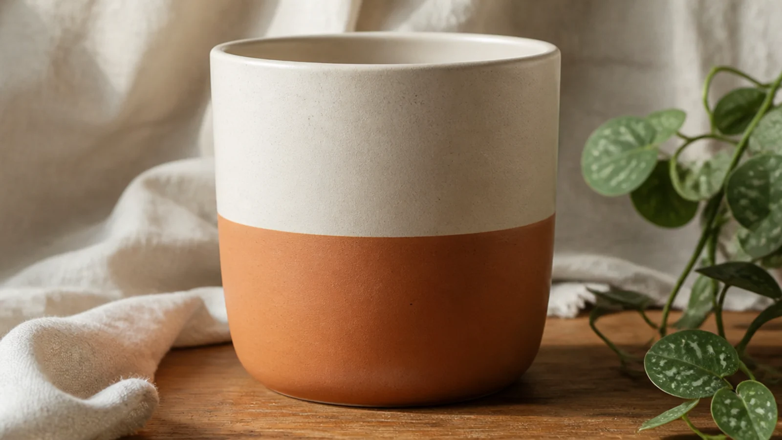
A color block is just two colors meeting at one clean line, and it looks like something from a plant shop. Beginners love it because the tape does all the precision. Put a lighter color on top and a deeper one on the bottom so the pot feels grounded, or flip it for an airier look.
Prime, then base-coat the whole pot in your lighter color and let it dry. Tape a level line around the middle, press the edge down hard, and paint the bottom half in your second color with two thin coats. Peel the tape before it fully cures. Touch up any tiny bleed spots with a small brush, then seal the whole pot.
Run a fingernail firmly along the tape edge before painting to burnish it so paint can’t creep underneath.
Don’t skip base-coating the whole pot first; if the top color doesn’t cover the seam line, the split looks muddy.
4. Painted Rim Only
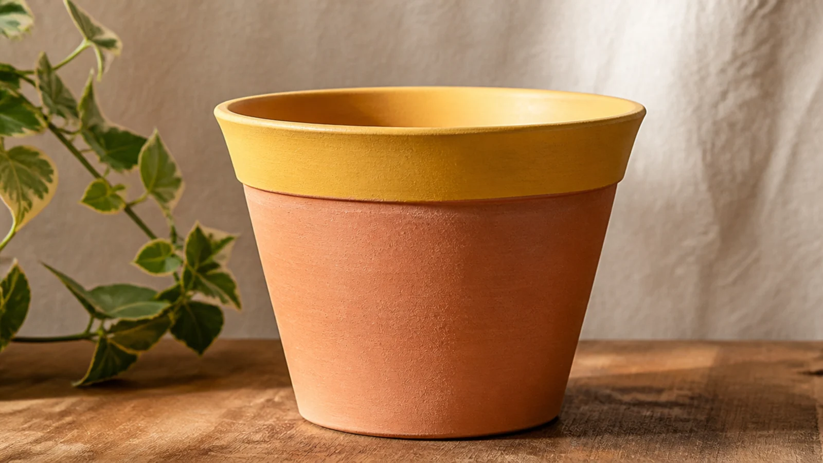
Painting just the flared rim in one color is a five-minute project with an outsized payoff. The rim frames the plant, and one bright shade — mustard, coral, teal — adds personality without covering the clay you like. It’s the perfect choice when you want a pop but not a whole repaint.
Prime the rim area and let it dry. Tape along the bottom edge of the rim where it meets the body, then paint the rim in two thin coats of your color, carrying it slightly over onto the inside lip. Peel the tape before it fully sets. Once dry, seal the painted rim with a clear topcoat.
Choose a rim color that repeats something already in the room — a cushion, a mug, a bit of art — so the pot looks styled in, not random.
Don’t use runny, watered-down paint here; drips down the bare clay body are glaringly obvious.
5. Painter's Tape Stripes
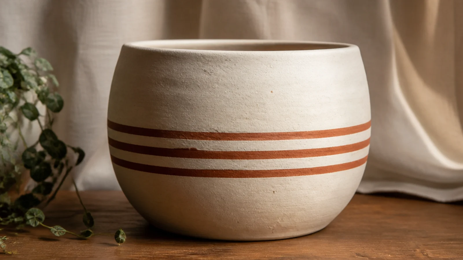
Even horizontal stripes look crisp and calm, and tape makes them foolproof. Two or three stripes is plenty — any more starts to look busy. Thin stripes read more elegant than thick ones, so keep them slim and evenly spaced for a styled, repeatable finish.
Base-coat the pot in a light color and let it dry. Wrap strips of tape where you want the bare gaps between stripes, spacing them by eye or with a ruler. Paint over the whole taped area in your stripe color, then peel all the tape while it’s still slightly wet. The covered areas stay your base color, leaving clean stripes. Seal when dry.
Use thin washi or narrow painter’s tape for skinny stripes — wide tape leaves chunky bands that look heavier.
Don’t lay stripes over a rough, grainy base; sand it lightly with 400-grit first so the tape seals flat.
6. Sponged Texture Wash
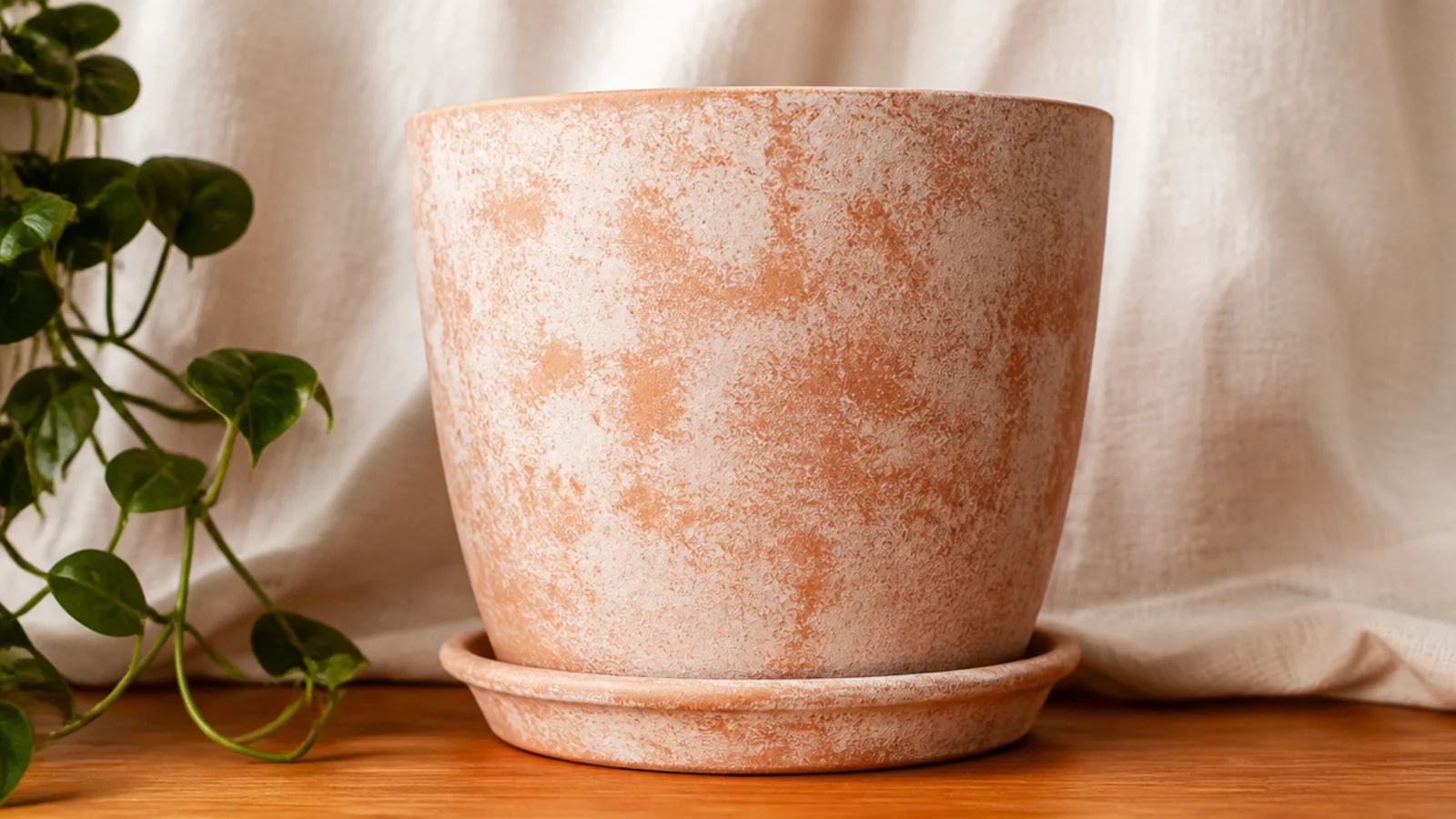
Dabbing paint on with a sponge instead of brushing it gives a soft, mottled texture that looks like glazed pottery and hides every imperfection. It’s genuinely hard to get wrong because there’s no line or edge to keep straight. Tonal colors close to the clay — cream, oatmeal, pale sage — look the most natural.
Prime and let dry. Pour a little acrylic onto a plate, press a damp natural sponge into it, and dab off the excess on a paper towel. Pounce the sponge lightly all over the pot, turning it as you go so the texture stays even and some clay peeks through. Build it up in layers rather than one heavy pass, let it dry, and seal with a matte clear.
Keep the sponge just damp, not wet — a slightly moist sponge lays down a softer, more even texture than a dry one.
Don’t press too hard or reload too often; heavy, saturated dabs flatten into solid blobs and lose the texture.
7. Ombré Fade
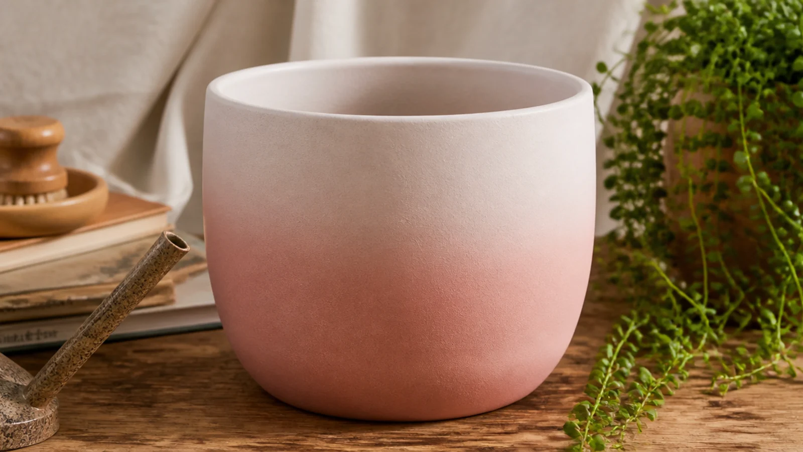
Base-coat the pot in your lightest color. While it’s still slightly tacky, dab your deeper color along the bottom with a damp sponge, then work upward with lighter pressure so it thins out. Pounce the transition zone with a clean part of the sponge to blur the seam. Build the fade gradually, let it dry, and seal.
An ombré fade looks advanced, but a makeup sponge does the blending for you. You dab the deeper color at the bottom and the lighter one at the top, then pounce where they meet so they melt together. Soft, tonal pairs — blush to white, blue to cream — blend the most forgivingly.
Skip thisDon’t pick two high-contrast colors for a first ombré; a hard jump between shades is very hard to blend cleanly.
Editor's noteMist the sponge lightly from a spray bottle between passes — a slightly damp sponge blends far smoother than a dry one.
8. Eraser-Dot Border
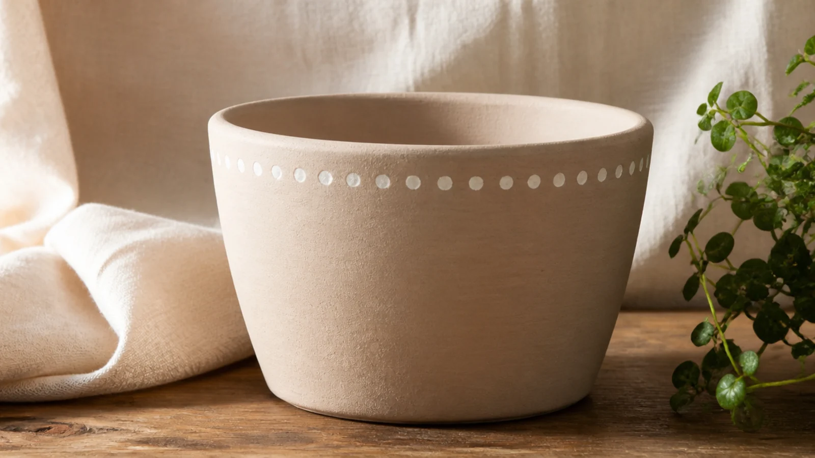
A tidy row of dots around the rim is one of the most beginner-proof upgrades there is. Because you stamp them with a pencil eraser, they come out the same size every time. One row near the top keeps it clean; add a second near the base and it feels finished.
Base-coat the pot and let it dry. Dip the flat end of a clean pencil eraser into your paint, tap off the excess on a paper towel, then press straight down onto the pot. Re-dip for every dot so they stay even. Space them by eye or make light pencil ticks first, then seal once the dots are dry.
Practice five dots on scrap paper first to learn how much paint gives a clean, round dot without a smear.
Don’t drag the eraser sideways as you lift; press straight down and pull straight up or your dots turn into commas.
9. Speckle Stoneware Finish
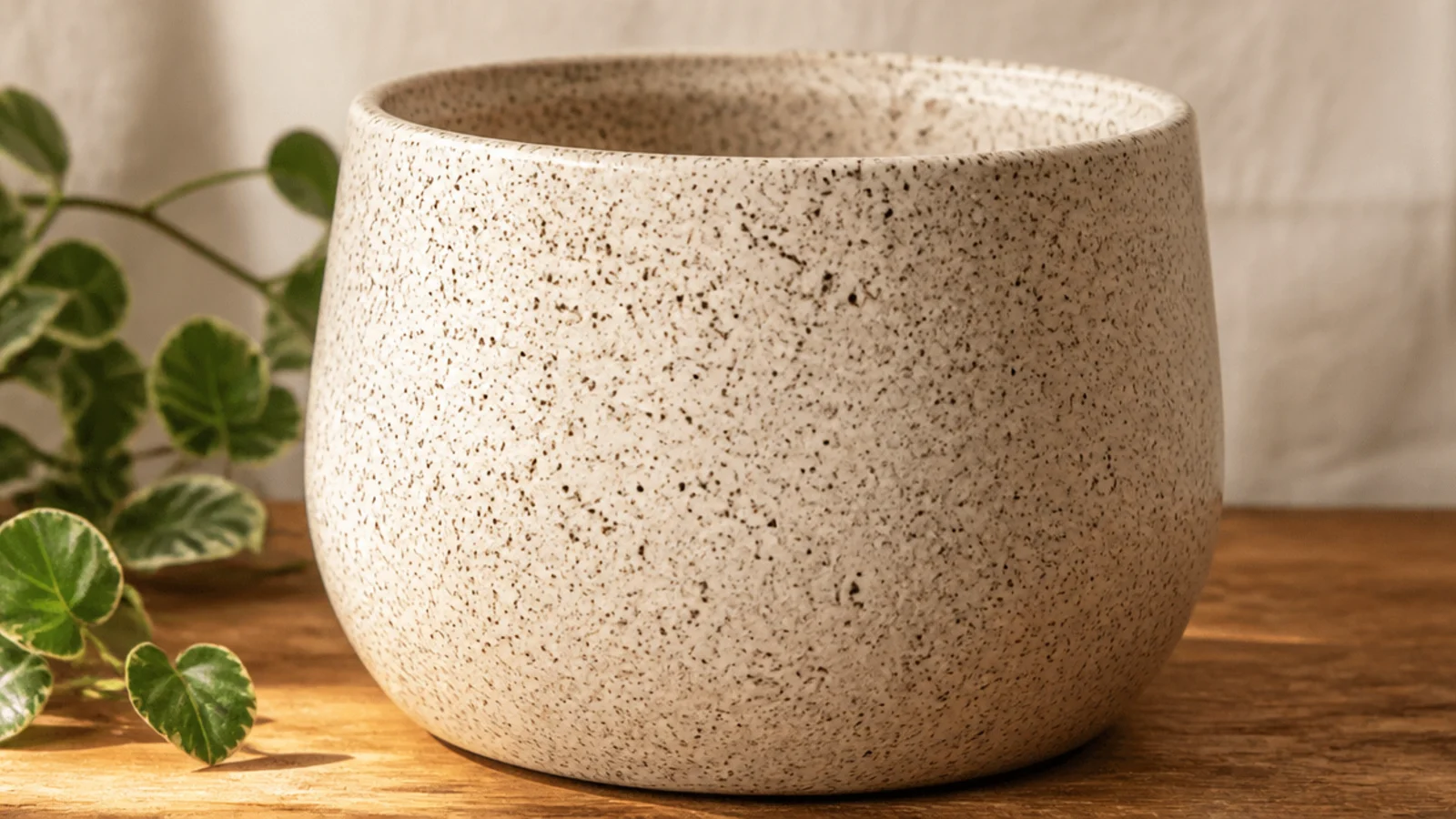
Fine speckles turn a plain pot into something that looks like handmade stoneware. You flick thinned paint off a stiff brush to scatter tiny dots across the surface. It’s a little messy but genuinely hard to get wrong, and it hides any unevenness in your base coat.
Base-coat the pot cream or white and let it dry. Thin a little dark brown or charcoal paint with water to a milky consistency. Dip a stiff brush — an old toothbrush is ideal — then run your thumb across the bristles to flick speckles onto the pot. Rotate the pot for even coverage, let it dry, and seal.
Do a few practice flicks on paper to dial in the paint thickness — too thick makes blobs, too thin makes runs.
Don’t over-thin the paint or hold the brush too close; big wet splatters read as accidents, not speckles.
10. Diagonal Color Block
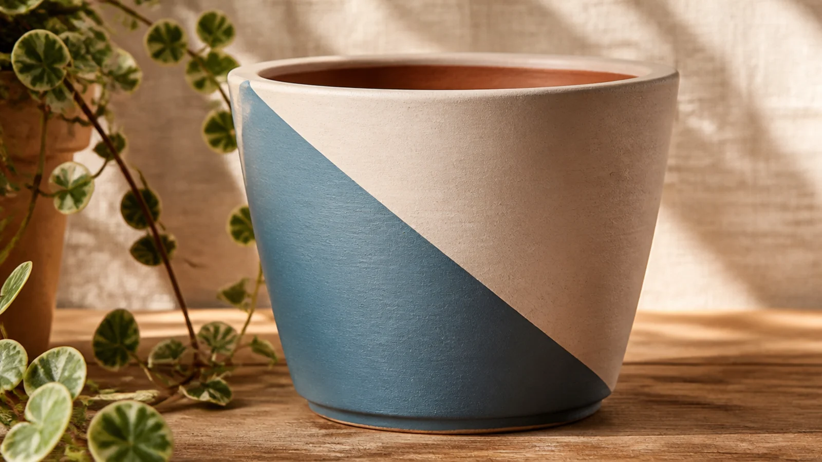
Angling the color block on a diagonal instead of straight across makes a simple two-color pot look designed and current. Tape still does the sharp edge, so it’s no harder than a horizontal split — just tilted. It’s a great next step once you’ve done a straight color block.
Base-coat the whole pot in your lighter color and let it dry. Run a strip of painter’s tape diagonally across the front, pressing the edge down hard, and paint the lower section in your second color with two thin coats. Peel the tape while slightly wet, touch up any bleed, and seal when fully dry.
Because a pot is curved, keep the diagonal to the front face rather than trying to wrap it — a front-only angle looks cleaner.
Don’t choose too steep an angle; a gentle diagonal reads as intentional, while a near-vertical slash looks like a mistake.
11. Scallop Border
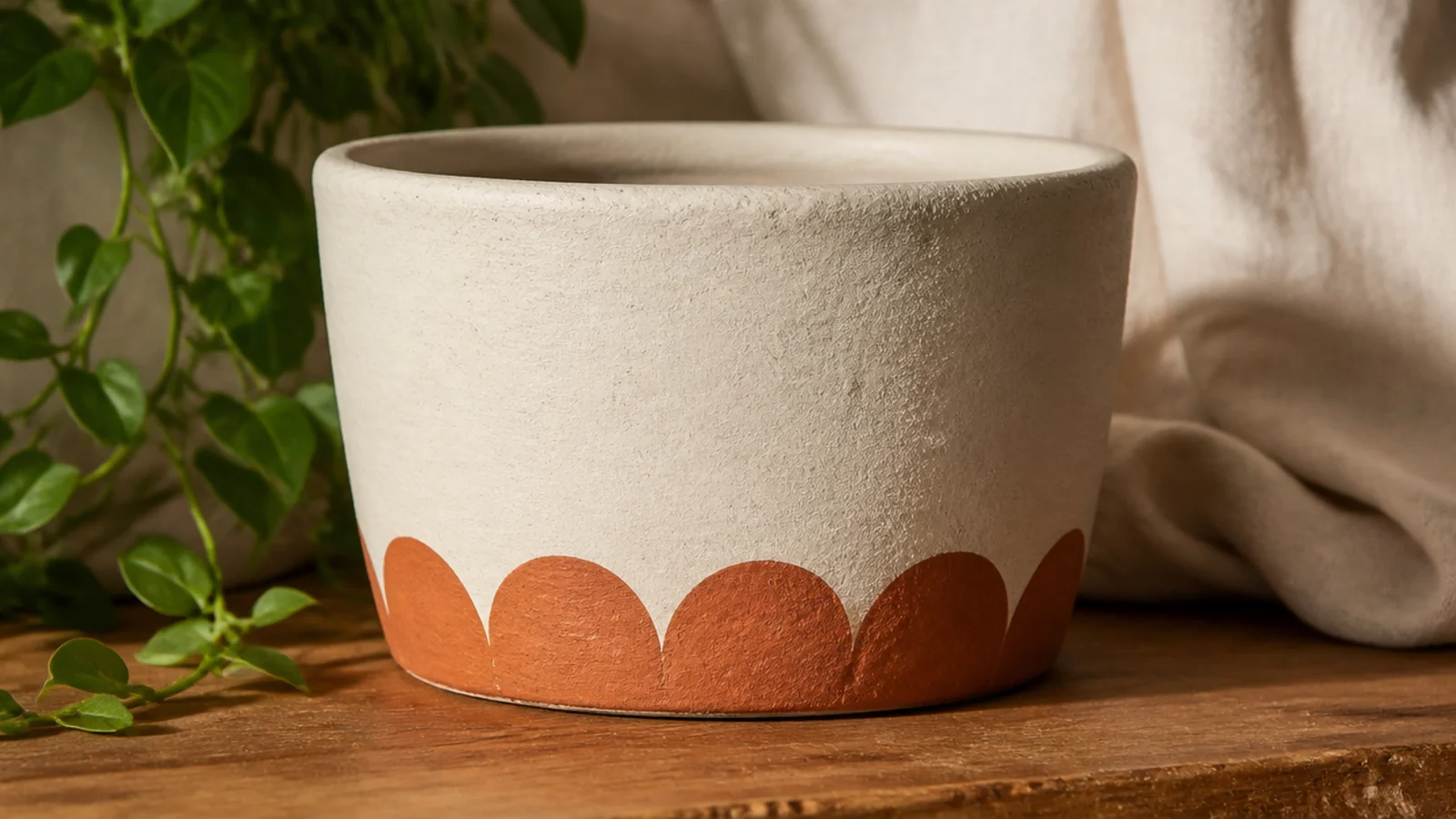
Base-coat and dry the pot. Find a round lid or bottle cap the size you want your scallops. Dip its rim in paint and stamp overlapping half circles along the bottom, or trace them lightly and fill with a small brush for solid scallops. Keep the spacing even, let it dry, and seal.
A scalloped border along the base looks like a detail from a ceramics studio, and it’s really just a row of half circles. Stamp them with a round object so they stay uniform. One color along the bottom is enough — it frames the pot without covering it.
Skip thisDon’t freehand the half circles if you want them even; hand-drawn scallops drift in size and break the rhythm.
Editor's noteDivide the pot into equal sections with light pencil marks first so the last scallop meets the first one cleanly.
12. All-Over Polka Dots
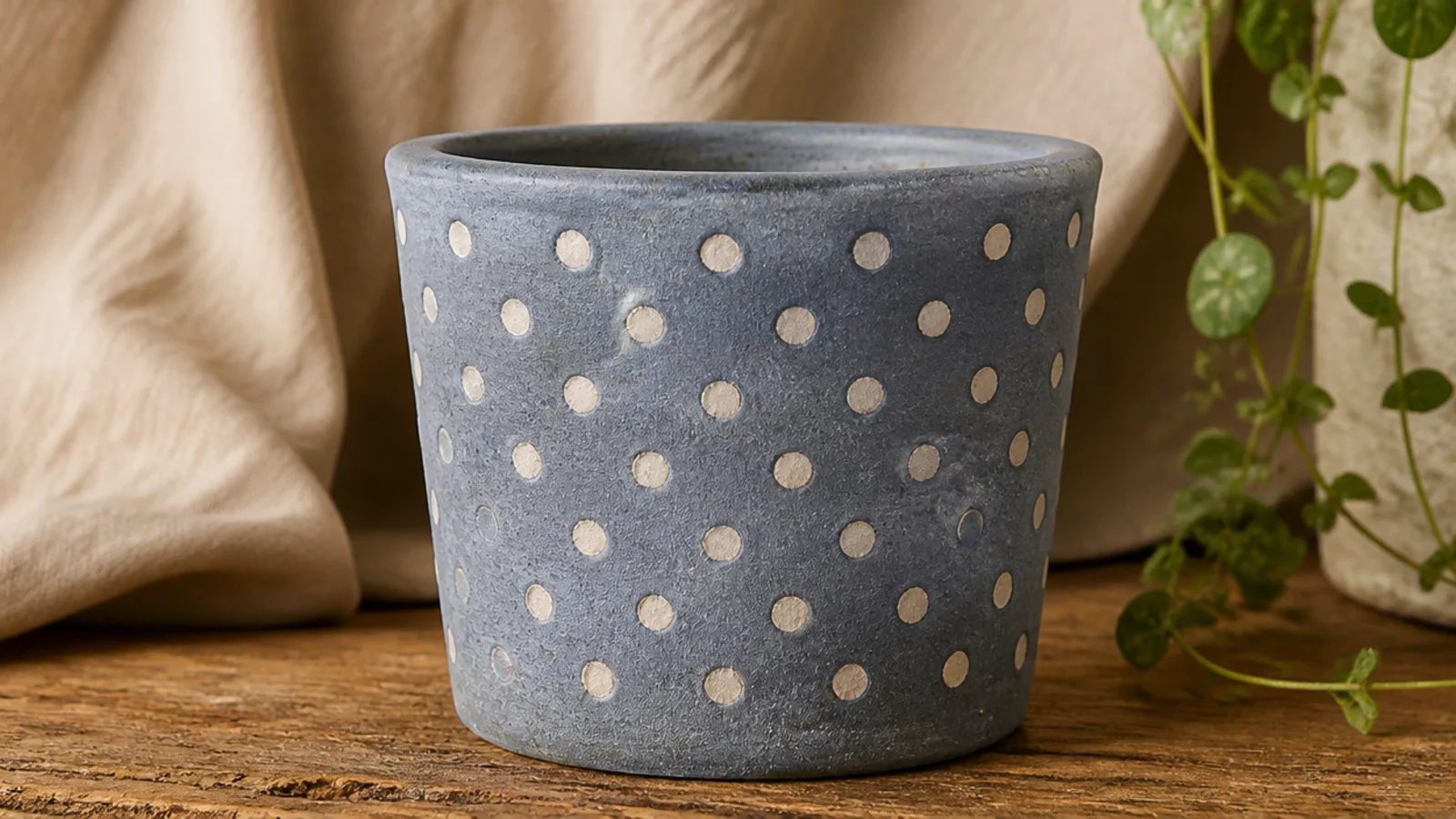
Dots scattered in an even pattern across the whole pot look cheerful and confident, and the eraser trick keeps every one the same size. A regular grid feels tidy; a looser scatter feels playful — both work. Two colors, base plus dots, is all you need.
Base-coat the pot and let it dry. Make faint pencil ticks in a staggered grid so your spacing stays even, then stamp each dot with a pencil eraser or cotton swab, re-dipping every time. Work in rows around the pot to keep the rhythm, let it dry, erase any stray marks, and seal.
Stagger every other row like brickwork rather than lining dots up in a strict square — it reads more balanced on a curved pot.
Don’t rush the spacing; dots crammed in one area and sparse in another are what make an all-over pattern look uneven.
13. Simple Daisy Dots
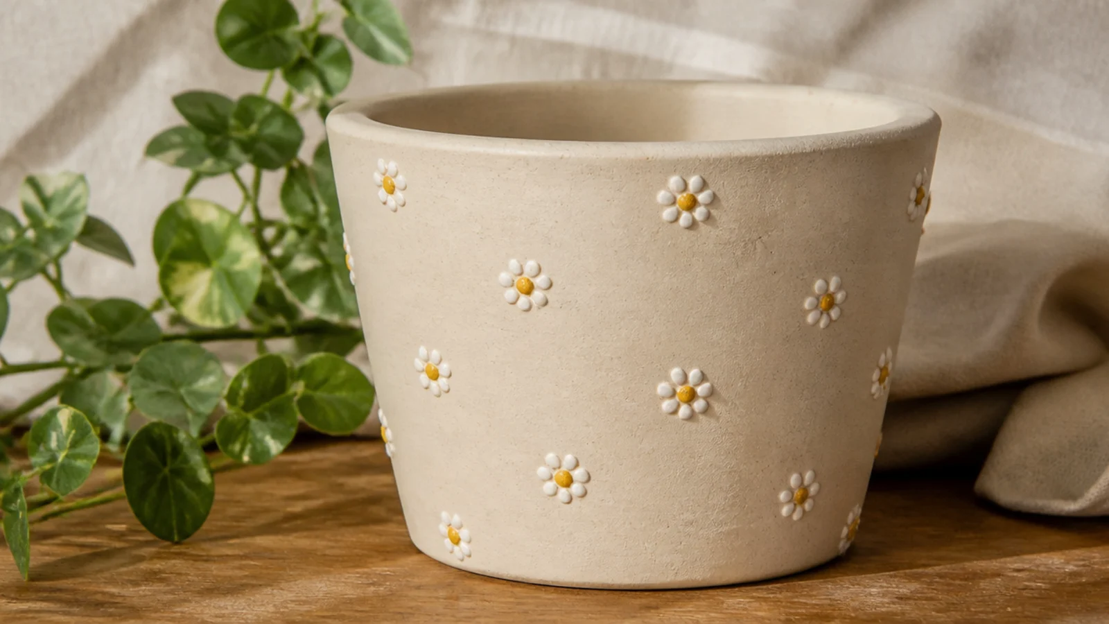
Base-coat and dry the pot. With a small round brush or a cotton swab, place five petal dots in a rough circle, then add a contrasting center dot. Keep the petals close so they read as a flower. Add tiny green leaf dashes between the blooms with the brush tip, let it dry, and seal.
Little dot-flowers look hand-painted and sweet, but each one is just five dots in a circle with a center dot. Scatter a few around the pot or line them in a row. This is the first real motif most beginners can nail, because every part of it is a dot.
Skip thisDon’t overcrowd the pot; a few well-spaced daisies look intentional, while a dense cluster looks messy.
Editor's noteAdd the center dot last and in a bold color; it pulls the five petals together into a clear flower shape.
14. Lavender Sprigs
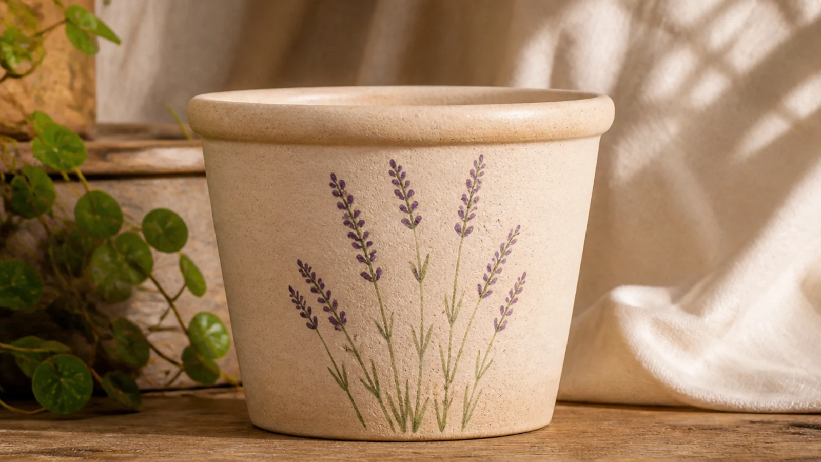
A couple of simple lavender sprigs make a pot look delicately hand-painted, and they’re built from thin lines plus tiny dots — no realistic flower skills needed. The tall, narrow shape suits a pot beautifully. Keep it to two or three stems on the front for a calm, botanical look.
Base-coat and dry the pot. With a small round brush, paint two or three slightly curved green stems on the front, thin and tapering. Along the top of each stem, dab small purple dots in a staggered double column to suggest buds, working from the tip down. Add a few short leaf strokes near the base, let it dry, and seal.
Load the brush lightly and pull each stem in one smooth upward stroke so it tapers naturally instead of looking like a straight stick.
Don’t make the buds a solid blob; separate little dots are what make it read as lavender rather than a smudge.
15. Geometric Triangle Band
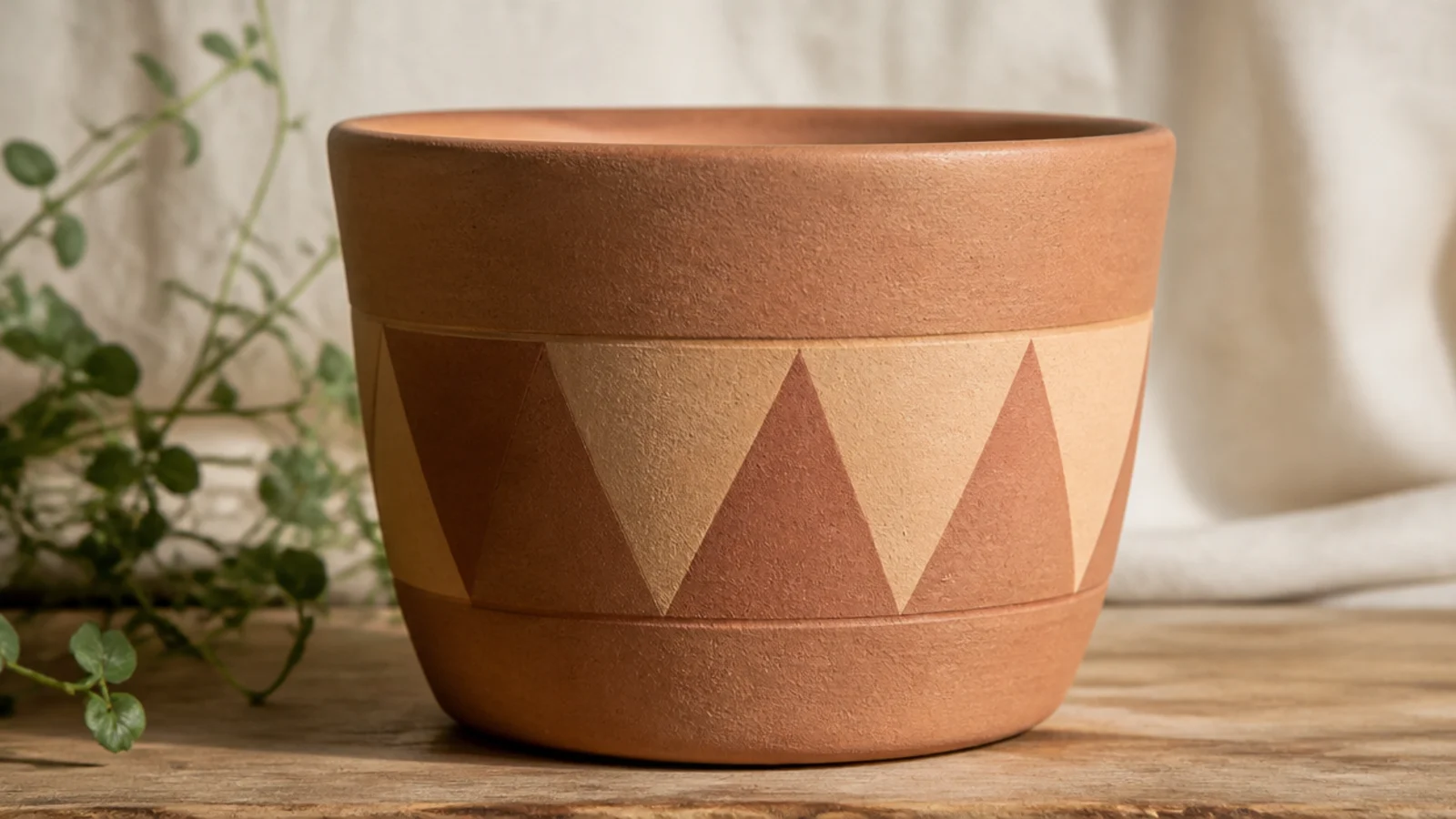
A row of crisp triangles looks graphic and intentional, and tape gives you the sharp points. Alternating a painted triangle with a bare-clay one keeps it from feeling heavy. Two earthy colors plus the natural terracotta is an easy, on-trend palette.
Base-coat if you want a colored background, or leave the primed clay bare. Lay strips of painter’s tape in a zigzag to mask off triangles, pressing every edge down firmly. Paint the exposed triangles, then peel the tape while slightly wet. Fill alternating triangles with a second color for a two-tone band if you like, let it dry, and seal.
Burnish every taped edge with a fingernail before painting — sharp triangle points only happen when the tape is fully sealed down.
Don’t reuse tape that has lost its stick; loose tape lets paint bleed under and rounds off your points.
16. Checkerboard Band
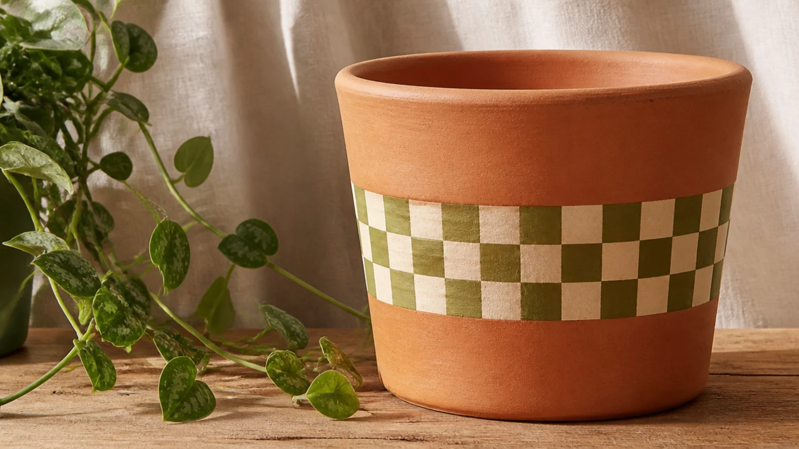
A checkerboard band looks playful and current, and the grid structure is forgiving — it hides small wobbles. Keep it to one band around the middle rather than the whole pot so it stays clean. Olive and cream or black and white are easy, high-contrast picks.
Base-coat the pot in your lighter color and let it dry. Lightly pencil a grid for one horizontal band, then paint alternating squares in your second color with a small flat brush, following the grid lines. Two thin coats keep the squares solid. Erase any visible pencil, let it dry, and seal.
Use a small flat brush, not a round one — its square tip fills each check with fewer, cleaner strokes.
Don’t checker the whole pot as a beginner; a single band is faster, looks intentional, and is far easier to keep even.
17. Muted Rainbow Arch
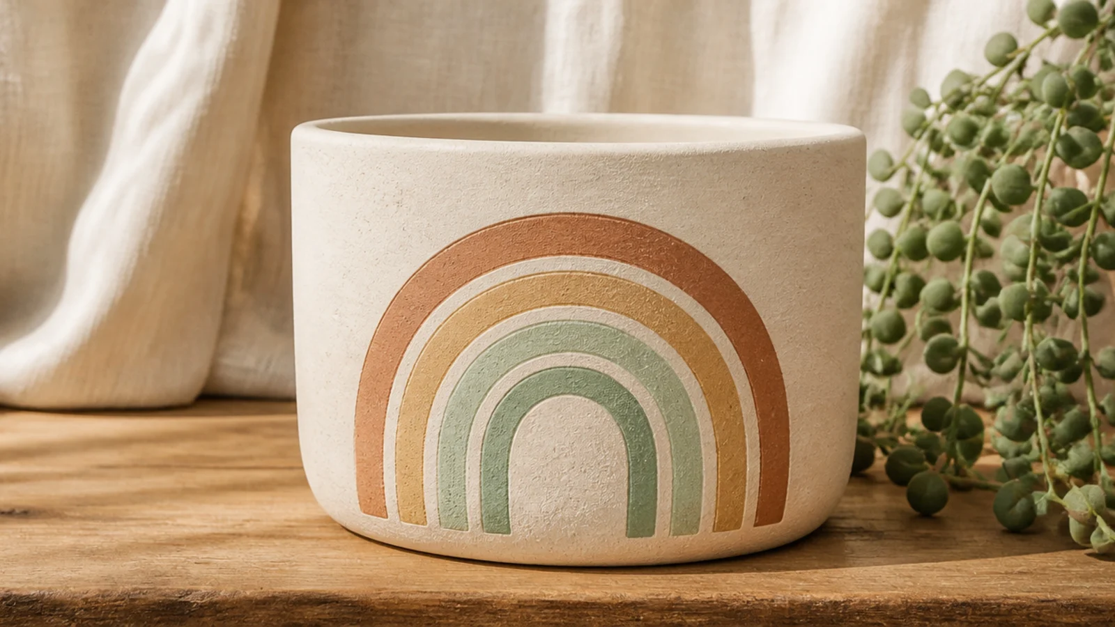
Base-coat the pot and let it dry. Lightly pencil three or four nested half-circle arches on the front. Fill each band with a small brush in muted colors — terracotta, mustard, sage, dusty blue — keeping the bands even in width. Let it dry, erase any stray pencil, and seal.
A single rainbow arch on the front is cheerful and modern, especially in muted earth tones instead of bright primaries. You draw nested arches and fill them in. Keeping it to one side, not wrapping the pot, makes it read as a designed graphic rather than a kids' craft.
Skip thisDon’t use bright primary rainbow colors if you want it to look grown-up; muted tones read far more expensive.
Editor's noteTrace around graduated round objects — a cup, a jar lid, a bottle cap — to get clean, even arch lines without freehanding.
18. Little Cactus Motif
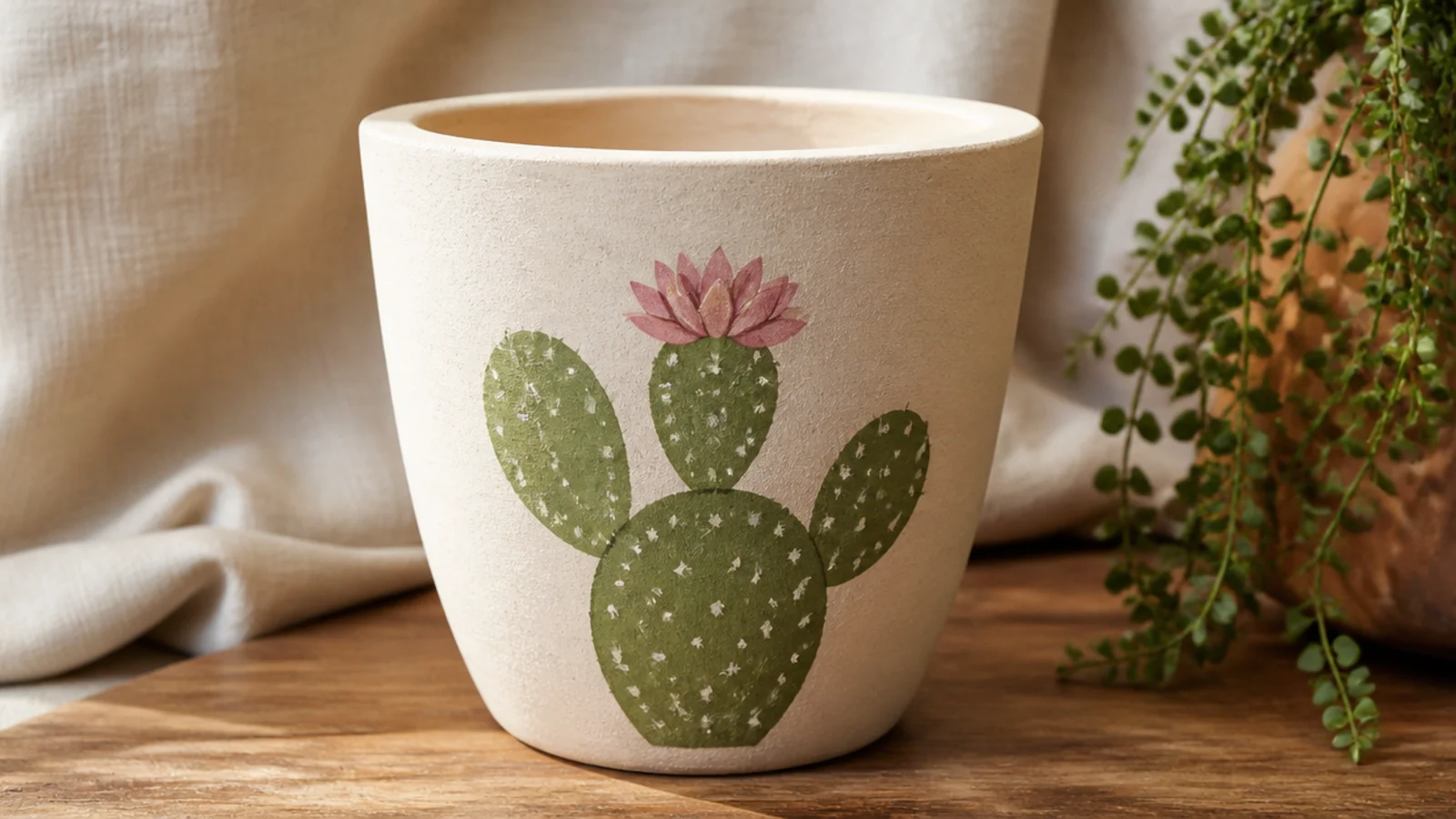
A single simple cactus is a friendly first picture-motif because it’s built from basic rounded shapes, not fine detail. It suits a plant pot perfectly and looks charming on a windowsill. One cactus on the front, centered, is all you need.
Base-coat and dry the pot. Pencil a simple rounded cactus shape — a tall oval with one or two paddle arms — on the front, then fill it with two thin coats of green using a small round brush. Once dry, dab tiny white spine dots in short rows and add a small pink or coral flower on top. Erase stray pencil, let it dry, and seal.
Keep the cactus shape chunky and rounded rather than spiky; simple silhouettes read cleaner than fussy detail at pot scale.
Don’t outline the cactus in a hard dark line; a soft filled shape with light spine dots looks far more polished.
19. Smiley Face Pot

A simple face turns a pot into something with personality, and the minimalist version — two dot eyes and a single curved smile — is genuinely easy. It’s playful without tipping into cartoonish, especially on a warm solid base. Great for a kid’s room or a cheerful kitchen shelf.
Base-coat the pot in a warm solid color and let it dry. On the front, stamp two small eye dots with a pencil eraser, spacing them evenly. With a small round brush, paint one smooth curved smile below in charcoal or a soft contrasting color, keeping it simple. Add small blush cheeks with a dry brush if you like, let it dry, and seal.
Sketch the smile in pencil first and keep it a shallow, even curve — an over-wide grin reads goofy rather than charming.
Don’t overwork the features; two dots and one clean line look modern, while eyebrows and detail tip it into cartoon territory.
20. Bumblebee Motif
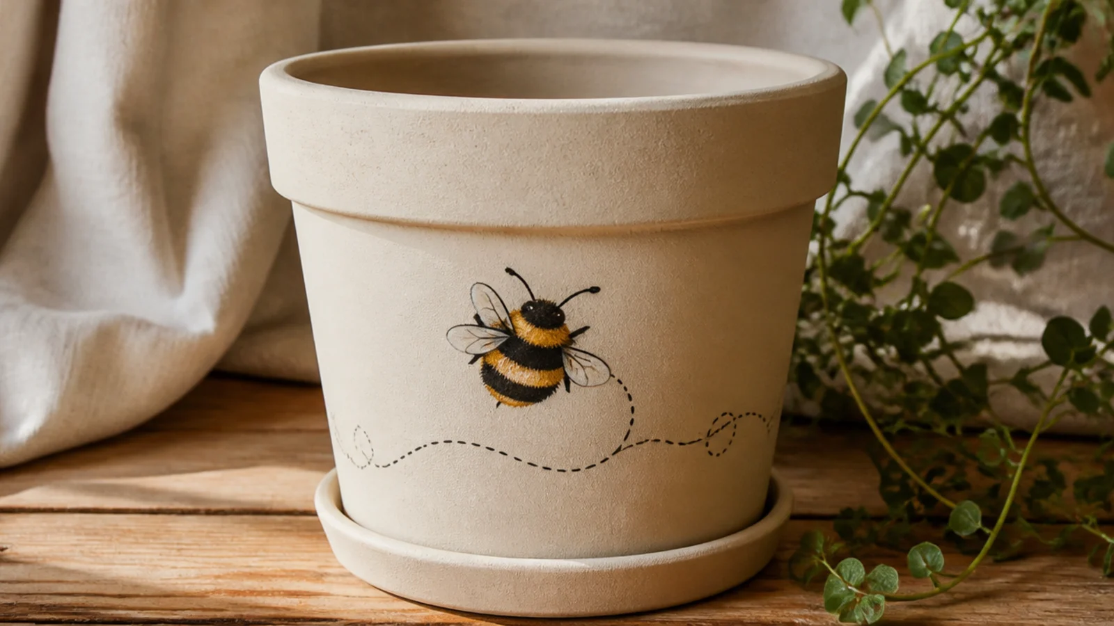
Base-coat and dry the pot. On the front, paint a small oval body in yellow, then add two or three charcoal stripes across it and a charcoal head. Add two small pale wings with a light touch, and dab a tiny white highlight. Finish with a curved dashed line trailing from the bee to suggest flight, erase any pencil, let it dry, and seal.
A tiny bumblebee is the sweetest simple animal motif for a pot, and it’s just a striped oval with little wings and a dotted flight line. It’s the most detailed idea here, so save it for once your hand is steady. One bee on the front, with a curving dashed trail, looks finished.
Skip thisDon’t make the bee too big or too detailed; a small, simple striped oval reads as a charming bee, while an oversized one looks clumsy.
Editor's notePaint the yellow body first and let it dry completely before adding the dark stripes, so the charcoal doesn’t drag into wet yellow and turn muddy.