1. Solid One-Color Pot
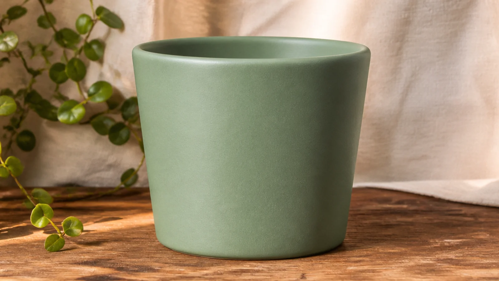
The easiest small pot design is also one of the most boutique — a single, well-chosen color covering the whole pot. On a little pot, one clean color reads modern and intentional with zero pattern to get wrong. Pick a soft, grounded shade like sage, dusty blue, or warm cream so it works with any plant and looks like a set when you make several.
Prime the whole pot and let it dry fully. Load a size 4-6 flat brush with acrylic and paint in one direction, working top to bottom in thin overlapping strokes. Let the first coat dry, then add a second thin coat for solid, streak-free coverage — two thin coats always beat one thick one. Paint an inch down the inside rim too, then seal with a matte or satin clear once dry.
Set the pot upside down on a jar or bottle so you can paint the sides and rim in one pass without touching wet paint.
Don’t glob on one thick coat to save time — it dries streaky and shows every brush drag on such a small surface.
2. Dip-Dye Bottom Third
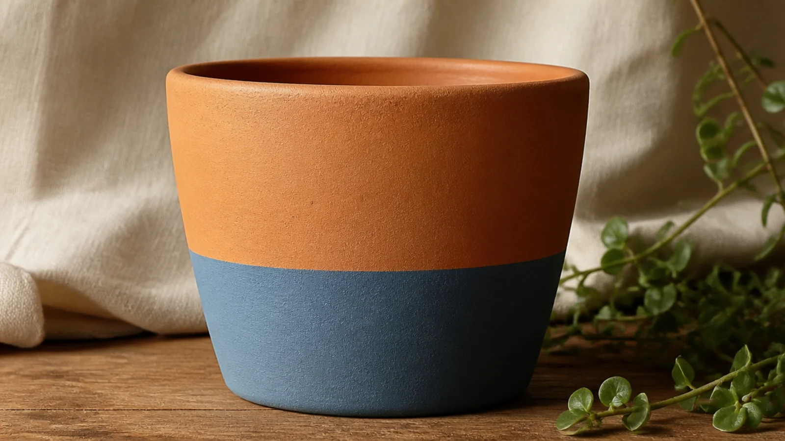
Painting only the bottom third one color, leaving natural clay on top, is the classic dip-dye and it looks straight off a plant-shop shelf. The contrast between raw terracotta and one clean color does all the work, and there’s no pattern to line up. On a small pot it’s especially fast because the painted area is so little.
Prime the whole pot and dry. Wrap a strip of 1/4-inch painter’s tape level around the pot about a third of the way up, using the pot’s height as your guide. Paint below the tape with two thin coats of acrylic, letting the first dry before the second. Peel the tape while the second coat is still slightly wet for a crisp edge, then seal once fully dry.
Set the small pot on a jar lid you can spin so the tape line stays perfectly level as you wrap it.
Don’t eyeball the tape line freehand — on a tiny pot a crooked line is impossible to hide.
3. Half-and-Half Color Block
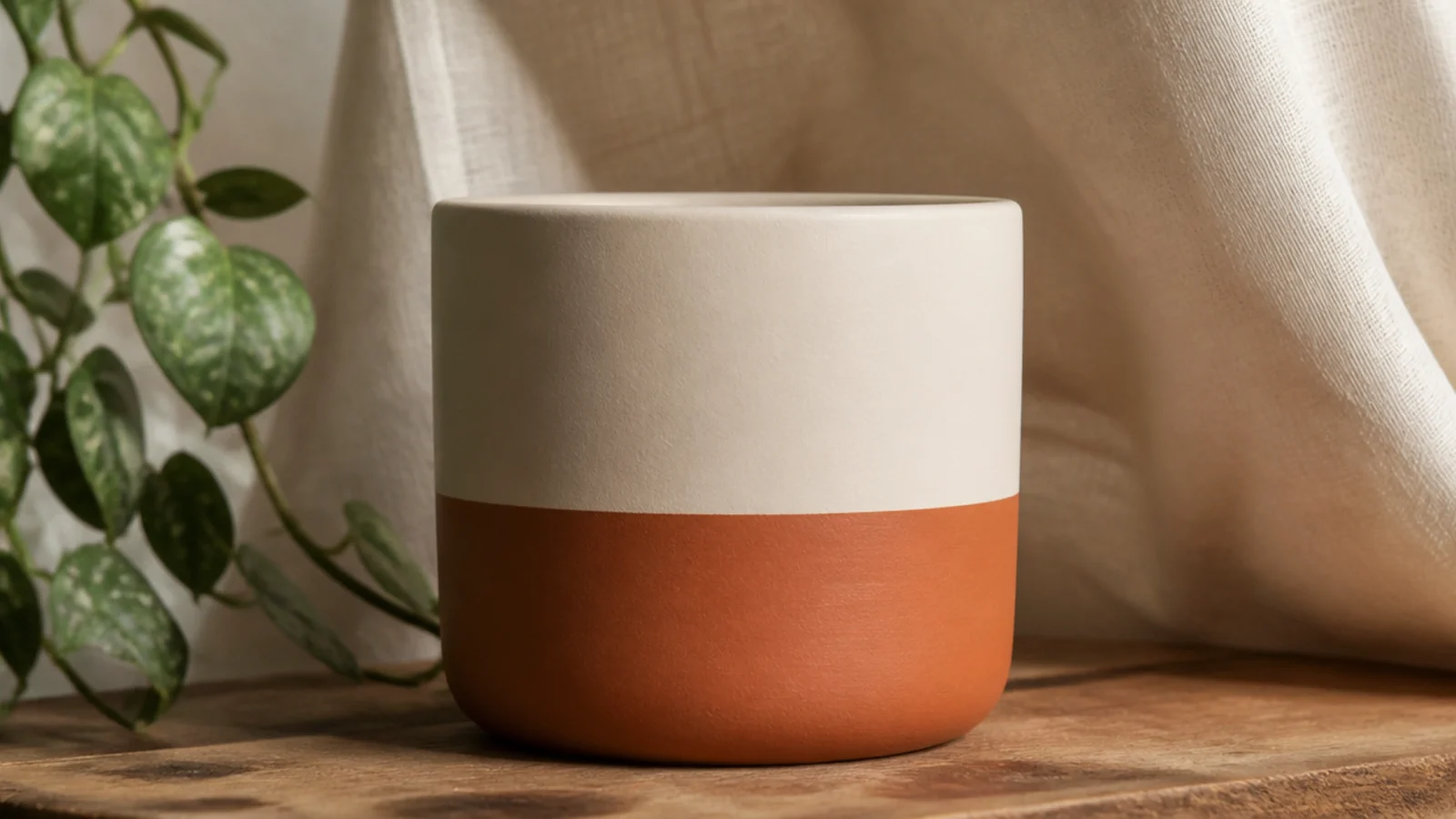
A color block is just two colors meeting at one clean line, and the tape does the precision. It looks designed on a small pot without any drawing skill. Choose a lighter color on top and a deeper one below so the little pot feels grounded, or flip it for an airy look.
Editor's noteBase-coat the entire pot in the light color first so the seam between the two colors never shows through as a muddy line.
Prime, then base-coat the whole pot in your lighter color and let it dry. Tape a level line around the middle, press the edge down hard with a fingernail, and paint the bottom half in your second color with two thin coats. Peel the tape before it fully cures, touch up any bleed with a size 0 brush, then seal.
Skip thisDon’t press wide standard tape onto a small pot — it curls off the curve and lets paint bleed; use narrow tape.
4. Painted Rim Only
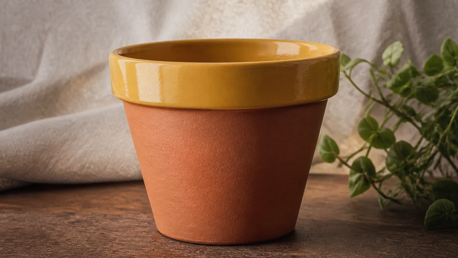
Painting just the flared rim in one bright color is a ten-minute project with a big payoff on a small pot. The rim frames the plant, and one cheerful color — mustard, coral, teal — adds personality without covering the terracotta you like. It’s perfect when you want a pop of color but a tiny commitment.
Prime just the rim area. Tape along the bottom edge of the rim where it meets the body, then paint the rim in two thin coats of a bold color with a size 4 flat. Carry the color slightly over onto the inside lip so no raw clay shows from above. Peel the tape before it sets and seal the painted rim.
Pick a rim color that repeats something nearby — a mug, a tea towel, a book spine — so the little pot looks styled in, not random.
Don’t use runny, watered-down paint on the rim; drips down the bare body are glaring against natural clay.
5. Single Tape Stripe
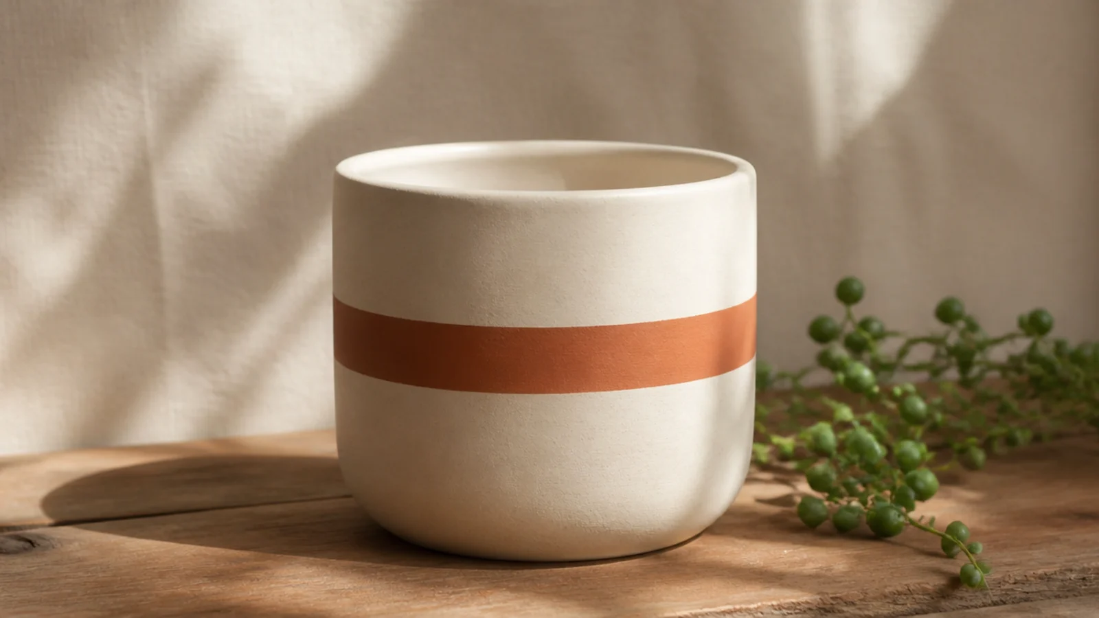
One crisp stripe around the middle is the most restrained pattern there is, and on a small pot that restraint is exactly right. A single band looks calm and deliberate where three stripes would crowd a tiny surface. Tape makes the edges foolproof, so it’s a great first pattern.
Editor's noteLine the two tape edges up against a rubber band stretched around the pot first, so your stripe stays the same width all the way around.
Base-coat the pot in a light color and let it dry. Wrap two parallel strips of narrow washi tape around the pot, leaving the gap between them as your stripe width. Paint the exposed gap with two thin coats of your stripe color, then peel both tapes while slightly wet. Seal once dry for a clean, level band.
Skip thisDon’t make the stripe too wide on a small pot — a slim band reads elegant, a fat one looks like a mistake.
6. Eraser-Dot Rim Border
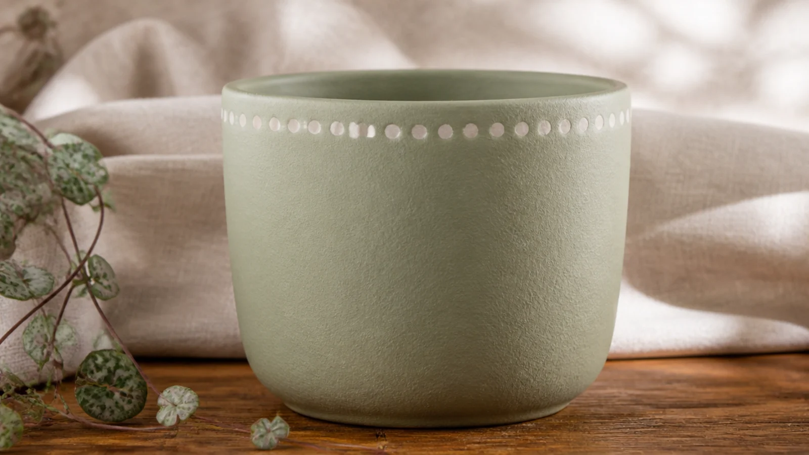
A tidy row of dots below the rim is one of the most beginner-proof upgrades for a small pot. Because you stamp them with a pencil eraser, they come out the same size every time — no brush control needed. One row keeps a little pot clean and finished without crowding it.
Editor's noteMake light pencil tick marks around the rim first, evenly spaced, so your dots land in a straight ring instead of drifting.
Base-coat and dry the pot. Dip the flat end of a clean pencil eraser into your paint, tap the excess on a paper towel, then press straight down just below the rim. Re-dip for every dot so they stay even, spacing them by eye or over light pencil ticks. Let dry and seal.
Skip thisDon’t drag the eraser sideways as you lift — press straight down and pull straight up or the dots smear into commas.
7. Scattered Dot Grid
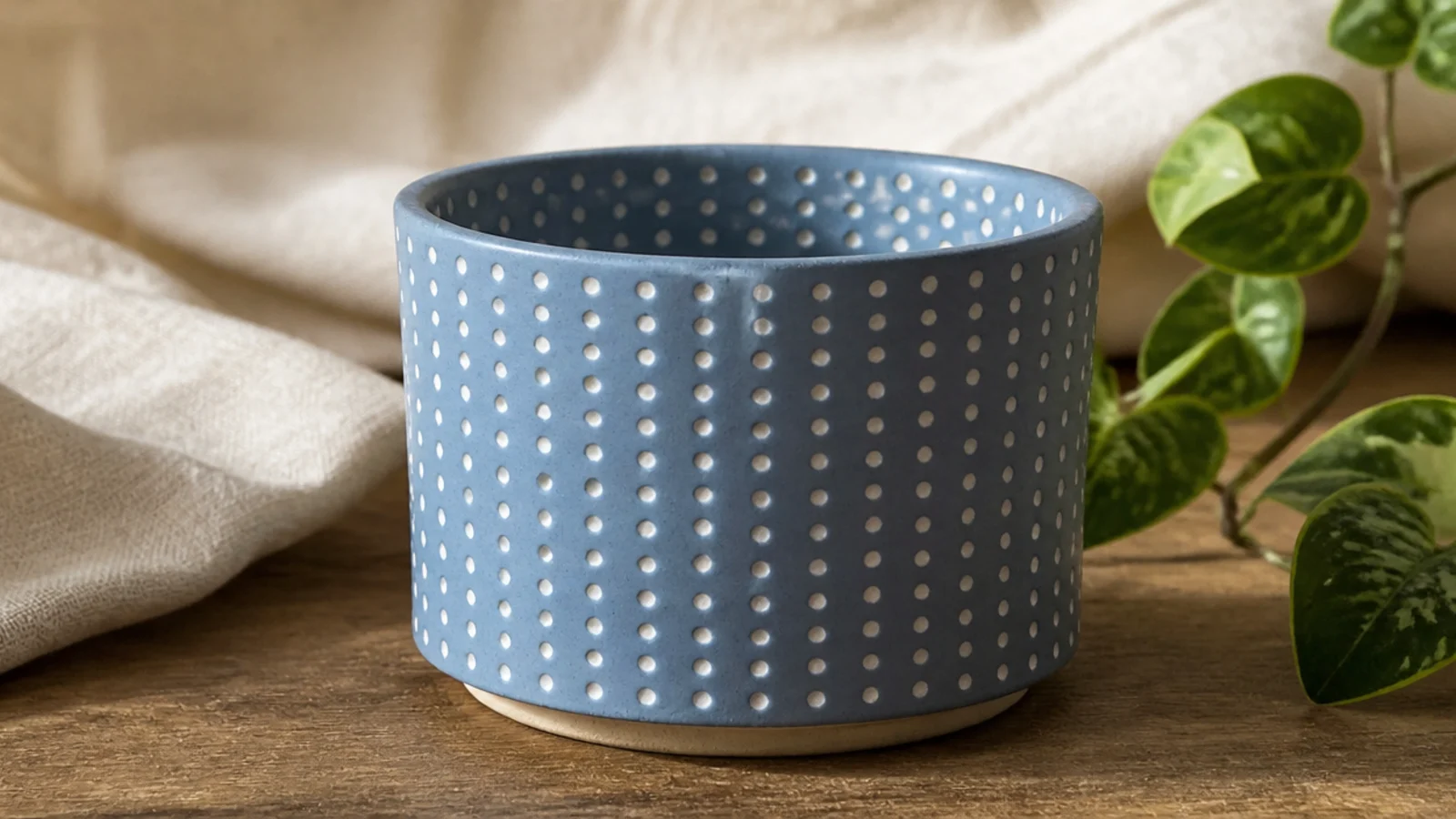
An all-over grid of small dots turns a plain pot into something that looks like patterned ceramic. The repetition reads as a designed textile print, and on a small pot a fine, even grid feels delicate rather than busy. Keep the dots small and the spacing regular so it looks printed, not hand-dabbed.
Editor's noteUse the small end of a chopstick or a skewer for uniform tiny dots — it holds just enough paint for one clean dot at a time.
Base-coat the pot and dry. Make faint pencil marks in a grid so your dots stay evenly spaced, roughly half an inch apart. Dip a cotton swab or the end of a thin paintbrush handle into your paint and press straight down at each mark, re-dipping every dot. Work in rows around the pot, let dry, and seal.
Skip thisDon’t let the dot size wander; mixed big-and-small dots look accidental, while uniform dots look like a pattern.
8. Sheer Color Wash
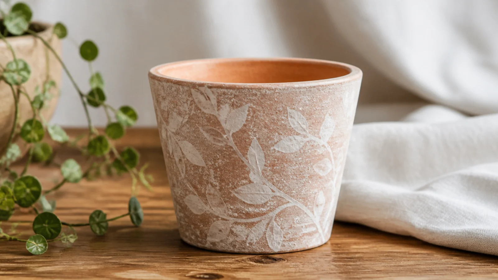
A watered-down wash lets the terracotta texture show through for a soft, weathered, expensive look, and it’s one of the easiest finishes here. One sheer coat of white or a pale color over natural clay tones it down without hiding it. It’s ideal when you like the little pot but want it a shade calmer.
Skip primer for this one — you want the clay to absorb the wash. Thin white or a pale acrylic with water to a milky consistency. Brush it on in long strokes over the small pot, letting some areas stay lighter and others catch more color. Wipe the raised texture back with a cloth for a worn look, let it dry, and seal with a matte clear.
Keep a damp rag in hand and wipe the wash off the raised clay texture right away for an authentic sun-faded finish.
Don’t prime under a wash — primer seals the clay and the wash sits on top instead of soaking in for that soft look.
9. Sponge-Texture Stoneware
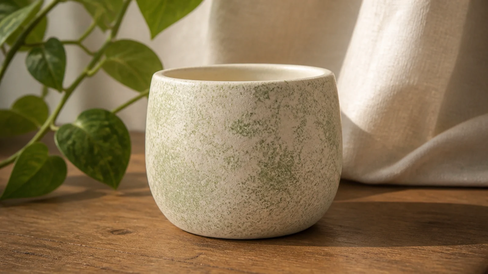
Dabbing on a second color with a sponge gives a small pot a soft mottled texture that looks like glazed stoneware. It hides any unevenness in your base coat, which makes it very forgiving. Tonal color pairs — cream with sage, or blush with white — look the most natural.
Base-coat the pot in your lighter color and dry. Dip a torn piece of natural sponge into a little of your second color, blot most of it off on a paper towel, then pounce it lightly over the pot in a random pattern. Build the texture gradually with a nearly dry sponge for a subtle finish, let it dry, and seal.
Blot the sponge until it’s almost dry before touching the pot — a loaded sponge makes heavy blobs, a dry one gives that soft stoneware mottle.
Don’t use a smooth kitchen sponge; its flat surface leaves obvious repeating marks instead of an organic texture.
10. Metallic-Dipped Base
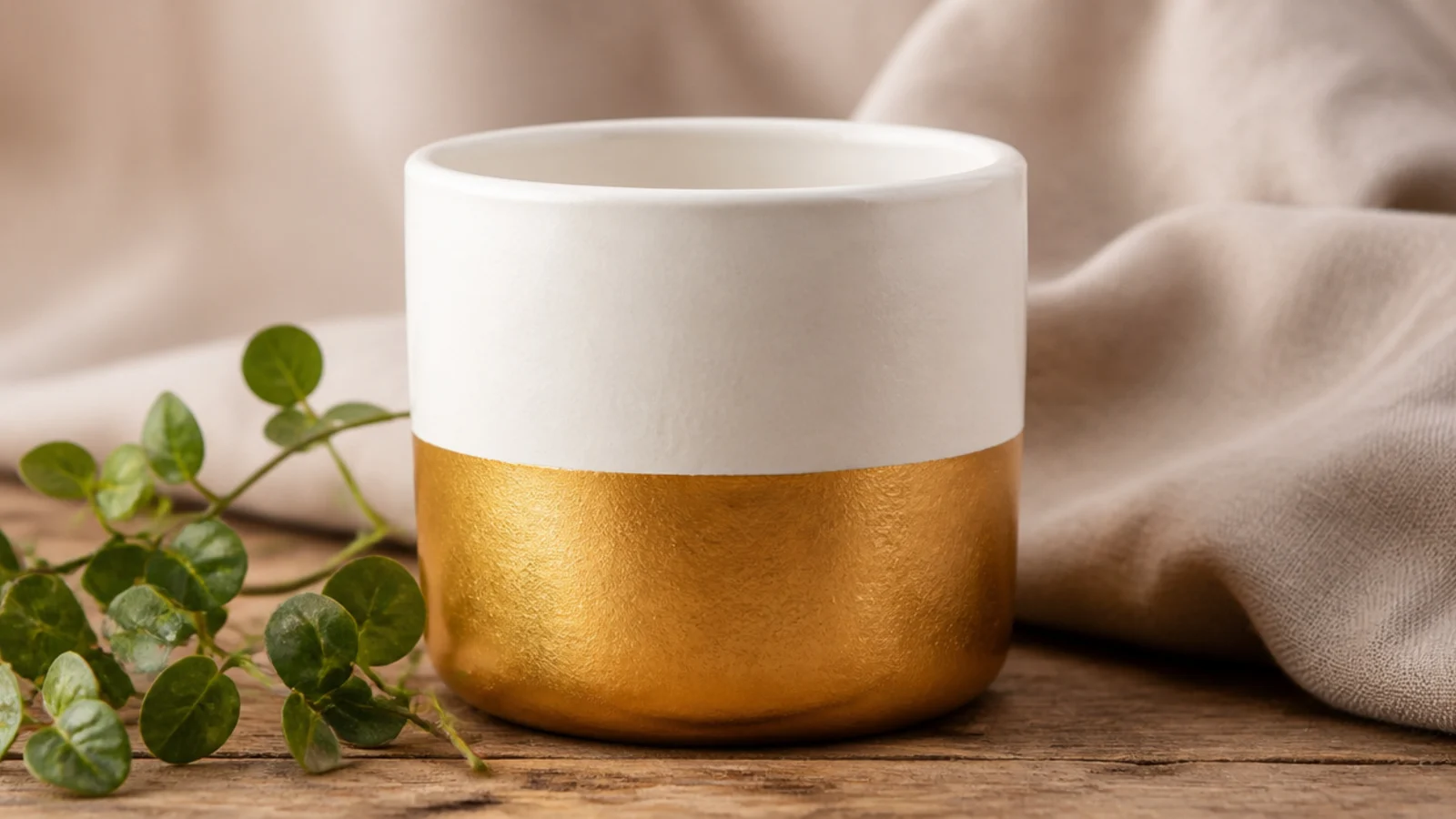
A metallic dip on just the bottom quarter gives a small pot a little glamour without going over the top. Gold, copper, or brushed silver against white or black looks like a boutique planter. On a tiny pot the metallic band is small enough to feel like an accent, not a statement.
Editor's noteStir metallic paint well and reload the brush often — the shimmer pigment settles and thins out, leaving dull patches if you don’t.
Base-coat and dry the pot. Tape a level line around the bottom quarter and press the edge down firmly. Paint below the line with two thin coats of metallic acrylic, letting each dry — metallics often need a second coat for even shimmer. Peel the tape before it cures, then seal with a light spray or gentle brush clear so you don’t drag the metallic finish.
Skip thisDon’t seal metallic paint with a heavy dragged-on varnish; it streaks the shimmer, so use a light hand or a spray clear.
11. Thin Triple Stripes
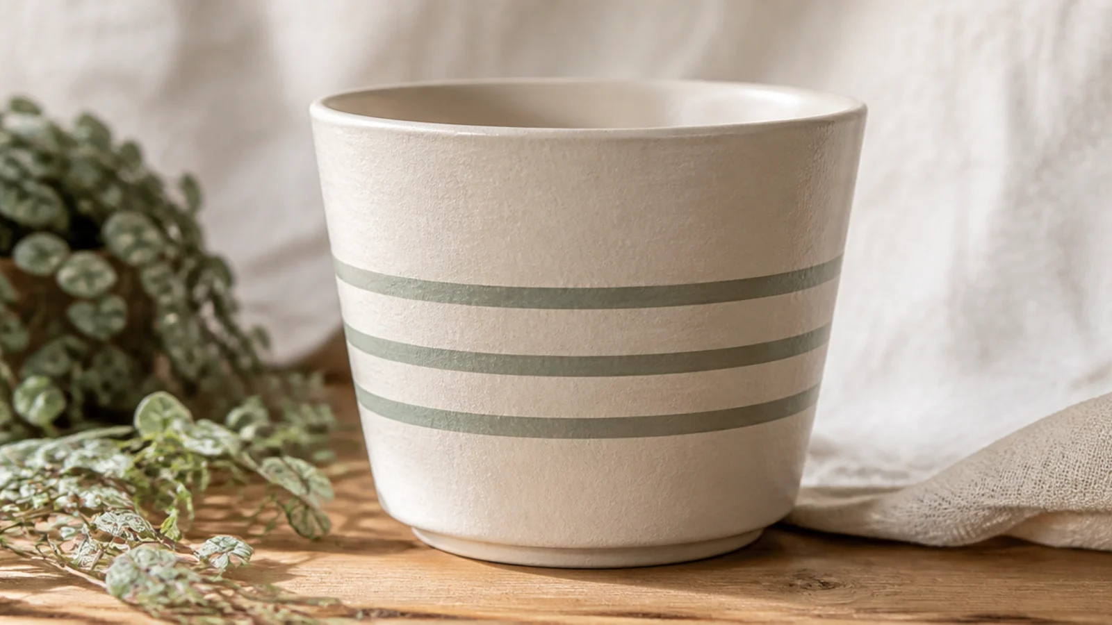
Three slim stripes look crisp and calm, and on a small pot thin is the key word — skinny stripes read elegant where thick bands look heavy. Even spacing makes it feel intentional and easy to repeat across a set. Tape keeps every edge sharp with no steady hand needed.
Base-coat the pot in a light color and dry. Wrap strips of narrow washi tape where you want the bare gaps, spacing them evenly with a ruler. Paint over the whole taped area in your stripe color with a size 4 flat, then peel all the tape while slightly wet — the covered areas stay your base color, leaving three clean stripes. Seal when dry.
Cut your washi tape strips to the same width before applying so all three stripes and gaps match exactly.
Don’t press stripes over a rough, grainy base — sand lightly with 400-grit first so the tape seals flat and paint can’t bleed.
12. Diagonal Color Block
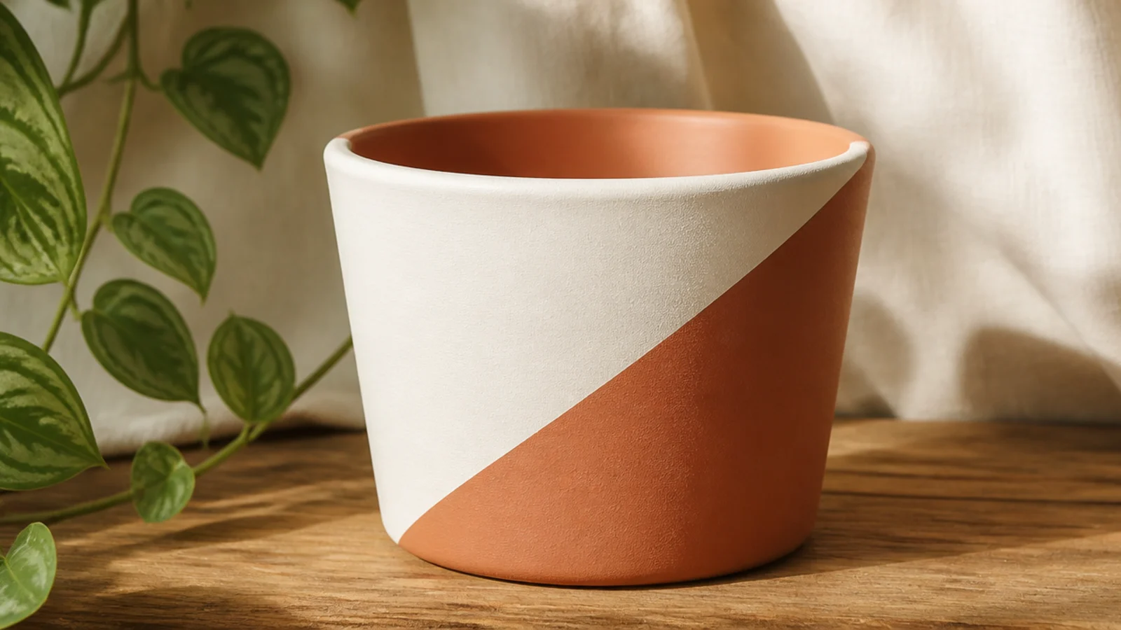
Tilting the color-block line to a diagonal makes a small pot feel more modern and dynamic than a straight split. It’s the same two-color, tape-driven technique, just angled. One diagonal across the front-facing side is enough — it looks like a graphic without wrapping the whole pot.
Base-coat the whole pot in your lighter color and dry. Run a strip of painter’s tape diagonally across the front at the angle you want, pressing the edge down hard. Paint the exposed section below the tape in your second color with two thin coats. Peel the tape before it cures, tidy the point with a size 0 brush, and seal.
Keep the diagonal shallow, around 20-30 degrees — a near-vertical slash looks off-balance on a small round pot.
Don’t let the tape lift on the pot’s curve mid-diagonal; press along the whole edge or the line will bleed and wander.
13. Speckle Splatter Finish
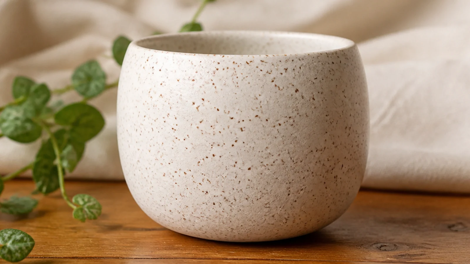
Fine speckles turn a plain small pot into something that looks like handmade stoneware. You flick thinned paint off a stiff brush to scatter tiny dots, and it’s genuinely hard to get wrong. It also hides any imperfections in your base coat, which is handy on a little pot.
Editor's noteDo a few practice flicks on scrap paper to dial in the paint thickness — too thick makes blobs, too thin makes runs.
Base-coat the pot white or cream and dry. Thin a little dark brown or charcoal paint with water to a milky consistency. Dip a stiff brush or an old toothbrush, then run your thumb across the bristles to flick speckles onto the pot. Rotate the pot for even coverage, let dry, and seal.
Skip thisDon’t hold the brush too close to a small pot; keep six inches back or you’ll get big wet splatters instead of fine specks.
14. Gold Rim Pen Line
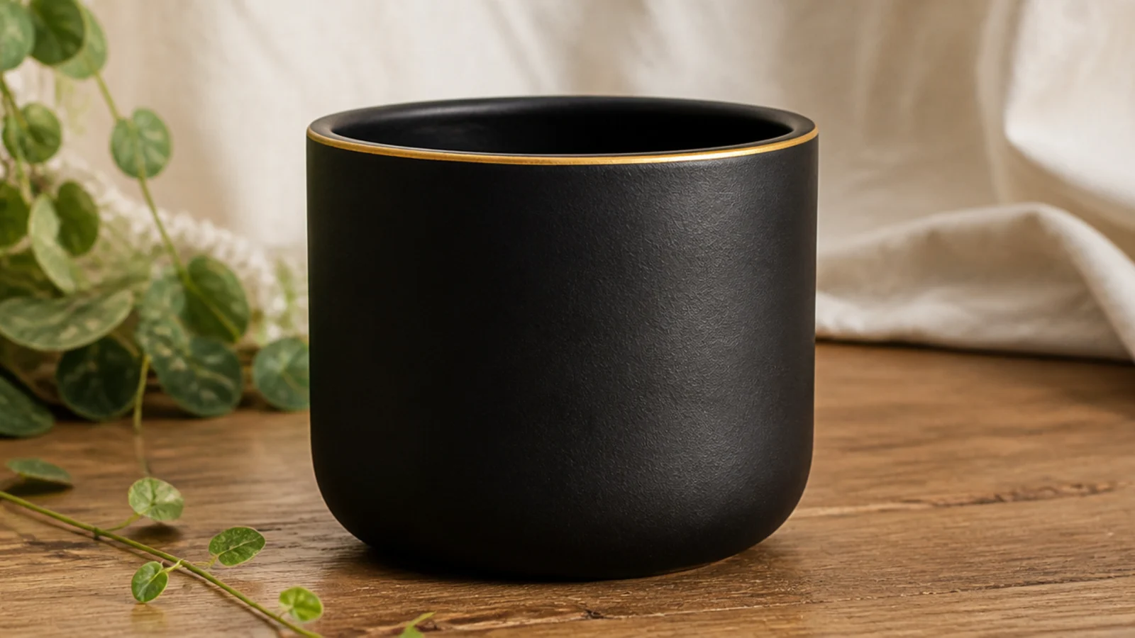
A single thin gold line around the rim edge makes any small pot look finished and a little luxe. A metallic paint pen gives a clean line with zero brush skill, which is a real advantage on a tiny curved rim. It works over any base but looks most striking over black, deep green, or navy.
Editor's noteMove the pot, not the pen — spinning the small pot against a steady pen hand gives a far smoother line than drawing around it.
Base-coat the pot and let it fully dry. Shake a fine-tip metallic paint pen well and prime it on scrap paper. Rest the pen tip on the rim edge and slowly rotate the pot with your other hand so the pen draws the line for you. Let it dry, then seal with a light spray clear so you don’t smear the metallic ink.
Skip thisDon’t brush a heavy varnish over metallic pen ink; it drags and smears, so use a light spray or a very gentle touch.
15. Scallop Base Border
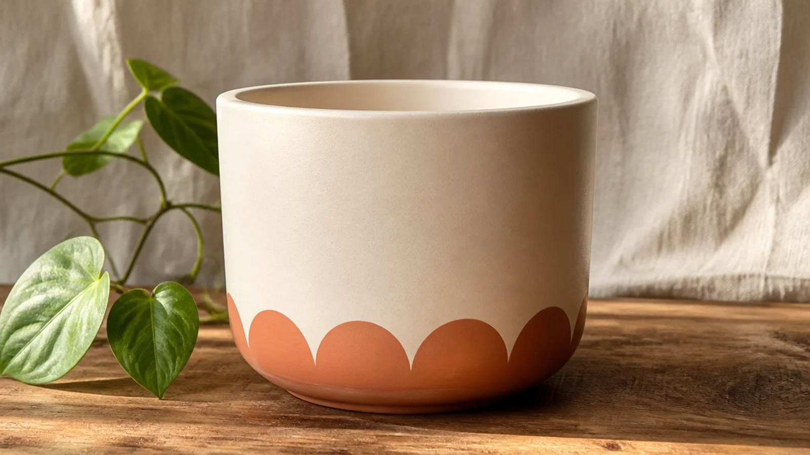
A scalloped border along the base looks like a detail from a ceramics studio, and it’s just a row of half circles. Stamping them with a round object keeps them uniform on a small pot. One color along the bottom frames the pot without covering it.
Editor's noteLightly mark the small pot into equal sections first so your scallops stay evenly spaced all the way around.
Base-coat and dry the pot. Find a bottle cap or the end of a marker sized for small scallops. Dip its rim in paint and stamp overlapping half circles along the bottom edge, or trace and fill them with a size 0 brush for solid scallops. Keep the spacing even so the last scallop meets the first, then seal.
Skip thisDon’t freehand the scallops if you want them even; hand-drawn half circles drift in size and break the rhythm on a little pot.
16. Tiny Heart Motif
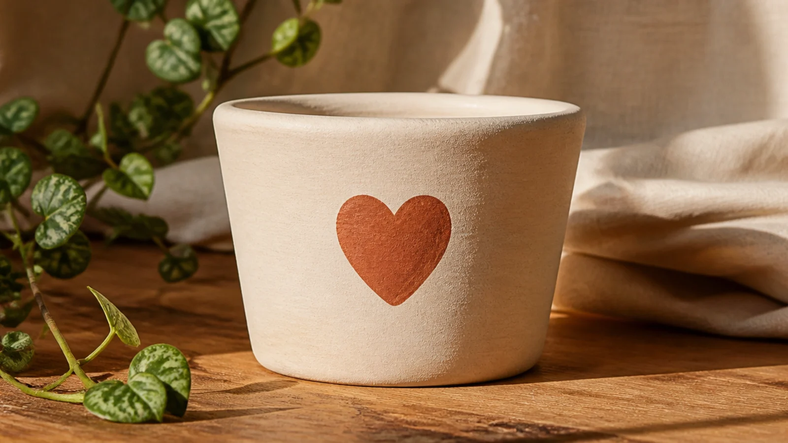
One small heart on the front is the friendliest single motif for a beginner, and on a little pot a single heart is all it needs. It reads sweet and personal — perfect for a gifted herb or a windowsill cutting. A solid, simple heart shape looks far better than an outlined or detailed one.
Editor's noteFold a scrap of paper and cut half a heart along the fold for a perfectly symmetrical template to trace onto the pot.
Base-coat and dry the pot. Lightly pencil a small heart, about an inch tall, on the front — draw two little bumps and a point, and erase until it’s even. Fill it with two thin coats using a size 0-2 round brush, working from the outline inward. Erase any stray pencil, let dry, and seal.
Skip thisDon’t make the heart too big for the pot — about a third of the front panel height keeps it charming, not cartoonish.
17. Single Mini Daisy
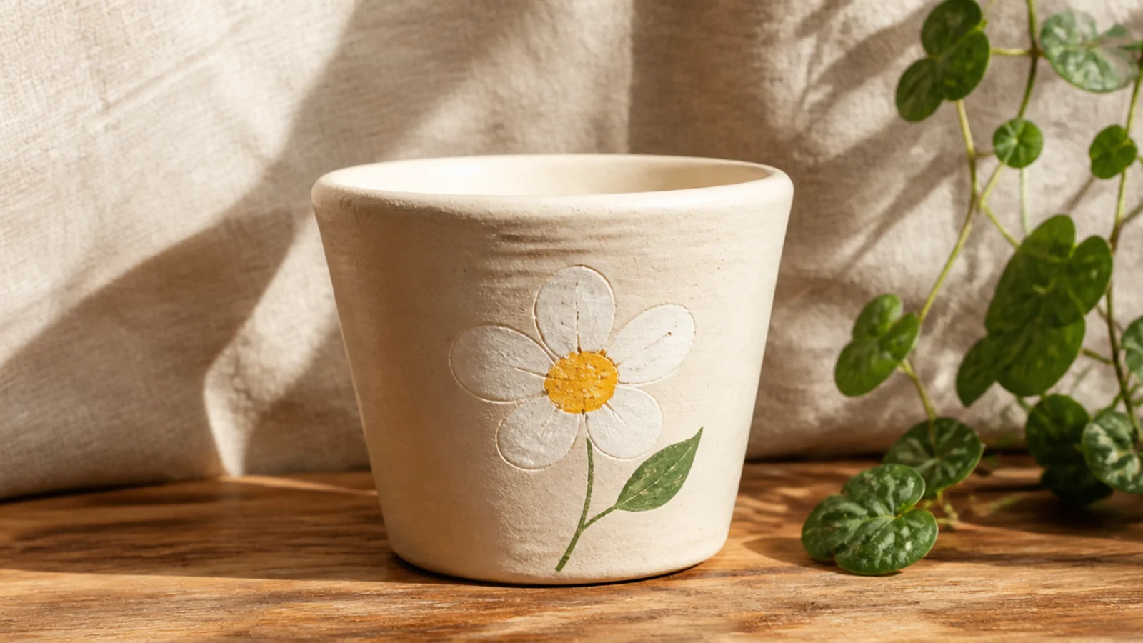
A single little daisy is a tiny floral that looks hand-painted but is really just five dots and a center. On a small pot one flower is plenty — it feels delicate and deliberate. It’s the first floral most beginners can nail because every part is a simple dot or dash.
Base-coat and dry the pot. With a size 0 round brush or a cotton swab, place five white petal dots in a rough circle on the front, then add a yellow center dot. Add one or two tiny green leaf dashes beside it with the brush tip. Keep petals close so it reads as a flower, let dry, and seal.
Paint the yellow center last and slightly overlapping the petal bases — it pulls the five dots together into a clear flower.
Don’t scatter several daisies around a small pot; one well-placed flower looks intentional, a cluster looks crowded.
18. Leaf Sprig Stamp
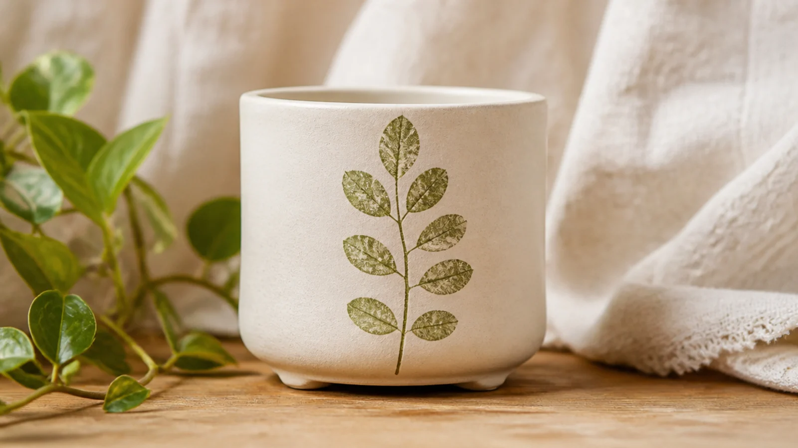
Using a real leaf as a stamp prints a crisp botanical sprig with no drawing at all, which suits a small pot beautifully. It looks organic and calm, perfect for a plant. A small herb leaf or fern frond with clean edges works best because it lies flat against the little curved surface.
Editor's noteChoose a leaf small enough to fit the pot’s front panel, and press through a paper towel so the whole shape — veins included — makes contact.
Base-coat and dry the pot. Coat one side of a small flat leaf lightly with sage paint using a sponge, press it paint-side down onto the front of the pot, and hold it flat with a dry paper towel for a few seconds so the veins print. Peel it off carefully, touch up any gaps with a size 0 brush, let dry, and seal.
Skip thisDon’t overload the leaf with paint; a thin, even coat prints crisp veins, while a heavy coat smears into a green blob.
19. Tiny Star Stamp
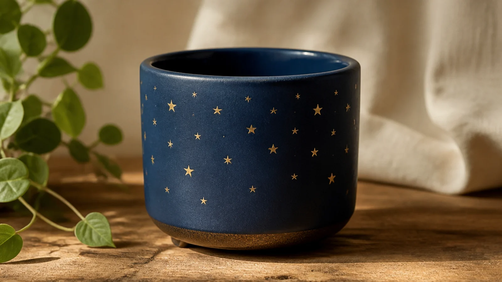
A scatter of small stars gives a little pot a quiet celestial charm, and stamping keeps every star identical. Gold or cream stars over a deep navy or charcoal base look especially good. On a small pot, keeping the stars small and sparse reads elegant rather than busy.
Base-coat the pot in a dark color and dry. Carve a tiny star into a pencil eraser with a craft knife, or use a small foam star stamp. Dab the stamp lightly in metallic or cream paint, blot once on paper, then press straight down and lift. Space the stars unevenly like a real sky, let dry, and seal.
Blot the stamp on scrap paper before each press so the star prints clean instead of flooding with paint at small scale.
Don’t crowd the stars evenly like a grid; a loose, uneven scatter looks like a night sky, a tidy grid looks stiff.
20. Two-Color Checkerboard Band
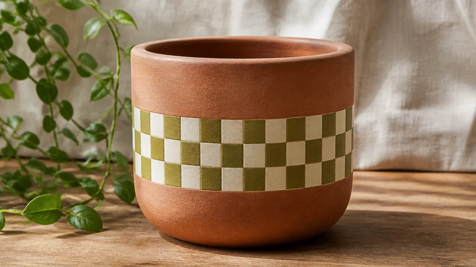
A checkerboard band looks playful and current, and the grid structure hides small wobbles — handy at tiny scale. On a small pot, keep it to one narrow band around the middle rather than the whole pot so it stays clean. Olive and cream or black and white are easy, high-contrast picks.
Base-coat the pot in your lighter color and dry. Lightly pencil a grid for one horizontal band of small squares, keeping them tiny to fit the pot. Paint alternating squares in your second color with a size 0 flat brush, following the grid. Add a second thin coat to keep squares solid, erase pencil lines, and seal.
Use a small flat brush the width of one square so each check fills with a single clean stroke instead of fussy dabs.
Don’t try to checker the whole small pot; a single band is faster, looks intentional, and is far easier to keep even.
21. Taped Triangle Band
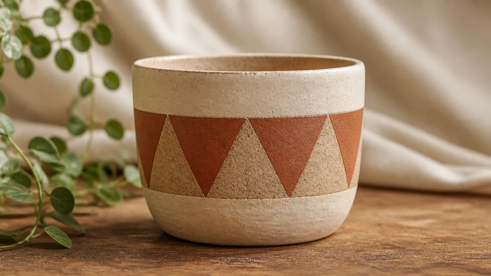
A row of crisp triangles looks graphic and intentional, and tape gives you the sharp points that are hard to freehand on a small pot. Alternating a painted triangle with a bare-clay one keeps a little pot from looking heavy. Two earthy colors over terracotta is an easy, on-trend palette.
Base-coat if you want a colored background, or leave primed terracotta. Lay short strips of narrow painter’s tape in a zigzag to mask triangles around the middle, burnishing every edge with a fingernail. Paint the exposed triangles, then peel the tape while slightly wet. Fill alternating triangles with a second color if you like, and seal.
Burnish every taped edge hard before painting — sharp triangle points only happen when the tape is fully sealed to the curve.
Don’t reuse tape that’s lost its stick; loose tape on a small curved pot lets paint bleed and rounds off your points.
22. Sponge Ombré Fade
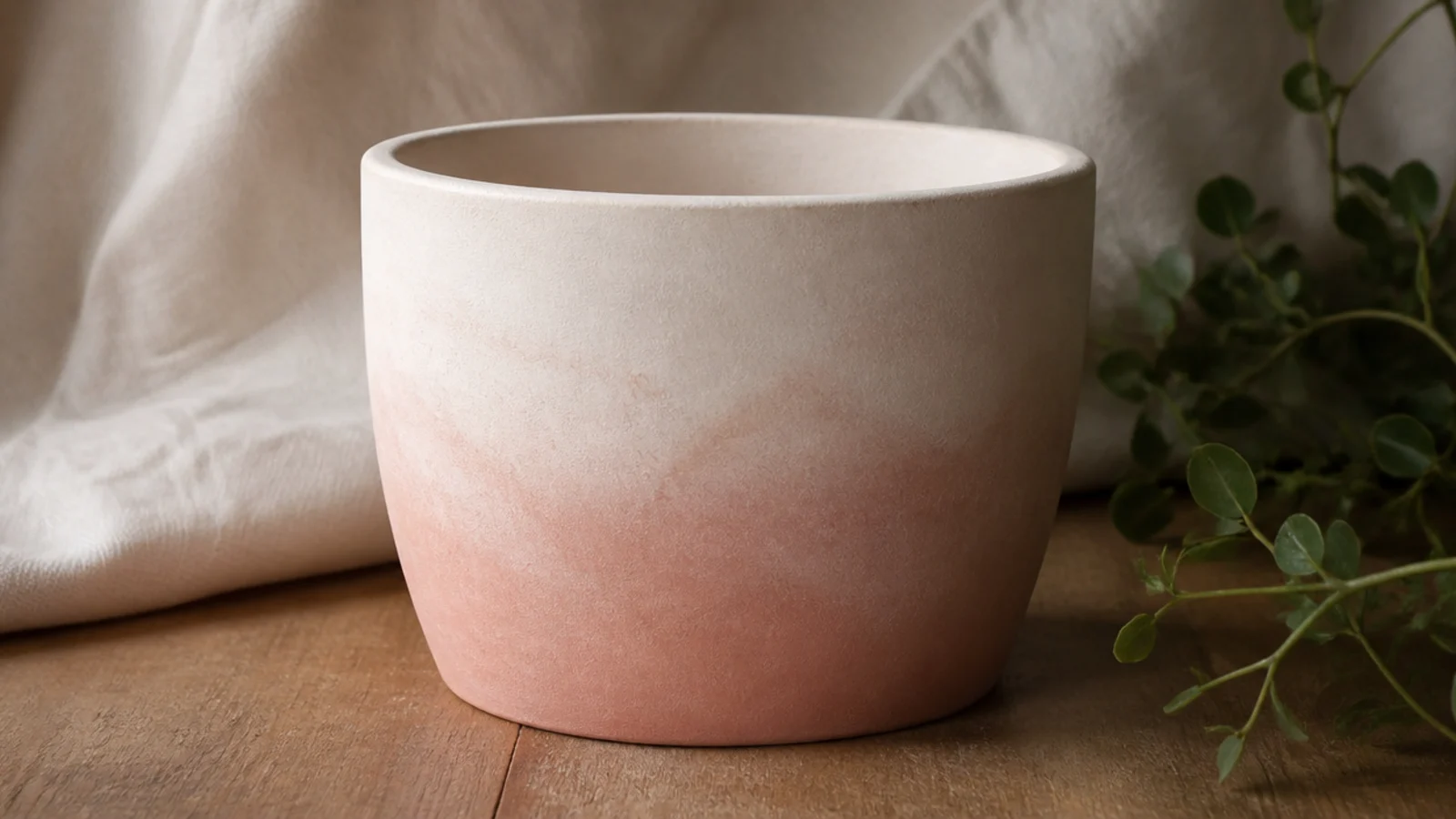
An ombré fade looks advanced but a makeup sponge does the blending for you, even on a small pot. You dab the darker color at the bottom and lighter at the top, then pounce where they meet so they melt together. Soft, tonal colors like blush to white or blue to cream blend the most forgivingly.
Base-coat the pot in your lightest color. While it’s tacky, dab your darker color along the bottom with a slightly damp makeup sponge, then work upward with lighter pressure so it thins out. Pounce the transition zone with a clean part of the sponge to blur the line, build it up gradually, and seal when dry.
Lightly mist the sponge with water first — a slightly damp sponge blends far smoother than a dry one on a small surface.
Don’t pick two high-contrast colors for your first ombré; a hard jump between shades is very hard to blend cleanly on a tiny pot.
23. Minimalist Arch Line
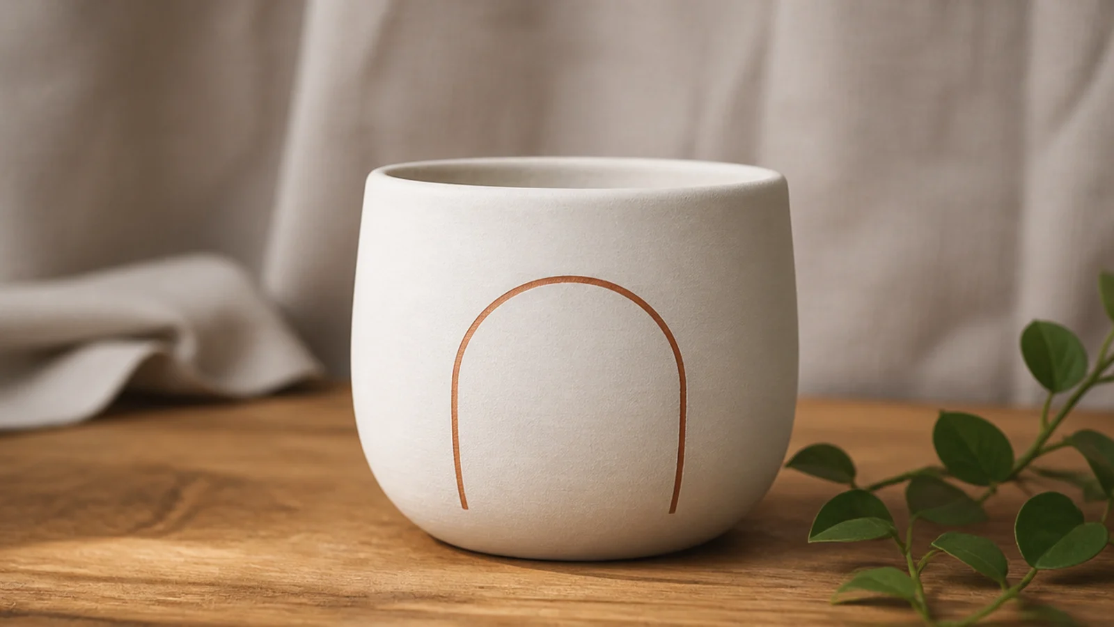
A single thin arched line on the front is a modern, minimalist motif that suits a small pot’s limited space perfectly. It reads as a designed graphic with just one confident stroke. A paint pen makes the line clean and even without brush control.
Editor's noteTrace around a round object for the arch instead of freehanding — a clean, even curve is what makes it look intentional.
Base-coat the pot and dry. Lightly pencil a half-circle arch on the front, tracing around a bottle cap or jar lid for a smooth curve. Go over the pencil line with a fine-tip acrylic paint pen in a single steady pass, rotating the pot slightly as you follow the curve. Erase stray pencil, let dry, and seal.
Skip thisDon’t go over the line twice trying to thicken it; a single crisp pass looks graphic, a doubled wobbly line looks shaky.
24. Squiggle Line Pattern
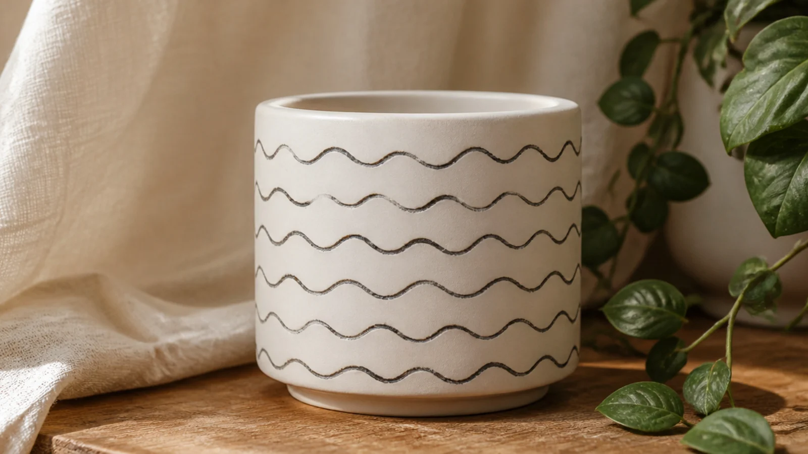
A single wavy squiggle line wrapping around the pot is a playful, modern pattern that’s easier than it looks. The repetition of one wave reads as a designed print. On a small pot one squiggle band is enough to feel patterned without crowding it.
Editor's notePractice the wave rhythm a few times on paper first so the ups and downs stay the same size all the way around.
Base-coat the pot and dry. Using a fine-tip acrylic paint pen, draw a continuous wavy line around the middle of the pot, rotating it slowly as you go to keep the waves even. Keep the waves shallow and consistent in height. Let it dry fully, then seal with a light clear so the pen line doesn’t smear.
Skip thisDon’t stop and restart the line mid-wave; lift and rejoin at the bottom of a dip so the seam disappears into the pattern.
25. Single Initial Monogram
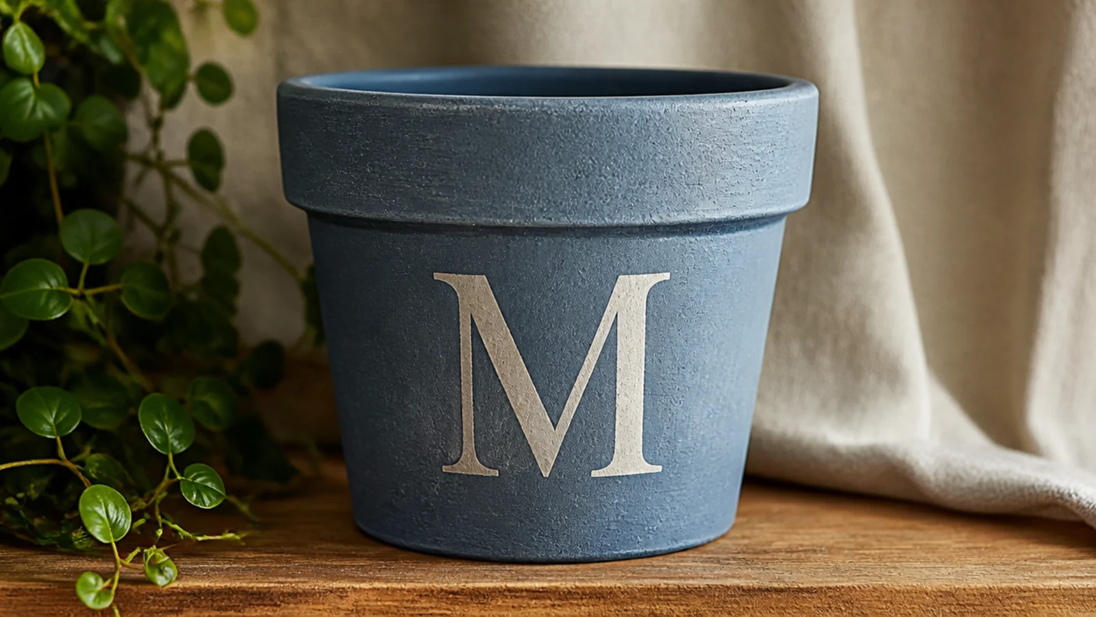
One large initial on the front turns a small pot into a personalized gift. Using a printed letter as a stencil keeps the shape perfect on a little surface. A simple, bold serif or block letter reads best — thin script is hard to paint cleanly at small scale.
Editor's noteSize the letter to take up about 60% of the front panel height — too small looks lost on a pot, too big looks cramped.
Base-coat and dry the pot. Print your letter sized to fill most of the front panel, cut it out, and trace around it lightly in pencil on the pot. Fill the outline with two thin coats using a size 0-2 round brush, working from the edges inward. Erase stray pencil marks, let dry, and seal.
Skip thisDon’t attempt freehand script for a first monogram; a clean block or serif letter is far more forgiving on a small pot.
26. Simple Smiley Face
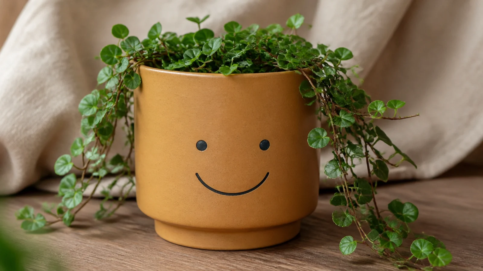
A simple face gives a small pot instant personality and reads as cheerful, retro decor. On a little pot a minimalist face — two dots and a curve — is all it needs. It’s a great motif for a kid’s room or a sunny windowsill, and it’s nearly foolproof.
Base-coat the pot in a warm color and dry. With a size 0 round brush, paint two small dot eyes spaced evenly on the front, using a pencil eraser if you want them perfectly round. Add a simple curved smile below with one confident stroke. Keep it minimal, let dry, and seal.
Place the eyes a little higher than center and keep the smile wide but shallow — that spacing reads friendly rather than surprised.
Don’t overdo the features with a nose, cheeks, and eyebrows; a small pot face looks best kept to eyes and a smile.
27. Little Cactus Motif
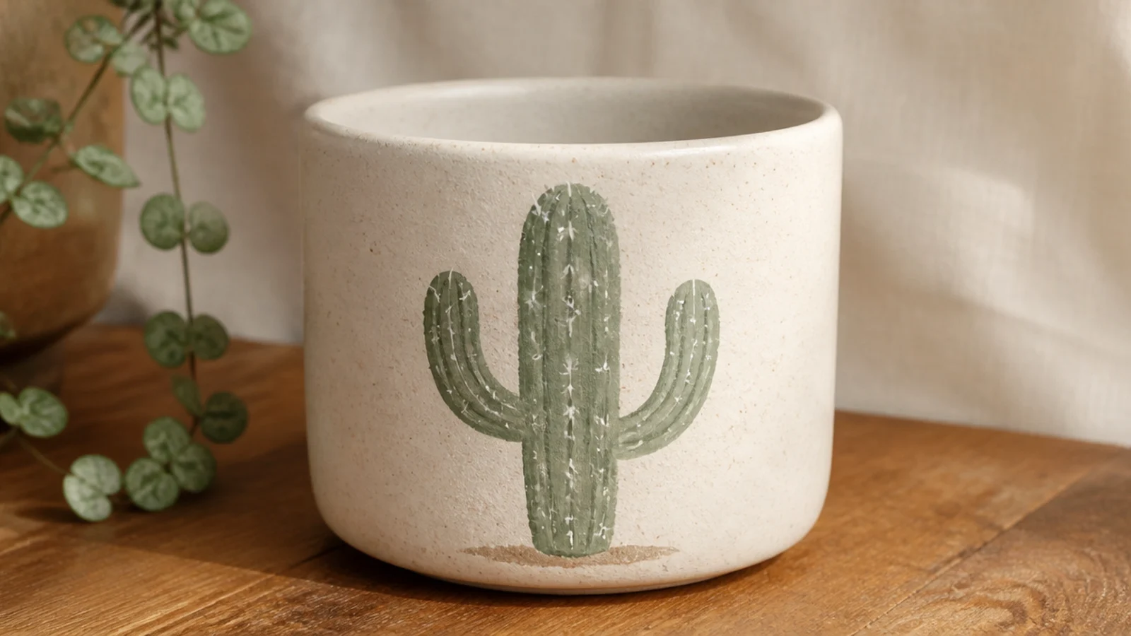
A single little cactus is a charming freehand motif that fits a small pot’s front panel perfectly. It’s mostly simple rounded shapes, so it’s more approachable than it looks. A soft sage or olive cactus on a cream pot feels calm and current.
Editor's noteRound off every edge of the cactus shape — soft, rounded arms look friendly and intentional where sharp corners look off.
Base-coat and dry the pot. Lightly pencil a simple cactus — one rounded main stem with one or two short arms — on the front. Fill it with two thin coats of sage green using a size 0-2 round brush. Once dry, add tiny white spine dashes and a small terracotta flower on top with the brush tip, then seal.
Skip thisDon’t add lots of spines or detail; a few small dashes suggest a cactus, while dense detail muddies it on a small pot.
28. Mini Mushroom Motif
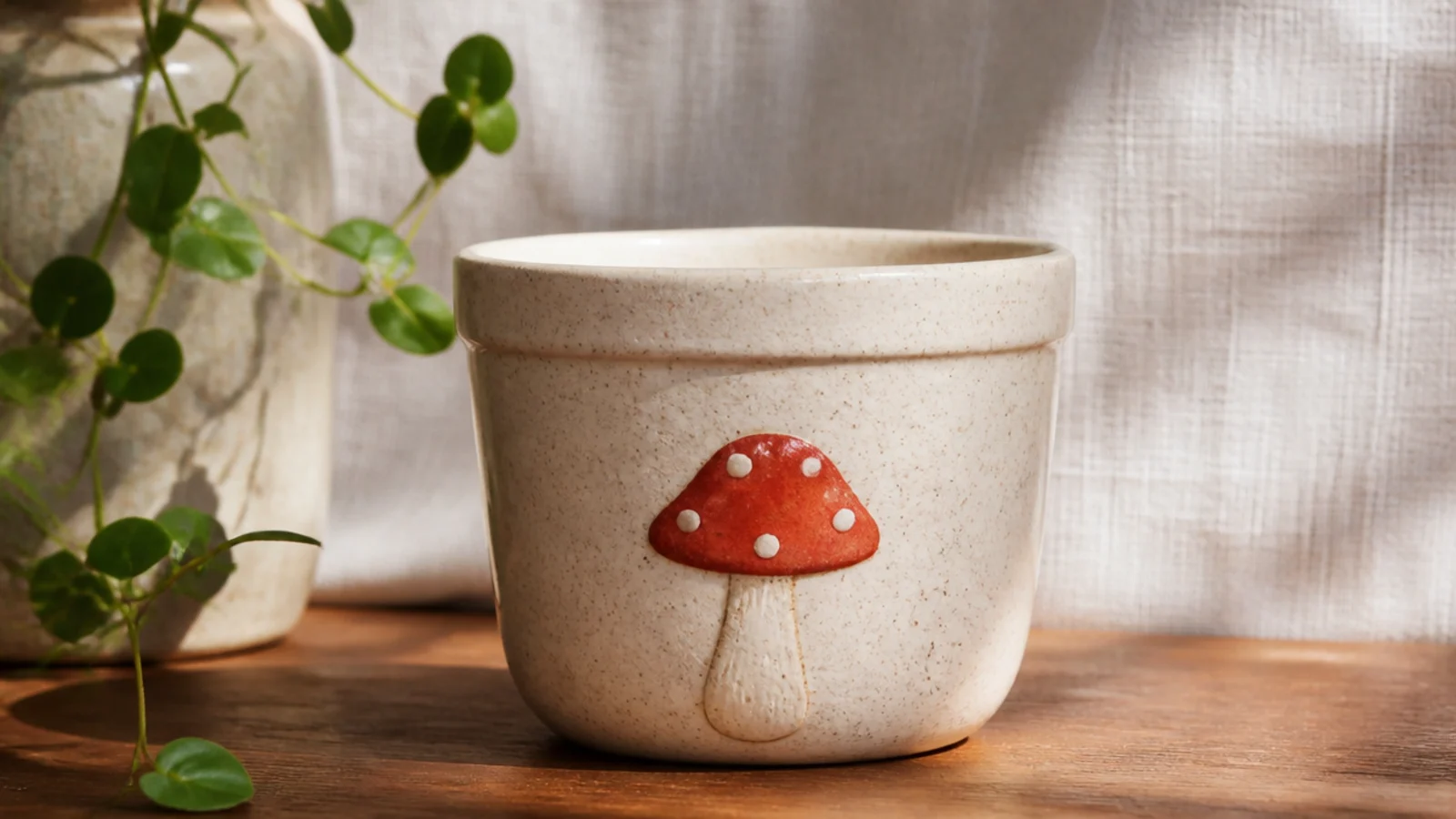
A single little mushroom is a cozy, cottagecore motif that’s having a moment and suits a small pot’s scale. It’s two simple shapes — a domed cap and a stubby stem — plus a few dots. On a tiny pot one mushroom is a complete, sweet design.
Base-coat the pot in cream and dry. Pencil a domed cap and a short stem on the front. Paint the cap in muted red or terracotta and the stem in cream or beige with a size 0-2 round brush, two thin coats each. Once dry, add small white dots on the cap with a cotton swab and a shadow line under the cap, then seal.
Add a thin darker line right under the cap where it meets the stem — that small shadow gives the mushroom a bit of depth.
Don’t use a bright fire-engine red; a muted, dusty red keeps the mushroom looking styled rather than cartoonish.
29. Abstract Color Dabs
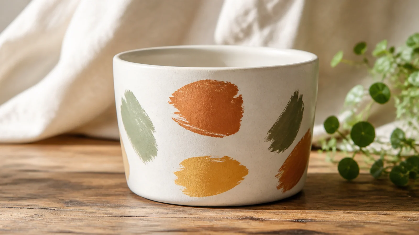
A handful of loose color dabs and short strokes looks like modern art and takes about ten minutes. On a small pot, three or four confident marks in muted tones read as an intentional abstract composition. The trick is restraint — a few marks, not twenty.
Editor's noteMake each mark in one quick motion rather than slowly dragging — fast strokes get that natural, tapered painterly look.
Base-coat the pot in a neutral and dry. Load a size 2 round brush with one muted accent color and make two or three quick, curved dabs on the front, lifting the brush so the ends taper. Add one or two smaller marks in a second and third color to balance them. Step back, resist adding more, and seal.
Skip thisDon’t keep adding dabs to fix the balance; abstract designs die from overworking, so stop while the pot still feels sparse.
30. Tiny Mountain Scene
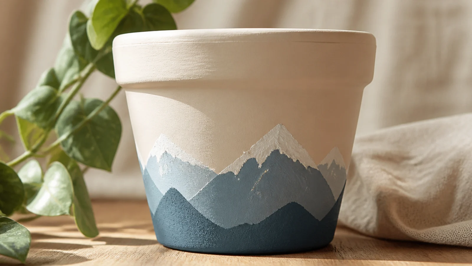
A tiny mountain scene is the most advanced look here, but it’s still just a few simple triangular peaks and flat color. On a small pot the limited space keeps it minimalist and modern rather than fussy. It feels like a little landscape painting and rewards a bit of patience.
Editor's noteVary the peak heights and let them overlap slightly — uneven, layered mountains look far more natural than matching triangles.
Base-coat the pot in a soft cream sky color and dry. Lightly pencil two or three overlapping triangular peaks across the lower front. Fill them with dusty blue and a second muted shade using a size 0-2 round brush for clean edges. Once dry, add small white snow caps on the peaks, erase stray pencil, and seal.
Skip thisDon’t add tiny details like trees, birds, or a sun; the charm is in the clean silhouette, and small extras get muddy fast.