1. Simple Smiling Face Pot
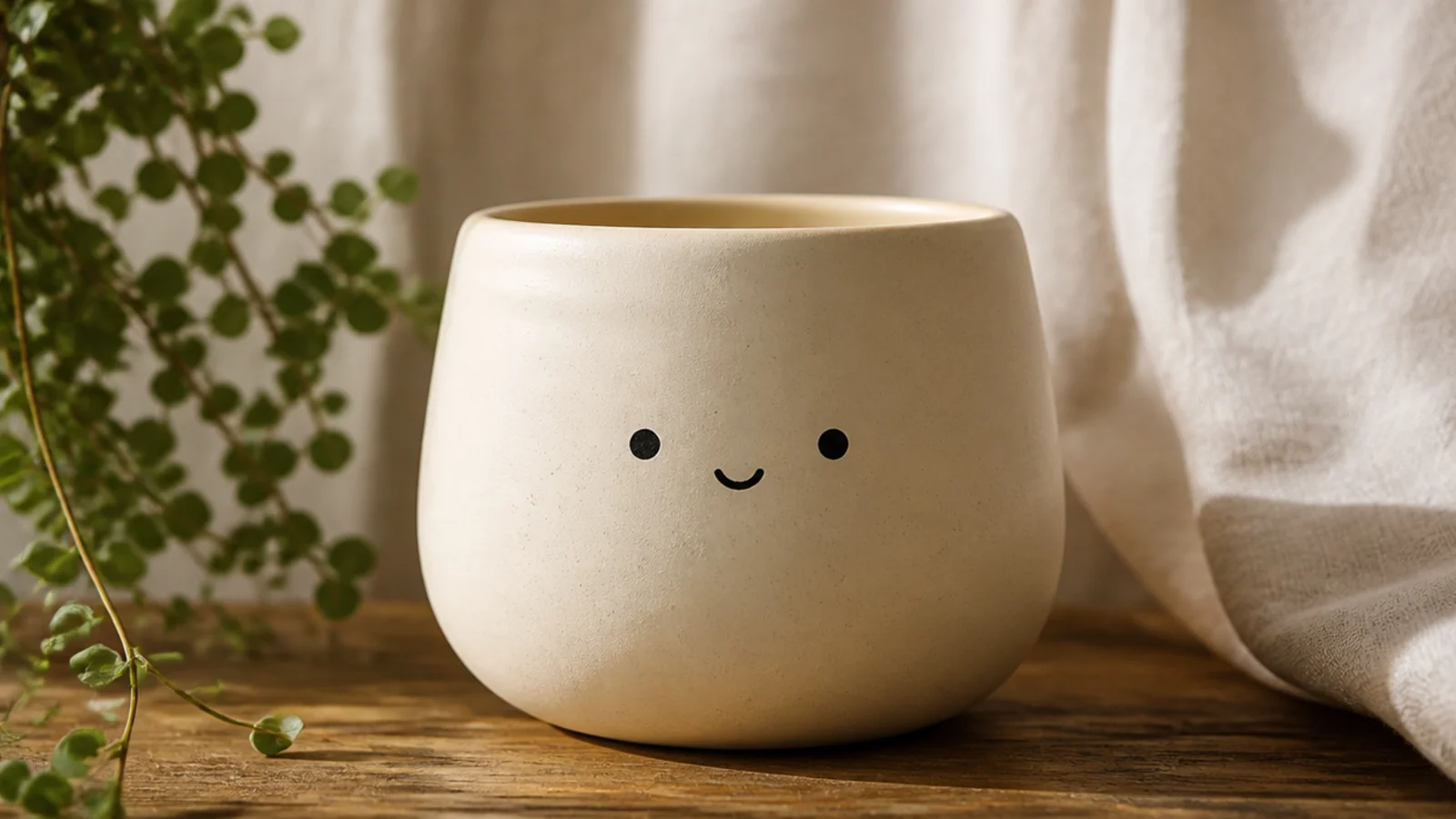
This is the easiest cute pot that still looks intentional, and it’s the one I hand to nervous first-timers. A face is just two dot eyes and one curved smile, so there’s no real drawing involved. Keep it small and centered on the front for that shy, sweet look, and choose a calm base color like cream or sage so the plant on top reads as the pot’s “hair.”
Prime the pot and base-coat it in a soft color with two thin coats, letting each dry. Lightly pencil two eye dots and a small curved mouth low on the front so the plant sits above the face. Paint the eyes with the flat end of a pencil eraser or a small round brush, then draw the smile in one slow stroke with a fine liner (size 0-1). Let it dry fully and seal with a matte water-based clear.
Editor's noteKeep the two eyes close together and the smile small — tight, low features look cute, while wide-set features look surprised.
Skip thisDon’t paint the face too high on the pot; a face near the rim gets hidden by the plant and looks cramped.
2. Rosy-Cheek Blush Pot
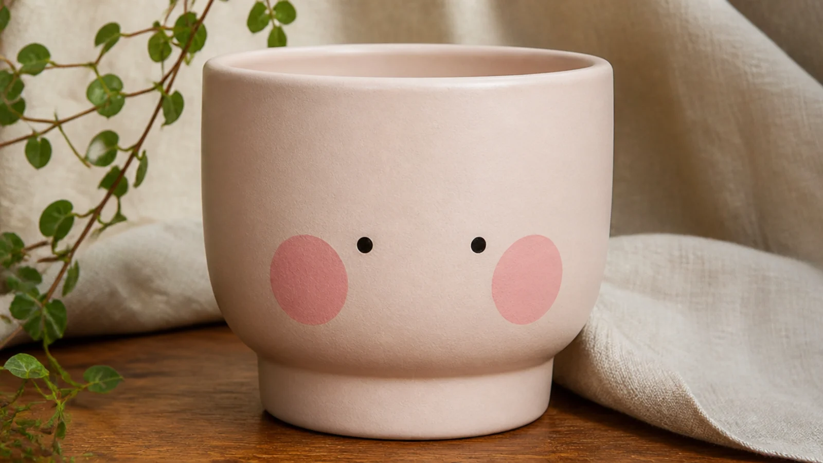
This one leans on just the cheeks to do the cuteness, so it’s almost foolproof. Two soft round blush circles plus tiny dot eyes give a bashful expression without a mouth at all. It suits a nursery, a desk, or a kitchen windowsill, and pastel bases — blush, butter, mint — make it feel extra gentle.
Base-coat the pot in a pale pastel and let it dry. For each cheek, dip a pencil eraser or a round-tipped sponge dauber in a dusty pink, tap off the excess, and press straight down — one press per cheek so they stay soft and round. Add two small dot eyes above and between the cheeks with a fine brush. Let it cure and seal with a matte clear so the cheeks keep their chalky, blushed softness.
Tap the loaded eraser on a paper towel until the first print looks slightly faded — that soft, less-saturated dot reads more like a real blush.
Don’t use a bright or fully opaque pink for the cheeks; a hard, saturated circle looks like a sticker instead of a blush.
3. Sleepy Closed-Eyes Pot
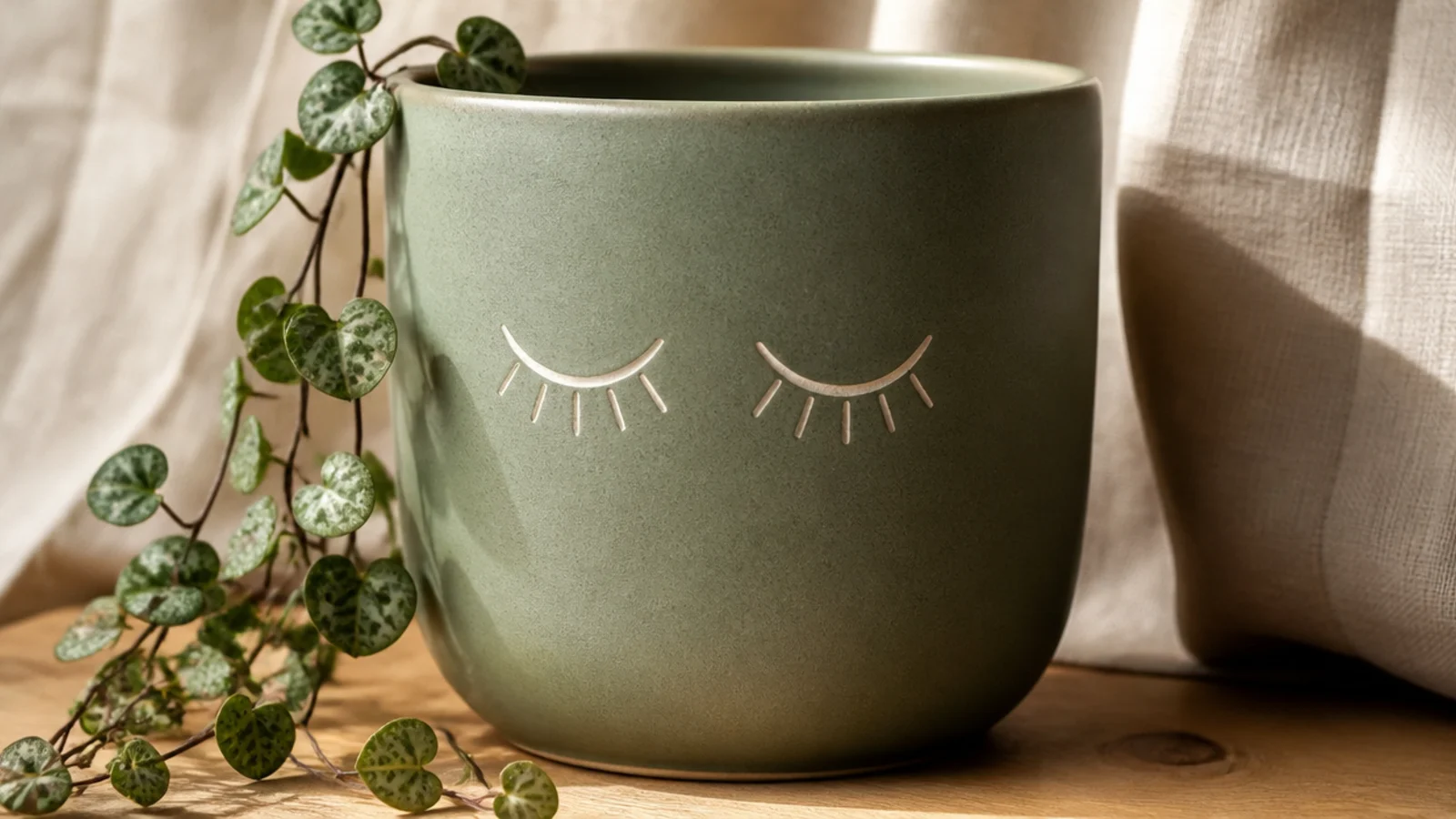
Closed, curved-down eyes give a calm, sleepy face that feels very Scandi and grown-up while still being cute. It’s a great pick if smiley faces feel too childish for your space. The whole design is two matching curves, so it reads as intentional minimalism, not a cartoon.
Base-coat the pot in a muted color like sage or greige and let it dry. Pencil two short downward-curving arcs side by side, low and centered. Paint each closed eye in one smooth stroke with a fine liner, then add two or three tiny lash lines at the outer end of each curve. Keep it black or deep charcoal for a clean look, then seal with matte clear.
Editor's noteDraw both eye curves in the same direction and at the same height by resting your hand and pulling each stroke the same way — matching arcs are what sell the calm expression.
Skip thisDon’t add a mouth or cheeks here; the charm is the restraint, and extra features turn a serene face busy.
4. Cheerful Color-Block Sunshine Pot
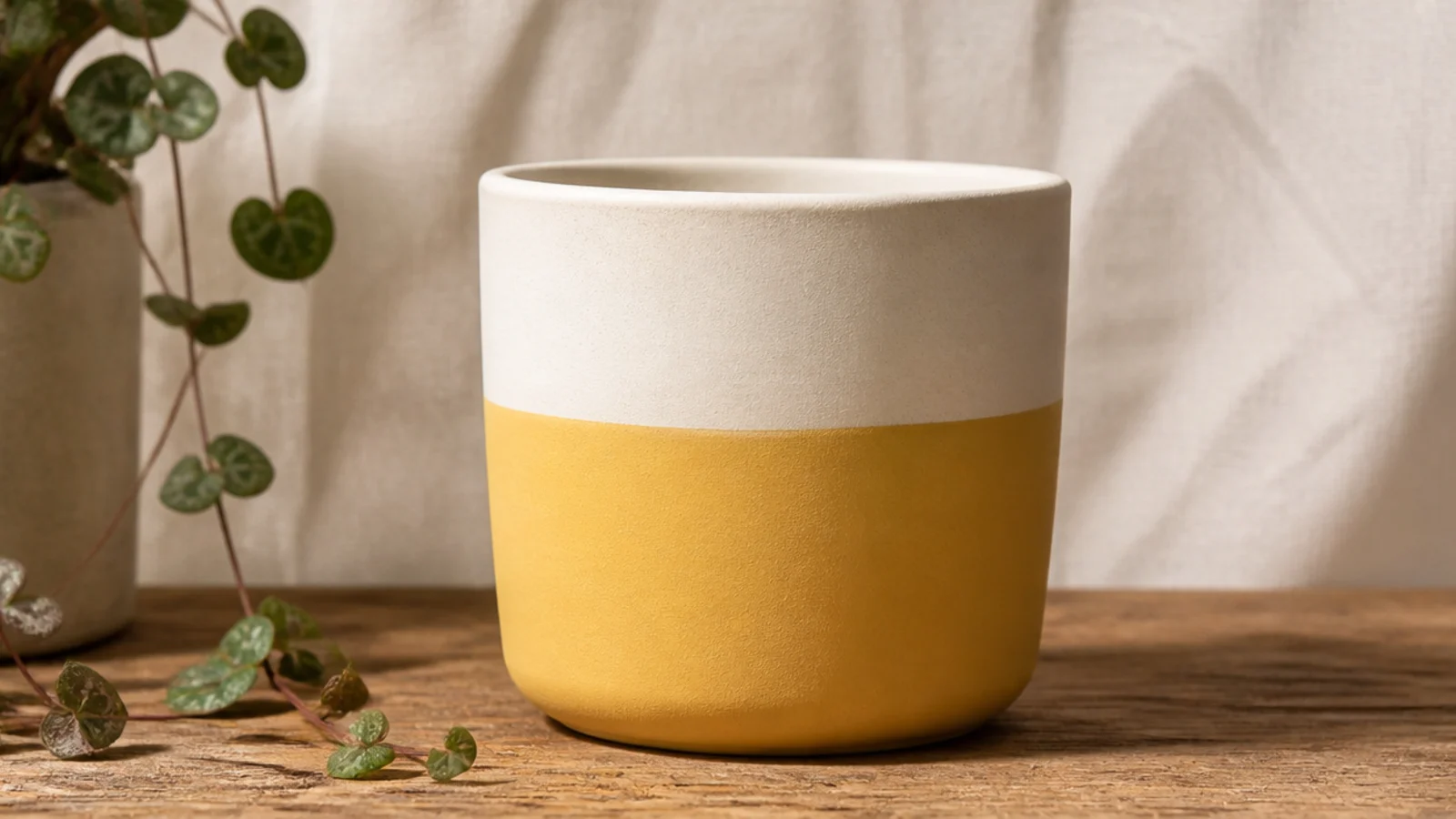
Not every cute pot needs a face — a happy color block does it with zero drawing. One warm, cheerful color on the bottom and a soft neutral on top reads sunny and modern, and the tape does all the precision work. Butter yellow, coral, or peach on the bottom keeps it bright without looking loud indoors.
Prime, then base-coat the whole pot in your lighter top color and let it dry. Wrap a strip of painter’s tape level around the pot about halfway up, pressing the edge down hard so paint can’t creep under. Paint below the line in your cheerful color with two thin coats, then peel the tape while the second coat is still slightly wet for a crisp edge. Touch up any bleed with a fine brush and seal with matte clear.
Editor's noteRun a fingernail firmly along the tape edge before painting to burnish it — that one move is the difference between a crisp line and a fuzzy one.
Skip thisDon’t skip base-coating the whole pot first; if the top color doesn’t fully cover, the seam between colors looks muddy.
5. Panda Face Pot
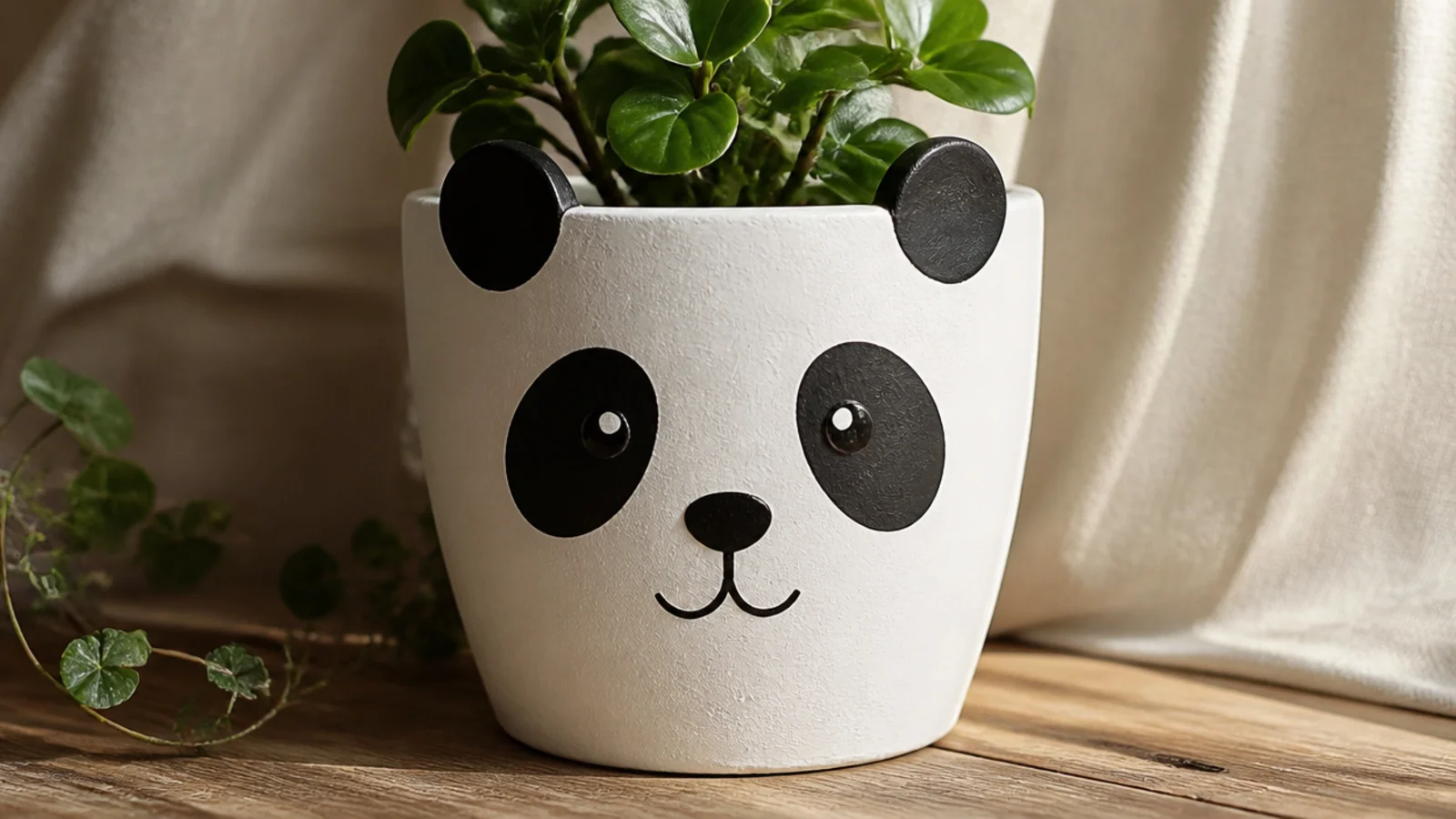
A panda is one of the most beginner-friendly animal faces because it’s all simple black shapes on white. Two round ears at the rim, two oval eye patches, a little nose, and a smile give you an instantly recognizable, very cute character. It suits a kid’s room or a cheerful kitchen shelf.
Base-coat the pot white with two thin coats and let it dry. Pencil two ear circles straddling the rim, two angled oval eye patches, a small nose, and a curved mouth. Fill the ears and eye patches with black acrylic using a small round brush, then dot a white highlight inside each black patch for the eyes. Add the nose and smile with a fine liner, let dry, and seal with matte clear.
Editor's noteAdd a tiny white dot as a catchlight inside each black eye patch — that single highlight is what makes the panda look alive instead of blank.
Skip thisDon’t make the black eye patches too big or too round; slightly angled, tapered ovals read as a face, while big circles look like a bug.
6. Boho Muted Rainbow Arch Pot
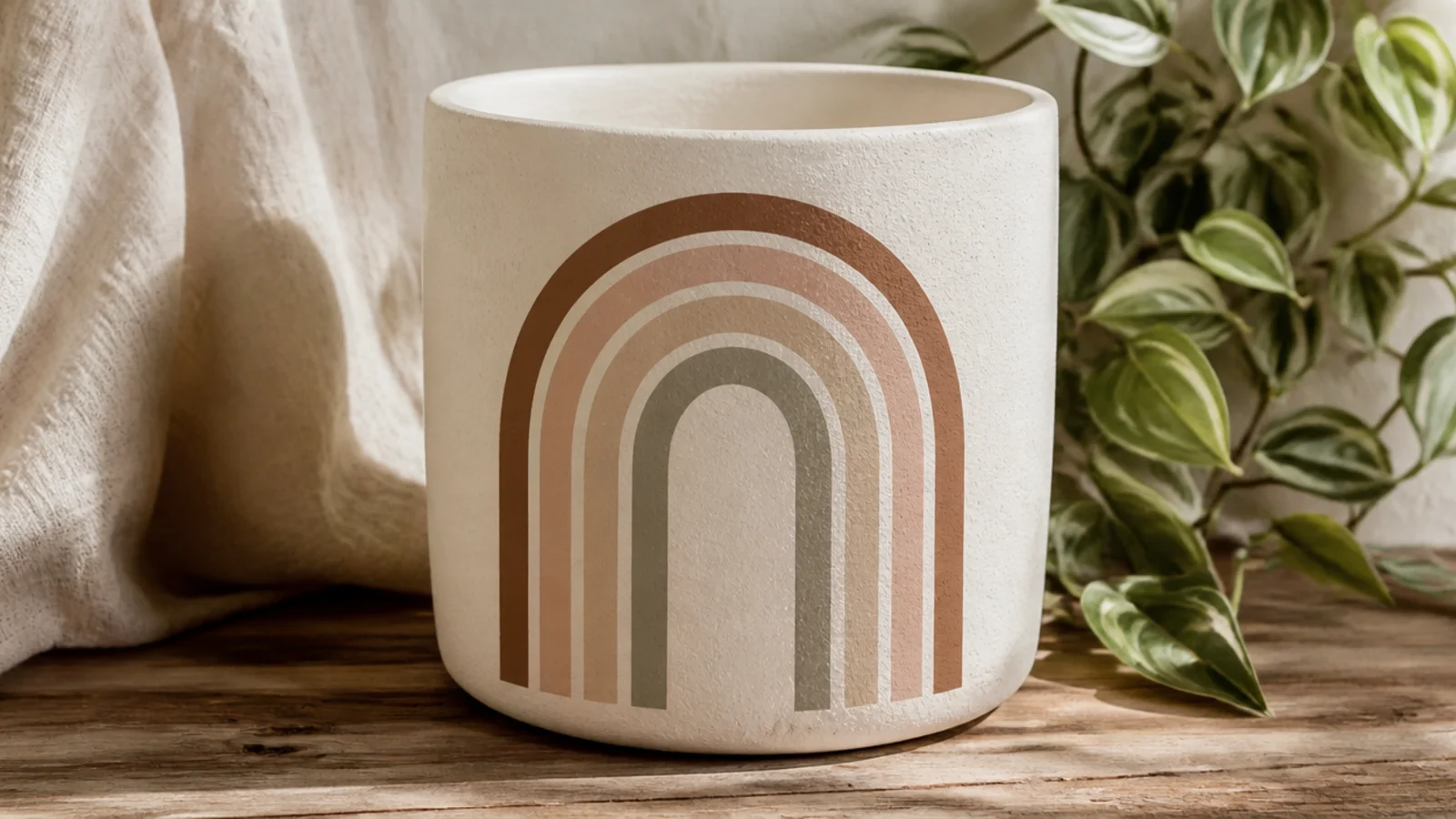
A single muted rainbow arch on the front is cheerful in a grown-up, boho way — especially in earth tones instead of bright primaries. You paint nested half-circles and fill them in, keeping it to one side so it looks like a designed graphic. It pairs beautifully with trailing plants and neutral shelves.
Base-coat the pot in cream and let it dry. Lightly pencil three or four nested half-circle arches on the front, tracing around graduated round objects like a cup and a jar lid for clean curves. Fill each band with a small brush in muted terracotta, mustard, sage, and dusty blue, keeping the bands even. Let it dry, erase stray pencil, and seal with matte clear.
Editor's noteTrace around progressively smaller round objects for each arch line — even nested curves are almost impossible to freehand cleanly.
Skip thisDon’t use bright primary rainbow colors if you want the grown-up boho look; muted earth tones read far more expensive.
7. Sweet Bunny Ears Pot
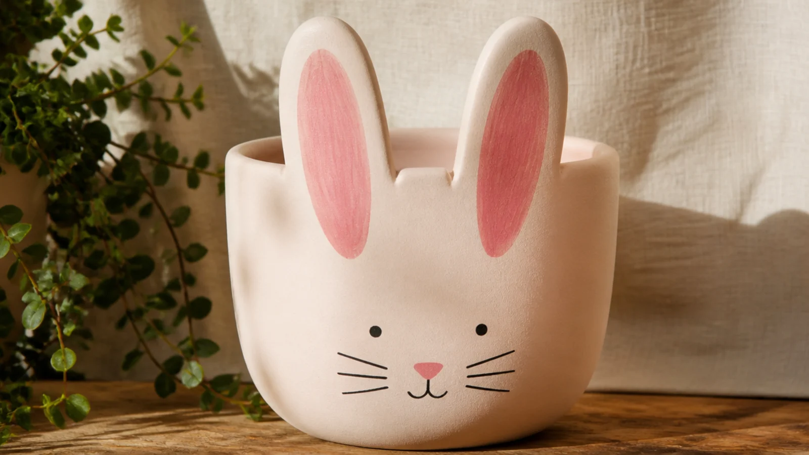
Two tall ears rising from the rim turn a plain pot into a bunny, and the plant pokes up between them like a little tuft. It’s playful without being complicated — the ears are two long ovals and the face is a few dots. Soft blush or cream bases keep it sweet rather than cartoonish.
Base-coat the pot in a soft color and let it dry. Pencil two tall, narrow ear shapes rising above the rim on the front, then paint a smaller pink inner-ear oval inside each with a small round brush. Below the ears, add two dot eyes, a tiny triangle nose, and a small stitched mouth with a fine liner. Add a few whisker dots if you like, then seal with matte clear.
Editor's notePaint the pink inner ear slightly narrower and centered inside the outer ear, leaving an even border — that clean margin is what makes the ears look designed.
Skip thisDon’t paint the ears leaning at different angles; mismatched ears make the bunny look lopsided instead of cute.
8. Freckled Cheek Pot

Add a scatter of freckles to a simple face and it goes from plain-cute to full of personality. The freckles sit over soft cheeks and read warm and friendly, especially on a sunny base color. It’s still beginner-level — the freckles are just tiny dots tapped on with a fine brush tip.
Base-coat the pot in a warm color like butter yellow and let it dry. Stamp two soft cheeks with a pencil eraser in dusty pink, then add dot eyes and a wide curved smile with a fine liner. Once the cheeks are dry, tap five or six tiny freckle dots across each cheek and the nose bridge using just the tip of a fine brush. Keep the freckles small and irregular, then seal with matte clear.
Vary the freckle sizes slightly and don’t line them up in a grid — a loose, random scatter looks natural, while an even row looks like polka dots.
Don’t add the freckles before the cheeks are fully dry, or they’ll smear and blur into the blush.
9. Curious Cat Face Pot
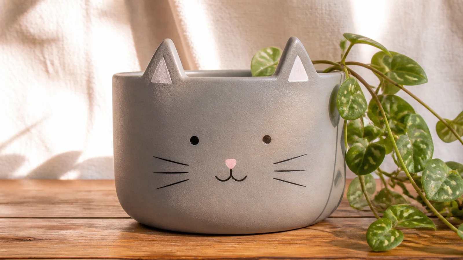
A cat face brings a bit more attitude than the round animals, thanks to the pointed ears and long whiskers. Two triangle ears at the rim, a small nose, and a few whisker lines are all it takes. Grey, cream, or soft ginger bases all read as a believable little cat.
Base-coat the pot in your cat color and let it dry. Pencil two triangle ears straddling the rim and paint a smaller pink inner triangle inside each. Add two dot or almond eyes, a small pink triangle nose, and a tiny curved mouth with a fine liner. Finish with three thin whiskers on each side using a fine liner in one confident stroke each, then seal with matte clear.
Editor's notePaint the whiskers in single, quick strokes flicking outward from the nose — fast strokes taper naturally, while slow ones come out thick and wobbly.
Skip thisDon’t make the whiskers thick or perfectly straight; heavy, ruler-straight whiskers look stiff instead of soft and cat-like.
10. Terrazzo Speckle Pot
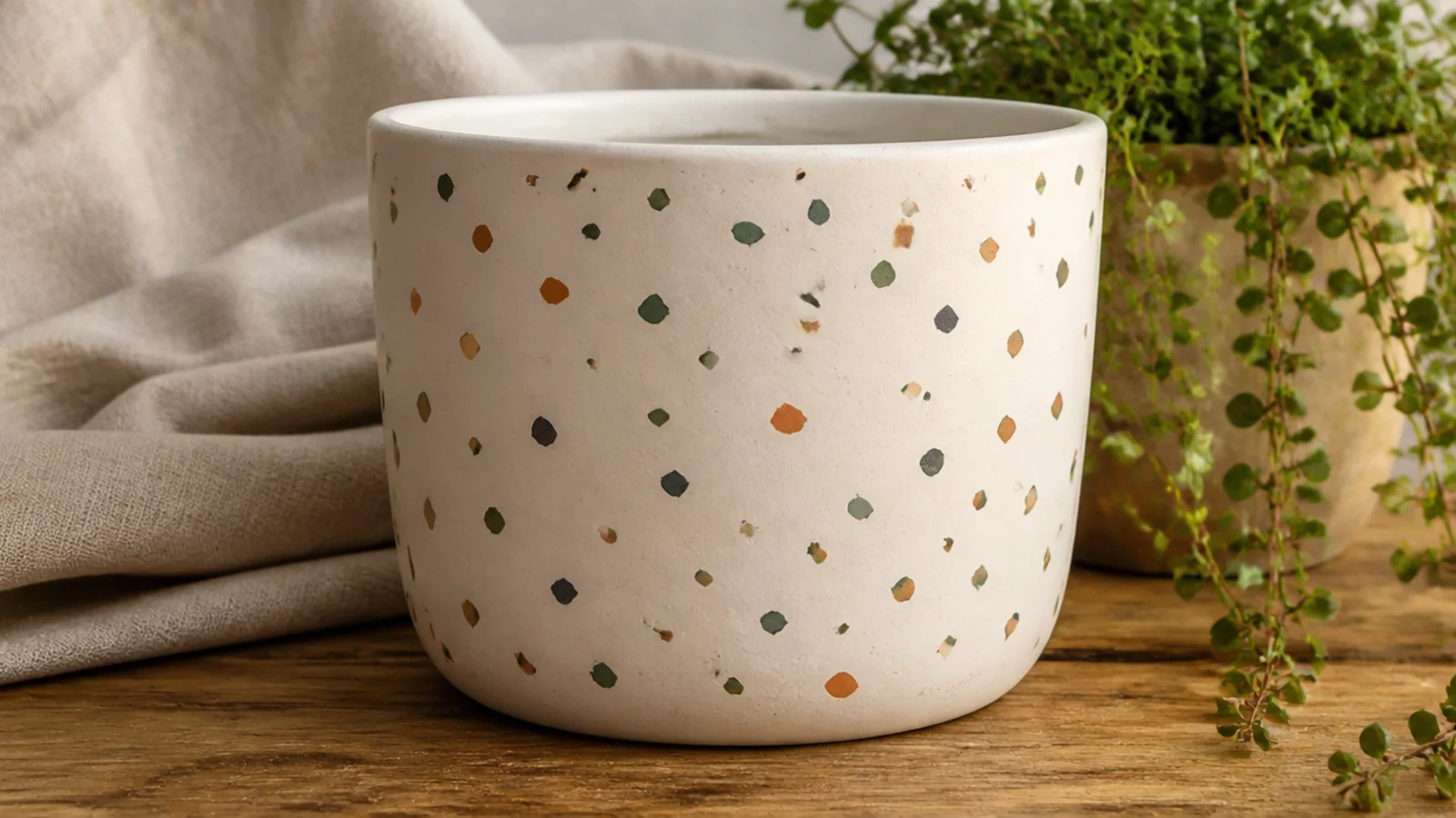
A terrazzo finish looks like a designer ceramic and is genuinely hard to mess up, since the random chips hide any unevenness. You paint small irregular flecks in a few colors scattered over a cream base. It’s a cute-but-grown-up look that suits a modern shelf and pairs with almost any plant.
Base-coat the pot cream with two thin coats and let it dry. Using a small round brush, paint small irregular chip shapes — little rounded triangles and ovals — scattered evenly around the pot in sage, terracotta, and charcoal. Keep the chips varied in size but spaced out so no color clusters. Let it dry fully and seal with a satin or matte clear for that ceramic feel.
Editor's noteRotate the pot as you go and add colors one at a time, stepping back often, so the chips stay evenly balanced instead of bunching on one side.
Skip thisDon’t make all the chips the same size or shape; uniform flecks look like polka dots, while varied shapes read as real terrazzo.
11. Boho Wavy Squiggle Pot
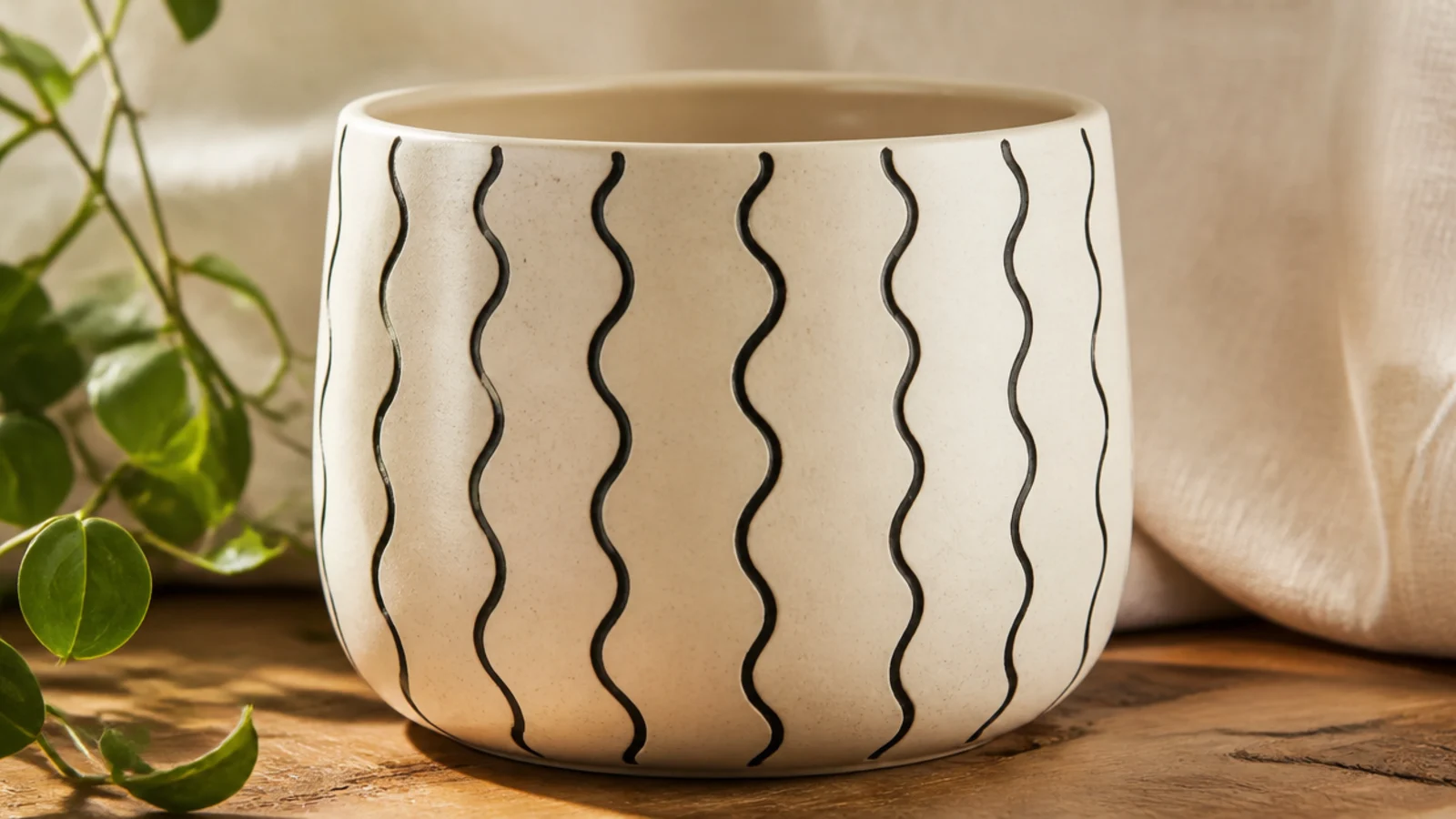
Thin wavy lines wrapping the pot give a calm, boho, hand-drawn look that suits a minimalist shelf. It’s just repeated squiggles, so there’s no shape to get right — the slight imperfection is the charm. A black-on-cream palette is the classic, but terracotta-on-cream is softer.
Base-coat the pot cream and let it dry. Using a fine black paint pen (much steadier than a brush for this), draw evenly spaced vertical wavy lines from just below the rim to the base, keeping a consistent wave size. Space them by eye, roughly a finger-width apart, working around the pot. Let the ink dry fully, then seal with a light matte spray clear so the pen lines don’t smear.
Use a paint pen instead of a brush for these lines and pull each squiggle in one continuous motion — a brush drags and blobs, while a pen glides evenly.
Don’t seal paint-pen lines with a heavy brushed-on varnish that can smear the ink; use a light spray clear or a gentle matte instead.
12. Matched-to-Decor Two-Tone Pot
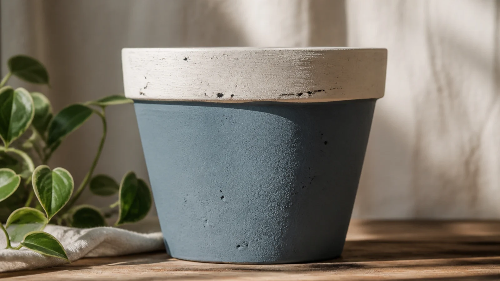
The most “designed” looking pots pick up a color already in the room, so the planter reads intentional rather than random. Here you paint the body one of your room’s accent colors and the rim a neutral to frame the plant. It’s a clean, grown-up cute — simple, but it looks styled in on purpose.
Prime, then base-coat the whole pot in your chosen accent color (match a cushion, a mug, or art in the room) with two thin coats. Once dry, tape a level line just below the rim, press the edge down firmly, and paint the rim and a little of the inside lip in a soft neutral like cream. Peel the tape while slightly wet, touch up any bleed, and seal with matte clear.
Editor's noteBring the actual object you’re matching — the cushion or mug — to the paint aisle or hold it against your paint bottles, since screen and memory colors drift.
Skip thisDon’t leave the inside rim raw; a painted inside lip is what makes the pot look finished when you look down at it on a shelf.
13. Happy Cloud and Raindrops Pot
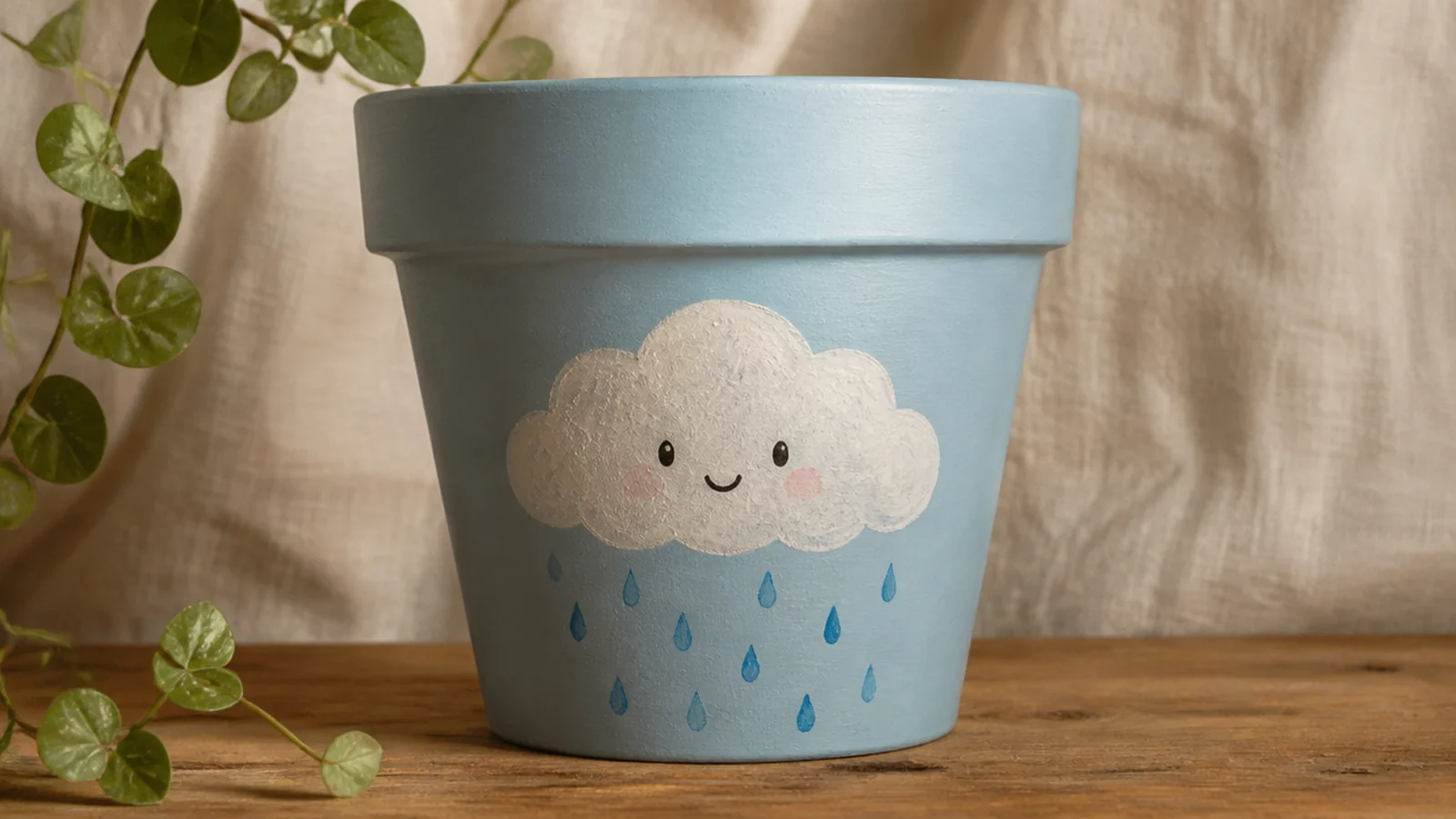
A little cloud with a face and a few falling raindrops is cheerful and fitting for a plant — the “rain” nods to watering. The cloud is a row of overlapping bumps and the drops are simple teardrops. It’s sweet without being babyish, especially in a soft sky-blue palette.
Base-coat the pot pale blue and let it dry. Pencil a fluffy cloud shape — a straight bottom with three or four rounded bumps on top — on the front and fill it white with a small round brush. Add two dot eyes and a tiny smile on the cloud, then paint five or six small teardrop raindrops falling below it in a deeper blue. Let it dry and seal with matte clear.
Paint each raindrop as a teardrop — a rounded bottom pulled up to a fine point — rather than a plain oval, so they clearly read as falling rain.
Don’t crowd the raindrops directly under the whole cloud; a light, spaced scatter looks like gentle rain, while a solid block looks like a curtain.
14. Woodland Fox Face Pot
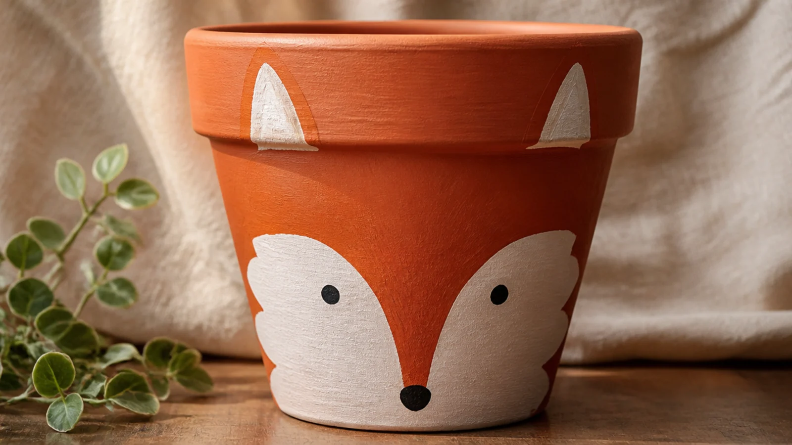
A fox brings warm woodland charm and uses terracotta’s natural orange as the fur color, which feels perfect for a clay pot. The white muzzle and pointed dark-tipped ears make it instantly readable as a fox. It’s a step up from the panda but still built from simple shapes.
Base-coat the pot in warm orange (or leave primed terracotta) and let it dry. Paint a white rounded muzzle across the lower front, then pencil two pointed ears at the rim and fill their tips dark brown or black. Add two dot eyes where the orange meets the white, a small black triangle nose at the top of the muzzle, and a tiny smile. Let it dry and seal with matte clear.
Editor's noteLet the white muzzle dry completely before adding the nose and eyes on top, so the dark details stay crisp instead of bleeding into the wet white.
Skip thisDon’t skip the white muzzle; without that lighter patch the face reads as a generic orange animal instead of a fox.
15. Hand-Lettered Affirmation Pot
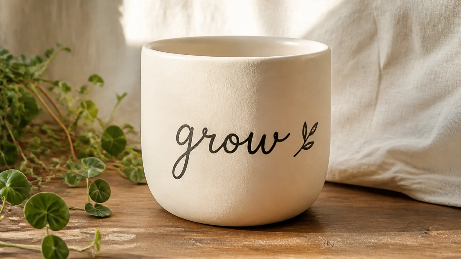
A short word — grow, bloom, hello — hand-lettered on the front makes a pot feel personal and gift-worthy. Keeping the word short and simple means even shaky lettering looks charming. It’s the most advanced look here only because of the lettering, but a paint pen makes it very doable.
Base-coat the pot cream and let it dry. Lightly pencil your short word centered on the front, sketching simple lowercase letters and checking the spacing before you commit. Trace over your pencil with a fine black paint pen in slow, steady strokes, thickening the downstrokes slightly for a script feel. Add a tiny leaf or sprig beside the word, erase stray pencil, and seal with a light matte spray clear.
Editor's notePencil the whole word first and adjust spacing until it’s centered — lettering fails almost always come from planning too little, not from bad handwriting.
Skip thisDon’t attempt a long phrase or fancy cursive on a first try; one short lowercase word is forgiving and reads as intentional design.