1. One Bloom on a Wide Mat
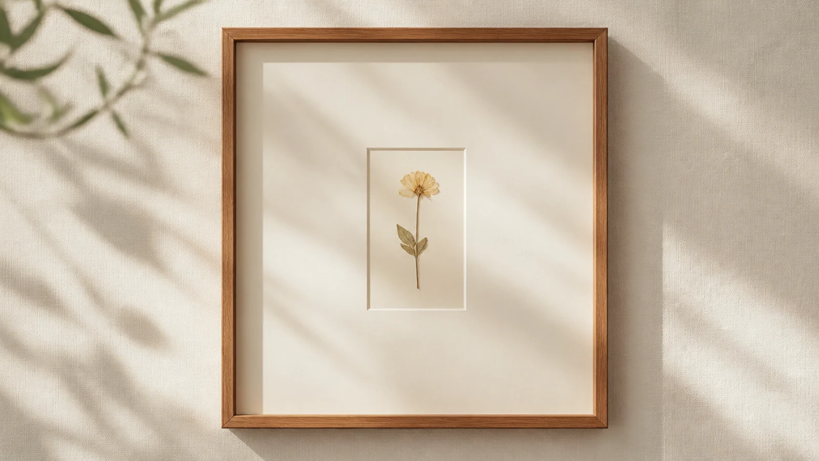
Press one flat flower until papery. Use a frame with a wide cream mat, or cut acid-free backing with lots of margin. Center the flower in the opening, mark its spot lightly, and mount with a single PVA dot at the center. Weight flat for an hour, set the mat on top, and close under glass.
This is the simplest design and the one to copy first. A single pressed bloom centered on a wide mat looks like gallery art because the margin does the styling. One flower, one decision, nothing to get wrong. Any flower with a clear shape works.
Skip thisDon’t add a second flower to fill space; one bloom with a wide margin is the design, and a second one clutters the calm.
Editor's noteChoose the widest mat that fits your frame; the more margin around the single flower, the more expensive and intentional it looks.
2. Three Stems in a Row
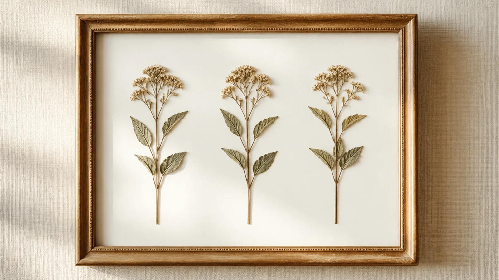
Press three similar stems flat. On white acid-free backing, measure and mark three evenly spaced positions in a row. Place each stem upright at a mark, matching heights, and anchor with PVA dots at the base and center. Erase the marks, weight flat overnight, and frame under glass.
Three matching stems in an evenly spaced row look orderly and modern. The repetition reads as deliberate design with almost no effort. Use three of the same flower so the row feels intentional and clean.
Skip thisDon’t space the three unevenly; with so few elements, an off gap is glaring, so measure the spacing before gluing.
Editor's noteUse three identical stems of the same height; matching pieces make the row read as a designed set rather than a random handful.
3. Off-Center Single Sprig
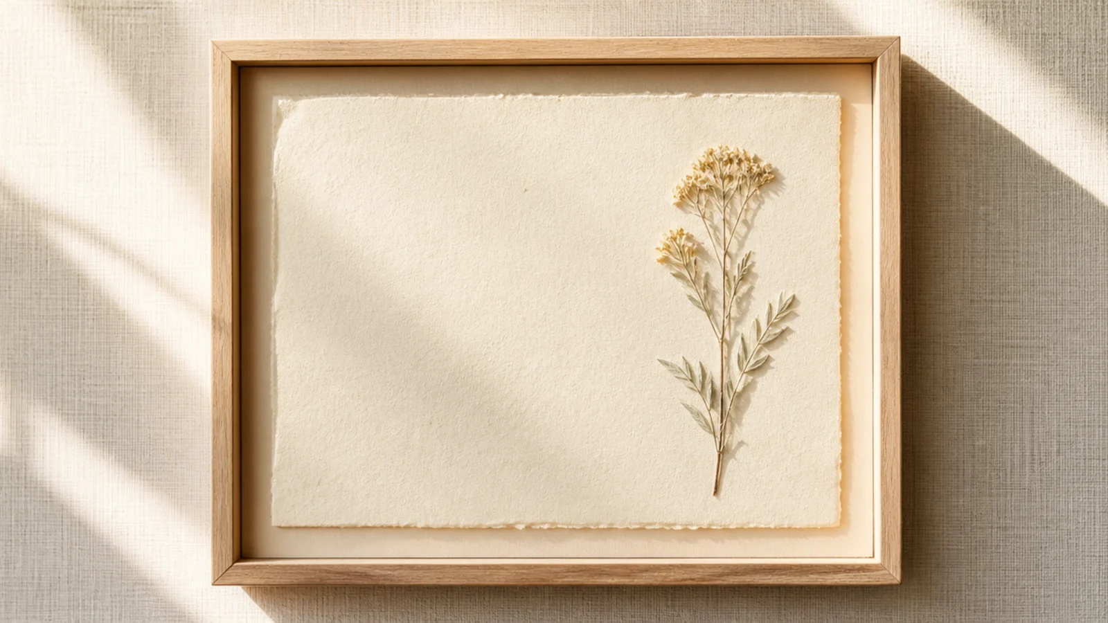
Placing one sprig off to the side, with open space beside it, looks fresh and modern. The asymmetry feels intentional and a little editorial. It’s a simple twist on the single-bloom design that reads more contemporary.
Press one delicate sprig flat. On neutral backing, place it toward one side (roughly a third in), letting it reach toward the open space. Mark the spot, mount with PVA dots at a couple of points, and leave the rest empty. Weight flat overnight and frame under glass.
Angle the sprig so it leans slightly into the empty space; that small gesture ties the asymmetry together and looks deliberate.
Don’t center the sprig or balance it with something on the other side; the off-center placement is the whole point.
4. Two-Tone Mat Border
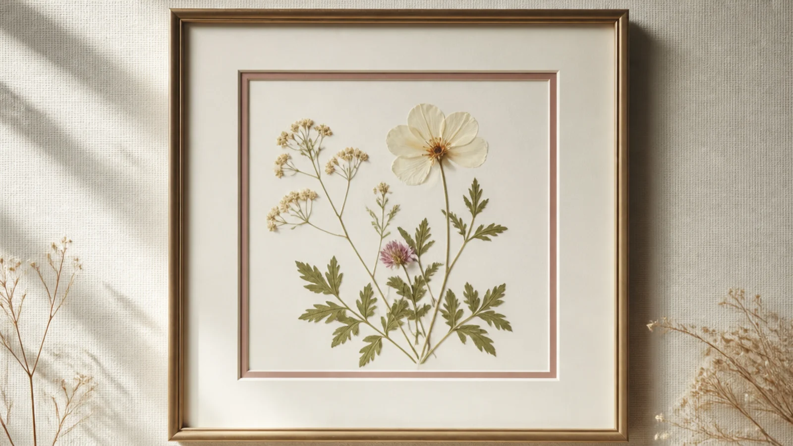
A double mat — a thin colored inner line around a wide neutral mat — adds a subtle designer detail to a single flower. The fine colored line frames the bloom like a professional gallery mat. It’s simple but looks custom-framed.
Press one flower flat. Use a double mat, or layer a small colored mat inside a wider cream one, so a thin band of color shows around the opening. Mount the flower centered on backing with a PVA dot, layer the mats over it, and frame under glass. Match the inner mat color to the flower for cohesion.
Pick the inner mat color from the flower itself; matching the thin line to a petal tone makes the whole frame feel considered.
Don’t make the inner colored border wide; a thin line reads elegant, while a thick colored mat overwhelms the single bloom.
5. Pressed Leaf Pair
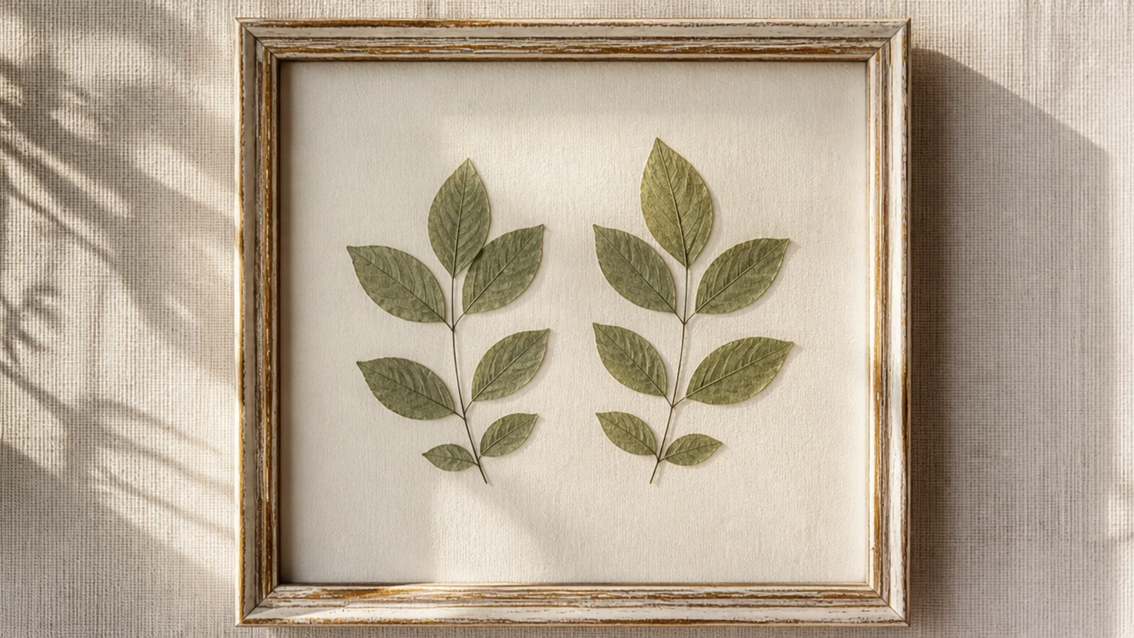
Press two matching leaves flat until dry. On cream backing, place them symmetrically — either side by side or mirrored — with even spacing. Anchor each with a PVA dot at the base and center. Keep the arrangement simple and balanced, weight flat overnight, and frame under glass.
Two simple pressed leaves are calm, greenery-only, and effortlessly modern. No color needed — the leaf shapes carry it. It’s a serene, botanical design that suits any room and any decor.
Skip thisDon’t use torn or curled leaves; a simple design shows every flaw, so pick two clean, flat, undamaged leaves.
Editor's noteChoose leaves with a clear, graphic shape like ginkgo or a simple oak; strong silhouettes read better than fussy, lobed leaves.
6. Vertical Line of Buds
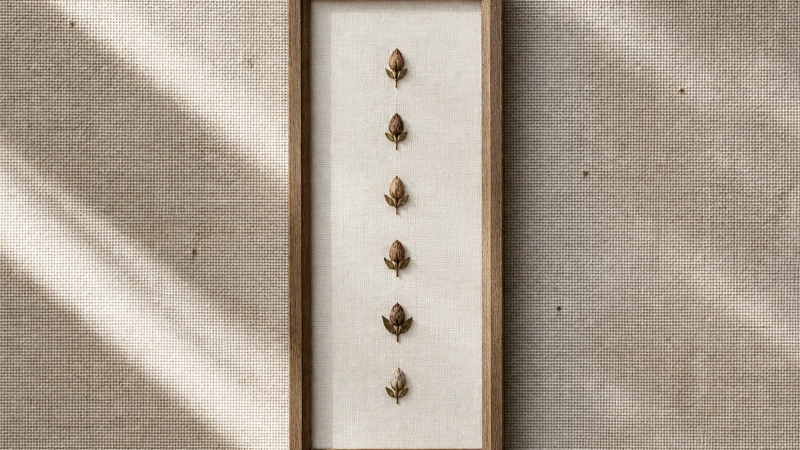
A single vertical line of small pressed buds is tidy, rhythmic, and suits a narrow frame. The evenly spaced dots of color draw the eye up. It’s a simple pattern that looks graphic and clean.
Press several small buds flat. Use a tall, narrow frame. On pale backing, mark evenly spaced points down the center, then place a bud at each, matching sizes. Anchor with a PVA dot each. Keep the spacing exact, erase marks, weight flat, and frame under glass.
Keep the buds the same size and perfectly aligned down the center; the clean vertical rhythm is what makes this design work.
Don’t let the line drift off-center or the buds vary in size; in a narrow frame, small irregularities stand out badly.
7. Single Corner Sprig
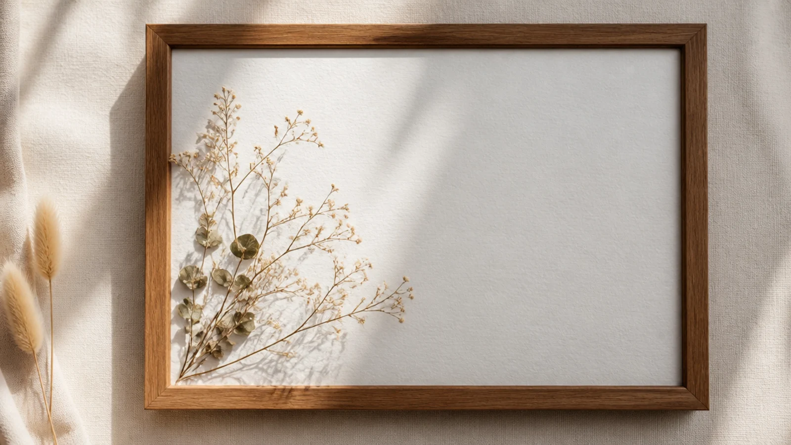
A small sprig tucked into one corner with everything else left open is minimal and modern. The corner placement feels intentional and leaves calm space. It’s a great design when you only have one nice small piece.
Press a small sprig flat. On white backing, place it in one corner, angled to reach slightly toward the center. Mount with PVA dots at two points. Leave the rest of the frame completely empty, weight flat overnight, and frame under glass with a clean margin.
Let one fine stem from the sprig extend a little into the open space; that single line stops the emptiness feeling accidental.
Don’t add a matching sprig in the opposite corner; the single-corner asymmetry is what makes it modern, not a balanced pair.
8. Small Centered Cluster
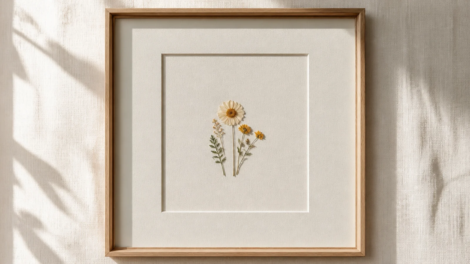
Press three to five small flowers flat. On backing with a wide mat, group them in a small, tight cluster in the center, overlapping slightly like a posy. Anchor each with a PVA dot. Keep the cluster compact with lots of margin around it, weight flat, and frame under glass.
A small, tight cluster of a few flowers centered in a wide mat is simple but a touch fuller than a single bloom. The little grouping reads like a posy. It’s a gentle step up from one flower while staying calm.
Skip thisDon’t let the cluster sprawl toward the edges; the generous empty margin around a compact group is what keeps it simple.
Editor's noteKeep the cluster small and tight in the center; a compact posy with a wide margin looks designed, while a spread-out one looks scattered.
9. Monochrome Trio
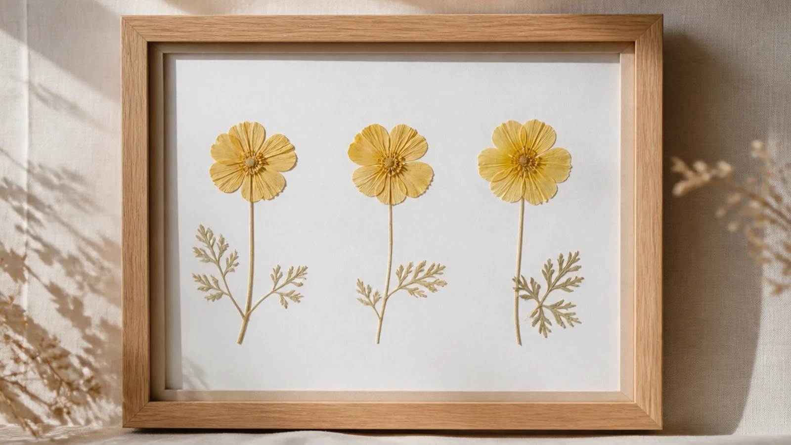
Three flowers in a single color are cohesive and calm, with the shared shade doing the styling. One-color designs always look intentional. It’s a simple way to make three blooms feel like a considered set.
Press three flowers in one color family flat. On white backing, arrange them simply — a row, a triangle, or a gentle cluster — keeping the spacing even. Anchor each with a PVA dot. The matching color ties them together, so the layout can stay very simple. Weight flat and frame under glass.
Vary the flower shapes but keep them all one color; the single hue unifies them while different shapes keep it interesting.
Don’t mix in an off-color bloom; one wrong shade breaks the monochrome effect that makes the simple trio look designed.
10. Simple Four-Square Grid
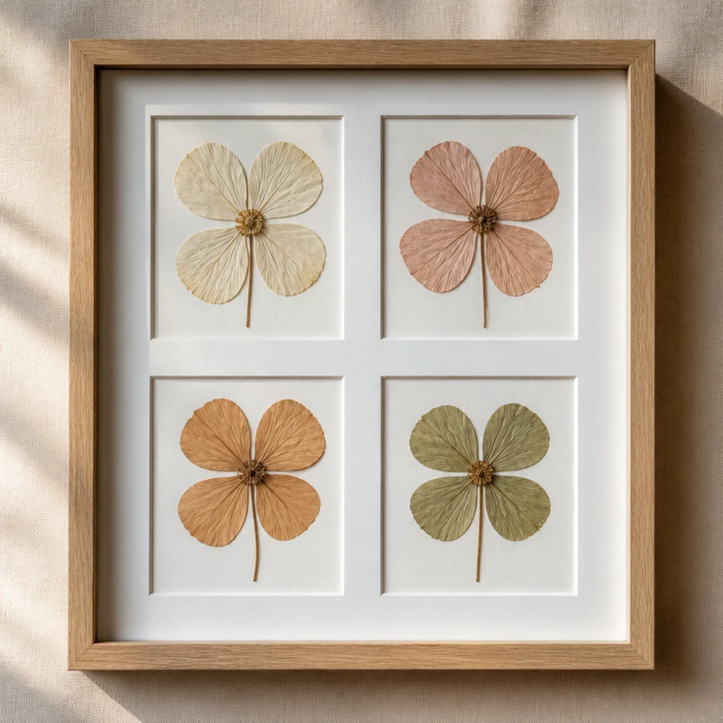
Press four flowers flat. On white backing, measure and mark a two-by-two grid with even spacing and margins. Place a flower at each point, all facing the same way, and anchor with a PVA dot each. Erase the marks, weight flat overnight, and frame in a square frame under glass.
Four flowers in a neat two-by-two grid are orderly and satisfying. The strict grid makes a simple design look deliberate and modern. It’s foolproof because the structure does the work.
Skip thisDon’t let the four flowers vary wildly in size; similar sizes keep the grid balanced, while one big and one tiny throw it off.
Editor's noteKeep equal margins around the whole grid and equal gaps between flowers; matching spacing all around is what makes a grid look clean.
11. Tall Frame, One Long Stem
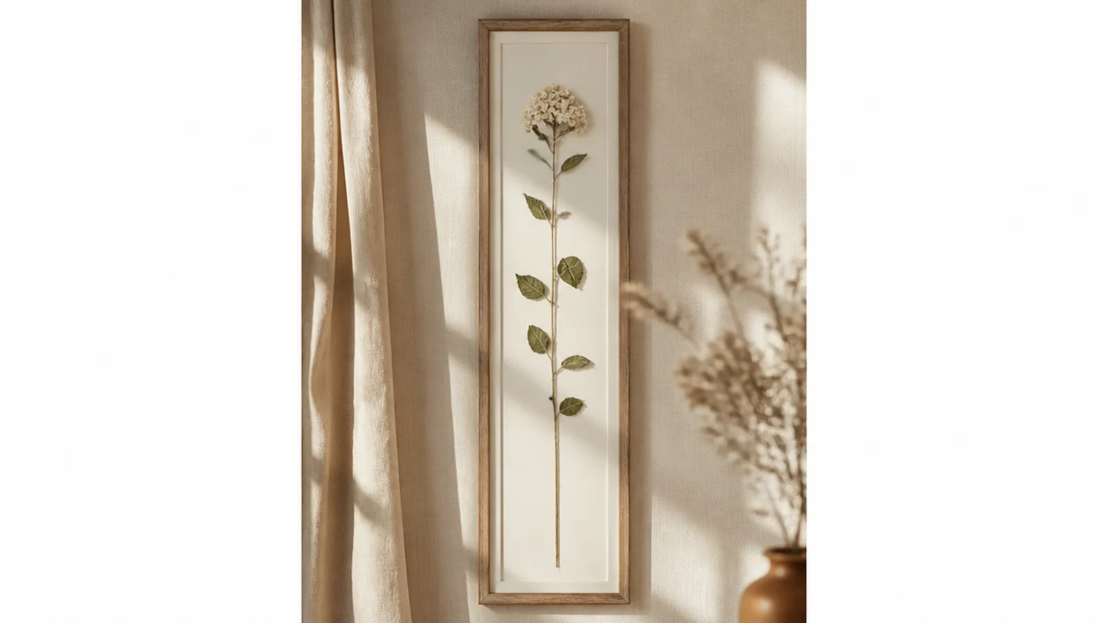
One long stem in a tall frame is architectural and elegant with a single element. The vertical line suits skinny wall spaces and looks intentional. It’s simplicity that fills an awkward gap beautifully.
Press one long stem or grass flat, as tall as possible. Use a tall, narrow frame. Center the stem vertically with a clean margin top and bottom. Anchor it with PVA dots every few inches so it stays straight. Weight flat overnight and frame under glass.
Leave a clear, equal margin above and below the stem; the breathing room top and bottom stops it looking cramped in the tall frame.
Don’t let the stem sit crooked; in a tall frame a leaning line is very obvious and undoes the clean vertical effect.
12. Wide-Margin Minimalist
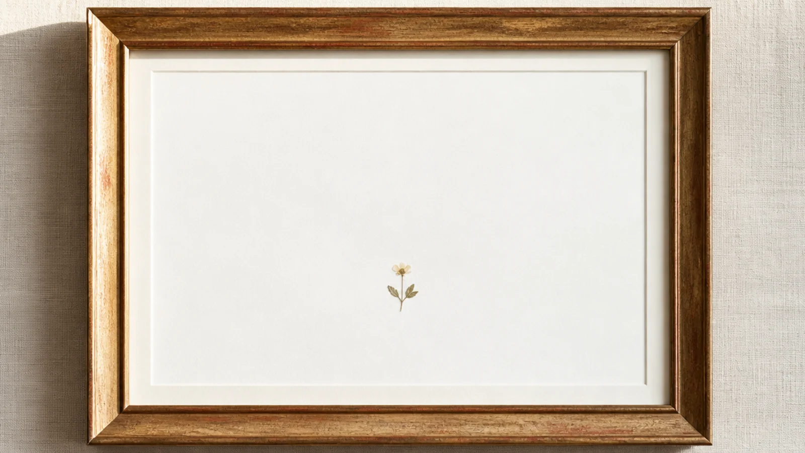
One small flower in a large frame with a huge margin is minimalism at its purest. The vast empty space makes the tiny bloom feel precious and gallery-worthy. It’s a bold, confident design that says a lot with almost nothing.
Press one small, perfect flower flat. Use a large frame with a wide mat or plenty of backing. Place the single flower low-center or slightly off-center, mount with one PVA dot, and leave an expanse of empty space around it. Weight flat and frame under glass.
Choose your single most perfect little flower for this; when it’s the only element in a big frame, it has to be flawless.
Don’t lose your nerve and add more; the daring emptiness is the entire design, and filling it makes it ordinary.
13. Two Facing Stems
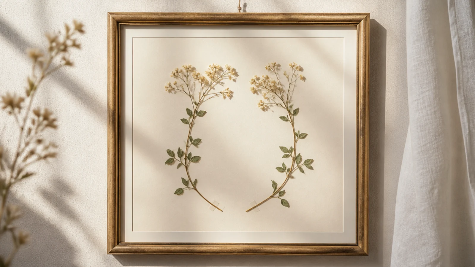
Press two similar stems with natural curves flat. On cream backing, place one on each side, curving gently toward the center so they nearly meet. Match their heights and anchor each with PVA dots. Keep it symmetrical and simple, weight flat overnight, and frame under glass.
Two stems curving toward each other are balanced and graceful without being fussy. The gentle facing shape reads calm and considered. It’s a simple two-element design with a little more elegance than a straight pair.
Skip thisDon’t let the two stems overlap or touch in the middle; a small gap where they nearly meet looks more elegant and intentional.
Editor's notePick two stems that curve in opposite directions naturally, so they face each other organically instead of looking bent to fit.
14. Diagonal Single Stem
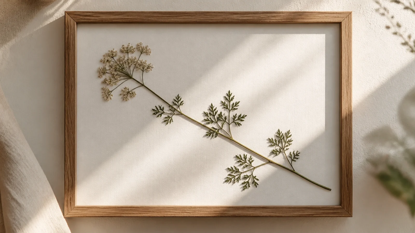
A single stem laid on a diagonal adds energy and movement to the simplest possible design. The angle feels dynamic and modern compared to a straight vertical. It’s one flower, placed with a bit of attitude.
Press one stem with a bloom flat. On white backing, lay it on a clean diagonal, running from near one corner toward the opposite area. Mount with PVA dots along the stem. Keep the angle deliberate and consistent, weight flat overnight, and frame under glass.
Commit to a clear diagonal angle rather than a slight tilt; a definite diagonal looks intentional, while a small slant looks like a mistake.
Don’t place the diagonal so the bloom lands in a corner; let the flower end sit in open space so it has room to be seen.
15. Matching Triptych Set
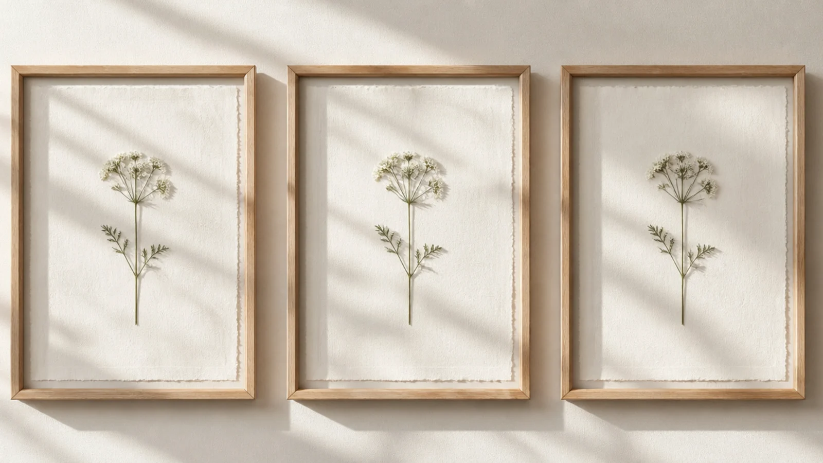
Make three identical simple frames, each with a single pressed flower centered on matching backing with the same margin. Use the same frame style and mat throughout. Hang them in a straight, evenly spaced row using a level and a paper spacer, so the gaps and heights match exactly.
Three identical frames, each with one flower placed the same way, make a calm triptych that fills a wall simply. The repetition is the design — no single frame is complicated. It’s the easiest way to turn simple frames into a striking set.
Skip thisDon’t vary the frames or flower placement between the three; the triptych effect depends on them being genuinely identical.
Editor's noteUse a paper spacing template cut to your gap width so all three frames hang at the same height and distance apart.