1. Neutral Minimalist Board
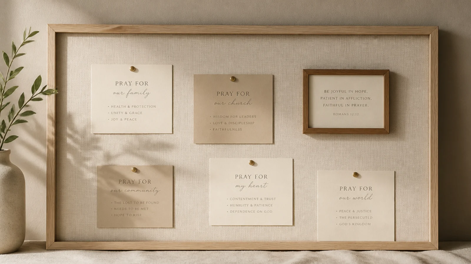
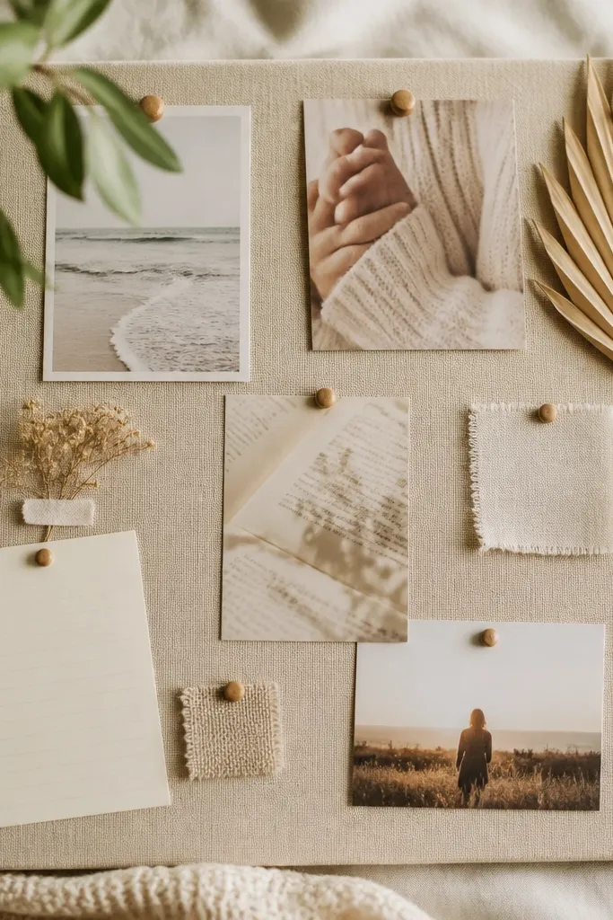
This is the most beginner-proof aesthetic because emptiness is the design. You mount a linen board, add just a handful of cards in cream and taupe, and let the negative space do the styling. It flatters any room and never looks busy. Perfect if you want calm and are nervous about overdecorating.
Editor's noteFollow a rough rule of thirds — keep at least a third of the board empty so it always reads calm and intentional.
Cover a board in cream linen or buy a pre-covered one. Cut cards from cream and taupe cardstock in one uniform size. Place a single small framed verse slightly off-center as the focal point, then add four or five cards with generous gaps. Write in one fine liner pen, and resist filling the space — the breathing room is the whole look.
Skip thisDon’t creep toward filling every gap; the moment a minimalist board gets crowded, it loses the only thing that made it work.
2. Boho Macramé Prayer Board
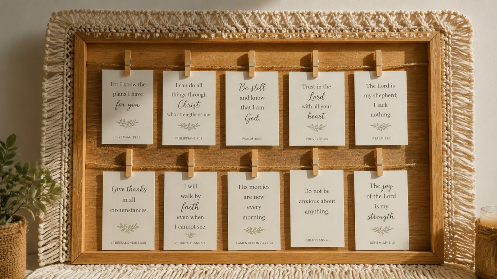
A macramé board brings warm, textured boho energy that feels handmade and cozy. You edge a board with jute macramé and hang cards from knotted strings. It suits a room with plants and natural textures, and the fringe softens hard edges. The texture makes even plain cards look styled.
Start with a natural wood or cork board. Knot a simple macramé fringe along the bottom edge using jute cord, or buy a small macramé piece and mount it as a border. String two or three horizontal jute lines across the board and clip cards with mini wooden pegs. Keep cards in cream and kraft tones so they blend with the natural fiber.
Comb out the jute fringe ends with a pet brush for that soft, full boho tassel look instead of stiff, stringy ends.
Don’t mix in glossy or brightly colored cards; they fight the natural fiber and break the earthy boho palette.
3. Floral Watercolor Board
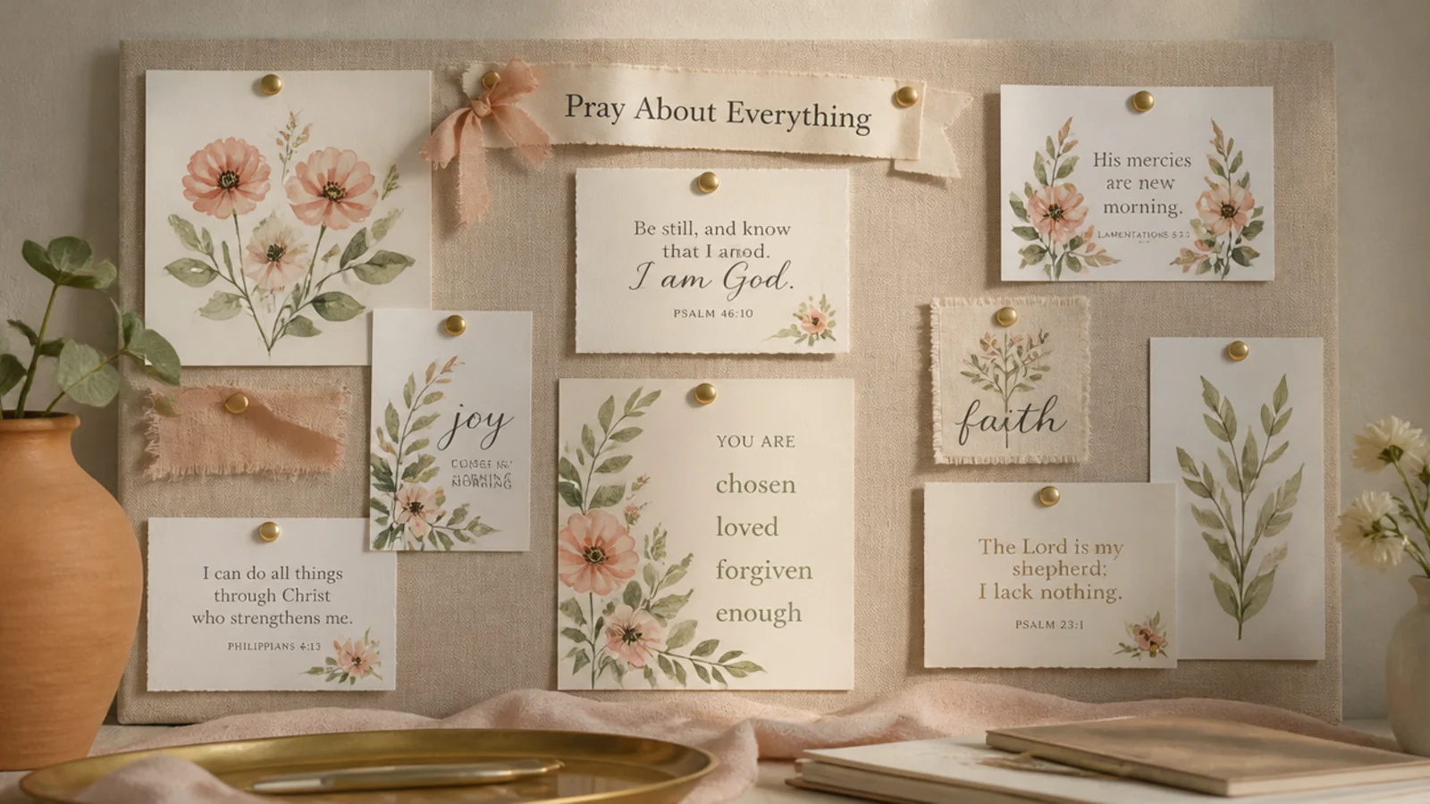
Watercolor florals give a gentle, feminine aesthetic that stays soft rather than sweet. You anchor the board with a couple of watercolor flower prints and echo their colors in the cards. It suits a bedroom or reading nook. The painted flowers do the decorating so your cards can stay simple.
Editor's notePull your card colors directly from the flower prints so the whole board reads as one coordinated watercolor set.
Print or paint two or three loose watercolor florals in blush, sage, and cream on cardstock. Mount them as anchors across the board and pull the card colors from the same washes. Add verse cards in a soft script that matches the painterly feel. Keep the flowers to two or three so the board stays airy, not floral-overload.
Skip thisDon’t cover the board in florals; two or three well-placed prints look styled, a wall of flowers looks like wrapping paper.
4. Pressed-Flower Cottagecore Board
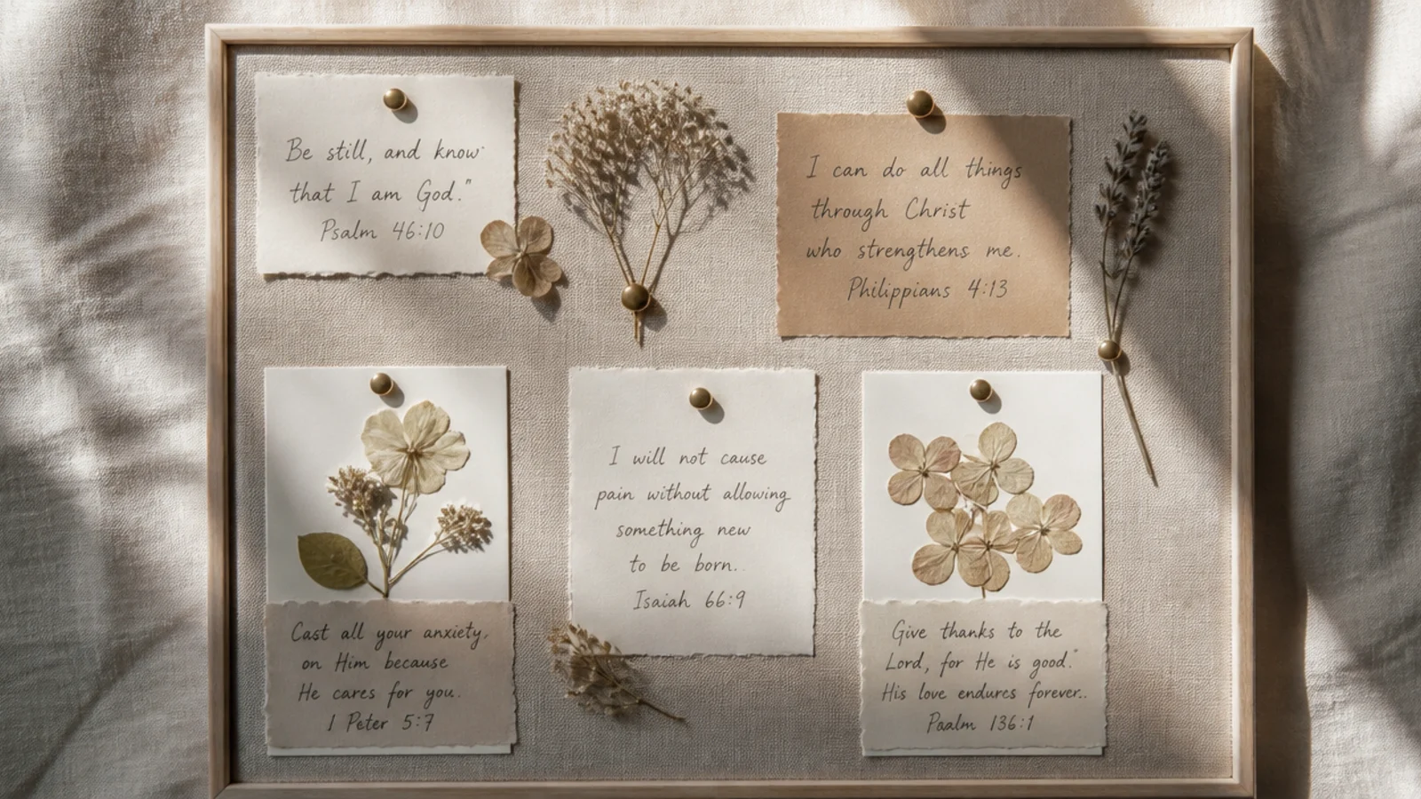
Real pressed flowers give a delicate cottagecore charm no print can fake. You tuck dried blooms among handwritten cards for a soft, garden-y board. It suits anyone who loves natural, romantic decor. The pressed flowers add texture and a personal, made-by-hand feel.
Press flowers between book pages for two weeks, or buy pressed ones. Arrange a few among your cards on a linen board, securing delicate stems with a dot of clear glue or tucking them behind ribbon. Handwrite verses in a soft script on cream cardstock. Keep the palette muted — dried flowers are naturally faded, so match cards to that softness.
Seal fragile pressed flowers under a small square of clear self-adhesive laminate so they don’t crumble over time.
Don’t use fresh or thick flowers; they mold and lose color, so only ever mount properly dried, flat blooms.
5. Sage and Cream Palette Board
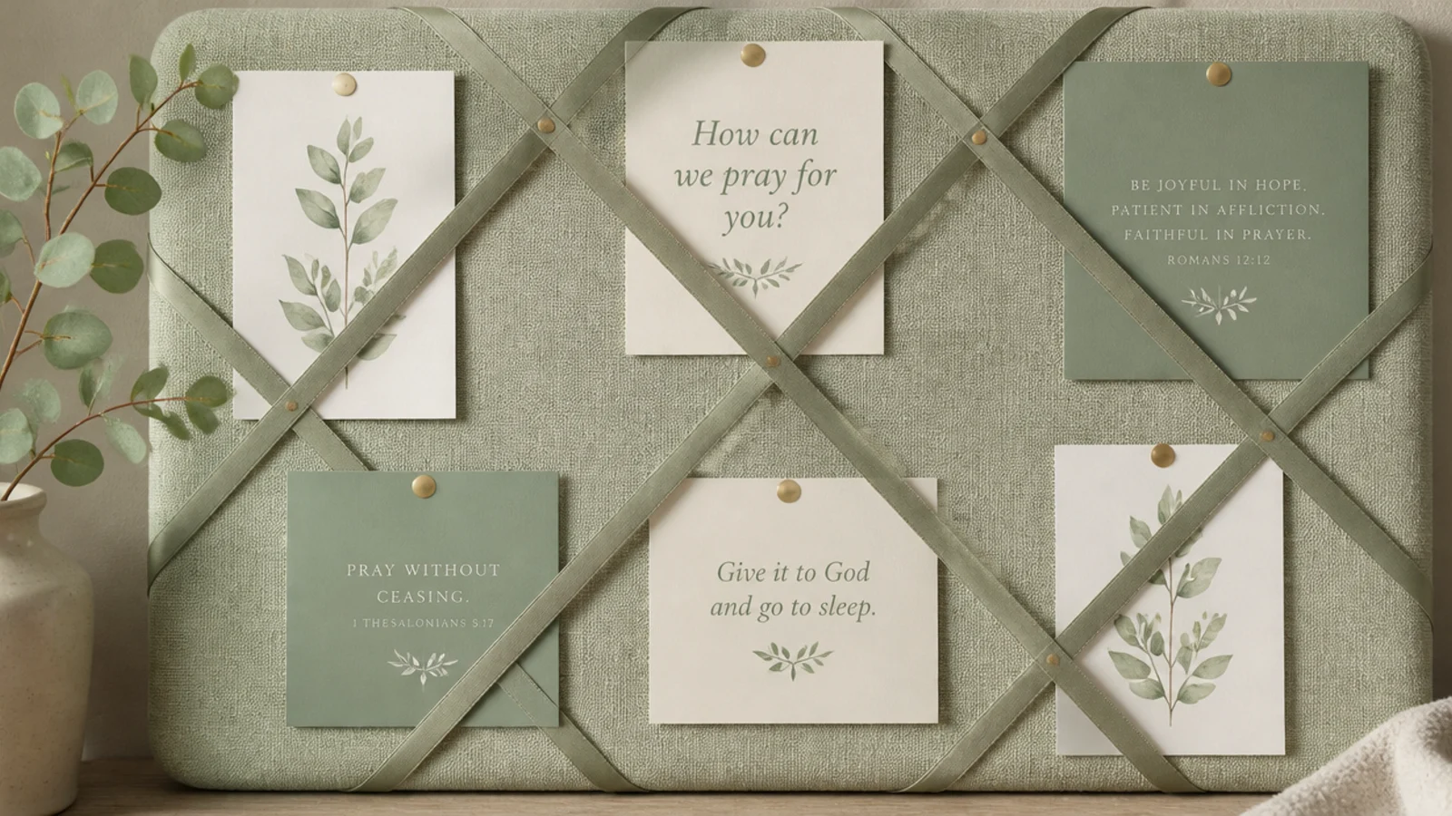
Committing to just sage and cream makes an instantly serene, spa-like board. You use only those two tones across every element for a soothing, cohesive look. It suits anyone who wants calm above all. The tight palette is what makes it feel expensive and intentional.
Editor's noteSwap black ink for a soft charcoal or sage-gray pen; true black is jarring against such a gentle two-tone palette.
Choose sage and cream cardstock, sage satin ribbon, and cream clips. Build your zones normally — requests, scripture, answered — but keep everything within the two tones. Add one sprig of real or faux eucalyptus for a natural accent that stays on-palette. Write in a soft charcoal or sage ink, never black, to keep the softness.
Skip thisDon’t sneak in a third bright color; the entire calm effect depends on holding strictly to sage and cream.
6. Terracotta and Linen Board
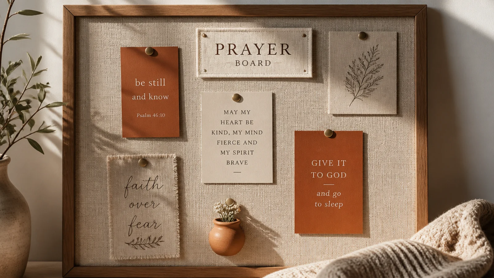
Terracotta over linen gives a warm, grounded, earthy aesthetic that feels cozy year-round. You pair rust and clay tones with natural linen for a rich, warm board. It suits warm-toned rooms and autumn lovers. The earthy palette makes the board feel snug and lived-in.
Editor's noteUse warm brown ink instead of black; it keeps the earthy palette seamless and reads softer against the linen.
Cover a board in natural linen. Cut cards in terracotta, rust, and cream, and use jute twine to string a card line. Add a small clay or ceramic accent — a mini pot clip or a bead — for texture. Write in warm brown ink and keep everything in the terracotta family so the warmth stays consistent across the board.
Skip thisDon’t add cool colors like blue or gray; they chill the palette and undercut the warm, grounded feeling.
7. Dusty Blue Coastal Board
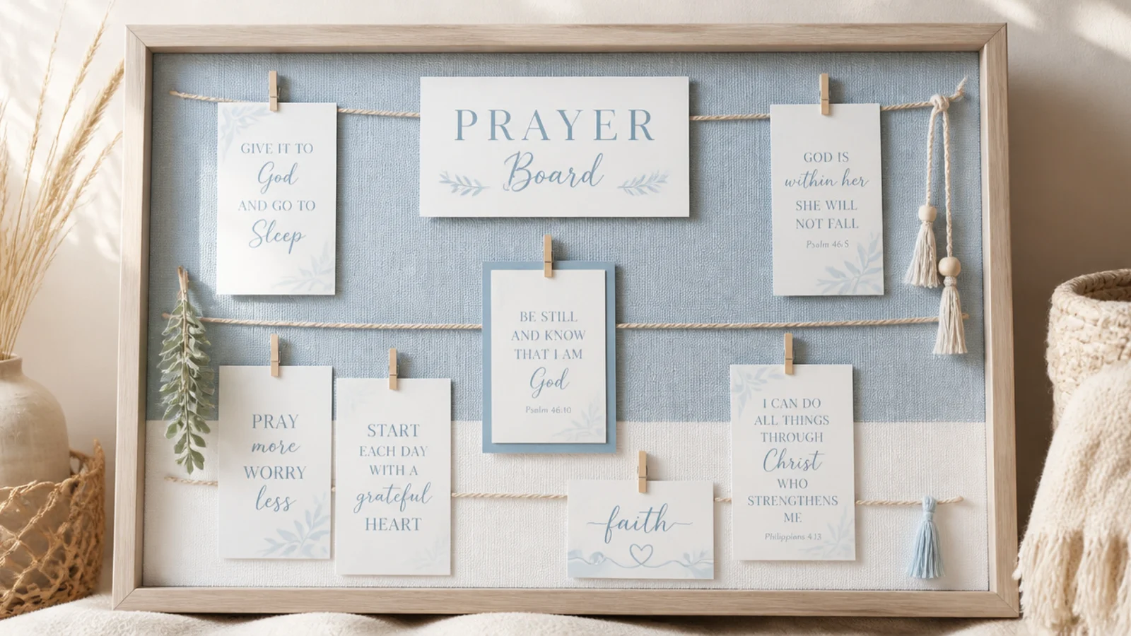
Dusty blue and white give a light, breezy coastal calm without going nautical-kitsch. You keep the palette soft blue and white with rope texture. It suits airy, light-filled rooms. The cool, quiet colors make it feel like a deep breath every time you look up.
Editor's noteStick to dusty, greyed blues rather than bright primary blue — the muted tone is what keeps it elegant, not beachy-kitsch.
Use a light wood or white frame. Cut cards in dusty blue and white and add thin cotton rope as your card line. Choose a soft blue watercolor verse as the focal point. Keep accents to natural rope and pale wood, and write in a soft navy ink so text stays legible without harshness.
Skip thisDon’t lean into literal beach props like shells and anchors; the color palette alone carries the coastal feel.
8. Gold-Accent Elegant Board
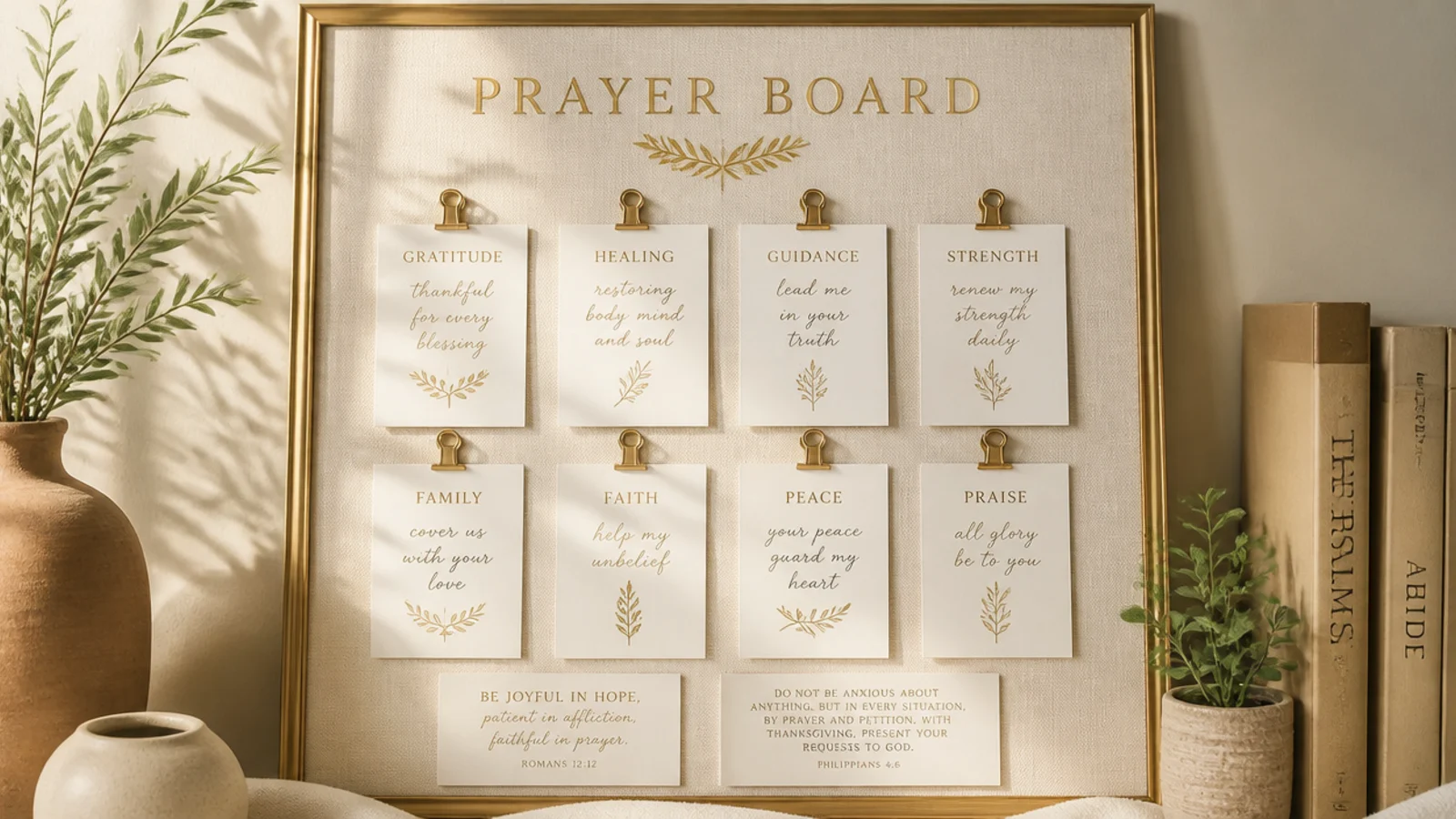
A few gold touches lift a plain cream board into something refined and gift-worthy. You add thin gold clips, a gold-edged frame, and metallic lettering as sparing accents. It suits anyone who wants elegant over cozy. The restraint — gold as accent, not everywhere — is what makes it look luxe.
Editor's noteTreat gold like jewelry — a few small pieces read as elegant, while gold everywhere tips into flashy and cheap.
Keep the base cream. Use gold binder clips or gold thumbtacks, a thin gold-edged frame for the focal verse, and a fine gold paint pen for a word or two of lettering. Limit gold to small doses — clips, an edge, a header word — against a mostly neutral board. Seal any metallic lettering with a light spray so it doesn’t smudge.
Skip thisDon’t use big shiny gold sheets or glitter; it reads craft-store, not refined, and overwhelms the neutral base.
9. Vintage Frame Gallery Board
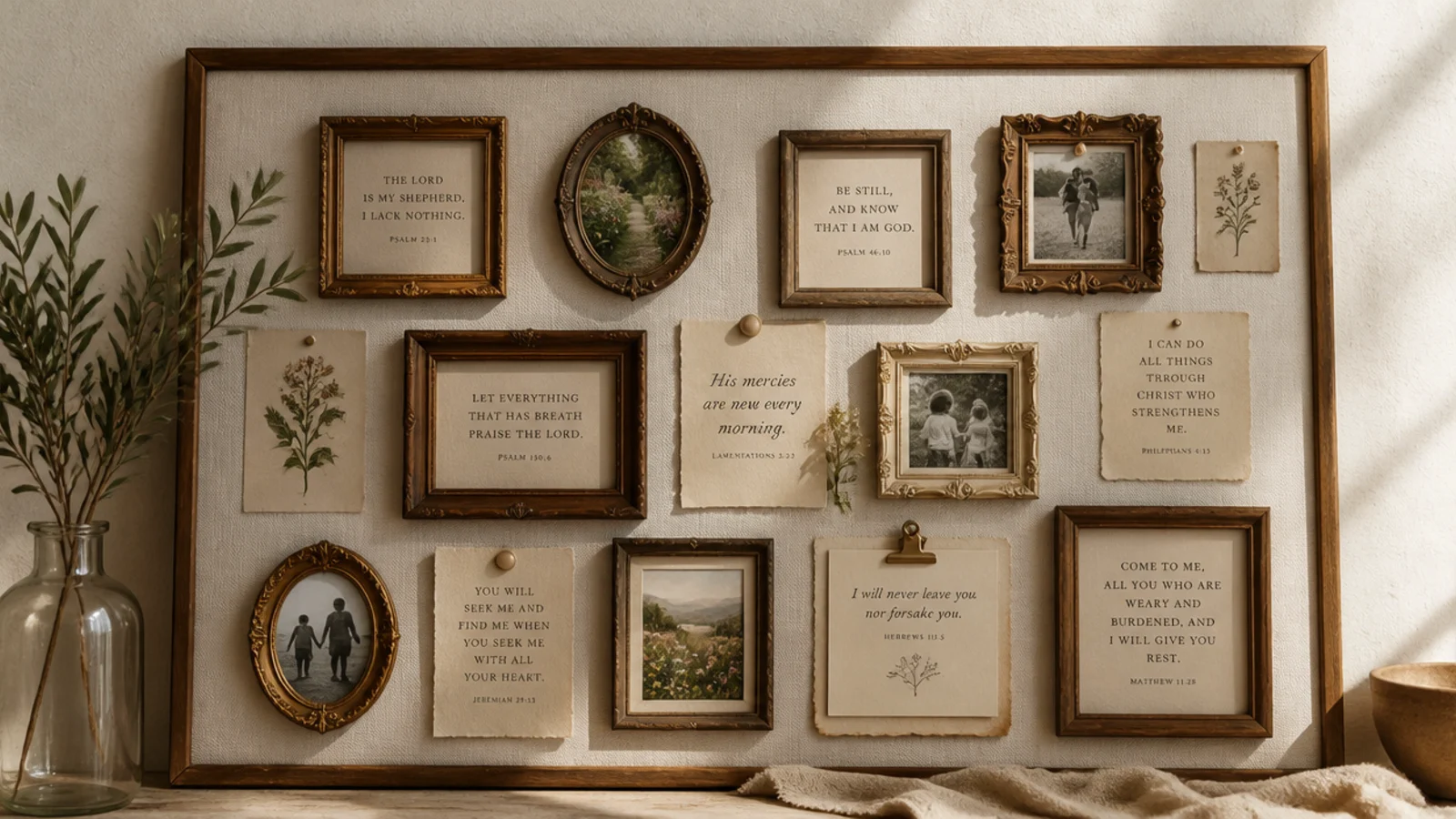
A cluster of little vintage frames turns scripture into a curated gallery wall in miniature. You mount several small thrifted frames salon-style, each holding a verse or photo. It suits collectors and vintage lovers. The mismatched-but-coordinated frames give instant character.
Gather five to eight small frames in gold, wood, and cream from thrift stores. Unify them by keeping the contents in one style — all verses in the same font, or all sepia photos. Arrange them on a board or directly around it, starting with the largest and filling in, salon-style. Leave even gaps so the cluster reads intentional.
Lay the whole frame arrangement out on the floor first and adjust until balanced, then transfer it to the wall or board.
Don’t mix wildly different frame finishes with clashing contents; unify either the frames or what’s inside them, or it looks like clutter.
10. Modern Arch Scripture Prints
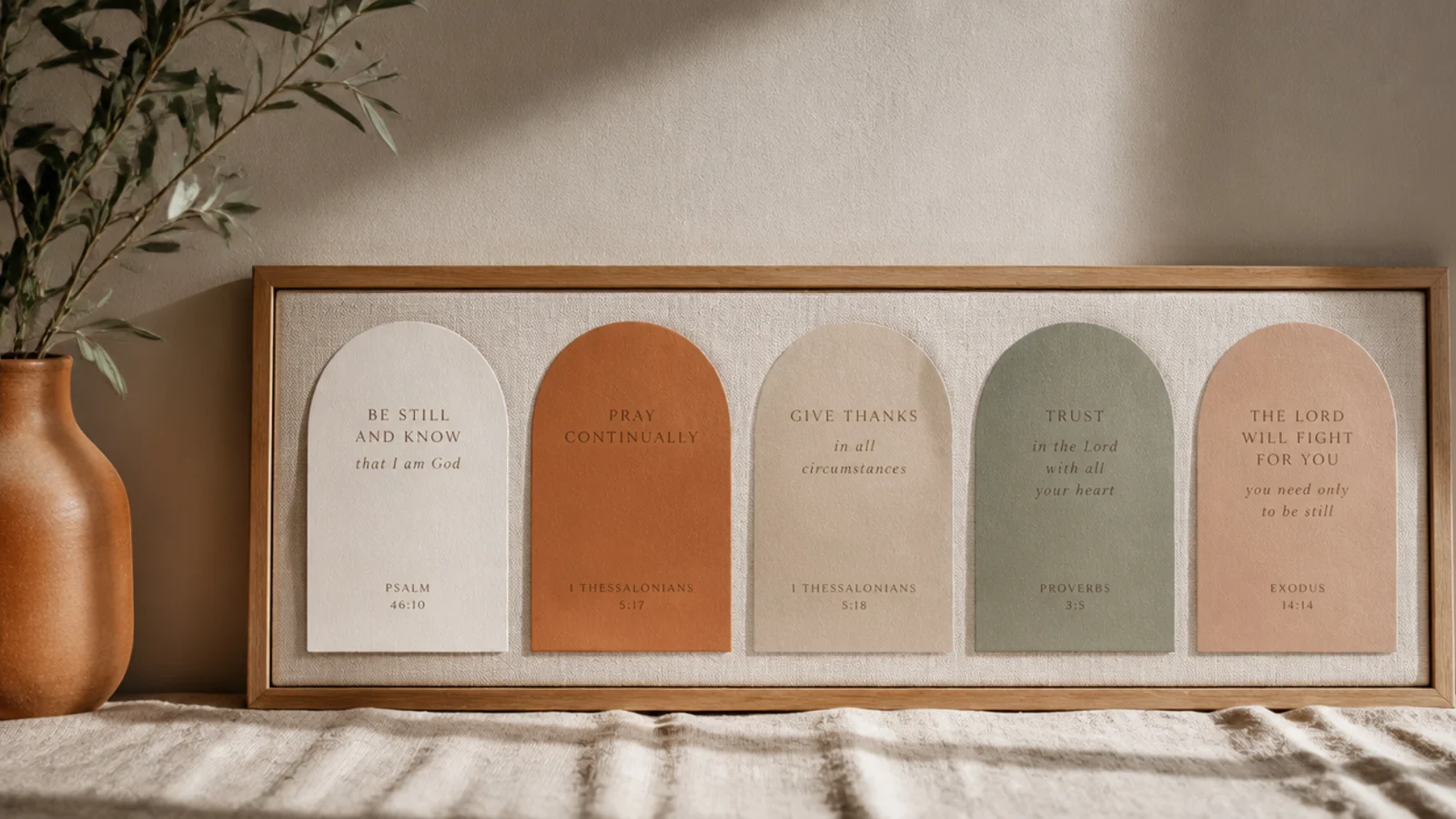
Arch-shaped prints give a clean, current, gallery-modern look. You use minimalist arch graphics with short verses in muted tones. It suits modern and mid-century rooms. The simple geometric shape feels designed and contemporary.
Print two or three arch-shaped designs — a solid arch with a short verse — in terracotta, mustard, and sage on cream cardstock. Arrange them in a clean row or a stepped line on the board. Keep type minimal and modern, and surround them with plain cards. The arches are the graphic anchor, so keep everything else quiet.
Repeat the arch shape in a couple of sizes for rhythm — matching shapes at different scales look deliberately designed.
Don’t crowd the arches with fussy details; their whole appeal is clean, minimal geometry, so keep them simple.
11. Grid Photo Aesthetic Board
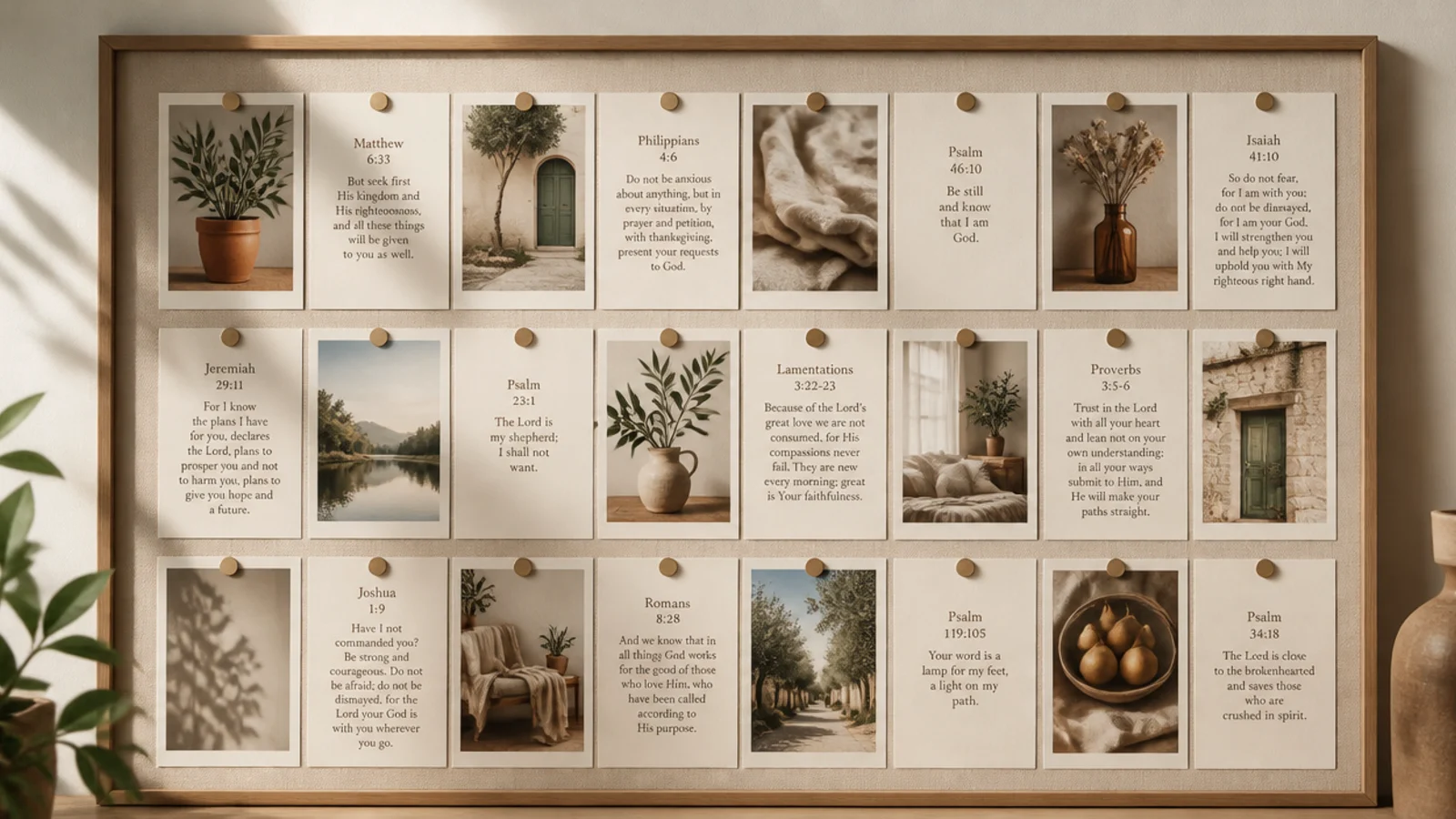
A strict grid layout gives a crisp, Instagram-tidy aesthetic. You align photos and cards in even rows and columns for a clean, modern order. It suits anyone who loves symmetry. The grid itself is the style — order reads as intentional and calm.
Editor's noteEdit all your photos to the same filter or tone first; matching color is what makes a photo grid look curated, not random.
Use a gridded metal board or lightly pencil a grid on a cork board. Print photos to one uniform size and cut cards to match. Place each in its grid cell with equal spacing, aligning edges precisely. Keep every photo in a similar tone — all warm, or all black-and-white — so the grid reads unified.
Skip thisDon’t let the grid drift out of alignment; even small misalignments break the crisp order that makes this look work.
12. Kraft Paper and Twine Board
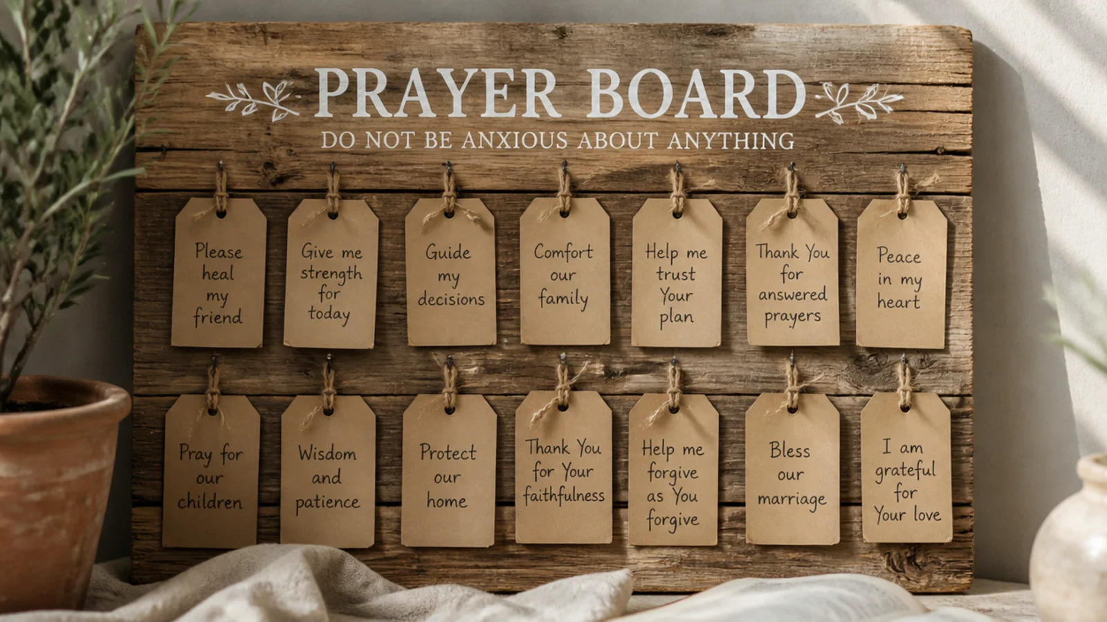
Kraft tags and twine give a warm, rustic, handmade-gift aesthetic for almost no cost. You write on kraft luggage tags and tie them with twine. It suits farmhouse and rustic rooms. The humble materials feel cozy and unfussy.
Editor's noteAge the kraft tags slightly by rubbing the edges with a used tea bag for a warm, vintage, handmade feel.
Buy plain kraft luggage tags or cut your own from a paper bag. Write verses and requests in black or brown ink, punch a hole, and tie each with a length of twine. Hang them from a twine line strung across the board, or pin the tags directly. Keep everything kraft and twine for a consistent rustic look.
Skip thisDon’t pair kraft with glossy or neon accents; the charm is in the humble, matte, natural materials staying consistent.
13. Monochrome Black-and-White Board
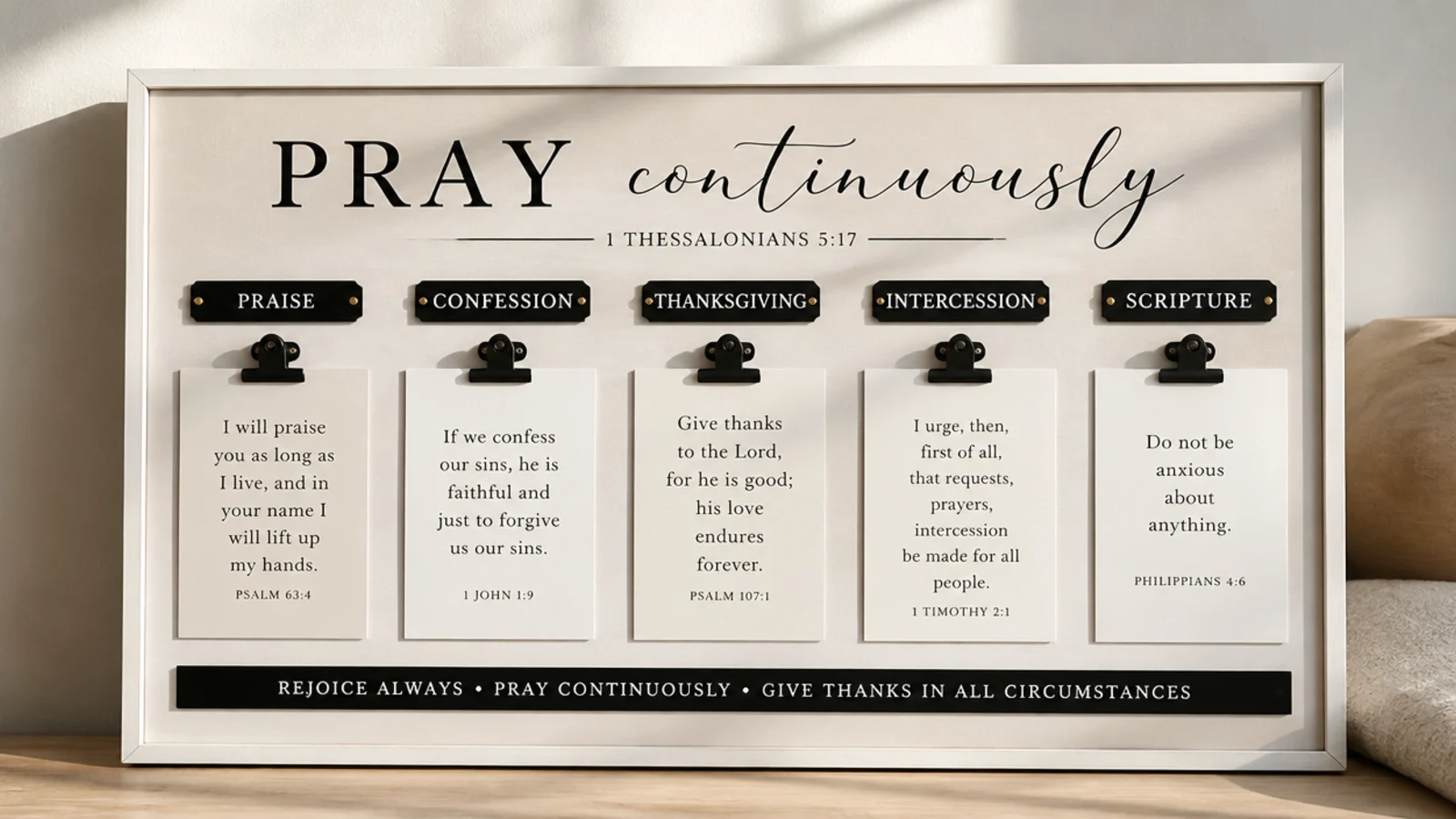
A strict black, white, and cream scheme gives a bold, graphic, modern aesthetic. You use strong typography and high contrast for a confident, editorial look. It suits minimalist and modern rooms. The tight monochrome palette feels intentional and sharp.
Choose a black or white frame. Print verses in a bold, clean font in black on white or white on black. Use black clips and cards strictly in black, white, and cream. Let one or two typographic cards be large and bold as focal points, with smaller plain cards around them. The contrast is the whole design.
Vary the type size dramatically — one big statement verse against small quiet cards gives the monochrome look its editorial punch.
Don’t introduce any color; even one warm accent dilutes the crisp, graphic impact that monochrome depends on.
14. Wildflower Meadow Board
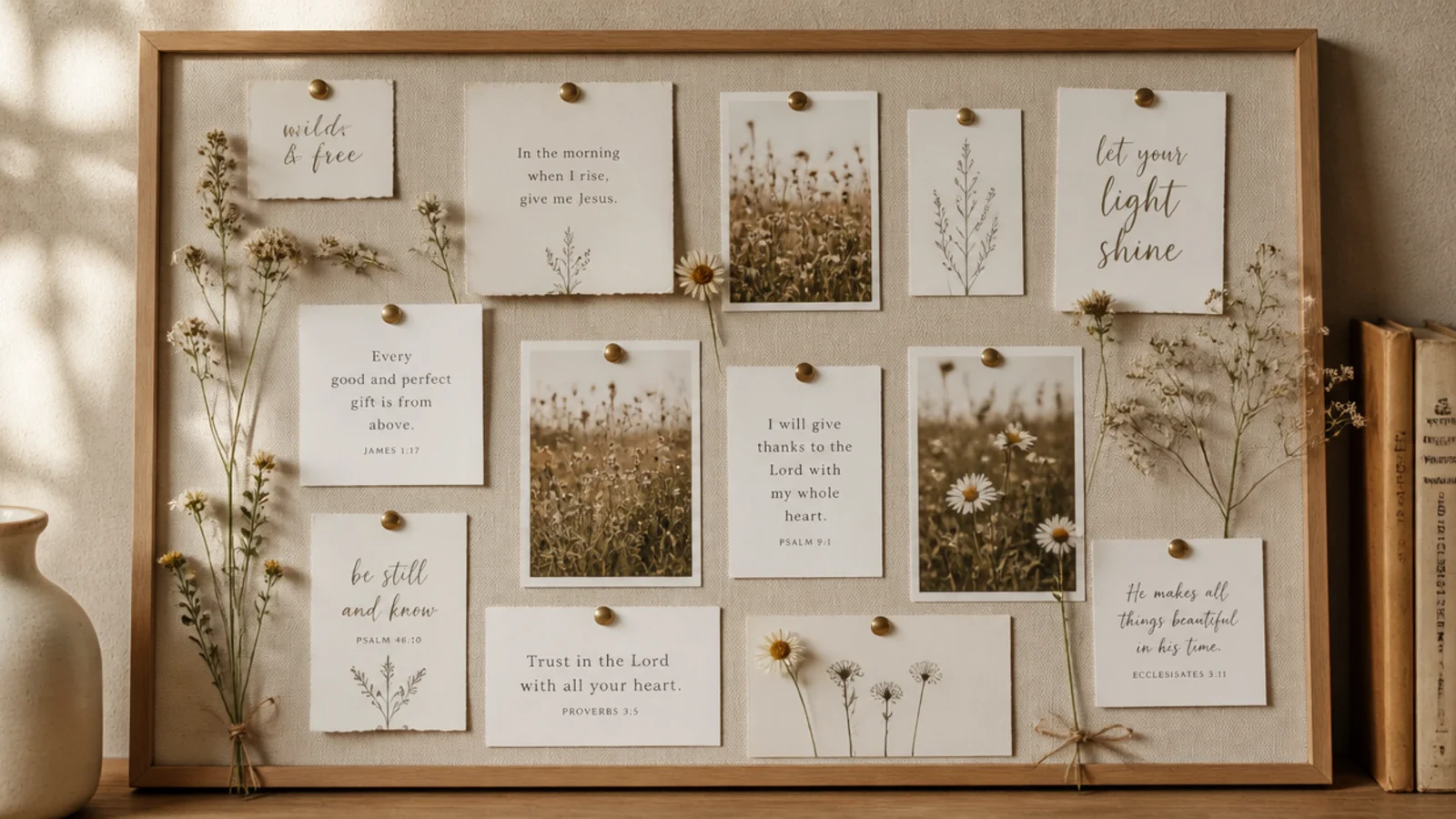
Loose wildflower stems give an airy, whimsical meadow feel that’s softer than arranged florals. You scatter delicate dried stems for a light, natural aesthetic. It suits spring and summer styling. The wispy stems keep it feeling breezy rather than heavy.
Gather dried wildflower stems — baby’s breath, grasses, tiny daisies. Tuck them loosely behind ribbon or clips so they fan out naturally rather than sitting in a tight bunch. Keep cards pale and simple so the flowers stay the focus. Let some stems extend past the board edge for that natural, uncontained meadow look.
Let a few stems break the board’s edge or overlap cards; a little wildness is what sells the natural meadow feel.
Don’t bunch the stems tightly like a florist’s bouquet; the airy, scattered spacing is what makes it look like a meadow.
15. French Memo Ribbon Board
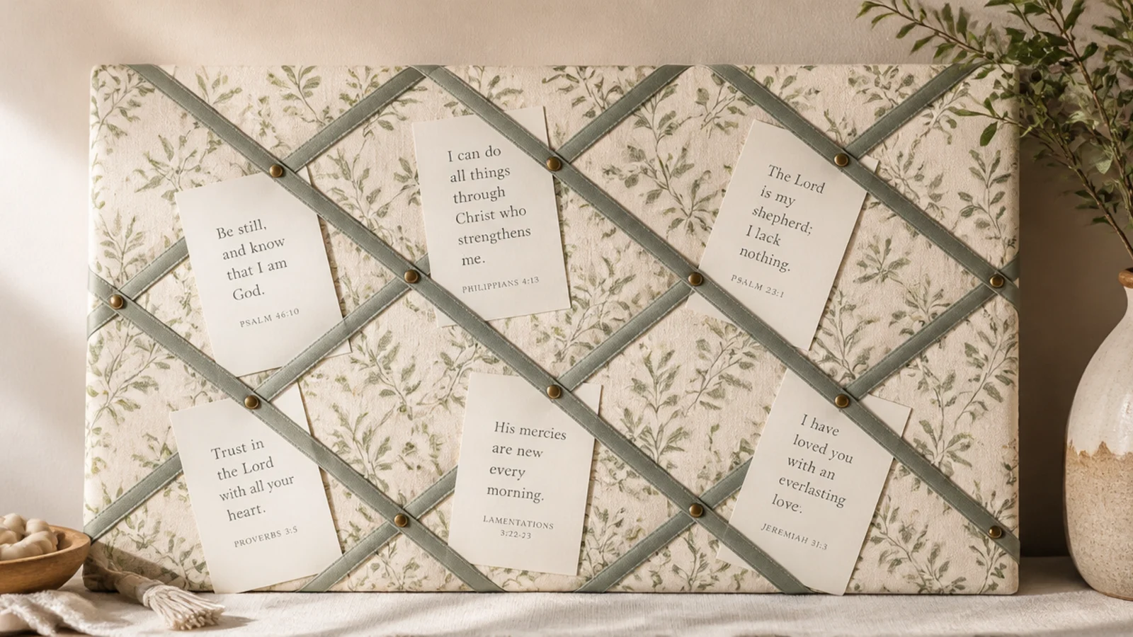
A French memo board is a classic pretty way to hold cards with zero pins. You stretch ribbon in a diamond lattice over padded fabric so cards tuck behind. It suits traditional and feminine rooms. The lattice pattern is decorative in itself, even before you add cards.
Editor's noteSew or pin a small button at each ribbon crossing — it anchors the lattice and adds the classic French-board detail.
Pad a board with a layer of batting, then stretch fabric over it and secure to the back. Crisscross satin ribbon diagonally both ways to form diamonds, fixing ribbon ends behind the board and pinning a button at each crossing. Slide cards and photos behind the ribbons. Match ribbon and fabric to your palette for a cohesive look.
Skip thisDon’t leave the ribbon slack; loose lattice lets cards slip out, so keep every ribbon run taut before fixing the ends.
16. Embroidery Hoop Prayer Board
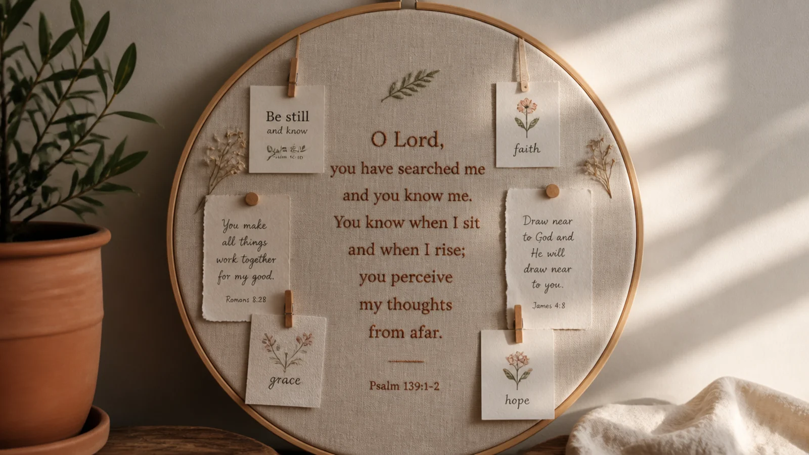
An embroidery hoop makes a soft round board that stands out from the usual rectangle. You stretch linen in a wooden hoop and add a verse and a few cards. It suits gallery walls wanting a shape break. The circle feels gentle and handmade.
Stretch linen or cotton in a wooden embroidery hoop (8-12 inches) and trim the excess behind. Add a central verse — stitched, printed, or lettered — and clip two or three small cards around it. Hang from a ribbon loop. Keep it sparse; a round board fills up fast, so a few elements read best.
Hang two or three hoops in different sizes as a set — varying circles make a striking, cohesive gallery moment.
Don’t overfill the circle; a round board looks cramped quickly, so keep it to a centerpiece and a couple of cards.
17. Dried Eucalyptus Board
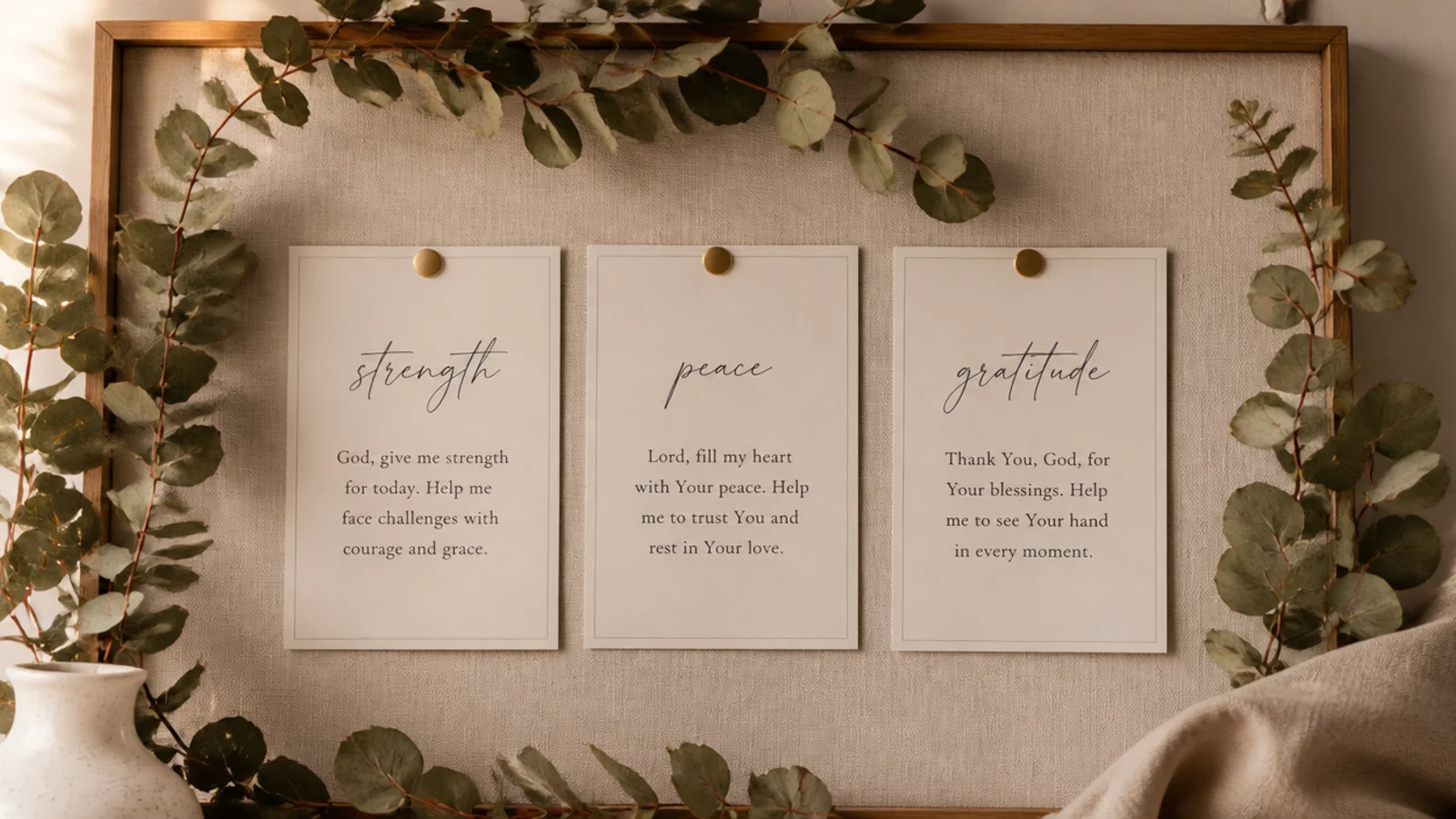
Draped dried eucalyptus gives instant softness and a subtle scent for very little effort. You frame a neutral board with the greenery to soften its edges. It suits almost any calm room. The eucalyptus is the single move that makes the whole board feel styled.
Buy or dry a few eucalyptus stems. Drape them along the top or one side of a neutral board, securing with small clips or wire. Keep cards cream and simple beneath the greenery. Let the eucalyptus be the only decorative flourish so it stays the elegant, spa-like accent.
Refresh dried eucalyptus every few months as it fades and drops; a fresh drape is what keeps the board looking cared-for.
Don’t smother the board in greenery; a light drape frames it, while a full wreath’s worth buries the cards.
18. Blush Romantic Board
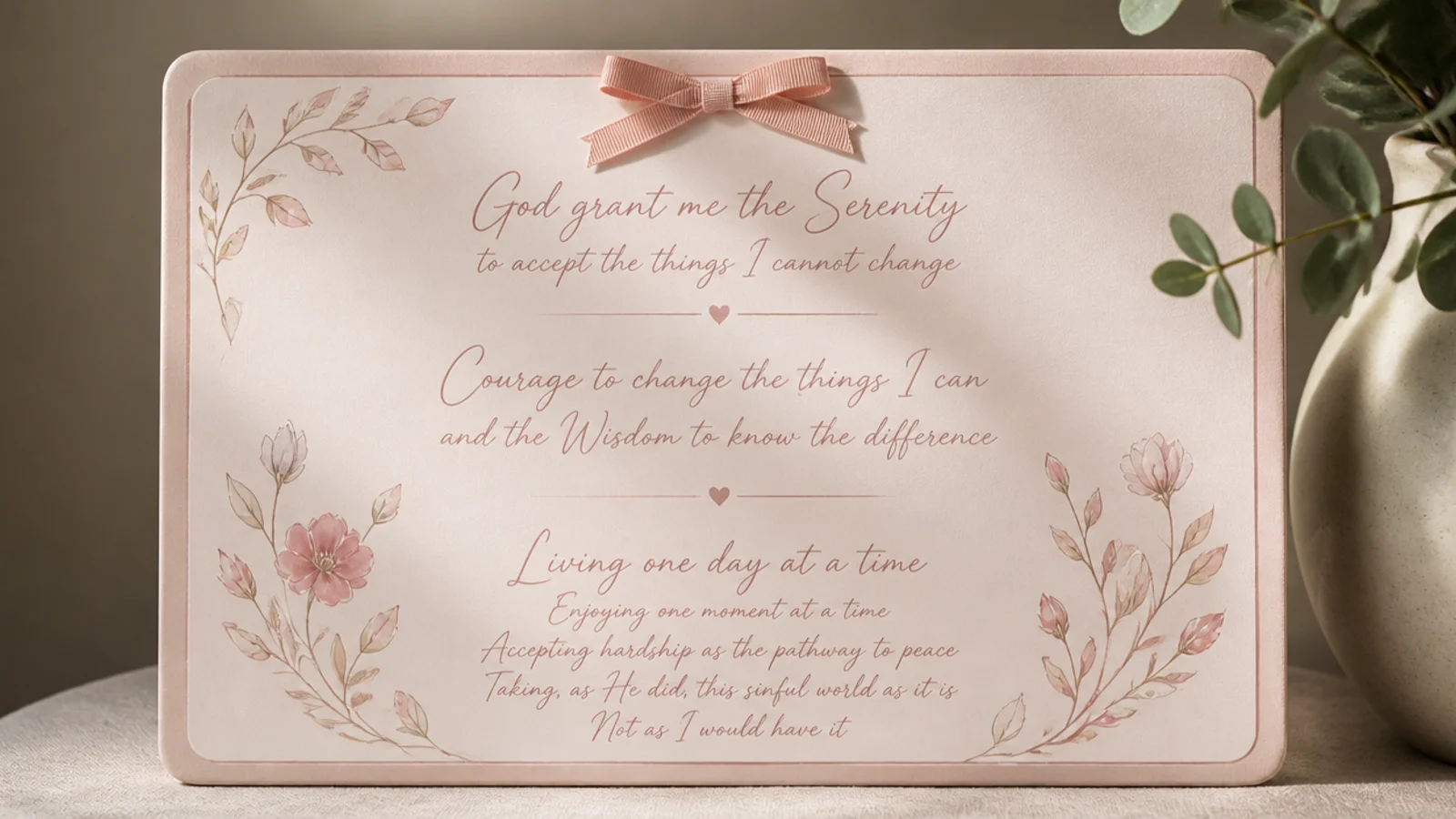
Blush and cream give a tender, romantic aesthetic that stays grown-up, not girlish. You keep everything in soft pink tones with delicate script. It suits a feminine bedroom or vanity. The gentle palette feels warm and loving.
Editor's noteGround the blush with a little brass or warm wood; a metal or wood accent keeps soft pink from feeling too sugary.
Choose blush and cream cardstock and a dusty rose ribbon. Write verses in a fine, delicate script. Add one small ribbon bow as an accent and keep clips and frames soft-toned or brass. Hold the whole board to blush, cream, and one metallic so it stays refined rather than sweet.
Skip thisDon’t use bright or hot pink; the romance lives in the muted, dusty blush, and a loud pink cheapens it instantly.
19. Fairy-Light Illuminated Board
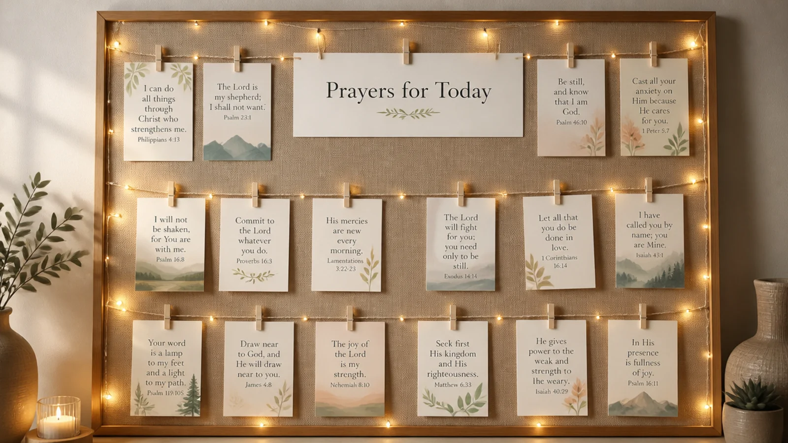
Warm fairy lights make the board glow and double as a cozy nightlight for evening prayer. You edge or lace the board with battery string lights that also hold cards. It suits bedside and evening routines. The soft light makes the space feel calm and inviting after dark.
Editor's noteChoose warm-white, never cool-white, lights and a timer — warm light is cozy, and the timer means it greets you each evening.
Use warm-white battery fairy lights with a timer. Lace them around the board’s frame or across it, and clip cards to the wire with mini pegs where lights sit between cards. Keep cards neutral so the warm glow, not color, is the effect. Set the timer for your evening prayer window so it lights up on its own.
Skip thisDon’t use multicolor or bright flashing lights; they kill the calm, and a steady warm glow is the whole point.
20. Wooden Lattice Card Board
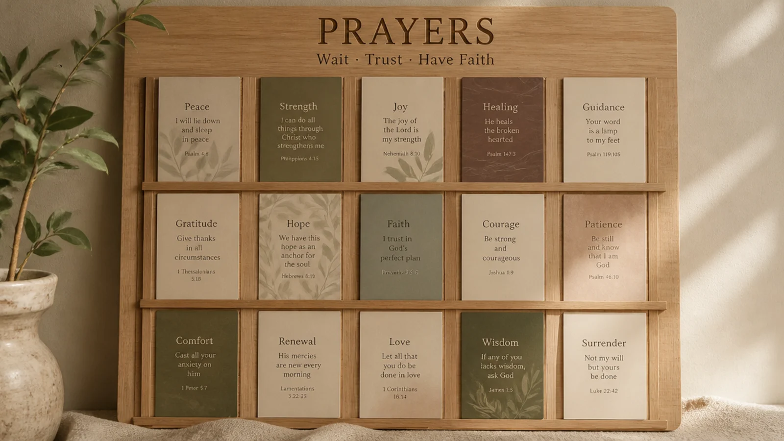
A wooden slat lattice is a warm, architectural way to hold cards without pins. You slot cards between crossing wood strips for a clean, Scandinavian look. It suits modern and natural rooms. The wood grain adds warmth and the lattice is tidy by design.
Mount thin wood slats or dowels in a crisscross lattice over a wood-backed board, leaving small gaps to slot cards. Slide cards and photos between the crossing strips. Keep cards in warm neutrals to match the wood. A light clear finish on the slats protects them and deepens the grain.
Sand the slats and add a light natural oil finish; smooth, warm wood is what makes this look Scandinavian rather than crafty.
Don’t force thick cards into tight slats; they buckle and pop out, so size the gaps to slip cards in and hold them flat.
21. Floral Linen Pinboard
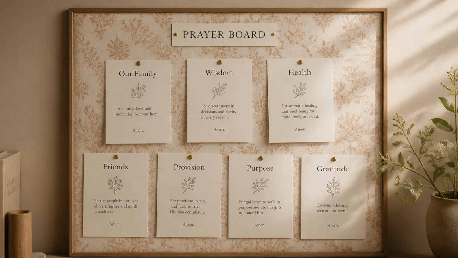
A patterned linen backing lets the fabric be the decoration so your cards can stay plain. You cover the board in a subtle floral print and pin simple cream cards over it. It suits anyone who wants pattern without busy cards. The fabric carries the aesthetic effortlessly.
Editor's notePick a small-scale, muted print; large bold florals compete with the cards, while a fine print reads as elegant texture.
Cover a cork board with a small-scale floral linen, pulling it taut and securing behind. Pin plain cream cards over it, spaced so the fabric shows around them. Keep cards and pins simple — the pattern is doing the work. Choose a muted, small-scale print so it reads as texture, not a loud statement.
Skip thisDon’t add more pattern on top of a patterned board; plain cards over the floral fabric keep it from looking chaotic.
22. Peg Rail Hanging Cards
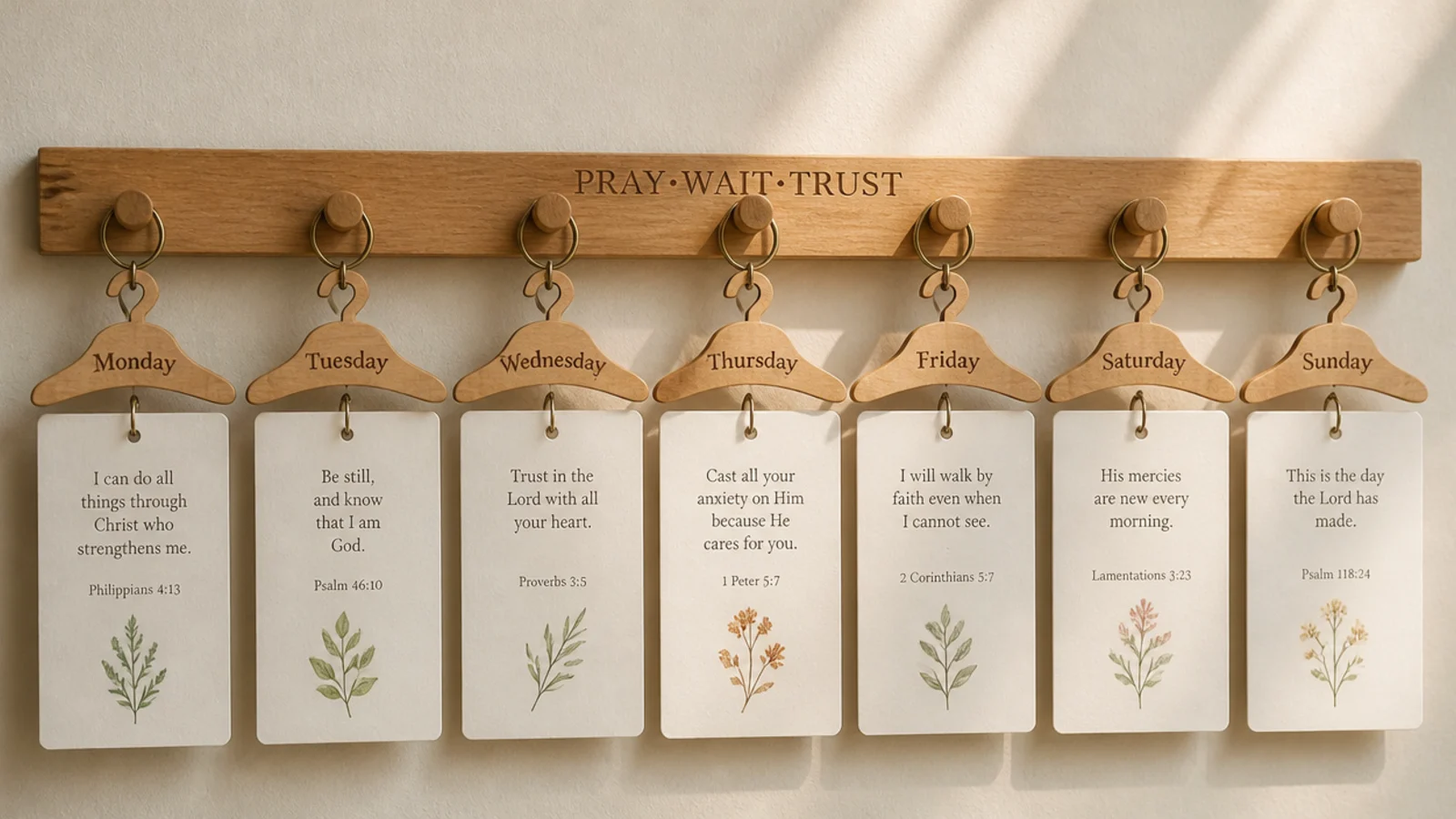
A peg rail swaps the board for a slim wooden rail that cards hang from. You dangle cards, tags, and small items from pegs in a clean line. It suits minimalist and Shaker-style rooms. The horizontal line feels architectural and takes little wall space.
Editor's noteVary the hanging lengths just slightly across the pegs; a gentle stagger looks intentional where a dead-level row looks stiff.
Mount a Shaker peg rail on the wall. Punch holes in cards or use small clips and hang them from the pegs with ribbon loops. Space them evenly and vary the drop lengths slightly for rhythm. Keep everything in one palette so the row reads as a set. Add a small hanging plant or tassel at one end to finish.
Skip thisDon’t overload each peg; one or two items per peg keeps the line clean, while crowded pegs look like a coat rack.
23. Marble Texture Backing Board
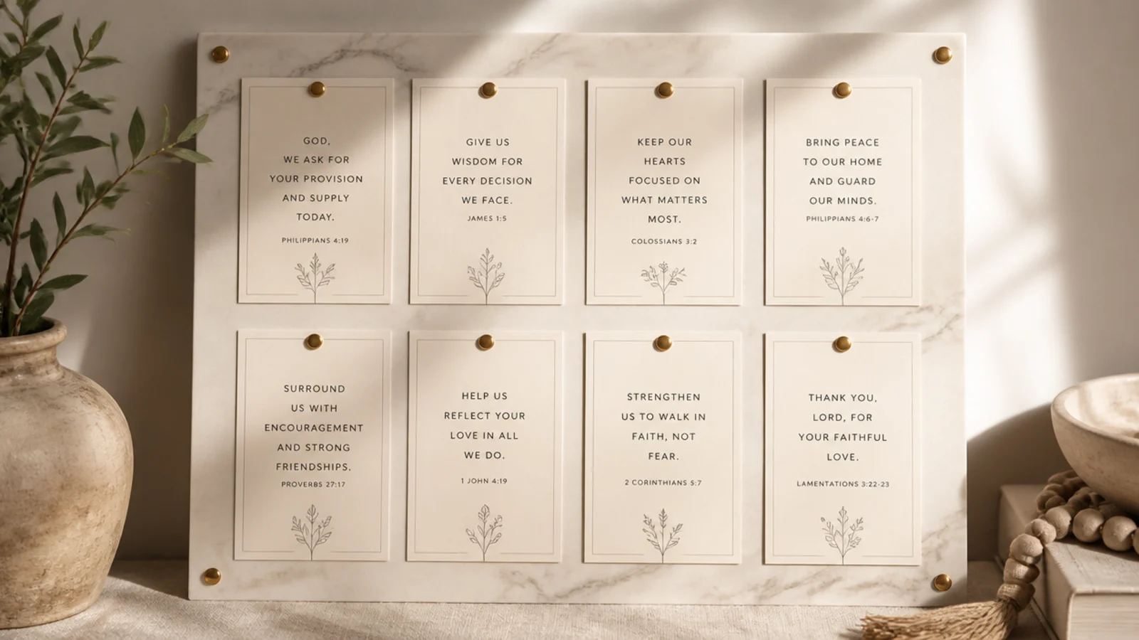
A marble-look backing gives a sleek, elevated modern aesthetic for the cost of a sheet of paper. You back the board in marble contact paper and add crisp minimal cards. It suits modern and glam rooms. The stone texture reads expensive with zero effort.
Editor's noteSmooth marble contact paper from the center outward with a credit card so no bubbles betray the paper backing.
Line the board with soft white-and-grey marble contact paper, smoothing out bubbles with a card. Add minimalist cards in white with fine black type and a few gold clips. Keep the layout spare so the marble shows. The texture plus restraint is what makes it feel high-end.
Skip thisDon’t pick a heavily veined, high-contrast marble; a soft, subtle vein reads elegant where a bold one looks like a phone case.
24. Layered Frame Collage Wall
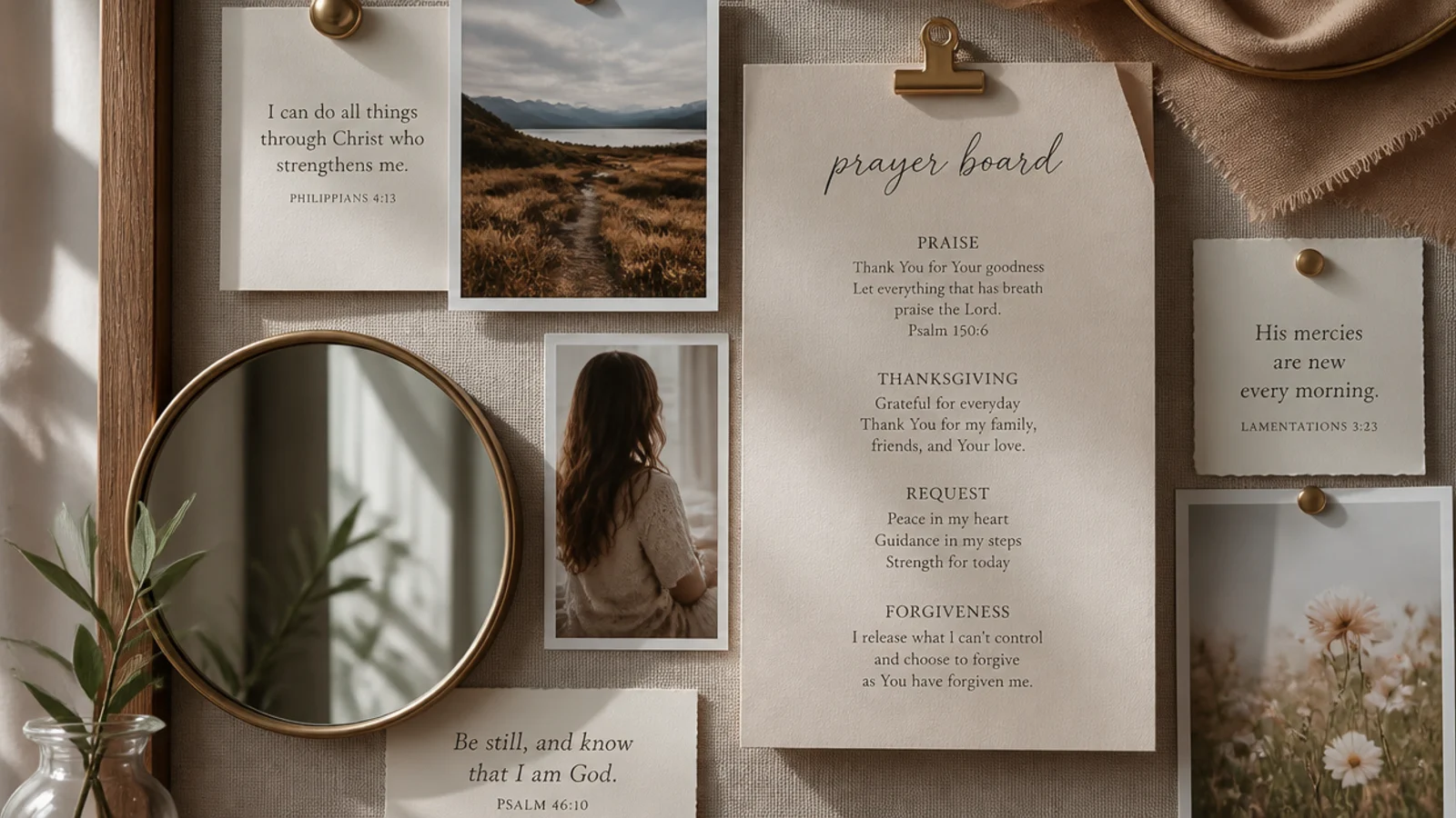
Layering frames and cards so they overlap gives a rich, collected, magazine-styled aesthetic. You build depth by letting elements sit partly on top of each other. It suits maximalist-leaning but curated rooms. The layering feels intentional and full without being messy.
Editor's noteLayer in odd numbers and keep one clear focal point; overlapping works when the eye still knows where to land first.
Start with a large card or print as the base layer, then overlap smaller frames, cards, and a small mirror or brass object on top, leaving each partly visible. Keep everything in one palette so layers read as cohesive. Anchor heavier items with strong clips or adhesive. Step back often to keep the balance from tipping.
Skip thisDon’t layer so heavily that nothing is fully readable; every verse card should still be legible under the overlaps.
25. Arch Mirror and Verse Board
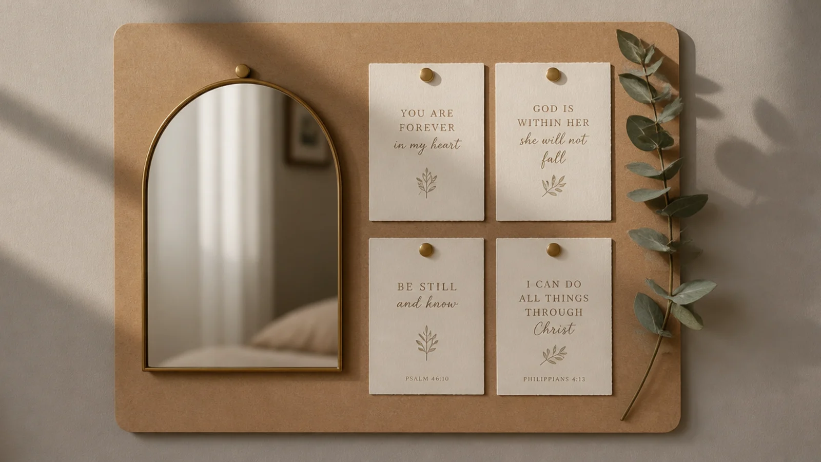
A little arched mirror adds light, depth, and a trendy shape as the board’s centerpiece. You mount a small arch mirror and ring it with verse cards. It suits modern and boho-modern rooms. The mirror bounces light and makes the board feel like intentional decor.
Mount a small arched mirror in the center or upper third of the board. Arrange cream verse cards around it in a loose halo, keeping spacing even. Add one eucalyptus sprig or a thin brass accent for warmth. Position the board where the mirror catches window light so it brightens the wall.
Place the board so the mirror reflects a window or a plant; a good reflection is what turns the mirror into a real feature.
Don’t hang a heavy mirror on weak adhesive; use a proper hook rated for the weight so it can’t fall and break.