1. Simple Cream Border Story
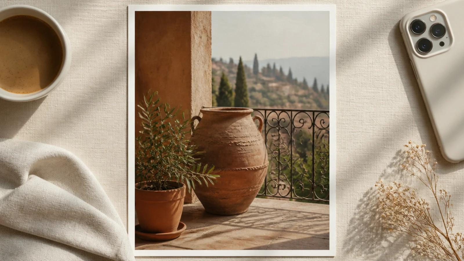
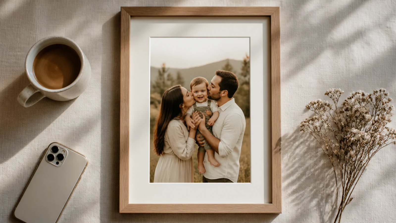
This is the easiest story frame that still looks designed, so start here. You float a vertical photo on a cream background with an even margin so the negative space frames it. It suits any photo because the border adds no color of its own, just calm space, and it reads instantly as intentional.
Set a 1080x1920 canvas filled cream #F5F0E6. Drag guides 250 px from the top and bottom for the safe zone, then place your photo centered within them, leaving an even 90 px side margin. Keep the photo inside the safe band so the interface never crops it. Export as PNG at full size.
Center the photo in the safe zone rather than the whole canvas, so the profile and reply bars sit on the cream, not the image.
Do not run the photo to the very top and bottom edges; the interface bars will overlap it and it looks cramped.
2. Top Caption Bar Story
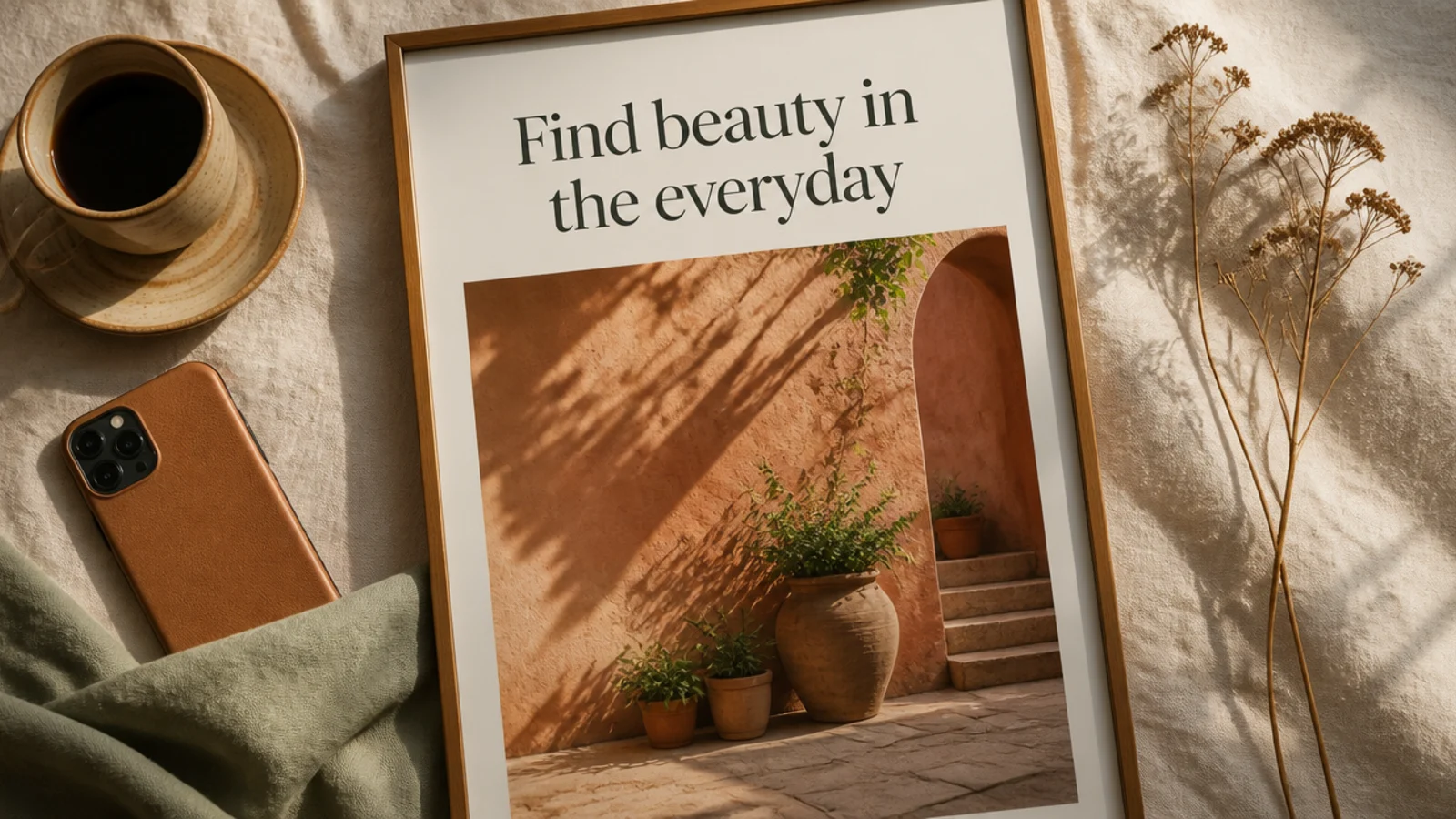
A caption bar near the top gives your words a clean home below the profile bar and above the photo. It is perfect for announcements, tips, and story intros. The bar guarantees your text is legible on any photo without a shadow.
On a 1080x1920 canvas, place the photo full-bleed, then lay a cream rectangle from about 260 px to 520 px down (just under the safe-zone top). Add a DM Serif headline at 64 px and a small Poppins line at 26 px in charcoal, left-aligned with a 90 px inset. Keep the bar position fixed. Export as PNG.
Editor's noteSit the bar just below the top safe line so it reads as a header without colliding with your profile picture.
Skip thisDo not place the bar at the very top; it will hide behind your profile name and look like a mistake.
3. Arched Window Story
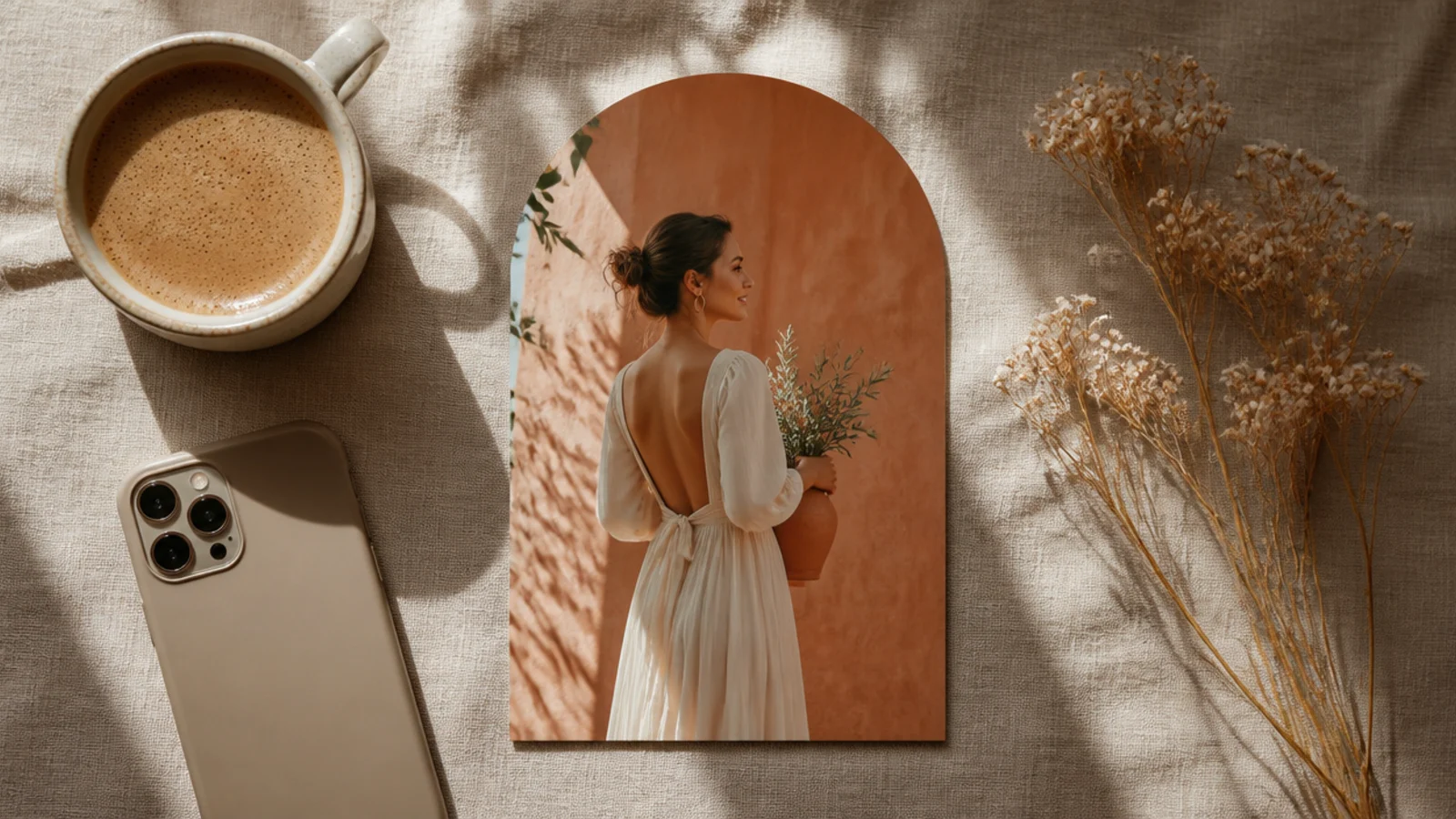
An arch-cropped photo makes a story feel editorial and calm, like a gallery print inside the frame. The shape carries the whole design. It suits portraits, architecture, and single-subject stories, and the space around it leaves room for a caption.
On a 1080x1920 terracotta canvas, add an arch shape sized about 760x1180 px and center it in the safe zone. Drag the photo onto the arch to crop it, then double-click to position the subject. Add a soft drop shadow and one small caption below the arch in Poppins 28 px. Export as PNG.
Leave clear space below the arch for a caption and above it for your profile bar — the arch should sit in the middle third.
Do not size the arch so tall it reaches the bars; keep it inside the safe zone or the shape gets clipped.
4. Two-Photo Stacked Story
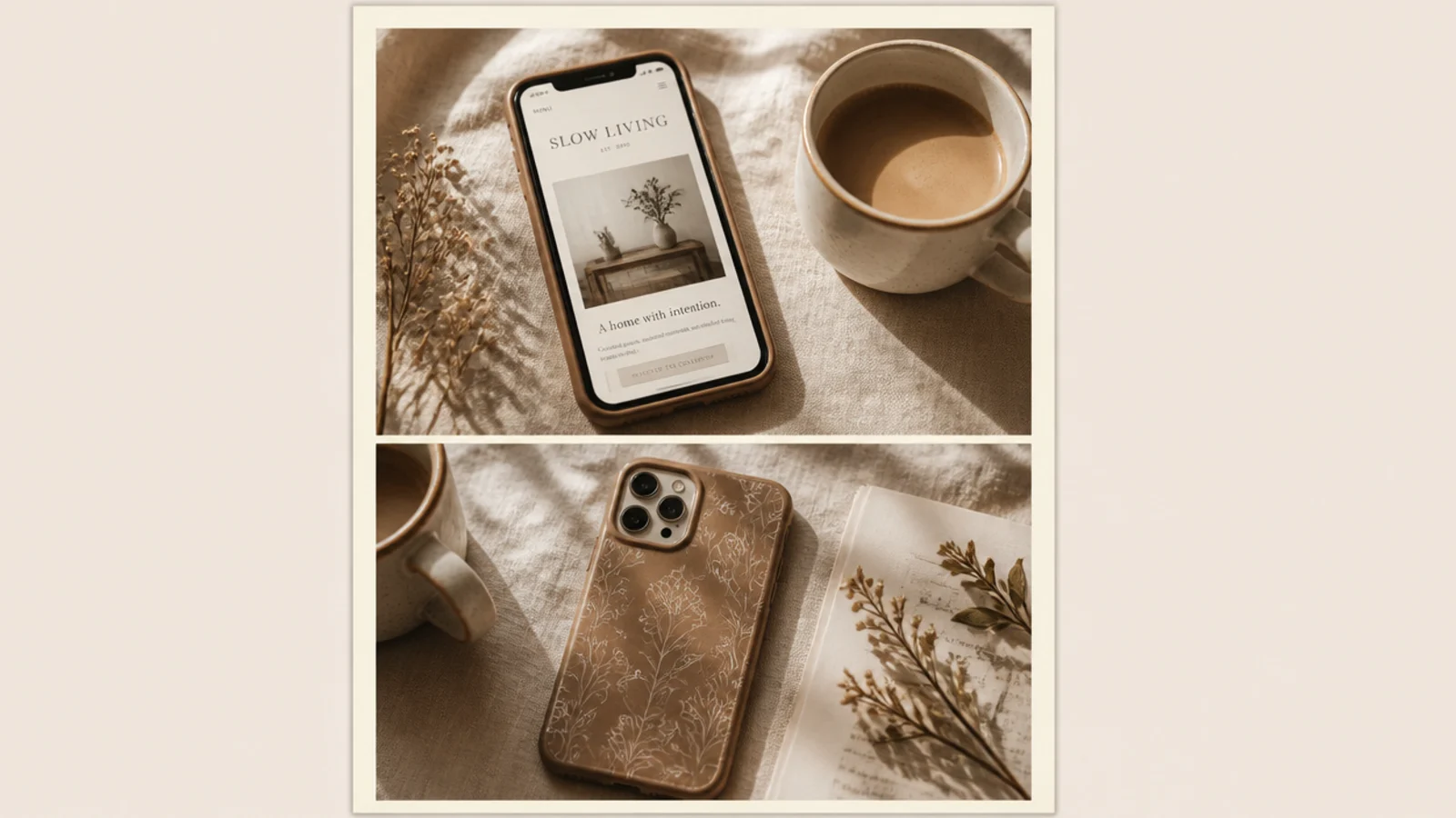
Stacking two photos in one story tells a quick story — a detail and a wide shot, or a before and after. The clean gap between them adds rhythm. It suits outfit stories, recipe steps, and travel pairings where one image is not enough.
On a 1080x1920 canvas, add two Canva frames stacked with a 24 px cream gap between them and a 70 px outer border, keeping both inside the safe zone. Drop a photo into each and reposition subjects. Keep the gap and border identical each reuse. Export as PNG at full size.
Give the two photos a shared color so the stack reads as one designed story, not two random shots.
Do not use two busy photos; pair one calm shot with one detailed one so the split stays balanced.
5. Kraft Scrapbook Story

This frame turns a story into a scrapbook page — the photo sits on kraft paper with washi-tape corners. It feels personal and warm, ideal for memories, throwbacks, and behind-the-scenes stories. The tape corners add a handmade touch flat frames lack.
Fill a 1080x1920 canvas with a kraft-paper texture. Center the photo at about 840 px wide inside the safe zone with a 2-degree tilt. Add two muted washi-tape elements across opposite corners and a faint shadow under the photo. Add one handwritten caption below. Export as PNG.
Use tonal washi tape (sage, blush, cream) so the scrapbook look stays aesthetic rather than childlike.
Do not tape all four corners; two opposite corners look casual and real, four looks stiff.
6. Bold Quote Block Story
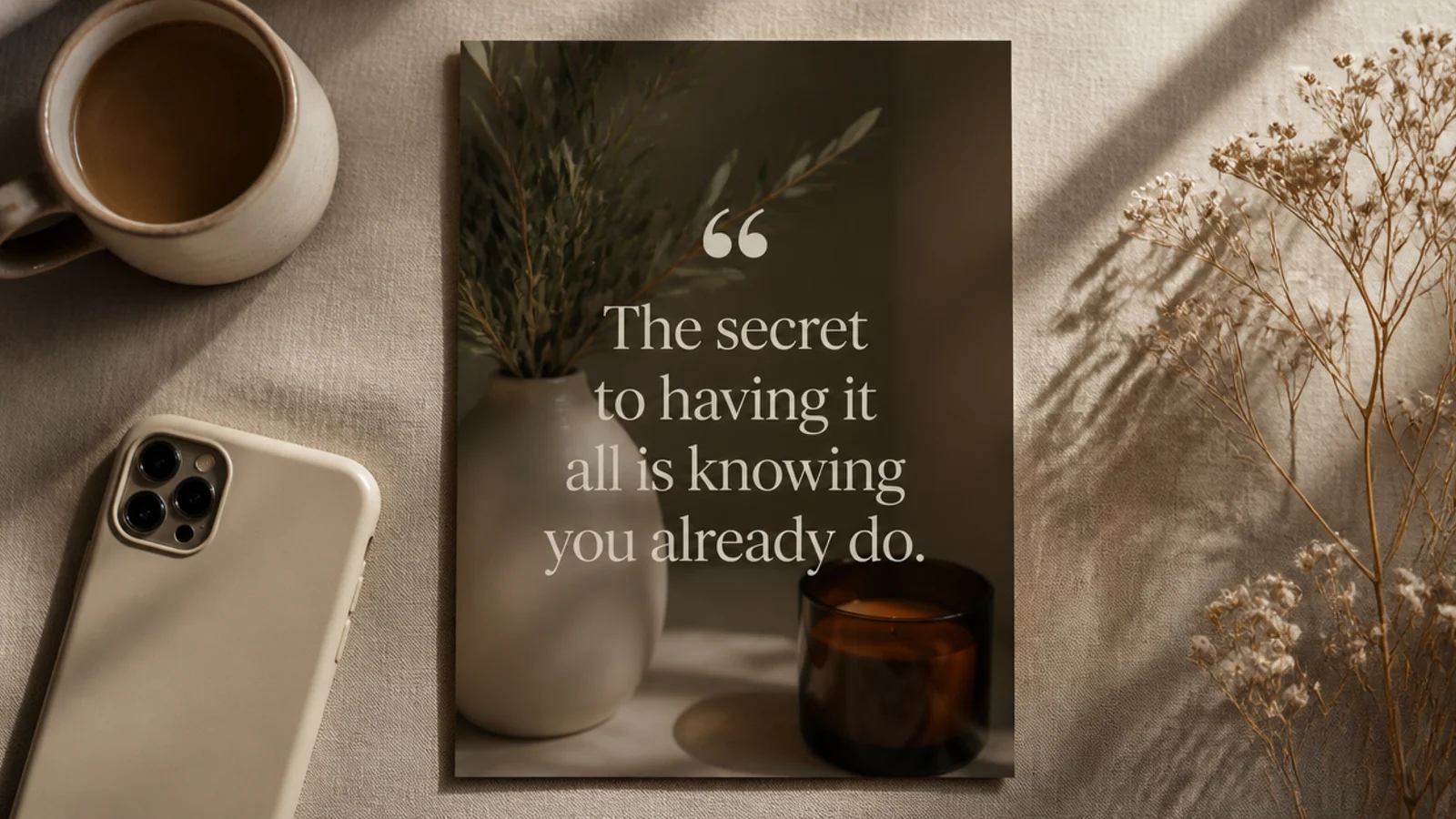
A quote-block story puts words first, laid over a dimmed photo so the text leads. It is made for shares, mantras, and caption-worthy lines. The oversized serif type is the design, so the photo just needs to be a calm backdrop.
On a 1080x1920 canvas, place the photo full-bleed and add a cream overlay at 30% to dim it. Center a Playfair Display quote at 60 px in cream within the safe zone, with a large decorative quotation mark above at 120 px. Keep line length short. Export as PNG.
Break the quote into short lines of three to five words each so it reads instantly as someone taps through.
Do not skip the dimming overlay; light text over a bright photo becomes unreadable and looks unfinished.
7. Grain Full-Bleed Story
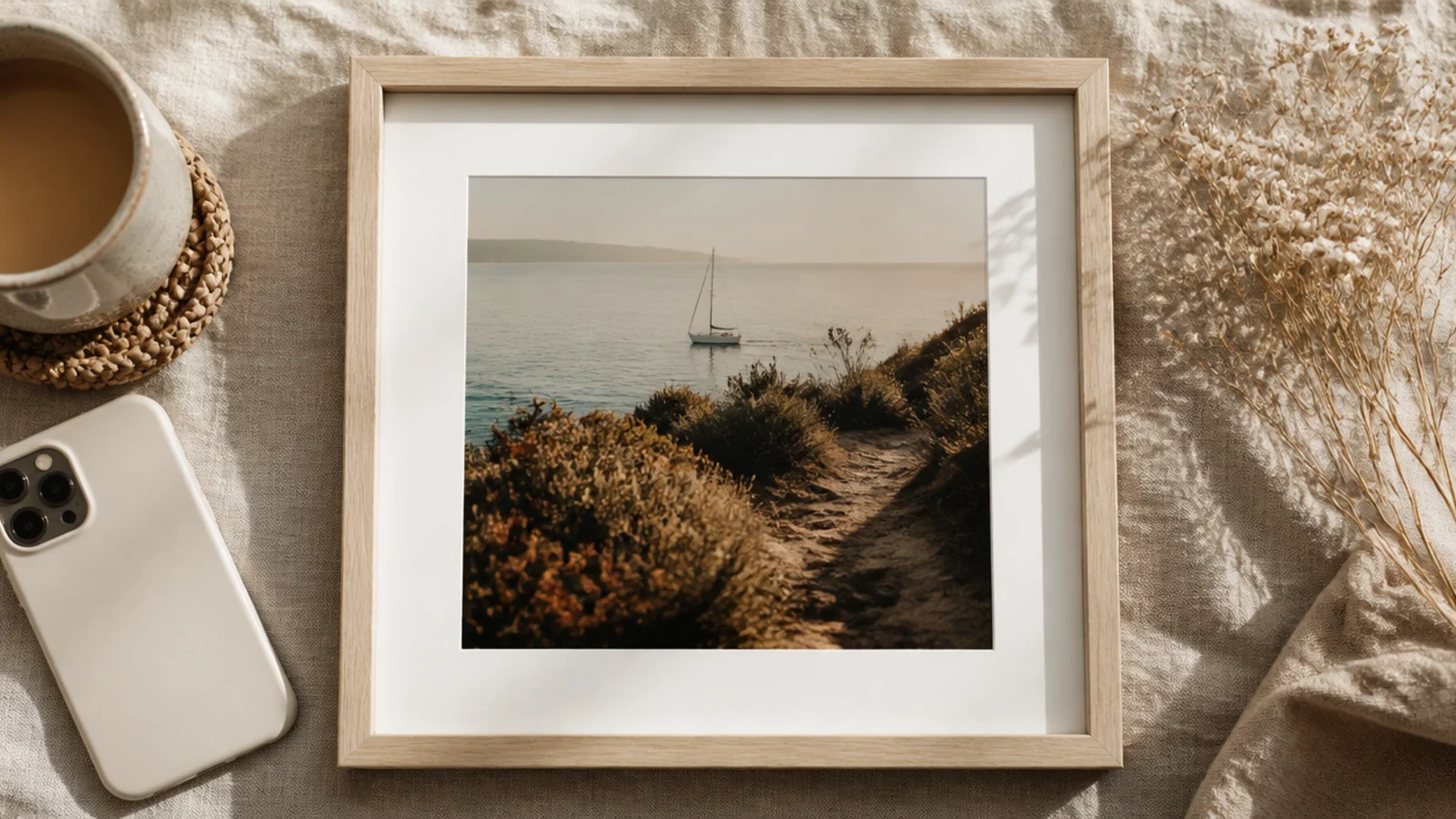
A grain overlay across the full story gives everything a cohesive film mood, tying a whole set together. You keep the photo full-bleed and add low-opacity grain on top. Because the grain is on every story, they all share one finish even with different photos.
On a 1080x1920 canvas, place the photo full-bleed. Add a 'film grain' element stretched over the whole canvas at 12-18% transparency with Overlay blend if available. Group the grain so it stays put when you swap photos. Add any caption inside the safe zone. Export as PNG.
Editor's noteKeep the grain opacity identical on every story so the whole sequence shares one consistent film finish.
Skip thisDo not push grain past about 20%; heavy grain reads as a low-quality photo, not a chosen texture.
8. Film Strip Vertical Story
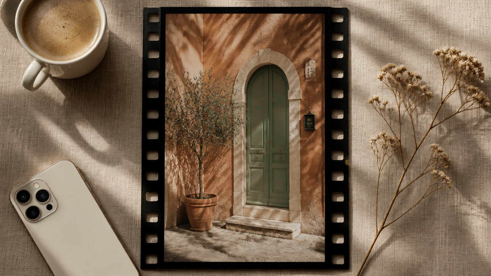
A vertical film-strip frame is playful and nostalgic, wrapping the photo in black with sprocket holes down the sides. It suits travel and retro stories, and the black surround makes photo colors pop. It reads as a single frame from a roll of film.
On a 1080x1920 canvas, add a vertical 'film strip' element sized to fill the safe zone. Drop your photo into its slot so it crops between the sprocket rows. Add small frame numbers in a mono font at the top. Keep the strip centered inside the safe band. Export as PNG.
Editor's notePick a matte grey-black film strip rather than pure black so it feels vintage instead of flat digital.
Skip thisDo not stretch the strip to a different ratio than the photo; keep proportions so the sprocket holes stay round.
9. Torn Paper Header Story
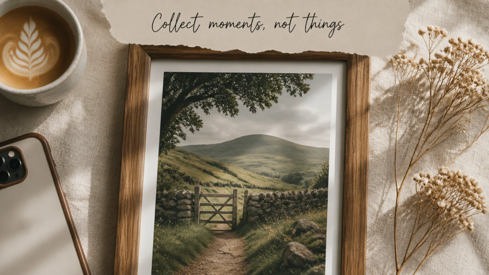
A torn-paper header gives a story a tactile, journal-like feel with a spot for a title. The rough deckled edge adds warmth. It suits blog-style stories, recipes, and diary posts where you want a quick heading over the image.
On a 1080x1920 canvas, place the photo full-bleed. Add a 'torn paper' element across the top inside the safe zone, about 1080x360 px, with the torn edge facing down. Add a headline in a handwritten font like Caveat at 56 px on the paper. Keep it below the profile bar. Export as PNG.
Angle the torn edge very slightly so the paper looks placed by hand rather than perfectly straight.
Do not let the paper strip reach the top edge; keep it below the safe line so your profile name stays clear.
10. Duotone Mood Story
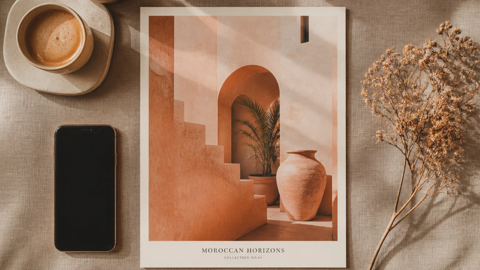
A duotone story recolors the photo into two tones, instantly unifying different images into one mood across a set. It is the strongest fix for a story sequence shot in mixed lighting. It suits mood boards, product drops, and themed story series.
On a 1080x1920 canvas, apply Canva’s Duotone effect with terracotta #C98570 shadows and cream #F5F0E6 highlights to a full-bleed photo. Save these exact colors for reuse. Add a small caption in Poppins 26 px at the base of the safe zone. Export as PNG at full size.
Editor's noteUse the same two duotone hex codes on every story — it is the fastest way to make a mixed set feel intentional.
Skip thisDo not choose high-contrast duotone colors; soft close-toned pairs read aesthetic, harsh pairs look like a filter.
11. Handwritten Doodle Frame Story

A hand-drawn doodle border adds casual, friendly personality that suits younger, chatty feeds. The loose line and small marks feel spontaneous. It works for reactions, polls, and everyday stories where a polished frame would feel too formal.
On a 1080x1920 canvas, place the photo inside the safe zone with a 100 px margin. Add a 'hand drawn frame' or 'doodle border' element in cream around the photo, plus two or three small doodle marks (stars, arrows) in the corners. Keep the marks sparse. Export as PNG.
Editor's noteKeep doodles to one or two accent marks so the frame stays charming instead of cluttered.
Skip thisDo not fill every corner with doodles; a few marks read as intentional, a swarm looks messy.
12. Ticket Stub Frame Story
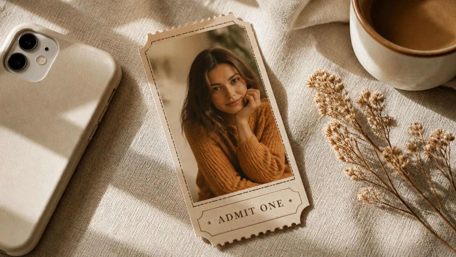
A ticket-stub frame is a fun, specific look for events, launches, and countdowns. The perforated edge and label read instantly as a ticket. It gives ordinary announcement stories a themed, collectible feel that stops the scroll.
On a 1080x1920 canvas, place the photo inside a rectangle with dashed perforation lines top and bottom. Add a small footer strip with an 'admit one' style label in a mono font at 24 px and a date. Keep everything in the safe zone. Export as PNG at full size.
Add a faint perforation shadow so the dashed edge looks torn rather than just drawn on.
Do not overload the stub with text fields; a title, a date, and one label keep it readable and real.
13. Grid Photo Dump Story
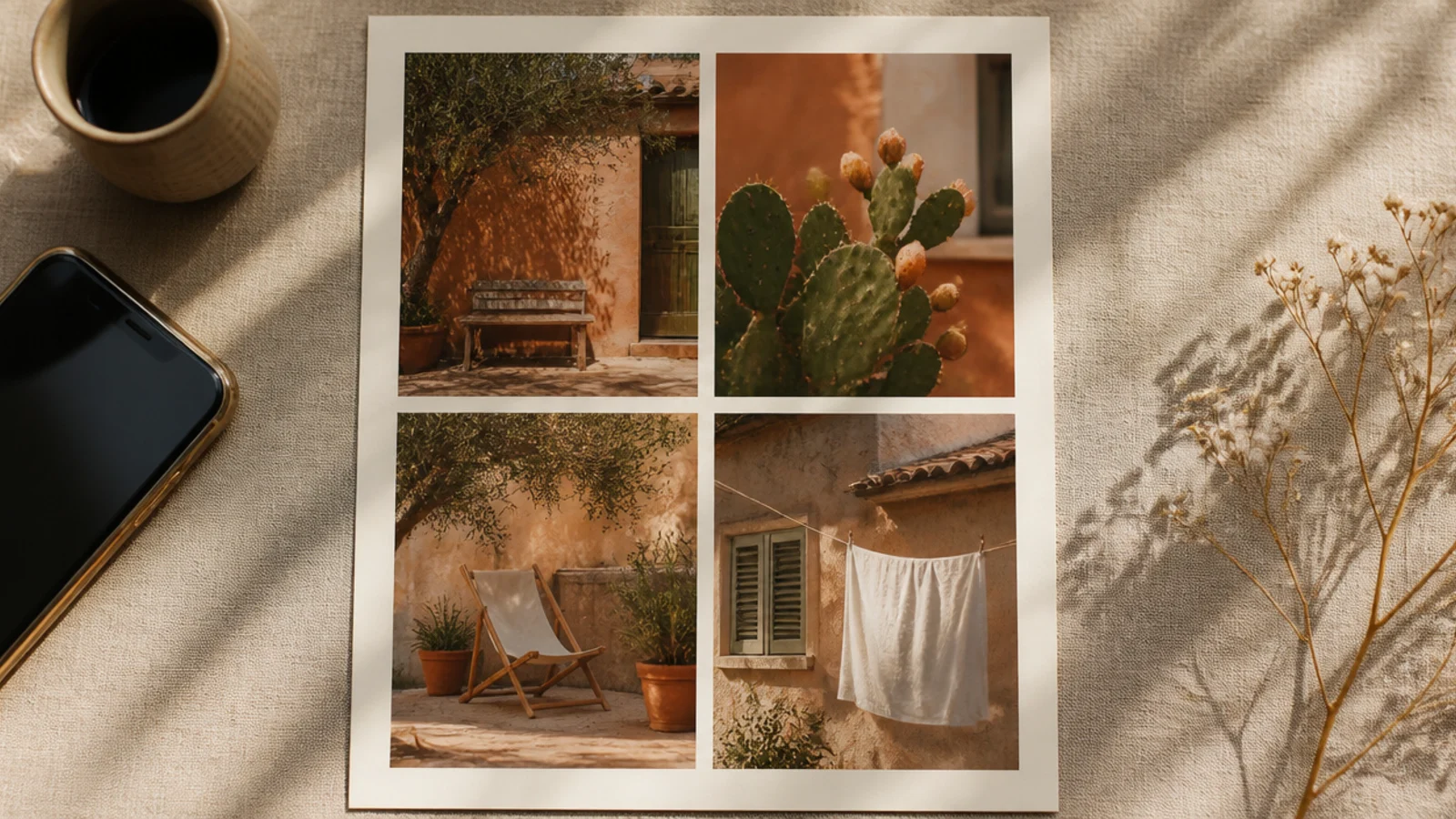
A grid frame fits several photos in one story — perfect for a photo dump, a recap, or a mini gallery. The even gaps keep it tidy instead of chaotic. It suits weekend recaps, event highlights, and 'this week' stories.
On a 1080x1920 canvas, add four Canva frames in a two-by-two grid with 20 px cream gaps and a 70 px outer border, all inside the safe zone. Drop a photo into each and reposition. Keep gaps and border fixed for reuse. Export as PNG at full size.
Choose four photos that share a color story so the grid reads as one cohesive dump, not four unrelated shots.
Do not cram in six or more photos; four keeps each image large enough to actually see on a phone.
14. Magazine Cover Story
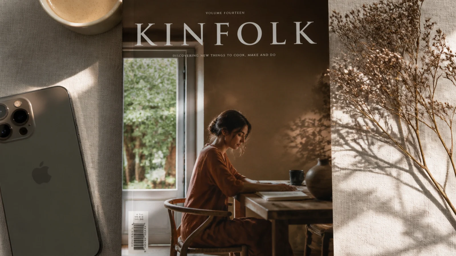
This frame styles a story like a magazine cover with a big serif masthead, giving instant editorial polish. It is ideal for highlight covers, series intros, and hero stories. The oversized type is the design, so the photo can be simple.
On a 1080x1920 canvas, place the photo full-bleed and add a masthead word in Playfair Display at 120 px across the top inside the safe zone, with a wide letter-spaced Poppins tagline beneath at 24 px. Keep the masthead position fixed. Export as PNG.
Let the masthead sit just behind the subject’s head for a real cover effect by sending the text one layer back.
Do not add cover lines all over; one masthead and one tagline is enough to read as editorial without clutter.
15. Footer Credit Bar Story
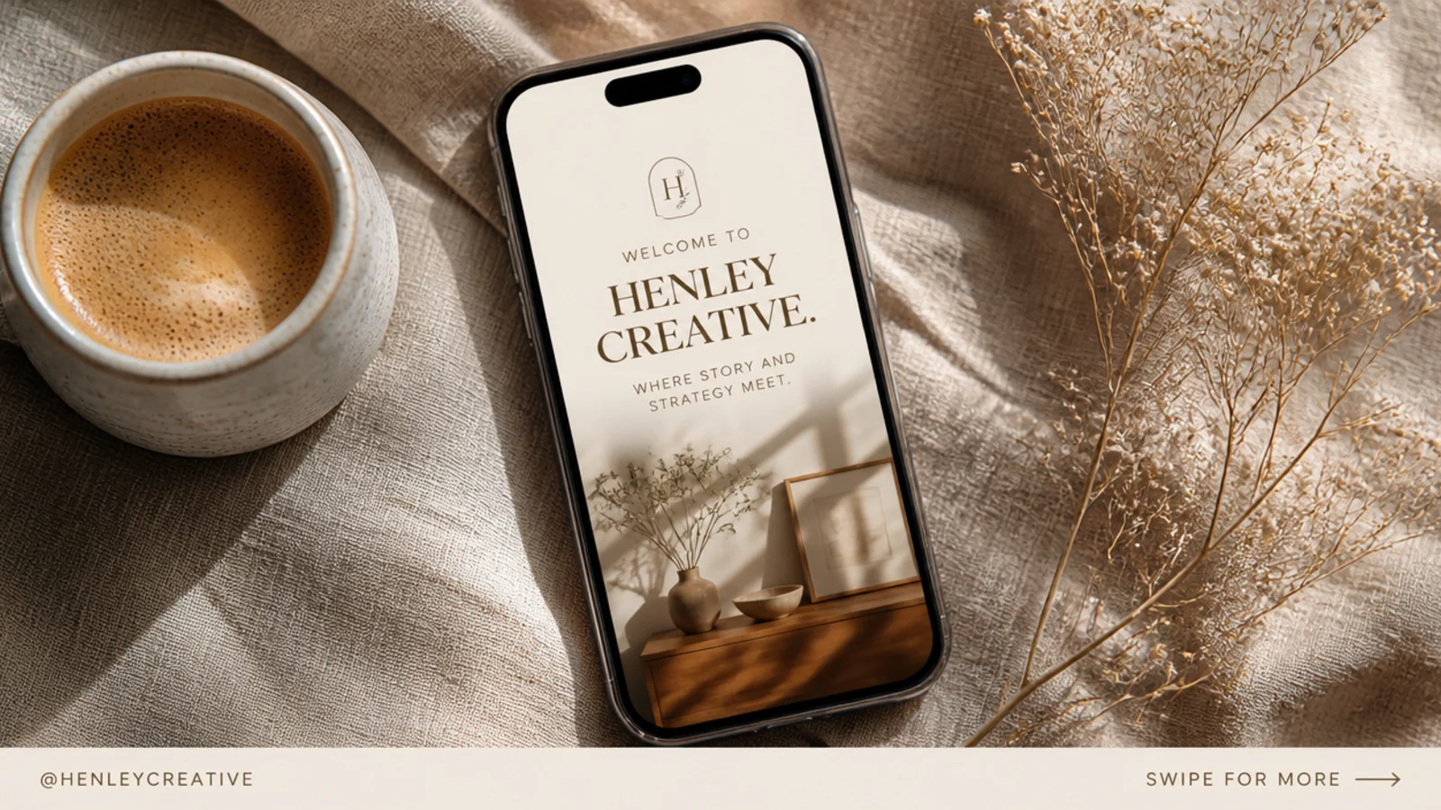
A slim footer bar brands a story and adds a call to action without covering the photo. It sits just above the reply bar with your handle or a swipe prompt. It suits every story type and quietly keeps your set consistent and recognizable.
On a 1080x1920 canvas, place the photo full-bleed and add a thin cream bar near the bottom of the safe zone, about 1080x120 px. Add your handle in Poppins 24 px on the left and a small prompt on the right. Keep the bar height and position fixed. Export as PNG.
Editor's noteSit the footer just above the bottom safe line so it never collides with Instagram’s reply box.
Skip thisDo not make the footer tall or loud; a slim, quiet bar brands the story without stealing from the photo.