1. Thin Cream Border Minimal

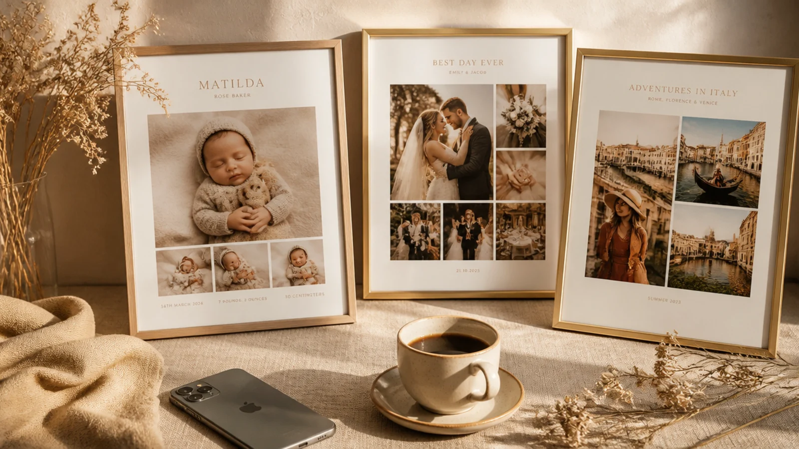
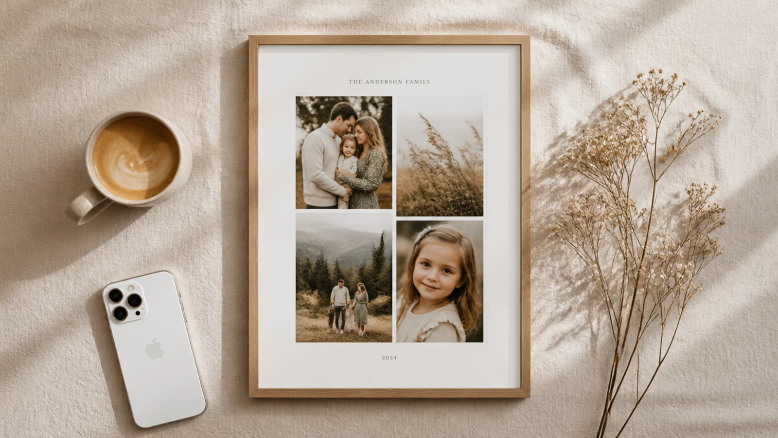
This is the simplest template that instantly looks curated, so it is where every beginner should start. You float the photo on a cream background with an even margin all the way around, letting the negative space do the framing. It suits any photo because the frame adds no color or pattern of its own, just calm breathing room.
Make a 1080x1350 px canvas and fill it with cream #F5F0E6. Drag guides at 90 px from each edge, then place your photo inside those guides so the cream shows as an even border. Hold Shift while resizing so the photo keeps its ratio. Nudge it with arrow keys until the top and bottom margins match exactly, then export as PNG.
Turn on Canva’s guides and snapping so the photo clicks to the exact margin every time instead of you eyeballing it.
Do not use pure white #FFFFFF for the border — it glares next to Instagram’s white app; a warm cream reads softer and more expensive.
2. Off-White Polaroid Frame
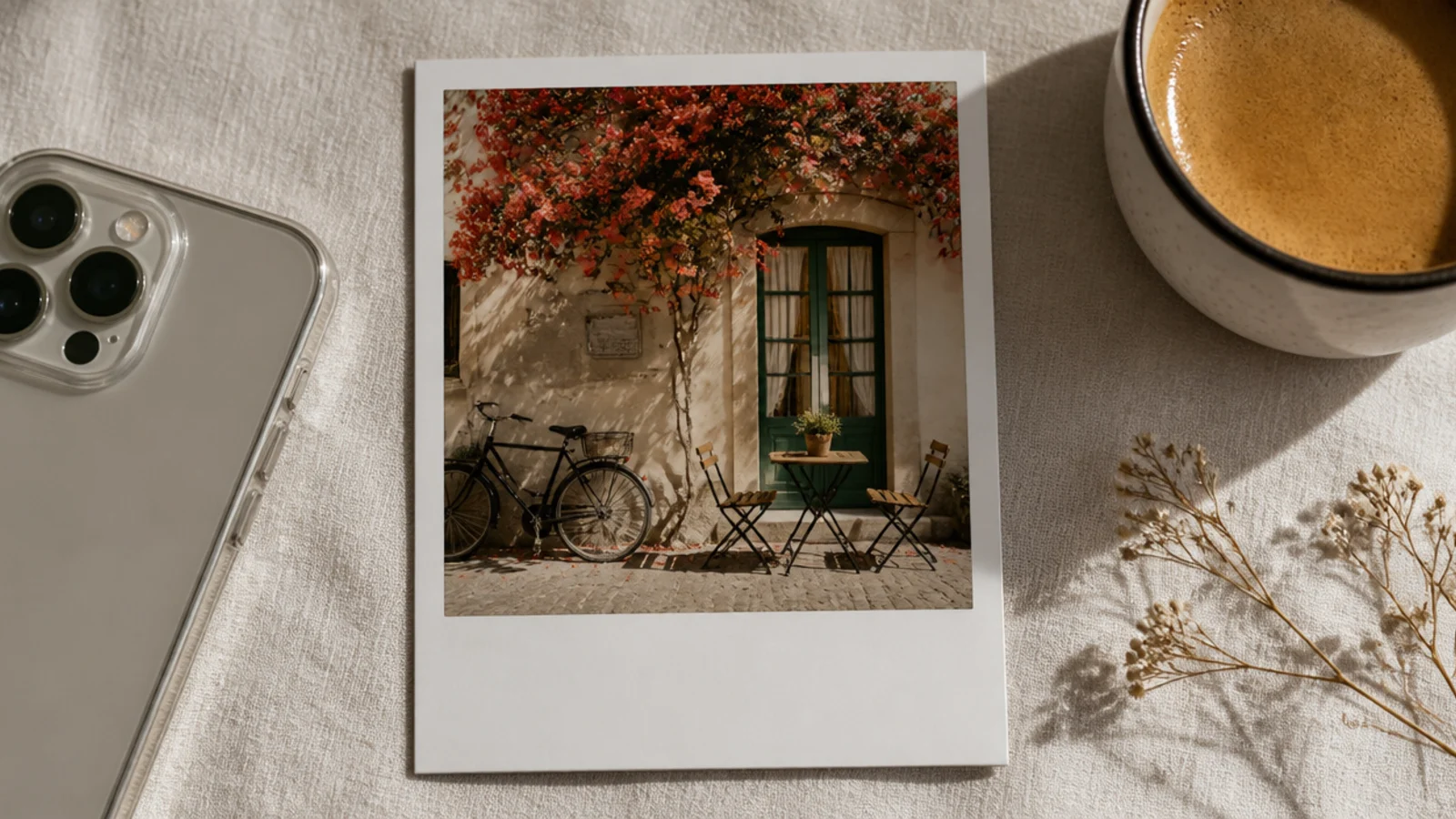
The polaroid frame gives instant nostalgia with almost no work — equal thin borders on three sides and a deep strip along the bottom for a caption or date. It flatters portraits and travel shots especially well. The wide bottom strip is where you add a handwritten-style word so it feels like a real snapshot.
On a 1080x1350 canvas filled cream, place the photo with a 70 px border on the top and sides and a 220 px strip at the bottom. Add one line of a handwritten font like Caveat, 40 px, centered in the bottom strip. Keep the photo crop tight on the subject. Export as PNG so the border edges stay crisp.
Keep the bottom caption to two or three words in a muted grey — a full sentence breaks the snapshot illusion.
Do not make all four borders equal; the polaroid look depends on that deeper bottom strip, or it just reads as a plain border.
3. Arched Photo Mask Frame

An arch-shaped photo instantly feels editorial and modern, like a gallery print. You mask the photo into a rounded arch and float it on a solid background. It works beautifully for architecture, portraits, and plants, and the shape alone carries the whole design so no other decoration is needed.
Add a rounded-top arch shape from Canva’s Elements (search 'arch'). Size it to about 760x1050 px and center it on a 1080x1350 terracotta or cream canvas. Drag your photo onto the arch so it crops to the shape, then double-click to reposition the subject. Leave even margin around the arch and export as PNG.
Editor's noteAdd a soft drop shadow to the arch (Canva’s Shadow effect, low blur, 20% opacity) so it lifts off the background like a framed print.
Skip thisDo not let the arch touch the canvas edges; the shape only reads as intentional with clear space around it.
4. Soft Grain Overlay Border
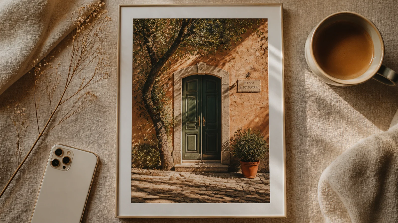
A whisper of grain over the entire post gives everything a cohesive film-photo mood, which is the secret behind a lot of aesthetic feeds. You add a thin border plus a low-opacity grain layer on top. Because the grain sits over both photo and border, every post in your feed shares the same finish.
Build a 1080x1350 canvas with a 60 px cream border. Search Canva Elements for 'grain texture' or 'film grain', stretch it over the full canvas, and set its transparency to 12-18% with blend mode Overlay if available. Group the grain with the border so it never shifts when you swap photos. Export as PNG.
Save the grain layer at the same opacity on every template so all your posts share one consistent film finish.
Do not push grain opacity above about 20% — heavy grain looks like a low-quality photo, not an intentional texture.
5. Serif Caption Bar Frame
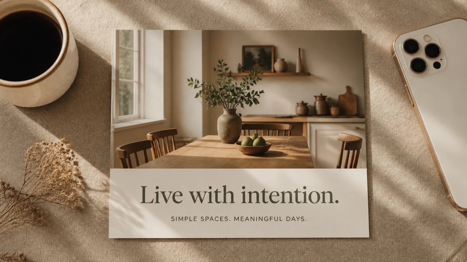
This frame turns a photo into a mini magazine page with a caption bar across the bottom third. It is perfect for quotes, tips, and carousel intros because the bar gives text a clean home. The serif-plus-sans pairing does the aesthetic heavy lifting.
On a 1080x1350 canvas, place the photo full-bleed, then lay a cream rectangle across the bottom 380 px. Add a Playfair Display headline at 60 px and one Poppins line at 26 px in charcoal #3A3A3A, both left-aligned with a 70 px inset. Keep the bar the same height on every post. Export as PNG.
Left-align the text with a generous inset rather than centering it — it reads more like an editorial layout.
Do not put dark text over the photo itself; the whole point of the bar is guaranteed legibility on any image.
6. Double Hairline Gallery Frame
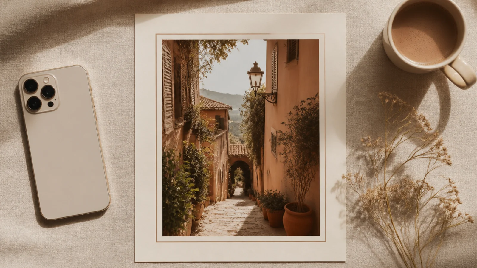
Two thin lines nested inside each other read like a framed gallery mat and feel quietly upscale. It adds structure without color, so it works over any photo. The small gap between the lines is the detail that makes it look considered rather than plain.
On a 1080x1350 canvas, place the photo with a 90 px margin. Add a thin line rectangle (2 px, charcoal) at 70 px from the edge, then a second at 100 px, leaving a 30 px gap between them. Group both lines so they stay aligned when you reuse the template. Export as PNG at full size.
Use a soft charcoal like #3A3A3A rather than black for the lines so the frame feels vintage, not harsh.
Do not make the two lines different thicknesses; matched hairlines are what give the clean gallery-mat effect.
7. Dusty Pastel Gradient Border
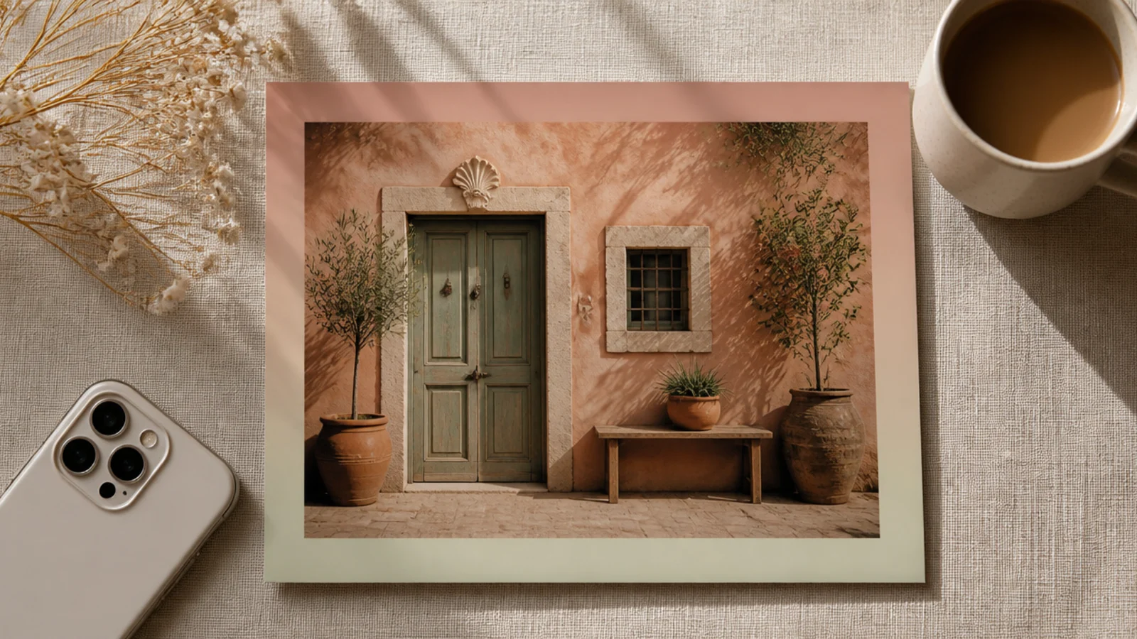
A soft gradient border adds gentle color while staying muted enough to feel aesthetic. The border shifts between two dusty tones so the frame has movement without a pattern. It flatters neutral or black-and-white photos that need a hint of color around them.
Fill a 1080x1350 canvas with a linear gradient using dusty blush #E8D3CE to pale sage #CBD3C3 (Canva’s gradient background). Place the photo with an even 100 px margin so the gradient shows as a border. Keep the gradient direction vertical on every template for consistency. Export as PNG.
Pick two colors that sit close together on the color wheel so the gradient reads as one soft wash, not a rainbow.
Do not use bright saturated gradient colors; muted, dusty tones are what keep it looking aesthetic rather than loud.
8. Torn Paper Edge Frame

A torn-paper layer under the photo gives a tactile, scrapbook-meets-editorial feel that stands out in a clean feed. The rough deckled edges add handmade warmth. It suits journaling captions, recipes, and cozy lifestyle shots.
On a 1080x1350 cream canvas, add a 'torn paper' or 'ripped paper' element from Canva sized to about 940x1210 px and centered. Place the photo on top of the paper with a small 40 px paper margin showing. Add a faint shadow between photo and paper for depth. Export as PNG so the torn edges stay sharp.
Editor's noteRotate the paper layer just 1-2 degrees so it looks placed by hand rather than perfectly squared.
Skip thisDo not stack more than one torn-paper layer; a single deckled edge looks intentional, multiples look messy.
9. Film Strip Sprocket Frame
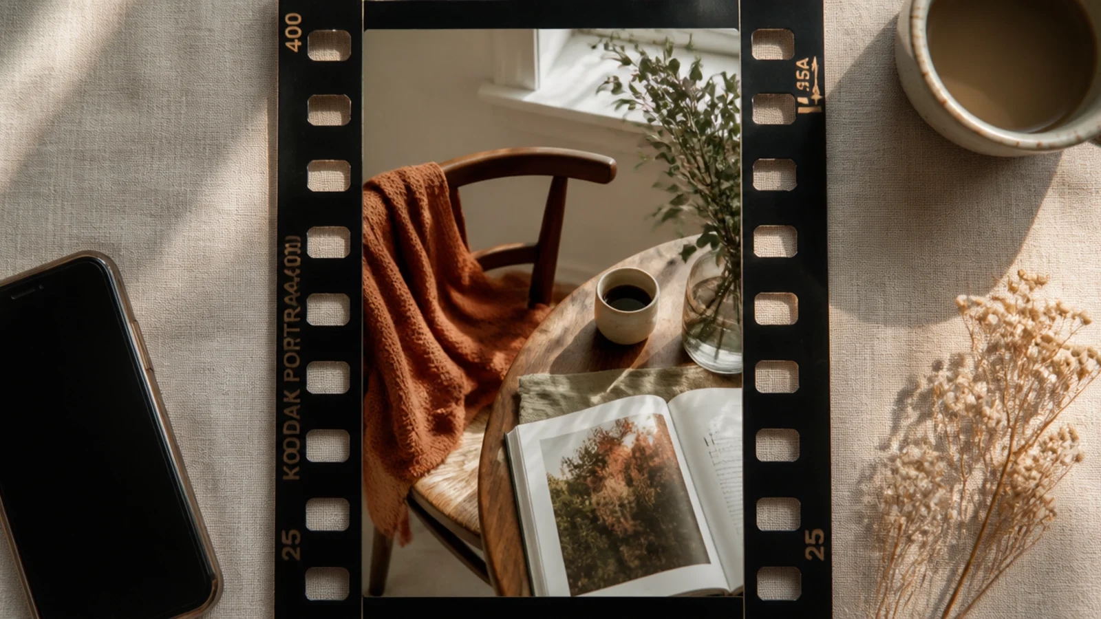
A 35mm film-strip frame is playful and instantly nostalgic, framing the photo in black with the classic sprocket holes. It is a favorite for travel dumps and retro edits. The black surround also makes colors in the photo pop.
On a 1080x1350 canvas, add a 'film strip' element from Canva Elements and size it to fill the frame. Drag your photo into the film-strip’s photo slot so it crops between the sprocket rows. Add small frame numbers in a mono font at the top if you want extra authenticity. Export as PNG.
Choose a film-strip element with a matte, slightly grey-black rather than pure black so it feels vintage, not flat digital.
Do not stretch the film strip to a different ratio than the photo; keep proportions so the sprocket holes stay round.
10. Scalloped Vintage Edge
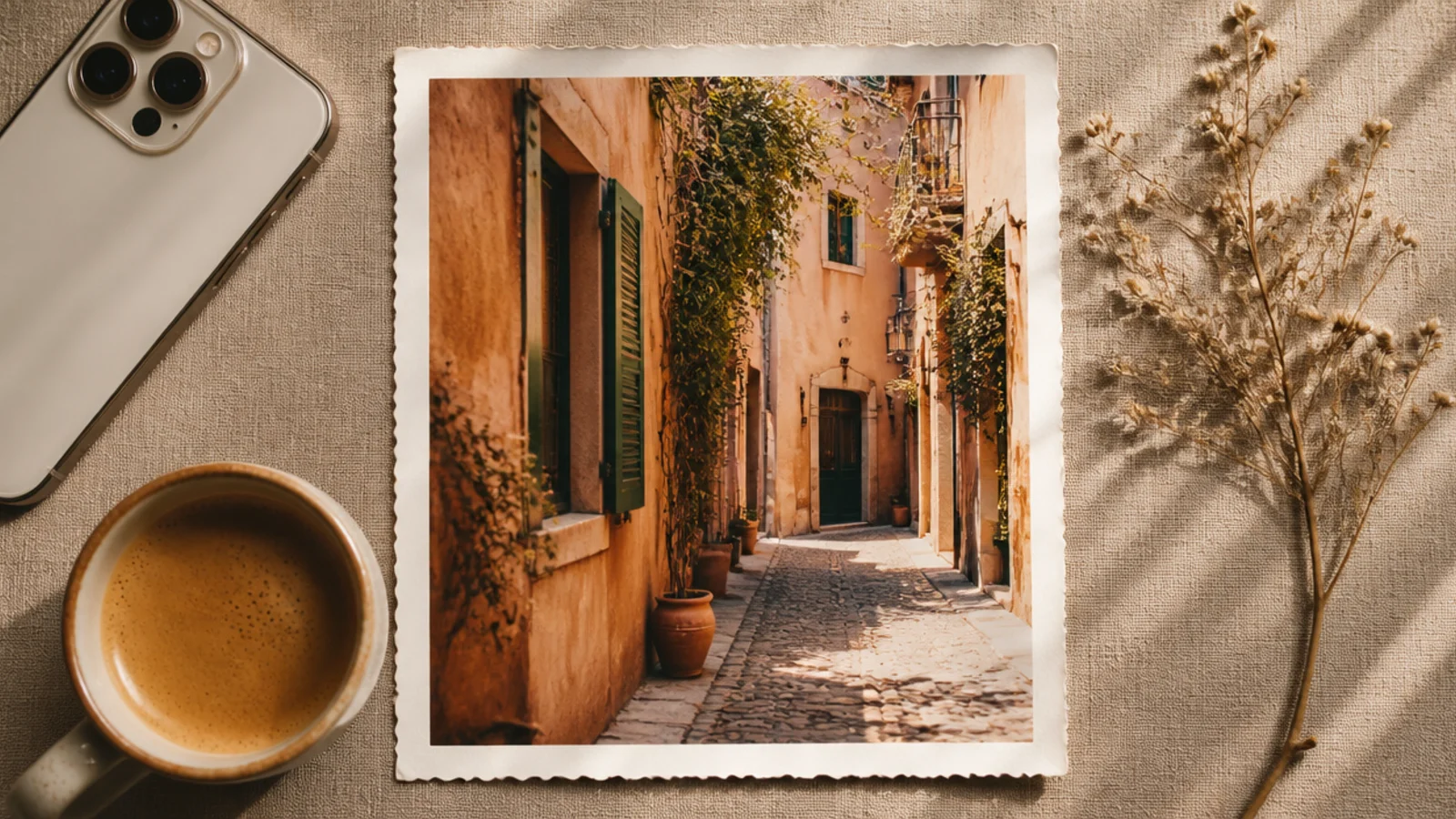
A scalloped border mimics the deckle-cut edges of old printed photos and feels charming and retro. The wavy edge frames the photo softly rather than with a hard line. It suits portraits, florals, and anything you want to feel like a keepsake.
On a 1080x1350 cream canvas, add a 'scalloped frame' element from Canva sized to about 900x1170 px and centered. Drag the photo into the frame so the scallops crop the edges. Keep an even cream margin around the scalloped shape. Export as PNG so the wavy edges render cleanly.
Editor's noteMatch the scallop border color to your feed’s base tone (cream or white) so it blends into your set rather than shouting vintage.
Skip thisDo not pair scallops with a second decorative border; the wavy edge is already the feature and doubling up looks fussy.
11. Kraft Paper Scrapbook Frame
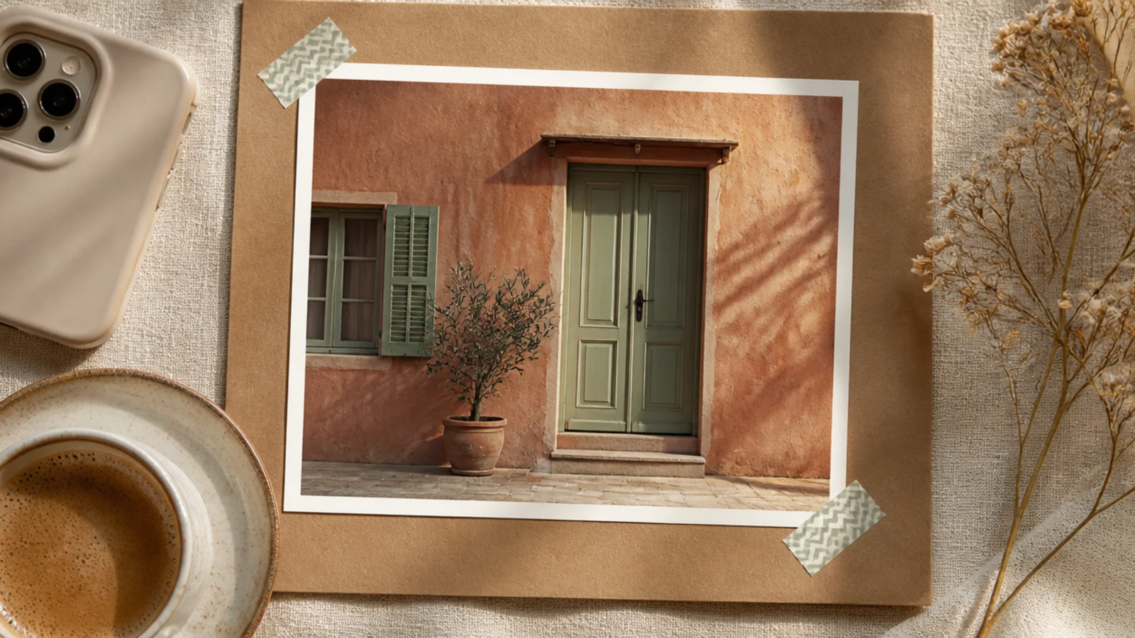
This frame recreates a scrapbook page — the photo sits on kraft paper with washi-tape corners holding it down. It feels personal and warm, great for memories, throwbacks, and journaling posts. The tape corners add a real handmade touch that flat frames lack.
Fill a 1080x1350 canvas with a kraft-paper texture (Canva Elements, search 'kraft paper'). Center the photo at about 860 px wide with a slight 2-degree tilt. Add two small washi-tape elements across the top-left and bottom-right corners. Drop a faint shadow under the photo. Export as PNG.
Use muted, tonal washi tape (sage, blush, cream) rather than bright patterns so it stays aesthetic instead of childlike.
Do not tape all four corners symmetrically; two opposite corners look casual and real, four looks rigid.
12. Minimal Date Stamp Corner
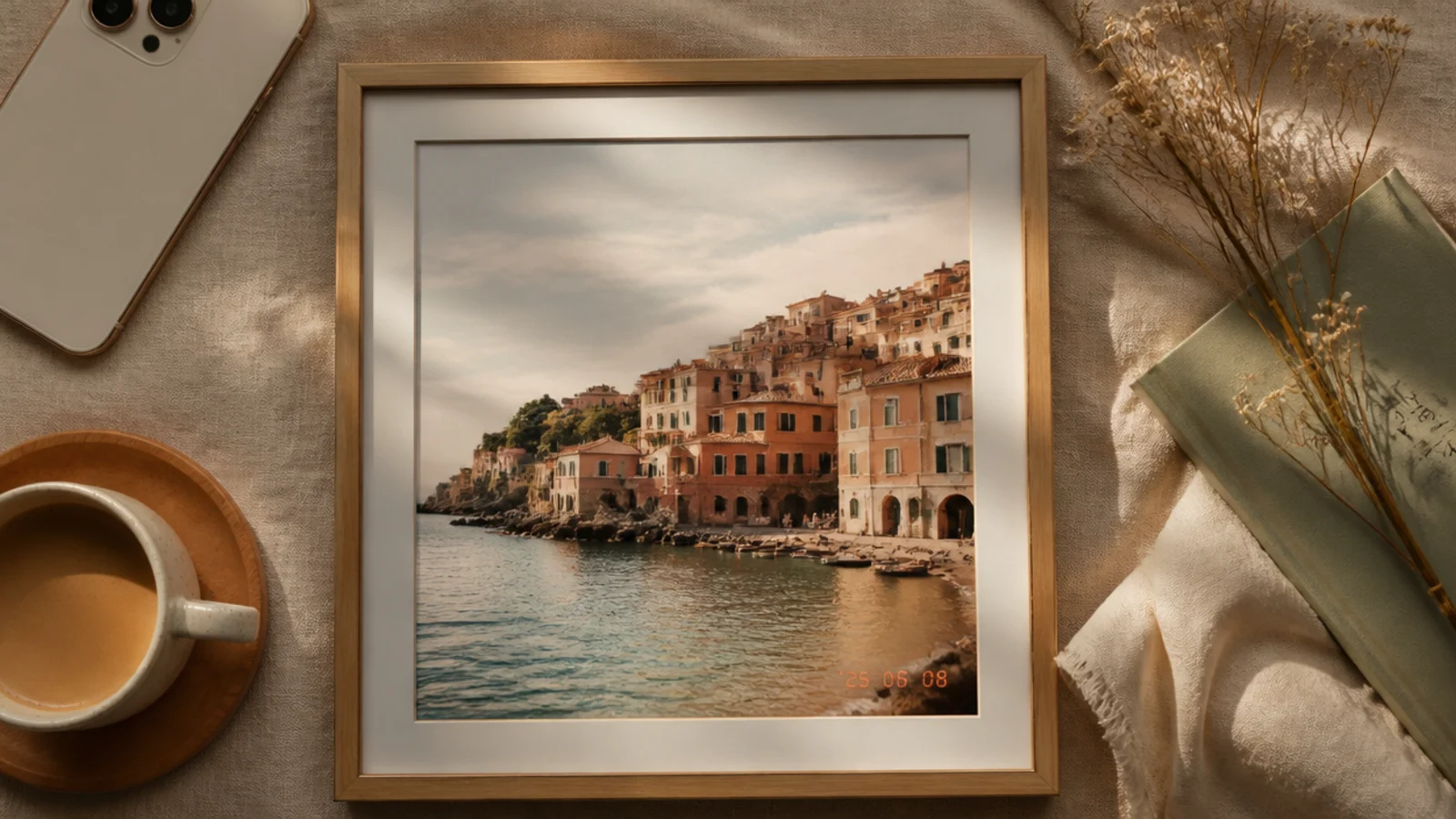
A tiny date stamp in the corner references old point-and-shoot cameras and adds a cool, casual detail with barely any design. Paired with a thin inner border it feels considered. It suits candid, everyday, and film-style photos.
On a 1080x1350 canvas, place the photo full-bleed and add a thin 2 px cream inner border at 40 px from the edge. In the lower-right, add a date in a digital font like DSEG or a mono font, 30 px, in a soft orange #E8A15C. Keep the same corner and color on every post. Export as PNG.
Editor's noteSet the date in the classic orange LED color — it is the detail that reads instantly as a retro camera stamp.
Skip thisDo not place the stamp where it overlaps a busy part of the photo; keep it in a calm corner so it stays legible.
13. Duotone Wash Frame
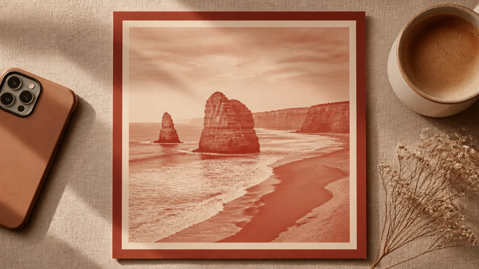
A duotone recolors the photo into just two tones, which instantly unifies wildly different images into one mood. Framed with a matching border, it is the strongest way to make a mixed camera roll feel curated. It suits feeds where photo quality varies a lot.
On a 1080x1350 canvas, apply Canva’s Duotone photo effect using terracotta #C98570 for shadows and cream #F5F0E6 for highlights. Add a border in the same terracotta at 80 px. Save these exact duotone colors so every future photo matches. Export as PNG.
Editor's noteUse the same two duotone hex codes across all posts — it is the single most powerful trick for a cohesive feed from mismatched photos.
Skip thisDo not pick high-contrast duotone colors like black and neon; soft, close-toned duotones read aesthetic, harsh ones read like an effect.
14. Rounded Window Mat Frame

This frame acts like a picture mat with a rounded-rectangle window, giving the photo a soft, contained, gallery feel. The wide mat around it reads calm and premium. It works for any subject and is especially flattering for portraits.
On a 1080x1350 cream canvas, add a rounded-rectangle frame element sized to about 820x1090 px, centered, with corner radius around 40 px. Drag the photo into it. Keep the cream mat margin even on all sides, roughly 130 px. Export as PNG for clean rounded corners.
Editor's noteKeep the corner radius subtle — a gentle round looks refined, while heavily rounded corners drift toward a dated app sticker.
Skip thisDo not shrink the mat margin to save space; the generous even border is exactly what makes this look expensive.
15. Handwritten Script Overlay Frame
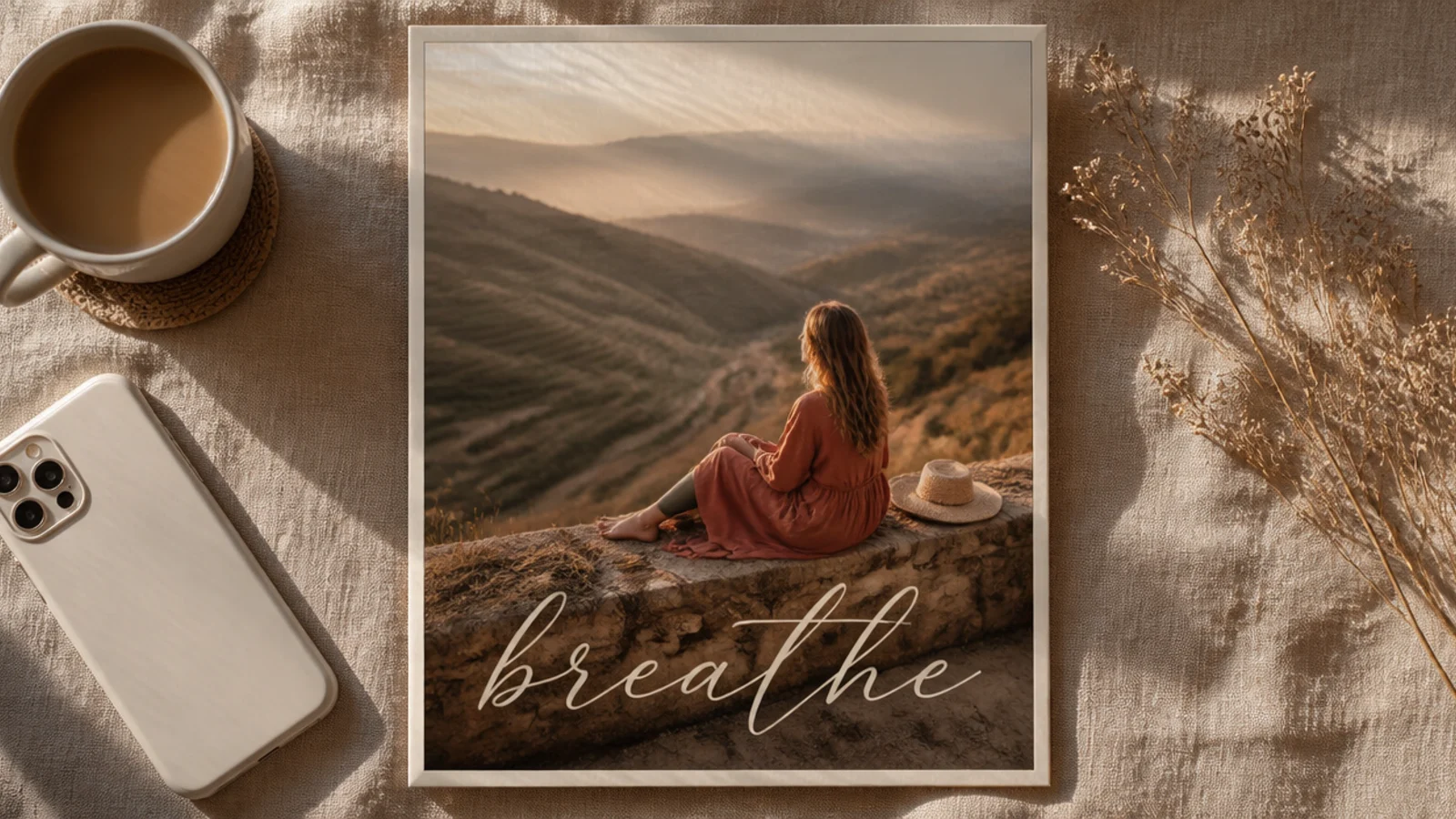
One handwritten word laid over the photo adds personality and a signature feel, like a caption written straight onto the print. Combined with a thin border it stays elegant. It suits mood posts, city names, and single-word themes.
On a 1080x1350 canvas, place the photo with a 60 px border. Add one word in a script font like Sacramento or Great Vibes at 90 px, cream #F5F0E6, positioned over a darker calm area of the photo. Add a very soft shadow behind the text for legibility. Export as PNG.
Place the script over the darkest third of the photo so cream lettering stays readable without a heavy shadow.
Do not write a full sentence in script; one or two words keep it aesthetic, more becomes hard to read and cluttered.
16. Two-Photo Split Frame
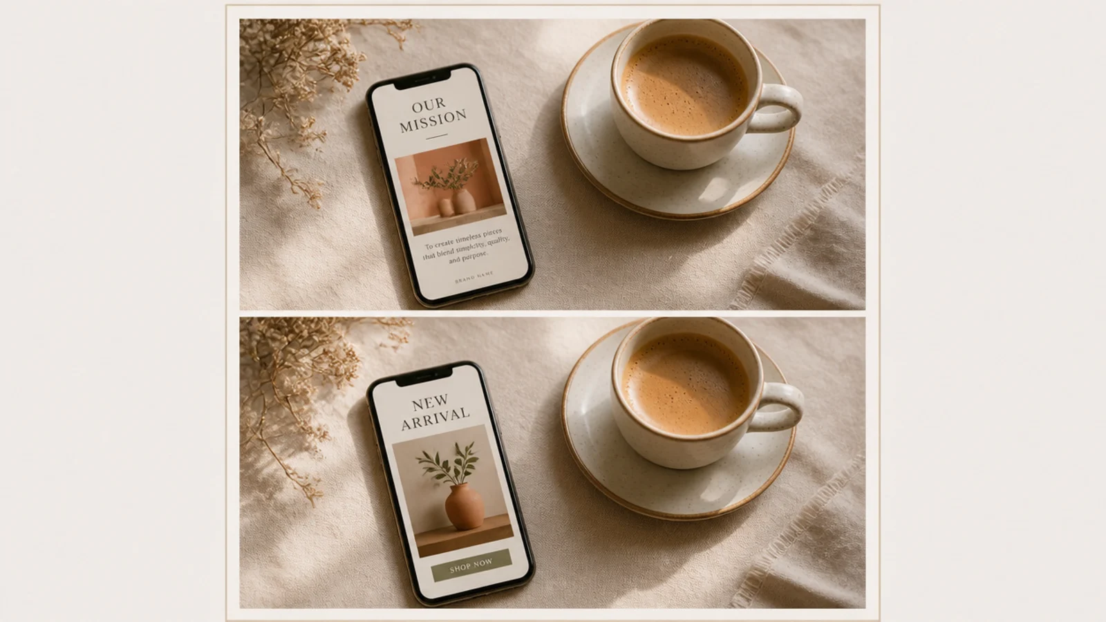
A split frame pairs two photos in one post — a detail and a wide shot, or a before and after — separated by a clean gap. It tells a small story and adds rhythm to your grid. It suits outfit posts, recipes, and travel pairings.
On a 1080x1350 canvas, add two Canva frames stacked vertically with a 20 px cream gap between them and an 80 px outer border. Drop one photo into each frame and reposition subjects. Keep the gap and border identical every time you reuse it. Export as PNG.
Editor's notePair photos with a shared color so the two halves feel like one image, not two unrelated shots stuck together.
Skip thisDo not use two busy photos together; pair one busy shot with one calm one so the split still feels balanced.
17. Sage Botanical Corner Frame
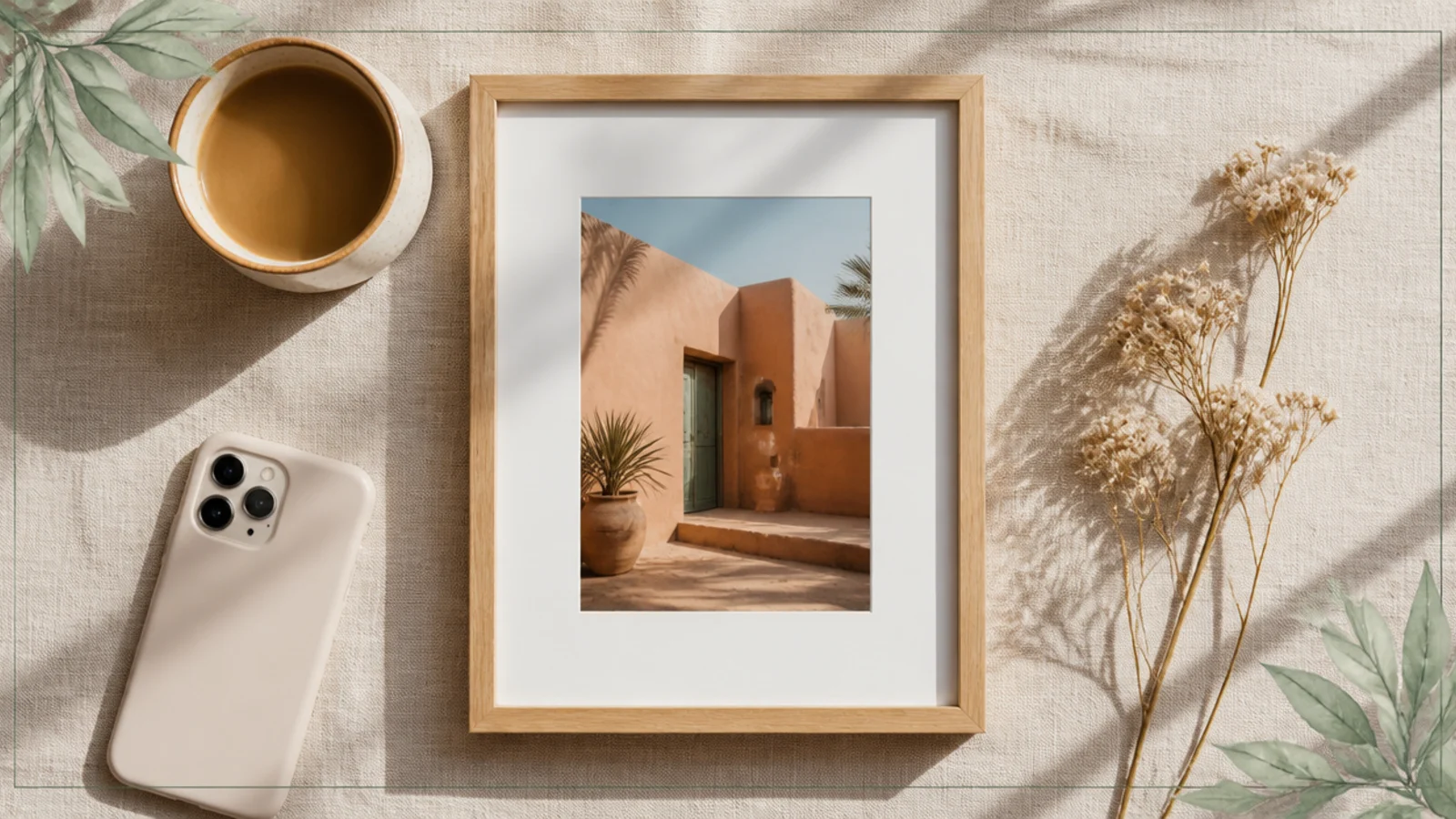
Fine botanical line-art in two corners adds a soft, organic touch that suits plant, wellness, and slow-living feeds. The leaves frame the photo without covering it. Kept in muted sage, it stays aesthetic rather than crafty.
On a 1080x1350 canvas, place the photo with a 70 px cream border. Add a fine 'botanical line' or 'leaf branch' element in sage #9CA986 to the top-left and a matching one flipped to the bottom-right, each about 260 px. Set them to low weight so they read as accents. Export as PNG.
Editor's noteMirror the same leaf element diagonally rather than using two different plants — the symmetry looks deliberate.
Skip thisDo not let the leaves creep over faces or the subject; keep them tucked into the corners as a frame, not a cover.
18. Magazine Masthead Frame

This frame styles the post like a magazine cover with a big serif masthead across the top. It gives instant editorial polish and is perfect for a feed’s hero posts or reel covers. The oversized type is the whole design, so the photo can be simple.
On a 1080x1350 canvas, place the photo full-bleed and add a masthead word in Playfair Display at 130 px across the top in cream, with a 24 px tagline beneath in Poppins letter-spaced wide. Keep the masthead position fixed on every cover post. Export as PNG.
Let the masthead sit partly behind the subject’s head for a real cover effect — send the text layer just behind the photo’s foreground.
Do not crowd the cover with cover-line text everywhere; one masthead and one small tagline is enough to read as editorial.
19. Sticker Tape Corner Frame
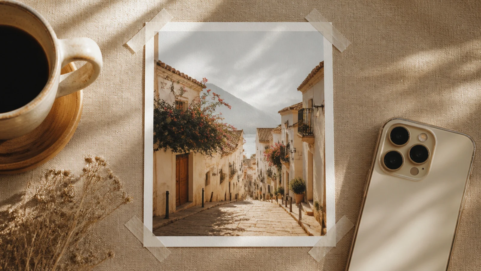
Translucent tape strips across the corners give an instant-photo-in-an-album feel while staying clean and modern. Unlike full scrapbook pages, this is minimal — just the tape and a thin border. It suits everyday and memory posts.
On a 1080x1350 cream canvas, place the photo with a 60 px border. Add four small translucent 'tape' elements at about 30% opacity, each angled across a corner at roughly 45 degrees. Keep them all the same size and angle for symmetry. Export as PNG.
Editor's noteLower the tape opacity to around 30% so it looks like real matte tape catching light, not a solid sticker.
Skip thisDo not use glossy or brightly colored tape graphics; translucent matte tape is what keeps this looking aesthetic.
20. Full-Bleed Grain and Caption Footer
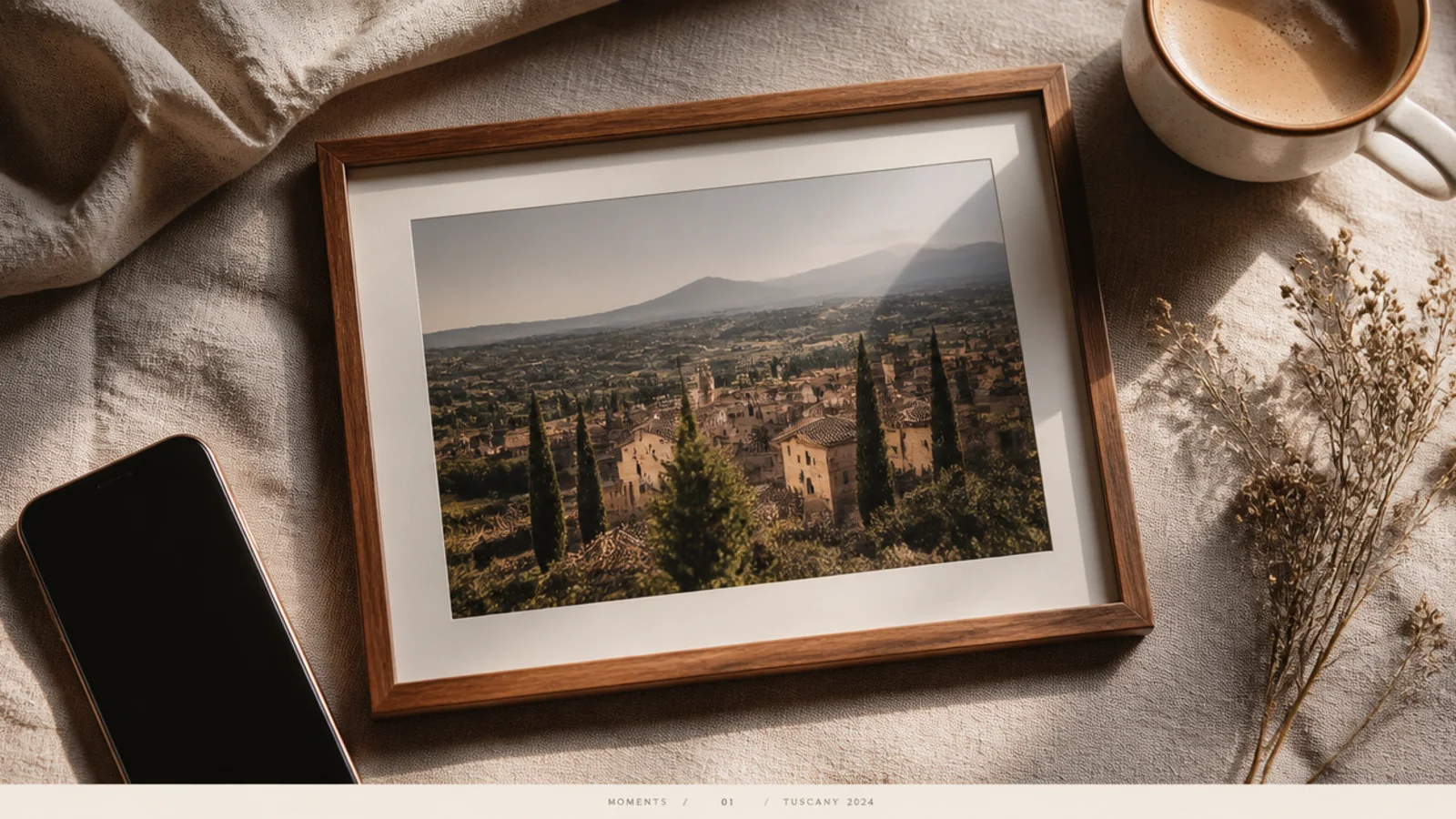
This is the most advanced aesthetic frame here — a full-bleed grainy photo with a minimal caption footer, like a photo book page. It maximizes the image while still branding the post. It suits polished feeds where the photography is the star.
On a 1080x1350 canvas, place the photo full-bleed and add a 12% grain overlay across it. At the very bottom, add a thin cream rule line and one centered caption in Poppins at 22 px, letter-spaced. Keep the footer height and font fixed for every post. Export as PNG.
Editor's noteLetter-space the footer caption wide (tracking around 200) so even a short line spans the frame and feels intentional.
Skip thisDo not let the footer caption compete with the photo; keep it small, quiet, and consistent so the image stays the hero.