1. Clean Margin Post
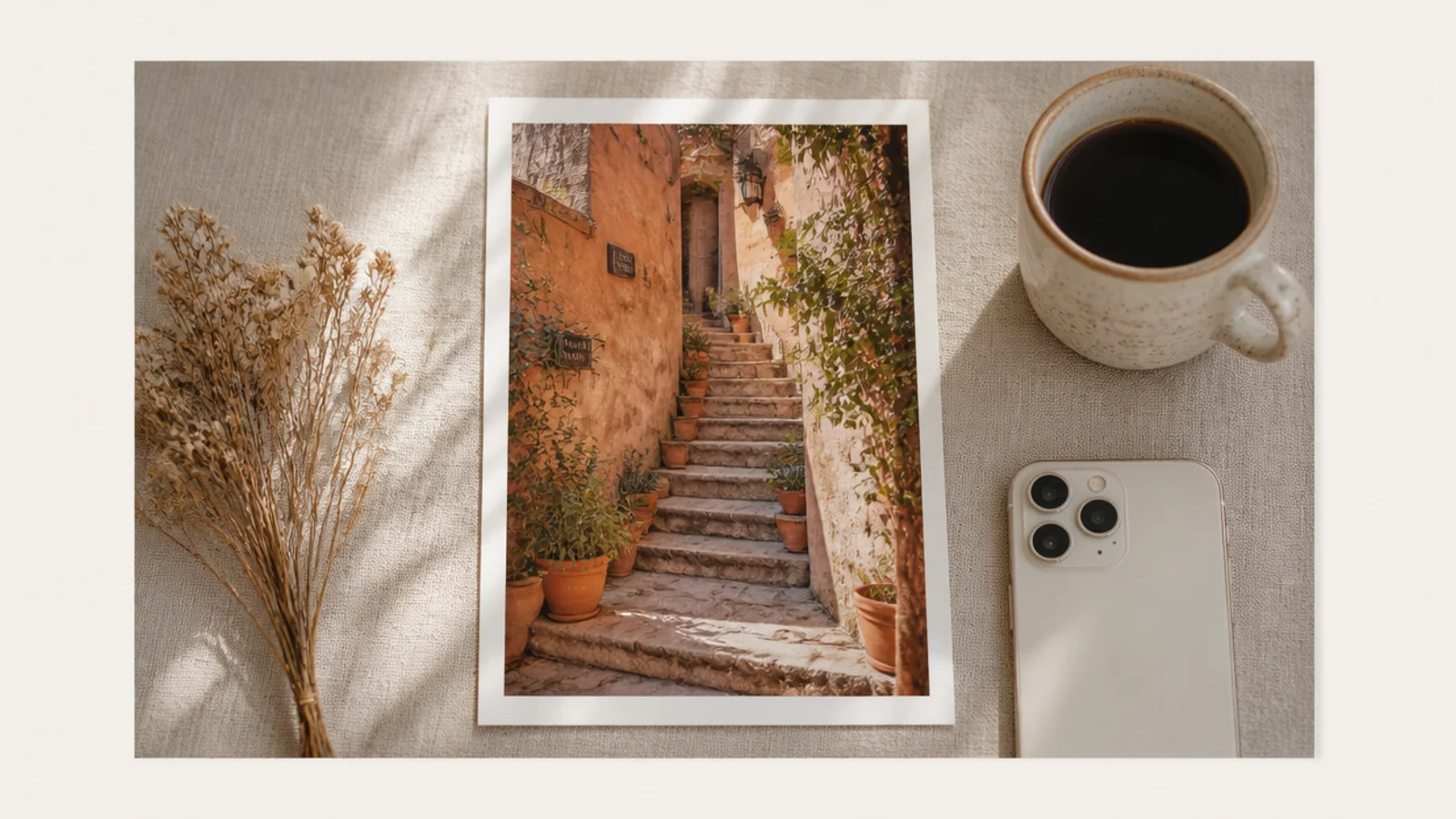
This is the simplest post frame that looks instantly designed, so start here. You float the photo on a cream background with an even margin so the space frames it. It suits any photo because the frame adds no color or pattern, just calm structure that reads as intentional.
On a 1080x1350 cream canvas, drag guides 100 px from each edge and place the photo inside them so the margin is even all around. Hold Shift while resizing to keep the ratio, then arrow-key until top and bottom match. Keep the margin identical on every post. Export as PNG.
Use Canva snapping so the photo clicks to the exact margin instead of you eyeballing it each time.
Do not vary the margin between posts; a consistent margin is what makes the grid look like one set.
2. Full-Bleed with Caption Footer
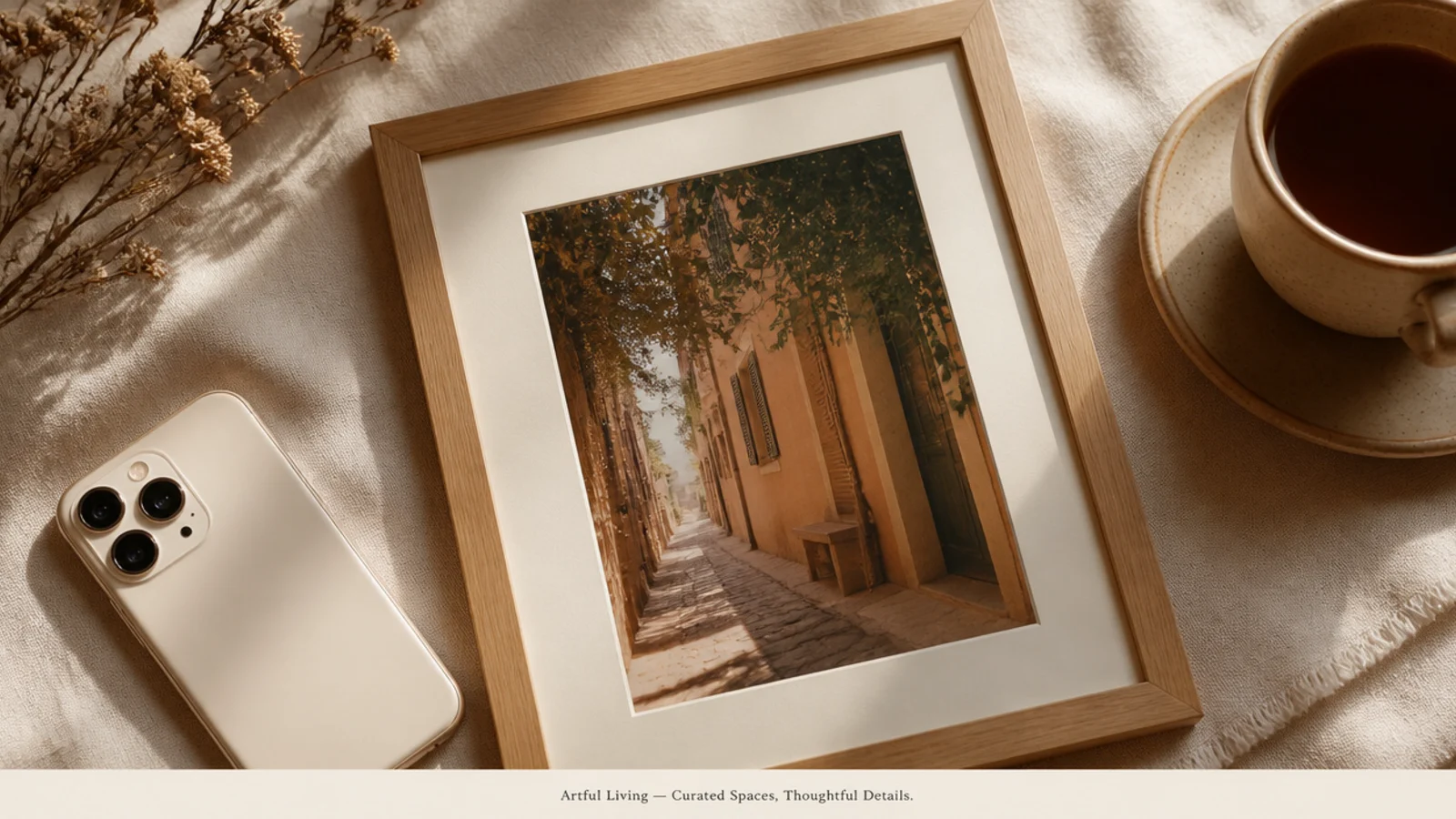
A full-bleed photo with a slim caption footer maximizes the image while still branding the post. The footer holds a title or handle. It suits photo-forward feeds where the picture leads but you still want a consistent signature.
Editor's noteLetter-space the footer caption wide so even a short line spans the frame and looks intentional.
On a 1080x1350 canvas, place the photo full-bleed. Add a thin cream footer bar about 120 px tall at the bottom with one centered caption in Poppins 24 px, letter-spaced wide. Keep the footer height and font fixed on every post. Export as PNG.
Skip thisDo not make the footer tall or loud; a slim, quiet bar keeps the photo the hero.
3. Quote Post Frame

A quote frame puts words center stage on a clean background, ready to be shared and saved. The big serif is the design. It suits mantras, captions, and thought-leadership posts that travel well when reshared.
On a 1080x1350 cream canvas, center a Playfair Display quote at 58 px in charcoal within a 120 px margin, with a large decorative quote mark above at 120 px in terracotta. Add a small handle line beneath in Poppins 22 px. Keep line length short. Export as PNG.
Break the quote into short lines of three to five words so it reads instantly in the feed.
Do not fill the whole canvas with a long quote; leave generous margins so the words breathe.
4. Tip Numbered List Frame
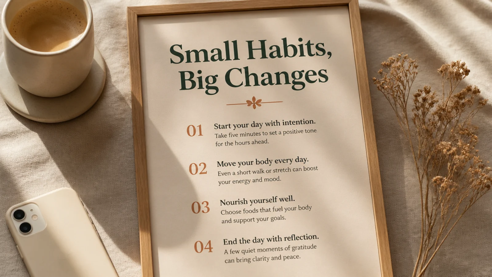
A numbered-list frame delivers value fast — a headline and a few numbered points. It is highly saveable, which helps reach. It suits how-tos, tips, and educational feeds where people screenshot to keep.
Editor's noteKeep each tip to one line so the list stays scannable; move detail to the caption.
On a 1080x1350 cream canvas, add a DM Serif headline at 54 px at the top within a 100 px margin. Below, list three or four points in Poppins 28 px, each with a bold terracotta number. Space the lines evenly. Keep the layout fixed. Export as PNG.
Skip thisDo not cram in more than four tips; a crowded list is hard to read on a phone.
5. Carousel Cover Frame

A carousel cover frame is the first slide that earns the swipe, with a bold title and a swipe cue. It sets the template for the inner slides. It suits multi-slide tips, stories, and educational carousels.
Editor's noteDuplicate the cover page for every inner slide so the whole carousel shares one layout.
On a 1080x1350 cream canvas, add a big Playfair Display title at 66 px, centered, within a 100 px margin. Add a small 'swipe' arrow cue in the lower-right in Poppins 22 px. Duplicate the page for inner slides, keeping margins and fonts. Export all as PNG.
Skip thisDo not change fonts or margins between slides; consistency is what makes a carousel feel designed.
6. Split Text-and-Photo Frame
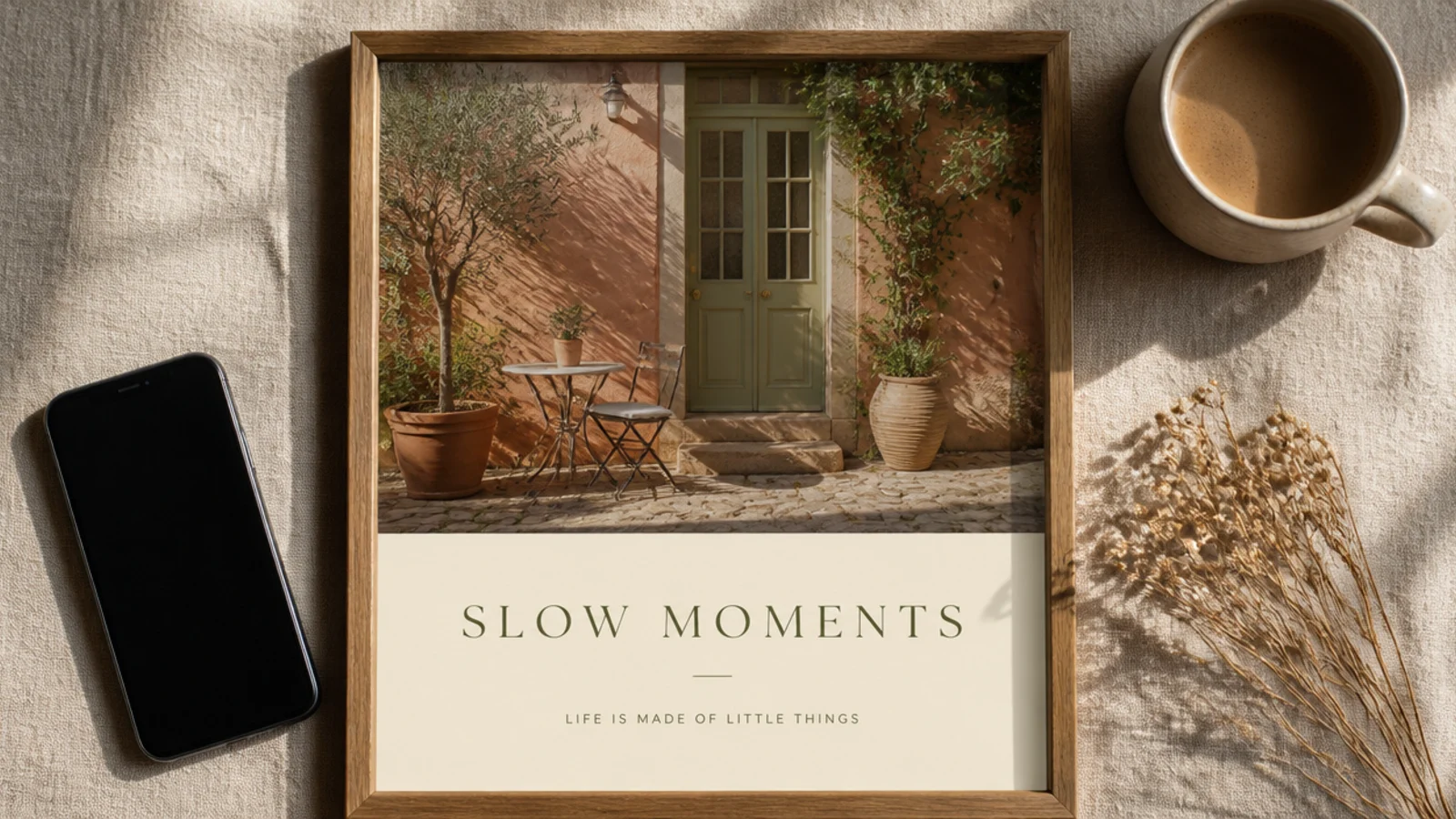
A split frame pairs a photo with a text block in one clean division. The photo grabs attention, the block delivers the message. It suits announcements, blog promos, and posts that need both an image and words.
On a 1080x1350 canvas, place a photo across the top 60% and a cream block across the bottom 40%. Add a DM Serif headline at 48 px and a Poppins line at 24 px in the block, left-aligned with a 90 px inset. Keep the split ratio fixed. Export as PNG.
Keep the split ratio the same on every post so the series reads as one template.
Do not put text over the photo half; the clean split is what guarantees legibility.
7. Two-Column Layout Frame
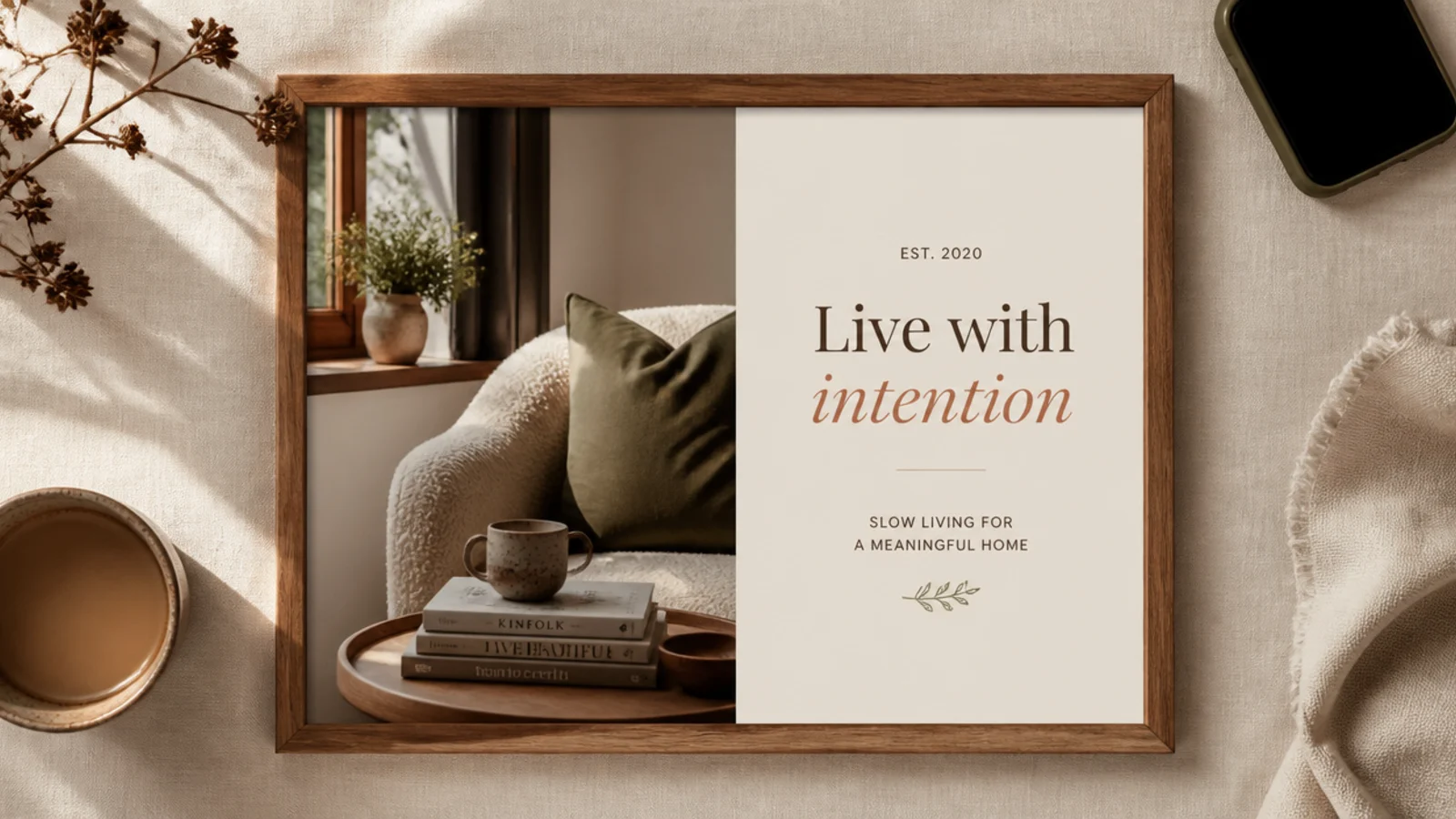
A two-column frame sets a photo beside a text column for a magazine-spread feel. The side-by-side layout is dynamic. It suits interviews, product features, and editorial-style posts.
On a 1080x1350 canvas, place a photo in the left 55% and a cream column on the right 45%. Add a DM Serif headline at 44 px and a short Poppins paragraph at 22 px in the column, with a 70 px inset. Keep the column split fixed. Export as PNG.
Align the headline’s top with the top of the photo so the two columns feel balanced.
Do not make the text column too narrow; leave enough width so lines do not break awkwardly.
8. Header Bar Post Frame

A header bar across the top gives announcements a bold, clear title zone over the photo. The colored bar draws the eye first. It suits promos, launches, and news posts that need a loud headline.
On a 1080x1350 canvas, place the photo full-bleed and add a terracotta bar across the top 260 px. Add a bold Poppins title at 44 px in cream, centered in the bar. Keep the bar height and color fixed. Export as PNG.
Match the header bar color to one color pulled from the photo so it feels tied to the image.
Do not use a header bar so tall it hides the photo; keep it to the top strip.
9. Sidebar Label Frame

A thin vertical sidebar with rotated text adds an architectural, editorial detail that brands the post subtly. It leaves the photo almost full. It suits minimalist, design-led feeds that want a signature touch.
Editor's noteRotate the sidebar text to read bottom-to-top so it feels like a book spine, clean and intentional.
On a 1080x1350 canvas, place the photo full-bleed and add a thin cream sidebar about 90 px wide on the left. Add small rotated text (handle or category) in Poppins 20 px running vertically. Keep the sidebar fixed. Export as PNG.
Skip thisDo not make the sidebar wide; a thin strip reads as a detail, a wide one eats the photo.
10. Rounded Card Post Frame
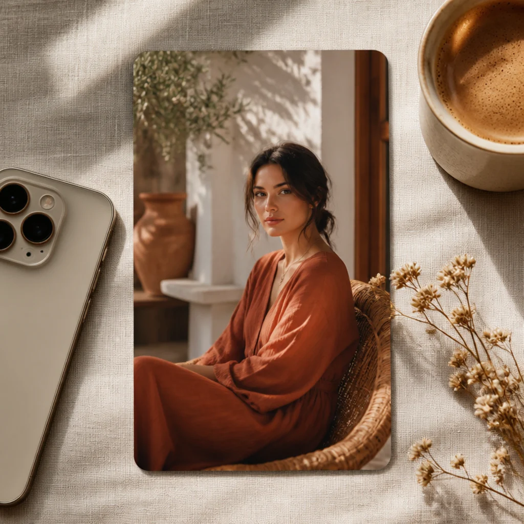
A rounded card with a soft shadow makes the post look like a floating UI card — clean, modern, and friendly. The shadow adds depth. It suits tech, wellness, and contemporary brand feeds.
On a 1080x1350 cream canvas, add a rounded-rectangle at about 880x1140 px, centered, with a 40 px radius and a soft drop shadow. Drop the photo in. Keep an even margin around the card. Export as PNG for clean corners.
Add a soft, diffused shadow under the card so it lifts off the background like a real card.
Do not use a hard, dark shadow; a soft one looks like depth, a sharp one looks fake.
11. Arch Photo Post Frame
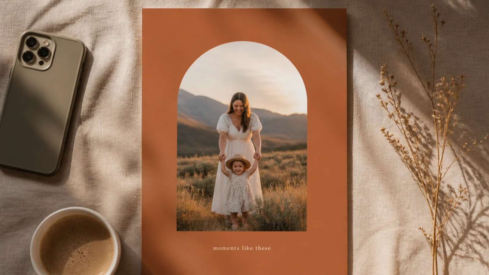
An arch-cropped photo feels editorial and calm, and the shape carries the design. It leaves room for a caption below. It suits portraits, architecture, and single-subject posts with a modern gallery feel.
On a 1080x1350 terracotta canvas, add an arch shape at about 760x1050 px, centered, with a soft shadow. Drop the photo in. Add a small caption below in Poppins 24 px. Keep the arch inside even margins. Export as PNG.
Leave clear space below the arch for a caption so the layout feels planned, not cramped.
Do not let the arch touch the edges; clear space around it is what makes the shape read intentional.
12. Grain Overlay Post Frame
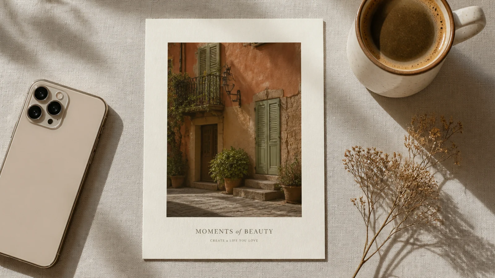
A light grain overlay across the post gives your whole feed one film finish, tying different photos together. The grain sits over photo and border alike. It suits any content and unifies mismatched images.
On a 1080x1350 canvas, add a 60 px border and a 'film grain' element over the full canvas at 12-18% with Overlay blend. Group the grain so it stays put. Keep the opacity identical on every post. Export as PNG.
Use the same grain opacity on every post so the whole feed shares one consistent finish.
Do not push grain past 20%; heavy grain reads as a low-quality photo, not a chosen texture.
13. Duotone Post Frame

A duotone recolors any photo into two tones, unifying a mixed camera roll into one mood. Framed with a matching border, it is the strongest cohesion trick there is. It suits feeds where photo quality varies a lot.
On a 1080x1350 canvas, apply Canva’s Duotone with terracotta #C98570 shadows and cream #F5F0E6 highlights. Add a matching border at 80 px. Save the exact duotone colors for reuse. Export as PNG.
Reuse the same two duotone hex codes on every post for instant cohesion from mismatched photos.
Do not pick high-contrast duotone colors; soft, close-toned pairs read aesthetic, harsh ones look like a filter.
14. Bordered Announcement Frame

A thick colored border around a centered headline makes an announcement impossible to miss. The border acts like a frame around the news. It suits sales, openings, and important updates.
On a 1080x1350 cream canvas, add a thick terracotta border about 50 px wide around the whole post. Center a bold headline in DM Serif at 60 px inside, with a small date line in Poppins 24 px. Keep the border width fixed. Export as PNG.
Keep the inside clean with just the headline and a date so the thick border stays the frame, not clutter.
Do not fill the bordered space with lots of text; a bold border works with a short, punchy message.
15. Before-and-After Split Frame
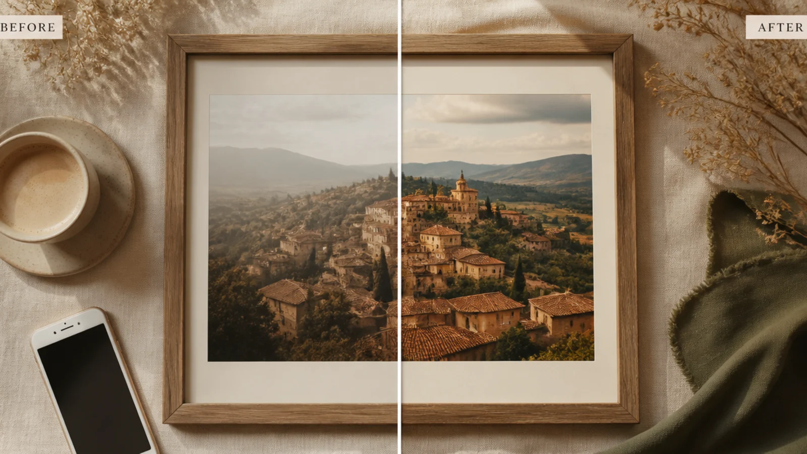
A before-and-after split shows two photos side by side with a clear divider and labels. It is compelling for transformations. It suits fitness, renovation, makeover, and product-result posts.
Editor's noteLine up the horizon or subject height across both photos so the comparison reads cleanly.
On a 1080x1350 canvas, split the frame vertically into two photos with a 20 px cream divider. Add small 'before' and 'after' labels in Poppins 22 px at the base of each. Keep the divider and labels fixed. Export as PNG.
Skip thisDo not crop the two photos differently; matching crops make the before-and-after fair and clear.
16. Grid Collage Post Frame
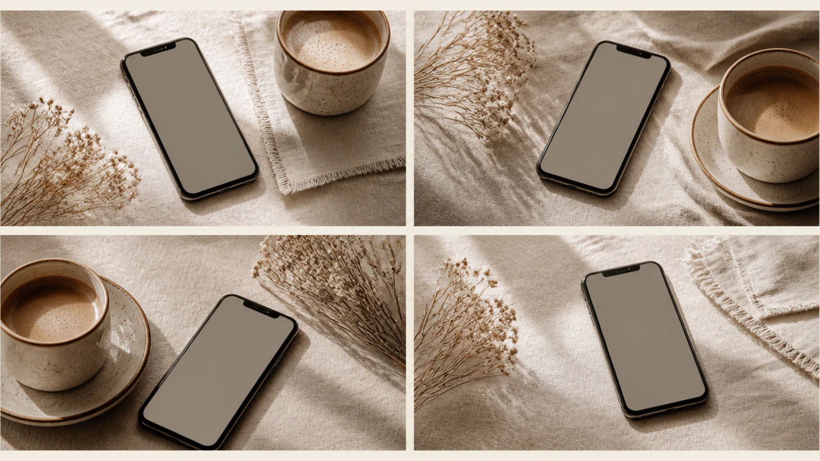
A four-photo grid fits a set in one post — great for roundups and collections. Even gaps keep it tidy. It suits recaps, product ranges, and mood boards where one image is not enough.
Editor's noteChoose four photos sharing a color story so the grid reads as one cohesive set.
On a 1080x1080 canvas, add four frames in a two-by-two grid with 20 px cream gaps and a 60 px outer border. Drop a photo into each and reposition. Keep gaps and border fixed for reuse. Export as PNG.
Skip thisDo not vary the gap widths; uneven gaps make the grid look sloppy.
17. Polaroid Post Frame

A polaroid post frame brings a personal, snapshot feel with a handwritten caption strip. It flatters candid photos. It suits behind-the-scenes, memories, and casual, human posts.
On a 1080x1350 cream canvas, place the photo with a 70 px top and side border and a 220 px bottom strip. Add a handwritten caption in Caveat 40 px, centered in the strip. Keep the crop tight. Export as PNG.
Keep the handwritten caption to a few words in muted grey so the snapshot feel holds.
Do not make all borders equal; the deeper bottom strip is what makes it read as a polaroid.
18. Sticker-Tape Post Frame

Translucent tape corners give a clean album-page feel without a full scrapbook. Just the tape and a thin border keep it minimal. It suits memory and everyday posts with a light handmade touch.
On a 1080x1350 cream canvas, place the photo with a 60 px border. Add two translucent tape elements at about 30% opacity across opposite corners at a 30-degree angle. Keep them matched. Export as PNG.
Lower tape opacity to about 30% so it looks like real matte tape, not a solid sticker.
Do not tape all four corners; two opposite corners look casual and real.
19. Bold Type Overlay Frame

A bold type overlay lays a huge headline over a dimmed photo for maximum impact. The type is the design. It suits statements, reel covers, and posts meant to stop the scroll with a word or phrase.
On a 1080x1350 canvas, place the photo full-bleed and add a cream overlay at 30% to dim it. Add a huge bold Poppins headline at 90 px in cream across the lower half, left-aligned with a 90 px inset. Keep the position fixed. Export as PNG.
Dim the photo enough that white text reads clearly without a heavy shadow behind it.
Do not skip the dimming overlay; bold text over a bright photo becomes unreadable.
20. Minimal Line Accent Frame
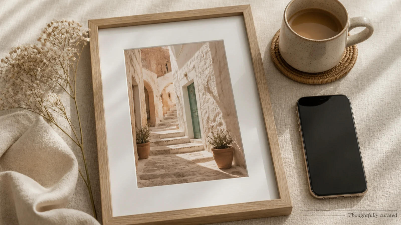
A single thin line plus a small caption is the most minimal branded frame — a whisper of structure. It stays out of the photo’s way. It suits photography and design feeds that want the lightest possible touch.
On a 1080x1350 canvas, place the photo full-bleed. Add one thin 2 px charcoal line across the bottom third and a small caption beneath it in Poppins 22 px in one corner. Keep line and caption fixed. Export as PNG.
Let the thin line sit just under a natural break in the photo so it feels placed, not random.
Do not add more lines or elements; the restraint is the whole point of this frame.
21. Circle Inset Post Frame
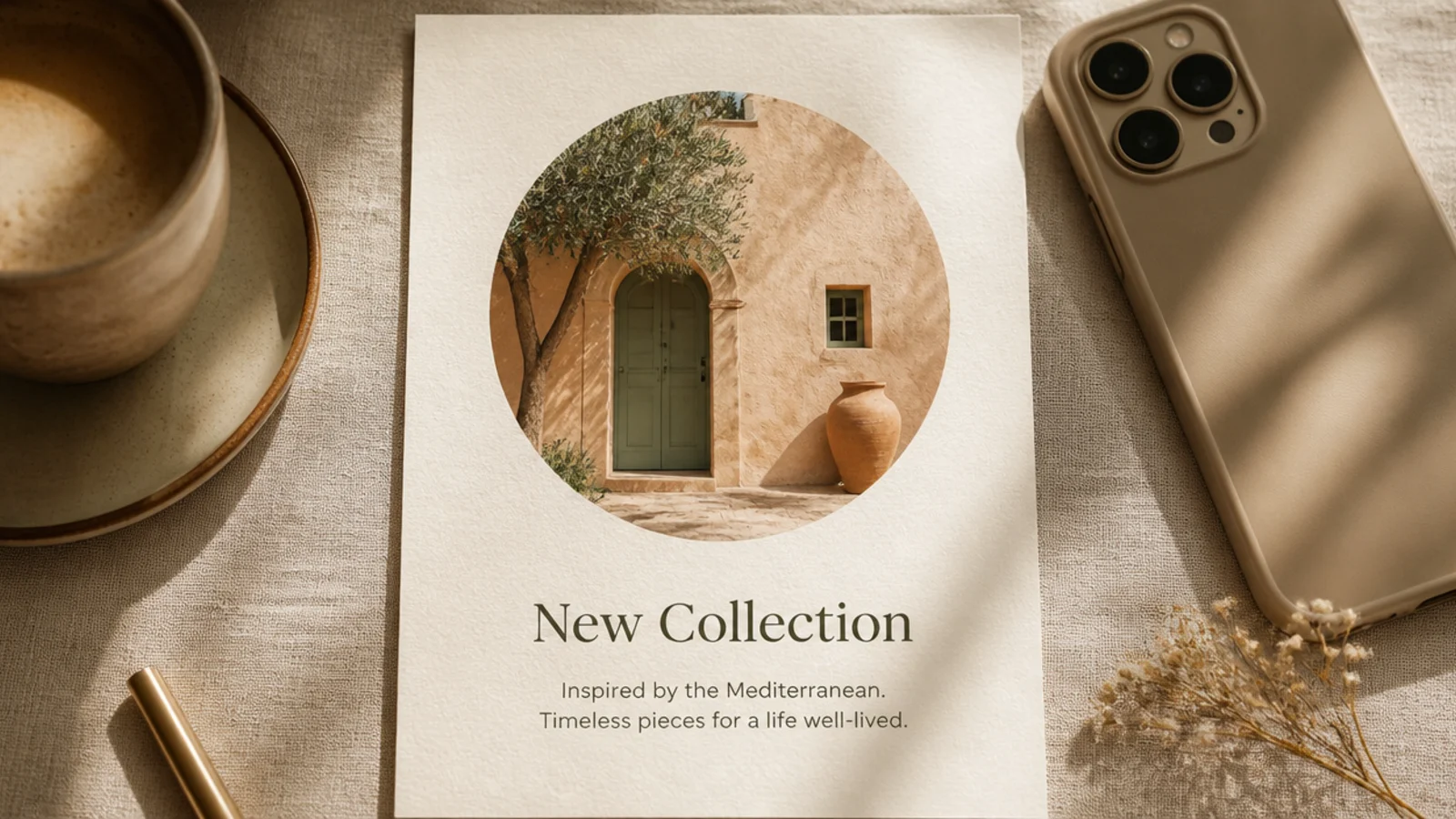
A circular photo inset above text reads like a clean profile or intro card. The circle draws the eye to a face or product, then the text explains. It suits intros, team posts, and product spotlights.
Editor's noteCenter a face or product in the circle before exporting since the round crop is unforgiving.
On a 1080x1350 cream canvas, add a circle frame about 520 px, centered near the top. Drop the photo in. Below, add a DM Serif headline at 46 px and a Poppins line at 24 px, centered. Keep the layout fixed. Export as PNG.
Skip thisDo not push the circle to the edge; keep even space around it so it reads as a clean inset.
22. Magazine Editorial Post Frame
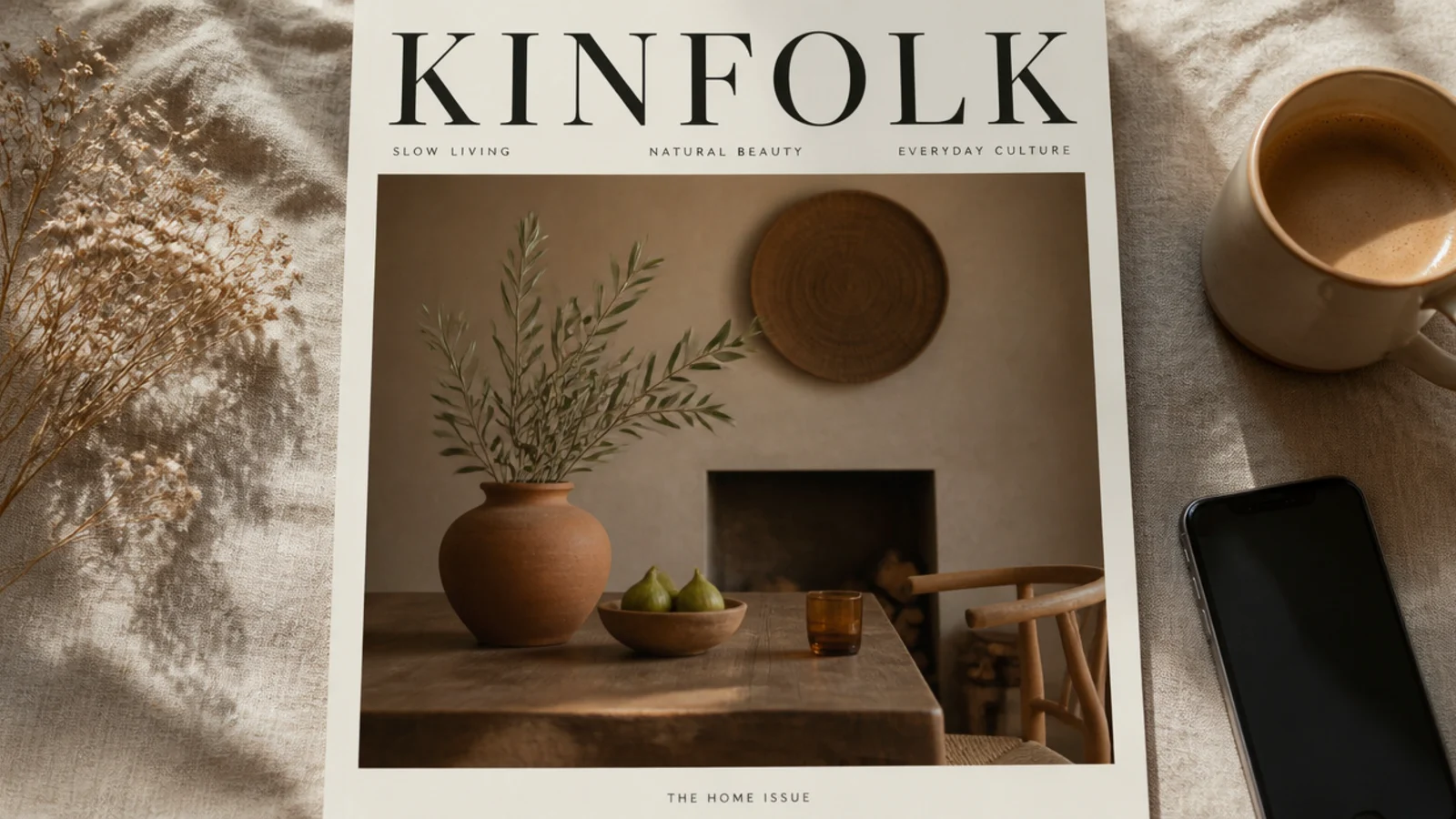
This frame styles the post like a magazine cover with a big serif masthead for instant editorial polish. It is a strong hero-post look. It suits feature posts, series intros, and reel covers.
On a 1080x1350 canvas, place the photo full-bleed and add a masthead in Playfair Display at 120 px across the top, with a wide letter-spaced Poppins tagline beneath at 24 px. Keep the masthead position fixed. Export as PNG.
Let the masthead sit just behind the subject’s head for a real cover effect by sending it one layer back.
Do not add cover lines everywhere; one masthead and one tagline is enough to read as editorial.
23. Product Spotlight Frame
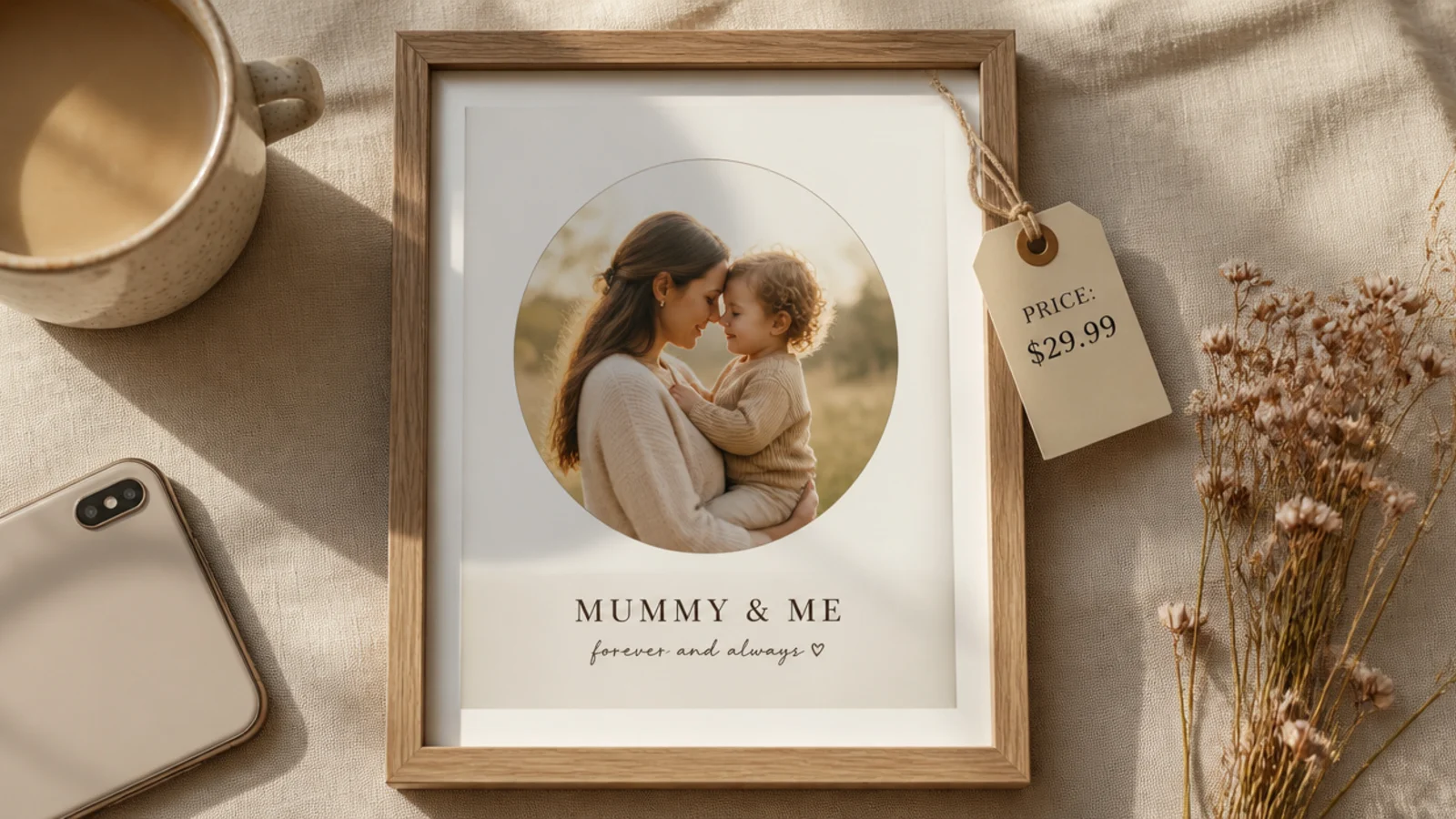
A product spotlight frame isolates one item on a clean background with a soft highlight and a price or label. It focuses attention on the product. It suits shops, launches, and e-commerce feeds.
Editor's noteUse a soft radial highlight behind the product so it lifts off the background without a hard shape.
On a 1080x1350 cream canvas, center the product with a soft light circle or radial highlight behind it. Add the product name in DM Serif 44 px above and a small price label in Poppins 24 px below. Keep the layout fixed. Export as PNG.
Skip thisDo not clutter the frame with multiple products; a spotlight works on one clear hero item.
24. Testimonial Card Frame

A testimonial card frames a customer quote with stars and a name for instant social proof. The card format reads trustworthy. It suits reviews, results, and brand-credibility posts.
On a 1080x1350 cream canvas, add a rounded card with a soft shadow. Inside, add five small terracotta stars, a quote in DM Serif 40 px, and a name line in Poppins 22 px. Keep the card centered with even margin. Export as PNG.
Keep the quote short and real; one honest sentence reads more credible than a long paragraph.
Do not overdesign the card; a quote, stars, and a name are all a testimonial needs.
25. Step-by-Step Number Frame
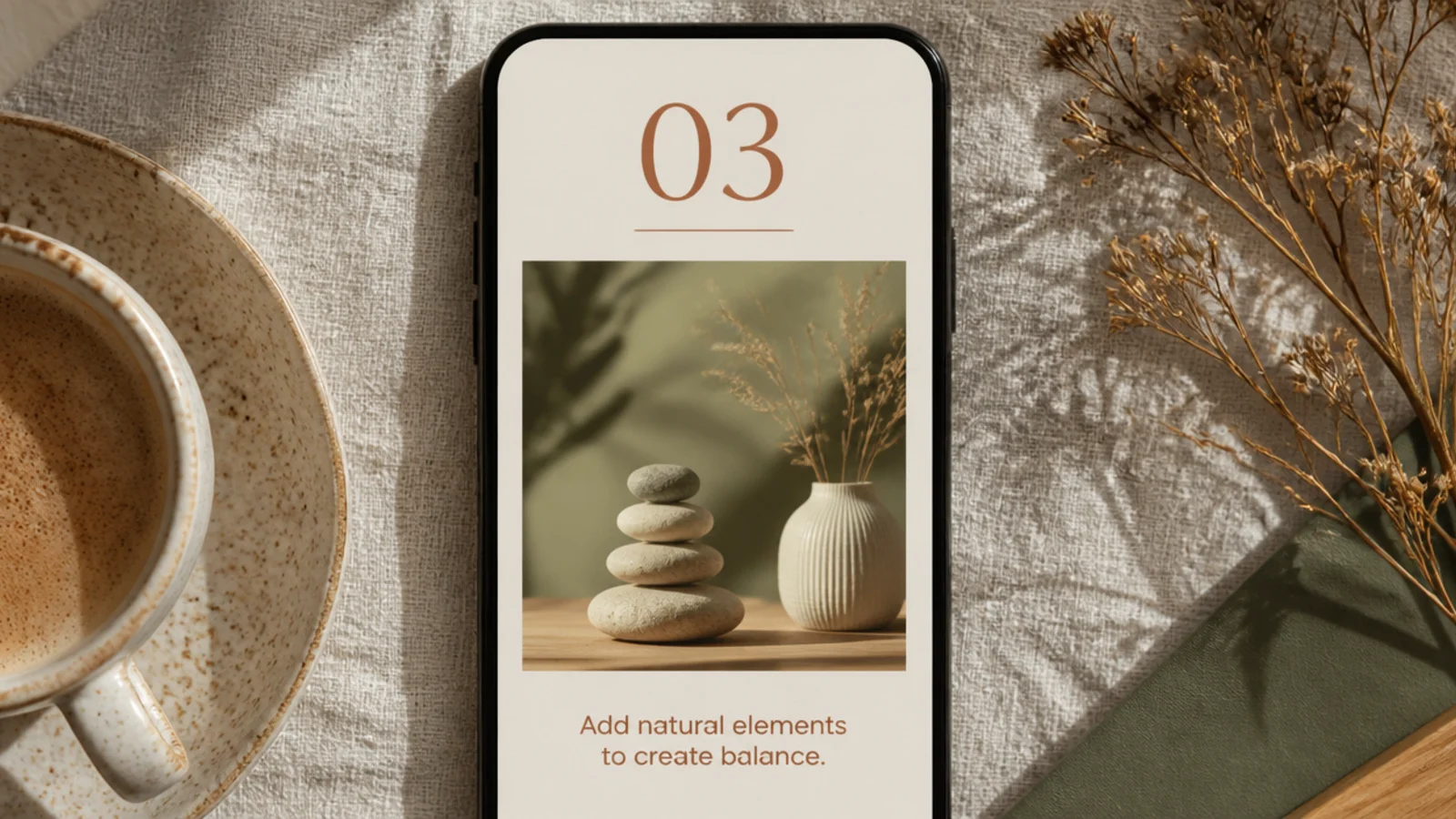
A step frame pairs a big step number with a photo and a short instruction — ideal as one slide in a how-to carousel. The number gives clear sequence. It suits tutorials, recipes, and process posts.
Editor's noteKeep the number style and position identical across steps so the carousel flows as one series.
On a 1080x1350 cream canvas, add a large step number in DM Serif at 100 px in terracotta at the top-left. Place a photo below and a one-line instruction in Poppins 26 px. Duplicate the page for each step. Export all as PNG.
Skip thisDo not write long instructions on the slide; one line per step keeps it scannable.
26. Highlight Quote Block Frame
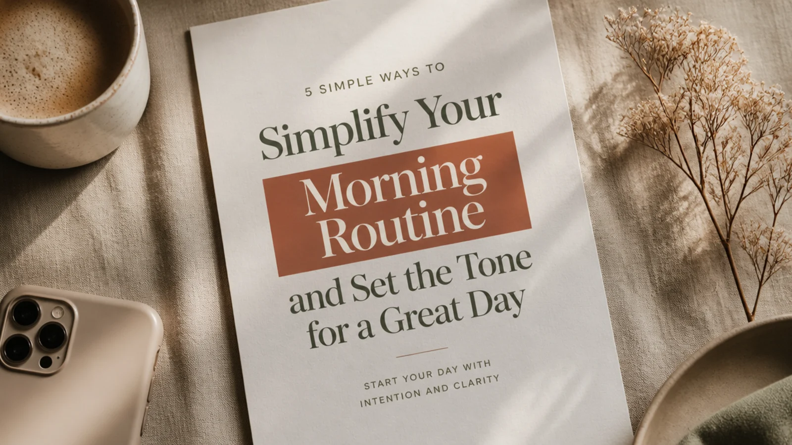
A highlight-block frame emphasizes one key phrase by boxing it in a colored block, like a marker highlight. It draws the eye to the point. It suits tips, hooks, and posts with a single big takeaway.
Editor's noteHighlight only one phrase; the emphasis works because everything else stays plain.
On a 1080x1350 cream canvas, set a headline in DM Serif 52 px, then place a solid terracotta block behind the key phrase with cream text on top. Center within a 100 px margin. Keep the highlight color fixed. Export as PNG.
Skip thisDo not highlight multiple phrases; more than one block cancels the emphasis and looks busy.
27. Gradient Background Frame

A soft gradient background adds gentle color and depth behind a photo or headline. The muted fade keeps it calm. It suits quotes, intros, and posts that want color without a pattern.
Editor's notePick two colors close on the wheel so the gradient reads as one soft wash, not a rainbow.
On a 1080x1350 canvas, apply a linear gradient from dusty blush #E8D3CE to pale sage #CBD3C3. Center a photo with an even margin, or a headline in DM Serif 54 px. Keep the gradient direction fixed. Export as PNG.
Skip thisDo not use bright, saturated gradient colors; muted tones keep it looking calm and designed.
28. Frame-in-Frame Layered Post

A frame-in-frame layers a smaller framed copy of the photo over the full-bleed version for a creative, layered look. It adds depth and interest. It suits design-led and artistic feeds that want a standout post.
On a 1080x1350 canvas, place the photo full-bleed, then add a smaller copy at about 60% size with a thin cream border and a soft shadow, offset toward one corner. Keep the inset size and offset fixed. Export as PNG.
Offset the inset toward a calm area of the background photo so it does not cover the main subject.
Do not center the inset perfectly; a slight offset looks intentional, dead-center looks like a mistake.
29. Corner Bracket Minimal Post

Four small corner brackets frame the photo like a camera viewfinder — minimal and techy. They imply a frame without a full border. It suits photography and modern minimalist feeds wanting a light structural touch.
Editor's noteKeep the brackets small and thin so they read as a viewfinder, not a heavy border.
On a 1080x1350 canvas, place the photo full-bleed. Add four small L-shaped charcoal line brackets at each corner, inset about 60 px, arms around 90 px long and 3 px thick. Keep them matched and grouped. Export as PNG.
Skip thisDo not misalign the brackets; identical insets are what make the viewfinder effect work.
30. Photo Dump Contact-Sheet Frame
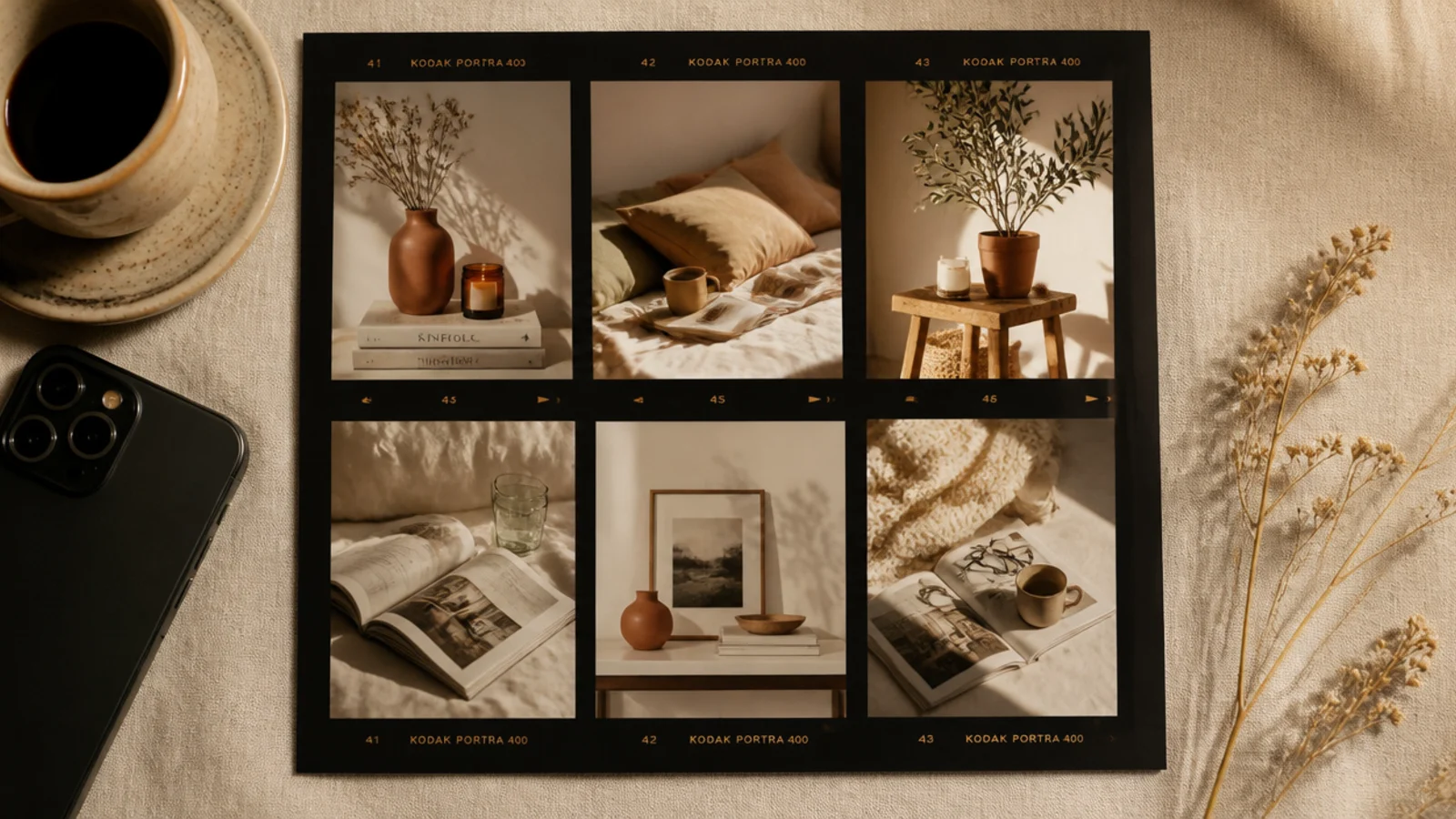
A contact-sheet frame arranges several small photos like a strip of developed film, with frame numbers. It reads as a curated photo dump. It suits recaps, event highlights, and analog-leaning feeds.
Editor's noteAdd small frame numbers beside each photo so it genuinely reads as a film contact sheet.
On a 1080x1350 dark canvas, arrange six small photos in a two-by-three grid with thin dark gaps, add small frame numbers in a mono font beside each, and a warm film-style border. Apply light grain. Export as PNG.
Skip thisDo not use too many photos; six keeps each one visible on a phone, more turns to mush.