1. Trick 1 - Lock the Layers So You Never Rebuild
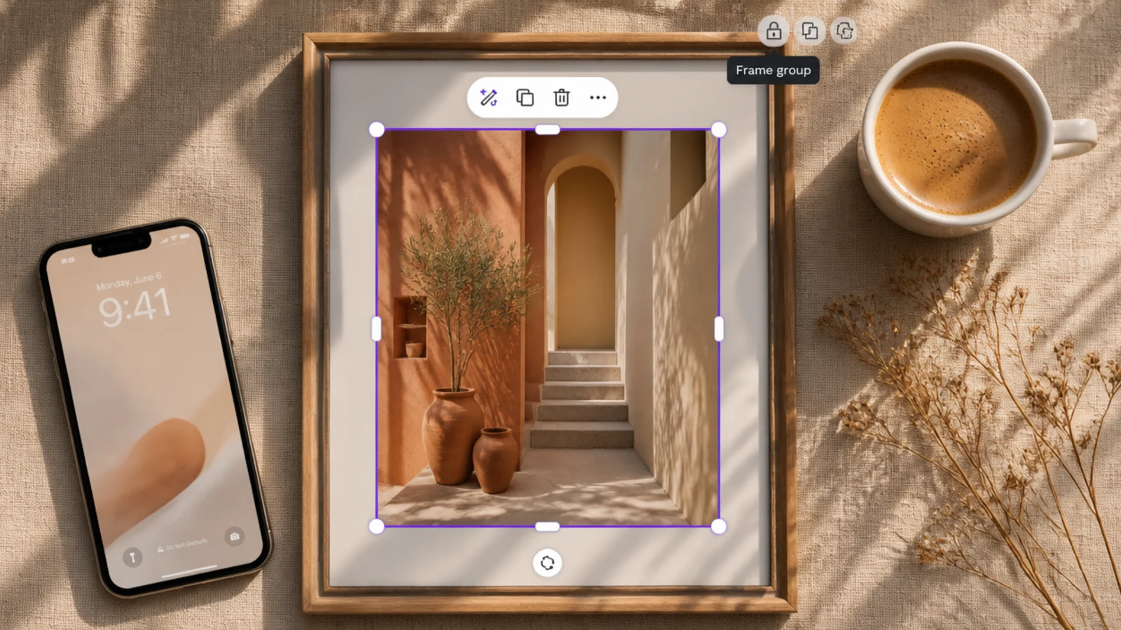
Once your border, shape, and text look right, select them all, right-click and Group, then click the lock icon so they cannot move. Keep the photo on its own unlocked bottom layer. Now click the photo, use Replace to swap in a new image, and the locked frame stays perfectly in place every time. Unlock only when you deliberately want to redesign.
This is the trick that changed everything and the easiest to start with. You group and lock the frame so you can swap the photo underneath without ever dragging the border out of place. It fixed the exact thing that used to make me rebuild frames constantly.
Skip thisDo not leave the frame unlocked; one stray drag while placing a photo and you are realigning the whole border again.
Editor's noteLock the frame group but leave the photo layer unlocked, so the only thing you can accidentally move is the thing you mean to swap.
2. Trick 2 - Steal One Color From the Photo
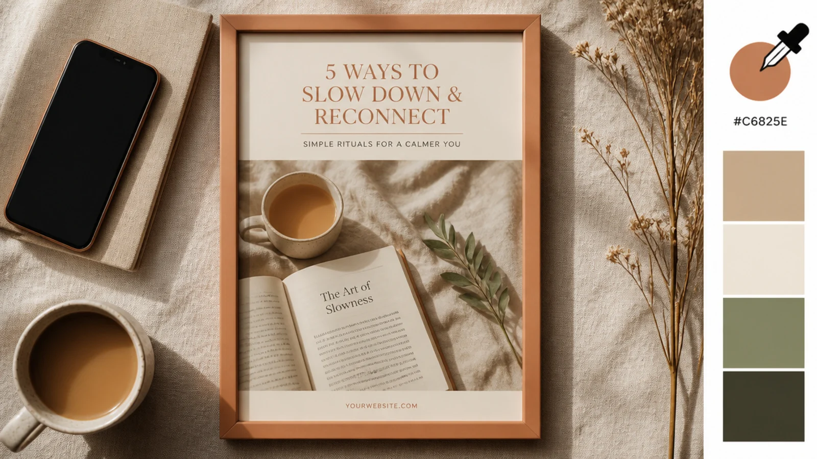
When you set a border, header bar, or accent color, use Canva’s color picker and click the eyedropper, then click a tone in the photo itself — a warm shadow, a piece of clothing, the sky. That exact color now ties the frame to the image. For a whole feed, keep your base palette fixed and only let this one accent color change per photo.
Pulling one accent color straight from the photo makes the frame feel tailored to that image instead of generic. It is a two-second move with a big payoff. This is how I keep a frame from looking pasted on top of the photo.
Skip thisDo not change your whole palette per photo; steal just one accent so the feed still holds together.
Editor's notePick the accent from a muted area of the photo, not the brightest spot, so it complements the image rather than clashing.
3. Trick 3 - Batch-Build a Week of Posts
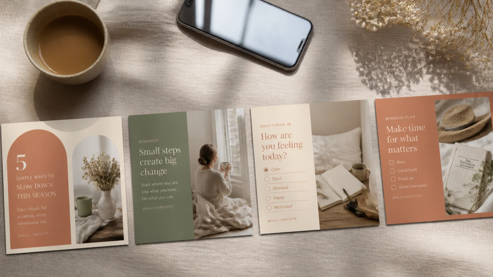
Building a week of posts in one sitting is the biggest time-saver I know. You set up the template once and stay in that headspace, so each post takes minutes. It also keeps the batch consistent because you make them together.
Open your master template, then use Duplicate Page once per post you want to make. Drop a different photo into each page’s photo layer, tweak the caption, and pull an accent color per photo. Because every page shares the same locked frame, fonts, and margins, the whole week matches. Export all pages at once as PNGs and schedule them.
Line up your photos before you start so batching is pure placement, not hunting for images mid-flow.
Do not batch across different templates at once; stick to one layout per session so the set stays consistent.
4. Trick 4 - Keep a Safe-Zone Guide Always On
For stories at 1080x1920 px, drag guides 250 px from the top and 250 px from the bottom. Save this as a blank 'story starter' template with the guides already placed. Every time you make a story, start from it and keep all important text and faces inside the middle band. For feed posts, do the same with your margin guides so text never drifts to the edge.
Keeping safe-zone guides always on stopped my endless reposts where the reply bar covered my text. You build the guides into a blank template so every story starts safe. It is a quiet habit that saves real frustration.
Skip thisDo not place text right at the top or bottom of a story; the profile and reply bars will cover it every time.
Editor's noteSave one blank guided template per format (post and story) so you never rebuild the guides from scratch.
5. Trick 5 - Use One Grain Layer Across Everything
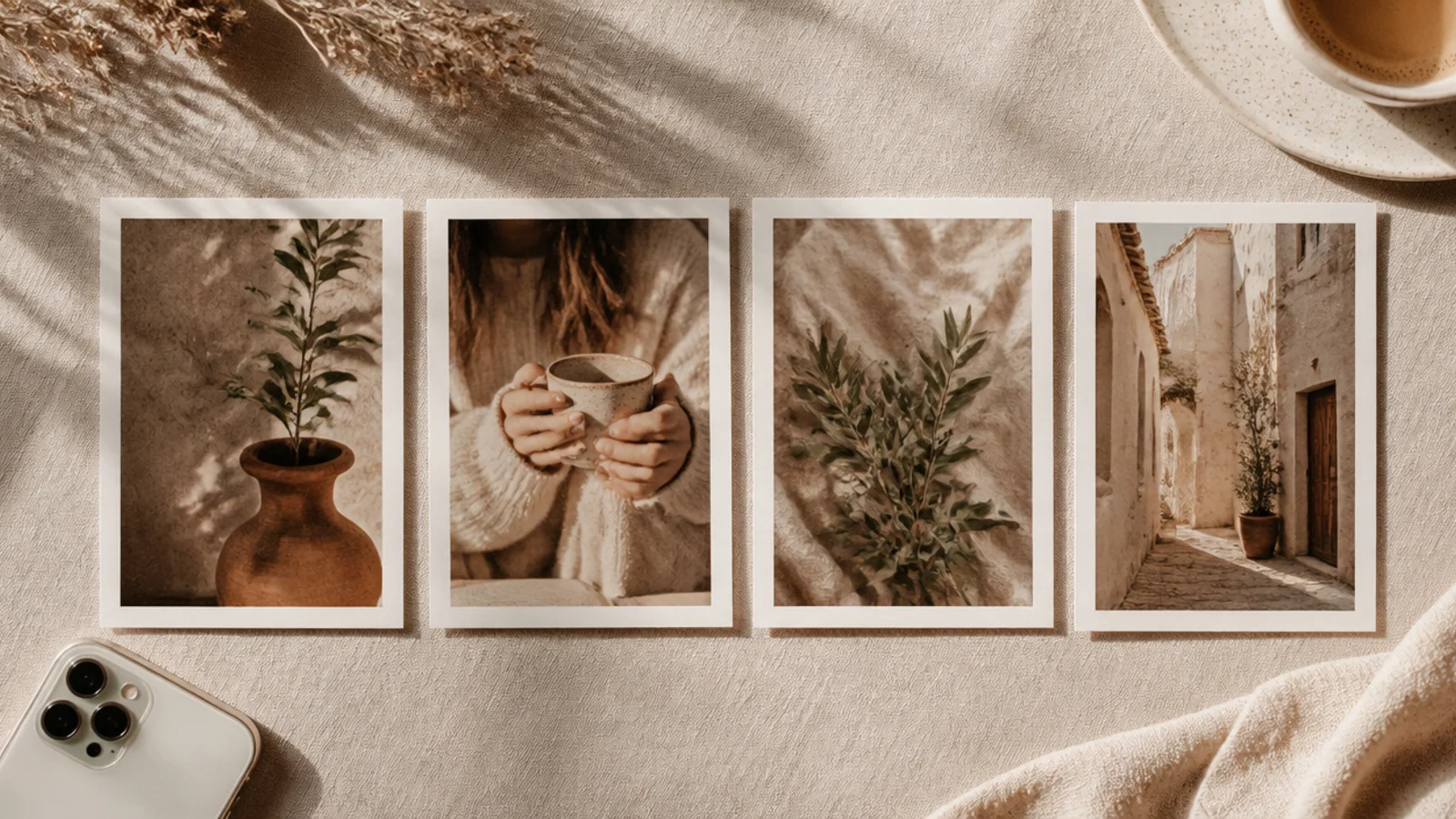
A single light grain layer, reused at the same opacity on every post, ties together photos shot in totally different lighting. It is the sneaky trick behind a lot of cohesive feeds. This is what made my mismatched camera roll finally look like one set.
Add a 'film grain' element over the whole canvas and set it to 12-15% transparency with Overlay blend. Copy that exact grain layer into every template and never change the opacity. Because the same finish sits over every photo, a bright indoor shot and a dark outdoor one suddenly feel like they belong together. Group it with your frame so it locks in place.
Copy-paste the same grain layer between templates rather than adding a fresh one, so the opacity stays identical everywhere.
Do not vary the grain opacity between posts; different grain amounts break the shared finish that creates cohesion.
6. Trick 6 - Duplicate, Don't Redesign
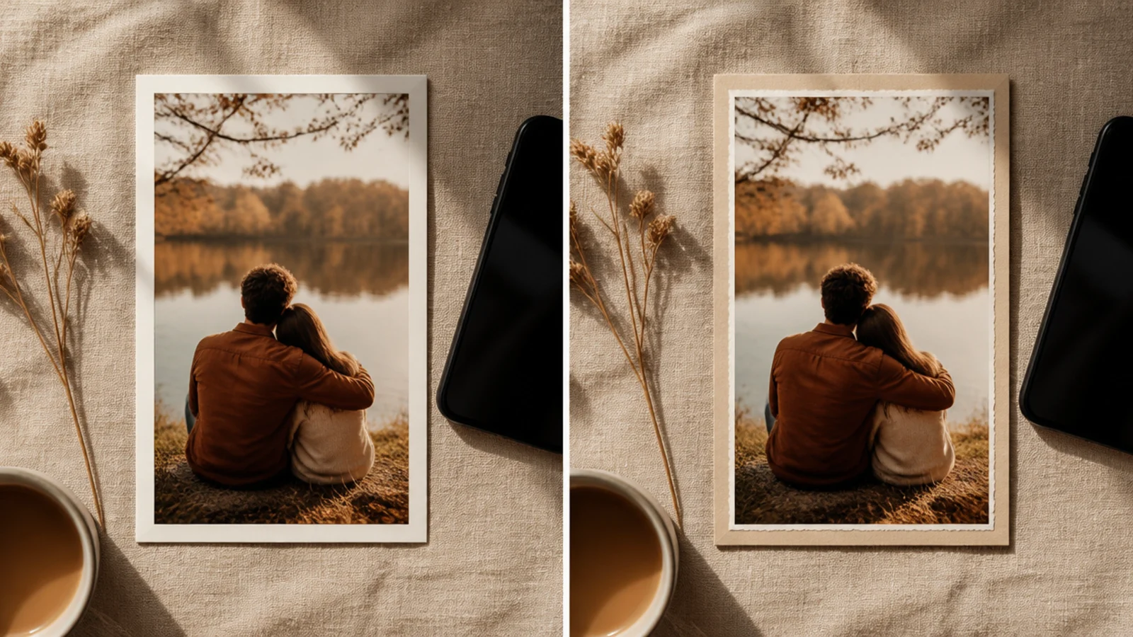
When I want a new look, I duplicate an existing template and change one thing instead of starting over. It keeps everything in the same family and takes a fraction of the time. This is how I build a whole template set without ever designing from a blank page twice.
Duplicate a working template, then change exactly one element — swap the border for an arch crop, recolor the header bar, or switch a square to a rounded card. Keep the size, margins, fonts, and palette identical. You end up with a related but distinct template that still matches your feed. Save each variation in one clearly named folder so your kit stays organized.
Change only one element per duplicate so every template in your kit still visibly belongs to the same family.
Do not redesign from a blank canvas each time; you lose the consistency that makes a small template kit look intentional.