1. Sand and Cream Tonal
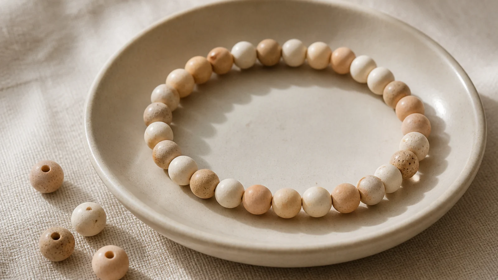
This is the easiest aesthetic bracelet and the anchor of any neutral stack. You mix three barely-different warm shades — sand, cream, oatmeal — so the bracelet reads as one soft color with quiet depth. Because the shades are so close, there’s no pattern to get wrong. It goes with absolutely everything.
Pull three warm neutrals into your dish. Cut 9 to 10 inches of 0.8mm cord, tape one end, and string the three shades in a loose random mix, only avoiding two identical beads side by side. String to about 6.25 inches, tie a surgeon’s knot, dab with clear glue, and slide the knot inside a cream bead to hide it.
Choose three shades that are only a hair apart in tone — the subtle blend is what makes it look expensive rather than plain.
Don’t add a contrasting color to 'break it up'; the whole point is the seamless tonal wash, and one loud bead ruins it.
2. Sage Green Minimalist
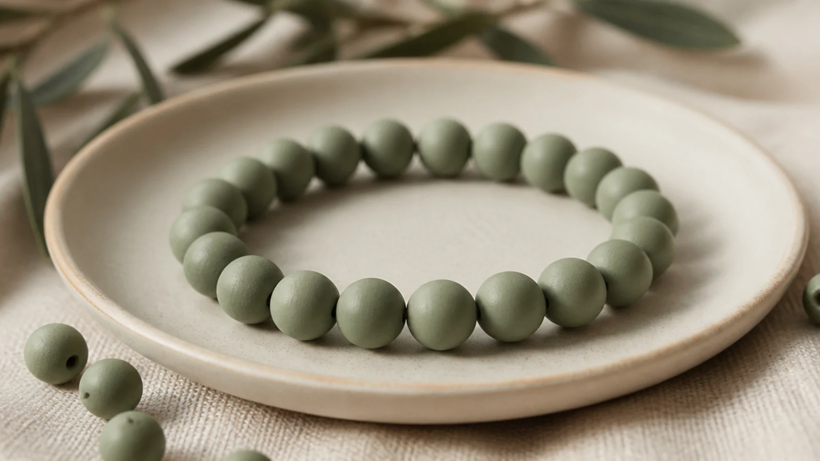
One quiet color, done cleanly, is peak minimalist aesthetic. A solid sage bracelet is calm, modern, and endlessly wearable. The whole design is in the finish — even beads, hidden knot, no distractions. It’s the piece I recommend everyone make first when they want the curated look.
Editor's noteBuy a solid tube of one sage shade rather than picking greens from a mixed tube — consistent color is the entire look here.
String only soft sage clay beads onto taped 0.8mm cord. Keep the beads facing the same way so the band lies flat and even. String to your wrist measurement minus a quarter inch for a snug fit, then tie a surgeon’s knot, seal with glue, and tuck the knot completely inside a sage bead so the band looks continuous.
Skip thisDon’t let a slightly-off green sneak in from a mixed tube; a single mismatched bead is obvious on a solid bracelet.
3. Terracotta and Clay Earth Tones
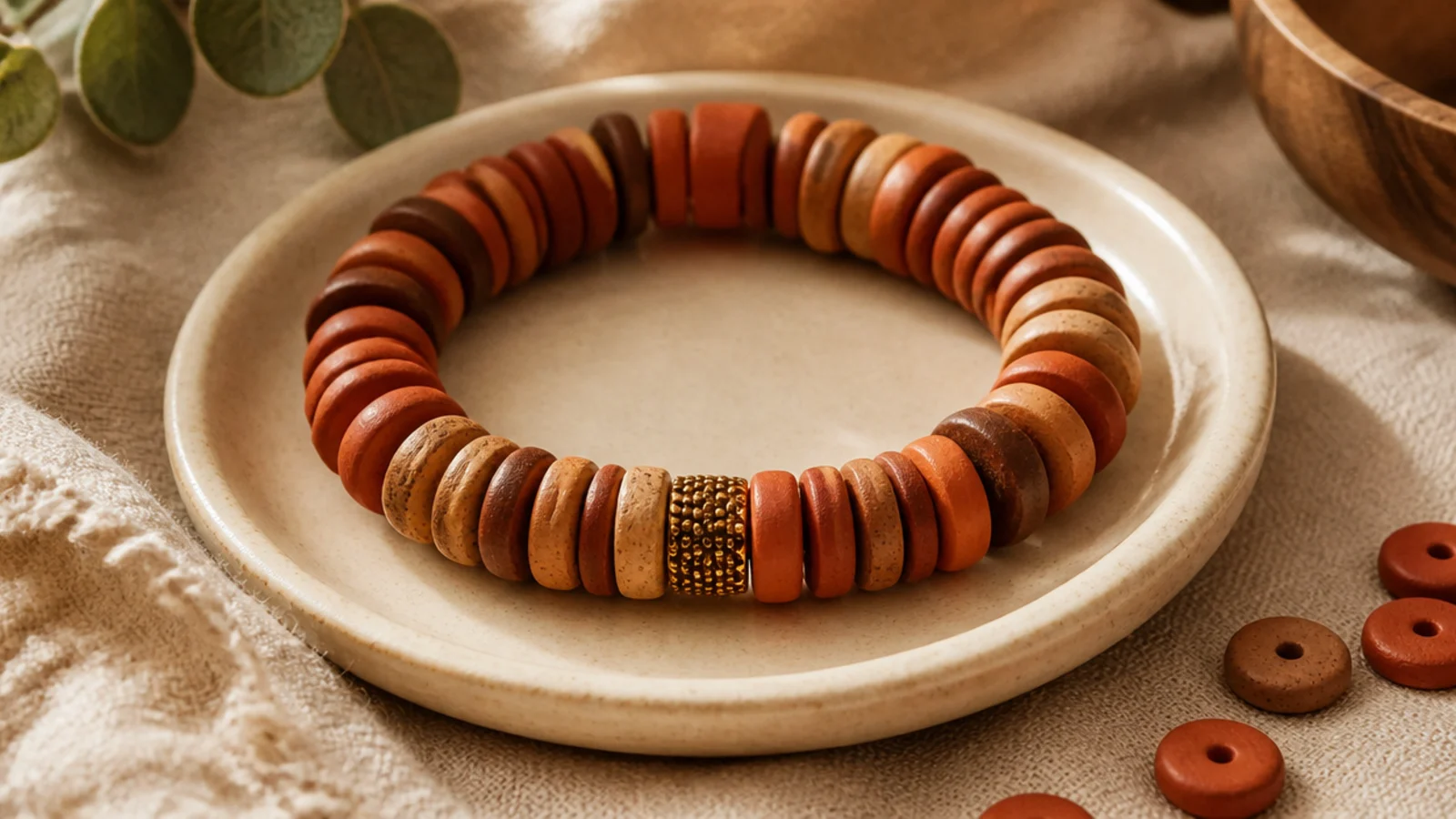
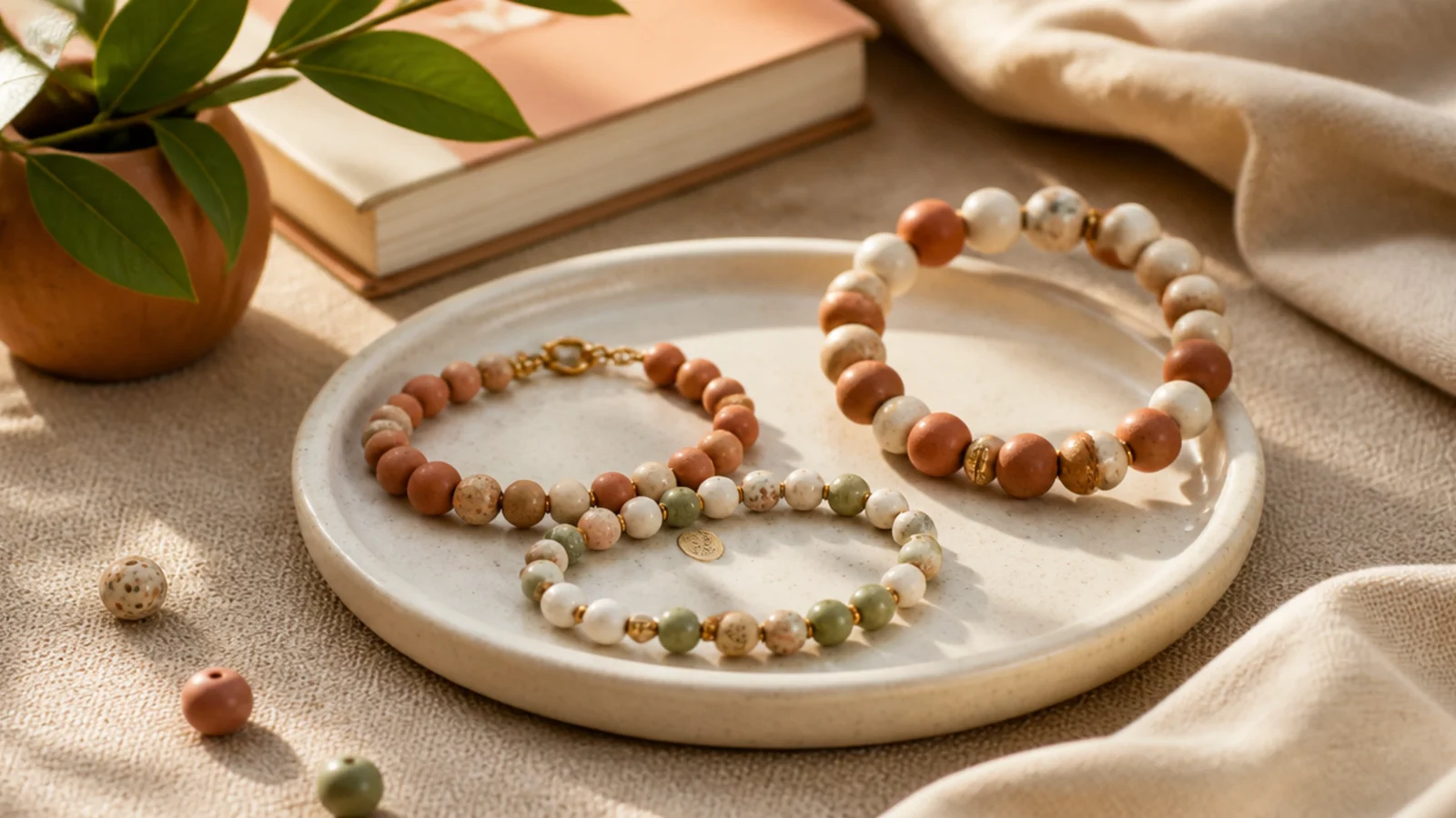
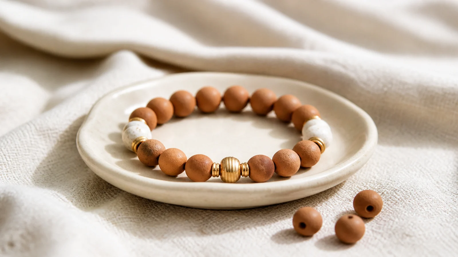
Warm earth tones — terracotta, rust, clay brown — give that grounded, natural aesthetic that pairs with linen and gold. Mixing three earthy shades adds richness while staying tonal. It’s cozy and a little bohemian without being loud. This one looks especially good against tanned or warm skin.
Curate terracotta, rust, and a warm brown into your dish. String them in a soft random mix on 0.8mm cord, keeping no two identical beads adjacent. For extra warmth, drop in a single small gold spacer at the front. String to your wrist length, then finish with a surgeon’s knot, glue, and hide the knot inside a terracotta bead.
Add just one gold spacer, not several — a single metallic touch warms the earthy palette without turning it flashy.
Don’t introduce a cool color like grey or blue; it fights the warm earth tones and muddies the whole palette.
4. Monochrome Beige Stack
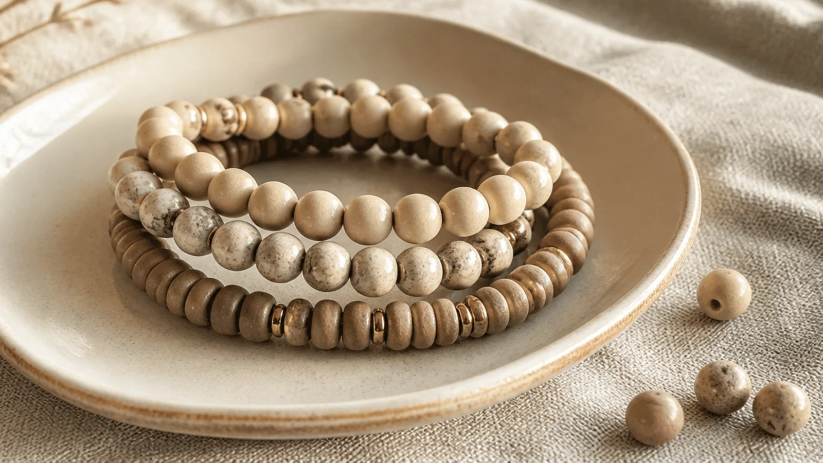
A monochrome stack in beige and taupe is the definition of quiet-luxury aesthetic. You make three bracelets in the same neutral family but vary the texture — one matte, one with pearls, one with gold. Together they look like a designed set. This is how you get the boutique stacked look at home.
Editor's noteKeep the color identical across all three and change only texture — matte, pearl, gold — so the stack looks curated, not random.
Make three bracelets on 0.8mm cord in beige-taupe tones: one solid matte, one with a few faux pearls, one with gold spacers every fourth bead. Keep all three the same length so they stack evenly. Finish each with a hidden surgeon’s knot. Wear them together so the shared palette and varied texture read as a collection.
Skip thisDon’t make each bracelet a different color; a matched palette with varied texture is what makes a stack look intentional.
5. Dusty Blue Single Tone
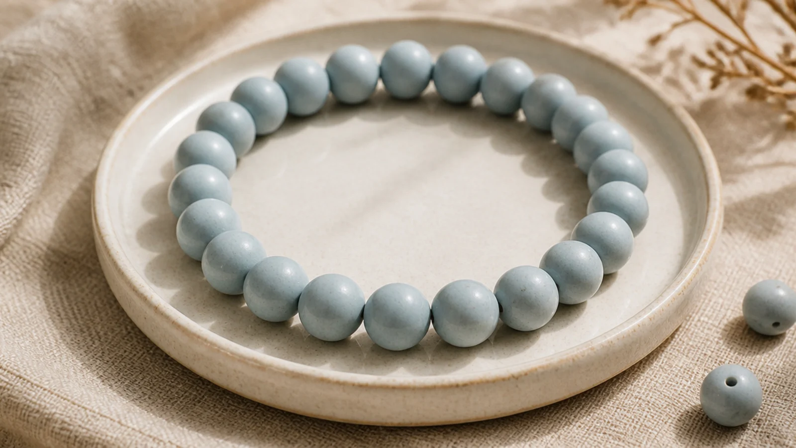
A muted dusty blue solid is serene and coastal without any beach kitsch. The soft, greyed-down blue is far more aesthetic than a bright primary. Like the sage minimalist, its beauty is in clean, even stringing. It pairs beautifully with silver as well as gold.
Editor's noteGreyed-down, muted blues photograph far more aesthetic than bright sky blue — lean dusty, not bright.
String only dusty-blue clay beads on taped 0.8mm cord, keeping them aligned so the band sits flat. String to your wrist measurement minus a quarter inch. Tie a surgeon’s knot, seal with clear glue, and hide the knot inside a blue bead. For a subtle upgrade, place a single silver spacer at the center.
Skip thisDon’t pick a saturated cobalt or turquoise; the muted, dusty quality is exactly what gives this its calm look.
6. Black and White Modern
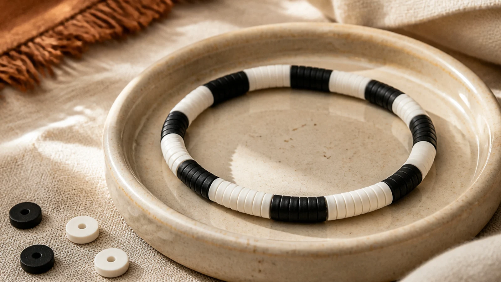
Black and white is timeless and graphic, the most modern of the neutrals. Grouping them in short blocks rather than single alternating beads feels more editorial. It’s high-contrast but still restrained because there’s no color at all. This one looks sharp with a watch or silver rings.
Pull just black and white beads. String them in blocks — three black, three white — repeating around the band on 0.8mm cord. Keep each block the same length for a crisp rhythm. String to your wrist size so blocks meet evenly, then finish with a surgeon’s knot, glue, and hide the knot inside a white bead.
Use even blocks of three rather than single alternating beads — the blockier rhythm reads more designed and less busy.
Don’t add a third color; the strict black-and-white contrast is the whole aesthetic, and any color softens the impact.
7. Gold-Flecked Neutrals
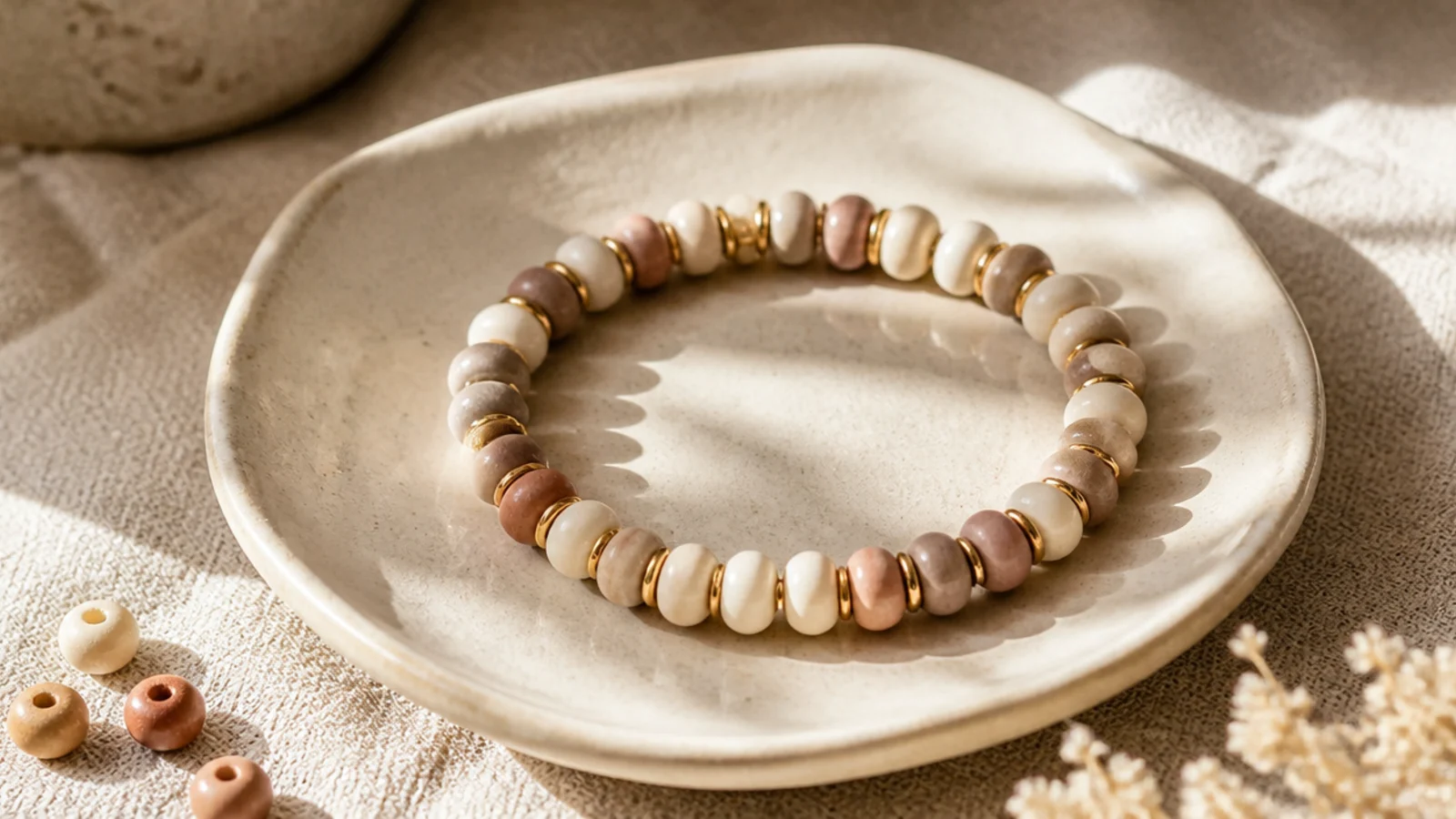
Neutral clay beads punctuated with regular gold flecks look genuinely high-end. The metallic breaks add rhythm and catch the light against the matte clay. It’s understated but never boring. This is the design that most convinces people you bought it at a boutique.
String a cream-and-taupe neutral mix and add a tiny gold rondelle spacer every fourth bead, keeping the count exact so the gold spaces evenly. The thin spacers tuck between the discs. String to your wrist length end to end, then tie a surgeon’s knot, seal, and hide the knot inside a clay bead.
Keep the spacing between gold spacers identical all the way around — the even metallic rhythm is what looks refined.
Don’t use big chunky gold beads; oversized metal looks costume-y, while small rondelles look like fine jewelry.
8. Warm Sunset Ombré
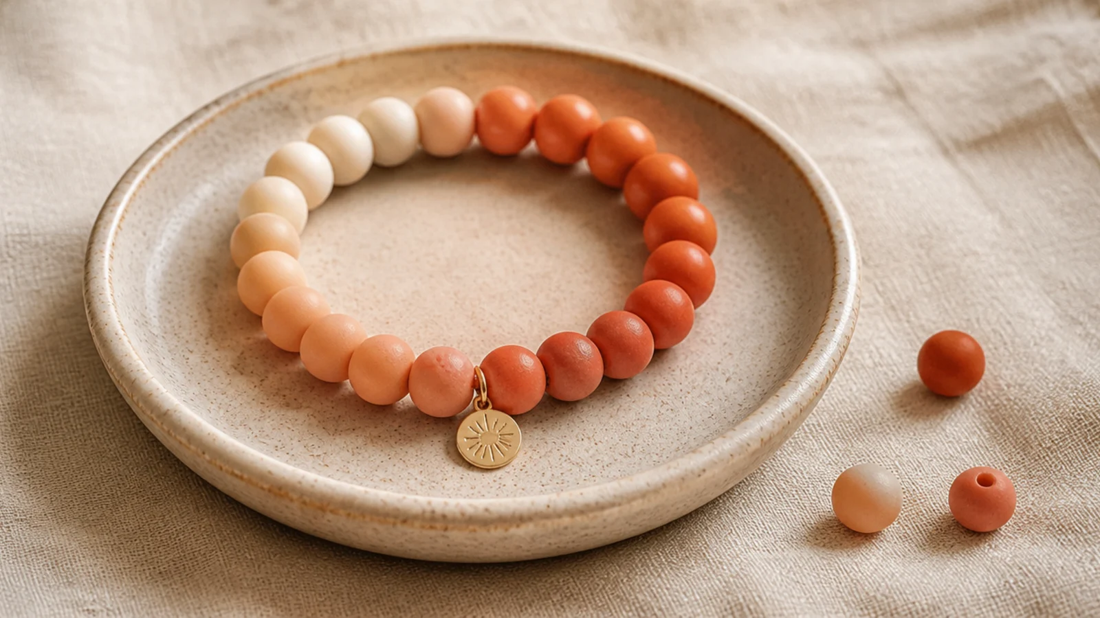
A warm gradient from cream to terracotta looks like a sunset and is deeply aesthetic. Staying in warm tones — cream, peach, coral, terracotta — keeps the fade cohesive. The gradient makes a simple bracelet look considered and artful. It’s a showpiece that’s still beginner-friendly.
Editor's noteReverse the fade at the center so both wrist-ends are pale — a symmetrical ombre looks intentional from every angle.
Sort four warm shades lightest to darkest. String a short run of cream, then peach, coral, and terracotta, moving to the center, then reverse back to cream so the fade is symmetrical. Keep each run the same length. String to your wrist size, then finish with a surgeon’s knot, glue, and hide the knot inside a cream bead.
Skip thisDon’t skip from cream straight to terracotta; without the peach and coral in between it becomes stripes, not a fade.
9. Ocean Blue Gradient
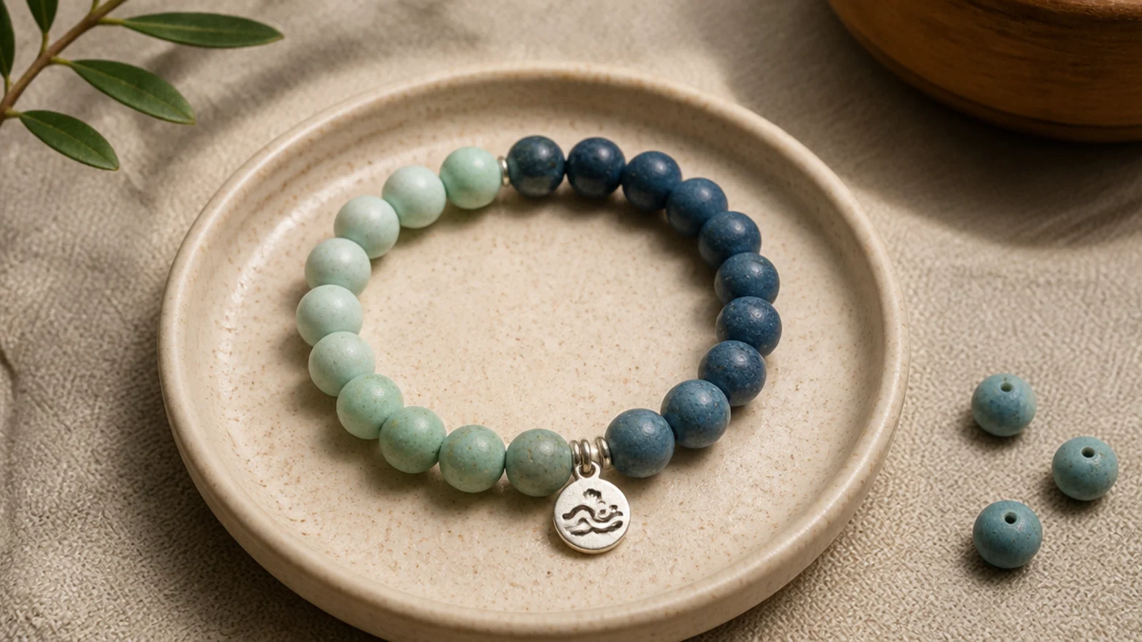
A cool gradient from seafoam to navy captures a calm, coastal aesthetic. The blue-green fade feels serene and looks far more advanced than it is. It’s the coastal answer to the sunset ombré. Beautiful on its own or stacked with a sand-tone solid.
Sort seafoam, dusty blue, and navy lightest to darkest. String equal runs from pale to deep and back for a symmetrical fade on 0.8mm cord. Add a single silver or pearl bead at the center for a coastal accent if you like. String to your wrist length, then knot, seal, and hide the knot inside a pale bead.
Add a single pearl at the deepest point of the fade — it reads like a drop of sea foam and lifts the whole piece.
Don’t mix warm and cool blues; a teal beside a grey-blue clashes and breaks the smooth coastal fade.
10. Matte Muted Rainbow
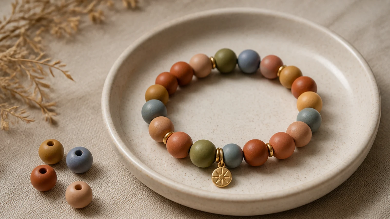
A rainbow can be aesthetic if every color is muted to the same dusty level. Terracotta, mustard, sage, dusty blue and mauve give you a grown-up rainbow. Matching the saturation is the secret that keeps it curated, not childish. It’s the sophisticated version of the classic rainbow bracelet.
Choose five dusty, muted shades that share a low saturation. String them in a set order and repeat the sequence around the band on 0.8mm cord. Because the tones match in intensity, the rainbow reads harmonious. String to your wrist length, then finish with a surgeon’s knot, glue, and hide the knot inside a bead.
Test your colors together in the dish first — every shade should look equally 'dusty', with no bright bead jumping out.
Don’t slip in one bright, saturated color; a single vivid bead among muted ones instantly makes it look like a kid’s craft.
11. Coffee and Cream
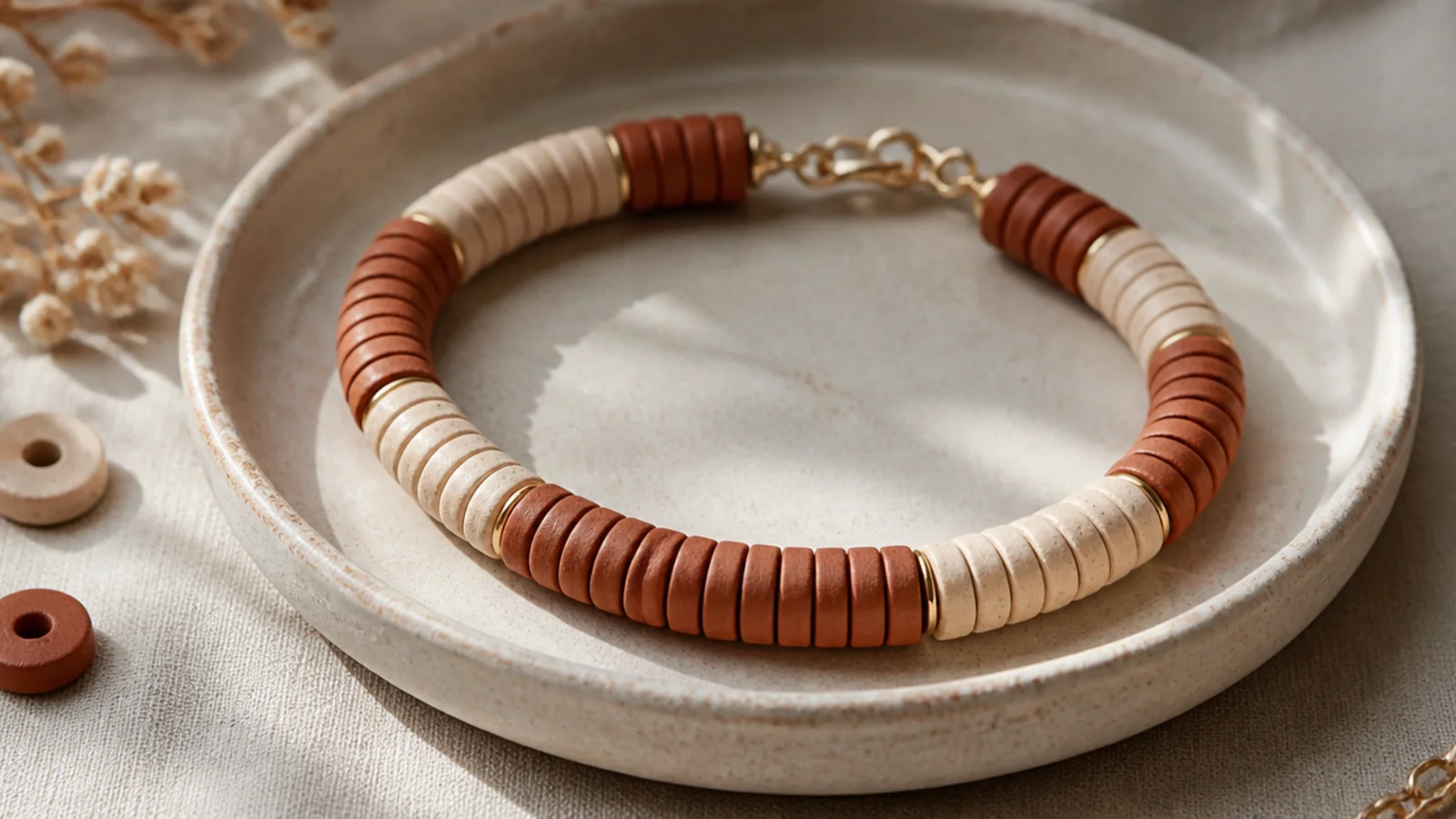
Coffee brown with cream is a cozy, latte-toned pairing that’s very on-trend. The two warm neutrals in soft blocks feel calm and rich. It’s simple but looks like a considered choice. Perfect for autumn and for anyone who loves a neutral wardrobe.
Editor's noteChoose a warm, milky brown rather than a cool grey-brown so it truly reads as coffee-and-cream, not mud.
Pull coffee-brown and cream beads only. String them in blocks of three, alternating the two colors around the band on 0.8mm cord. Keep block lengths equal for an even rhythm. String to your wrist size so blocks meet cleanly, then tie a surgeon’s knot, seal, and hide the knot inside a cream bead.
Skip thisDon’t use single alternating beads for this; the blocked rhythm looks intentional while single alternating can look busy.
12. Lavender Haze Tonal
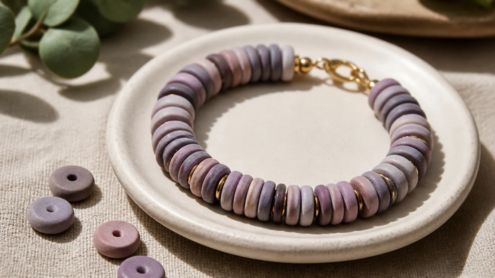
Soft purples blended together give a dreamy, hazy aesthetic. Mixing lavender, mauve, and greyed lilac keeps it tonal and gentle. It’s romantic without being sweet. Lovely stacked with a cream solid and a touch of silver.
Editor's noteKeep all three purples greyed and muted — a hazy tonal blend looks far more aesthetic than bright violet.
Curate three muted purples into your dish. String them in a soft random mix on 0.8mm cord, avoiding two identical beads together. Add a single small silver or pearl accent at the front if you like. String to your wrist length, then finish with a surgeon’s knot, glue, and tuck the knot inside a lavender bead.
Skip thisDon’t add a warm color; yellow or coral fights the cool purples and breaks the soft, hazy feel.
13. Olive and Rust Autumn
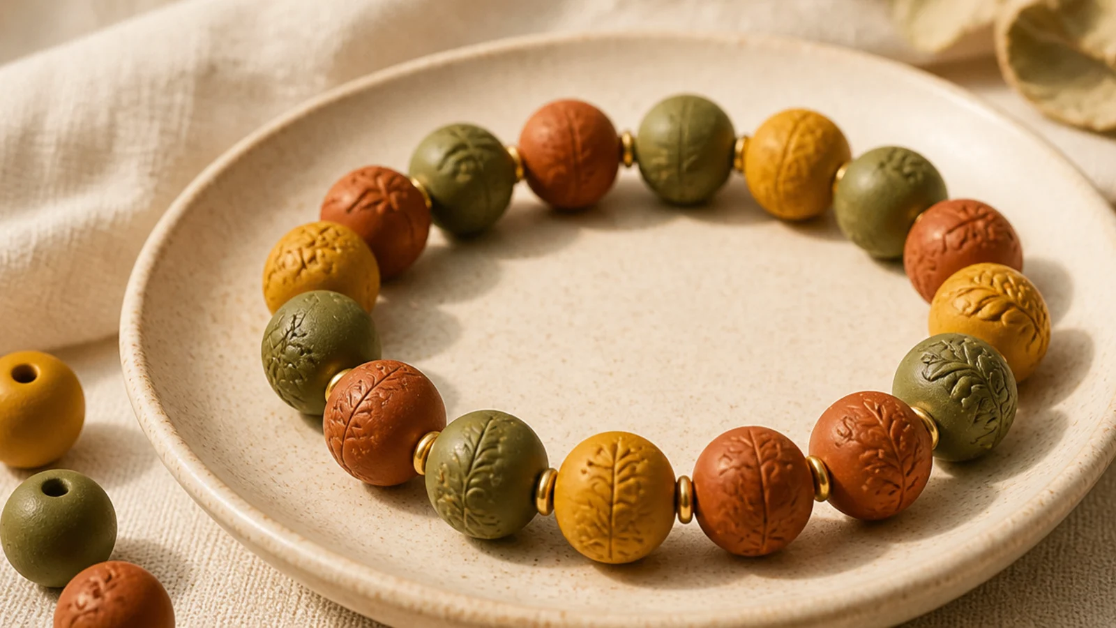
Olive, rust, and mustard together are the ultimate autumn aesthetic. The warm, earthy trio feels seasonal and rich. It’s a little moody and very cozy. This one looks especially good with knitwear and gold.
Pull olive, rust, and mustard into your dish. String them in a loose mix on 0.8mm cord, keeping no two identical beads adjacent. A single gold spacer at the center adds warmth. String to your wrist length, then tie a surgeon’s knot, seal with glue, and hide the knot inside an olive bead.
Let olive be the dominant color and use rust and mustard as accents — a balanced trio beats equal thirds here.
Don’t add a cool or pastel shade; it pulls the palette out of autumn and makes the earthy colors look dull.
14. Pearl and Beige Elegant
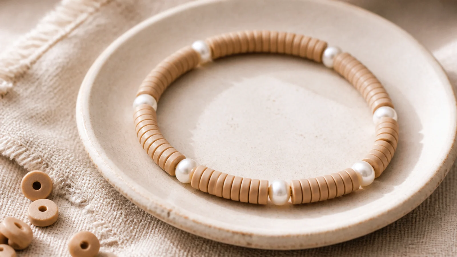
Beige clay beads with real-looking pearls is quietly elegant and dressy enough for events. The round pearls add shine and texture against the matte discs. It’s the most refined bracelet in the set. Wear it alone for understated polish.
Editor's noteSpace the pearls evenly and sparingly — a few well-placed pearls look fine, a full row looks like a costume piece.
String beige clay beads and add a small faux or freshwater pearl every fifth bead, keeping the spacing even. Check the pearl holes fit your 0.8mm cord first. The pearls' shine plays beautifully off the matte clay. String to your wrist length, then finish with a surgeon’s knot, seal, and hide the knot inside a beige bead.
Skip thisDon’t force pearls with tight holes onto thick cord; switch to 0.6mm elastic rather than stressing the beads.
15. Cream and Gold Spacer
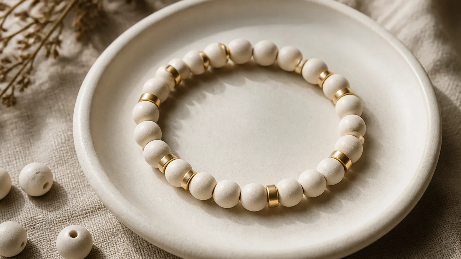
Cream beads with slim gold tube spacers is minimal and expensive-looking. The gold tubes are a touch more architectural than round spacers. It’s clean, modern, and dresses up instantly. A perfect everyday-luxe piece.
Editor's noteGold tube spacers add length, so check the fit on your wrist before knotting — they can make a bracelet run large.
String cream clay beads and insert a slim gold tube spacer every fifth bead, keeping the count consistent. The tubes add a little length, so measure as you go. String to your wrist size, then tie a surgeon’s knot, seal with clear glue, and hide the knot inside a cream bead so only the clay and gold show.
Skip thisDon’t mix gold and silver spacers in one bracelet; a single metal tone looks intentional while mixing looks accidental.
16. Marbled Feature Bead
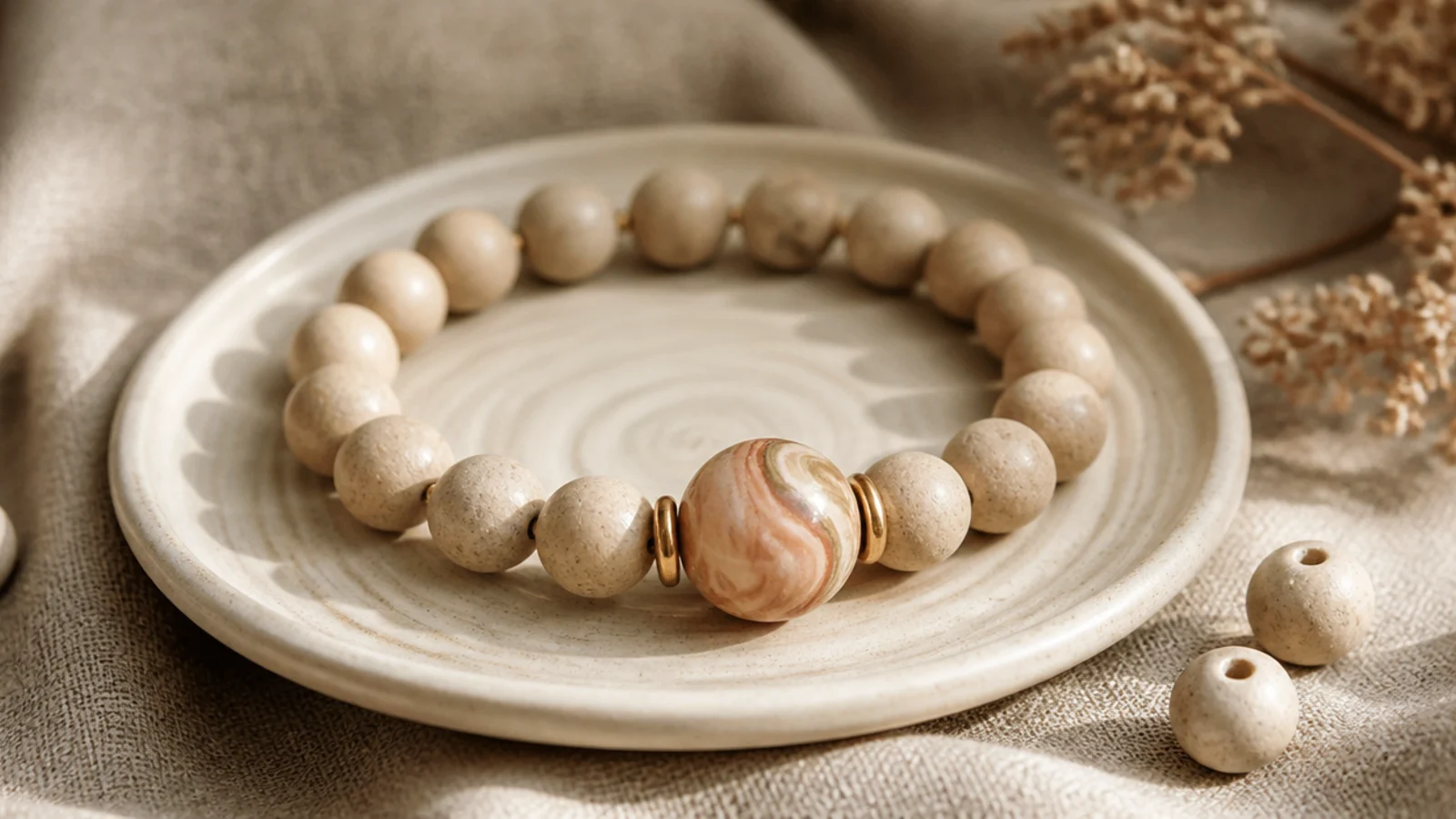
One larger marbled bead against plain neutrals is a subtle, artful focal. The swirl of colors in the feature bead adds interest without any pattern work. It’s understated and gallery-ish. A great way to show off a special handmade bead.
Editor's notePick a base color drawn from the marbled bead’s swirl so the focal looks planned into the palette.
String a neutral base — cream or taupe — to the halfway point. Add the marbled feature bead in the center, flanked by a small gold spacer on each side. Because the feature bead is larger, string a couple fewer base beads on each side to keep the fit. Continue to your wrist length, then knot, seal, and hide the knot inside a base bead.
Skip thisDon’t surround a bold marbled bead with a busy patterned base; a plain base is what lets the feature bead shine.
17. Minimalist Single Accent
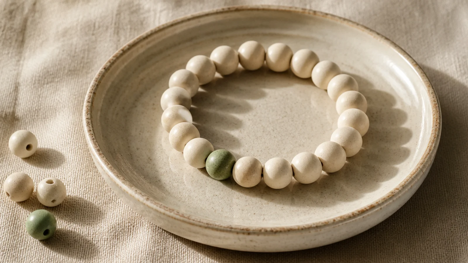
The most minimal aesthetic move: a solid bracelet with exactly one contrasting bead. That single off-color bead reads as an intentional design detail. It’s quiet, clever, and very modern. This is minimalism at its most confident.
Editor's notePlace the single accent bead off-center, not dead-middle — a slightly asymmetric placement looks more designed.
String a solid cream band and place one single sage (or terracotta) bead slightly off-center for a modern, deliberate look. Everything else stays one color. String to your wrist size, then finish with a surgeon’s knot, seal, and hide the knot inside a cream bead so the lone accent is the only event.
Skip thisDon’t add a second accent bead; the entire charm is the restraint of exactly one, and two makes it a pattern.
18. Woodland Brown and Sage
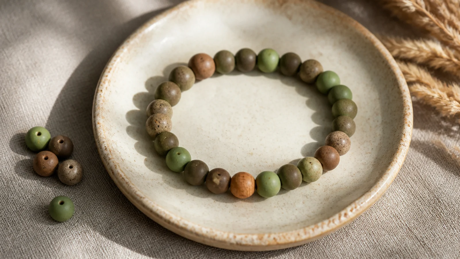
Mushroom brown and sage together give a soft woodland, earthy-aesthetic feel. Adding a natural wooden bead ties in the organic mood. It’s grounded and calming, perfect for a nature-lover. Pairs beautifully with linen and leather.
Curate mushroom brown and sage clay beads. String them in short two-bead runs, alternating around the band on 0.8mm cord. Add a single small round wooden bead at the front for organic texture. String to your wrist length, then finish with a surgeon’s knot, seal, and hide the knot inside a brown bead.
Add one natural wooden bead for texture — the matte wood among the clay reinforces the organic, woodland mood.
Don’t use a glossy varnished wood bead; a matte natural finish blends with the earthy palette, while shiny wood clashes.
19. Blush and Bronze
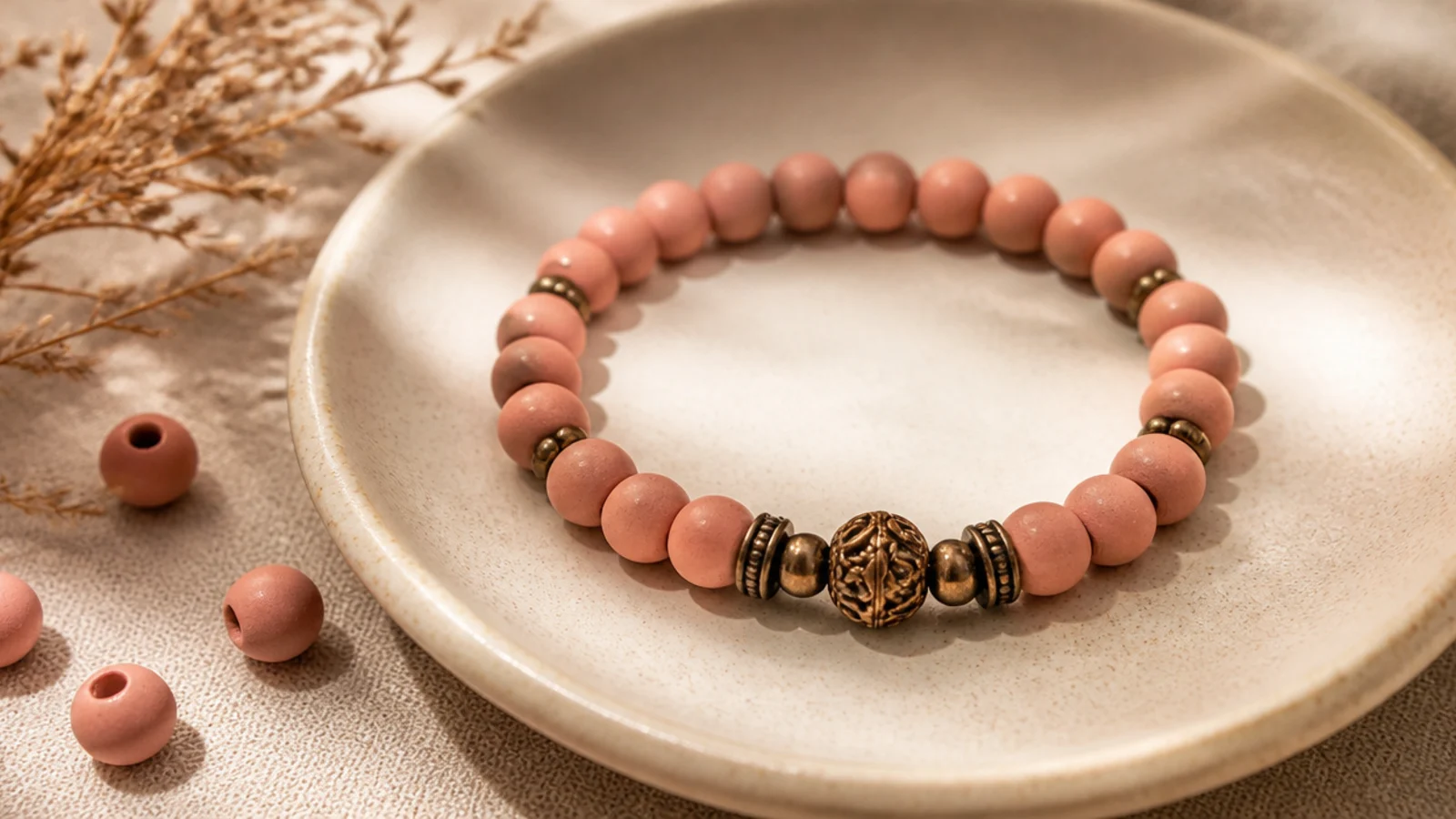
Soft blush with bronze accents is warm, feminine, and refined. The bronze is warmer than gold and flatters the pink beautifully. It’s romantic but still grown-up. A lovely everyday piece with a little glow.
Editor's noteChoose bronze over yellow gold here — the warmer metal flatters blush pink and looks more expensive against it.
String blush-pink clay beads and add a small bronze spacer every fourth bead, keeping the count even. The warm metal complements the pink. String to your wrist length, keeping the spacer rhythm consistent, then tie a surgeon’s knot, seal with glue, and hide the knot inside a blush bead.
Skip thisDon’t pair blush with cool silver; the temperature clash makes both the pink and the metal look off.
20. Clay and Freshwater Pearl Mix
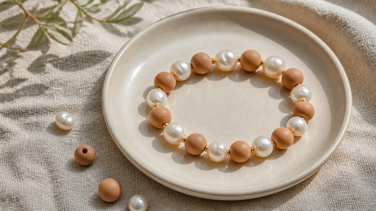
Alternating clay discs with irregular pearls gives a rich, organic texture. The mix of matte flat beads and glossy round pearls is very of-the-moment. It’s the most texturally interesting piece in the set. Understated color, maximum tactile appeal.
String neutral clay beads and freshwater-style pearls in a loose alternating rhythm — two clay, one pearl — on 0.8mm cord, confirming the pearl holes fit first. The irregular pearls add natural variation. String to your wrist length, then finish with a surgeon’s knot, seal, and hide the knot inside a clay bead.
Use slightly irregular baroque-style pearls rather than perfectly round ones — the organic shapes look more high-end.
Don’t use bright white plastic pearls; a soft ivory or natural tone reads far more expensive next to matte clay.
21. Smoke Grey Tonal
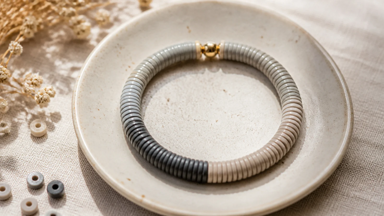
Soft greys blended together are sleek and minimal. Mixing dove grey, greige, and a touch of charcoal keeps it tonal and modern. It’s the most neutral of neutrals — it truly goes with everything. Cool-toned but still soft.
Curate three greys from light to dark. String them in a soft mix on 0.8mm cord, avoiding two identical beads adjacent and keeping the darkest grey the least frequent. String to your wrist length, then finish with a surgeon’s knot, seal with glue, and hide the knot inside a mid-grey bead.
Use charcoal sparingly as the accent, not the base — a mostly-light grey blend with a few dark beads has more depth.
Don’t let it go fully monochrome-flat; some tonal variation between the greys keeps it from looking like one dull color.
22. Warm Neutral Color Block
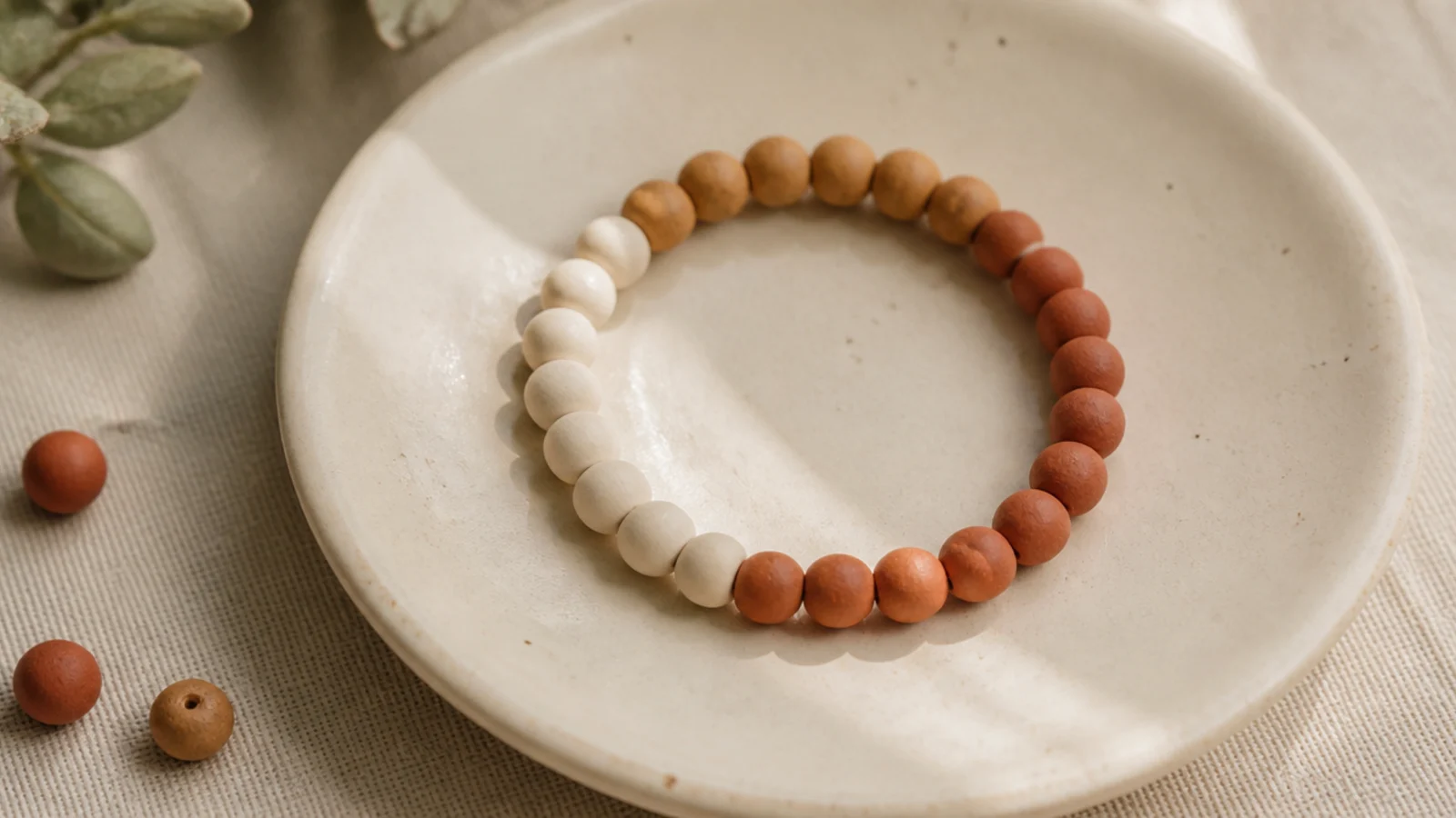
Three big blocks of warm neutrals is graphic and calm at once. Each color gets its own clear section, which feels intentional and modern. It’s a color-block done in a grown-up palette. Simple to string, striking to wear.
Editor's noteMake the three blocks exactly equal in length by counting beads — even thirds are what make color-blocking look deliberate.
Divide your bead count into three equal sections — cream, camel, terracotta. String each color as one solid block on 0.8mm cord, keeping the sections the same length. The clean color divisions do all the work. String to your wrist size, then finish with a surgeon’s knot, seal, and hide the knot inside a cream bead.
Skip thisDon’t blur the blocks with stray beads of the wrong color; crisp divisions are the entire point of a color block.
23. Sea Glass Greens and Blues
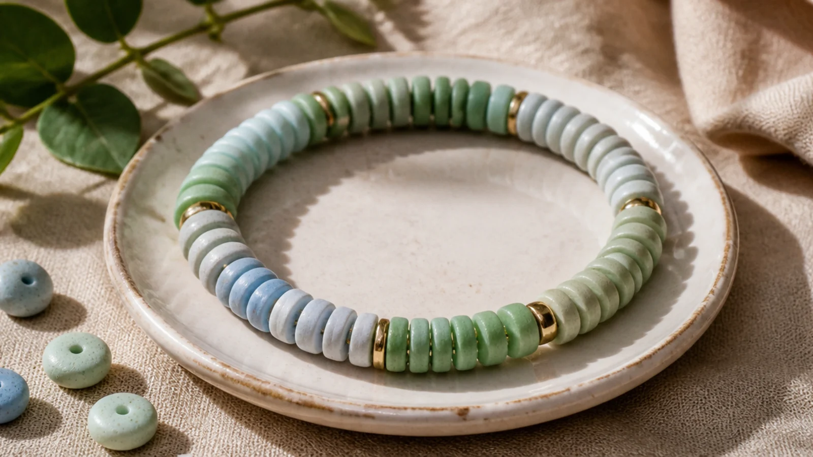
Soft greens and blues blended like sea glass give a fresh, coastal-aesthetic feel. The watery palette is calming and a little more colorful than pure neutrals while staying muted. It’s perfect for summer stacks. Beautiful with silver and pearls.
Curate sea-glass green, aqua, and pale blue into your dish. String them in a soft random mix on 0.8mm cord, keeping the tones evenly balanced. Add a single frosted or pearl bead for a sea-glass touch. String to your wrist length, then finish with a surgeon’s knot, seal, and hide the knot inside a green bead.
Keep all the colors frosty and muted like real sea glass — soft, washed-out tones sell the coastal look.
Don’t use a bright teal or turquoise; a vivid tropical blue breaks the soft, weathered sea-glass mood.
24. Muted Terracotta Stripe
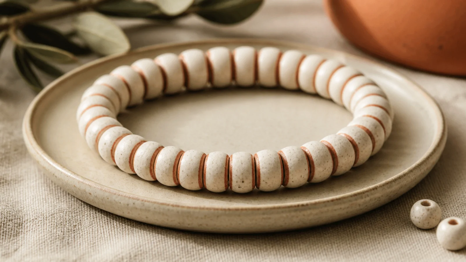
A cream band broken by two slim terracotta stripes is subtle and architectural. The thin stripes add just enough structure without color overload. It’s minimal with a graphic edge. A refined take on the classic striped bracelet.
Editor's noteKeep the stripes thin — three beads each — and evenly spaced; slim, balanced stripes look far more refined than thick bands.
String cream clay beads and place two thin terracotta stripes — three beads each — evenly spaced around the band. Count the cream beads between the stripes so they sit symmetrically. String to your wrist length, then finish with a surgeon’s knot, seal with glue, and hide the knot inside a cream bead.
Skip thisDon’t add more than two stripes; extra bands crowd the cream base and lose the clean, minimal effect.
25. Layered Aesthetic Stack
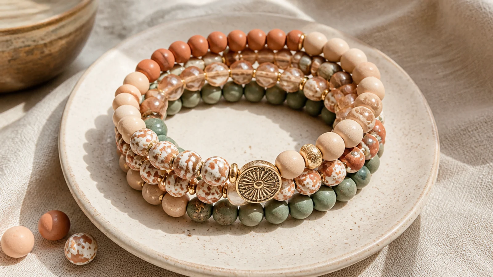
The full curated look: five bracelets in one palette, layered together. You vary texture and rhythm across the five — solid, gradient, gold-spacer, pearl, single-accent — so they coordinate without matching exactly. It’s the aesthetic payoff of everything in this list. The stack is the statement.
Make five bracelets in one warm neutral palette on 0.8mm cord, each a different design from this list but sharing the colors. Keep them all the same length so they layer evenly. Finish each with a hidden surgeon’s knot. Wear the odd number together and let the varied textures create depth while the shared palette holds it together.
Stick to an odd number — five reads as a deliberate curated stack, while an even number can look like it’s missing one.
Don’t let the widths vary wildly; bracelets of very different thicknesses sit unevenly and break the layered look.