
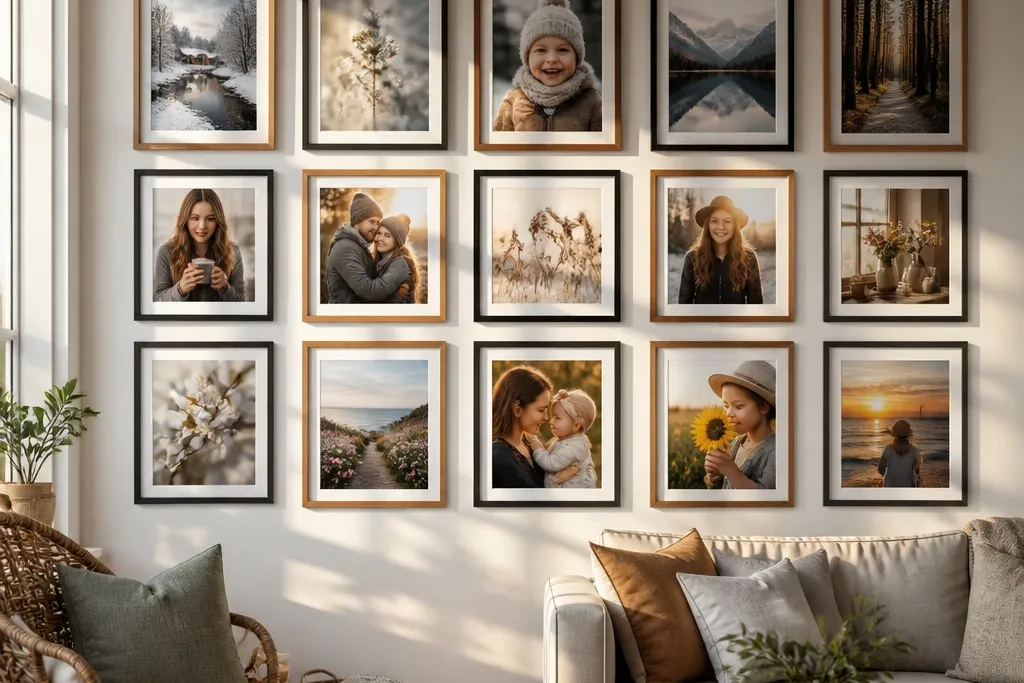
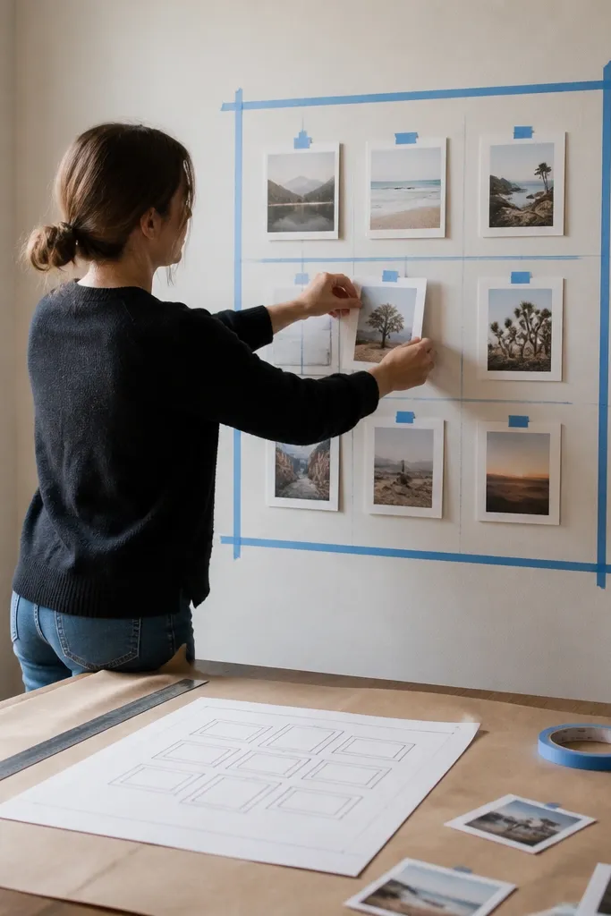
1. The 3x3 Anchor Grid With One Big Center
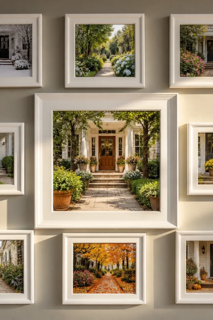
This layout looks neat year-round because it’s built like a calendar without the seasonal chaos. You keep nine frame positions locked, then rotate the photos inside each one as the year changes. The big center frame gives you a clear focal point, so the wall stays intentional even when the surrounding images vary in mood. Use a consistent mat color and frame finish so the collage reads as one piece instead of separate photos.
Start by measuring the wall width and choose a total collage width that leaves at least 2-3 inches of breathing room from edges. Build a 3x3 grid where eight frames are the same size and the center frame is one size larger (example: eight 8x10 openings with a 11x14 center). Mark the grid on the wall with painter’s tape, then set a consistent gap between frames (about 2 inches edge-to-edge is a good starting point). Mount the center first, confirm it’s level, then mount the eight surrounding frames to your tape lines.
Use frames with the same outer dimensions even when the photo openings differ — it keeps alignment crisp.
Don’t mix mat colors or frame widths; the grid stops looking like a collage and starts looking like leftovers.
2. Vertical Storyline Column With Side Moments
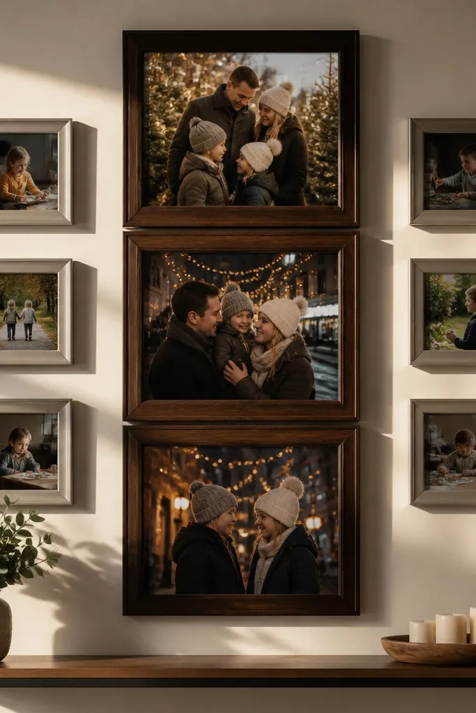
If you want a collage that feels like it’s “moving” through the year, this is the layout. A tall central column handles big moments (birthdays, holidays, trips), while smaller side frames hold quieter updates you can swap seasonally. It stays photogenic because the eye travels top to bottom, and the side moments fill in without stealing attention from the main narrative. This plan is especially good for narrow walls and hallways where a wide collage feels cramped.
Pick one tall anchor frame opening for the center column (example: 11x28 or 12x24 with a vertical orientation). Choose 4-6 smaller frames for the side moments, keeping their widths consistent even if their heights vary. Lay it out on the wall with tape so the top of the center frame sits slightly above eye level, then space side frames evenly relative to the center. Mount the center column first, then mirror the side frames left and right to keep the look balanced.
Keep the side frames in the same mat color and thickness so they look like one family even when you rotate images.
Don’t let the side frames cluster too close to the center; leave a clear gap so the storyline stays readable.
3. Gallery Ledge Look With Overlapping Offsets
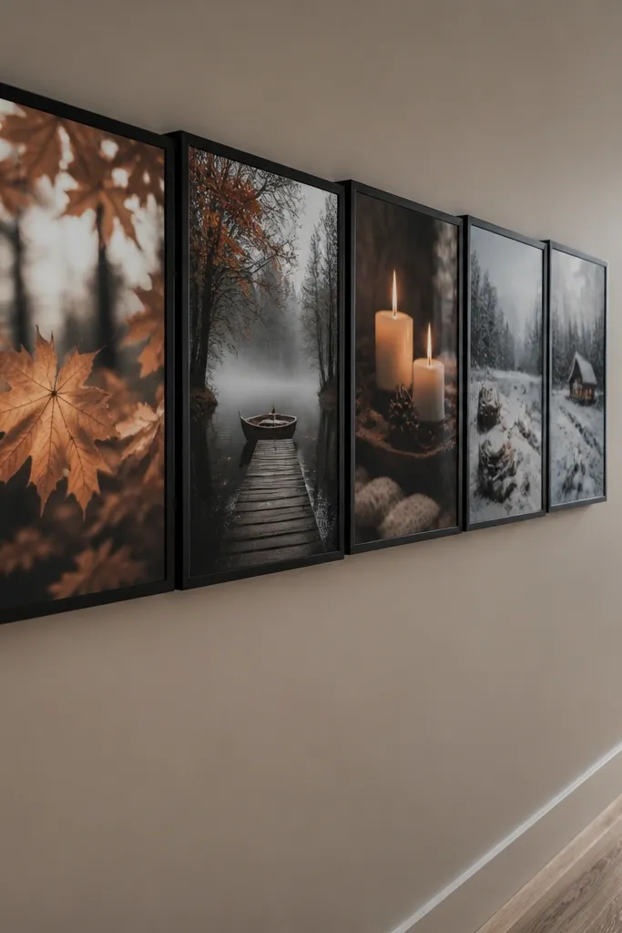
This one is for people who want a lived-in, design-y collage that still looks good after you swap photos. The staggered offsets create depth, so even if you change images by season, the wall keeps its style. You get a high-end gallery vibe without needing real gallery hardware. Use this when you like a slightly casual feel, and when you want the wall to look good from different angles, not only straight-on.
Choose one frame style and finish, then arrange 10-14 frames in a loose rectangle. Start by placing two frames as your base row, then offset the next frames by 1-2 inches so corners overlap visually. Keep a consistent overlap direction (for example, always shift to the right) so it looks intentional, not random. After taping, step back and adjust until the overlaps form a smooth perimeter; mount the heaviest frame positions first.
Use uniform frame thickness and matte glass if possible — glare differences make staggered walls look messy.
Avoid mixing frame heights that create a “staircase” pattern; it turns overlap into clutter.
4. Horizontal Band Collage For Living Rooms
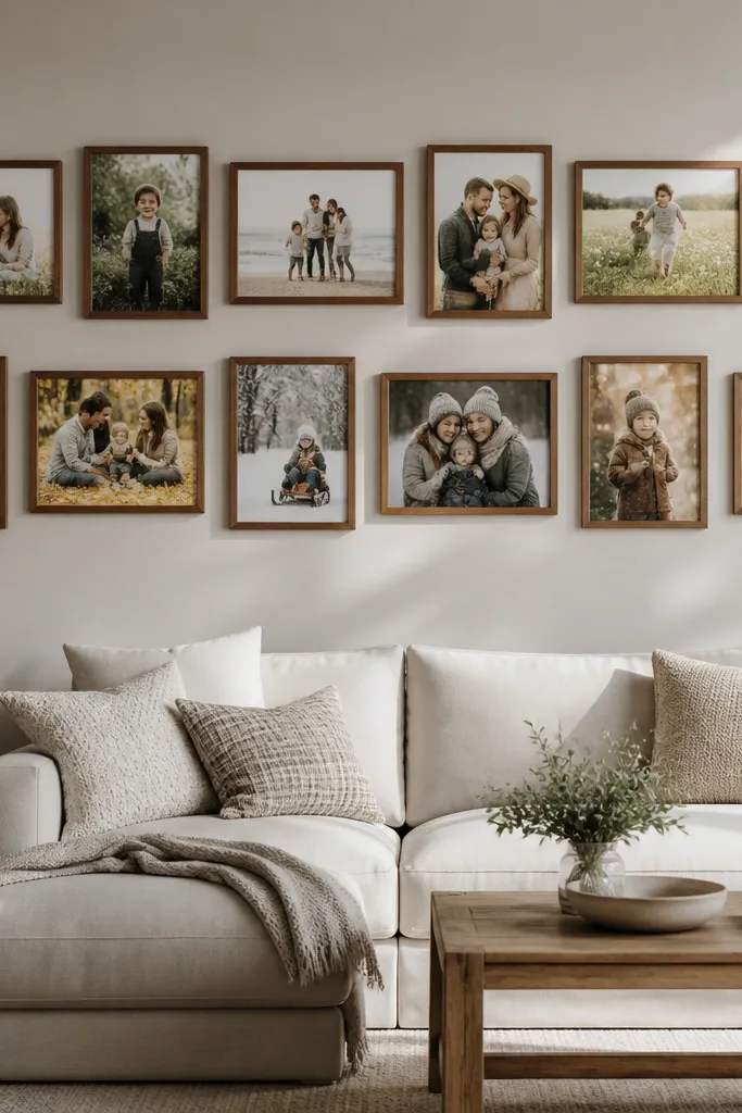
This layout is built for sofas and media walls where you need width, not height. Two horizontal rows make the wall feel grounded, and the collage stays readable even with photos that have different compositions. It’s also easy to maintain because you can swap photos by row: top row for seasonal highlights, bottom row for everyday moments. Choose a consistent mat and frame finish so the band looks like one design.
Measure the width of the wall area above your sofa or console, then decide on a total collage width that fills about 70-80% of it. Choose 8-12 frames split into two rows with equal outer frame heights in each row. Use a tape guide to set consistent vertical spacing between rows (about 2-3 inches edge-to-edge). Mount the bottom row first, then align the top row so the collage center sits at eye level from the couch.
Pick a dominant aspect ratio for photos in each row: wide images look best in the horizontal band.
Don’t vary the outer frame sizes wildly across rows; keep widths consistent so the band reads clean.
5. Diamond Center With Rotated Squares
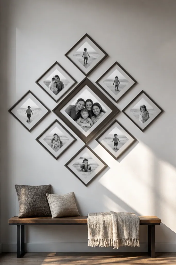
A diamond pattern looks striking and stays interesting through the year because it doesn’t depend on holiday colors. You rotate your frames as a group, so even a plain black-and-white photo still fits the composition. This is a great choice for people who want a modern collage without going minimal. Use the same frame finish and mat to keep the rotated look crisp and not chaotic.
Pick a square grid count that works for your wall, like 5-9 frames total. Draw a center point on the wall with a pencil dot, then tape frames so their edges align to a rotated grid (45 degrees is the classic choice). Keep frame gaps consistent by measuring between outer edges with a small ruler or tape measure. Mount the center frame first, then work outward, checking symmetry as you go.
Use frames with sturdy hanging hardware so the tilted alignment doesn’t drift over time.
Avoid random rotation angles; either use one rotation for all frames or your diamond turns into a tilt mess.
6. Frame-Within-Frame Oversized Statement
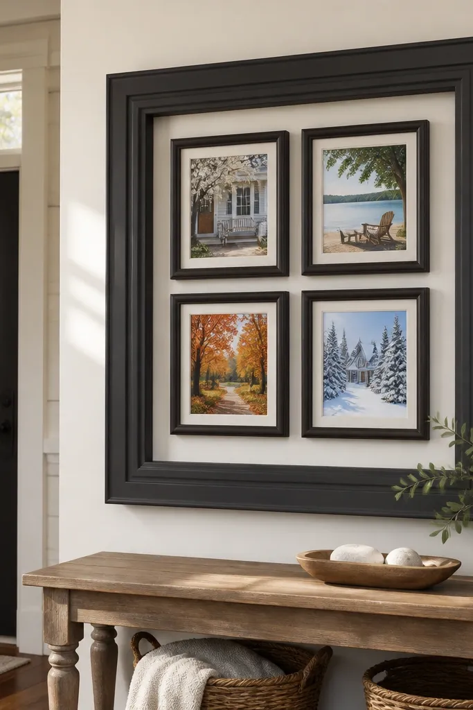
This plan makes your year-round photo wall collage feel like a single art piece. You use one large outer frame as the visual container, then place smaller photos inside it so the collage never looks scattered. It works especially well in entryways because people see it as one focal moment, not a collection of separate items. If you like a polished, styled look, this is the most “designed” option on the list.
Buy or build one large outer frame with a backing board that can hold multiple photo openings. Plan 4-6 smaller photos inside the outer frame, keeping their mats consistent in color and thickness. Arrange them like a mini grid, then mark mounting positions on the backing board. Insert photos using spacers or removable tabs so you can swap prints later without disturbing the entire layout.
Editor's noteChoose an outer frame with a deep enough rabbet so mats don’t press against the glass.
Skip thisDon’t skip a backing board plan; stacking photos directly behind glass causes uneven spacing and wonky alignment.
7. Symmetry Pairing With a Center Stack
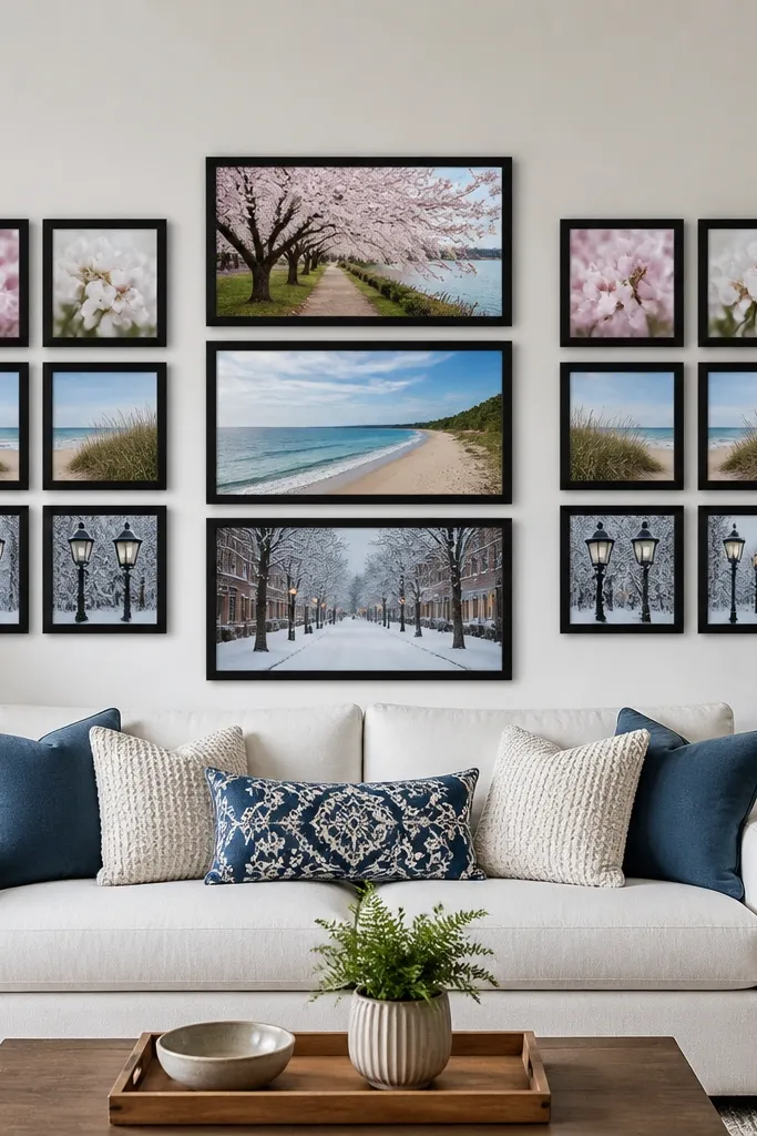
This is the most forgiving layout for people who want order without boring repetition. You build two matching clusters on the left and right, then add a vertical center stack as the anchor. The result stays balanced when you swap photos, because the structure is symmetrical and the center stack always pulls focus. It looks especially good with family photos, since skin tones and clothing colors stay cohesive across seasons.
Choose a center stack size first, like three frames stacked vertically with consistent widths (example: three 8x10 frames). Then design two side clusters with the same number of frames and approximate footprint on each side. Use painter’s tape to map the full silhouette, then measure the distance from the center stack edges to each side cluster edge so the spacing is mirrored. Mount the center stack, then mount both side clusters using the tape outlines to keep symmetry tight.
Editor's noteMatch frame widths across the whole wall even if photo sizes differ; symmetry breaks when frame thicknesses vary.
Skip thisDon’t hang one side higher than the other; symmetry collapses fast when vertical alignment is off.
8. Twelve-Frame Seasonal Rings (Swap by Quarter)
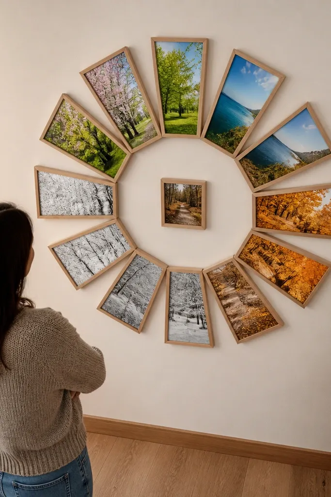
This layout makes “year-round” literal. You keep 12 frames in a ring pattern and rotate photos by quarter, so the wall updates cleanly without adding more pieces. The circular rhythm is photogenic because photos feel like they belong together, even when you use different colors each season. It’s also a great way to avoid the common issue where holiday photos crowd everything else.
Pick a center point and decide your ring diameter so the outer frames leave 4-6 inches from adjacent wall edges. Use 12 frames spaced evenly around the circle, with consistent outer frame sizes and mats. Mark each frame position using tape and measure from the center point so spacing stays equal. Mount the center reference point, then place and level each frame around the ring before committing to screws.
Editor's noteUse the same photo aspect ratio for all ring frames to keep the rotation looking uniform.
Skip thisAvoid mixing very different frame sizes; the ring effect depends on consistent visual spacing.
9. Clock-Face Rows With One Minute-Hand Accent
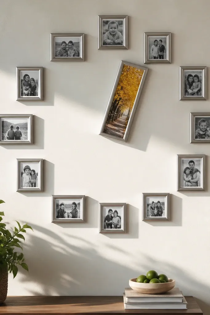
This collage feels playful but still structured, which is hard to pull off with photo walls. You arrange frames like clock positions — rows that approximate a clock face — and then add one longer “minute-hand” frame that points toward the center. Swap photos as the seasons change and the wall still reads as intentional because the geometry stays the same. This looks great in kitchens and creative spaces where you want energy without chaos.
Choose 10-14 frames and pick one elongated frame for the accent (example: 8x20). Arrange the frames so they form a clock-like perimeter, with consistent spacing along each row. Place the long accent frame so it points toward the center point, then fill the rest of the clock positions with smaller frames. Use tape and a ruler to keep each “row” of frames aligned, then mount the accent frame first to anchor the entire pattern.
Editor's notePick one mat color and one frame finish so the geometric pattern doesn’t fight the photos.
Skip thisDon’t place the accent frame off-angle; the whole clock vibe depends on the direction being clear.
10. Asymmetrical Balance With Repeated Sizes
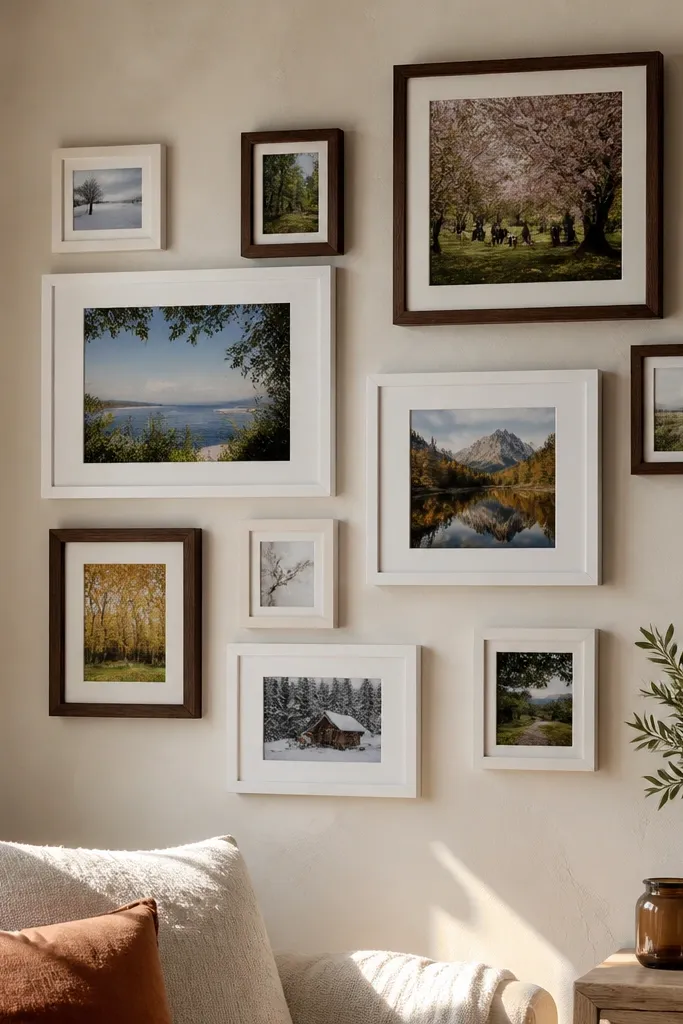
Asymmetry looks expensive when it’s controlled. This layout uses different shapes and spacing, but it repeats two or three frame sizes so your eye never feels lost. It’s ideal for year-round photo wall collage because you can keep swapping images while the structural balance stays fixed. Use this when you want the wall to look modern and not like a school project.
Pick three frame sizes: one large anchor, one medium, one small. Arrange them into a rectangle, but don’t mirror left and right; instead, balance by weight. Place the large anchor slightly off-center, then distribute medium frames on the heavier side and smaller frames to visually lighten the opposite side. Tape the full plan first, then measure distances between frames so the gaps look even from the dominant viewing angle.
Use the same mat width for all three sizes; it makes asymmetry feel planned, not messy.
Avoid random one-off sizes; if you can’t describe how many of each size you used, the layout will look accidental.
11. Micro-Grid With Wide Picture Rail Style Spacing
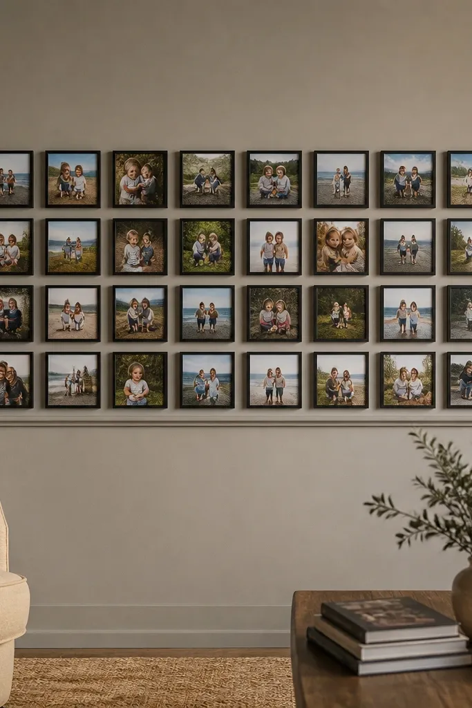
If you love lots of photos but hate clutter, this solves it with a micro-grid and consistent gaps. Small frames give you flexibility for year-round photo updates because you can swap out individual moments without affecting the wall’s overall shape. The wide spacing between frames acts like a visual “breath,” so the collage stays airy. This works well in stairways, home offices, and hallways where you want texture without big scale.
Choose a consistent small frame size (example: 5x7 openings) and decide your gap width (about 1.5-2 inches edge-to-edge). Plan a grid footprint that fits your wall — start with 12-20 frames so the micro-grid looks intentional. Mark the grid with tape and keep every frame aligned to a straight guideline using a level. Mount using the picture rail approach if you can: a rail keeps spacing consistent and makes future swaps easier.
Use a spacing jig (a scrap board cut to your gap width) so every frame gap stays identical.
Don’t go too tight; if frames nearly touch, the wall reads as a single block instead of a collage.
12. Two-Tier Collage With a Floating Top Row
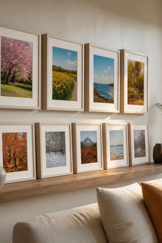
This layout adds depth without using overlapping frames. The top row floats slightly higher and is offset by a small horizontal shift, which makes the collage feel layered and modern. It’s great for year-round photo wall collage because you can rotate only the top row for seasonal updates while the bottom row stays more stable. The floating effect looks intentional when you keep the same frame style and consistent mat borders.
Pick a lower row of 5-7 frames in a straight horizontal line, all the same size. Add a top row of 3-5 frames that sits higher and is offset left or right by about half a frame width. Use painter’s tape to map the vertical spacing between tiers (about 3-4 inches edge-to-edge works well). Mount the bottom row first, then align the top row to your offset marks and confirm the whole collage center is level.
Keep the top row mats slightly lighter or use thinner mats so the floating layer doesn’t feel heavy.
Don’t change frame sizes between tiers; the offset is what creates interest, not mixed dimensions.
13. Large Center Photo With Surrounding Mini Frames

This is the cleanest way to make your photo wall collage look polished even when you have photos with different crops. The big center photo becomes the main story, and the mini frames act like supporting cast. Because the center stays the same size and position, swapping the smaller photos won’t throw off the whole look. It’s excellent for entryways and living rooms where you want one moment people instantly recognize.
Choose one large center frame opening (example: 16x20 or 18x24) and build a surrounding halo of 8-12 mini frames. Keep the mini frames consistent in outer size, even if their photo openings are different. Plan spacing so there’s a clear ring between center and minis, then mark everything on the wall with tape before mounting. Mount the center first, then work outward in a circle or near-rectangle so the halo stays even.
Editor's noteUse a consistent mat color and match the mat opening ratio so mini photos don’t look squeezed next to the center.
Skip thisAvoid mixing too many mini frame sizes; the halo needs repetition to look styled.
14. Serif-Line Look With Frames Like Book Spines
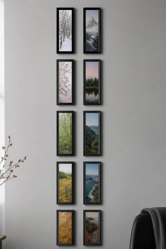
This layout gives you a graphic, design-first photo wall collage. You use narrow vertical frames aligned in a row or two, and the photos read like book spines — clean, modern, and easy to keep consistent. It’s perfect for year-round updates because you can swap one or two frames without rebalancing anything. Keep the frame finish consistent and choose photos with similar contrast so the wall feels cohesive through every season.
Pick a narrow frame size with a vertical orientation (example: 4x6 openings in slim frames). Arrange them into one long row or two rows stacked, keeping outer frame widths the same. Use tape to create a straight line and a single consistent gap (about 1-2 inches edge-to-edge). Mount the center two frames first to lock alignment, then add the remaining frames outward.
Editor's noteChoose a mat color that matches your room trim or furniture hardware — it makes the vertical spines look intentional.
Skip thisDon’t use wide photos in narrow openings; crop to a vertical composition so the wall stays sharp.
15. Grid Breaker With One Misaligned Frame (On Purpose)
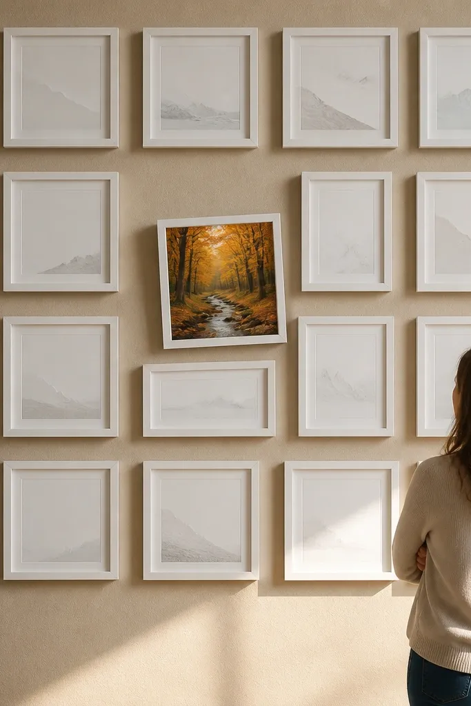
This is how you add personality to a year-round photo wall collage without ruining the order. You build a mostly strict grid, then intentionally misalign one frame by a small amount — just enough to create energy. It’s photogenic because it creates a visual “moment” that pulls attention, even when the rest of the photos change. Use it when you want a playful accent but you still crave a clean, modern look.
Start with a grid layout like 3x4 or 4x4 using consistent frame sizes and equal spacing. Choose one frame to be the accent and plan it in the visual center or near the lower third. Tilt that accent frame by a few degrees (around 3-5 degrees) after you tape the layout, then level everything else normally. Mount the grid frames first, then mount the tilted accent last so you can fine-tune the angle against the wall.
Editor's notePick the accent frame to be your highest-contrast photo so the tilt reads as design, not mistake.
Skip thisDon’t tilt multiple frames; one intentional disruption keeps the rest looking deliberate.



