
1. Receipt-Photo-Note Grid for a Month We Actually Did Stuff
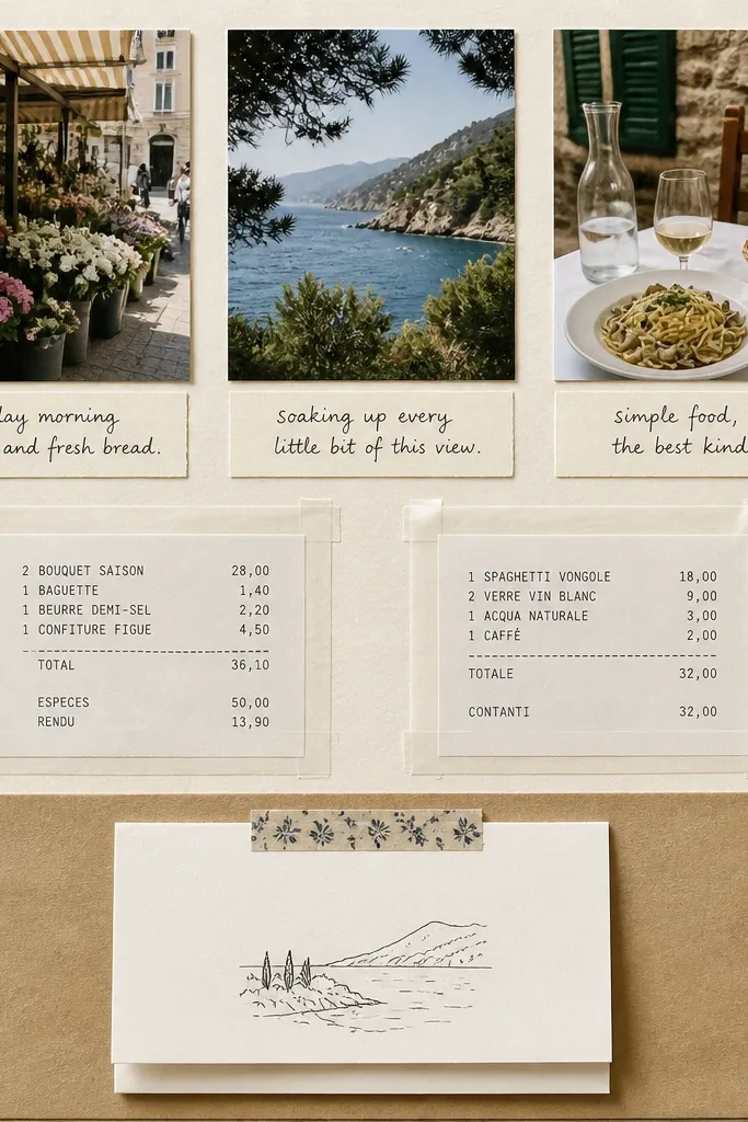
This layout works because it looks like a documentary page, not a craft page. Use a kraft or light cream cardstock base, then place your 4x6 photos in a neat grid so his eye knows where to land. Add a receipt behind a clear tape “window” so the text is readable but protected from glue bumps. I like writing the note with a black gel pen and finishing it with a tiny date stamp sticker so it feels real. It flatters any photo style — warm or cool — because kraft neutralizes mixed lighting and makes the receipts look intentional.
Start by trimming your base to fit your scrapbook (I use 12x12 pages folded into a 12x12 binder or a 9x12 album). Cut three photo mats from off-white cardstock, each sized to frame a 4x6 photo with about 1/4 inch border. Place photos in a 3x3 grid, then tape receipts behind a clear tape border over the middle cells. Finally, tuck a small folded note card under the bottom center photo using double-sided tape on the top corners only so it opens.
Editor's noteWrite one sentence that includes a specific detail like “the neon sign at 9:12” so it feels like a memory, not a generic compliment.
Skip thisDon’t glue receipts flat; tape them so they don’t buckle or create thick ridges that warp the page.
2. Ticket Pocket Page with a Hidden Love Note
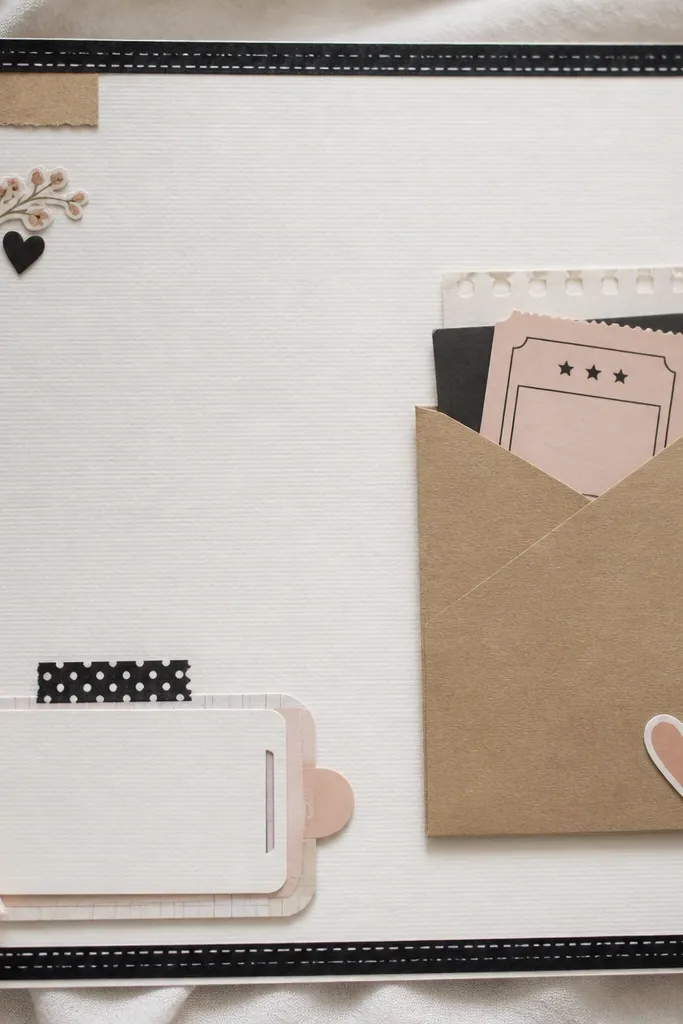
This is the page he’ll reach for. The pocket is practical and keeps your keepsakes from getting bent, and the hidden note makes it feel like a secret. Use a kraft envelope pocket for contrast, then add a single ribbon or twine loop to make it look styled. I’ve done this with movie tickets, concert stubs, and even bus passes — it all reads as “we went somewhere.” It works best for boyfriends who like tangible proof, and the muted kraft tone looks good with both dark and light skin tones in photos.
Start by measuring a ticket or stub and building a pocket that gives it 1/4 inch breathing room on all sides. Glue a kraft pocket panel to the page, then reinforce the pocket opening with a strip of double-sided tape along the top edge. Add your ticket inside, then place a photo on the left side with a 1/2 inch white mat. Finish by attaching a pull-tab note at the bottom using a small strip of washi tape as a hinge, and slide it under the photo edge.
Editor's noteWrite the hidden note on thick cotton paper or cardstock so it feels smooth when he pulls it out.
Skip thisDon’t use a pocket that’s too tight; tight pockets tear at the edges after a few openings.
3. Map Coordinates Spread with Photo Corners
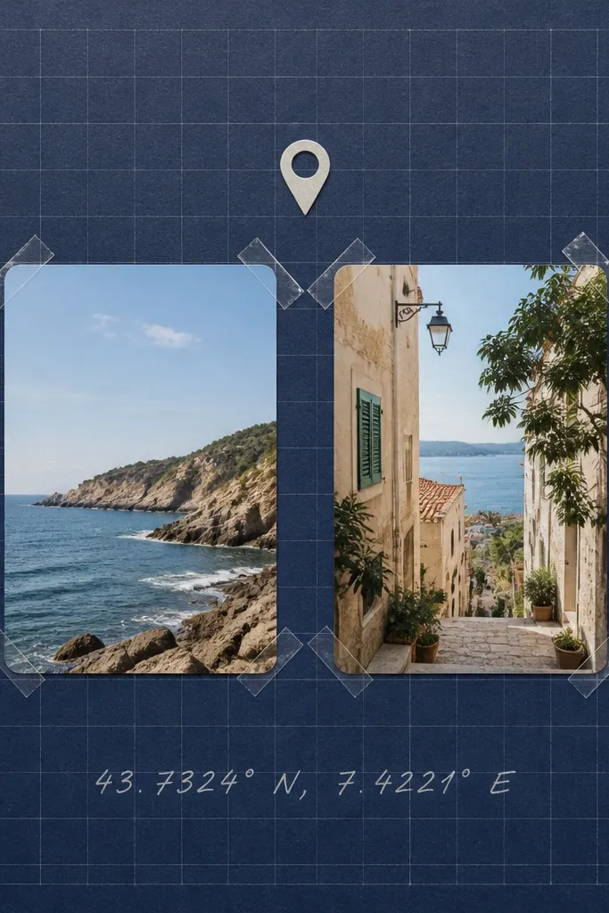
This is the page for the places that matter: where you met, the first date spot, or a favorite walk. The map look is clean and masculine when you use navy, gray, and white, and it avoids the “cute scrapbook” vibe that some guys don’t like. I keep photos at the center with corner tape so the page feels airy. Coordinates in silver gel pen look sharp next to navy cardstock and read clearly. The style works for any skin tone because the focus is on the place text and the photo framing, not on overly saturated colors.
Start with a navy cardstock base and add a faint grid layer using a light gray pen and a ruler, spacing lines about 1 inch apart. Print or hand-draw a small map pin icon and place it above your main photo. Mount 4x6 photos with only corner tape — two pieces per corner — so they look floating. Write the coordinates (or the street name if you don’t have exact coords) in silver gel pen below, then add one short line of text under it like “We stood right here.”
Editor's noteUse a ruler for the grid; freehand grids look messy fast and cheapen the page.
Skip thisDon’t cover the page with too many map stickers; two icons max looks intentional.
4. Sports Card Style Page with Stats Blocks
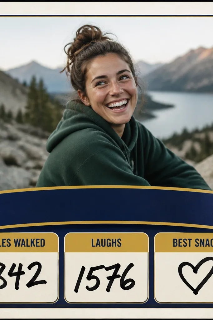
If your boyfriend likes sports, this makes the scrapbook feel like his world. The sports-card layout is structured, so it looks neat even if your writing is casual. Use one team color for the banner (red, green, or royal blue), then keep the rest in white and black for clarity. I’ve used this for hiking days too — “miles walked” reads the same as sports stats. It flatters photos with bold contrast because the banner pulls attention to the center. Keep the numbers big and readable; that’s what makes it feel like a real card.
Start by picking one team color and cutting a banner strip about 1.5 inches tall across the page. Place a large rounded-rectangle photo on top, leaving a 1/2 inch margin. Add three stat blocks using white cardstock rectangles with black marker headings and bold numbers underneath. Use double-sided tape along the sides only so the blocks sit flat. Finally, add a small “date” line in the bottom corner like a card back, then sign it with your name and the year.
Editor's noteWrite stats as exact numbers when you can: “4.2 miles” or “12 songs on the car ride.”
Skip thisDon’t choose a banner color that matches the photo too closely; it disappears and looks like a mistake.
5. Polaroid Stack Page with Real Photo Dates
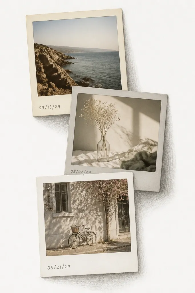
This layout looks cute without turning into a kid’s craft. Polaroid-style borders give your photos a consistent shape, and the slight tilt adds personality. I use three frames max on a page so it stays clean. Write the date on each frame in the same place, like the real thing, and it instantly makes the scrapbook feel authentic. This works best for boyfriends who like nostalgia or who keep old photos on their desk. The neutral borders keep the page flattering in any lighting and don’t overpower skin tones in portraits.
Start by printing or selecting three photos that look good together in color. Cut photo borders from cardstock, each sized to leave about 1 inch of border around a 4x6 photo. Add a tiny shadow behind each frame by lightly shading with gray pencil just under the bottom edge. Tape the photos down with double-sided tape at the edges only, then place them stacked with one corner slightly overlapping another. Write the date at the bottom of each frame with a fine-tip black pen.
Editor's noteMake borders from two neutrals and one tiny accent like light gray so the stack looks intentional.
Skip thisDon’t use glossy photo prints under a matte border; glare makes the whole page look cheap.
6. "If This, Then That" Inside Joke Page
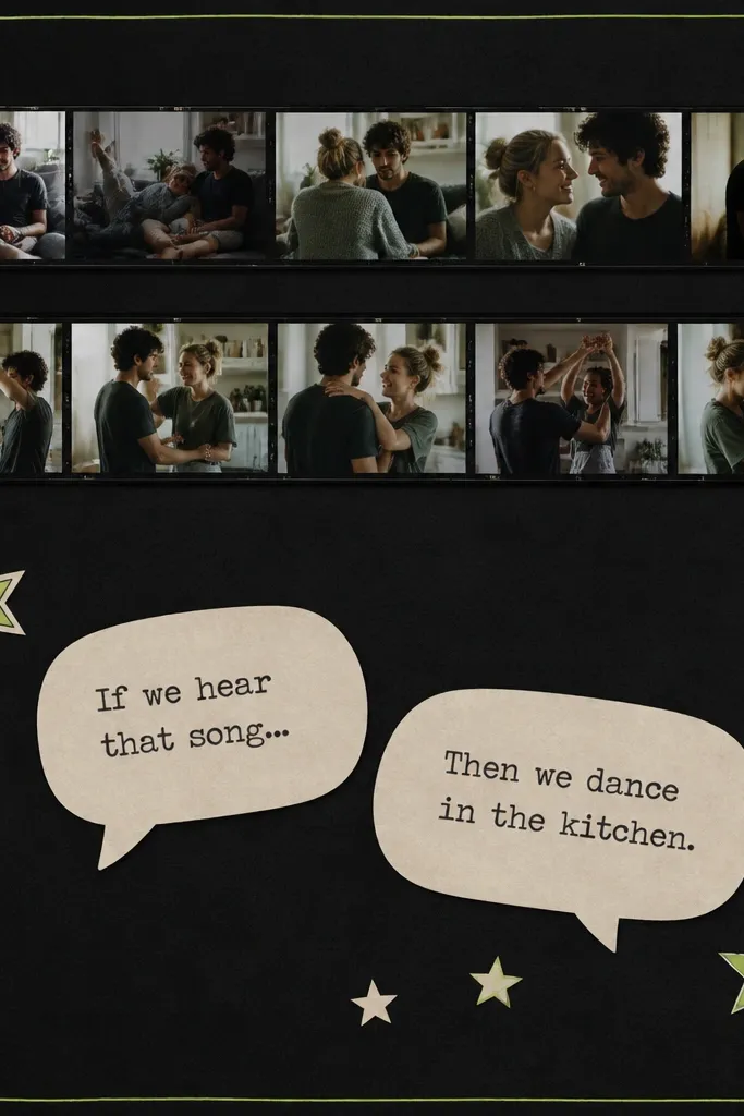
Inside jokes land better when the page reads fast. The “If this, then that” format is playful and structured, so it looks good even if you’re not a writer. Use a charcoal base and one neon accent for the speech bubbles; it looks like a poster, not a diary. Put one small photo strip on top to anchor the joke to a real moment. This style works for boyfriends who laugh easily and don’t want sentimental pages that feel too heavy. The dark background also makes skin tones in photos look richer without needing extra edits.
Start with charcoal cardstock and add a thin neon-green line around the edge using a ruler. Cut two horizontal photo strips, each about 4 inches tall, and tape them across the top with a 1/4 inch gap. Make two speech bubbles from white cardstock and outline them lightly with a neon marker or printed border stickers. Attach the bubbles with foam tape so they pop off the page. Add small star stickers in the corners only, then write your joke text with a thick black marker.
Editor's noteKeep the text short enough to read in 3 seconds. If it takes longer, split it into two pages.
Skip thisDon’t use too many fonts; one bold font style plus your handwriting is cleaner.
7. Before and After DIY Project Spread
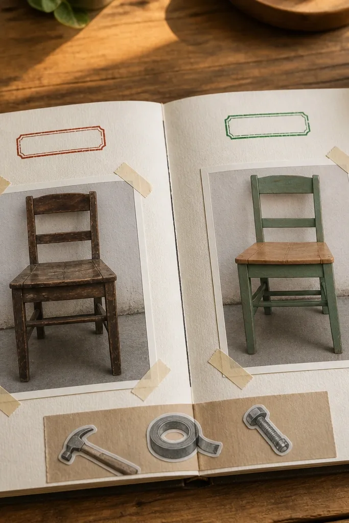
This page works when you two built something, fixed something, or even improved a routine. The before/after split creates instant structure and makes your photos look intentional. Use one vertical divider line and keep the stamps consistent: red for before, green for after. Add a narrow materials strip with simple icons like “drill,” “paint,” or “gloves” so the page reads like a mini how-to. It flatters practical boyfriends because it feels like a record of work, not just feelings. The white space between photos stops the page from looking crowded.
Start by choosing two photos that show clear contrast and crop them to match the same aspect ratio. Draw a vertical line down the center of the page and place the before photo on the left and after photo on the right. Add a small stamp under each photo using printable stamp sheets or stickers. Create a materials column in the center margin about 1 inch wide, then write 3-5 items in a neat list. Finish by gluing a thin strip of washi tape along the bottom edge like a label.
Editor's noteUse the same crop on both photos so the split looks clean.
Skip thisDon’t pick after photos that are too dark; the split highlights differences in lighting.
8. "We Ate That" Food Menu Page with Bite-Size Notes
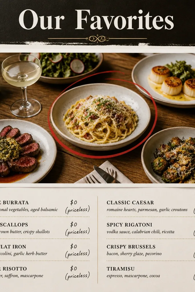
Food pages keep things fun and readable. The menu layout makes it feel like a guide, and it gives you a natural place for short memories. I use a black header and white paper for a clean look, then I add one accent color like red for the “order” markers. Put one main photo under the header and circle the dish with a red marker — it feels personal and he can spot the exact moment. This works best for boyfriends who care about trying new places and remember meals. It also keeps skin tones from being the focus, which helps if your photos have mixed lighting.
Start by picking 5 dishes you both ate and writing them in two columns on white cardstock. Add a black strip at the top with the title in white pen. Place a 4x6 photo right under the header, then circle the dish with a red marker and add a tiny arrow label pointing to it. Add small food icon stickers in the corners only — four max. Finish by writing a bite-size note under each dish using 1 sentence per item.
Editor's noteWrite one “order detail” like “extra spicy” or “we shared fries” so it reads like a real memory.
Skip thisDon’t use full restaurant receipts with greasy spots; it looks messy and stains pages.
9. Map Pin + Thread Stitched Path Page
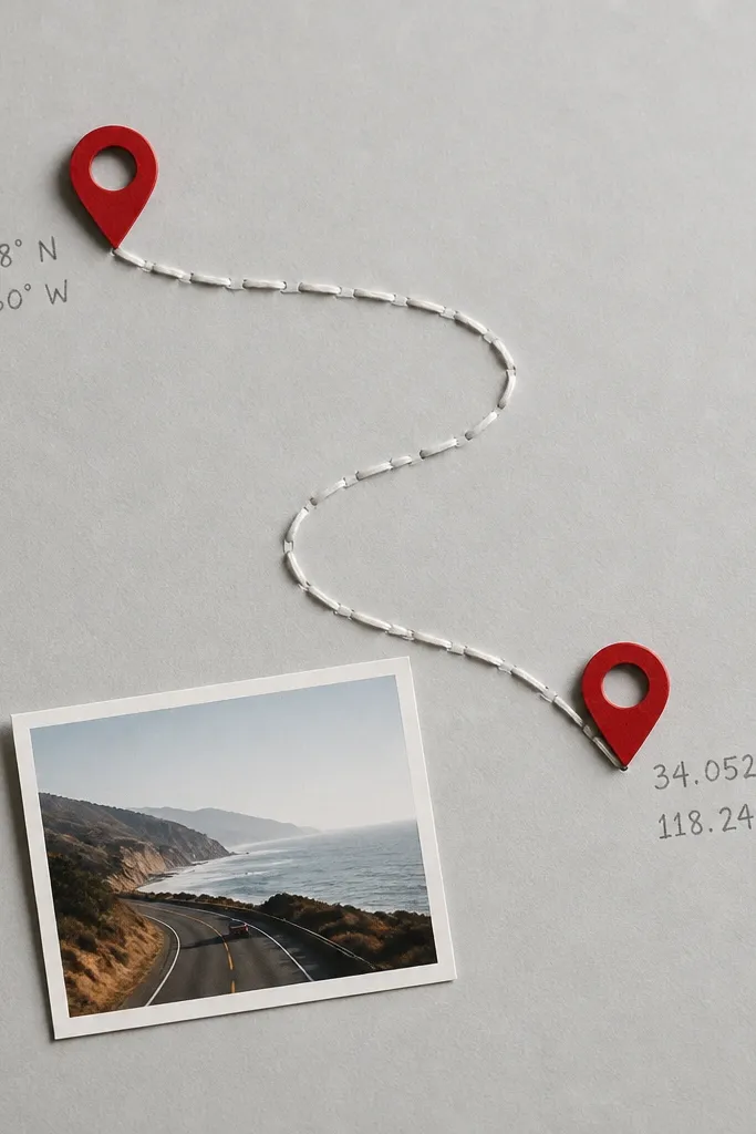
This is the page that looks handmade in a good way. Thread and stitching hide crooked placement errors because the line becomes the focus. Use two pin icons and stitch a path between them that matches the route you walked or drove. I like using white thread on gray cardstock because it’s crisp, and red pins make it pop without turning childish. Add one small photo so the story stays grounded. This works for boyfriends who like maps, travel, or anything “plan and do.”
Start with gray cardstock and mark two points where the pins go using a pencil dot. Place red map pin icons and write coordinates or a short place name next to each. Punch small holes at the two points and along the route using a pushpin (spacing about 1 inch apart). Thread white embroidery floss through each hole and stitch the path, pulling tight but not so tight that the paper puckers. Finally, attach a small 4x6 photo at the bottom with a thin mat and write one sentence about the moment you arrived.
Editor's noteSeal the thread ends by tying a tight double knot on the back and taping it flat with a small piece of matte tape.
Skip thisDon’t pull the thread too tight; it warps the paper and makes the stitching look uneven.
10. Car Ride Playlist Page with QR Code Placeholder Area
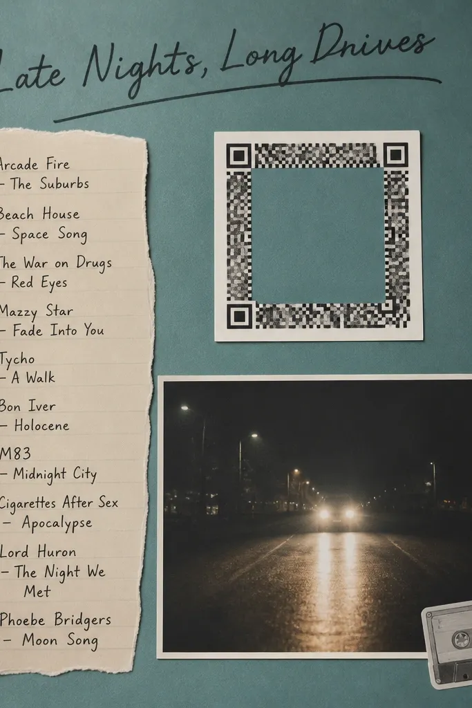
Music pages hit fast because they’re already a format he understands. A playlist list makes the scrapbook feel like a real artifact from your relationship, not a random decoration. I stick to teal, white, and black so it reads crisp and doesn’t fight with night photos. Put the photo of the car ride under the list and add one small icon like a cassette or speaker so it stays themed. This works for boyfriends who talk about songs, make playlists, or remember “that one track.” The contrast keeps the page readable even when your photos are dark.
Start with a teal base and write a playlist title at the top in thick black marker. Add a list of 7-10 song titles in a neat column, leaving about 1/4 inch margins. Create a square “code” area in the middle using a QR-style border sticker or a cut-out square of matte white paper — keep it blank until you’re ready. Tape the square down with double-sided tape and then place your 4x6 night photo below it. Finish by adding one caption line on the bottom like “We sang every word at the red light.”
Editor's noteUse matte photo prints for night shots; glossy makes the page reflect the room lights.
Skip thisDon’t cram 20 songs; 7-10 reads clean and looks intentional.
11. Polite Handwritten Letter Page with Photo Frame
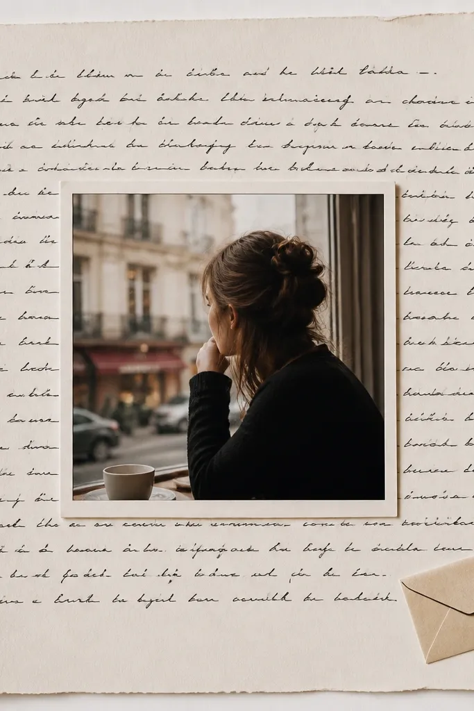
A letter page makes the scrapbook feel personal without needing a fancy design. I use a simple photo frame in the center, then write the letter around it like a border. Keep the letter short — 10-14 lines — and write like you talk. This is perfect for boyfriends who like sincerity but don’t want cheesy decorations everywhere. The cream background makes black ink look crisp, and the photo frame prevents the page from feeling like homework. It flatters almost every photo because the focus is on the handwriting and the frame.
Start by choosing one 4x6 photo and mounting it with a 1/2 inch mat around it. Place it in the center of a cream cardstock page. Draw light pencil guide lines around the photo for your letter text, keeping line spacing consistent. Write your letter with a black gel pen, then add two small accents like red heart dots or tiny checkmarks in the margins. Add an envelope sticker or a mini pocket at the bottom if you want to tuck a second note.
Editor's noteUse a ruler for your letter lines. Even a simple pencil guide makes it look professionally neat.
Skip thisDon’t write the whole page in tiny text; he should be able to read it in one sitting.
12. Favorite Quote Cutout Page with Layered Borders
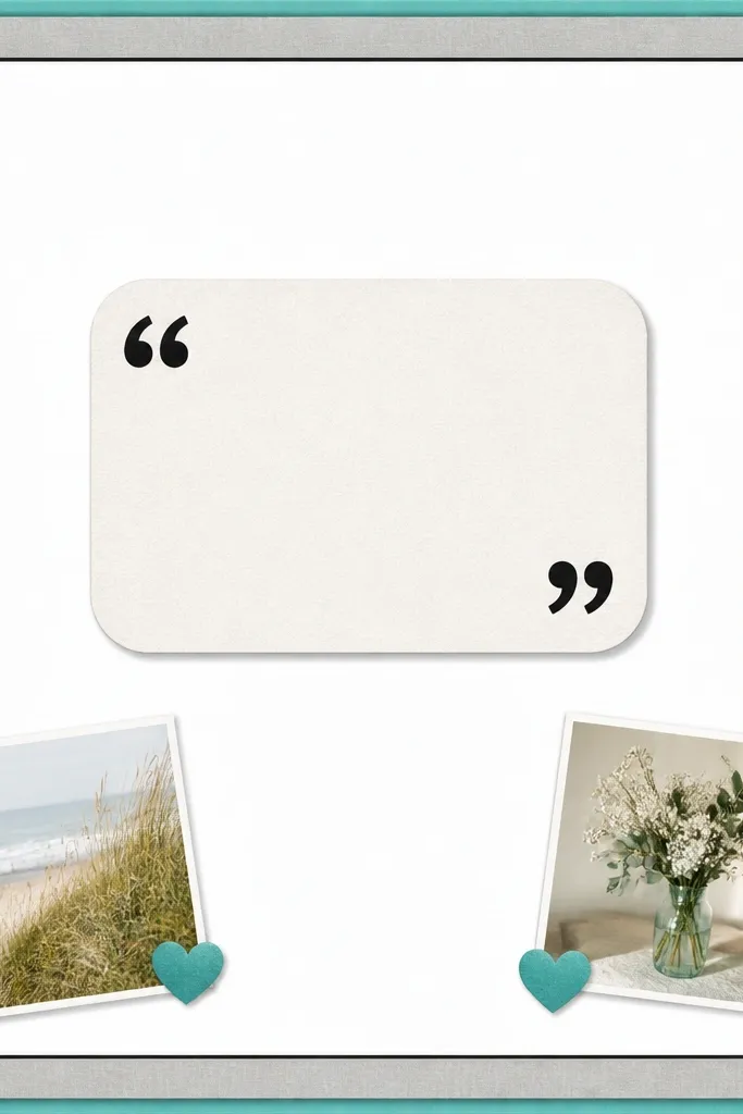
A quote page is clean and masculine when you keep it typographic. I use layered borders because they give structure and make the center quote stand out. The trick is to keep one quote, one shape, and two small photo anchors. Use a bold marker for the quote and keep your handwriting consistent across the letters. This works for boyfriends who like reading or who have a strong favorite line from a show, game, or movie. The neutral border colors keep it from looking too “crafty,” and they frame the photos without stealing attention.
Start by cutting two border strips from teal and gray cardstock, each about 1/4 to 1/2 inch wide, then layer them along the page edges. Place a rounded rectangle in the center (off-white cardstock) and write the quote on it with a thick black pen. Add two small 2x3 photos at the bottom corners, each angled slightly the same direction. Finish by placing tiny matching stickers (teal heart or star) near the photos. Tape everything down with double-sided tape so the layers look flat and crisp.
Editor's noteWrite the quote first on scrap paper, then trace it lightly onto the final piece with pencil before inking.
Skip thisDon’t pick a quote that’s too long; long quotes shrink and look messy.
13. Scrapbook Timeline Page from First Date to Now
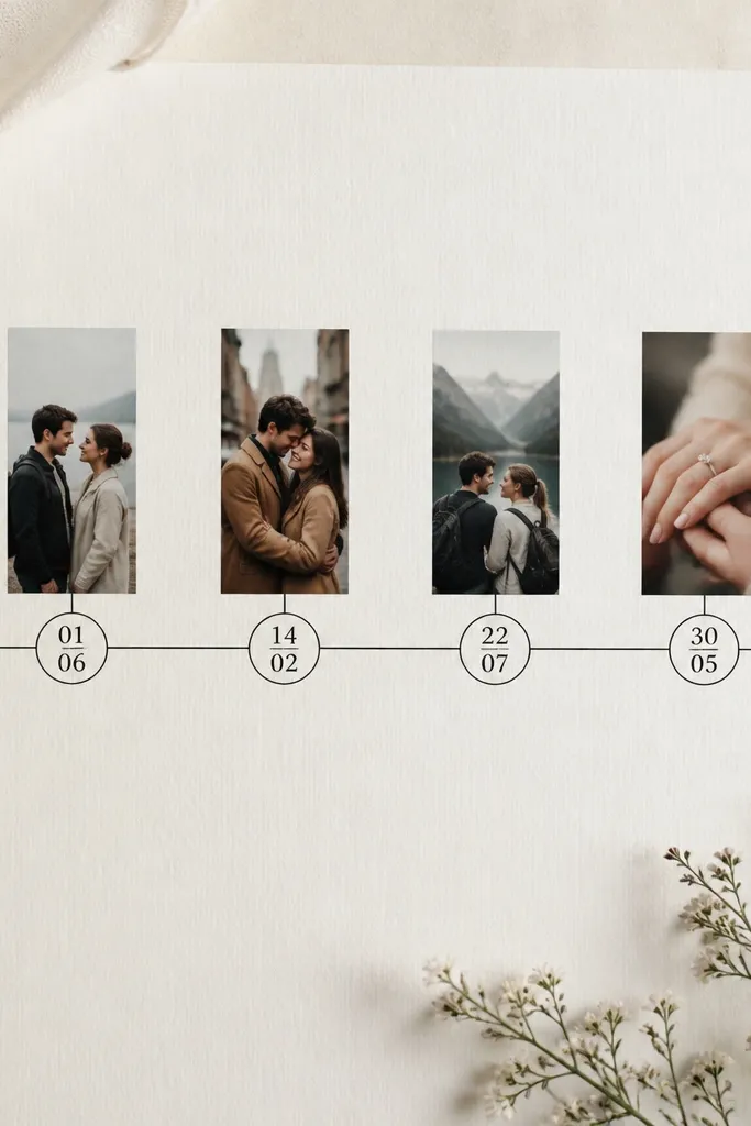
Timelines make the whole book feel organized, especially if your relationship spans years. The line gives you a direction and lets you include small moments without clutter. I use four to six checkpoints so the page stays readable. Put a small icon at each end and keep circle sizes consistent. This works well for boyfriends who like “progress” — they’ll see growth at a glance. The neutral background with a single accent color line keeps everything cohesive.
Start with a solid cardstock base in off-white or light gray. Draw a timeline line across the page using a ruler, about 1/2 inch above the lower third. Mark 4-6 points with pencil dots, then trace circles around each point using a coin as a template. Place small 1.5x3 photo strips above each circle, and write short dates inside the circles. Add one sentence at the bottom like “Our favorite thing is still showing up for each other.”
Editor's noteUse the same ink color for all dates so the page looks consistent.
Skip thisDon’t squeeze too many dates; if the circles touch, it looks rushed.
14. Shadow Box Page with Tiny Objects from a Trip
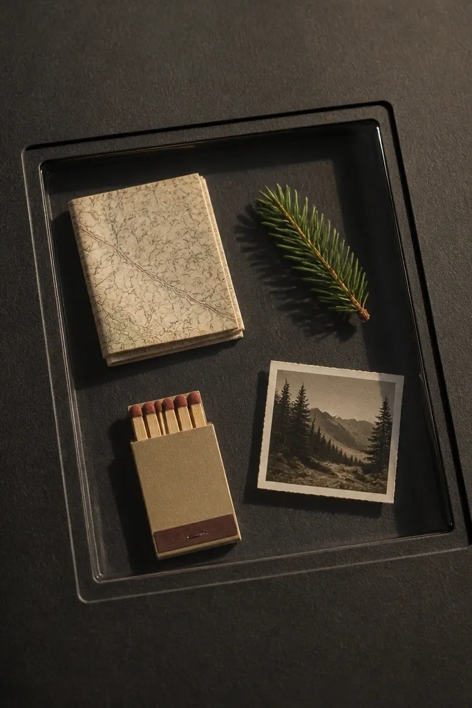
A shadow box page makes small keepsakes feel important. It looks dimensional without you having to build a complicated 3D model. Use a black or dark navy frame so the objects pop, and stick to flat-ish items so the page closes cleanly. I’ve done this with beach trip bits like a small shell and a mini sand bag, and it reads clearly even years later. This is best for practical boyfriends who like collecting, because it turns random souvenirs into a single display. The dark frame also helps photos look sharper because it adds contrast.
Start by buying or making a shallow clear window pocket that fits your scrapbook page size. Mount dark cardstock behind the clear window to create a strong background. Arrange 3-5 small flat objects inside: folded map corner, matchbook, ticket stub, and a tiny photo taped at the back. Glue down only the edges so things don’t slide, using a glue stick on the back of items. Add a title strip at the top with the trip name and date, then close the window with tape or a pocket flap designed for scrapbooks.
Seal fragile items like leaves with a tiny layer of clear matte medium on the back so they don’t crumble.
Don’t pack the compartment too full; pressure makes the page bow and the clear cover scratch.
15. Stitched Photo Border Page with Contrast Thread
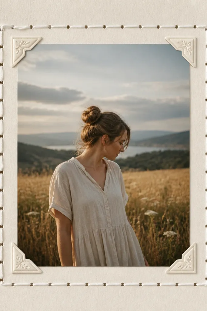
A stitched border makes the whole scrapbook look like a real project, not a sticker collage. You’re adding texture without heavy bulk, and the repeated stitch pattern makes the page feel consistent. I like using contrast thread — white on cream, or black on kraft — because it reads clearly and photographs well. Put the main photo centered and keep the rest of the page simple. This works for boyfriends who like clean design and don’t want a page that screams “craft.”
Start by mounting your main photo with a mat that leaves about 3/4 inch border on all sides. Mark a rectangle path inside the mat area and punch evenly spaced holes every 1/2 inch around the perimeter. Thread embroidery floss and stitch around the frame, keeping tension even. Tie knots on the back and tape them flat with matte tape. Add two tiny corner stickers or small label stickers near the top left and bottom right, then write a short caption under the photo.
Punch holes with a single sharp pushpin; dull tools tear paper fibers and make the stitch look messy.
Don’t use thick yarn; it makes the page too bulky to close in most albums.
16. Before-You-Knew-Me Page with Things He Loves
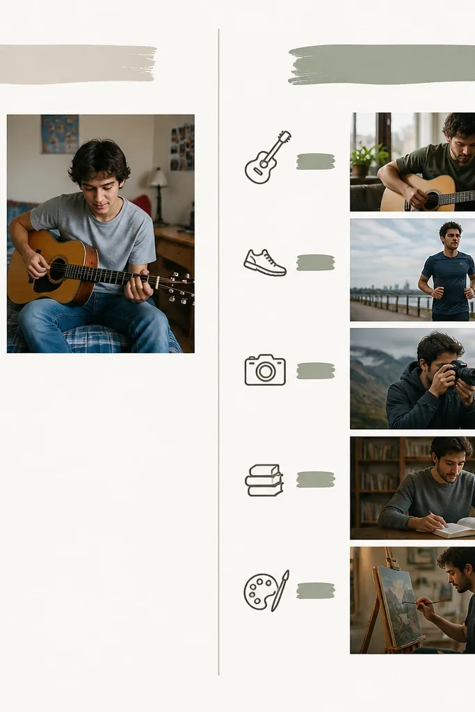
This layout gives the scrapbook a sense of growth without long paragraphs. You list 3-4 things he loved before you two got serious, then show how you shared them later. It reads like a story arc, and it helps you avoid writing generic “I love you” lines. Keep the text short and let the photos do the work. This is great for boyfriends who like routines and hobbies, because you’re documenting what stayed and what changed. The two-column structure also makes mixed photo lighting easier to handle.
Start by picking 3-4 hobbies like gaming, hiking, cooking, or music. Create a vertical divider line down the page and label left “Then” and right “Now” using a bold marker. Place one small photo next to each “Then” item and one small photo next to each “Now” item, aiming for similar sizes like 2x3 or 2.5x3.5. Use double-sided tape only on the top and sides so nothing warps. Finish by writing one short line under the “Now” column item that describes what you did together.
Use the same handwriting style for both columns so it feels like one page, not two separate ones.
Don’t use tiny photos for the “Then” side; small images look like filler.
17. Weekend Routine Page with Mini Checklists
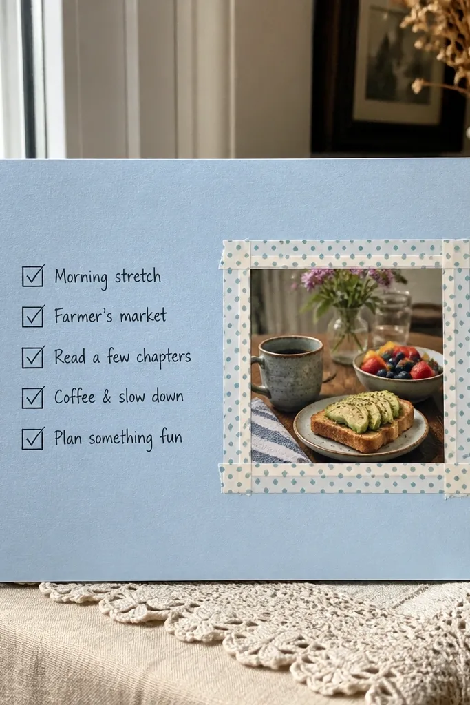
Routine pages feel real because they capture how you spend time, not just big events. Mini checklists are easy to read and look tidy on paper. Use a calm background like light green or pale blue so it doesn’t overpower photos. Place the checklist on one side and a photo on the other so the page has balance. This works for boyfriends who like consistency and who remember weekends by what they did, not by dates. The clean boxes also make your handwriting look organized.
Start with a pale cardstock base and add a header strip using a thin washi tape line. Draw two columns or halves of the page and label “Saturday” and “Sunday” at the top of each. Create 5 checklist lines per day, leaving a blank space next to each box for a check mark. Add a 4x6 photo on the bottom right with a small mat, then write a caption strip under the photo with one sentence. Finish by adding a calendar icon sticker near the header and two small washi tape corners.
Use a black fine-tip pen for boxes and a thicker marker for the day labels so the hierarchy is clear.
Don’t write long checklist items; keep each line under 6 words.
18. Handmade Frame Mat Page with Spray Texture Background
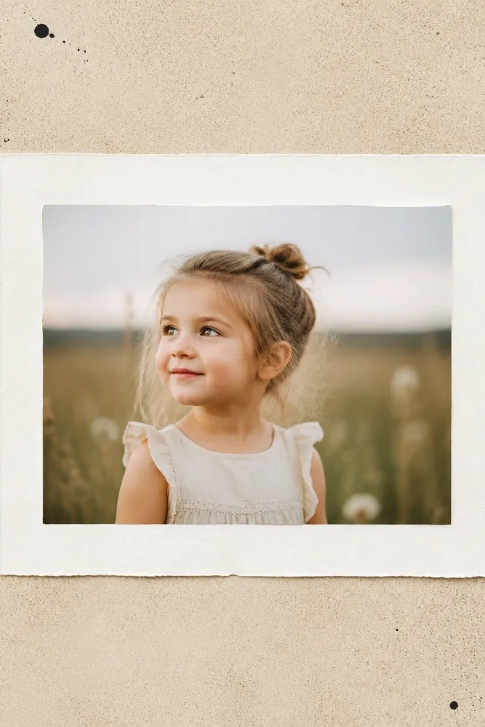
Texture makes a scrapbook page look expensive without needing fancy supplies. I do a light spray-splatter background with a stencil so it doesn’t cover the whole page, then I add a clean framed photo. The contrast between textured background and crisp frame makes the photo feel like the main event. Use beige or taupe for a grounded look, and keep splatters in one ink color like black or dark brown. This works for boyfriends who like moody aesthetics and for photos that are black-and-white or low saturation. It also flatters skin tones because the background is neutral.
Start by protecting your workspace with cardboard. Lightly mist the cardstock with water, then use a stencil or a cut paper mask to spray tiny dots with black or dark brown spray ink from far away. Let it dry fully, then cut a white cardstock frame mat for a 4x6 photo with about a 1/2 inch border. Place the photo inside and tape it down with double-sided tape along the edges. Add a small caption strip below the frame and sign it in one corner.
Do 2 light passes instead of one heavy pass so the texture stays subtle.
Don’t spray too close; large blobs look like a mistake and bleed under glue.
19. Sticker Border + Photo Strip Page for Quick Wins
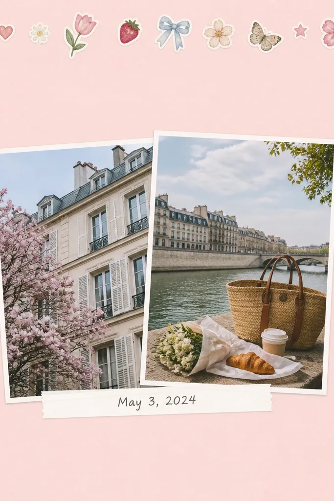
This is the page you make when you want it done in one evening but still want it to look styled. A sticker border gives you instant structure, and the photo strip keeps it from looking like random decor. I keep the sticker border along the top and sides only, so the center stays clean. Use pastel pink, light blue, or mint with black handwriting so it reads clearly. This works for boyfriends who like playful vibes but still want the scrapbook to look organized. The sticker border frames the images without stealing attention from faces.
Start with a pastel cardstock base and apply a sticker border along the top and left/right edges, leaving the bottom clear. Add two photos as a horizontal strip in the center, overlapping by about 1/8 to 1/4 inch. Mount the photos with double-sided tape and keep their heights identical. Place a thin white label strip under the photos and write the date and one caption sentence. Finish by adding one tiny sticker icon in the bottom right corner only.
Editor's noteChoose one sticker theme and stick to it for the whole border; mixed themes look chaotic.
Skip thisDon’t cover the entire page in stickers; it turns into clutter fast.
20. "Things I Remember About You" Page with Callout Tags
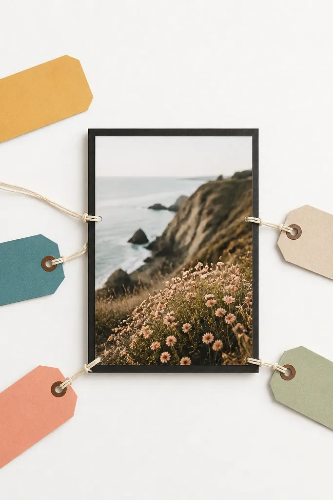
Callout tags make a sentiment page feel specific instead of mushy. I like putting one main photo in the center and then attaching tags around it, each describing a detail — his laugh, how he fixes things, the way he orders food. It reads like a set of little proofs, and that makes it feel real. Use a white background and keep tag colors to three shades so it looks cohesive. This works for boyfriends who appreciate details and who get emotional when they feel seen. The central photo keeps the page from scattering, and the tag style keeps it readable.
Start with a white cardstock base and mount a central 4x6 photo with a dark mat like black or navy. Cut five small tag shapes from colored cardstock, each about 1.5 inches tall. Write one short phrase on each tag using a black pen. Punch a hole at the top of each tag and attach them using thin paper string or yarn, tying the other end behind the photo edge. Arrange the tags so they all point inward toward the photo, then add one small date line at the bottom.
Editor's noteKeep each tag to 3-6 words. If you need more, split across two pages.
Skip thisDon’t use too many tag colors; more than three makes it look like a school poster.
21. Black-and-White Photo Page with One Color Accent
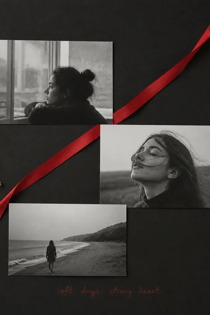
This is my go-to when the photos are mixed quality or when you want the scrapbook to look sharp. Black-and-white photos hide lighting problems, and the single color accent adds emotion without visual chaos. I use charcoal or deep gray so the photos pop, then I add one red element like a ribbon or marker underline. Keep the page minimal: three photos max and one caption. This flatters almost any photo subject because skin tones are in grayscale, and the accent color pulls focus. It’s also great for boyfriends who like “clean” design rather than cute decorations.
Start by converting or printing your chosen photos in black-and-white. Mount the page on deep charcoal cardstock and place three photos in a triangle layout with equal spacing. Add a red ribbon across the page diagonally, tucking the ends behind the photo edges with tape. Write a single short caption in red marker near the bottom. Keep stickers to zero or one tiny icon so the accent ribbon stays the star.
Use matte ribbon; shiny ribbon reflects light and makes photos look washed out.
Don’t add multiple accent colors like red and teal; it breaks the clean look.
22. Scrapbook "Bucket List" Page with Check-Off Spots
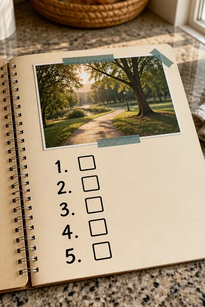
Bucket list pages are future-focused, and they keep the scrapbook from feeling like it’s only about the past. The checkboxes give you a reason to revisit the book later, and it turns the scrapbook into an active thing. I keep the numbers and checkboxes big so it reads from across a room. Use one photo at the top to anchor the theme, like a shot of you holding hands or standing at a landmark. This works for boyfriends who like planning or who get excited about “next.” The cream background makes the ink look clean and masculine.
Start with cream cardstock and write a header at the top in thick black marker. Create a grid with 4 rows and 2 columns for 8 bucket list items, leaving space for checkboxes. Draw a checkbox next to each item using a ruler so they line up. Place a 4x6 photo in the top left corner and trim it so it doesn’t crowd the grid. Tie a small twine loop on the right side and attach it with tape so you can tuck a pen or small note behind it.
Use verbs in the list items: “Try,” “Visit,” “Learn,” “Cook,” so they feel like actions.
Don’t write vague goals like “travel more”; make each one specific.
23. Holiday Ornament Page with Mini Photo Baubles
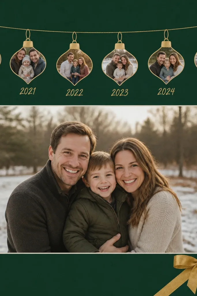
Ornament pages are surprisingly easy and look impressive because the shapes do the work. Mini baubles make it feel themed without turning into a seasonal card. Use deep green or burgundy cardstock, then pick one metal accent like gold. Put tiny photos inside the ornament shapes — even 1x1 inch cropped pics — and write a date or a one-word memory under each. This works for boyfriends who like holidays and also for anyone who loves visual storytelling. The dark background makes the gold accents look crisp and the photos look intentional.
Start with deep green cardstock and draw or trace 6-8 ornament shapes across the top using a template. Cut mini photo squares sized to fit inside each ornament, then glue photos to a slightly larger ornament backing. Add a thin gold ribbon line across the top and tape the ornament tops to it so they look hung. Place a larger 4x6 photo centered below with a small mat. Write holiday dates under each ornament using a fine-tip marker, then add a small gold bow sticker in a corner.
Use a matte gold pen for the ornament hooks; it looks more real than foil stickers.
Don’t add glitter everywhere; it sheds and makes pages look messy.
24. Scrapbook "Bottle Cap" Photo Magnet Page
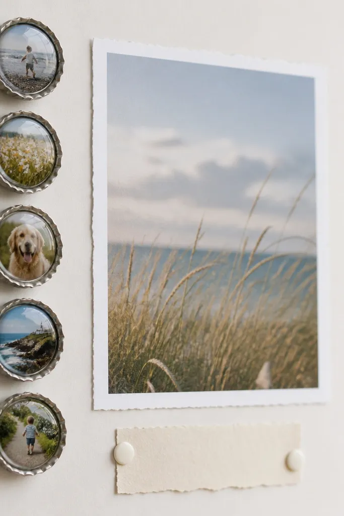
This turns scrapbook content into a usable keepsake. The bottle cap circles look fun and masculine, and the magnet means he can actually use it. I’ve made these with tiny photos from weekends, concerts, and even “us in the car” shots. Keep the photos small but clear, and use a consistent border so they look like a set. This works for boyfriends who like practical gifts and who keep magnets on the fridge. The page design stays clean because the circles line up neatly against a plain background.
Start with a plain cardstock base and decide how many cap circles you want, usually 5-7. Trim tiny photos to fit bottle cap inserts, then attach them to cap rings following the kit instructions you have. Glue the finished cap pieces onto the page in a straight line along one side, leaving equal gaps. If you’re adding magnets, attach a thin magnet circle behind one cap and test it on your fridge before gluing permanently. Add a central 4x6 photo and a caption label at the bottom like “For your fridge.”
Pick photos with strong focus — no blurry faces — because tiny inserts magnify blur.
Don’t place glossy photos on a textured page; glare makes the tiny images hard to see.
25. Layered Corner Frames with Small Quote Tags
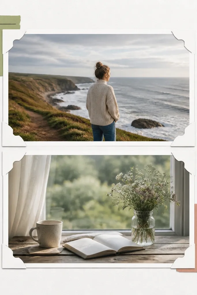
Corner frames give you that “designed” look without covering the entire page with borders. It’s a great choice when you want photos to take the spotlight but still want a crafted feel. I use layered corner cutouts in one color family like navy and light blue so it stays cohesive. Put two photos side-by-side or stacked with a small gap, then tuck small quote tags under the corners pointing to each photo. This works for boyfriends because it feels like a gallery print setup, not a scrapbook collage. The clean frames also help if your photos are different sizes.
Start with a white or off-white page base. Cut two photo mats and mount your photos with a consistent mat border. Create corner frames by cutting small L-shapes from cardstock and layering them at each photo corner, using double-sided tape for the top layer. Make two or four small quote tags from colored cardstock and tuck them under the frame layers so they peek out. Finally, add a thin separator line across the middle if you’re using two photos, and write one caption strip at the bottom.
Editor's noteUse the same corner cut size for both photos so the page looks balanced.
Skip thisDon’t mix too many frame colors; two shades is enough.