
1. Peppermint Stripe Ombre Pillars
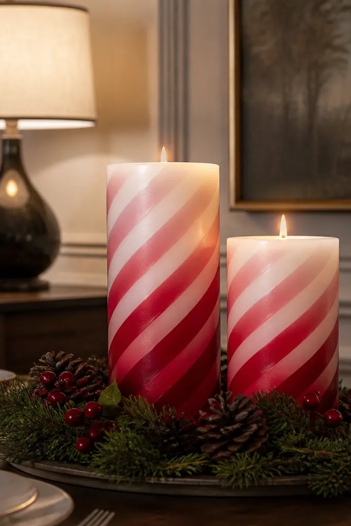
This one makes candles look like candy without turning them into a kid’s craft. The diagonal stripe pattern reads instantly, and the ombre fade keeps it from looking flat or cheap. Paint it so the darkest red sits near the bottom third, then blend upward into blush — the gradient catches light when the candle sits in front of a shelf shadow. It’s great for winter, but swapping red for terracotta makes it work in fall too. Skill level is easy: you’re doing stripes plus a controlled blend, not tiny illustration.
Start by scuffing the candle surface lightly with fine sandpaper, then wipe dust with a dry cloth. Brush on a matte white base coat and let it dry fully. Tape diagonal guides, paint wide red stripes, and blend the edges with a damp makeup sponge while the paint is still workable. Finish with a matte varnish over the stripes once everything is dry.
Use a makeup sponge for the blend — foam brushes leave hard bands.
Don’t paint glossy base coat first; it makes the ombre peel at the edges.
2. Charcoal Monogram Label Candles
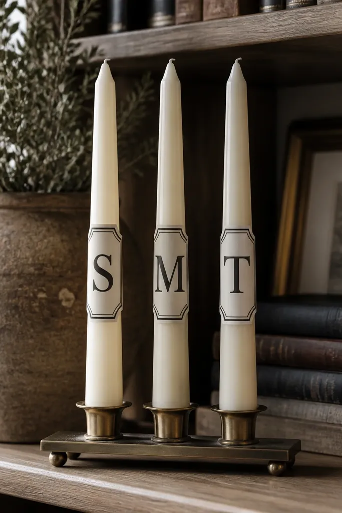
Monograms make decor feel intentional even when you’re using plain candles. The label frame keeps the design clean, and the charcoal ink color gives contrast without screaming “holiday.” This is the best option for a cozy shelf because it looks like curated stationery on wax. It also scales well: one letter per candle, or a full word across several. It takes patience for straight lines, but the result looks sharp year-round.
Choose an ivory pillar or a cream votive and scuff lightly, then wipe clean. Paint a thin rectangular label in warm white or ivory, then outline it in charcoal with a paint marker. Add the monogram in the center using a stencil or letter guide, keeping strokes thick for distance readability. Seal with a clear matte varnish so the charcoal doesn’t smear when you touch the candle.
Print a monogram stencil at 2-3 inches tall and tape it to the candle for clean alignment.
Skip freehand lettering if you want crisp edges; uneven letters make the whole set look messy.
3. Forest Linework Botanical Sprig
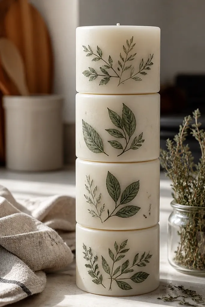
Linework botanical designs look classy and natural, especially when the leaves are simplified into a few clusters. The thin strokes mimic pressed plants, and the limited color palette keeps it from looking busy. This design works year-round because you’re not locked into one season — you can keep it evergreen and still feel fresh. It’s also forgiving: slight imperfections look like intentional sketching. Use it when you want the shelf to feel calm instead of loud.
Scuff and base coat the candle with a matte cream paint. Sketch one sprig placement using a pencil lightly, starting near the upper third. Paint leaves with dark green using a small liner brush, then add thin stems and a few tiny vein lines with a paint marker. Let dry and seal with matte varnish.
Keep leaves to 3 sizes maximum so the sprig reads as one shape from afar.
Don’t add lots of tiny details; tiny veins disappear and make it look smudged.
4. Sunburst Halftone Circle Votives
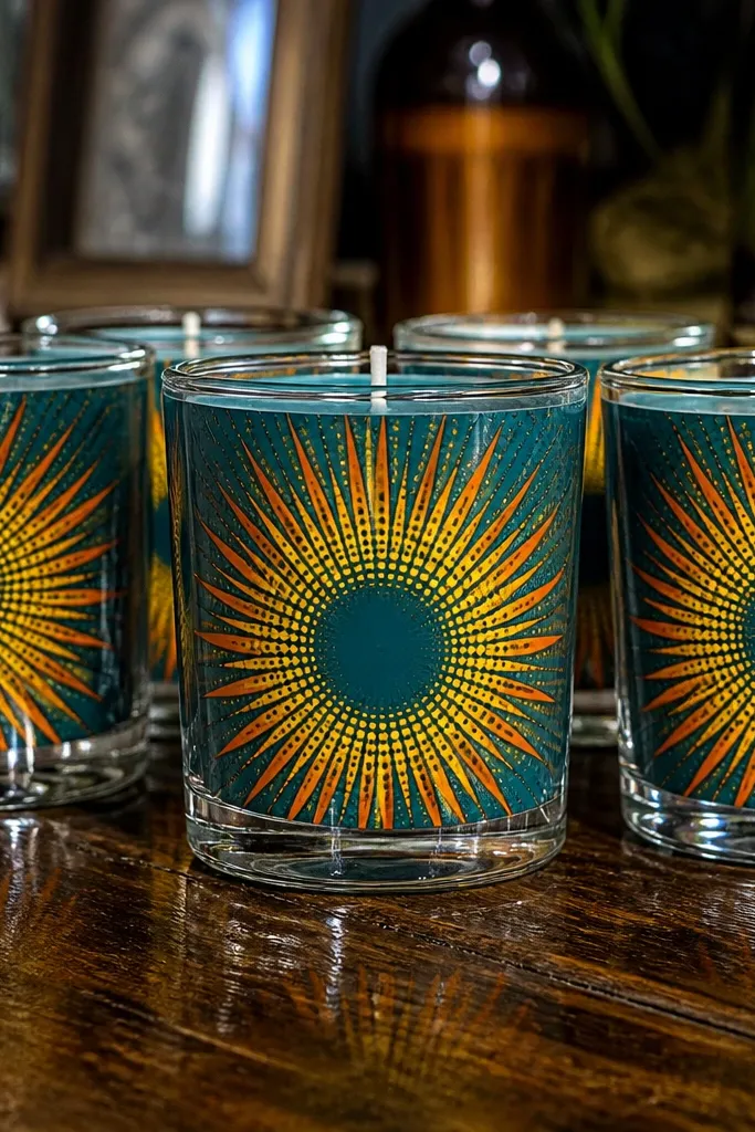
Halftone sunbursts make candles look like retro prints, and glass votives amplify the effect with reflections. The circular center is easy to place, and the rays create a strong silhouette even when the flame is off. Use bright yellow and orange for summer, or swap to gold and bronze for fall. This is one of the most photogenic ideas because the design sits on a curved surface and naturally catches light. Skill level is moderate because you’re dotting, but the pattern is repeatable.
Clean glass votive cups with rubbing alcohol so paint sticks. Paint a flat yellow circle on the side, centered, then add orange rays using a round stencil or a taped guide for consistent spacing. For halftone, use a dotting tool or the tip of a paint marker to place small dots along the ray edges. Let cure fully, then apply a thin clear varnish made for glass surfaces.
Editor's noteUse painter’s tape as a temporary “ray comb” to keep spacing even.
Skip thisDon’t overpaint the dots; heavy paint turns the halftone into blobs.
5. Terracotta Wash + White Tie-Dye Swirls
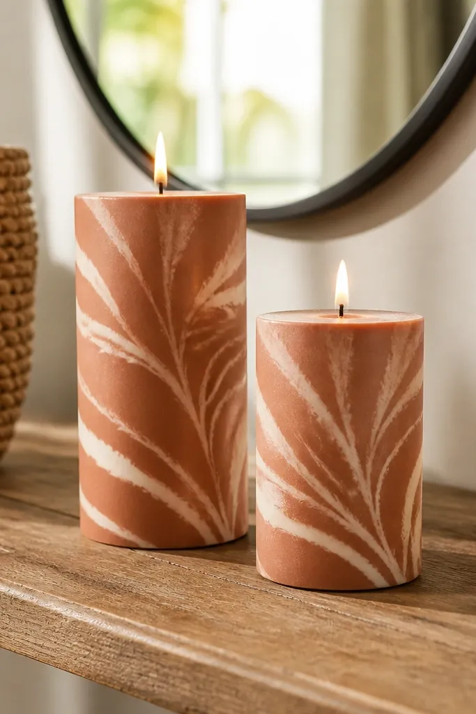
This look gives you that cozy handmade feel without looking messy. The terracotta wash sets warmth, and the white swirls add movement that looks good from multiple angles. It’s perfect for fall and also works in winter if you pair it with cream and dark accents. The “tie-dye” style is forgiving because you’re not chasing perfect symmetry — the randomness reads as texture. It’s a great choice if you want your shelf to feel artsy but still clean.
Scuff and base coat with a terracotta matte paint diluted slightly with water for a wash. While it’s still tacky, dab a sponge with white paint and drag it into swirl arcs. Build a few thicker swirls near the center, then soften edges with a nearly dry sponge. Seal with matte varnish after the surface is completely dry.
Editor's noteDilute terracotta just enough that it stays semi-translucent; that glow is the whole point.
Skip thisDon’t paint swirls on fully cured base — you’ll get hard lines instead of soft texture.
6. Ink Blue Tide Stripes on White Pillars
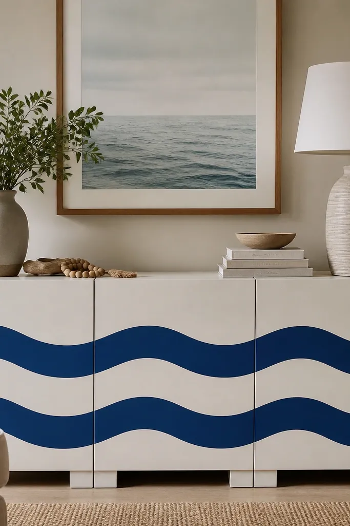
Wavy stripes feel coastal and modern, and they look especially good when stacked because the stripes align across the set. Ink blue on white gives crisp contrast that looks expensive. The wave shapes add softness so the design doesn’t feel like school art. This is a year-round shelf idea because it reads like “calm water,” not a specific holiday. It also takes less effort than detailed painting while still looking designed.
Base coat the candle in matte white and let it dry. Tape a band around the bottom third where the stripes will live. Paint 3-5 ink blue wavy stripes using a thin brush, then remove tape once the paint is set but not fully cured. Add a second thin lighter blue stripe between two dark ones for dimension, then varnish matte.
Editor's noteUse painter’s tape to create a clean boundary; wipe tape edges with a damp cloth before it sets.
Skip thisDon’t make waves too tight; narrow waves smear when the candle curves.
7. Gold Leaf Chevron on Matte Black
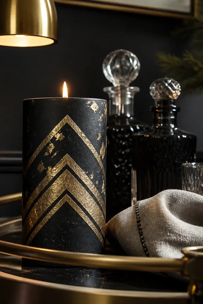
Matte black plus gold leaf looks like high-end bar decor, and it photographs like crazy against light shelves. The chevron pattern gives structure, while gold leaf flecks add that uneven sparkle that looks real. This is your “winter glam” option, but it also works in spring because black is only a base color — the gold is the hero. Skill level is medium because gold leaf placement needs a careful hand. The payoff is that the candles look like they belong in a styled vignette.
Scuff and base coat the candle with matte black acrylic or spray paint made for crafts. Draw chevron lines lightly with pencil so you know where they land. Apply gold leaf adhesive in the chevron areas, then press gold leaf sheets onto the adhesive and burnish gently with a soft tool. Seal with a clear matte top coat that’s compatible with gold leaf so it doesn’t dull too fast.
Save gold leaf scraps and press tiny bits into blank spaces for natural-looking sparkle.
Avoid glossy top coat; it makes black look plastic and kills the luxe contrast.
8. Pastel Checkboard Labels
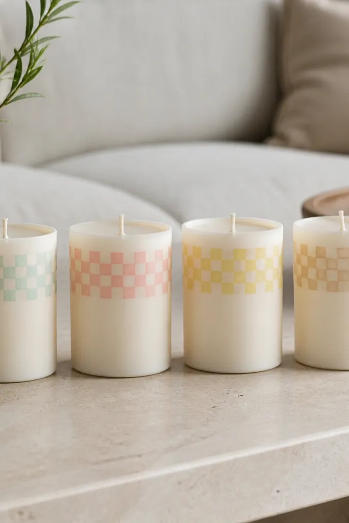
Checkboards look tidy and playful at the same time, which is exactly what a cozy shelf needs. Keep the pattern inside a label so it doesn’t cover the whole candle and overwhelm the set. Pastel mint, pink, and butter yellow give a soft spring vibe without abandoning warmth. This design looks best in groups of 3-5 candles because the colors feel coordinated rather than random. It’s beginner-friendly and very repeatable.
Base coat candles in matte cream and let dry completely. Add a rectangular label using painter’s tape, then paint a light mint base inside the label. Use a ruler to mark square sizes, paint alternating squares in pink and butter yellow, and wait for each color to dry before touching the next. Remove tape carefully and seal with matte varnish.
Use 1/4 inch squares for a checkboard that stays readable from across the room.
Don’t rush color changes; wet layers bleed and blur the squares.
9. Vintage Postcard Mountain Scenes
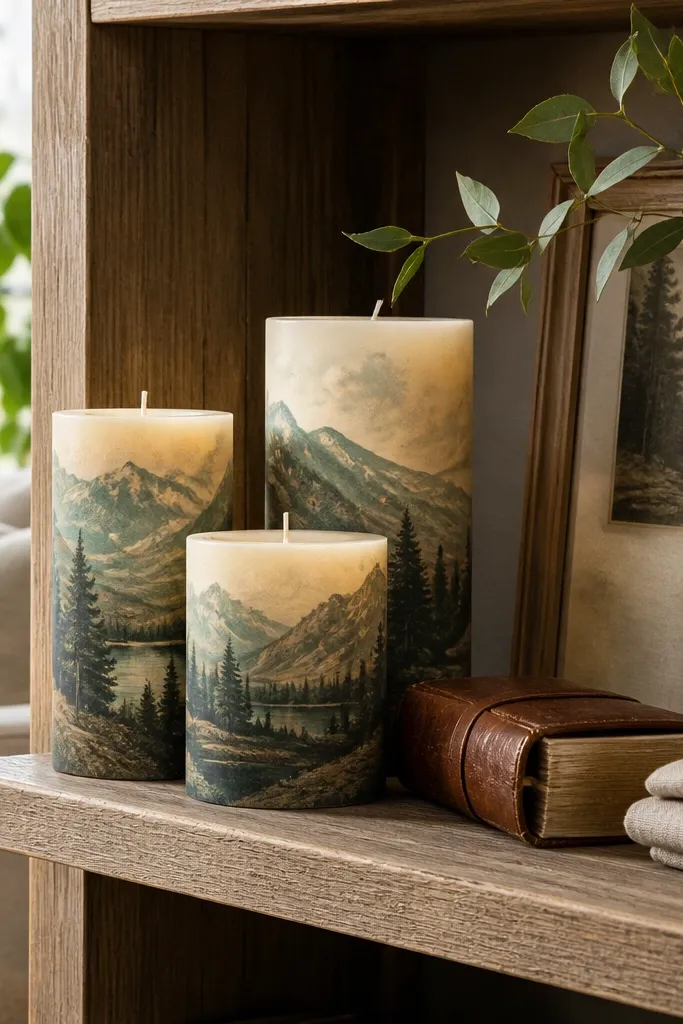
Postcard scenes bring a travel vibe that still feels cozy because the colors are muted. Mountains with a hazy sky look good even when you keep details minimal. This is a strong year-round idea because it’s not tied to Christmas or spring flowers — it’s tied to mood. Use muted teal, warm brown, and a faded sky wash so the candles look like they belong together. The finish reads vintage, which makes shelves look styled instead of random.
Scuff and base coat with a warm off-white. Paint a thin sky wash in faded teal using watered paint, then blend with a damp sponge for haze. Add mountain silhouettes in warm brown with a flat brush, then add a lighter layer behind them to create depth. Finish with a simple “postcard” border line and seal with matte varnish.
Blend sky edges with a sponge while paint is still wet; that haze is the look.
Skip bright neon colors; vintage candles need muted tones to look intentional.
10. Cinnamon Stick Pattern Wrap on Pillars
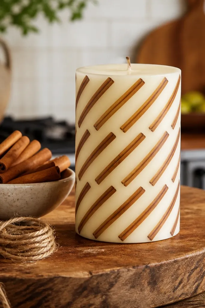
This is a cozy design that reads like a spice store without painting fruit or holiday icons. Repeating diagonal stick lines create movement, and the warm brown tones pair with almost any shelf decor. It’s also easy to scale across multiple candles — just match spacing. The pattern is photogenic because it forms a consistent rhythm around the candle. Skill level is easy, and the results look clean if you keep line thickness consistent.
Base coat with matte ivory and let dry. Mark three diagonal “track” lines lightly with pencil around the candle and use painter’s tape to guide your first row. Paint thin cinnamon-brown lines, then remove tape and keep line spacing consistent for the next row. Add a second color line in lighter tan for contrast, then seal with matte varnish.
Use a fine liner brush and load paint lightly; thick paint looks uneven on wax.
Don’t freehand every line; pencil guide tracks keep the pattern crisp.
11. Chalkboard Style Seasonal Icons
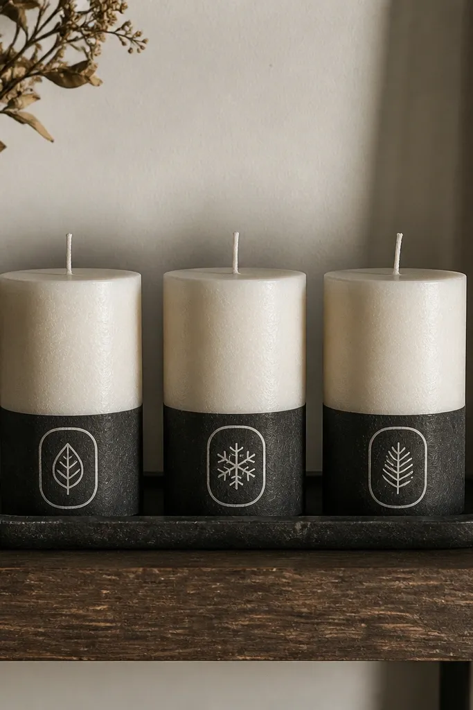
Chalkboard style looks cozy because it mimics hand-written notes. Use a dark gray base, then paint icons in off-white so they look like chalk. You can rotate icons by season across your shelf — leaf for spring, snowflake for winter, star for fall — without changing the whole candle design. It also photographs well because the contrast is strong. This is a great option if you like variety but hate mismatched decor.
Scuff candle surface and paint a matte dark gray base coat. Once dry, sketch one icon placement per candle: a leaf, a snowflake, or a star. Use a white paint marker or very thin brush to create chalky strokes, leaving tiny gaps for texture. Seal with a matte varnish that won’t turn the off-white gray.
Add small “chalk smudges” by tapping a dry brush with off-white near icon edges.
Avoid glossy varnish; it removes the chalk look and reflects harshly.
12. Rose Quartz Pink Marble Swirls
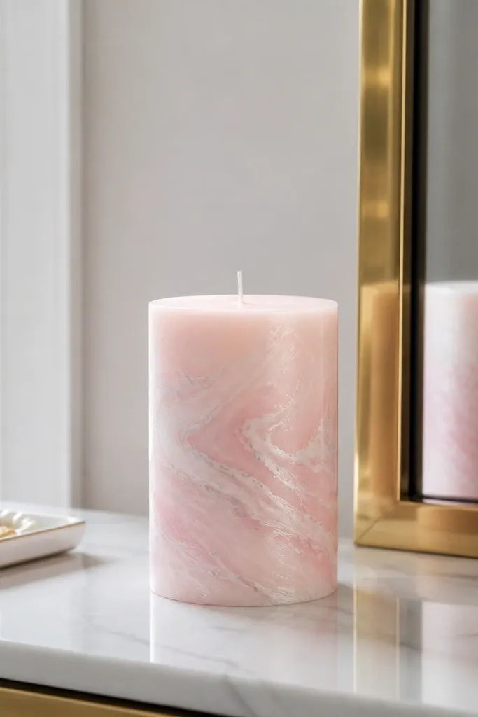
Marble swirls look luxurious even on a plain pillar, and pink marble is cozy without being overly sweet. The key is controlled veining: thin gray lines make it feel like stone, while white swirls add softness. This is a year-round shelf idea because it reads like decor texture, not a season. It also pairs well with gold accents and neutral wood shelves. Skill level is medium because you’re layering marbling lines, but you’re not drawing realism — you’re painting the illusion.
Base coat the candle in pale pink matte paint and let it dry. Add white swirls by dragging a loaded brush lightly, then wipe the brush often so swirls stay thin. Paint thin gray veining lines and connect them with a few short arcs for a natural pattern. Seal with matte varnish, and avoid thick layers that crack.
Editor's noteWork in small sections; marbling looks best when you keep paint wet and flowing.
Skip thisDon’t overwork the swirls; too many passes makes it look muddy.
13. Modern Terrazzo Speckle Bottom Half
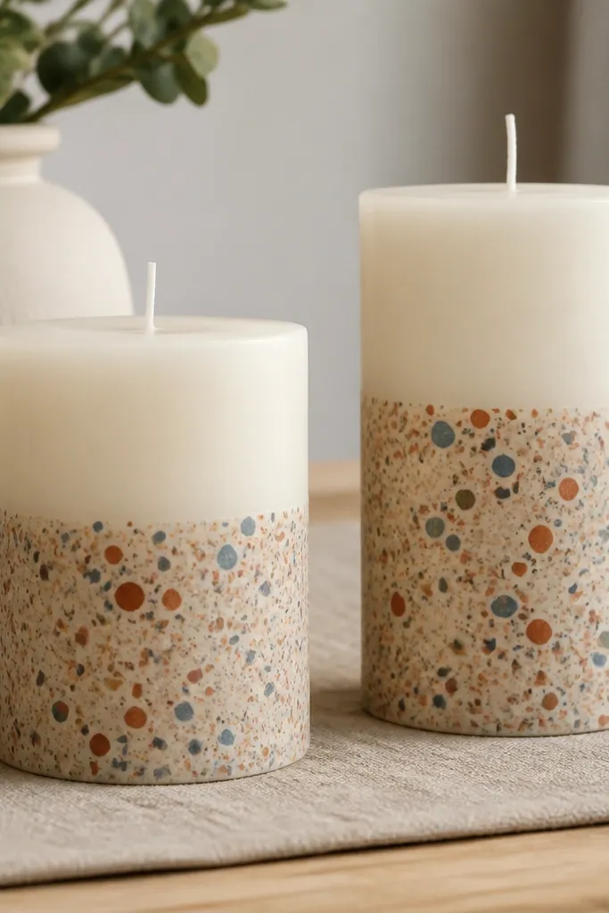
Terrazzo speckle is the easiest way to make candles look designer. The pattern hides minor imperfections, and the speckles create texture that shows up in photos even without close detail. Concentrate speckles on the bottom half so the top stays clean and shelf-friendly. Use muted colors like dusty blue, terracotta, and soft mustard to keep it cozy rather than playful. This design works across seasons because the colors are subtle.
Scuff and base coat in matte cream. Tape off the top third so paint stays clean. Mix acrylic paint into a thick-ish consistency, then flick speckles with a stiff toothbrush toward the taped area edge. Remove tape once the paint is tacky, then add a final thin cream mist to soften edges. Seal with matte varnish.
Practice flicking on paper first; you want medium speck size, not tiny dust dots.
Don’t spray; spray speckles look too uniform and lose the terrazzo feel.
14. Monochrome Grid + Tiny Stars
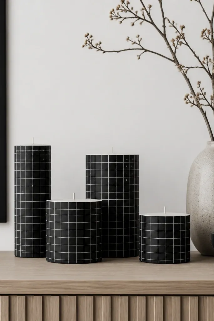
A monochrome grid looks modern and calm, and tiny star dots add just enough whimsy. The grid gives structure so the candle set looks coordinated, while the stars keep each candle from feeling identical. Use black and off-white for a year-round look that works with any shelf style. This is also great when you want a “no holiday icons” option because stars don’t scream one season. It’s beginner-friendly and looks crisp in photos.
Base coat candles in off-white matte paint. Use a ruler to draw a grid with a thin black paint marker, leaving margins so it looks framed. Add 3-5 tiny star dots using a dotting tool or marker tip; keep them in one corner or along a vertical line for balance. Seal with matte varnish after the ink dries.
Editor's noteMake the grid lines thicker than you think; thin lines vanish at shelf distance.
Skip thisAvoid smudging marker lines with your finger; use a clean cotton swab if you mess up.
15. Sage Green Wash With White Dried Florals
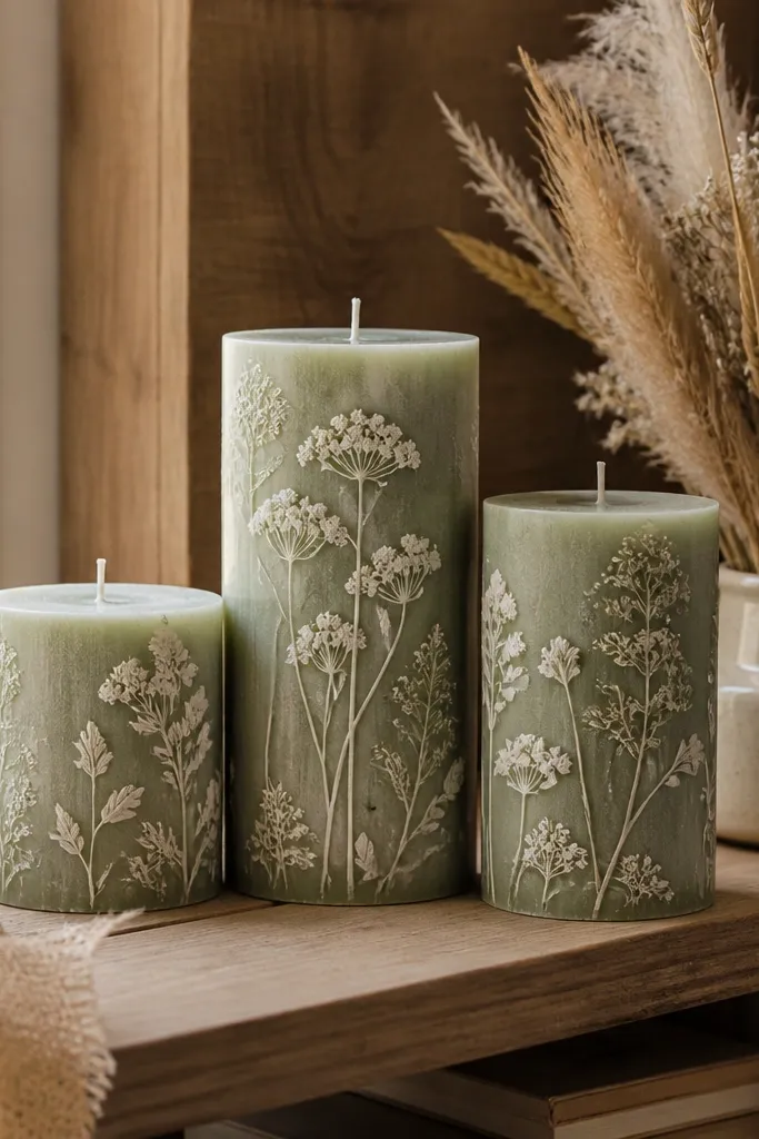
This looks like pressed florals on wax, and the sage base keeps it soft and calming. White florals create a high-contrast silhouette that reads even when the candle is unlit. It’s a strong spring and summer option, but it also works in fall if you pair it with warm neutrals. The design is photogenic because it creates texture without bold colors. It’s not hard either: you’re painting shapes, not realistic petals.
Scuff and paint the candle with a sage green matte wash. Use a light pencil to mark where the bouquet sits near the upper third. Paint simplified dried flower shapes in off-white: a few petals, small bud dots, and thin stems. Add one faint gray shadow line under the bouquet to create depth, then seal with matte varnish.
Editor's noteUse a small round brush and keep petals slightly uneven; dried florals look better imperfect.
Skip thisDon’t use bright pure white; it can look harsh against sage — go for off-white.
16. Seasonal Calendar Numbers on Pillars
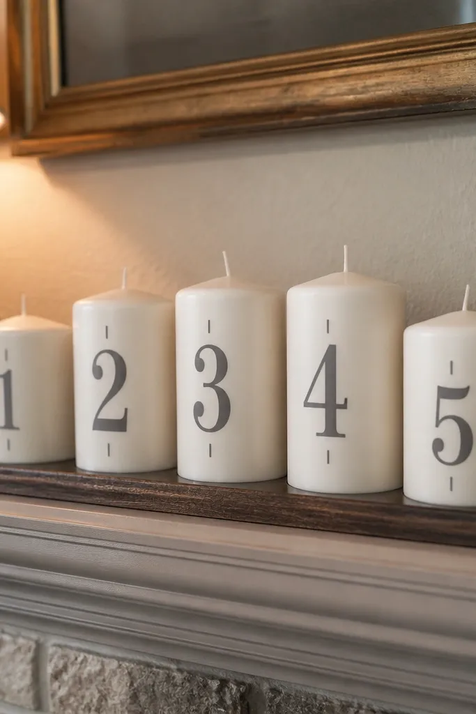
Large numbers make candles feel like part of a styled calendar display. This design is year-round because you can rotate which numbers are visible: 1-31, month numbers, or even a set of date tiles across candles. Use gray so it looks like typography, not graffiti. The tick marks give structure and help the candle look designed rather than random text. It’s a great shelf idea when you want a graphic look that still feels cozy.
Base coat in matte cream. Pick a number size that fits: about 3-4 inches tall on pillars. Use a stencil or print a number template, then trace lightly and paint with a gray paint marker. Add small tick marks or tiny dots around the number for a calendar feel, then seal with matte varnish.
Editor's noteStencil the number twice: first lightly, then go over with paint for solid coverage.
Skip thisAvoid cursive fonts; they smear and lose clarity on wax.
17. Citrus Peel Rinds and Segments
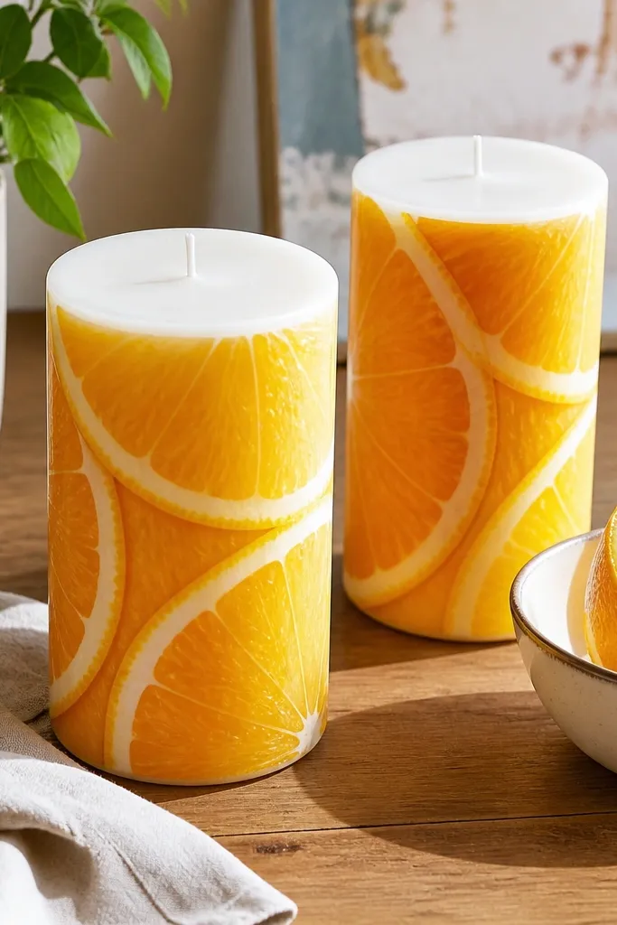
Citrus segments are bright, cozy, and very photogenic because they create a curved pattern that wraps the candle. The look works in summer but it also makes winter shelves feel less heavy. Paint thin rind lines between segments so the candle reads like real peel. Use a limited color set: sunny yellow, orange, and a small touch of green for the rind. This design adds energy without turning into a loud cartoon.
Scuff and base coat with matte yellow. Sketch 6-8 curved segments around the candle, starting near the top third and widening slightly as you go down. Paint orange segments, then outline each segment with a thin darker orange or brown rind line. Add a small green rind accent at the top edge, then seal with matte varnish.
Editor's noteOutline segments after filling them; it keeps lines cleaner and prevents gaps.
Skip thisDon’t blend orange too much; crisp segment boundaries make it look like citrus.
18. Holiday-Ready But Minimal Snow Drift Bands
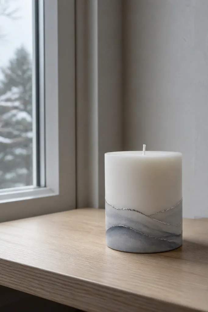
Snow drift bands make a candle feel winter-ready without using snowflakes or heavy holiday graphics. The design is minimal, so it doesn’t fight with other decor on the shelf. Soft gray drifts and a faint silver edge create a gentle winter glow in photos. This works year-round because the look is “weather” texture, not a specific holiday. Skill level is easy: it’s blending bands, not drawing detailed scenes.
Base coat with matte white. Tape a band across the midsection and paint a soft gray band, then remove tape. Blend the top and bottom edges with a damp sponge so it looks like snow piling. Add a thin silver line along the highest edge of one drift using a paint marker, then seal with matte varnish.
Use a damp sponge for blending; it keeps drifts soft instead of streaky.
Skip glittery paint; it looks messy on wax and catches dust.
19. Brown Leather Wrap Faux Stitching
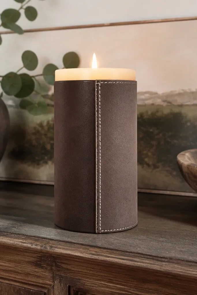
Faux leather stitching makes candles look like they belong in a farmhouse-modern space. The wrap panel gives dimension, and the stitch lines add realism without needing actual leather. Use smoky brown, then paint a slightly lighter brown panel on one side to mimic folds. White stitches keep it readable and crisp in photos. This is a year-round cozy idea because it looks like texture. It also pairs with wood, metal, and neutral textiles.
Scuff and base coat the candle with matte smoky brown. Paint a vertical panel about 1/3 of the candle width, slightly lighter brown, starting near the top third. Outline the panel edges with a darker brown line so the fold reads, then add faux stitching with a thin white paint marker — small repeating dots or short dashes. Seal with matte varnish.
Keep stitch spacing consistent; 8-10 stitches per inch looks realistic on candle scale.
Don’t use bright white; use warm off-white so it reads like thread.
20. Rosemary Sprig With Tiny Seed Dot Accents
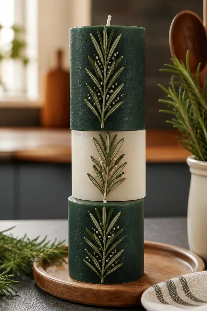
This is a clean herb look that screams kitchen-cozy. A vertical rosemary sprig creates a tall silhouette that looks great on shelf stacks. Tiny seed dot accents make it feel detailed without clutter. Use deep green and off-white so it stays photogenic and not muddy. This idea also works for gifting because it looks thoughtful even when you keep it simple. Skill level is easy for the sprig and medium for the dots.
Scuff and base coat with matte cream. Sketch a rosemary sprig down the center using pencil, with small branching points. Paint the sprig in deep green with a small liner brush, then add tiny seed dots in off-white at select leaves. Add one thin shadow line beside the sprig to give depth, then seal with matte varnish.
Editor's noteUse the tip of a paint marker for dots; it keeps them uniform.
Skip thisDon’t place dots randomly everywhere; cluster them so the eye reads a pattern.
21. Pastel Watercolor Wash With Soft Edges
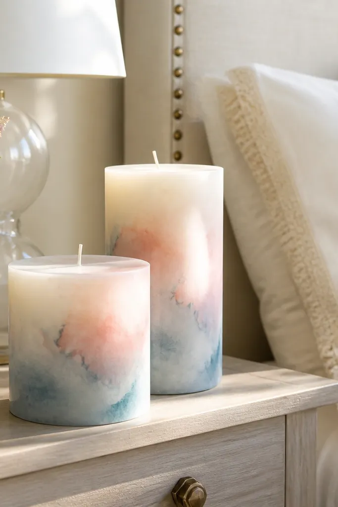
Watercolor washes look airy and cozy at the same time, and they photograph well because the edges are soft and natural. The key is controlling the gradient so it looks like dye, not streaks. Pastels keep it year-round, especially when you keep the palette to 2-3 colors. This is a great “filler” candle design when you want variety but still want the shelf to look cohesive. It’s beginner-friendly if you use a sponge and keep layers thin.
Scuff and base coat with a very light cream. Mix watercolor-style acrylic by thinning paint with water until it looks like tinted milk. Sponge-paint pink at the lower third, then dab peach in the middle, and lavender at the top, blending where colors meet. Let dry between layers, then seal with matte varnish to lock in soft edges.
Thin paint more than you think; thick paint kills the watercolor look.
Don’t over-blend; too much rubbing makes gray smudges.
22. Gold-Tip Candle Caps With Matte Color Bodies
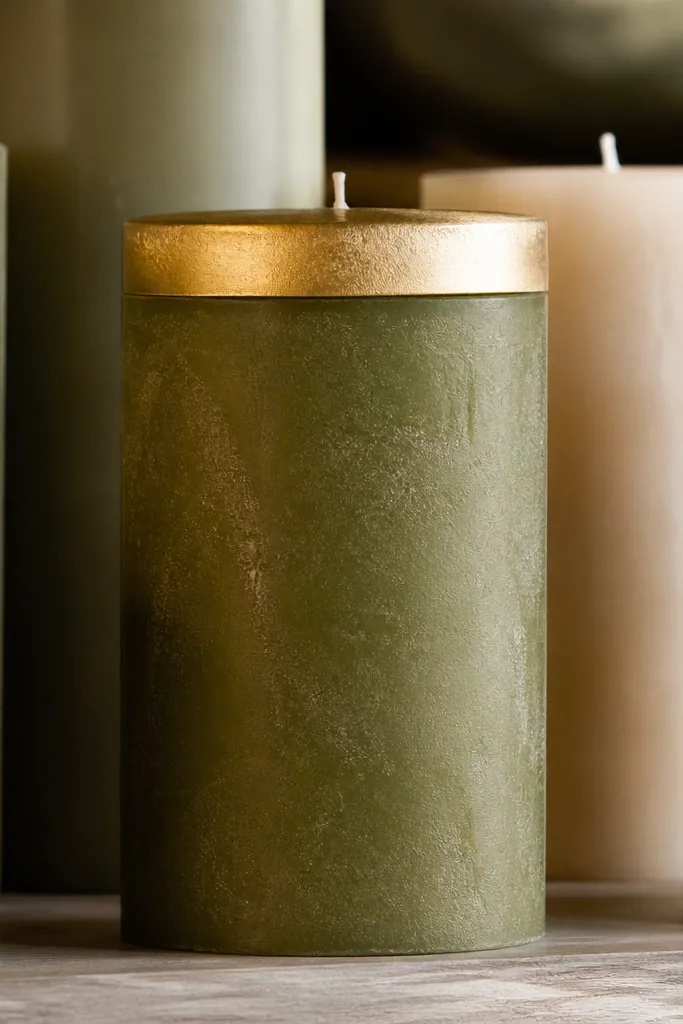
Gold-tipped caps are the easiest way to make plain candles look styled. Keep the gold band thin and straight so it reads like a premium finish, not a craft accident. Pair any color body with gold for year-round flexibility: dusty blue in winter, sage green in spring, terracotta in fall. This design looks especially good when you line up multiple candles on a tray or shelf. It’s fast, clean, and very photogenic because the gold catches highlights.
Scuff and paint the candle body in matte color, then let dry. Mask the top edge with painter’s tape so you get a clean band width (about 1/4 inch). Apply gold metallic acrylic or gold leaf adhesive for a sharp line, then remove tape while paint is slightly tacky. Once dry, seal with a matte clear coat over the body — keep the gold band uncoated if the varnish dulls metallic.
Editor's noteIf gold looks streaky, apply two thin coats instead of one thick one.
Skip thisDon’t use broad brush strokes across wax; it leaves ridges that show in photos.
23. Waffle Knit Texture Pattern in Beige and Umber
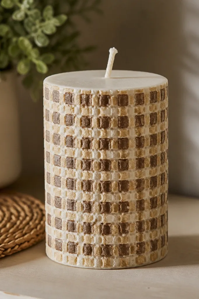
Texture is the secret to making painted candles look expensive. A waffle knit pattern gives a tactile vibe even though it’s paint, and the grid creates a strong visual rhythm. Beige and umber looks cozy and neutral, so it works for any season. This one is great for shelves because it adds “fabric” energy — your decor starts to feel soft and warm. Skill level is medium because you’re painting a repeating pattern, but it’s systematic. The result reads well in close and medium shots.
Base coat the candle in matte beige and let dry. Use a ruler to mark a grid on the surface with pencil, then paint darker umber lines to form square outlines. Create the waffle effect by adding diagonal cross-lines inside each square using a small brush or paint marker. Add tiny highlights by dragging a nearly dry lighter beige brush across the line edges, then seal with matte varnish.
Editor's noteTest line spacing on paper first; candle curvature makes squares look slightly stretched.
Skip thisDon’t make the grid too dense; wide squares read better on candle scale.
24. Layered Paper-Cut Snowflakes on Clear Glass

Layered paper-cut snowflakes on clear glass look crisp and dimensional without using actual paper. The paint layers create shadow depth, so the snowflake looks like it’s floating. This is a strong winter shelf idea that still feels clean because the design is white-on-clear. It’s also surprisingly quick if you use a stencil and repeat the same shape with slightly offset layers. Skill level is easy to medium because you’re repeating a template, not free-drawing.
Clean clear glass votives with rubbing alcohol and let dry. Tape a stencil on the outside of the glass and paint the first snowflake layer in opaque white. Once dry, reposition the stencil slightly offset and paint a second layer in thicker white or light gray. Add a third micro-layer by dabbing small dots at the snowflake arms for a cut-paper feel, then seal with a glass-safe top coat.
Editor's noteOffset layers by 1-2 millimeters so the shadow effect is visible in photos.
Skip thisDon’t use translucent paint for layers; you need opacity to get that stacked look.
25. Candle Painting State-Map Contour Lines
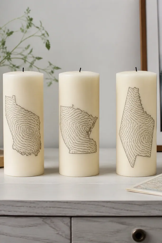
Map contour lines make candles look graphic and grown-up. Use one recognizable outline shape and then add contour lines that wrap inside it. The result looks like modern prints, which makes the candles feel like decor instead of craft. Keep the palette to cream and gray so it stays calm and year-round. This is the best pick if you like typography and lines but don’t want holiday imagery. It’s medium skill because the outline needs accuracy, but stencils make it doable.
Pick a map outline stencil or print a simplified shape and transfer it to the candle with pencil. Base coat the candle in matte cream and let dry. Trace the outline in medium gray, then add contour lines inside with a fine liner brush. Keep contour lines evenly spaced so it reads as topography, then seal with matte varnish.
Use masking tape to hold the stencil edges so the outline doesn’t shift on the curved wax.
Don’t add too many contour lines; 6-10 lines looks clean and photo-friendly.



