
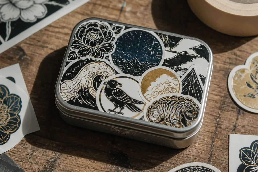
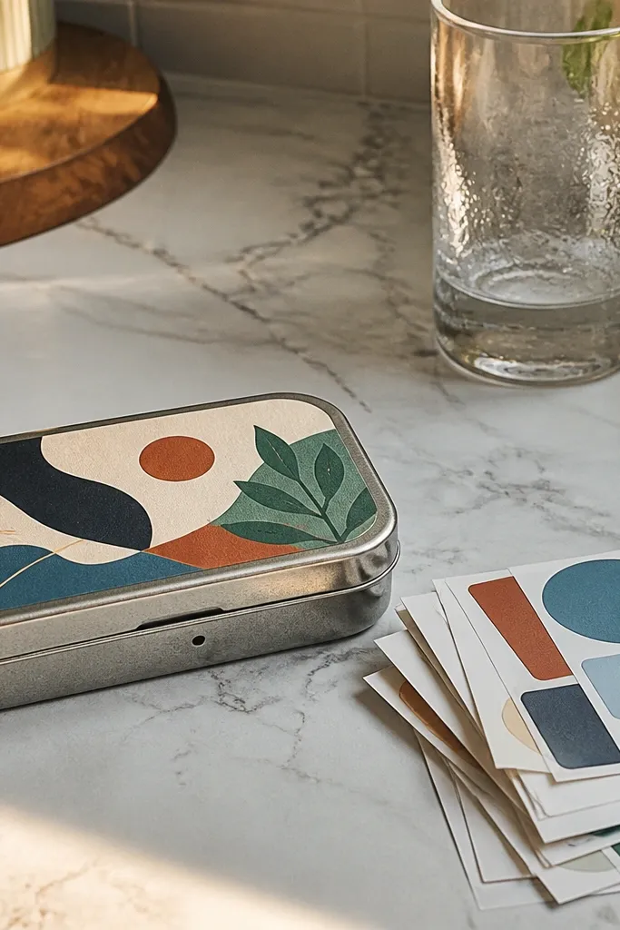
1. Black-and-cream stripe frame with tiny starburst center
This one looks sharp because the frame gives you instant structure. Black-and-cream stripes also stay readable even when the wallet sits in a messy bag. Put a tiny starburst or spark icon in the center and you get a “designed” look without tiny details all over the place. It works in every season because the palette is neutral and the starburst reads festive without being holiday-specific. Build it with a clean border so the metal underneath never shows through at the edges.
Cut a strip pattern first: make a rectangle about 2.3 x 3.3 inches for the front, then add a 1/8-inch border margin. Print or hand-paint thick stripes (about 1/4-inch wide) in cream on matte black paper or vinyl, then seal the whole base with clear matte medium. Add a small starburst center using 1-2 colors, then topcoat again. Finally, trim to the wallet’s exact front shape and apply with a thin roller so the sticker lies flat with no bubbles.
Editor's noteUse matte topcoat, not glossy — shiny stickers look cheap on metal because they show every fingerprint.
Skip thisDon’t print ultra-thin stripes; they blur at the edges after cutting and handling.
2. Pastel spring florals in a rounded window cutout
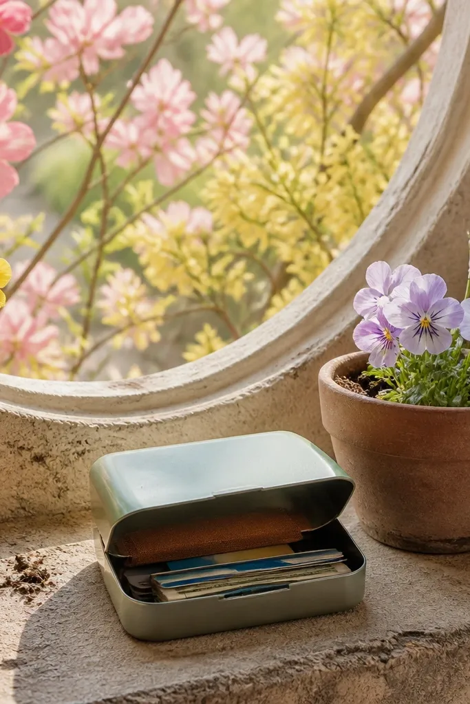
Spring florals look better when they’re framed like a window, not scattered across the whole front. The rounded cutout keeps the design soft and modern, and it makes the sticker feel like it belongs on a small object. Pick two pastel tones plus one cream background so the flowers don’t turn muddy. This is a clean year-round option too, because the same layout works in summer with brighter flowers and in fall with dried-rose tones. The goal is a sticker that looks calm and intentional in daylight.
Make a rounded-rectangle template that matches your wallet front, then cut a window opening so the border stays thick (about 1/4-inch). Print or cut your floral pieces in two pastels and one cream, then place them behind the window border. Seal the floral layer with a thin coat of clear acrylic medium so paper doesn’t warp. Apply the border layer first, then align the floral window inside and press down with a flat tool.
Editor's noteIf your flowers are printed, spray a light tack coat before sealing to reduce wrinkling.
Skip thisAvoid full-bleed floral backgrounds; small miscuts make them look messy fast.
3. Navy nautical compass with cream micro-grid
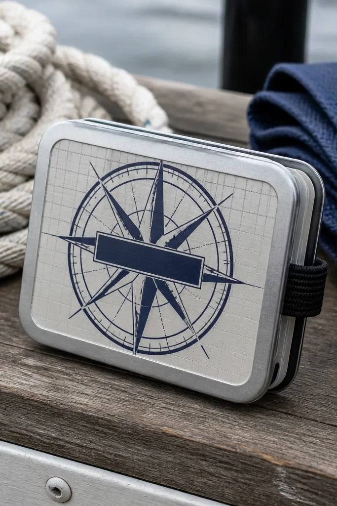
A compass design is one of the rare sticker themes that stays cool across seasons. Navy-and-cream reads crisp, and the micro-grid texture adds depth without clutter. Keep the compass lines thick and the center text minimal, so it stays readable on metal. This is also a great choice if you like “decorative but not cute.” The design looks best when the compass is centered and the grid is faint enough that it doesn’t compete with the icon.
Create a background layer: a cream rectangle with a subtle grid pattern at about 1/8-inch spacing. Add a navy compass circle on top, keeping line thickness around 3-4 mm. Print on sticker vinyl if possible; if using paper, seal the grid and compass separately before layering. Trim the final shape with a smooth rounded-corner rectangle, then apply with a firm press from the center outward.
Use a craft knife with a fresh blade for clean compass edges — dull blades drag and ruin the circle.
Don’t use tiny compass ticks; they disappear once the sticker is curved onto the wallet.
4. Monochrome mountain peaks with fog gradient band
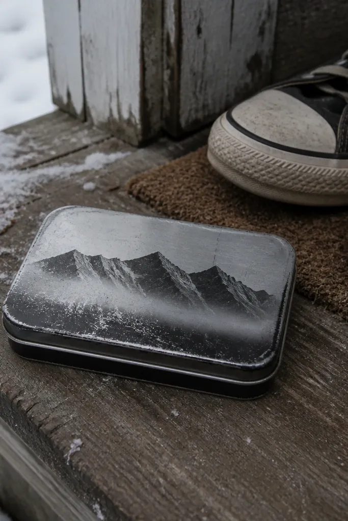
Mountains look good on an Altoids Wallet when you keep them monochrome and add one fog band. The fog gradient creates that “distance” effect, and it hides minor alignment issues because the gradient softens edges. This style also works in winter (snowy whites), fall (gray-browns), and spring (cool blues) by swapping one color — the mountain shade — while keeping the layout. It’s a strong aesthetic because it feels calm and graphic, not busy. Use it if you want something that looks good even when you’re not in a holiday mood.
Pick a palette: charcoal mountains plus a cool gray fog band. Make a simple three-peak graphic with thick silhouettes, then place a translucent fog strip across the lower third. Print on matte vinyl for best durability, or print on paper and seal twice with clear matte medium. Trim to a rectangle with rounded corners, then cut a tiny notch or half-circle at the top edge if you want a “sticker label” look.
Keep the gradient band at least 3/8-inch tall so it doesn’t look like a smudge.
Don’t add multiple tiny trees or snowflakes; they turn into noise at this size.
5. Citrus slices in a stacked row with a white border
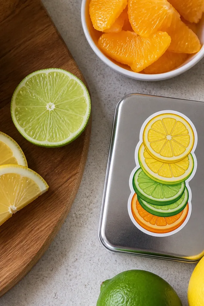
Citrus slices scream summer, but the trick is the layout. A stacked row with a white border makes it look like a modern label, not a random fruit collage. Choose two citrus colors (like lemon and lime) plus a third accent (orange or grapefruit). The white border makes the colors pop against the metal and prevents the sticker from looking “floating.” This design holds up because the shapes are bold and spaced, so handling doesn’t crush details.
Draw a long rectangle front graphic area about 2.3 x 3.3 inches. Add a 1/8-inch white border, then place 3-4 citrus slice icons in a vertical stack, leaving equal spacing between them. Print on thick vinyl or seal paper with two coats. After it dries, trim carefully and press the sticker onto the wallet front starting at the center, then smoothing outward.
Editor's noteUse a white gel pen to add tiny highlight arcs over the sealed sticker if you want extra shine without gloss.
Skip thisAvoid thin outlines on the fruit — they crack or fade first around the edges.
6. Halloween candy wrapper style with candy stripe corners

This design looks like it came from an actual candy wrapper, which is why it photographs well. Keep the main area simple and put the “spooky” cue into one small icon like a bat, ghost, or pumpkin silhouette. The striped corners give you instant texture and make the sticker look dimensional. It’s also easy to swap: change the icon for different years while keeping the wrapper layout. The colors should be high contrast — black, orange, cream — so it reads even under low light.
Create a base rectangle and add diagonal stripes in the four corners, each corner about 1/3 of the sticker area. Center a single icon at about 1 inch wide, using solid fills. Print on vinyl if you can; if using paper, seal the whole sticker with clear medium and let it cure overnight. Trim, then apply with a flat press, especially on the corner stripes where edges lift first.
Editor's noteIf you’re cutting by hand, freeze the paper for 10 minutes before trimming — it stiffens and cuts cleaner.
Skip thisDon’t scatter multiple Halloween icons; it turns into a sticker collage that looks messy.
7. Winter cabin sign typography with faux wood grain fill
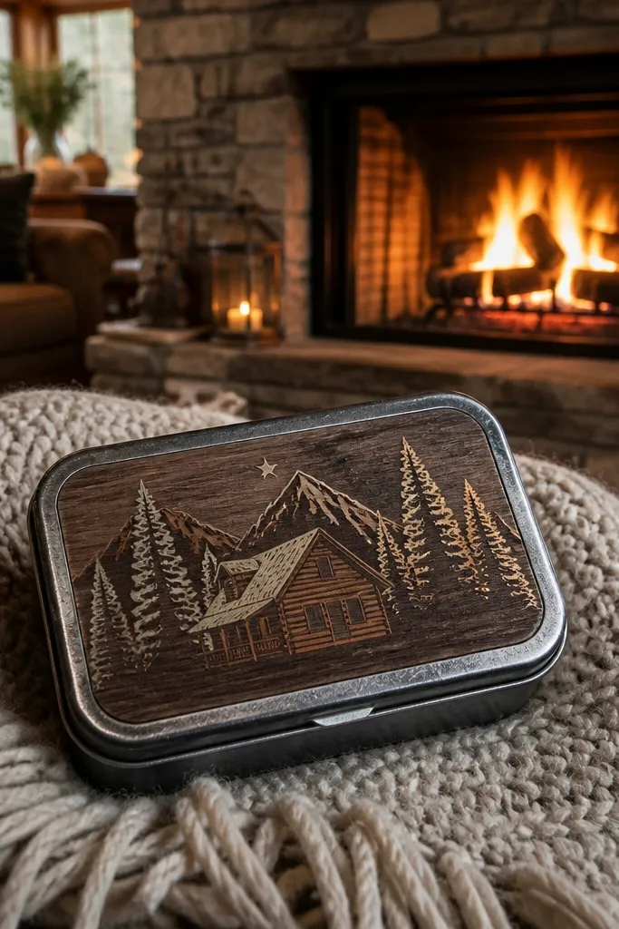
A cabin sign style sticker looks good because typography carries the design. Use big block letters and fill them with a simple wood grain pattern so it still looks warm even on a dark winter palette. Add one small star or snowflake as a side accent — keep it tiny and consistent. This is year-round because the layout is the same each time; you can swap the text and the grain tone for other seasons. It also feels “craft-made,” which is the whole point for a DIY wallet.
Make a wood-grain background: use a light tan base and add thin wavy lines in a darker brown, then blur slightly so it reads as grain. Add one line of big block text centered, about 1.5 inches wide, with thick strokes. Print on vinyl or seal paper well, then topcoat with matte medium. Trim to a rounded rectangle and apply, pressing hardest around the letter edges.
Editor's noteChoose block letters with squared corners; rounded scripts get fuzzy after cutting.
Skip thisAvoid very light wood grain; it disappears when the sticker is on dark metal.
8. Monogram crest with double border and tiny dots
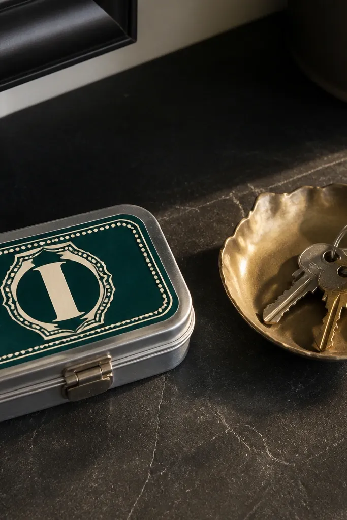
A crest-style monogram looks classy without being fancy. The double border makes it feel like a label, and the tiny dot accents add a crisp finish. This design is great for year-round use because you’re not tied to season imagery — your monogram stays the same. Pick one bold initial in a contrasting color, and keep the crest shape consistent. It also photographs well because crests have strong symmetry.
Draw a shield or oval crest outline with a double border: an outer line and an inner line separated by about 1/8-inch. Place a single monogram letter in the center using thick strokes. Add 6-10 dots arranged in a ring or along the inside border. Print on vinyl, trim, and apply with clean alignment — start at the center of the crest and press outward to prevent wrinkles.
Editor's noteUse a white or cream vinyl base so the letter reads clearly on any wallet color.
Skip thisDon’t use thin decorative filigree; it breaks up and looks like noise.
9. Summer neon waves with black "night" background
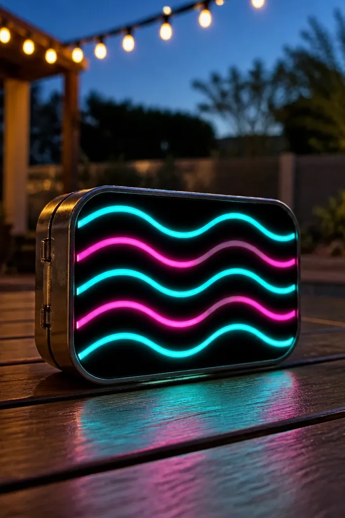
Neon waves look bold on a small wallet because the lines are already graphic. Put them on a black background so the colors pop like a mini sign. Keep the wave lines thick and spaced; if you cram too many lines, it turns into a blur. This design is year-round because you can swap neon colors by season: turquoise and pink for summer, gold and orange for fall, icy blue for winter. It’s the most “aesthetic” option if you like that nightlife poster vibe.
Create a black rectangle base, then draw 3-5 wave lines across it. Use neon-like colors (hot pink, electric blue, lime green) but keep each line a solid fill or thick stroke. Print on matte vinyl so it doesn’t look plasticky and glossy. Trim and apply, then add a thin clear matte topcoat if you’re using paper so it resists scuffs.
Editor's noteIf you see glare on glossy vinyl, switch to matte vinyl or add matte topcoat after cutting.
Skip thisDon’t use very thin neon lines; they disappear when the sticker flexes.
10. Autumn dried leaves with torn-paper edge frame
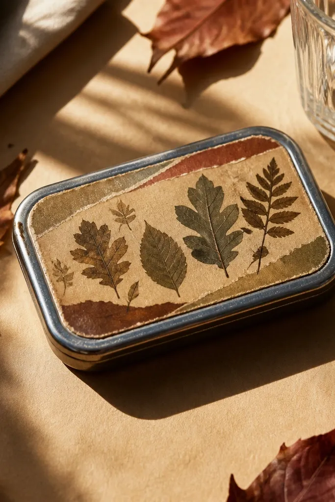
A torn-paper edge frame makes this leaf theme look handmade instead of printed. The leaves themselves can be simple silhouettes, but the torn edge adds texture that reads instantly. Use warm tones like burnt orange, olive, and faded tan so it matches fall without turning into a Halloween costume. This stays year-round as a “warm neutral” design if you keep the background cream and avoid dark reds. It’s also forgiving if your cut isn’t perfect because torn edges hide tiny mistakes.
Make a cream base and add a torn-paper frame about 1/4-inch wide. Tear small paper strips for the edge effect, then glue them down lightly so you get real uneven texture. Add 3-5 dried leaf silhouettes in layered colors, then seal the whole thing with matte medium. Trim to the wallet front and apply, pressing the frame edges down firmly to stop lifting.
Editor's noteUse a foam brush for topcoat so you don’t flatten the torn texture.
Skip thisDon’t use glossy glue on the torn edges; it soaks in and makes shiny spots.
11. Spring pastel checkerboard with one floral patch
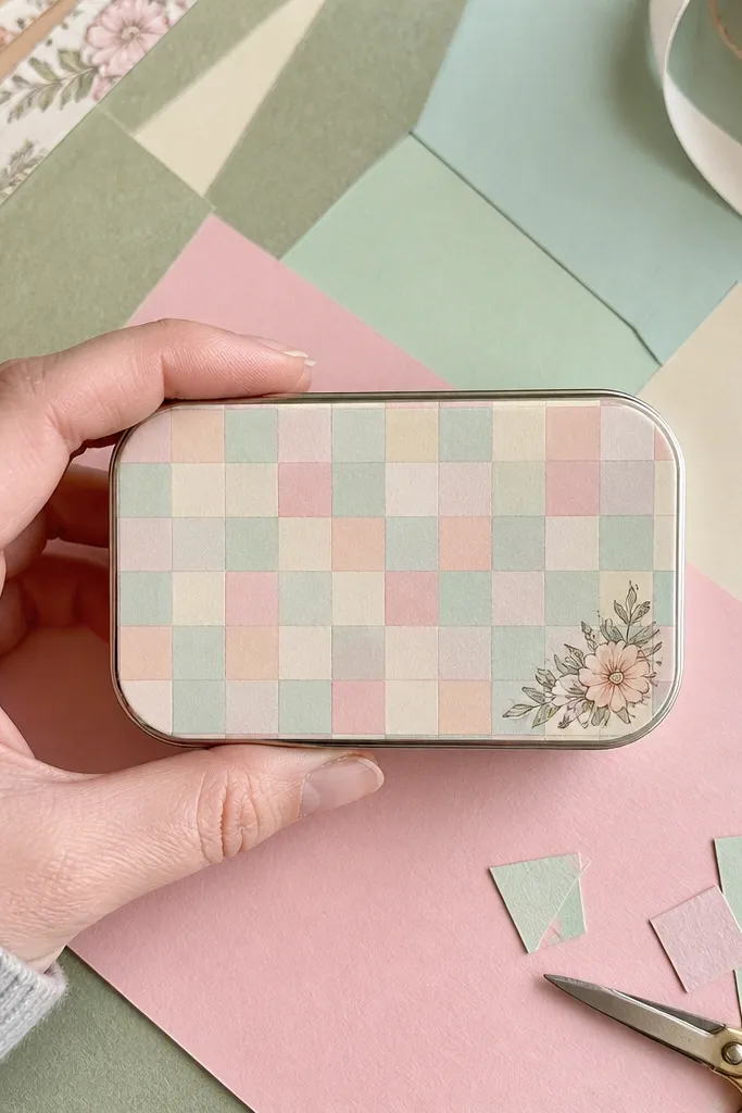
Checkerboards look clean and graphic, and the trick is restraint. Keep the pattern small and pastel so it doesn’t feel loud, then add only one floral patch in a corner to avoid clutter. This gives you a year-round “base design” that you can reuse by swapping the patch image each season. It’s also perfect for pairing with neutral outfits because it isn’t overly thematic. The corner placement makes it look intentional even if the sticker shifts slightly.
Create a pastel checkerboard background with squares about 1/8-inch each. Leave a blank circle or rectangle corner patch area about 5/8-inch wide. Add a small floral cutout patch with 2-3 colors, then seal it. Trim the whole sticker to fit the wallet front and apply with a roller, aligning the corner patch last so it doesn’t drift.
If your checkerboard looks fuzzy after printing, increase contrast by darkening one pastel shade.
Avoid a patch that’s too busy; small prints inside a tiny corner smear visually.
12. Black marble swirl with gold "constellation" dots
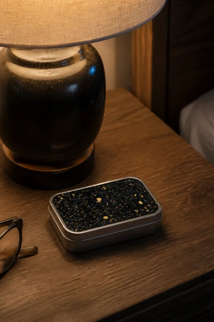
Marble swirls look expensive on a small sticker when you keep the motion simple. Black marble plus gold dots reads like jewelry, not craft clutter. Constellation dots give a controlled sparkle without needing glitter that sheds. This works in winter because it feels sleek, but it also works in summer because gold reads warm. The key is to keep the gold dots small and spaced so the pattern stays crisp under pocket lighting.
Create a black marble background by layering gray and charcoal streaks, then blending lightly so it looks like veining. Add 10-20 gold dots arranged in a constellation line pattern, keeping dot size around 1-2 mm. Print on vinyl if you can; if using paper, seal thoroughly with matte medium and let it dry flat. Trim to a rounded rectangle and apply carefully, then topcoat once more for edge protection.
Editor's noteUse metallic gold vinyl for dots if you want the cleanest look and the least flaking.
Skip thisDon’t use loose glitter — it catches on fabric and makes the sticker look worn fast.
13. Retro TV scanlines with a small "OFF/ON" toggle icon
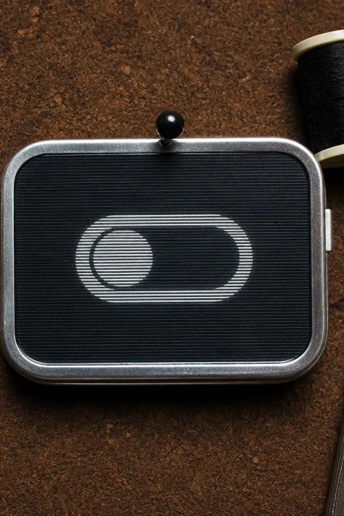
Scanlines are a graphic texture that looks great at small scale. Put them on a dark background, then add one simple toggle icon with “OFF” and “ON” in chunky letters. This style is fun without being childish because the icon is minimal. It’s year-round because it isn’t tied to a holiday; it’s tied to a vibe. The strongest part is the contrast between the scanline texture and the bold icon.
Make a dark base rectangle and add horizontal scanlines at about 1/16-inch spacing. Place the toggle icon centered or slightly lower, with letters thick and readable. Print on vinyl, then trim with rounded corners. Apply starting at the center and smooth outward to keep scanlines straight and prevent wavy alignment.
Editor's noteCheck alignment under a desk lamp; scanline designs show crooked placement immediately.
Skip thisDon’t add extra retro elements like stars and rockets; the icon already does the work.
14. Monochrome floral sprig with micro border dots
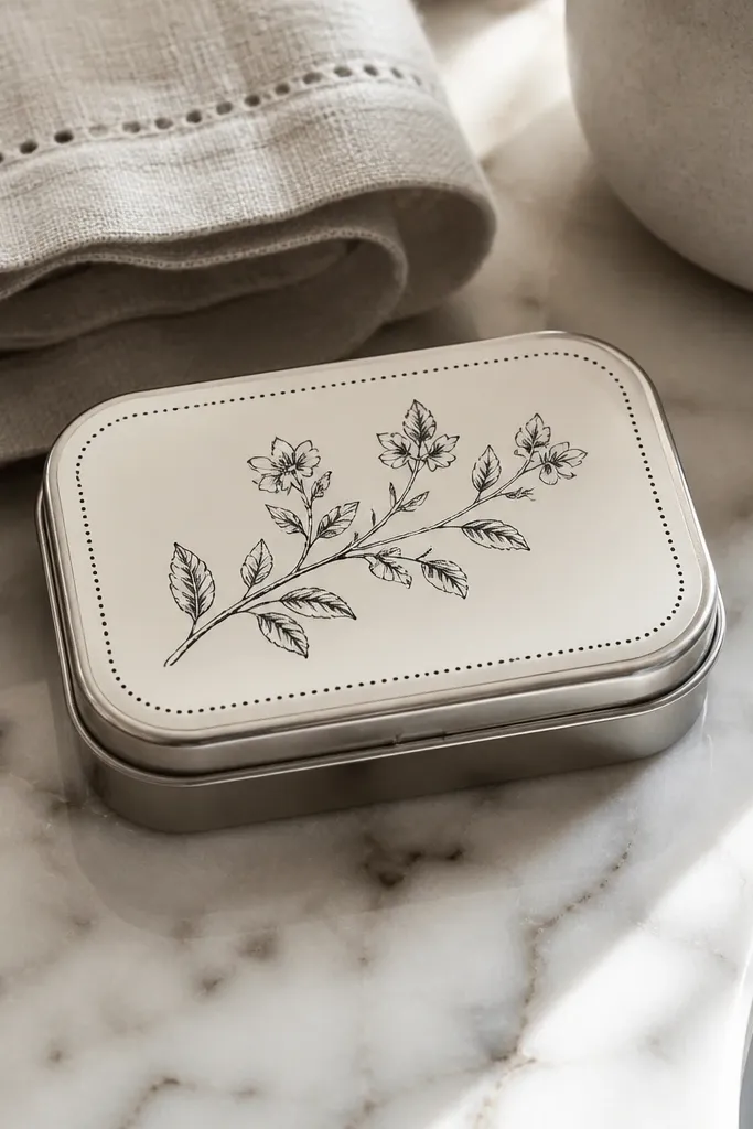
If you want “pretty but not seasonal,” a monochrome sprig is the move. Keep the sprig as a single line-drawn cluster and add a dot border around it. The dot border makes the sticker feel framed and helps hide slight cutting gaps. Use one ink color like deep green or charcoal so it looks intentional and calm. It’s photogenic because the sprig has clear negative space, so it won’t turn into a dark blob on metal.
Pick one dark ink color and design a sprig graphic with thick-enough lines so it doesn’t disappear. Add a dot border around the sprig at a consistent distance, each dot about 2 mm. Print on vinyl or seal paper with matte medium twice. Trim to a rectangle with rounded corners and apply with a clean edge — press the dot border down slowly so it doesn’t lift.
Editor's noteUse a circle cutter for the dot border spacing so the frame looks even.
Skip thisDon’t use watercolor-style sprigs; texture smears on small stickers.
15. Food label style ramen bowl with bold red accents
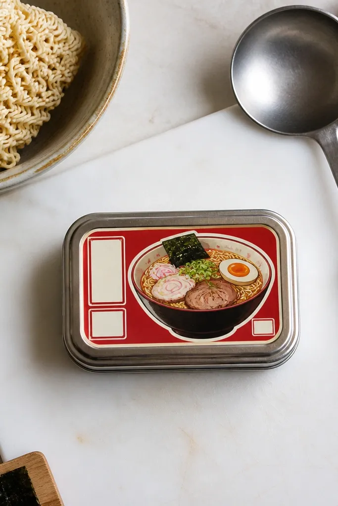
Food label stickers look good because they’re already structured. A ramen bowl graphic with bold red accents reads like packaging, which looks intentional on a wallet. Keep the label text minimal and chunked, like “NOODLES” or “BROTH,” so it doesn’t turn into tiny unreadable lines. This is a year-round choice because you can swap the bowl color palette by season: rich reds for fall/winter, lighter tones for spring/summer. The style photographs well because it has a clear hierarchy: icon, then text.
Design a label layout: top band for a short word, center bowl icon, bottom band for a small date or flavor tag. Use a limited palette: cream background, deep navy lines, and red for one accent. Print on vinyl, then trim with a 1/8-inch border margin. Apply to the wallet front and press along the top and bottom bands first so the label looks flat.
Use a white gel pen to add a small highlight ring on the bowl for extra pop.
Avoid too many flavors or long ingredient text; it turns into visual clutter.
16. Spring sunrise gradient with a thick horizon line
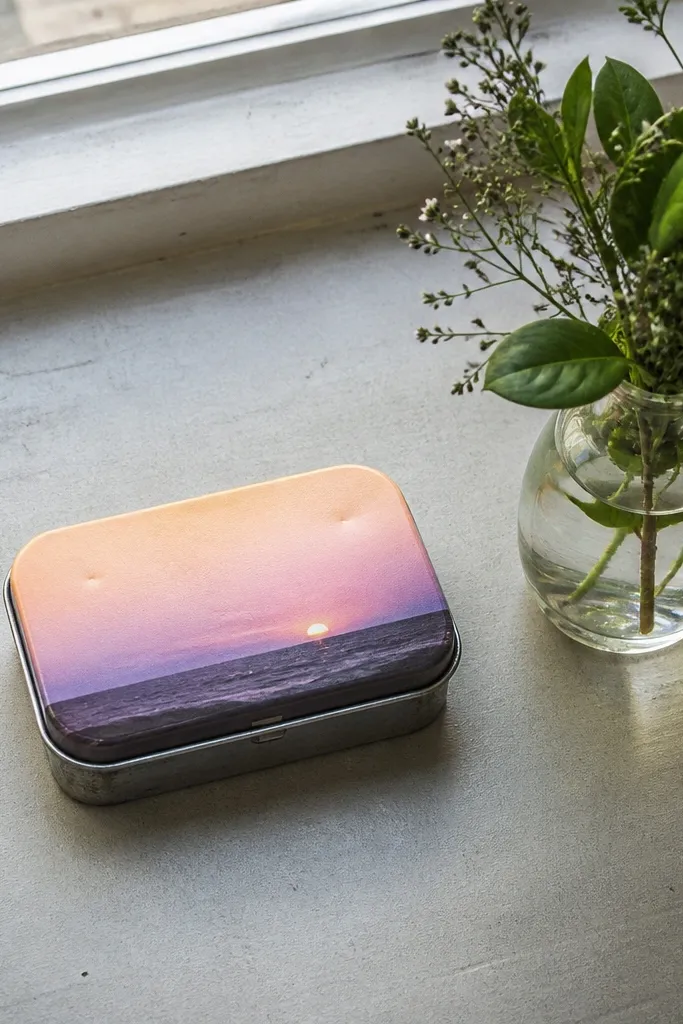
A sunrise gradient works year-round when you anchor it with one thick horizon line. The horizon line keeps the design stable and readable, even when the gradient shifts slightly from print to print. Use a soft peach-to-lavender gradient for spring, then switch to brighter orange-yellow for summer, deeper teal for winter, and muted amber for fall. The result looks like a mini poster on your wallet front, not a random color wash.
Create a gradient background rectangle and add a thick horizon band across the lower third. Place a small sun circle just above the horizon, with a simple outline or fill. Print on vinyl for smooth gradients; paper gradients show banding after sealing. Trim and apply, then topcoat with matte medium if you used paper so the surface doesn’t scuff.
If your gradient banding shows, reduce the number of gradient steps by re-exporting at higher resolution.
Don’t make the horizon line thin; thin lines disappear on metal.
17. Summer botanical leaves in a clean circle badge
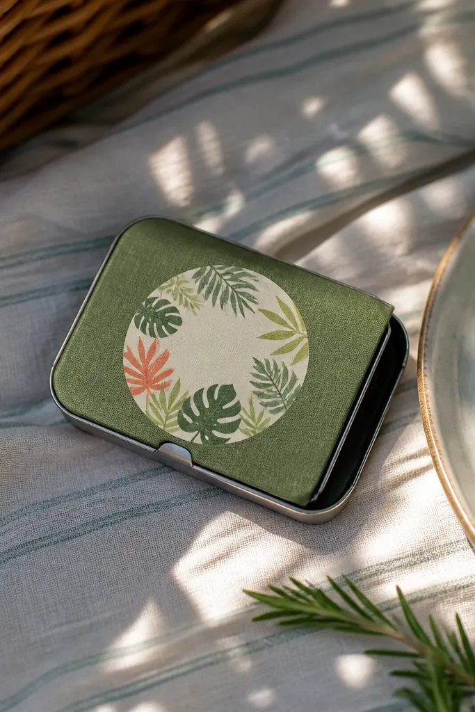
Circle badges look great on Altoids Wallets because circles frame the design and hide minor placement shifts. Use one botanical leaf type repeated in a ring, then leave the center mostly clean for readability. Choose bright leaf greens and one accent color like coral or lime-yellow. This is year-round because the badge layout stays the same; you swap leaf colors by season. It also feels “designed” without needing complex illustration.
Cut a circular sticker badge that fits the wallet front, then add a ring border about 1/8-inch thick. Place 8-12 leaf shapes around the ring, leaving the center at least 1 inch clear. Print on vinyl or seal paper carefully to avoid warping circles. Apply the circle badge first, then add a tiny 1-line label under it if you want extra structure.
Editor's noteUse a circle cutter or compass template for a perfect edge that looks store-bought.
Skip thisAvoid overlapping leaves that touch the border; they look cramped at this size.
18. Fall plaid mini pattern with a single gold acorn
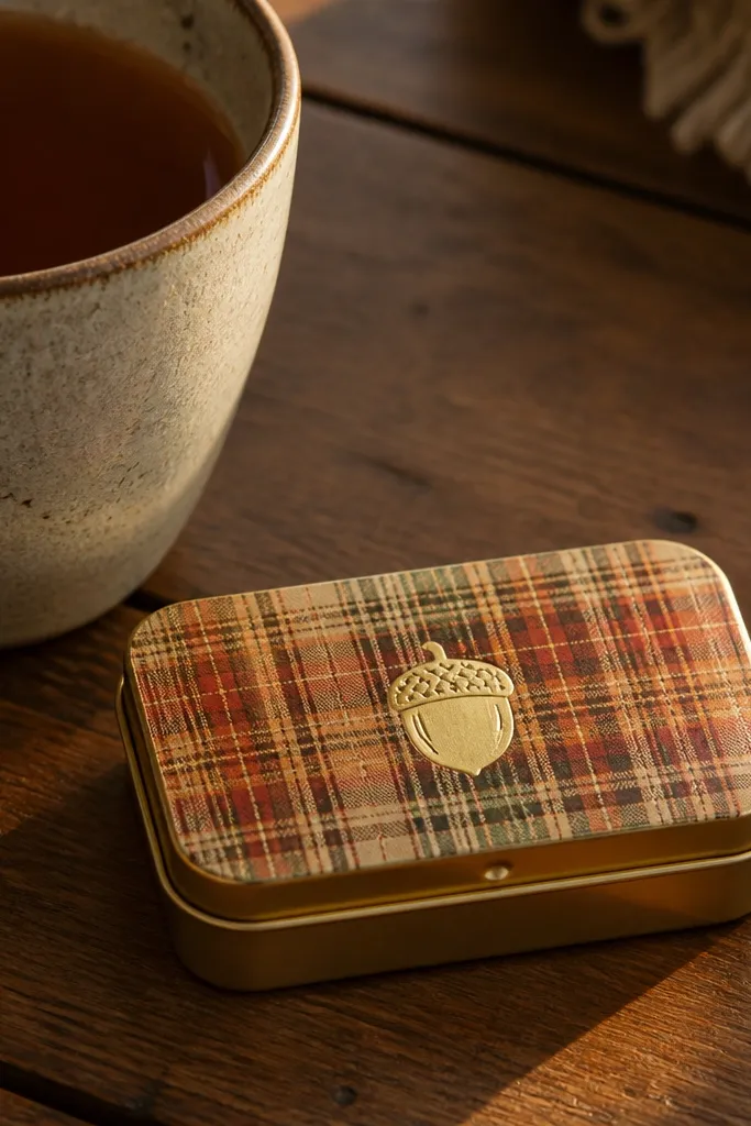
Plaid looks cozy and seasonal, but the way you keep it clean is by using mini-scale lines and one focal icon. Put a gold acorn in the center so the sticker has a “reason” to exist beyond pattern. Stick to two plaid colors plus one gold accent so it stays readable. This design is also forgiving if your cuts are slightly off because the plaid grid hides edge imperfections. It photographs well under warm indoor light because gold catches it.
Make a plaid background using thin intersecting lines about 1/16-inch each. Use two main colors like deep brown and muted orange, then leave the center clear for the acorn. Add a gold acorn silhouette about 3/4-inch wide. Print on vinyl, trim with rounded corners, and apply with firm pressure so the plaid lines don’t lift at the edges.
If you’re hand-cutting plaid, use a ruler and cut one color layer at a time to keep alignment crisp.
Don’t add extra fall icons like pumpkins and leaves; plaid plus acorn is plenty.
19. Winter snowflake stencil with negative-space layout
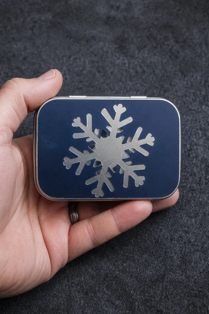
Negative-space snowflakes look cleaner than full-ink snowflake drawings. You cut or print the snowflake shape so the metal shows through, then frame it with a solid background color. This makes the snowflake look crisp even on small surfaces. Choose a dark background like navy or charcoal, then keep the snowflake shape bold. It’s a strong winter look, but the same negative-space layout works for other seasons if you swap the stencil shape for something like a heart, leaf, or star.
Create a dark background rectangle and add a snowflake cutout area where the metal will show. Use stencil shapes with thick arms so the cut isn’t delicate. Seal the background first, then apply the sticker so the cutout lines up. Add a thin border ring around the cutout for a finished look, then topcoat lightly along the border only.
Editor's noteUse a backing sheet under your wallet while trimming so you don’t nick the metal surface.
Skip thisAvoid ultra-thin snowflake arms; they tear during application and look ragged.
20. Spring clean label with tiny date and flower icon
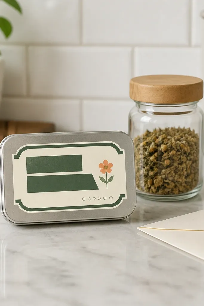
Minimal labels look best when they’re structured and spaced. This design uses a clean typographic block, a tiny flower icon, and one short date line so it looks like a real product label. The colors should stay light: cream background, muted green text, and one pastel accent. It’s year-round because you can swap the tiny flower icon for different seasons without changing the layout. The result is calm, organized, and very photogenic against the metal.
Set up a rectangle label area and add a top line word in muted green (chunky font, 1/8-inch stroke thickness). Place a tiny flower icon on one side and a short date or number on the other. Print on vinyl, then trim with rounded corners. Apply using a straight edge alignment so the text lines stay level; smooth from center outward.
Use a single font style across all lines so the label looks intentional, not pieced together.
Don’t use multiple font styles; small labels get messy fast.
21. Summer retro palm print with cream "sun" badge
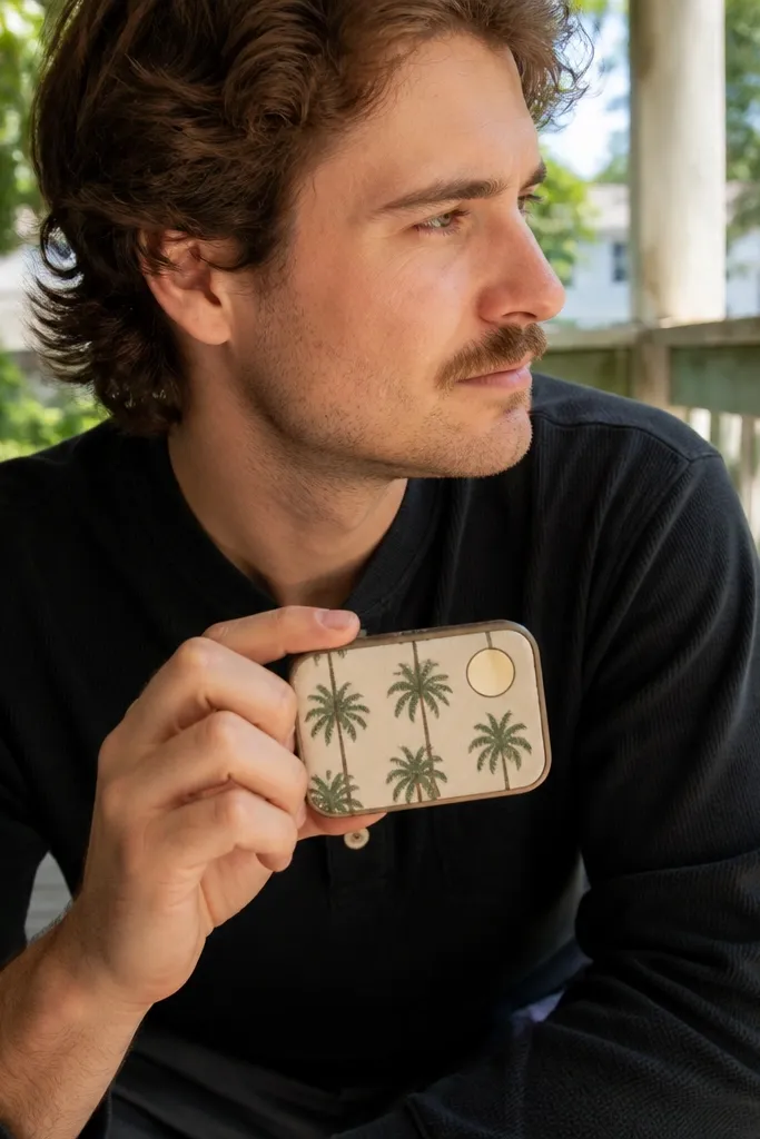
Retro palm prints feel summery without requiring bright neon. The trick is to keep the palms in one color and let the cream badge do the work visually. A sun badge in the corner creates a focal point and makes the sticker look like a graphic design poster. This is year-round because you can switch the palm color for fall/winter (deep green, charcoal, rust) while keeping the sun badge constant. It’s also one of the easiest looks to get photogenic — the contrast between cream and dark palms reads instantly.
Print a palm pattern background using one dark color on a cream base. Add a cream sun badge shape in a corner, about 1 inch wide, with a simple outline and rays. Place your sticker design so the badge doesn’t cover too many palms; keep clear spacing. Trim and apply, pressing the badge edges first so they adhere cleanly.
Editor's noteUse matte vinyl for the palm pattern so it doesn’t glare in photos.
Skip thisAvoid multicolor palm prints; they get muddy at small scale.
22. Autumn coffee label with crema swirl inside a rounded square
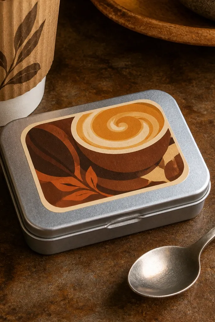
Coffee labels look good because the shapes already feel like packaging. Put a crema swirl inside a rounded square, then add one word like “ROAST” or “CAFÉ” in thick letters above. Use browns and cream with a single darker accent so the design stays legible. This style works in fall and winter because it feels warm, and it can work in spring if you swap the accent to a lighter tan. It’s photogenic because the crema swirl gives you a soft focal curve against hard edges.
Build a rounded square icon area for the crema swirl, about 1.2 inches wide. Draw the crema swirl with 2-3 brown tones, then add thick lettering above in a cream banner. Print on vinyl and trim the full label with a thin border margin. Apply to the wallet front and press the banner area last so the swirl stays aligned.
Editor's noteIf your crema swirl looks too flat, add one thin highlight curve with a white gel pen after sealing.
Skip thisDon’t use light gray text; it disappears on metal under shadows.
23. Year-round hearts in a minimal outline with one accent color
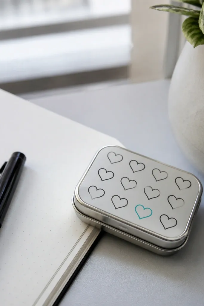
Minimal hearts are the “always works” sticker when you don’t want seasonal imagery. Use outlined hearts in a neutral color like charcoal, then pick one accent heart in a stronger color like teal or red. The layout should be spaced so the hearts don’t touch and blur. This design looks clean and modern, and it’s great for matching any outfit because the palette stays controlled. It’s also a good choice if you want something cute without feeling like a holiday sticker.
Create a cream or light gray background base, then draw 6-8 outlined hearts with thick strokes. Make one heart filled in your accent color and keep the rest outlines only. Print on vinyl, then trim to a rounded rectangle. Apply with careful alignment since outline designs show skew immediately; smooth from center outward.
Editor's noteUse thick stroke hearts (at least 2 mm) so the outlines don’t break after trimming.
Skip thisAvoid tiny heart shapes; they look like dots after the sticker flexes.
24. Monochrome line art animal face with a thin frame
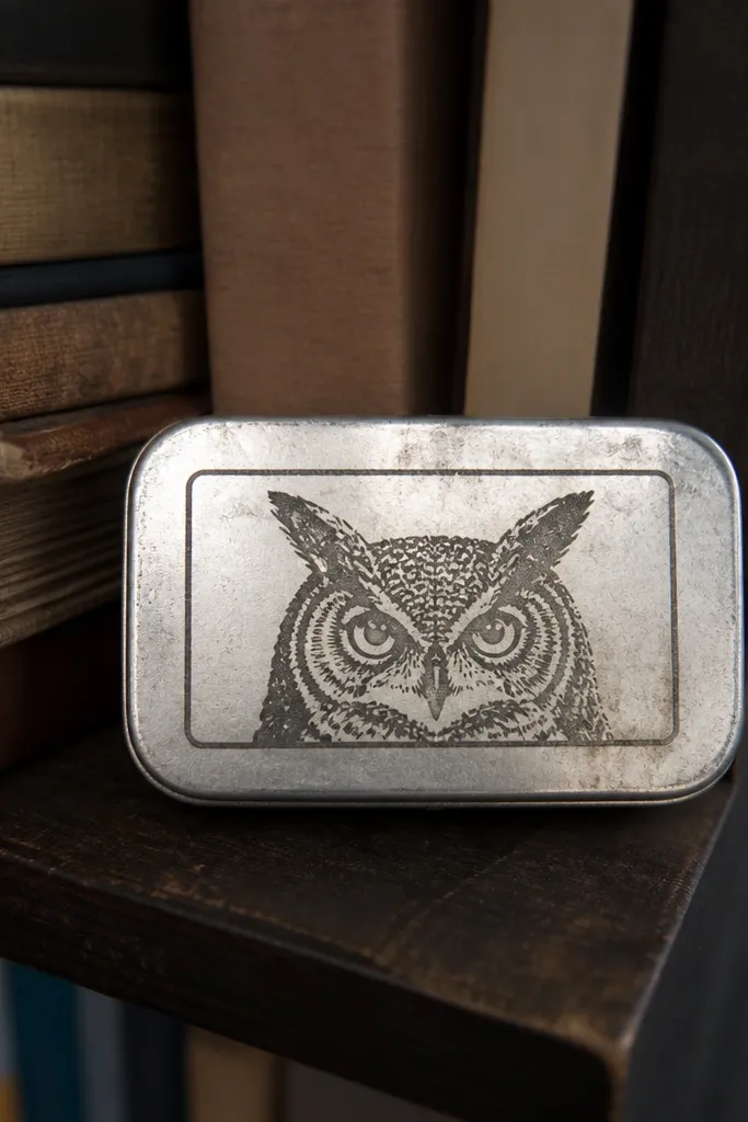
Line art animals look aesthetic when they’re monochrome and framed. A thin frame gives structure, and the single-color drawing stays readable at small size. Pick a face with simple shapes like a fox, cat, or owl, then keep the line weight consistent. This is year-round because it’s not tied to holidays, and it matches both cozy and sporty styles. The best versions look clean and a little graphic, not sketchy and messy.
Draw or print a line art animal face centered, with line weight around 2-3 mm. Add a thin rectangular frame around it with rounded corners. Print on vinyl or seal paper twice with matte medium so the lines don’t smudge. Trim to size and apply, then burnish the frame edges with a plastic tool to prevent lifting.
Editor's noteUse a ruler to keep the frame perfectly straight; line art shows crooked edges instantly.
Skip thisDon’t add heavy shading or lots of tiny fur marks; they clog on metal.
25. Sporty track lanes with a small finish flag icon
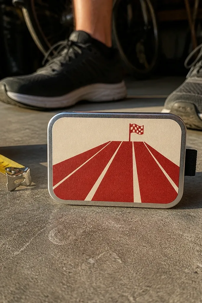
Track lanes give you instant energy, and the finish flag adds a clear focal point. Keep the lanes in two tones and add one small flag icon in a contrasting color like red. This looks great year-round because it’s not seasonal; it’s sporty. The lanes also create a strong visual direction, so the sticker reads even when the wallet is angled. If you like aesthetics that feel active and clean, this is the one.
Create a background base in dark gray or navy. Draw 4-6 track lane lines angled toward the center, keeping them thick and evenly spaced. Place a small finish flag icon near the bottom right, then add a short word like “READY” in chunky letters. Print on vinyl, trim, and apply with the angled lines aligned to the wallet’s edges so it doesn’t look off.
Editor's noteUse matte vinyl to keep the lane lines crisp without glare.
Skip thisAvoid gradient backgrounds behind lanes; they blur the lane lines.



