
1. Ledger-Edge Letter Paper with Faint Accounting Lines
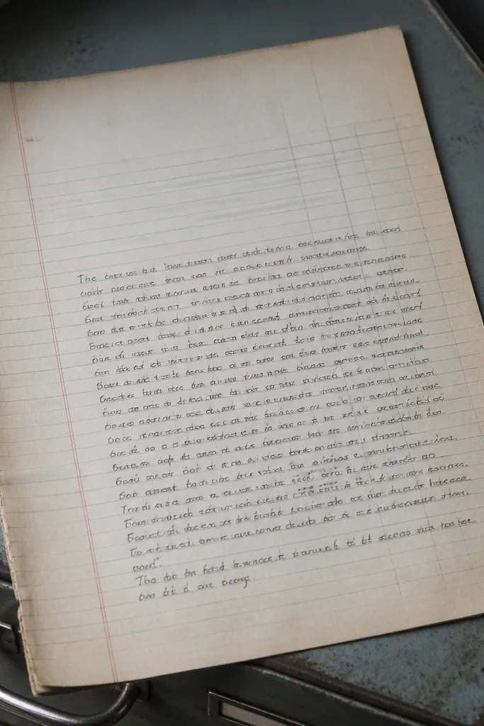
This one gives you that old office feel without turning your notes into a spreadsheet. The faint accounting lines guide your writing while still letting the page look soft and vintage, not schoolwork. The worn left margin adds realism, so the whole sheet reads like something kept in a drawer for years. It’s best for thank-you notes, short letters, and reminders where you want the page to look “organized” even when your handwriting isn’t.
Print the sheet at 100% scale so the margin lines land where your pen naturally rests. Use a light gray or black pen so your writing doesn’t fight the printed lines. After printing, trim only the outer edge if you have a border that’s too wide for your envelope. If you plan to fold into thirds, crease gently with a ruler for a clean vintage fold.
Editor's noteIf your printer tends to over-darken backgrounds, lower ink density using your print settings before printing a full stack.
Skip thisDon’t use gel pens on this one — the ink can look too shiny against the matte paper texture.
2. Postmarked Letter Paper with Fake Cancellation Date Box
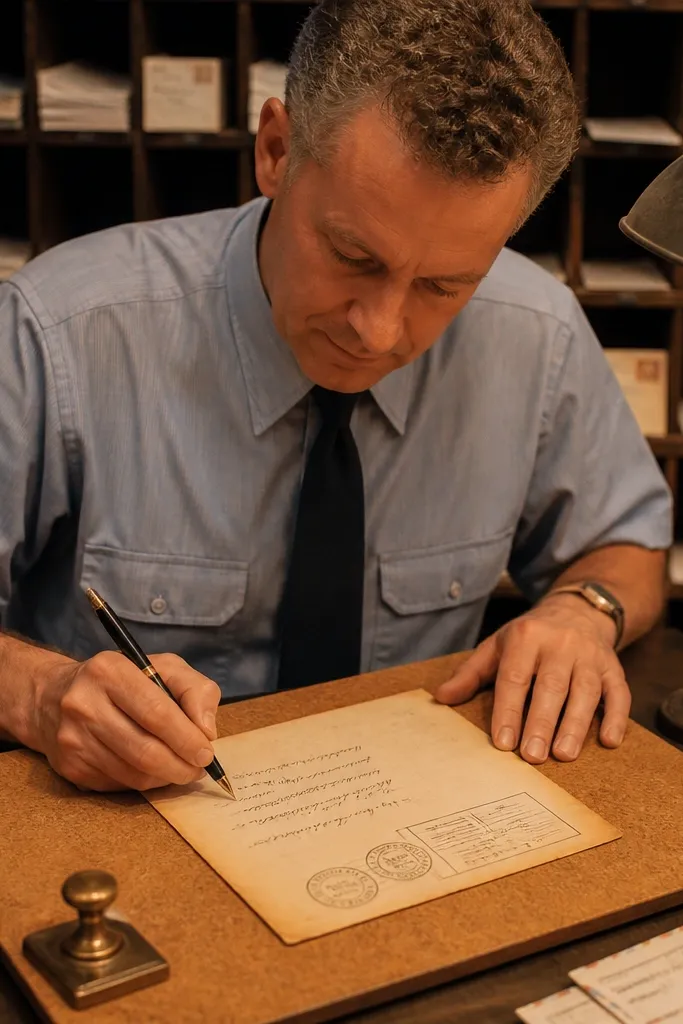
This themed Vintage Paper Printable makes your notes feel mailed, even if you hand-deliver them. The cancellation date box gives you a built-in header area that looks great when you start writing from the top left. The postmark circles add age and motion, but they’re light enough that your text still reads cleanly. Use it for invitations, “thinking of you” notes, and any message you want to feel ceremonial.
Print on slightly warmer paper like ivory or light tan for the postmark to blend instead of looking pasted on. Leave the top header area untouched for the first line of your message. Write with a medium-tip pen and start right under the date box so your handwriting aligns with the printed structure. If you’re mailing it, punch a small corner notch on the back for a consistent fold alignment.
Add a real stamp on top when you mail it; it makes the fake postmark look intentional instead of decorative.
Don’t place your date after you write — the stamped box is meant to guide your layout from the start.
3. Victorian Border Letter Paper with Corner Flourishes
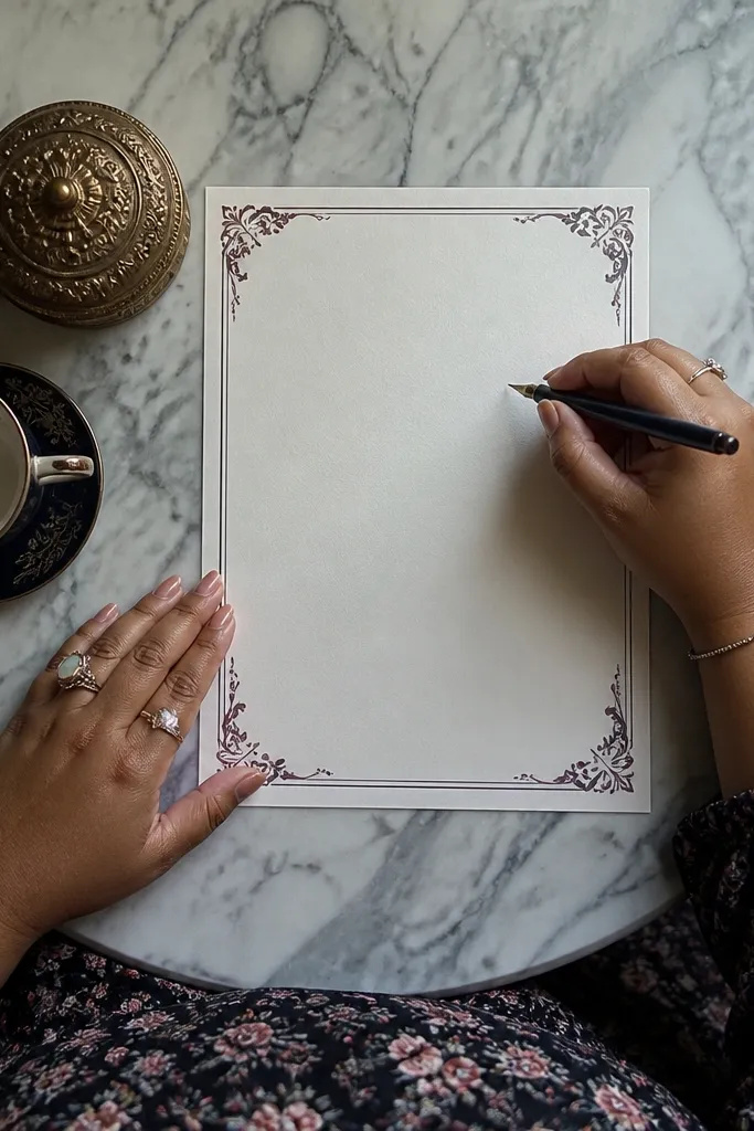
This design is all about framing your words with delicate corners, so your note looks like it came from a real stationery set. The flourishes sit in the corners, which keeps the center clear for handwriting. The border style is photogenic in flat lays and in close-ups, because it creates a clean rectangle that looks “finished.” It’s perfect for sympathy notes, formal thank-yous, or handwritten messages you want to look extra polished.
Print at 100% and keep your paper oriented the same way every time so the corners match your writing habit. Use a fine pen for tight script or a felt-tip for bolder handwriting; both work because the center stays open. Trim any border overflow so the frame doesn’t look uneven. If you want it to feel more antique, lightly rub the printed page edges with a dry brown chalk pastel.
Editor's noteTo keep flourishes from smearing, let the ink dry fully before stacking pages.
Skip thisDon’t write too close to the border — the flourishes can visually crowd your letters.
4. Aged Desk Letter Paper with Soft Ink Blots
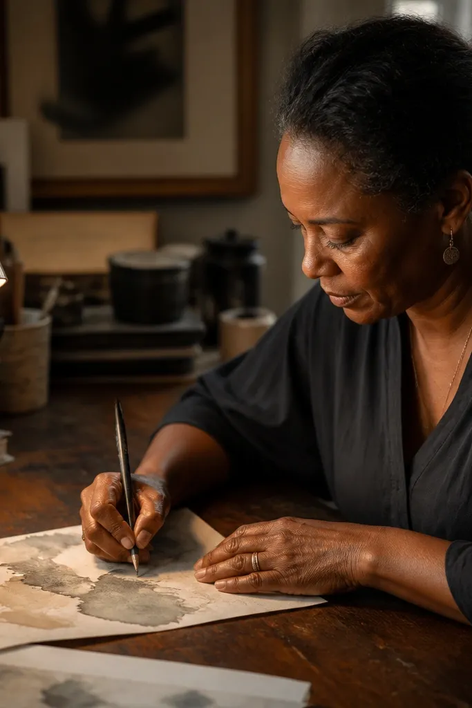
This printable looks like it’s been sitting on a desk, not like it’s been designed to impress. The soft ink blots add texture and movement, so your note looks more human and less “template.” The background is subtle enough that handwriting remains the focus. It’s great for casual letters, journaling-style notes, and “I remembered you” messages.
Print on 28-32 lb paper so the background texture doesn’t look washed out. Use a darker ink pen to anchor your words against the gray blot tones. Write from the top third down, leaving the blot areas as visual breathing room. After printing, press the sheet flat under a heavy book for 10 minutes if your printer curled the edges.
If your printer leaves streaks in gray areas, try switching to a lighter paper mode and print one test page first.
Don’t over-ink — thick marker strokes can look too modern against the soft blot texture.
5. Botanical Margin Letter Paper with Pressed Leaf Silhouettes
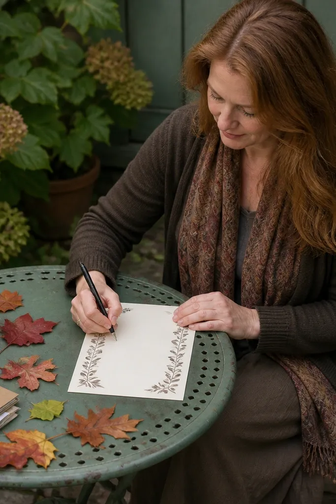
A botanical margin makes your note feel gentle and thoughtful without needing fancy wording. The leaf silhouettes frame the sides, so your handwriting naturally becomes the center focus. This themed Vintage Paper Printable works well for thank-you notes, housewarming messages, and notes tucked into gifts. The best part is that it looks good even when you write short — the margins still feel “designed.”
Print on slightly textured paper if you have it, because leaf silhouettes look more believable with a soft tooth. Keep your writing centered and avoid crossing through the leaf shapes. Use a fine black pen to match the delicate line weight of the printed leaves. If you want a stronger vintage effect, lightly mist the finished page with a tiny amount of water and let it dry flat.
Use less ink than you think — pens that bleed will ruin the leaf edges.
Don’t choose a bright gel pen; the leaf lines look muted and the color mismatch stands out.
6. Typewriter-Inspired Letter Paper with Faint Monospace Header
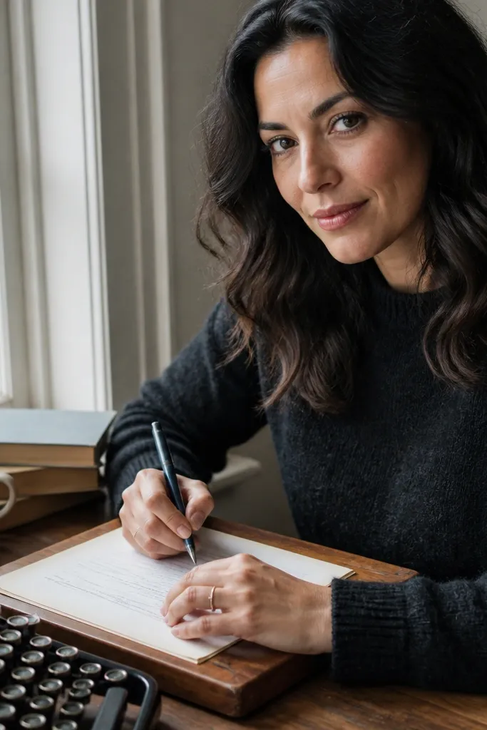
This design mimics the vibe of typewriter letters while still letting you write by hand. The monospace header gives you a structured starting point, and the soft rules keep lines consistent. It’s a strong pick if you like your handwriting to look neat and aligned. Use it for letters to friends, recipe notes, or any message where you want a “document” feel.
Print the sheet and mark a dot lightly at the start line so you always begin in the same spot. Use a pen that doesn’t smear — a ballpoint or gel with a quick-dry tip works best. Write in straight lines using the printed rules as guidance. Fold and store in a binder sleeve if you want the typewriter header to show cleanly on top.
Editor's noteIf your printer adds too much gray, switch to “draft” for the background and “normal” for text, then combine two prints by swapping only the top layer — it keeps the header crisp.
Skip thisDon’t rotate the page after printing — the header alignment is meant to match your writing direction.
7. Nautical Letter Paper with Compass Rose Corner Markers
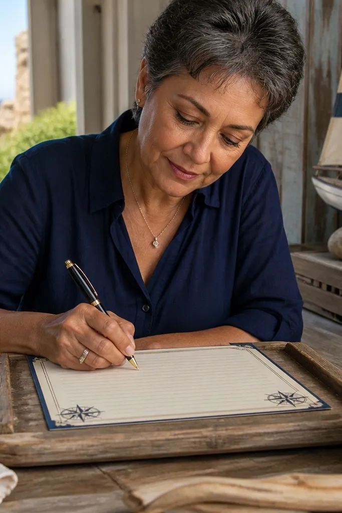
Nautical paper makes notes feel like they’re part of a story. Compass rose corner markers frame the page and make the sheet look lively in photos and when held up. The design is best when your message is short and intentional, like a note to a partner or a travel-themed card insert. The center stays clear, so your handwriting stays readable.
Print on warm cream paper so the compass icons don’t look too stark. Use a dark pen and keep your first line under the top markers for a clean layout. If you’re adding a date, write it near the upper right corner area for balance. For a crisp vintage look, trim the sheet with a paper trimmer so the corners look sharp.
Editor's notePair this with thick envelopes — the sturdier envelope makes the compass theme feel more “real” than flimsy stationery.
Skip thisDon’t use a fountain pen with heavy ink — it can pool around the corner icons.
8. Rope-Tied Parcel Letter Paper with Faux String Header
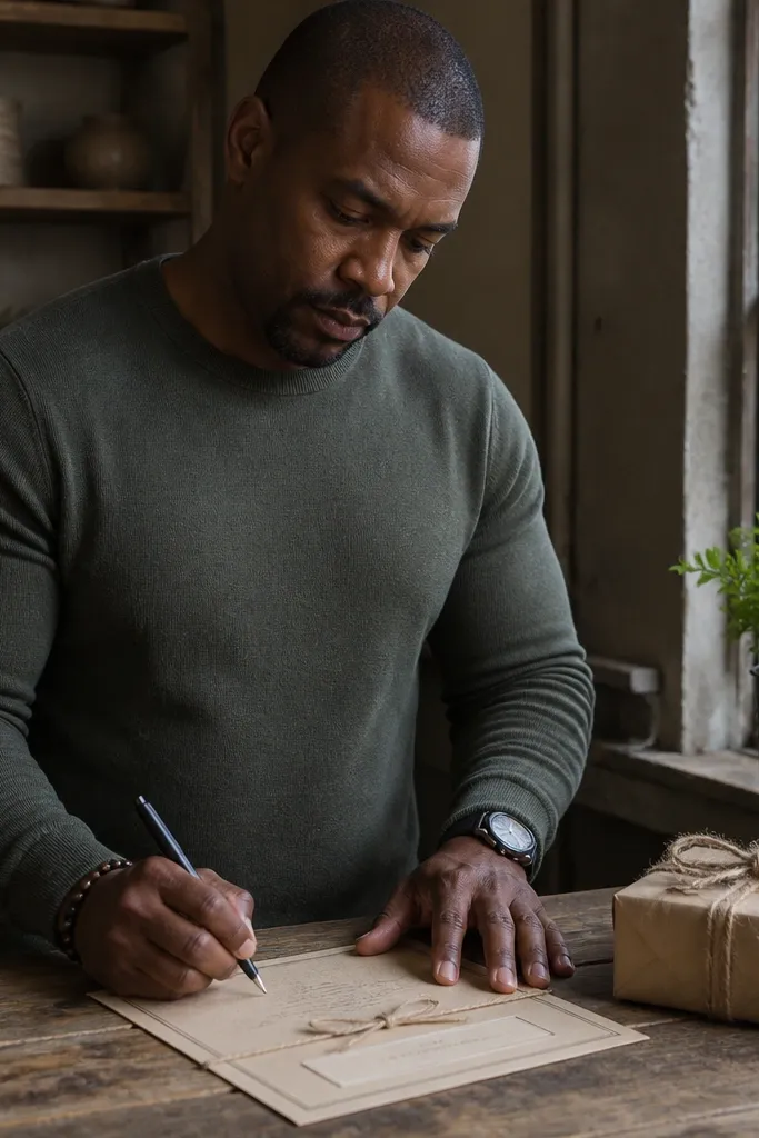
This themed Vintage Paper Printable turns a plain note into a package-style message. The faux string header gives you instant visual interest, while the label box gives you a place for a subject line or recipient name. It looks great for gift notes, holiday tags, and “from the kitchen” cards where you want the paper to feel like part of the gift. The center is clear, so writing stays readable.
Print on slightly thicker paper so the header graphic doesn’t look washed out. Write your header text inside the label box area, then leave the rest for the message. Use a fine-tip pen to keep letters crisp against the rope texture. If you plan to attach it to a gift, punch a hole through the top area and thread ribbon through the printed header region.
Test ink dryness by touching the corner rope area lightly; if it smears, wait longer before handling.
Don’t fold directly over the densest rope area — it can crack and make the header look worn in the wrong way.
9. Antique Map Letter Paper with Border Coordinates
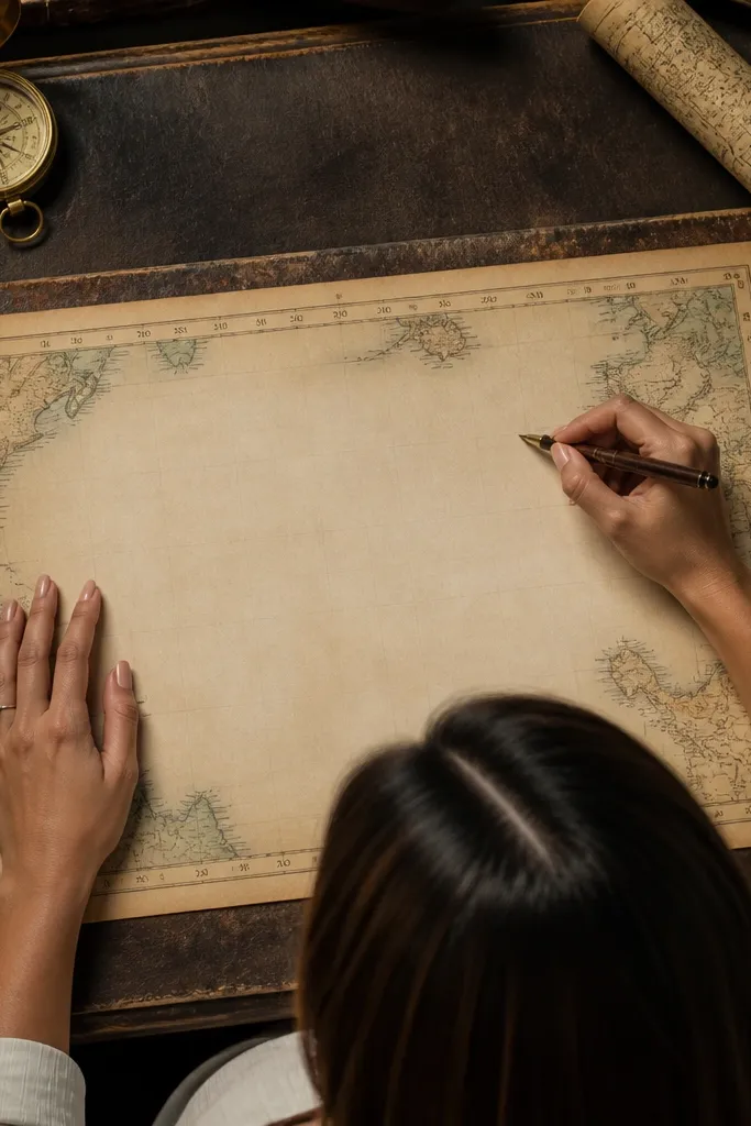
Map borders make handwriting feel like it belongs to an old travel document. Coordinate numbers along the border create a “real map” frame, and the center stays clean for notes. This is one of the best options when you want a themed Vintage Paper Printable that still reads as letter paper, not wall art. It’s ideal for travel plans, journal prompts, and notes to yourself.
Print and keep the page flat — map borders show misalignment quickly. Use a pen that writes smoothly so your letters don’t skip across the slightly textured look. Write in the center without touching the coordinate numbers. For a more convincing antique feel, lightly tint the page edges with a tea-brown watercolor wash and let it dry completely.
If your printer struggles with thin numbers, print one page and zoom in; adjust scale to 99% if the border shifts.
Don’t use a bright color pen; coordinate borders are muted and bright ink will look out of place.
10. Old Library Due-Date Letter Paper with Card Pocket Lines
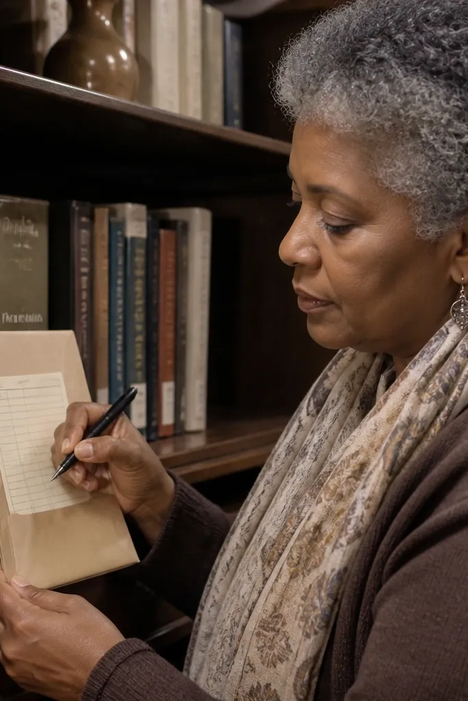
This printable turns notes into something that looks borrowed and returned. The due-date box gives you a built-in place for a date, and the pocket lines keep the layout structured. It’s a fun choice for reminders, book-related notes, and small “you owe me” jokes that still look tasteful. The page background is light, so your handwriting remains the star.
Print on 24 lb paper so the due-date box stays crisp. Write the due date in the box, then start your message under it with a consistent line spacing. Use a ruler if you want straight, librarian-style alignment. If you’re binding these notes, punch holes on the left side where the pocket lines are lighter to avoid tearing.
Editor's noteUse a pencil first for layout, then trace over with a pen once the spacing looks right.
Skip thisDon’t place the message too high — the due-date area needs breathing room to look like a real card.
11. Faded Letterhead Vintage Paper with Ornate Title Block
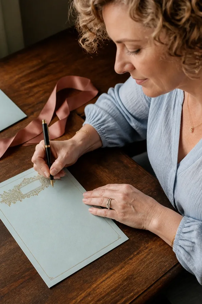
A letterhead style makes your note look official without being formal in tone. The ornate title block sits at the top like a company letter, which helps your message feel intentional even if it’s just a few lines. The rest of the page is calm, so handwriting stands out. Use it for invitations, announcements, or “quick letter” notes where you want a clean header.
Print at 100% and write your title or topic in the top block. Keep your body text centered and start each new paragraph on a new line to match the letterhead spacing. Choose a pen with a consistent line width so your handwriting doesn’t vary with the printed ornament. If the header is too dark on your printer, reduce contrast by switching to a lighter print preset.
Editor's noteFor crisp results, let the sheet dry flat under a book before folding.
Skip thisDon’t overfill the title block; leave it mostly for a short subject line.
12. Sepia Coffee Stain Letter Paper with Soft Borders
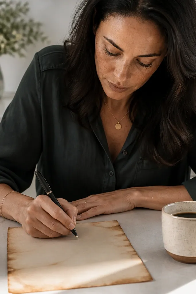
Coffee-stain edges make notes look like they were written in a cozy room, but in a controlled way. The stains sit around the perimeter, so your center stays readable and clean. This themed Vintage Paper Printable works great for casual letters, recipe notes, and journaling pages you want to feel warm. It’s also forgiving — even if your handwriting is messy, the border frames it and keeps the page looking intentional.
Print the sheet and let it dry fully before adding any distressing. If you want the stain effect stronger, dab watered sepia ink or diluted brown paint around the edges using a sponge, then blot with a paper towel. Let it dry flat for at least 30 minutes. Write with a dark pen so your text doesn’t blend into the sepia tone.
Use a sponge with uneven texture — smooth foam makes stains look fake.
Don’t stain the center; keep distressing to the edges so handwriting stays readable.
13. Faux Watercolor Wash Letter Paper with Speckled Background
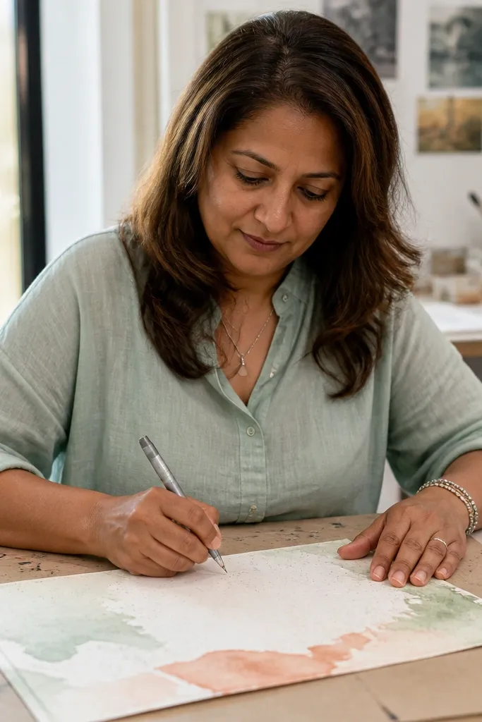
This design gives you an airy vintage feel without heavy patterns. The watercolor wash is light enough that it doesn’t fight your handwriting, and the speckles add realism. It’s a good choice when you want notes that look soft and slightly artsy, not antique-engraved. Use it for letters, thank-yous, and note cards you plan to photograph for your decor or gift wrapping.
Print on smooth paper so the wash doesn’t look blotchy. Leave the message area central and write slightly larger than you would on plain lined paper. Use a pen that handles light texture — ballpoint works well. If your printer creates banding in the wash, print a single sheet and adjust print quality to a higher setting for the background layer.
Try writing with a slightly thicker pen tip so your ink stays visible over the speckles.
Don’t use very light gray ink; the speckles can make it disappear.
14. Vintage Sheet Music Letter Paper with Silent Staff Lines
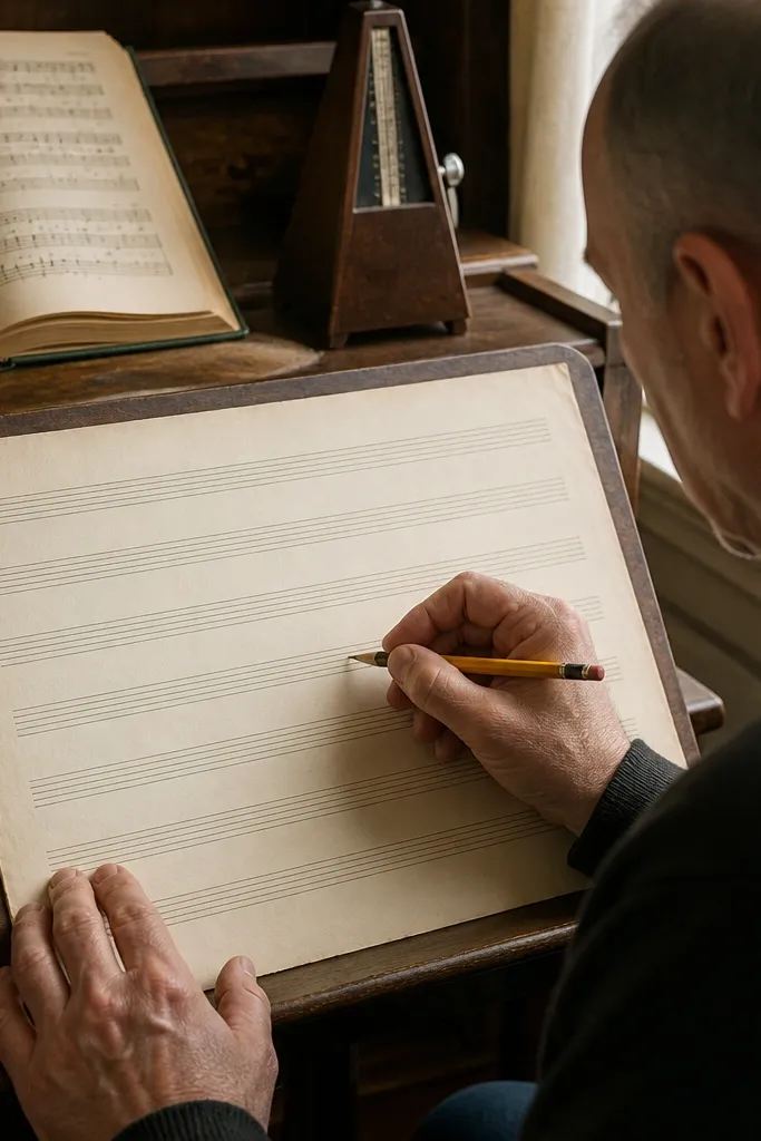
Musical staff lines are a sneaky trick for neat handwriting. This printable keeps the staff visible but removes the notes, so it looks like old sheet music while still functioning as letter paper. Your writing aligns naturally, and the page looks artistic even with short messages. It’s perfect for music lovers, thank-you notes after performances, and gift notes that feel personal and themed.
Print on 24 lb paper so the staff lines stay crisp. Write across the staff lines, using them as a guide for consistent height. Keep your message centered so the staff feels balanced around it. If you’re using these as inserts, trim the sheet to match your card size and fold cleanly along the center.
Use a pen with matte ink so it doesn’t shine against the vintage background.
Don’t write too close to the edges; the staff lines get visually busy near borders.
15. Antique Seal Letter Paper with Wax-Stamp Style Corner
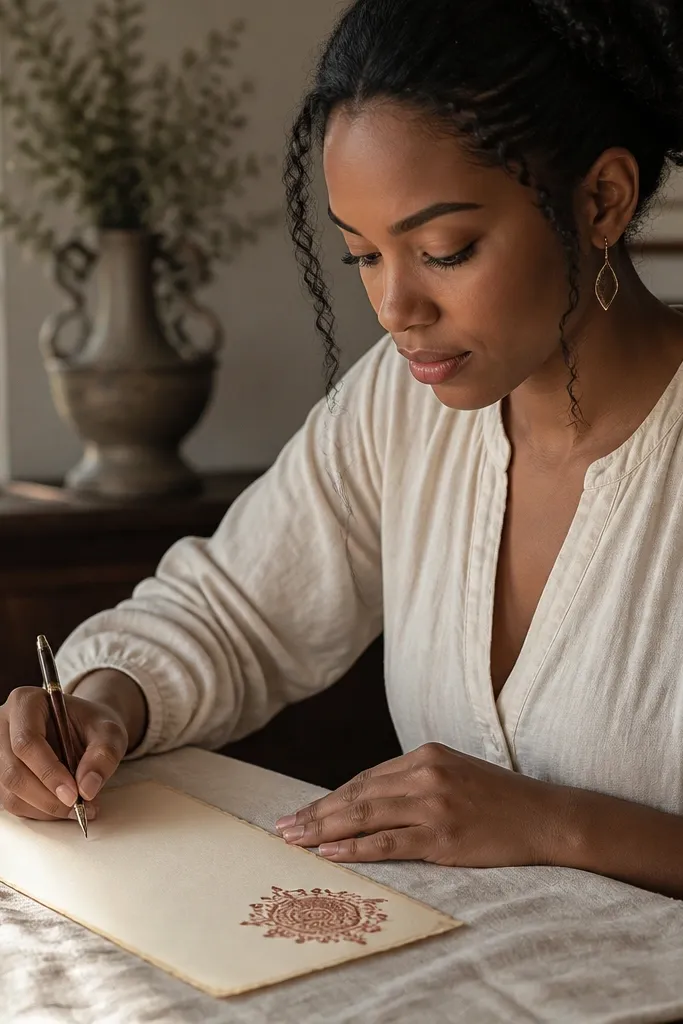
A wax-seal corner makes your note feel sealed and special, without needing actual wax. The seal graphic anchors the page visually and gives you a dramatic starting point for your message. This themed Vintage Paper Printable is great for invitations, apology notes, and any note you want to feel ceremonial. The rest of the page stays clear so your handwriting remains readable and the seal stays the focal point.
Print at 100% and position the seal corner so it sits where you’ll naturally start writing. Use a dark pen and keep your first line away from the seal edge so it doesn’t crowd the graphic. For photos, hold the page slightly angled to show the seal texture effect. If you want extra depth, gently rub the seal area with a tiny amount of brown chalk pastel.
Use a matte pen for the body text so the seal looks like it belongs to the same era.
Don’t add real wax on top of the printed seal; the weight can tear thin paper.
16. Faded Newspaper Column Letter Paper with Side Headings
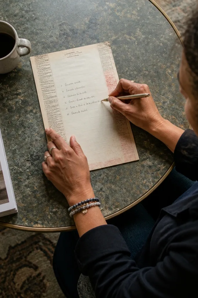
Newspaper-style headings make a note feel like a tiny document. The side headings give structure, and the faded print keeps it from looking like modern print. This design works well for lists, short updates, and “letter + notes” style messages. It also photographs nicely because the side elements create vertical interest while the center stays writing-friendly.
Print and write in the center column area, keeping your lines straight. Use a pen that doesn’t bleed so the faded headings don’t blur into your text. If you want it to feel more authentic, lightly crumple the paper once, smooth it out, and crease only the fold lines you plan to use. Store the finished sheets in a folder so the heading text stays aligned for future prints.
Editor's noteIf your printer makes the faded headings too dark, reduce print intensity or choose a lighter paper setting.
Skip thisDon’t write over the side headings — it ruins the “newspaper” illusion.
17. Monogrammed Stationery Letter Paper with Corner Initials
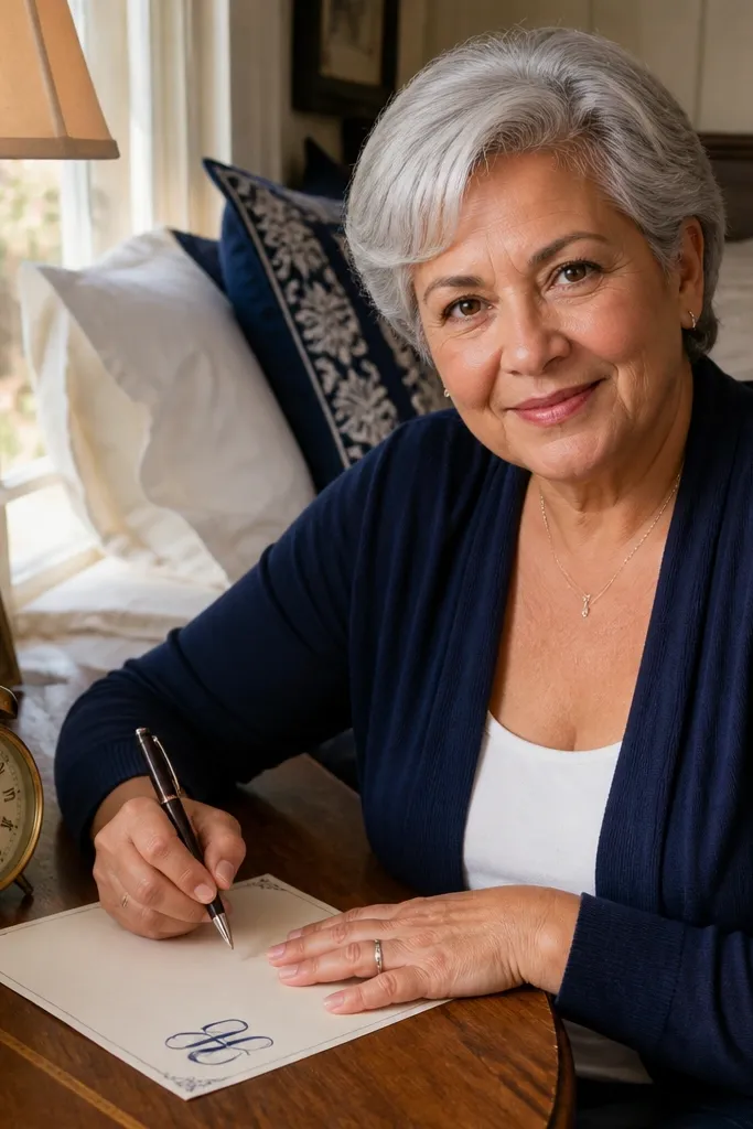
Corner initials make handwritten notes feel personal fast. The monogram sits in the corners, so it’s visible without taking over the center where you actually write. This themed Vintage Paper Printable is ideal for consistent stationery — you can use the same design for months and it still looks intentional. It’s also great for family notes, recipe cards, and “from my desk” messages.
Print on 32 lb paper if you want the monogram to look sharp and not fuzzy. Write inside the inner writing box and keep line spacing consistent. Use a ruler for the first line so the box guides your handwriting. If you’re stacking for a set, separate designs with a plain sheet so corners don’t get scuffed.
Editor's noteChoose one pen color and stick to it; monograms look best with consistent ink tone.
Skip thisDon’t pick a monogram design with dense background — it makes the initials hard to read after printing.
18. Vintage Envelope-Style Letter Paper with Address Lines
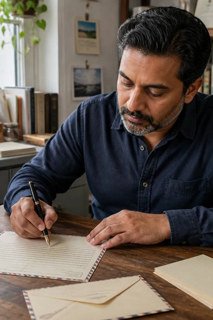
This printable gives you a built-in “to/from” layout, which makes notes feel like real correspondence. The address-style lines at the top guide where the date and recipient info go, so your note looks organized even when it’s short. It’s best for gift inserts, holiday cards, and quick letters where you want the page to look finished. The handwriting space below stays clean so you can write comfortably without fighting decorative clutter.
Print and fill the top lines first: date, recipient, and a short subject line. Write your message below, staying within the main writing area. Use a pen that writes smoothly on paper with light printed lines so your letters don’t drag. If you’re making a set, print all sheets in the same batch so paper tone stays consistent across the stack.
Use a darker pen for the top lines and a slightly lighter pressure for the message so the header pops.
Don’t cram multiple sentences into the top address area; it should look like header info.
19. Vintage Recipe Card Letter Paper with Cut-Edge Index Tabs
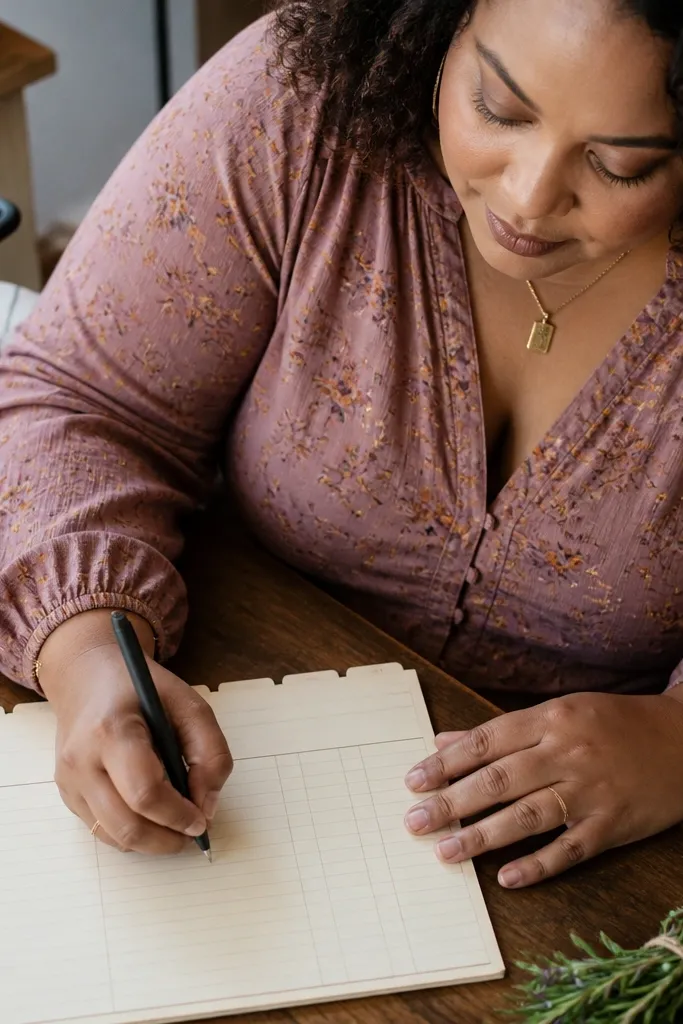
This themed Vintage Paper Printable turns notes into something people want to keep — like a recipe card wall in paper form. The design uses a thick “index tab” strip across the top edge and a recipe layout grid below, so your message sits in the same place every time. It looks gorgeous for grocery lists, dinner invites, and handwritten thank-you notes because the tab gives the page a built-in label. You get that real vintage feel by combining slightly off-white paper tone with faint recipe lines, smudgy ink blocks, and a few controlled misalignments. This is a simple DIY print-and-cut project that takes about 20-30 minutes per sheet, and it works best on desks, kitchen counters, and any spot where notes get grabbed fast.
Print the themed Vintage Paper Printable at 100% scale on 65 lb (120-160 gsm) cream cardstock or heavyweight printer paper so the ink looks textured instead of flat. Trim to letter size 8.5 x 11 in, then cut a shallow “tab” line 0.6 in tall across the top margin using a craft knife and a metal ruler. Add 3-4 narrow tab shapes by cutting only the top edge — leave the bottom edge intact — with widths around 1.1 in each and 0.15 in gaps between tabs. Use a fine-tip pen to darken the faint recipe headings in the layout so they read like stamped ink, not light gray guide lines. Finish by lightly sanding the cut tab edges with 220-grit to soften the paper fibers so the tab looks aged instead of freshly sliced.
After trimming, run the page through a laminator on the printed side only if you want the ink to resist smudging when handled in the kitchen.
Don’t print on thin copy paper — the cut tabs will warp and the “ink” will look washed out.
20. Weathered Ticket Stub Letter Paper with Perforated Side Coupons
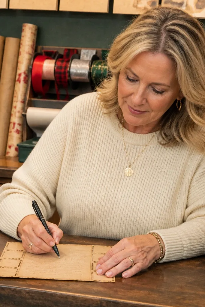
This is the kind of themed Vintage Paper Printable that makes a short note feel like a collectible. The layout mimics a ticket stub: a main letter panel with a weathered center, plus coupon strips on both sides that look perforated and ready to tear off. It fixes a common problem with plain letter paper — your writing area looks flat — by giving the sheet an interactive frame that photographs well and feels fun in hand. The “weathered” effect looks best when the background has speckling and faint streaks, with small type details that don’t overpower your handwriting. Skill level is beginner-friendly: print, trim, then add the perforation look with a simple tool. Plan on 15-25 minutes per sheet, and it’s perfect for event notes, small announcements, and thank-you slips that you want to feel special without going full card.
Print on 8.5 x 11 in paper with a matte finish, using 90-120 gsm for easy tearing or 160 gsm for sturdier stubs. Trim the sheet to clean edges, then measure a side coupon width of 1.0 in on both left and right. Score a dotted perforation line at 0.05 in spacing along each coupon border using a perforation wheel or a ruler with a needle tool, keeping the score shallow so the paper doesn’t rip. Add the ticket “age” by lightly rubbing the side coupon area with a dry charcoal pencil or a gray pigment ink pad — keep it subtle near the center writing panel. Seal with a light mist of fixative or a thin layer of matte spray so the background doesn’t transfer when you write.
Editor's noteUse a scrap piece under the paper when scoring so your perforation lines stay crisp and you don’t dent your desk.
Skip thisDon’t go heavy on the charcoal — too much gray makes the handwriting area look dirty instead of aged.



