
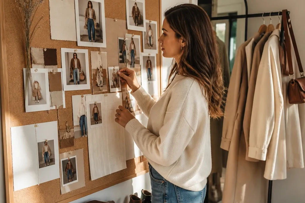
1. Cream + Cognac Studio Minimal
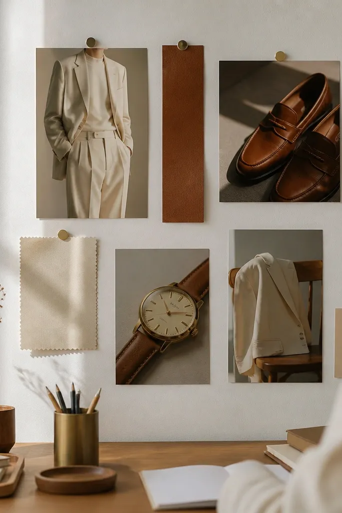
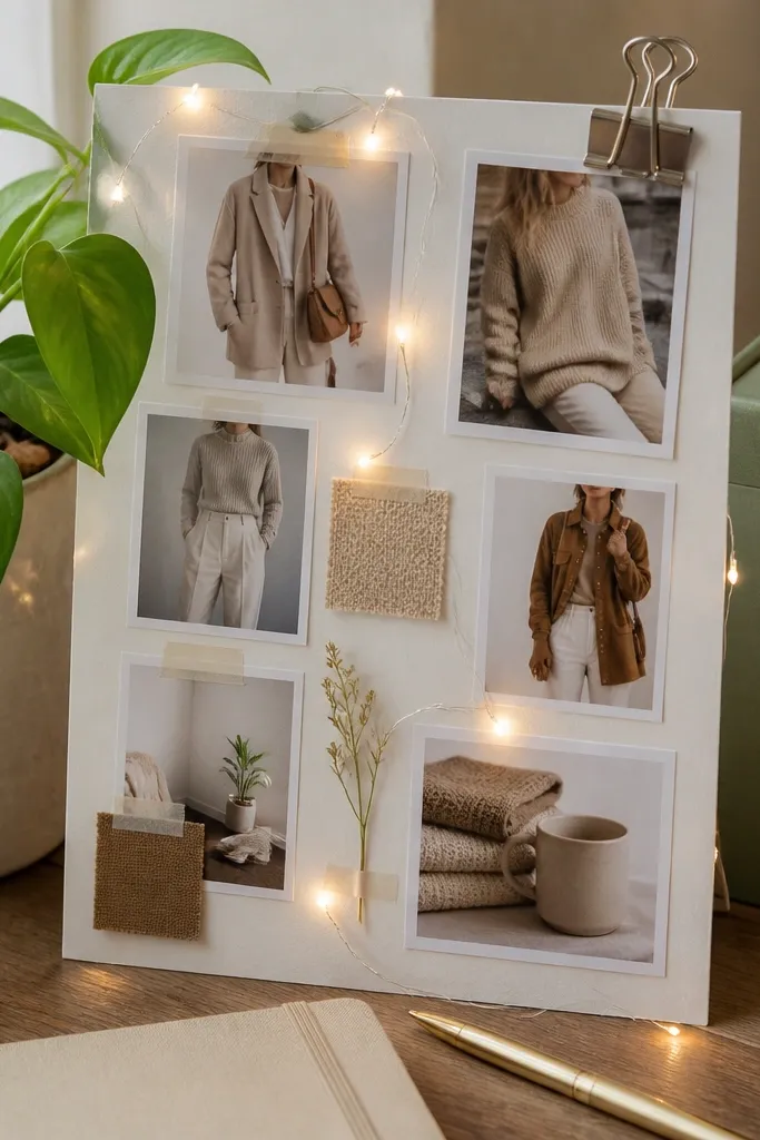
This theme turns “I have nothing to wear” into a repeatable office-to-coffee outfit formula. The color pairing is forgiving: cream reads clean, while cognac leather adds warmth without looking loud. Your photos should show the full outfit once, then repeat the same tones in accessories so the board looks cohesive. Matte textures like knitwear, suede, and smooth leather make the photos feel expensive even with simple pieces. Build it for workwear corners, home offices, and anyone who wants a calm wardrobe that still looks put together.
Editor's noteUse matte photo paper and avoid glossy prints; glossy highlights make cream look washed out.
Start by printing 6-10 photos in cream, off-white, beige, and cognac. Choose one hero outfit photo with a cream top and cognac belt or bag, then add 2 detail shots like knit texture and leather close-ups. Mount everything on foam core using a 1 inch border around each photo so edges don’t blur together. Finish by adding one thin gold accent element (a small paperclip chain or gold sticker) to echo the hardware across the board.
Skip thisDon’t mix in bright reds or icy blues — they break the cream/cognac harmony fast.
2. Black Denim + White Tee Contrast Grid
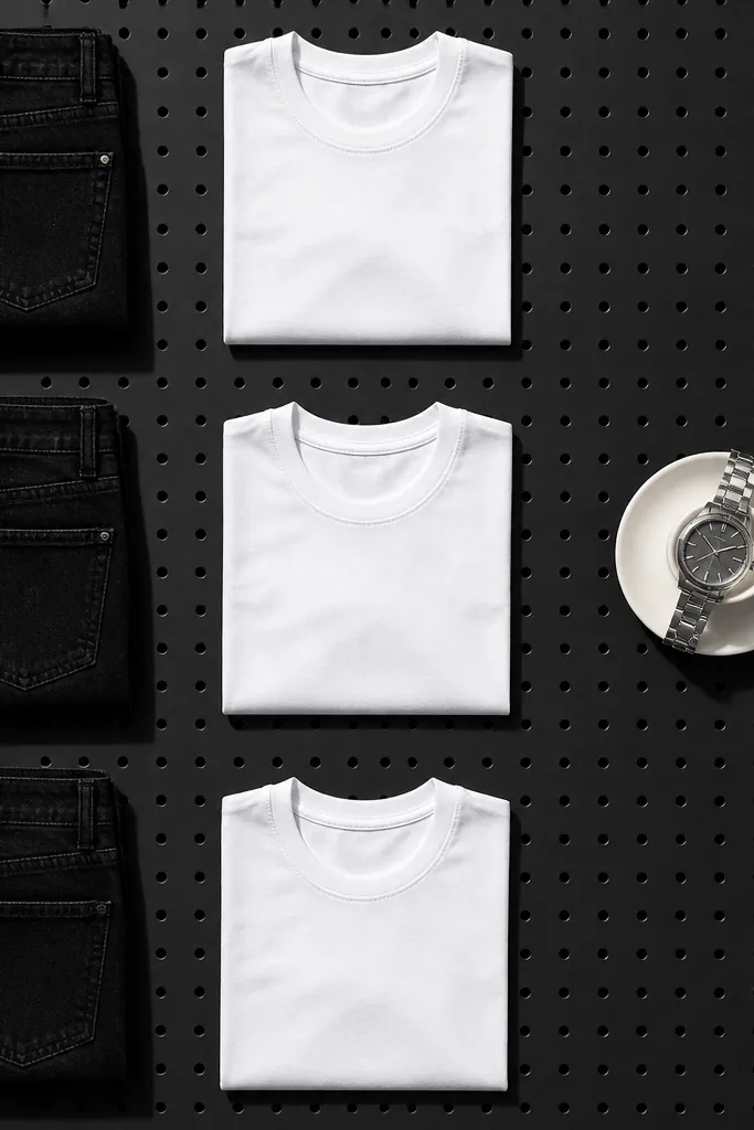
If your closet feels random, a contrast grid fixes it. The black-and-white rule forces every photo to match, so you can plan outfits without overthinking. This board looks sharp because it repeats one strong visual idea: dark denim and a crisp light top. Add one metallic detail image (silver watch or ring) to keep the board from looking flat. This is a great fit for casual wardrobes, weekend uniform fans, and anyone who likes clean lines and strong contrast.
Editor's noteUse a black backing sheet or black card stock behind the grid — it makes whites pop.
Pick 8 photos and arrange them in a strict grid: 1 hero outfit in the center, then 7 supporting images. Keep each supporting photo focused on one element: denim texture, shoe shape, belt line, or watch shine. Print photos so the whites look true (not gray) and the blacks look deep (not faded). Mount with even spacing using a ruler so every gap is the same width.
Skip thisSkip mixed shoe colors like black and tan together; the grid loses its punch.
3. Olive Utility + Tan Leather Outdoors
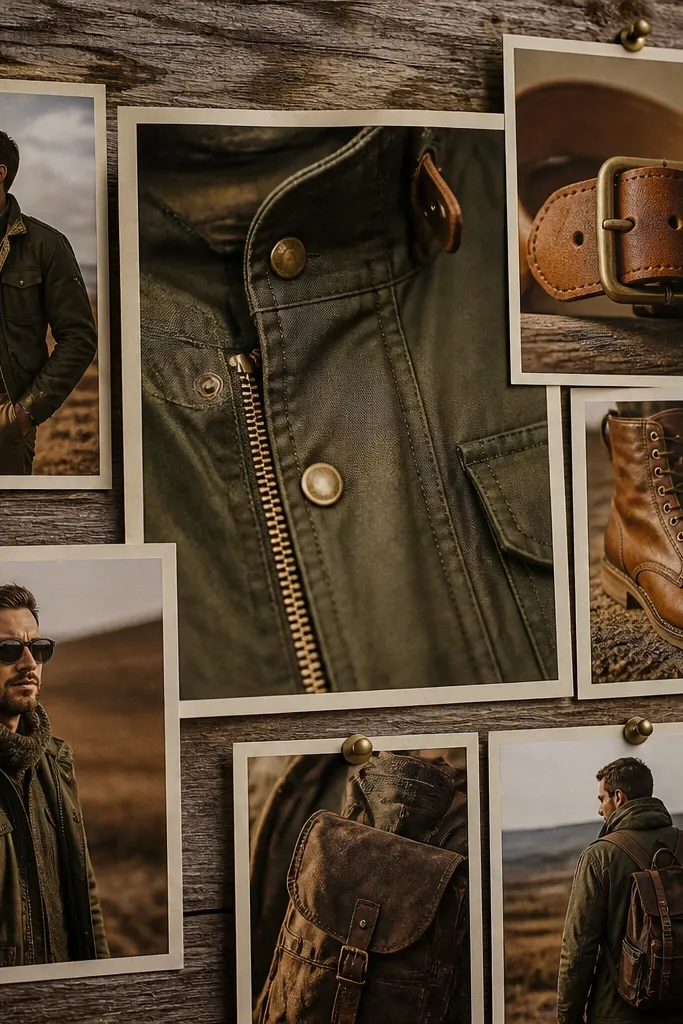
This board is for the “utility but make it cute” crowd. Olive fabric gives you that grounded, outdoorsy mood, while tan leather adds a polished finish. It’s visually strong because the photos naturally share earthy tones and rugged textures. Include at least one close-up of hardware (brass buttons, zipper teeth) so the board feels tactile, not generic. It works well in entryways, craft rooms, and bedrooms when you want your wardrobe to feel practical and stylish.
Editor's notePick one olive tone (moss or sage) and stick to it so the board looks intentional.
Choose 5 outfit photos and 4 detail photos, keeping everything in olive, khaki, tan, and brass. Start by placing the jacket photo as the anchor, then build around it with boots and a bag. Mount on corkboard or textured backing if you have it, then use short washi tape strips at the corners for a clean hold. Label nothing; instead, add a small cutout shape (like a paper compass rose) in the corner.
Skip thisDon’t add neon greens or cold grays; they make the theme look off.
4. Rose Blush + Warm White Soft Romance
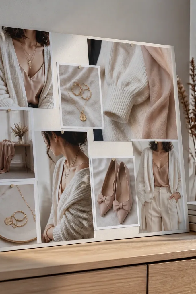
This is a wardrobe theme for gentle color without turning childish. Warm white keeps everything flattering, while blush gives softness that still photographs well in daylight. The board looks pretty because you build layers: a full outfit image, then close-ups of fabric drape, jewelry shine, and shoe shape. Keep jewelry images consistent — pearls, thin gold chains, and rose-toned stones read as one story. This works for date-night dressing, brunch uniforms, and anyone who wants a calmer color palette.
Editor's noteUse daylight photos when possible; blush looks better without harsh indoor lighting.
Print 9-12 photos using only warm white, blush, and one neutral like taupe. Put the dress or blouse photo in the top center, then add 3 detail photos around it: necklace, fabric texture, and shoe. Use light pink paper strips behind photos to soften contrast, but keep text zero. Mount with photo corners or tape so edges look crisp.
Skip thisDon’t mix in stark black — it makes blush look harsher than you want.
5. Navy Sailor Stripes + Red Pop
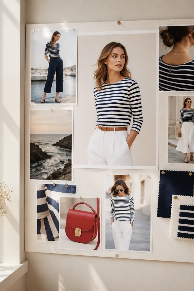
This theme is punchy and graphic, which is why it looks great on a board. Navy stripes give structure, white keeps it fresh, and a red pop adds energy without turning chaotic. Your photos should show stripe direction clearly in at least one hero image, because that’s the visual hook. Add one accessory image with red (scarf, bag, lipstick shade) so the board feels intentional. It’s ideal for people who want a classic look with one playful detail.
Editor's noteKeep red items consistent in tone — choose true red, not pink-red.
Collect 8 photos: 4 outfit shots, 2 accessory shots, and 2 shoe shots. Make sure at least one outfit photo includes visible stripes and a clean white base underneath. Arrange in a diagonal pattern across the board for movement: top left to bottom right. Use a navy paper backing and mount photos with straight edges so the stripes don’t look crooked.
Skip thisDon’t add too many other prints; stripes need breathing room.
6. Burgundy Knit + Chocolate Brown Cozy
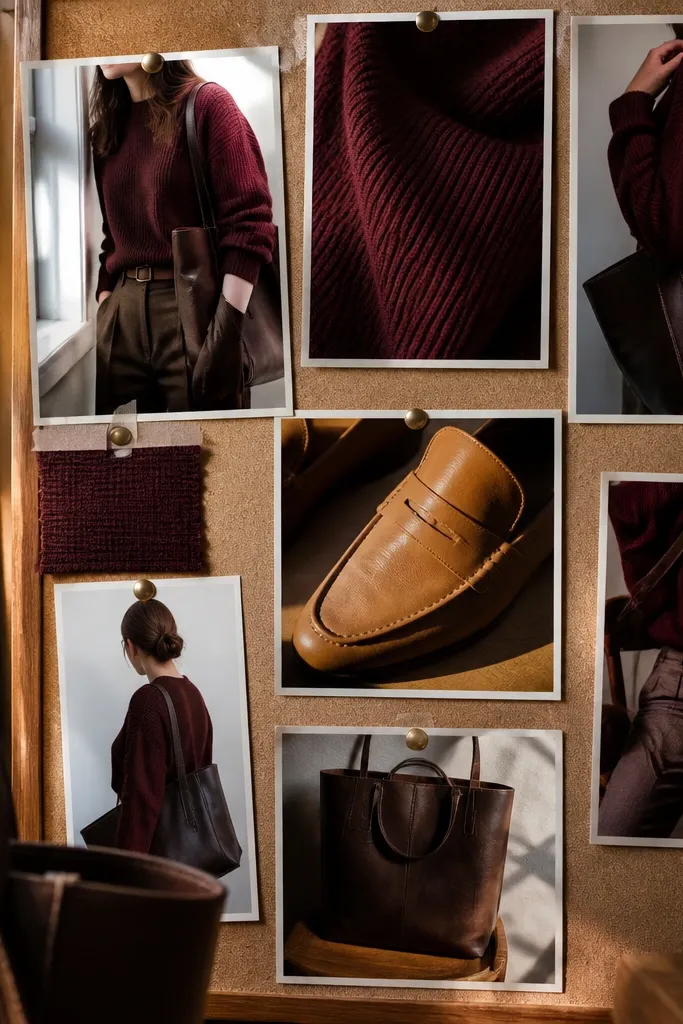
If your style is seasonal and you want cozy without looking sloppy, this is the board. Burgundy reads richer than wine and looks great in matte knit textures. Pair it with chocolate brown for depth, then add one warm accessory like a tan loafer or leather tote strap. The board works because it’s all about fabric: knit, wool, and brushed cotton show the theme clearly. Put it in your closet area so you see it when you’re picking layers.
Print 10 photos in burgundy, wine-adjacent reds, chocolate brown, and one tan highlight. Choose a hero image of a knit sweater paired with brown bottoms, then add detail shots of knit texture and leather grain. Mount on a light cream backing so dark colors don’t swallow the board. Leave 1 inch spacing between photos so the board doesn’t turn into one big dark block.
Use small swatches of fabric behind two photos to show knit weave — it makes the board feel curated.
Avoid mixing burgundy with cool gray; it flattens the warmth.
7. Monochrome Sage + Cream Airy Layers
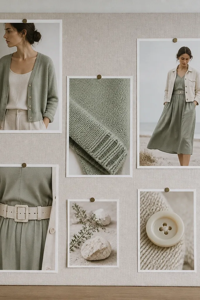
This board makes light outfits look like a plan. Sage and cream create a gentle palette that stays flattering in photos, even when the lighting isn’t perfect. Your board should show layering: a cardigan over a tank, a light jacket over a dress, or a soft shirt under a vest. Add one “structure” element like a belt or clean tote handle so it doesn’t look too floaty. Great for spring wardrobes, airy apartments, and anyone who wants a calm, clean aesthetic.
Pick 9 photos total. Place the most structured outfit photo in the center, then surround with layering details: sleeves, hems, and shoe silhouettes. Use light cream backing paper and keep your tape or corners minimal so the photos look airy. If you’re pinning, keep all pins on the same side of each photo for a neat edge.
Choose sage items that lean more gray-green than yellow-green for a more modern look.
Don’t add dark navy accents; it pulls the board out of its soft palette.
8. Earthy Terracotta + Natural Straw Summer
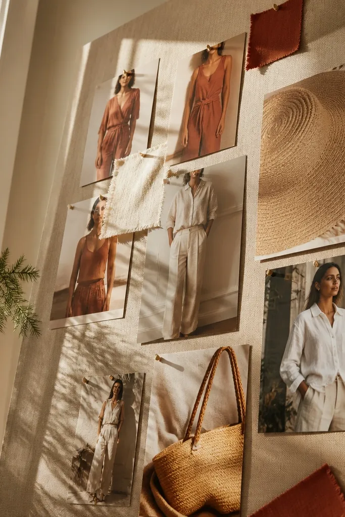
Terracotta plus straw looks like summer even when you only wear it twice a week. The warmth of terracotta photographs beautifully against neutral backgrounds, and straw adds texture you can actually see from a distance. Include one photo of a straw bag or woven hat so the board has a tactile anchor. Keep linen and cotton in the mix for believable texture variety. This is ideal for vacation packing, weekend outfits, and anyone who wants their wardrobe to feel sun-kissed.
Gather 11 photos: 5 outfits, 4 details (woven textures, buttons, stitching), and 2 shoe shots. Start by placing the straw bag photo as the anchor on one side, then build outfits using terracotta tops and light bottoms. Mount on tan cardstock and use matte prints so the woven textures don’t glare. Add small cut paper circles in a lighter clay tone to echo terracotta without adding clutter.
If you print, adjust exposure so terracotta doesn’t turn orange; aim for warm brick, not neon.
Skip bright cobalt or lime; they clash with terracotta’s warm base.
9. Soft Black Leather + Cream Minimal Night Out
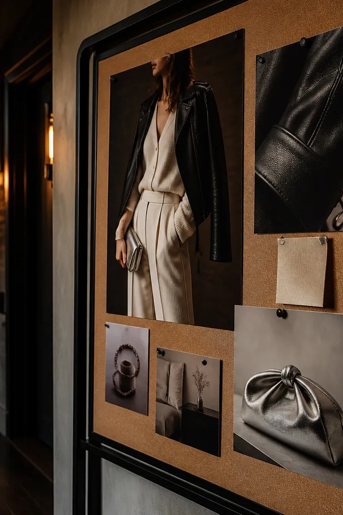
This board is for the “one outfit does everything” mindset. Cream and black are high-contrast, but the leather texture keeps it from looking plain. The look is sleek because you repeat one hero item — a leather jacket, skirt, or bag — across the board. Include a close-up of leather grain so the board has depth even if your photos are simple. It fits small apartments, capsule wardrobes, and anyone who wants night-out outfits that still feel streamlined.
Editor's noteUse a silver accent detail (a small metallic sticker or ribbon) so hardware matches across images.
Choose 8 photos and keep the palette to cream, black, and one metal tone like silver. Put the leather jacket photo in the upper center, then add 3 outfit photos that reuse the same cream base. Mount with a black border around the board so cream photos look crisp. Use photo corners so the edges stay sharp and don’t peel.
Skip thisDon’t include tan leather in the same board; it turns the palette muddy.
10. Powder Blue + Silver Chill Office
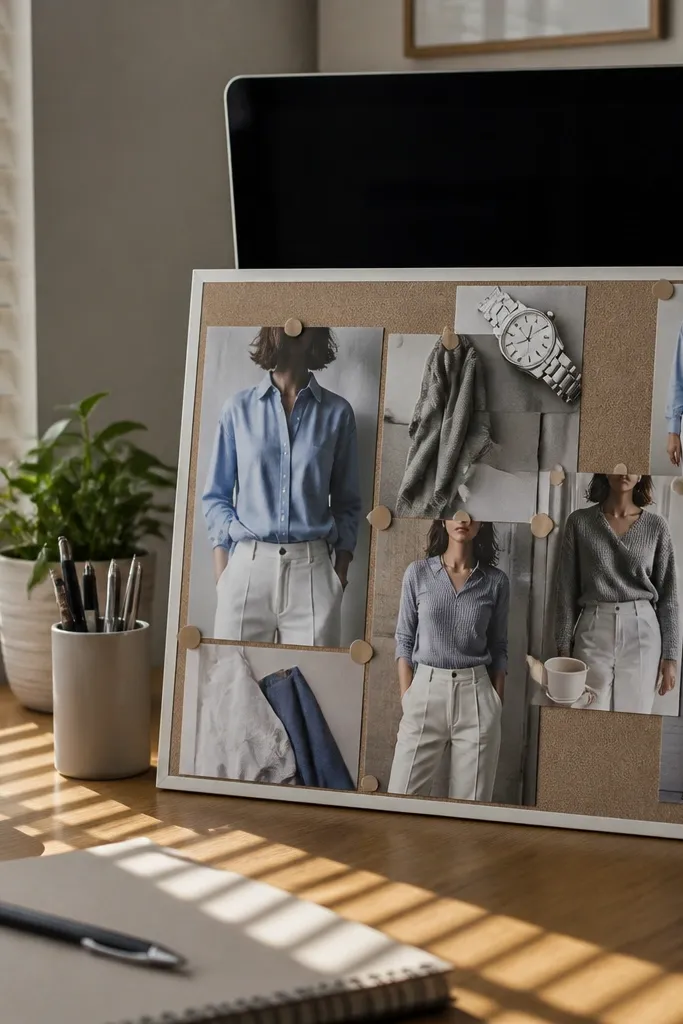
Powder blue makes office outfits look fresher without going loud. Pair it with gray and crisp white so the board feels clean and organized. Add one silver accessory photo to keep the theme consistent and photo-ready. This board looks good because it’s built around one color family and one metal finish. It suits workwear capsules, people who hate bright prints, and anyone who wants their wardrobe to look tidy in pictures.
Editor's noteChoose powder blue items that look slightly muted, not neon-cold; it photographs more flattering.
Collect 10 photos: 4 powder blue outfits, 3 detail shots (watch, buttons, fabric texture), and 3 bottoms/shoes. Place one powder blue blouse photo as the hero at the top, then build a neat column layout down the side. Print on matte paper and keep spacing even with a ruler. Finish by adding a thin strip of light gray paper behind the powder blue photos to improve contrast.
Skip thisSkip warm orange accessories; they fight the cool palette.
11. Camel Coat + Black Turtleneck City Chic
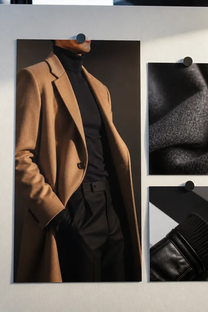
This theme is the easiest way to make winter dressing look intentional. Camel and black create a city-chic contrast that reads expensive in photos. The board works because it’s built around one outerwear hero — the camel coat — then repeats black underneath. Add one photo of scarf texture or glove material so you get that winter detail without clutter. It’s perfect for colder climates, capsule wardrobes, and anyone who wants a polished look with minimal effort.
Pick 9 photos and make the camel coat photo the center anchor. Add 3 photos for the black base (turtleneck, boots, tote) and 2 detail shots (scarf fold, coat buttons). Mount on cream paper and use a thick border around the coat photo so it stands out. Keep your fonts empty — no labels — because the photos do the work.
If you print, use slightly higher contrast so camel doesn’t look washed out next to cream backing.
Don’t mix in olive green with camel on the same board; it shifts the vibe.
12. Bright Summer Yellow + White Eyelet
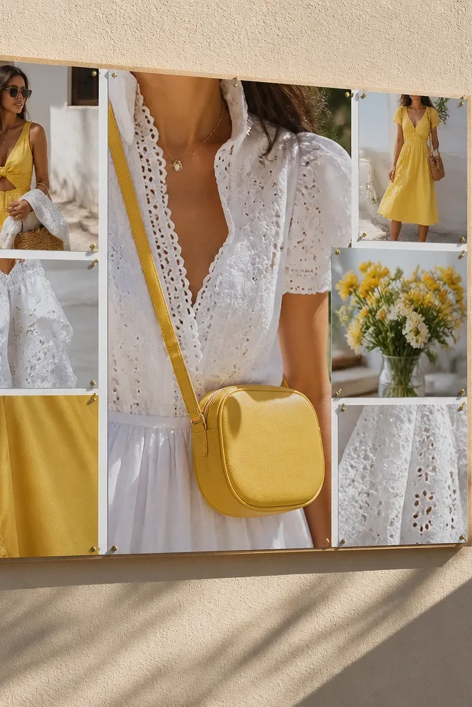
Yellow boards are bold, but the trick is pairing it with white textures that look delicate in photos. Eyelet, lace, and crisp cotton keep the look airy instead of loud. Add a couple of accessory shots like gold hoops or a small bag so the yellow feels styled, not random. This board is for people who want standout outfits that still look cohesive. Put it near your closet door so it nudges you toward the pieces you actually love.
Gather 10 photos: 4 yellow hero outfits, 4 white texture close-ups, and 2 shoe or bag photos. Arrange in a sunburst pattern with the yellow photos radiating outward from the center hero. Use white backing paper and keep photo edges aligned so the layout looks intentional. Tape down thin strips behind eyelet photos so the texture shows without glare.
Keep yellow items in one shade family (lemon vs. Mustard) across the whole board.
Avoid mixing yellow with busy floral prints; it turns the board visually noisy.
13. Gray Sweatshirt + Black Bike Shorts Athletic Street
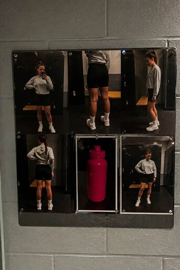
This theme turns workout clothes into a style plan. Gray and black streetwear looks clean in photos because it’s mostly solids and simple shapes. The key is to include one sporty hero outfit photo and then repeat details like sock height, sneaker silhouette, and cap brim. Add a small accent item like a bright water bottle photo if you want a single pop color. This is ideal for gym-to-cafe routines and anyone who wants a low-effort wardrobe that still looks cool.
Print 9 photos total and keep everything in gray, black, and one accent color. Place the sweatshirt-and-shorts outfit in the center, then arrange the rest around it in a slightly staggered pattern for street energy. Mount on dark gray paper to make lighter grays look richer. Use matte prints so sweatshirts don’t glare.
Pick one sneaker color family and stick to it; mixed shoe tones ruin the clean look.
Skip too many close-ups of random accessories; one hero detail per side looks better.
14. Linen Stripe Set + Woven Sandals Beach Day
Stripes plus linen reads instantly beachy, but it can still look grown-up. The board works because stripes give structure while linen gives texture. Include a hero photo with the striped top and matching light bottoms, then add close-ups of woven sandals and hat weave. Keep the palette to beige, cream, and one muted blue or stripe color. Great for warm-weather wardrobes and anyone who wants a casual look that still photographs well.
Collect 12 photos and keep stripes visible in at least 3 of them. Put the hero striped outfit at the top left, then place the sandal and hat close-ups on the right side. Use a light sand-colored backing and leave 1 inch borders around each photo. If your prints have strong shadows, lighten them slightly so the board looks airy.
Use a ruler to align stripe angles; crooked stripes make the whole board look sloppy.
Don’t add dark denim; it makes the beach theme feel heavy.
15. Emerald Satin + Gold Chain Luxe
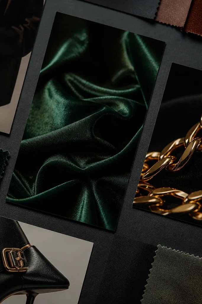
This theme is built for shine without looking tacky. Emerald satin photographs with depth, and gold chain details look sharp against dark bottoms. Your board should have one hero image showing the satin drape, then add close-ups of the chain and shoe hardware. Keep the rest dark and neutral so emerald stays the star. It’s perfect for party dressing, holiday outfits, and anyone who wants a wardrobe that looks glamorous in one glance.
Editor's noteChoose matte prints for satin photos; gloss prints can blow out highlights.
Pick 8 photos: 3 emerald satin outfits, 2 gold jewelry close-ups, and 3 shoe/bag shots. Arrange in a vertical stack with the satin hero at the top, then alternate outfit and detail images. Use black backing paper so emerald looks richer and gold pops. Mount using photo corners for a clean, gallery feel.
Skip thisAvoid mixing gold and silver hardware in the same board; pick one finish.
16. Red Statement Dress + Black Accessories
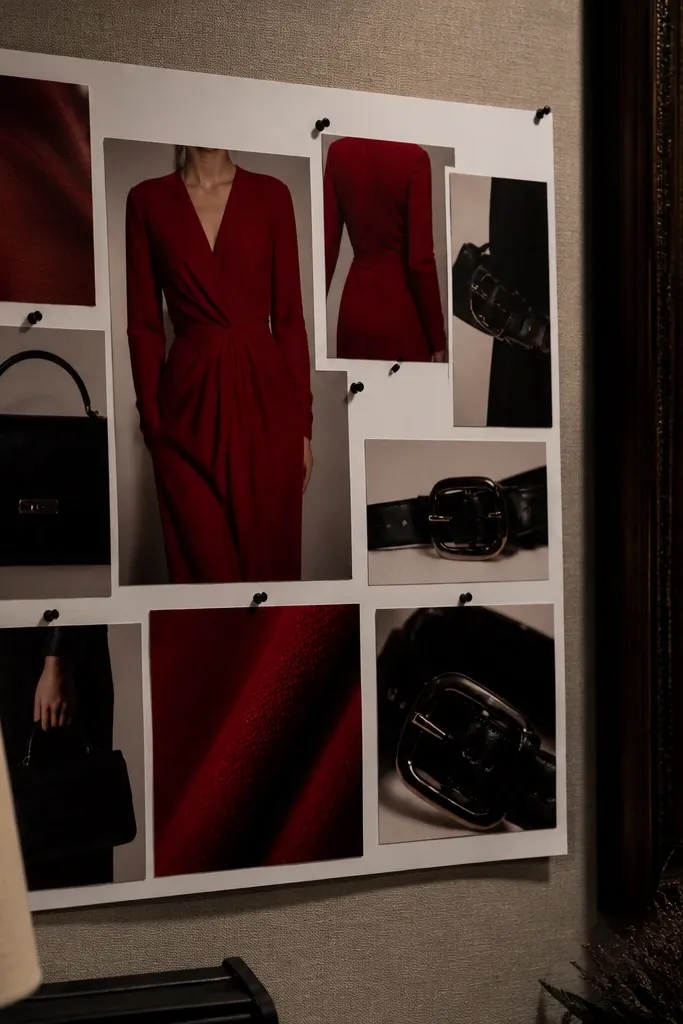
This board is for people who want a standout item to anchor their style. A red statement dress gives instant drama, and black accessories keep it grounded. The board looks best when you include one photo of the full dress and then repeat black elements across multiple images so the outfit feels consistent. Add a small swatch card with the red tone next to the dress photo so the color stays accurate across prints. Great for events, date nights, and anyone building a mini capsule around one favorite piece.
Editor's noteKeep all black photos truly black — avoid charcoal; it looks different next to red.
Print 7-9 photos and place the dress as the center anchor. Add two close-ups: neckline detail and shoe or clutch shape. Add one extra card with a printed lipstick shade or fabric swatch in the same red tone. Mount on white or cream backing so the red stays crisp and doesn’t look muddy.
Skip thisDon’t add multiple red shades; one red tone keeps the board clean.
17. White Shirt + Denim Overalls Playful
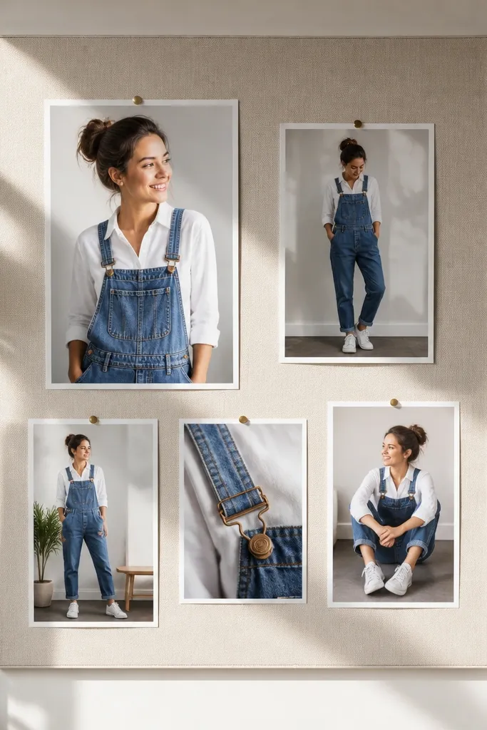
This theme makes everyday outfits look cute without turning childish. White shirt and denim overalls share a natural casual palette, and canvas sneakers add a friendly finish. The board works because the silhouettes are easy to repeat: one top, one denim layer, one shoe type. Include a detail photo of overall straps or stitching so the board has texture. It’s good for weekend wear, school runs, and anyone who wants a light, approachable wardrobe.
Grab 10 photos and keep them all in white, denim blue, and one neutral like tan. Place the overall outfit hero in the center, then add 4 detail photos around it: stitching, straps, shoe laces, and bag texture. Mount on light gray backing paper to make denim look richer. Keep the layout symmetrical — it makes the cute theme look intentional.
Use a single font-free layout: no labels, no arrows, just consistent spacing.
Skip dark leather boots; they fight the denim casual vibe.
18. Pattern Mixing Rules: Checks + Solid Neutrals
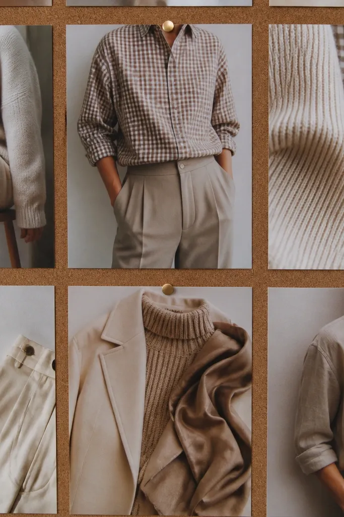
If you love patterns but end up looking chaotic, this board gives you a rule you can follow. The theme is built around checks (or gingham) paired with solid neutrals so you get visual interest without losing control. Your photos should show one patterned hero item and then multiple solid pieces that calm it down. Add a detail shot of fabric close-up so the board looks styled, not random prints. This works for creative wardrobes, people who want variety, and anyone who needs a pattern system.
Editor's notePick one neutral base (beige, cream, or taupe) and keep it across every outfit photo.
Collect 9 photos: 3 checkered pieces, 4 solid neutral outfits, and 2 accessory shots. Arrange with a clear separation: patterned photos on one side, solids on the other. Print on matte paper and keep neutral backgrounds consistent so photos don’t look mismatched. Add a small strip of patterned paper behind the patterned side to reinforce the rule visually.
Skip thisDon’t add three different pattern types; checks plus solids already does the job.
19. Camel + Cream Knitwear Capsule
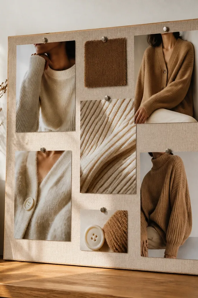
This theme turns knitwear into a system. Camel and cream are close enough to match, but different enough to create dimension in photos. The board looks great because it’s all about texture: ribbed knits, soft cardigans, and brushed wool. Include at least one photo of a knit close-up so you can see the fabric pattern, not just the color. This is a strong fit for anyone building a capsule wardrobe or trying to rotate fewer items in colder months.
Print 12 photos and focus on knit texture: 5 outfit photos and 4 close-ups of knit weave. Put the camel turtleneck image in the center, then add cream layers around it. Use cream backing paper and keep spacing consistent with a ruler. Finish by adding two accessory photos that match the knit palette — like tan boots and a camel tote strap.
Take the guesswork out by choosing one boot color family that appears in at least 3 photos.
Avoid adding black or bright red accessories; knit capsules look best staying in the warm neutral family.
20. Pastel Lavender + Soft Gray Calm
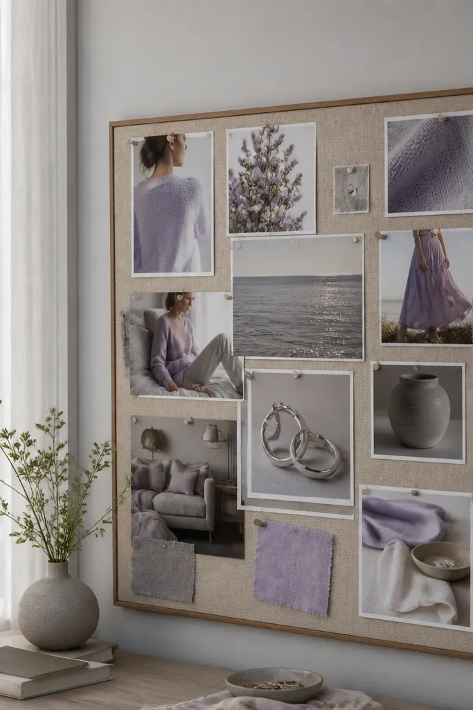
This board is for soft, calm outfits that still look curated. Lavender looks gentle on camera, and soft gray keeps it grounded. The board works because you repeat one “cool pastel” tone and one neutral so every photo feels like it belongs. Add one jewelry close-up in silver or light metal so the board has a consistent finishing touch. It’s a good fit for people who want a lighter wardrobe without going neon or overly colorful.
Editor's notePrint lavender photos slightly darker; pale prints wash out quickly on white paper.
Choose 10 photos and keep the palette to lavender, soft gray, and white. Place the lavender hero outfit in the top center, then add gray bottoms and silver accessory details around it. Mount on white backing paper and keep the collage airy with slightly larger gaps between photos. Use washi tape only at the corners so the lavender images stay crisp.
Skip thisDon’t mix in warm tan — it shifts lavender into a more muted, less fresh look.
21. Black-and-White Photo Booth Monochrome
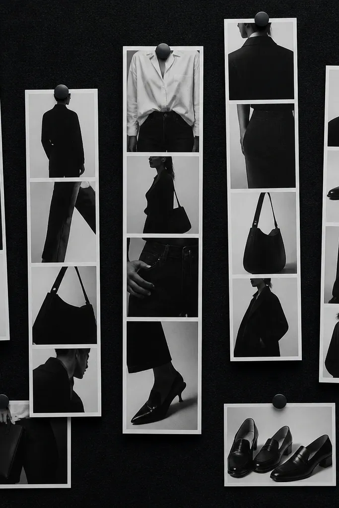
Monochrome black-and-white boards look stylish fast because they remove color decisions. This theme is about shape: collar lines, pant cuts, bag silhouettes, and shoe forms. The board looks good when the photos are consistent in contrast, so the collage reads like a set. Include a few framed photo strips to add variety without changing the palette. It’s ideal for people who want a high-fashion look without hunting for matching colors.
Editor's noteUse the same paper finish for all prints so blacks don’t look different between photos.
Print 10-14 photos in black and white and keep the contrast similar across the set. Use a mix of full outfit images and 3 detail crops, like a bag strap or watch face. Mount on black or deep charcoal backing for the most dramatic look. Add 2-3 “photo strip” layouts using narrow rectangles so the board feels like a gallery wall.
Skip thisAvoid mixing low-contrast grayscale photos; the board will look uneven.
22. Tropical Palm Green + Cream Linen Resort
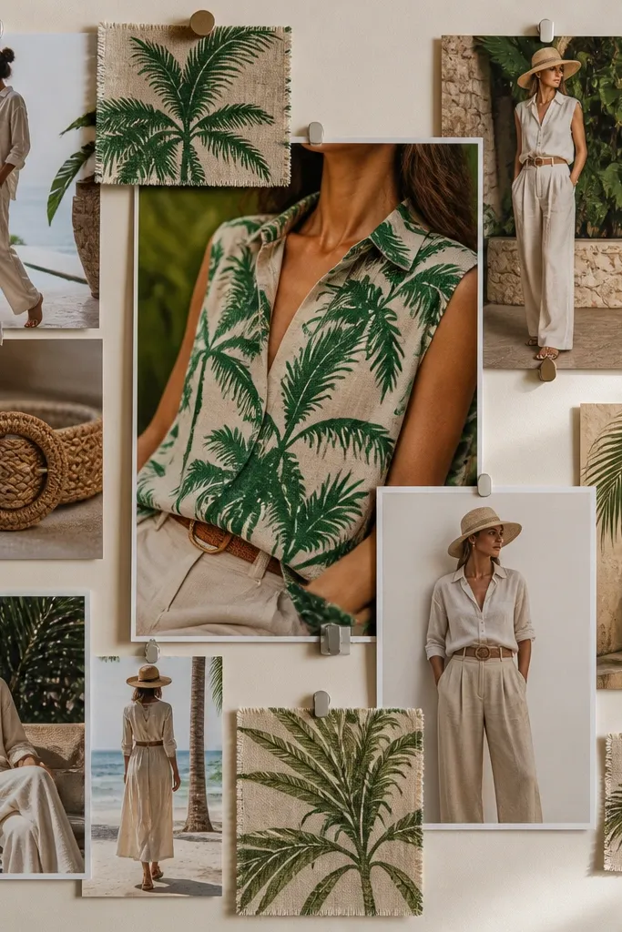
This board brings vacation energy into daily dressing. Palm green gives you a bold color cue, while cream linen keeps it airy and wearable. The board looks great because tropical patterns have clear shapes, and linen adds texture that makes photos feel real. Use one hero pattern photo, then repeat cream outfits to balance it. This is great for warm climates, resort packing, and anyone who wants a wardrobe that feels like a getaway.
Editor's noteChoose palm prints with one dominant green tone; multiple greens make the board messy.
Collect 9 photos: 2-3 palm green patterned items, 4 cream linen outfit shots, and 2 accessory shots like woven belts or sandals. Place patterned photos at the top corners and keep cream outfits in the center for balance. Mount on cream backing and use small green paper strips behind the patterned photos to reinforce the theme. Leave at least 1 inch between the pattern and cream sections so the board stays readable.
Skip thisSkip heavy black winter boots; they kill the resort vibe.
23. Chocolate + Ivory Wedding Guest Soft Glam
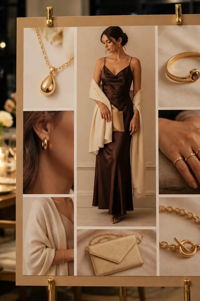
This themed vision board ideas pictures set is built for event dressing that looks polished without going full formal. Chocolate and ivory create a classic contrast, and gold accessories add polish in photos. The board works because it includes one full outfit hero and then details that scream “guest-ready”: shawl drape, clutch shape, and shoe height. Keep fabrics in the mix that photograph well — satin, crepe, and brushed knits. Great for weddings, dinners, and any event where you want to look thoughtful, not last-minute.
Editor's noteUse low-glare prints for satin; glossy paper can blow out highlights on event fabrics.
Print 8-10 photos and keep the palette to chocolate brown, ivory, and gold. Place the dress hero at the center, then add 2-3 detail photos around it: clutch, jewelry, and shawl or wrap. Mount on warm ivory backing and use consistent spacing so the collage looks intentional. Add one small metallic gold accent sticker near the jewelry photos to tie the board together.
Skip thisDon’t mix in cool silver jewelry; it breaks the chocolate-and-gold harmony.
24. Denim-on-Denim Blue Fade + White Sneakers
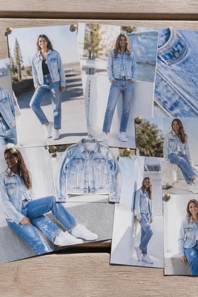
Denim-on-denim looks best when you show fades clearly. This board is built around multiple blue washes so your outfits look layered even with simple pieces. White sneakers keep the palette clean and make the whole board feel fresh. The board works because it teaches a shade rule: mix one light wash with one medium or dark wash, then keep accessories neutral. It’s ideal for casual style, spring and fall dressing, and anyone who wants an easy wardrobe that still looks put together.
Editor's noteMatch the undertone: choose washes that lean either warm blue or cool blue, not both.
Pick 10 photos and include at least 3 different denim washes. Choose one hero photo showing a denim jacket over jeans, then add detail shots for seams, buttons, and pockets. Arrange the light-wash photos on one side and darker-wash photos on the other. Mount on white backing and keep all accessory photos centered under the matching wash section.
Skip thisAvoid adding tan belts or bags; they make the denim fade look mismatched.
25. Camel Suede + Forest Green Plaid Cozy Cabin
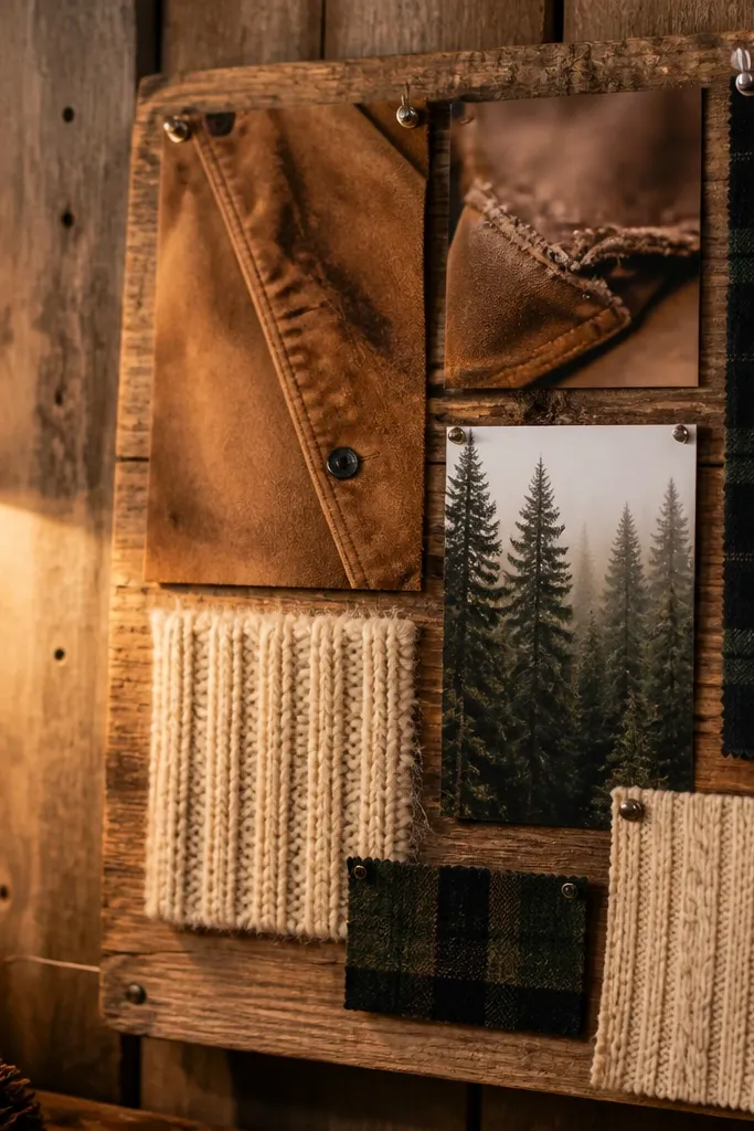
This themed vision board is about texture, not color chaos. Camel suede gives you that warm, slightly dusty base, and forest green plaid adds structure and a little drama without fighting the neutral. Build the board like a mini outfit board: suede swatches, plaid strips, and cream knit pieces arranged in a grid so every photo reads clearly. It fixes the usual vision board problem where everything looks pretty up close but messy as a set. Materials are cheap and forgiving: cardstock, fabric swatches, and a few printed outfit photos tied together with consistent borders. It takes about 60-90 minutes if you cut cleanly, and it suits fall closets, cozy workwear corners, and anyone who wants a wardrobe that feels grounded.
Editor's noteUse a 45-degree cut on fabric corners so they don’t lift at the edges when you seal the board.
Step 1: Cut a 16x20 inch board from foam board or thick matte poster board, then draw a 3-column grid with 1/4 inch gutters using a pencil and ruler. Make each column one material story: column one is camel suede texture (use real suede samples if you have them, or print a close-up photo of suede and tape it down), column two is forest green plaid strips, and column three is cream knit (actual knit scraps or printed swatches). Step 2: For the plaid, cut strips 1.5 inches wide and vary the length by about 1 inch so the board looks styled, not uniform; align plaid so the pattern direction stays consistent across each strip. Step 3: Add 8-10 outfit photos that match the palette, but crop them tight so you only show the garment area and accessories; place one photo per grid cell and frame each with a 1/2 inch cream paper mat. Step 4: Seal the whole thing with matte Mod Podge or a clear matte spray over the fabric areas, then let it dry flat for 2 hours before hanging.
Skip thisAvoid mixing plaid scales (tiny check next to big tartan) — it makes the board look like random samples instead of one outfit mood.



