
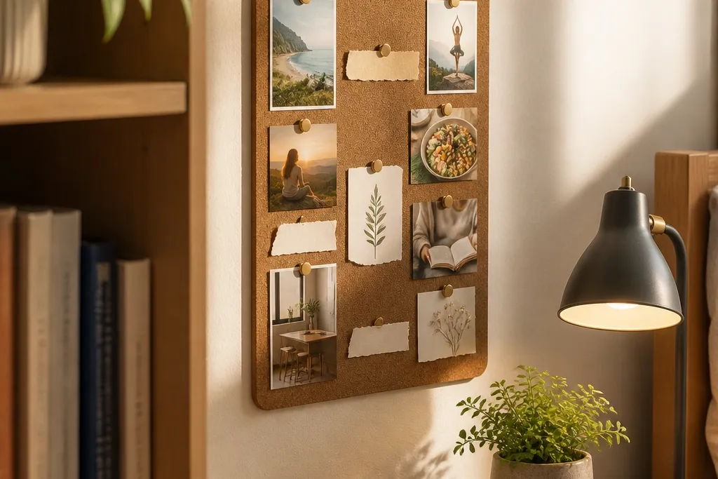
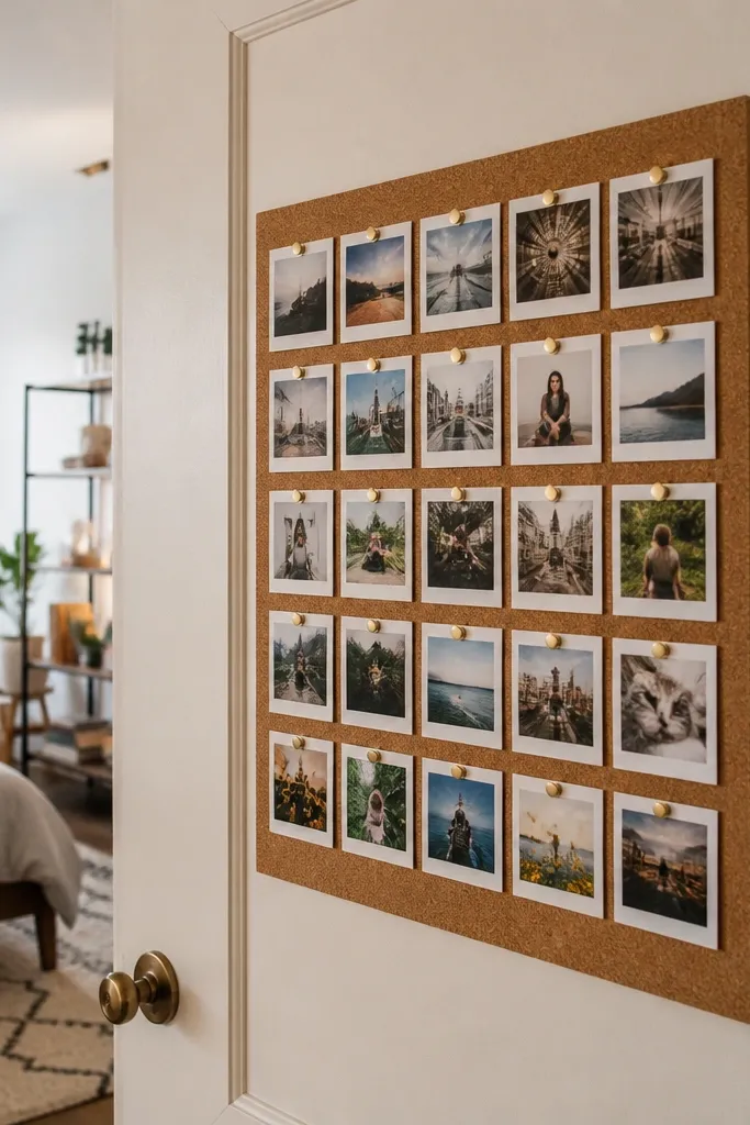
1. Corkboard Grid With Cream Paper Bands
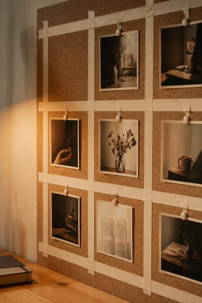
This is a small-space vision board that looks tidy because the grid creates instant structure. Start with a corkboard panel and cover the negative space with cream paper bands so clippings don’t float around. Pin photos in the grid cells using matching pushpins so it looks like a design system, not a scrapbook. It’s great for tight walls and dorm corners because the cork texture adds warmth while the cream keeps it bright in pictures. Expect it to take about an evening and a little patience with straight spacing.
Cut or buy a corkboard panel sized for your space, like 12x18 inches. Tear or trim cream cardstock into strips that are all the same width, around 1 inch, then place them in a grid with a few millimeters gap. Pin each strip alignment point first so the grid stays straight, then add small photo squares into each cell using pushpins. Finish by tying a thin jute string around the board edges or pin a small label card in the corner for a clean focal point.
Editor's noteUse a metal ruler and mark the grid lightly with pencil before you pin anything.
Skip thisDon’t use random pin colors — it breaks the “designed” look fast.
2. Black Felt Board With Gold Washi Borders
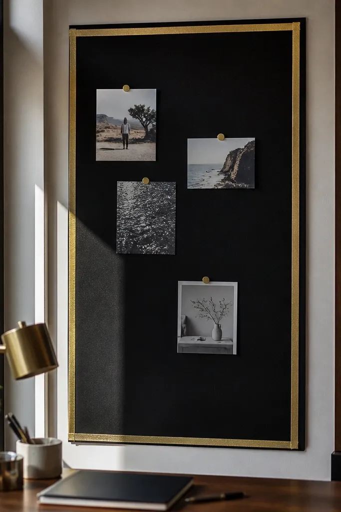
Black felt makes everything look styled because it absorbs light and makes your photos pop. Gold washi borders give you crisp frames without needing a full picture frame. This setup is perfect if you want a moody, modern aesthetic pic and you’re placing the board on a narrow desk wall. The felt also grips lightweight paper, so your board stays flat and doesn’t sag when you add multiple clippings. It’s a good choice for people who keep changing their goals because felt tolerates swaps.
Buy a felt sheet or felt panel in black, sized around 11x14 inches for a compact board. Cut small rectangles of gold washi tape and place them as borders around photo clusters, not around every single image. Attach photos with tiny glue dots or by pinning through the felt. Add one “anchor” card in the center using thicker cardstock so the composition has a focal point.
Press the washi down with a credit card edge so it stays crisp in photos.
Don’t overload the board with too many small pieces — black felt looks best with breathing room.
3. Framed Photo Holder With Clear Pocket Inserts
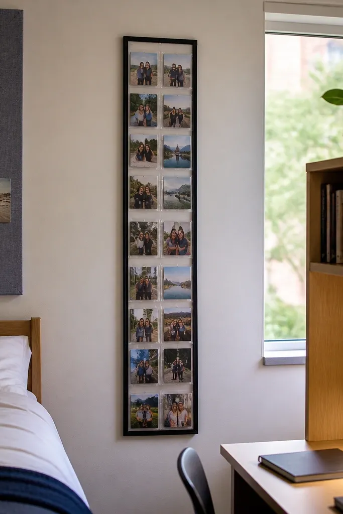
If your goal is an aesthetic pic with zero clutter, clear pockets beat tape. This method uses a frame plus plastic sleeves so photos look like organized cards instead of loose paper. It works especially well for small spaces because you can mount it vertically and it still reads clean. You also get easy swaps: pull a card out, slide a new one in, and the layout stays the same. It’s great for renters since you can mount the frame with minimal wall damage.
Choose a slim frame with a backing board, size around 10x20 inches. Attach clear document pockets or plastic trading-card sleeves to the backing with strong adhesive strips, keeping them in a grid. Slide printed photos and small label cards into each pocket so edges line up. Add a title strip at the top in a single color, like white or cream, using thin cardstock.
Editor's noteUse matte-finish photos so glare doesn’t ruin the aesthetic pic.
Skip thisAvoid glossy laminating — it creates shiny hotspots in indoor lighting.
4. Floating Shadow Box With Layered Tissue Paper
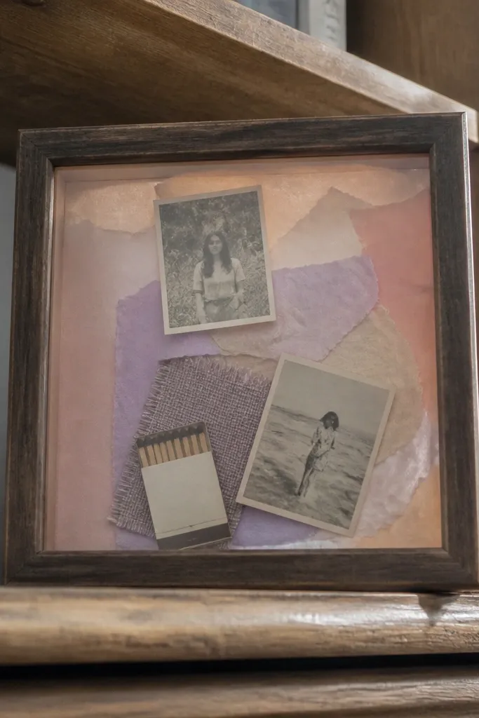
This is one of the best small-space vision board ideas aesthetic pic setups because it has depth. A shadow box lets you stack tissue paper layers behind photos for a soft, dreamy gradient look. It also lets you include tiny objects — like a matchbook, a ticket stub, or a fabric swatch — without them getting crushed or curling. The result looks intentional even when your space is small because the box creates a defined stage for everything. It takes a bit longer than tape boards, but the visual payoff is real.
Pick a small shadow box frame, about 8x10 or 9x12 inches, with a depth of at least 1.5 inches. Cut tissue paper into 3-4 overlapping shapes and tape them to the back panel lightly at the edges. Layer your photos on top with double-sided tape dots, then add small objects using glue dots. Finish by placing a simple caption card in one lower corner so the scene feels finished, not random.
Editor's noteChoose tissue paper colors that are close in tone (cream to blush) for a smoother gradient.
Skip thisDon’t glue tissue paper flat in the center — it wrinkles and looks messy in close photos.
5. Mini Desk Vision Board With Magnetic Sheet
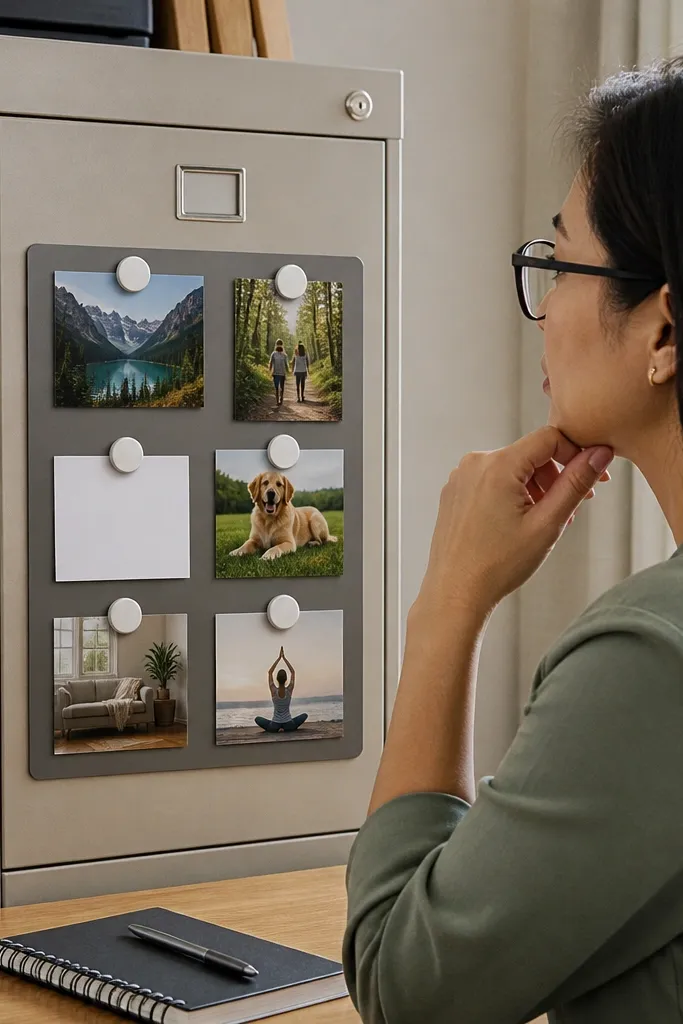
A magnetic sheet board is a small-space cheat code when you want an aesthetic pic without fuss. It looks clean because magnets hold images evenly and you don’t see tape lines. You can mount it on a desk, the side of a shelf, or inside a cabinet door. The layout stays consistent even when you rotate photos for different seasons. It’s a smart pick for tiny apartments where wall mounting is a no-go.
Get a thin magnetic sheet panel, like 9x12 inches. Cover it with a matte fabric or paint a thin layer on a rigid backing so the metal doesn’t show through. Use small magnets to attach photo prints, and add label tags with a strip of cardstock. Arrange in two rows with one larger center photo so the composition looks intentional.
Editor's noteUse 10-15 small magnets rather than a few big ones so images sit flat.
Skip thisSkip heavy magnets — they bend paper and make corners lift.
6. Linen Ribbon Pinboard With One Corner Cluster
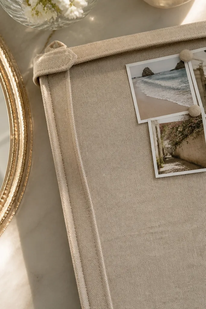
Instead of filling the whole board, this design places the action in one corner. Linen ribbon adds a soft, tactile look that reads expensive in photos, and the corner cluster keeps your small space from looking crowded. It’s ideal if you want a board that looks calm and styled, not chaotic. The ribbon also creates a natural boundary so your photos don’t sprawl. You can fit this on a narrow wall strip or beside a mirror.
Use a small pinboard panel, around 10x14 inches. Wrap linen ribbon around the board edges lightly, then tie two vertical ribbon lines to form a corner frame. Pin your photos inside that corner, keeping each photo the same size or same aspect ratio. Add one text card in the corner on top of the ribbon so it looks layered.
Editor's noteTrim ribbon ends on a slant so they don’t fray as fast.
Skip thisDon’t spread the cluster across the entire board — the aesthetic collapses.
7. Pastel Washi Tape Timeline Board
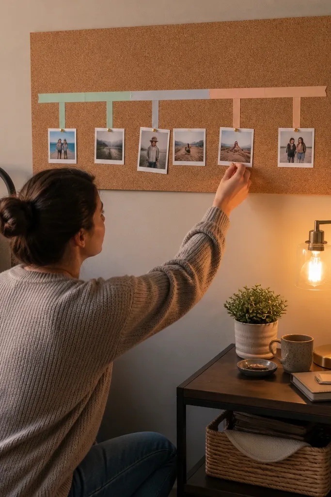
This board looks good because it creates a clear story line. A horizontal timeline with pastel washi tape gives you structure while still feeling soft and cute. Each photo sits at a point on the line, so even a small board looks organized. It’s perfect for goals that unfold — like saving, learning, or building a routine — and it photographs well because the eye follows the timeline. The overall vibe stays light and airy without needing lots of space.
Start with a cork or foam board around 12x16 inches. Draw a straight line across the center using a pencil and a ruler, then place pastel washi tape segments along it. Add small photos above and below the line at even intervals, each with a tiny label tag under it. Finish by adding two larger “chapter” photos at the ends of the timeline for balance.
Editor's noteUse one single pastel family (sage, mint, blush) so the timeline doesn’t look random.
Skip thisDon’t mix thick and thin washi strips — thickness differences show up in photos.
8. Polaroid-Style Strip Board With Tape Corners
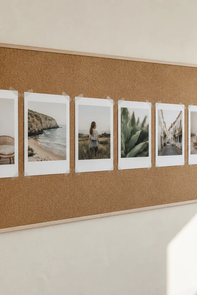
Polaroid-style strips make a small vision board look instantly cute because the photos feel like a set. Tape corners keep everything removable and give you that playful, styled look. This works best on a blank wall or a large cork panel where you can create a single horizontal strip. It’s also easy to swap individual photos without disturbing the whole layout. If you want an aesthetic pic that looks fun and not overly serious, this one delivers.
Use a neutral backing board, like off-white cardstock or a small cork rectangle. Print your photos with white margins, then cut them into consistent rectangles. Place them in a horizontal strip, leaving equal gaps, and tape only the corners with double-sided tape or washi. Add one small caption card at the far left so the strip looks finished, not floating.
Editor's noteKeep all photo widths within 1/8 inch so the strip looks aligned.
Skip thisDon’t tape the entire back — it makes the board look flat and less photogenic.
9. Acrylic Frame Collage With Matte Cards
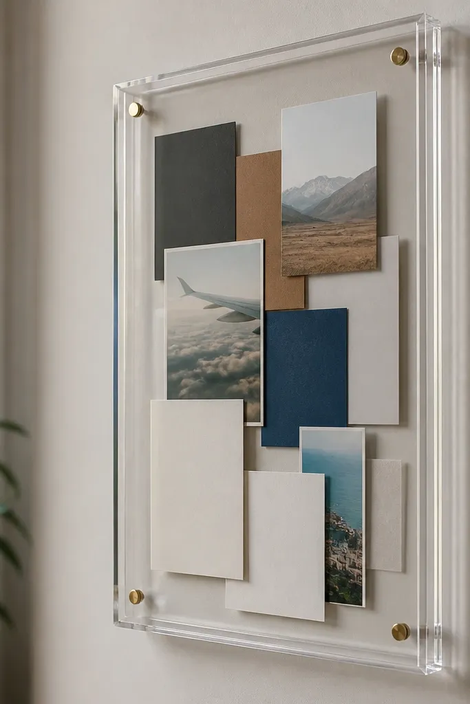
Acrylic frames look clean in photos because the edges are defined and the collage stays contained. Pair that with matte cardstock for photos so glare doesn’t wash out your colors. This is a great small-space vision board idea aesthetic pic choice if you want something that looks like decor, not crafts on a wall. The grid layout also keeps it readable from a distance. You’ll need a bit more prep for cutting cards, but the final look is sharp.
Buy or make a small acrylic frame, around 8x10 inches, with a removable backing. Cut matte cardstock into photo mats, all the same size, like 3.5x4.5 inches. Arrange mats in a grid with one larger center mat, then secure them with removable adhesive squares. Slide the whole collage into the frame and add a thin title strip at the bottom.
Use a craft knife and a metal ruler for perfectly straight mat edges.
Avoid mixing glossy and matte prints — the glare mismatch ruins the clean look.
10. Shadow-Box Mini Garden Goals
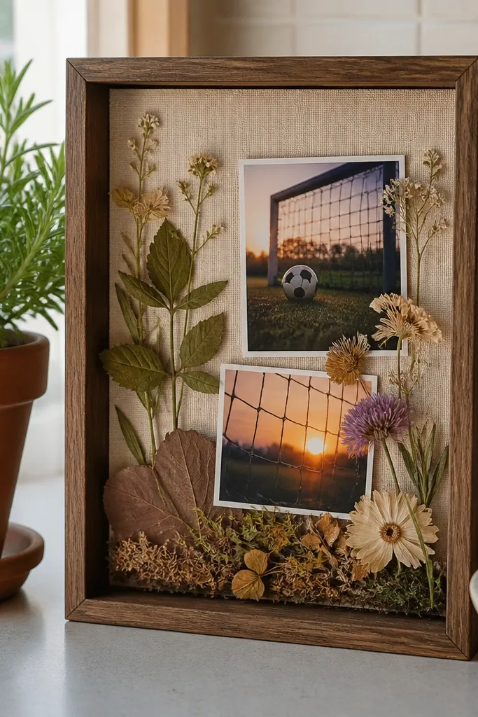
This board looks aesthetic because it mixes paper with real texture. A mini shadow box with dried leaves or pressed flowers makes it feel grounded, and it photographs beautifully against neutral backgrounds. It’s great for goals that connect to home, wellness, or creativity. The photos look calmer when they sit behind translucent elements like dried leaf layers. If you’re building a small board for a shelf, this is one of the most visually interesting options.
Find a small shadow box with a glass front, around 8x8 or 9x9 inches. Place a sheet of neutral cardstock inside, like light tan, and add a thin layer of tissue paper for softness. Arrange dried leaves in one corner, then glue down only the stem edges with a tiny amount of hot glue. Add your photos on top using glue dots and finish with a mini label card for each theme.
Editor's noteSeal pressed items with a light spray fixative so they don’t shed dust.
Skip thisDon’t glue leaves across the whole surface — it warps the paper and looks sloppy.
11. Grid Cork With Tiny Label Tags
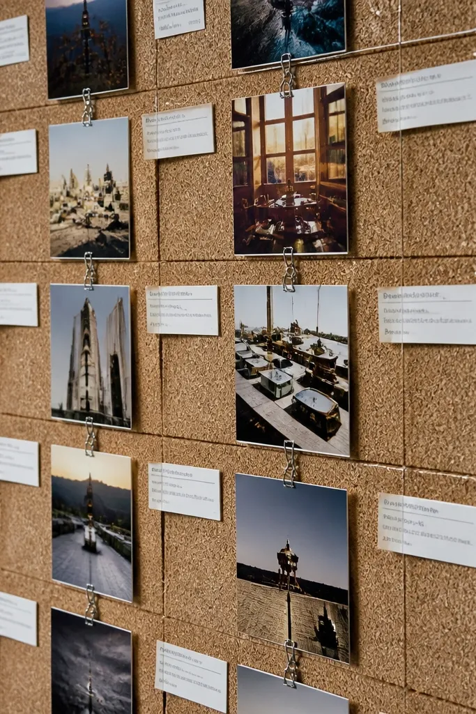
Tiny typed labels make the board look intentional even when the photos are small. This setup uses a consistent grid and repeating tag style so the whole thing reads like a designed wall piece. It’s perfect for small spaces because you can pack a lot of meaning into a compact panel without visual clutter. If you want an aesthetic pic that looks organized and calm, this is the move. It’s also easy to build quickly because the rules are simple: grid, repeat tags, repeat spacing.
Cut a corkboard panel to around 12x18 inches and draw a faint grid with pencil using a ruler. Print or handwrite label tags on cardstock, about 1 inch wide and 2-3 inches tall. Pin photos into each grid cell first, then place a label tag under each photo using mini binder clips or pushpins. Keep the tags all the same color, like espresso brown or sage green, for consistency.
Use a single font style for labels, even if handwritten, so the page looks designed.
Skip long paragraphs — labels should be short enough to read at a glance.
12. Monochrome Board With One Accent Color Pop
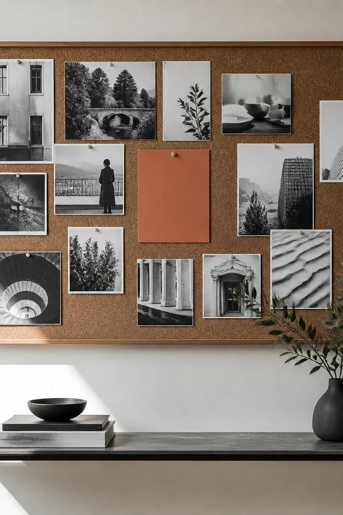
Monochrome boards look expensive because they reduce visual noise. Choose a black, white, and gray photo set, then add one accent color element — like a single terracotta card or a neon chartreuse label. That pop gives the viewer a focal point, which makes your small board photo look balanced. This works in tiny spaces because it’s controlled and doesn’t fight for attention. If you’re tired of boards looking messy, this rule fixes it fast.
Pick a background, like matte black foam board or off-white cork. Print photos in black and white (or choose grayscale images) and cut them to consistent sizes. Add one accent color element — a larger card, a ribbon strip, or a single photo with that color — and place it in the center. Keep all other labels in grayscale and use one accent-only font color for the center card.
Editor's noteChoose your accent color from one photo element so it looks like it belongs.
Skip thisDon’t sprinkle multiple accent colors — the board stops looking intentional.
13. Mini Fridge Magnet Mood Board
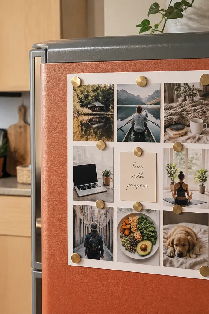
If your space is so small you can’t mount anything, use the fridge as your vision board surface. Magnets create a clean, removable layout, and the kitchen background makes warm colors look extra cozy in photos. Keep your design to a small rectangle, like 9x12 inches, so it doesn’t look like clutter. The magnets let you refresh goals without re-taping. It’s also practical because you’ll actually see it daily.
Measure a small space on your fridge and mark a 9x12 inch rectangle. Print 6-10 small photos and cut them to consistent sizes, plus 2-3 label cards. Use small magnets to attach photos in a grid, then place labels at the bottom row. Add one “weekly reminder” card in the top corner so the board has a focal spot.
Editor's noteUse matte photo prints so the fridge lighting doesn’t glare.
Skip thisDon’t mix paper sizes — mismatched edges make it look messy fast.
14. Velvet Ribbon Bow Board With Soft Labels
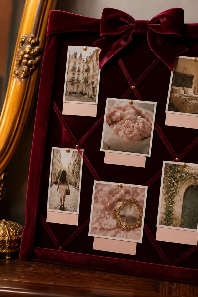
Velvet ribbon adds softness that reads instantly aesthetic in pictures. This board works because it creates a frame around your photos, and the ribbon texture makes the whole thing feel styled even if the board is small. It’s best for bedroom corners, vanity spaces, or beside a mirror. Use soft label cards to keep it cohesive. The look is romantic but still structured, thanks to the ribbon borders.
Start with a foam board or cork panel about 10x14 inches. Wrap velvet ribbon around the edges, then add two vertical ribbon lines to create a simple layout. Pin or tack photos into the center area using small brads or glue dots, then tie tiny bows at each photo corner. Finish by adding one larger label card under the center photo with a single line of text.
Editor's noteCut velvet ribbon ends cleanly and seal with a tiny dab of fabric glue at the tip.
Skip thisAvoid too many bows — one per photo cluster looks intentional; five looks chaotic.
15. Clear Tape Scrapbook With Clean White Margins
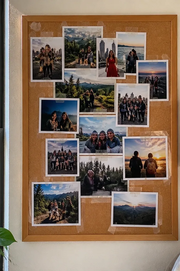
This is a scrapbook look that still reads clean because the margins stay consistent. Clear tape borders let you layer photos without hiding edges in dark adhesives. If you want “aesthetic pic” energy but you’re working with random clippings, this helps you organize them visually. The white margins make the whole board feel airy and modern, even when it’s on a small panel. It also stays removable, so you can adjust the layout later.
Use a small cork or cardstock base, like 12x12 or 12x16 inches. Print photos with white margins or add white paper mats so every image edge lines up. Layer photos with small pieces of clear tape at the corners only. Add a thin white strip label under your main photo, then keep spacing consistent by using a ruler for gaps.
Editor's noteTrim all tapes to the same width so the border thickness looks deliberate.
Skip thisDon’t overlap images randomly — overlapping without a plan makes it look like a pile.
16. Washable Contact Paper Backdrop With Photo Squares
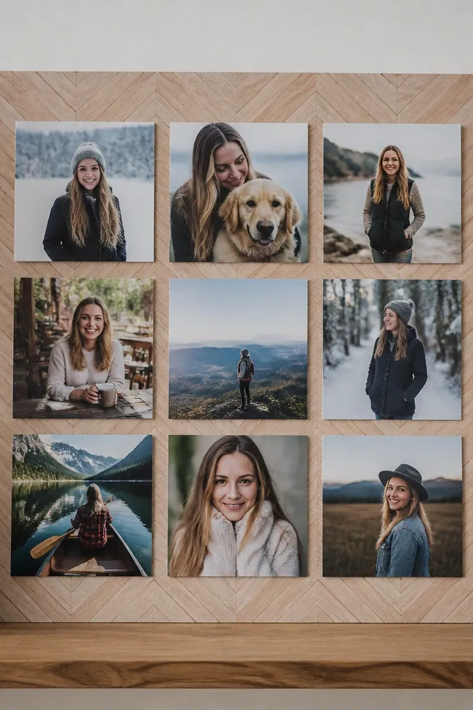
Contact paper is an easy way to make a small board look like decor. Choose a pattern that reads clean in photos — small polka dots, subtle marble, or warm wood grain. Then place photo squares in a grid so the pattern stays in the background instead of becoming the main event. This is ideal for renters because you can change the look without repainting. Build time is quick because the backdrop does most of the styling work.
Cut a rigid board base, like foam board or thin wood panel, to your target size, around 11x16 inches. Apply washable contact paper smoothly, trimming the edges and smoothing bubbles with a plastic card. Cut your photos into squares, like 3x3 inches, and arrange them in a grid with equal gaps. Secure with removable adhesive squares and add one small title card at the bottom.
Editor's notePress the contact paper with a microfiber cloth so it looks matte, not shiny.
Skip thisAvoid busy patterns if your photos are colorful — the board becomes visually loud.
17. Gallery Wall Mini Board With Three Frames
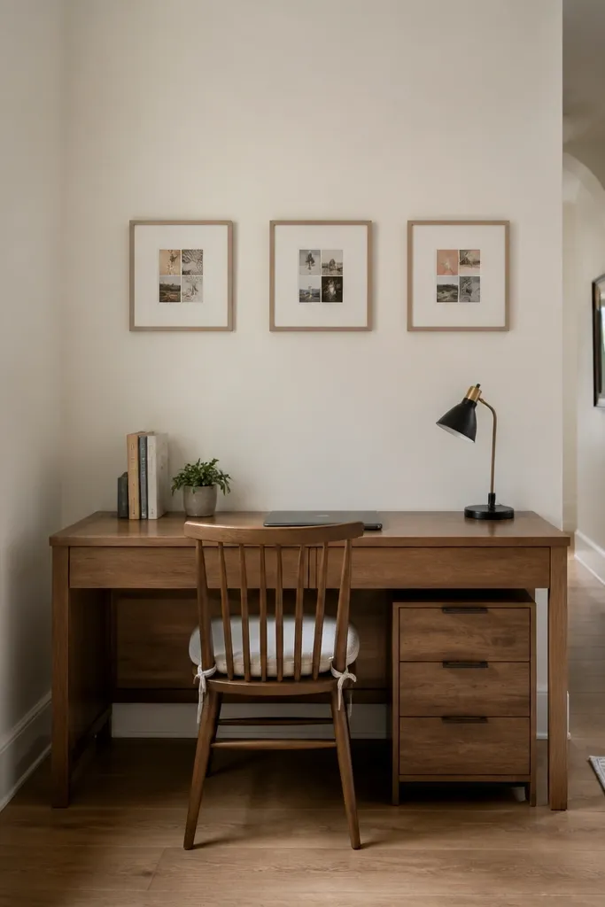
When you don’t have space for one big board, three small frames create the same effect with better composition. This layout looks aesthetic because each frame has a boundary, and the negative space between frames reads as intentional spacing. It’s great for narrow hallways, above a desk, or beside a bed where a single board would look too bulky. Use consistent frame colors so the whole cluster looks like one set. The frames also keep your photos protected.
Pick three matching frames, like 5x7 inches, and hang them in a tight horizontal line or a 2-over-1 arrangement. Inside each frame, mount a small photo collage on one mat board so edges are aligned. Use the same mat color across all frames, like cream or light gray. Add a simple label card in the bottom corner of each frame so the three parts feel connected.
Editor's noteLevel the frames first with painter’s tape outlines before you drill anything.
Skip thisDon’t mix frame sizes wildly — it breaks the clean, planned look.
18. A4 Planner Cover Vision Board
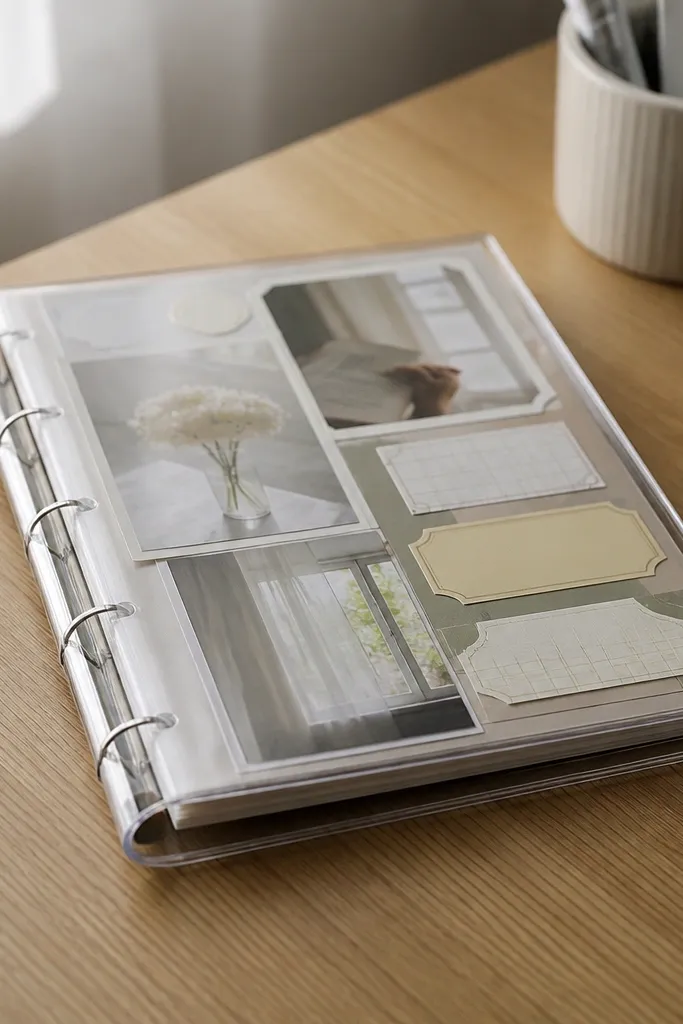
This is a vision board you can carry or swap, and it still photographs beautifully. Use a clear planner cover or binder sleeve as the structure, then build inside with printouts and sticker-like labels. The page stays flat because it’s inside a rigid cover, so you don’t get curled edges. It’s a strong option for tiny spaces where wall space is limited but desk space exists. Also, it makes updating your goals feel easy.
Get a clear A4 binder sleeve or a clear-front planner cover. Print your photos in A4-friendly sizes, like 2x3 inches or 3x4 inches, and cut them cleanly. Arrange them in a simple layout with one larger center photo and smaller side photos. Secure the page inside the sleeve and place a title label on the top edge using cardstock that matches your color palette.
Editor's noteUse matte paper for labels so they don’t stick to the clear plastic.
Skip thisSkip thick layers piled up — too much bulk causes waves and glare.
19. Wood Slat Board With Mini Clothespins
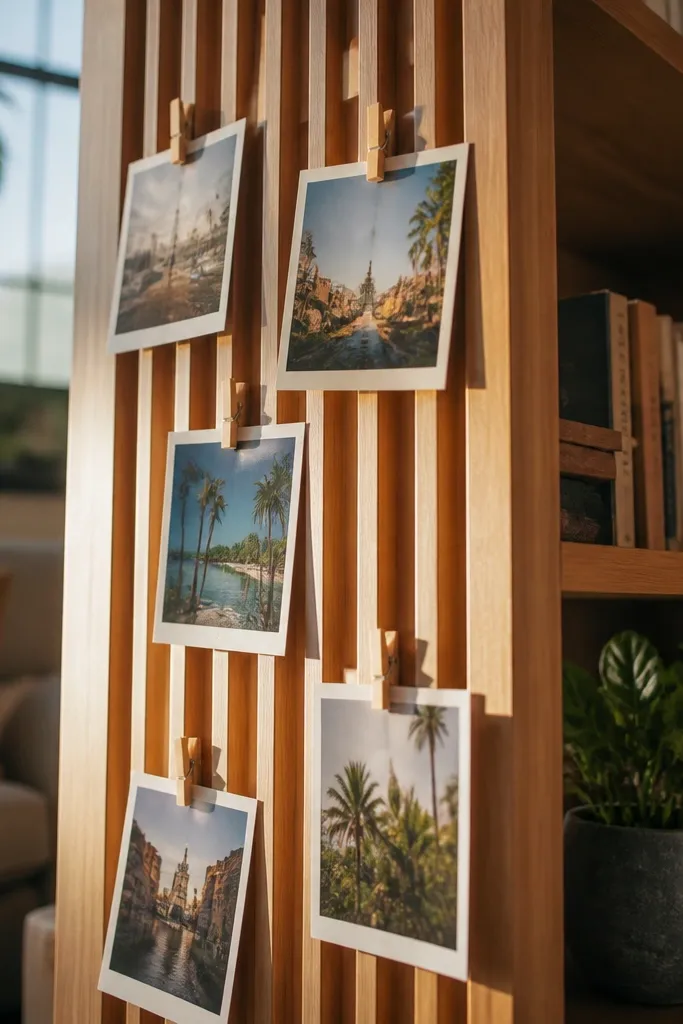
Wood slats plus clothespins looks charming and organized, and it’s perfect for small-space boards. The slats create natural lines for photos, and clothespins make swapping easy without tape. This also gives you a slightly airy look, so the board doesn’t feel heavy in a small room. It’s great for apartments where you want a decor piece that feels handmade but still neat. In photos, the wood tones add warmth and your photos look crisp.
Buy a small slatted wood board or create one with thin wooden strips mounted to a backing, around 10x16 inches. Sand the edges lightly and wipe dust off. Clip your photos onto the slats using mini clothespins, keeping each photo the same height for a clean grid feel. Add one label card clipped at the top and one at the bottom so the composition has anchors.
Editor's notePaint or stain the slats a matte finish so it doesn’t glare under indoor lights.
Skip thisDon’t use oversized clothespins — they look bulky and ruin the delicate look.
20. Wallpaper Accent Board With Cut-Out Headlines
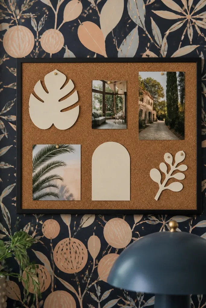
This board looks aesthetic because it mixes a bold background with simple typographic elements. Patterned wallpaper gives you instant style, and cut-out headlines make it feel like a design magazine. It’s a great option when you want a vision board that looks intentional even with fewer photos. Keep the photos small and let the headlines do the heavy lifting. It fits well in small spaces because the background pattern replaces the need for lots of decor pieces.
Cut a rigid base board to around 12x18 inches. Apply a small piece of patterned wallpaper to the base and trim the edges cleanly. Print or cut headline cards from magazine clippings or cardstock, then place them on top with double-sided tape. Add only a few photos, like 5-7 images, and keep them consistent in size so the typography stays readable.
Use one font style for all headlines, even if it’s from different sources, so it looks cohesive.
Avoid stacking too many patterns at once — wallpaper plus patterned photos looks messy.
21. Monogram Corner Board With Matched Sticker Fonts
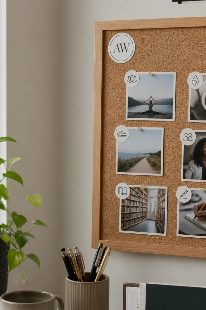
A monogram corner board is a clean way to make a small vision board look like decor. Put your initial or a simple icon in one corner, then build the rest around a tidy photo cluster with matching sticker-style labels. This works because it creates a clear hierarchy — the corner detail becomes the visual anchor, and the photos fill the space without chaos. It’s great for desks and entryways where you want a subtle, aesthetic pic. The build is quick because stickers and labels do the design work.
Start with a small board, like 10x12 inches, in a neutral color. Add a monogram cutout in the top corner using adhesive vinyl or cardstock and glue. Arrange photos in a grid below the monogram and add label tags using the same sticker font style. Seal everything with a light matte spray if you’re using paper labels, but keep it minimal so it doesn’t curl.
Editor's noteChoose one sticker font and stick to it for every label card.
Skip thisDon’t use multiple monogram styles — a mixed look reads like clutter.
22. Tape Frame Collage On Whiteboard Panel
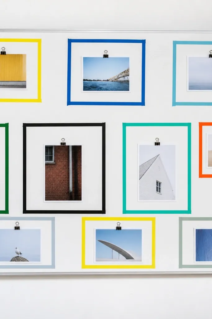
Whiteboard panels are underrated for vision boards because you get flatness and easy swaps. Tape frames give you clean boundaries, and the white surface keeps colors bright in pictures. This layout looks modern and structured, especially in small spaces where you want the board to feel crisp. You can also add a handwritten goal line with a dry erase marker on the bottom. It’s a practical aesthetic pic setup because everything stays centered and aligned.
Get a small whiteboard panel, around 11x14 inches. Use painter’s tape to create rectangles as photo frames, then press the tape edges firmly. Add photos inside the rectangles with removable adhesive strips or tiny clips. Write one short goal line at the bottom with a dark marker, then remove and update later without damaging anything.
Stick the tape, then wait 10 minutes before placing photos so the tape edges set.
Don’t put photos directly under marker smudges — it blurs the final look.
23. Folded Paper Map Board With Thread Lines
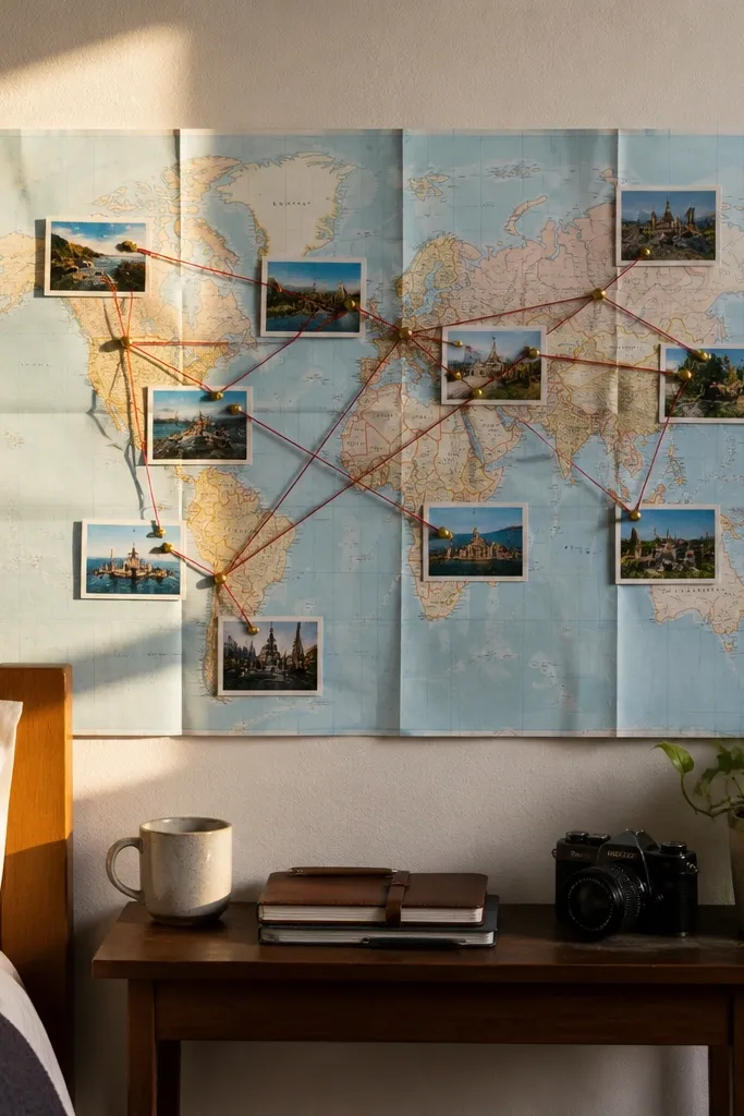
This design looks artistic because it adds lines and movement without needing a lot of objects. A folded paper map background creates texture, and thin thread lines connect photos like routes. It’s perfect for travel goals, moving plans, or any goal that has steps. In small spaces, the thread lines create a sense of direction, so your board doesn’t feel static. It also looks great in close photos because the thread catches light.
Cut a small base panel, about 12x12 inches. Create a map-like background using brown craft paper folded in sections, then glue it to the base. Place your destination photos at points, then tie thread around small pushpins or into tiny punched holes. Keep the thread lines minimal — 2-3 connections max — so it stays clean.
Editor's noteUse thin cotton thread and pull it tight so it looks crisp, not saggy.
Skip thisDon’t crisscross every photo — too many lines make it look like a mess.
24. Acrylic Nail-Polish Color Strip Board
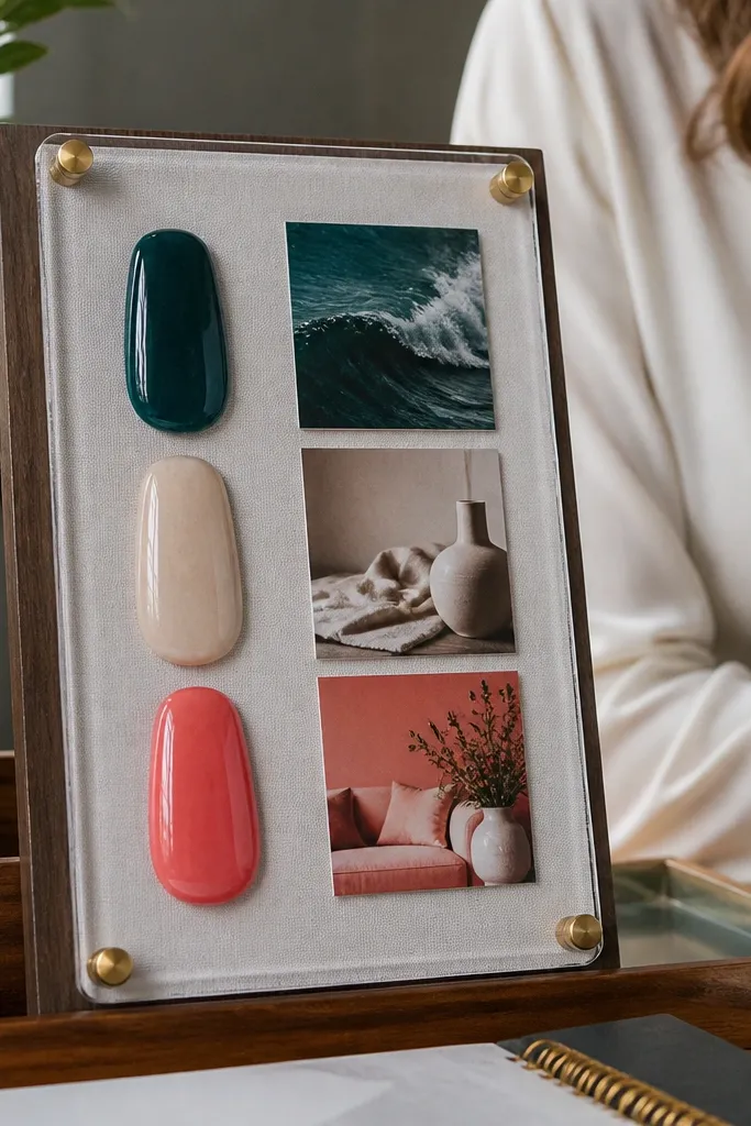
Color-strip boards look aesthetic because they bring color order to everything. Use actual nail polish swatches or printed color swatches in a vertical strip, then place small photos next to each color for that mood connection. This is especially good for small spaces because it uses color as structure, not extra decor. The result is clean and graphic in photos, with a clear visual system. It takes less than an evening if you already have swatches.
Pick a base board around 9x14 inches and paint it matte white or pale beige. Create a vertical color strip using swatch cards or nail polish painted onto cardstock, around 1 inch wide each. Place one small photo next to each swatch and add a short label under the photo. Seal the swatches with a clear matte spray so they don’t smudge.
Editor's noteUse matte spray over nail polish swatches so they don’t glare.
Skip thisAvoid wet-looking glossy swatches — they reflect light and ruin the photo.
25. Fabric Swatch Inspiration Board With Photo Tags
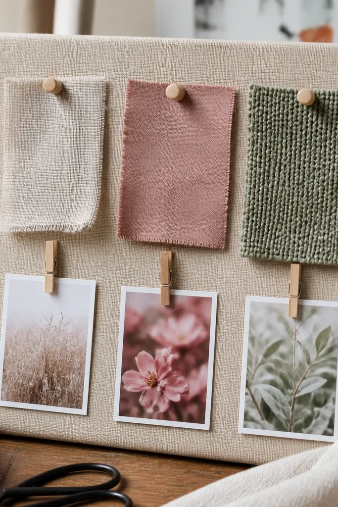
Fabric swatches instantly make a vision board look design-minded because texture is doing the styling. Pin or glue small fabric rectangles in a row, then attach tiny photo tags that match each swatch color. This is perfect for home decor goals, outfit planning, or color-focused aesthetics. In small spaces, fabric keeps the board from looking flat, and it photographs well because you get texture contrast. This one is also satisfying to build because you can touch everything as you arrange.
Choose a base like cork, felt, or a thin wooden panel around 12x16 inches. Cut fabric swatches into consistent rectangles, around 2x3 inches, and pin them down with small thumbtacks. Add a photo tag next to each swatch using cardstock, then secure with glue dots or pins. Place a title label at the bottom in a single color so the layout reads complete.
Editor's noteWash and iron fabric swatches first so they lie flat.
Skip thisDon’t use wrinkled fabric — it makes the whole board look unfinished.



