
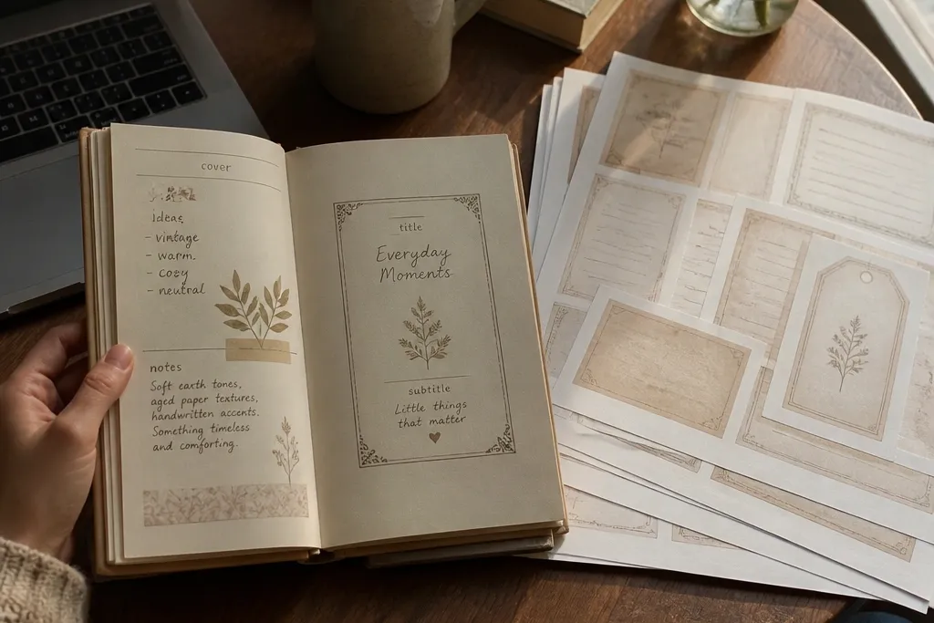
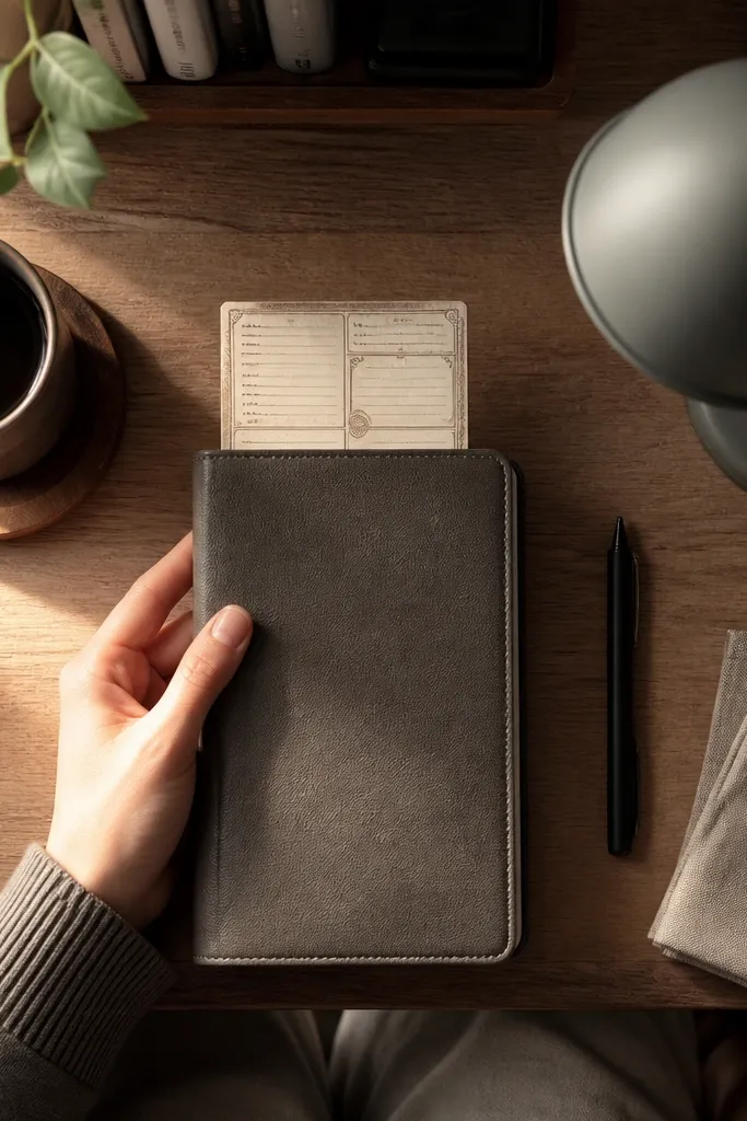
1. Tea-Stained Label Sheet for A5 Covers
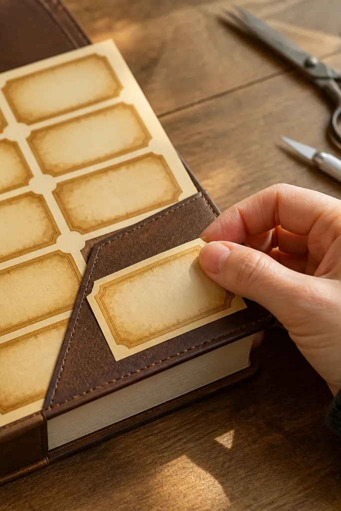
Print the label sheet at A5 scale (fit to page off, choose actual size if your printer offers it). Use a metal ruler and craft knife to cut along the label outlines so the borders stay sharp. Lightly tap a brown ink pad around the cut edges, or use a tiny brush with watered-down tea to darken only the border strip. Let it dry flat under a book for 10-15 minutes, then place the labels with washi tape hinges on one side for easy repositioning.
This one is a fast way to make a journal cover or first page feel “found” instead of brand-new. The labels are built like sticker-size pieces, so you can cover a corner, make a title block, or tuck a note under a flap. The tea-stain look is concentrated around the label edges, which keeps the center readable and gives you that warm, cozy tone. It’s great for small-space Vintage Paper Printable setups because you don’t need extra patterned paper — the printable already carries the texture. Print it once, then cut only what you need for each page.
Skip thisDon’t soak the paper — warped borders make the vintage look sloppy.
Editor's noteIf your ink looks too dark, blend with a damp paper towel right after tapping.
2. Ledger Number Blocks for Weekly Pages
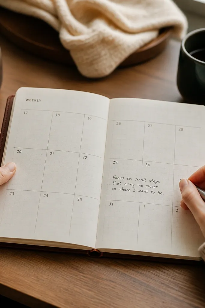
Print the ledger blocks on letter or A5, then cut a grid section that matches your page width (leave 1/4 inch margin if you can). Score the top edge lightly with a bone folder so the paper lies flat. Place the grid using a single strip of glue along one side or tape hinges at the corners. Write dates in the number boxes first, then add short notes along the ruled lines.
Ledger-style blocks turn blank weekly planning into a cozy, organized layout without adding clutter. The numbered grid gives you clear zones for dates, quick notes, and a “one sentence” reflection. Because the lines are thin and spaced, your handwriting stays readable and the background doesn’t fight your pen. This is a strong choice when you want the vintage vibe but still need structure. It also prints cleanly on home printers, so you can repeat the layout across multiple weeks.
Skip thisAvoid placing the blocks too close to the cut edge — you’ll lose the “printed paper” look.
Editor's noteUse a fine-tip gel pen for the vintage blocks; thick markers will bleed into the printed wear.
3. Antique Postcard Frames for Half-Page Inserts
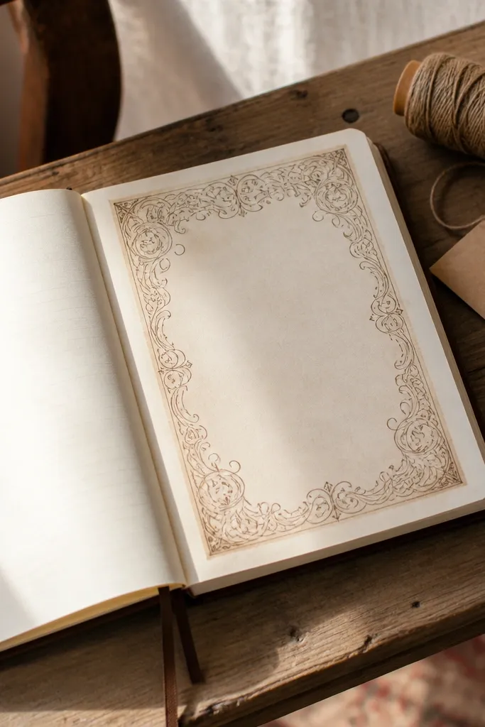
Print on 8.5x11 and set your printer to scale 100% so the frame stays proportional. Cut the postcard frame along the outer border, then trim 1-2mm off the inside edge if you want a tighter look. Add a thin layer of glue along the bottom edge only, then align the top edge first. Finish by adding a date stamp label in the corner and writing your message in the center.
Postcard frames are perfect for cozy journals because they give you a “message on the go” layout. The ornate border makes the page look finished, while the center stays open for journaling, sketches, or a small photo print. Half-page inserts are ideal for small desks because you can print and cut one piece that fits neatly without trimming a full page. The frame lines also help your handwriting stay aligned and neat. This design looks especially good when you add a small stamp-like sticker or a date label.
Skip thisDon’t glue the entire back — it causes bubbles on textured paper.
Editor's noteUse double-sided tape dots on the corners if you want a removable insert.
4. Victorian Corner Flourish Page Backs
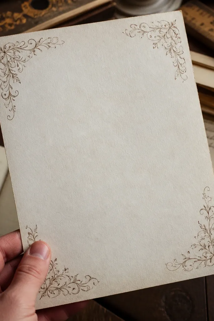
Corner flourishes make a page look richly designed without forcing a full background pattern. The flourishes sit in the corners and along the edges, so your center space stays clean for writing — that’s the cozy part. This is a good pick when your journal pages already have stickers or photos and you just need a tasteful frame. The vintage linework also photographs well, which matters if you like sharing your spreads. You can use it as a full-page backing or under a smaller insert.
Print the flourish sheet on A5 if you’re building smaller pages; letter-size works too if you cut down. Cut a full-page piece and round the corners lightly with a corner rounder if you want a softer vintage feel. Apply glue stick to the back in a thin, even layer and keep it away from the center writing area. Press under a heavy book for 15 minutes so the paper stays flat and crisp.
Dust the paper lightly with a dry brush of graphite on the flourishes to mute the print and blend it into your page.
Don’t add extra patterned paper behind it — the corners will get lost.
5. Vintage Ticket Strip Collection for Journal Pockets
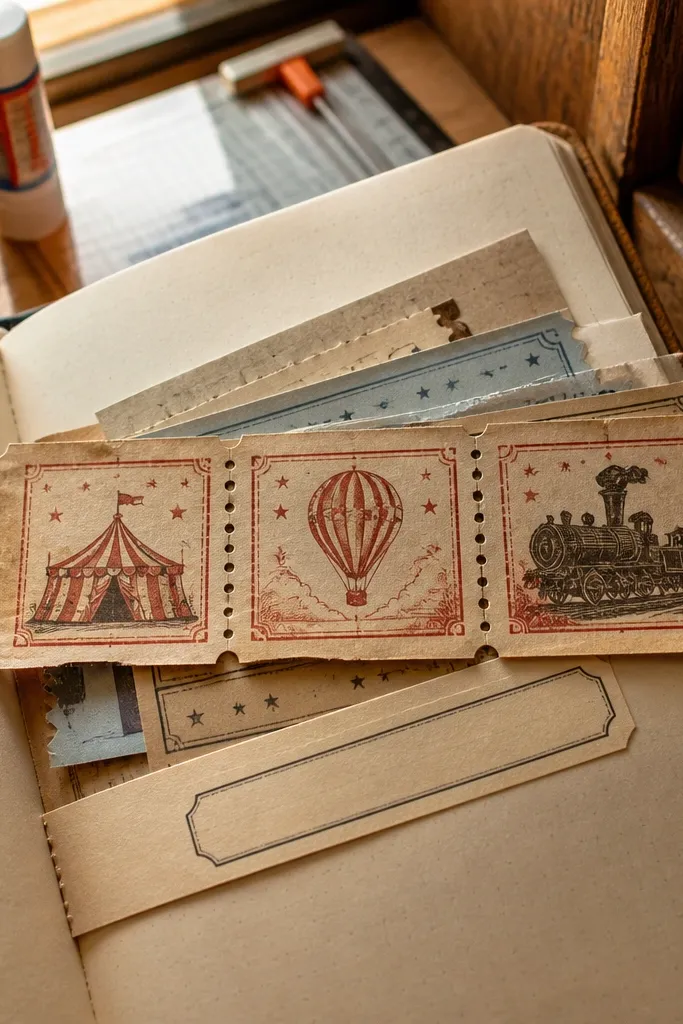
Print on 8.5x11 at 100% scale. Use a craft knife to cut along each ticket outline, then score the perforation line lightly so the strip bends without tearing. Create a pocket by folding a small rectangle of thin cardstock and taping only the sides. Slide the ticket strip into the pocket or glue it to the pocket flap so it flips up.
Ticket strips are tiny but they make a journal page feel like it has receipts, memories, and movement. You can tuck one strip into a pocket, glue it across a page crease, or layer it under a label for instant depth. The “perforation” edges look real and add a crisp, graphic vintage feel. This is a smart small-space Vintage Paper Printable because you can print a sheet, cut a handful, and use them across many pages. It also works with minimal ink — a single strip plus your handwriting can look complete.
Skip thisSkip thick glue — it makes the pocket stiff and the ticket stops looking like paper.
Editor's noteFor a more authentic look, run a black-brown colored pencil along the perforation edges after cutting.
6. Scripted Recipe Card Backgrounds
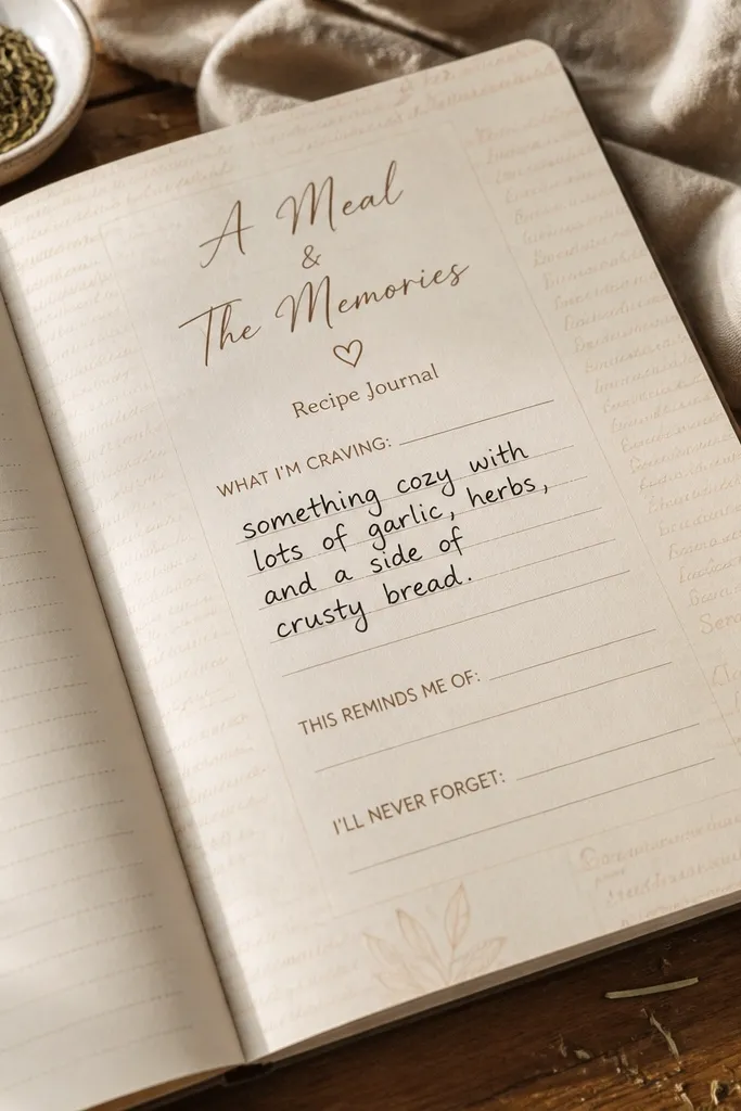
Recipe cards are cozy-journal gold because the layout already tells you where to write. The ruled lines and cursive heading make your handwriting look like it belongs there. Use these as backgrounds for meal memories, self-care routines, or “what I’m craving” notes. They look photogenic because they have clear typographic contrast — warm paper tone plus darker ink lines. Small-space Vintage Paper Printable readers like this because you get a ready-made structure without extra supplies.
Print the recipe card sheet on letter or A5 and cut individual cards with a 1/8 inch trim around the border. If you want layering, print a second copy and use one card as a backing with the top card slightly offset. Add a glue stick to the backing card only, then place the top card centered. Write your heading first, then fill the ruled lines with short lines instead of paragraphs.
Use a pencil for the first draft, then go over with a dark brown pen for a softer vintage tone.
Don’t use gel pens that smear — recipe-card ink lines are close together.
7. Museum Tag Labels for Page Titles
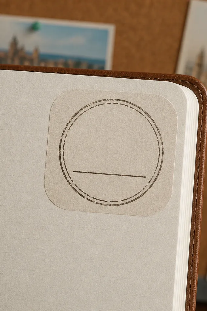
Print on cardstock-friendly paper if you have it; regular copy paper works if you seal edges later. Cut each tag with a straight cut, then round the bottom corners if the file doesn’t already. Ink the edges with a brown ink pad to unify the print with your handwriting paper. Place the tag with a single piece of tape at the top back corner so the tag sits slightly lifted.
These tags give you that “catalogued” look without needing a full scrapbook kit. They’re made to sit at the top corner of a page, so they work even when your desk is small and you want a quick layout. The rounded corners and stamp circle create a vintage focal point, while the blank text line keeps it flexible for dates, moods, or titles. This is one of those printables that makes your journal feel intentional fast. It also photographs nicely because the tags create a clear vertical hierarchy.
Skip thisDon’t glue the entire tag — you’ll lose the raised vintage feel.
Editor's noteUse a 0.5mm fineliner for the tag text line so it matches the printed type weight.
8. Faded Book Page Strips for Layered Collage
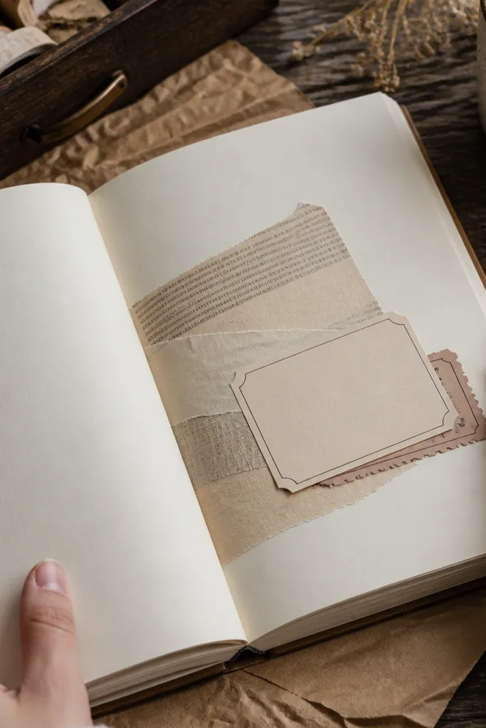
Faded book page strips make your journal pages look layered even when you’re not using photos. The printed text is subtle enough that your writing still stands out, but it adds texture behind headings and ticket strips. Use them as a side strip, a diagonal accent, or a background for a small photo print. This is a solid choice for small-space Vintage Paper Printable because you only need to cut a few strips, and they add instant depth. The torn-edge effect also looks real on paper and gives you movement across the page.
Print the strips, then cut into widths like 1 inch, 1.5 inches, or 2 inches depending on your page. Tear the edges by hand after cutting the strip outline so the torn look looks organic. Seal with a light spray of matte fixative or brush a thin layer of clear matte medium if you have it. Lay the strip first, then place labels or tickets on top, using only small glue points.
Mist the strip lightly with water before tearing for a cleaner vintage fiber break.
Don’t cover the entire page — the text texture should frame your handwriting.
9. Vintage Botanical Border for A5 Writing Spaces
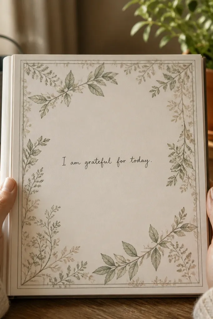
Print at A5 size on smooth paper so the border lines stay crisp. Cut a full border sheet, then trim 1/4 inch off if your printer leaves a white margin. Ink only the outer edge with green-brown ink or a brown pad mixed with a touch of green. Glue down the border sheet, then write in the center within an invisible “box” you mark lightly with pencil.
Botanical borders make a journal feel calm and cozy, but the trick is to keep the center writable. This printable uses a thin border line with faded leaves so you get the decoration without losing space. It’s great for mood tracking, gratitude lists, or “Sunday reset” pages where you want structure and breathing room. The muted greens and browns photograph well, especially under warm lighting. In a small-space setup, it’s one print that turns your entire page into a finished spread.
Skip thisDon’t choose a border that covers the center — it makes writing look crowded.
Editor's noteIf your printer colors look too flat, add a tiny amount of diluted watercolor to the leaf tips with a fine brush.
10. Old Map Compass Rose for Top-Center Accents

Print on letter or A5 at 100% scale. Cut just around the compass rose and trim inside the outer ring for a clean edge. Lightly sand the back of the cutout with a fine sanding sponge to reduce stiffness if you want it to sit flatter. Glue the compass rose at the top center with a thin line of glue along the bottom third only, so the top edge looks slightly lifted.
A compass rose is a cozy journal trick because it gives a clear “direction” focal point without taking over the page. Put it at the top center and let the rest of the page be yours. The aged map texture pairs well with ticket strips, ledger blocks, and handwritten dates. This is a small-space Vintage Paper Printable win because you can print it once, cut it out, and reuse it across many pages for a consistent journal style. It also gives you a natural spot for a location name or a season heading.
Skip thisDon’t place it too low — it will compete with your main writing area.
Editor's noteUse a darker brown pen for location names to match the compass ink tone.
11. Faux Postmark Circles for Date Stamps
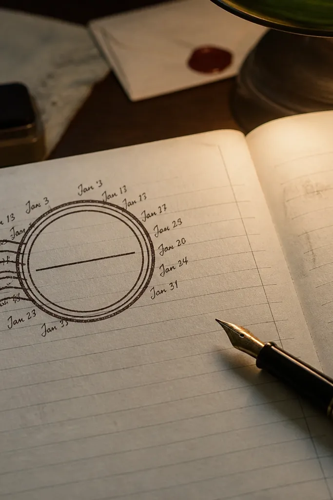
Postmark circles instantly make pages feel like they traveled. Use them as date stamps, mood markers, or “sent from” labels for journal entries. The ring design frames text neatly, so your handwriting looks crisp and centered. This printable works especially well with small-space Vintage Paper Printable journaling because you don’t need a big background; a circle plus your writing can look finished. It’s also easy to repeat across pages for a consistent theme.
Print the postmark sheet, then cut circles using a hole punch or circle cutter if you have one. If cutting by hand, use a small ruler and craft knife for clean edges. Ink the outside ring with a brown ink pad so it matches your journal paper. Place one circle on each entry page at the top right, then write the date inside with a fineliner.
If your postmarks look too light, print a second copy and cut only the darkest rings to layer behind one circle.
Avoid placing postmarks over busy background textures — the ring edges disappear.
12. Vintage Envelope Pockets for Loose Notes
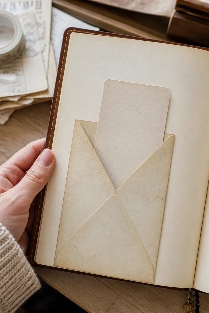
Envelope pockets keep loose notes from turning into a messy stack, which is a real problem in small spaces. The printable envelope template gives you the exact shape and flap placement so you can assemble pockets in minutes. Use them for receipts, ticket stubs, mini journaling cards, or “future me” reminders. The vintage paper texture on the pocket adds warmth even when the pocket is mostly empty. This idea delivers because it adds function — storage — not just decoration.
Print on medium cardstock so the pocket holds its shape. Cut along the outer lines, then score the fold lines with a bone folder. Assemble by gluing the side tabs only, leaving the flap free. Ink the flap edge lightly with brown pad, then press the pocket under a heavy book for 20 minutes.
Stick a small washi strip hinge on the flap edge so it opens without cracking.
Don’t use thin printer paper — the flap will crease and sag.
13. Faded Floral Corner Stickers
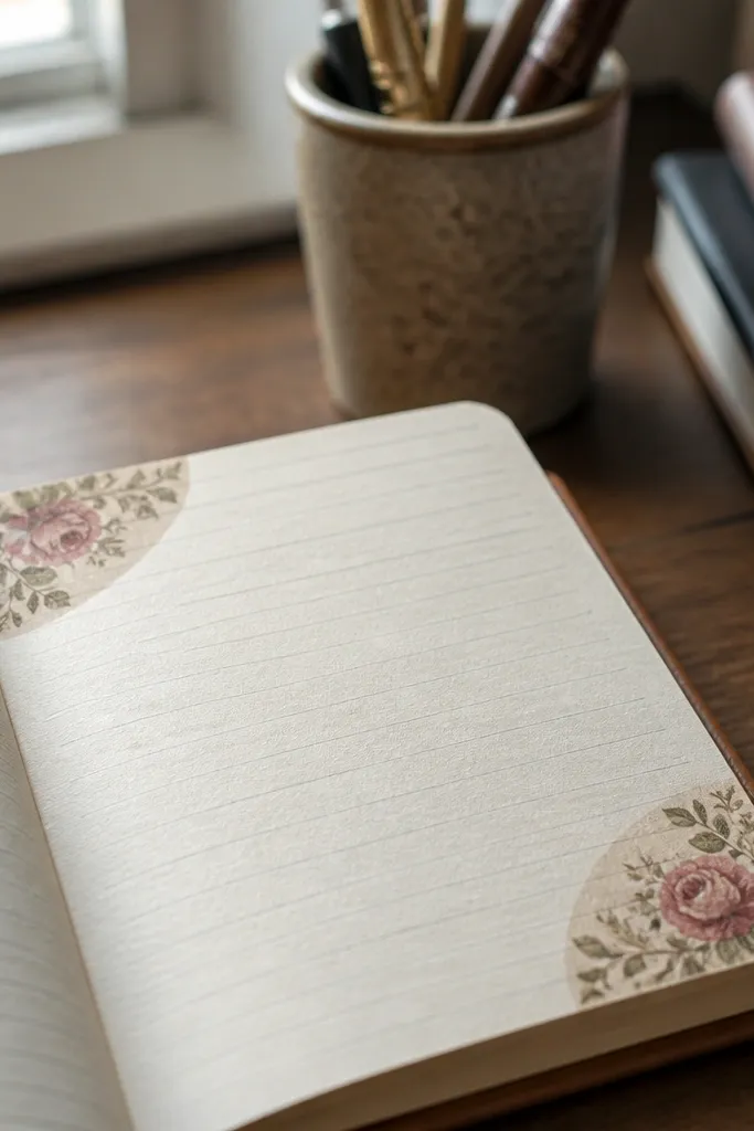
Print on heavier paper than copy weight, then cut the corner stickers with a small border around the design. Ink the edges so the sticker blends into your page paper. Apply adhesive only on the back border area, not across the printed flowers, so the flowers stay flat. Place the sticker corners at consistent angles across pages for a uniform look.
Corner stickers make your journal spreads look styled even if you only add a little writing. The floral prints are placed in corners, so they frame the page without covering your text. This is a good choice for small-space Vintage Paper Printable because the stickers are modular — print, cut, and place on different pages as accents. The muted colors keep it cozy rather than bright. If you want your journal to look “put together” with minimal effort, these corners do it.
Skip thisDon’t stretch the paper while sticking — it creates wrinkles that show through the vintage print.
Editor's noteUse a ruler to measure the same corner placement every time — it makes spreads look designed, not random.
14. Vintage Ticket Mat for Photo-less Memory Pages
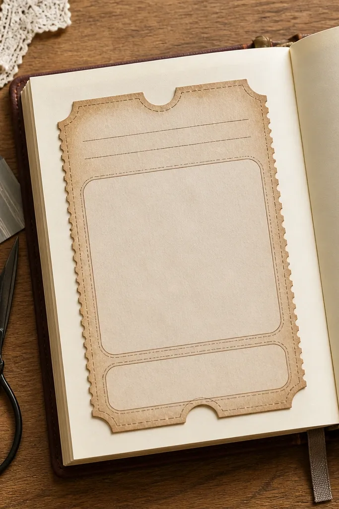
Print the ticket mat and cut it out cleanly along the outer shape. If your journal is A5, trim the mat by 1/8 inch on each side so it fits without hanging off. Glue only the bottom edge first, align it, then press the top corners with tape hinges. Fill the top section with a short title, then write the story in the middle and a single detail at the bottom.
This mat gives you a layout that feels like a memory page even when you don’t paste photos. Three sections let you write a title, a short story, and one detail, all in a structured vintage frame. The ticket shape adds a playful cutout look, and it’s easy to keep the rest of the page clean. It’s perfect for cozy journals because it keeps your writing area centered while the mat provides the decoration. Small-space Vintage Paper Printable readers also like it because it uses one printable as the whole page foundation.
Skip thisAvoid covering the mat with heavy stickers — the ticket shape should stay the focal point.
Editor's noteWrite the title in darker ink and keep the story in softer brown for contrast.
15. Old Stationery Border Strips for Side Columns
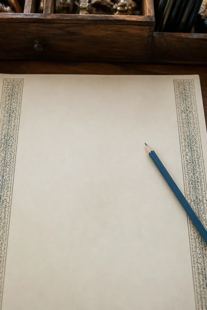
Print the border strip sheet and cut strips to 1 inch or 1.25 inch widths depending on your journal margin. Ink the cut edges lightly to prevent white lines from showing. Place the strip along the left or right edge using a thin glue line or tape hinge every 1-2 inches. Write inside the bordered area, and keep your handwriting parallel to the border lines.
Side column borders are a sneaky way to make small pages look like full spreads. You get a vintage edge frame while the main page stays open for writing, lists, or a sketch. The strips are narrow enough that they don’t require precise cutting — just align one edge and you’re done. This idea is great for readers who want aesthetic pages but don’t want to cover the whole sheet with background prints. It also works with nearly any pen and paper color because the border tone is warm and muted.
Skip thisDon’t center the strip if the design is meant for one side — it breaks the intended framing.
Editor's noteUse a gel pen for headings only; keep body text in a fineliner to match the printed thin rules.
16. Faux Receipt Paper for Budget Journals
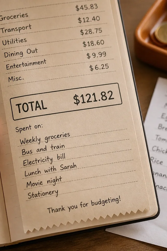
Print the receipt sheet at 100% scale, then cut receipts into single strips. Trim the edges with a straight blade, then ink around the border so it looks aged. Fold the receipt strip in half once if your journal page is narrow, then place it inside an envelope pocket or glue it flat. Write the date on the top line, then fill item lines with short phrases and amounts.
Receipt paper is cozy and practical. It turns money tracking into something visual and satisfying, and it looks great in small journals because the receipt format is compact. The printed totals box gives you a clear place for weekly sums or a “spent on” note. Even if you don’t track budgets, you can use it for habit costs, self-care logs, or “time spent” mini receipts. This printable delivers because it gives a ready-to-write form that still looks vintage without feeling busy.
Skip thisDon’t use bright neon ink — it clashes with receipt typography.
Editor's noteAdd a tiny tear on one side before inking for a more authentic worn receipt look.
17. Vintage Calendar Blocks for Monthly Check-ins
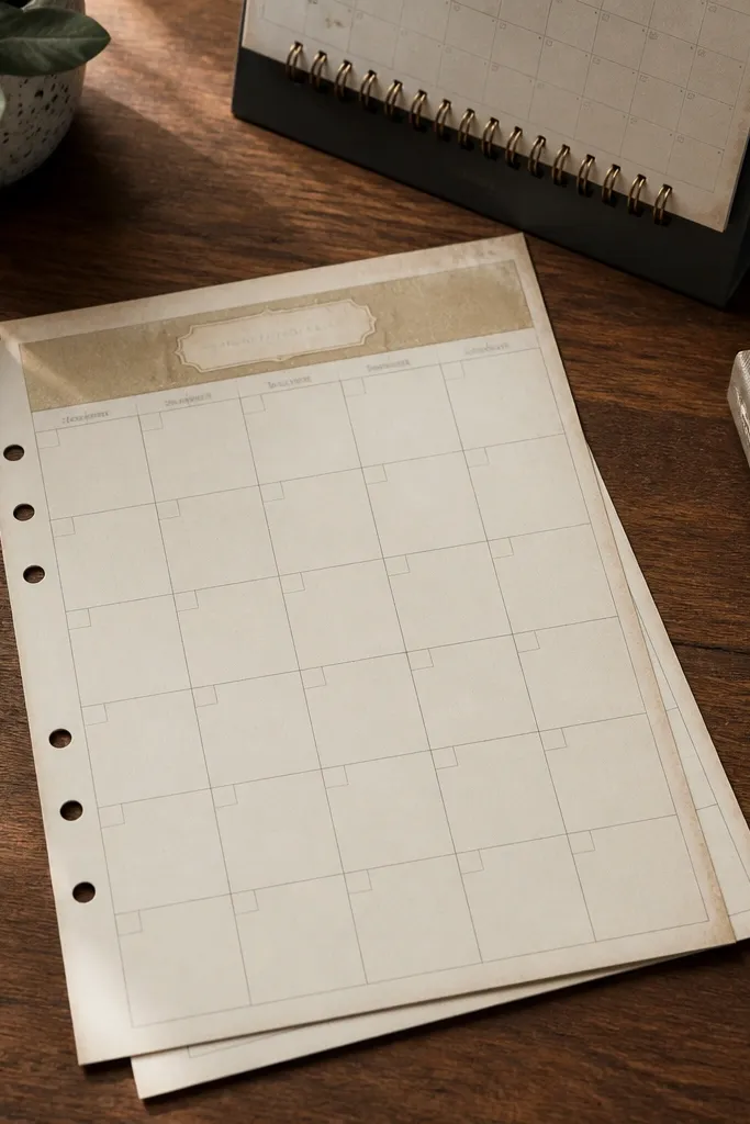
Calendar blocks give you a place to write without drawing lines yourself, which is the biggest time-saver in small-space journaling. The vintage header and muted grid make the page look like an old desk calendar. You can use it for habit check-ins, mood ratings, or a simple monthly reflection. Because the squares are separated, your handwriting stays legible even when you fill a lot. This is one of the most practical printables for cozy journals because it keeps structure year-round.
Print on A5 for the cleanest fit, then cut out the calendar grid leaving a 1/4 inch border. Ink the border edge with a warm brown pad so it blends with your page paper. Glue down with a single strip of glue at the top and tape hinges at the corners so you can lift and journal underneath if needed. Fill each week with one short note per row, then circle 2-3 highlights in darker ink.
Use a ruler to draw only the month heading line if your printer is slightly off — it keeps everything aligned.
Avoid overcrowding every square with long text; use one phrase per day.
18. French Script Page Background for Mood Entries
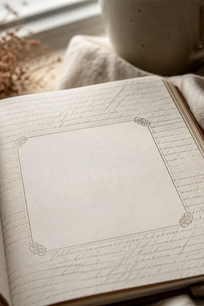
Print on letter or A5 and cut a full-page background piece. If there’s a writing panel, keep it untouched by inking; only ink the outer edges. Place the background on your journal page with glue stick, then write inside the panel using a dark brown pen. Add one small accent label or postmark circle at the panel corner for a finished look.
French script backgrounds look classy and cozy because they add texture without heavy graphics. The key is that the design includes a clean writing panel or blank center so you can actually write. The script is usually lighter than the border ink, so your handwriting reads clearly. This works well for mood entries, journaling prompts, and quick “how today felt” pages. Small-space Vintage Paper Printable readers also like it because it covers a whole page with one print and still leaves you room to personalize.
Skip thisDon’t stack two script backgrounds — the text texture becomes unreadable.
Editor's noteIf the script is too light after printing, re-ink only the outer border area — don’t darken the center text.
19. Vintage Botanical Label Tags for Self-Care Sections
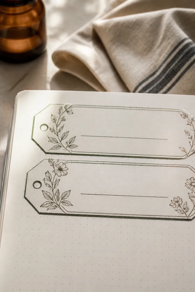
Print the tag sheet, then cut tags with a straight blade around the outer edge. Ink the tag edges with a brown pad, then lightly dab green ink on leaf icons if you want more contrast. Place tags at consistent intervals across the page, using a tape hinge at the top if you want them to lift slightly. Write one heading per tag, then fill the section underneath with short lines.
These label tags help you break journal pages into sections without drawing boxes. The tags are designed to sit across the page or at the top of a column, with a blank line for headings like “tea time” or “rest.” The botanical linework adds softness, and the vintage tone keeps it cozy rather than modern. This is a great small-space Vintage Paper Printable because you can print one sheet, cut a handful, and use them to organize multiple journal entries. It also makes your spreads look intentional even when you only add quick notes.
Skip thisAvoid placing tags too close together — leave at least 1/2 inch breathing room for legibility.
Editor's noteUse a different pen for headings versus notes so the tags read like labels, not decoration.
20. Old Photobooth Strip Frames for Mini Journaling Cards
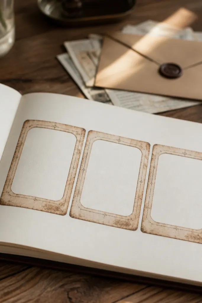
Print the strip frames and cut out the full strip as one piece. Trim each frame opening slightly if you want a window effect, then back the strip with plain paper so it looks solid. Glue the strip to a journal page using a single strip of glue along the center back. Write one short line per frame and add a postmark circle in the margin if you want extra vintage detail.
Even without photos, these mini frames look great because they create a triptych layout for mini journaling. Each frame can hold one sentence, a date, a tiny sketch, or a cut-out scrap of paper. The vintage border ties the frames together so your page doesn’t look random. This is a strong choice for small-space Vintage Paper Printable because you print one strip, cut it into a card, and it becomes a reusable template. It’s also photogenic because the repeated frames create a clear visual rhythm.
Skip thisDon’t fill all three frames with long text — keep each frame to 6-10 words.
Editor's noteUse a pencil to place your lines inside each frame, then write over in pen after alignment.
21. Vintage Library Card Inserts for Index Pages
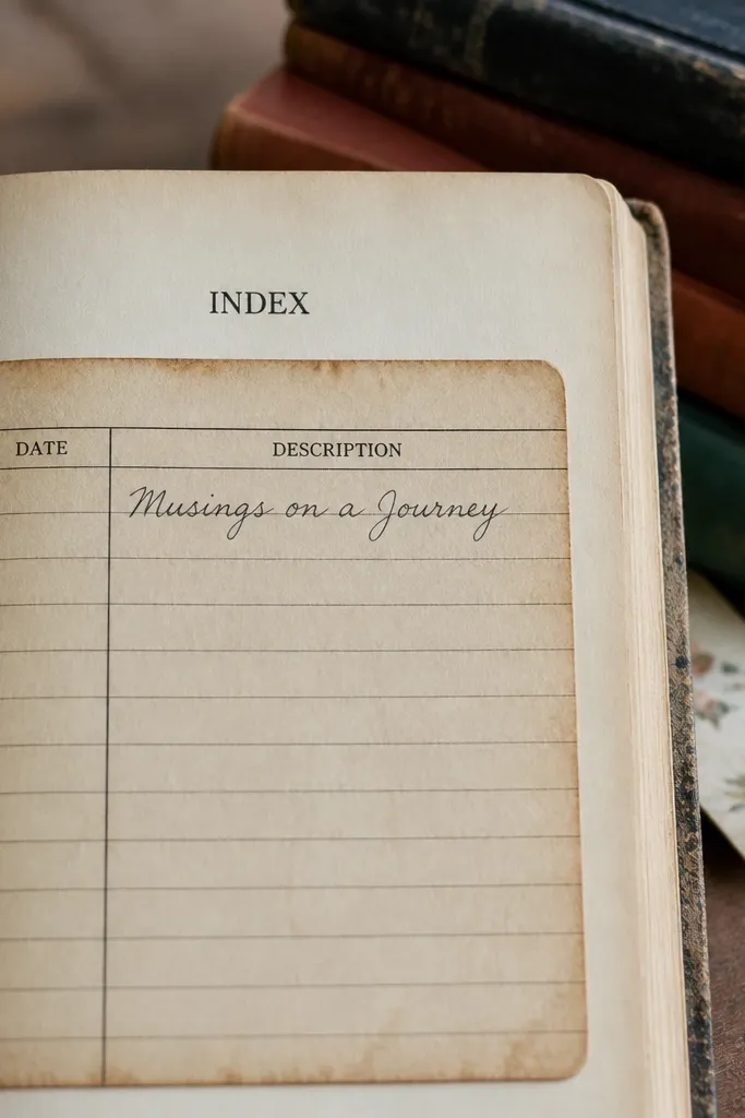
Library cards feel cozy because they’re built for lists and references. Use them as index pages, content summaries, or “books I want to read” logs. The card layout has boxes for dates and a description line, so you get structure without drawing. The aged border and type look like an old catalog entry, which makes your journal feel curated. For small-space Vintage Paper Printable readers, these inserts are practical because you can print a stack and rotate them across weeks.
Print the library card inserts and cut each card with a consistent 1/8 inch border. Ink the edges with a brown pad so they look like real paper. Add a pocket to the journal page by gluing a thin cardstock rectangle on three sides, then slide the card in. Write the card number and title first, then add a short description in the field labeled for notes.
If your printer is slightly off, trim only the width first so the card still matches the pocket opening.
Don’t over-ink the boxes — it can make the text field look muddy.
22. Antique Frame Washi-Style Borders
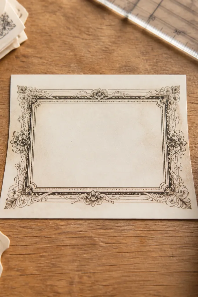
This printable gives you frame borders that look like decorative tape, but you can cut them cleanly and glue them down. It’s ideal for small-space Vintage Paper Printable layouts because you can frame a single paragraph, a photo-less sketch, or a journaling prompt. The frame lines are thin and spaced so they don’t overwhelm your handwriting. You get that finished, gallery-like look without needing multiple patterned papers. It also photographs well because the frame edges catch light.
Print the border strip and cut into 2-3 inch lengths depending on your journal page. Ink the cut edges lightly so the border looks aged, not freshly cut. Place the strip around your writing area, using washi tape hinges if you want repositioning. Glue the border down with a thin glue line, then write inside the framed box.
Use a light touch with glue — too much glue squeezes and creates shiny spots.
Avoid thick paper under the border — it can lift and peel at corners.
23. Vintage Ticket Topper for Corner Journaling
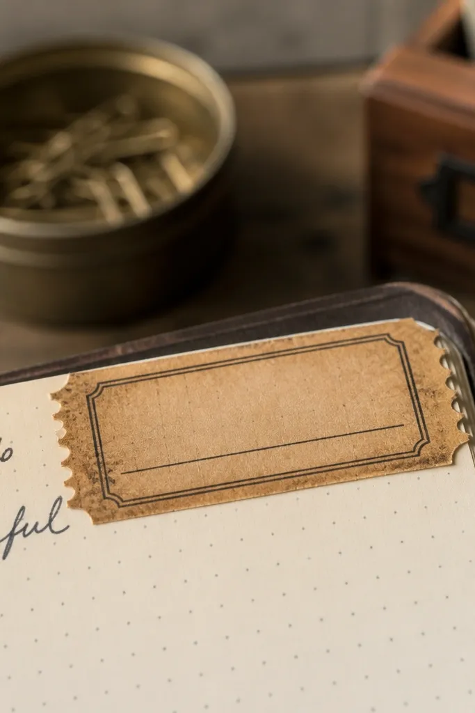
Print and cut each ticket topper with a clean outline. Ink only the outer edge with a brown ink pad, then dry flat. Place the topper on the page with a tape hinge at the back corner so it lifts slightly. Write the date first, then add your one-word mood and one short note under the corner if you have space.
Corner toppers are perfect when you want a cozy accent but don’t want to redesign the whole page. This ticket topper sits near the top corner and gives you a dedicated spot for a date, a mood word, or a tiny “today’s theme.” The faux perforation edge makes it look like a real detachable ticket. It’s also small-space friendly because you print once, cut a handful, and use them like page markers across your journal. The look is graphic and warm — the kind of vintage detail people notice in photos.
Skip thisDon’t place it too centered — toppers look best when they anchor a corner.
Editor's noteIf your handwriting looks uneven, draw a faint pencil baseline first inside the ticket line.
24. Faded Map Strips for Diagonal Storytelling

Diagonal strips add instant motion to a journal page. This printable uses map grid lines and faded labels so you can build a diagonal storytelling area without drawing lines yourself. It’s cozy because the colors are muted and the background texture feels old-paper, not modern graphic. Use it for travel memories, week summaries, or “where my thoughts went” entries. Small-space Vintage Paper Printable readers like it because it’s easy to cut and it fills a page visually with one element.
Print the map strip sheet and cut it into one long diagonal piece that matches your journal page height. If you want a cleaner diagonal, measure from the top left corner to the bottom right corner and cut along that line. Ink the edges lightly, then glue the strip with a single strip of glue along the back center. Write your story in the blank map label area, then add a postmark circle near the top end.
Use a dark brown pen for writing and keep the rest of the page in lighter tones so the diagonal stays readable.
Avoid placing the diagonal strip too close to the page edge — you’ll crop the map markings.
25. Vintage Note Card Set for Prompt Pages
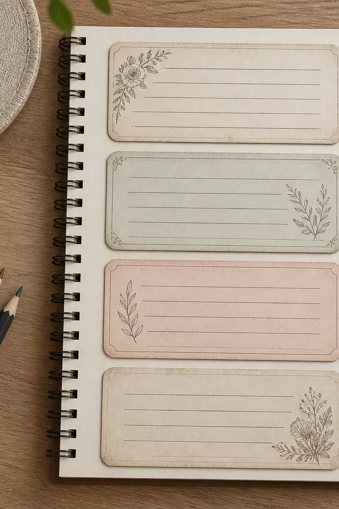
Note card sets are the easiest way to turn one journal page into a prompt page. The cards give you separate writing zones, which keeps your journal tidy even when you write short thoughts. The rounded rectangle design looks soft and cozy, and the vintage tone keeps it consistent with the rest of your spreads. This idea is a strong match for small-space Vintage Paper Printable because you can print a set, cut them quickly, and arrange them with pockets or tape hinges. It also makes your spreads look intentional in photos because the cards create layers.
Print the note card sheet and cut each card out with a straight blade. Round the corners with a corner punch for a softer vintage look. Place two cards on one page with a 1/4 inch gap, using tape hinges on the back so you can lift and write underneath. Write one prompt on the first card, then answer on the second card.
If your cards slide on the page, add a small washi tape tab at the bottom edge only.
Don’t glue every edge — you’ll lose the layered “lift” effect.
26. Antique Seal Sticker Shapes for Sealing Entries
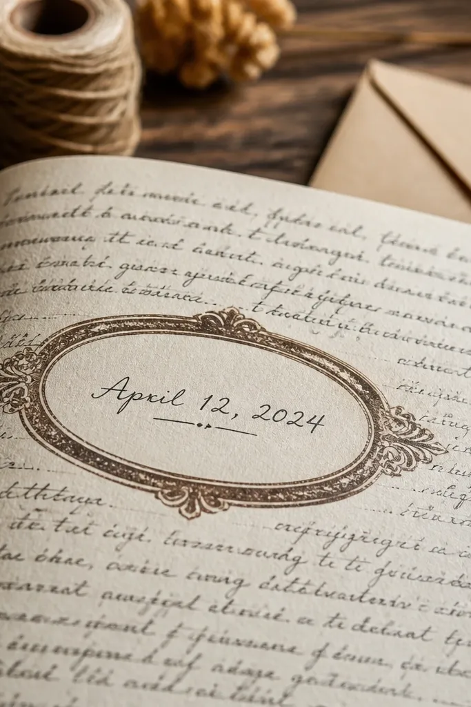
Print the seal sheet and cut out one seal at a time. Ink the outer edge with a deep brown pad and let it dry. Apply adhesive only around the border so the center stays flat for writing. Place one seal on each entry, then write the date or a one-word summary inside the seal center.
Seals add a finished, ceremonial feel to journaling. Use the oval seals for “signed” entries, weekend reflections, or “approved” habit check-ins. The blank center is key because you can write a short word or date without the design fighting your text. This is small-space Vintage Paper Printable friendly because you only need one seal per page to make it look styled. The aged edges and stamp style also photograph well, especially when you place them near the top or side of your writing area.
Skip thisAvoid writing with a marker that bleeds — seals often have lighter ink backgrounds.
Editor's noteIf you want a stronger stamp feel, lightly rub a pencil eraser over the seal border to blur the edge print.
27. Vintage Receipt Totals Box for Mood Metrics
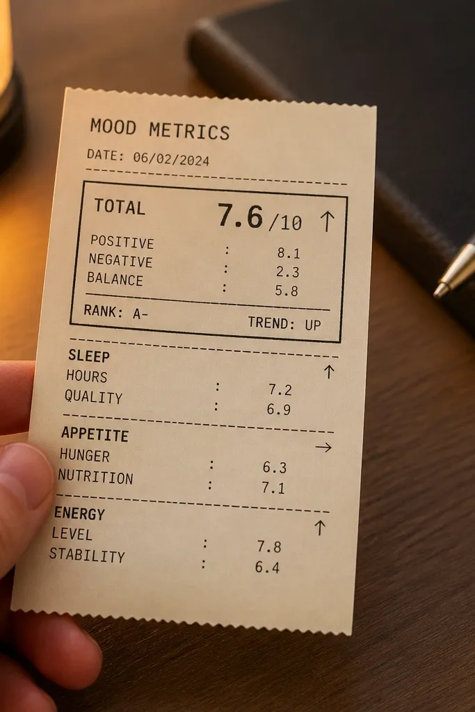
Print the totals box sheet and cut out the receipt section leaving a small border. Ink the edges lightly, then glue the box to your page with a thin glue line along the top and bottom. Add a tape hinge on one side if you want to write underneath later. Fill the rating lines first, then write one short sentence in the totals area.
Totals boxes make mood tracking feel like a data page without turning your journal into spreadsheets. The receipt format gives you a bold “total” section for a summary rating, while smaller lines work for notes like sleep, appetite, or energy. It’s cozy because it looks like old paper and tiny printed type, not modern UI. Small-space Vintage Paper Printable readers benefit because you get a ready-made metric layout that takes minutes to fill. It also looks great layered under a ticket strip or next to a library card insert.
Skip thisDon’t cram numbers and sentences into the same line — keep numbers in the totals area only.
Editor's noteUse a brown or black-brown pen for ratings so it matches the printed totals style.
28. Vintage Botanical Ledger for Habit Sheets
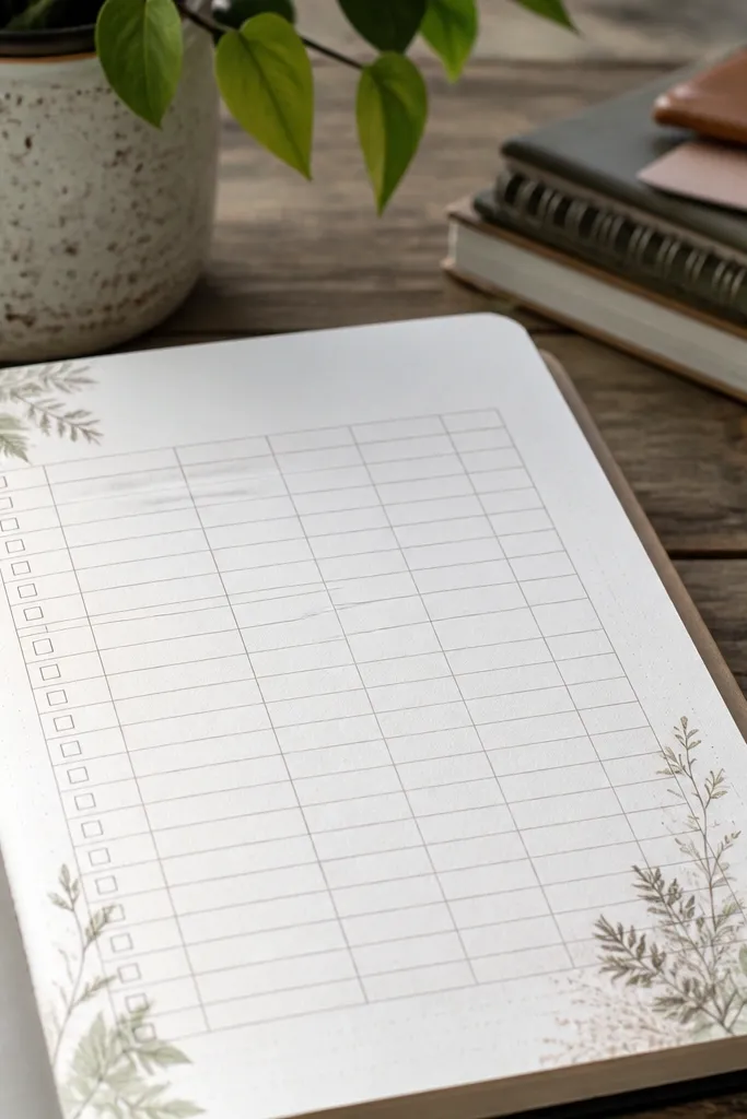
A habit ledger with botanical accents is the sweet spot between structured and cozy. The ledger table gives you checkboxes or rows for days, while the botanical corners soften the page. This works well for small-space Vintage Paper Printable journaling because you can print multiple pages and repeat the same layout without redesigning. The vintage headings also keep you from staring at a blank page — the form tells you where to write. It’s especially good for monthly habit check-ins and weekly routines.
Print the habit ledger and cut the page to fit your journal size, leaving a margin for binding. Ink the outer edge with brown and add a tiny dab of green ink on the botanical corner accents if you want more contrast. Glue down flat with a glue stick, then fill the date rows with a simple check system. Use one row for notes so your habit tracking stays readable.
If your checks look too sharp, use a pencil check first and then trace with pen lightly.
Avoid filling every row with long explanations — keep notes to a few words.
29. Antique Photo Label for Scrapless Journals
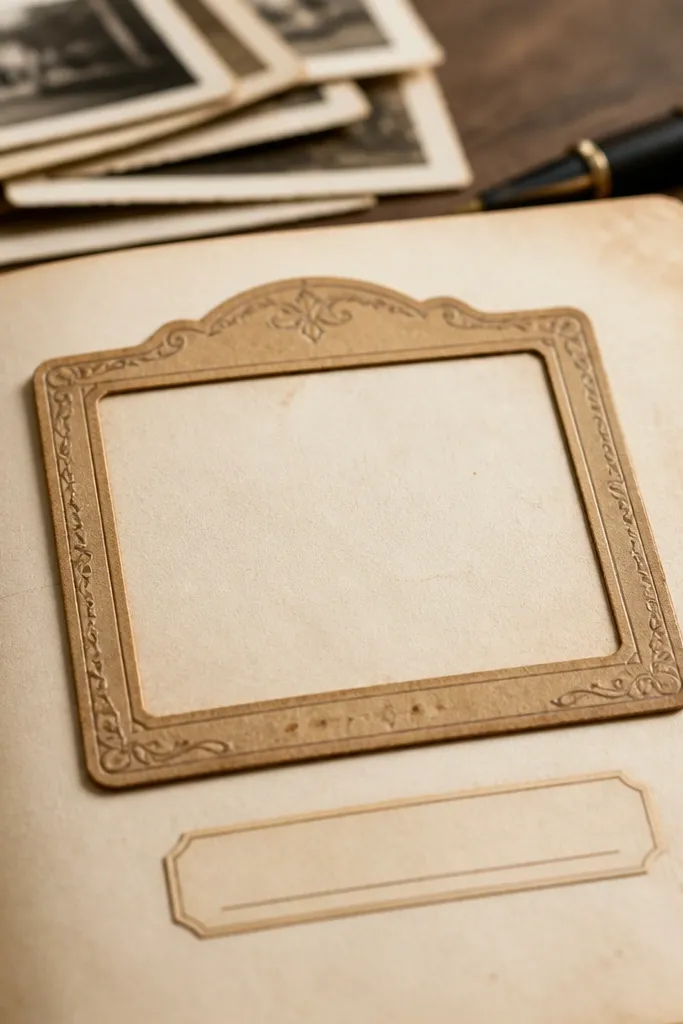
Photo labels are built for people who love the look of photos but don’t always paste them in. This printable gives you a caption block that you can treat like a mini headline for the page. The aged border makes it feel like a printed photo mount, and the blank caption line keeps it usable for any theme. Small-space Vintage Paper Printable readers can use it as a replacement for bulky scrapbook paper because it’s one cutout that gives structure. It also pairs well with postcard frames, ticket strips, and corner flourishes.
Print and cut the photo label with a neat border. Ink the edges lightly so the label looks aged, then glue it at the top of your writing area. If you want dimension, place a thin foam tape strip behind the label center. Write a short caption in the blank line, then place your main journaling text underneath.
Keep captions short — 3-8 words reads best on vintage labels.
Don’t cover the caption line with other stickers; it should stay the clearest text on the page.
30. Vintage Letterhead for Cover Notes
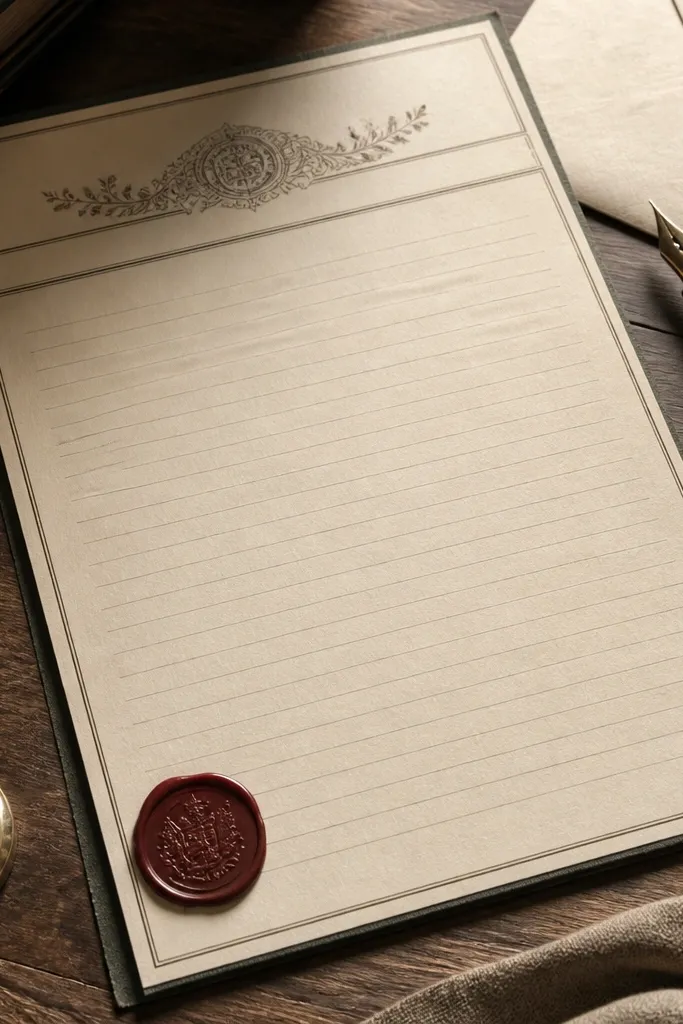
Print the letterhead strip and cut it into a width that matches your journal page. Ink the outer edge with brown pad and let it dry flat. Glue it across the top third of the page, leaving the lower area open for your text. Write your header date first, then fill the body note lines with short paragraphs or bullet points.
Letterhead gives you instant “official stationery” energy, which is cozy in a journal way. The header area looks like an old desk document, while the blank note body gives you room for a welcome message, a promise for the month, or a quick introduction. The linework keeps handwriting aligned and makes pages look polished even with minimal content. This is a good small-space Vintage Paper Printable because it’s one horizontal piece that instantly upgrades a cover or inside cover page. It also looks great when paired with a small postmark circle.
Skip thisAvoid gluing letterhead too low — it makes the page feel cramped.
Editor's noteUse a slightly lighter ink for body text so the header stays the focal point.



