
1. One-Screen Entry Page for Tiny Days
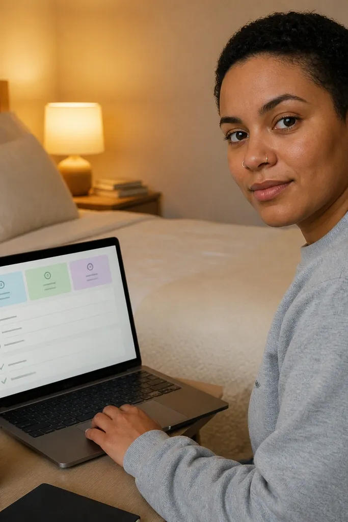
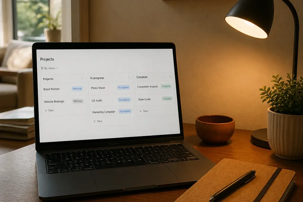
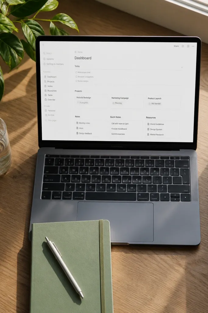
This layout is built for the moment you open Notion and need clarity in 20 seconds. You get a single page that shows your current focus, one short list, and a quick “done list” so the page stays calm. The look is clean because the page uses three compact blocks at the top and avoids long text. It fits small spaces because it doesn’t ask you to manage multiple tabs — it gives you one place to start and one place to finish.
Create a new page and add a header line using a single short sentence. Then create one database with three properties: Status (select), Priority (select), and Due (date). Make a view that shows only cards, filtered to show Status is not Done, and place it directly under a callout block. Add a second view filtered to Status is Done with a small limit, and place it at the bottom. Finally, add a template button that resets the top cards for the day.
Use a small Status set like Not started / Doing / Done so the page doesn’t get visually noisy.
Don’t add more than three top cards or the page will lose the one-screen feel.
2. Sunset Color Study Tracker (With Photo Headers)
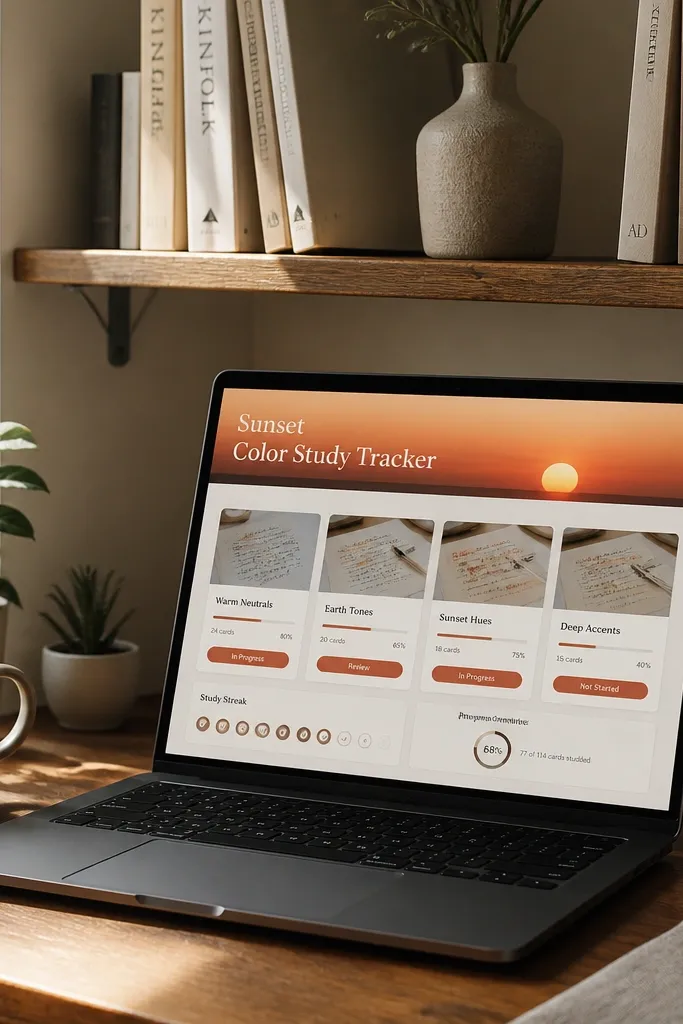
This template is for people who want their study tracking to look like a mood board, not a spreadsheet. The main win is a consistent color palette: one warm header color and one accent for status. Cards are the star — each study item shows a clean title, a tag, and a status pill, so the page reads fast. It’s great in small spaces because it stays readable on a phone and looks good in screenshots even when you only have a few entries.
Set up a database called Study Topics with properties: Category (select), Status (select), Time (number), and Notes (text). Create two views: one grid view for overview and one list view filtered to Status is Doing. For the aesthetic, set the page cover to a warm gradient (use a simple photo with orange/pink tones) and use consistent emoji icons in the Category values. Add a template for new entries that auto-fills Status as Not started and Time as 25. Place the grid view right under the header and keep the list view in the next section.
Pick one cover image style and reuse it across pages so your Notion looks intentional.
Don’t mix five different accent colors for Status or the cards will look messy.
3. Tiny Kitchen Menu Board (Weekly + Grocery Split)
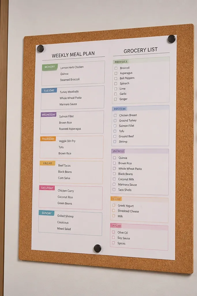
This is the “I can’t plan meals without it turning into chaos” template. It looks like a board because it uses a weekly view for meals and a separate list view for groceries, both on the same page. The split makes it easy to shop without scrolling through recipe notes. It’s a strong small-space fit because you can keep the whole plan on one screen and update it quickly.
Create one database called Meals with properties: Day (select like Mon-Sun), Meal (title), Recipe Link (url), and Status (select). Create a second database called Grocery Items with properties: Item (title), Category (select), Needed Week (select), and Used (checkbox). Add a weekly view for Meals filtered to the current week and show Day as the grouping. On the same page, add a filtered list view for Grocery Items where Needed Week equals the current week. When you plan a meal, add its ingredients as grocery items and set Needed Week to match.
Use a tight Category list like Produce, Protein, Pantry, Dairy so grocery cards stay compact.
Don’t put the grocery items inside each meal as separate text blocks — you’ll lose the shop list.
4. Compact Cleaning Checklist With Room Tiles
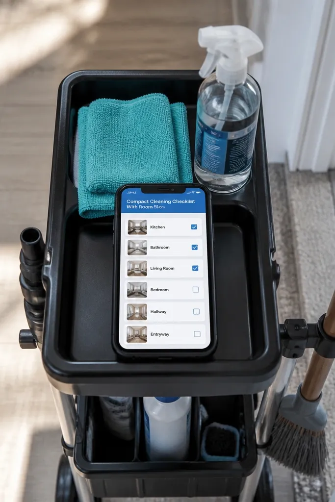
Create a database called Rooms with properties: Room (title), Frequency (select Weekly/Biweekly/Monthly), and Color (select). Create a second database called Cleaning Tasks with properties: Task (title), Room (relation to Rooms), Frequency (select), and Done (checkbox). Add a Rooms grid view filtered to Frequency is Weekly and use it as the top section. Then create a Tasks list view filtered by the selected Room using a linked filter or by creating separate views per room. Add a template for new tasks that includes default Frequency and a short task text format like “Wipe counters”.
This template makes cleaning feel organized instead of endless. Room tiles keep it photogenic and scannable: each tile shows the room name, the task list, and a checkbox status. The visual rhythm matters — you want rows that align and don’t require long scrolling. For small spaces, it’s ideal because it groups tasks by room and keeps recurring chores from turning into a giant master list.
Skip thisAvoid mixing deep chores with quick wipes in the same room tile — it makes the tile look cluttered.
Editor's noteKeep task text short and action-first so the tiles look clean when you screenshot them.
5. Budget Capsule Tracker (Bills in a Phone-Sized Layout)
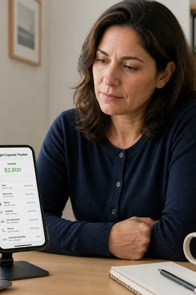
This is the budget template for people who hate spreadsheets but still want control. The aesthetic is simple: one income number at the top, then a card list of bills with status and due date. You can design it to fit phone screens, which matters if you check money on the go. It’s a small-space win because you don’t need five dashboards — you need one clear view of what’s due next.
Create a database called Bills with properties: Bill (title), Amount (number), Due (date), Category (select), and Status (select: Unpaid/Paid). Add a separate page property section at the top for Income (number) and Remaining (formula). Make a view filtered to Due is within the next 14 days and Status is Unpaid. Sort by Due ascending and show cards. Add a second view filtered to Status is Paid, placed under the main one, so the page still looks balanced.
Use one category set and keep it short; too many categories create visual noise.
Don’t add receipts and long notes to the main Bills database or the cards will look heavy.
6. Laundry Day Planner With Cycle Cards
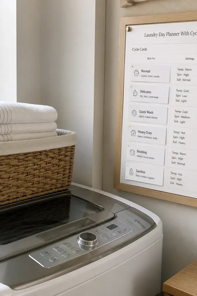
Create a database called Laundry Cycles with properties: Cycle (title), Load Type (select Whites/Darks/Towels/Bedding), Cycle Date (date), and Status (select). Add a view that shows this week only by filtering Cycle Date is within next 7 days. Switch the view to cards and add a property display for Status. Create a second view filtered to Status is Not started to highlight what you still need. Use Notion templates to create new cycles with default Status as Not started and Cycle Date as today.
Laundry templates usually become a boring checklist. This one looks better because it treats each cycle like a card with a clear label and a status pill. You also get enough structure to stop forgetting things like towels or bedding. In a small space, it’s useful because you can keep the plan for the week on one page and check it quickly while you’re standing in front of the machines.
Skip thisDon’t use free-form notes for the load type; you’ll lose the card uniform look.
Editor's noteUse one consistent naming format for Cycle like “Wash — Towels” to keep cards tidy.
7. Plant Care Log With Weekly Water Highlights
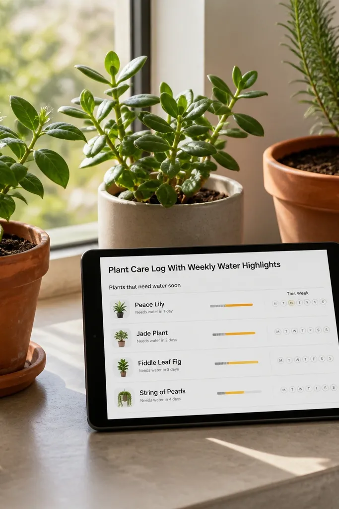
Create a database called Plants with properties: Plant (title), Species (text), Next Water (date), Light (select), and Status (select). Create a view filtered to Next Water is within next 3 days and show cards. Add a second view sorted by Next Water that you keep hidden for later reference. Add a template button for “Watered” that sets Next Water to today plus the recommended interval you choose manually. Keep the card layout minimal: show Plant, Next Water, and Light.
This template makes plant care look good and stay accurate. The aesthetic comes from using a weekly highlight view that shows only plants needing water soon — so the page stays clean. You also avoid the usual problem where the log becomes a dumping ground with no “what do I do today?” answer. Small spaces benefit because you can fit your plant reminders into a single page next to your plants or in a sidebar.
Skip thisDon’t track watering as a long timeline in one text field — it destroys the clean card look.
Editor's notePick a simple light scale like Low/Medium/Bright so your cards look consistent.
8. Desk Setup Mood Board (Cable + Surface Inventory)
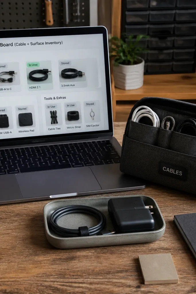
This one is for maker brains that keep rearranging without documenting what works. The beauty comes from combining a mood-board header with a practical inventory of what sits on your desk. You get cards for cables, chargers, and tools, each with a status for “in use” or “stored.” It’s small-space friendly because you can keep a clean inventory view and stop losing items in drawers.
Create a database called Desk Items with properties: Item (title), Type (select Cable/Tool/Accessory), Location (text like Drawer A), and Status (select In use/Stored). Add a gallery view that shows cards and sort by Type. Put a photo cover at the top of the page using a desk surface image. Add a second filtered view for Status is Stored so you can tuck away everything you’re not using. Add a template that helps you record “Needed daily” items by setting Status to In use.
Use short location text and a consistent format like “Drawer A” so your cards stay compact.
Avoid long descriptions on each card; keep details in separate linked pages if needed.
9. Recipe Index With "Make Again" Filters
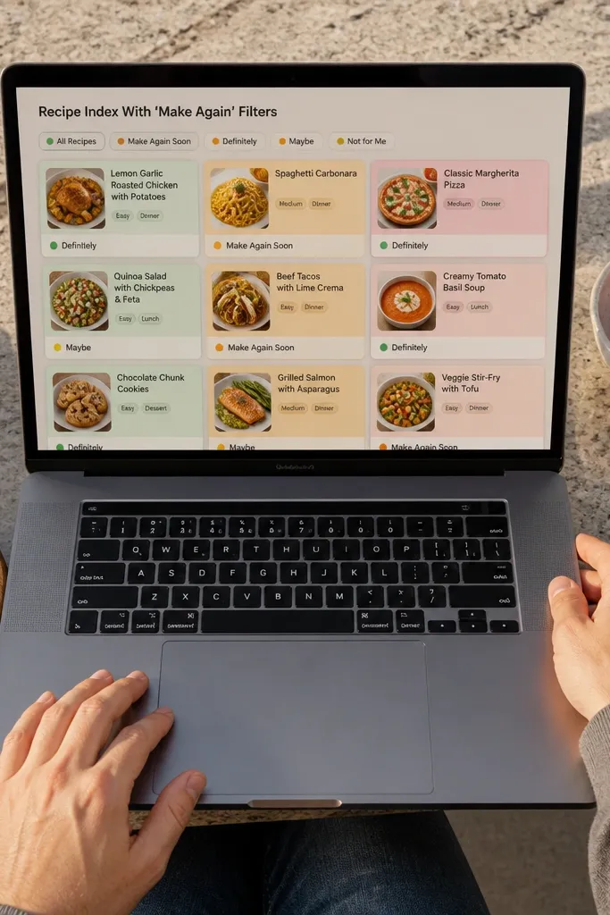
This recipe template makes your cooking list feel curated without turning into a messy scrapbook. Cards look good because they use tags and a status property, so you can instantly see what you want to repeat. For small spaces, the key is the view filters: one view shows meals you’ll make again soon, another shows everything else. It’s also great for people who cook in batches and need a quick plan without reading full recipe text.
Create a database called Recipes with properties: Recipe (title), Time (number), Tag (multi-select like Quick/Comfort/Vegetarian), and Make Again (select: Yes/No). Add a view called Make Again Soon filtered to Make Again is Yes and Time is under 45. Add a second view for All Recipes sorted by Time ascending. For aesthetics, use card covers by adding a simple image per recipe page (you can keep them consistent with one style). Use a template button that sets Make Again to Yes and Tag to Quick by default.
Keep Time in minutes as a number so sorting and filtering stays clean.
Don’t store full recipe steps in the same card database field or your cards will look cluttered.
10. Micro Goals Board With Weekly Check-in

This template is for goals that keep getting pushed aside because the system is too heavy. The look is clean because each goal is a small card with one progress property and a short next step. You also get a weekly check-in view that shows only goals you need to update. In a small space, it works because you only see the stuff that needs attention, not every goal you ever wrote.
Create a database called Goals with properties: Goal (title), Next Step (text), Status (select: Active/Paused/Done), Progress (number 0-100), and Week (select). Make a view filtered to Status is Active and Week is this week. Show the view as cards with Progress displayed. Add another view filtered to Status is Paused for later. Create a template button “Weekly Update” that sets Week to this week and keeps Status Active.
Use Progress in 10-point increments so cards don’t show tiny, messy numbers.
Don’t add multiple progress fields; one number keeps the cards visually calm.
11. Capsule Wardrobe Tracker With Outfit Slots
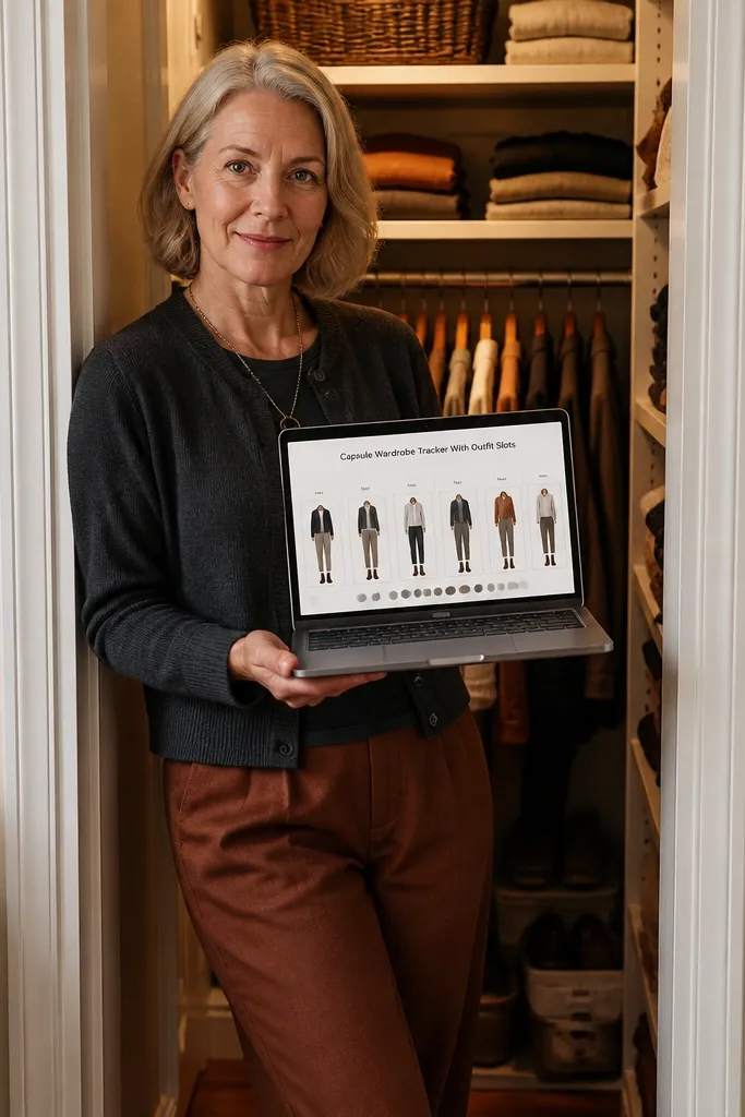
Create a database called Clothing with properties: Item (title), Category (select), Color (select), and Warmth (select). Create a second database called Outfits with properties: Slot (select: Mon/Wed/Fri or 1/2/3), Outfit Name (title), Items (relation to Clothing), and Weather (select). Build an Outfits view as cards grouped by Slot. Then create an outfit template that creates three slots for the week with Weather left blank. When you drag items into relation fields, your outfit cards stay structured and photogenic.
This template turns wardrobe tracking into something you can actually use, even if your closet is tiny. It looks good because it uses outfit slots — a small set of planned looks for the week — and each slot pulls from your clothing database. You can keep your style consistent by using a color palette and categories like Tops, Bottoms, Outerwear. Small-space benefit: you don’t need a huge list; you need a weekly plan that stops you from overthinking.
Skip thisAvoid adding shoe laces-level detail into the clothing name; keep the name short for card readability.
Editor's noteUse a small Color list like Black/White/Tan/Denim/Green so outfit cards don’t become rainbow clutter.
12. Small-Space Desk Planner With Daily Blocks
Create a database called Daily Blocks with properties: Date (date), Time Block (select like Morning/Afternoon/Evening), Task (title), and Status (select). Make views for each time block filtered by Date is today. Add three columns on the page by embedding each filtered view and placing them side-by-side. Keep Task as a short text and avoid long descriptions. Add a template button “New Day” that creates three tasks with default Status Not started.
This is a daily planner that looks like a clean desk schedule, not a massive project manager. You get time blocks and a short task list, so you can plan fast and still feel in control. The aesthetic comes from using narrow sections and consistent block spacing, which reads well in screenshots. It’s especially good for small spaces because you can check your day while you’re sitting — no long scrolling, no hunting for the next task.
Skip thisDon’t let Time Block be free-form text; fixed options keep the layout tidy.
Editor's noteUse Status values Not started/Doing/Done so the blocks look consistent.
13. Bathroom Product Shelf Log (Expiry + Rotation)
Create a database called Products with properties: Product (title), Type (select: Shampoo/Soap/Toothpaste/Skincare), Expiry (date), Opened (date), and Use First (select). Add a view filtered to Expiry is within next 60 days and sort by Expiry ascending. Create a second view sorted by Type for browsing. On your main page, place the 60-day view at the top and the Type view below. Add a template button “Opened Today” that sets Opened to today and leaves Expiry blank for you to fill.
This template keeps bathroom products from turning into a mystery pile. The beauty is in the grid of product cards with expiry dates and a simple rotation status, so you can see what to use first. It fixes the common problem of buying duplicates because you forgot what you already own. Small-space fit: you get a compact view that works for a small shelf or a shared bathroom.
Skip thisAvoid including ingredient lists in the product database; link a separate notes page if you need it.
Editor's noteUse Use First values like “This week” and “Next month” so the cards stay readable.
14. Home Library Shelf Tracker With Reading Mood Tags
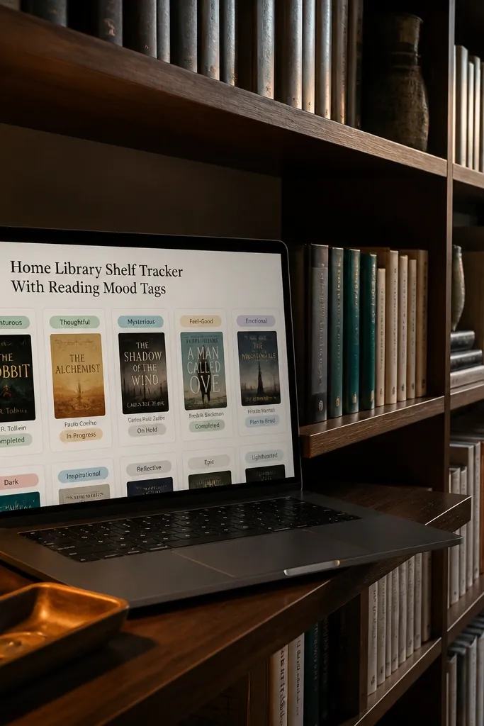
This is for small home libraries where you need to know what you own and what you want to read next. It looks good because book cards use mood tags and a simple status pill, so you can scan quickly. The template also helps you avoid buying duplicates since you can see if you already have a title. Small-space benefit: you can keep your entire library plan on one page and filter by status.
Create a database called Books with properties: Title (title), Genre (select), Mood (multi-select like Cozy/Intense/Light), Status (select: Want/Reading/Finished), and Pages (number). Create a view Want to Read as cards filtered to Status is Want. Create a second view Reading Now filtered to Status is Reading. Add a third view Finished as a simple list with fewer fields. Place the Want and Reading views on one page so you can plan quickly.
Keep Mood tags to 3-5 options so your library looks cohesive.
Don’t use long author bios as card titles; keep the title clean.
15. Charging Station Checklist With QR Labels
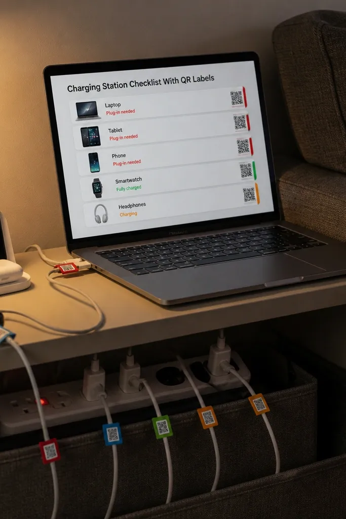
Create a database called Devices with properties: Device (title), Type (select: Phone/Tablet/Headphones/Camera), Cable (text), and Status (select: Ready/Needs charge). Add another property QR (url) if you want to link to a label page. Build a view filtered to Status is Needs charge and show cards. Add a view for All Devices sorted by Type. On the page, place the Needs charge view at the top and All Devices below. When you update status, you keep the station calm and predictable.
This template makes your charging station look organized and actually work. You keep device cards with a simple “plug-in needed” status and a field for a QR label link, so you can attach a label to each cable and scan to see what it belongs to. It’s photogenic because the page uses neat cards and a consistent icon set for device types. For small spaces, it’s the best fix for clutter — you stop having cables everywhere.
Skip thisDon’t store messy cable descriptions; keep Cable text short so cards stay clean.
Editor's noteUse one QR label per cable, not per device — it keeps the station simpler.
16. Entryway Key + Wallet Tracker (No More Lost Items)
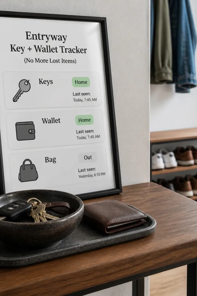
This one is about reducing daily friction with a tiny system. The look is clean because you use three big cards for keys, wallet, and bag, each with a status like Home/Out. You get a “last seen” timestamp so you can figure out what happened when something goes missing. Small-space fit is strong because it’s meant for a small entry table, not a whole command center.
Create a database called Entry Items with properties: Item (title), Type (select Keys/Wallet/Bag), Status (select: Home/Out), and Last Seen (date). Make a view filtered to Status is Out and show as cards. Put the Home/Out summary cards at the top by creating separate views filtered to each status and embedding them. Add a button template “Set Home” that changes Status to Home and sets Last Seen to today. Keep the database limited to three items so the page stays readable.
Use consistent item names like “Keys” and “Wallet” so you don’t end up with duplicates.
Avoid adding dozens of random items; this template works only when it stays small.
17. Craft Supply Inventory With Color-Coded Categories
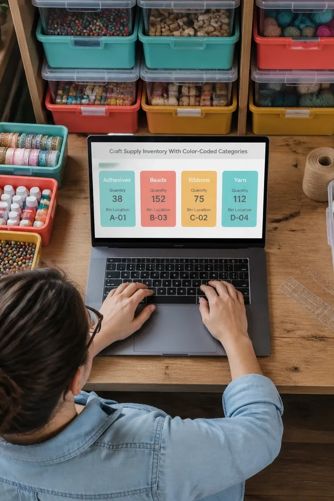
Create a database called Supplies with properties: Supply (title), Category (select with 6-10 options), Quantity (number), Bin (text), and Status (select: In stock/Low/Out). Make a view sorted by Status so Low items appear first. Add a second view filtered to Category is a specific one for quick browsing. On the main page, embed the Low/Out view at the top and a grid view of In stock below. Add a template button “New Supply” with default Status In stock and Quantity 1.
This template prevents the classic DIY problem: buying the same thing twice because you can’t see what you have. It looks good because categories are color-coded and cards show quantity at a glance. For small spaces, it’s perfect if you store supplies in bins — you can track by category and bin location without turning your craft room into a warehouse. The visual style keeps you motivated to actually use what you own.
Skip thisDon’t use free-form categories like “misc”; you’ll lose the color system.
Editor's noteKeep Bin text short like “Bin A1” so your cards don’t stretch.
18. Wall Art Planning Sheet With Size + Frame Notes
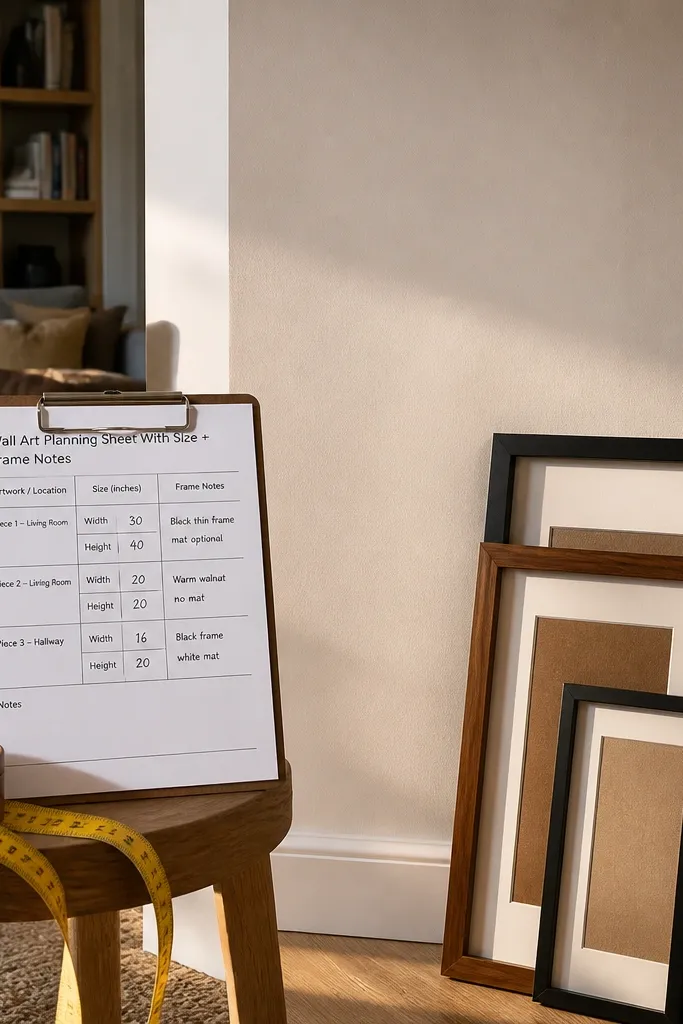
This template is for people who want their wall to look intentional, not like random prints taped up. Cards show size and frame notes so you can compare options quickly. The aesthetic comes from using consistent measurement fields and short frame descriptions, which makes the page look organized. Small spaces benefit because you need to plan around tight wall sections and you can keep all candidates in one place.
Create a database called Wall Art with properties: Title (title), Width (number), Height (number), Frame (select like Wood/Black Metal/White), and Placement (select like Above Sofa/Entry). Create a view called Fit for the Wall filtered by Width is under your max and Height is under your max. Add a grid view showing Frame and Placement on cards. On your placement page, embed the filtered grid view and add a short “max size” note at the top. Add a template button “New Frame Option” that sets Frame to Black Metal and leaves Placement blank.
Use the same unit for all measurements (inches or cm) so your comparisons don’t get messy.
Don’t rely on notes-only measurements; you need numbers for filtering.
19. Mini Gallery Wall Checklist (Spacing + Leveling Guide)
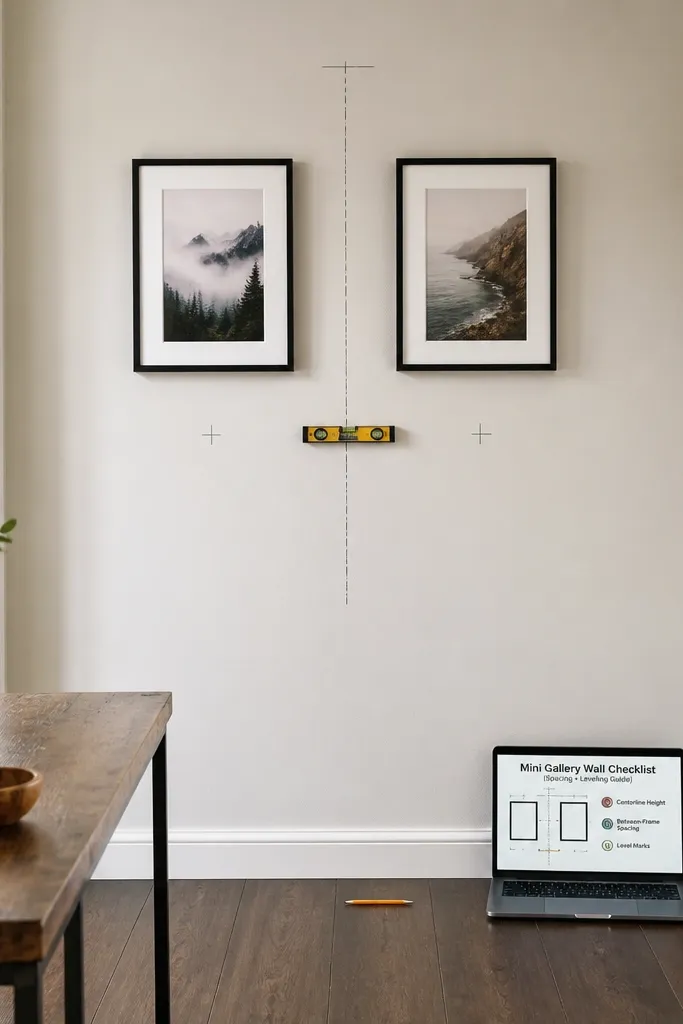
This is a gallery wall template that looks like an actual plan, not a list of guesses. It uses image slots and spacing rules so you can lay out frames with confidence. The beauty is in the callouts: one for “centerline height,” one for “between-frame spacing,” and one for “level marks.” Small-space fit is great because a mini gallery wall often goes on narrow walls, and you need the rules to avoid uneven spacing.
Create a database called Frames with properties: Frame (title), Width (number), Height (number), Quantity (number), and Status (select: Planned/On wall). Add a view filtered to Status is Planned and show cards. Add a separate page section with three callout blocks for Centerline (like 57 in from floor), Spacing (like 2 in between frames), and Leveling (use a bubble level). Put those callouts above the Frames view. Add a template button “Add Frame” that creates a card with default Spacing Notes set to “2 in gap.”
Write your centerline number in the callout and keep it visible while you measure.
Avoid eyeballing spacing — it’s the fastest way to end up with a wall that looks off in photos.
20. Holiday Decor Storage Map (Bin Labels + Scene Ideas)
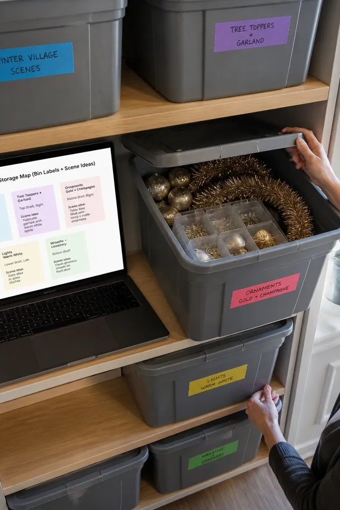
This template fixes the “where did I put that?” problem that wrecks holiday prep. It’s aesthetic because the cards show bin location and a short scene idea, so you can plan what to pull out without reading long text. Small-space benefit: you can store decor in a few bins and still know exactly what’s inside. It also photographs nicely because the layout is organized into one page with clear sections.
Create a database called Decor Pieces with properties: Piece (title), Holiday (select), Bin (text), Condition (select New/Good/Worn), and Scene (text). Create a view filtered to Holiday is the current holiday and show as cards. Add a second view filtered to Condition is Worn for repairs. On the main page, embed both views and add a top section with a “Bin Map” list in short bullet form like “Bin 1: lights, Bin 2: ornaments.” Add a template button “New Box Entry” that sets Condition to Good and leaves Scene blank.
Use consistent bin naming like “Bin 1 — Top Shelf” so you don’t have to decode your own system later.
Don’t store “holiday” as free text; you’ll end up with duplicates like “Xmas” and “Christmas”.
21. Budget Meal Prep Calendar With "Cook Days"
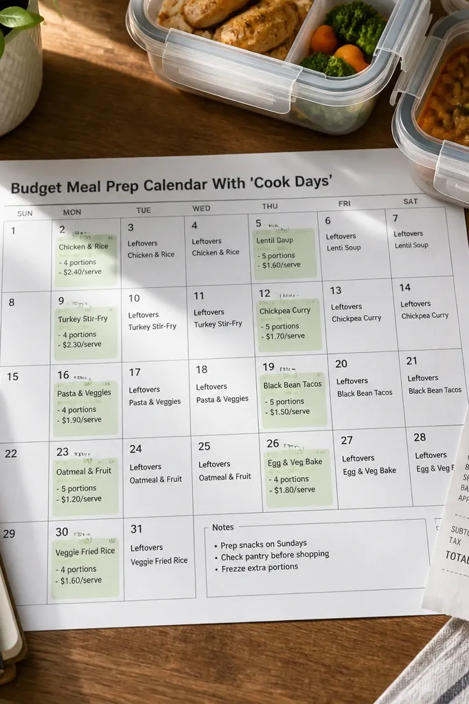
Create a database called Cook Days with properties: Date (date), Prep Type (select Batch/Quick), and Meals (relation to Recipes). Create a second database called Recipes with properties: Recipe (title), Time (number), Category (select). Add a calendar view for Cook Days and color the Prep Type property so cook days stand out. Add a list view filtered to Prep Type is Batch for the week. Place the calendar view at the top of a page and embed the list view below. Add a template button “Cook Batch” that pre-fills Prep Type to Batch and adds three empty meal relations.
This template is for meal prep that stays under control, not meal prep that turns into five half-finished containers. The aesthetic is a calendar grid with highlighted cook days and compact cards for each meal prep item. Small-space benefit: you can see the plan at a glance and avoid stacking too many recipes in one day. It also helps you batch groceries because your cook days drive what you buy.
Skip thisAvoid adding long recipe steps to this setup; keep prep steps on separate recipe pages.
Editor's noteKeep Prep Type to two options so the calendar stays readable.
22. Self-Care Routine Cards With Mood Filters

Self-care templates usually look like a journal. This one looks like a card deck — fast, clean, and designed to pick a routine based on how you feel. The main visual win is mood filters that show only the routine you need right now. Small-space fit: it stays simple, so you can keep it in a sidebar and check it without getting overwhelmed. It’s also easy to maintain because you add one routine at a time.
Create a database called Routines with properties: Routine (title), Mood (multi-select: Calm/Focus/Reset/Sleep), Time (number), and Steps (text). Create a view filtered to Mood contains Reset and show cards. Add another view filtered to Mood contains Focus and show cards. Put both views on one page with a short header that says “Pick a mood, do one routine.” Add a template button “New Routine” that sets Time to 10 and adds Steps placeholder like “1) Breathe 2) Stretch 3) Water”.
Use time in minutes and keep it under 30 so the cards stay realistic.
Don’t add five moods per routine; too many tags make the page visually chaotic.
23. Project Status Board With Tiny Donut Progress
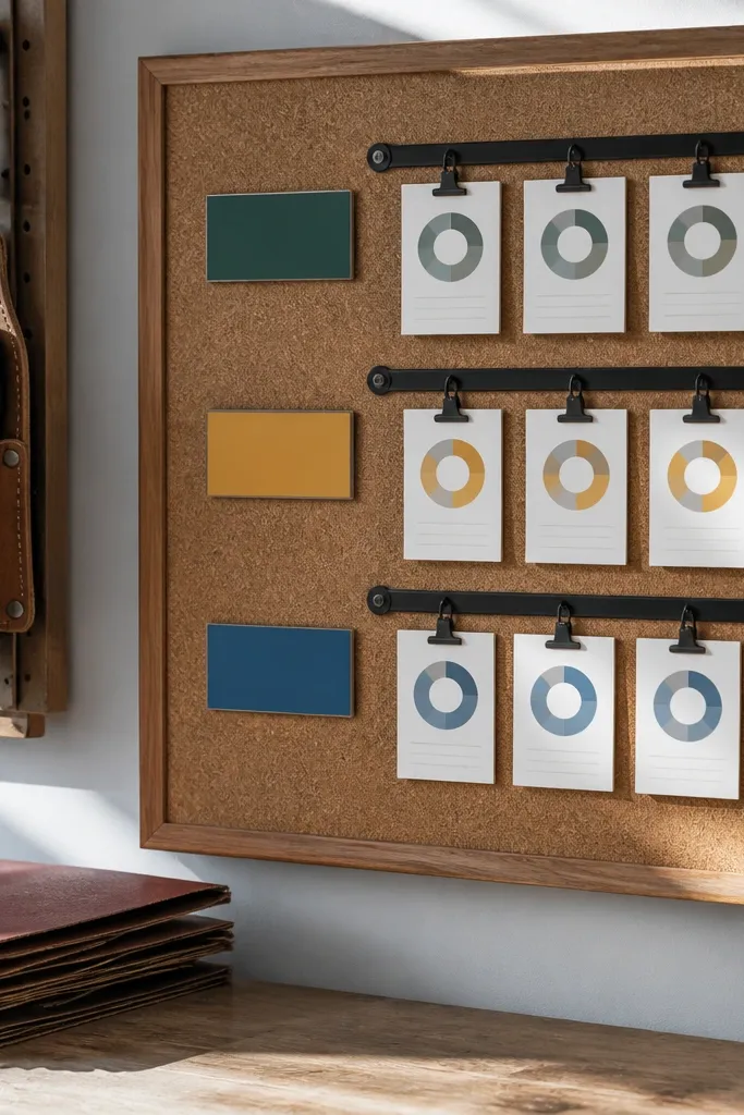
This template makes project tracking look tidy and motivating, even in a small space. The aesthetic comes from a single status field and a progress number that updates your cards. You get views that show only what’s Active, what’s Waiting, and what’s Done, so the board never turns into a wall. It’s useful when you have multiple small projects and need a quick visual scan without reading details.
Create a database called Projects with properties: Project (title), Status (select: Active/Waiting/Done), Progress (number 0-100), and Next Action (text). Add a view for Active filtered to Status is Active and sort by Progress ascending. Add a second view for Waiting filtered to Status is Waiting. Add a third view for Done filtered to Status is Done and keep it at the bottom. Show Progress on cards using the number property display and keep Next Action short. Add a template button “New Project” that sets Status Active and Progress 0.
Keep Next Action to one sentence. If it runs long, cards start looking messy.
Don’t add multiple progress fields or you’ll lose the clean visual meaning.
24. Weekend Social Planner With Invite Cards
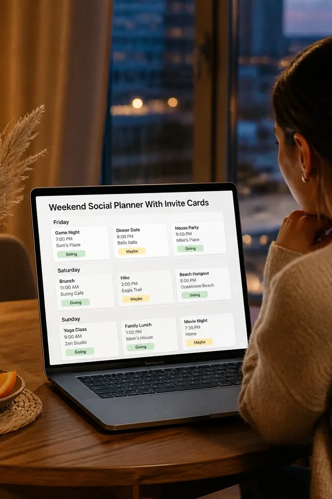
This template is for people who want their weekends to look planned, not chaotic. It uses event cards with RSVP status and a date so you can see what’s happening at a glance. The look is photogenic because cards are compact and grouped by day. Small-space benefit: it keeps your social plans from getting buried under work tasks, and you can check it quickly when you’re deciding what to do.
Create a database called Events with properties: Event (title), Date (date), Type (select: Hangout/Party/Errand), RSVP (select: Yes/Maybe/No), and Notes (text). Create a view grouped by Date and show cards. Add a view filtered to RSVP is Yes and place it at the top. Add another view filtered to RSVP is Maybe and keep it smaller at the bottom. Add a template button “New Invite” that sets RSVP to Maybe and Date to the upcoming weekend day you pick.
Use a tight RSVP set: Yes/Maybe/No. More options make the cards look busy.
Avoid long event descriptions in the card title; keep details in the event page.
25. Pet Care Log With Medication Countdown
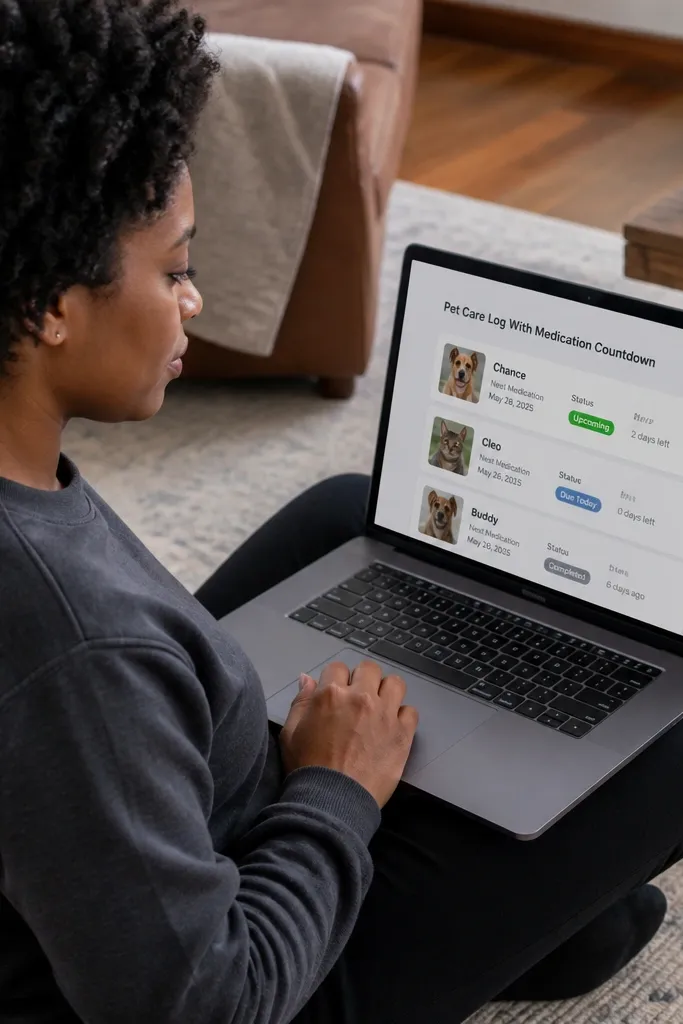
This template keeps pet care organized and visually calm. Cards show the next medication date and status, so you always know what’s due. It fixes the common problem where medication info is buried in notes and you forget until it’s too late. Small-space fit: you can keep it on one page and quickly scan through what needs attention this week.
Create a database called Pets with properties: Pet (title), Next Med (date), Medication (text), and Status (select). Create a view filtered to Next Med is within next 7 days and show cards. Add a formula property called Days Left that calculates difference between Next Med and today. Put Days Left on the cards. Add a template button “Dose Taken” that sets Next Med to today plus the interval you enter manually in Medication interval. Keep the medication text short like “Oral 10mg” so cards don’t stretch.
Use a formula Days Left so you don’t have to update countdowns by hand.
Don’t store medication schedules as paragraphs in one field; it’s too hard to scan.
26. Kids Chore Chart With Color Status Tiles
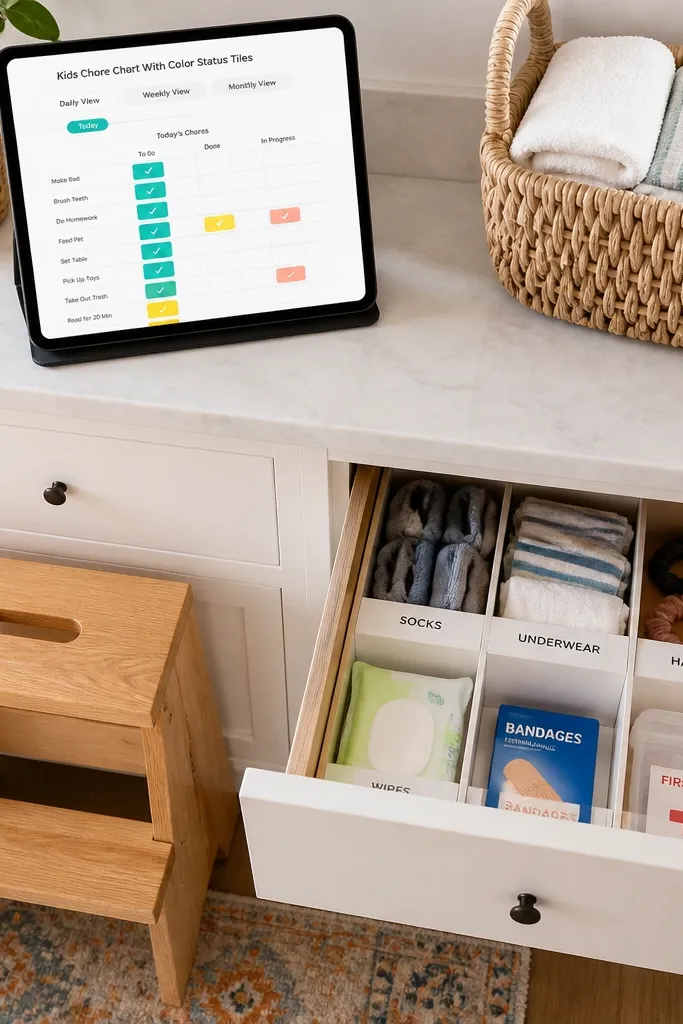
Create a database called Chores with properties: Chore (title), Kid (select), Time (select Morning/Evening), and Status (select: Not started/Doing/Done). Create a second database called Rewards with properties: Reward (title), When (select: Weekly/Monthly), and Eligible Chores (relation to Chores). Make a view filtered to Time is today’s time block and show as tiles. Add two embedded views side-by-side for Morning and Evening. Use a template button “Mark Done” that sets Status to Done and updates a separate Last Updated date property.
This template makes chores look friendly and structured without turning into a punishment wall. The color status tiles create a clear visual rhythm so kids can see what’s done. You also get a simple view for “today” so parents don’t have to hunt through history. Small-space benefit: it works in a small kitchen area because you can keep it open on a tablet and update it quickly.
Skip thisAvoid using many status steps like 8 phases — kids won’t read it.
Editor's noteKeep the number of chore tiles small per day so the page stays readable.
27. Small-Space Weekly Review With Three Lanes
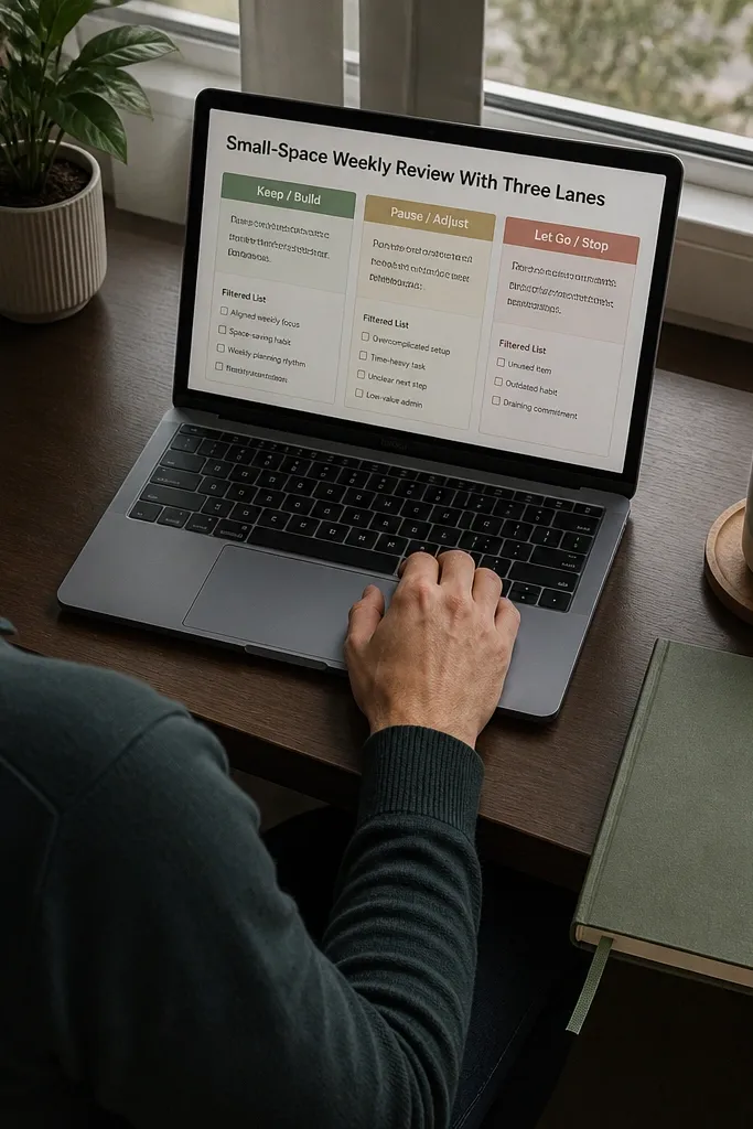
This template is designed for weekly review that doesn’t become a chore. The look is strong because the page is split into three lanes with short prompts and filtered lists below each lane. You get a clean structure for reflection and planning, without writing essays. Small-space benefit: you can reuse it every week, and the layout stays consistent so it’s easy to screenshot and track progress.
Create a database called Weekly Items with properties: Week (select), Lane (select Wins/Fixes/Next week), Item (title), and Status (select). Create a view filtered to Week is this week and Lane is Wins, displayed as cards. Create two more views for Fixes and Next week, each filtered similarly. Place all three views in one page in a column layout. Add a template button “New Weekly Entry” that sets Lane to Wins and Week to this week.
Use Lane as a single select so the weekly lanes stay consistent.
Don’t add long text fields to the cards; keep the card preview short and move details into the linked page.
28. Photography Shot List With Edit Status and Colors
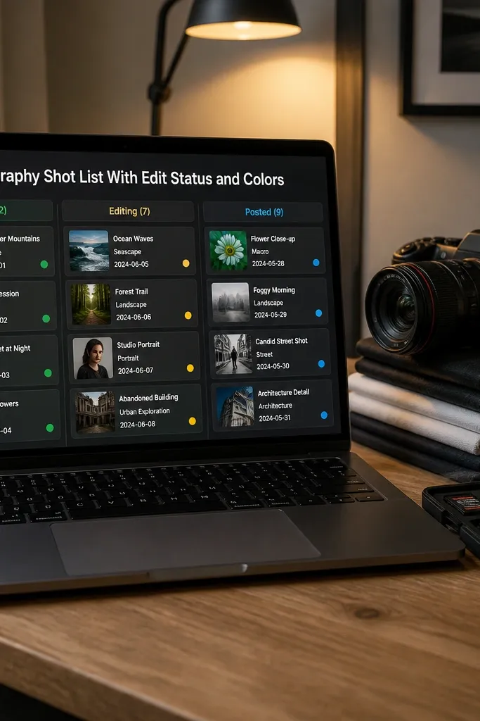
Create a database called Shots with properties: Shot (title), Session (select), Edit Status (select: Raw/Editing/Ready), and Color Tag (select). Add a view filtered to Edit Status is Editing and show cards. Create another view filtered to Edit Status is Ready for quick export planning. Put both views on one page and keep the rest hidden. Add a template button “New Shot” that sets Edit Status to Raw and Color Tag to Neutral by default.
If you take photos for your home or DIY projects, this template keeps your shot list from turning into a trash folder. The aesthetic comes from using color tags and edit status so you can quickly see what’s ready to post. Small-space benefit: you can keep it on one page and update it in minutes after you shoot. It also helps you maintain a consistent visual style because each shot has a clear tag.
Skip thisDon’t use dozens of unique tags per shot; it makes the page unreadable.
Editor's noteUse a small Color Tag set like Neutral/Warm/Cool so the cards look cohesive.
29. DIY Project Mini Planner With Bill of Materials Cards
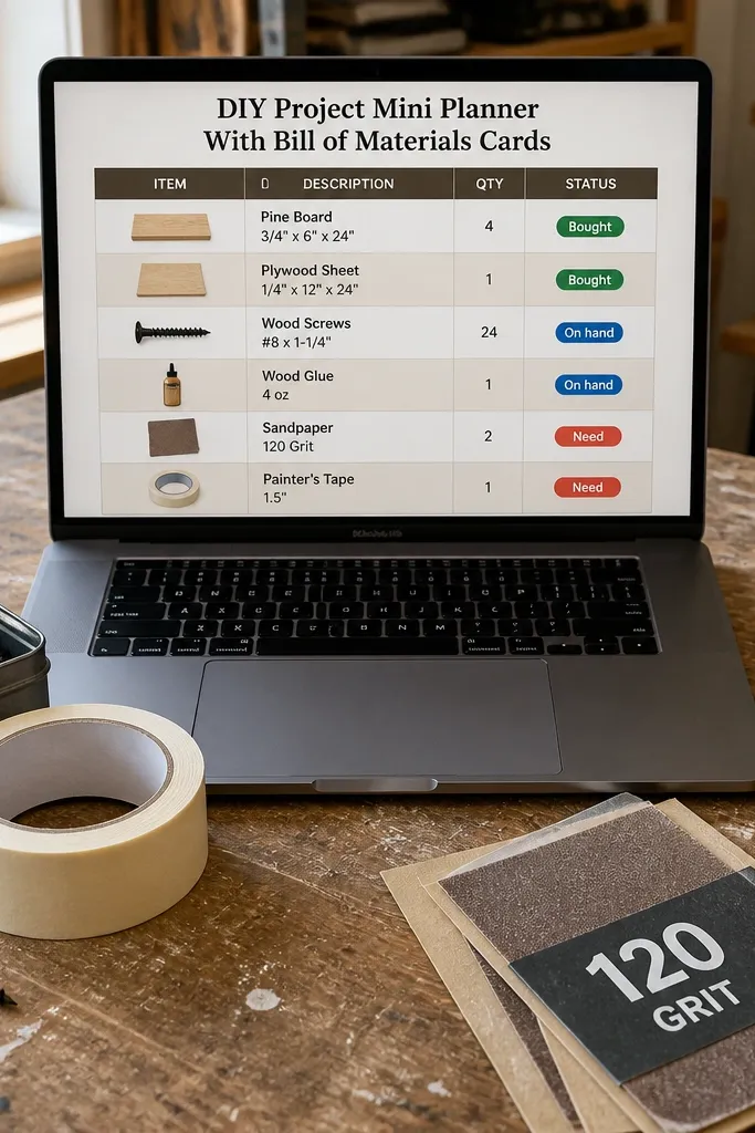
Create a database called Materials with properties: Material (title), Project (relation to a database called Projects), Quantity (number), Unit (select like pcs/ft), and Status (select: Need/On hand/Bought). Create a Projects database with properties: Project (title), Status (select), Start (date), and Finish (date). On the project page, add a Materials view filtered to this project and show cards. Add a second materials view filtered to Status is Need and place it at the top of the page. Add a template button in Projects called “New DIY” that sets Status to Active and creates three empty material entries.
This template is built for DIY projects that need materials tracked without turning into a spreadsheet. The look is good because you get a materials card grid with quantities and a status pill for Bought/On hand/Need. Small-space benefit: you can keep one active project visible and hide the rest. It also prevents last-minute runs to the store because your “Need” view makes gaps obvious.
Skip thisAvoid mixing “need” and “bought” inside notes — use the Status field so the views work.
Editor's noteUse a fixed Unit list so cards don’t show random abbreviations.
30. Small-Space Habit Tracker With Streak-Like Layout
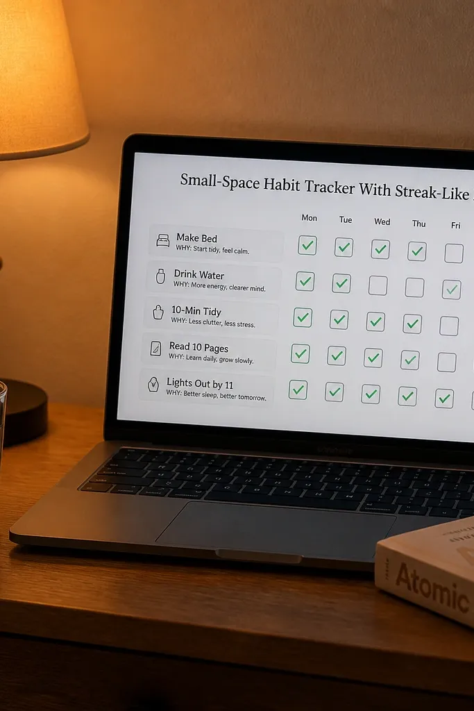
This is a habit tracker that stays pretty because it uses cards and a simple daily check system. You don’t get a huge spreadsheet grid that overwhelms a small screen. Instead, each habit is a card with a daily checkbox and a short “why” line. Small-space benefit: you can keep it open during your routine and update it in seconds.
Create a database called Habits with properties: Habit (title), Category (select), Why (text), and Daily (checkbox). Create a view filtered to Category is your current focus and show cards. Add a daily page for today with an embedded view filtered to Habits where Category matches your focus and Daily is true. For the visual check, create a second view filtered to Daily is false and show it as a small list. Update Daily checkboxes each day and use a template button “New Day” to reset Daily checkboxes back to false.
Keep habit categories to 3-4 so the page stays uncluttered.
Don’t add complex streak formulas; the simple daily check keeps the layout clean.



