
1. Matte Black + Gold Leaf Drip Candles
This look is flashy without being messy. The matte black base makes the gold read like jewelry, and the drip pattern adds motion so it looks styled from across the room. Gold leaf works best here because it catches light in tiny fragments instead of forming thick paint blobs. You get a high-end vibe for a fraction of the cost of store-bought candles, and it stays renter-friendly since you’re only painting on the surface.
Editor's noteUse a stiff foam brush for drips — it gives a controlled edge without flooding the wax.
Start by wiping the candle with a dry microfiber cloth so dust doesn’t block adhesion. Paint a few narrow drip trails from about 1 inch below the top edge down to the mid-height using metallic gold craft paint, then leave the drips slightly uneven so they look natural. Press small pieces of gold leaf onto the wet paint areas and tap off excess. Finish with a clear matte or satin topcoat so the leaf doesn’t shed when you move the candle.
Skip thisDon’t seal gold leaf with a heavy glossy coat; it can look plastic and dull the leaf texture.
2. Vanilla Wax Speckle + Espresso Spiral
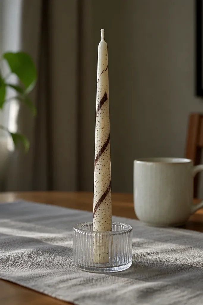
This is understated but still photo-ready. The off-white base reads clean, while the espresso spiral creates a focal line that looks intentional even from a distance. Speckling gives texture so the candle doesn’t look flat, and it photographs well because the specks catch tiny highlights. It’s also forgiving if your spiral isn’t perfectly even; the speckles visually soften any tiny wobble.
Begin by marking a faint guideline around the candle with a removable pencil or light tape wrap, then sketch a spiral path lightly. Paint the spiral with a thin liner brush using matte espresso paint, keeping lines about 1-2 mm wide. For speckles, load a toothbrush with the same espresso paint, then flick over the top half for a denser cluster. Seal with a thin clear coat after everything dries fully.
Make the spiral slightly wider at the top and narrower at the bottom — it looks more dimensional in photos.
Skip water-thin paint; it runs and turns speckles into streaks.
3. Sunset Ombré Banding (Peach to Coral)

Ombré bands look expensive because they create smooth color transitions without needing detailed drawing. Peach to coral is a safe color combo that flatters most rooms and makes your candle look warm even in cooler lighting. The banded method keeps edges controlled, so your ombré doesn’t turn muddy. It also works great on renters' shelves because it looks like decor from every angle — no hanging hardware needed.
Editor's noteStencil a 1/2 inch strip of painter’s tape as a guide for the first band so your horizon lines stay straight.
Start with an off-white or cream candle for the brightest transition. Paint horizontal bands across the candle using three colors: soft peach, coral, and a thin line of warm orange at the top edge. Blend each band while it’s still slightly tacky using a sponge or dry brush, working in small motions upward. Let it dry, then add a satin clear topcoat to keep colors from rubbing.
Skip thisDon’t blend too hard; overworking makes the transition turn gray-brown.
4. Arched Terracotta Blocks with White Outline
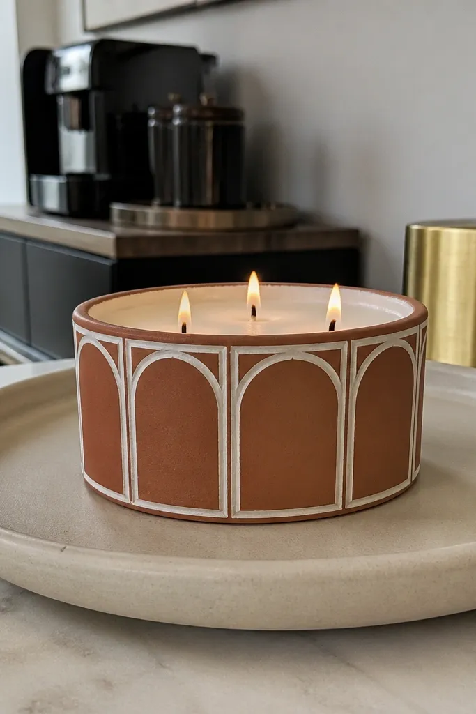
This style looks like little architectural panels wrapped around a candle. Terracotta plus crisp white lines reads warm and modern, and the arches add softness compared to straight stripes. It’s especially photogenic on a tray because the repeated shapes create a rhythm. You’re painting geometric motifs, so it feels intentional instead of “handmade random.”
Editor's noteLet the terracotta dry fully before outlining; wet paint makes the white bleed.
Paint a light cream base if your candle isn’t already off-white. Use painter’s tape to block out three or four vertical sections, then remove tape so you have clean dividers. In each section, paint a terracotta arch shape with a flat brush, then outline each arch with a thin white paint line. Finish with a clear satin seal after the paint cures.
Skip thisDon’t use thick tape for long — it can pull wax and leave a rough edge.
5. Forest Green Lines with Natural Linen Texture
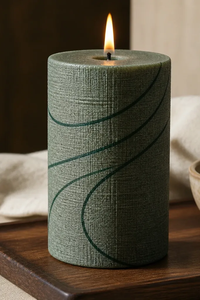
This is for people who like calm, earthy decor. Thin forest-green line work gives a graphic look, while the linen texture makes it feel tactile instead of flat. It photographs well because the texture catches light at an angle. The best part is that it looks good even if you’re not confident drawing — you’re using a repeatable pattern.
Editor's noteUse a cotton swab to clean the edges between texture and background so the candle stays crisp.
Wrap the candle lightly with a strip of clean linen or use a linen-texture stamp if you have one. Dab a diluted forest-green paint over the fabric texture, then press gently onto small sections to transfer a woven pattern. After it dries, paint thin vertical lines over the textured areas using a fine liner brush. Seal with a flexible clear topcoat.
Skip thisDon’t soak the fabric; heavy paint smears and makes the texture disappear.
6. Celestial Constellation Dots and Tiny Moon
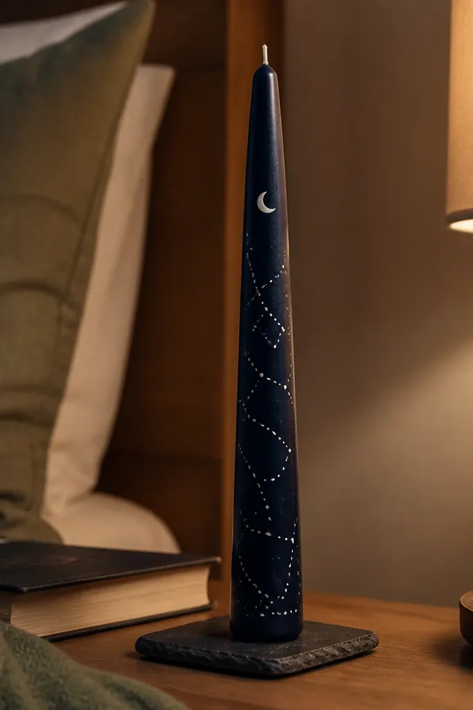
Dark base plus tiny white dots reads like actual night-sky decor. The trick is scale: small moon shapes and short line connections look delicate, not childish. This design is perfect for renters because it works on any candle shape and doesn’t require attaching anything to walls. It also looks great in sets — three candles with different constellations look intentional as a group.
Editor's noteUse a needle or toothpick for dots so they stay round and controlled.
Start with a dark navy, charcoal, or deep green candle. Paint a small crescent moon near the top using a fine brush, then add 10-20 white dots across the upper half. Connect select dots with two or three short lines to form constellations, keeping lines thin. Let it dry, then seal with a clear matte topcoat so the stars don’t reflect too much.
Skip thisAvoid big moon shapes; they overpower the candle and ruin the delicate effect.
7. Candy-Coated Chevron with Glossy Highlights
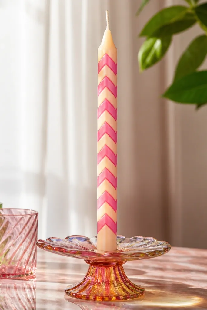
Chevrons look playful and clean when you keep the stripes crisp. The candy-coat effect comes from using glossy highlight lines, which makes the painted stripes look like they have depth. This is a strong choice if you want your candle to look like decor rather than a simple craft. It also pairs well with colored glass jars and bright trays because the design has strong geometry.
Draw a center guideline and then sketch chevron angles lightly. Paint alternating bands in two or three colors (like teal, coral, and warm yellow) using a small flat brush. After the stripes dry, add a thin glossy highlight line along one edge of each chevron using clear glaze or a glossy medium tinted slightly toward the stripe color. Seal the rest with a clear coat but avoid heavy gloss everywhere.
Keep chevron points sharp by using a ruler edge under your brush for the first pass.
Don’t overpaint chevrons; thick paint rounds the corners and kills the graphic look.
8. Coastal Rope Wrap Illusion (Painted, No Twine)
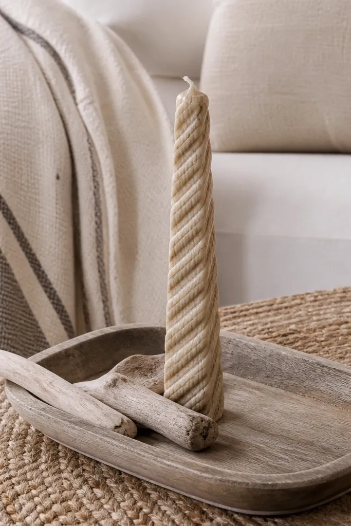
This gives you a rope-wrapped look without actually wrapping rope around the candle. The illusion is made with layered curved bands, shaded to look like twisted fiber. It reads coastal and relaxed, and it’s easy to make renter-friendly because you’re not using glue that could leave residue. The best part is that you can match your room palette by swapping tan shades for whatever you already own.
Base-coat the candle in off-white or cream. Paint 6-10 curved “rope bands” around the candle using a mid tan, then shade one side of each band with a darker brown using a small angled brush. Add a thin lighter line on the opposite side to mimic rope highlight. Let dry and apply a satin seal so the illusion stays smooth.
Paint bands slightly wider at the top; it makes the rope look twisted instead of stamped.
Skip pure black shading; it looks harsh and makes the rope illusion look dirty.
9. Classic Red Script Candle (Modern Minimal)
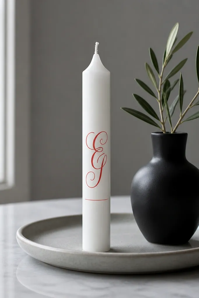
Script text can look classy if you keep it small and centered. A single red word with a minimal underline feels modern and reads clearly in photos, especially when you place it on a light tray. This idea is also great for renters because it doesn’t require any mounting — it’s just paint on wax. Keep the design minimal and it won’t look like a school project.
Pick an off-white candle and plan your word placement with light pencil marks. Use a paint marker or a fine liner brush to write one short word in red, about 2-3 inches tall. Add a tiny underline made of 4-6 dot points spaced evenly. Let it dry, then seal with a satin topcoat to protect the lettering.
Practice your letters on paper first and match your stroke thickness to your brush tip.
Don’t write multiple lines; small candles get crowded fast.
10. Marble Veins with Soft Gray Mist
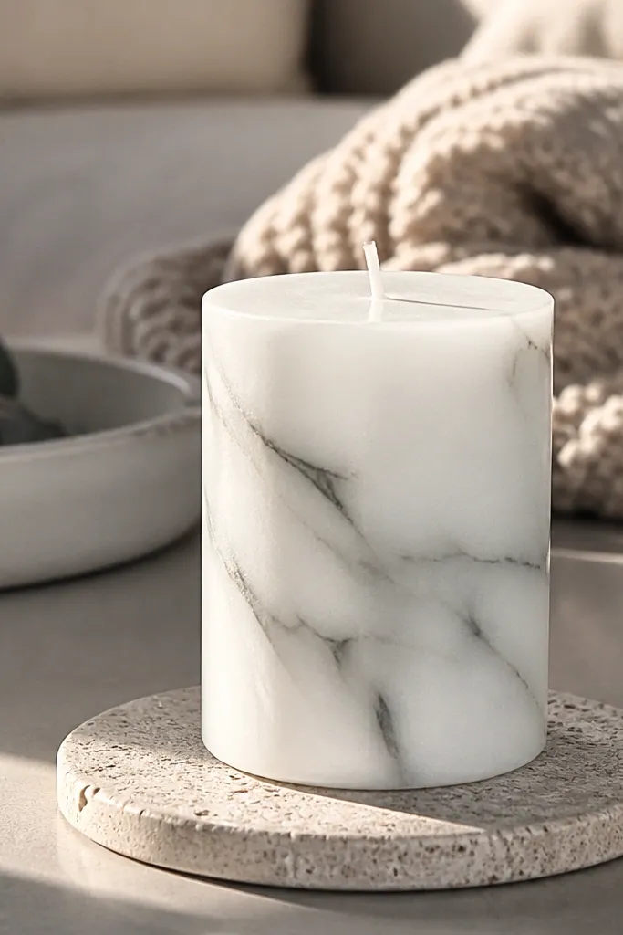
Marble veins make candles look like they belong in a designer home. The trick is not drawing hard black lines — you want soft gray veining with subtle misting so it looks natural. This style is photogenic because the veining creates movement across the candle body. It also works well in neutral rooms and looks great in stacked candle heights.
Editor's noteUse a dry brush to feather the mist — it prevents harsh edges.
Base-coat the candle in warm off-white. Mix a soft gray using white and a touch of black, then drag a few thin veining lines from top to bottom with a fine brush. Add a light mist around some vein edges using a sponge with very diluted gray paint. Let everything dry, then seal with a matte or satin clear coat to avoid shiny plastic look.
Skip thisDon’t use heavy black outlines; marble looks fake when the contrast is too sharp.
11. Botanical Leaf Silhouette in Olive and Cream
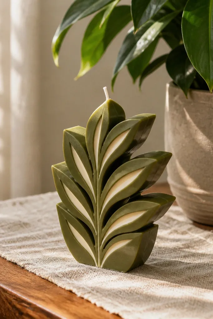
Leaf silhouettes are one of the most reliable ways to get an aesthetic candle without complex painting. Olive on cream looks calm and expensive, and the silhouette approach hides small imperfections because the shape is the star. Add tiny cream highlight cuts and your leaves look dimensional. This design also scales well for sets — different leaves on each candle look like a coordinated collection.
Choose a cream candle and decide where the leaf cluster sits, usually just below the top third. Paint one or two large olive leaf shapes using a leaf stencil or by tracing a real leaf silhouette onto paper first. Then paint small vein lines in a lighter olive or off-white to add depth. Seal with a satin topcoat so the leaf edges stay crisp.
Keep leaf stems thin; thick stems make the design look flat.
Don’t crowd the candle with too many leaves; three shapes read better than six.
12. Midnight Gradient with Starburst Gold Tips
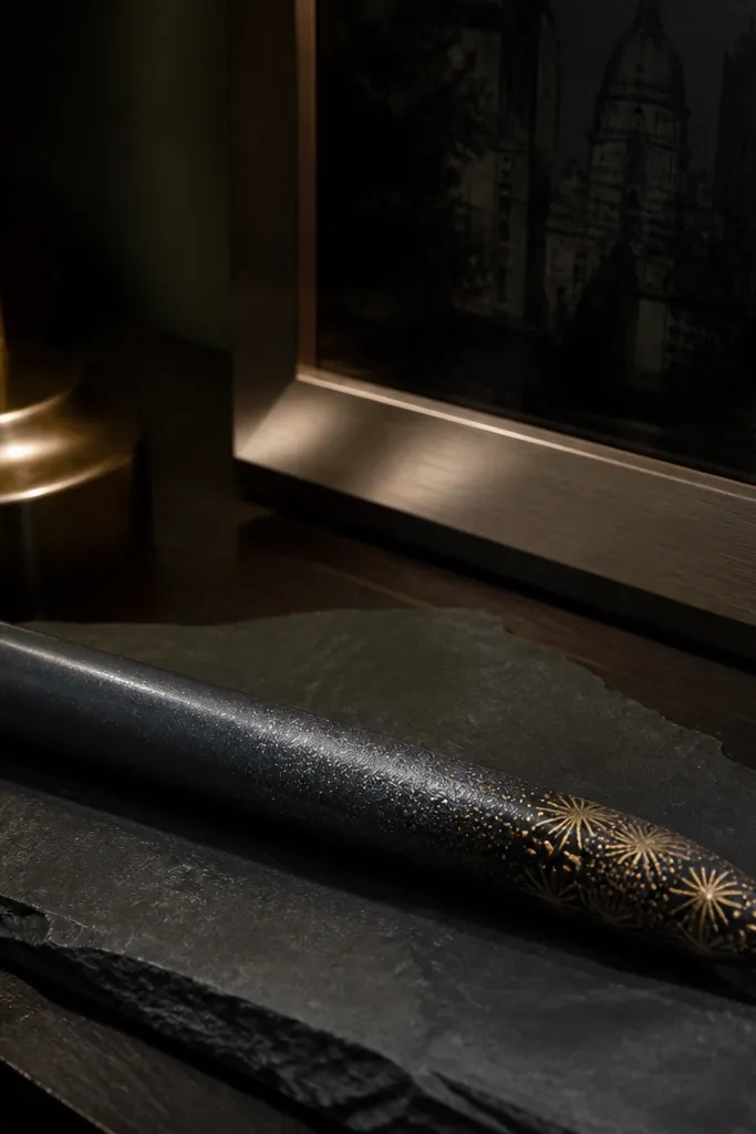
This one looks like night sky meets jewelry. A smooth midnight gradient creates a moody base, and gold starburst tips add a pop that reads premium in photos. You don’t need to draw lots of stars; a few concentrated bursts near the top are enough. It’s also a strong renter-friendly choice because it doesn’t depend on room lighting or wall placement — the candle itself carries the look.
Start with a dark candle or base-coat with charcoal or deep blue. Paint a vertical gradient by blending three tones: deep blue, midnight navy, and a near-black at the bottom edge. Work with a damp sponge so the transition stays soft. After it dries, use gold paint to add 5-8 short starburst lines around a small circle near the top, then seal with a satin finish.
Use makeup sponges for gradients; they blend smoother than bristle brushes.
Don’t use thick glitter paint for the gradient; it turns gritty and catches dust.
13. Rose Quartz Blush Blocks with Soft Border
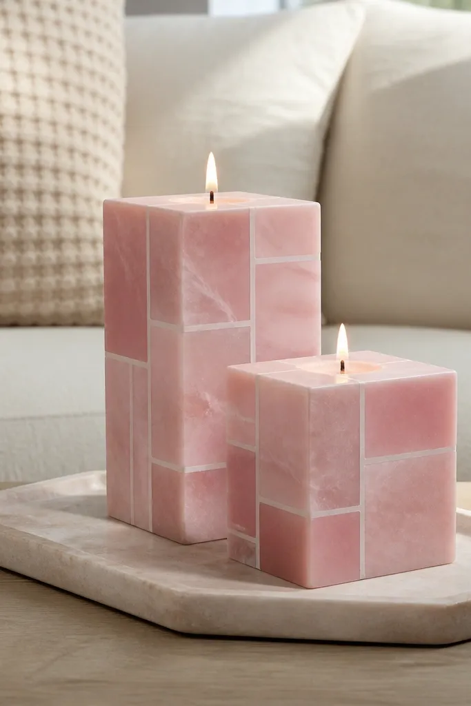
Rose quartz blocks look modern because the geometry is clean, but the color stays gentle. Blush pink with pale borders mimics stone without needing realistic carving. The block pattern is easy to repeat and still looks high-end in pictures, especially when you pair candles of different heights. It’s also friendly for beginners because you can build the look with tape lines and controlled brush strokes.
Editor's notePress tape down firmly with a fingernail to prevent paint bleed.
Base-coat the candle in a light blush pink. Use painter’s tape to create 6-8 rectangular or irregular “stone blocks,” then paint a slightly darker blush inside each taped area. Remove tape while paint is still slightly tacky for cleaner lines. Add a thin off-white border line around the blocks, then seal with a satin clear coat.
Skip thisDon’t let tape sit too long; it can lift paint and create jagged edges.
14. Terrazzo Confetti Dots in Black, Cream, and Gold
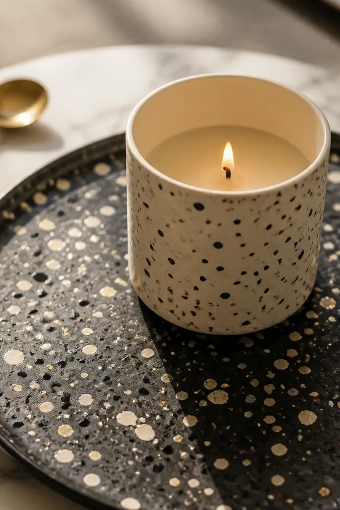
Terrazzo dots are the fastest way to look artsy and intentional. The scatter pattern hides minor placement issues, so you can get a polished result without perfect drawing skills. Black, cream, and gold create strong contrast that reads luxury. It also photographs well because the dots create texture under side lighting.
Editor's noteTest your flick on paper first to dial in dot size and avoid big splats.
Use a cream base candle. Paint the candle with a thin layer of cream if needed, then add dots by flicking paint from a toothbrush in two passes: black first, then gold. Keep the gold dots smaller than the black dots so the pattern has depth. Let it dry completely, then seal with a clear matte or satin coat so dots don’t smear when handled.
Skip thisSkip heavy paint on the toothbrush; it spits and makes blobs.
15. Chocolate Chip Ombre with Tiny White Drizzle
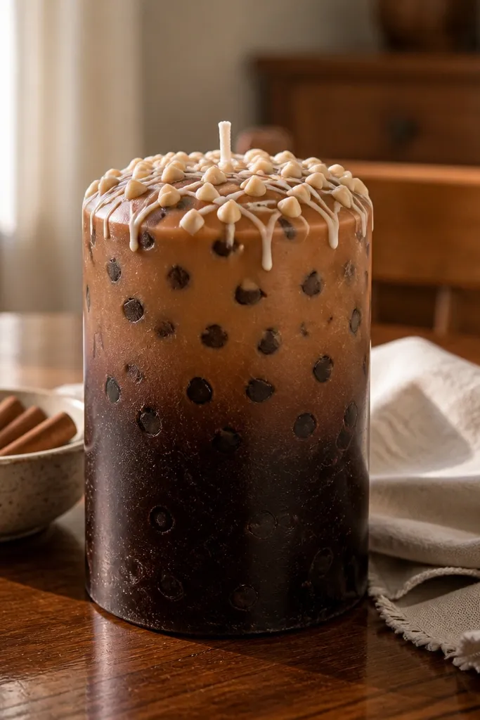
This looks like dessert but in an adult, decor way. Brown ombré gives depth, and the tiny white drizzle adds a playful highlight that still reads chic. The small “chips” can be cream-toned dots, which makes the candle feel textured instead of flat. It’s a fun choice for kitchens, dining tables, or holiday setups where you want the candle to look like part of the styling.
Start with a warm white base candle. Paint a brown ombré by blending cocoa brown from top to bottom, leaving the bottom a little lighter for dimension. While still slightly tacky, add tiny cream dots as “chips” using a small round brush. Then drizzle thin white lines using a paint pen or a watered-down white paint in a fine nozzle brush. Seal with satin topcoat.
Keep drizzle lines short and uneven so it looks hand-finished, not stamped.
Don’t overdo drizzle; too many lines makes it look messy instead of sweet.



