
1. Sepia Postage Frame Notes
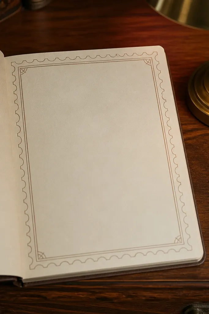
Start by printing on US Letter or A4 at 100% scale, not “fit to page.” Then cut the page into note-size pieces using your paper cutter, keeping the stamp frame intact on all sides. Finally, add a light guideline if you want extra control: draw one faint horizontal line at the top of the writing area with a pencil so your handwriting stays level.
This printable gives you that old-mail feeling without turning the page into a busy collage. The postage frame sits near the edges, leaving a clean center for writing. The background is a soft cream with a faint paper grain, so your pen ink looks warmer instead of harsh. Use it for quick thank-you notes or short letters where you want the page to look “collected” even when the message is simple.
Skip thisAvoid bright white printer paper; it makes the sepia look like a filter instead of aged ink.
Editor's noteIf your printer has a “borderless” option, keep it OFF — you want margins so the frame doesn’t get clipped.
2. Faded Ledger Column Note Paper
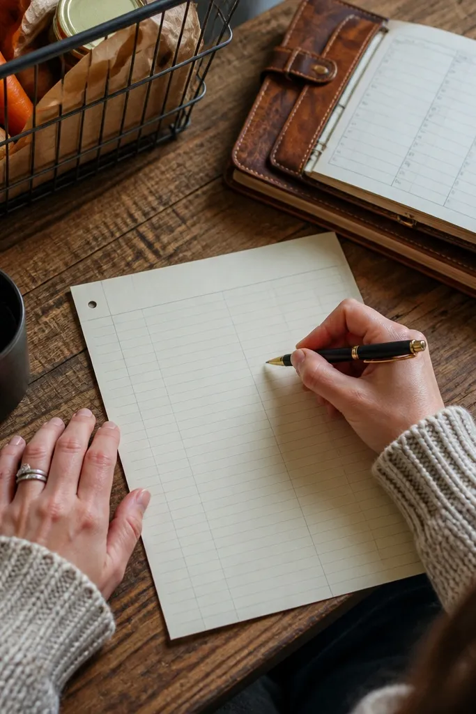
Print one sheet first and check that the column markers land where you expect. Set your printer to a lower ink density if you see the lines getting too dark. Next, trim to your preferred note size and punch a single corner hole if you like to file these in a binder.
Ledger-style paper looks vintage because it mimics structure. This design uses faint vertical column markers and thin row lines, so the page feels like it has history but still writes cleanly. The key is that the lines are light enough for handwriting, not so dark that they compete with your ink. It’s great for grocery lists, quick budgeting notes, or any writing where alignment matters.
Skip thisDon’t pick a pen that smears easily; ledger lines amplify smudges.
Editor's noteUse a gel pen or a 0.5mm rollerball for crisp lines on faint guides.
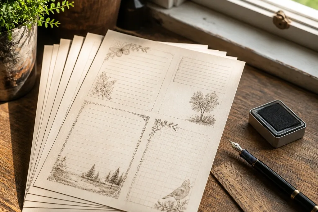
3. Botanical Margin Wash Notes
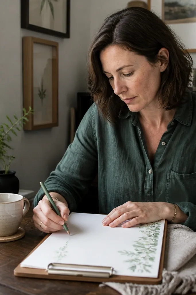
Print at standard letter/A4 size and keep the background at default color settings — boosting brightness ruins the faded look. Then cut off the right edge slightly if your printer shifts margins; you want the botanical wash to frame the writing area evenly. Finish by adding a simple heading line at the top with a light pencil if you plan to reuse the set for different topics.
This is the “soft vintage” option for people who like botanicals but hate clutter. The leaves and stems sit in the margin, with a watercolor wash that fades toward the center. That keeps the page calm and makes your handwriting look like it belongs on old stationery. It’s perfect for letters, journaling prompts, and anything you want to feel gentle rather than formal.
Skip thisSkip dark green ink; it turns the botanical wash into something that looks like a modern highlighter.
Editor's noteIf your printer tends to banding, use a higher-quality print mode for this one design only.
4. French Café Menu Cutout Notes
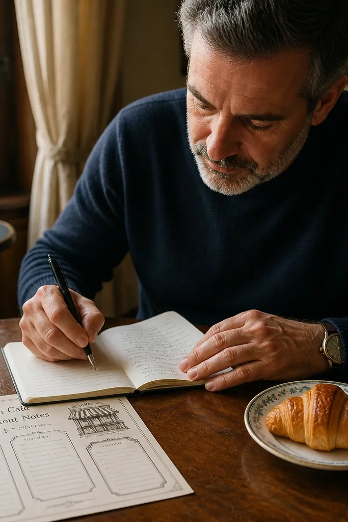
Menu typography is vintage without needing old photos. This printable uses a faux café header and a few small “menu” style blocks, then leaves the rest of the page for writing. The trick is spacing: the header should not crowd the top lines, or your handwriting will look cramped. Use it for recipe notes, travel journaling, or writing that feels a little romantic and a little practical.
Choose the file that matches your paper size and print in grayscale if your printer has a strong color tint. After printing, fold a small corner notch at the top right if you want a visual cue for “start here.” Then trim cleanly so the header stays centered.
If you use fountain pens, let the sheet sit for 10 minutes before stacking to prevent smears.
Don’t shrink the design with “scale to fit” — the header will shift and look off.
5. Old Map Compass Rose Notes
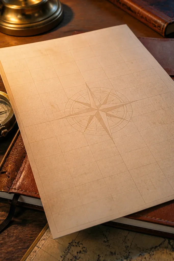
Print one sheet and check that the compass rose stays light enough to not overpower writing. If it’s too dark, switch your printer to “economy” off and use a neutral color mode so it doesn’t over-saturate. Next, cut into note cards and round the corners for a softer look.
A compass rose is one of those motifs that reads instantly as vintage. This printable places it as a watermark-style element so it looks like it’s part of the paper, not pasted on top. The faint grid gives structure without making the page look like graph paper. It’s a great fit for travel plans, writing goals, or “where I’m going next” notes.
Skip thisAvoid heavy black borders; they clash with the subtle compass watermark.
Editor's noteUse a brown pen with this one; it matches the compass tones and looks period-correct.
6. Victorian Corner Scroll Notes
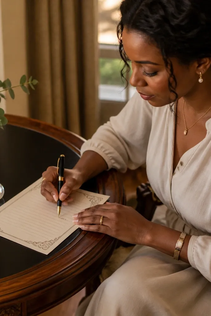
Corner scrolls give you that classic Victorian feel while keeping the center usable. The design places ornamentation only in the corners, so your handwriting stays the focus. The line spacing is generous, which makes it easier to write neatly without squeezing letters. It looks great for formal notes, invitations add-ons, and “thinking of you” cards.
Print on heavier paper (at least 24 lb or 90 gsm) so the ornament lines don’t look flimsy. Then trim to a consistent size and use a ruler to keep the scroll corners symmetrical. Finally, test with your exact pen — Victorian-style ink lines can show smearing if your pen is too juicy.
A quick way to make it look extra vintage is to lightly distress the cut edges with sandpaper.
Don’t place the writing lines too close to the ornaments; keep a clear buffer zone.
7. Sepia Typography Label Notes
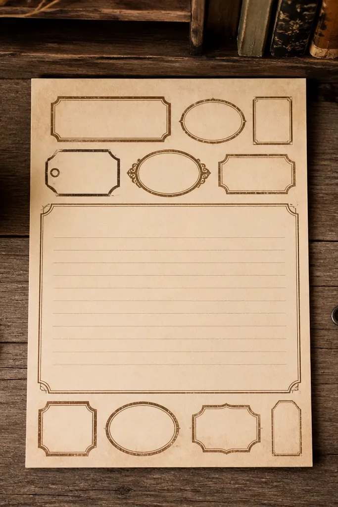
Print at 100% with no scaling, then check the label alignment. If your printer shifts slightly, rotate the page 180 degrees and see which direction looks better. Cut straight down the center lines so each note keeps the full label set.
This printable mimics typographic labels you’d see on old storage boxes. The text blocks are decorative, but they’re arranged so the writing area stays open. The sepia type is intentionally uneven, like it’s stamped rather than printed perfectly. It’s a clean vintage look for notes you’ll actually use every day.
Skip thisAvoid thick markers; they cover the label texture and flatten the vintage effect.
Editor's noteUse a fine-tip pen (0.38-0.5mm) so your handwriting stays crisp against the label texture.
8. Aged Stationery Stripe Notes
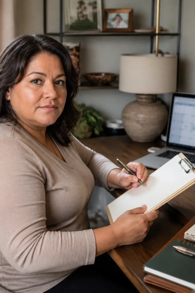
Print on paper with a smooth surface, not glossy. Then choose either full-page printing for a letter look or half-page cutting for note cards. Finally, keep your pen color in the same family: brown, espresso, or muted burgundy.
Stripe paper is underrated because it looks sophisticated without needing fancy illustrations. This design uses thin sepia stripes that fade slightly, like old stationery that’s been handled. The stripes frame the writing area, which makes the page feel structured and easy to write on. Use it for letters, meeting notes, or anything you want to look tidy and vintage at the same time.
Skip thisDon’t use a cool gray pen; it makes sepia stripes look dirty.
Editor's noteIf your stripes look too dark, reduce printer “contrast” rather than changing the printable file.
9. Antique Lace Border Notes
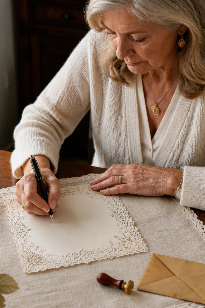
Print on 28 lb or 105 gsm for clean lace lines. Then trim carefully with a craft knife so the lace detail isn’t jagged. If you plan to fold these into envelopes, cut slightly smaller than your envelope opening so the border doesn’t catch on the flap.
Lace borders make paper feel like a craft project even when you’re just printing. This design keeps lace detail around the edges and uses a lighter background so handwriting stays readable. It’s best when the lace is thin and delicate; heavy lace looks cartoonish. Great for wedding stationery add-ons, gift tags, and “small note, big feeling” messages.
Skip thisAvoid printing on thin copier paper; lace lines will look fuzzy and uneven.
Editor's noteFor a more authentic look, lightly crinkle the paper after trimming, then flatten it under a book.
10. Rust Stamp Circle Notes
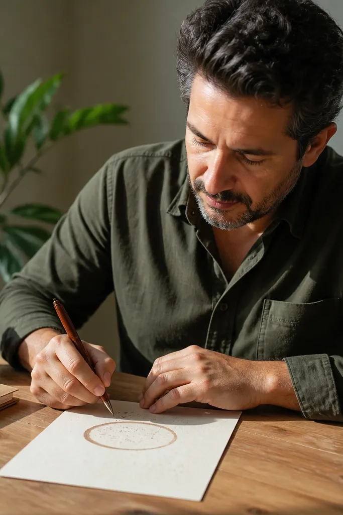
A stamp circle is one of the fastest ways to get a vintage feel because it looks imperfect by design. This printable places a circular stamp near the top, with faint “ink bleed” texture that mimics old printing. The rest of the page stays simple so you can write without fighting decorative elements. Use it for formal notes, document-style letters, or journaling entries you want to feel official.
Print in a normal print mode, then let the sheet dry fully if your printer tends to lay down heavy ink. If the stamp looks too dark, dial down printer saturation rather than editing the file. Next, cut into note sizes and keep the stamp centered on each piece.
Use a brown-black pen for the stamp look; pure black feels too modern here.
Don’t add extra stickers on top — the stamp already carries the vintage identity.
11. Faded Photograph Frame Notes
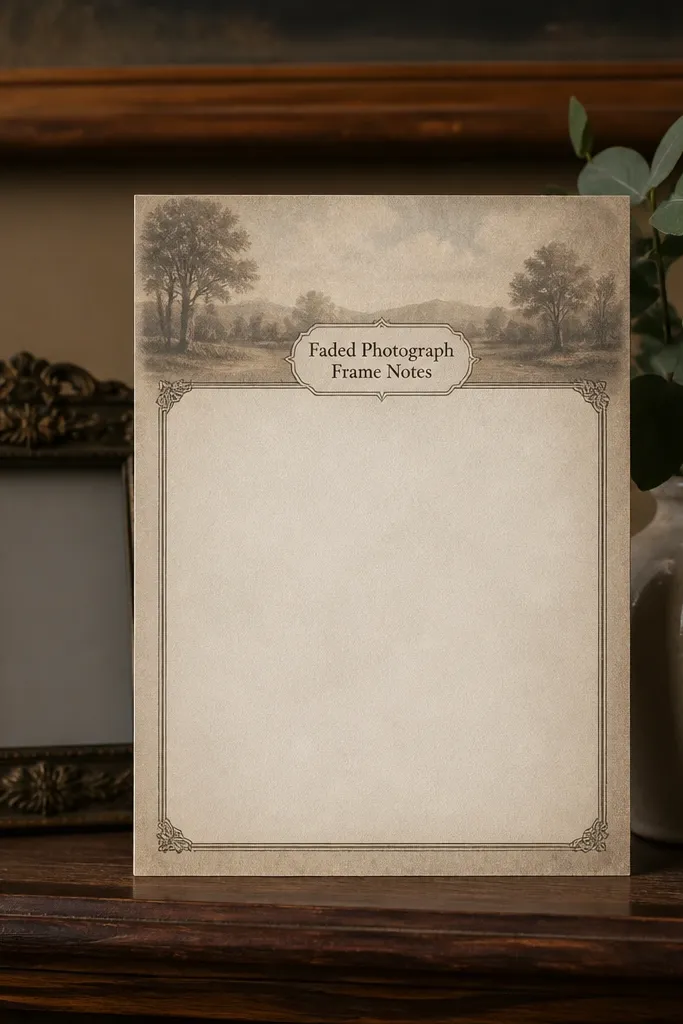
Print on medium-weight paper so the vignette gradient looks smooth. Then trim the page so the frame sits fully on the final note size, not cut off. If you want it to feel even more period-correct, write with a slightly darker sepia ink rather than a bright blue.
This design gives you that “kept memories” vibe without requiring an actual photo. A soft frame sits in the center, and the background has a gentle vignette so the paper looks older. The writing area stays clear enough for notes and short letters. It’s a good choice when you want decorative stationery for events like anniversaries, holiday cards, or thank-you notes.
Skip thisDon’t overfill the frame with writing — keep the frame as a visual anchor.
Editor's noteAvoid glossy paper; the vignette can look streaky under glare.
12. Botanical Blueprint Grid Notes
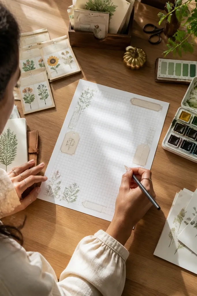
Blueprint styling reads vintage because it mixes technical lines with organic labels. This printable uses a light grid and small botanical “tag” accents, then leaves a generous center for writing. It looks striking on warm paper because the grid stays muted, not neon. Use it for plant journals, craft planning, or notes that need structure but still feel handmade.
Print at full size and keep your printer’s color settings neutral so the blue stays soft. Then choose a pen that matches the palette: muted teal or espresso-brown. Finally, trim into a consistent rectangle and use a corner rounder if you want a cleaner edge.
If your printer makes the grid too blue, switch to grayscale printing for this design only.
Avoid adding heavy color pens; blueprint grids hate contrast spikes.
13. Rosewood Script Header Notes
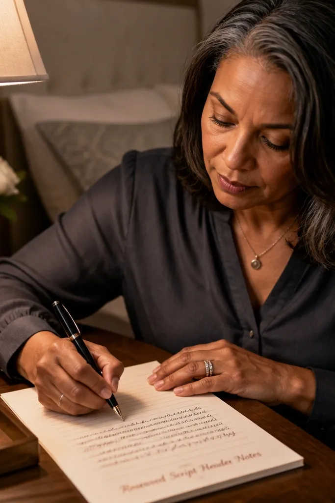
Print on 24 lb paper or thicker so the script edges stay crisp. Then test with your pen and adjust line thickness if your pen bleeds. After that, cut into cards and fold the top slightly only if you want a “stationery tuck” look.
A script header gives the page personality in seconds. This printable places a rose-brown cursive title at the top and then keeps the rest of the page simple with clear writing lines. The background is warm and lightly textured, so the script looks like it was stamped or brushed. It’s perfect for letters, note cards, and journaling pages where you want your handwriting to look styled.
Skip thisDon’t choose a cool-toned ink; rose-brown needs warm ink to look right.
Editor's noteUse a pen that dries fast — script headers show smudges quickly.
14. Old Postcard Divider Notes

Postcards are built for writing, and this design borrows that balance. It uses divider lines like a postcard layout, with a blank message area where your text sits naturally. The vintage background has a slight edge fade so it looks like it’s been around. Great for short letters, recipe swaps, and travel notes you want to keep as a set.
Print at 100% scale and keep the page centered so the divider lines don’t drift. Then cut into note-size rectangles and punch a small hole at the top if you plan to bind them. Finally, write a date in the divider area to make the set look cohesive.
Use a ruler under the paper to keep your first line straight; divider layouts make crooked writing obvious.
Avoid trimming too close — you’ll cut off the divider and lose the postcard effect.
15. Faded Newspaper Column Notes
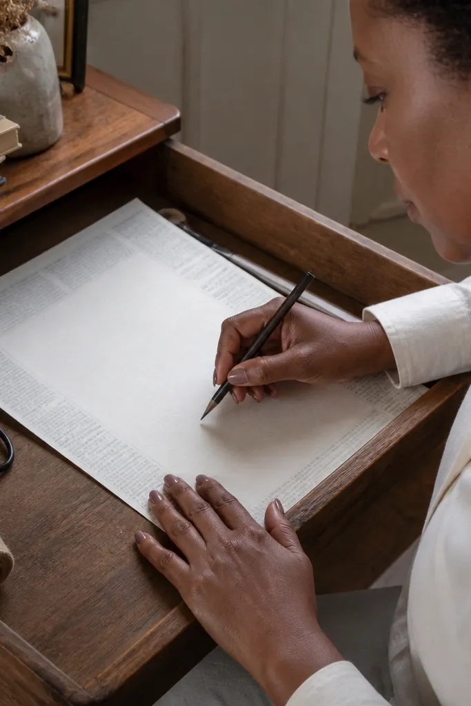
Print in color mode if your printer keeps the newspaper blocks warm; grayscale can make them look gray instead of aged. Then trim so the margin blocks remain visible. Finally, write with a darker brown so your handwriting pops against the subtle background.
Newspaper texture makes paper feel real because it suggests information, even when it’s mostly decorative. This printable uses faint column blocks in the margins and keeps the center clean for writing. The “text” is intentionally soft so it doesn’t turn into a distraction. It’s a strong choice for journaling, project notes, and anything where you want a vintage editorial vibe.
Skip thisDon’t use bright blue ink; it fights the newspaper palette.
Editor's noteIf your printer makes text too sharp, switch to a draft/standard mix: too sharp kills the faded look.
16. Cottage Garden Frame Notes
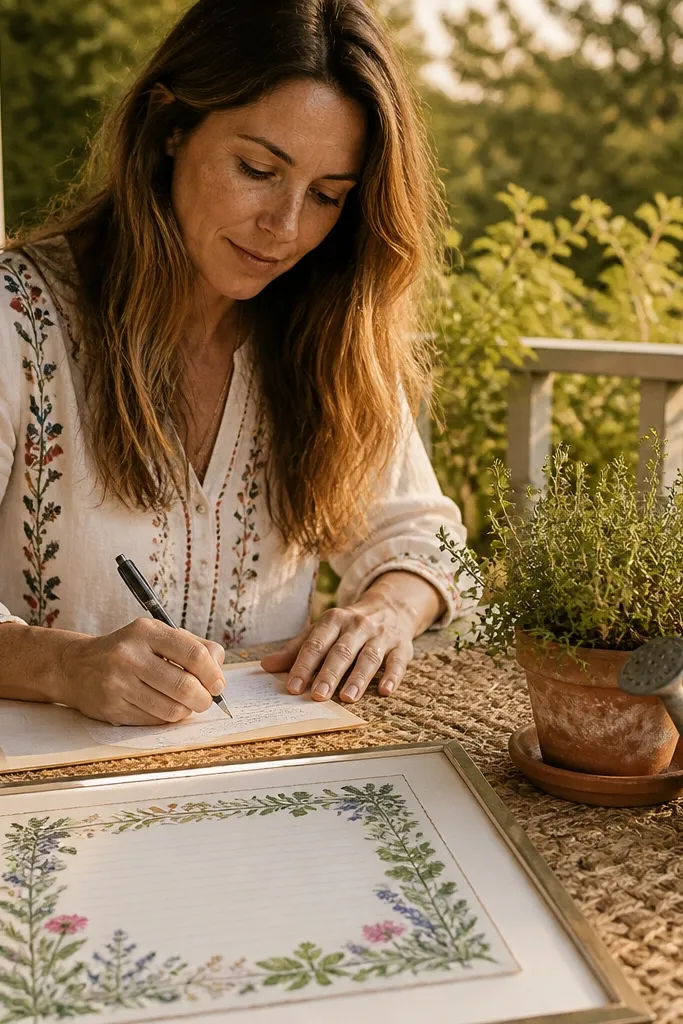
Print on textured cardstock if you want extra vintage feel, but keep it smooth enough for writing. Then cut along the frame edges to make each note look intentional. If the frame looks too bright, reduce printer “background” or saturation and reprint one sheet to confirm.
This is a sweet, cottage-style design that stays photogenic because it frames the page instead of filling it. The botanical illustration sits in a rectangular frame, and the writing lines stay centered with enough space to breathe. It works for letters and notes because the illustration reads as a border, not a distraction. Use it for birthdays, thank-yous, and any note you want to feel softly old-school.
Skip thisAvoid ultra-dark backgrounds; the frame loses its delicate look.
Editor's noteA soft pencil sketch of your heading helps you keep spacing consistent across a set.
17. Antique Keyhole Accent Notes
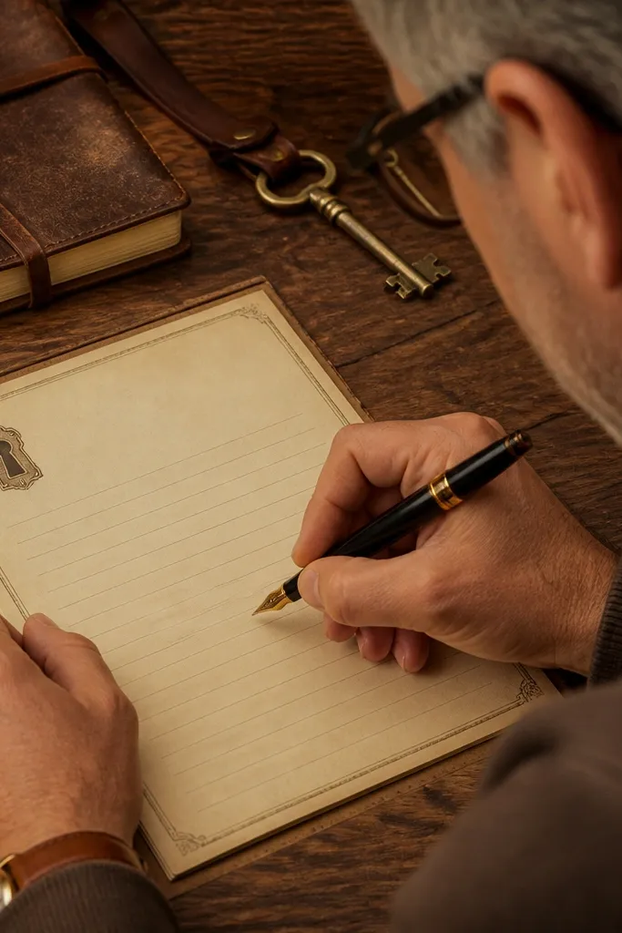
Keyholes are a fun vintage motif because they feel like a secret, even when the design stays minimal. This printable uses a small keyhole illustration near the top corner with a warm parchment background. The rest of the page is clean, with a small set of writing lines so the note still feels usable. It’s great for love notes, mystery-themed party cards, and journaling pages that need a focal point.
Print at full size and check that the keyhole sits fully on the trimmed note. Then add a date line using your own pen if you want consistency across multiple notes. Finally, trim with a straight edge so the minimal design looks crisp.
Use a slightly thicker pen tip (0.7mm) so your handwriting matches the weight of the keyhole art.
Don’t overcrowd the page with extra decorations; minimal motifs look best alone.
18. Faded Library Card Notes
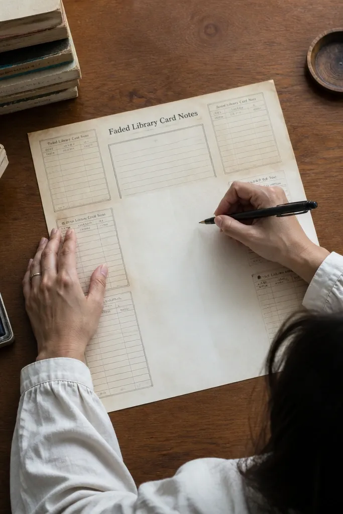
Print on 24 lb paper and set your printer to a neutral color mode. Then cut out the card shape using a template or a ruler and craft knife. Finally, write a title or subject in the top block and keep the rest for your message.
Library card design feels vintage instantly because it has built-in information blocks. This printable uses card-like rectangles at the top and sides, then leaves a writing area that stays readable. The background has a subtle age tint so the blocks don’t look like modern labels. It’s a great choice for study notes, book clubs, and any writing you want to feel organized and old-fashioned.
Skip thisAvoid tiny font sizes; they look messy once written over.
Editor's noteIf your printer shifts, rotate the page 180 degrees and compare which orientation keeps the card blocks aligned.
19. Tea Stain Ombre Notes
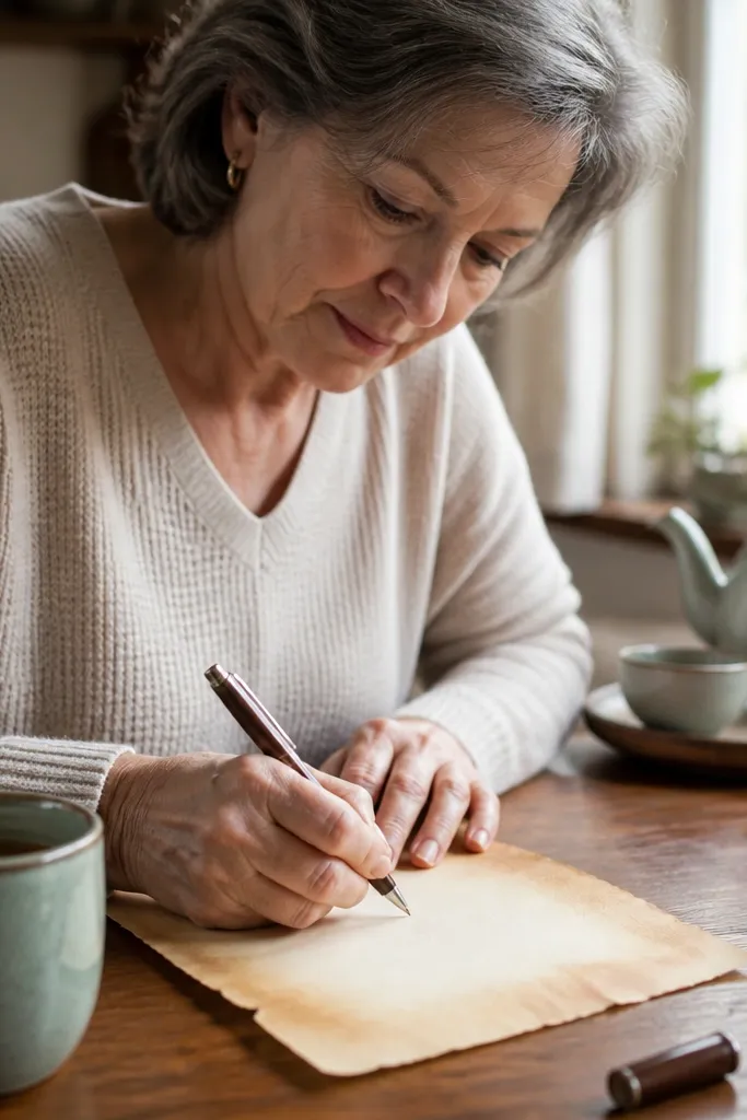
Tea stain looks authentic because it’s irregular. This printable uses an ombre edge fade that mimics the effect of old paper without requiring you to actually stain sheets. The center stays bright enough for writing, while the edges add age. Use it for casual letters, journaling, and gift notes where you want a warm, handmade vibe.
Print on standard paper first to test how your printer handles gradients, then move to 28 lb if it looks smooth. Keep margins so the stained edges aren’t clipped. After printing, cut into note sizes and stack with a weight on top for 5 minutes so the paper lies flat.
If gradients band, switch to a higher print quality setting for just this design.
Don’t print with the background turned off; you’ll lose the tea-stain effect.
20. Sepia Botanical Stamp Grid Notes
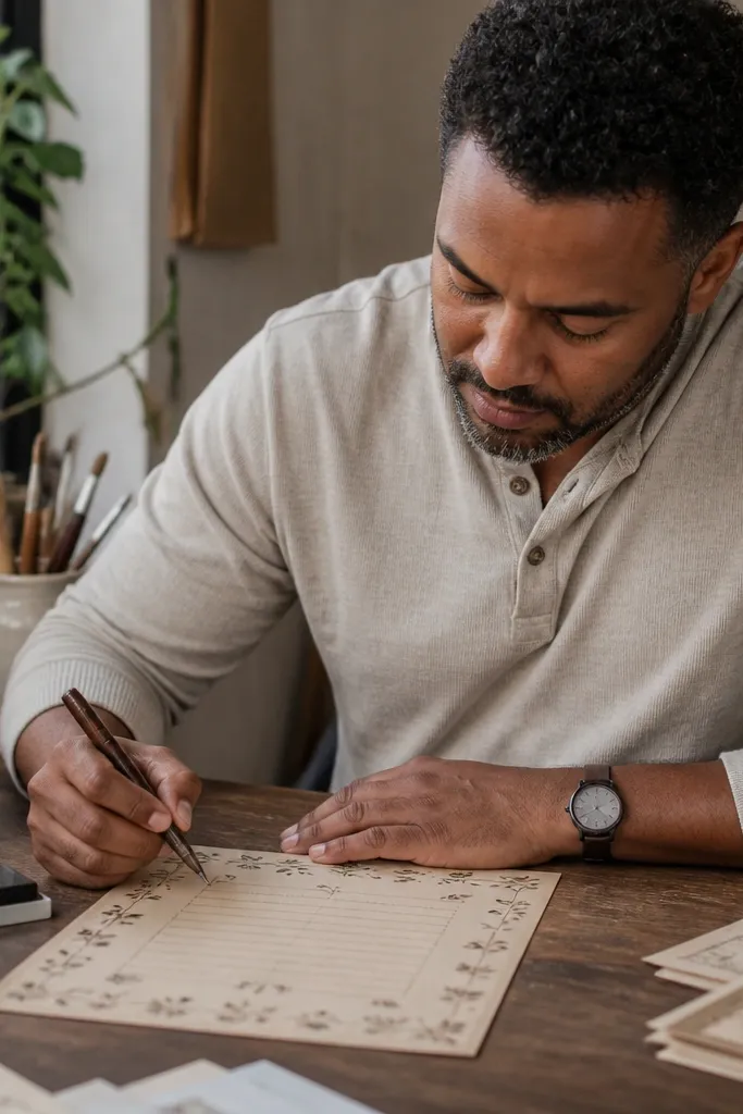
This one looks like a scrapbook page but stays printable. Small botanical stamp marks repeat lightly across the background, and the center has clean lines for writing. The stamps are muted so your handwriting remains the main event. It’s a strong choice for journaling, habit tracking, and notes that feel playful while still vintage.
Print at full size and avoid “enhance” settings that increase contrast too much. Then trim so the stamp pattern remains consistent on each note card. Finally, use a brown pen and write in the center area only; letting your writing overlap the stamps can make it look crowded.
Use a light hand on pressure; stamps show through strongly on thin paper.
Avoid cheap copy paper; it makes background stamps look blotchy.
21. Antique Scroll Divider Notes
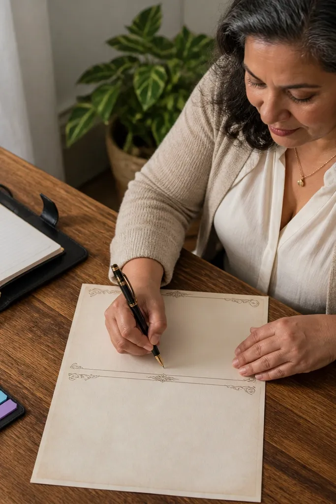
Print on 24 lb or thicker and keep the paper flat while printing so the scroll bands don’t look wavy. Then trim along the page edges while keeping the scroll bands fully visible. Finally, write section headers lightly in pencil and go over them with your pen once you like the spacing.
Scroll dividers give you a vintage “chapter” feel on a note sheet. This printable uses thin horizontal scroll bands near the top and middle, then provides a wide writing area. The scrolls are delicate and framed so they don’t overwhelm handwriting. It’s perfect for structured notes like letters with sections, meeting summaries, or journaling where you want visual pacing.
Skip thisDon’t add thick underline strokes; they overpower the delicate divider art.
Editor's noteUse a ruler and write your first line across the page lightly; scroll dividers reveal misalignment.
22. Vintage Monogram Corner Notes

Print on smooth paper so the monogram edges stay sharp. Then cut to your preferred note size and keep the monogram corner intact. If you want a cohesive set, use the same pen color across all notes so the monogram and writing match visually.
Monograms make note paper feel personal fast. This design keeps the monogram in one corner and uses a warm parchment background so it looks stamped, not pasted. The center is lined and clean, so the monogram acts like a signature. It’s a good match for thank-you notes, holiday cards, and anything you want to feel tied to a name or theme.
Skip thisAvoid placing the monogram too large; it should feel like a corner detail, not a headline.
Editor's noteChoose a monogram-friendly pen: espresso brown or dark sepia looks best.
23. Old Botanical Label Tags Notes
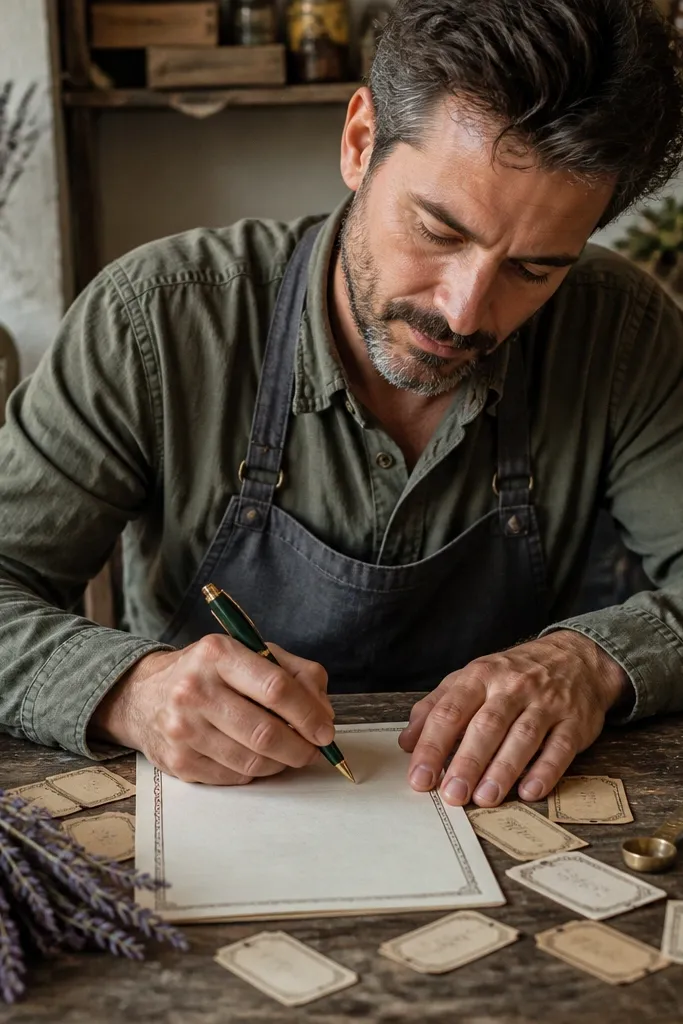
Print at full scale and check that the label tags land in the margins you keep. Then trim with care so each note has a clean border around the labels. Finally, write your message in the center area only and use a consistent date format so the set looks organized.
Label tags feel vintage because they look like they came from an apothecary. This printable scatters small label rectangles around the top and sides, leaving the writing area open. The background stays warm, and the label text is decorative, not too dense. Use it for herbal journaling, craft inventory notes, or any stationery set where you want cute but not childish.
Skip thisDon’t use ultra-fine handwriting; tiny writing disappears against label textures.
Editor's noteIf your labels look washed out, increase printer “density” slightly instead of changing the file colors.
24. Faded Sheet Music Note Paper
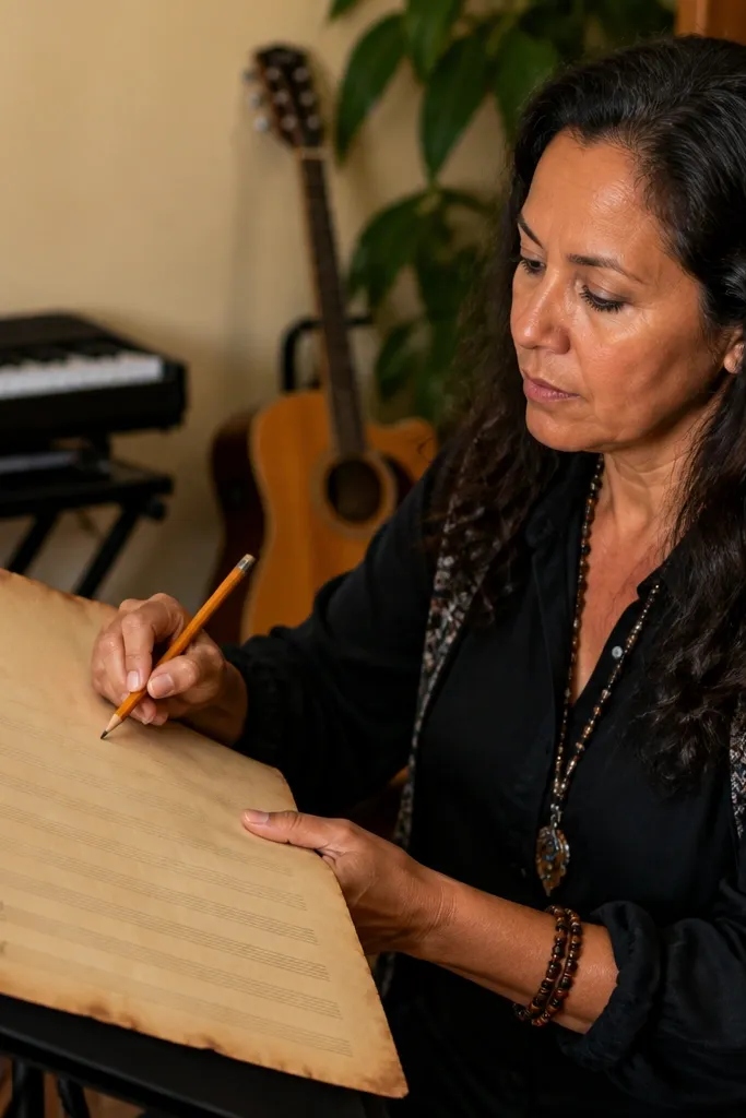
Print on 24 lb paper so the staff lines stay light but visible. Then test with your pen and make sure the staff doesn’t bleed through too much. After that, trim and keep the staff line area consistent across your set for a uniform look.
Sheet music is vintage stationery with built-in rhythm. This design uses faint staff lines near the bottom or behind the writing area, so you get a subtle musical vibe without turning it into a worksheet. The background has a warm tint that keeps it from looking like modern print. It’s perfect for music notes, songwriting ideas, and letters for people who love old songs.
Skip thisAvoid dark markers; they crush the delicate staff effect.
Editor's noteUse a pen with moderate ink flow; very wet pens blur the staff lines.
25. Antique French Recipe Card Ticket Notes
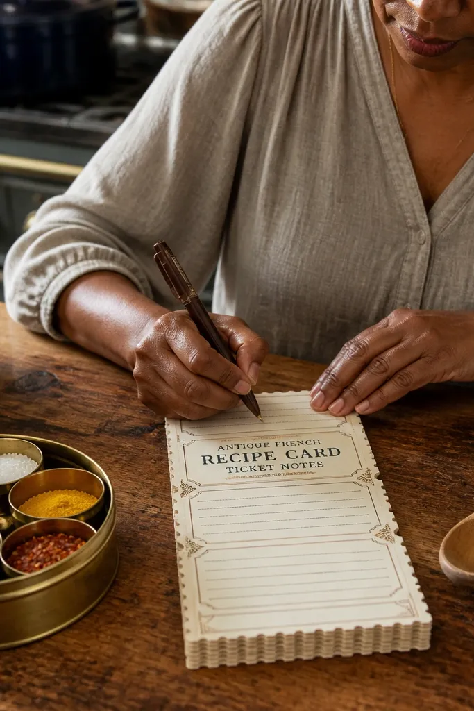
Start with a quick and easy Vintage Paper Printable sized like a standard recipe card: 4 x 6 inches (or 5 x 7 if you want bigger writing). Print on 65-100 lb cardstock or matte photo paper, then trim with a metal ruler and craft knife. Add the ticket edge look by creating a perforation line on one side using a perforating wheel or by lightly scoring with a ruler and then carefully tearing along the score. Layer a narrow top label band (about 3/8 inch tall) over the main text block, then add a small corner “recipe box” tag using a 1/2 inch circle punch or a tiny rectangle cut. Seal the finished card with a light coat of matte spray so the ink doesn’t scuff when you write on it.
These notes look like they were pulled from an old French recipe box, with ticket-style perforation edges and stacked text blocks. They are perfect when you want your quick and easy Vintage Paper Printable to feel collected, not generic. The perforation detail sells the vintage vibe even when the paper is just printed and trimmed. You get a clean writing area plus decorative French recipe-style labels, so the page photographs beautifully and still works for actual notes.
Skip thisDon’t print on glossy paper — the ink smears when you handle the cards and write on them.
Editor's notePrint a test page first and adjust the trim guides so the perforation edge lands exactly where you want the tear line. Matte spray in two light passes beats one heavy coat.



