

1. Linen Moodboard Planner
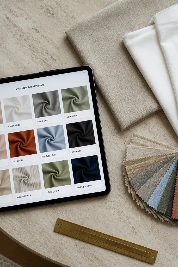
This template is for when you want your decor taste to look organized, not scattered across screenshots. The main view is a gallery grid where each card holds one fabric or finish photo plus a short caption like “oat linen” or “chalk white.” It stays stylish because you keep the text short and let the images do the work. The template also includes a simple “Color family” property so your cards group into calm sections, like beige, sand, and stone. It’s a good fit for DIY styling days, small refreshes, and anyone who likes to plan with materials in front of them.
Start by creating a database called Swatches with properties: Name (title), Color family (select), Notes (short text), and Photo (files & media). Add a gallery view and set the card layout to show Name and Notes under the image. Then create a second view called “By Color” using the same database but grouped by Color family in a 3-5 group setup. Finally, add a simple page header with a cover image in a warm neutral and pin it to your iPad home screen for quick access.
Editor's noteUse a consistent photo crop (same aspect ratio) so the grid looks intentional, not random.
Skip thisDon’t add long paragraphs into Notes — it makes the grid ugly fast.
2. Ceramic Paint Color Lab
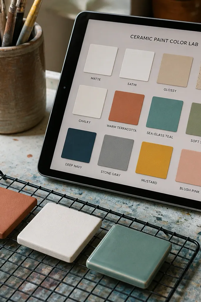
This one turns paint testing into something you can actually revisit. Each entry is a “test tile” with a photo of the painted surface, the finish type, and one line for what you noticed after it dried. The aesthetic comes from a consistent card size and a finish property that you display as a small label. You also get a “Batch” field so you can track which tests belong together when you mix and compare. Perfect for ceramic mugs, planters, picture frames, and any DIY where the final color looks different once it dries.
Create a database named Paint Tests with properties: Tile (title), Finish (select: matte/satin/gloss), Dry time (text), Result (select: looks right / too dark / streaky), and Photo (files & media). Make a gallery view called “Finish” grouped by Finish so the cards look like a planned set. Add a board view called “Result” with four columns to help you decide what to buy or repeat. Keep the “Dry time” field short like “2 hrs” or “overnight,” not a story.
Editor's noteLabel your photos with the Tile name inside the image file name so you never lose track later.
Skip thisSkip storing paint brand names in long text; use short codes in Result or Finish instead.
3. Sunday Meal to Make List (Craft Edition)
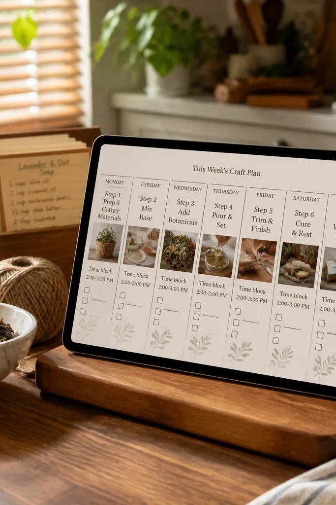
This is for DIY people who plan like they cook: small steps, clear timing, and a satisfying check-off. The template uses a weekly board where each card is one craft step, not a vague project blob. That’s why it looks good — the cards stay short, aligned, and easy to scan on an iPad. It also includes a “Time block” property like 20 min, 1 hr, or 2 hrs so you can match your mood. Great for quick decor tasks like painting a shelf edge, swapping hardware, or assembling a small wall organizer.
Build a database called Tasks with properties: Task (title), Weekday (select: Mon-Sun), Time block (select: 20 min/1 hr/2 hrs), Status (select: Not started/In progress/Done), and Photo (files & media). Create a board view grouped by Weekday and set the card to show Task and Time block. Add a second view called “By Status” grouped by Status so you can find what needs attention. On the iPad, use the board with the “Weekday” grouping as your daily landing view.
Keep Time block values consistent (exact same text) so your board grouping stays clean.
Don’t use too many statuses; four is enough for a good-looking board.
4. Gallery Wall Build Tracker
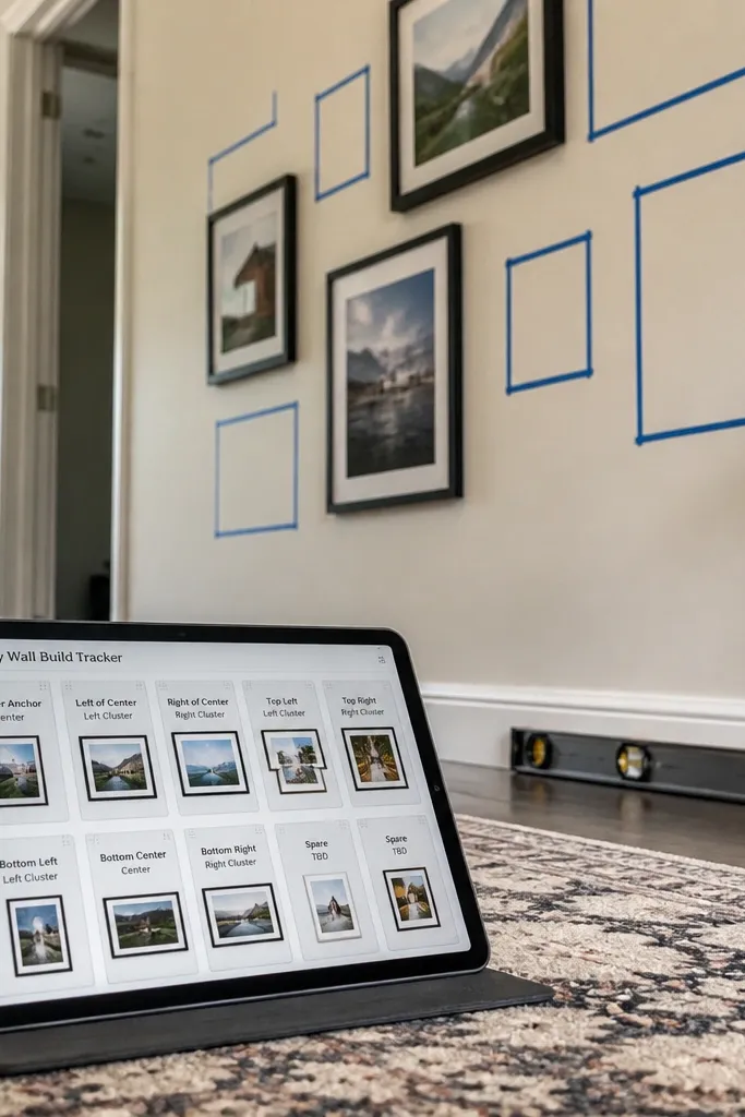
This template is designed for the moment you’re laying out frames and you need the plan to look as good as the wall will. Each card is one frame or print with a photo, dimensions, and placement intent like “center” or “left cluster.” The aesthetic comes from a board view with a limited set of placement statuses and tight card text. You also get a “Grid size” field so you can keep spacing consistent across the whole wall. It fits DIY framing, print swaps, and anyone who wants to avoid the chaos of “I think this goes here.”
Create a database called Wall Pieces with properties: Piece (title), Placement (select: Center/Left cluster/Right cluster/Corner), Frame size (text like 11x14), Status (select: Measuring/Ready/Hung), and Photo (files & media). Make a board view grouped by Status with only four columns. Add another view grouped by Placement so you can see the clusters as you arrange. Finish by adding a separate page called “Layout notes” with a simple checklist for spacing rules like “keep 2-3 inches between frames.”
Use a single dimension format everywhere (like 11x14, 8x10) so the cards line up visually.
Don’t store dimensions as separate width and height fields; the cards get cluttered.
5. Hardware Swap Lookbook
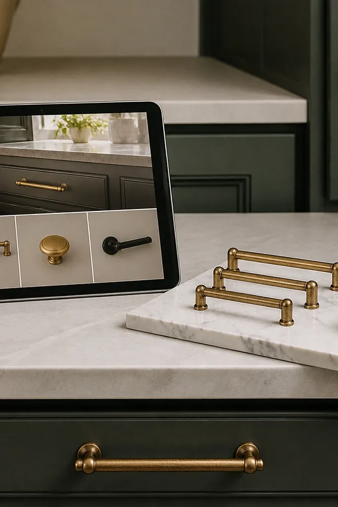
This template makes hardware shopping and matching look intentional instead of random. Each entry is a “pull set” with a hero photo, finish type, and which surface it fits (drawer, cabinet, door). The design stays pretty because your gallery cards show one strong image and a finish label — no long descriptions. You also include a “Budget” field so you can keep decisions grounded without turning it into a spreadsheet. Works great for kitchen refreshes, dresser updates, and bathroom vanity tweaks.
Create a database called Hardware Sets with properties: Set (title), Finish (select: matte black/aged brass/chrome/white ceramic), Fits (select: drawer/cabinet/door), Price (number), and Photo (files & media). Add a gallery view with cards showing Finish and Fits. Create a second view called “By Finish” grouped by Finish so you can compare quickly. Then add a page called “Install list” that links to the Hardware Sets database and filters to Price under your target budget.
Take photos on a neutral background, then add a consistent light source angle so the finish reads the same across cards.
Don’t mix finish types in one card; keep one hardware set per entry for clean comparisons.
6. Rug Sizing and Placement Sketchpad
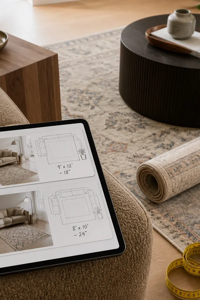
If you hate guessing rug sizes, this template gives you a repeatable way to plan. Each card includes a photo of your room corner (or a rough sketch) plus the rug dimensions and where the rug should sit relative to furniture. The aesthetic is in the clean card structure: one room photo, one size line, one placement note. You’ll also track “Do I like it?” as a select value so you can learn what works for your space. This is ideal for living rooms, entryways, and bedrooms where layout matters more than decoration.
Create a database called Rug Plans with properties: Room (title), Rug size (text like 6x9), Placement rule (select: front legs on/under front legs/centered), Photo (files & media), and Decision (select: keep/too small/too big). Make a gallery view called “Placement” grouped by Placement rule. Then create a board view called “Decision” with three columns. Add a small “Measurement checklist” section on the template page with a list for width/length and furniture overhang.
Editor's noteUse the same unit format (feet and inches or only inches) so your notes stay consistent.
Skip thisAvoid vague notes like “looks right” — replace them with your placement rule choice.
7. Upcycled Furniture Before/After Gallery
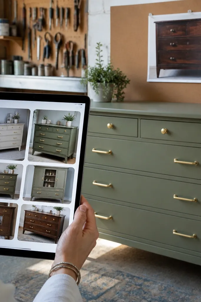
This template is built for dramatic transformations, and it looks good because the structure forces you to show the change. Each entry has a before photo, an after photo, and a one-line “What I changed” field that stays short. The key is the view: a gallery where each card shows the after photo as the main image, while the before photo is tucked into a separate property panel. That means your iPad feed looks like a clean portfolio, not a messy album. Great for dressers, side tables, chairs, and any DIY that benefits from visual proof of progress.
Create a database called Furniture Projects with properties: Project (title), Before photo (files & media), After photo (files & media), Change (text), and Time (select: weekend/one week/two weeks). Set the database cover to use After photo as the primary image in the gallery view. If your Notion setup lets you show multiple media, keep it to one main media and one secondary. Add a filter view called “Weekend” that shows only weekend projects for quick inspiration.
Keep the “Change” line to one sentence that starts with the action, like “sanded and painted oat linen.”
Don’t upload 15 photos per project; pick one before and one after to keep the feed sharp.
8. Seasonal Decor Switchboard
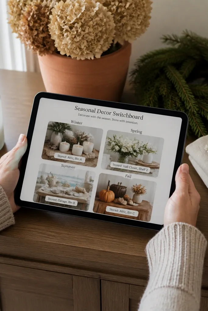
This is the template you want when you rotate decor and you don’t want to forget what you used last time. Each card is one decor item or DIY element, tagged by season and stored location. The aesthetic stays clean because you keep the board to four seasons and you show only the item name and one photo. Add a “Storage bin” field so the template also works as a practical system, not only inspiration. Perfect for holidays, summer refreshes, and any seasonal shelf swapping.
Create a database called Decor Items with properties: Item (title), Season (select: Spring/Summer/Fall/Winter), Storage bin (text like “Bin A-3”), Status (select: Ready/Needs DIY/Shopping), and Photo (files & media). Make a board view grouped by Season with exactly four columns. Set the card to show Item and Storage bin under the image. Create a second view called “Shopping” filtered to Status equals Shopping so you can plan your next run.
Use short storage labels consistently (like “Bin A-3”), and keep them in one format so the cards stay readable.
Don’t create a separate page per season; the board view is what keeps it pretty.
9. Printable Label Design Planner
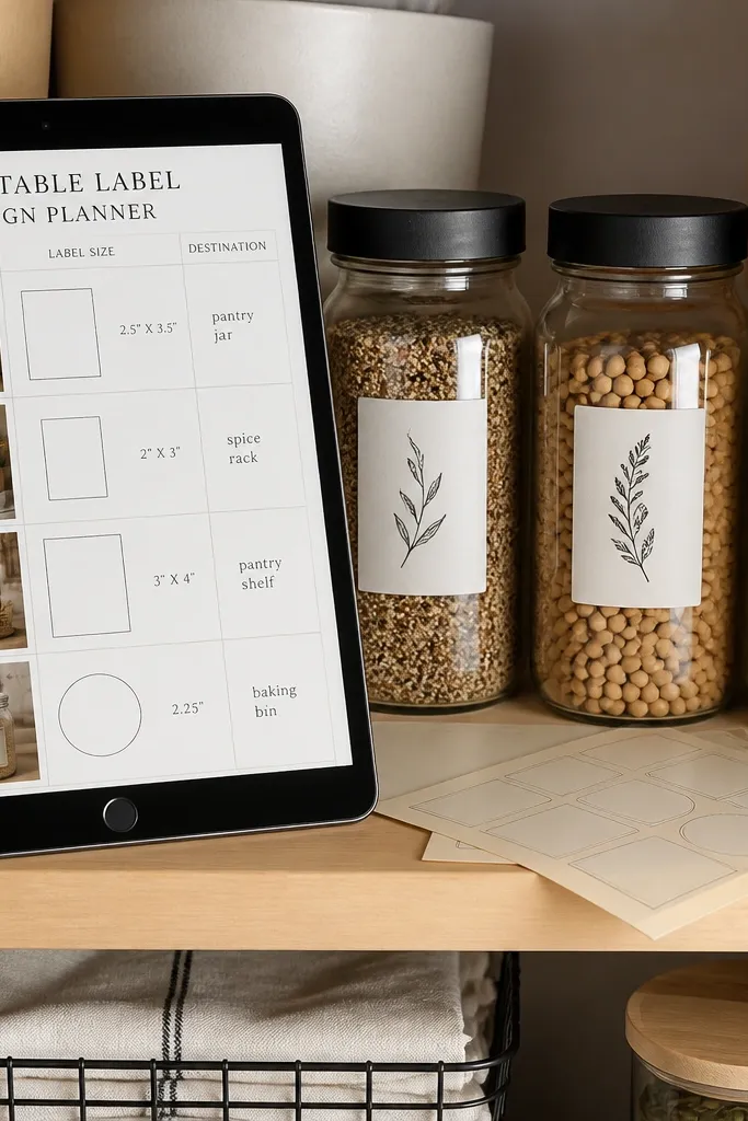
This template turns label-making into a design system. Each card is one label style with a mockup photo, font choice, label size, and where it goes (pantry jar, spice rack, closet bin). It looks aesthetic because your gallery shows a clean mockup image and two small text lines, so the page feels like a brand sheet. You also get a “Material” property for label paper or sticker type, which helps you match fonts to the surface. Ideal for DIY organizers, pantry refreshes, and anyone who wants their labels to look intentional.
Create a database called Label Styles with properties: Label style (title), Font (select: serif/mono/sans), Size (text like 1.5x3), Surface (select: glass/plastic/cardboard), and Mockup (files & media). Add a gallery view where each card shows Mockup, Font, and Size. Create a filtered view called “Pantry” where Surface equals glass or plastic, depending on your setup. Add a separate checklist page for printing so you don’t forget to test one sheet first.
Pick one font family you like and stick to it across all label styles; variety looks messy in a grid.
Avoid mixing label sizes in the same style card; keep each card one label size.
10. Lighting Mood and Fixture Notes
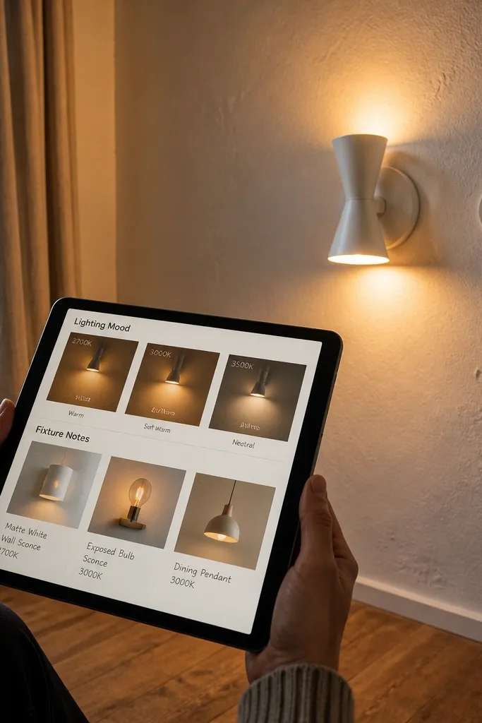
Lighting changes everything, and this template keeps your decisions visual. Each entry is a fixture test with a photo of the room in that lighting and a note for bulb temperature or warmth level. The template is pretty because the cards are image-led and the text is minimal: fixture type and “warmth” label. You also track “Brightness in room” with a simple select, so you can choose between “cozy” and “task-ready” without overthinking. Great for DIY lamp builds, shade swaps, and anyone restoring an older room where lighting feels off.
Create a database called Light Tests with properties: Fixture (title), Fixture type (select: table/lamp/pendant/sconce), Warmth (select: 2700K/3000K/3500K), Room effect (select: cozy/neutral/bright), and Photo (files & media). Make a gallery view grouped by Warmth so it reads like a lighting menu. Add a board view grouped by Room effect with three columns. Keep the photo crop consistent so the warmth looks comparable across cards.
Use the same camera position for each test photo so the warmth comparison is real.
Don’t record bulb temperature as a long sentence; use the exact K value in Warmth.
11. Wall Paint Finish Selector
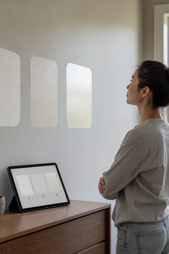
This template helps you choose wall paint finish without turning it into a guessing game. Each card is a finish sample with one photo under your room lighting plus a short note about how it looks from across the room. The aesthetic comes from a clean select label for finish type, like matte, eggshell, or satin, displayed under the image. You also track touch points like “shows marks” so your future self doesn’t forget the tradeoff. Perfect for DIY rooms, rental refreshes, and anyone who wants the paint to look good in real light.
Create a database called Finish Samples with properties: Sample (title), Finish (select: matte/eggshell/satin), Room (select: living/bedroom/hall), Mark visibility (select: low/medium/high), and Photo (files & media). Add a gallery view grouped by Finish, then set the card to show Finish and Mark visibility. Add a second view called “By Room” grouped by Room for quick comparisons. Put all your sample photos in one folder so uploading stays fast.
Label your sample photos with the exact finish name in the title, not in the image.
Skip “maybe” decisions — set Mark visibility to low/medium/high so you can commit.
12. Kitchen Pantry Inventory With Aesthetic Cards
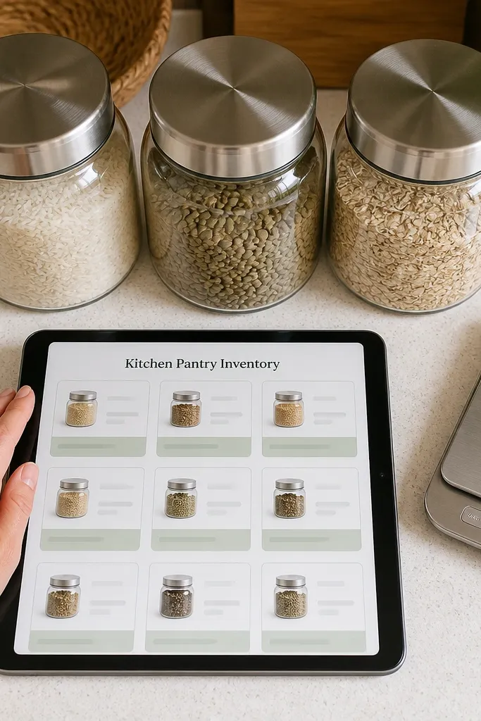
This template is for people who want inventory without a dull spreadsheet vibe. Each card is one pantry item with a jar photo, quantity, and an expiration or “use by” date when it matters. The look stays stylish because cards show the jar image first and the text is short: quantity + use-by. You also get a “Category” select (grains, spices, baking, snacks) so the board can group into clean sections. It fits everyday DIY-style organizing, recipe planning, and anyone who likes their kitchen system to look good.
Create a database called Pantry Items with properties: Item (title), Category (select: grains/spices/baking/snacks), Quantity (text like 12 oz), Use by (date or text), and Jar photo (files & media). Make a gallery view called “By Category” grouped by Category with cards showing Quantity and Use by. Add a board view called “Need soon” filtered where Use by is within the next 14 days. Keep Use by text short like “Aug 30” if you don’t want full dates everywhere.
Editor's noteUse date format consistently (MM/DD or Month Day) so your iPad cards don’t look chaotic.
Skip thisDon’t include every brand detail; keep the card clean so the photo matters.
13. Spring Cleaning Reset Checklist With Photo Proof
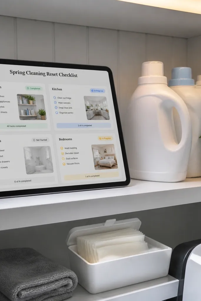
This one turns cleaning into a record you can actually use. Each card is one cleaning task tied to a room, with a photo property for quick proof and a status select for completion. The template looks good because the board is grouped by room and the cards are short: task name plus status. Add a “Supplies used” text field so you remember what worked without writing a novel. Great for seasonal resets, move-ins, and any time you want the work to feel less chaotic next time.
Create a database called Reset Tasks with properties: Task (title), Room (select: kitchen/bathroom/bedroom/living), Status (select: todo/done), Supplies used (text short), and Proof photo (files & media). Make a board view grouped by Room with Status as the card label. Add a filtered view called “Done” so you can review your work quickly. Keep the “Supplies used” field to one or two items like “vinegar + baking soda” to stay readable.
Editor's noteUse Proof photo only for tasks that matter visually (mirrors, grout, shelves), not every single wipe.
Skip thisDon’t create separate databases per room; one database keeps the design consistent.
14. Macrame and Rope Project Pattern Library
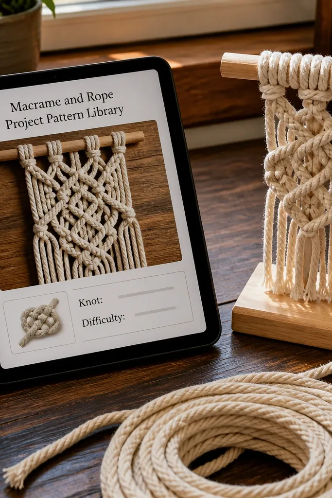
If you do knot work, you know patterns get lost. This template keeps each macrame design as a card with rope type, knot style, and a pattern photo. It looks aesthetic because each entry has a single hero image and a compact knot label — no long instructions on the card. You also add a “Difficulty” select so you can pick the right project for your energy level. Perfect for wall hangings, plant holders, curtain ties, and DIY rope decor where visuals are the whole point.
Create a database called Rope Patterns with properties: Pattern (title), Knot type (select: square knot/fringe/half hitch), Rope (text like 3mm cotton), Difficulty (select: easy/medium/challenging), and Pattern photo (files & media). Add a gallery view with cards showing Knot type and Difficulty under the image. Create a board view grouped by Difficulty with three columns. Add a “Supplies checklist” section in each pattern page using a simple bullet list template you paste into the page when you create a new pattern entry.
Photograph your rope next to a ruler once per batch so thickness is obvious in the grid.
Avoid mixing multiple knot types in one card; one pattern per entry keeps the library readable.
15. DIY Shelf Styling Planner
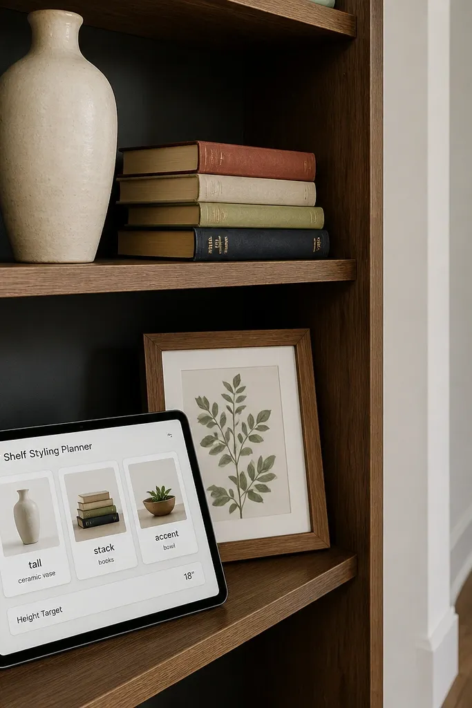
This template helps you style shelves like a person who cares about balance. Each card is one shelf item with a photo, color tone, and role like “tall,” “stack,” or “accent.” The template stays pretty because you group by role and keep the item description to one line. It also includes a “Height target” field so you can build a layered look without guessing. Ideal for living room shelves, bathroom counters, and entryway tables where you want it to look intentional from across the room.
Create a database called Shelf Items with properties: Item (title), Role (select: tall/stack/accent/ground), Color tone (select: warm neutral/cool neutral/color pop), Height target (text like 6-8 in), and Photo (files & media). Add a board view grouped by Role with cards showing Color tone and Height target. Add a gallery view grouped by Color tone so you can see the palette quickly. Build a separate page called “Shelf rule” with a short checklist: one tall piece, two stacks, one accent.
Editor's noteUse consistent photo framing for shelf items (same angle and distance) so the role grouping looks clean.
Skip thisDon’t let Role become a free-text field; use a select so the board stays tidy.
16. Fabric Yardage and Cut Planner
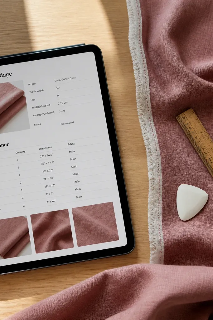
This is a practical template that still looks good because it’s measurement-led. Each entry is one fabric with yardage, pattern repeat info, and a photo of the fabric in good light. The aesthetic comes from clear, short measurement fields and a gallery that stays readable even when you add many fabrics. You also get a “Cut plan” text field for the exact cuts you need, kept short enough for the card. It’s great for sewing DIYs, pillow covers, curtains, and any cut-and-sew project where you don’t want to lose track of yardage.
Create a database called Fabrics with properties: Fabric (title), Yardage (number with unit in text like “2.5 yd”), Width (text like 54 in), Pattern repeat (text or select: none/short/long), and Swatch photo (files & media). Add a gallery view and set it to show Yardage and Width beneath the photo. Create a board view grouped by Pattern repeat so you can plan for different matching needs. For Cut plan, add a related page section where you paste a short list of cuts for each fabric entry.
Keep yardage as a number plus a separate “Unit” text field if you mix inches and yards; it keeps cards consistent.
Avoid storing cut lists as big paragraphs in the card; use a page section so the grid stays pretty.
17. Plant Potting Schedule With Aesthetic Photos
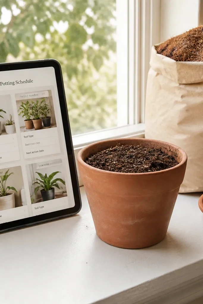
This template keeps plant care organized without looking like a medical chart. Each card is one plant or one potting batch with a pot photo, soil type, and the next action date. The look stays clean because the card shows a single plant image and one or two short fields — soil and next action. Add a “Stage” select like seedling, established, repotting so your board visually tracks progress. Great for DIY plant repotting, shelf plant styling, and anyone who wants their plant corner to look consistent and cared for.
Create a database called Plant Plans with properties: Plant (title), Stage (select: seedling/established/repotting), Soil (text short), Next action (date), and Pot photo (files & media). Make a board view grouped by Stage with cards showing Next action. Add a filtered view called “Next 30 days” using Next action within the next 30 days. On each plant page, add a small checklist section called “Supplies” with items like pot, soil, gloves.
Editor's noteUse the same pot photo angle for every entry so the board feels like a styled collection.
Skip thisDon’t cram watering notes into the card; put them on the plant page so the grid stays clean.
18. Holiday Table Setting Builder
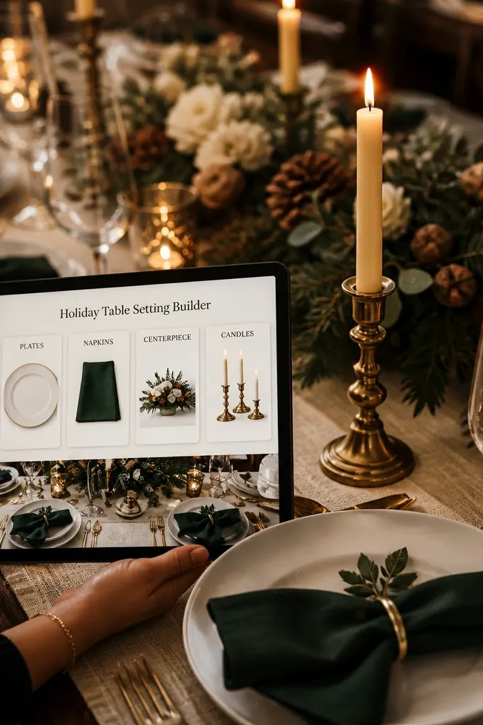
This template makes holiday tables look planned instead of assembled at the last minute. Each entry is one table component like plates, napkins, centerpiece, or candles, with a photo and a color palette label. The design is photogenic because you group cards by component type in a board view, so you can build the table in layers. Add a “Seat count” field for the components that need quantity planning. It’s ideal for DIY table decor, seasonal hosting, and anyone who wants their iPad to act like a checklist with style.
Create a database called Table Components with properties: Component (title), Type (select: plates/napkins/centerpiece/candles), Palette (select: gold cream/black white/red green), Seat count (number), and Photo (files & media). Make a board view grouped by Type with cards showing Palette and Seat count. Add a gallery view grouped by Palette so you can keep the color story consistent. Create a page called “Table run sheet” with a linked view filtered to the components you picked for this holiday.
Use a limited set of Palette values and reuse them across years so your templates stay consistent.
Don’t add Type as free text; the board gets messy and stops looking good.
19. Digital Scrapbook for DIY Home Refresh
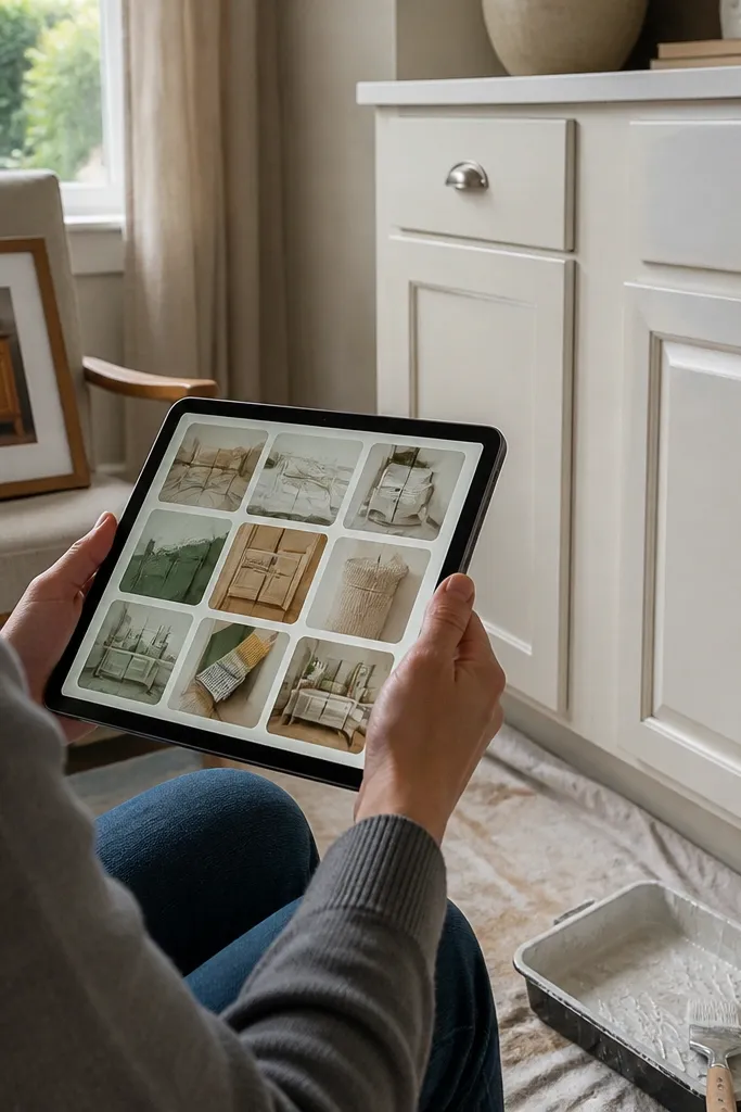
This is the template for capturing your progress in a way that looks like a mini magazine page. Each card is one refresh moment with a photo, a date, and a short title like “new shelf brackets” or “painted cabinet doors.” It’s stylish because the card format is consistent and the text is short enough to avoid clutter. Add a “Category” select so you can filter by paint, hardware, styling, or organization. Perfect for DIYers who document projects and want a beautiful archive, not scattered files.
Create a database called Refresh Moments with properties: Moment (title), Date (date), Category (select: paint/hardware/styling/organization), Summary line (text), and Photo (files & media). Use a gallery view sorted by Date descending so the newest work appears first. Add a filtered view for each Category so you can pull a clean set of images later. On the main template page, add a cover image and keep the database view full width so it looks like a scrapbook spread.
Use one consistent naming format for Moment titles like “Action + Object,” so your grid reads smoothly.
Avoid long Summary lines; one sentence is enough for a photogenic grid.
20. Notion iPad Shopping Run List (Photo-Ready)
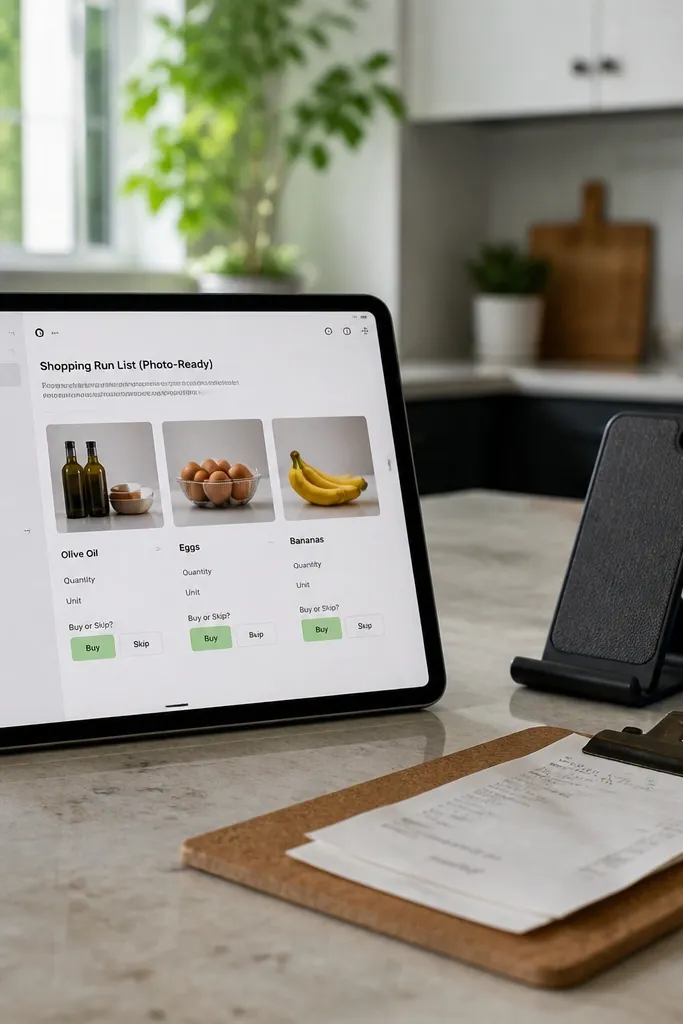
This template is for quick and easy Notion Template Ideas when you need to shop without losing the plot. Each card includes a photo reference, a short item name, and one decision field like “Buy” or “Skip.” The look stays crisp because cards stay minimal and the board is grouped by store or section. You can also add a “Max price” field so you don’t drift while browsing. It’s ideal for DIY runs to hardware stores, fabric shops, and home decor aisles where you need to move fast and still look organized.
Create a database called Shopping Runs with properties: Item (title), Store (select: Target/IKEA/Home Depot/etc.), Max price (number), Decision (select: Buy/Skip/Ask first), and Photo reference (files & media). Build a board view grouped by Store with 4-6 columns maximum by limiting stores in your select list. Add a second view called “Ready to buy” filtered to Decision equals Buy. Keep Store values short so the board header doesn’t take over the screen.
Add one photo reference per item so you can match it in-store quickly without reading tiny descriptions.
Don’t add 10+ stores; prune your Store select values so the board stays clean.



