
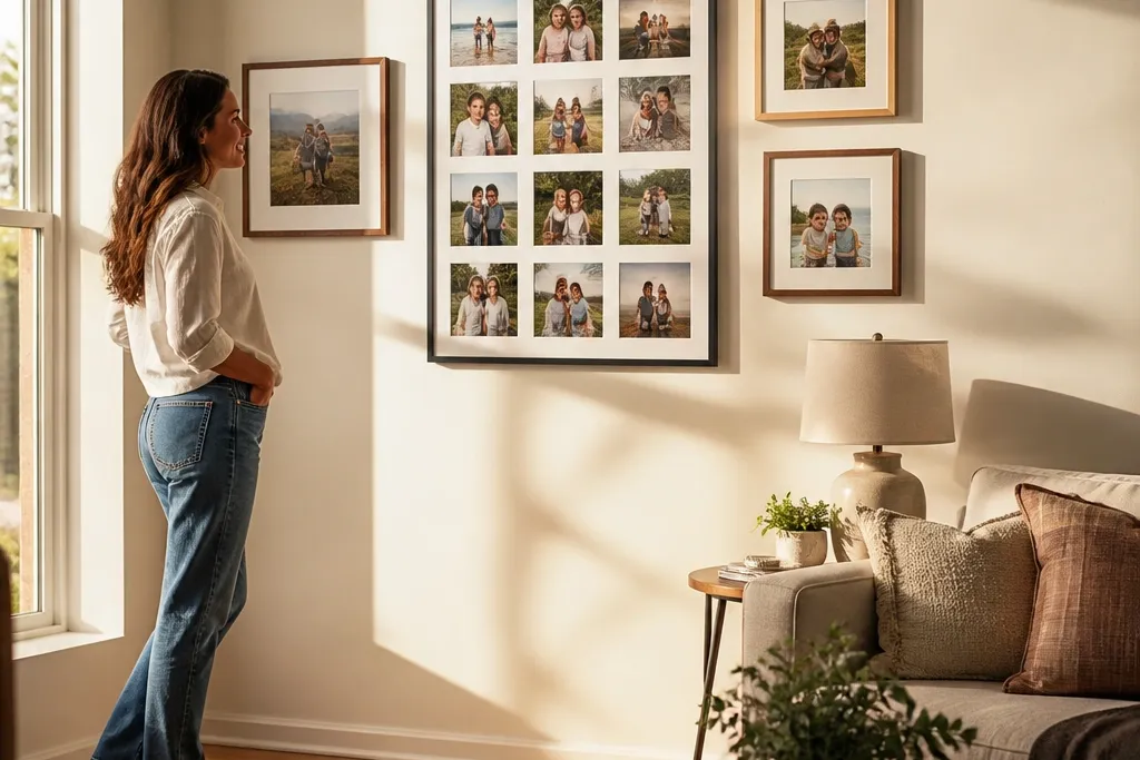
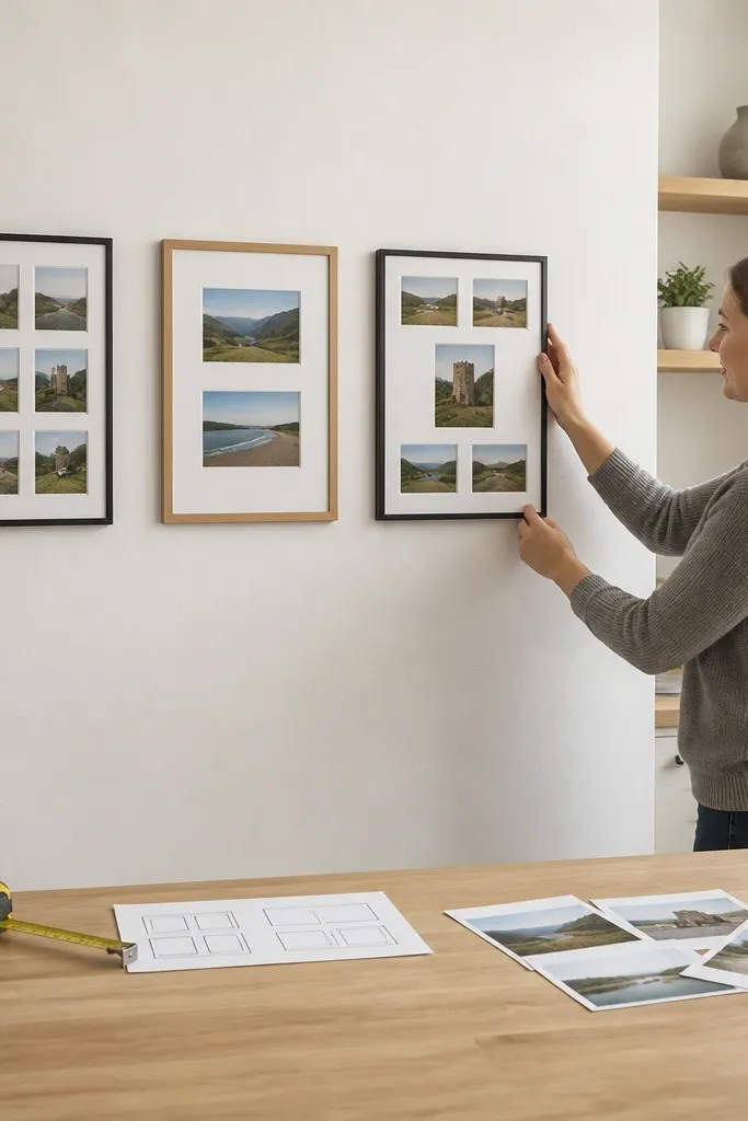
1. Twelve-Photo Tight Grid With White Borders
This is the fastest way to get a clean, finished look because the layout does the heavy lifting. A 3x4 grid reads clearly from across the room, and the white borders keep every photo edge crisp. Use it for travel photos, family pics, or art prints where you want variety without visual chaos. It’s also forgiving if your photos are different scenes, because the grid ties them together. Expect about 60-90 minutes from prints to hanging if you already have frames or a print shop can cut borders for you.
Start by choosing one photo size and one border width, like 4x6 photos with a 1-inch white mat look. Lay them on the floor in a 3x4 grid and measure the full outer dimensions so you can buy the right frame set or spacing. Cut a piece of craft paper to the same outer size, tape it to the wall, and mark the hanging points through the corners. Hang using a level, then swap in photos and close the frames.
Editor's notePrint with a white margin so the photo edges never run right up to the frame glass.
Skip thisDon’t mix different photo sizes inside the same grid unless you’re ready to adjust spacing for each one.
2. Three-Row Band Collage in Matching Frames
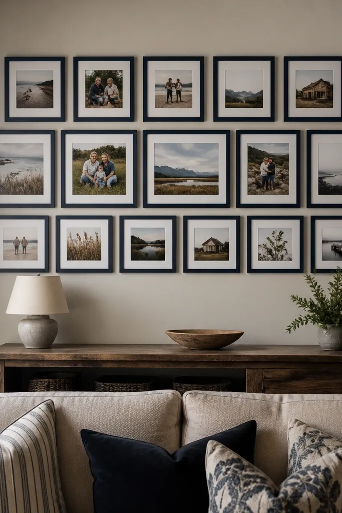
A band collage looks intentional because it creates one strong horizontal line. The trick is to keep the frames aligned in three rows, so your eye reads it like decor, not a bulletin board. This works great above a dresser, sofa back, or entry console where you want height control. Pick a single frame color to make it feel cohesive even with different photos. It’s quick because you repeat the same arrangement logic across all three rows.
Choose a frame size you can repeat, like 8x10 with a mat opening that fits 4x6 or 5x7 photos. Place three frames across for row one, then duplicate the same spacing for rows two and three, keeping the gaps equal. Make a paper template of the full band width and hang height, then tape it to the wall. Use a level to hang the top row first, then align the remaining rows to that reference.
Use the same photo border width across all frames so the band has one clean rhythm.
Avoid mixing frame sizes in the same band; it breaks the horizontal line.
3. Overlapping Polaroid-Style Cluster On One Corner
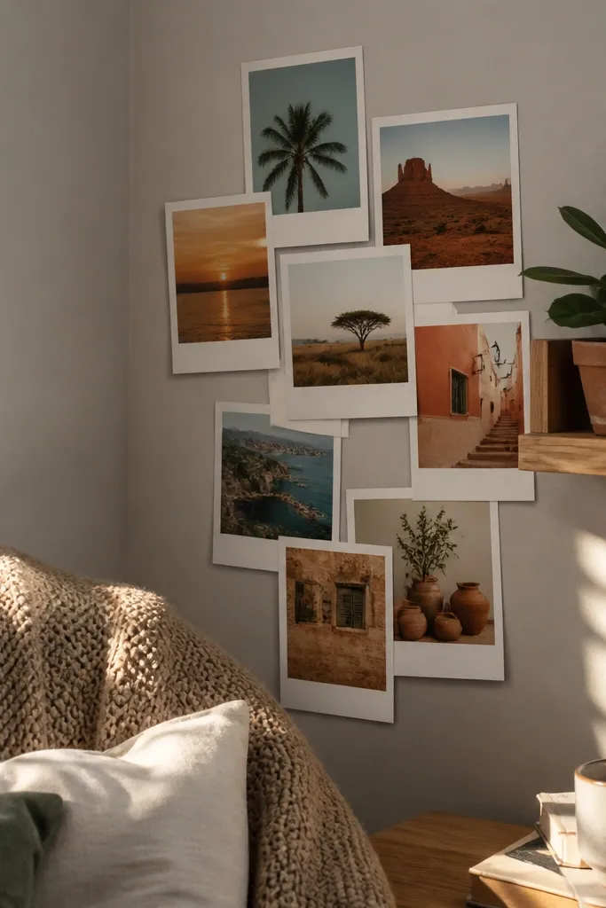
This one is photogenic because it has built-in depth. Overlapping polaroid-style prints look casual but styled when you keep the overlap consistent and the colors coordinated. It’s great for a desk wall, a reading nook, or anywhere you want a little personality without building a big structure. Use it with a limited palette like warm browns and creams, or black-and-white photos with one color accent. The cluster reads as a moment, not a random set of pics.
Print photos with a thick white “polaroid” border look, or create it by mounting 4x6 photos onto 5x7 cardstock. Cut small strips of double-sided mounting tape and place them so each print overlaps the next by about 1 inch. Arrange everything starting from the largest piece, then fill gaps with smaller overlaps. Press flat, then add one piece of tape behind the top corners for extra hold.
Keep all photos slightly rotated in the same direction range, like -3 to +3 degrees, so it looks curated not chaotic.
Don’t stack overlaps randomly; choose one anchor photo and build outward from it.
4. Gallery Wall With 9 Frames, One Large Center
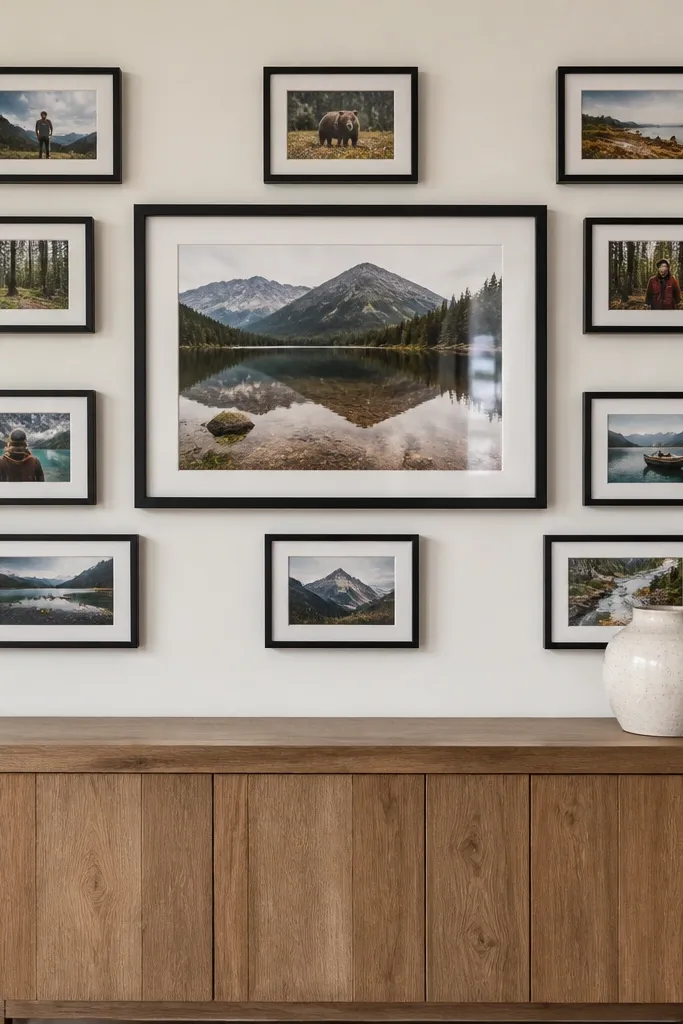
A large center photo makes the whole wall feel designed and easy to read. The smaller frames around it fill space without forcing perfect symmetry everywhere. This is a good choice when some photos are landscape and others are portrait because the center sets the focal point. It also photographs well because the eye lands in the middle first. If you want a “wow” look without complicated carpentry, this is the cleanest way to get it.
Pick one hero frame size, like 16x20, and decide the sizes of the remaining eight frames, like 8x10. Arrange them so four frames sit to the left and right of the center in two rows, then place the other four above and below with equal gaps. Use painter’s tape to outline each frame on the wall before hanging anything. Hang the center first, then level each surrounding frame to match the center’s height.
Editor's noteKeep gaps consistent at about 1 inch between frame edges to avoid that “almost aligned” look.
Skip thisDon’t let the center photo be the only one with a different border thickness; match mat/border widths.
5. Black Frames, White Photos, No-Mat Look
This style is crisp and modern because the black frames create strong edges. Going no-mat (or using a very thin mat) makes photos feel larger, which looks good in photos taken from the room. It also reduces build time because you’re not cutting mats for each frame. Use black frames for black-and-white photos, light backgrounds, or any set that has high contrast. It’s a strong option if your wall is light and you want the collage to read clearly.
Choose a consistent frame size, like 8x10 with a 8x10 opening or 5x7 with a 5x7 opening. Print all photos to match the opening size exactly, including orientation. Arrange them in a grid like 2x4 or 3x3, measuring total width so the set fits your wall. Hang by marking the top corners, then verify with a level before you drill.
If you’re printing at home, pick a matte photo paper to reduce glare in photos and in real life.
Don’t mix glossy and matte prints; the shine differences show up fast.
6. Wood Frame Mix With a Single White Mat Color
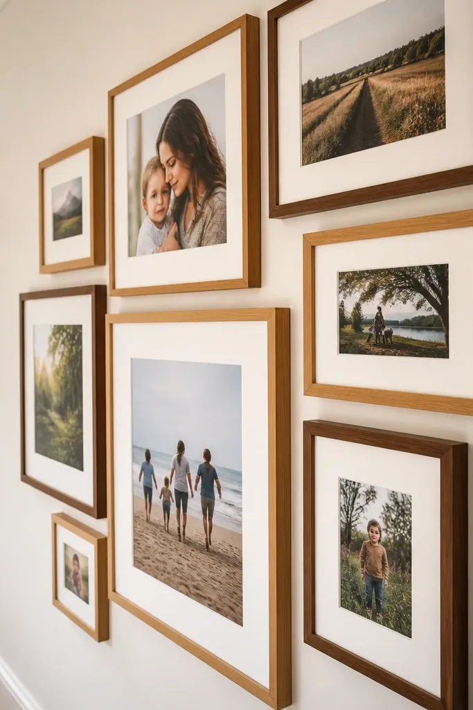
Wood frames add warmth, and keeping one mat color makes the mix look intentional. This layout works when your photos have different vibes — some bright, some muted — because the mat creates a consistent visual border. It’s a great match for kitchens, hallways, and cozy living rooms. The look also photographs well because wood tones add texture without clutter. This is quick because you can buy frames from a thrift or discount rack as long as the mat style stays consistent.
Pick one mat color, like crisp white, and decide on a single photo size you’ll use in every frame. If the frames have different openings, use a print shop to resize and print to fit the mat opening. Arrange in a cluster of 10-12 frames, keeping overlaps minimal and edges mostly aligned. Use tape templates for each frame, then hang after you like the arrangement from standing height.
Aim for one wood finish tone — either light oak or dark walnut — so the warmth doesn’t fight itself.
Don’t mix very different mat thicknesses; 1/8 inch differences are visible.
7. Hexagon Photo Wall Using Paper Templates
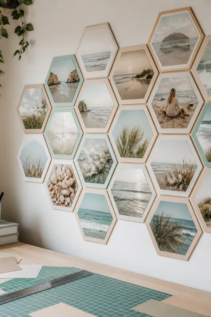
Hexagons make a photo wall feel graphic and modern. The pattern is easy to photograph because it forms clear repeating shapes, and the wall looks like a design piece rather than a collage. This works best with a set of photos that share a color theme, like beach neutrals or a black-and-white set. It also helps you avoid the “where do I put this next” problem because the geometry guides placement.
Decide on one finished hex size, like 6-inch flats, and cut paper hex templates from poster board. Print photos and trim them to fit the hex shape or mount them on hex cutouts. Arrange the templates on the wall first, starting from a central hex and spiraling outward. Once the layout clicks, swap templates for frames or mount each hex with picture-hanging hooks.
Use a ruler and pencil for the first template, then trace copies quickly so all hexes match.
Don’t freehand the angles; one off-hex makes the whole pattern look sloppy.
8. Photo Strip Timeline Across a Wall
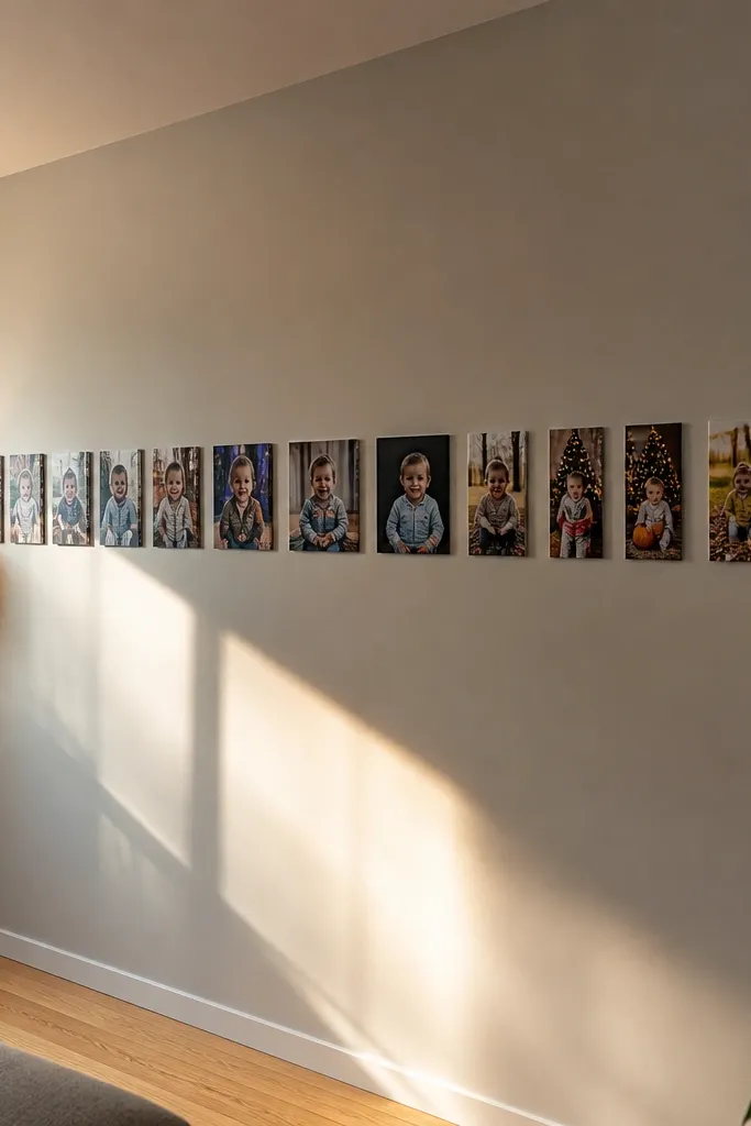
A timeline strip turns photos into a visual story without needing fancy labels. It’s also one of the quickest ways to cover a long wall section because you’re repeating one format. Use it for milestones, graduations, wedding moments, or a year of everyday life. The photo strip reads clearly in wide-room photos because it’s a single line. Keep the strip height consistent so it doesn’t feel like it’s drifting.
Choose one photo size and border style, like 4x6 prints with a 1-inch white border. Arrange them in a single horizontal row with 1/2 inch spacing, then measure the total width. Print a strip template on craft paper to match the full length and tape it to the wall at the right height. Hang using a picture rail or individual hooks, then verify spacing before you remove the template.
If you want a cleaner look, use small frame clips and keep all frame fronts flush to the same plane.
Don’t vary the photo orientation randomly; rotate only if the strip still reads as one line.
9. Monochrome Stack With One Color Photo Pop
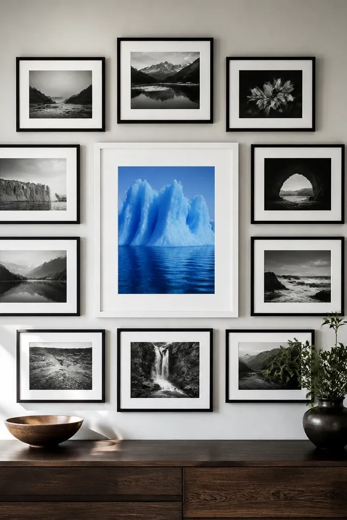
This layout looks like intentional styling because it uses contrast as the design. Put a single color photo in the center and surround it with black-and-white images in a tight grid or cluster. The eye lands on the color immediately, and the rest of the wall feels calm. It’s perfect for sets where one photo has better lighting or stronger composition than the others. The whole collage stays quick because you’re repeating one frame style and one size.
Pick one hero photo in full color and convert the rest to black-and-white for consistent tones. Choose a uniform frame size and keep all borders identical. Build a 3x3 grid with the color photo in the center, or a 2x5 strip with the color photo at the midpoint. Tape the full arrangement to the wall first, then hang starting from the center and working outward.
Use frames with anti-glare glass if you have overhead lights; glare kills the monochrome look.
Don’t pick multiple color photos; the “pop” effect disappears.
10. Frame-Free Photo Wall With Washi Tape Borders
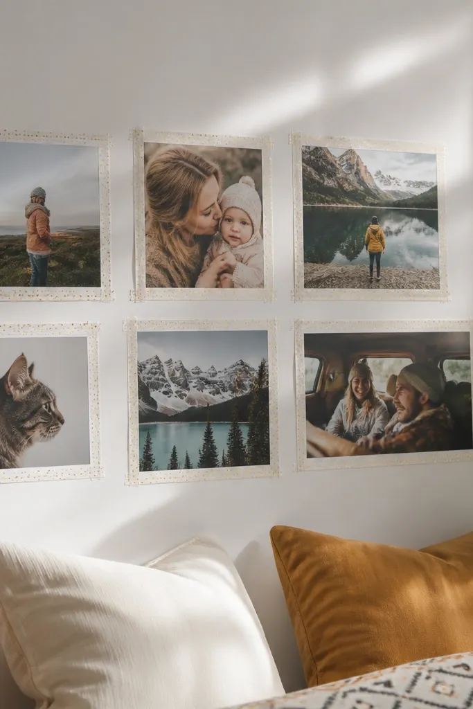
If you want the fastest possible collage, go frame-free. Washi tape borders give you the crisp edges that frames normally provide, and it’s easy to swap photos later. This looks great in bright rooms because the tape edges catch the light in a subtle way. It’s also budget-friendly if you’re using printouts from a local shop. Use it when you need something quick without drilling.
Print photos to a consistent size, like 5x7, and trim them cleanly. Tape a border around each photo using straight strips of washi tape, keeping the corners sharp. Arrange in a grid layout on the wall and press the tape firmly along the paper edges. If you’re hanging on textured paint, add a thin strip of painter’s tape under the washi for extra hold.
Editor's noteChoose one tape color and width so the wall reads cohesive, like 10mm black tape on white walls.
Skip thisDon’t use a mix of tape widths; it makes the collage look DIY in a messy way.
11. Rope-And-Clothespin Photo Line
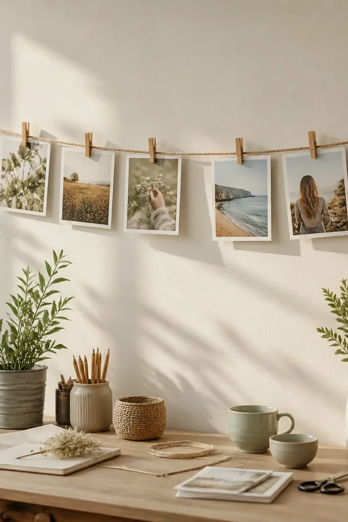
This style is airy and looks great in casual spaces. The photos hang with light separation, so each image is readable and the wall feels less crowded than a grid of frames. It’s perfect for seasonal snapshots or a set you want to rotate. Clothespins add a playful detail that still looks intentional when you keep the photo sizes consistent. It’s quick because you’re mounting one rope line, then clipping photos.
Mount two hooks on the wall at the same height and stretch a rope between them tight enough to remove slack. Cut a piece of twine or use a cotton rope and tie it securely. Print photos to a consistent width and use small clothespins that can grip paper without tearing. Clip photos in a repeating rhythm — for example, small-large-small — and adjust spacing so images don’t overlap.
Editor's noteSpritz a little fabric-safe anti-static spray on your prints before clipping if they curl.
Skip thisDon’t let the rope sag; a drooping line makes the whole wall look unfinished.
12. Floating Photo Ledge With Mini Frames
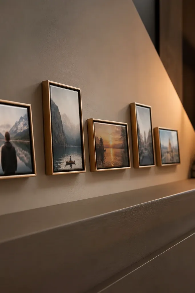
A ledge layout looks clean and modern because the photos sit at one height and angle. It’s also practical: you can dust and swap prints without taking down a wall full of frames. Use it along a console table, mantel, or narrow shelf where a flat wall collage would feel too heavy. This is quick because you’re building a simple shelf moment rather than aligning lots of individual hang points. The result looks like decor, not a craft project.
Pick a ledge shelf size that matches your wall space, like a 30-36 inch narrow shelf. Mount the shelf using the proper anchors for your wall type. Arrange 10-14 mini frames on the ledge with 1/2 inch gaps, then mark where each frame sits. Place non-slip shelf liner under the frames so they don’t slide, and level the shelf before adding frames.
Editor's noteUse frames with a consistent thickness so the row looks aligned from the side.
Skip thisDon’t stack frames too close to the shelf edge; it looks cramped and can slip.
13. Corner Gallery With Two Vertical Columns
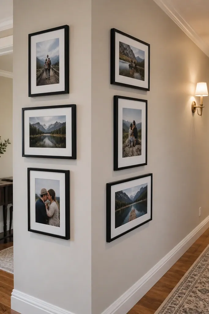
Corner placement can look expensive when you keep the structure simple. Two vertical columns create a clean visual boundary, and the photos feel like they belong to the space instead of hanging randomly. This works well in hallways where you need to use side walls without covering everything. Choose photos that share similar tones so the columns feel cohesive. It’s quick because you’re repeating the same spacing rule down two lines.
Choose one frame size and plan two columns, like 5 frames per column. Measure from the corner so each column is the same distance from the wall — a standard like 2 inches from the corner edge. Tape a vertical guide line down the wall for each column. Hang the top frames first, then work downward using a level and consistent 3/4 inch gaps.
If your corner isn’t perfectly square, use a paper spacer behind the frames so both columns look straight to the room.
Don’t place frames too close to the corner; they catch shadows and look crooked.
14. Vintage Scroll Frame With Photo Cards Inset
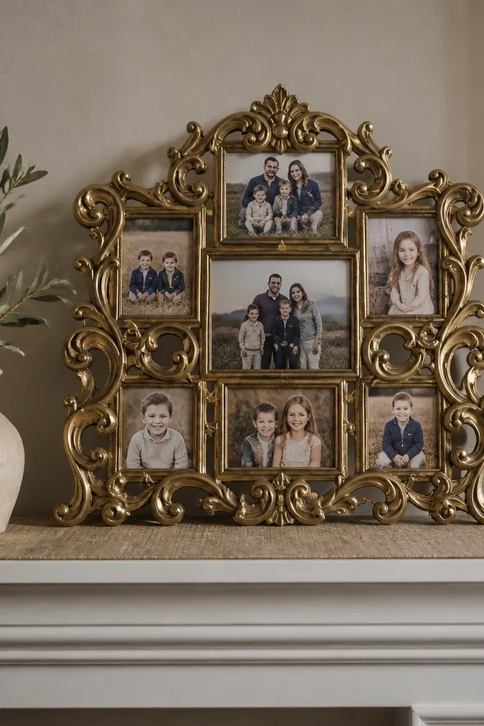
This is a “statement without complexity” approach. A decorative frame gives the collage a finished border, so your job is only to place photo cards inside. The look is great for mantel photos, entry walls, or anyone who likes a slightly old-school vibe. It photographs well because the outer frame creates a clear edge for the camera. It’s also fast if you already have a decorative frame or can find one secondhand.
Find a large decorative frame that has an opening for inserts, like 18x24 or 20x30. Print photo cards to a consistent size, like 4x6, and trim them to fit the insert area. Arrange cards in a grid inside the opening, leaving about 1/4 inch between cards. Use photo corners or thin double-sided tape to hold each card, then hang the finished frame at eye level.
Use one photo orientation across the card set so the inside looks uniform.
Don’t overcrowd the insert; leave breathing room so the decorative frame still reads.
15. Horizontal Frame Ladder With 7 Prints
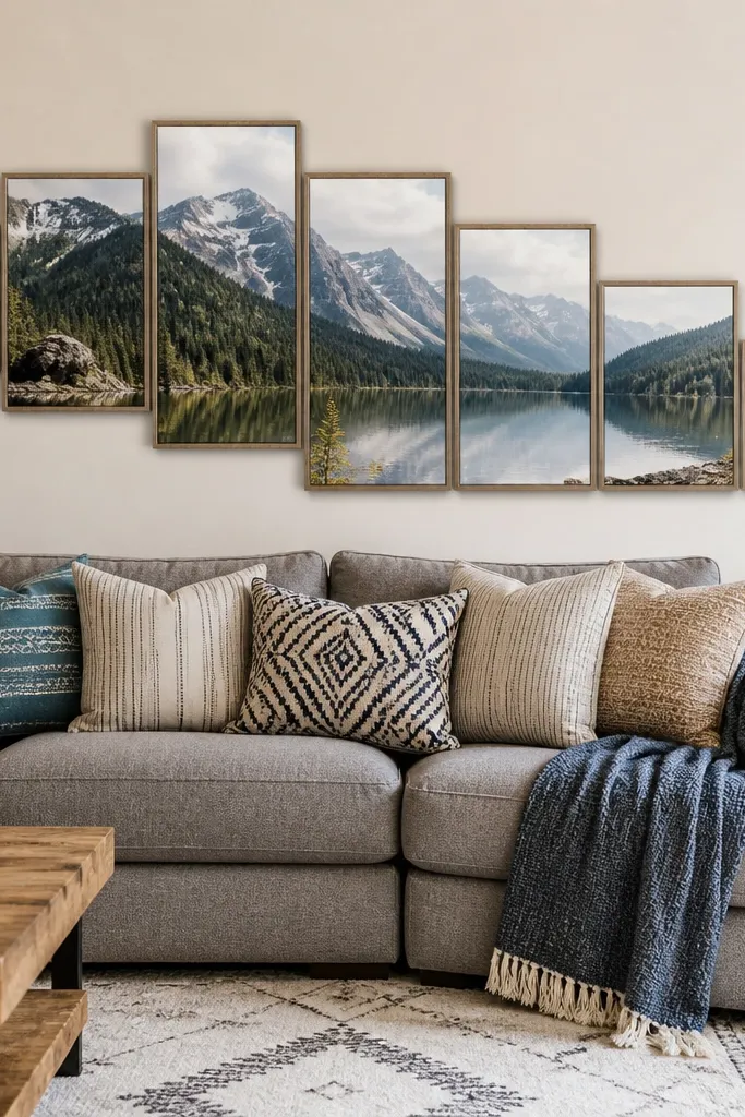
A ladder layout looks playful and organized at the same time. You get a subtle stagger that adds movement without turning into a messy overlap. This is a good option for above a sofa or along a staircase landing where you want something dynamic but still tidy. Use it with landscape photos so the ladder rhythm looks consistent. It’s quick because you’re placing a small number of frames with a repeatable stagger step.
Choose seven frames in the same size, like 8x10 with 5x7 openings. Mark a starting point and decide your stagger step, like raising each next frame by 1 inch. Place frames in a line using painter’s tape to map the ladder curve. Hang the center frame first, then level each subsequent frame to match the stagger marks.
Editor's noteUse a consistent border thickness so the stagger looks deliberate rather than accidental.
Skip thisDon’t change frame sizes; the ladder effect depends on repetition.
16. Shadowbox Collage With Layered Paper Photos
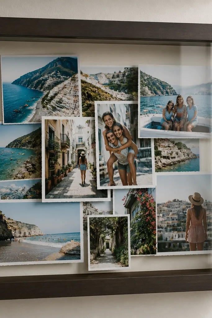
Shadowboxes look premium because you get depth without complicated hardware. Layered paper photos inside a box create a 3D collage effect that still counts as a quick weekend project. It’s great for a single theme set like baby photos, concert tickets, or a vacation series. The glass front protects everything, so it stays clean. Photographically, the depth gives your collage a “collected” look rather than flat prints.
Buy a ready-made shadowbox with a deep backing, like 2-3 inches deep, and a removable back panel. Print photos and cut them into shapes or simple rectangles, then layer them with foam squares. Arrange the layers on the backing, then glue or tape only the edges so nothing warps. Put the backing back in, then hang the shadowbox with the included hardware.
Editor's noteUse matte photo paper for the layers so reflections don’t wash out your composition.
Skip thisDon’t use thick glue blobs; they warp paper and create uneven shadows.
17. Polaroid Grid With One Row Upside Down
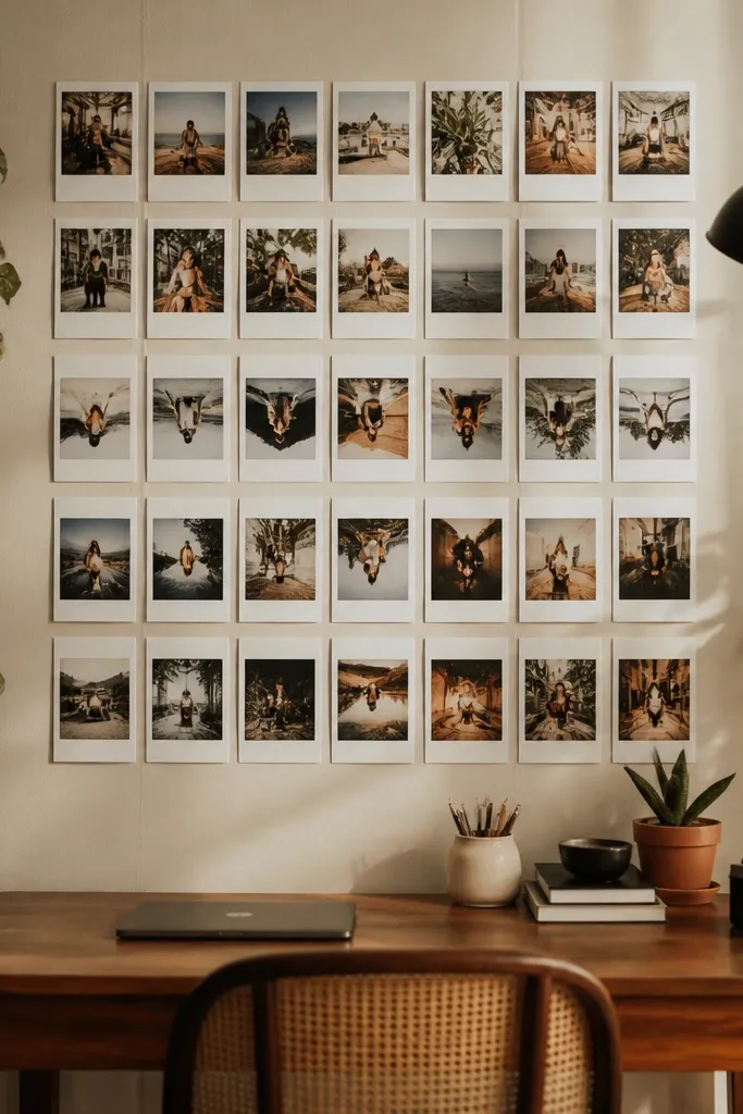
This is the easiest way to add personality to a grid while keeping it controlled. Most of the collage stays straight, then one row has a subtle rotation or flip that makes it feel lived-in. It’s photogenic because the contrast between strict grid and playful row catches the eye. Use it for candid photos or a collection that already has a fun vibe. You still get the speed of a grid layout.
Print polaroid-style borders for all photos so the format matches. Arrange in a 3x4 grid and keep the first two rows straight. For the third row, rotate each print by about 2-5 degrees in alternating directions, or flip orientation while keeping borders consistent. Tape them in place with small mounting squares and then hang as one grid using a template.
Editor's noteKeep the rotations within a narrow range so it reads “intentional” instead of crooked.
Skip thisDon’t flip multiple rows; one playful row is enough.
18. Frame Collage Using One Color Mat Background
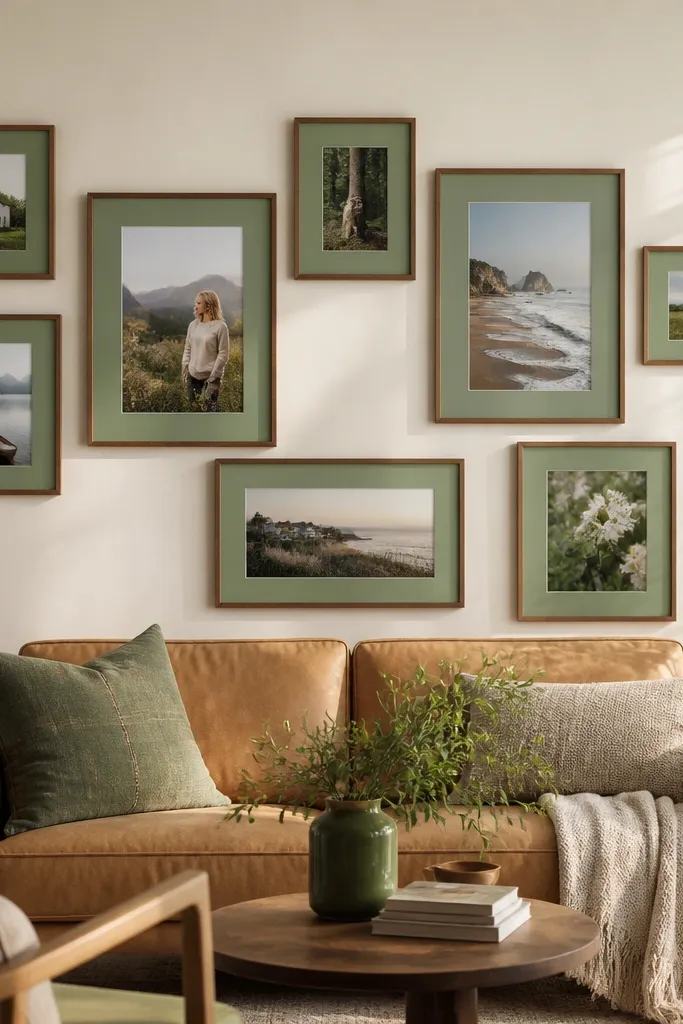
A consistent mat color makes a collage look like it was designed, even when the photos vary. Pick one mat color like soft sage, dusty blush, or charcoal gray, and keep it across every frame. The mat creates a unified background that photographs beautifully. This layout looks especially good with warm wood frames and photos that have skin tones or nature colors. It’s quick because you’re repeating one mat choice instead of trying to match everything photo-to-photo.
Choose frame openings and order mats in one color for all frames, like sage green 1-inch mats. Print photos to the opening size and keep the photo border inside the mat opening consistent. Arrange in a simple 4x3 grid or a tight cluster, keeping equal gaps between frames. Hang by marking the top row first, then spacing down with the same distance between frame edges.
Editor's noteUse a mat color that sits between your wall color and your photo colors for the most natural look.
Skip thisDon’t choose a mat color that’s too saturated; it can overpower the photos.
19. Minimalist Two-Frame Vertical Stack With One Wide Photo
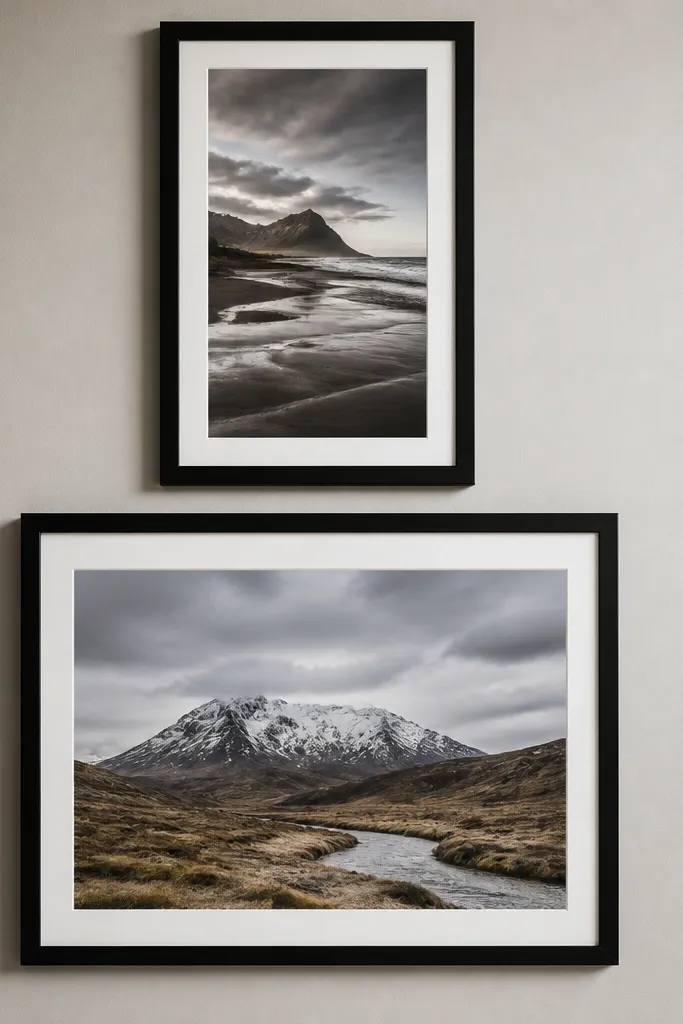
Sometimes quick and easy means using fewer pieces with stronger composition. A two-frame vertical stack looks sharp and gives your photos real presence. The wide photo at the top or bottom anchors the layout and makes the wall feel intentional, not empty. This works when you have one standout image set that deserves space. It’s also the fastest build here because you’re hanging only two frames.
Pick two frames with matching styles, like black or light oak, and decide which photo is the wide one. Use sizes like 11x14 for the wide photo and 8x10 for the narrower one, but keep frame depth consistent. Measure the total stack height and mark the centerline at eye level. Hang the top frame first, then align the second frame so the gap between frames is about 1 inch.
Editor's noteUse a thin mat if the photos have busy backgrounds; it keeps edges crisp.
Skip thisDon’t use two frames with different frame widths; it reads off.
20. Five-Photo Symmetry With One Side Cropped
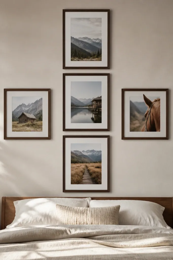
This layout is clean because it keeps symmetry, then adds a styling twist with a cropped look. You place three photos in a vertical column and two photos on the sides, all aligned to the same centerline. The cropped photo adds visual interest without breaking the structure. This is a smart choice when you have a couple of photos that are better as close crops than full prints. It’s quick because you’re working with five frames and strict alignment.
Pick consistent frame sizes for the five pieces, like 8x10 with 4x6 or 5x7 openings. Print three photos as standard, then crop one side photo so it feels like it belongs in the composition but has less “empty” background. Lay the arrangement on the floor and confirm the centerline alignment. Tape the center point on the wall, hang the middle frame first, then place the two side frames using the same measured gap from the centerline.
Crop with the rule of thirds so the “cut” looks deliberate, not accidental.
Don’t crop randomly; keep the framing consistent with the photo’s subject.
21. Circle Frame Collage With 8 Photos Around
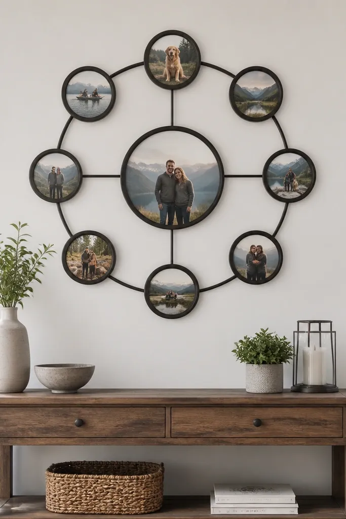
A circle layout reads modern and feels like graphic decor. The center photo is your focal point, and the eight surrounding photos create a neat visual orbit. This looks great in entryways and above small consoles because it doesn’t sprawl. It also photographs well because there’s a clear center and repeating shape. It’s quick if you use one circular template and keep all frames identical.
Choose a center frame size, like 5x7, and eight surrounding frames that match, like 4x6. Make a paper circle template with a center hole and eight evenly spaced guide marks. Arrange frames around the center on the floor using the guide marks so spacing is equal. Transfer the layout to the wall with tape, hang the center first, then hang the eight around it using a level and the guide lines.
Editor's noteUse frames with the same mat color so the circle looks like one unit.
Skip thisDon’t eyeball spacing around the circle; equal spacing is the whole look.
22. Two-Row Scrapbook Style With Tiny Labels
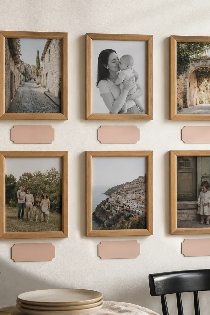
This one looks like a scrapbook page, but it’s still clean enough for a wall. Tiny labels add personality and make the collage feel intentional, especially for milestones. Keep labels minimal and consistent — short dates or locations — so it doesn’t become clutter. It’s photogenic because the eye travels from photo to label in a predictable pattern. It’s also quick because you’re building two rows only.
Print photos to a consistent size, like 4x6, and mount them on cardstock with a uniform white border. Add small labels under each photo using a simple font style and black ink, sized so the text fits in one line. Arrange two rows with 3/4 inch spacing and tape them to the wall using mounting corners. If you want extra durability, laminate the labels and use archival tape for mounting.
Use one label format everywhere, like 'Month Year' or 'City, Year', so it reads cohesive.
Don’t use long sentences; one line per photo is the sweet spot.
23. Monogram Backdrop Collage With Photos in Cutouts
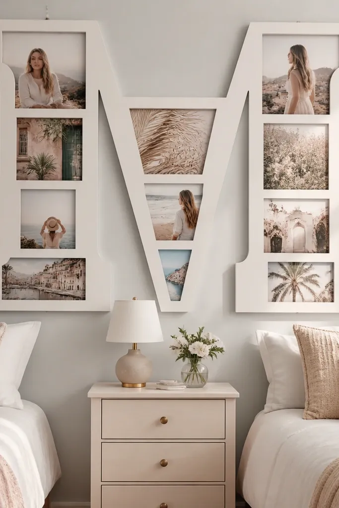
This is a clever way to make a photo collage look like graphic decor instead of just pictures. A big monogram creates the structure, and photos placed inside cutouts feel curated. It’s great for bedrooms, nurseries, and anyone who wants a personal letter centerpiece. The look photographs well because it has a clear silhouette and contrast. It’s still quick because you’re repeating one cutout shape across multiple photos.
Choose a monogram letter and print it full-size on thick paper or use a vinyl stencil. Trace the letter onto foam board or poster board and cut out photo windows in a grid pattern inside the letter. Print photos to match each window size and mount them behind the cutouts using tape. Mount the letter cutout board to the wall and make sure the photo windows align cleanly so edges look crisp.
Editor's noteUse foam board for stability so the cutout edges stay straight and don’t warp.
Skip thisDon’t use thin cardboard; it bends and makes the letter look wavy.
24. Seamless Corner Frame Wall With Overlap Edges
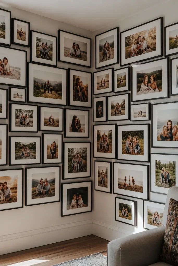
Corner walls are tricky, but overlap edges can make them look seamless. This layout uses consistent overlap spacing so the collage looks like it’s wrapping the corner rather than stopping abruptly. It’s photogenic because you get depth and a continuous pattern from two angles. Use it with photos that have similar color tones so the overlap doesn’t look busy. It’s quick because you’re repeating one overlap rule across a small set of frames.
Pick three frames for one side of the corner and three for the other, all the same size. Arrange them so the inner edges overlap the corner by about 1/2 inch, and keep overlaps consistent. Tape the first frame to anchor the spacing, then continue adding frames around the corner. Hang with a level, then adjust only by shifting the entire frame slightly so edges stay parallel to the wall.
Use corner-friendly mounting hooks that let you fine-tune position after hanging.
Don’t mix frame sizes; corner overlap is only believable when the edges match.
25. Black-and-White Photo Grid With Thin Gold Frames
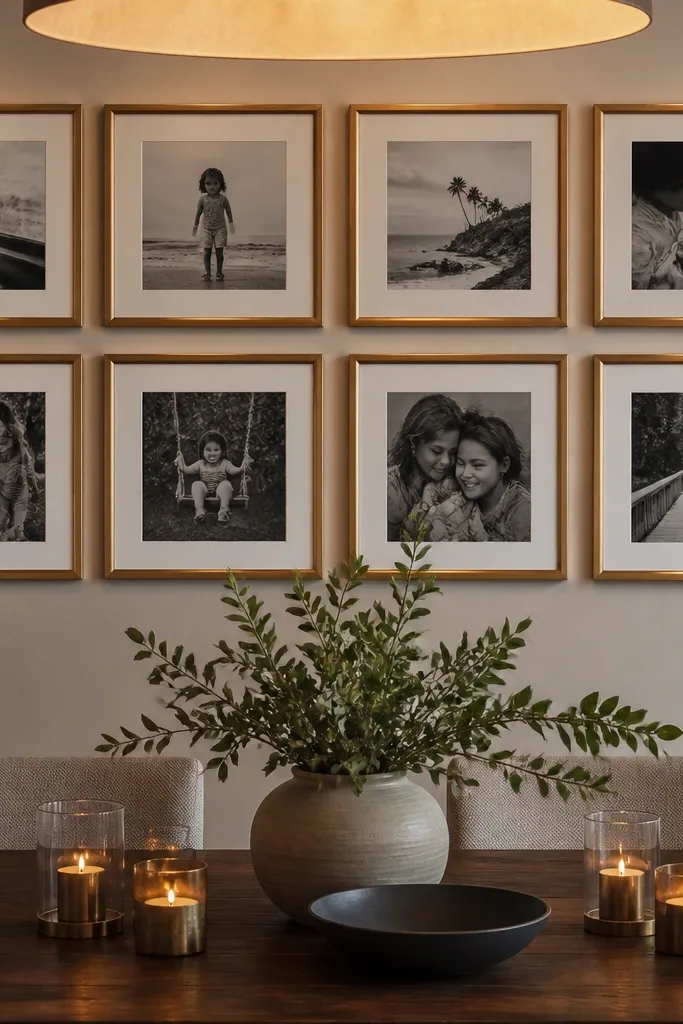
Thin gold frames add a little glam without turning into a cluttered wall. Pair that with black-and-white photos and you get a clean, classic look that still feels elevated. The gold edges show up nicely in room photos and make the grid look intentional. This works in entryways, dining areas, and any space where you want a polished finish. It’s quick because you’re repeating one frame style and one grid size.
Choose a frame set with the same thin profile and consistent mat opening. Print black-and-white photos to match the openings and keep the border consistent if you use mats. Arrange in a 3x4 grid or 2x6 strip depending on wall width. Tape the full grid outline first, then hang the top row and work downward using the same gap between frames.
Wipe frames with a microfiber cloth right before hanging so fingerprints don’t show in the light.
Avoid thick mats with thin frames; it makes the photos feel cramped.
26. Color-Blocked Photo Collage With 6 Mini Panels
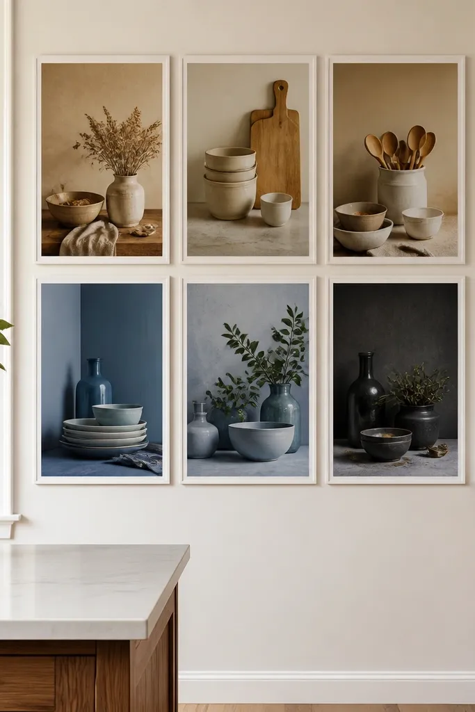
Color-blocking makes your collage look like design art. You group photos by tone — like warm, cool, neutrals — and arrange them in blocks so the wall has structure even with different images. This is especially good when you have photos that are all over the place in subject but share a color family. It’s quick because you’re building with six panels and simple spacing. The finished look photographs well because the blocks create clean edges and strong contrast.
Pick six photos and sort them into two or three tone groups. Choose one mini frame size, like 6x8 openings, and keep spacing between frames at about 1/2 inch. Arrange them in blocks, like three on top and three on bottom, with a clear gap line between tone groups. Tape the block layout to the wall, then hang starting from the top-left corner and level each frame as you go.
If your photos have mixed tones, edit them lightly toward the same temperature so the blocks look intentional.
Don’t mix every color everywhere; the block effect disappears.
27. Clothesline With Mini Clip Frames
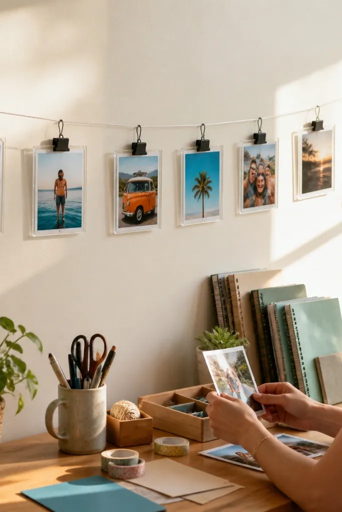
This version of a photo line uses mini frames instead of loose prints. The frames keep the edges crisp and protect the photos, so the wall looks tidy even up close. It’s great for kids' rooms, craft rooms, and any place where you want easy updates. The line also makes your collage feel light and airy, not heavy like a grid of frames. It’s quick because you hang one line and clip everything in.
Mount two wall hooks and string a line tight enough to stay straight. Use small clip frames that open for swapping photos, or use binder-style clips with thin frames. Print photos to a consistent size so all clips fit cleanly. Clip from left to right with consistent spacing, then adjust until the line looks level from where you stand.
Use the same clip color on every frame so the hardware doesn’t become the focal point.
Don’t use different frame thicknesses; the clips will sit uneven.
28. Mirror-Backed Photo Collage In A Single Frame
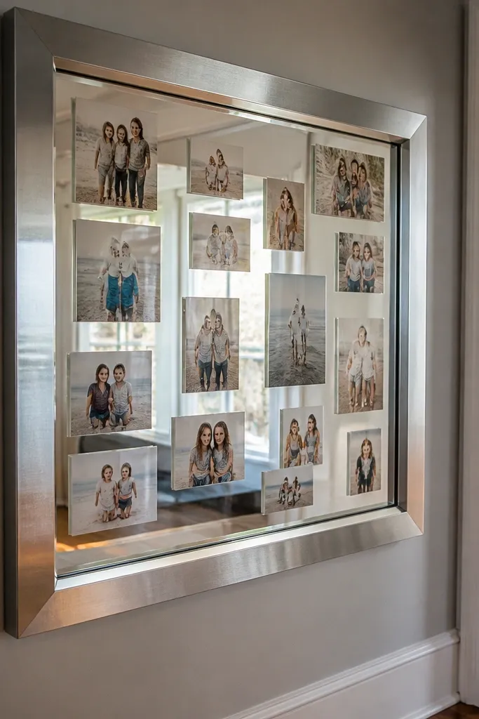
A mirror-backed collage makes photos feel brighter because the reflective surface bounces light. It also makes a single large frame look like a multi-photo display without the clutter of multiple frames. This works well in entryways and hallways where you want light and movement. The mirror background also helps photos stand out even if they’re not all perfectly exposed. It’s quick if you buy a ready mirror frame or a large frame with removable backing.
Buy a large frame with a removable back and add a mirror sheet to the backing if it’s not included. Print photos to a consistent size and arrange them on the mirror backing using small mounting squares. Keep spacing tight, like 1/4 to 1/2 inch, so the mirror doesn’t look empty. Close the frame and mount it using the existing hang hardware.
Choose photos with faces or high contrast — the mirror makes those details pop.
Avoid glossy photo paper if your room has strong overhead light; glare can wash out faces.
29. Stacked Frame Columns With Unequal Photo Heights
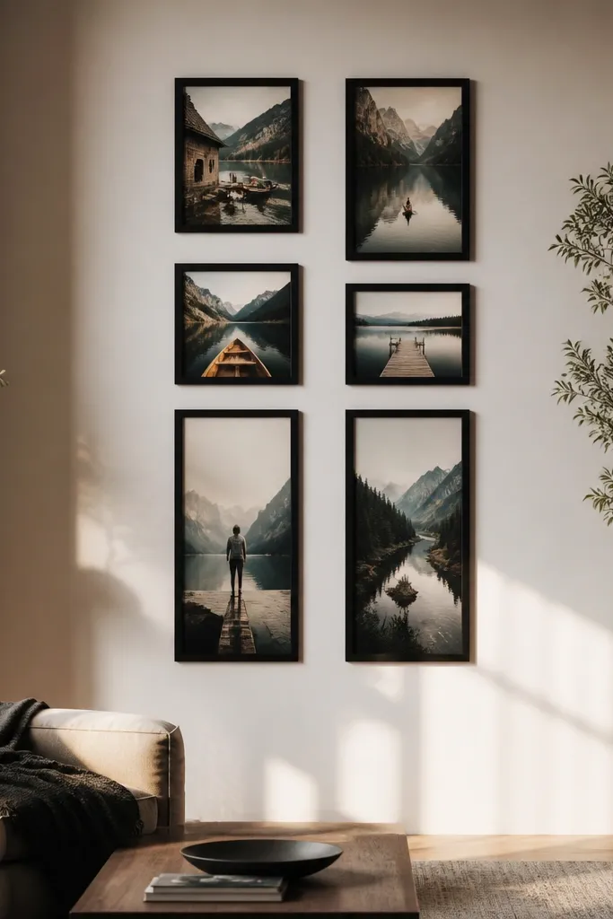
Unequal photo heights in a controlled column looks artsy without getting messy. You keep the frames aligned in two vertical columns, then vary the photo proportions inside that structure. This is a great way to use both portrait and landscape photos in the same wall while still looking intentional. It photographs well because the vertical rhythm is consistent. It’s quick because you’re repeating a column layout and only adjusting which photos go where.
Choose one frame width for both columns and pick two or three photo aspect ratios that fit inside the frame openings. Arrange two columns with equal vertical spacing between frames, like 1 inch. Place portrait photos in the taller slots and landscape photos in the wider-feeling openings. Tape the column outline to the wall, hang the top frames, then work down keeping the gaps even.
Editor's noteUse matching mats so the photo proportions change, but the frame edges stay uniform.
Skip thisDon’t let frames drift horizontally; columns only look good when their edges align.
30. Photo Wall With Fabric Hanger And Clip Rows
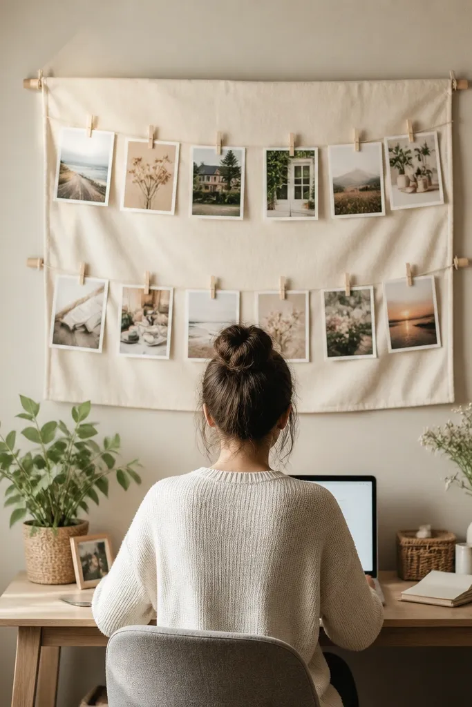
Fabric makes the collage softer and more decorative than string alone. Clip rows keep photo placement adjustable, so you can swap images without remounting. This works in nurseries, offices, and any space where you want a gentle look. The fabric also hides tiny mounting mistakes because it absorbs visual noise. It’s quick because you mount one fabric strip and clip photos on in minutes.
Mount a fabric strip, like a linen panel or narrow canvas, using two wall brackets at the top. Stretch it tight so it hangs flat, then add two or three horizontal lines of clips or binder rings. Print photos to a consistent width and use small clips that won’t dent paper. Clip photos in rows, keeping spacing consistent within each row and leaving a small margin at the ends.
Iron the fabric flat before hanging so wrinkles don’t make your clips look uneven.
Don’t choose slippery fabric; clips slide and photos shift over time.



