
1. Black-and-cream check wallpaper with a 9-photo grid
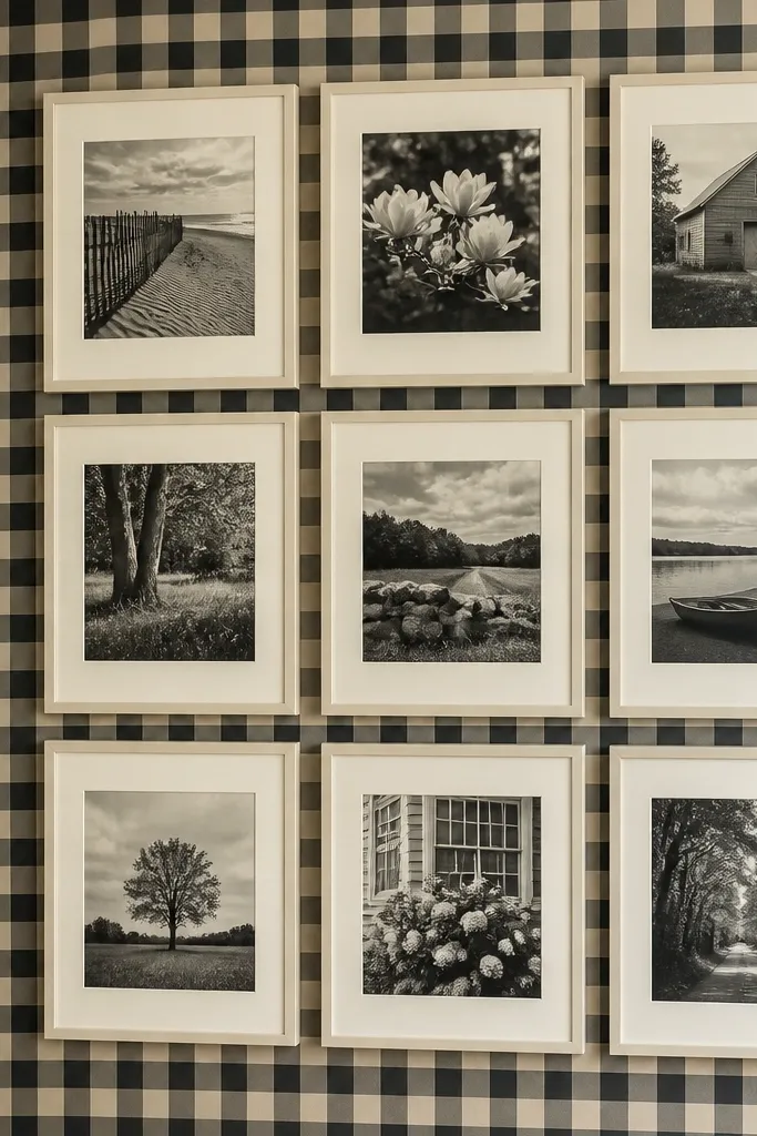
This setup looks real because the check pattern gives you an instant alignment reference. Use a 9-photo grid (3 across, 3 down) with equal mat sizes so the photos feel like they were designed as one unit, not added one by one. Stick to a tight palette: black-and-white photos or photos with cream highlights. Matte prints help the check pattern stay crisp instead of turning shiny and messy. It’s great for small hallways and entryways because the grid pulls your eye straight across the wall.
Start by covering the wall with black-and-cream check wallpaper, then mark a simple 3x3 grid using painter’s tape. Cut 3/16-inch foam board mats so each mat has the same outer size, then mount your prints flush inside the openings. Keep the gaps between mats at 1/4 inch for a gallery-style look. Finally, seal the edges with a light brush of Mod Podge or clear matte medium so the paper doesn’t curl when you handle the mounted pieces.
Editor's notePrint your photos with a light border (even 1/8 inch) so tiny misalignment doesn’t look like a mistake.
Skip thisDon’t mix wildly different mat sizes with a strict check pattern — it turns into visual noise fast.
2. Muted floral wallpaper with an off-center anchor collage
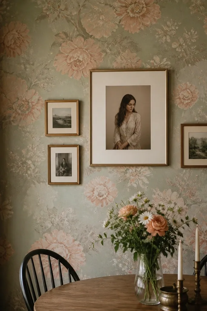
Floral wallpaper looks best when the collage feels like it’s framed by the pattern, not fighting it. Choose one anchor photo that’s bigger than the rest — think 11x14 or roughly 3 inches taller than nearby mats — then build smaller photos around it in a loose triangle. The wallpaper supplies texture and color, while the anchor supplies structure. Use photos that pull colors from the wallpaper (sage, dusty rose, or warm beige depending on the print) so everything looks intentionally styled. This is a strong choice for living rooms and dining rooms where you want warmth without clutter.
Hang the floral wallpaper first, then decide where the anchor sits by tape-marking its footprint on the wall. Cut foam board mats for the anchor and two smaller sizes so the anchor reads clearly from 6 feet away. Arrange the smaller mats in a gentle arc around the anchor, keeping consistent spacing at 3/8 inch. Mount everything using removable adhesive squares on the back for easy repositioning before you commit with a final layer of mounting tape.
Match the anchor photo’s dominant color to one of the wallpaper’s repeating tones, even if your other photos are black-and-white.
Avoid using high-contrast, neon photos against muted floral — the wall will look like two different rooms.
3. Gallery stripe wallpaper with vertical photo columns
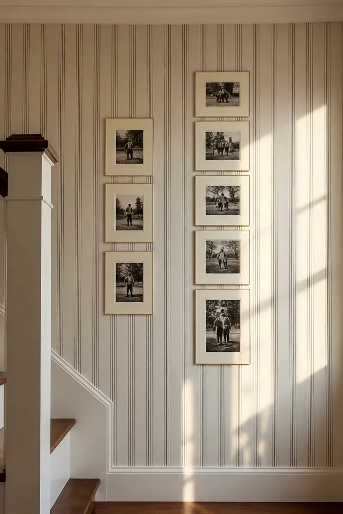
Stripe wallpaper gives you a built-in rhythm, and vertical columns make the collage look like a curated print wall. Use 2 or 3 vertical columns with uneven photo heights, but keep the column widths consistent. The stripe lines make the collage feel aligned even when photo sizes vary. Choose a stripe wallpaper in cream with charcoal or soft gray lines so the photos stay the star. This looks sharp in offices, stair landings, and any narrow wall where you want height.
Apply the stripe wallpaper and let it fully set flat. Mark three equal column centerlines with painter’s tape, then cut mats in two heights (for example, 8x10 and 5x7 equivalents) so every column has a repeating pattern. Assemble each column on the floor first, then transfer it to the wall as one taped “unit” to avoid crooked spacing. Leave 1/4 inch gaps between mats and press edges down firmly so the foam board doesn’t lift.
Editor's noteIf your wallpaper has a pronounced stripe width, size your mat widths to land between stripe bands for a cleaner look.
Skip thisDon’t rotate any mats off-level — stripes punish sloppiness instantly.
4. Washi-style paper wallpaper with layered frame-look mats
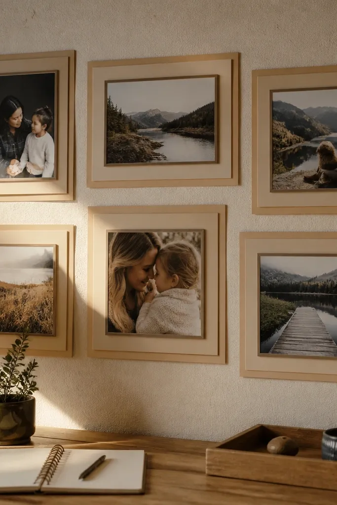
Textured washi-style wallpaper makes a collage look “collected,” like it’s been there for years instead of assembled last weekend. The secret is adding a layered mat effect on each photo so the collage has real depth. Use a pair of mats: a thin outer mat in a warm neutral and a slightly darker inner mat so the photo edges look like they’re floating behind glass. Keep the photo sizes similar — the texture does the heavy lifting. This works great for bedrooms and reading corners where you want cozy, tactile vibes.
Cover the wall with washi-style textured wallpaper and smooth out seams carefully. Cut two mat layers per photo from foam board: an outer frame layer (about 1 inch border) and an inner mat (about 1/2 inch border). Mount prints to the inner mat, then glue the inner mat to the outer frame using thin strips so it doesn’t warp. Arrange the layered frames in a staggered pattern with 3/8 inch gaps so the texture and shadows stay visible.
Lightly sand the foam board edges after cutting so the layered frames look smoother and less “cut-out.”
Don’t use glossy photos here — the texture and glare fight each other.
5. Soft dot wallpaper with a clean 4x4 staggered collage

Dots are forgiving, which makes them perfect for learning how to make a collage look deliberate. A 4x4 staggered layout keeps it interesting without losing structure. Use mostly horizontal rectangles with one or two vertical anchors so the eye moves across the dots. Choose dots in a pale tone (cream dots on light gray, or blush dots on warm white) so the collage doesn’t feel loud. This setup looks especially good in kitchens and small living areas where you want a friendly, organized wall.
Install dot wallpaper and mark a 4x4 grid using painter’s tape, then shift every other row by half a mat width for the staggered look. Cut foam board mats with consistent outer dimensions, and keep gaps at 1/4 inch between mats. Mount matte prints and press them into the inner openings so the edges stay crisp. Before gluing anything permanently, lay the full collage on the floor and measure the overall width against your wall space.
Editor's noteKeep your photo count to 16 or fewer for dot wallpaper — more pieces start to look like wallpaper is covering the photos.
Skip thisAvoid tiny photos with dot wallpaper; the dots will overwhelm them.
6. Terracotta grid wallpaper with warm-toned photo blocks
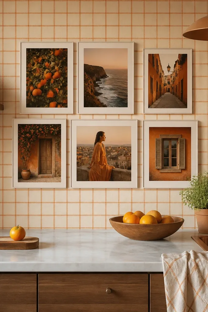
Grid wallpaper makes the collage feel architectural, and terracotta adds warmth without needing fancy frames. Use a blocky layout: 6 photos total, arranged as two rows of three, but vary the photo sizes slightly within each row. This gives you “designed” energy while still reading as tidy. Stick to warm photo tones that echo terracotta and cream (golden light, skin tones, sandy landscapes). Matte prints keep the grid from looking shiny or cheap.
Apply terracotta grid wallpaper, then mask the wall with tape where the collage will sit. Cut mats so the top row uses wider rectangles and the bottom row uses slightly taller ones, keeping overall block width consistent. Mount prints to foam board and use removable mounting tape for the first placement. Once it looks centered, press all mats down and add small corner strips of double-sided adhesive for security.
Editor's noteUse one family of photos (same color temperature) so the terracotta grid doesn’t highlight random color shifts.
Skip thisDon’t pick a wallpaper grid with thick lines if your photos are very small — the mismatch looks cramped.
7. Dark botanical wallpaper with a monochrome photo strip
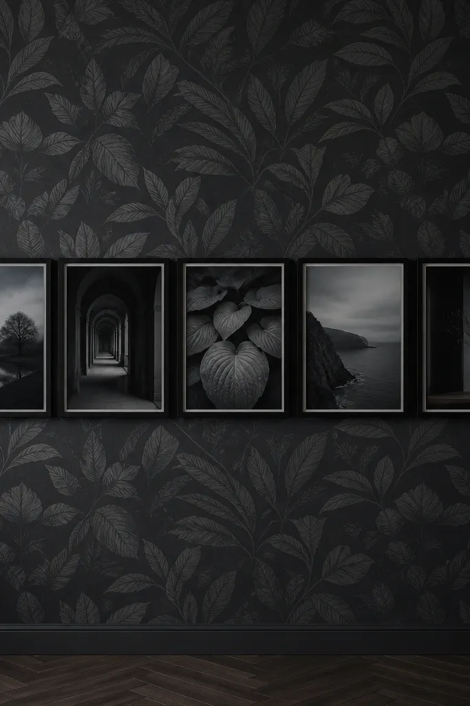
Dark botanical wallpaper looks expensive, but only if your collage stays controlled. Build a single horizontal strip of photos across the middle of the wall, then add a larger empty margin above and below so it breathes. Use monochrome photos with a cool tone (charcoal, slate gray) to match the greenery. The botanical pattern fills the space around the strip, so you don’t need many photos to make it feel like a full design. This works well above a console table, especially in rooms with dark wood or black metal accents.
Hang the botanical wallpaper and let the surface dry flat. Measure your strip area and cut mats with a consistent height but varying widths (for example, mix 5x7 and 8x10 equivalents) while keeping the top edge aligned. Mount matte prints inside the mats and place the strip centered at eye level. Use 1/2 inch gaps between mats so the dark pattern shows through and makes the strip look intentional.
Editor's noteIf the wallpaper has a repeating leaf direction, align the strip so the leaves appear to “point” toward the photos.
Skip thisAvoid scattering photos across the wall — dark botanical needs space to look stylish.
8. Marble-look wallpaper with faux-framed portrait rectangles
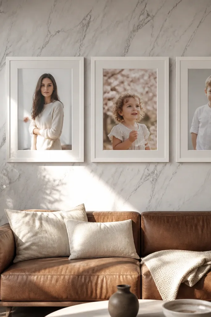
Marble-look wallpaper gives you a high-end background, and the collage looks real when the photos look like proper frames. Use portrait rectangles with identical outer mat sizes in crisp white or warm off-white. Keep the spacing even at 3/8 inch, and align the photo tops so the wall reads like a gallery display. This is a great choice for bathrooms powder rooms, and entryways because marble looks clean and the white mats keep everything bright. Matte prints help prevent glare on the marble pattern.
Install marble-look wallpaper and smooth out seams with a plastic smoother. Cut foam board mats for uniform outer sizes (for example, 10x13 outer with 7x10 inner openings). Mount prints with acid-free photo corners or archival tape so they sit flat. Arrange the mats in a 2x3 layout, then mark mounting points and press mats into place using mounting squares.
Editor's noteUse slightly thicker foam board (3/8 inch) for the frames if you want stronger shadows against the busy marble pattern.
Skip thisDon’t use dark wood frames with marble-look wallpaper unless your photos also have warm highlights.
9. Muted stripe wallpaper with a single large photo and three smalls
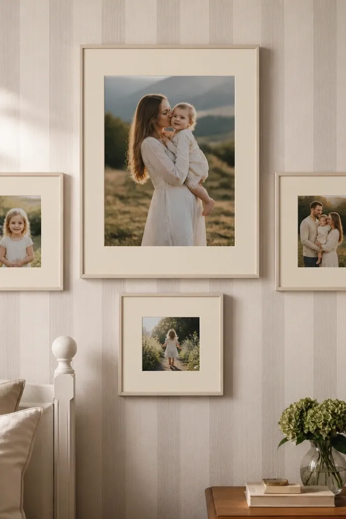
This is the easiest way to make a collage look expensive: one big hero photo plus three supporting photos. The stripe wallpaper already gives structure, so you don’t need many pieces. Place the large photo slightly above center, then tuck the three smaller mats into a triangle formation around it. Use matching mat colors — cream or soft gray — so the wallpaper and frames don’t clash. It’s a clean look for bedrooms and hallways where you want impact without visual clutter.
Hang the stripe wallpaper and locate the center of your wall. Cut one large mat (for example, 12x16 outer with 9x12 inner) and three smaller mats (8x10 outer). Mount matte prints and keep mat borders identical thickness so everything looks like one set. Arrange the three smaller photos at consistent spacing (3/8 inch) and mount the whole cluster using a level line for the hero photo top edge.
Editor's noteChoose the hero photo first — the whole collage depends on it. Keep it in the dominant color family of the wallpaper.
Skip thisAvoid using four photos with the same size — the triangle effect disappears.
10. Rainbow gradient ombre wallpaper with matching color-sliced photos
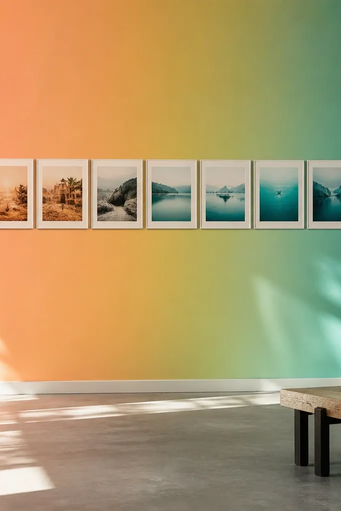
Ombre wallpaper can look like a background that belongs behind a collage, but only if your photos follow the gradient. Arrange 10 photos in a left-to-right color sweep: warm tones on one side, cool tones on the other. Use similar mat sizes so the gradient remains the star, and keep gaps tight at 1/4 inch so it reads as one composition. Matte prints are especially important because ombre backgrounds show glare. This works great in creative spaces, kids rooms, and any wall where you want a bold mood.
Apply the ombre wallpaper, then decide how many steps you want in the color sweep (10 works well). Sort your photos by dominant color and print them in a consistent ratio set (mix 4x6 and 5x7, but keep mat outer sizes consistent). Cut mats with the same border width and mount each photo flat. Arrange the mats in one long row or two staggered rows, then confirm the gradient reads correctly from a standing height.
Editor's noteIf you can, edit your photos to reduce extreme saturation so they blend into the ombre instead of fighting it.
Skip thisDon’t add black-and-white photos randomly; they break the gradient flow.
11. Vintage map wallpaper with a compass-style collage layout

Map wallpaper looks best when the collage imitates a travel diagram. Use a compass-style layout: one central square photo, plus four photos placed like the compass points around it. Add a thin border mat in a muted cream so the map text doesn’t compete with the images. Keep the central photo slightly larger so the layout feels anchored. This looks great in a home office, entryway, or a hallway where travel photos make sense and you want the wall to feel story-driven without being messy.
Hang the map wallpaper and choose a section of the wall with fewer dense words near where the collage will go. Cut a central mat (for example, 10x10 outer) and four surrounding mats (8x10 outer) with the same border thickness. Arrange them in a compass pattern, keeping 3/8 inch gaps so the map shows through between photos. Mount the center first using a level, then place the four sides one at a time to keep symmetry.
Editor's notePick one map color tone for your mat color — cream or light tan — so photos don’t look pasted over ink.
Skip thisAvoid placing the collage over the densest map labels; your photos will lose clarity.
12. Tropical leaf wallpaper with a staggered 3D shadow-box vibe
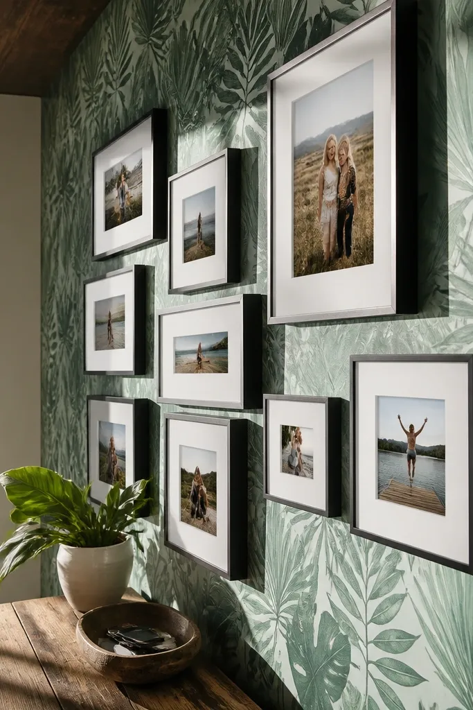
Tropical leaf wallpaper already has movement, so your collage should look dimensional. Use a staggered arrangement with some mats slightly overlapping in depth (not physically overlapping the image area, just layered boards). The “shadow-box vibe” comes from using foam board thickness and keeping the mat edges clean. Choose photos with greens, sand, or warm sky tones so they blend into the leaf colors. This setup is best for living rooms and sunrooms where natural light makes the wallpaper pop.
Install the leaf wallpaper and let it dry fully so it doesn’t ripple under your mats. Cut foam board mats in two depths: one set from 3/16-inch foam and another from 1/4-inch foam so some frames cast stronger shadows. Mount prints flat, then place thicker mats behind two or three positions in the staggered layout. Keep the horizontal gap consistent at 1/4 inch, then press everything down and add small corner anchors for stability.
Editor's noteUse a matte spray over the mounted print if your room gets bright sun — it reduces glare on leaf patterns.
Skip thisDon’t use glossy prints here — tropical wallpaper plus glare looks cheap.
13. Navy star wallpaper with a night-sky photo collage
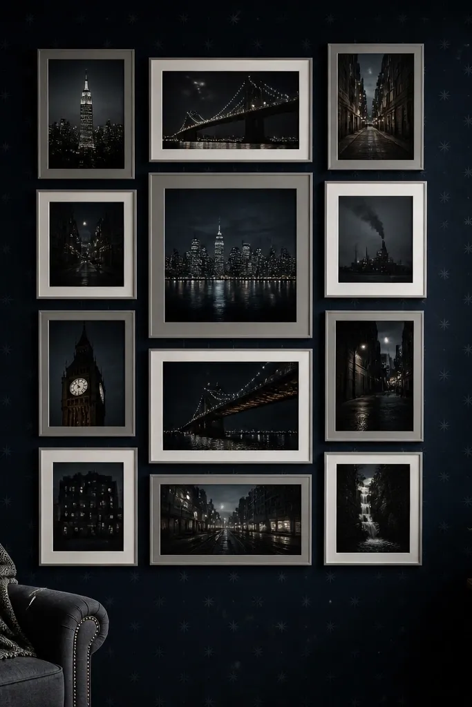
If you want the collage to look like it belongs in the wallpaper, use a night-sky concept. Navy star wallpaper gives you a dark field, so the photos should be darker and moodier. Do a 12-photo collage arranged in a loose grid: 3 columns by 4 rows, with one or two larger mats breaking the pattern. Use white or light gray mats so the photos have contrast against the navy stars. This works well in bedrooms and kids rooms, especially where you want a themed look that still feels grown-up.
Hang the star wallpaper and find a spot with consistent star density behind your collage area. Cut mats in two sizes: standard 8x10 outer and a larger 11x14 outer for the anchors. Arrange 12 mats in 3x4, keeping vertical alignment consistent by using a level line. Mount photos with matte paper and leave 3/8 inch gaps so the star wallpaper shows between frames.
Editor's noteUse mostly photos with night blues or grayscale city lights so the collage doesn’t look random on navy.
Skip thisAvoid bright daylight photos; the navy background will make them look pasted.
14. Soft gingham wallpaper with symmetrical mini-frames
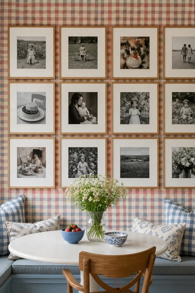
Gingham is classic, and the collage looks real when you keep it symmetrical. Use a simple 2x5 or 3x4 layout with mini frames where every mat border is identical width. Pick photos that match the gingham palette: cream, pale blue, or dusty red depending on the print. Matte photos keep the look crisp. This is a strong choice for kitchens, laundry rooms, and entryways where you want tidy charm without overcomplicating.
Apply gingham wallpaper and mark a rectangle on the wall where your frames will sit. Cut identical mats for all photos so the borders line up like a set. Arrange them in strict rows, then mount with removable adhesive squares so you can adjust before final placement. Keep gaps tight at 1/4 inch for a polished grid look, and use a straightedge to ensure every row stays level.
Editor's noteIf your wallpaper has a directional pattern, align the gingham squares so the collage edges land on full squares.
Skip thisDon’t use uneven mat borders — gingham will expose every inconsistency.
15. Textured linen wallpaper with one vertical gallery ladder
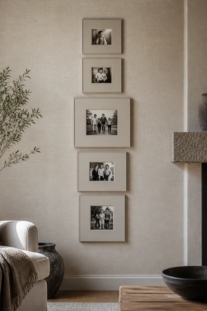
Linen-textured wallpaper gives you a calm, high-end background. The collage looks most believable when you build a vertical ladder: one column of photos that increases slightly in size toward the middle. Keep mat borders consistent and use a neutral mat color that matches the linen tone. This approach avoids the “random sticker wall” problem because the ladder creates a single path for your eye. Great for stairways, narrow hall walls, and spaces where you want a clean, modern gallery feel.
Hang the linen wallpaper and smooth seams. Cut mats in three sizes so the middle photo is about 2 inches larger in height than the top and bottom ones. Lay them out like a ladder, then transfer the positions to the wall using tape and a level. Mount the top photo first, then work down so spacing stays even at 3/8 inch between mats. Finish by sealing the edges and corners so the mounted prints don’t loosen.
Editor's noteUse a thin white mat if your linen wallpaper is warm beige; it keeps the photos from blending into the texture.
Skip thisAvoid mixing too many photo orientations — the ladder look fails if everything is rotated.
16. Geometric terrazzo wallpaper with a mixed-size collage that still lines up
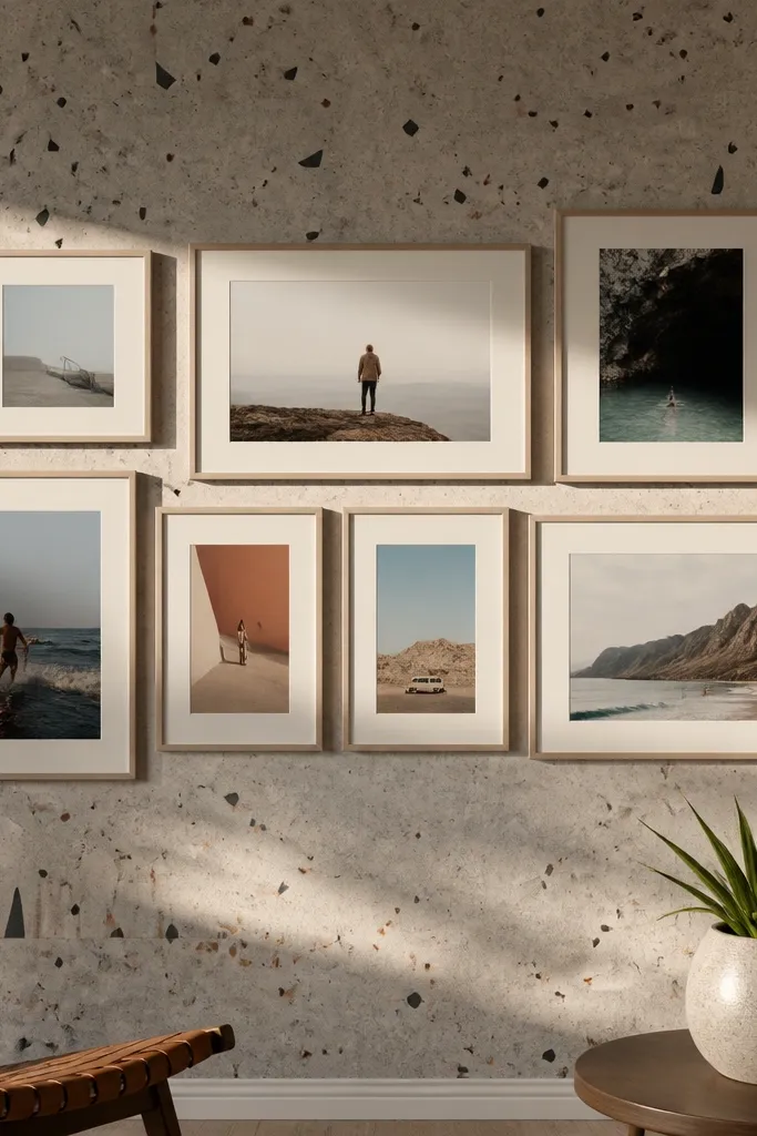
Terrazzo wallpaper is busy, so your collage needs straight edges and consistent alignment to look real. Make a mixed-size collage but keep all mat tops aligned in each row. Use a 2-row layout with 7 photos total: three in the top row, four in the bottom, with different widths but the same mat height per row. Choose mat colors in white or light gray so the terrazzo speckles don’t compete with the photos. This is a great pick for modern apartments and home gyms where you want energy without chaos.
Install the terrazzo wallpaper and pick the most visually calm area for the collage block. Cut mats so the top row uses one mat height and the bottom row uses a second mat height; keep the outer mat border thickness identical. Arrange photos on the floor and align all top edges within each row using a ruler. Mount by row: place the top row first, then add the bottom row with 1/4 inch gaps so the terrazzo pattern stays visible.
Editor's noteIf your wallpaper has big speckles, keep your photos mostly grayscale or muted to avoid color collisions.
Skip thisDon’t use freeform placement on terrazzo — it looks like a mistake.
17. Art deco wallpaper with a stepped collage frame
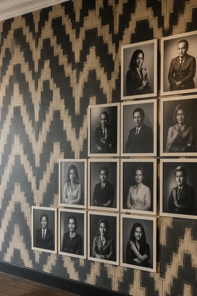
Art deco wallpaper has strong shapes, so a stepped collage layout makes the whole wall look designed. Use a staircase pattern: two columns of photos where each next row steps up by one mat width. Mat borders should be crisp and thin, like 1/2 inch, in a warm cream or black depending on your wallpaper. Keep photos in tones that match the deco palette — gold, black, cream, or muted teal. This looks amazing in a foyer or dining area where you want a statement wall that still feels tidy.
Hang the art deco wallpaper and find a section where the big shapes don’t get cut awkwardly by seams. Cut mats in one consistent size, then arrange them into a stepped pattern that follows the wallpaper’s geometry. Use painter’s tape to outline the staircase footprint on the wall before mounting. Mount in order from the lowest step upward so your edges stay straight, keeping 3/8 inch gaps between mats.
Editor's noteUse a matte black mat only if your wallpaper background is light — otherwise the photos disappear.
Skip thisAvoid chunky thick borders with art deco patterns; it makes the collage look heavy.
18. Monochrome floral wallpaper with a circle-and-square mix
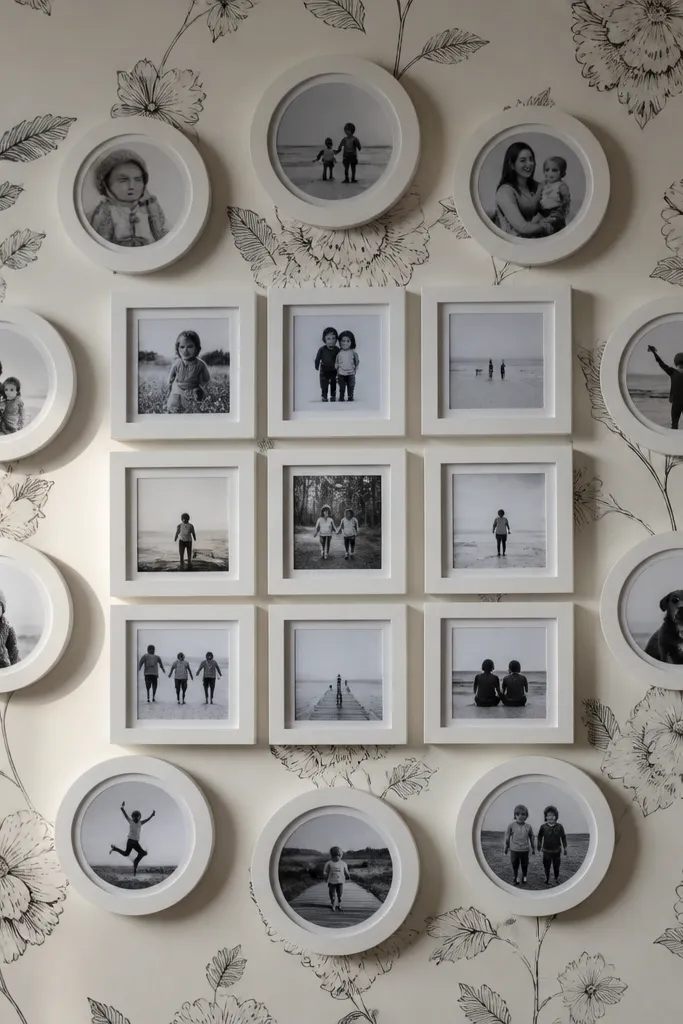
Circle frames add softness, and monochrome floral keeps it from looking childish. Mix circles and squares in a controlled way: circles on the outer ring, squares in the center. Use thick foam board mats so the circular edges cast a noticeable shadow. The wallpaper pattern stays black-and-white too, so the collage reads as one graphic system. This is a great choice for bathrooms and bedrooms because the palette feels calm and the shapes look intentional.
Install the monochrome floral wallpaper and mark a center point on the wall. Cut square mats (for example, 8x10 outer) and circle mats using a compass cutter or circle template (for example, 6-inch outer diameter). Mount photos into each mat and arrange them in a ring around the center square, with 3/8 inch gaps. Press all mats down and check symmetry from across the room before you add permanent adhesive.
Editor's noteCut circles slightly oversized and sand the edges so they don’t look jagged against the floral print.
Skip thisDon’t overdo circles; more than 5 circles in a small collage makes it look like random cutouts.
19. Chocolate brown woodgrain wallpaper with bright photo pops
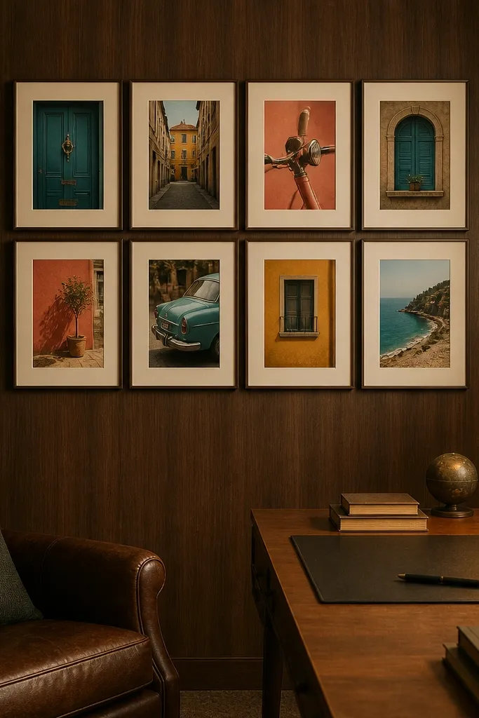
Woodgrain wallpaper gives a warm, grounded background, and the collage looks real when your photos add color contrast. Use a compact cluster of 8 photos arranged in a 4x2 block, with consistent mat borders in cream. Choose photos that have one strong accent color (teal, mustard, or coral) so the collage looks styled rather than random. Matte prints keep the woodgrain from getting shiny. This is a great choice for living rooms with neutral furniture because the wallpaper adds depth without needing real wood.
Apply woodgrain wallpaper and let it dry flat. Cut cream mats with identical outer size for all photos, then mount matte prints that have a consistent accent color theme. Arrange the mats in a 4x2 block centered on your wall, keeping 1/4 inch gaps. Use removable mounting squares for placement, then add a thin strip of double-sided tape along each mat edge for a clean finish.
Editor's notePick one accent color and stick to it across all photos; woodgrain makes every color difference more obvious.
Skip thisAvoid using all-white or all-gray photos; the woodgrain will swallow them.
20. Soft watercolor wash wallpaper with a loose collage scatter on a grid
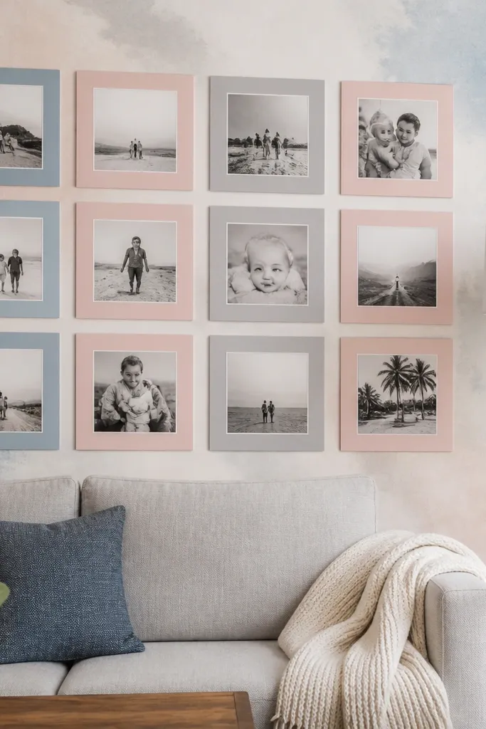
Watercolor wash wallpaper looks dreamy, but it can make a collage look messy unless you anchor it to a grid. The solution is a loose scatter where every photo still lines up to grid reference points. Use 12 photos with alternating sizes, but keep the left edges aligned within each column. Mat colors should match the wash palette — blush, sage, or warm white. This is best for bedrooms and cozy reading spaces where you want soft visual movement without losing order.
Hang the watercolor wash wallpaper and draw a light grid on the wall with pencil and a ruler (you’ll cover it with mats). Cut mats in two or three sizes, but keep border thickness the same. Place photos so each mat sits on a grid intersection, then keep gaps consistent at 3/8 inch. Mount using removable tape first, then commit with mounting squares once the scatter looks balanced.
Editor's noteUse a matte photo finish so the watercolor background stays soft instead of reflecting light.
Skip thisDon’t rotate mats randomly — watercolor already has organic shapes, so rotations look like mistakes.
21. Crisp black wallpaper with white mat gallery and negative space
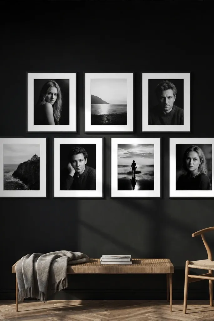
Black wallpaper turns a collage into a graphic design piece. The look is real when you leave negative space around the photos so the wall doesn’t feel crowded. Use 6 to 9 photos in a clean rectangle block, all with white mats and consistent spacing. Keep your photos high contrast — black-and-white portraits or scenes with strong light-dark. Matte prints prevent glare, and the white mats create that “framed gallery” feel. This works in modern living rooms, offices, and any space with black decor accents.
Apply the black wallpaper carefully and smooth seams because any bumps show up fast. Cut white foam board mats with the same border thickness and mount matte prints inside. Arrange the mats in a rectangle block (for example, 3x3 with one gap if you want breathing room) and keep gaps at 1/2 inch. Mount the top row first, then use a level line for each subsequent row so the whole block stays straight.
Editor's noteIf your wallpaper has a slight texture, use slightly thicker foam board (1/4 inch) for stronger shadow separation.
Skip thisAvoid adding too many photos — black wallpaper punishes dense layouts.
22. Soft terracotta tile look wallpaper with a simple 5-photo L-shape
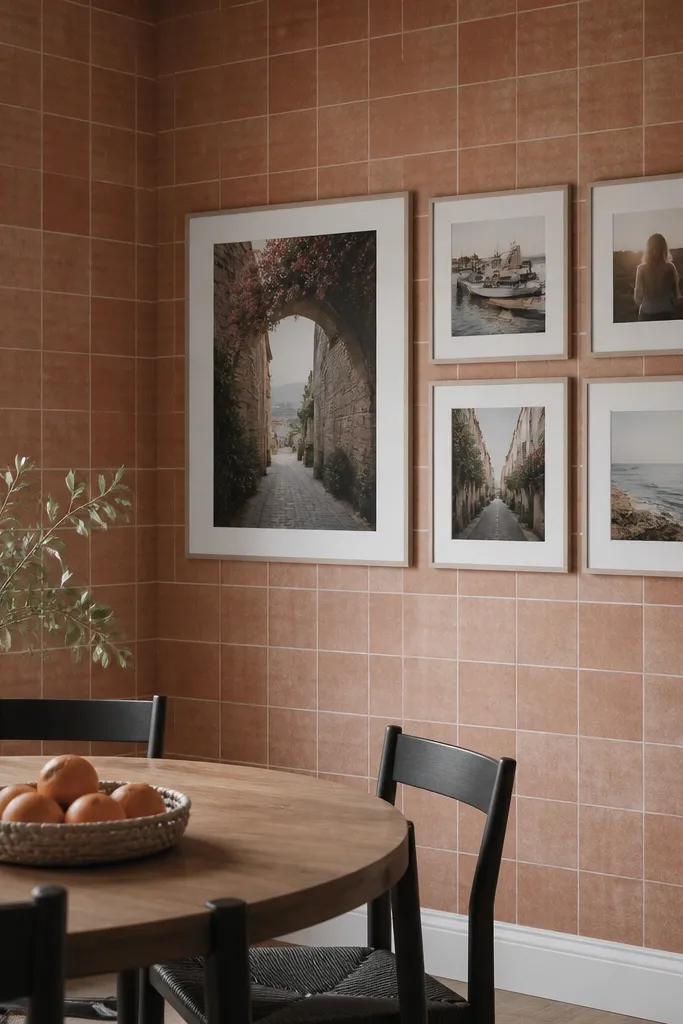
Tile-look wallpaper is visually grid-like, so a simple L-shape collage looks intentional and architectural. Use five photos: one large photo at the corner of the L, then four smaller photos extending outward. This layout is forgiving if your wall has tricky edges or angles because the L-shape still reads as one composition. Choose mats in warm cream so the collage matches the tile look. This setup is great for kitchens, laundry rooms, and entryways where tile patterns already feel “structured.”
Install the tile-look wallpaper and locate a clean seam area where your L-shape will sit. Cut mats so the corner mat is about 2 inches taller than the others, keeping the same border thickness across all mats. Arrange the five mats on the wall so the L edges are perfectly straight, using painter’s tape as a guide. Keep gaps at 3/8 inch so the tile pattern shows through and makes the collage look like it’s integrated.
Editor's noteUse a single print size ratio family (like all 4x6 and 5x7 equivalents) so the L-shape feels cohesive.
Skip thisDon’t let the L-shape drift — check alignment against the wallpaper tile lines.
23. Pastel striped wallpaper with a diagonal photo ribbon
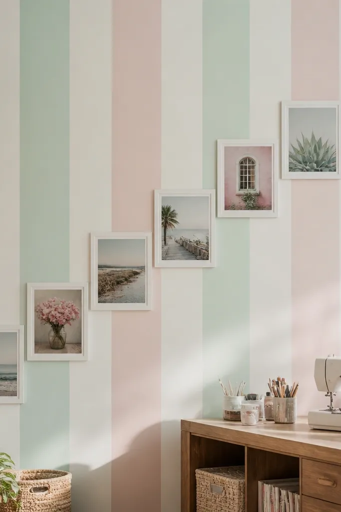
A diagonal ribbon turns a collage into motion, and stripes make that motion look planned. Use 7 photos in a single diagonal band that runs from lower left to upper right. Keep mat sizes consistent so the diagonal reads as one ribbon, not a random tilt. Pick photos with soft pastel tones that echo the stripes. Matte prints keep everything grounded against the pattern. This is a fun option for kids rooms and creative studios where you want energy without losing structure.
Apply pastel striped wallpaper and pick a wall area with enough width for the diagonal ribbon. Cut seven identical mats in one size, then mount matte prints. Use painter’s tape to create a diagonal guideline at the angle you want, and place the top and bottom mats first. Fill in the middle mats along the tape line with 1/4 inch gaps, then mount permanently in order so the ribbon stays smooth.
Choose an angle that matches the composition lines of your room — a diagonal that’s too steep looks like it’s falling.
Avoid mixing mat sizes in a diagonal ribbon; it makes the tilt look accidental.
24. Soft geometric wave wallpaper with a horizontal row of long frames
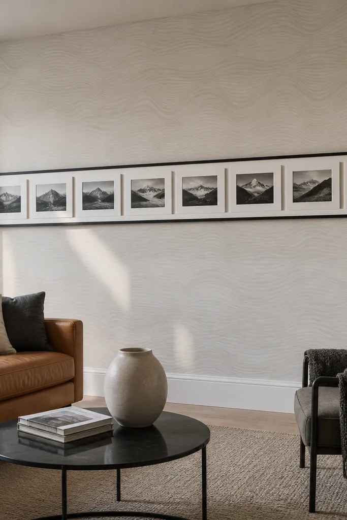
Wave wallpaper creates movement, and a row of long horizontal frames turns that movement into a clean design line. This collage looks real because the photos align into a single long band, so you get cohesion even with different photo images. Use 8 to 10 photos in one row (or two tight rows) with consistent mat height. Choose photos with light midtones so they don’t disappear into the wave pattern. Great for hallways, above sofas, or along a dining room wall where you want a calm, continuous look.
Hang the wave wallpaper and mark a horizontal line at your preferred height. Cut mats for all photos with the same outer height and border thickness, and mount matte prints. Arrange 8 to 10 mats along the line with 3/8 inch gaps so the wallpaper waves show between frames. When it looks straight from across the room, mount each mat using mounting squares and check the whole row with a level one last time.
Editor's noteIf your wave wallpaper has repeating crests, align the row so the crests run behind the gaps between mats.
Skip thisDon’t stack the collage in a tall column with wave wallpaper — it fights the wave rhythm.
25. Antique ledger wallpaper with a tight typography-like photo stack
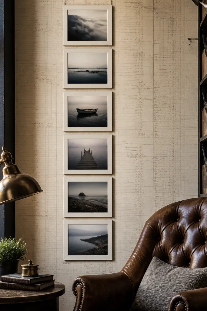
Ledger-style wallpaper has text density, so your collage needs to behave like typography: tight, aligned, and limited in sizes. Use a vertical stack of 6 photos with consistent left edges and small gaps, so the collage reads like a designed block instead of covering important text. Mat color should be off-white so photos stay readable. Choose photos with warm neutrals or sepia tones that match the paper feel. This is ideal for home offices and reading corners where you want a “paper archive” vibe.
Apply the ledger wallpaper and find an area where the text isn’t too dense behind where you’ll place photos. Cut mats in one consistent outer size (or two sizes max) and mount matte prints. Arrange the photos in a single vertical column with 1/4 inch gaps, aligning left edges using a ruler. Mount the bottom mat first, then add upward so the stack stays straight; seal edges lightly with matte medium.
Use one photo orientation family (mostly horizontal or mostly vertical) so the stack looks like a block of print.
Don’t place photos over the darkest ink sections — the contrast makes the collage look flat.



