
1. Victorian Tea Party Dress Set
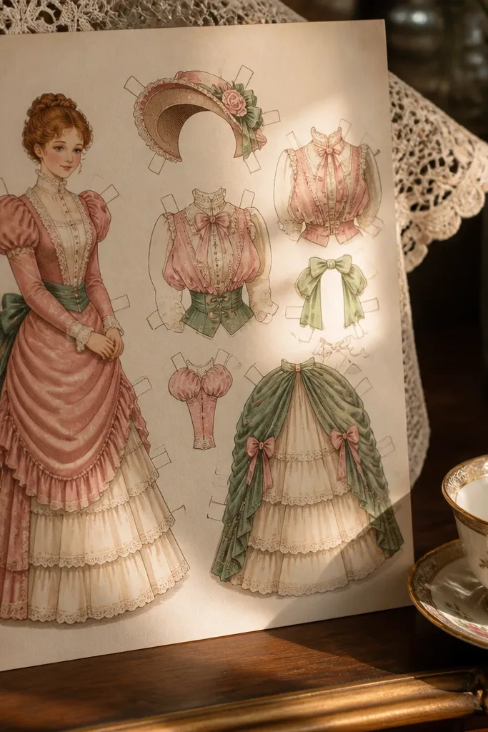
This set is built for calm, slow coloring because the outfit has big, readable shapes: a high collar, puffed sleeves, and a layered skirt that fills the page nicely. The bonnet adds a curved silhouette that looks great with soft shading and warm colors like rose, cream, and sage. It also works as decor after you finish since the dress reads clearly even from a distance. Plan on coloring for a single sitting because the outfit pieces are separated and easy to place without fiddling.
Editor's noteUse a white gel pen to add tiny lace highlights on the collar and sleeve edges.
Start by printing on 8.5x11 paper and check the margins so the bonnet doesn’t get cut off. Color the dress first with light base tones, then add darker folds along the skirt pleats and sleeve seams. Finally, color the bonnet ribbon and small lace details, then cut only the clothing pieces if your template includes cut lines.
Skip thisDon’t use thin gray outlines that force you to retrace details with darker ink.
2. Modern Denim and Striped Top
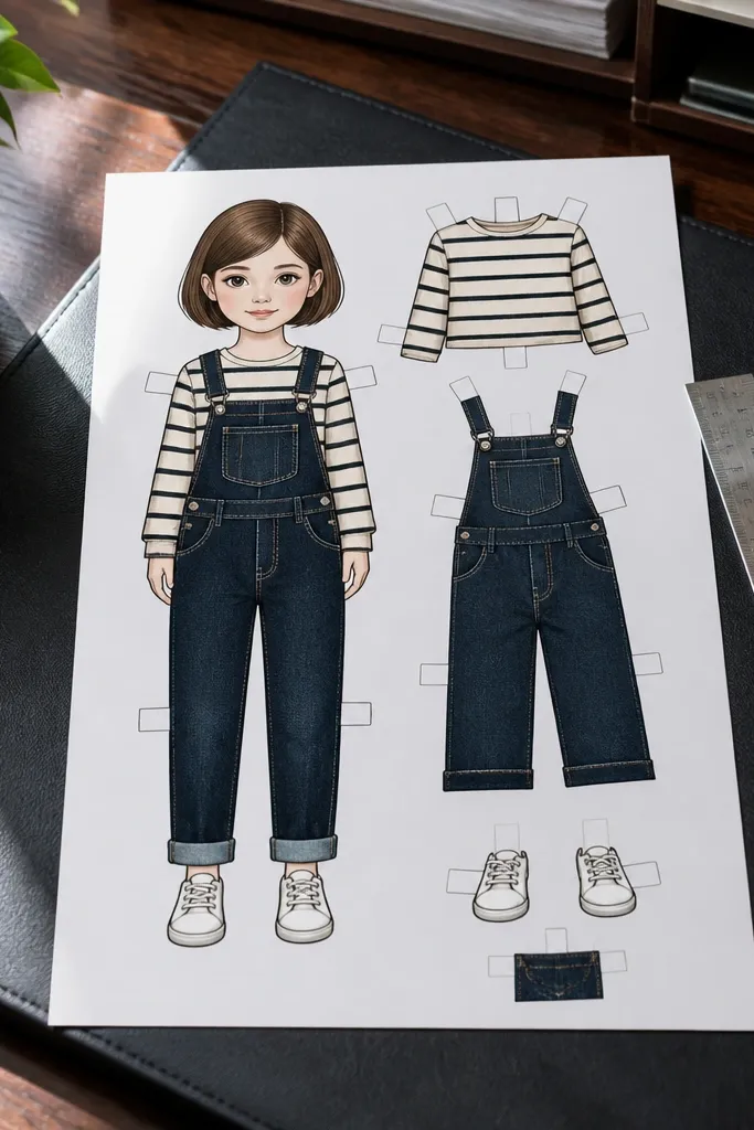
If you want quiet time that still looks crisp, this look is the one. Denim and stripes create strong color blocks that stay photogenic even when you color fast. The overalls have defined panels, so you can color each section without worrying about tiny accessories getting lost. It’s also forgiving for beginners because the shapes guide you. After coloring, it looks good taped to a wall or placed in a frame because the outfit reads instantly.
Editor's noteColor stripes with a ruler-guided light pressure so the lines stay even.
Print the template and color the shirt stripes first using two marker colors that contrast (like navy and white). Then color the denim panels with a darker blue base and add lighter highlights along seams. Finish by coloring the overall straps and pocket shapes, then cut out the clothing pieces along the provided lines.
Skip thisAvoid overloading the page with too many colors in the denim — pick two blue tones plus one accent.
3. Garden Floral Wrap Dress
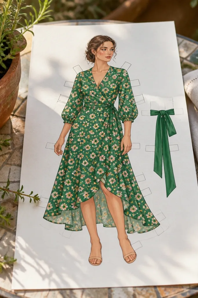
Wrap dresses are relaxing because the design gives you two main areas to color: the skirt wrap and the bodice folds. Floral patterns look gorgeous when you keep them simple — small repeated blossoms, not dense micro-print. The ribbon belt gives you an obvious spot for a pop color that photographs well. This template is ideal for evenings when your brain wants something pretty but not complicated.
Editor's noteUse colored pencils for the flowers so each blossom stays clean without bleeding.
Start by coloring the wrap bodice in one solid tone, then add a darker shade where the fabric overlaps. Next, color the skirt with a base color and then add blossoms in a limited palette (for example, pink and yellow on green). Finally, color the ribbon belt and small bow details, then cut and place the dress pieces if the template separates them.
Skip thisDon’t try to color every tiny leaf detail if your goal is a finished session.
4. Space Explorer Suit
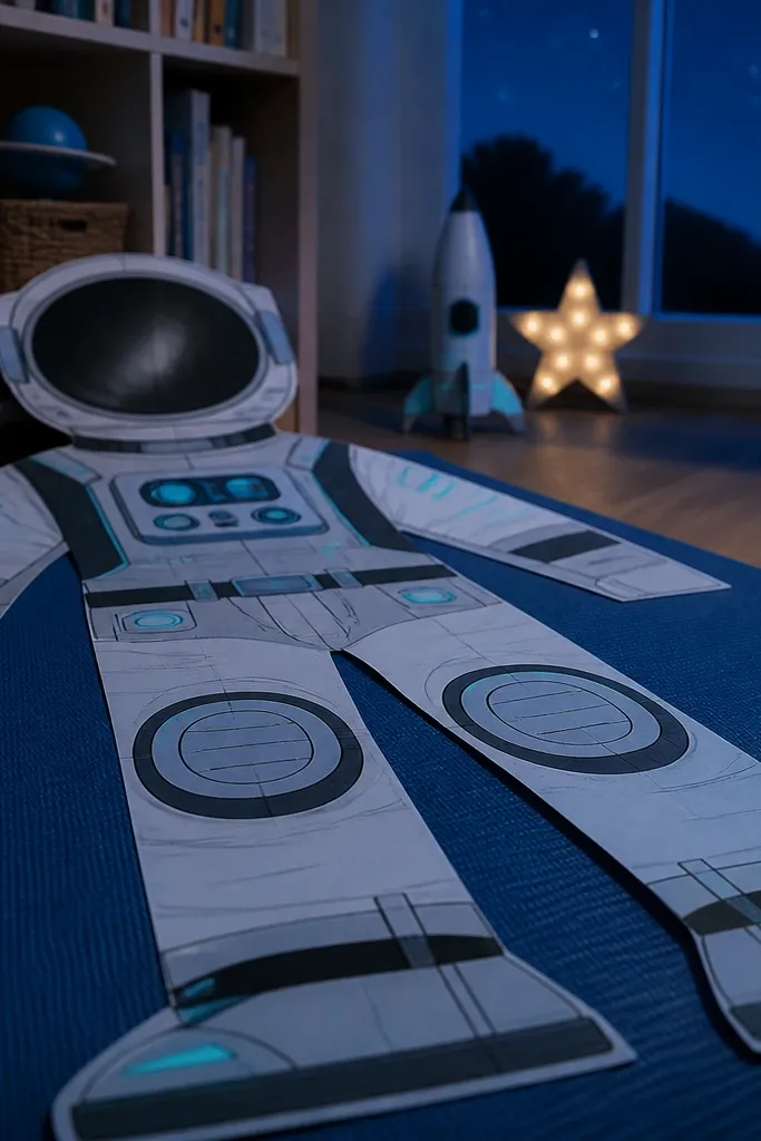
This one looks fun and still works for quiet time because the suit has large surfaces you can shade gradually. The helmet and chest panel create clear sections for color gradients and small “control” accents. You get instant visual interest without needing fine line drawing. It’s also great if you want to color with metallic-look colors using gel pens or glitter markers on the panel details.
Editor's noteAdd a thin silver gel pen line around the helmet edge for a “glass” effect.
Print and color the suit base first, using one main color for the body and a second for gloves and boots. Then shade the helmet with a light-to-dark gradient following the curve of the visor. Finally, color the chest panel buttons and stripes, then cut out the suit pieces along the template lines.
Skip thisAvoid coloring the smallest panel buttons with heavy marker — use a fine tip pen instead.
5. Cozy Cable-Knit Sweater Outfit
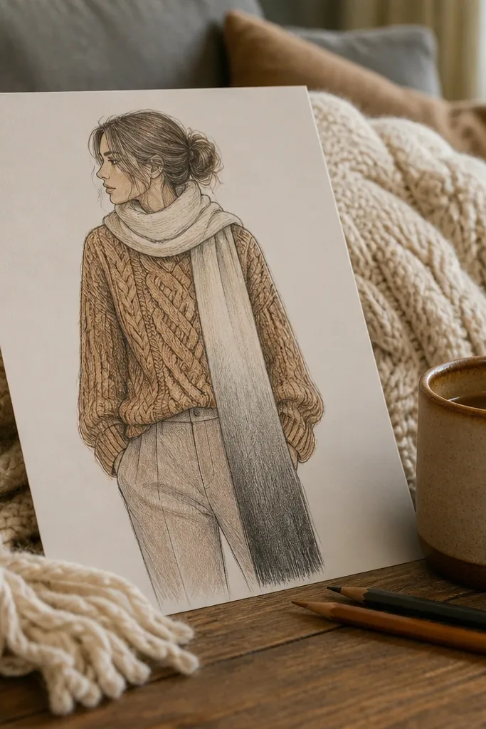
Cable knit textures look amazing on paper because they create natural lines for shading. This template gives you those texture cues in the sweater, plus a scarf that creates a long, satisfying coloring area. You can keep it cozy with warm neutrals like cream, caramel, and charcoal. It’s also a great choice if you like using colored pencils since the knit pattern holds up to light layering. The final look stays neat because the outfit isn’t overloaded with tiny accessories.
Start by coloring the pants first with a flat tone so the sweater becomes the focus. Then color the sweater base and use a darker pencil to fill only the knit channel lines. Finish by coloring the scarf stripes or solid wrap, then cut out the sweater and scarf pieces if included.
Press lighter on the knit ridges and heavier in the grooves to make it look dimensional.
Don’t use one flat color everywhere in the sweater — knit needs contrast.
6. Art Studio Smock and Paint Supplies
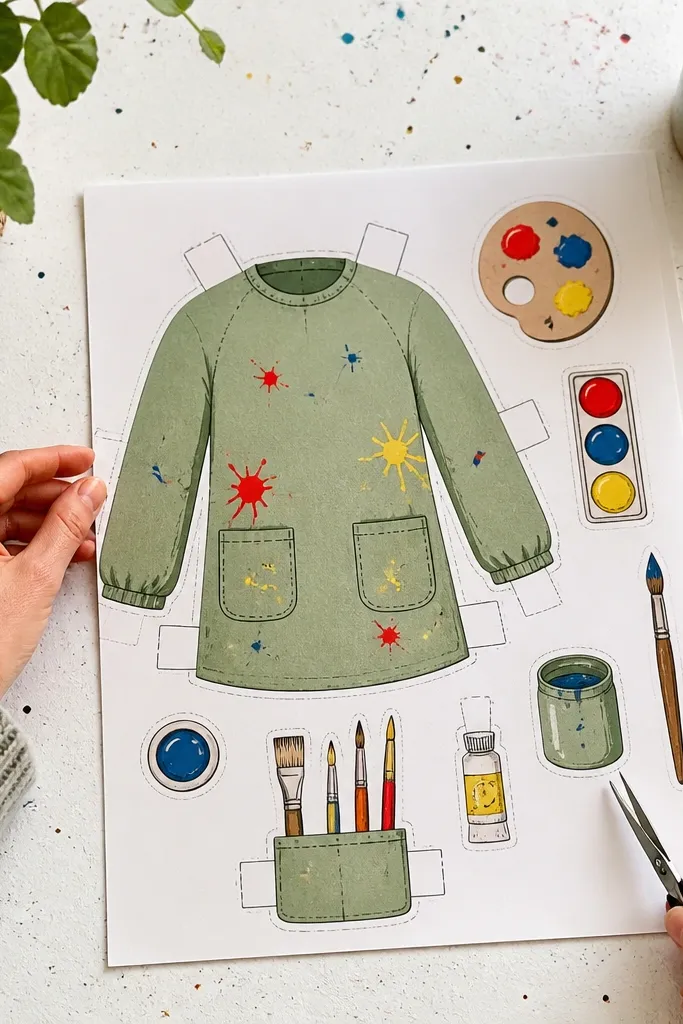
This set is made for people who want their coloring to feel like a mini craft moment. The smock has roomy panels that are easy to color in big strokes, and the paint accessories give you extra fun without making the page messy. You can keep it aesthetic by choosing one smock color and using bright paint dots in a tight palette. It’s also a good option for kids because the shapes are forgiving.
Editor's noteUse a white gel pen dot pattern to make paint splatters look glossy.
Print and color the smock panels first, leaving a few white highlights if you want a “fabric” look. Then color the paint palette shapes with 3-4 bright colors and add small dots on the smock where paint would land. Finally, color any apron straps or cuffs, then cut the clothing pieces along the lines provided.
Skip thisAvoid using too many paint colors on the smock — stick to 3-4.
7. Classic Ballet Tutu and Wrap Shoes
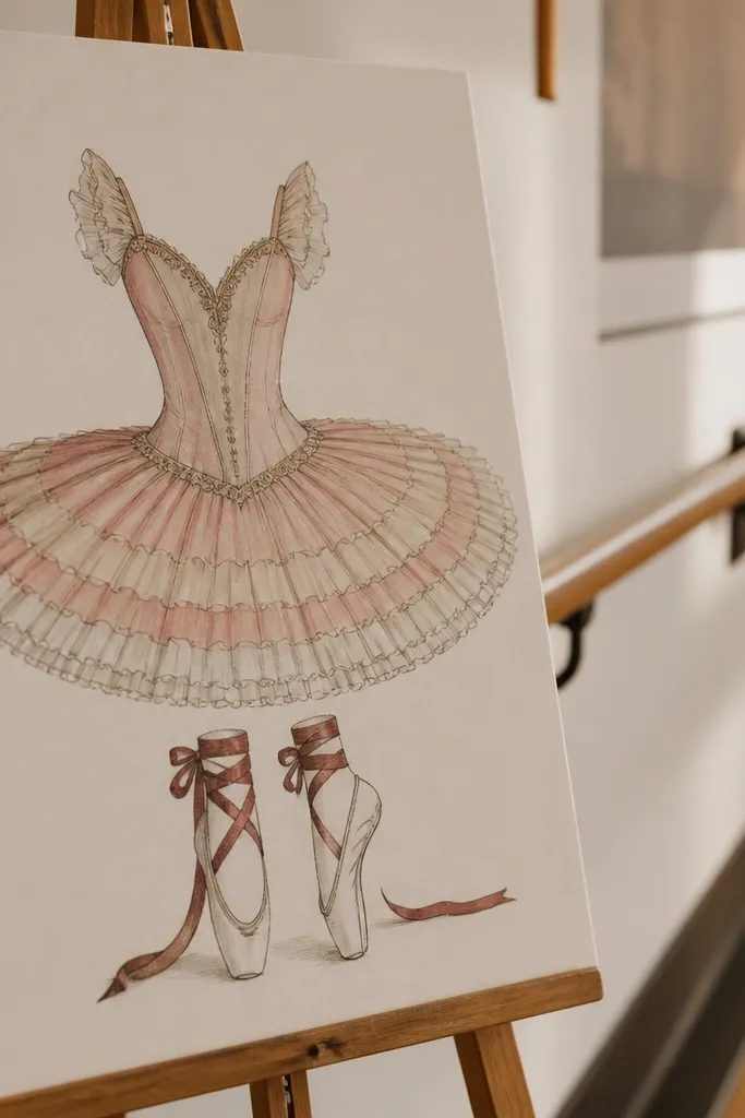
Ballet outfits are photogenic because they have lots of movement lines even on a flat page. The tutu has repeated layers that are perfect for soft shading and alternating light/dark tones. Ribbons add thin details that look clean with gel pens. This template also makes quiet time feel special because you get a clear “finished costume” at the end, not just a partially colored page.
Editor's noteUse a light pink or lavender base for the tutu, then add one darker shade only where folds overlap.
Start by coloring the leotard with one base color, then shade under the arms and neckline with a slightly darker tone. Next, color each tutu layer in alternating shades so the layers read clearly. Finish by coloring ribbons and slippers, then cut the tutu and accessory pieces if the template separates them.
Skip thisDon’t outline every ribbon fold with a heavy marker; use a pen for thin detail.
8. Beach Day Striped Shirt and Shorts
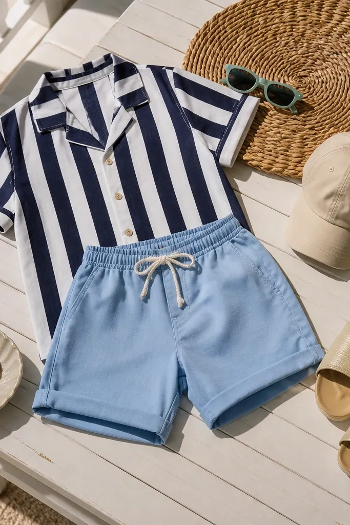
This look is a fast win. Stripes create a clean rhythm, and the shirt shape gives you a large area to color without getting stuck on tiny patterns. Shorts and simple accessories keep the page from turning into a detailed coloring marathon. It’s perfect for a short quiet time window because you can finish the outfit in one session and it still looks bright and styled.
Editor's noteColor stripes with a consistent angle and keep pressure light so the paper doesn’t warp.
Print and color the shirt stripes first, choosing two colors that contrast strongly. Then color the shorts with one solid tone and add a darker shade along the seams. Finish with small accessories like belt or waistband details if included, then cut out the clothing pieces along the template lines.
Skip thisAvoid over-saturating the stripes; heavy marker can bleed through thin paper.
9. Autumn Scarf and Plaid Coat
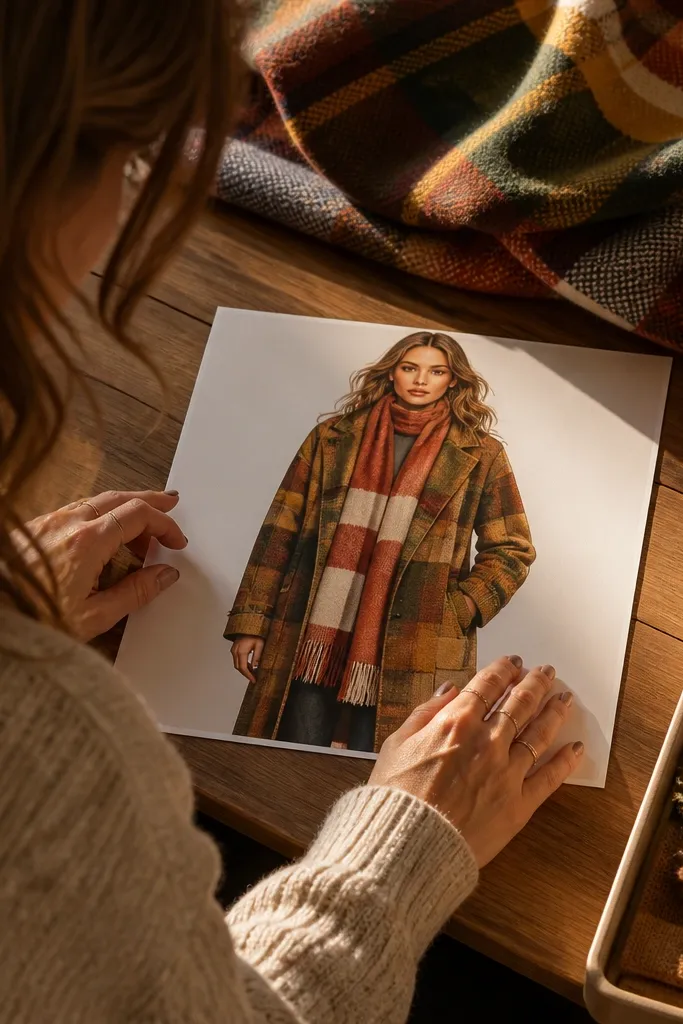
Plaid is the calmest kind of chaos if the template is designed with clear grid lines. This coat gives you big plaid sections that let you practice color planning without needing tiny brushwork. The scarf adds a long vertical coloring area that makes the whole outfit look finished. Choose warm tones like rust, mustard, and deep green for the most photogenic result.
Start by coloring the coat base color and then add plaid lines with a darker shade following the template’s grid. Next, color the scarf in a contrasting tone and add one or two stripe accents. Finally, color buttons and collar edges, then cut the coat and scarf pieces along the lines.
Use colored pencils for plaid so you can erase and correct light mistakes with minimal mess.
Don’t try to freehand plaid — follow the drawn grid or it will look messy fast.
10. Royal Cape and Crown Set
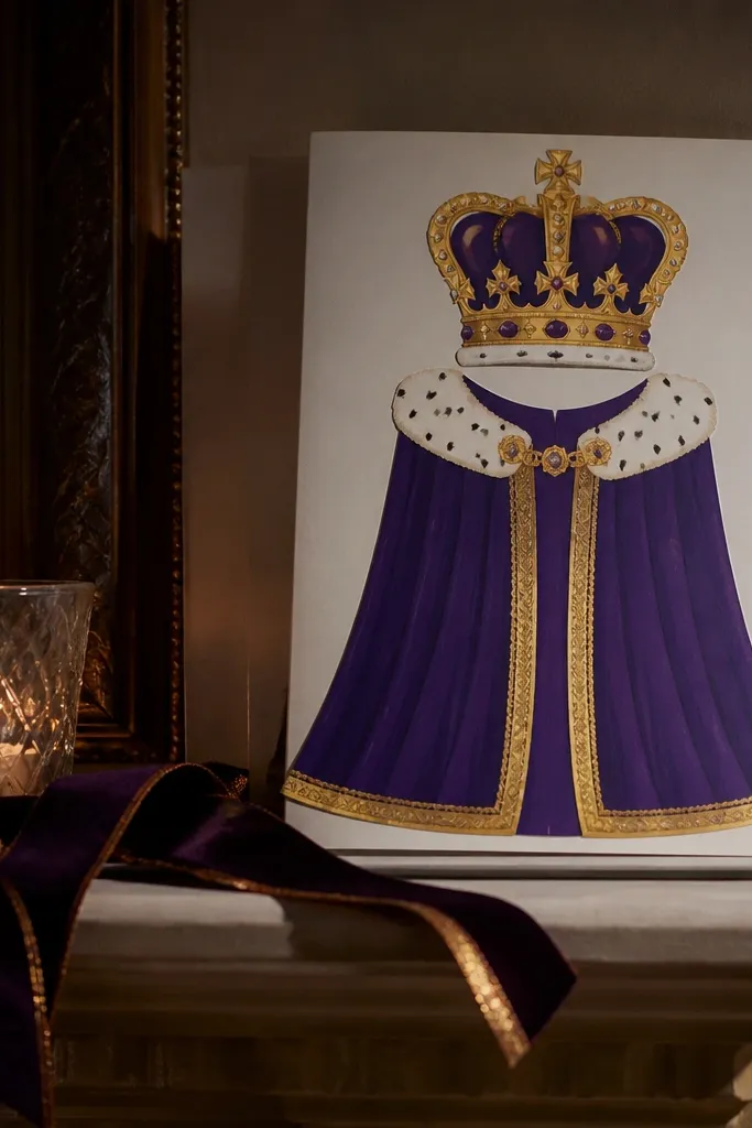
Capes are a cheat code for aesthetic coloring. The sweeping shape gives you a dramatic silhouette and large fabric areas that look great with gradients. The crown adds small high-contrast details that make the final piece feel like a complete character. If you like using metallic colors, this is where they look intentional rather than random. It also works well for framing because the cape reads clearly even when viewed from a distance.
Print and color the cape base, then add a darker shade near the fold lines for instant depth. Next, color the crown with a metallic-like pen or pencil and add small highlight lines on edges. Finish by coloring the outfit underneath in a calmer tone so the cape stands out, then cut out the cape and crown pieces.
Make a simple two-tone gradient by blending with light pencil strokes from top to bottom.
Avoid using bright neon colors on the cape — it kills the regal look.
11. Monochrome Suit with Tie
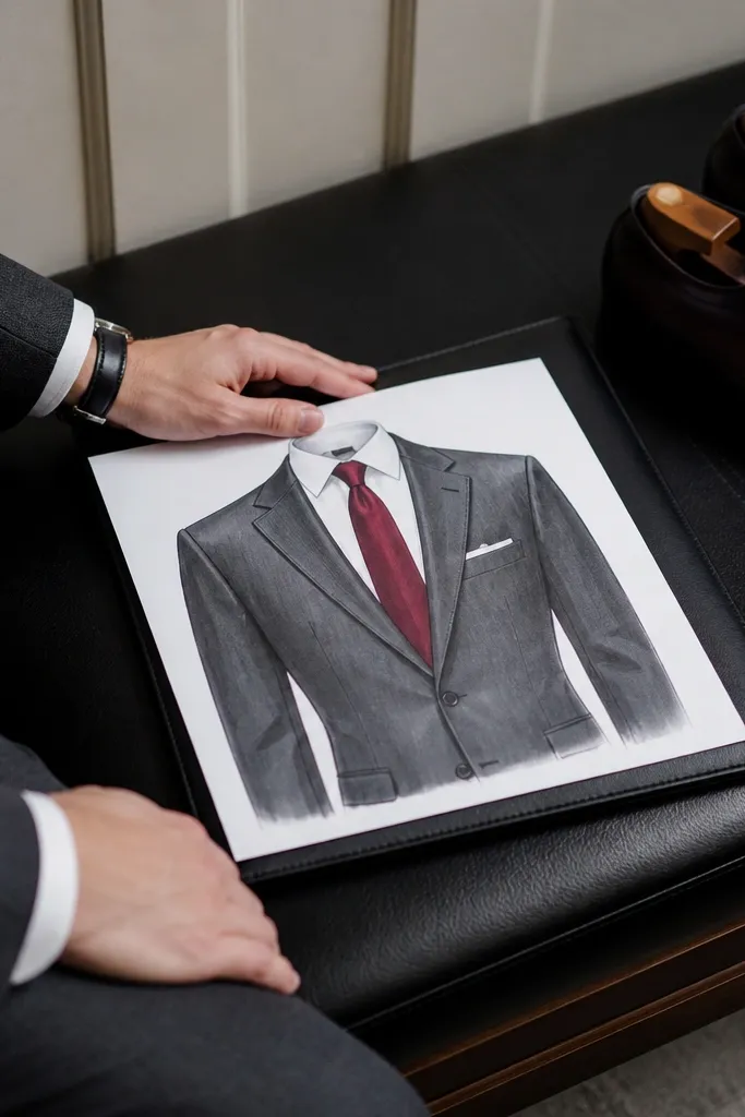
This template is for quiet time when you want something classy and controlled. Monochrome suits photograph sharply because the shapes are clean and the contrast comes from folds and tie patterns. You can color the suit with charcoal or navy and then pick one accent color for the tie. It’s also great for practicing shading: collar, lapels, and pant creases give you natural places to add darker tones.
Start by coloring the suit with one dark base and add a slightly lighter tone on the chest and shoulder highlights. Then color the tie with a pattern — small dots or stripes look best — using one accent color. Finish by coloring the shirt collar and shoe soles, then cut the outfit pieces if your template separates them.
Use a blunt colored pencil edge to shade lapels smoothly without harsh lines.
Don’t leave the tie the same color as the suit; pick a clear accent.
12. Sweet Kitchen Apron and Oven Mitts
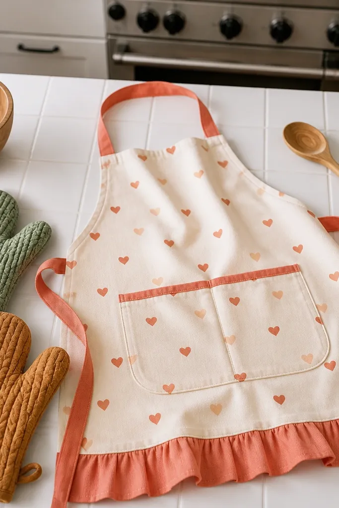
Kitchen outfits are adorable and practical for quiet time because they include simple, chunky shapes. The apron has a big front panel that’s easy to color, and the oven mitts give you two extra areas for texture or pattern. Add tiny motifs like hearts or tiny checks to make it photogenic without making the page too busy. This is a great pick for home decor photos because it looks cozy on printed paper.
Editor's noteColor the apron straps with a lighter shade so the pocket panel pops.
Print and color the apron base first, then add a pattern to the front panel using one or two colors. Next, color the oven mitts with a contrasting tone and add seam lines with a darker shade. Finish by coloring straps and any pocket details, then cut the apron and mitts along the template lines.
Skip thisAvoid tiny micro-patterns; big checks or hearts look cleaner.
13. Snow Day Puffer Jacket and Beanie
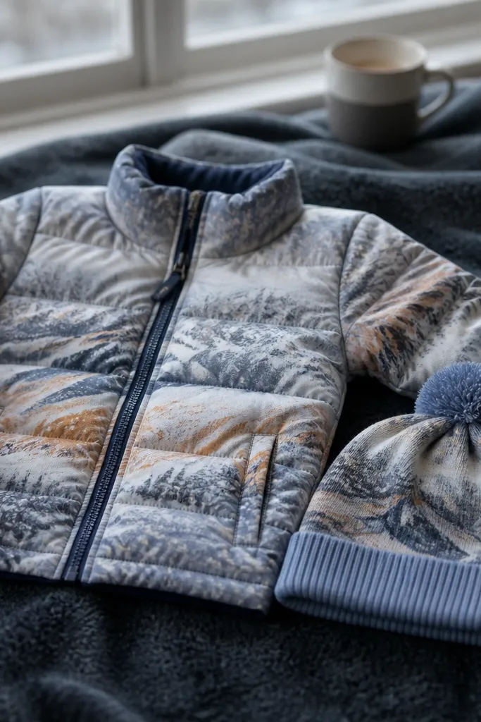
Puffer jackets look great because the quilting lines give your coloring structure. This template lets you color in neat sections that still feel warm and dimensional. The beanie adds a soft curve and a place for a cuff stripe, which helps the outfit look finished even with minimal coloring. Pick blues, grays, or deep teal for a snowy look, or go bold with red for a “holiday card” vibe.
Start by coloring the jacket base, then shade each quilt panel with a darker tone along the stitched lines. Next, color the beanie with a solid base and add a cuff stripe at the bottom. Finally, color gloves or boots if included, then cut out the jacket and hat pieces along the lines.
Use a light gray or pale blue for highlights on the quilt edges to make it look puffy.
Don’t color puffer panels in random colors — keep to 2-3 tones.
14. Boho Maxi Skirt and Tassel Top
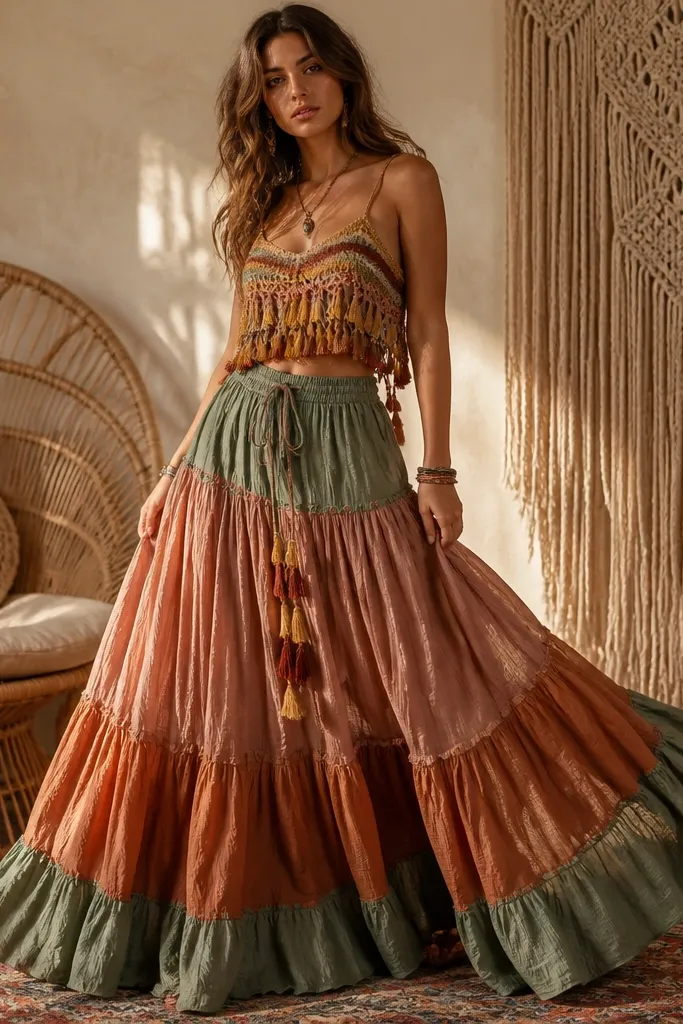
Boho outfits are visually rewarding because you get movement lines and texture cues. The maxi skirt has flowing sections that look great with layered shading, while the tassels give you a fun detail to color with quick strokes. This template is photogenic because the skirt dominates the page and reads clearly. It’s also forgiving for beginners since the pattern is spread out instead of concentrated in tiny areas.
Editor's noteColor tassels with a repeating light-to-dark pattern so they look intentional, not random.
Print and color the top first in a warm tone, then add darker shading around the neckline and sleeve edges. Next, color the maxi skirt with a base tone and then add a second shade to create fold depth across the fabric sections. Finish by coloring tassels and any belt accents, then cut the skirt and top pieces along the template lines.
Skip thisAvoid filling the skirt with too many tiny patterns; let the fabric folds do the work.
15. Night Garden Moon Dress
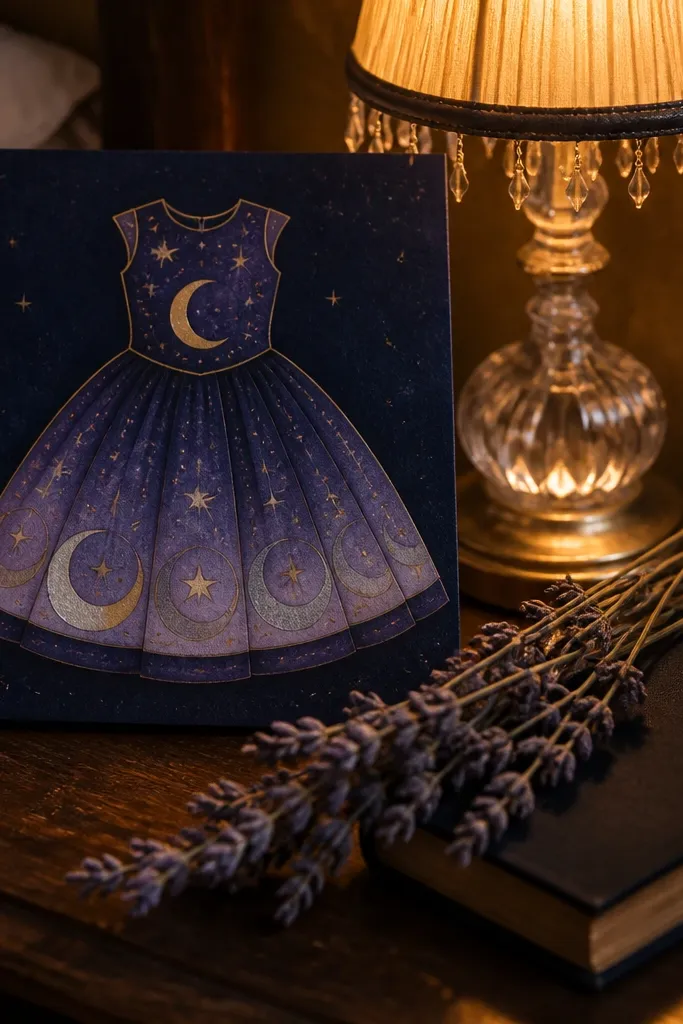
Moon-and-star themes look magical on paper without needing complex drawing. The dress typically has clear sections for background color and character motifs, so you can make it aesthetic with just a few choices: deep navy, soft lavender, and one bright accent like silver or pale yellow. This is the kind of page that makes quiet time feel like a mini ritual because each motif sits in its own space. It also photographs well because the motifs create a strong focal point.
Print and color the dress base with a deep navy or charcoal. Then add star and moon shapes with a bright pencil or gel pen, keeping sizes consistent. Finally, color small dress details like collar edges and any ribbon, then cut out the dress pieces along the lines.
Use a silver gel pen for the moon and stars; it reads bright even on plain paper.
Don’t use heavy black everywhere — leave lighter areas so the motifs stand out.
16. Chef Whites and Check Apron
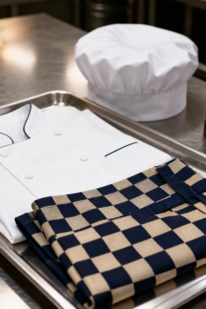
This template is for crisp, high-contrast coloring. Chef whites give you large blank areas that make your apron pattern pop. The checkered apron is satisfying because it’s a grid you can repeat cleanly, and it looks sharp even if you color quickly. It also works for different skill levels: beginners can do simple checks, and advanced colorers can shade the folds for extra realism.
Editor's noteUse a fine-tip marker for the check lines so the pattern stays crisp.
Print and color the chef hat and coat in a warm white or very light gray so the apron becomes the focal point. Then color the check apron with two colors and keep the grid square by following the drawn lines. Finish by coloring buttons and shoe details, then cut the outfit pieces along the template lines.
Skip thisAvoid coloring the entire coat with dark gray shading; keep it mostly light for contrast.
17. Coastal Sailor Outfit
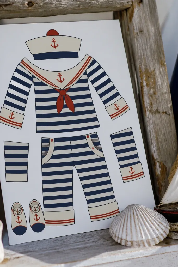
Sailor outfits are instantly recognizable and look clean on paper. The stripes and anchor motifs create a strong theme that reads well in photos and in a quick “before/after” comparison. This template is great for quiet time because you can color the stripes in a steady rhythm, then finish with the anchor and collar details. If you like blue-and-white palettes, this gives you a safe, good-looking set.
Editor's noteColor stripes with a ruler and light pressure, then go back with a darker blue only on the shadow side.
Print and color the sailor stripes first using two blue tones for dimension. Then color the collar and anchor motifs with a contrasting accent color like red or darker navy. Finish by coloring the skirt folds and any belt details, then cut out the clothing pieces along the lines.
Skip thisDon’t skip the collar contrast; it’s what makes the whole outfit look styled.
18. Renaissance Poet Cloak
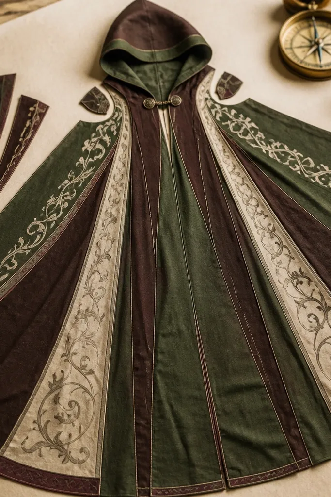
This is a “slow coloring” page because cloaks have long folds and natural shading zones. The tunic and scroll add small details that you can color last when your hands are warmed up. It looks best with earth tones: deep brown, muted green, and cream, plus one accent like burgundy for the trim. The cloak’s shape gives you a dramatic silhouette, so the finished page feels special without needing lots of tiny accessories.
Print and color the cloak base first, then use a darker tone along the fold lines to create depth. Next, color the tunic in a lighter neutral and add trim accents around the edges. Finish by coloring the scroll with a parchment tone and a darker line for text imitation, then cut out the cloak and scroll pieces along the lines.
Use colored pencil for the cloak folds so you can blend without smudging.
Avoid using bright neon colors on cloak trim; earth tones read more authentic.
19. Playground Athletic Set
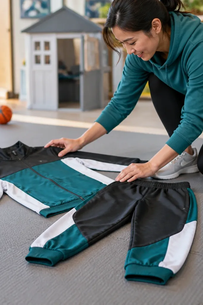
Athletic outfits make quiet time feel energetic but still controlled. Tracksuits have paneling that guides your coloring, and sneakers add a clean shape for highlights. This template is good if you like bold color combos because the design separates areas clearly. It also works as a decor swap: you can print several copies and color different colorways for a “mini collection” look.
Editor's noteAdd a tiny highlight line on sneaker edges with a white gel pen for instant polish.
Print and color the top and pants base in one main color each. Then add contrast stripes or panel lines with a second color, following the template’s separation lines. Finish by coloring sneaker soles and laces, then cut out the tracksuit pieces along the lines.
Skip thisDon’t use more than two main colors; too many makes the panels blur.
20. Lemon Summer Dress and Straw Hat
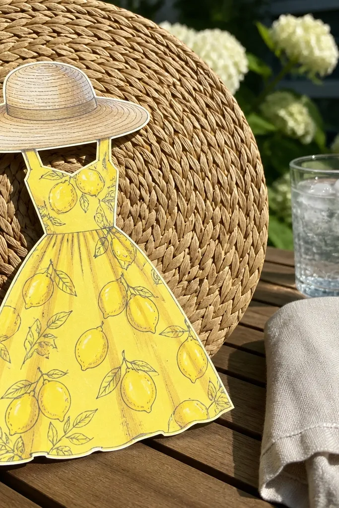
This template is cheerful without being childish because the dress pattern is simple and bold. Lemon motifs look great when you use a clean yellow base and add a darker outline for the fruit shape. The straw hat gives you a textured area where you can add light-to-dark pencil strokes to mimic weave. It’s a strong choice for bright afternoon quiet time because the page looks sunny even on plain paper.
Editor's noteUse a brown colored pencil to draw thin weave lines on the hat for a quick texture effect.
Print and color the dress base in a light yellow or pastel tone. Then add lemon slices or dots in a brighter yellow and orange shade, keeping the pattern spaced. Finish by coloring the straw hat with light tan and darker tan strokes to suggest texture, then cut out the dress and hat pieces along the lines.
Skip thisAvoid coloring lemons with only one shade; add a darker accent so they read as fruit.
21. Moonlit Witch Hat and Star Cloak
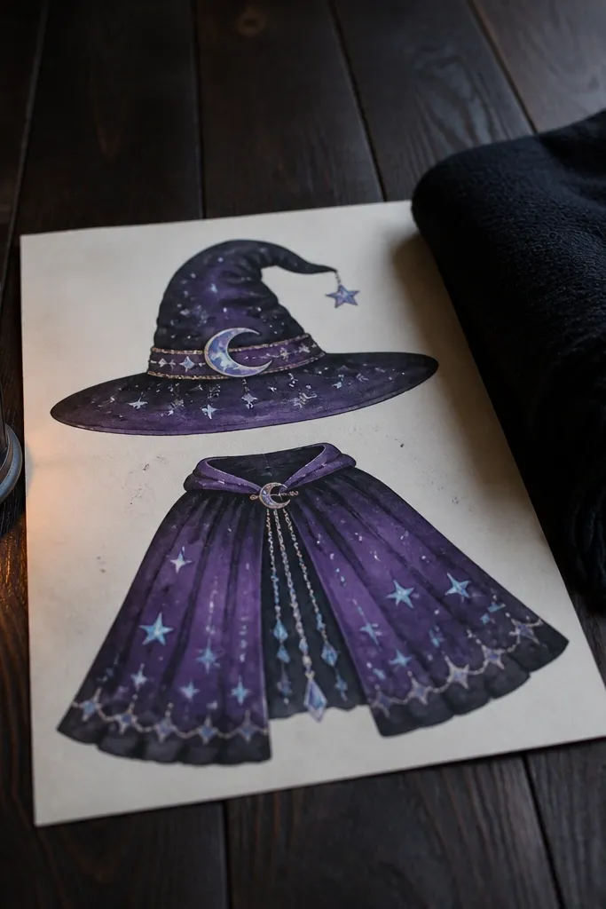
If you want dramatic coloring with minimal work, this is the one. The pointed hat creates a tall silhouette, and the cloak has star placements that act like color “targets.” You can make it look cohesive with a limited palette: black or deep purple fabric, plus pale blue or silver stars. It also works well for gel pen coloring because stars catch the light and look crisp on paper.
Editor's noteDo the stars last so you can see where the contrast needs to be stronger.
Print and color the cloak base with deep purple or black, then add star dots using pale blue and silver gel pen. Next, color the hat base and add a band stripe in a single contrasting color. Finally, color any face details and trim, then cut out the hat and cloak pieces along the lines.
Skip thisDon’t overfill the cloak with stars — leave some negative space so it looks intentional.
22. Winter Picnic Plaid Blanket Set
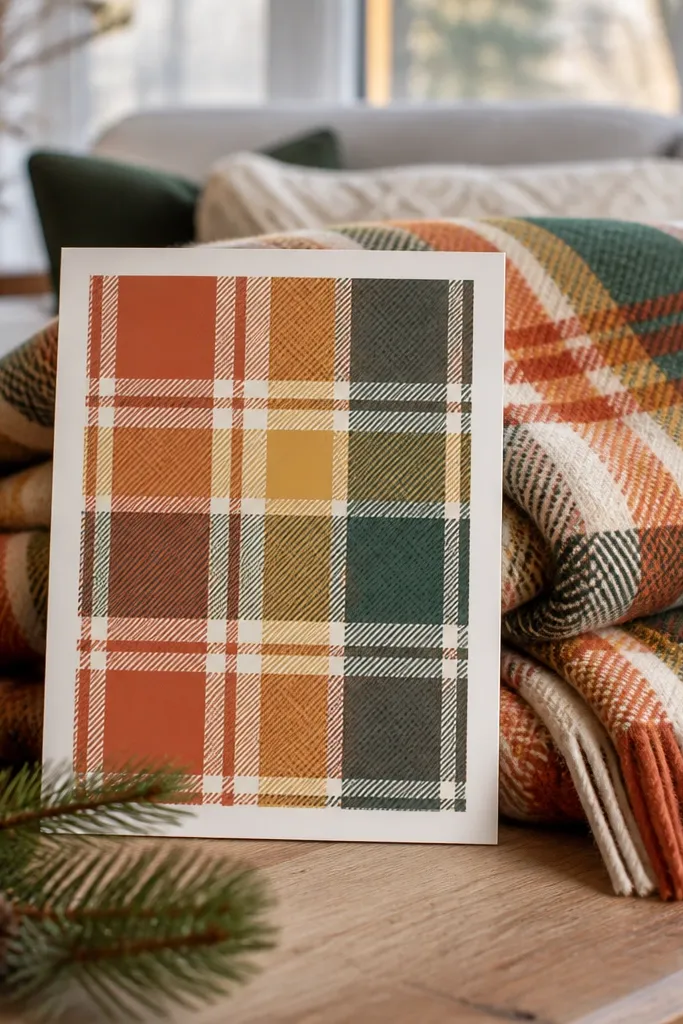
This is a decor-friendly template because the blanket pattern gives you a second main visual besides the outfit. Plaid on a blanket looks good even with simple color blocks, and it creates a cozy, “printed scene” look. If your quiet time goal is something you can photograph, this gives you a full composition on one page. The outerwear keeps the theme consistent so the finished result feels like a set, not separate doodles.
Editor's noteChoose one warm accent color for the plaid (like rust) so the scene looks cohesive.
Print and color the outerwear first in a warm base (charcoal, brown, or deep green). Then color the blanket plaid with two to three colors and keep the squares consistent by following the drawn grid. Finish by coloring small details like scarf edges or basket accents if included, then cut out the clothing pieces along the lines.
Skip thisAvoid using too many plaid colors; three is the sweet spot for clean readability.
23. Rainy Day Trench Coat and Umbrella
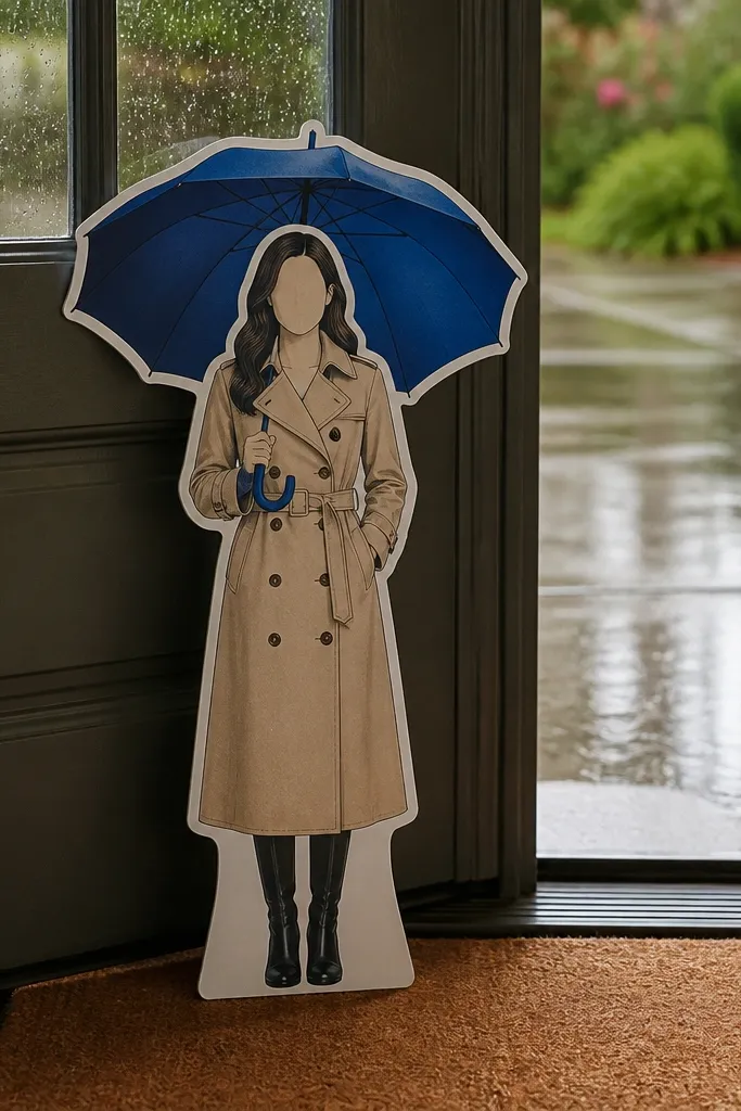
Rainy day outfits look stylish because the umbrella creates a clear circle shape and the trench coat has long vertical lines for shading. This template lets you create mood with color choices: muted beige or navy for the coat, then a bright accent for the umbrella. It’s also great for quiet time because you can color in sections — coat panels first, umbrella second, then small details. The final page looks like a scene you’d want to pin or frame.
Editor's noteUse a lighter pencil on umbrella panel edges to simulate light reflection.
Print and color the trench coat base with a muted tone, then add darker shading along lapels and belt folds. Next, color the umbrella with one base color and add panel lines to show ribs. Finally, color any rain accents and shoes, then cut out the coat and umbrella pieces along the lines.
Skip thisDon’t make the umbrella the same color as the coat; you lose the scene contrast.
24. Enchanted Library Cardigan and Bookmark Set
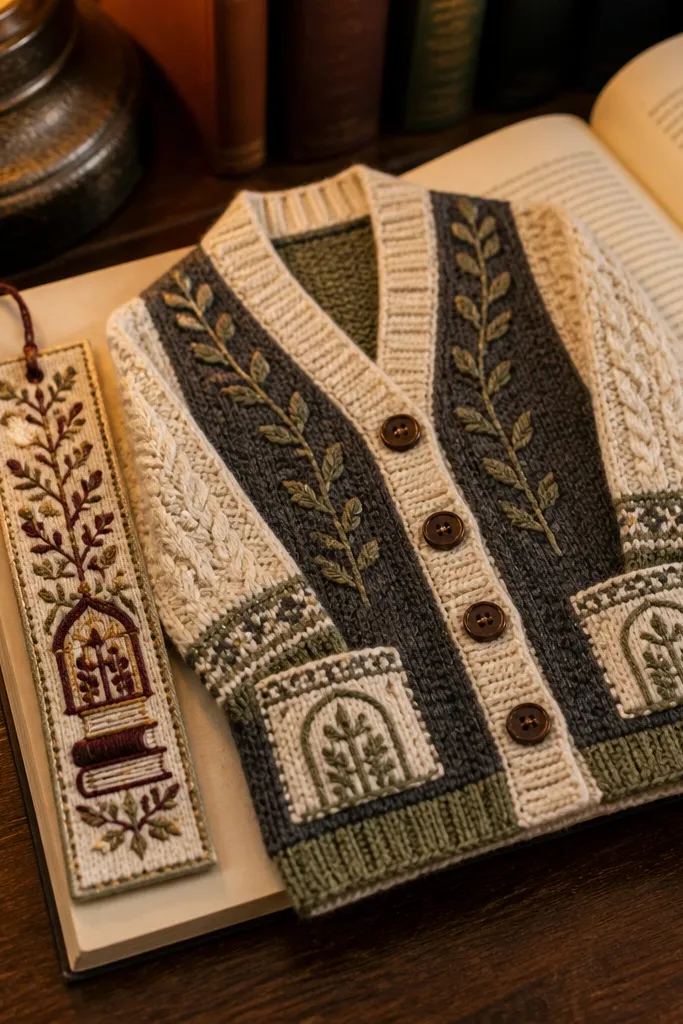
This set is perfect for quiet time because it’s small, detailed, and forgiving to color — you get lots of clean areas for skin, buttons, and patterned fabric without the chaos of full scenes. The cardigan layout makes the outfit feel layered even on a simple paper cut, and the bookmark gives kids a practical “finish line” they can use right away. You’re coloring one character, one accessory, and a few tiny props, so the session stays calm and focused. It also looks great on a table photo because the bookmark stands upright and the books add neat, readable blocks of color. This is a solid pick for ages 6-10 with about 20-35 minutes of coloring and a quick DIY assembly if you print on thicker paper.
Editor's noteUse colored pencils for the cardigan patterns — they hold crisp lines around buttons and cuffs better than most markers.
1) Print the paper doll outfit and the bookmark onto 160-220 gsm cardstock, then cut out the cardigan and bookmark pieces with a sharp craft knife or scissors. 2) Add a simple bookmark spine by gluing a 1 cm wide strip of cardstock behind the bookmark tab so it stands flat and doesn’t flop; keep the tab centered so the doll and bookmark look aligned. 3) For extra sturdiness, run a thin line of glue along the cardigan edges and press with a ruler edge so the seams stay crisp. 4) Color with colored pencils or markers, then let ink dry fully before stacking the pieces. 5) If you want a cleaner finish, cover the bookmark front with a single layer of clear packing tape, burnishing the edges so it resists smudges.
Skip thisDon’t cut the bookmark too narrow; a width under 4 cm makes it curl and messes up the standing shape.
25. Rainy City Umbrella Dress and Sidewalk Map
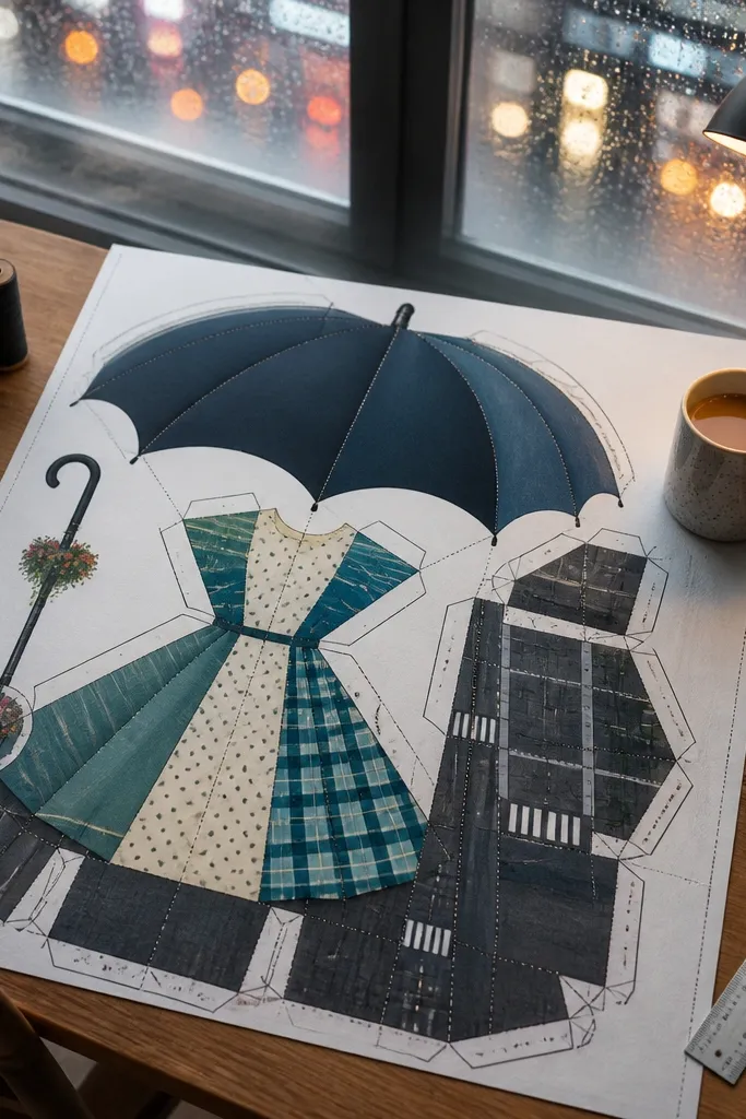
This one keeps quiet time engaging because it turns coloring into a mini “route” you can complete — umbrella, dress, then a sidewalk map panel with simple street shapes. The umbrella canopy gives you a big, satisfying area for gradient colors, while the dress has panels that look good with either polka dots or plaid. The side-walk map adds structure, so kids don’t feel stuck staring at a blank page; they fill in sections like blocks and crosswalks. It’s also photogenic: the umbrella sits at an angle and the map panel frames the doll like a little travel card. Skill level is easy — most of the work is coloring, with optional assembly in 10 minutes if you print on sturdier paper.
1) Print the umbrella dress set and the sidewalk map panel on 200 gsm cardstock, then cut the umbrella canopy and handle separately from the doll body. 2) Create the umbrella hinge using a 1 cm paper hinge: cut two small tabs on the umbrella handle side, fold them back, and glue them to the umbrella frame so the canopy can sit slightly open. 3) Build the map panel base by gluing the map behind a second cardstock rectangle that is 1 cm wider and taller, then trim flush once the glue dries. 4) Color the map with clear sectioning — use a darker gray for the street lines and bright colors for building blocks so it reads from a photo. 5) Seal the umbrella canopy with a matte clear tape sheet or a light spray seal from a distance, then let it dry flat to prevent warping.
Color the umbrella canopy in two passes: light color first, then darker strokes along the ribs so it looks curved even on paper.
Skip glossy tape on the map if you’re using markers; it can smear when the ink is still fresh.



