1. Minimalist Monogram Initial
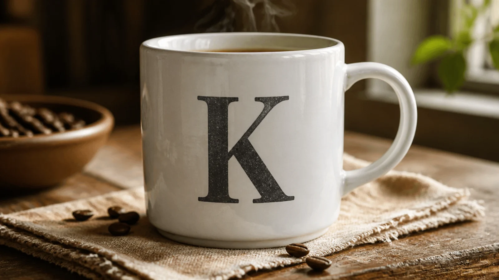
This was the first one I made and the safest place to start. One clean initial in charcoal looks sharp and grown-up, not crafty at all. It suits any guy because it’s just his letter, done simply.
I degreased the mug with rubbing alcohol, printed his initial in a bold block font, cut it out, and traced it lightly in pencil on the front. I filled the outline with two thin coats of charcoal porcelain paint using a small brush, working from the edges in, then erased stray pencil. I air-dried it 24 hours and baked it in a cold oven at 300F/150C for 30-35 minutes, cooling inside.
Editor's noteI sized the letter to fill about 60% of the front height — big enough to feel intentional, not so big it crowded the rim.
Skip thisDon’t try freehand script for this; a printed block letter traced in pencil is far cleaner and more masculine.
2. Inside Joke Hand-Lettering
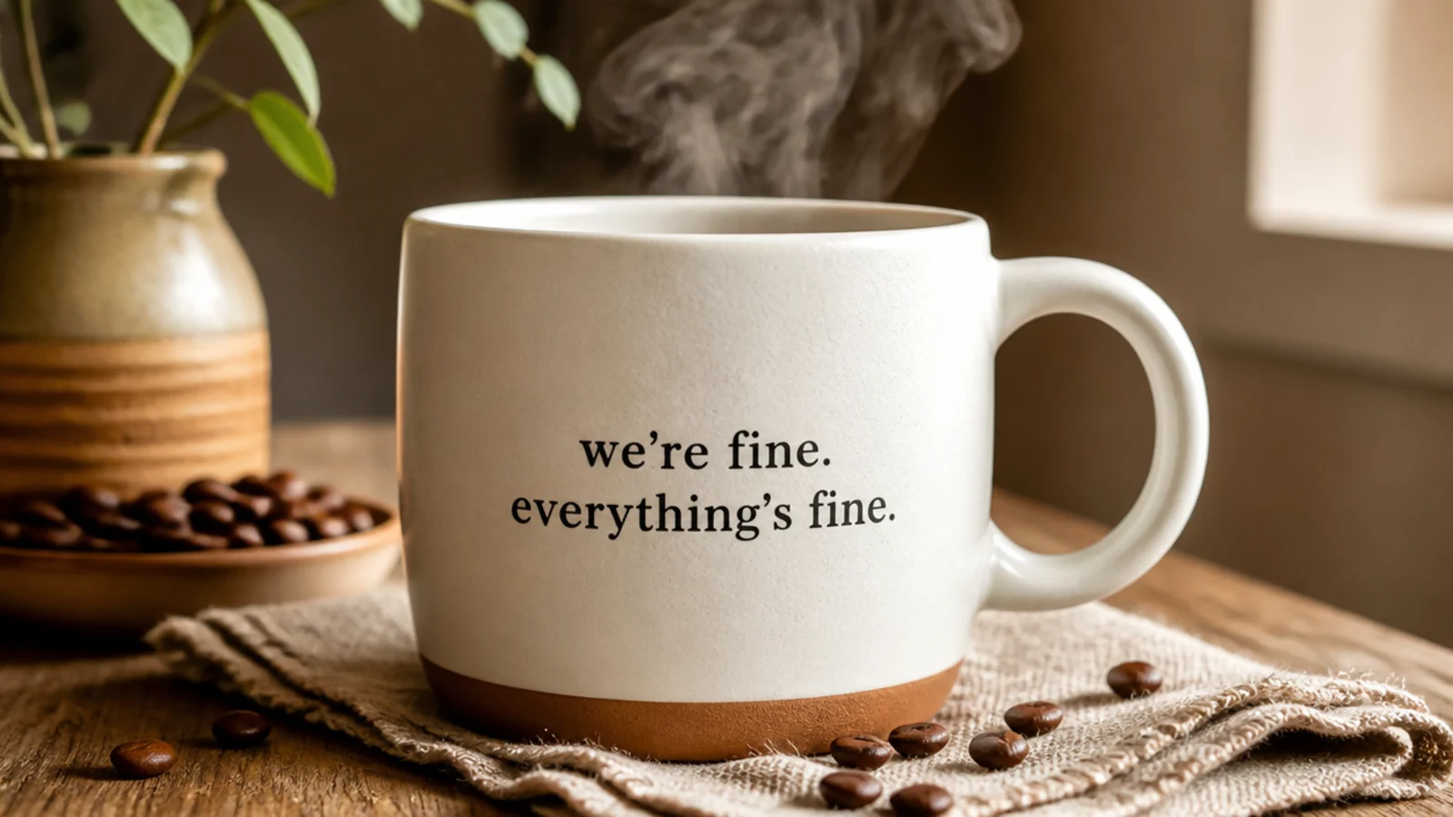
The second one I did was a phrase only the two of us find funny, in plain print lettering. An inside joke turns a mug into something personal and makes him smile every morning. Simple print kept it from looking like a greeting card.
I degreased the mug and penciled the phrase in a straight stacked layout below the rim to nail the spacing. I traced it with a fine black porcelain paint pen in even print letters, keeping the lines level with a light pencil baseline, then erased the guides once dry. I air-dried it 24 hours and cured it in a cold oven at 300F/150C for 30-35 minutes, cooling inside.
Editor's noteI wrote the whole phrase in pencil and adjusted the spacing twice before inking; that’s what kept the letters from drifting.
Skip thisDon’t wrap a long phrase around the mug; keep it short and stacked on the front so it stays large and legible.
3. Mountain Range
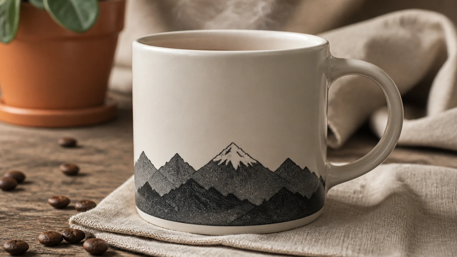
For my outdoorsy boyfriend, a simple mountain range silhouette was perfect. It’s calm, masculine, and reads as adventure without any fuss. It’s just a jagged line filled in, so it was easier than the lettering.
I degreased the mug and penciled a jagged peak line across the lower front. I filled everything below the line with two thin coats of charcoal porcelain paint for a flat silhouette, then added a tiny cream snow cap on the tallest peak with a fine pen once dry. I air-dried it 24 hours and baked it in a cold oven at 300F/150C for 30-35 minutes, cooling inside.
I varied the peak heights and widths so it looked like a real range instead of an even row of triangles.
Don’t add trees, a cabin, or a sun; the clean silhouette is what makes it look intentional rather than childish.
4. Voice-Memo Sound Wave
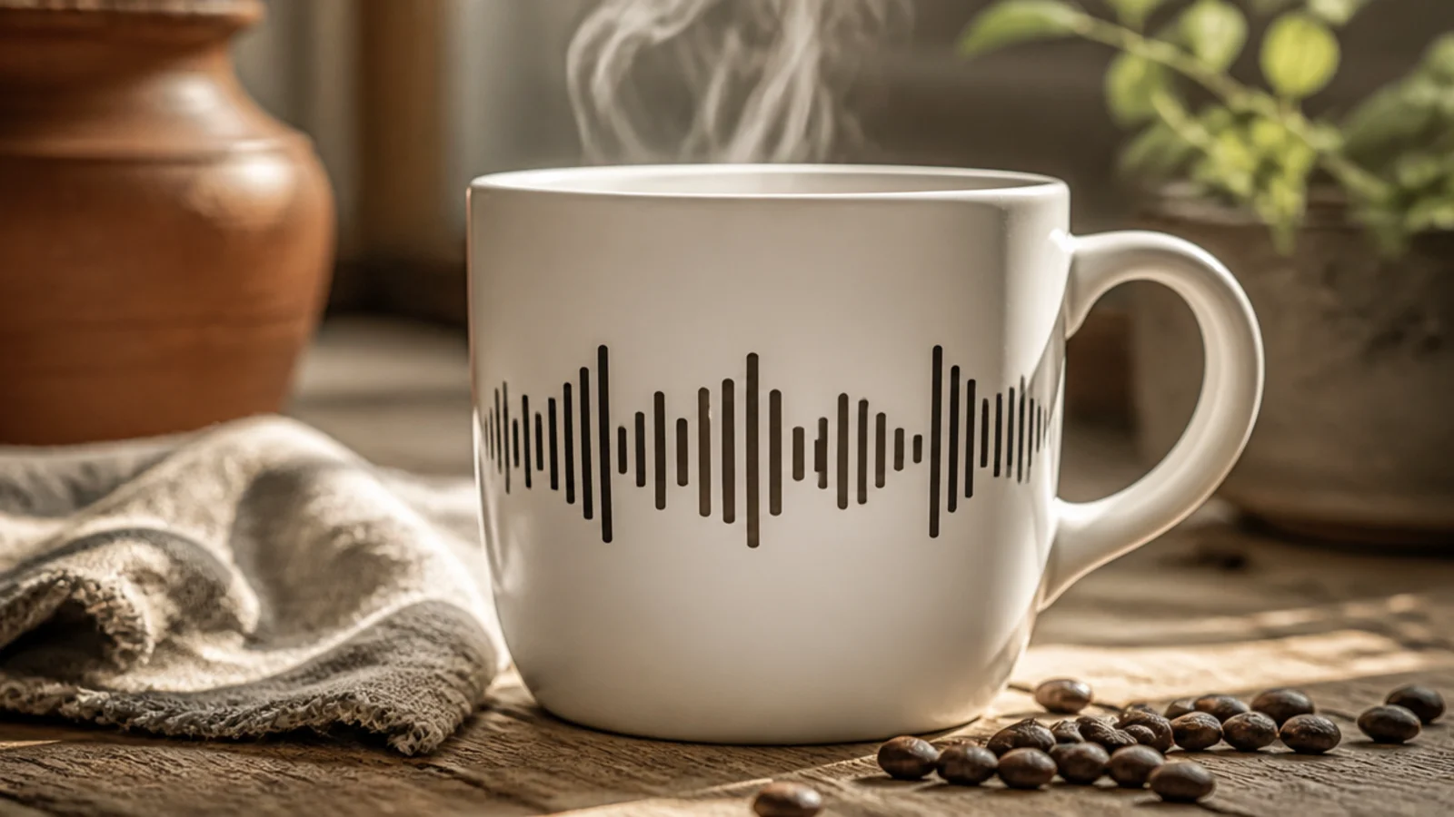
This one got the biggest reaction of all seven. It’s the waveform of a short voice memo I recorded, painted as a row of bars. It looks technical and thoughtful, and it’s secretly just vertical lines.
I screenshotted the memo’s waveform on my phone for reference, degreased the mug, and penciled a center baseline. Using a fine black porcelain paint pen, I drew evenly spaced vertical bars of varying heights above and below the line to match the wave. I erased the baseline, air-dried it 24 hours, and cured it in a cold oven at 300F/150C for 30-35 minutes, cooling inside.
Editor's noteI kept the bar spacing perfectly even and only varied the heights; consistent gaps are what make it read as a real waveform.
Skip thisDon’t freehand the heights randomly; glance at your actual waveform screenshot so the pattern looks genuine, not made up.
5. Map Coordinates
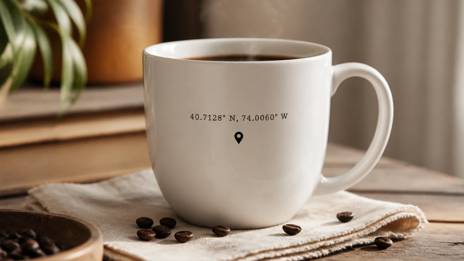
I painted the coordinates of the place we first met, with a little pin underneath. It’s a subtle, meaningful detail that doesn’t shout. The numbers look clean and modern in simple type.
I looked up the exact latitude and longitude, degreased the mug, and penciled the two coordinate lines centered on the front. I traced them with a fine black porcelain paint pen in even numerals, then added a small solid location-pin icon below. I erased the pencil, air-dried it 24 hours, and baked it in a cold oven at 300F/150C for 30-35 minutes, cooling inside.
Editor's noteI used a light pencil baseline for each number row so the digits stayed level and evenly sized, which matters with numerals.
Skip thisDon’t guess the coordinates; look up the real ones so the detail is actually accurate and meaningful.
6. Team Colors Stripe
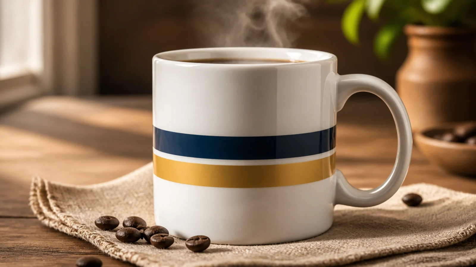
For his sports-loving side, I did a clean two-stripe band in his team’s colors instead of a busy logo. It nods to the team while staying tasteful. Tape made the stripes crisp and easy.
I degreased the mug and taped off two even horizontal stripes around the middle, burnishing the edges. I painted one stripe navy and one gold in two thin coats each, peeling the tape while slightly wet, and kept them below the rim. I air-dried it 24 hours and cured it in a cold oven at 300F/150C for 30-35 minutes, cooling inside.
Editor's noteI used his team’s exact color pair and kept the stripes equal width, so it reads as a deliberate nod rather than random bands.
Skip thisDon’t try to freehand a team logo; a clean color-stripe band looks far sharper and is much easier to pull off.
7. Star Sign Constellation
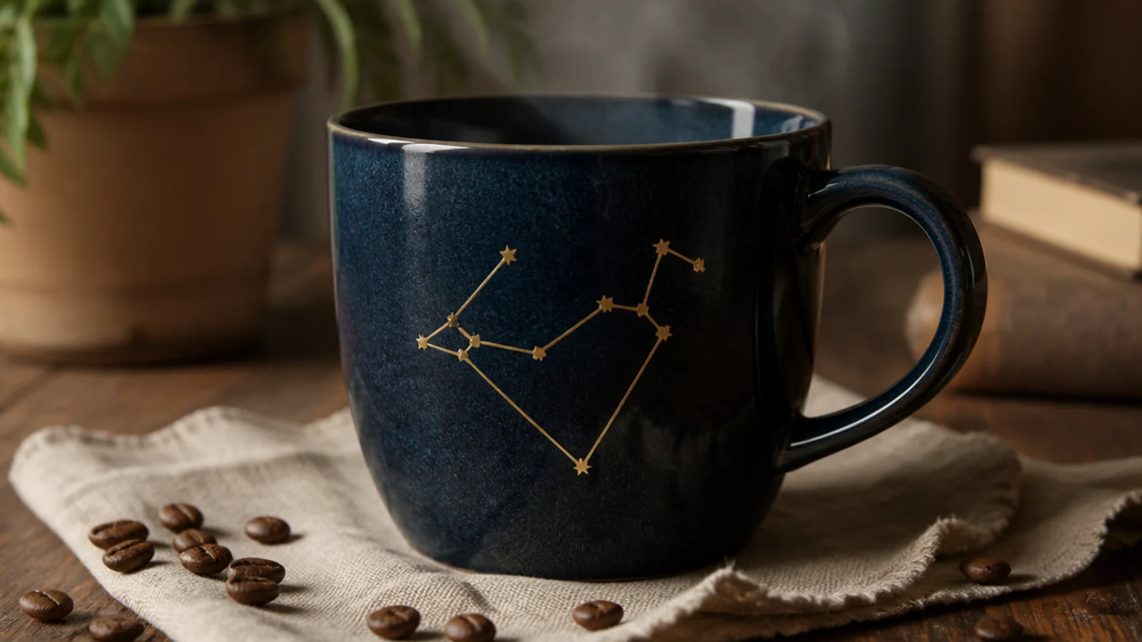
The one I was proudest of was his star sign as a constellation on a navy mug. Gold stars connected by fine lines look elegant and personal. It felt like the most finished of the seven.
I degreased the mug and base-coated it navy, letting it dry. I looked up his constellation’s shape, penciled the star positions, then stamped small gold dots with a fine metallic porcelain pen and connected them with thin lines. I air-dried it 24 hours and baked it in a cold oven at 300F/150C for 30-35 minutes, cooling inside.
Editor's noteI placed the stars from a reference image of the real constellation so the shape was accurate, then connected them last.
Skip thisDon’t crowd in extra random stars; keep only the constellation’s real points so the shape stays recognizable.