
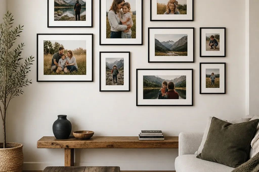
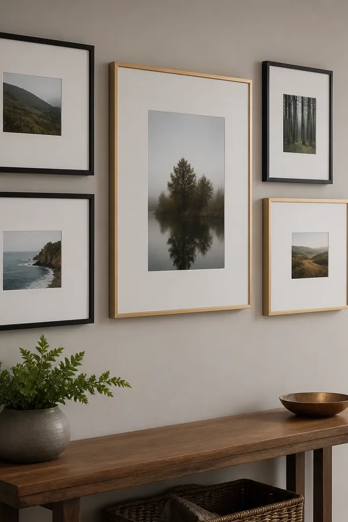
1. Black frame grid with 4 inch white margins
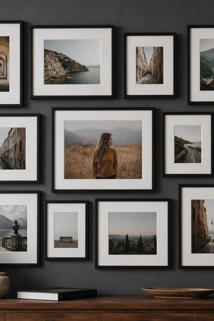
This one is clean, modern, and forgiving if your photos aren’t all the same size. The black frames give you contrast against almost any wall color, and the consistent white mat margins create a calm rhythm. You’re basically making your collage read like a design poster, not a pile of photos. Use this when you want the wall to look sharp in both daylight and evening light from lamps.
Start by choosing a single frame size for the majority of the wall, like 8x10 photos in 11x14 frames. Cut off-white mat paper or matboard to create a 4 inch border around each photo area. Tape a paper layout grid to the wall first, then hang the frames using a level and painter’s tape to lock spacing. Finish by aligning the frame edges so the outer corners of the grid form one straight rectangle.
Editor's notePrint your photos slightly matte (not glossy) so the white mats stay crisp under lamp glare.
Skip thisDon’t mix frame finishes like black and brass on the same grid — it breaks the modern look.
2. Floating photo panels on a light wood backing board
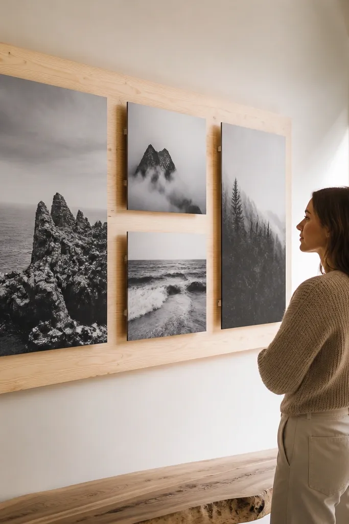
Floating panels make a collage feel more architectural because the photos sit off the backing. This is a great choice if you like the modern look of “layers” without using a ton of hardware. The light wood backing warms up cooler interiors and makes black-and-white photos look extra crisp. It also hides small wall imperfections because the board sits flat and covers uneven paint texture.
Cut a plywood or MDF backing board to your desired size, like 36x48 inches. Mark a grid for your photo rectangles, then attach small standoffs or foam mounting squares behind each photo so they sit 1/4 inch off the board. Mount the photos with acid-free photo corners or adhesive photo squares, keeping edges aligned to your pencil marks. Hang the board with two D-rings or a French cleat for a level, secure mount.
Seal the wood with a matte clear coat so it doesn’t look yellow over time.
Skip thick adhesive tape directly on the photos — it can lift corners and look messy.
3. Monochrome diptych strips with matching mat colors
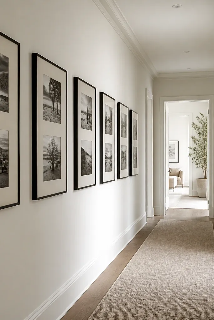
Diptychs create a modern “story” without overcrowding your wall. When you use monochrome photos (or one color family) and keep mat colors consistent, the collage looks styled instead of random. The repeating vertical strips guide the eye, so it reads clean even with different photo subjects. This works well for hallways and stair landings where you want a tall, narrow visual rhythm.
Pick 10-14 image pairs for a strip layout and choose frames with the same outer dimensions, like 12x16 with two openings. Use a single mat color across every pair, like warm white or charcoal gray. Arrange the strips with equal vertical spacing, then tape the final strip positions to the wall. Mount each frame securely, checking that the top edges line up across the entire strip row.
Use photos with similar contrast levels — diptychs look best when highlights and shadows match.
Don’t use mixed mat colors inside one strip cluster — it breaks the uniform look.
4. Twelve-photo salon wall with equal spacing and one accent frame
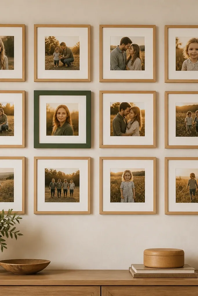
A salon wall can look modern when you control spacing and repeat the frame style. The trick here is equal gaps and one intentional accent frame that adds personality without chaos. Use neutral frames for 11 photos, then choose one frame in a strong color like deep green or terracotta for a single hero photo. The result looks curated, but you’re still building it with a simple mounting plan.
Choose 11 frames in the same size and finish, like 8x10 frames in matte black, and one accent frame in a contrasting finish. Plan a rectangle or slight arc shape on paper, then keep a consistent gap like 2 inches between frame edges. Mark the wall with painter’s tape, place the frames, and level the top row first. Mount the accent frame last so you can fine-tune its position as the visual anchor.
Editor's notePick the accent photo first — it should have the strongest subject contrast and color in your set.
Skip thisAvoid random overlaps — salon walls look modern when frames don’t crowd each other.
5. Color-block collage with 3 photo sizes repeating in columns
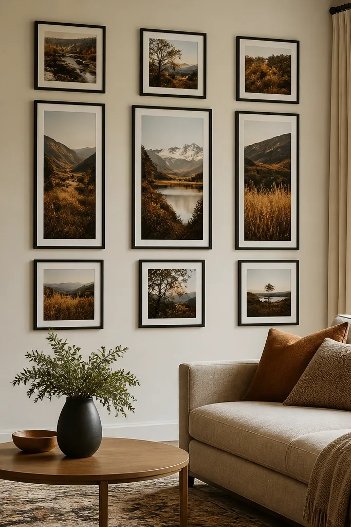
This layout uses repetition to look intentional, but it still feels playful because color blocks separate the photos. You’ll feel the modern vibe when the same three photo sizes repeat in each column. The gaps act like design elements, not empty space. This is ideal for living rooms where you want the wall to match your color palette and not just your photos.
Pick three photo sizes that share the same aspect ratio, like 4x6, 5x7, and 8x10. Choose a frame or mat system that makes the spacing visible, like white mats with black frames. Arrange the photos into 4-5 columns on paper, using the same size order in each column. Tape the layout on the wall, then hang each frame so the column edges line up and the gaps stay consistent.
Use photos that share one dominant color family so the color blocks feel cohesive.
Don’t pick three random sizes — repetition needs a clear pattern to look modern.
6. Round photo frames scattered on a grid base
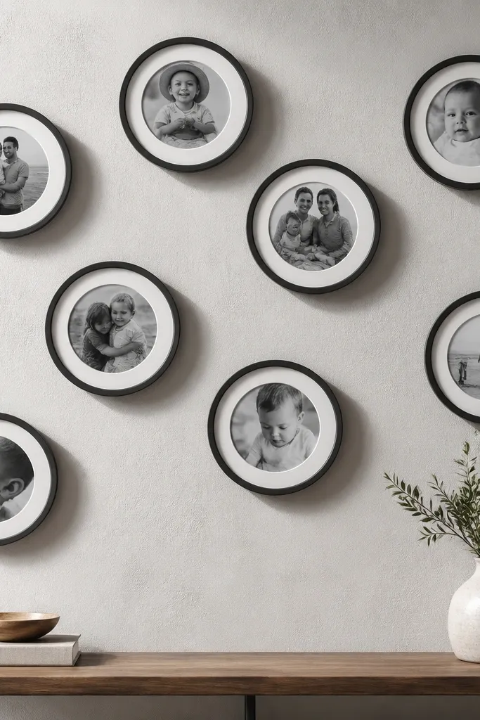
Round frames soften the hard lines of a grid and make the collage feel modern and friendly. The key is to anchor the circles on a hidden grid so spacing stays controlled. Use round frames of one diameter, like 8 inches, and keep them aligned to a rectangular boundary. This looks great above a console table or in a reading nook where you want something softer than standard rectangles.
Draw a grid on paper for your wall rectangle, like 6 columns by 3 rows. Place round frame sizes that fit the grid spacing, keeping the same center-to-center distance between circles. Tape the paper mockup to the wall, then mark mounting points with a pencil through the frame backs. Mount the frames level, using a template so every circle sits in the same grid alignment.
Choose matte black or white frames — shiny metals can look too decorative for a modern collage.
Don’t mix circle diameters — it turns into a random sticker wall.
7. Oversized center photo with a halo of small frames
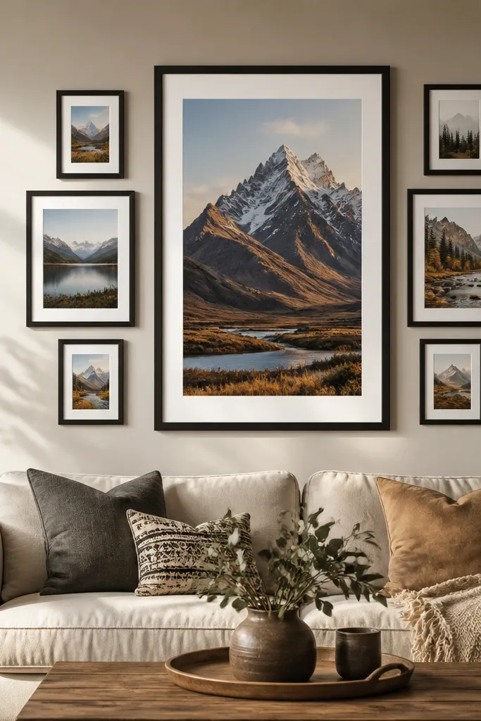
A big center photo gives you an obvious focal point, then the small frames create a modern halo effect. This is the easiest way to make a collage look “designed” because your eye knows where to land. Use a large frame like 20x30 for the center, then surround it with smaller frames like 5x7 or 8x10. This layout looks gorgeous on feature walls because it reads as one composition, not separate pieces.
Pick your center frame first and measure its outer dimensions on the wall. Mark a halo boundary around it, then place smaller frames in a ring with equal gaps, like 2 inches between frames. Keep all small frames the same orientation so the halo looks uniform. Mount the center frame level, then work outward from the center to reduce spacing mistakes.
Use matte mats for the small frames so the center photo stays the visual leader.
Avoid placing the halo too tight — if the gaps disappear, it looks crowded.
8. Gallery rail strip with mini frames aligned to one baseline
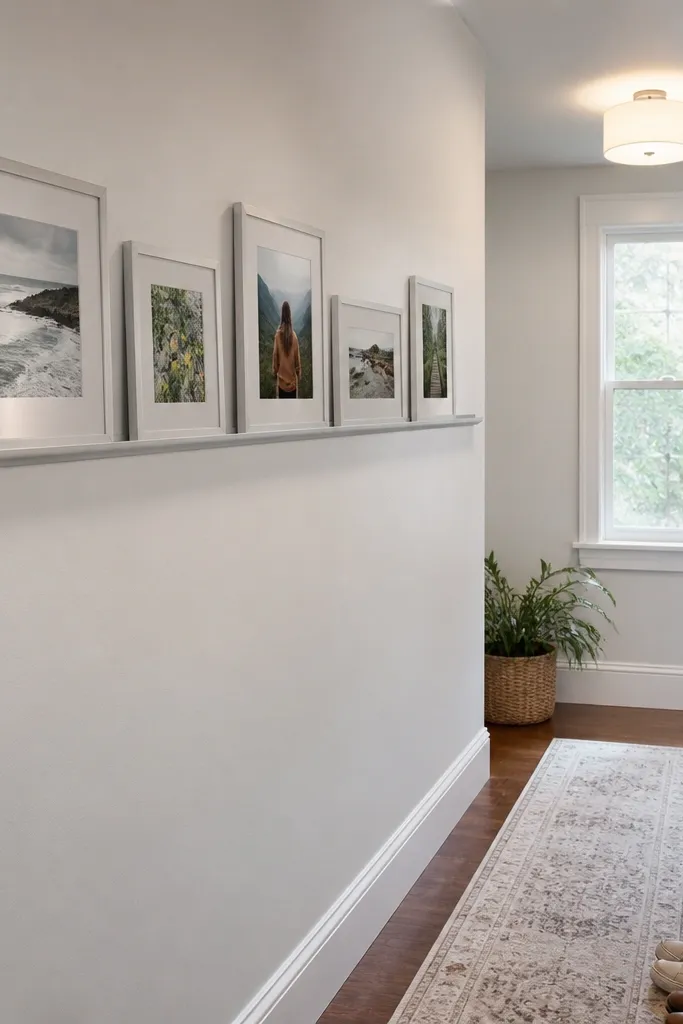
If you hate measuring individual heights, a gallery rail is a modern cheat code. The collage becomes a clean row where all frames line up to the same baseline, so it always looks intentional. Use mini frames like 4x6 or 5x7 for a tidy, styled look. This works especially well for kitchens, laundry rooms, or any hallway wall where you want a neat, long composition.
Install a picture rail at a height you like, then hang the frames using the rail’s hooks. Use a tape measure to mark equal spacing between frame centers, like 4.5 inches. Choose frames with the same thickness and mount the photos with the same mat border width. Keep the row length within about 48 inches so it doesn’t sag visually.
Pick a rail finish that matches your hardware — brushed nickel with silver frames looks cleaner than mixed metals.
Don’t hang frames at random rail hooks — the line will drift and look sloppy.
9. Fabric-backed collage with pinned photo cards in a grid
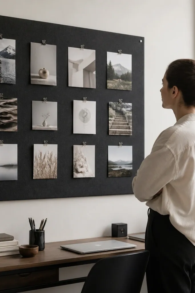
Fabric gives you texture and makes the collage look soft and modern without being “scrolly.” Pinning photo cards lets you swap pictures without remounting frames, which keeps the wall looking fresh. Use a solid color fabric like oatmeal linen or charcoal cotton so the photos stay the focus. This is a great choice for a bedroom wall where you want warmth and a slightly handmade vibe.
Stretch fabric over a backing board using a staple gun, then pull it tight and trim edges clean. Mark a grid with pencil on the backing and create photo card sizes like 4x6 or 5x7. Use small brass push pins or photo clips to attach each card so the spacing stays consistent. Mount the board using a French cleat or sturdy wall anchors so the fabric stays flat.
Iron the fabric flat before stretching — wrinkles show through even when photos are pinned.
Skip stretchy knit fabrics — they sag and make the grid look uneven.
10. Stone-texture wallpaper behind a black-and-white photo set
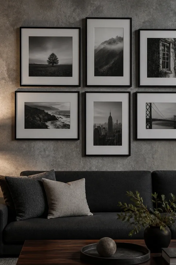
Texture can make a photo wall look high-end when the photos are simple. Stone-texture or concrete-look wallpaper adds depth behind the frames, so the collage reads modern even if the frames are basic. Keep the photos black-and-white or one muted palette to avoid visual clutter. This is best for a feature wall behind a couch or desk where the texture becomes part of the composition.
Apply wallpaper to the section of the wall you want, then let it dry fully. Choose black frames with consistent mat widths, like 1.5-2 inches, and arrange 9-12 photos in a grid or staggered rectangle. Tape the layout on the wallpaper before mounting so you can see how texture affects contrast. Hang the frames with level marks and check alignment after the last frame goes up.
Use matte frames and matte photo prints — glossy finishes fight with textured walls.
Don’t use bright colored photos against busy texture — it turns into visual noise.
11. Staggered frame wave using two sizes only
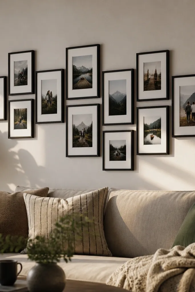
A staggered wave is one of the most photogenic modern collage patterns because it creates motion without looking messy. The secret is discipline: use only two frame sizes and alternate them in a repeating wave. This keeps the wall from looking random while still feeling dynamic. Works great above a sofa where you want the wall to feel alive but controlled.
Pick two frame sizes that share the same aspect ratio, like 8x10 and 11x14. Decide on a wave height, then draw alternating placement marks on paper. Tape the layout to the wall, start hanging from the center, and keep the vertical edges aligned. Secure each frame, then step back and adjust spacing by shifting the whole wave slightly before it gets final.
Choose frames with a thin profile like 3/4 inch — thick frames make the wave feel heavy.
Avoid using more than two sizes — that’s what turns a wave into a jumble.
12. White mat collage with brass frames and warm-toned photos
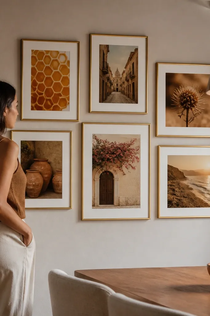
Brass with white mats reads modern when the mat size stays consistent. The warm photos keep the wall from feeling cold, while the white mats unify everything. This idea looks especially good in rooms with warm light bulbs or wood floors because the brass catches the glow. Use this when you want modern but not stark.
Pick brass frames all in the same width, then choose an even mat border like 2 inches. Arrange 12 frames in a grid, leaving 2 inches between frame edges. Tape a paper mockup first, then mount the top row and work downward. Finally, straighten each frame so the mat borders create a uniform grid line.
If your photos have warm highlights, print them on matte paper to keep brass from looking too shiny.
Don’t add black frames to this mix — it breaks the warm modern palette.
13. Polaroid-style photo strips with exact 1 inch overlaps
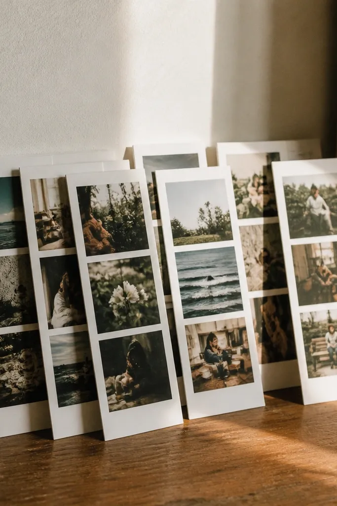
Polaroid-style layouts look modern when you treat them like a graphic design, not a scrapbook. The exact overlap creates a rhythm that looks intentional on camera. Use consistent paper color and margins across every photo so the wall reads cohesive. This works well for kids' rooms, playrooms, and casual living rooms where you want a playful but clean aesthetic.
Print photos in a consistent ratio and trim to a Polaroid card size, like 3.5x4.5 with a white border. Create a strip template on paper that includes a 1 inch overlap per photo. Tape the first strip in place, then build the rest using the template so overlaps stay identical. Stick the photos down with photo-safe adhesive corners so the edges stay flat.
Use a paper cutter and a metal ruler — uneven borders ruin the modern look fast.
Skip random overlap sizes — they make the wall look like a craft project, not a collage.
14. Gallery cluster with one horizontal row and two vertical columns
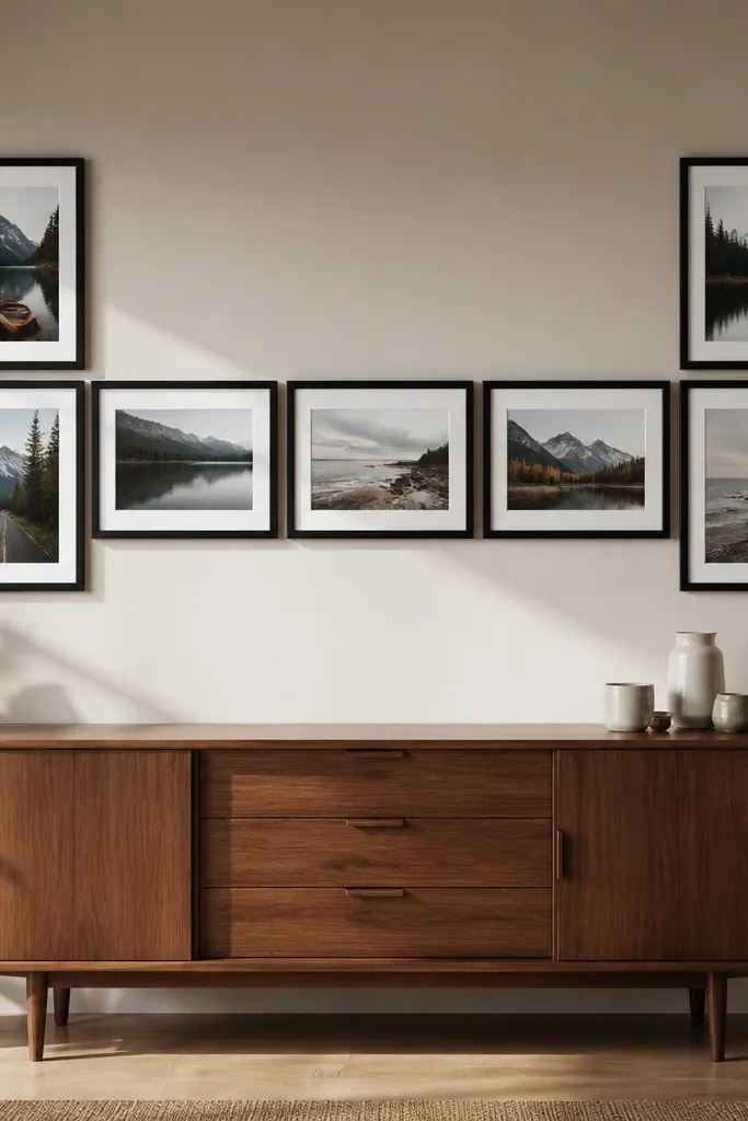
This cluster structure is modern because it has a clear skeleton. One horizontal row anchors the composition, then two vertical columns add height without turning the wall into a scattered mess. Keep all frames the same finish and choose two photo orientations: landscape in the row, portrait in the columns. It’s a smart pick for awkward wall sizes where a perfect grid won’t fit.
Pick a total of 11-13 frames and decide which will be landscape and which will be portrait. Draw a layout with one straight horizontal line through the middle, then place two vertical stacks at the left and right ends. Tape the arrangement and measure the outer boundaries so it fits your wall. Mount the central row first, then add the vertical columns and check alignment from the side.
Editor's noteUse the same mat border width on every frame in the cluster so the edges feel unified.
Skip thisDon’t center every frame by eye — use the tape mockup so spacing stays consistent.
15. Shadowbox collage with layered prints and labels
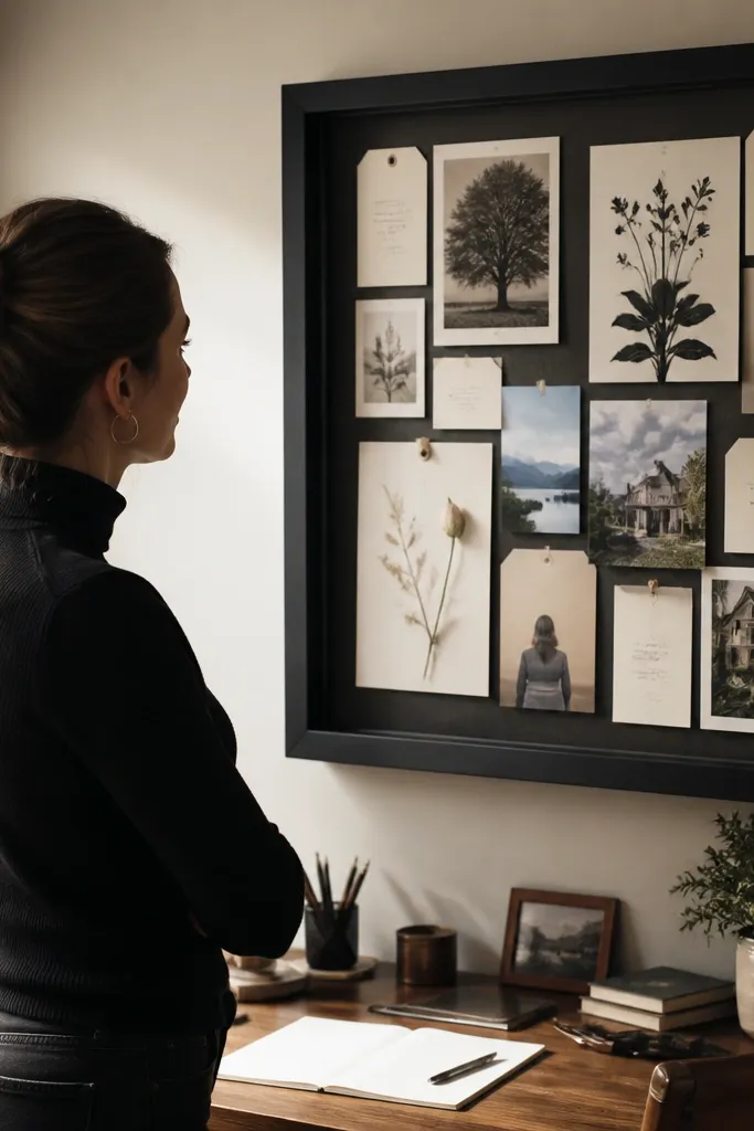
Shadowboxes make a photo collage feel like a curated display, but you still get a modern look if you keep the design simple. Layered prints create depth, and small label cards add a graphic element. Use one clean font style printed on cardstock and align labels to a grid. This is great for a home office, where you want something visual that also feels organized.
Buy a shadowbox frame large enough for your layout, like 24x36 inches. Cut photo prints and mount them to the back using foam mounting squares for depth, like 1/2 inch layer spacing. Add label cards with thin cardstock, aligned left and centered vertically under their photos. Seal everything flat, then hang the shadowbox with the included hardware or a French cleat.
Editor's noteUse archival photo corners or glue sticks made for paper so labels don’t curl over time.
Skip thisDon’t use thick, bulky embellishments — they make the inside look cluttered.
16. Tape-on photo collage with matte paper and wide negative space
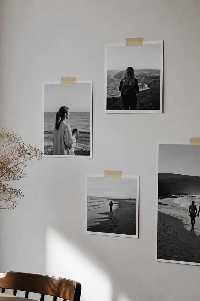
This is the modern “graphic” approach where the wall becomes a collage poster. Matte prints look clean, and wide negative space keeps the design from feeling crowded. You also get a light DIY vibe without cheapening the look because the spacing is the star. This works well for renters since you can use removable tape for the whole layout.
Print photos on matte paper and trim them into consistent sizes like 5x7. Lay them on a table and plan a grid with wide gaps, like 3 inches between edges. Use removable photo tape to attach the prints to the wall, pressing corners firmly. Add a thin border of painter’s tape around the whole collage area so the layout looks intentional and straight.
Editor's noteUse the same paper thickness for every print — thin vs thick paper changes how edges lift.
Skip thisDon’t use glossy prints — tape edges catch light and look messy.
17. Terracotta frame cluster with black-and-white photos
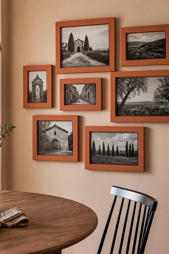
Color accents make a collage feel modern when the photos are restrained. Terracotta frames with black-and-white photos create a strong contrast that looks styled, not random. Keep the cluster tight enough that it reads as one block, but leave consistent gaps so it still looks clean. This is a great choice for a dining area where you want warmth without adding patterns to your wall.
Choose 9 frames in terracotta (or one close matching shade) and keep them all the same width. Pick black-and-white photos with similar contrast so the wall looks cohesive. Arrange them in a rectangle, spacing each frame 1.5-2 inches apart. Tape, level, then mount with sturdy anchors so the weight stays secure.
Editor's noteMatch the frame color to one existing element in the room, like a terracotta pot or throw pillow.
Skip thisDon’t add extra colors in the photos — keep it black-and-white to let the frames lead.
18. Neutral wood frames with staggered mat borders
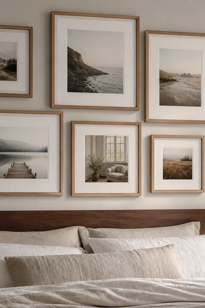
Wood frames look modern when the mats are consistent but staggered. Instead of lining every photo edge up perfectly, you shift mat borders slightly so the wall has depth. Neutral wood with warm white mats creates a calm, design-forward look. This works in living rooms and bedrooms where you want modern comfort instead of stark minimalism.
Select wood frames with the same outer dimensions and a warm white mat. Create a stagger plan on paper where each next frame is shifted by about 1/2 inch horizontally or vertically. Tape the layout, then mount from the center outward. Use a level to keep the top row straight even if the mats are staggered.
Editor's noteKeep the stagger direction consistent so it looks intentional, not accidental.
Skip thisDon’t stagger by random amounts — stick to one shift measurement.
19. One big vertical strip with 8 matching frames
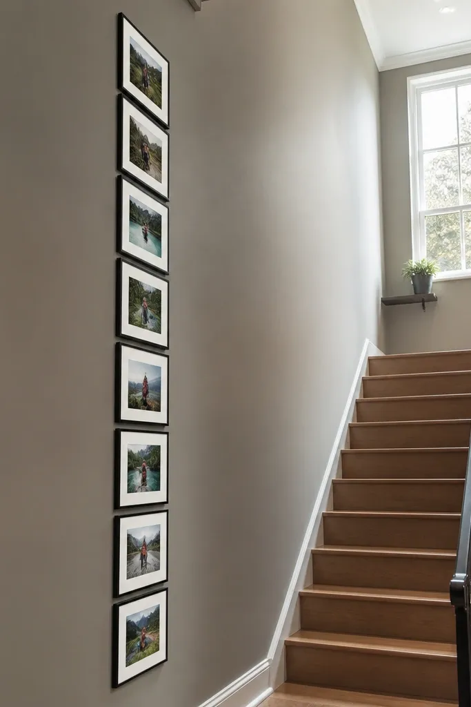
A single vertical strip makes a photo wall look modern and purposeful, especially on narrow walls. Matching frames create a clean column effect, while the repeated spacing makes it feel like a gallery installation. Use portrait photos or crop landscape photos to portrait orientation so the strip stays consistent. This looks gorgeous near a staircase or next to a doorway where width is limited.
Choose 8 matching frames in a portrait orientation, like 8x10 or 9x12. Mark the centerline of the wall, then measure total strip height so it sits comfortably above furniture. Tape the frames in a vertical line with consistent gaps like 2 inches. Mount the first frame on the centerline, then use the frame edges as your guide for the rest.
Editor's noteHang the top frame so the bottom edge ends around 8-10 inches above the floor line for a balanced look.
Skip thisDon’t let the gaps vary — even small differences show up in a vertical strip.
20. Two-tone collage with half the wall in white mats
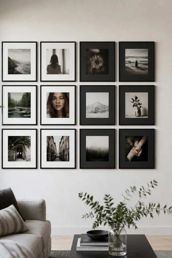
Two-tone layouts look gorgeous because the wall has a design logic. Use one half of the collage with white mats and the other half with black or charcoal mats, keeping frames consistent. The photos don’t need to be identical, but the mat color separation creates a modern visual split. This works well for open-plan spaces where you want the wall to look intentional from multiple angles.
Pick one frame finish for the whole wall, like matte black. Choose two mat colors: white for one side, charcoal or black for the other. Plan the division line on paper so it’s straight and centered, then arrange photos symmetrically around that line. Tape and hang the white-mat side first, then mirror the spacing on the dark-mat side before mounting the rest.
Editor's noteUse photos with light backgrounds on the white-mat side and darker backgrounds on the dark-mat side for natural contrast.
Skip thisDon’t mix mat colors within a single row — keep the split clean.
21. Arch-top modern collage using a curved template
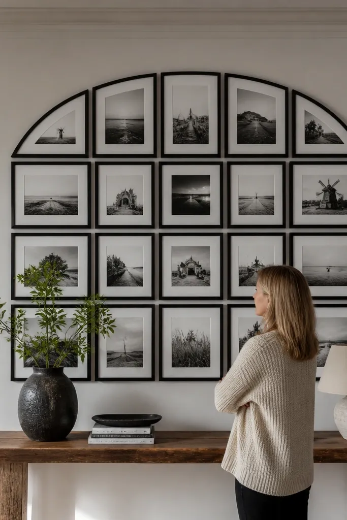
An arch-top collage looks modern when the curve is controlled and the frames repeat. Use one curved top boundary made from a template, then fill the rest with aligned rectangles. This gives you softness without losing structure. It looks especially good above a console table or in entryways where you want a gentle focal shape.
Create a curved template from cardboard by drawing an arc that matches your desired arch height, like 10 inches above the top row. Place frames on the template so their top edges follow the arc, while bottom edges stay aligned to a straight baseline. Tape the template to the wall, then mark mounting points through each frame. Mount frames starting with the arch corners, then fill in the center and work down.
Editor's noteKeep the frame sizes consistent so the arc looks smooth rather than jagged.
Skip thisDon’t eyeball the curve — use the cardboard arc and measure from it.
22. Photo collage on pegboard with removable hooks
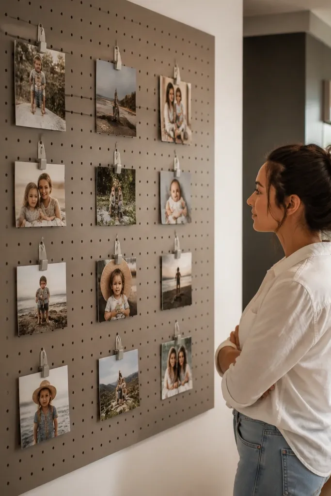
Pegboard makes a photo wall look modern because the mounting method is part of the design. You get adjustable spacing and you can swap photos anytime without remounting frames. Use a matte painted pegboard in black or warm gray, then clip photo cards with small binder clips or pegboard hooks. This is a strong option for kids' photos or seasonal updates.
Cut pegboard to fit your wall section and mount it level using wall anchors. Paint the pegboard if needed, then let it fully dry. Print photos to a consistent card size and attach them with clear binder clips so edges stay neat. Plan the pattern on paper first, then place clips in a grid with equal spacing for a clean look.
Editor's noteUse a light behind the pegboard if possible — it makes the clips and photo edges pop.
Skip thisSkip uneven peg spacing — pegboard patterns show every irregularity.
23. Minimal white frames with one black-and-white panoramic photo

This layout looks modern because it mixes scale on purpose. White frames keep everything quiet and contemporary, and one panoramic photo adds a cinematic anchor. The panoramic image pulls the collage together because it spans width, then the smaller frames balance the composition below and above. It’s a smart choice for living rooms where you want your wall to feel spacious rather than packed.
Choose white frames in two sizes: small ones for the surrounding photos and one large frame for a panoramic image, like 12x36. Use consistent mat borders for every frame, like 2 inches. Arrange the panoramic photo in the center, then place 8-10 smaller frames around it in a rectangle shape. Tape the layout, mount the center panoramic frame first, then build outward with equal gaps.
Editor's noteCrop the panoramic photo so the subject sits near the centerline — it keeps the collage balanced.
Skip thisDon’t place the panoramic photo off-center — it makes the whole wall look lopsided.
24. Mirror-backed collage with simple black frames
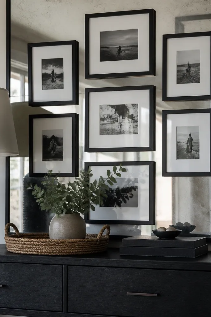
A mirror backing adds light and makes a collage look modern and high contrast. The frames stay simple, but the reflected light makes the photos feel brighter and more layered. This works best in entryways, bathrooms, or dining areas where you want the wall to feel more open. Use black frames to avoid a cluttered, reflective mess.
Mount a mirrored panel or mirrored tiles to the wall area you want, then secure it with proper adhesive rated for mirrors. Choose black frames with consistent mat borders and keep the collage to 6-10 photos so reflections don’t overwhelm. Tape the layout on top of the mirror area to check alignment, then drill and anchor frames carefully through the mirror backing per your hardware plan. Hang level and wipe fingerprints off glass after installation.
Use matte photo prints to reduce glare from the mirror surface.
Don’t crowd too many frames — mirror reflections multiply visual clutter.
25. Oversized paper mats with no frames
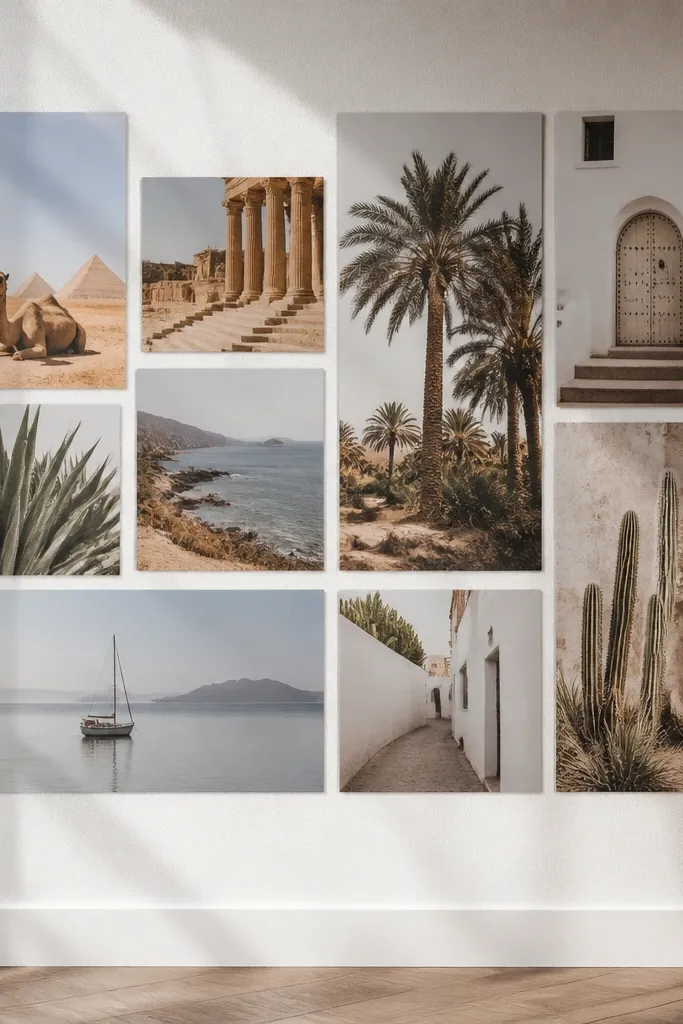
Going frame-free looks modern when the mat is oversized and the photo edges are perfectly aligned. The paper mat becomes the “frame,” and it creates a gallery poster vibe. This is also cheaper than buying dozens of frames, and it’s easier to rearrange when you want to refresh the photos. Use this when you want a clean, minimalist look without hardware clutter.
Cut thick paper or matboard into large rectangles, like 11x14, with a centered window for each photo. Tape or glue the photo into the window so it sits flat and doesn’t warp. Arrange the mats on the wall in a grid and mark mounting points for a hidden pin or small adhesive squares. Press down firmly and use a ruler to keep edges aligned across the full layout.
Use a craft knife with a fresh blade — ragged mat edges make the whole wall look DIY in a bad way.
Don’t use thin paper mats — they curl and ruin the crisp modern look.
26. Matte black frames with glassless acrylic prints
Glassless acrylic prints look sharp and modern because the surface stays clean and doesn’t collect glare like regular glass. Matte black frames add contrast and keep the wall from feeling shiny. This is a strong choice if your wall gets strong daylight — the collage stays readable. Keep your photo set consistent in tone so the acrylic highlights don’t make some images look brighter than others.
Order acrylic prints in consistent sizes that match your frames, like 8x10 or 11x14. Choose matte black frames that accept acrylic insert backs. Insert each print carefully, then hang frames in a grid with equal spacing, like 2 inches between frames. Wipe the acrylic before mounting and check alignment under both daylight and lamp light.
Pick photos with midtones — acrylic prints show shadow detail and can make dark photos look too heavy.
Skip mixed frame finishes — glossy metal plus acrylic looks messy fast.
27. Stair-step collage with diagonal alignment and straight spacing
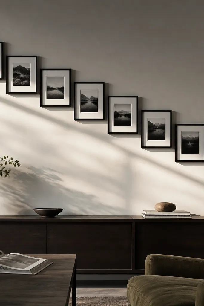
Diagonal stair-step collages look modern because they create movement across a wall. The trick is to keep the spacing consistent and let only the diagonal shift. Use frames of one size so the diagonal pattern stays crisp. This works well on walls with lots of horizontal lines, because the diagonal breaks the monotony.
Pick a single frame size, like 8x10, and decide how many frames fit across your wall width. Draw a diagonal baseline on paper, then place each frame at a consistent step interval, like 4 inches down per frame across. Tape the plan to the wall and mark mounting points. Mount starting at the highest corner, then follow the diagonal steps downward with a level check.
Editor's noteUse the same photo orientation for every frame, so the diagonal feels intentional rather than random.
Skip thisDon’t change frame sizes on a diagonal — it makes the steps look uneven.
28. Two-row collage with alternating frame orientations
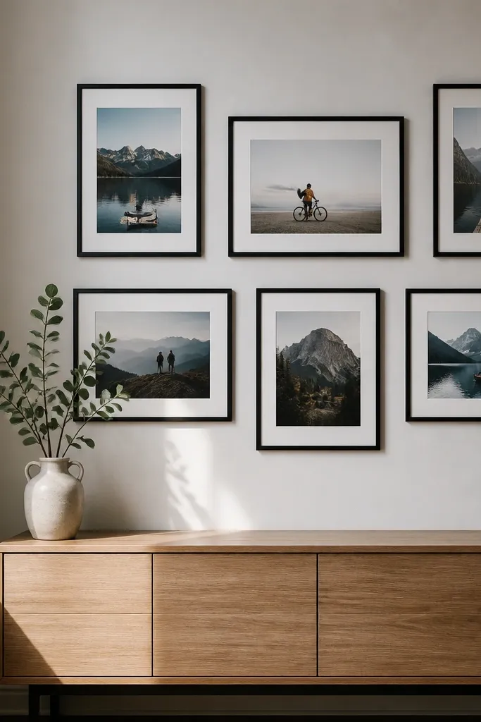
Alternating orientations can look gorgeous when it’s controlled into two rows. The layout feels modern because the eye keeps moving, but the structure stays simple. Use the same frame size and finish, and alternate portrait and landscape photos in a repeating pattern. This is a great option for walls above sideboards where you want a horizontal piece that still has energy.
Choose frames in one size, like 8x10, and use mats so both portrait and landscape photos sit centered. Plan two rows with equal gaps, then alternate portrait and landscape placements in a checker pattern. Tape the arrangement on the wall and align the top edges first so both rows sit level. Mount each frame using the same measuring reference from the centerline.
Editor's noteKeep the photo subject placement consistent (faces near the upper third) so the alternation looks balanced.
Skip thisDon’t alternate orientation randomly — repeat the pattern row to row.
29. Large grid collage with thin aluminum frames
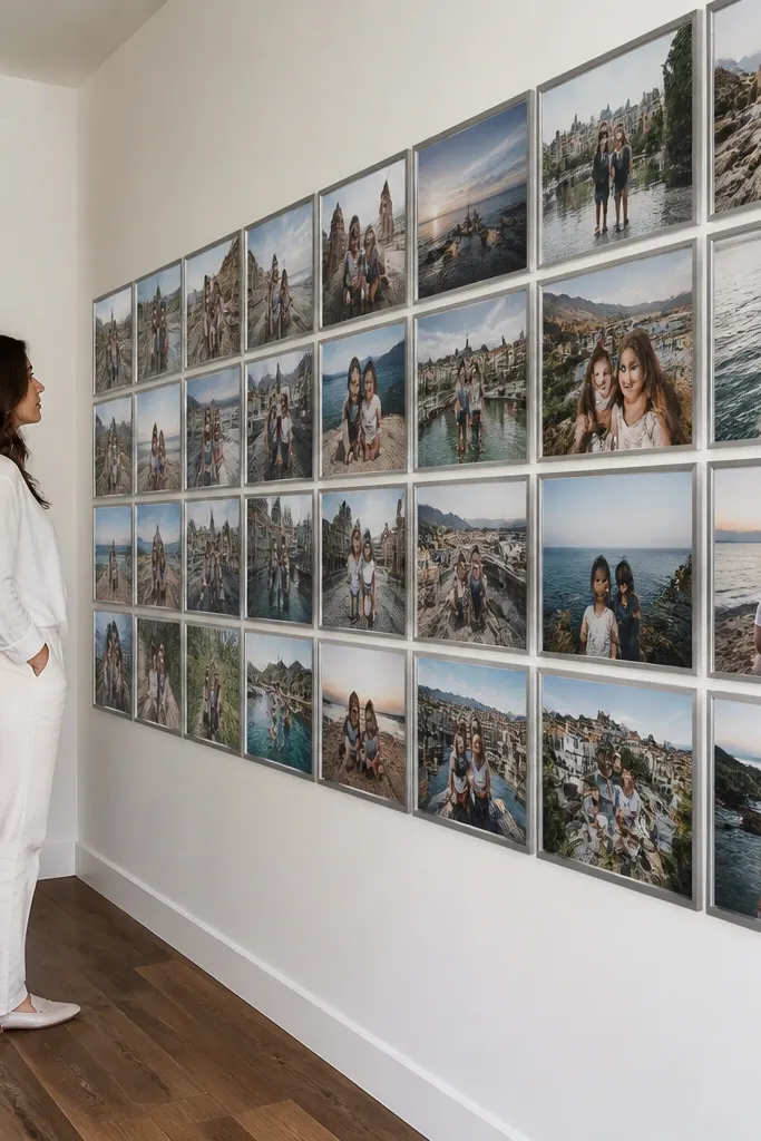
Thin aluminum frames give you a sleek, modern “museum” look without turning the wall into a heavy gallery. The grid feels crisp, and the thin frame profile keeps attention on the photos. This is ideal when you want lots of images but still need the wall to look clean. Use this for family photo sets or travel prints where you want variety but not clutter.
Choose a frame system that uses a consistent outer size and thin profile, then pick a photo size that fits the system, like 4x6 or 5x7. Plan a grid that forms a rectangle, not a scattered layout, and keep spacing between frames consistent, like 1.5-2 inches. Tape a paper grid to the wall and mark screw points through the frame templates. Mount the grid starting with the top-left corner, then fill row by row.
Take one extra minute to align frame corners — thin frames show even small misalignment.
Don’t use thick mats with thin frames — it can look bulky and less modern.
30. Monochrome film strip collage with numbered frames
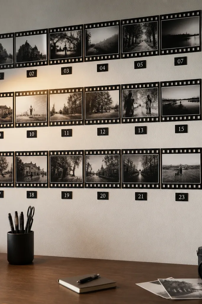
Film strip style looks modern when you add structure like numbering and consistent spacing. Black-and-white photos plus small number cards create a graphic design effect that reads instantly. This is a fun choice for a teen room or a creative workspace where you want the wall to feel like an art piece. It also makes the collage look cohesive even if your photos vary a lot.
Print photos in narrow strip proportions, like 2.5x4 or 3x4, and mount them onto a long backing board or poster board. Add small number cards between photo strips, aligned to a straight baseline. Use a matte black backing paper to keep it film-like. Hang the finished strip using two wall anchors or a picture rail so it stays straight.
Use the same font on every number card and keep the font size consistent for a clean graphic look.
Skip random number placement — the spacing is what makes it feel like a designed film strip.



