
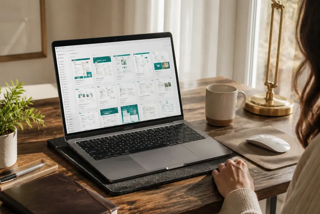
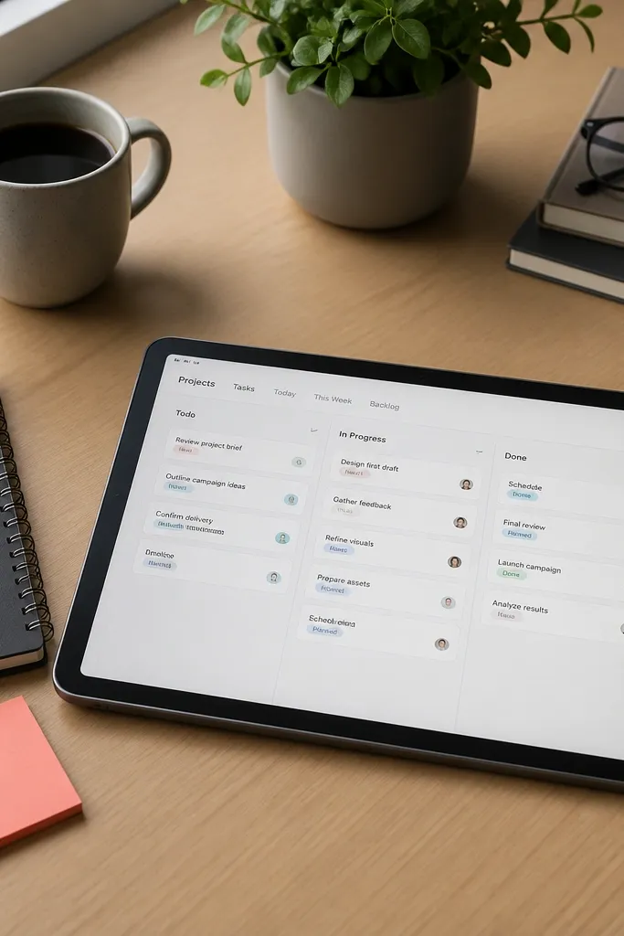
1. Morning Dashboard with a Single-Scroll "Today" Strip
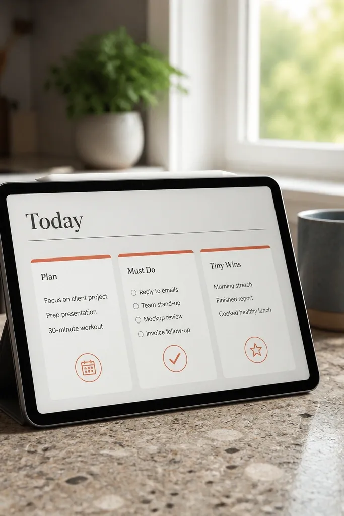
Start by creating a new page called Today Dashboard and add a 3-column layout. Put a checkbox list in the left column, a short text plan in the middle, and a “wins” checklist in the right. Then create a database called Daily Tasks with properties: Date (date), Status (select with 3 values), Priority (select), and Tag (multi-select). Add a filtered view on the dashboard that shows tasks where Date is today, sorted by Priority. Finish by setting the view to compact layout and hiding extra properties so the top stays clean.
This template is built for quick starts. You get one scrollable “Today” strip at the top with three blocks: a short plan, a must-do checklist, and a tiny wins area. The look stays modern because it avoids heavy sections and keeps the same spacing pattern every day. Use a clean cover and a single accent color for statuses so the page reads like a designed interface. It’s best for people who open Notion first thing and want direction in under a minute.
Skip thisDon’t paste random notes into the dashboard; keep tasks in the database so views stay tidy.
Editor's noteSet Status options to emoji labels like ⏳ Planned, ✅ Done, 🧹 Cleared so the dashboard looks good at a glance.
2. Weekly Planner with a Two-Tile Calendar + "Top 3" Panel
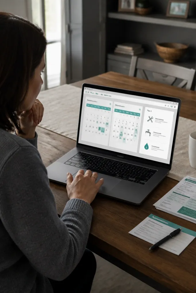
This one looks sharp because it’s structured like a magazine spread: two calendar views side by side, then one focused panel. The first calendar shows scheduled items; the second calendar shows a separate database for “life admin” like bills, appointments, and errands. The “Top 3” panel is a static block you update once per week, which keeps your page from feeling like a cluttered feed. This template is great for weekly reset habits and for anyone who needs balance between work and life tasks. It stays modern because the page has strong visual hierarchy.
Create two databases: Work Schedule and Life Admin. Add Date (date) and Status (select) to both, plus a Priority select on Work Schedule. On your Weekly Planner page, create a two-column layout and insert a calendar view for each database filtered to the current week. Then add a “Top 3” section with three checkbox lines that you manually update each Monday. Finally, create a third view called Weekly Summary that groups tasks by Status and shows only counts, so you get a clean snapshot without extra text.
Use the same Status names across both databases so your weekly summary stays visually consistent.
Skip adding ten sections; two calendars and one panel is the sweet spot for a clean look.
3. Project Tracker that Looks Like a Minimal Kanban Card Wall
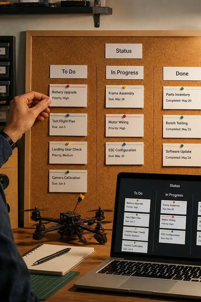
Create a database called Projects with properties: Status (select with 4 values), Due (date), Priority (select with 3 values), and Next Step (text). In the board view, set grouping by Status and switch card preview to show Due and Priority. Add a filter that hides “Completed” unless you toggle a separate view. Then create a second view called “Today’s Next Steps” using a filter where Due is today and Status is not Completed. Finish by adding a page button labeled New Project that creates a template row with default Status = ⏳ Planned and Priority = Medium.
If you want modern Notion Template Ideas that look good and stay usable, make a board that you can scan in 5 seconds. This project tracker uses one database with compact cards, short titles, and one line of metadata. You’ll have columns for Status, but each card stays clean because you hide long fields and show only essentials like due date and priority. It’s perfect for ongoing work, home improvement projects, or anything with moving stages. The aesthetic comes from consistent card height and a strict property set.
Skip thisDon’t include big text previews on cards; it wrecks the clean wall effect.
Editor's noteKeep Next Step short (under 10 words). Long text makes cards look messy fast.
4. Meal Planning with a Weekly Grid and "Grocery List Rollup"
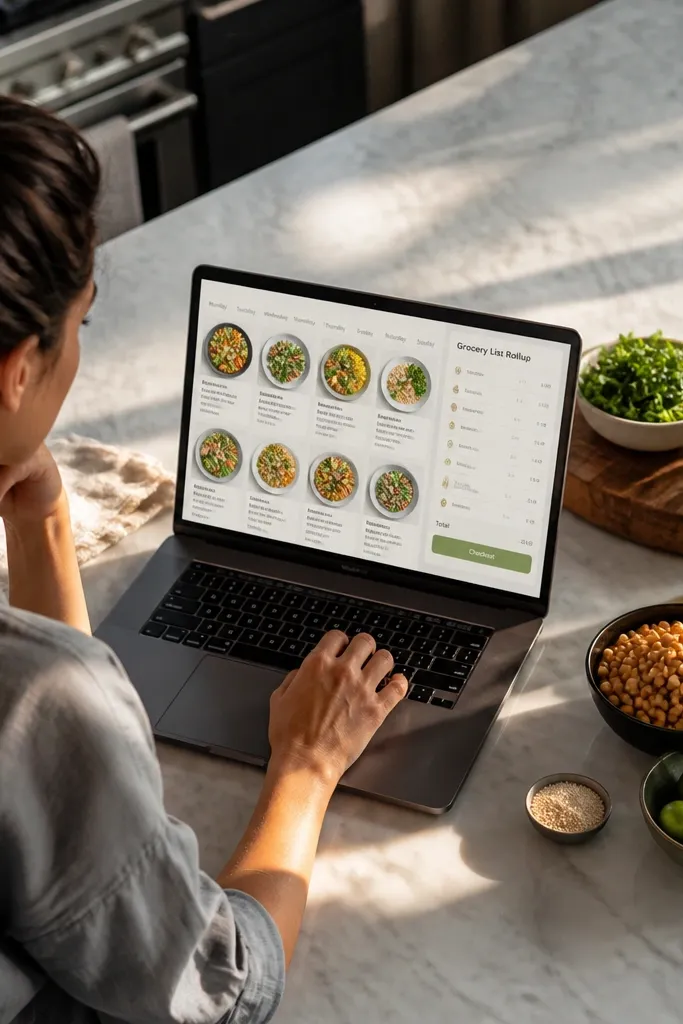
Build a database called Meals with properties: Date (date), Meal Type (select like Breakfast/Lunch/Dinner), Recipe (text), and Ingredients (multi-select or text list). Create a second database called Recipes if you want more structure, with Ingredients as multi-select. On the Meal Plan page, add a calendar view for Meals filtered to the current week and adjust to show Meal Type. Then create a grocery list section using a filtered view that groups ingredients by ingredient name and sums counts if you track quantities. Finally, add a “Choose from favorites” button by pre-creating template rows for common meals.
This template is photogenic because it’s a grid. You get a weekly meal plan with one entry per day, and a separate grocery list that updates based on what you selected. The modern look comes from using a database view that shows days clearly, plus a compact grocery section that feels like a checkout page. It’s built for repeat use, so you save time and stop retyping ingredients every week. It works best for people who plan one week at a time and want a clean list without spreadsheets.
Skip thisAvoid free-form ingredient paragraphs; they don’t roll up into a readable list.
Editor's noteIf you use Recipes, set Ingredients as multi-select so the grocery list view stays sortable and clean.
5. Cleaning Routine with a "Room Tiles" Index and Check-In Dates
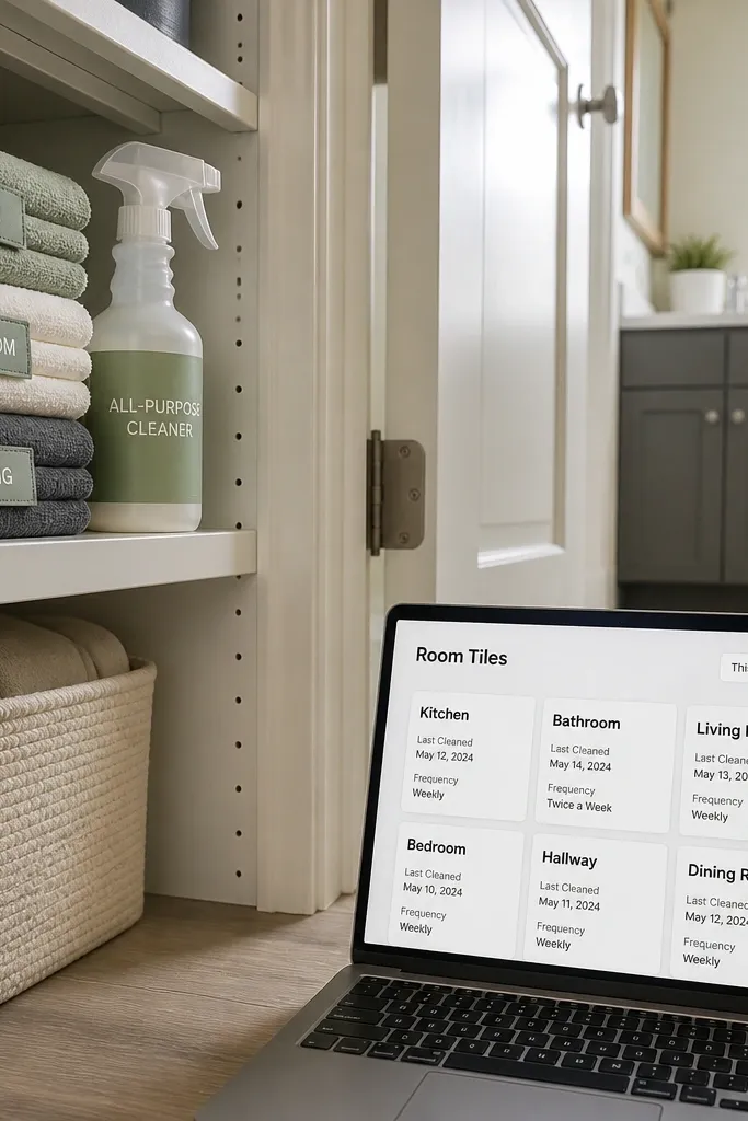
This is one of the best modern Notion Template Ideas for making chores look organized. You create a Room database with tiles that show room name, last cleaned date, and frequency. Then you generate a “This Week” view that filters to rooms due for cleaning. The aesthetic is clean because each tile is the same size and uses consistent status styling. It’s great for apartments, shared houses, and anyone tired of forgetting what gets cleaned when. You end up with a routine that feels like a dashboard, not a chore list.
Create a database called Rooms with properties: Room (title), Frequency (select like Weekly/Biweekly/Monthly), Last Cleaned (date), and Status (select like Due, Scheduled, Done). Create a view called This Week that filters where Last Cleaned is older than the frequency threshold using a calculated approach: add a property called Next Due (date) and set it when you complete a cleaning. When you finish a room, set Next Due to the correct future date and update Status to Done. On a Cleaning page, add a linked database view in layout set to tiles so the rooms look like cards. Finish by adding a button template called Start Cleaning that creates a checklist block for that room.
Use tiles layout for rooms and hide extra properties so the page stays calm.
Don’t track chores as one huge checklist; separate rooms so your views can filter cleanly.
6. Budget Tracker with Category Bands and a "Spending Today" Bar
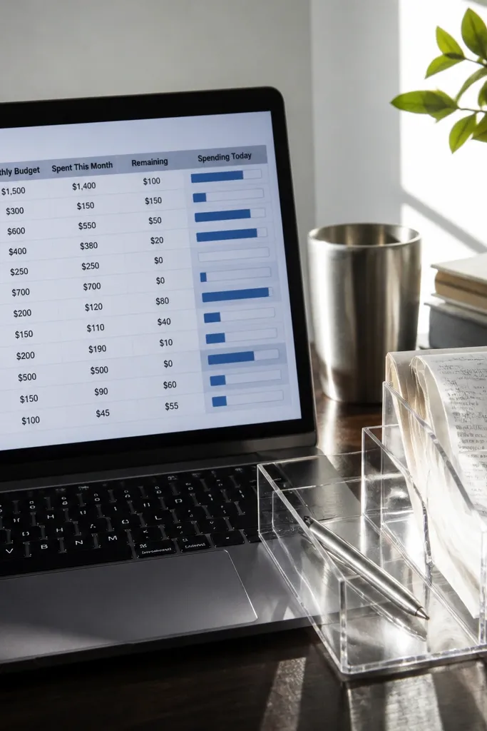
Create a Transactions database with properties: Date (date), Category (relation to Categories), Type (select Income/Expense), Amount (number), and Note (text). Create a Categories database with properties: Category (title), Color Tag (select), and Type (select Expense/Income). On your Budget Dashboard page, add a grouped table view of Transactions filtered to the current month and grouped by Category. Add a separate view filtered to Date is today and Type is Expense, sorted by Amount descending, then show it as a compact table. Finally, add a “New Transaction” template row that pre-fills Type and Category for common categories.
A budget template looks modern when it’s visual and restrained. This one uses a database for transactions and a second database for categories, then shows category totals in grouped views. The “Spending Today” bar is a narrow section that filters transactions to today and displays totals by category. The look stays clean because you don’t cram every transaction on the main page; you show summaries. It’s best for people who want control without doing math in spreadsheets. You get a dashboard that feels like a finance app.
Skip thisDon’t show every transaction on the dashboard; keep it summary-first.
Editor's noteSet Amount to a number with currency formatting so the totals align nicely.
7. Book Notes in a "Margin Quote" Style Database View

This template is aesthetic because the content blocks behave like notes in a book. You store quotes and your reactions in a database, then display them in a view that emphasizes the quote text. The modern look comes from turning metadata into small properties rather than long paragraphs. You can filter by book and tag themes, so it stays searchable without turning into a messy library. It’s great for reading goals, learning retention, and building a personal knowledge base that you actually revisit.
Create a database called Book Notes with properties: Book (select or relation), Quote (text), Page (number), Theme (multi-select), and Status (select with values like Draft, Final, Archived). On the Book Notes page, add a gallery view filtered to a specific Book, with card preview set to show Quote and Page. Add another view called Themes that groups by Theme and shows only Final notes. To keep quotes readable, use a consistent font size for Quote blocks by putting Quote in a dedicated property and limiting other text in the card. Finish by creating a template for new entries that defaults Status to Draft and leaves Page blank until you fill it in.
Use Theme as multi-select with 8-12 options max; too many themes makes the UI feel noisy.
Avoid dumping full chapters into Quote; keep entries short so the cards look intentional.
8. Recipe Card System with "Ingredient Checklist" and Portion Notes
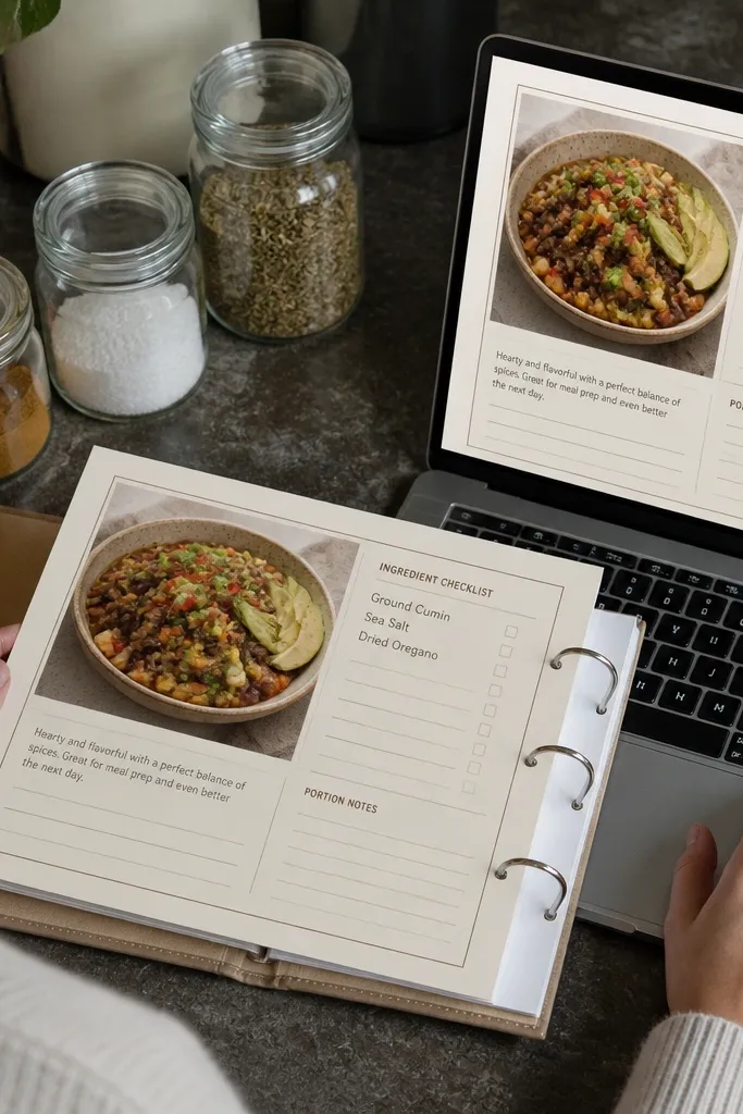
Create a Recipes database with properties: Recipe (title), Prep Time (number), Cook Time (number), Difficulty (select), and Ingredients (multi-select or text list). Add a separate Ingredients database if you want substitutions and categories, with a relation from Recipes. On each recipe page, include three sections: Ingredients checklist, Steps, and Notes. For the checklist, use a synced block linked to a view of ingredients if you built Ingredients as its own database; otherwise keep ingredients as a bullet list generated from the Ingredients property. Finish by adding a “Portions” section as a number property or a small text block that you update when you scale recipes.
This looks like a real recipe binder because each recipe has a card layout with repeatable sections. Your database holds the recipe title, prep time, cook time, and a structured ingredient checklist. The modern part is how it’s designed for scanning: you can flip between recipes and see ingredient lists without opening a wall of text. It also helps you cook better because portions and substitutions are separate fields, so you don’t lose them. If you cook regularly, this template will feel practical and good-looking.
Skip thisDon’t mix substitutions into the main ingredients list; it makes the card harder to scan.
Editor's noteKeep difficulty as a select with 3 values max so recipe cards stay visually consistent.
9. Fitness Habit Tracker with a "Streak Strip" and Weekly Heatmap View

This template is modern because it shows progress visually, not as a long list of checkboxes. You create a Habits database and a separate Log database for daily completion. Then you show a heatmap-style weekly view by filtering the log to the current week. The look is clean because the habit names are short and the completion status is color-coded. It’s great for building routines and tracking consistency without obsessing over every workout. You can keep it simple or add details later.
Create a Habits database with properties: Habit (title), Category (select), and Goal Frequency (select like 3x/week). Create a Log database with properties: Date (date), Habit (relation to Habits), Status (select with values like Done/Missed), and Notes (text). On the Habit Dashboard page, add a linked view of Habits in table or gallery layout. Add a separate weekly log view filtered to Date is within the current week, grouped by Habit. Finally, add a “Streak Strip” section that uses a rollup or calculated streak field if you track consecutive days; if not, use a manual streak number property and update weekly.
Use Status colors consistently: Done should be green, Missed should be muted gray.
Avoid tracking too many habits at once; the heatmap gets unreadable fast.
10. Home Inventory with Photo Tiles and Purchase Dates

This is an aesthetic template with real payoff: your home inventory becomes a visual catalog. Use a database where each item has a photo, purchase date, and condition. The tiles layout makes it fast to scan, and the purchase date lets you plan replacements and warranties. It’s perfect for renters, new homeowners, or anyone who hates hunting for model numbers when something breaks. The look stays clean because every item has the same card structure and short fields. You’ll also thank yourself during insurance paperwork.
Create an Inventory database with properties: Item (title), Category (select), Purchase Date (date), Condition (select), Warranty (text), and Photo (file). Use the database cover area or photo property as the main visual. On an Inventory Dashboard page, add a gallery view set to tiles layout with compact card preview showing Condition and Purchase Date. Add a filtered view called “Warranty Active” that filters Warranty is not empty. For quick adding, create a template row that pre-fills Category and Condition defaults, then prompts you to upload a photo and enter Purchase Date.
Name photos consistently like “Item-Location-YYYY-MM” so your folder stays sortable.
Don’t rely on long descriptions on the card; keep details on the item page.
11. Event Planning Page with Timeline Blocks and Vendor Notes

This template looks polished because it uses a timeline layout instead of a checklist dump. You create an event page with date-based sections and keep vendor notes in a linked database. The timeline makes it easy to see what happens first, and the linked vendor table keeps contact info tidy. It’s ideal for parties, trips, weddings, conferences, or any event with deadlines. The aesthetic comes from consistent section spacing and a clean vendor card layout. You end up with a page that reads like a plan, not a jumble of tasks.
Create a database called Vendors with properties: Vendor (title), Category (select), Contact (text), Due Date (date), Status (select), and Notes (text). Create an Event page template with a timeline section layout: “Now,” “Next 2 weeks,” and “Next 2 months” as three headings. Add a linked database view for Vendors filtered by Due Date range and grouped by Category. On the event page, include a short checklist block called “Event Essentials” with 8-12 items. Finish by adding a simple page template for “Vendor Meeting Notes” that creates a new vendor entry with Status set to Scheduled.
Keep vendor categories short (Venue, Catering, Photographer) so the grouped view stays readable.
Don’t make one giant table with every vendor detail on the event page.
12. Learning Tracker with "Module Cards" and a Knowledge Map View

Create a Modules database with properties: Module (title), Topic (select), Goal (text), Resource (url), Status (select), and Time Spent (number). On a Learning dashboard page, add a gallery view filtered to Status!= Archived and set card preview to show Goal and Topic. Add a table view grouped by Topic that shows counts by Status. Create a “New Module” template row that defaults Status to ⏳ Planned and Topic to your current topic. Finish by adding a “Weekly Review” section with a simple checklist of what you finished and what you’ll do next.
Modern Notion Template Ideas work when learning feels organized, not academic. This template uses a Modules database where each module has a short goal, a resource link, and a completion status. Then you display modules in a gallery view that feels like flashcards. A second view groups modules by topic so you can see your coverage at a glance. It’s great for courses, language study, or skill projects you want to finish. The look is clean because each module card has the same structure and short text.
Skip thisAvoid writing full lesson notes inside the module card; store notes on the module page.
Editor's noteKeep Goal under 90 characters so cards don’t stretch and ruin the layout.
13. Travel Kit Planner with Packing Lists per Weather Zone

Create a Packing Items database with properties: Item (title), Category (select like Clothing, Toiletries, Tech), Weather Zone (select), and Packed (checkbox or select). Create a Travel page template with a property called Destination Weather Zone (select) and Travel Dates (date range). Add a linked database view filtered to Weather Zone equals the selected destination zone. Sort by Category and set the view to table with compact rows so it looks tidy. Finish by adding a “Last Day Check” section that filters to Packed is not checked and shows only remaining items.
This template looks good because it’s built around categories that people actually pack by. You set up a packing list database with items assigned to a Weather Zone like Cold, Mild, Hot. Then your travel page shows only the relevant zone items, so the list stays short and clean. The aesthetic comes from consistent checkbox styling and a tight layout. It’s perfect for frequent travelers who hate rewriting packing lists and want a page that looks organized on their phone. You also get a clear view of what you haven’t packed yet.
Skip thisDon’t mix multiple weather zones on one list; it makes the page feel chaotic.
Editor's noteUse Packed as a checkbox, not a text field, so you get clean sorting and filters.
14. Daily Journal with a 5-Block Layout and Mood Timeline
This journal template is modern because it’s designed like a form, not a blank page. You get five blocks: mood, what happened, what I learned, what I’m grateful for, and one intention. Add a Mood timeline view so you can see patterns over time without extra work. The look stays clean because each entry page uses the same layout, with short headings and consistent spacing. It’s ideal for anyone who wants reflection that’s readable and trackable. You can also reuse the mood system for fitness or stress tracking.
Create a Journal database with properties: Date (date), Mood (select with 5 levels), Title (title), Learned (text), Gratitude (text), and Intention (text). In the database settings, create a template that shows a five-block layout on the entry page. Add a separate view called Mood Timeline that is a timeline grouped by Mood. Then add a “Today Entry” button on a Journal Home page that creates a new entry with Date = today. Finish by limiting text blocks to one paragraph each so entries stay consistent and easy to read.
Use fixed mood labels like 1-5 or Calm/Okay/Off/Bad so your timeline doesn’t turn into vague words.
Skip free-form mood descriptions; they break filtering and the timeline view.
15. Budget-Friendly Home Decor Moodboard with Color Tags
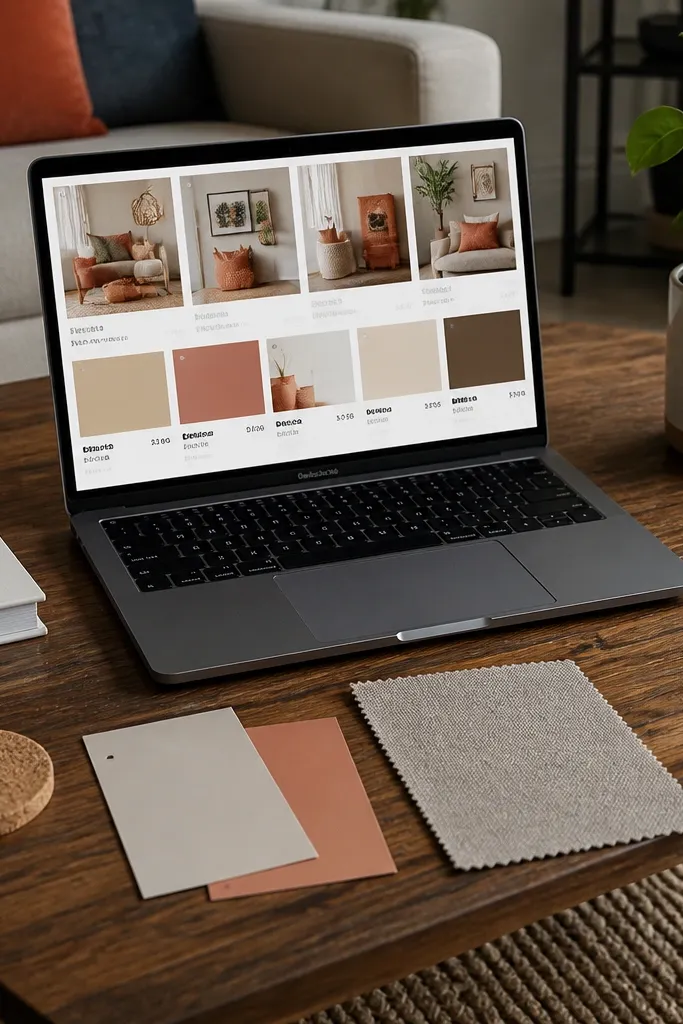
Create a Moodboard database with properties: Item (title), Room (select), Color Tag (select), Estimated Cost (number), and Status (select like Wish, Sourcing, Bought). Add a photo file property for each item. On the Moodboard page, use a gallery view set to tiles and configure the card preview to show Room and Color Tag. Add a second view filtered to Status!= Bought if you want a clean shopping list. Finish by making a template row for “DIY Project” with defaults like Status = Wish and Estimated Cost = 0.
This is a decor template that looks like a Pinterest board but stays structured. You store items you want to buy or DIY, each with a color tag, cost estimate, and where it would go in your room. The modern look comes from using tiles and color-coded tags so you can scan the board by palette. It’s perfect for people who get overwhelmed by options and need a visual shortlist. You also get the practical part: budgets and room placements so you don’t buy something that doesn’t fit.
Skip thisDon’t add long paragraphs to the card; keep notes on the item page.
Editor's notePick 6-8 Color Tags max. More than that turns the board into a rainbow with no direction.
16. DIY Tools Checklist with Checkout Status and Maintenance Dates
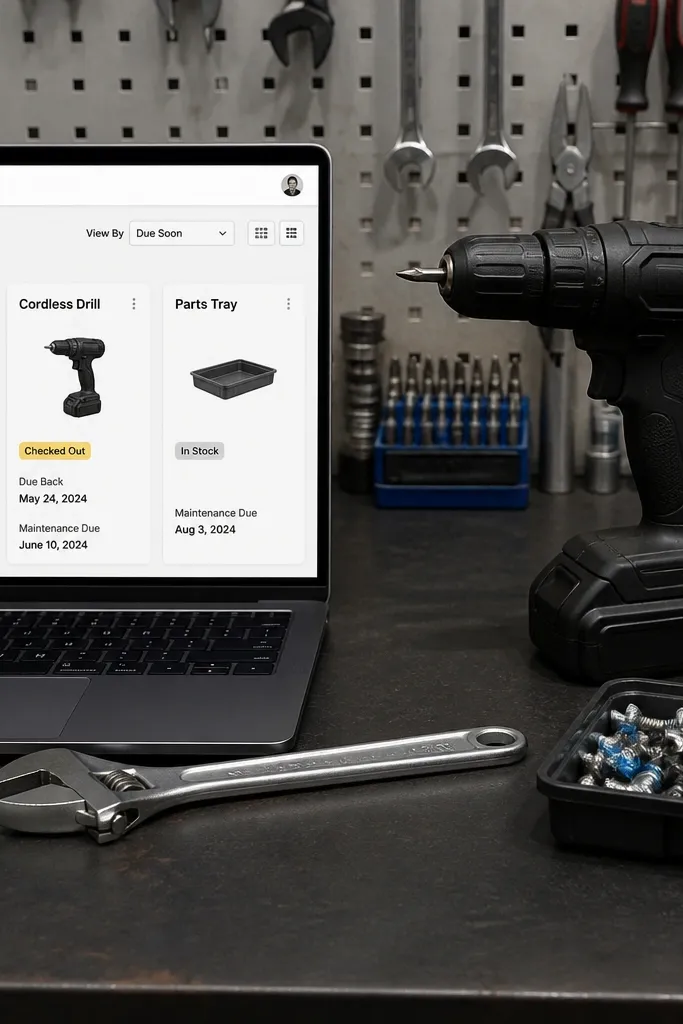
This template keeps your workshop calm. You store tools in a database with a checkout status and a maintenance due date, then you show a “Due Soon” view when it’s time to clean blades or replace batteries. The look is modern because each tool card is short, with status chips and dates as the only visible metadata. It’s perfect for shared spaces or anyone who loses tools to clutter. You’ll also remember what needs maintenance before it becomes a problem.
Create a Tools database with properties: Tool (title), Category (select), Checkout Status (select like In, Out, Needs Service), Last Maintenance (date), and Next Maintenance (date). Add a photo file property if you want quick recognition. On a Tools Home page, add a linked database view called Due Soon filtered to Next Maintenance is within the next 14 days and Checkout Status!= Needs Service. Use a table view with compact rows so the list stays readable. Finish by adding a template row for “New Tool” with default Checkout Status = In and Next Maintenance set 90 days out.
Use a single maintenance interval per category (like 30 days for blades) so Next Maintenance stays consistent.
Don’t track maintenance as notes only; you’ll miss due dates without a date property.
17. Finance Admin Vault with Receipts, Categories, and Year Tabs
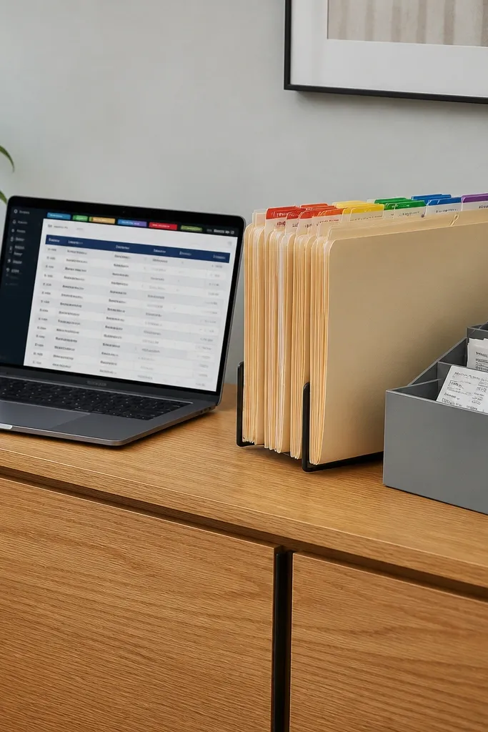
This template looks tidy because it’s file-first and date-structured. You store receipt entries in a database with a Year property and a Category property, then you view them in a clean table grouped by year. When you need something, you filter by category and date instead of searching through folders. It’s best for taxes, warranties, and reimbursement tracking. The aesthetic is calm because the main page shows grouped rows and short labels, not long notes. You also keep everything in one place with consistent naming.
Create a Receipts database with properties: Receipt (title), Date (date), Category (select), Year (formula or select), Amount (number), and File (file upload). Add a view grouped by Year and set it to a table layout so the rows stay compact. Then create a filter view called “Tax Month” that filters Date within your tax period. For naming, set Receipt title format like “Vendor — YYYY-MM-DD — Category” so sorting stays correct. Finish by adding a “New Receipt” template row that defaults Year to the current year and Category to the most common one you use.
Set File uploads to always include the original PDF name in the Receipt title for easier backtracking.
Avoid storing receipts as random attachments without a Category and Date property.
18. Content Calendar with Draft Status and "Queue to Publish" Board
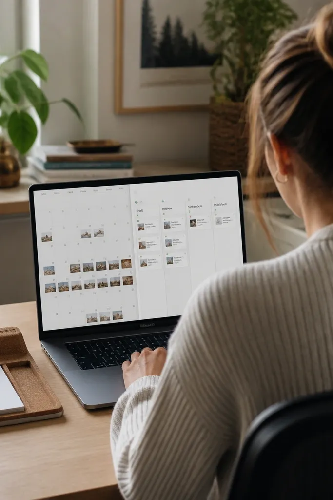
Create a Content database with properties: Post (title), Status (select with Draft/Review/Scheduled/Published), Publish Date (date), Platform (select), and Topic (multi-select). On your Content Home page, add two views: a calendar view filtered to Status!= Published and a board grouped by Status. In the board card preview, show Publish Date and Platform only. Add a third view called Queue to Publish filtered to Status = Scheduled and sorted by Publish Date ascending. Finish by adding a template row for “New Idea” that defaults Status = Draft and Publish Date = next available day.
This template is built to look like a real production board. You track posts in a database with statuses like Draft, Review, Scheduled, and Published. A calendar view shows dates, while a board view shows the queue by status so you can see what’s waiting. The modern look is in the card preview: keep it short with one line for title and one line for date. It’s perfect for blog posts, social content, and weekly newsletters. You also get a clean workflow from idea to publish with less switching.
Skip thisDon’t let statuses expand into custom one-offs; keep Status values fixed.
Editor's noteUse one Platform select value per post, not multi-select, so cards don’t look crowded.
19. Friend Catch-Up Tracker with Relationship Notes and Last-Contact Dates
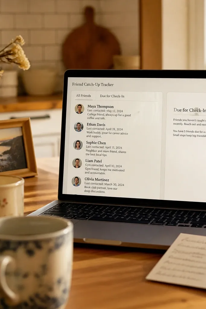
Create a People database with properties: Person (title), Last Contacted (date), Frequency (select like 2 weeks/1 month/6 weeks), and Status (select like Reach Out, Warming Up, Done). Add a Notes property for “what to mention.” On your Catch-Up page, add a tiles view of People filtered to Status!= Done. Create a second view called Due for Check-In that filters where Last Contacted is older than the selected frequency by using a Next Due date property you update when you log contact. Finish by adding a “Log Contact” template that sets Status = Done and updates Last Contacted to today and Next Due to the future date.
This template looks personal because it’s structured around people, not generic tasks. You store each person with last-contact date and a short note about what you’re planning to talk about. Then you create a “Due for Check-In” view that filters to people you haven’t contacted in a set time window. It stays modern because the main page shows tiles with minimal metadata. It’s good for maintaining relationships without keeping a messy list in your phone. The aesthetic comes from consistent card formatting and short, readable notes.
Skip thisAvoid storing full conversation transcripts; keep them in a separate Notes page if you need them.
Editor's noteKeep the Notes field to one sentence so tiles don’t stretch.
20. Habit + Reward System with a "Points" Progress Bar
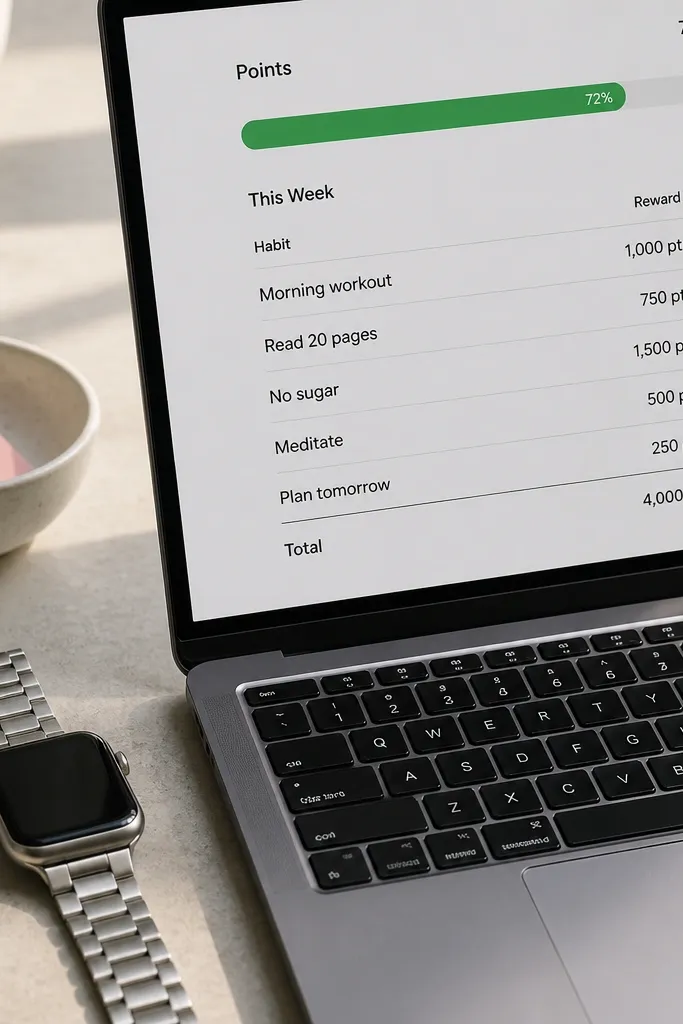
This one makes repetition feel satisfying. You track habits in a database, log daily completion, and convert it into points. Then you show a progress bar style section for the week’s points so your motivation has a visible scoreboard. The modern look is in the clean math: few properties, clear statuses, and a single weekly progress view. It’s great for building routines without turning your life into spreadsheets. You also get a clear place to plan rewards, so the whole system feels intentional.
Create a Habits database with properties: Habit (title), Points Per Win (number), and Category (select). Create a Daily Log database with properties: Date (date), Habit (relation), Status (select Done/Missed), and Earned Points (number). Add a rollup in Daily Log or a formula that sets Earned Points based on Status and Points Per Win. On your Rewards page, create a weekly view filtered to Date within the current week and grouped by Category, then include a table that sums Earned Points. Add a “Weekly Reward” section with a text block and a checklist of reward prep tasks.
Use only 3-6 habits in the system. Too many points sources makes the weekly view messy.
Don’t add free-form “almost done” statuses; keep it binary so points stay consistent.



