
1. Two-Tone Geometric Stripes (Straight, Modern Bands)
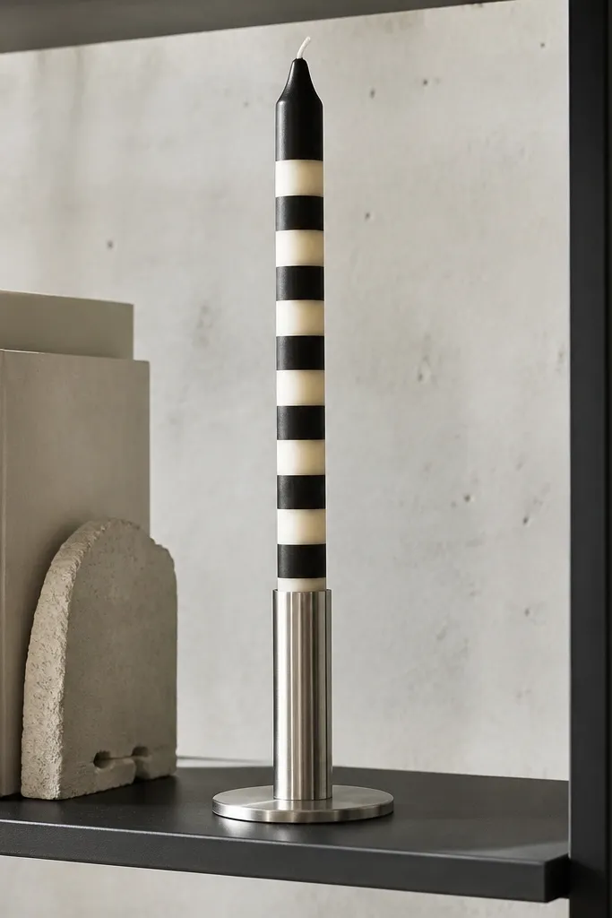
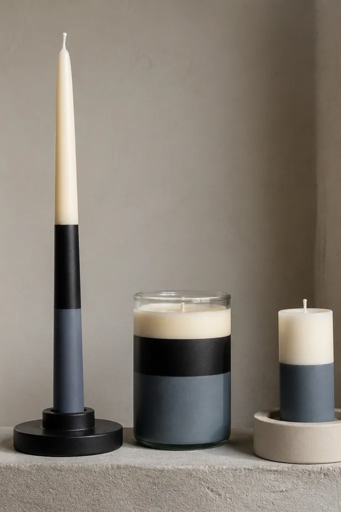
This design looks modern because it reduces the candle to clean geometry. Two-tone stripes make the surface feel intentional, and the contrast reads crisp from across a room. Go with matte black plus warm white or slate gray plus cream for a calm, styled look that fits shelves, entry tables, and minimalist decor. It’s also beginner-friendly because you’re not drawing tiny details; you’re painting controlled bands. Plan the stripe widths so they feel balanced — for example, 1 cm bands with 0.5 cm gaps on a medium pillar candle.
Start by marking three to five horizontal guideline lines around the candle with a light pencil, spacing them evenly. Paint the first stripe with a flat brush using thin coats, then let it dry completely. Tape over the edges with painter’s tape to keep the next stripe boundary sharp, and repeat until you finish all bands. Finally, remove tape while the paint is still slightly tacky for the cleanest edge, then seal with a clear acrylic sealer once fully dry.
Use painter’s tape only for straight edges; press it down gently so paint doesn’t creep under.
Don’t load the brush heavy — thick paint makes stripe edges look wavy.
2. Monochrome Wave Ribbons (Single-Color Flow Lines)
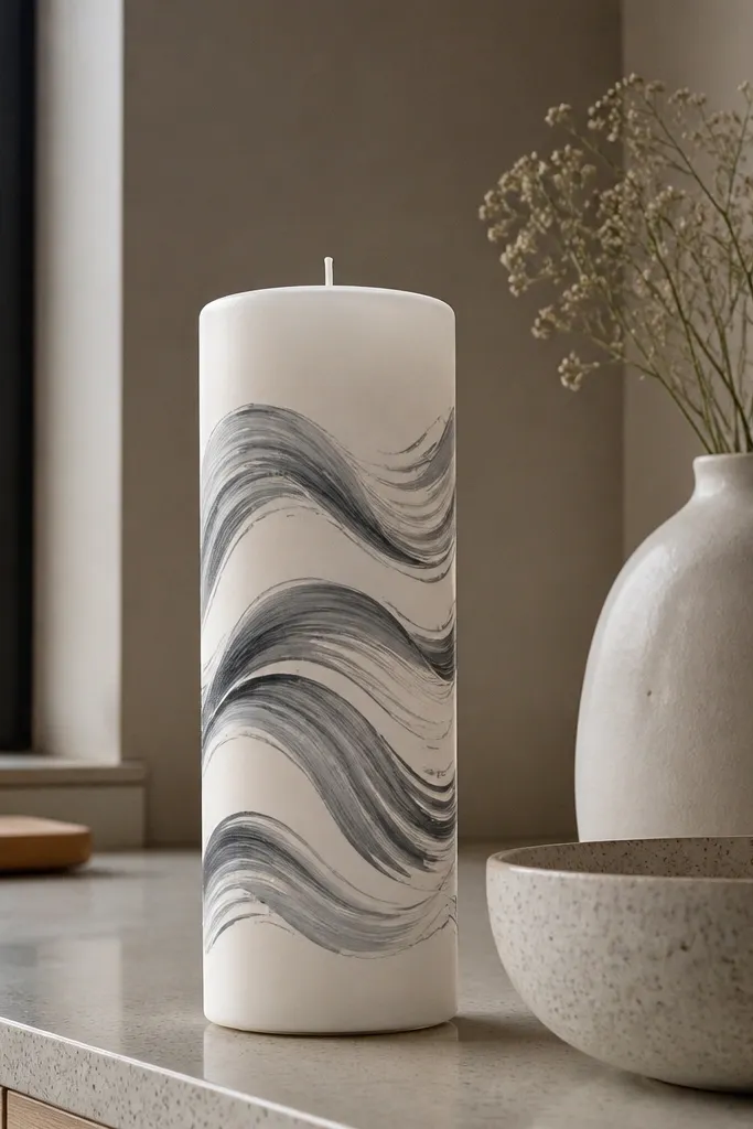
Wave ribbons give you motion without visual clutter. When you keep it monochrome, the candle reads sleek instead of busy. This is a great choice if you want candle decor that matches modern ceramics or neutral walls. The curves wrap around the candle, so it looks good from multiple angles, not just front-on. Use a single strong color like deep navy, charcoal, or terracotta, and keep the line thickness consistent for a polished finish.
Sketch one continuous wave path on paper, then copy it onto the candle with light pencil marks at two or three key points. Paint the ribbon with a flat brush for the base stroke, then refine the edges with a fine liner brush. Let it dry, then add a second pass only where the ribbon edges look uneven. Seal after drying so the wave line stays sharp when you handle the candle.
Draw the wave rhythm first — if the curve spacing is off, the candle looks handmade in a messy way.
Skip freehand zig-zags that change thickness — inconsistent line weight kills the modern look.
3. Minimal Dots and Half-Moons (Polka Meets Geometry)
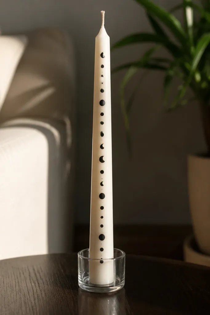
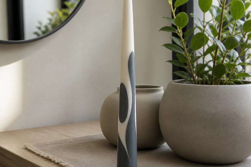
This design is photogenic because it uses small marks with big contrast. Dots and half-moons read modern when they’re evenly spaced and kept to a tight palette. It looks especially good on tall tapers because the pattern can run vertically like a graphic print. Choose black plus cream, or deep green plus ivory. Keep the shapes small and intentional — oversized dots can look childish fast.
Start by painting the candle base color if needed, then let it dry fully. Use a dotting tool or the back end of a small paintbrush to place evenly spaced dots in a vertical column. Add half-moons by painting a flat arc shape next to the dots, keeping their curvature consistent. Finish by sealing the whole candle with a clear matte sealer to keep dots from smearing during handling.
Use painter’s tape as a guide strip to keep your dot row perfectly straight.
Don’t stack dots randomly — the pattern must repeat to look designed.
4. Terracotta Sunburst (Radial Lines From One Center)
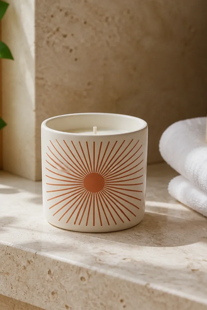
Sunbursts look bold and modern because they create a clean focal point. The radial lines pull the eye inward, so even a plain candle becomes a statement piece. Terracotta on a light base feels warm without going rustic. Use a matte finish so the lines look like graphic ink, not shiny craft paint. This works great for mantel styling because it reads clearly even at a distance.
Mark the center point on the candle face with a pencil dot. Paint the first radial line, then space lines evenly around the center using a ruler and light pencil guides. Keep each line thin with a fine liner brush, and correct any wobbles by brushing over the edge once the paint is dry. When you finish the outer lines, add a small center circle in the same color or a darker shade, then seal after drying.
If you struggle with symmetry, rotate the candle between lines and keep your spacing measured from the center mark.
Avoid thick lines — they turn the sunburst into a blob instead of a graphic.
5. Art Deco Corner Frames (Sharp Panels and Lines)
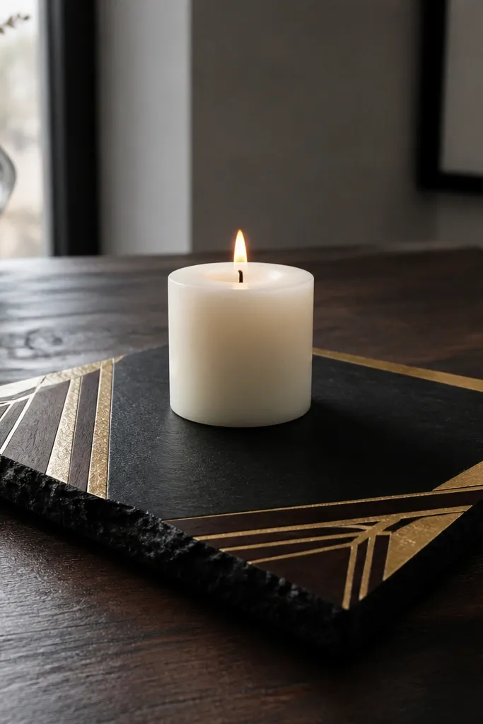
Art deco frames look expensive because they use straight lines and sharp angles. Corner framing gives the candle a structured, gallery-like look without covering the whole surface. Pair metallic gold with black or deep espresso for a high-contrast modern art vibe. This design also hides minor surface imperfections because the frame lines pull attention to the geometry. It’s a strong option if you want a candle that looks good next to brass trays or black picture frames.
Start with a base coat if your candle isn’t already the color you want. Use painter’s tape to block out two mirrored corner frames on the front, leaving a clear panel space in the middle. Paint the frame lines with black, let it dry, then add metallic gold on top in thin strokes. Pull tape carefully, then seal with a clear acrylic medium to protect the metallic paint.
Paint frames in two passes — one for coverage, one for crisp edges — instead of trying to do it in one thick coat.
Don’t freestyle the angles; if the corners aren’t consistent, the whole candle reads sloppy.
6. Botanical Minimal Stems (One-Color Line Leaves)
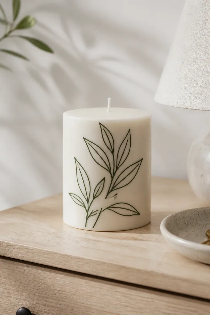
Minimal stems make your candle look modern because the drawing style stays graphic, not detailed. You’re not painting full leaves; you’re painting a few line leaves that suggest a branch. This works well in neutral kitchens and modern bedrooms where you want a hint of nature without the farmhouse vibe. Use one color only — olive, sage, or charcoal — and keep the line weight consistent. It’s a good choice if you like delicate decor but want it to look clean.
Editor's noteUse a brush with a sharp tip — a rounded brush makes leaf tips look blunt.
Lightly sketch one stem rising from the bottom of the candle. Add a few leaf shapes using a fine liner brush, keeping each leaf pointed and spaced evenly. Reinforce the stem line with a steady second coat after the first dries, so it looks smooth. Finish with a tiny dot cluster at the top or a small curved flourish, then seal once dry.
Skip thisDon’t add too many leaves; three to six marks is enough for that clean look.
7. Abstract Split-Color Panels (Clean Blocks, No Blending)
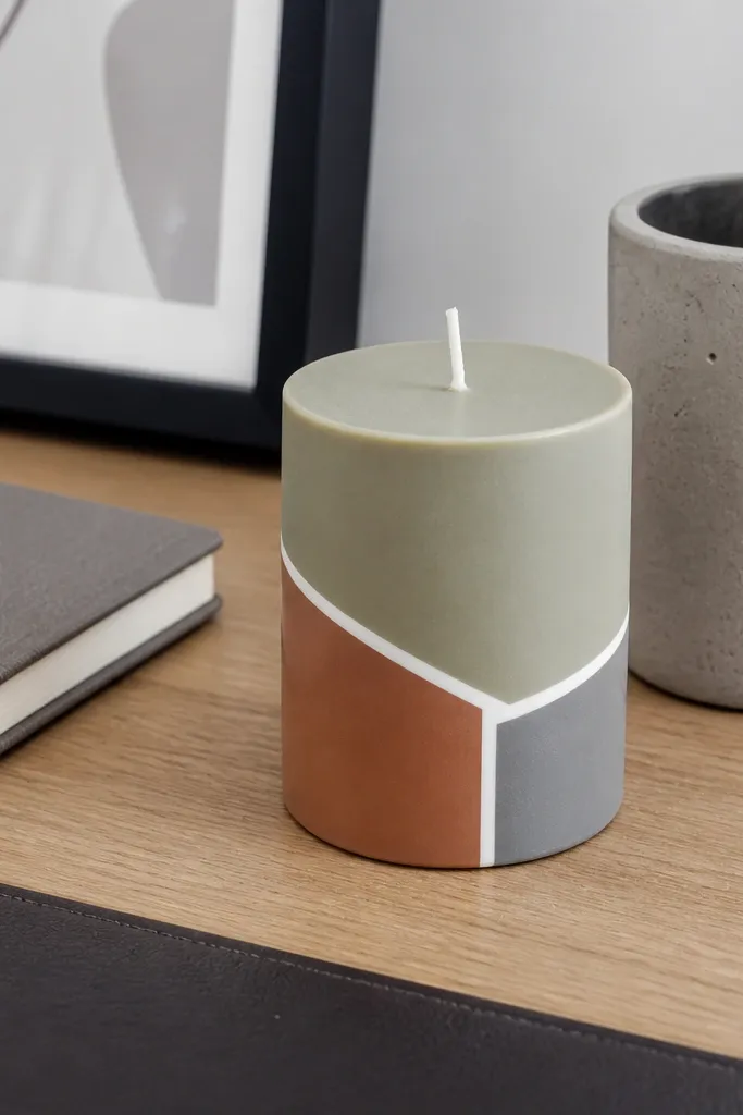
Split-color panels look modern because the shapes feel like product design, not decoration. The trick is sharp edges and intentional negative space. Pick two or three muted colors like sage, clay, and warm gray, then separate them with clear line boundaries. This design looks great on short pillars where you can fit two to three panels across the front face. It also pairs well with patterned pillows because the candle stays graphic instead of busy.
Editor's noteIf tape leaves a hard edge, paint right up to it — don’t try to fill gaps with extra paint.
Mask off the panel boundaries with painter’s tape to protect the negative space. Paint the largest panel first, using thin coats, then let it dry before removing tape or re-taping for the next color. Keep each shape simple — rectangles, angled trapezoids, or one curved edge — and keep the lines straight. When all colors are dry, seal the candle with a clear coat that won’t yellow.
Skip thisAvoid mixing colors on the surface; you want clean separation, not gradients.
8. Ink-Style Drip Edges (Controlled, Not Messy)
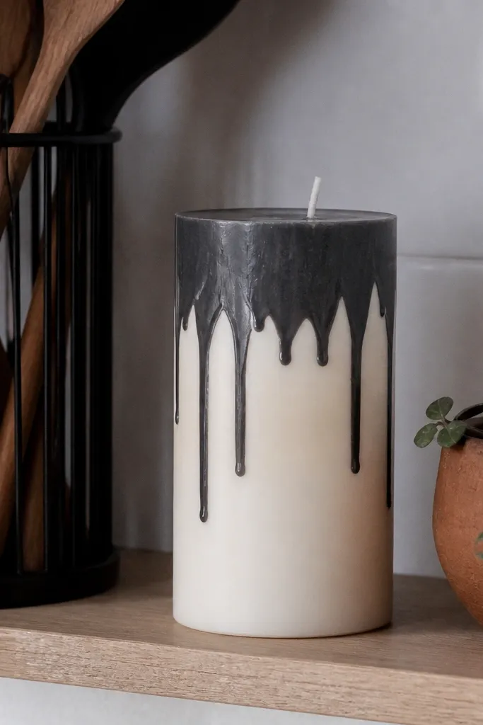
Drip edges can look messy, so the modern version is controlled. You’re painting a clean top band and letting only a few drips drop — think graphic ink, not wax spill. This makes a candle feel edgy and current while still being simple to paint. Use black, charcoal, or dark teal on an off-white base. Keep drips varied in length but consistent in width so it looks intentional.
Paint a solid top band across the candle face, about 2 to 3 cm tall on a standard pillar. While the band is still slightly tacky, draw 6 to 10 drip lines using a fine brush, then stop each drip at a planned length. Let it dry fully, then touch up any drips that spread by painting the drip edge back in with the same color. Seal after drying to prevent smudging.
Use a small amount of paint on the brush for drips — too much paint makes them run wide.
Don’t paint the drips after the band fully dries; you’ll get streaky, uneven lines.
9. Matte Ombre Fade With Hard Stop Line

Ombre looks modern when it’s subtle and has a hard stop. This design gives you a smooth gradient feel without the messy look of watercolor blending. The hard stop line keeps it graphic and clean, like a modern product label. Use acrylic and keep it matte so it doesn’t look glossy and craft-y. This looks great on tall tapers and pillars where you can see the gradient shift clearly.
Start by painting the entire area above your stop line in the lightest color. Then blend in darker paint gradually using a sponge or a wide flat brush, working in small passes and keeping the fade smooth. Once you reach the darkest shade at the bottom of the gradient, use a straight edge or tape to define the hard stop line. Let everything dry and seal with a matte clear sealer.
Blend with light pressure and stop blending earlier than you think — acrylic dries darker than you expect.
Skip glossy paint for ombre; shiny gradients show streaks more clearly.
10. Single-Line Portrait Profile (Minimal Face Outline)
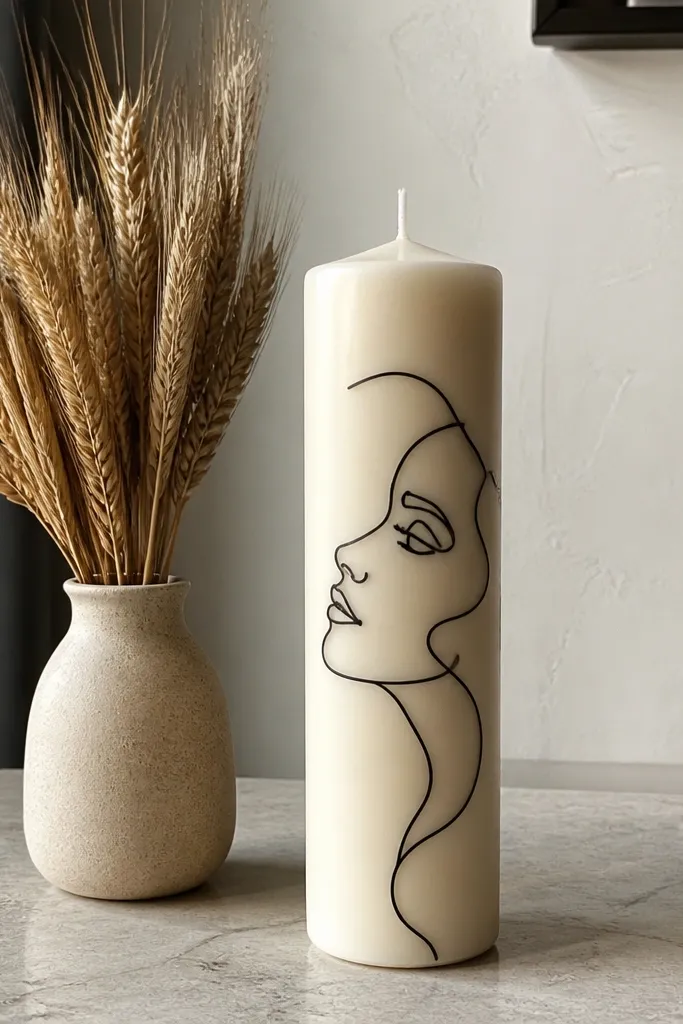
A single-line portrait is one of the most photogenic modern candle looks because it’s art, not craft. The line style makes the candle feel like a design object, and it reads clean from both front and side angles. Keep it monochrome for a sleek look. Use a fine liner brush and draw a continuous profile line around the candle, leaving small gaps for the candle color to show through. It’s best on smooth taper candles where the line can flow naturally.
Editor's noteIf your line wobbles, don’t erase — just repaint the line over it once the first layer is dry.
Lightly sketch the profile on paper first so you know where the nose and chin points land. Transfer the outline to the candle with light pencil marks, then paint over the lines using a fine liner brush in one steady motion. Let it dry, then add a second pass only where the line needs extra darkness. Seal with a clear acrylic medium so the line doesn’t smear while you move the candle.
Skip thisDon’t add shading or tiny features; the single-line style stays modern because it’s simple.
11. Color-Blocked Vertical Columns (Museum-Label Style)
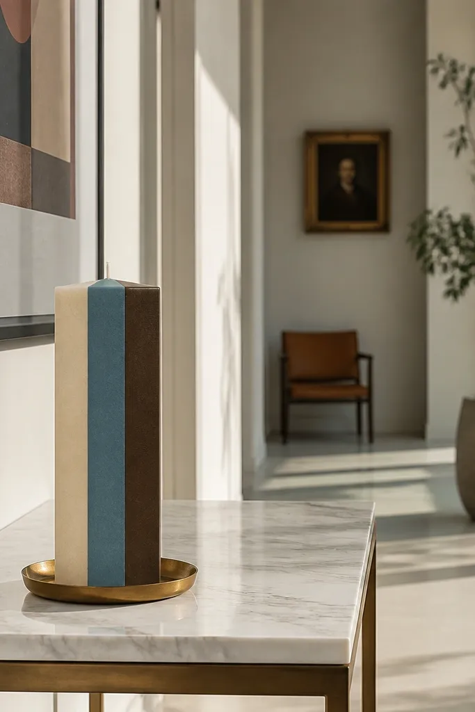
Vertical columns look like modern signage, and that’s exactly why they photograph well. The candle becomes structured, and the eye reads the design quickly. Use three columns maximum so it stays clean. Try muted tones like oatmeal, dusty blue, and cocoa brown, or stick to a two-color palette if you want it calmer. This design works on candles with a flat front face and gives a styled look on coffee tables.
Mark three to four equal-width vertical sections on the candle with pencil guidelines. Tape each boundary so you paint inside clean borders, then paint the first column with a flat brush in thin coats. Remove tape only after the paint is dry enough to not smear, then tape again for the next color. Seal with a clear coat after all sections dry fully.
Use the same brush for all columns to keep line texture consistent across the candle.
Don’t vary column widths wildly; it looks accidental unless you plan the proportions.
12. Metallic Halo Ring (Concentric Circle Accent)
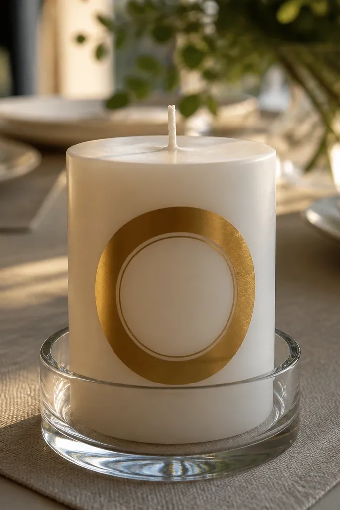
A metallic halo ring gives you instant “styled” energy because it catches light. The design is simple but high impact when you keep the ring centered and crisp. It looks especially good on plain white candles because the gold reads clean and intentional. This is a smart pick if you want something modern that still feels special for dinner tables. Use metallic gold or silver, and keep the rest of the candle plain or lightly tinted.
If needed, apply a thin base coat to even out the candle color and let it dry. Use a string-and-pencil compass method on paper to size the circle, then transfer the ring outline lightly to the candle. Paint the ring with metallic acrylic using a small flat brush, then let it dry and add a second pass for full coverage. Finish by sealing with a clear acrylic sealer so the metallic stays bright.
For a cleaner circle, paint the ring in segments and connect them after each segment dries.
Avoid thick metallic paint; it dries with texture that looks messy.
13. Stencil Script Numerals (Numbers Without the Mess)
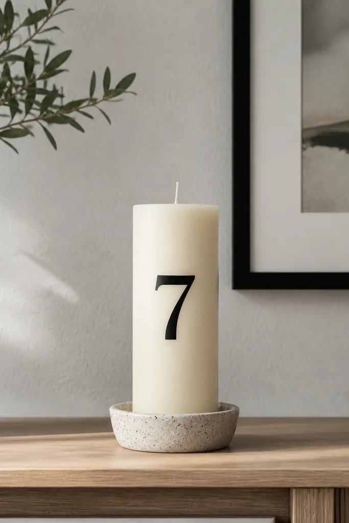
Stenciled numerals look modern because they feel like design typography. You’re not relying on freehand lettering, which usually turns uneven and crooked on a candle. Pick one number like 3, 7, or 11 and put it centered, with plenty of breathing room. Black numerals on cream are the cleanest look, but deep green also works. This is great for a set of candles where each one has a different number for a cohesive shelf display.
Editor's noteUse foam dabbing instead of brushing — it keeps the edges sharp and prevents paint bleed under the stencil.
Choose a stencil numeral set with a simple block or clean serif shape. Tape the stencil to the candle at the exact center, then use a foam brush to dab paint into the stencil openings. Let the paint dry for a few minutes, then remove the stencil carefully without smearing. Add a second light coat only if the numeral looks patchy, then seal once fully dry.
Skip thisDon’t use liquid-heavy paint through a stencil; it spreads and ruins the crisp edges.
14. Monochrome Marble Swirls (Painted Veins, Controlled)
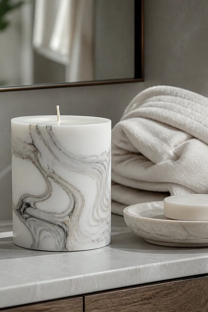
Marble swirls look luxe, but modern ones stay subtle. You’re painting thin veining and soft swirls, not a full chaotic marble slab. Keep it monochrome: white base with gray or light taupe veining reads clean and contemporary. This design fits spa bathrooms, modern bedrooms, and minimal desks because it adds texture without loud color. The key is thin lines and a light touch so the candle still looks smooth, not heavy.
Editor's noteIf your veins look too dark, wipe the brush on a paper towel before you paint the next line.
Paint the entire candle with a thin base coat of your white or light neutral and let it dry. Mix a slightly darker gray with a tiny bit of water so it flows like ink, then use a fine liner brush to draw 5 to 8 veining lines. Add soft swirls around the veins with a small brush, but keep those strokes light so you don’t fill the whole surface. Seal after drying to lock the pattern in place.
Skip thisDon’t overwork the swirls; repeated blending makes it look like smudged paint.
15. Geometric Frame With Negative-Space Center
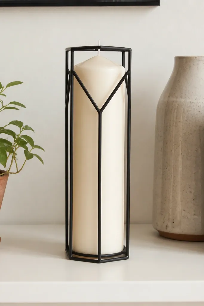
Negative space makes this design modern. Instead of covering the whole candle, you paint a thin geometric frame and leave the center clean so the candle color shows through. The look feels graphic and calm, like a minimal poster. Use a single accent color such as black, deep blue, or olive, and keep the frame lines thin and even. This is a great option if you want the candle to match lots of decor because the design doesn’t fight patterns.
Editor's noteUse a ruler for frame spacing — the clean look depends on symmetry, not fancy paint effects.
Lightly mark a rectangle or rounded rectangle frame on the candle, leaving a wide center opening. Tape along the frame boundaries to keep edges sharp, then paint the frame color in thin coats. Remove tape carefully after the paint sets, then touch up any tiny gaps with a fine liner brush. Let it dry fully, then seal with a clear coat.
Skip thisDon’t make the frame too thick; heavy borders look craft-made.



