
1. Ledger Margin Numbers
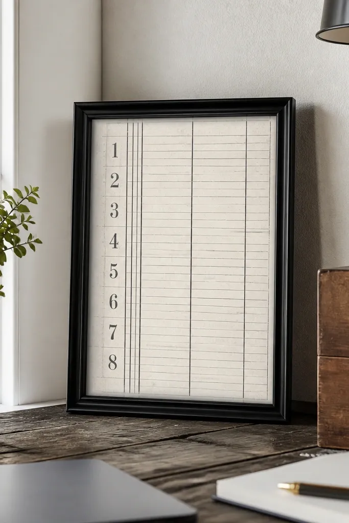
This printable mimics the quiet authority of old accounting pages. The margin numbers create a strong vertical rhythm, so your eye knows where to land even if the room is busy. Black-and-white keeps it modern while the thin ruled lines bring the vintage paper texture feeling. It works best in small frames because the composition is dense and stays interesting when it’s scaled down. If you want a low-maintenance Vintage Paper Printable that always looks “done,” this is the one.
Print on 65 lb cardstock for better contrast. Trim with a paper trimmer to a 1/4-inch border so the lines don’t get cut off. Mount it to a rigid backing board or slip it into a clip frame; keep the glass out if you’re using a matte finish to avoid glare.
Pick frames with white or black mats so the margin numbers don’t blend into the paper.
Avoid printing on thin copy paper — the lines look gray and lose the vintage punch.
2. Botanical Herb Labels
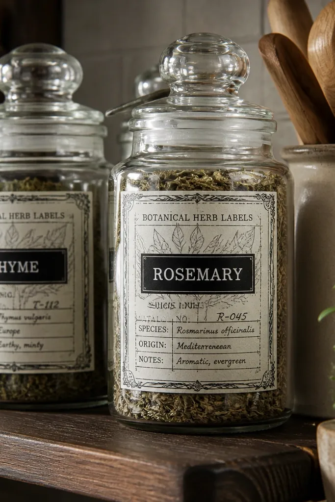
Herb labels look vintage without trying too hard. The key is the layout: a label border, a main name block, and small secondary text that reads like catalog notes. In black-and-white, the leaf outlines add texture while the text blocks keep the page from feeling empty. It’s photogenic because the labels naturally create “stacked” visual layers. Put one in a simple frame or group two for a neat set that still feels airy.
Print on matte photo paper or 110 lb cardstock if you want a sturdier sheet. Cut out with a rectangle border shape, leaving a 3/8-inch frame around the design. Place it in a black clip frame or behind a clear acrylic sleeve with a matte backing to reduce glare.
Use matte paper so thin label lines stay crisp instead of looking shiny.
Don’t choose frames with heavy gold tones — they fight the black-and-white look.
3. Antique Map Compass Rose
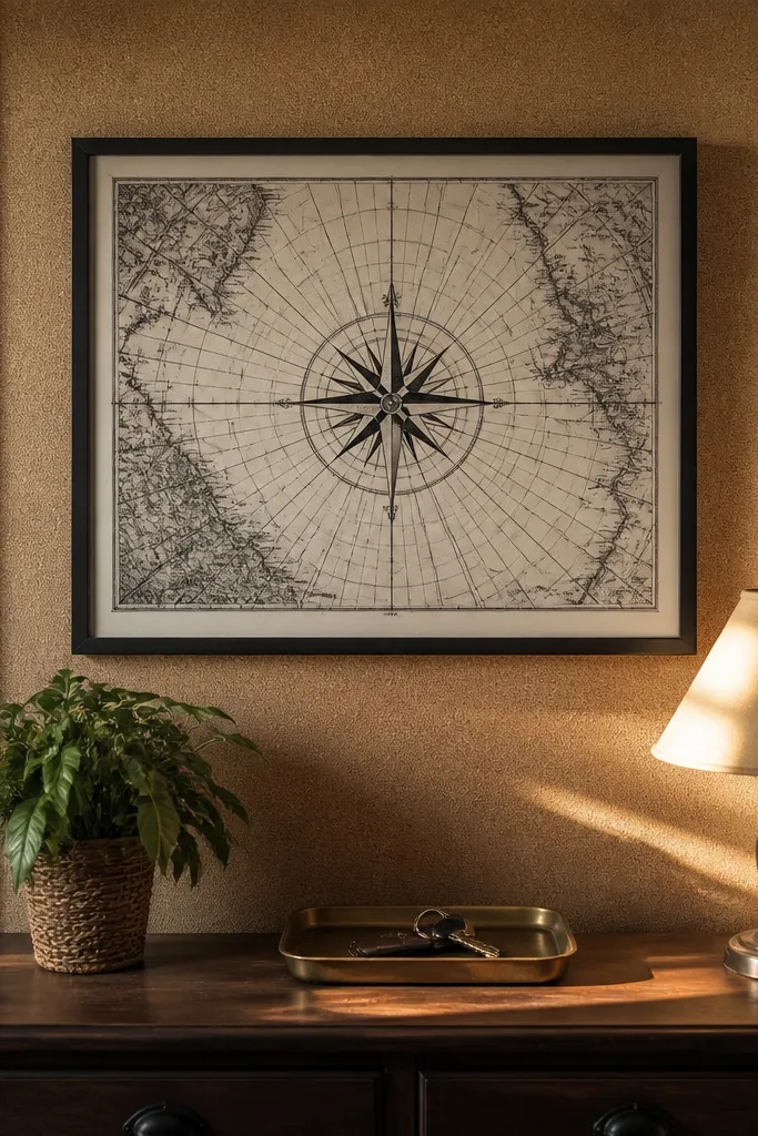
A compass rose print gives you instant focal point energy. The radiating points make the page read as vintage even at small sizes, and the faint grid lines add depth without clutter. Black-and-white keeps it clean and lets the compass lines stay sharp. This works great for kitchens, hallways, and desks because it feels functional, not just decorative. It’s also a smart choice if you want a printable that looks good alone, not only in a gallery wall.
Print at the highest quality setting to keep the compass lines dark. Trim to a square or slightly off-center crop so the compass sits near one third of the page. Frame with a thin black mat or mount on foam board so the compass doesn’t look like it’s floating.
Editor's noteIf your printer tends to gray blacks, run a test print and adjust until the compass lines look near-black, not charcoal.
Skip thisSkip glossy paper — the grid lines glare and flatten the vintage depth.
4. Victorian Ornate Corner Medallions
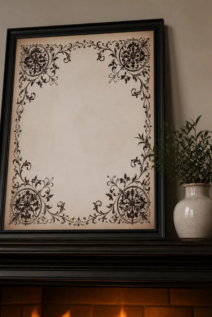
Corner medallions are a cheat code for a high-end look with minimal effort. The design frames the center without forcing you to read tiny text, which is why it looks good even when printed small. Black-and-white flourishes add drama while the center space gives your wall breathing room. Use it for a mantel, shelf, or dining wall where you want elegance without a lot of clutter. It also plays nicely with modern frames because the ornament stays in the paper.
Print on 8.5x11 paper and then trim to 8x10 for a standard frame fit. Use a 1/2-inch outer border when you trim so the corners stay intact. Mount on cardstock and slide into a frame with a white mat for contrast.
Choose frames with a mat even if the printable already has a border — it makes the corners look intentional.
Don’t over-trim. If you cut into the corner flourishes, the whole effect collapses.
5. Old Typewriter Quote Blocks
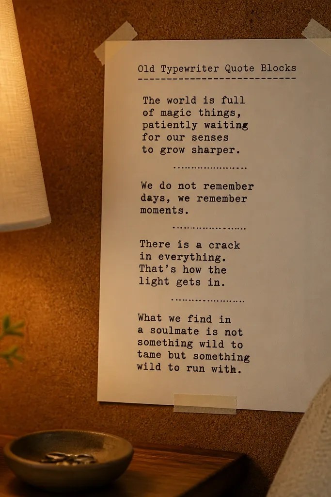
These printables look like something you found in a drawer — typed, imperfect, and confident. The block paragraph layout gives you strong structure, and the typewriter-style letterforms bring a tactile vibe even in black-and-white. You get a vintage feel without needing ornate borders or illustrations. It’s great for a kitchen nook or office wall where you want a message-like design that still feels decor-first. Keep the text large enough that it reads from across the room.
Print with “fit to page” turned off so the type block doesn’t shift. Trim to a 5x7 or 8x10 depending on your frame size. Mount to cardstock and use a simple matte frame so the paper grain stays visible without glare.
If the text looks too light, bump print contrast or switch to thicker matte paper for darker blacks.
Avoid frames with thick reflective glass — typewriter lines smear under glare.
6. French Archive Ticket Strip
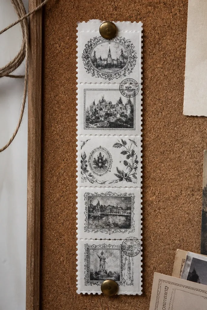
Ticket strip designs add movement and story without needing a full scene. The perforation edges look crisp and vintage, and the stamp blocks create a layered collage feel. In black-and-white, the stamp texture reads like ink on aged paper. This printable is photogenic because it frames itself — you don’t have to style a lot around it. It’s especially good for entryways and shelves where you want a horizontal accent.
Print on 110 lb cardstock so the perforation lines look clean. Trim along the strip edges, then cut a second narrow strip of backing paper for a neat border. Use a clip frame or a slim horizontal frame so the strip stays straight on the wall.
Editor's noteUse a ruler and craft knife for the perforation edges if your paper trimmer tears them.
Skip thisDon’t fold or crease the strip — it shows immediately on white cardstock.
7. Scientific Diagram Labels
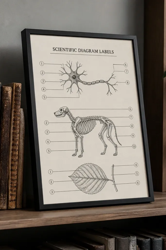
Scientific diagrams look vintage because the layout is honest: numbered parts, callout lines, and clean labeling. Black-and-white keeps it graphic and modern, while the line drawings add the old-book feel. This design is great if you want visual interest that still looks tidy. It also works well in small sizes because the numbers and callouts guide the eye. Put one above a desk or in a hallway where you want “brainy” decor.
Print at high quality and check that the callout numbers are fully dark. Trim to a standard frame size like 8x10, then mount on a white mat if your printer leaves any gray haze. Use a thin black frame so the callout lines pop.
Editor's noteIf your printer rounds thin lines, switch to matte photo paper — it holds linework better.
Skip thisAvoid low-resolution prints. Fuzzy callout lines make the whole diagram look cheap.
8. Vintage Postmark Circle
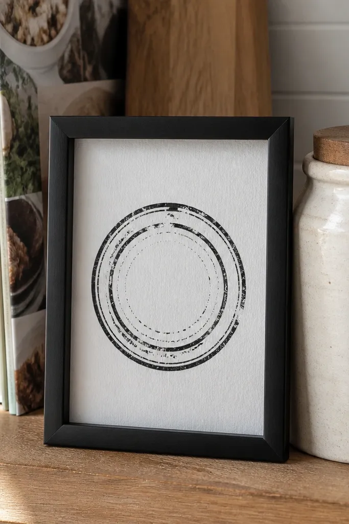
A postmark circle gives you a centered, stamp-like focal point that looks great in black-and-white. The ring creates structure, while faint text inside the circle adds vintage texture. This works well for a single-frame statement because it reads instantly. It’s also low-maintenance to style: you can place it on a shelf with a neutral backdrop and it still looks cohesive. Choose it if you want vintage paper that looks graphic, not busy.
Print on matte paper and let it dry fully before handling. Trim to a 6x6 or 8x8 crop so the circle isn’t clipped. Mount with a foam board or thick cardstock backing, then frame with a white mat to keep the ring edges sharp.
Use a mat with a little breathing room around the circle — it prevents the stamp edge from looking cramped.
Don’t use thick decorative borders in the frame. The stamp should be the border.
9. Black Border Ornate Frame Page
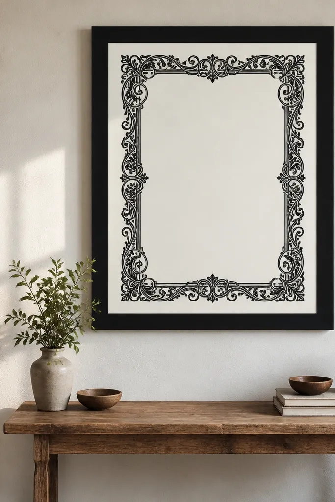
This one is for the “I want it to look finished instantly” crowd. A thick black border makes the page feel like a real archival print, even when it’s just paper. Corner scrollwork adds vintage detail without crowding the center. In black-and-white, the border anchors the design and makes it look intentional from across the room. It’s ideal for a gallery wall where you want consistent visual weight across multiple prints.
Print on 80 lb cardstock so the border stays solid. Trim carefully so the border thickness stays even around all sides. Put it in a simple frame with no additional mat if the border already fills the page, or use a narrow mat if the border is thin.
Check print alignment on the first page — a shifted border makes the whole frame look crooked.
Avoid frames with matching black borders that blend — the edge can disappear.
10. Old Book Spine Typography

Book spine typography is a clever way to add vintage paper texture without illustrations. The vertical layout looks great on narrow walls, shelves, and bookcase backgrounds. Black-and-white gives it that quiet library feel, and the line marks make it look like real printed matter. This printable is also low-maintenance because it’s built for easy placement — one piece per shelf creates a curated look. Choose it when you want vintage decor that doesn’t demand lots of space.
Print on cardstock and trim to a narrow size like 4x10 or 5x12. Use a corner-to-corner alignment ruler so the spine typography stays straight. Mount on foam board and place it in a slim vertical frame or behind a clear stand on a shelf.
If your shelf is cluttered, pick a spine with fewer text blocks — it reads cleaner.
Skip busy designs with tiny microtext. They blur when printed and look messy.
11. French Pharmacy Label Sheet
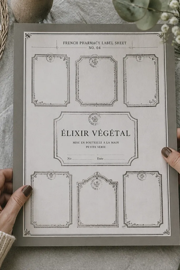
A pharmacy label sheet gives you options. You can frame the whole sheet for a collage look, or cut out individual labels and group them on a board. Black-and-white label borders and stamp marks look authentic because the layout is repetitive and structured. This is one of the best low-maintenance Vintage Paper Printable styles because you can adapt it to whatever space you have. It looks great in a set of two or three, even if you don’t want a full gallery wall.
Print on 65 lb cardstock so labels stay crisp when cut. Use a craft knife for label edges and a steel ruler for straight cuts. Mount the entire sheet to a backing board, or clip individual labels into small frames with a white mat.
Editor's noteCreate a consistent gap between labels if you group them — 1/8 inch looks clean.
Skip thisDon’t cut too close to label borders. Leave a slim white edge so ink lines don’t get trimmed.
12. Seamless Grain Paper Background Panel
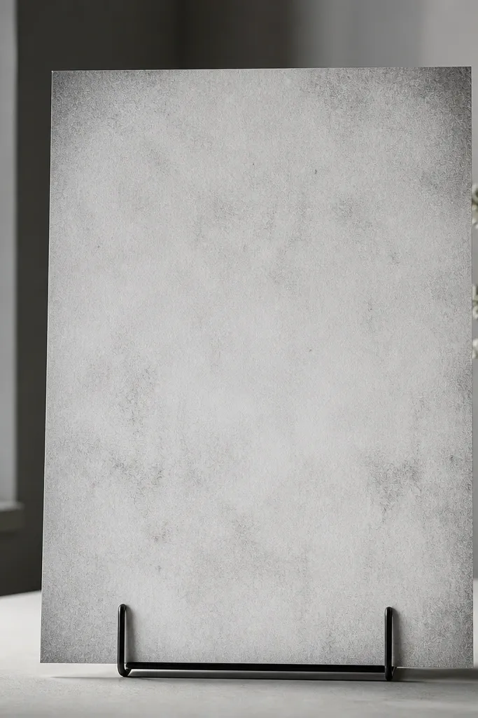
This is the printable you use when your room needs texture more than a picture. It’s black-and-white, but the texture does the work: subtle grain, faint stains, and a soft vignette that looks like old paper under light. It’s photogenic because it creates depth even without text. Frame it alone for a minimalist vintage look, or use it behind a photo for contrast. It’s low-maintenance since there’s no trimming complexity beyond a clean rectangle.
Print at high quality and keep the paper flat as it dries to avoid ripples. Trim to your frame size with a 1/4-inch margin. Use a matte frame or a mat board so the grain doesn’t glare under glass.
Editor's noteIf you want the texture to look stronger, choose matte photo paper over plain copy paper.
Skip thisAvoid glossy finishes. The grain turns shiny and loses the aged paper vibe.
13. Vintage Railroad Timetable Blocks
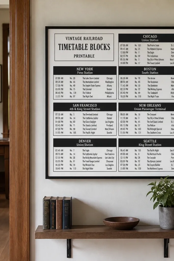
Timetable blocks look vintage because the grid is structured. Rows and columns create a clean, graphic pattern, while bold route headers keep it from feeling like generic data. Black-and-white is perfect here because the contrast reads as ink on paper. This printable is great for entryways and home offices where you want a functional-looking piece. Frame it as a single sheet or pair it with a compass rose for a travel theme that still looks tidy.
Print on 80 lb cardstock and verify the grid lines are dark enough to read. Trim to 8x10 or 11x14 depending on your frame. Mount with a white mat so the grid doesn’t blend into the paper and use a black frame for strong contrast.
Editor's noteFor a crisp grid, choose “photo paper” settings only if you’re using matte photo paper — otherwise use standard cardstock settings.
Skip thisDon’t pick a frame color that matches the paper gray. You want contrast.
14. Engraved Scroll Frame with Center Text
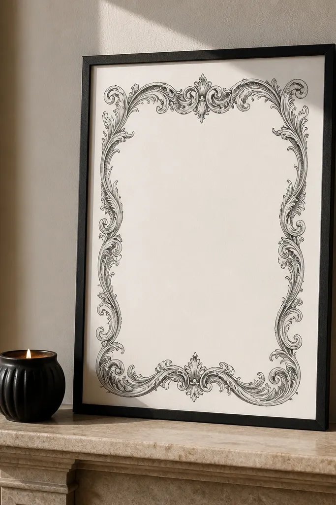
This design is built for flexibility. The engraved scroll border gives you vintage detail, while the center space stays calm so your room doesn’t feel crowded. In black-and-white, the scrollwork looks like etching, and the empty center makes it easy to style in multiple ways. You can leave it blank for a minimalist look or add your own printed quote over the center area. It’s a low-maintenance Vintage Paper Printable because the border does the heavy lifting visually.
Print on matte cardstock and trim to the frame size with a consistent margin. If you want to add your own quote, print the quote on a separate small sheet and tape it behind the center area before framing. Use a frame with a mat if the scroll border is thin; skip the mat if the border is thick.
If you add text, keep it in a single weight font and center it — mixed fonts look messy fast.
Avoid busy centers. The whole look depends on calm negative space.
15. Vintage Ornamental Divider Lines
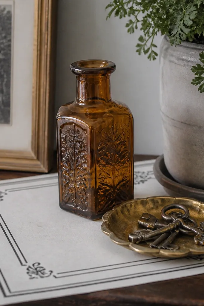
Divider-line printables are understated but they photograph beautifully. The thin lines create structure, and small corner accents keep it from feeling sterile. Black-and-white makes it look like stationer paper or old stationery sets. This works well as a background piece behind small decor objects, like a stack of books or a tray label. It’s also easy to rotate because it doesn’t rely on a big central scene.
Print on 110 lb cardstock so the thin lines don’t fade. Trim to a horizontal or vertical rectangle based on your display spot. Mount on foam board and place in a frame that doesn’t add heavy mat texture so the divider lines stay the focus.
Choose a frame with a slight inner lip so the paper sits flat and doesn’t curl at the edges.
Skip cheap frames with wavy backing — thin lines warp when the paper isn’t flat.
16. Monochrome Botanical Press Sheet
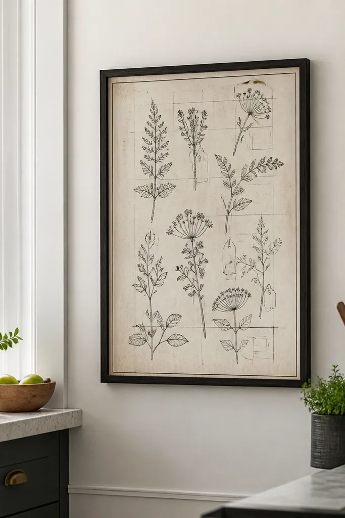
A botanical press sheet looks authentic because it’s built like documentation. The plant outlines and label tags feel vintage, while the faint grid keeps the page from looking like a modern poster. Black-and-white is key here: it makes the “ink” feel consistent and keeps the plants from looking too graphic. This printable looks great in a simple frame because it has enough detail to stand alone. It’s also a good pick for bathrooms or bedrooms where you want calm texture.
Print on matte photo paper for clean plant linework. Trim to 8x10 and keep the label tags inside the border so they don’t get cut off. Frame with a clear mat and avoid thick decorative borders that compete with the tags.
If labels look too tiny, choose a larger size like 11x14 so the tags stay readable.
Don’t use heavy glare glass — plant lines lose definition.
17. Vintage Ticket Stub Labels
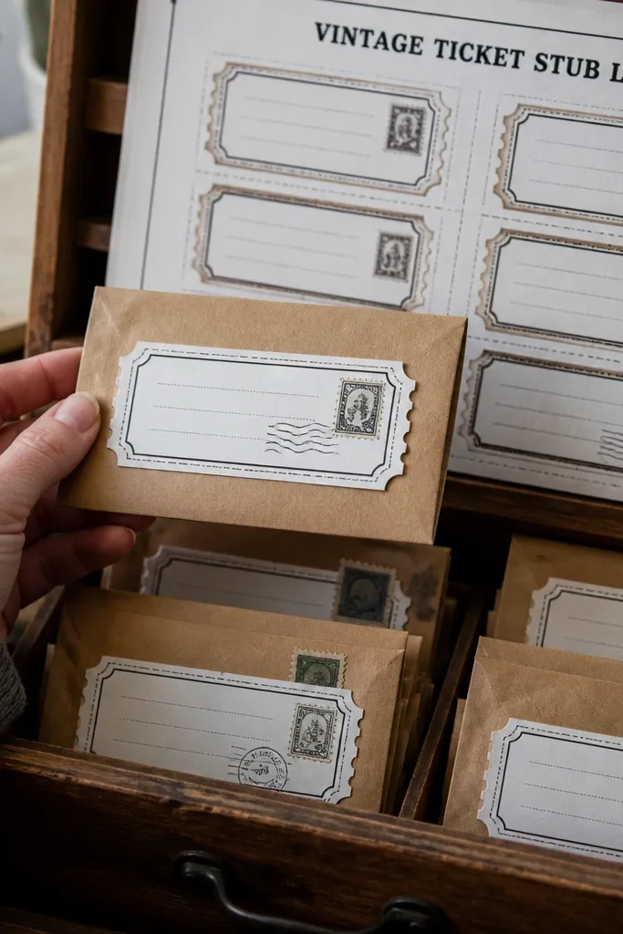
Ticket stubs add charm because they look like something you’d keep. The cut marks and stub lines create a strong vintage document vibe, and the stamp text makes it feel layered. Black-and-white keeps it classic and lets the stub edges be the design. This is a great low-maintenance Vintage Paper Printable when you want a small statement piece that still looks like it belongs in an old collection. It’s especially good for a cluster on a wall ledge.
Print on cardstock and trim to two separate stubs if the design is split. Use a corner punch or craft knife to shape cut edges cleanly. Mount on a white backing board, then clip into a frame or mount onto a shadow box tray with thin spacers.
Editor's noteShadow box trays hide tiny trimming imperfections better than flat frames.
Skip thisAvoid straight trimming if the stub is designed to look “torn.” It should follow the cut marks.
18. Monochrome Museum Wall Card
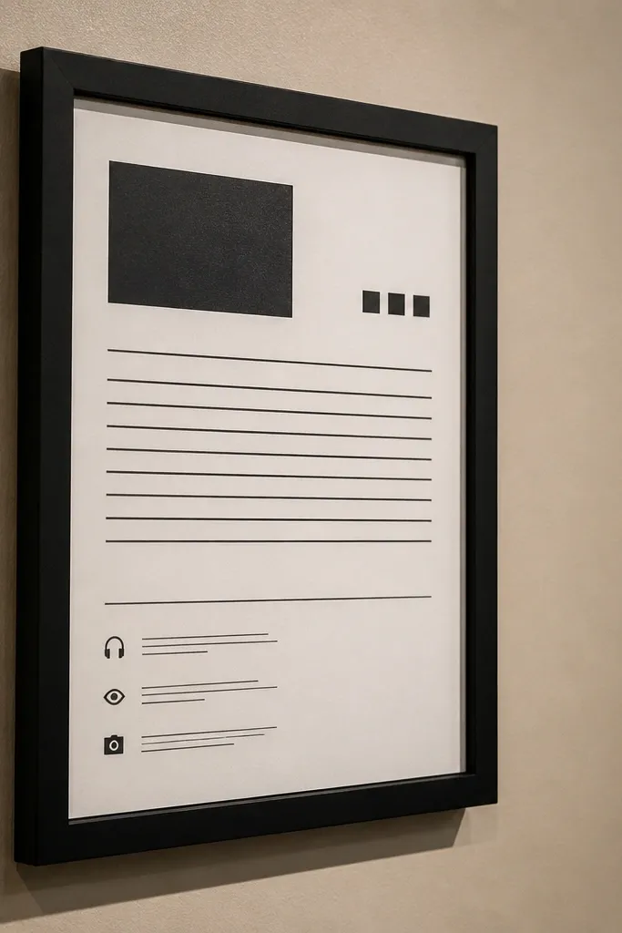
Museum wall cards look polished because the layout is strict: title block, body text lines, and small icon accents. In black-and-white, it reads like printed information on quality paper, not like a random quote poster. The strict grid makes it easy to style in a group, and it photographs well because the card’s negative space looks crisp. This is a strong choice if you want vintage paper decor that still feels clean and modern. Print one, then repeat the style with different designs for a set.
Print on 80 lb cardstock and trim to 5x7 or 8x10. Use a white mat to keep the card edges crisp. For a low-maintenance display, use a tabletop easel or a clip frame so you can swap cards without remounting.
Editor's noteKeep your display height consistent — align the top edge of each card at the same level.
Skip thisAvoid textured frames that add their own pattern. The card layout should stay the pattern.
19. French Recipe Card Grid with Tear-Off Tabs
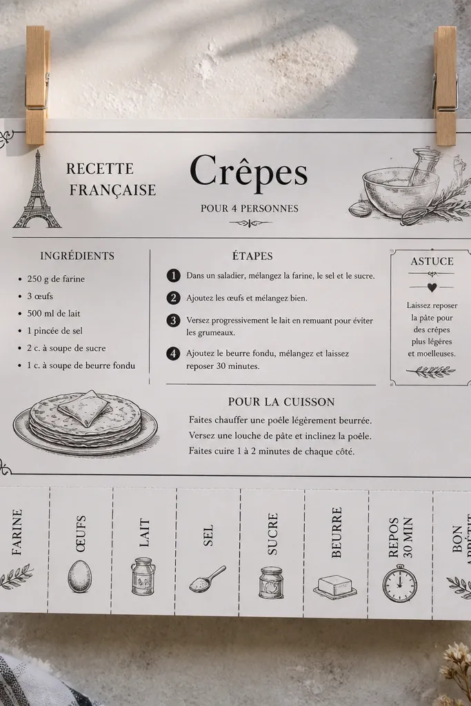
This printable set gives you a clean, vintage way to label recipes, pantry instructions, or DIY steps without fighting messy typography. The tear-off tabs look like something you’d find in an old restaurant binder — practical and photogenic when you clip them to a string or tuck them into a binder sleeve. It’s low-maintenance because you print on one paper type, cut once, and you’re done. The grid and tab layout keeps the design readable from a few feet away, which matters if you’re making a wall display or a flat-lay photo. Skill level is beginner, and the build time is mostly printing and cutting.
Print the sheet at 100% scale on off-white 65-90 gsm paper. Use a ruler and craft knife to cut along the outer card edges, then cut each tear-off tab along the dotted line so the tabs sit slightly above the card body.,Add a simple aging finish if you want the look to feel more lived-in: rub a damp cotton cloth with black tea or instant coffee concentrate on just the card edges. Let it dry flat, then press the cards under a book for 20-30 minutes so the paper doesn’t curl.,Mount the cards by punching a small hole through each tab and running twine through. If you want a cleaner look for photos, use a 1/8 inch hole punch and attach mini binder rings so the cards lay flat.
Use a cutting mat and a fresh blade — recipe cards have lots of straight lines, and dull blades make ragged edges that show in close-up photos.
Avoid printing too large or too small — recipe card grids look wrong fast when the tab spacing shifts.
20. Monochrome Botanical Herbarium Specimen Labels with Number Tags
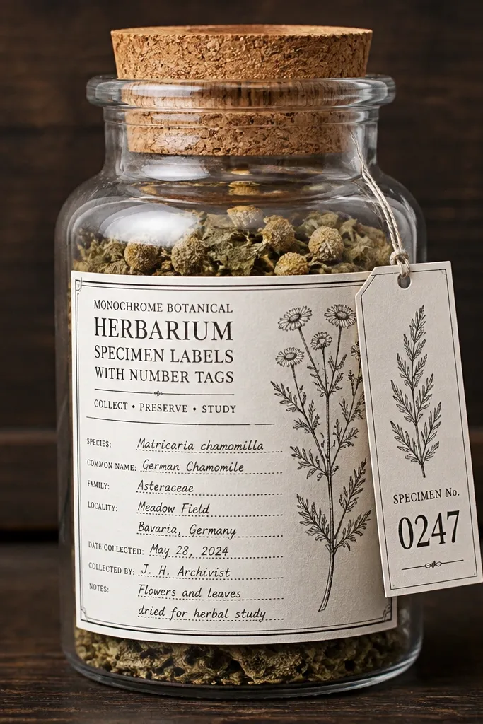
This one is for labels that look like they came from an old herbarium drawer — the kind with numbered specimens and tight, monochrome typography. It fixes the common problem with vintage printables: generic labels that look good on paper but don’t read well when you attach them to jars, envelopes, or sleeves. The number tags make your labels feel organized, not decorative, so they work for seed storage, dried flower samples, or craft supply sorting. You get a high-contrast black and white look that photographs cleanly against glass, kraft paper, and linen. It’s beginner-friendly and fast because you print, cut, and seal — no complex assembly.
Print on 80-100 gsm matte cardstock for crisp edges, then cut the labels with a paper trimmer if you want perfectly even sides. Keep the number tag attached area intact until after cutting so the label stays aligned.,For a more authentic herbarium feel, add a thin pencil-style accent: lightly shade the corners with a soft graphite pencil, keeping the center text clean. If you want extra contrast, brush diluted black ink only along the outer border and let it dry completely.,Seal for durability if these go near moisture: brush a thin layer of matte gel medium or apply a matte spray on the front only. Attach by punching two tiny holes near the top corners and tying with waxed cotton thread or by using small glue dots at the edges.
If you’re attaching to clear jars, seal the paper first — matte medium reduces smudging and keeps the text readable when you handle the label.
Avoid glossy coating — it creates glare that ruins the black and white vintage look in photos.



