
1. Golden-hour coastal road strip
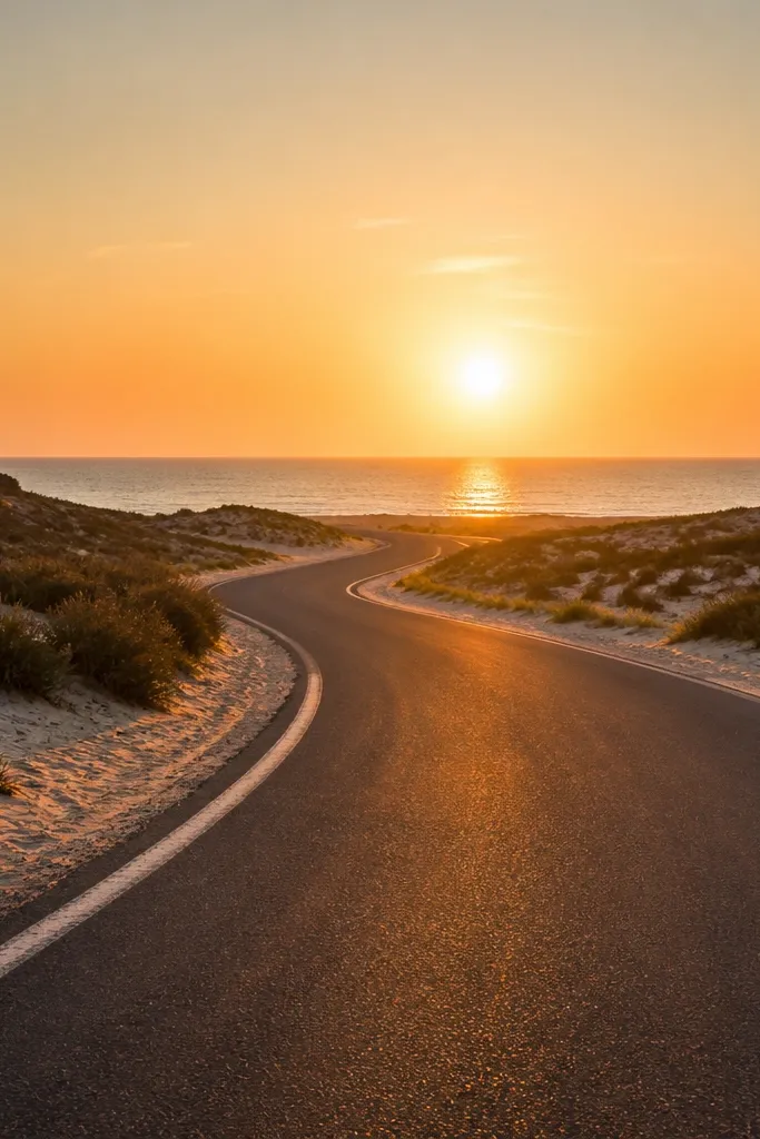
This one looks good because it has a single subject path and a horizon that anchors the whole photo. Print it as a tall 5x7 or crop to 4x6 so the road leads your eye across the board. The warm orange and sandy tones set a travel vibe that feels optimistic without needing extra text. It’s also an easy “anchor image” — place it in the center column so everything around it feels intentional.
Print the photo in 5x7 for best framing. Cut a piece of cardstock backing the same size, then mount the photo with thin photo corners. Place it in the middle of your grid, and keep the surrounding photos in similar warm tones so the palette stays tight.
Editor's noteIf your printer washes out oranges, bump contrast slightly in your print settings before you export the file.
Skip thisDon’t pick a coastal photo with lots of tiny objects in the foreground — it turns into visual noise when printed.
2. City street leading lines at dusk
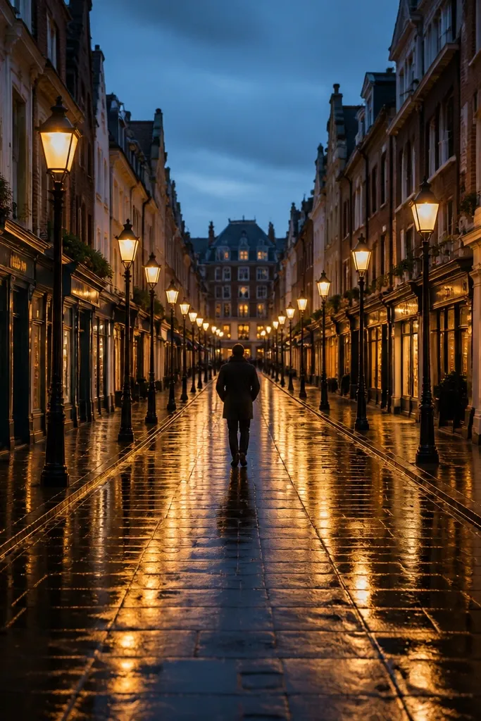
Dusk streets photograph well and they print even better because the lighting creates depth. The leading lines make your vision board feel like it’s moving, which is exactly what you want for travel motivation. Choose a photo with strong symmetry or a clear vanishing point so your board looks balanced. It also pairs nicely with bolder colors, like teal or deep navy, without clashing.
Print this as 4x6 and place it near the top row to create a “destination path.” Add a 1/4-inch gap around it so the street lines don’t feel cramped. If you’re doing a grid, keep the same vertical alignment as your other street photos.
Editor's noteUse a matte photo finish or matte photo paper so the dusk tones don’t glare under room lighting.
Skip thisSkip street photos with big signs dominating the frame — they steal attention from the lines that make the image work.
3. Minimal white beach towel flat lay
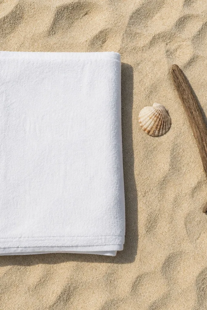
Flat lays are low-effort because you can repeat the same styling across multiple images and still look cohesive. This one works because the background is calm and the objects are spaced, so it doesn’t crowd the board. It’s perfect for the “photo vibe” bucket — it tells you what kind of travel photos you want: clean, bright, airy. Add it to your board when you want the whole thing to feel lighter and less busy.
Print it in 5x7 and center it on your board with equal margins. Mount with corners or double-sided tape placed only at the back edges so the photo stays flat. Pair it with two other light-background photos so the board doesn’t swing into darker tones too quickly.
Choose flat lays with lots of negative space — they make your board look expensive even with basic printing.
Don’t pick a flat lay with cluttered items scattered everywhere; it reads messy on a small print.
4. Backpack and passport on neutral wood
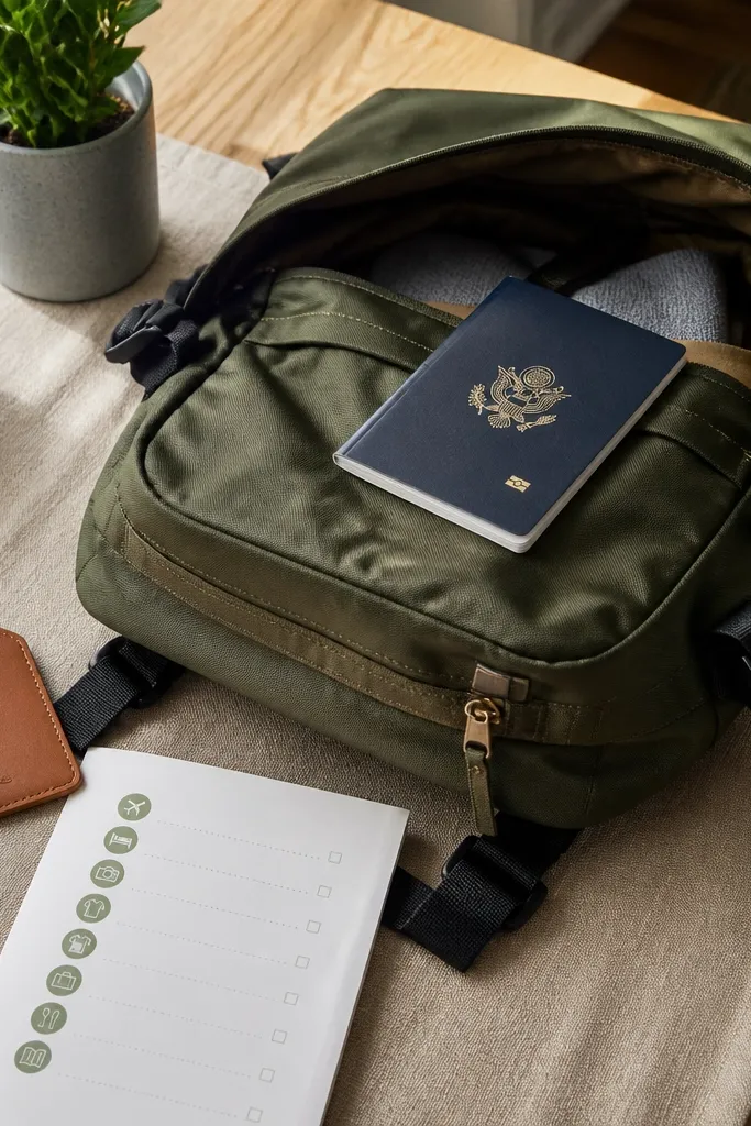
This is a travel-planning image that still looks aesthetic. The neutral wood and muted colors keep it from feeling like a generic “travel checklist” photo. It’s also great for low-maintenance boards because it’s instantly recognizable — you don’t need extra context. Put it near the bottom or side of your board as a “ready-to-go” visual cue.
Print in 4x6 so the passport text area doesn’t dominate. Mount it using photo corners, then add a thin strip of washi tape along one edge for a gentle accent. If you’re using a corkboard or fabric board, pin it with a single clip for easy swapping later.
Editor's noteKeep the rest of your nearby photos in warm neutrals so this one doesn’t fight with bright neon images.
Skip thisAvoid photos with heavy glare on the passport — reflections look bad when printed.
5. Terracotta balcony plants and laundry lines
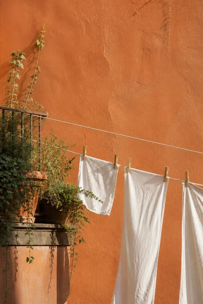
This image screams “slow travel” without adding clutter. The terracotta walls and plant greens give you a strong color pairing that repeats well across a whole board. It also has lots of texture, which looks good printed because it feels tactile. If your board needs warmth, this is one of the best pictures to add, especially in a grid with other Mediterranean tones.
Print it as 5x7 and crop so the balcony rail is visible — it adds structure. Mount it with corners and keep spacing consistent with your other 5x7 photos. Add one more terracotta-toned photo next to it so the palette reads as intentional.
Editor's noteIf you’re printing at home, slightly reduce sharpness; balcony textures can look harsh when oversharpened.
Skip thisDon’t choose an image where the horizon is tilted — it makes the whole board feel off.
6. Overwater bungalow walkway symmetry
Symmetry is your friend for a good-looking board. Repeating posts and a clear walkway draw the eye straight through the photo, and that visual order makes your layout look designed. This is a “place” image that also doubles as photo vibe because the water color is clean and consistent. Print it slightly larger if you can — 8x10 works well when the image has strong leading lines.
Print in 8x10 and place it as a focal point in the center or top center. Use a foam board backing so the photo looks crisp and doesn’t curl. Leave at least 1/2-inch space around it so the walkway lines don’t feel crowded by neighboring prints.
Editor's noteUse a darker mat or border color behind it (charcoal or deep navy) to make the turquoise pop.
Skip thisSkip walkway photos where the water is murky; it kills the clean color vibe when printed.
7. Night market lantern rows
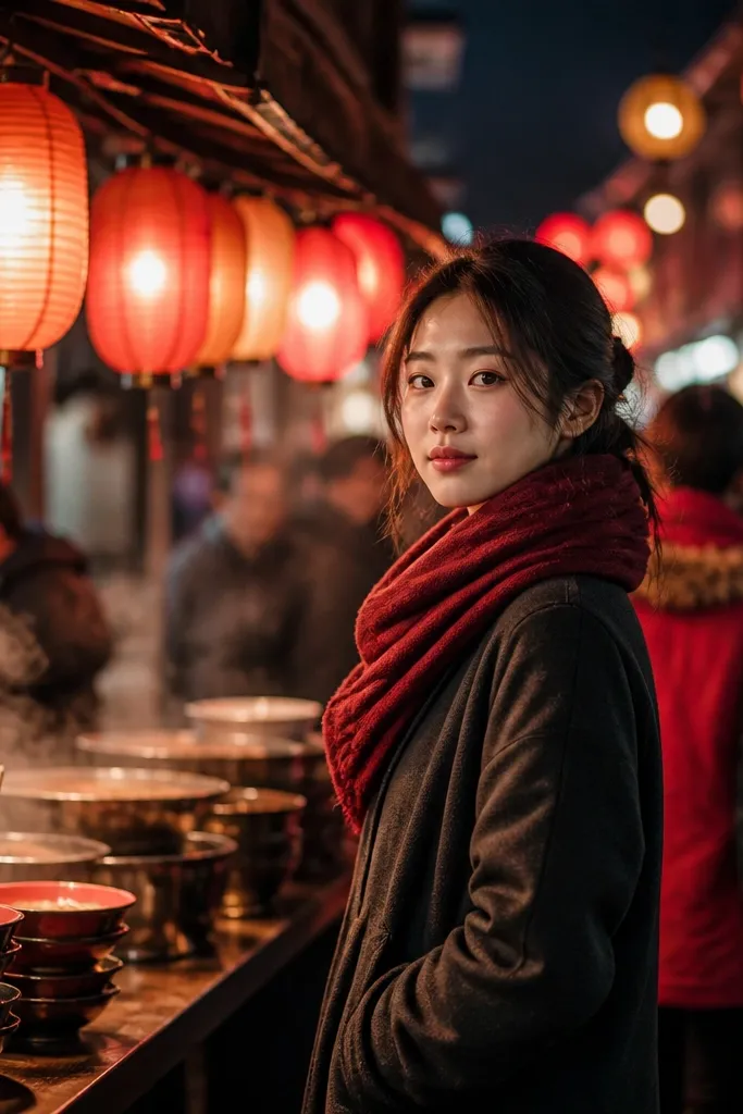
Lantern photos look amazing on vision boards because they bring light and color without needing lots of readable details. The blur in the background keeps the image from turning into text soup, which is a common issue with night scenes. Add this to your “experiences” bucket to remind you of wandering, eating, and staying out late. It also balances the board if you’ve got many daylight images.
Print in 4x6 and place it in the second row to break up lighter pictures. If your printer struggles with dark scenes, increase exposure slightly in your print editor. Mount it with tape only at the corners so the photo can be swapped without peeling.
Choose lantern photos with warm orange and amber tones so they match terracotta and sandy images on the same board.
Don’t use night market photos with a bright sign dominating one side; it pulls the whole board’s attention.
8. Desert dunes minimal horizon
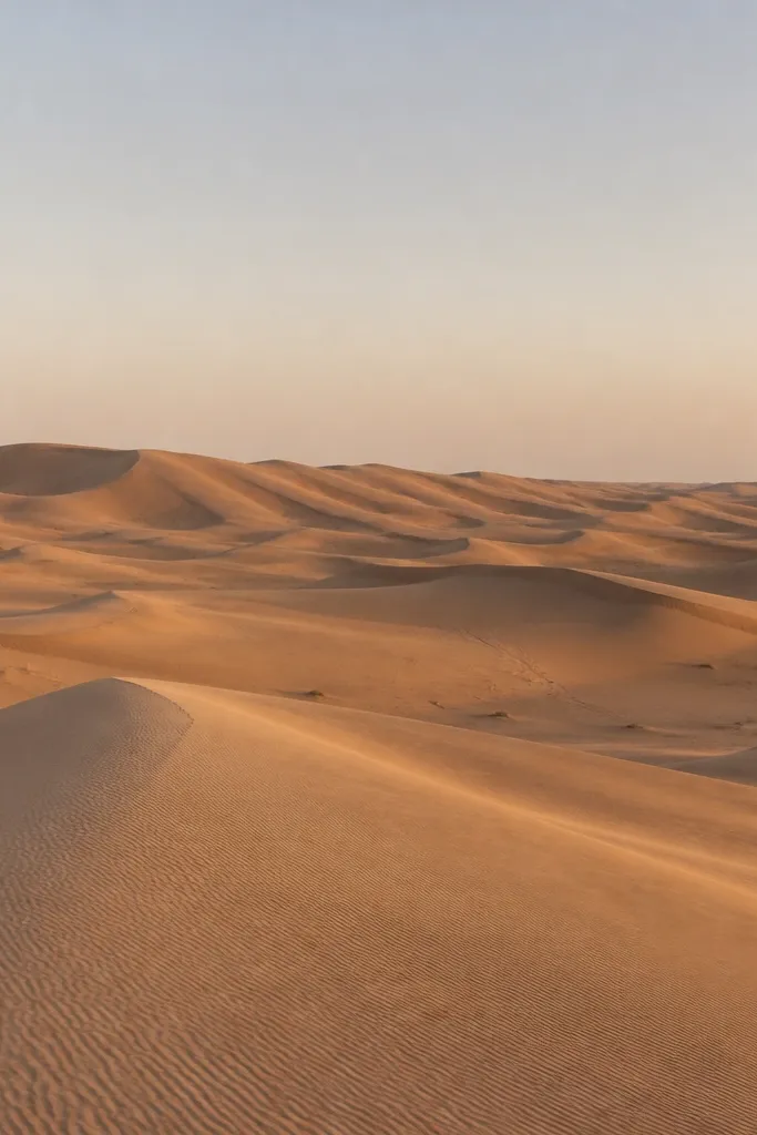
Minimal desert horizons give your board breathing room. They’re visually calm, which matters when you’re stacking 30 pictures — you need some images that don’t compete. The soft curves print beautifully, and the limited palette makes the board feel cohesive. Use this to set a “quiet adventure” vibe when your other photos are more crowded or colorful.
Print in 8x10 if you have the space, otherwise 5x7. Place it as a full-width-like element by centering it and keeping your side photos smaller. Mount flat with photo corners so the sand texture doesn’t look wrinkled.
Editor's noteIf your desert photo looks flat after printing, bump contrast slightly and reduce highlights so the dune curves show.
Skip thisAvoid desert photos with multiple distinct foreground objects — the minimal effect disappears.
9. French bakery window and croissants
This is an “experiences” image that reads instantly — food travel motivation. It works on vision boards because the warm interior light wraps the scene, and croissant shapes create a repeating pattern. Pick a photo where the window frame is visible; it gives the picture a natural border so it looks finished when printed. It also pairs well with other warm-toned images like terracotta and golden-hour coastal scenes.
Print in 4x6 and place it near a “place” photo so the sequence feels like a trip story. Mount with corners, then add a thin strip of kraft paper behind the bottom edge like a faux mat. Keep the spacing consistent so all your 4x6 prints line up.
If the photo has strong yellow light, print on slightly warmer paper (or use a warm color correction) to prevent dull skin tones and muddy whites.
Skip bakery photos where the window is heavily reflective; glare kills the cozy look.
10. Hiking trail viewpoint with big sky
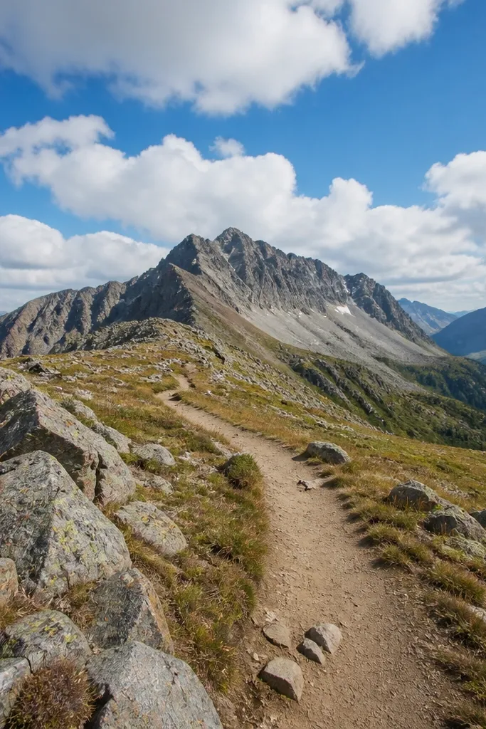
A hiking viewpoint is a clean, action-first photo that still feels aesthetic. The composition is usually simple: trail lines, distant peaks, sky. That simplicity makes it easy to print and easy to place among other travel images. It’s also great for low-maintenance boards because it gives you a strong “do something” reminder without needing captions. Put it in the experiences row so your board has motion.
Print in 5x7 and crop so the sky takes up about 40% of the frame. Mount it with corners and keep it aligned with your other 5x7 prints. If your board is cork, pin it through the top edge so you can swap it quickly later.
Editor's noteChoose trail photos where the path curves gently; straight trails can feel too rigid when repeated across a board.
Skip thisDon’t use hiking photos with heavy foreground branches; they darken the image when printed.
11. Ski lodge wood beams and candlelight
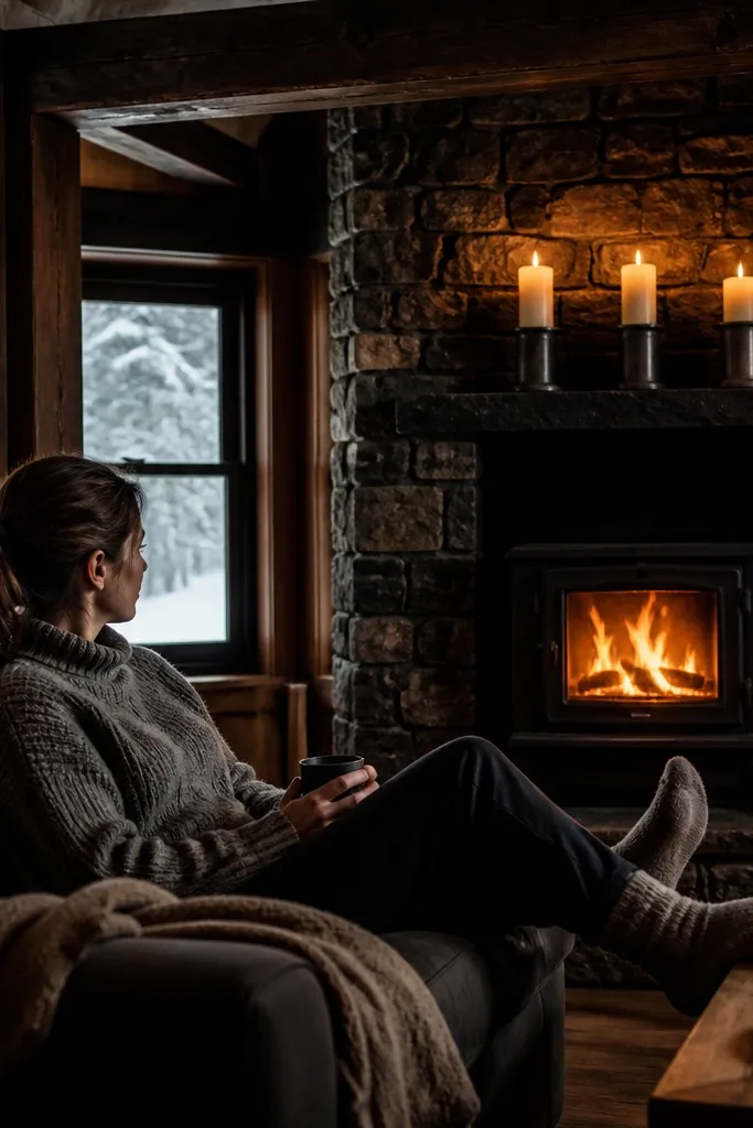
Cold-weather travel boards need at least a couple of dark, cozy images so the whole thing doesn’t look like summer. Wood beams and candlelight give you warm highlights and deep shadows, which print with a rich look on matte paper. This one is perfect for the “vibe” bucket, especially if your other photos are bright beaches and city streets. Keep it as a contrast image so the board feels balanced.
Print in 4x6 and place it opposite a bright photo to create visual contrast. Mount it with a thin black or dark brown border strip behind the photo for frame-like definition. If your printer tends to brighten shadows too much, reduce brightness by a small amount before printing.
Editor's noteUse matte paper for candlelight scenes; glossy paper turns warm highlights into glare.
Skip thisAvoid interiors with too many small decorations; they look like clutter once printed small.
12. Museum steps with clean stone lines
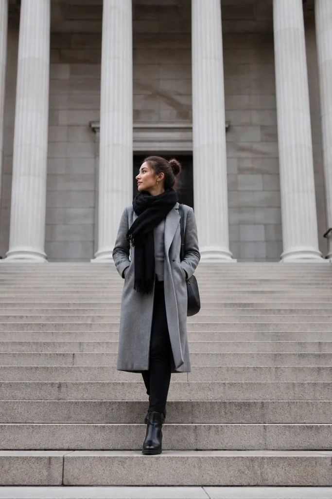
Architectural photos make vision boards look intentional because the geometry is clean. Museum steps are especially good because the steps naturally frame the viewer and give you scale. Print this for a “place” image that’s not a typical landmark close-up. It also works as a neutral palette breaker if your board is heavy on warm colors.
Print in 5x7 and center the steps so the geometry stays symmetrical. Mount with corners and keep it on the same row as other 5x7 prints so the grid stays consistent. If you’re using a fabric board, use two pins on the top corners to hold it flat.
If the photo has blue sky, slightly cool the temperature in editing so the stone looks crisp instead of orange-tinted.
Don’t pick a building photo with crooked vertical lines; it makes the board look sloppy.
13. Teal kayak silhouette on glassy water
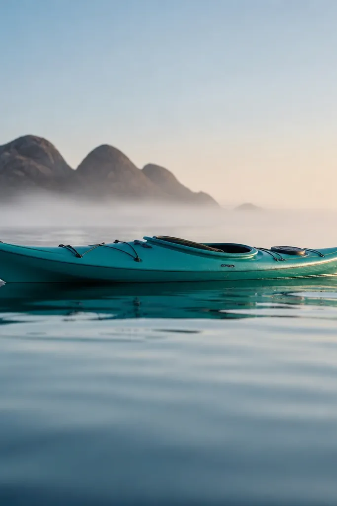
This is a low-maintenance vision board picture because it’s visually simple and color-forward. The teal kayak gives you a strong accent color you can repeat elsewhere, which helps your board look cohesive. Glassy water backgrounds are forgiving when printed because there’s less fine detail to blur. Use this in the “vibe” bucket to create a calm, outdoorsy feel.
Print in 4x6 and keep generous margins around it. Mount it with photo corners and align it with other accent-color images so the teal theme reads across the board. If you want a cleaner look, place it between two neutral photos (sand, stone, or white walls).
Repeat the teal accent at least 3 times across your 30 prints so the color story feels planned.
Skip photos where the water is too busy with waves; the teal can get muddy when printed.
14. Old map texture under glass frame
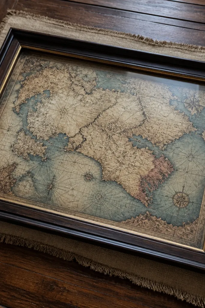
Map texture pictures are sneaky-good for vision boards because they add travel context without showing a single place. They also look cohesive with almost any color palette because the ink tones are muted. Print this as a background element around photos, or add it as one of the 30 images if you want the board to feel more “travel diary.” It’s a great choice when you want the board to look artsy but still simple to maintain.
Print in 8x10 if you’re using it as a focal texture, otherwise 5x7. Cut a thin border mat from cardstock (about 1/2 inch) and center the print inside it. Mount the whole thing flat so the texture doesn’t wrinkle.
Editor's noteUse a slightly darker cardstock border to keep the ink from looking washed out next to bright photos.
Skip thisDon’t use low-resolution map images; blurry text makes the whole board feel cheap.
15. Green jungle canopy path

Jungle canopy photos bring depth and drama, and they print nicely because the lighting creates a natural contrast. The green palette also gives you a second color story if your board is mostly warm neutrals. Place this in the experiences row to remind you that travel is movement, not just destinations. It also adds variety to a board that might otherwise be beaches, streets, and interiors.
Print in 4x6 and place it beside a warm-toned food or sunset photo so greens and oranges balance. Mount with corners and keep the spacing even so the board stays tidy. If your printer tends to over-saturate greens, reduce saturation slightly before printing.
Choose jungle photos with visible light rays — they add a focal point even when the board is crowded.
Avoid jungle photos with foggy haze; the image turns flat when printed.
16. Café chair backs and window light
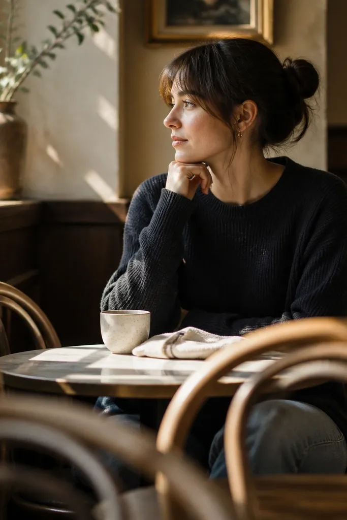
This is a vibe photo that’s beautiful without being busy. Chair backs create repeating shapes, and the window light gives you soft contrast that prints cleanly. It’s great for the “photo vibe” bucket when you want your travel board to feel cozy and photogenic. Put it in the middle section so it breaks up the big landmark images and keeps the board feeling calm.
Print in 5x7 and crop so the window edge is visible on one side. Mount with corners and keep it aligned with your other 5x7 prints. Add it near a food photo so the board tells a mini-story: sit, eat, wander.
Use matte paper and avoid glossy — chair shadows look better without glare.
Skip café photos where the table clutter is too prominent; it reads messy when scaled down.
17. Cathedral stained glass color blocks
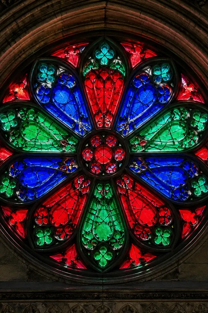
Stained glass gives you instant color harmony because the colors are already organized. It looks striking on a vision board even with no captions. Print this as a focal image because the shapes are high-contrast and will stand out from softer photos like beaches and cafés. Use it when you want your board to feel artsy and layered without extra decoration.
Print in 8x10 if you can, otherwise 5x7. Mount with a dark border strip so the bright glass doesn’t wash out. Place it in the top third of the board as a visual “ceiling” element, then keep nearby photos in similar color families.
Editor's noteIf your stained glass is too bright, lower highlights in your print editor to preserve details in the darkest lines.
Skip thisDon’t choose a stained-glass photo where most of the frame is shadow — you lose the color block effect.
18. Sourdough loaf and olive oil travel snack
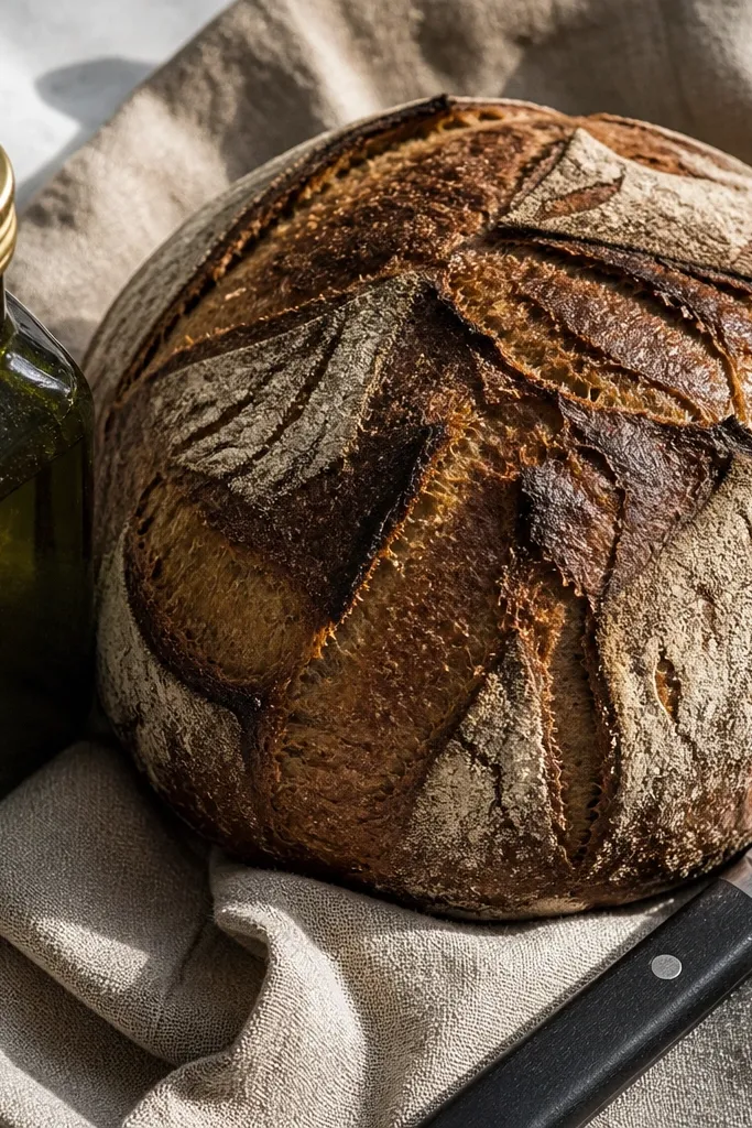
Food close-ups work when the scene is simple and the colors are earthy. This one is photogenic because it has texture (crust, linen) and a clean focal point. It belongs in the experiences bucket and helps you remember the small moments that make travel feel real. Add it when you want your board to look warm and human, not sterile or purely landscape.
Print in 4x6 and center the loaf so it sits in the middle of the frame. Mount with photo corners and keep the background around it clean by using a consistent spacing grid. Pair it with one other food image and one architecture image so it doesn’t feel like a theme page.
Choose linen-toned photos to keep the board looking cohesive with terracotta and wood textures.
Avoid glossy food photos with heavy shine; they show glare on paper.
19. Desert sunset gradient dunes
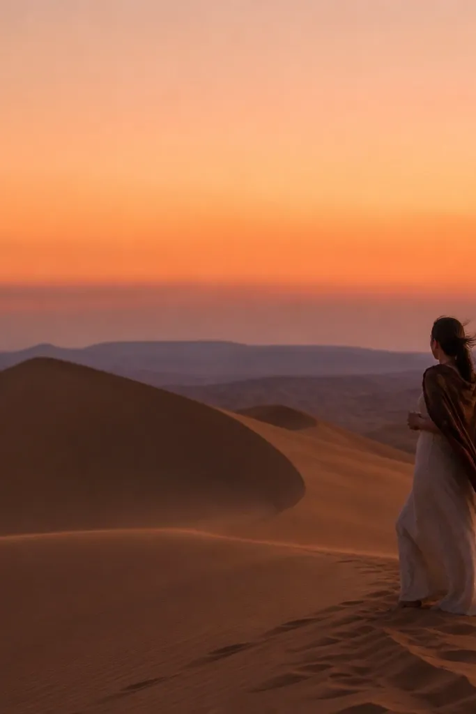
Gradient sunsets are the easiest way to make your whole board feel cohesive. They act like a color bridge between warm neutrals and cooler night scenes. Print this as one of your bigger images so the sky does the visual work. It’s also a great “vibe” reminder if you want your travel photos to look cinematic, not random.
Print in 8x10 and place it as a side focal element rather than dead center. Mount flat and use a thin cream cardstock mat to make the gradient look richer. Keep the adjacent images in warm tones so the sunset feels like the board’s color story, not an interruption.
Editor's noteIf the sky banding looks too harsh, use a photo editor to smooth noise slightly before printing.
Skip thisDon’t use a sunset photo with clouds that are too detailed; it can look grainy when printed.
20. Railway track toward mountains
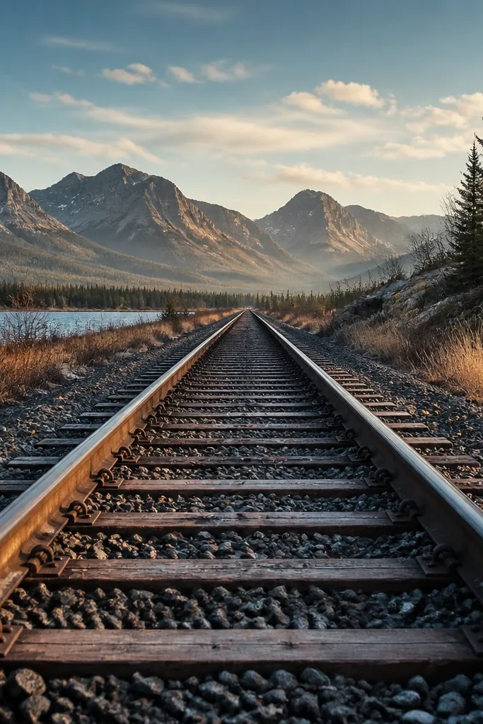
Tracks give you instant direction, and direction makes boards feel like plans. This photo type works because it has a strong central line and a clear depth scale. It’s a place image that also feels like movement, so it fits both the places and experiences buckets. Use it when you want your board to feel future-forward instead of just decorative.
Print in 5x7 and crop so the tracks reach toward the center of the frame. Mount it aligned with the grid, then pair it with two smaller images that match the mountain color tones. If you’re using a corkboard, pin through the top two corners to keep the paper flat.
Editor's notePick morning light photos for tracks — they print with cleaner contrast than overcast scenes.
Skip thisAvoid tracks where the vanishing point is blocked by foreground objects.
21. Coastal cliff lighthouse in fog
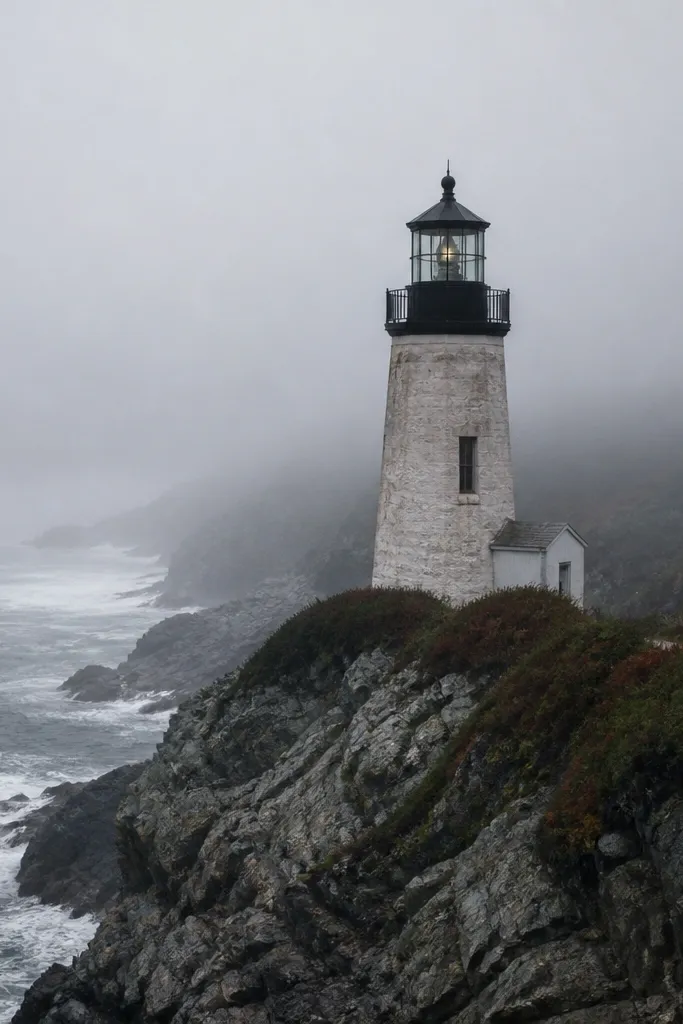
Fog photos add mood and they balance bright, sunny images. The gray palette is a visual reset, and the lighthouse gives you a clear focal subject. This is perfect for the “vibe” bucket when you want your travel board to feel cinematic and slightly mysterious. Print it smaller (4x6) so it doesn’t overpower the warmer images around it.
Print in 4x6 and mount with corners. Place it between two warm photos so the fog acts like a breather. If your printer crushes blacks, lighten shadows slightly in your print editor so the lighthouse details stay visible.
Editor's noteUse matte paper to keep fog scenes from looking flat and shiny.
Skip thisSkip fog photos with no distinct subject; a blank gray frame looks empty on a board.
22. Thailand street noodles bowl color pop
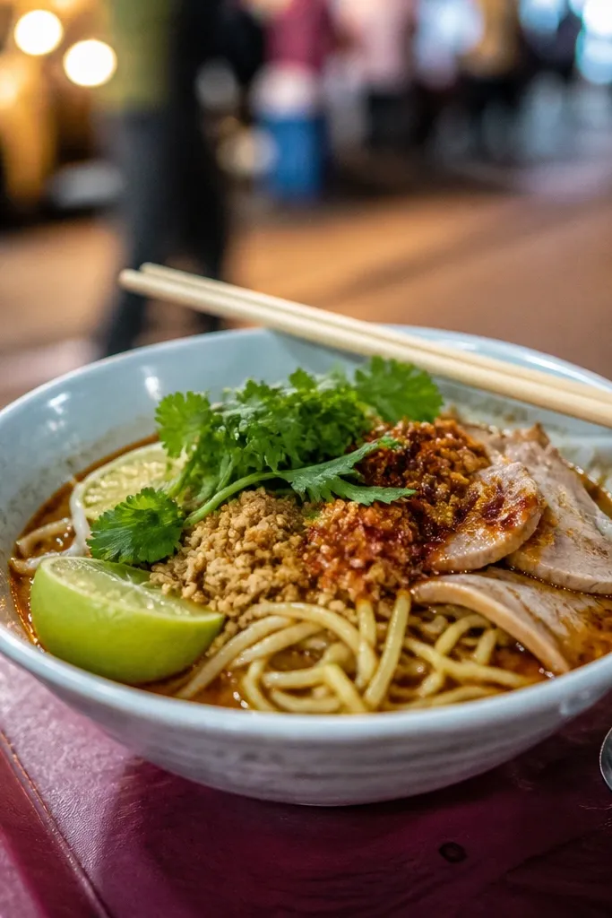
Street food color pop images are great because they bring energy to a board. The bowl is usually centered and the colors are clear — greens, reds, golds. This gives your vision board a “do this” reminder that feels fun, not heavy. Use it in the experiences row so your travel plan includes meals, not only sightseeing.
Print in 4x6 and keep it centered so the bowl sits in the visual middle. Mount with photo corners and add a simple kraft paper strip under it for a warm frame effect. Place it near one street scene photo so the board’s street-food energy makes sense together.
If you have to choose between sharpness and color, prioritize color accuracy; food looks better with true greens and reds than with overly sharp edges.
Don’t pick a bowl photo with messy backgrounds; it reads cluttered once printed.
23. Scandinavian cabin window view
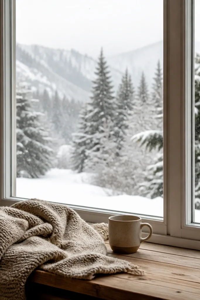
This photo type mixes cozy interior warmth with outdoor winter calm. That contrast looks great on a printed board because your eye gets both comfort and adventure. It’s a strong “vibe” image and it pairs well with darker lodge photos or city-night lantern scenes. Put it in the lower-left or lower-right corner so it feels like a destination you’re returning to.
Print in 5x7 and mount flat with corners. Use a dark border mat behind it so the window view doesn’t wash out. Keep the surrounding photos in cooler tones (blues, grays, deep greens) so the snow palette stays consistent.
Editor's noteIf the snow looks blue-gray and dull, slightly warm the temperature to keep it bright without overexposure.
Skip thisAvoid cabin photos where the interior is too bright compared to the outside view — the window details disappear.
24. Sakura street path soft pink canopy
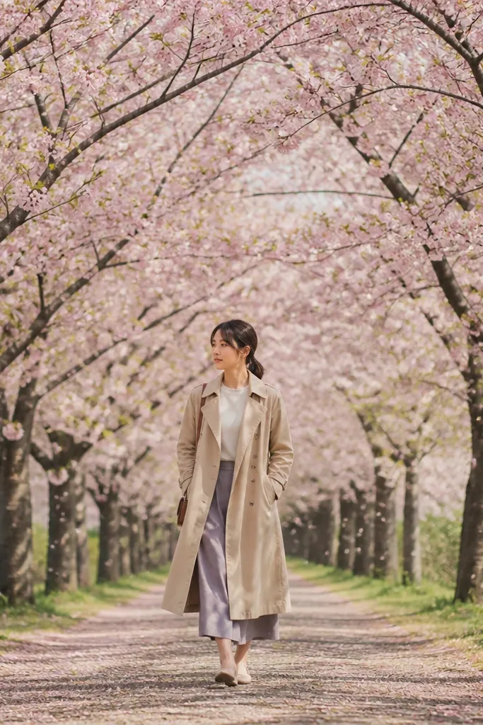
Cherry blossom streets are the ultimate low-maintenance aesthetic choice. The repeating blossoms create texture, and the color stays in one family — soft pinks and muted greens. Print it as a medium-size image so it fills space without overwhelming the board. This also adds a romantic seasonal vibe if your board is otherwise summer-heavy or city-heavy.
Print in 5x7 and crop so the path leads forward. Mount with corners and keep it in the top half of your board for a “spring arrival” feel. Pair it with one neutral architecture photo and one food photo to keep the vibe balanced.
Use a matte finish so the pink petals look soft instead of glossy.
Don’t choose a cherry blossom photo where petals are smeared by motion blur; it prints grainy.
25. Monochrome street photo with one red accent
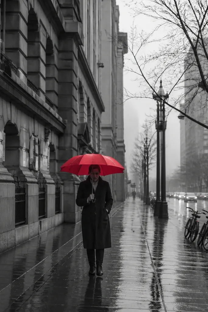
Monochrome photos make vision boards look more curated because they reduce visual noise. Adding one red accent gives you a focal pop that feels intentional. This is a great “layout stabilizer” when your other photos are colorful and you want the board to look designed, not chaotic. It also helps tie warm and cool palettes together through one controlled accent color.
Print in 4x6 and place it where you need a visual reset, usually near the middle. Mount with corners and keep a consistent gap around it like your other 4x6 prints. If your board uses a grid, align this one to the same row so the rhythm stays clean.
Pick photos where the red accent is a small object, not a giant sign; small accents look more classy when printed.
Avoid monochrome images with multiple red accents; it breaks the “one pop” effect.
26. Pastel suitcase sticker collage
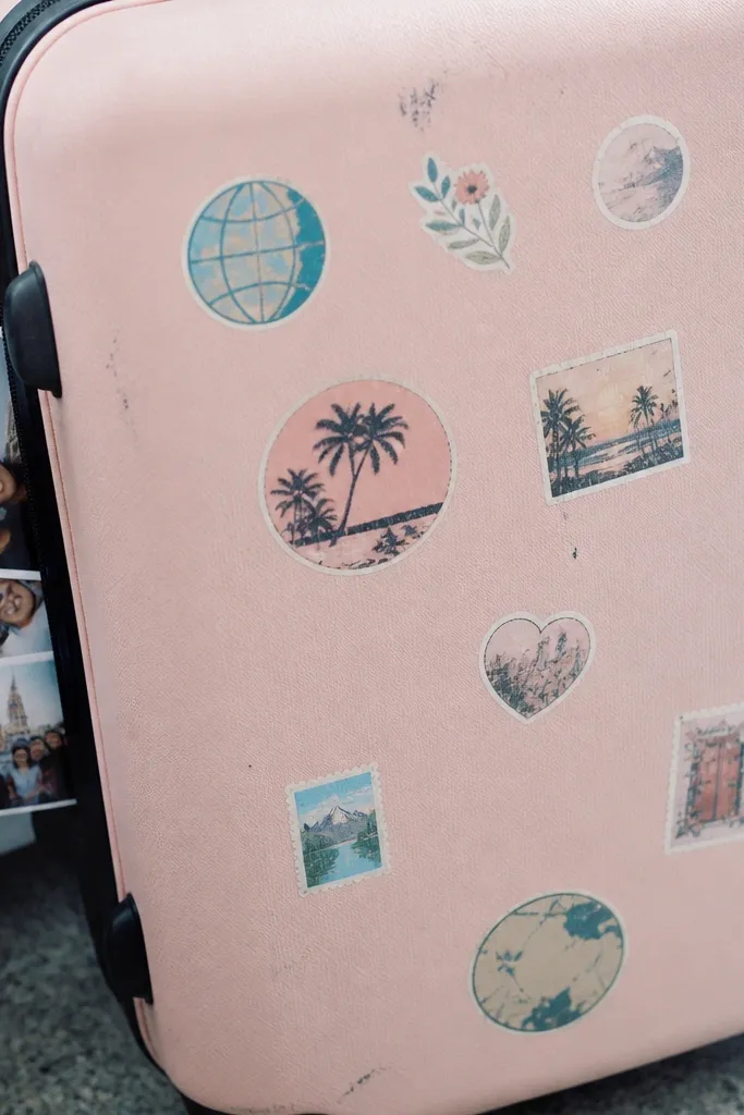
Sticker-collage images are fun because they look like memory keeping, not a mood board that will sit untouched. Pastel luggage tones also help your board look soft and friendly. This works best as a “vibe” image that you repeat with other travel-planning visuals. Print it smaller so it reads as a detail, not the whole theme.
Print in 4x6 and mount with corners. Place it near your passport/backpack image so the travel prep story flows. Use thin washi tape in one color family to match the stickers, and keep the tape minimal for a clean look.
Choose sticker photos with lots of light space — it makes the print look crisp even on basic paper.
Skip high-contrast sticker photos; they can look harsh on home printers.
27. Ocean pool steps and tiled pattern
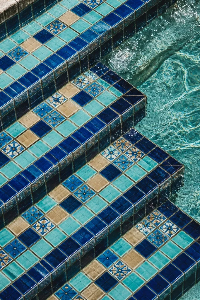
Tiled patterns are one of the best ways to make your board look decorative without extra craft. Repetition is visually pleasing, and it prints with clear lines. This photo also gives a strong color story — blues that match many other travel palettes. Use it to add texture and rhythm between photos of landmarks and people.
Print in 5x7 and make sure the tile lines are straight in the frame. Mount flat with corners and keep it aligned with your other 5x7 prints. Place it between two solid-color photos (like a sunset or a neutral beach towel) to make the pattern feel intentional.
Editor's noteIf your image is too blue, reduce saturation slightly so the tiles don’t look neon when printed.
Skip thisDon’t use a tile photo where the pattern is cut off awkwardly; it makes the edges look sloppy.
28. Old town cobblestone street overhead angle
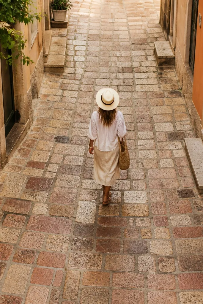
Overhead cobblestone photos look great because the texture becomes the design. They also add variety to a board that might otherwise be mostly eye-level scenes. The warm building colors around the cobbles create a cozy frame that feels “walkable.” Print this as a medium focal texture so it brings craft-like interest without you doing any extra work.
Print in 5x7 and center the cobblestone section so the texture fills the frame. Mount with corners, then add a thin gray border strip behind it for contrast. Place it near the center-left or center-right so the overhead angle balances the rest of your eye-level photos.
Editor's noteChoose overhead photos with consistent lighting across the cobbles; uneven lighting looks patchy on paper.
Skip thisAvoid overhead shots with lots of random objects scattered — it turns into clutter.
29. Airport window seat wing view
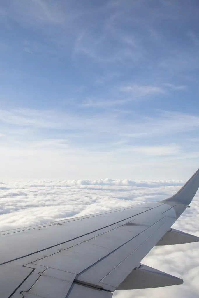
This image is pure travel momentum. It’s also a good low-maintenance option because it’s usually clean and minimalist: sky, wing, clouds. Use it as a “start the trip” cue on your board, especially if you’re planning multiple trips and want a consistent beginning. It also adds a cool tone that balances warm sunset and terracotta images.
Print in 4x6 and place it at the top center of your grid. Mount with corners and keep it surrounded by lighter photos so the sky tones blend smoothly. If the wing area is dark, lighten shadows in your print edit so details stay visible.
Editor's noteUse a slightly brighter exposure for window-wing photos so clouds don’t look gray and heavy.
Skip thisDon’t use a window photo with heavy reflections across the wing; the glare reads badly when printed.
30. Train compartment seats with patterned fabric
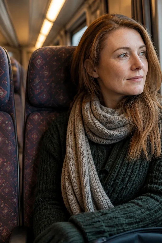
Train interior photos are underrated for vision boards because they show the experience, not just the destination. The patterned fabric gives you a design element, and the soft light keeps it cozy. This is a great “experiences” image that also helps your board feel lived-in. Print it medium size so the pattern is visible but doesn’t compete with your big landscape shots.
Print in 5x7 and crop to keep the seat pattern dominant. Mount with corners and keep the spacing consistent with your other 5x7 photos. Place it next to a place photo so the experience feels connected to where you’re going.
If the pattern looks too busy, reduce sharpness a touch; it keeps the fabric looking smooth.
Avoid interiors with too many people faces; it makes the board feel personal and cluttered.



