

1. Soft Neutrals Hero + Today Strip
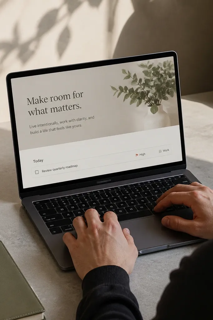
This layout gives you the calm homepage feeling because it has one big visual anchor and one narrow action area. The hero block uses a large title line and a short sentence for what matters today, so you get clarity without scrolling. Under it, the “Today” strip is a single row of task items or a linked view that you check off quickly. The look stays clean because there’s no sidebar clutter and the page uses consistent padding and neutral colors.
Editor's noteUse a single icon for the Today strip and keep it the same across every template you link to, so the page feels consistent.
Start by creating a top section with a large page title and one line of text under it, then add a divider line with a simple horizontal rule. Next, create a database view called Today with a filter for due today and place it under the hero as a compact list or board row. Finally, set the page to use a light background for the main area and keep the tasks strip to one view so it never grows into a messy stack.
Skip thisDon’t put your entire task database on the homepage — keep it to one filtered view.
2. Two-Column Weekly Dashboard Grid
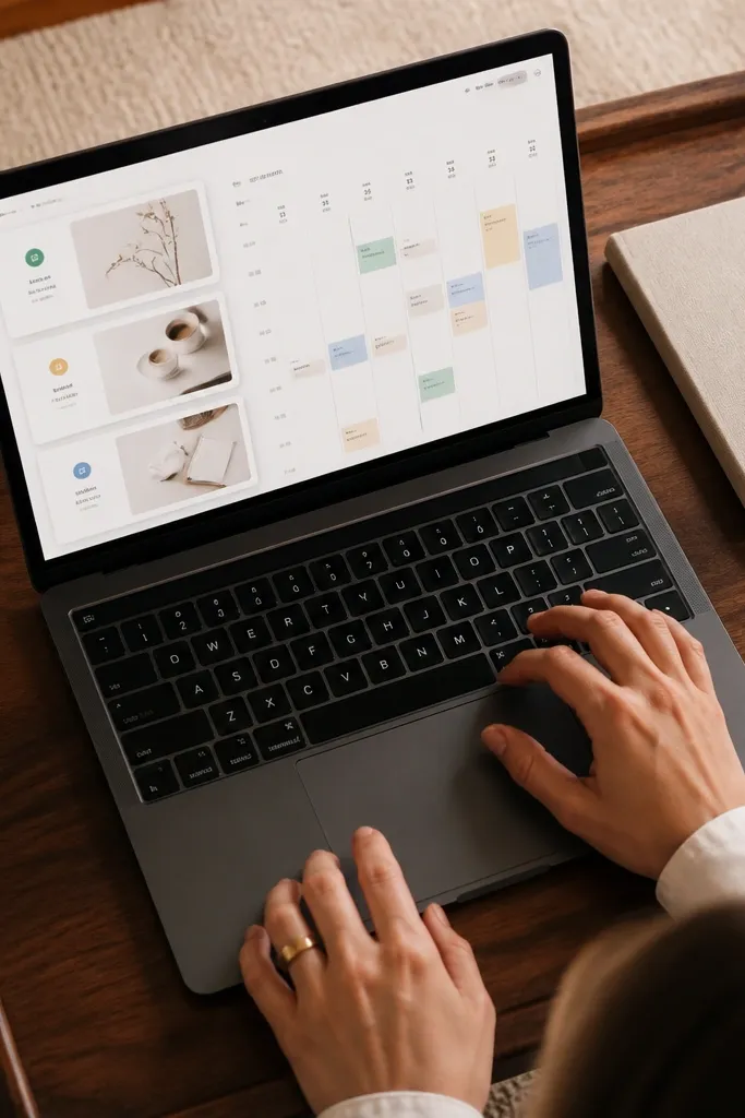
A two-column dashboard is one of the most photogenic Notion homepage styles because it creates symmetry. The left column holds three callout cards for weekly goals, habits, or priorities, while the right column holds a compact weekly view like a calendar or timeline. This format stays low-maintenance because the cards don’t require constant edits — you update each card once per week and let everything else sit. It also looks good in screenshots because each block has clear boundaries and the content doesn’t sprawl.
Create a 2-column layout and label the left column “This Week” with three callout blocks beneath it. In the right column, add a linked database view set to Calendar or Timeline and filter it to the current week. Then, set the callouts to short prompts like “Top 3,” “Must-do,” and “Quick wins,” so you’re not rewriting long paragraphs every day.
Keep the weekly date label in the header and use it as the only place you change wording, not inside every card.
Avoid mixing too many view types (table + gallery + calendar) in the same row; it makes the grid look noisy.
3. Minimal Sidebar Map with Section Anchors
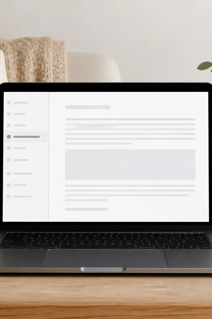
This is a homepage idea for people who hate visual clutter and still want navigation. The left “map” is a vertical stack of anchor links to your key areas, and the main panel shows one active section at a time. It’s low-maintenance because you’re not redesigning the whole page — you just switch which section is open. The aesthetic is strong because the left column has a consistent width and the right side stays focused on one content block.
Build a two-column layout where the left column is a fixed narrow width using an inline layout with a small header and 4-6 linked buttons or linked page blocks. In the right column, add a callout that tells you what to do next and place your Today view underneath it. Finally, use linked views for each section so the main panel stays consistent when you click around.
Use the same icon set and ordering for the anchors every time — it stops the page from feeling random.
Don’t add extra text blocks inside the sidebar; the width should stay clean and scannable.
4. Gallery of Outcomes with One Sentence Per Item
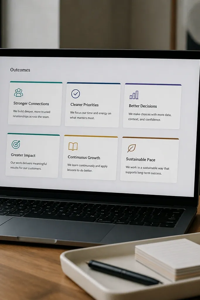
Gallery-based homepages look good because each item becomes a card, and cards create visual rhythm. This idea uses a gallery of outcomes or projects where each card has a title and a single sentence, so you never get essay-length clutter. It’s low-maintenance because you’re updating short lines, not rebuilding layouts. The aesthetic is controlled: consistent card sizing, consistent image placement (or a color tag), and plenty of whitespace between rows.
Editor's noteIf you use covers, pick one style (same crop and brightness) so the gallery looks intentional, not random.
Create a database called Outcomes with properties for Title, Category, and a one-line Prompt text field. Add a Gallery view and set cards to show Title and Prompt, then choose a simple cover style (either a color cover or one consistent image per category). Place the gallery in a top section and keep the page width aligned so cards don’t stretch too far.
Skip thisAvoid long descriptions in the card — keep it to one sentence or it kills the clean look.
5. Moodboard-Style Focus Tiles (No Chaos)
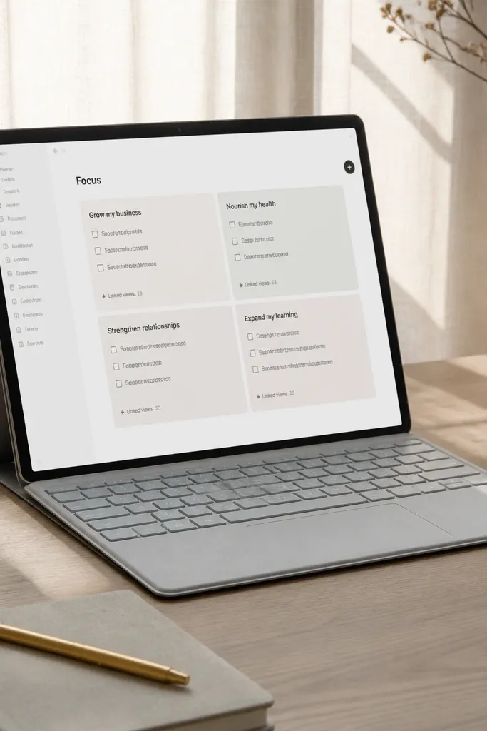
Focus tiles make your homepage look like a designed board, not a database dump. The key is to limit it to four tiles and keep each tile to a short focus statement plus a checkbox list or linked view count. This stays low-maintenance because you update the focus tiles only when your priorities change, not every time you finish a task. It’s photogenic because the tile grid has clear edges, and the page reads instantly in a screenshot.
Create a 2x2 grid using two columns repeated, or one 3-column row with empty space reserved if your layout supports it. Make each tile a callout block with an icon in the first line and a short focus statement in the second line. Under each tile, add a small linked view filtered to that category (or show a simple rollup count). Keep the text inside each tile to two lines max.
Use the same emoji style across tiles (either all icons or all emojis) so it looks cohesive.
Don’t cram five or six tiles on one row; it turns into a wall instead of a calm set of focus points.
6. Routine Stack with Checkboxes and Time Blocks
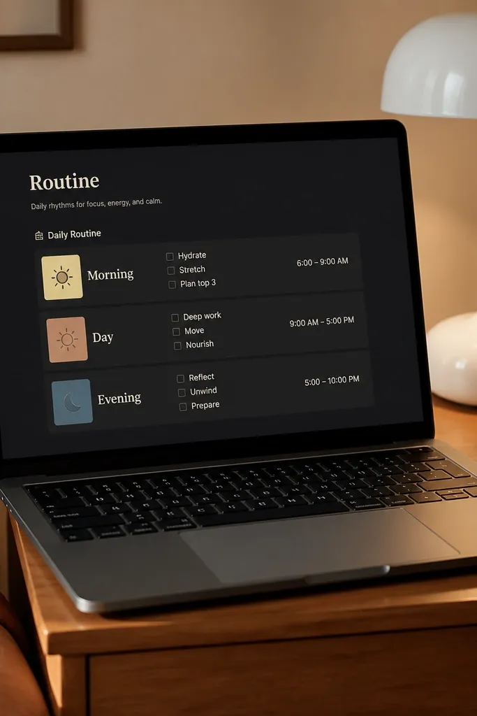
This layout is for calm mornings and controlled evenings. You get a stacked “routine” section that looks tidy because each block is the same height and has the same structure: a label, a short checklist, and a time range. It’s low-maintenance because you check boxes, and you only edit the routine text occasionally. Visually, it’s clean because the spacing is consistent and the blocks don’t compete with each other.
Create two databases or two views inside one Routine database with fields for Routine Name, Time, and Items. Add a list view for each routine (Morning and Evening), then display it as a compact stacked list under two callout headers. Set each routine items to checkboxes and keep time labels short like “7:30-8:00” so the blocks don’t expand.
Use rollups to show “Items done” counts on the routine header so you get an at-a-glance win.
Don’t mix long item text with short time labels; it makes the cards uneven.
7. Project Cards with Status Color Bands
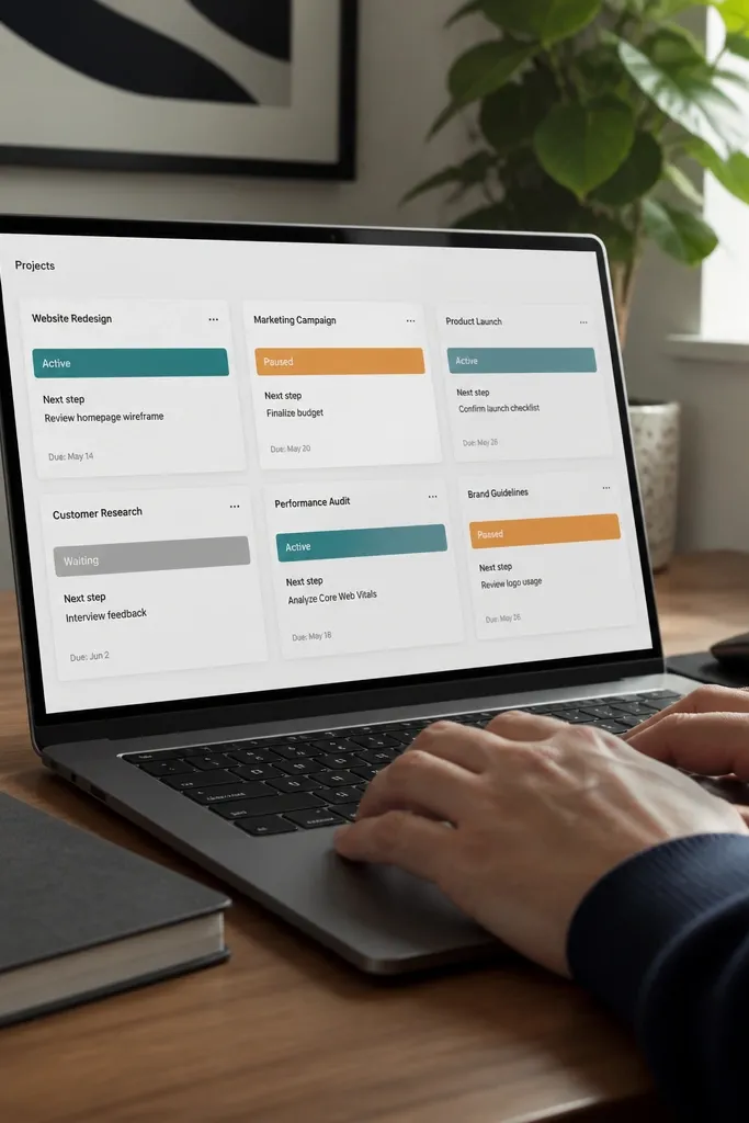
Status color bands make your homepage look organized without extra text. Each project card shows a short next step and a status band that visually separates active, paused, and waiting work. This is low-maintenance because you only update status when it changes, and the band updates everywhere you view the database. It also stays photogenic because color blocks create clear sections and your cards don’t rely on long paragraphs.
Create a Projects database with properties for Status (Active/Paused/Waiting), Next Step, and Due (optional). Add a board view with columns by Status and set card preview to show Next Step. Place the board view at the top of your homepage and keep card content minimal: title, next step, and one status hint. If you want stronger visual bands, use a status property that maps to consistent colors and shows on the card cover.
Keep the Next Step under 8 words so the card stays uniform in height.
Avoid adding attachments or multiple fields to the card preview — it makes the homepage look crowded.
8. Daily Notes Panel with One Default Template
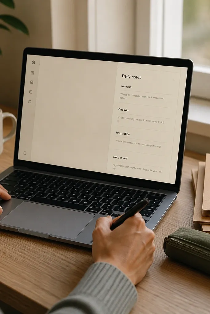
A daily notes panel makes your homepage useful, but it stays aesthetic when you keep it tight. The panel is one narrow section with a small set of prompts like “Top task,” “One win,” and “Next action,” so you don’t open a blank page every day. It’s low-maintenance because you use one default template and the homepage always looks the same. The look remains calm because the panel has a fixed size and consistent prompt wording.
Create a Daily Notes database with properties for Date, Top Task, One Win, and Next Action. Add a linked view on the homepage filtered to Today, and display it as a simple list or a single page preview. Set up a template for new daily notes so the prompts are already there, then link a button or page to create today’s note quickly. Keep the panel content limited to those four prompts.
Use the Date property as the only driver for the homepage filter so you never have to manually switch views.
Don’t add a long journal text field to the homepage preview — it ruins the clean panel look.
9. Books, Ideas, and Links Shelf (Three Columns)
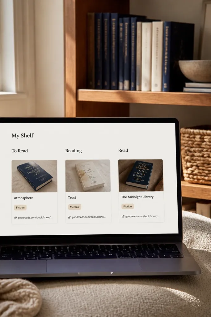
A shelf layout is one of the best ways to make a Notion homepage feel like decor. Three columns keeps the cards readable and stops the page from becoming a scrolling timeline. You get a curated look because each card is short and consistent: title, category label, and a link. This is low-maintenance because you add items as you find them, and the homepage just shows the latest batch. It also looks great in screenshots since the columns create clean vertical rhythm.
Create three small databases: Books, Ideas, and Links, each with Title, Category (optional), and URL or Source. Add a recent view of each database and display them in three columns on the homepage. Set each view to show only the newest 6-10 items using a sort by Created time. Keep the card preview minimal: title and one label.
Use short category labels like “UX,” “Health,” “Finance” so the shelf stays visually quiet.
Avoid mixing different card layouts across the three columns; it makes the shelf feel mismatched.
10. Seasonal Header + Monthly Goals Strip
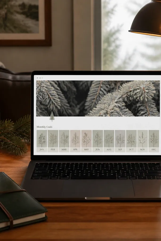
This layout feels designed because the header sets the mood and the monthly strip keeps you moving. You place a big seasonal title at the top (Winter Goals, Summer Reset, etc.) and then a horizontal row of monthly goal cards. It’s low-maintenance because monthly goals change rarely, and the homepage stays stable for weeks. The design wins come from the header size contrast and the single-row goals strip that doesn’t sprawl.
Create a top section with a large header line and a single sentence under it for the month theme. Build a Monthly Goals database with properties for Goal, Area, and Status. Add a board or gallery view set to the current month and place it as a narrow horizontal strip under the header. Keep to 5-7 goals so the strip doesn’t wrap into a second line.
Use one color per goal area and keep it consistent across the month so the strip looks intentional.
Don’t add weekly goals into the same strip; it breaks the clean monthly rhythm.
11. Weather-Driven Focus (Symbol + Tasks Count)
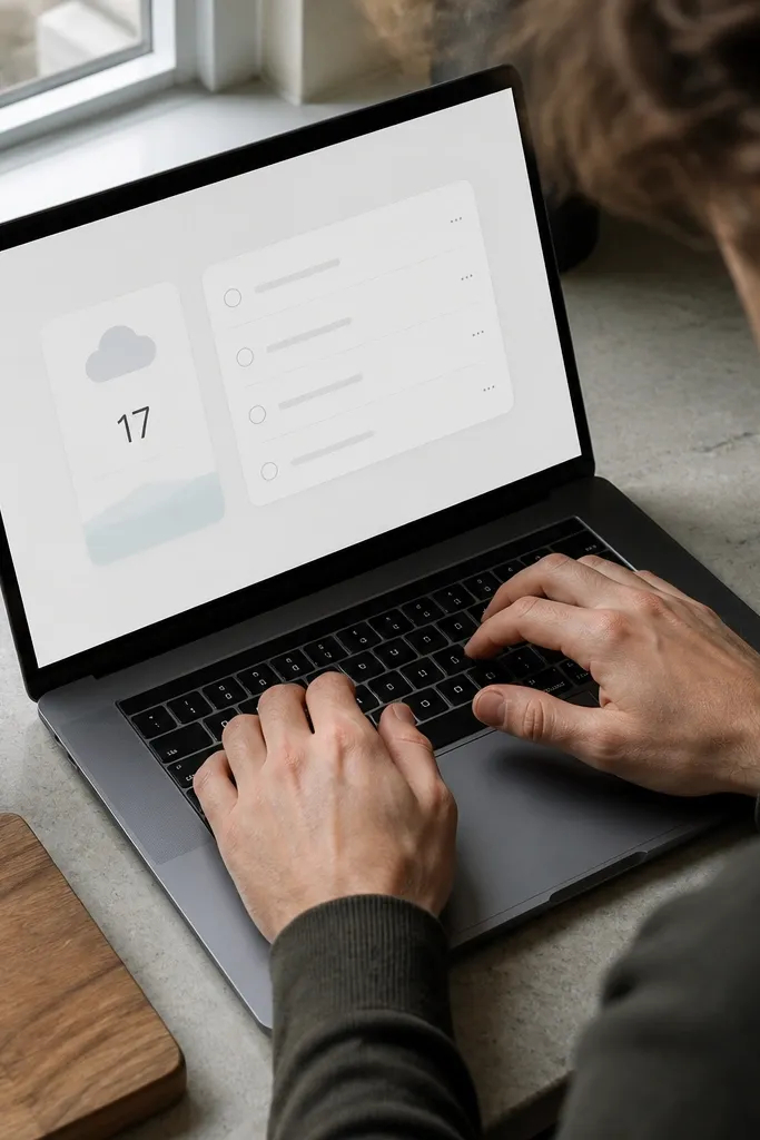
This is a clever low-maintenance homepage trick: tie your focus to a small visual cue, then show one count that tells you what to do next. The page has a small “weather/focus” card and a tasks count view, so you don’t need to read long instructions. It stays aesthetic because you keep it to one card and one number, not a dashboard of charts. The calm feeling comes from the page being predictable and minimal.
Create a small Focus database with properties for Focus Type (e.g., Deep work, Admin, Errands) and a short Focus Statement. Add a single card or callout on the homepage that displays the current focus statement and one rollup count for tasks in that category. Then add a filtered Today view under it for the actual checklist. Keep the focus card to one block so it never grows.
Use one consistent icon for each focus type so the homepage reads instantly at a glance.
Avoid adding multiple charts or widgets next to the focus card; it ruins the minimal look.
12. Artful Calendar with Tiny Event Titles
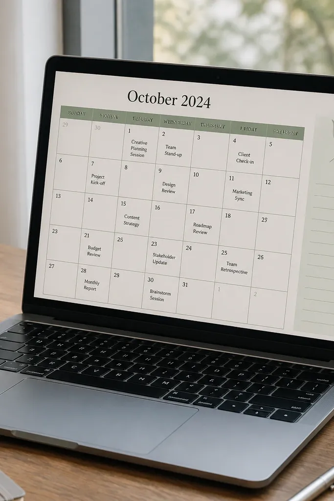
A calendar-first homepage looks good because it’s structured. This version keeps event text short and puts a single notes box on the side for context. It’s low-maintenance because you update events in the calendar database, and the homepage just reflects it. The aesthetic stays clean because calendar cells stay uniform when event titles are short and the notes box has a fixed size.
Create an Events database with fields for Title, Date, and a short Context. Add a Calendar view and set the event title display to just the Title property. Place the calendar in the left side of a 2-column layout and add a callout on the right for “Today’s context,” using a linked view filtered to today. Keep the callout text limited to 2-3 bullet lines.
Shorten event titles to 2-4 words, then put details in Context so the calendar stays visually quiet.
Don’t show full descriptions inside calendar cells; it turns the grid into a wall of text.
13. Reading and Learning Table with Cover-Like Headers
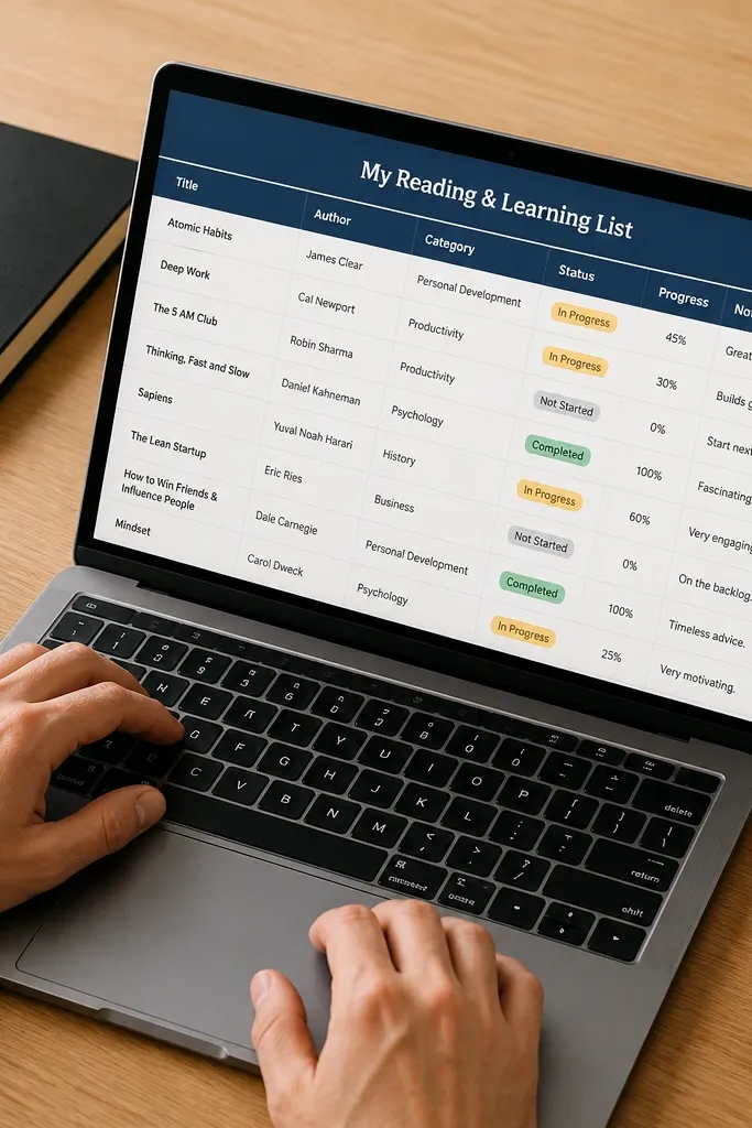
Tables don’t have to look boring. This layout uses a clean table view for reading and learning, but it keeps it pretty with strong headers and minimal columns. The homepage stays low-maintenance because you only add rows and update a status field. It looks photogenic because the table sits in a tight section with consistent column widths and the rest of the page is whitespace. You get a calm learning dashboard without endless toggles.
Create a Learning database with properties for Title, Type (Article/Book/Course), Status, and Source URL. Add a Table view on the homepage and limit it to 3-4 columns: Title, Type, Status, and maybe a short Date. Turn on compact row spacing if your view allows it, then keep the table width aligned with the page margin. Add one callout above the table with a short prompt like “What I’m reading now” and link it to the same database filtered by Status.
Use Status colors consistently (e.g., Now/Next/Done) so the table reads like a set of labeled cards.
Avoid adding 8+ columns to the table; it stops looking like decor.
14. Command Center with Three Linked Buttons
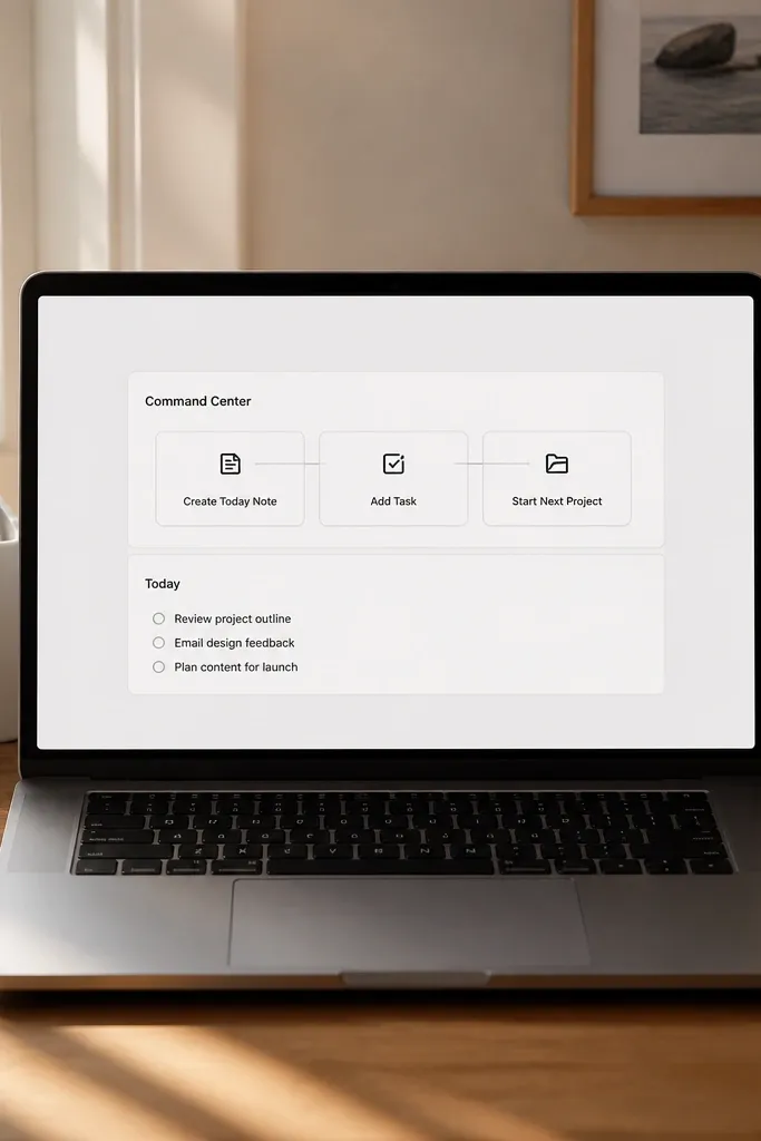
This layout is for people who want action fast, not a homepage full of data. The page has a single command center block with three linked buttons: Create Today Note, Add Task, and Start Next Project. Beneath it, you show one small view that confirms what changed, like a filtered Today list. It’s low-maintenance because the command center never changes — only the linked databases update. The aesthetic is strong because the command block is centered, and the rest of the page stays minimal.
Create a callout block at the top with a short title and three linked page buttons using inline links to your templates or database creation pages. Under the callout, add a filtered view that shows the results of your most common action, usually Today tasks. Set the view to a compact list so it doesn’t take over the page. Keep the rest of the page empty or limited to one small section so the command center stays the focal point.
Use consistent button text length across all three buttons so the command block looks balanced.
Don’t hide the main action behind multiple nested buttons; you want three taps, not seven clicks.
15. Inbox Zero Inbox Card Wall
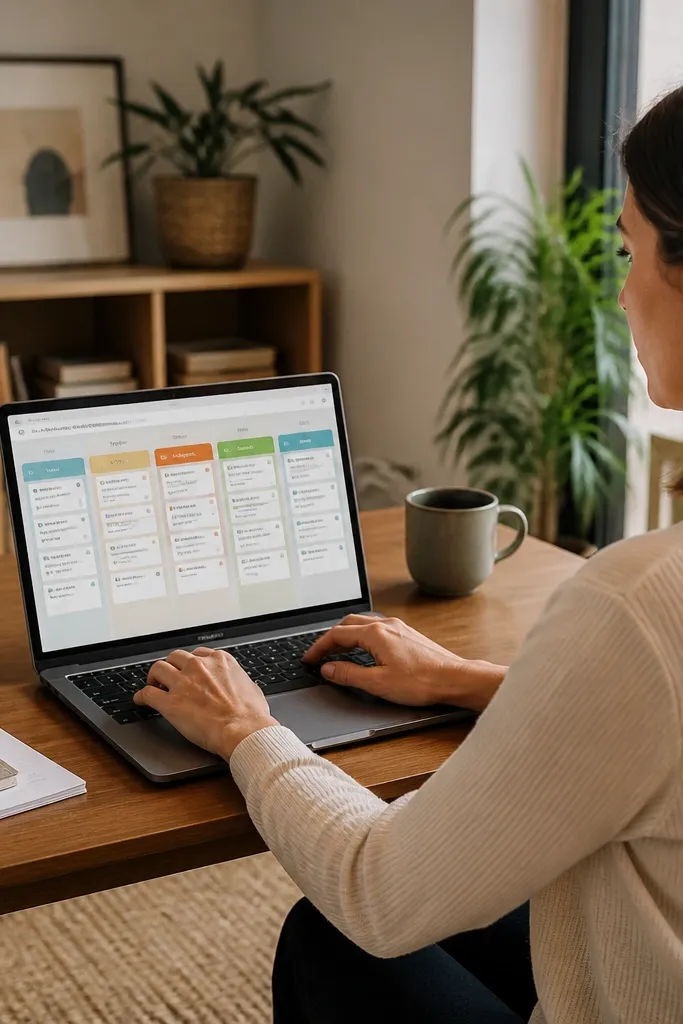
This fixes the homepage problem where your task list is always full, but nothing moves. The card wall gives you a visible “inbox-to-done” flow right on your Notion homepage, so you spend less time deciding and more time clearing. It looks good because every lane uses the same card size, the same spacing, and one color accent per status. You get low-maintenance Notion template ideas because the cards pull from one database and the homepage stays tidy even when your lists grow. It suits people who live in email, messages, or quick capture notes and want a daily reset without a messy dashboard.
Editor's noteUse a single “Capture” button elsewhere (like a command center link) that creates a new Captures entry with Status set to Inbox. Keep card content limited to title plus one property so the wall stays readable at a glance.
Step 1: Create one database called Captures with properties: Status (three options: Inbox, Doing, Done), Priority (Low/Med/High), and Due (date). Set the database view to a “Board” view grouped by Status, then adjust card width so each card is the same size and the text wraps cleanly. Step 2: Build the homepage section by placing the board view in a two-column layout: left column shows Inbox + Doing, right column shows Done as a narrow strip. Turn on a filter on the homepage board view so Done only shows items from the last 7 days. Step 3: For each card, set the card content to show only the title and one small line like Due or Priority, then hide the rest of the properties so the wall stays photogenic and not cluttered.
Skip thisDon’t put ten different views and properties into the cards — it kills the clean look and turns the homepage into a scroll trap.



