
1. Sepia Recipe Card Set for a Countertop Stand
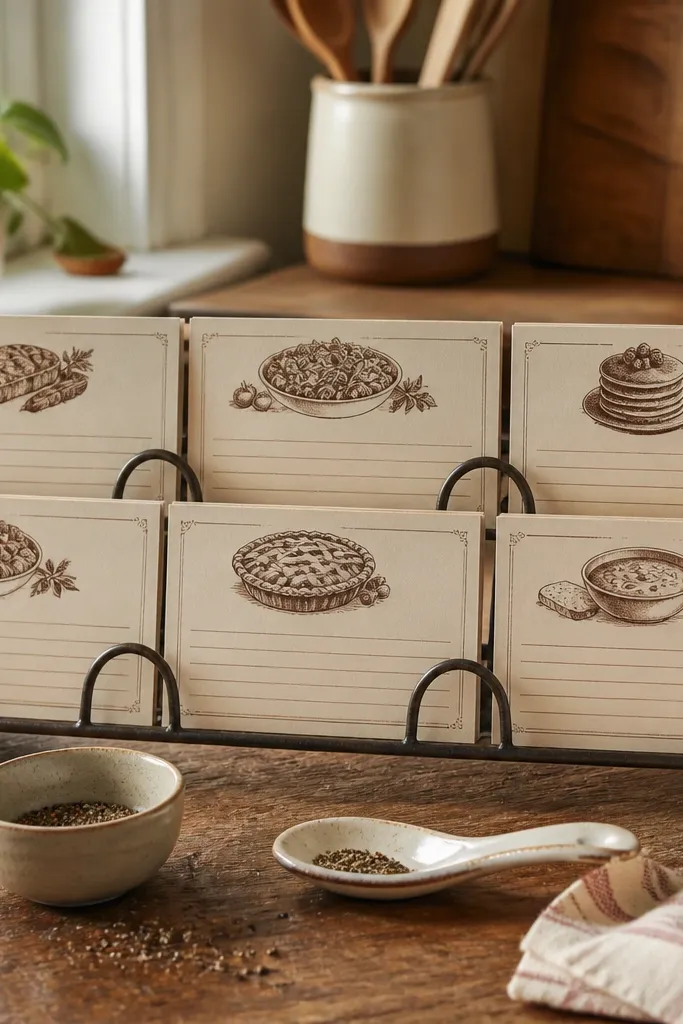
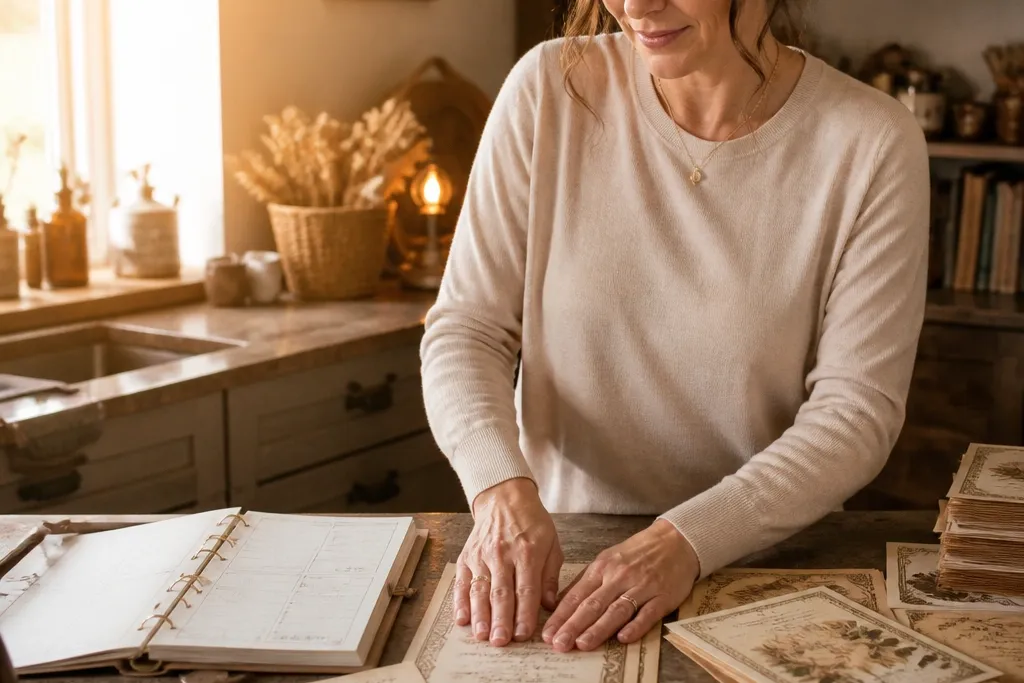
This is the easiest high-end Vintage Paper Printable you can run weekly because it always looks “in use.” A recipe card layout reads warm and intentional, especially when you print on cream cardstock and keep the typography in one ink tone. Use a set of 6-10 cards with consistent margins so the stand looks styled, not cluttered. The beauty is in the paper feel — thick sheets with matte ink look like they came from an old kitchen binder. It suits a kitchen counter, pantry shelf, or a breakfast nook where people actually see it every day.
Print on 65-110 lb cream cardstock at 100% scale. Cut to card size (choose 4x6 or 5x7 for a stand that can hold cards), then round the corners with a 1/4-inch radius punch. Finish with a light matte spray sealer so ink stays crisp and won’t transfer when touched. Finally, add a simple ribbon tab or binder clips at the top so each card stacks neatly in the stand.
Do a quick test print on plain paper first to lock in scale — recipe cards are unforgiving if the margins shift.
Don’t use glossy photo paper for recipe cards; it makes the vintage look too modern.
2. Aged Postal Labels for a Small Wall Grid
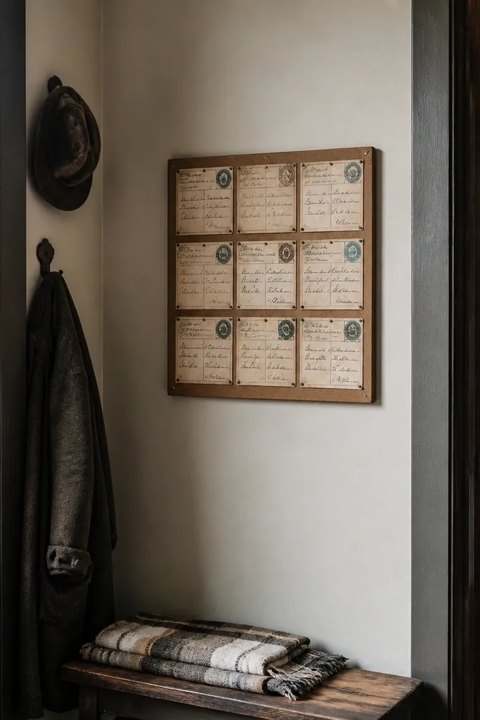
Choose a label size that fits your grid, like 2.5x4 inches or 3x4 inches, then print a full sheet of labels. Cut cleanly with a paper trimmer for straight edges, not scissors. Arrange them on a cork board or a thin wood panel using small double-sided mounting squares. Seal the labels with matte spray if you plan to handle them often, then hang the panel with a picture hook.
Postal labels look expensive because they have structure: addresses, stamps, and clear spacing. When you print them as a set and group them into a grid, the wall reads like curated ephemera instead of individual downloads. Keep the colors muted (sepia ink, faded teal, off-black text) and let the “stamp” elements repeat across labels. This project is photogenic because it creates a pattern with negative space. It works great in entryways, home offices, and laundry rooms where you want a busy look without heavy decor.
Skip thisAvoid mixing wildly different font weights; it breaks the vintage consistency.
Editor's noteUse a single stamp “frame” style across all labels so the grid looks like one collection.
3. Botanical Border Quote Prints for Clip Frames
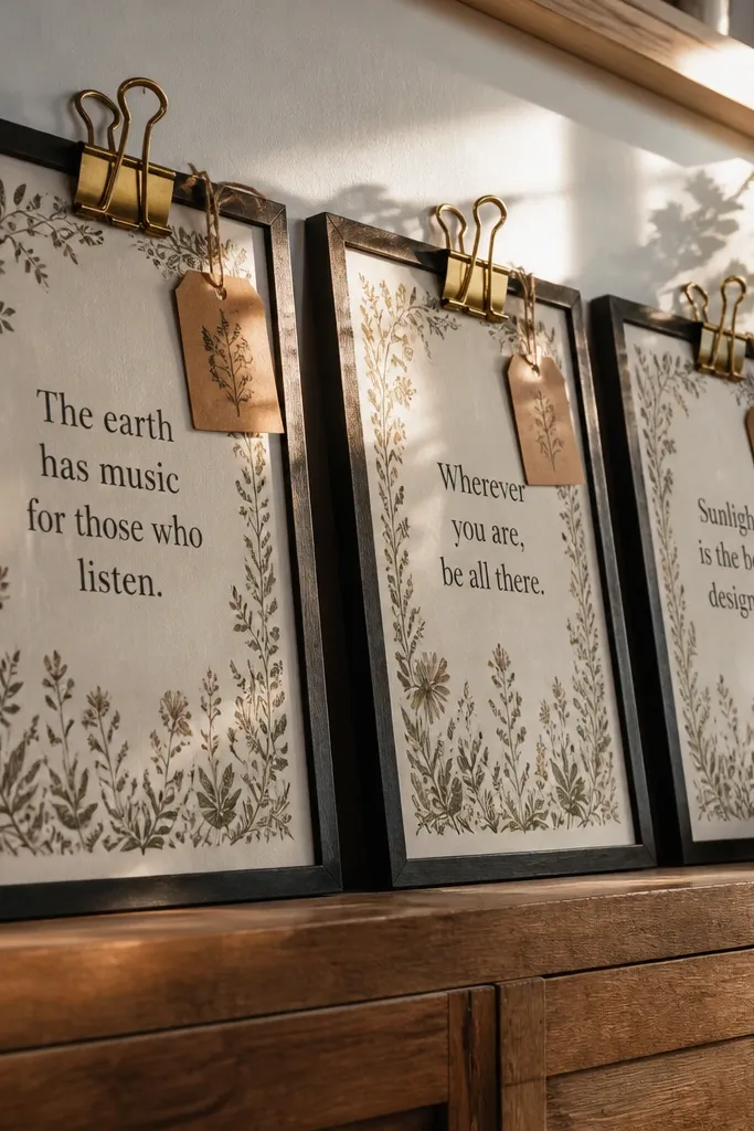
Pick a print size that fits your clip frame, like 5x7 or 4x6. Print at 100% scale, then trim using a guillotine trimmer for sharp edges. Clip each print to a wire frame with mini clothespins, then add a thin backing board so the paper sits flat. Finish by misting matte spray from a distance (light coats) and let it dry fully before clipping.
Botanical borders plus short quotes look high-end because the design has movement without needing color fireworks. Clip frames are the secret weapon here: you get a gallery vibe, and you can swap prints weekly. Print on matte cardstock so the border lines feel like etched paper. Keep the quote text short enough to read at a glance — that’s what makes it look “designed,” not like a wall of tiny words. This suits kitchens, bedrooms, and craft rooms where you want gentle decoration that changes with the season.
Skip thisDon’t use thick laminating sheets on paper quotes; they create glare and flatten the vintage texture.
Editor's noteIf your clip frame has a lip, trim 1-2 mm smaller than the opening so the edges don’t scrape.
4. Vintage Bookplate Prints for a Shelf Backer
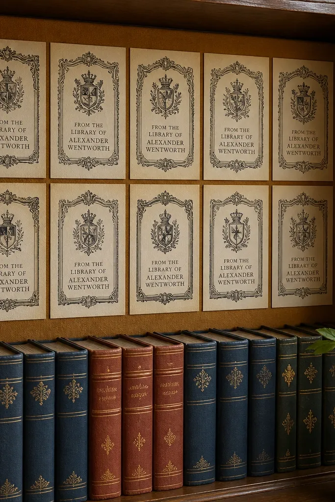
Bookplate designs make shelves look curated because they mimic real library ownership marks. The layout is naturally photogenic: a central crest or decorative frame with clear text. Print a set of 8-12 bookplates in matching sizes so the backer board looks intentional. Use warm paper and keep the ink dark but not jet-black; sepia and soft black read more believable. This project is perfect for bookshelf styling, entryway shelves, and any spot where you want a vintage layer behind books or baskets.
Choose bookplate dimensions that match your shelf spacing, like 2.5x3.5 inches or 3x4 inches. Print on matte cardstock, then cut precisely with a craft knife and straightedge for clean borders. Adhere to a thin backing board (foam board or poster board) using acid-free glue or double-sided tape. Add the backing board behind books and baskets so the book spines frame the bookplates.
Print one extra bookplate and test placement before gluing the rest — spacing is what makes this look high-end.
Avoid cheap tape that goes shiny over time; it shows through the paper edges.
5. Old Map Mini Prints for a Drawer Liner Look
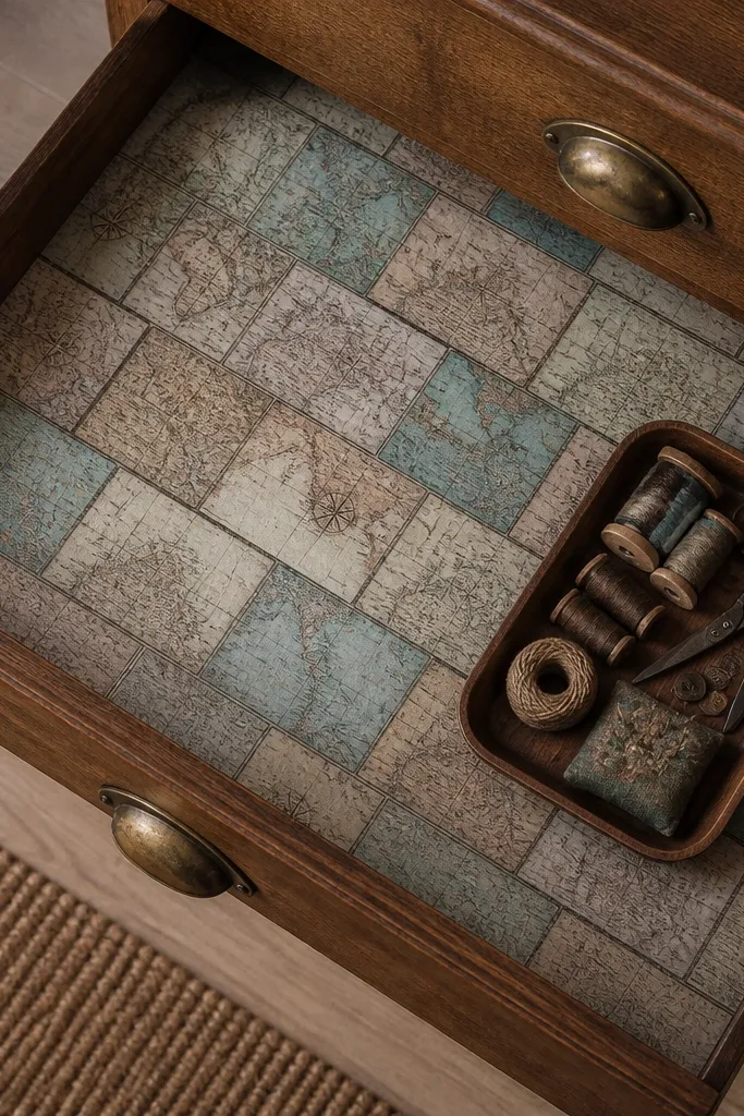
Mini map printables look premium because they add texture and geography without needing bulky decor. The high-end effect comes from scale: small prints placed inside drawers feel intentional and collectible. Print on sturdy matte paper so it doesn’t curl when you apply it. Keep the map palette muted and add subtle compass rose elements that read like aged cartography. This works in bathroom drawers, office drawers, and jewelry boxes where you want a hidden detail people actually notice.
Measure a drawer liner area and cut a template from paper first. Print your map minis so seams land in clean lines, then trim each piece to fit. Apply a thin layer of removable adhesive spray or double-sided mounting tape to the drawer bottom, then press the paper smooth with a brayer or clean cloth. Seal the top with matte spray if the drawer gets handled often, and let it cure fully before use.
Use a brayer to prevent bubbles; it makes the paper look professionally applied.
Don’t use thick glue paste — it wrinkles thin map paper and warps the edges.
6. Vintage Ticket Stubs for a Wall Shadow Box
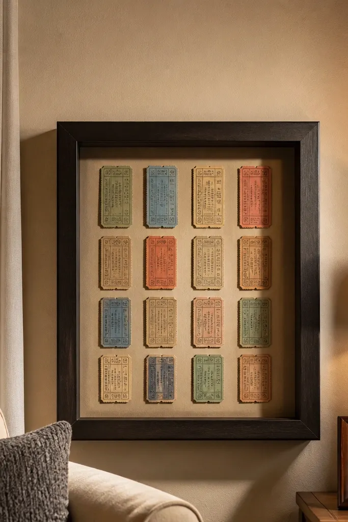
Choose a shadow box with a depth of at least 1.5 inches so paper doesn’t press against the glass. Print ticket stubs on matte cardstock, then cut to keep the perforation lines aligned. Arrange stubs in layers, using small strips of acid-free tape at the back corners to hold them. Seal with matte spray first if your ticket designs have darker inks that smear easily.
Ticket stubs are instantly recognizable, and that’s why they look expensive when arranged neatly. A shadow box makes the paper feel like a real memorabilia piece, not a flat print. Print multiple stub designs with consistent edges and slightly different “dates” so the collection feels authentic. Use a deep shadow box so you get depth — the paper sits back and catches light. This is great for a hallway wall, above a desk, or near a reading corner.
Skip thisAvoid placing paper flush against glass; it looks flat and can trap glare.
Editor's noteLayer tickets with 2-3 mm offsets so each one shows a different date line.
7. Antique Label Strip Prints for Mason Jar Storage
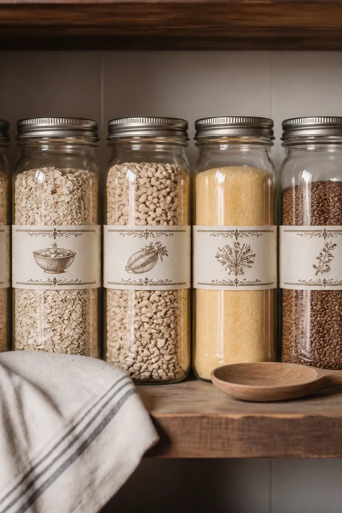
Pick a label strip size like 1.5x4 inches for small jars or 2x5 inches for larger ones. Print on 110 lb matte cardstock, then cut strips with a trimmer. Apply a thin coat of clear craft sealant over the label if you want water resistance, then adhere to jars at the same height using double-sided tape. Finish by aligning labels so the text lines sit level across jars.
Label strip printables turn basic storage into a vintage system. The trick is consistency: same label width, same placement height on each jar, and a matching ink tone across the set. Mason jars read classic, and printed labels make the jar contents look organized instead of random. Print on thick matte paper so labels don’t look flimsy when you handle the jars. This suits pantry organization, bathroom cotton storage, and craft supply shelves.
Skip thisDon’t print labels too close to the edge — trimming errors show on cylindrical jars.
Editor's noteIf the label will touch condensation, seal it twice with matte spray and let it dry between coats.
8. Vintage Ledger Pages for a Table Runner Background
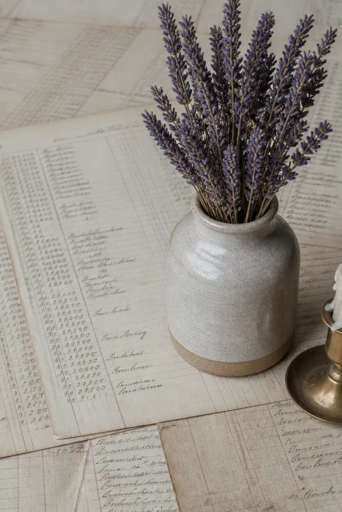
Print ledger pages on heavyweight matte paper, then trim to your table width (runner style works well at 11x17 or smaller repeated panels). Lay the paper as a base, then pin or tape the corners to keep it flat. If you want a crisp edge, add a thin border strip in a matching cream color. Seal with matte spray lightly so it’s less likely to scuff when you move items on top.
Ledger-style pages look high-end because they create instant texture under decor. You’re not trying to read every line; you’re using the page pattern like fabric — subtle, detailed, and calming. Print on matte paper and use larger sheets so the pattern fills space like a real document. The look photographs well because it adds grain and structure behind candles, vases, or centerpieces. This works for dining tables, coffee tables, and party tables where you want a vintage base layer.
Skip thisDon’t use pages with bright neon colors; vintage ledger prints should stay muted.
Editor's noteUse a soft brush to remove paper dust after sealing; dust shows up in photos.
9. Faded Library Card Prints for a Standing Frame

Select a standing frame size that matches your print, like 8x10 or 5x7. Print library cards at 100% scale, then trim with a trimmer so edges are straight. Use a mat if your frame has glass to prevent the paper from touching the surface. Add a thin backing board and tape the print at the corners only so it stays flat over time.
Library cards look like authentic paper ephemera, which is why they read high-end instantly. When you frame them, you get a vintage look without clutter, and you can rotate designs weekly. Print on cream cardstock with a matte finish so the “paper” texture is visible. Choose designs with realistic field boxes and small typography blocks; those details make it feel like a real card. This is great for desks, bedside tables, and shelves where a single framed piece can carry the vibe.
Skip thisAvoid frames with heavy glare glass — it makes vintage ink look washed.
Editor's noteIf your printer makes text look too sharp, print on slightly warmer paper; it softens the contrast.
10. Botanical Specimen Label Prints for a Vintage Tray
Choose label sizes around 2x3 inches, then print a stack of different specimens. Cut with a straightedge for clean borders, then punch a small hole at one corner if your tray uses twine. Place labels on a tray liner or lightly tack them to a thin felt sheet so they don’t slide. Seal the labels with matte spray if you’re putting them near jars that might sweat or spill.
Specimen labels are the kind of decor that looks smart without trying. It’s a label format with clear lines, Latin-style naming, and neat typography blocks — perfect for a tray where you can style jars, clips, and small tools. Print on matte cardstock and keep label backgrounds off-white so the text looks like it’s on aged paper. This project is photogenic because it creates a mini science-museum vibe. It suits apothecary shelves, bathroom shelves, and craft corners.
Skip thisDon’t add extra fonts; specimen labels look best with one consistent type style.
Editor's noteUse two label sizes in the same tray: one for the “specimen,” one for the “notes” block.
11. Vintage Monogram Place Card Prints for Everyday Hosting
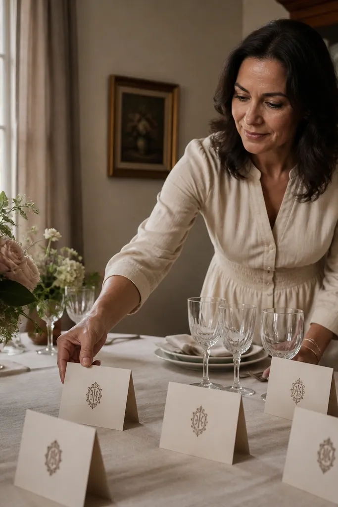
Pick a place card size like 4x2.5 inches, then print a sheet with multiple monograms and names. Trim with a trimmer, then fold along a guide line if your design includes a fold. Use a tiny dot of double-sided tape on the back to hold the fold flat. Place cards in a holder or prop them with a small fold stand so they sit upright.
Place cards are a small detail that instantly makes a table feel designed. Monogram styles look high-end because they’re simple, centered, and easy to read from a distance. Print on thick matte cardstock so the card stands up without bending. The designs look best when you use a consistent monogram size and spacing across a set, so the table looks coordinated even with different names. This works for dinner parties, holiday breakfasts, and even casual brunch when you want the table to look intentional.
Skip thisAvoid thin paper — place cards crumple when you set them down.
Editor's notePrint names in all caps for a more vintage bookplate look.
12. Aged Letter Writing Paper for a Photo-Ready Desk Flat Lay
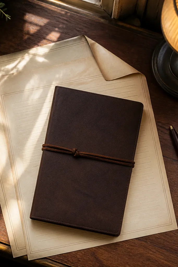
Print letter paper on 110 lb matte cardstock or thick matte art paper. Trim to standard sheet size like 8.5x11, then lightly crease fold lines if your design includes them. Layer the paper under small items, using clear removable tape at the corners to keep it from shifting. Seal lightly with matte spray if the paper will be handled often so edges don’t scuff.
Letter writing paper makes any desk scene look styled because it adds real texture and negative space. Print it as large sheets so you can fold corners, tuck it under a pen, or layer it behind a notebook. The high-end look comes from subtle border lines and faint ruling — it reads like paper, not a poster. Use matte paper so ink looks soft, and keep the palette warm and restrained. This suits desk corners, reading nooks, and flat lay photos where you want the background to look intentional.
Skip thisDon’t laminate — it turns paper backgrounds glossy and kills the vintage feel.
Editor's noteIf your ink looks too dark, reduce print density in your printer settings and reprint one sheet to compare.
13. Vintage Label Tags for Gift Wrap That Looks Professionally Done
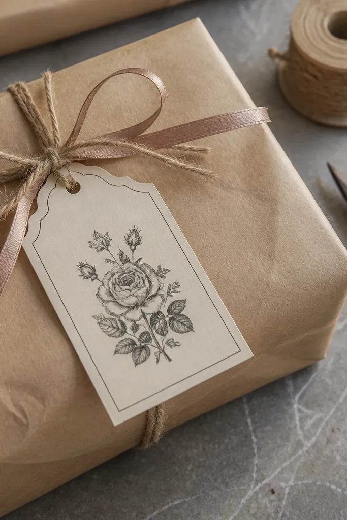
Choose tag size like 2x3.5 inches or 3x4 inches, then print multiple tags per sheet. Cut with a tag punch or trimmer for consistent edges. Poke a hole at the top center with a 1/8-inch hole punch, then tie with jute twine. Seal with matte spray if the ink smears when handled, and let it dry fully before tying.
Gift wrap tags are one of the most visible uses of vintage printables, and they look high-end when the tag has real weight. Print on thick matte cardstock and use a tag shape with a clean notch or rounded corner so it reads like a store-bought label. Tie with jute twine or thin ribbon for that old-world look. This project is photogenic because it sits right in the foreground — the tag is the focal point. It works for birthdays, hostess gifts, and holiday wrapping where you want to look polished without buying a pile of supplies.
Skip thisDon’t punch holes too close to the edge; it tears the paper when you pull the twine.
Editor's noteUse a slightly darker ink tone for the names only — it makes the tag pop against kraft paper.
14. Vintage Botanical Watercolor Frame Prints for a Gallery Wall
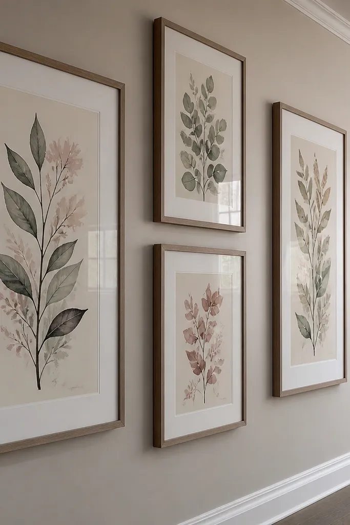
Print each botanical design on matte cardstock, then trim to fit your frame openings. Use a mat board if your frame uses glass — it prevents the print from sticking to the glass and protects edges. Arrange frames on a grid with 1-2 inches between frames, then measure and mark screw points before hanging. Seal the prints lightly with matte spray if your printer ink is prone to smearing.
Gallery wall prints look expensive when the set repeats framing style and spacing. Vintage botanical designs work because they have organic forms that feel hand-made, even when printed. Print at a larger size like 11x14 equivalents (11x17 is common) so the details don’t blur. Use off-white paper and matte finish so colors look softened and aged, not like fresh ink. This is the project for living rooms and hallways where you want a clean, photogenic wall that still feels warm.
Skip thisAvoid mixing frame sizes with mismatched mats; it makes the wall look accidental.
Editor's noteStick to one frame color across the set — black, espresso, or natural wood — and keep it consistent.
15. Vintage Ticket Map Collage for a DIY Print-on-Board Piece
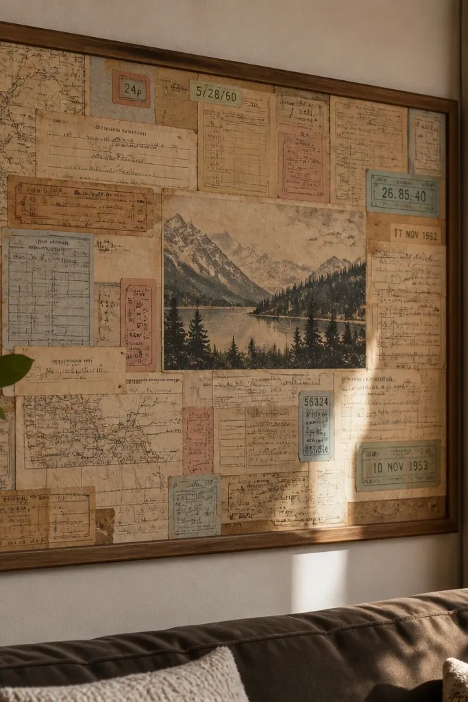
Start with a board like foam board or thick poster board sized to your display, such as 8x10 or 12x16. Print ticket stubs and map minis, then cut into small rectangles and strips. Layer pieces with overlap and tape the back edges with acid-free tape so the front stays clean. Finish with matte spray sealant over the entire surface in light coats to unify the textures.
A collage board looks high-end because it creates layers and depth, not just a single print. Combine ticket stubs and tiny map sections so the eye has multiple focal points. The vintage look comes from keeping everything on matte paper with warm tones and consistent edge treatment. This piece is easy to photograph because it has texture — paper edges, overlaps, and subtle shadows. It fits entryway tables, shelves, and office walls where you want one statement decor item.
Skip thisAvoid heavy glue blobs — they warp paper and show bumps under light.
Editor's noteLeave 5-10 mm gaps between layers so the paper edges cast visible micro-shadows.
16. Antique Tea Card Print for a Mini Standing Easel
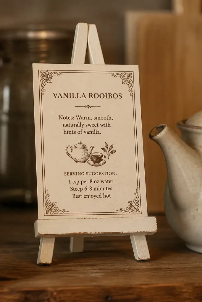
Pick an easel size that matches the card, like 4x6 or 5x7. Print on 110 lb matte cardstock, then trim to exact size with a trimmer. Place the card on the easel and add a thin backing card if your easel has a spring clamp that bends paper. Spray matte sealer lightly, then let it dry flat for at least 30 minutes before display.
Tea cards are charming because they’re small, readable, and look like something you’d find in a vintage shop window. A mini standing easel lets you swap the card weekly while keeping the display tidy. Print the card with a border and a product-style layout: tea name, notes, and a simple “serving suggestion.” The high-end feeling comes from thick paper and matte finish that looks like it’s been sitting in a drawer. This works in kitchens, coffee corners, and on a sideboard where you want a rotating detail.
Skip thisDon’t use super-thin printer paper; it bows and makes the easel look sloppy.
Editor's noteIf your easel pinches the paper, cut the card 2 mm smaller on all sides to prevent edge fraying.
17. Vintage Apothecary Labels for a Bathroom Vanity Tray
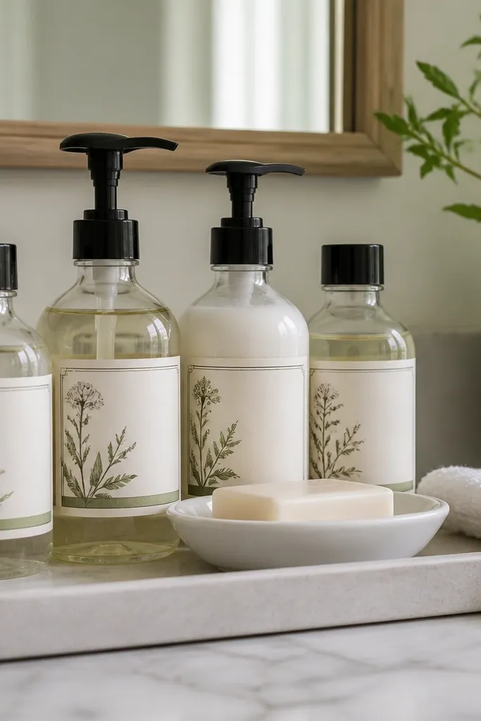
Choose label sizes that match your bottles, like 1.25x3 inches for mini bottles or 2x4 inches for larger ones. Print on 110 lb matte cardstock, then cut with a trimmer for straight edges. Apply labels using double-sided tape or a glue stick applied thinly to avoid bubbles. Arrange bottles on a tray and keep label text aligned so it reads like one system.
Apothecary labels are the quickest way to make a bathroom tray look like a curated vintage set. The look hinges on label typography and consistent label placement — same height, same alignment, same paper weight. Print on matte cardstock and seal if the bottles are near water. This project is photogenic because trays show everything at once: labels, bottle shapes, and the paper’s warm tone. It suits small bathrooms where you want style without replacing furniture.
Skip thisAvoid labels with tiny text that you can’t read at arm’s length; it looks like clutter.
Editor's noteUse a single “ink family” (sepia plus one accent color) so the tray doesn’t feel busy.
18. Aged Botanical Pattern Print as a Wallpaper-Style Accent
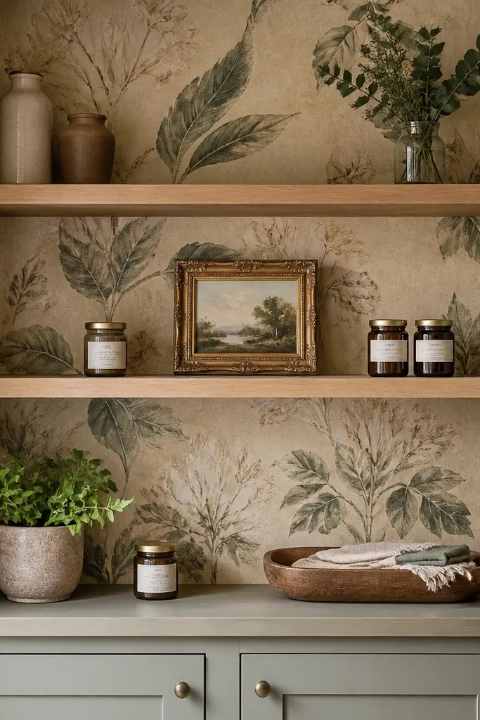
You can get the vintage wallpaper look without committing to real wallpaper by using a removable accent. A pattern print behind open shelving or a small desk creates a premium backdrop that makes everything placed on top look more intentional. The high-end effect comes from print scale and paper finish: use matte paper and keep pattern repeats crisp. This is a great weekly project because you can rotate themes by swapping panels. It suits reading corners, craft rooms, and behind-the-shelf styling where you want a clean, photogenic background.
Print the pattern on matte paper panels sized to your accent area, like 11x17 sections or smaller. Test the repeat alignment by printing one small section first, then adjust scaling if needed. Tape the panels to the wall with painter’s tape on the edges only so removal is easy. Seal the paper lightly with matte spray to reduce scuffing from dust and handling.
Keep the pattern panel edges straight and aligned — crooked seams scream DIY.
Avoid curling — let prints dry flat under weight for 1-2 hours before taping.
19. Vintage Pharmacy Checklist Prints for a Fridge Magnet Set
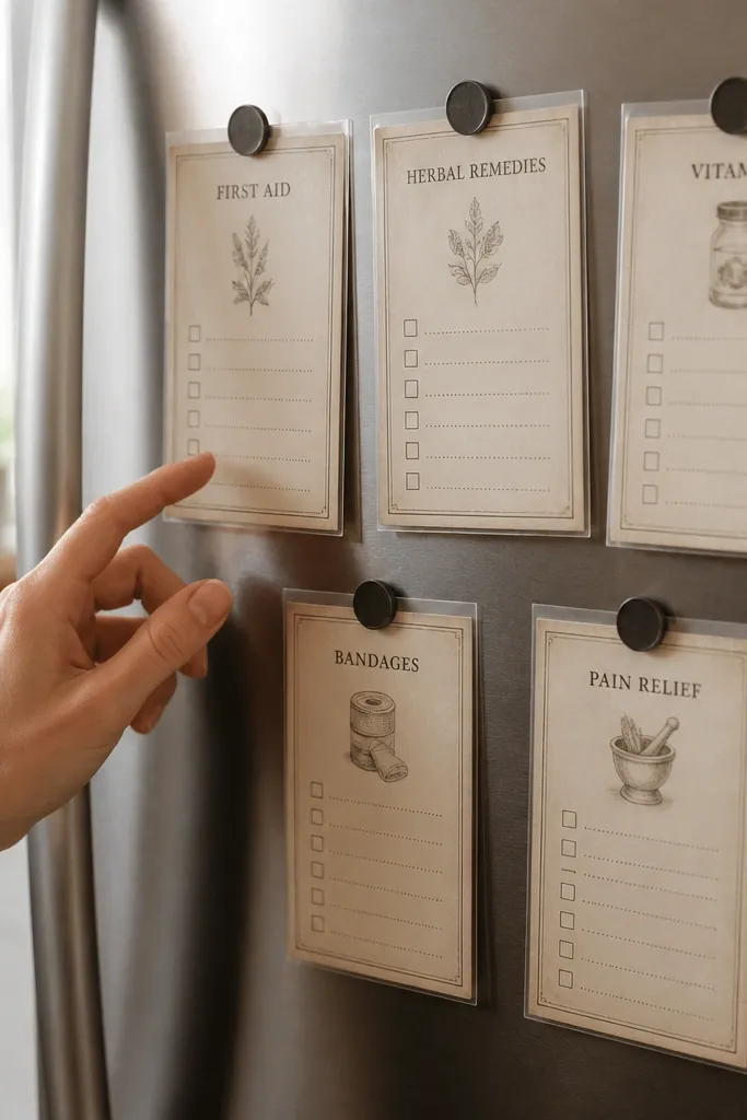
This is one of the most useful high-end Vintage Paper Printable uses because it turns paper ephemera into something you touch every day. The trick is to print on paper that already feels old, then seal it so it survives fridge humidity and fingerprints. You end up with crisp, readable checklists that look like they came from an old pharmacy counter — not like random printouts. It takes about an hour total for a set, and it works great in kitchens, utility rooms, and laundry spaces where you want quick reminders that look intentional. Skill level is easy, because the only “craft” is mounting and laminating with clean edges.
Print 8 checklists on 8.5x11 cardstock using a sepia palette and a simple grid layout with lines for dates and checkboxes. Cut each card to about 3.5x5 inches, then round the corners with a 1/4-inch radius corner punch for that vintage-soft look. Seal the front and back by laminating with matte laminate (or self-laminating pouches), then trim right to the edge so you do not get a thick border. Glue two small rare-earth magnets to the back — one near the top and one near the bottom — using contact cement or strong craft glue meant for paper. Let the glue cure fully before sticking them on the fridge so the magnets do not lift at the corners.
Use matte laminate, not glossy. Gloss shows every fingerprint and smears under kitchen lights.
Skip standard printer paper — it wrinkles and warps fast once it gets fridge steam.
20. Aged Linen Recipe Box Inserts with Hidden Sliding Tabs
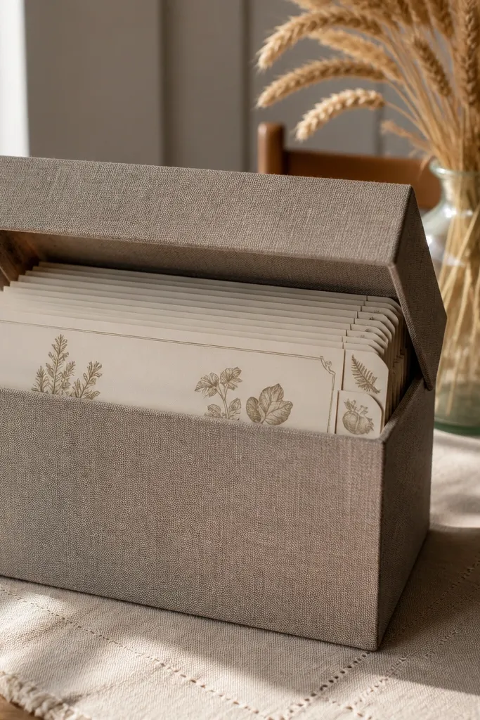
This one makes your paper prints feel like real storage, not wall decor. You print aged recipe cards and mount them into a box system that has sliding tabs, so you can pull one card without disturbing the rest. The look is high-end because the inserts sit under a linen-textured lid and the tabs peek out like an old drawer label. It fixes a common problem with recipe printables — they get shuffled, bent, and hard to grab when you are cooking. Plan on 2-3 hours the first time, mostly for cutting and fitting, and it suits anyone who hosts, cooks weekly, or keeps recipes in a cluttered drawer.
Start with a plain wooden or thick cardboard recipe box sized around 8x6 inches, with a removable lid if possible. Print 12 recipe inserts on thick paper (at least 110 lb cardstock), each sized to fit inside with about 1/16 inch clearance on all sides; add a 3/4-inch-wide tab area at the top. Cut 12 inserts and 12 tabs, then laminate the inserts with matte laminate for wipeable durability. For the sliding system, glue a thin strip of cardstock to the back of each tab and attach a matching guide strip inside the box along one side using double-sided tape. Test-fit by sliding one insert in and out before gluing everything down permanently, then finish by adding a linen-contact paper layer to the lid or front panel for that aged fabric look.
Sand the box edges lightly before lining with contact paper. It makes the paper lie flat and keeps corners from peeling.
Avoid gluing tabs directly to the box base — you want them to slide, not stick.



