
1. Monochrome Dashboard with a Real Today Strip
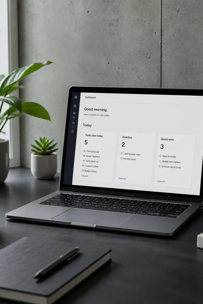
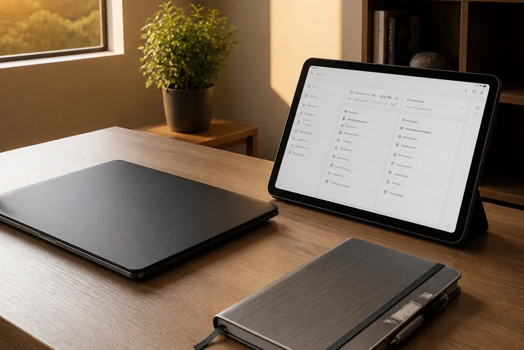
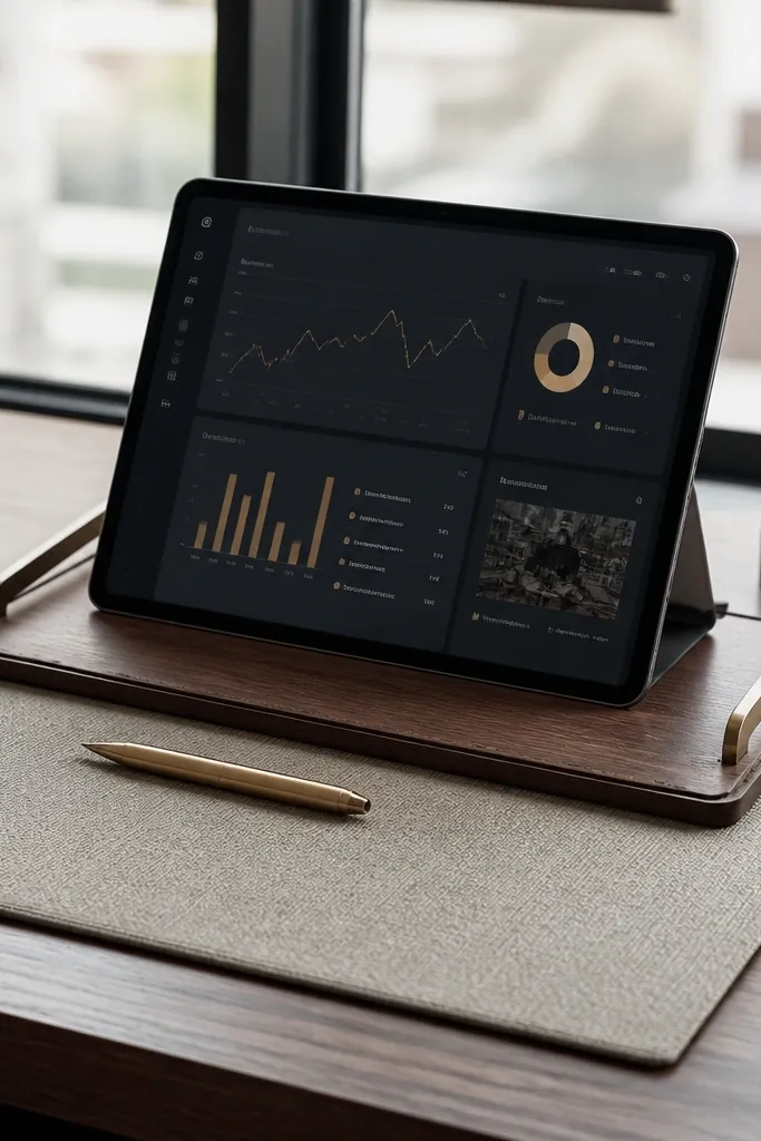
Start with a monochrome cover and keep the dashboard to one screen width. The “high-end” move here is a Today strip that shows exactly three sections: tasks due today, overdue items, and quick wins. Use a single database view for the strip, then duplicate it into three filtered views with the same card style. This makes the template look intentional because the layout never changes — only the items do.
First, create one Projects database and one Tasks database. Then add a linked view called Today Strip, and make three linked views from it with filters: Due date is today, Due date is before today, and a tag equals Quick Win. Finally, lock the card layout by keeping the same properties visible in every view and set the same grouping for each strip.
Editor's noteUse a fixed status property with the same labels everywhere, or your dashboard will look inconsistent as soon as you add new statuses.
Skip thisDon’t mix board, table, and timeline views on the same dashboard — it breaks the clean product look.
2. Two-Tone Project Tracker with Status Pills
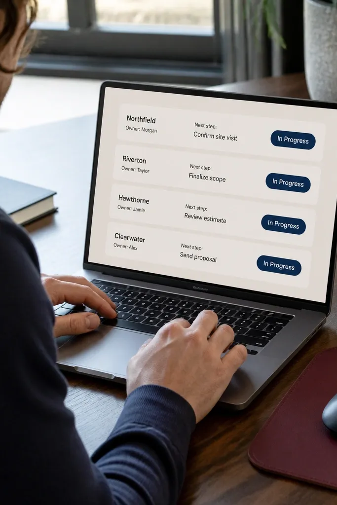
This template looks premium because it treats status like design, not like text. Use a two-tone palette: one neutral for the background and one for status pills, so every project card feels like it belongs. The view should show project name, owner, next step, and a status pill — keep everything else hidden until the project page. When the dashboard stays minimal, the template reads “high-end” even with lots of data.
Create a Projects database with properties: Status (select), Owner (person or text), Next step (text), and Deadline (date). Then create a linked view grouped by Status and keep the same property columns on every card. Add a second view sorted by Deadline, but keep it in the sidebar so the main dashboard stays clean.
Pick status labels that sort well alphabetically (example: Backlog, Planned, In Progress, Blocked, Done). That keeps cards aligned visually.
Don’t use 10+ statuses. Too many labels makes the cards look like a spreadsheet.
3. Weekly Planning Page with a Calendar-Card Hybrid
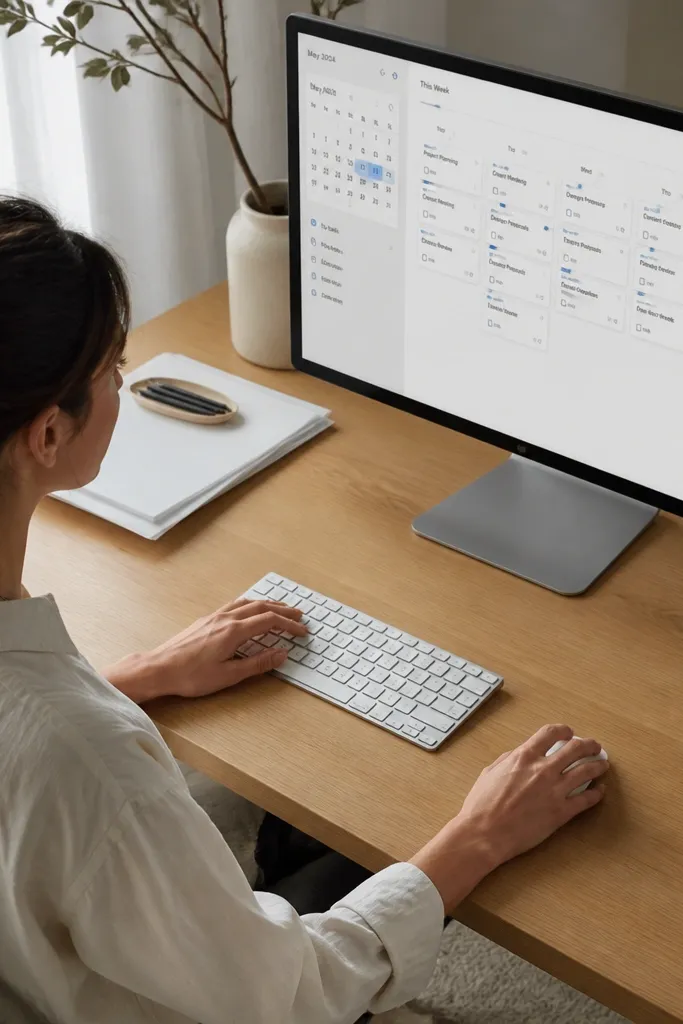
A premium weekly planner doesn’t rely on one view style. Use a compact calendar for dates, then show tasks as cards in a separate linked view filtered to the selected week. This hybrid gives you the high-end look because the page has structure: date column on one side, task cards on the other. It also keeps the system fast because you don’t need to open every task to see what’s happening.
Make a Weekly Planning page with two columns. Add a calendar view linked to Tasks filtered by project or team, then add a linked table or card view filtered to the week range using a date property and a “Week of” computed field. Finally, keep card properties limited to Status and Due date, and use a “Priority” select with only three values: Low, Medium, High.
Use “Week of” as a date property set to Monday, so your weekly filters stay consistent and screenshots look aligned.
Don’t show every task in the weekly view. Limit to tasks with a due date within the week.
4. Client-Ready Project Pages with a Single Cover Rule
If you want high-end Notion Template Ideas for work, the project page matters more than the dashboard. The look here comes from one strict cover rule: every project page uses the same cover style (same aspect, same placement) and the same header structure. Put three blocks at the top: Project Summary (one paragraph), Key Dates (a small table), and Current Status (a callout). That layout makes every project page feel like a polished document.
Create a Project Template page linked to your Projects database. Set the template content with three sections and include a “Key Dates” linked view filtered to that project. For the cover rule, pick either a solid color or a single photo theme and apply it to the template so you don’t improvise per project.
Editor's noteKeep the summary paragraph to 3-5 lines by using short sentences and a fixed callout width. It looks designed in screenshots.
Skip thisDon’t let each project page have a different header layout. That inconsistency kills the premium look.
5. Status Roll-Up Cards that Actually Read Fast
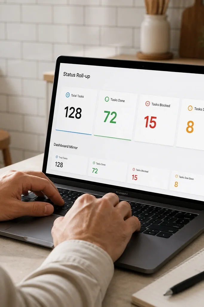
The cleanest templates show progress without making you click. Use roll-ups so each project page has a few big numbers: total tasks, tasks done, tasks blocked, and tasks due soon. Then mirror those numbers on the dashboard with small cards. This creates a high-end look because the UI is data-dense but visually controlled. You get clarity without clutter.
In Projects database, add a relation to Tasks. Then add roll-up properties: Done count (Tasks where Status equals Done), Blocked count, and Due soon count (Tasks due within 7 days). Create dashboard linked views that show only these roll-up properties plus Project Name and Deadline.
Use number formatting with no decimals for counts. It keeps the cards crisp.
Don’t show raw task lists on the project page until you need them. Lists look messy in screenshots.
6. Tidy Intake Form that Feels Like a Product
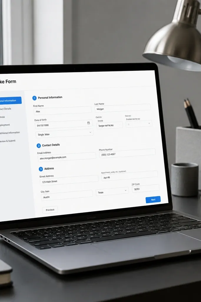
A high-end work template looks good because the input is controlled. Use a form for requests so every new project starts with the same fields and the same defaults. The aesthetic payoff is immediate: your database views stay consistent because the data structure is consistent. Put the form on its own page with a short instruction line and a confirmation block so the flow feels intentional.
Create a Requests database with properties: Request type (select), Priority (select), Needed by (date), Budget range (select), and Notes (text). Add a Notion form linked to that database. Then create a “Request Received” callout that appears after submission by linking the database view filtered to just created items.
Editor's noteDefault Priority to Medium in the form so you don’t end up with blank or random values.
Skip thisDon’t collect 30 fields. Too many inputs make the page look like paperwork.
7. Meeting Notes Template with a Two-Column Decision Block

Work templates look premium when meetings don’t produce chaos. Use a meeting notes page template with two columns: Decisions on the left, Action items on the right. Add a small “Attendees” property at the top and keep everything else inside toggles with short labels. This keeps the page clean while still capturing details for later. It’s also easy to screenshot because the layout is fixed and readable.
Create a Meetings database with properties: Date, Attendees (multi-select or text), Meeting type (select), and Link to Project (relation). Build a page template with a callout for Decisions and a linked view for Action items filtered to that meeting. Finally, add a toggle section called Notes and keep the notes area as a single long text block.
Use action items with a single required property: Owner. If Owner is blank, hide the card by filtering.
Don’t dump everything into one long notes page. A wall of text looks cheap.
8. Resource Library with Covers that Match the System
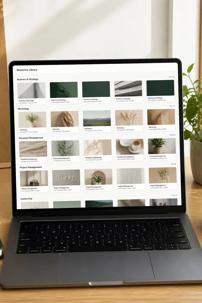
A resource library can look high-end if it’s styled like a gallery, not a filing cabinet. Use a database with card covers and consistent cover assignment rules. Tag resources with only 6-10 categories, then show cards grouped by category in a grid. Keep the visible properties minimal: title, category, and last updated date. This makes the library feel designed and helps you find stuff fast.
Create a Resources database with properties: Category (select), Last updated (date), Format (select), and Owner (text). Apply a cover rule by using either solid colors per category or a single photo style and mapping categories to that style. Then create grouped card views by Category and limit visible properties to three fields.
Editor's notePick one date format and stick to it (like YYYY-MM-DD) so cards line up cleanly.
Skip thisDon’t show Description on cards. It makes cards tall and uneven.
9. Hiring Pipeline with a Clean Scorecard View
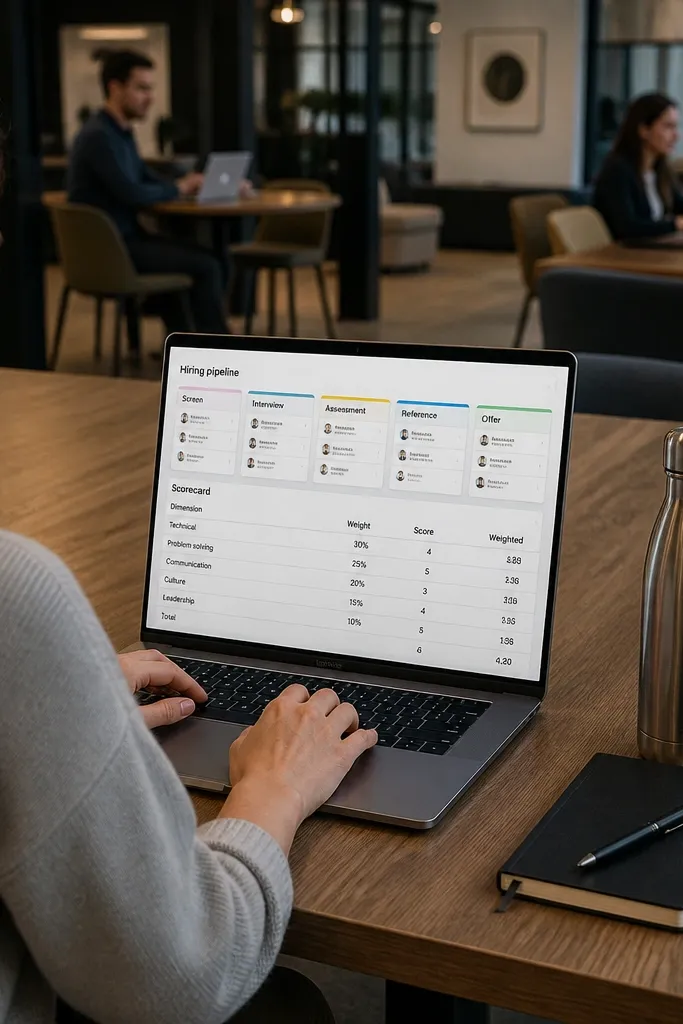
Hiring templates look expensive when candidate stages are visual and evaluations are standardized. Use a pipeline board for stages, but add a separate scorecard table view that shows only the scoring fields you care about. This keeps the pipeline clean and prevents the board from turning into a cluttered mess. The scorecard view gives the work-side structure, so the template looks sharp and stays usable.
Create a Candidates database with properties: Stage (select), Role (select), Score (number), and Notes (text). Add a second database or properties for evaluation criteria if you need them, but keep the scorecard view simple. Build a board grouped by Stage for the main page, then add a linked table view filtered to the current stage selection.
Use a 1-5 score scale and keep it numeric. It sorts cleanly and looks tidy.
Don’t put long candidate notes on the pipeline cards.
10. Ops Checklist Dashboard with Progress Bars via Percent
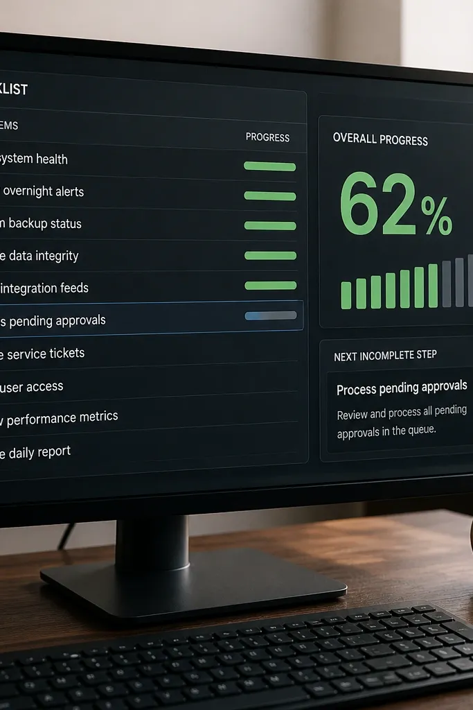
Operations templates look high-end when progress is visible at a glance. Build tasks into checklists with a percent complete property, then show that percent as a big number or bar-like display. Pair it with a small “Next incomplete step” field so you always know what to do. This makes the dashboard look like a status control panel, not a list of chores.
In Projects, add a relation to Checklist Items database. Each Checklist Item has a Status (select) like Not started, In progress, Done. Add a roll-up percent property in Projects by counting done items over total items. Then create a dashboard view grouped by Department or Project Type with visible properties: percent complete, next incomplete step, and due date.
Use consistent checklist item naming like “01 — Scope” so sorting stays logical.
Don’t rely on “Done” text alone. Use a status select so roll-ups work reliably.
11. Design Review Tracker with a Comment-to-Task Bridge

If you do design work, your template should treat feedback like work, not like scattered comments. This idea connects review comments to tasks so every piece of feedback becomes an actionable item. Visually, it looks clean because the review page shows a left column for “Open issues” and a right column for “Assigned fixes.” The result feels high-end because the system reduces the messy back-and-forth.
Create a Reviews database with properties: Review date, Project (relation), Reviewer (text), and Status (select). Create an Issues database with properties: Linked Review (relation), Type (select), Assignee (text), and Due date. Then on the Review template page, add two linked views filtered to that review: one for Issues where Status is Open and one where Status is Assigned.
Editor's noteStandardize Issue Type with 5 values so cards stay visually consistent.
Skip thisDon’t let issues live only in comments without a status field.
12. Expense + Budget Tracker with a Clean Monthly Snapshot
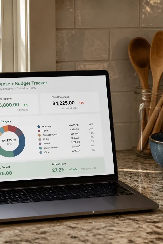
Budget pages look premium when they show one month at a time and keep the rest quiet. Use a Transactions database with a category select and a monthly roll-up in a separate Monthly Summary database. Then create a dashboard view that shows only the current month’s totals and category breakdown. The high-end look comes from a simple grid: total spend, total income, net, and the top 5 categories by spend.
Create Transactions with properties: Date, Category (select), Amount (number), and Type (select: Income or Expense). Build a Monthly Summary database with a “Month” date property and roll-ups from Transactions filtered by that month. Then create a dashboard page with linked views filtered to the selected Month and show only four roll-up numbers plus a category breakdown view.
Editor's noteUse Amount as a number with Expenses entered as positive numbers and compute sign with Type in roll-ups.
Skip thisDon’t show every transaction on the dashboard — it destroys the polished look.
13. Content Calendar with a Photo-Like Card Layout
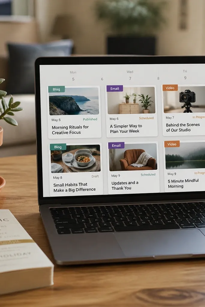
Content calendars get high-end fast when cards look like they belong together. Use a card view with covers assigned by content type (Blog, Email, Video) and show only the date, status, and title. Pair it with a “Next up” table view that lists the next three publish dates. This gives you a clean editorial feel and keeps the system useful for deadlines.
Create a Content database with properties: Title, Type (select), Publish date (date), Status (select), and Project (relation). Assign card covers based on Type by using a consistent cover set (same style, different color). Then add two views on the same page: a calendar view for the month and a linked table view filtered to Status not Done, sorted by Publish date ascending.
Limit Status to 5 values: Draft, In review, Scheduled, Published, Archived.
Don’t add multiple long fields to cards. Keep cards short so they line up.
14. Personal Ops Sidebar with One-Click Filters
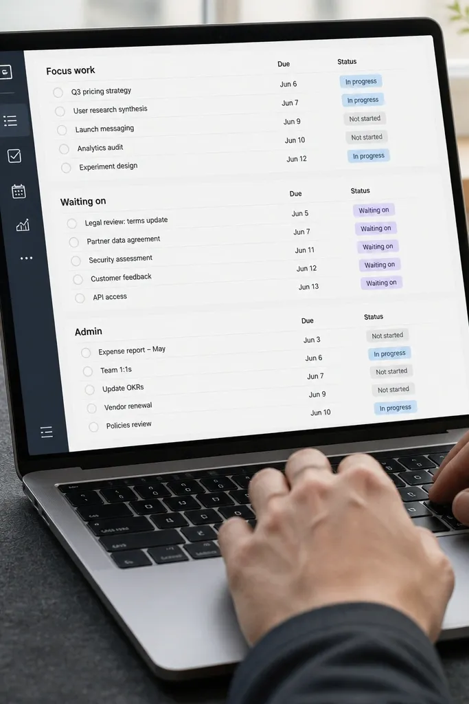
A work template looks expensive when navigation is fast and predictable. Build a sidebar page that contains only three linked views with hard filters: Focus work, Waiting on, and Admin. Each view shows only the top 5 items with due dates and status. That structure keeps your main workspace clean, and the sidebar becomes a polished control panel you can screenshot.
Create a Tasks database with properties: Area (select), Status (select), Due date (date). Then create three linked views filtered by Area equals Focus work, Waiting on, and Admin. Set each view to show only 5 items and sort by Due date ascending. Place these views in a sidebar layout on your main dashboard page.
Use exactly the same card layout for all three views so the sidebar feels like one designed widget.
Don’t put toggles inside the sidebar. Collapsed toggles make the layout look unfinished.
15. Daily Work Log with a Clean Metrics Row
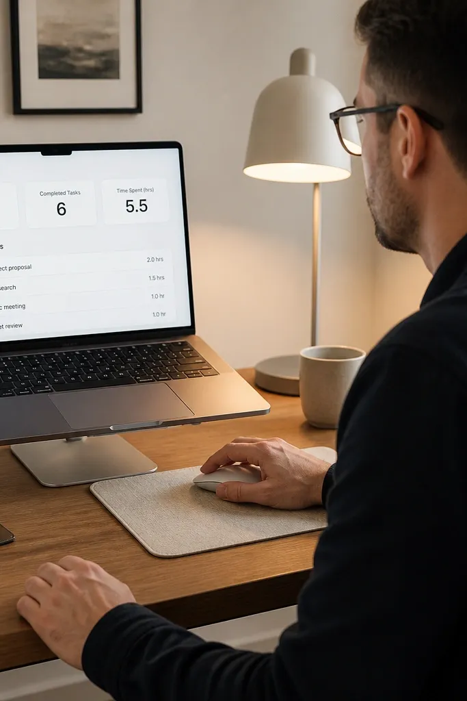
Daily logs can look high-end when they’re structured like a report, not a journal. Add a metrics row at the top: planned tasks, completed tasks, and time spent (in hours). Then show a short card list of completed tasks only, so the page stays tidy. This works because the page always has the same layout, and the metrics make it easy to scan.
Create a Daily Log database with properties: Date, Planned count (number), Completed count (number), Time spent (number), and Notes (text). Link your Tasks database to Daily Log via a relation property like “Logged on.” Then create a linked view filtered to the current date and show only tasks where Status equals Done and Logged on equals this date.
Editor's noteUse Time spent in 0.5-hour increments (like 1.5, 2.0) to keep your numbers consistent across entries.
Skip thisDon’t include both planned and completed lists on the same page.
16. Research Inbox with a Two-Level Tag System

Research templates look sharp when tagging is controlled. Use a two-level tag system: Topic (select) and Stage (select: Capture, Read, Summarize, Use). Then build an inbox view that shows only items in Capture and Read, with cards showing the first sentence or a short summary. The look is high-end because every card is uniform and the filters keep the page from becoming a dump.
Create a Research database with properties: Topic (select), Stage (select), Source (text or URL), and Summary (text). Add a “Stage” filtered inbox view on the main research page that shows only Capture and Read. Then create a second view grouped by Topic for the Summarize stage so you can work in batches.
Editor's noteKeep Topic names short and consistent, like “Pricing” or “Onboarding,” so tags don’t wrap.
Skip thisDon’t let Stage be free text. Use a select so view filters stay reliable.
17. Workshop Plan with a Timeline That Stays Clean
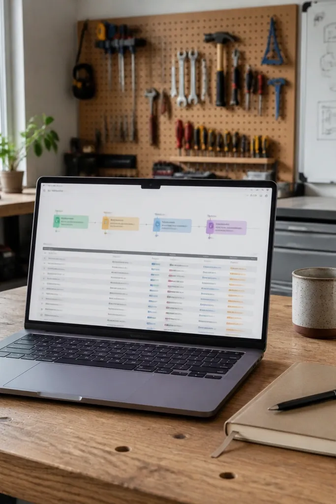
Timelines look premium when they are calm and readable. Use a timeline view for major milestones, but keep detailed tasks in a linked table under it. The milestone cards should show only the milestone name, owner, and due date — nothing else. This keeps the page from turning into a dense wall while still giving you structure for planning.
Create a Workshop database with properties: Milestone (text), Owner (text), Due date (date), and Type (select). Build a timeline view grouped by Type and set the card display to show only Milestone and Due date. Then add a linked table view for tasks filtered to the selected workshop, with columns for Status and Owner.
Use Milestone naming like “Module 1 — Setup” so timeline entries sort naturally.
Don’t put every tiny task on the timeline. Keep it to milestones.
18. Status Page for Stakeholders with a Single Narrative Block

Stakeholder pages look high-end when they read like a clean update, not a spreadsheet dump. Put one narrative callout at the top called Update Summary, then include three small linked tables underneath: Progress by Project, Risks, and Next milestones. Keep the narrative block short, and force every row in the tables to have a due date or a status. This makes the page look polished and keeps the information actionable.
Create a Stakeholder Updates page template with an Update Summary callout block. Then create linked views from your Projects and Issues databases: one for Projects where Status is not Done, one for Risks where Status equals Open, and one for Milestones where Due date is within 14 days. Limit each linked table to 8 rows max and sort by due date.
Use one callout style for the narrative across every update so the page has consistent visual rhythm.
Don’t let the narrative callout grow into a full essay. Keep it to 5-7 lines.
19. Template Theme Lockdown with a Property Style Sheet
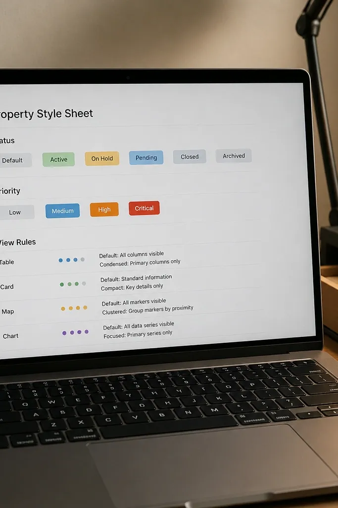
This one is the cheat code for keeping your template looking high-end after weeks of use. Create a small “Property Style Sheet” page inside your workspace that defines status labels, priority labels, and what each view shows. It’s not glamorous, but it prevents drift — the thing that makes templates lose their clean look as soon as multiple projects pile up. When your team or future self follows the style sheet, the template stays visually consistent.
Create a “Property Style Sheet” page and add tables listing Status labels, Priority labels, and their exact meanings in one sentence each. Then go through every view and remove extra properties so only the defined set appears on cards. Finally, set default values in templates for Status and Priority so new pages don’t start blank.
Keep the style sheet in the same page template group so it’s easy to duplicate when you build new sections.
Don’t rely on memory for status meanings. One inconsistent label makes your views look off.
20. Time-Block Focus Wall with Drag-and-Drop Blocks
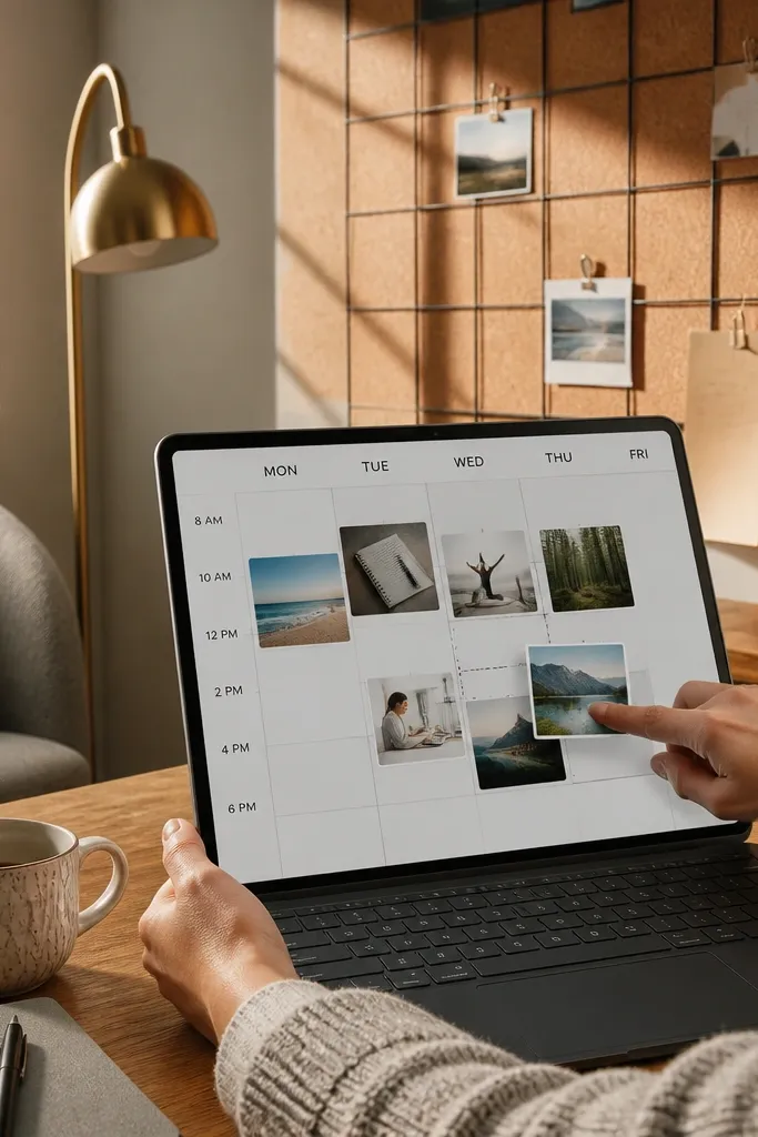
This fixes the problem most work Notion templates have: planning that looks good but doesn’t steer your day. A Focus Wall gives you big, photo-like time blocks you drag across a clean grid, so your schedule feels physical instead of buried in tables. The visual style is high-end because each block has one job — a single color, a short label, and a tiny progress dot — and the grid stays calm. Build it once and you get an at-a-glance day that’s easier to follow than a calendar list. It fits anyone who works in sprints, freelancers, and small teams that need structure without turning everything into project management.
Step 1 — Create a new page with a database called Focus Blocks. Add properties: Start (Date), End (Date), Block Type (Select with 6 values like Deep Work, Admin, Calls, Creative, Break, Buffer), Color (Rollup or separate Select), and Done (Checkbox). Then set a view called Focus Wall as a board grouped by Block Type and a second view called Today Strip as a list sorted by Start. Step 2 — Use a grid layout by placing the Focus Wall view at the top and the Today Strip below it, with a “Now” line made from a separate database that tracks the current time (Date) and a formula that highlights blocks whose Start <= Now < End. Keep Block Type labels short (max 2 words) so blocks stay clean and readable. Step 3 — Style each Block Type with consistent colors and make the block title property the only text line shown in the board view; hide everything else so it looks like a wall of tiles, not a dashboard with clutter. Add a small progress dot using a formula that returns “●” when Done is checked and “○” when it’s not, then use it as a single visible property.
Editor's noteUse 6 block colors max and pick one neutral for breaks (gray) so the whole wall doesn’t scream. Keep labels under 12 characters so your blocks stay photogenic even on a small laptop screen.
Skip thisAvoid mixing long task names into the block title — it kills the look and makes the wall hard to scan.



